#also I finally figured out how to draw digitally! yay me
Explore tagged Tumblr posts
Text


Can't stop thinking about that maid fit (plus a cat kon as a treat)

He's just my little dress up doll
#kon el fanart#kon el#kon el superboy#superboy#kon el kent#young justice#young justice 1998#dc fanart#dc comics#maid outfit#maid dress#cat boy#artists on tumblr#drawing#also I finally figured out how to draw digitally! yay me
706 notes
·
View notes
Text
Life After Info Post
[Click here to access the Life After Digital Comic Book]
Summary: Two years ago, a viral outbreak rose the dead. Considering how his life had gone up to this point, surgeon Trafalgar Law figured this might as well happen too. When a supply run into the nearby city gets intercepted by a seemingly reckless and impulsive former patient, the dependable routine Law had settled into in this new life shatters. He finds himself exposed — his body out in the infected landscape, his conscious clawing to define what he believes is right, his heart begrudgingly deciding to find a new home on his sleeve. Maybe there’s more than a virus roaming the new world that can bring a dead man back to life.
Content Warnings: Canon typical violence, zombies/body horror (but lbr I am not good at making scary things look scary)
Relationships: Luffy x Law
Update Schedule: New page every Monday/Wednesday/Friday
Page Count: [37 posted | 55 drawn]
Latest Update: [7/21/24] WOWEE did I get myself carried away this morning. I just spent 5 hours organizing my comics and creating the digital comic book pages. I could have spent that time drawing or idk not doing what I do for my job, but I cannot be stopped. Anyway I blocked out 30 pages of this comic last week and they include the most intense action sequence I've ever done in my gotdang life. Wish me luck because I am nervous about tying down all my drawings lmao.
OLD UPDATES:
[6/29/24] HULLO! I'm doing so bad at keeping my masterposts updated lately I am sorry. All pages of life after are tagged life after if you're ever looking between masterpost updates! Also exciting update, I finally have figured out all the different plot points i'm gonna be hitting (yay!). I got hung up on something for awhile that made me not wanna work on this project, but I'm back at it. I think we'll end up with 6-7 parts! I have probably another 80-100 pages to draw lol. Also i got the app Magic Poser and it's AWESOME and I immediately used it to block out sets cuz MAN I hate backgrounds.
[6/10/24] HELLO. I'm sorry I've been shit at updating my masterposts lately. It's easiest to do from my computer, which I rarely use, and life has been happening. I also can't believe I bungled the queue and posted pg19 before pg18 i am very sorry 🤦 Eventually I'll have to turn this into an airtable base I'm sure, but until that day comes where I have like 100 pages of this comic we're stickin to the regular post lmao
[5/26/23] I got real caught up in doing summer of lawlu comics this week and this is the first week since the first week of April I haven't drawn new Life After pages and it feels weird 🙊
[5/19/24] More Luffy backstory comin' this week! :^)
[5/12/24] Updating now so get myself on schedule to update on Sundays like I had been with my other comic master post!
[5/8/24] Thank you to everyone who's liked/reblogged/comment on the first few pages!! It means the world to me that anyone's reading my silly little comics.
[4/28/24] HULLO. It’s happeninnng. I’ve spent the last few weeks working on this comic, and I gotta make this post so I can start queuing pages & link this in them! This is the most like….legit? Comic endeavor I’ve undertaken perhaps….ever. I’m very nervous about committing to how long it will need to be lol. This story is dear to my heart — zombie content is kind of my very favorite. I’ve always found it to be a great backdrop for exploring themes like grief, coping with change, community, and learning to live again. It’ll be a long haul but I hope you’ll ride it out with me!! Tomorrow I’ll be posting the first two pages. After that a page will post every Monday/Wednesday/Friday. As of this post I’ve completed over 20 pages so that I have a good lead on what’s posting and continuing to write, so I’m hopeful that’s a cadence I’ll be able to maintain. I’ll update this post weekly to include the most recent pages the way I do with my main comics master post. All pages will be tagged 'Life After' and I'll tag any pages with zombies in them with 'zombie' for blacklisting etc.
387 notes
·
View notes
Text
Grad School Q2 - Week 0
I'm going to try this again and hopefully not get buried in homework after week 5 again because I LEARNED MY LESSON. I WILL BE PROACTIVE! I WILL NOT PROCRASTINATE!
The pre-quarter assignments were a lot of "pitch several narratives, one will become your final" stuff, which is sooooo much work, like, guys! I don't have this many stories in me just ready to go? So, all tomorrow I'm going to be out there struggling to come up with some ideas for a 24-page comic I'd theoretically want to write... just so I can not choose them lol
I came up with a short horror narrative yesterday that I'm actually proud of, but it took days of brainstorming... I think I'm just going to generate a bunch of random words and just make them into something at this point.
The only assignment that was actually drawing was anatomy (not thrilled at this being a required course), which was kind of just "draw a figure in your style and show how you built it"
So, I found the first full-body picture I saw on pinterest and drew this:
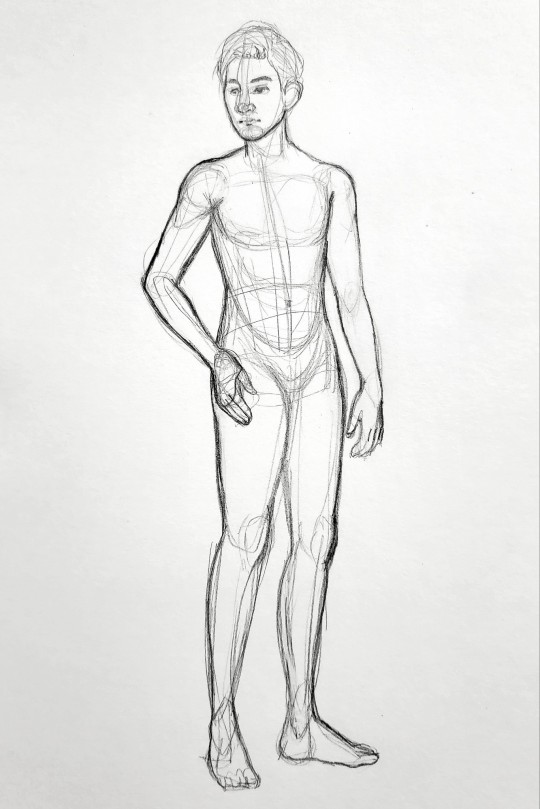
I was like, ugh, I should really do this digitally since I don't have a working scanner right now. Guess this can just be a warmup. Also, I looked at the discussion board and someone else chose a very similar pose and mine looked weak compared to theirs, so I went to TRUSTY OLD the pose archives for this one:
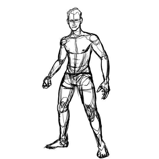
But, I was like, this doesn't feel like my style, ya know? It feels like a figure drawing. (I think if I had just finished it, it would have looked fine...) Nah, I decided, hey, I've drawn two men with basically the same body type. Let me draw from imagination since I totally know what a guy looks like now.
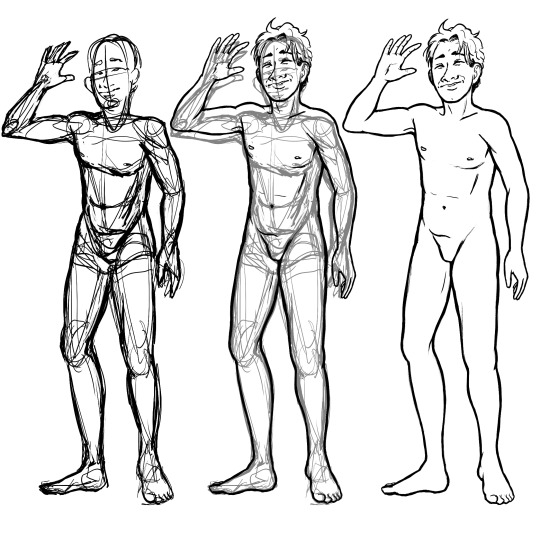
So, yay? Not a single reference used for this one! Love that I, for no good reason, made myself do this simple assignment 3 times. Now you see why I'm so slow at art. Smh.
#also got weirdly in my head about what body type to draw like#oh no is it going to reflect bad on me if i draw a female figure over a male one? if i choose thin over fit over fat?#welp gonna spend the rest of the night contemplating if i'm a bad person over an extremely minor assignment! HOORAY!#As if there is a secret right answer to that lol#lifeblogging#grad school
4 notes
·
View notes
Text
Aight well, since I’m pretty sure I’m most of the way out of Vargas brainspace this time around, have some unpublished/unfinished sketches and doodles! Prepare for lots of extremely rough concepts and possibly some walls of text lol
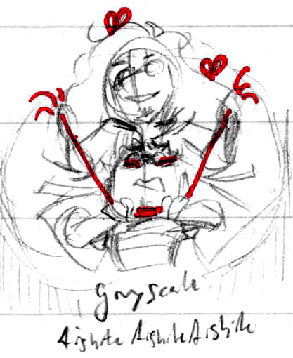
Veryyyy early sketch, the first unfinished one actually! You can tell how early since I hadn’t chilled out on the yarn yet lol. Was looking around for music and while I didn’t add it to the playlist, the male cover of Aishite, Aishite, Aishite is always going to have a special place in the inspiration part of my brain

They be doing homework. I’m so weak to domestic stuff, and every scene with Todd delivers so much, bless him

I threw around a couple card ideas, I’m still undecided as to which one I like better, but I decided pretty early on Jack of Spades and King of Hearts - the King of Hearts is known as the Suicide King which - well. And I’ve always seen the Spade as being like a stabbed version of the Heart lol, and since it’s black it’s the opposite in aesthetic. They both have a pretty dark aesthetic, so if one was going to get red, it seemed right to be Scriabin

A tiny tiny One Way Mirror doodle I didn’t have room for anywhere else. Just turn around!

I have a few iPod scribbles for late-night or early-morning ideas where I couldn’t quickly get to my notebook. This one was right after I woke up from a Vargas dream, pretty much the whole cast was there! This frame in particular stuck out to me because of the composition, it was a fully animated music video and they all had that two-frame back and forth poppy kind of motion, thus all the action lines lol

Don’t trust him with pointy things. I really like how the last one turned out other than his hand

A particularly stupid late-night idea lol
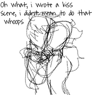
I may or may not have written a kiss scene into the TGWDLM crossover, I swear I didn’t do it on purpose

More of the TGWDLM crossover, you can see I got about 1/4th of the way through this one and then gave up lol. I actually had almost a half page of concept sketches for if Scriabin got Apotheosized - since I use eye colour to signify who’s been hiveminded, how was that supposed to work with Scriabin? Blue scars were pretty prevalent, so how about that? The idea of the two of them being on the same page and actively working together was rather intimidating as well, but it all didn’t go very far since that wasn’t the concept I wanted to explore
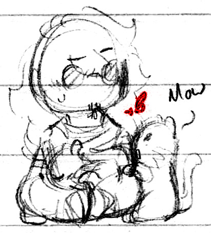
The idea of them going to a Cat Cafe popped into my head and I had to quickly scribble it down and then I remembered I don’t know how to draw cats lol. I drew Scriabin freaking out first, a cat among cats lol, and a cat trying to play with the yarn in his hair because cliche
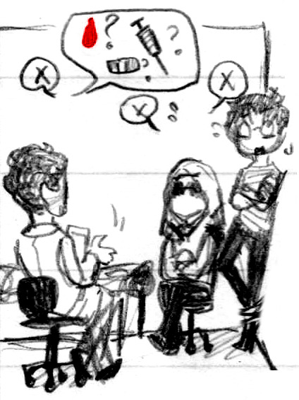
The prospect of them going to the doctor’s just delights me so much. I actually made a little minicomic about it but I never finished it. I’d want to redo it to do it justice because I’m just so excited about them having to deal with this situation lol
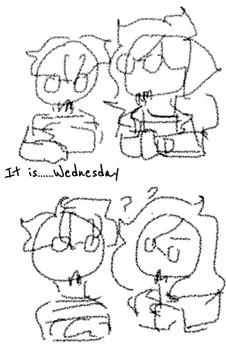
An extremely absent-minded doodle lol, I was thinking about Edgar’s watch of all things. I think I did draw this on a Wednesday
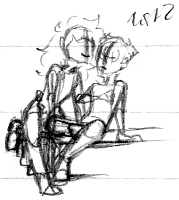
Was trying a few pose references to finish digitally and somehow this spaghetti sketch was the best of the three lol. They look like theatre masks

Oh very cursed! Very cursed! Thanks me, how very cursed. I had to tho, this colour is called “Liar’s fave” and it somehow perfectly matches how I’ve been drawing his glasses. I think I prefer the censored version tho haha. Also surprisingly not a TGWDLM reference, I just wanted to draw him with weird coloured eyes
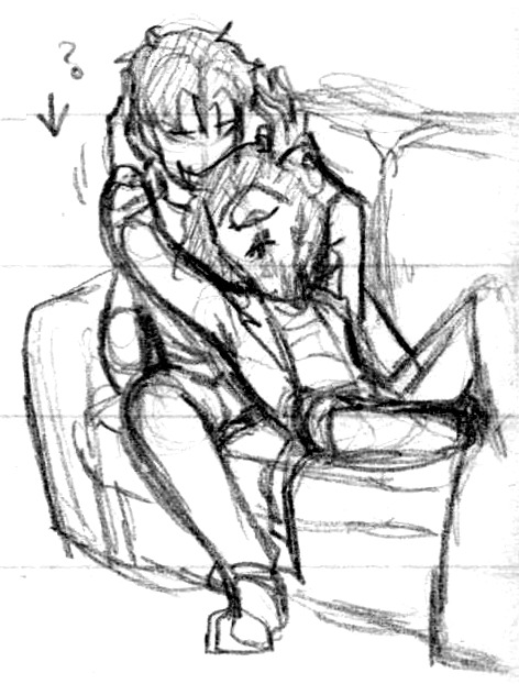
I was thinking about the weird, twisted ways Edgar gets “compliments”, especially from Nny, and the line “Anything in the right context can sound sweet. Isn’t that right, my dear?” accompanied by this pose made it’s way through my head. I didn’t expect the perspective lol
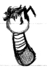
Oh my gosh, a main character, how’d that happen
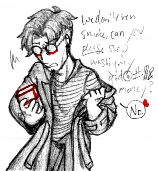
I wanted to try grawlix swearing and had the idea of Scriabin buying stuff that neither of them would use just to piss off Edgar, so 👏 Also “taking a coat partway off” is one of my favourite kinds of poses and I so rarely draw it! Thanks, Edgar

A combination of thinking about how often they kiss (ironically about how Edgar was Scriabin’s first real kiss After, but this is almost certainly Before?? I dunno) and bruising. I only wanted the second one but my hand was not behaving >:| It did at least give me the image of Edgar’s tears falling through Scriabin’s fingers
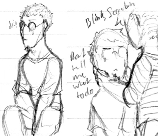
He’s never had real eyes before, would he remember to blink if he started focusing really hard? I’ve had eyes my whole life and I forget to blink sometimes
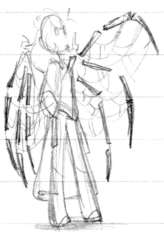
Slowly but surely improving on his wings. I finally realized what they remind me of - hands! I guess that seems obvious lol, demon wings are usually based off bats, aren’t they? Just goes to show how many wings I’ve been basing off arms rather than hands. Probably doesn’t help that I usually draw fingers with two joints instead of three haha. Starting to understand how to keep the silhouette clean while still adding lots and lots of yarn as well, yay
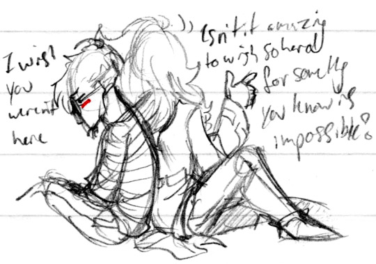
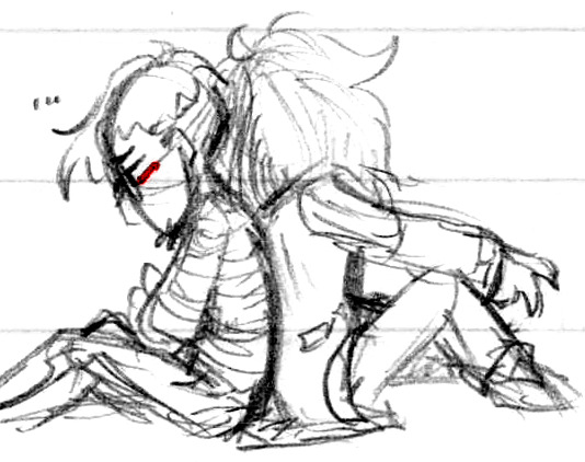

Is he being sarcastic or saying it in earnest? That’s the fun part, you never know! Scriabin being vague on whether he’s being nice or rubbing salt in the wound has appealed to me for quite a good while. I think he less skirts the line and more falls on both sides simultaneously haha

Yet more wings! I liked the idea of each of them having a distinct silhouette but Scriabin still posing behind Edgar, so you can tell his wings are his own but they’re still muddling Edgar’s outline
So that’s most of my unfinished sketches and doodles that I couldn’t figure out where else to put! From early June up through September, what a ride ♪
#💟#Doodles#Art#Sketchdump#Scriabin#Edgar#Todd#Nny#Devi#No blood this time around but some light abuse and light tenderness throughout#Since I talked about each one in the body text the tags are gonna be so spoiler-free this time around lol#I talked about a few of them phrased in a way like I want to finish them - I do it just might take a while#I'm mostly just done /actively/ drawing Vargas - I'm sure I'll still do the occasional doodle and I have a couple projects yet to finish#But even with just my backlog I'd have enough Vargas doodles to keep my queue running for months lol - so no new ones if I can help it#Speaking of the backlog some highlights include: multiple instances of Moth Edgar - at least one Spongebob meme lol -#Honestly just a lot of memes lol I have like ten or so lol - a BG/domestic object(s) idea - a couple more Minecraft shitposts -#And a whole goshdang voice-acted shitpost I just really love shitposts lol#I have no idea if/when/how many I'll get to but I still love them all lol#Anyhow - hope these are enjoyable uwu Even if I didn't finish them all I do still like them#Also I can't even imagine how this is gonna look on mobile lol soz
118 notes
·
View notes
Text
Requestober: Vargas Edition
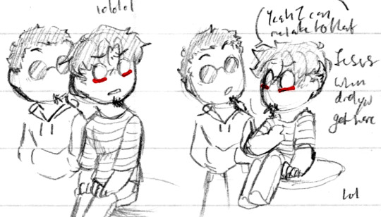
Day 3. I really liked Edgar’s face, clearly. It’s too bad I couldn’t draw Scriabin right behind him for the final version since Edgar was sitting but at least I got to draw it here. They’re both a bit catlike!
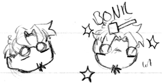
Bonk ✨

My original idea(s) for Day 6′s “Fluff” theme kept turning out silly instead of fluffy so I had to scrap them, so have a concept version of Scriabin picking on Edgar by calling him a teratophile lol (He’s referring to himself of course)

So many notes lol, I do still want to redo this one, I can’t let go of how much I like the hand positioning, somehow using a prop made it more dynamic, who’d’ve thought haha

And then what I finally settled on for Fluff. I had to move Scriabin back a good bit for the digital sketch to better see Todd, always so center-frame ♥
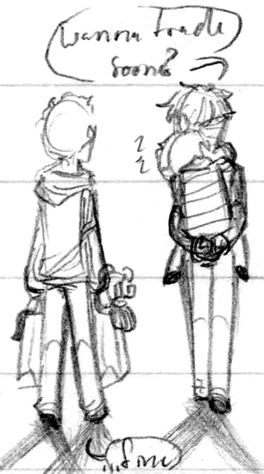
My only sketch note for this one was two arrows pointing towards both of them and just “closer” - Walk closer! They are in the digital version so I’m happy. I had to consider how to include Shmee too, since Todd was there. I felt like Scriabin wouldn’t want to hold him directly haha
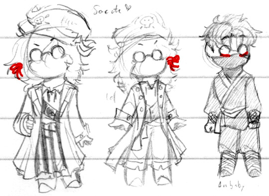
Day 23, cute costume time!! I grabbed details from a few different sources before settling on anything, and it was so fun to draw pirate stuff again ♪ I wasn’t expecting to get so emotionally invested in the ninja costume but drawing a gi top made me feel so nostalgic, ah. I also forgot which side laid over which until I mimed putting mine on and realized I’d drawn it wrong - my references lied to me! I still ended up getting it wrong in the final version lol, just chalk it up to a cheap costume. What belt would Edgar have, hmm...

Basically all my notes are just iterations of “cute” lol. I was planning on adding toy weapons to the final version and then I forgot lol. I liked the idea of him showing off, tiny happies ♪

The sketch that would become the final version! I wasn’t having the best drawing day so I knew I wanted to change Scriabin’s pose a good bit but getting anything down to paper to use as a base was the real goal here lol. The pumpkin originally had a little pressed-in jack-o-lantern face, I used to have one of those ♪

Even after I drew the final version I still wanted to draw them being cute hehe. Scriabin’s just like “More candy for me thx.” How many Oos and Aas do you suppose they got dressed so? The cutest kids

And then right into Diaryfic for Day 24! Yay. His arm did originally say “Scriabin” but I scratched it out a little too much and it just looks like messy crosshatching now lol. I was intending to go quite ambitious for this one and try to make a storyboard, and then I realized that if I wanted to post it anytime close to the date, I had to skip out this time :’D A lot changed between the sketch and the final version anyway, so even if I didn’t get to do that, I’m glad I spent my time polishing it. And I did get to do a little bit of animation!
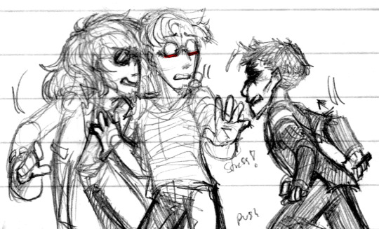
Day 29. I haven’t drawn Johnny seriously since like, 2013 lol. I did forget that his shirt was fun to draw! Flap flap. I kinda just let my pencil loose to try and get some of the energy that these three in one room would generate lol. I quite liked how much motion ended up in their hair, stress floofs!

Ah yes, the Draw The Squad. I waffled on this one for-approximately-ever, not least of all trying to figure out which would be which in the main duo, who would give either of them a low five?? Each of them has a note-title, the first one being “Is literally anyone in the story happy about this??” and the second’s “Congrats for growing a pair lol” Honestly I even considered Shmee being the third wheel since at least he can see just how many concessions they’d have to make to get to that point, but it was too ridiculous lol
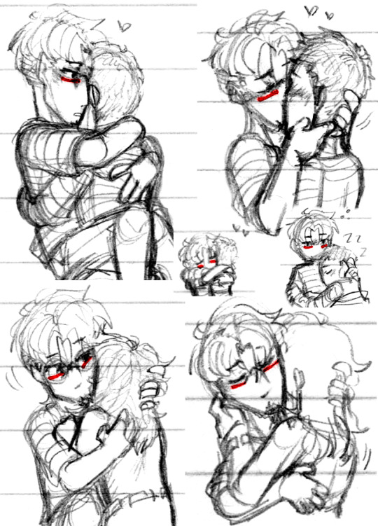
Day 31′s prompt was “Edgar and Scriabin holding each other and/or kissing” and like - you can’t encourage me like that, I have negative control when it comes to them being sweet to each other, as evidenced, to the point where I didn’t even use any of these, I made all of these based on the prompt and it still wasn’t enough! Lol. The first set was just my brain running away with the thought of if Edgar could comfortably initiate a kiss, he tends to channel his nervousness into aggression so what if he was feeling calm? A big ask lol. I didn’t mean to make the last one so sensual but I’m not mad about it so lol. The sleepy one was specifically inspired by the final scene from You Can’t Live Like This, I love that one ♥

Since you asked you didn’t here’s a doodle from my other notebook from when the tenderness just took over for a bit, completely unrelated, just yet more proof of not being able to stop myself lol
And that’s all the Vargas Requests! :D I had fun with them!
#Requestober#Vargas#Blood#Vargas had enough sketches to qualify for its own separate post lol#Of course#Even if there had been more non-Vargas requests I still sketched a lot more Vargas stuff lol#Anyhow yes do be aware of blood for the Diaryfic sketch :0 The rest are all quite tame tho#Also there's quite a lot of Edgar/Scriabin so look out for that lol#I almost certainly had the most fun with the costumes one uwu Love me some cute clothes!!#By volume of sketches tho I'd have to say it's tied with the tenderness roughs - a bit more for the latter actually#But that has an unfair advantage 'cause I have a backlog of unfinished doodles already - cheating!#They're tied for Actual Requestober Prompts#Anyway I did my usual blocks of text per image lol enjoy my rambles
16 notes
·
View notes
Text
Match up! (~˘▾˘)~
Hi again…can I get an Ikevamp match-up? I got curious on who I would end up with tbh😅😅😅
About myself…I never lose a temper, I am extremely shy and quiet, it’s extremely difficult for me to trust new people. I am around 5'9 feet tall, above shoulder length messy brown hair tied into a ponytail; I would be mistaken for a boy if I let my hair down. I wouldn’t even notice if they mistook me for a boy until someone addresses me as one😅😅😅. I look intimidating at first sight because 1.)I am silent most of the time, I look cold and aloof, I never smile, and 2.) I can be blunt without noticing + my difficulty of showing emotions would make them think I’m judging their soul *yikes…whoops?😅😅😅*. That intimidates most people and when in reality when I am the one who feels more intimidated by them. 😅😅
Once I warm up, I have this side that only my family and close friends know. I get along well with anybody; I won’t judge people for their race, beliefs, personality, religion, and all. It doesn’t exist here when I befriend them 😊. I have this weird sense of humor that can turn dark and morbid without noticing… 😅😅 I am like a child at Christmas when it comes to new art supplies, baking, and cooking new recipes; I love sharing it with my family and friends. I can compare my strength to a guy and I can carry heavy things without a problem😅… I love to play the guitar and I used to play the piano when I was younger and I missed playing it. I’m extremely rusty after not practicing for 7 years now😥. I can still read music notes, and it will take longer for me to navigate the piano if I play it. I mostly draw and paint right now tho…
I’m not a fan of wearing girly clothes, and I would rather stick to wearing good ol’ shirts, polo (long/short sleeves), pants, and hoodies style. I avoid drinking alcohol because I easily get tipsy; I’d turn into a loud drunk after a few sips. My friends would often keep me away from who knows what they’re reading and watching stuff… Told me that they don’t want me to taint my innocent eyes and soul or something like that…I never cuss even if I’m used to hearing my classmates swear like a sailor. The first time my friends hear me accidentally swear, they look at me in horror and demanded me to know where I got that word🤣🤣
I don’t like loud and crowded places, I would feel dizzy and suffocated if I stayed there for too long. There will be times on where I’m nowhere to be found since I would look for an isolated place somewhere around the corner for me to hide whenever I want to draw or paint. I am not really confident of my skills in drawing; I have a bad habit of hiding those from my family *which annoys them*. I have another bad habit of being stubborn whenever I got sick, and I wouldn’t even let anyone know I am unwell because I do not want anyone to worry about me. But when someone noticed, I would admit that I am sick. *I would go to school even when sick so I can finish my school works because, whenever I miss a class, there will always be some of them who would deliberately not tell me that I missed something in class so…i learned the hard way.😅* …
I easily get startled by sudden noises if I let my guard down: objects making a loud sound when they drop. I don’t know how to deal with physical affections and would probably get stiff and flustered. I’m not used to guys hugging me cuz would go stiff whenever a guy hugs me *I love hugs and all but… I’m not used to being hugged by guys… 🙁* I’m a bit of a disaster-prone whenever I’m outside, and would accidentally hit my head on lower tree branches and lower places, sometimes I would accidentally sprain my ankle on the uneven ground *if someone made me wear heels especially if it’s stilettos*. 😅😅😅
Yay: I love my coffee with a ridiculous amount of milk and with less sugar; baking, cooking, sweets, drawing, painting, digital art, music, cats, dogs, pokemon, Manga, anime.
Nay: I despise certain types of vegetables that are bitter and slimy. My face would shrivel up seeing those kinds of vegetables. Animal cruelty is a big no-no for me; I normally don’t get angry, and I forgive people within a blink of an eye *that annoys my family a lot😅* but, I will make an exception for that.
I can control my own anger, that no one can tell I am fuming.
If it’s ok with you…😅😅😅 Took me a long time to figure out how to send a more detailed one. 😂😂 I think that’s enough spilling tmi about myself… Whoopsie…😅😅 🦊🐱🦊🐱
Hi hi love! ❤🌻Thank you so much for the request! I had so much fun writing this up for ya and i hope you enjoy it dear! ❤🦊Also i hope you are keeping safe and well and have a super good day!🐇❤ Also sooooorrrry for taking 2 billion years with this! hehe so without further ado........... @xarexraven
So I match you with…………… Theo

The first time you met everyone, you were so quiet and reserved hiding behind Comte. They took one look at you and instantly thought, “oooh great another male guest.” You were wearing a hoodie and jeans and your hair tie keeping your hair in a ponytail, had just snapped as you walked through the door. Comte gave you a gentle push to introduce yourself, and one look at your intimidating face, had the entire household believing that they had another tsundere in their midst.
During dinner, you had hardly noticed that they all thought you were a boy. The residents all started retiring to their rooms after dessert, when Sebastian handed you a final cup of coffee, “Here you are sir.” Your eyes widened, and you started up at Sebastian in confusion, too shy to correct him/ That is when Comte who was still sitting beside you gave your head a gentle pat, “Sebastian it is quite rude to mistake our precious guest for a boy, especially one who is beautiful.” Both you and Sebastian were left blushing at the comment, that’s when Vincent, who was the only other resident still at the table, spoke up. “I have to agree with Comte, it is not nice to call someone so pretty, a boy.” The resident angel beamed up at you, while Sebastian apologised profusely, and through it all, the only thing you could think was, “man, this is awkward.”
The next morning after Comte explained the whole, everyone in this mansion is a vampire thing, you wandered around the mansion aimlessly. Well, that is until Napoleon came across you and grabbed your hand, dragging you to the dining room, where a feast of sugary goodness laid wait. He told you that he had made way too many pancakes and that they needed help finishing them. No one in the mansion had seen you smile yet, but at the sight of the giant stack of sugary pancakes, you couldn’t help but beam. Vincent had spotted you and flagged you over to sit next to him. “Oi knaap, don’t go hog all the pancakes, save some of the rest of us will you,” Theo loudly exclaimed as you loaded up your plate to a stack of pancakes almost as high and his. At the sound of Theo calling you a boy, Vincent narrowed his eyes at Theo and started scolding his younger brother for being so rude. Theo stared at you in disbelief but with your hair now in a pony tail he simply shrugged and gave you a new nickname “Hondjie”. With the misunderstanding finally cleared up once and for all, you made quick work of polishing off the stack of pancakes with the three men.
After lunch Vincent gave Theo a detailed list of art supplies that he needed, and at the mention of art supplies your ears perked up. Your eyes gleamed in excitement, and your cold, aloof exterior changed to one of an excited child on Christmas morning. Your cheeks were starting to hurt, that had been a record of two smiles in one day. Although even though your smiling felt weird to you, to the three me it was the most beautiful sight. Theo took notice of your enthusiasm and in his typical indifferent voice, asked if you wanted to come along for the ride. You without a second thought nodded, you basically radiated excitement as you went upstairs to put on some shoes and get a jacket. You met Theo out in the foyer, and soon the two of you made your way to the art supply store.
Comte had told you that you were free to break the bank and buy anything and everything your heart desired, on the condition that he would be able to see your first piece of art created with the new supplies.
You were so excited at the thought of new art supplies and being able to continue your passion for art, even though you were stuck in the past, that you let your guard down a little with Theo. He asked you in his usual blunt way, why you were dressed like a boy and not wearing skirts and dresses like other women. You told him that you were most comfortable wearing pants and hoodies. The way your eyes were beaming, low key reminded him of his precious brother, and he found himself low key drawn to your pure, innocent energy.
The two of you spent hours and hours picking out the perfect supplies, you were low key shook at Theo’s knowledge about art and supplies. He actually helped you pick out the best supplies for your personal drawing and painting style. After spending hours in the art shop. The two of you made your way to the waiting carriage, when Theo spotted an ice cream store, his eyes lit up at the thought of sweets. When you saw how excited he was, you suggested that the two of you investigate the shop before heading back.
For the first time in Theo van Gogh whole existence, a woman had paid for him. He was sitting across from you in the ice cream parlour while you were happily eating away at your sugary treat, still trying to process it all. You had paid as a token of thanks for him helping you pick out the best art supplies. What shocked him even more was during argument about the bill you legit gave him a deadpan look and bluntly said that you were ganna treat him no matter what. After that comment you legit left him blushing and speechless, you truly were a strange woman.
The two of you sat in silence for a few moments when you finally decided to break the ice. You curiously asked why it was that he knew so much about art, and that’s when he revealed that he was an art dealer. And so the rest of the afternoon was spent chatting about art, paintings, drawings and your mutual passion and appreciation for the trade. To say Theo was pleasantly surprised by you would be an understatement, his first impression of you was now so laughable compared to the person sitting before him. The first time he saw you, he thought you an aloof, little boy who seemed to judge him down to the very depths of his soul. Yet as he got to know you, he had come to realise that there was much more to you.
In the weeks to follow you seemed to surprise Theo more and more. The first thing that had this boy sister shook was your inhuman strength. One day as you were helping Isaac sorts out the library. The two of you had managed to fill up 2 huge boxes of junk and clutter that could be stored in the mansions attic. Isaac lifted one of the boxes and determined that it was too heavy for the both of you, so he went to call Theo or Leo who would have an easier job with doing the heavy lifting. As Theo rounded to the corner to help move the boxes, he almost rammed straight into you. “Oi hondjie, you are going to hurt yourself let me take…” As he took the box from your hands, his face started going red, and a vein in his neck started popping out. The box you had been carrying was obviously almost too heavy for him to carry, he turned around swiftly and started walking up the attic stairs. It took you no time to catch up to him carrying another heavy box of your own. At this point you could see a bead of sweat roll down his face. Theo was determined to carry this box up, there was no way he was going to be shown up by a girl, especially one that he liked. He finally made it to the top of the attic and place the box down with a huff, you had to laugh at the small blush that was still on his cheeks.
Just then out of the corner of your eye, an old piano caught your attention. Theo eyed you curiously still recovering from the blow to his ego, as you sat down on the dusty piano chair and blew the dust of the piano keys. Your fingers moved to their own accord, gliding across the keys to play a familiar song from muscle memory. Theo sat down next to you and closed his eyes to absorb the beautiful melody. As the last note echoed through the attic, Theo opened his eyes, and sapphire eyes glared down into the depths of your soul. He had honestly never in his life felt more drawn to anyone, before he could say anything your stomach gave a loud growl. It was now your turn to blush and look away in embarrassment. Theo then leads you downstairs, where he whipped you up some stroopwafels.
You tied the apron around your waist and helped Theo prepare the sugary dessert. You were so excited and happy, you loved baking and learning/exchanging new recipes. Once the two of you were done making the sweet snack, you sat down and munched on the Stroop waffles and coffee. The rest of the afternoon was spent chatting about your mutual hate for bitter slimy vegetables and love for dogs as you ate the sugary snack and sipped on coffee. This actually started a tradition between the two of you, where once in a while the two of you would exchange recipes and cook your favourite dishes together.
One day as Theo joined Comte in his room for some tea, he saw a beautiful painting hanging behind Comte, it was just filled with so much emotion. “Hey, Comte, did Vincent paint that one, I haven’t seen it before.” Comte gleamed in delight and told him that you were the artist responsible for the masterpiece and that you had given it to him as a thank you gift for the art supplies. Theo was shook, he knew you loved art but to have created such a masterpiece. He stomped his way to your room and knock on your door. He could hear shuffling from the other side, he swung the door open and spotted you throwing a heap full of tissues in the dustbin and hiding the trashcan behind you. All it took was one look at your red nose, pale face and tired eyes to know that you were clearly sick. You tried to play it off and make your way past Theo to help Sebastian with lunch service, when Theo picked you up and plonked you down on your bed. The second your head hit the pillow, your tired eyes closed and you lost consciousness. You woke a few hours later to Theo sitting by your side gently stroking your hair while placing a cold washcloth on your forehead every now and then. You stubbornly tried to convince him that you weren’t sick. Theo narrowed his eyes at you and in a soft, gentle tone said, “Hondjie can you just stop being stubborn for one minute and let me take care of you.” Theo had nursed you back to full health and you got to see a new side of Theo that you had never seen before, his sweet kind gentle side. It was actually during this time when Theo had confessed his undying love for you.
Theo love love loved your art and would insist you show him your masterpieces once you are done with them. He knew your weren't confident in your skills and would usually hide your drawings so he did what any reasonable person would do. He tickled you until you gave up the hiding spot so he could see your creation.
He also knows you don’t like crowded places or loud noises, so he actually cleared up a room for you to use as your own art room to work in peace, where no one was allowed to disturb you.
He knew you would get dizzy and feel suffocated whenever the two of you would walk through a busy crowd in the markets. So now every time the two of you cuties go out, he was sure to plan your route using back roads to avoid unnecessary crowds or he would bring King along for a walk with you. Even though King is a sweet, friendly golden retriever, he has come to love you and will do whatever it takes to protect the new member of his pack. Even if that means angry staring down people so they can part like the red sea before you and Theo.
Theo absolutely loves you to the moon and back. He loves your sweet innocent mind and will always cover your ears and glare daggers at Arthur whenever he is telling stories of previous nights conquests as he “doesn’t want Arthur to taint your innocent mind and soul.”
He absolutely loves to finally have someone around who gets his dark, morbid sense of humour and who can equally match his weird jokes. Often when the two of you are together, you would be quick-firing the weirdest jokes at each other, while being in stitches laughing at each other.
Theo also loves how you have similar beliefs as him in not judging people. It was due to this that he was completely able to open up about his past with you. You helped him to heal and grow from his past traumas. You helped catch him many a time before falling in the abyss, dragging him out back into the light.
Both of you were pretty awkward when it came to physical affection at the beginning of your relationship. However, after many, a stiff, awkward hug followed by a fit of laughter from how awkward the two of you were, eventually the two of you started to get more comfortable around each other.
Now when Theo cuddles you, as you draw him as a manga character, the two of you chuckle at the memory of how stiff and awkward it was the first time the two of you had even held hands. Theo will 100% always insist on holding your hand whenever the two of you go outside as he knows just how accident-prone you are when it comes to nature.
Ultimately Theo loves to spend quiet evenings with you snuggled up in his arms as the two of you exchange stories of each other days. He loves to read all your little manga’s you manage to create for him. Although he will never admit it, he always gets super excited when you tell him about an anime you watched or show him your newest manga drawing. He will shower you with endless amounts of hugs and cuddles from the moment you go to bed till the moment you wake up. And every morning without fail Theo will greet you with a freshly bred cup of milky coffee and a kiss.
Other potential matches…………… Vincent
I hope you enjoyed this dear and i hope you have the best day! 🦊🌻❤
#matchups#ikesen matchup#match ups#ikevamp matchup#ikevamp match up#theo ikevamp#ikevamp theodorus#Theodorus van Gogh#ikemen vampire theodorus#submission
20 notes
·
View notes
Photo
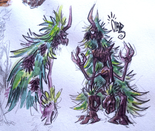
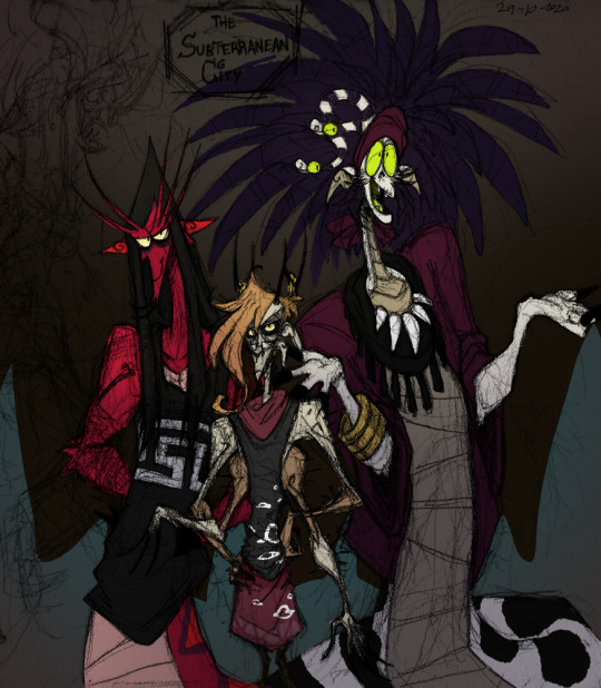
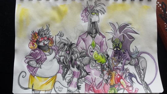
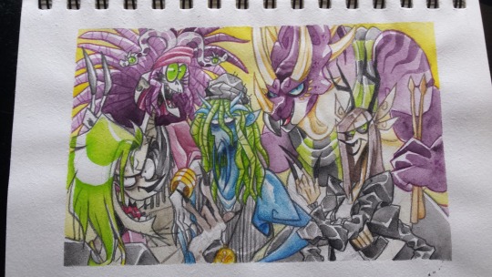
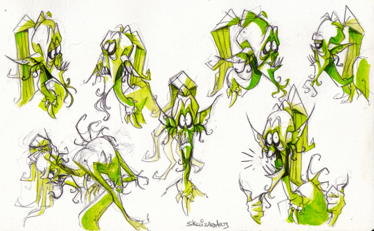
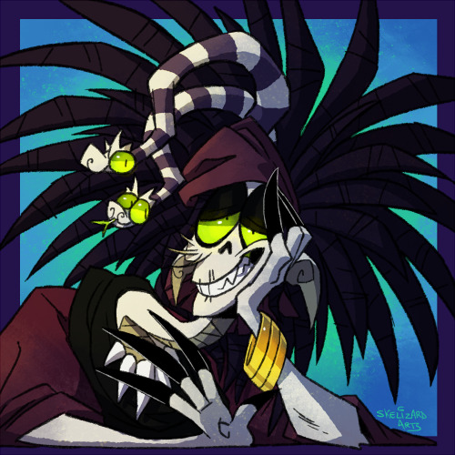
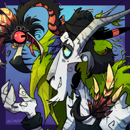
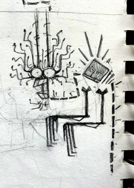
Another sketchbook/art dump where I talk about things yay.
1. Character design concept for Ord, an old character of mine (if you followed me from deviantart days you may vaguely recognise them aha). I thought they’d be great as a treant! I like to have at least one character of all the races in my fantasy world ‘cuz I then use them as a base to develop that race, what they look like, their culture, ect. Ord’s based on pine trees. They’re part of a short comic that I was planning to be working on now, but then I redesigned the tengu race and the second main character is a tengu and I’m still figuring out their new design lol. So this project’s getting pushed back.
2. These are the trio of an underground desert city in one of my main comic projects. (most of my projects exist in the same world, just in different regions of it). From left-right, Naga, Thorne and Kalvah. Thorne is an arachne who basically despises everything, and his friends Naga and Kalvah are gorgons who are like the only characters I have that are in love wowee (excluding the parents of characters ofc). This was me loosely figuring out their heights and liked the sketch enough to slap some quick colours on it.
3. The main cast of a comic project called Impz that I’m doin’ loose work on in the background while I work on other projects and things. I recently made the decision of giving the imp race horns and removing them from the scavengers (a race closely related to imps), so I fiddled around with what kind of horns the characters would have. Left-right we have Maria, Kevin, Mal, Zig, and Flick. All of them are imps while Flick is an imp x scavenger hybrid. I tried using the water brush that came with my watercolour travel set with this in which I went to the local park to draw and paint this. It was difficult to control the amount of water I wanted out of the brush (too much water!!), but it’s definitely great for when you’re out n about with a travel pan set! Also idk what the red thing is lol I just put it there so that Flick’s pose made sense ‘cuz I didn’t wanna change it. :’)
4. This is a group photo type thing of Kalvah’s band, who probably will only show up as background characters for the project Kalvah’s in, but it was fun to design them all. Apart from Kalvah, and 13 (the dude on the left), none of them have names. I spent way too much time on this but I really love the result!
5. Expression sheet of Murray, a muldjewangk character that’s in a planned short animated film I wanna do, but that’s a project for when I get myself a computer upgrade. I am currently animating him though in a short 20s animation to a song I like with a koala I designed for it. Animation takes 50 years but I’m really liking how it’s turning out!
6. Just a digital portrait of Kalvah, used it as a test for how I wanna do the art for the comic. (drawn so much of her lately! I love her).
7. The same thing I but this time with Phanes and Quetz. Dew this after the multi-animator project I was a part of that featured them went live. Phanes is a druid, which are a race of tree goat nature people, and Quetz is their pet amphithere. They’re one of the main characters in the same project Kalvah’s in. I’ll probably upload both of these to my main art blog at some point.
8. And finally, one of the final concept sketches finalising the design of Void, a character who is the shadow & imaginary friend of a kid. ‘Cuz they’re a shadow they are strictly 2D, and so I was inspired by paper shadow puppets for their design, as well as skeletons (because ofc I have to be on-brand) and axolotls lol (axolotls are very much on the brain lately). I wanted them to be flexible but also strict in movement. Took about 7 pages of concept work in my sketchbook to get to this design, it was a struggle but I really like the outcome! Void is part of a short 20/30page comic I’m currently working on! So expect that in a few months maybe?
#sketchdump#skeleart#characters#really should talk bout my characters more but everythings still in development and i worry im gonna share potential spoilers#hence why i talk bout them here and not on my main lol#there's also a smaller project I wanna do that's like a beastiary where it's like a lil fact file of all the different races#all the races are either original or based on a mythological being that I then put my own spin on#so idk maybe that could be a side blog project who knows
4 notes
·
View notes
Text
Obroth Revamp (pt 1)
Hello my lovelies, I hope everyone is doing well. I am (slowly) pulling myself out of the hole of malaise I’ve been in for the past couple months. A special thanks to @raevenlywrites and @writingamongthecoloredroses for sending me World Building Wednesday questions each week ‘cause it’s been setting the spark to the kindling of my motivation :)
As I’d mentioned in an answer yesterday, I’ve been wanting to redraw the map of Obroth - the world which holds Elgovina, Asdarant, and Chesnia. And I’d thought I’d share a bit of that process as it’s literal “world building” :P
If you’ve been here awhile, or read my agwitow.ca blog (before WordPress ate it and I moved it over to Wix), then you might remember my original map:

Part of me is like “I’m still proud of it” and part of me is like *cringe*
So my original process looked something like this:

1 - I figured out the rough scale of the world I wanted (in comparison to Earth so I didn’t need to worry about different gravities)
2 - I placed Elgovina/Asdarant and then roughed in where major landmasses would be based on travel times
3 - Penciled in the landmasses in more detail
4 - Inked the details
**I didn’t take pictures/scans as I put in borders and colours, but that’s basically how I made the map.
This time around I’m doing it digitally and (so far) am liking how it looks much more...

1 - I roughly drew in tectonic plates based (very) loosely on plate maps of Earth
2 - Using the basic “brush” (in Paint.Net) at 2pt, I just started drawing my landmasses, keeping the plate lines in mind (generally speaking, where 2+ tectonic plates meet you’ll have the edge of a landmass, mountains, and/or volcanos) - also made the Chesnian/Eswoldian islands in loose circles based on a vague recollection/understanding of how impact craters can form rocky island chains because world history reasons
3 - I removed the plate lines to have a clear image of my map thus far
**I missed preserving the step between 1 and 2 where I drag-and-dropped circles to guide the placement of landmasses. Whoops!
And because I love me some colour in my maps, I threw in some ice/ocean colouring (following image also includes the grid overlay I use throughout the process that I am unsure whether or not I will keep for the final product)

Yay, pretties!
As you can see, I kept the islandy kingdoms of the west more-or-less the same and basically threw out most of the rest of it.
Also, also, I’m thinking Obroth’s sea level is higher than here on Earth, but... I’m not actually motivated enough to do the math to figure it out. It just looks like there’s more open water? Meh
Next step is to add in borders, possibly map markers (like trees, mountains, etc) if they won’t look awful shrunk down a ton, colour it, then label it.
And because I did this digitally, it’ll be significantly easier to lift portions to make more detailed country maps!
Next steps and final looks in part 2!
(Also, if people want an actually detailed tutorial/look at how I go about this sort of thing, let me know)
10 notes
·
View notes
Text
Commission for Confidence
This is an Artist!Peter Parker x Plus Size!Reader work. It’s going to be multi-chapter, and will potentially have smut later on. It’s only a slight AU, with aged up Peter and him as an artist. The rest is pretty much canon.
Tagging: @pparkerwrites bc you asked me to! I hope you like the first chapter!!
Summary: Y/N has been struggling with her self esteem for years. After incessant pushing from your best friend, Y/N decides to commission an artist to draw her, expecting everything to happen via Internet. However, when your phone is stolen, you try to cancel the commission, but Peter Parker has other ideas. He quickly becomes enraptured by you, and a friendship forms easily. Will it lead to something more? Or will your past fears get in the way?
A/N: This is mostly just warming up, it’s only chapter one. I have a decent amount written already, so I’ll probably post the second chapter in a few days. This is my first time posting anything, so I’d love some constructive criticism!
Chapter One:
“Seriously, you need to do it! I know you never believe me, or anyone, when we tell you that you’re gorgeous, and I know you’re working on it. And I know that I never believed when you guys said it to me, but seriously,” your friend Monica stressed over video call. “Getting art of myself commissioned has done wonders for my self-esteem. And it’s not like you have to show up and sit there. You send in reference photos. The guy who did mine was absolutely amazing. His name is Peter, and I’m sending you his information. I seriously, seriously suggest it. Spend some money on you, Y/N! It’s totally worth it.”
You sighed deeply and tilted your head back. She’d been on this horse for at least half an hour now, for the third day in a row, but you had to admit that she did potentially have a point. It’s not like you hadn’t toyed with the idea in the past, but you’d always been just a little too strapped for money to risk the expense.
“Y/N,” Monica drew your attention again, “seriously. It is totally worth it. Please just think about it, okay? His art is amazing, and his prices are really fair. I sent you his information, just check him out, alright? You won’t regret it.”
“Alright, alright, you win, Monica,” you chuckled, noting her wide smile. “I’ll check out his art and let you know, okay?”
“Yay!” Monica cheered, the sudden loud noise shocking your ears.
Monica had certainly been right. This “Peter Parker” was incredibly talented. He seemed to do most of his commission work in charcoal or pencil. But it seemed that he liked to create art in other mediums, like chalk, paints of all sorts, watercolor pencils, oils, photography, a bit of sculpture work, and even some digital art more recently. His mixed medium pieces were your favorite ones to look at. He was really talented and had a decent number of followers.
But what really drew you to him was that he showed his processes and his failures. You were never really intrigued by complete perfection, and while Instagram certainly stressed perfection, this guy seemed to shun that. Instead, he showed the nitty gritty of art making, the countless failures and trashed pieces. He showed his progress, and you found yourself falling in love with all of his work.
So, finally bogging down, you decided to send him an email.
“Hello, Mr. Parker,
I am Y/N, and I have recently fallen in love with your art after my friend suggested you. She recently had a piece commissioned from you and only had rave reviews. She knows how low my self-esteem can be at times, so she pushed me to reach out to you. Therefore, I was wondering if I could commission you to do full body artwork based on me? I figure that seeing myself as seen through the eyes of a talented artist, I could definitely find more beauty in myself. If you’re too busy, or simply wish to decline, I totally understand! You are very talented and seem very sweet and easy to work with.
Thank you very much,
Y/N”
After writing and rewriting the email, you finally decided to just bite the bullet and send the email. As you settled down with some popcorn to watch Netflix and finish up some work, you did not expect to get an email. It read:
“Hello Y/N!
Please, call me Peter, ‘Mr. Parker’ is much too stuffy for my liking. Thank you so much, I am so glad you like my work! I’m also glad that you’re entrusting me to do work so personal to you. If you could just send me some reference photos of yourself, and then I’ll send over an audit for payment, then I’ll get to work!
Thank you, I look forward to hearing from you,
Peter”
Blinking in surprise at the quick response, and the excitement written within it, you smiled and starred the email to look at again tomorrow.
#peter parker x reader#peter parker x plus size reader#peter parker x insecure!reader#peter parker x you#artist!peter parker#spider-man x reader#spider-man x plus size reader#please let me know what you think!!!!!!#writing#first time posting my writing#commission for confidence
136 notes
·
View notes
Text
Gwenspiration: The Wacky Version Vol. 2 - The Fanart
Aaaaaand the madness continues thanks to @jaimebrienneonline!
I am taking the opportunity and official allowance for shameless tooting to feature a number of fanarts I did throughout the years that hold some precious memories for me.
I’ll start with this one, which marks my humble beginnings in the fandom.

Link
I was happy with it in the end (which is not necessarily a thing that happens often with me lol) because the aim was to capture the fear in her eyes (which can be tough in pencil drawings because eyes are just sooooo tiny). So when that worked, I was a very happy creator who since undertook the journey of fanarting in so many of its facets and continued testing herself out wherever the creative paths may lead her.
The rest will go below the cut because that post got waaaaaaaay too long. :)
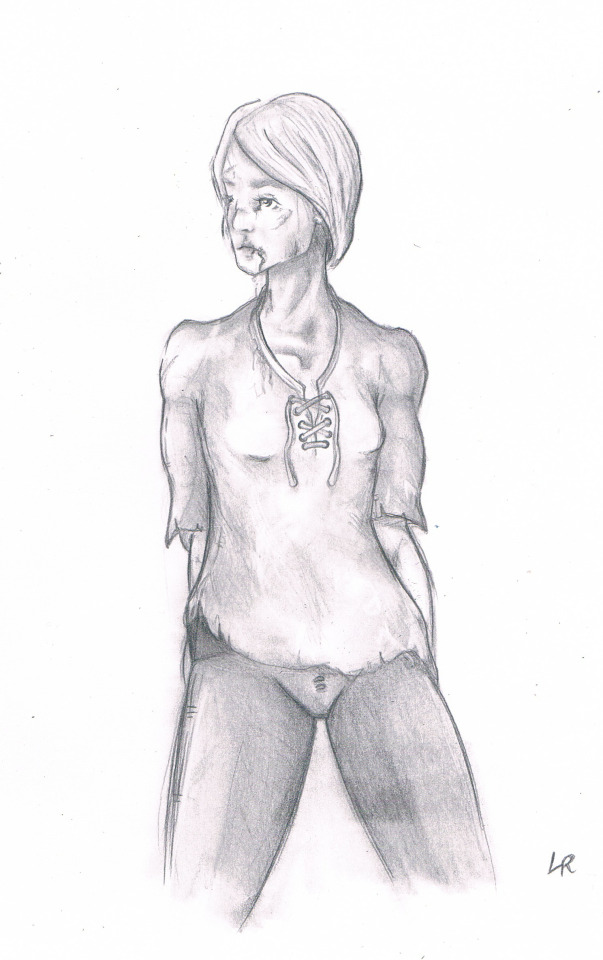
Link
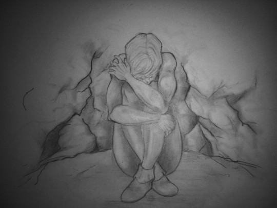
Then there’s also this quick sketch, which has a special place in my heart because I have a soft spot for drawing Brienne in her younger times, never running away from a fight.
Link
Another one I just really enjoyed making was this one. And I was surprised people liked it despite the shitty, shitty photo I took of it since it was done during the holidays where no scanner was anywhere near in sight. The aim was to reflect book!Brienne’s desperation at feeling naked and alone without Oathkeeper by her side.

Link
This is one of my first baby steps at digital art, which is still a journey I am on, not yet having arrived anywhere (though that is kind of the point, isn’t it?). I liked the mood of it, though, which is why I am including it in that list. Also... shiny freckles!

Link
Another one on my personal list of fond fanart memories is this one. Yet again, my first steps at digital art, based on a pencil sketch I made before. The aim was to bring across both book!Brienne’s muscular physique alongside her vulnerability and youth.

Link
This one, yet again a book!Brienne sketch, was supposed to show her irritation at being complimented by Jaime on the matters of her blue dress. And I was happy with the confusion on her freckled face. :)

Link
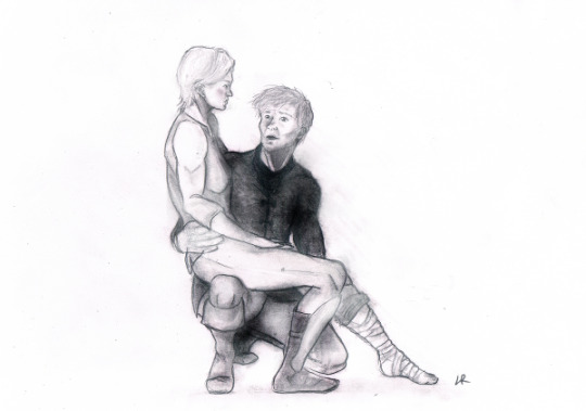
This is something I had to draw because I am a thirsty hoe when it comes to Jaime being all about courtship with Brienne to make her feel like the lady she is but sometimes believes she isn’t because of her looks.Thankfully, Jaime is there to show her that she is, forever, his lady.
Link
Pouty Brienne sketches also deserves an honorary mention, I believe. Even more so if coupled with a consoling and supportive Jaime because you know he would.

Link
This one was fun to do as I got a nice prompt for the matter. I love me my happy endings for JB, so both of them at a feast with Brienne all flustered while Jaime is all touchy-feely was all kinds of fun to do.
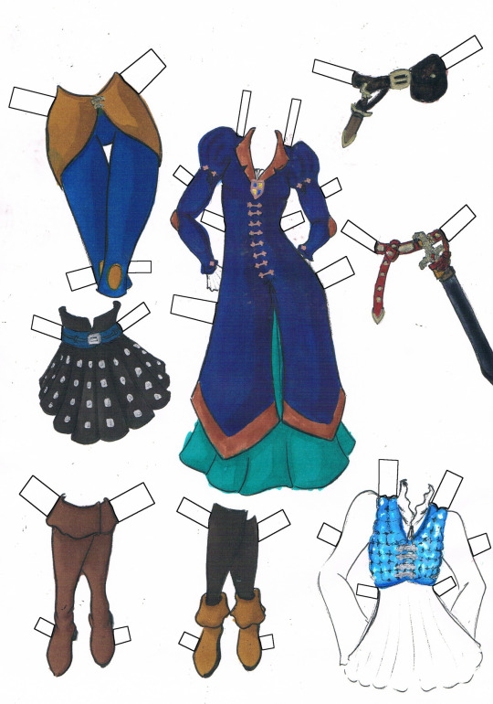
A special intermezzo for a project that was a lot of fun to do: the JB paperdolls
Link
I was really happy just how many of the JBO folk in particular was having flashbacks to childhood/teenage times of cutting out those things, because that was my very own experience with them. And I love drawing clothes, what can I say? I just posted the original ones, though I did a whole bunch of them. But this post is long enough as it is, so I thought I would spare you having to scroll through all of them LOL.

Link
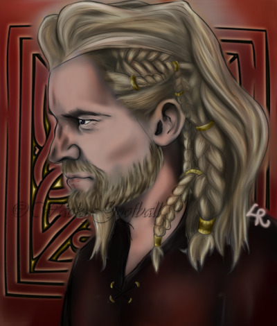
Those two make me happy because I see it, compared to my earliest beginnings at digital art, as a definite improvement on the journey towards finding my own style and figuring out some things I currently still struggle with. I was happy with how the two turned out in terms of style and I very much enjoyed indulging myself on Viking Jaime and Brienne since my fanfic May the Norns Bind Their Fate has my mind very much preoccupied with how sexy Viking JB look like in my mind as they continue to kick Viking ass. There’s still so much to learn and I am looking forward to it, but painting that made me happy, and that is, for me, all that counts.

Link
And then, of course, I coudln’t possibly make a post about my wacky fanart without making mention of this one. The JB unicorn creation is one of my proudest up-to-date and thus has a very special place inside my heart. I mean, it combines JB *and* unicorns. What not to love, amirite??? Also, it made the person I made this for very happy, which makes me all the happier. Yay!

Link
One of my personal favorites thus far is this one, which is why I make it the grand finale for this post. I had fun painting the kind of church window background and Jaime’s profile always has me go *chef’s kiss*. And it also checks the boxes for Jaime as King, which is one of my most favored headcanons people can pry from my cold dead hands.
So yeah, that’s it for now! Thanks for letting me gush in the name of Glorious Gwendoline Christie!
Much love! ♥♥♥
#gwenspiration#jaime x brienne#jaime lannister#brienne of tarth#game of thrones#wacky fanart#fanart#braime
44 notes
·
View notes
Text

So I did that ‘year in art’ thing and all I have to say is Sweet Jesus what happened. Also sorry for the picture quality. We’re just gonna go through each drawing and rip my old art apart.
So here we go 👏👏 Art Review
January

This was one of the only drawing I could find from January. Dear Lord so much has changed since then. The lines were all one thickness, it was smudge shaded, the anotomy is so strange, and it just looks so weird to me. This was when I first switched from Adobe Draw to Ibis Paint, so I was figuring out how to shade with the airbrush and blur tool. This was actually my tumblr profile picture when I first started, so that means I have been on tumblr for almost a year. I was also figuring out how to draw people and used to have very thin necks in my drawings. The hair looks terrible but I don’t really think that overall it’s that bad.
February

This is one of my first posts here and it has a lot of the same problems as January. I actually drew this for an art homework and got a 95, but like why. The hair and anatomy are a lot better but What is that neck.
March

This drawing is a personal favorite of mine even though it’s pretty bad. I also used this as art homework and got a good grade so IDK. I just always liked the umbrella and the way the rain was drawn dripping off of it. The puddle and hat were also kinda nice. The neck is still a problem, it’s too long and skinny but more of an improvement on the other two.
April
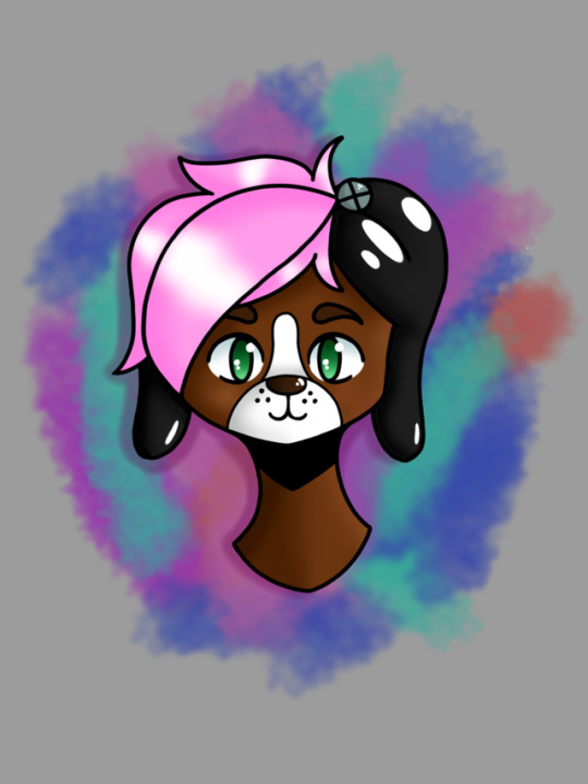
This one was a badge drawing for my friend Patchy when we went to Anime Boston. It was one of my first times drawing dogs so it looks a little weird. The shading is still pretty bad but and the neck is lopsided but at least it’s not a stick. Also the hair shaving got even worse.
May
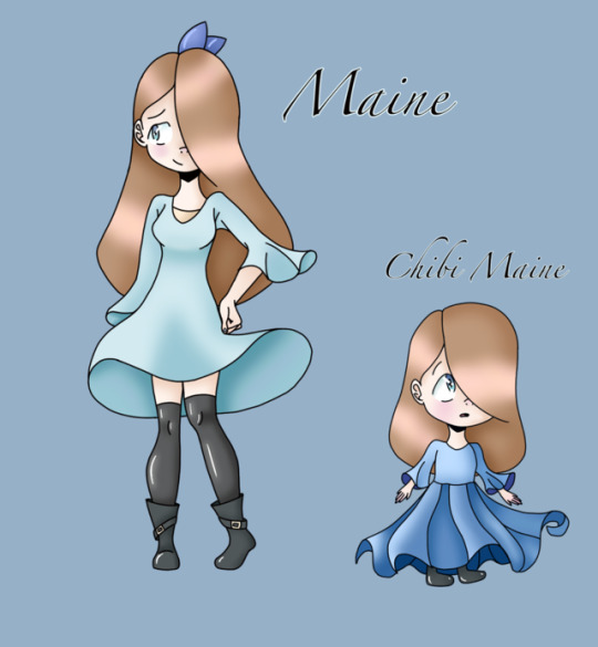
Yay it’s Maine. I honestly do love this drawing just because mains character design looks really cute. The shading has improved in most aspects and the neck is finally right! Took you long enough Also she has pupils which do look nicer with the style at the time. The anatomy is actually pretty good but the line art is a problem since its all one thickness. It was soon after this drawing that I started doing really thick line art and my style changed a lot.
June
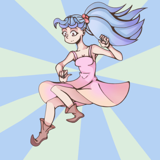
This is where the art kinda starts looking more like it does today. This was a year after I started digital art so it’s pretty good in terms of progress. The shading is a little too dark in some places, like the face and arms, but it started using gradients so it’s almost forgivable.
July
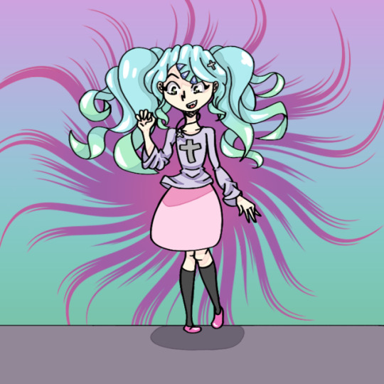
This is a lot more similar to my current style. The only problems are that the line art is too thick and the anatomy is kinda weird in places.
August
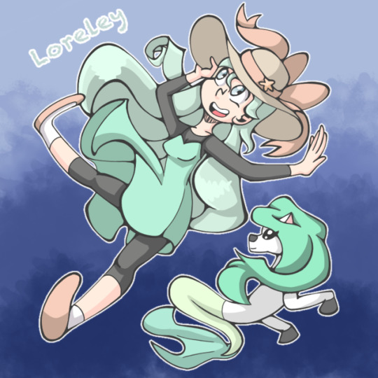
This was a redraw of my Oc Loreley and I really like it. The colors are nice, the anatomy is really good and the shading is good. It looks really cute.
September
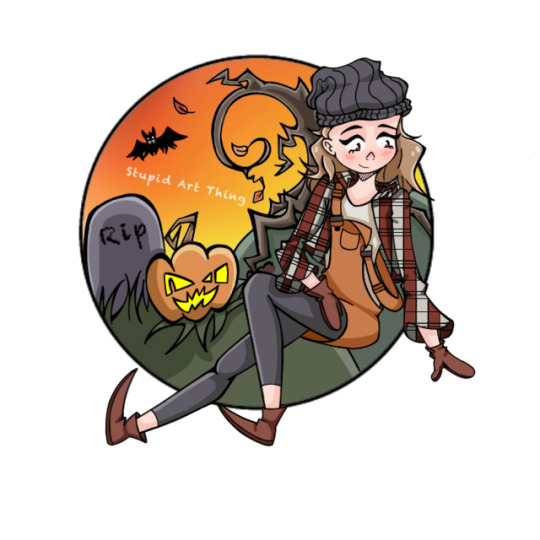
This was my profile picture for autumn and it looks pretty nice. The anatomy is fine, the shading is good and it’s pretty well drawn. It would look better with more gradients and the nose is kinda weird but I like it.
This is gonna need a part two because Tumblr is a bitch and does not want to let me put pictures
#art#artist#drawing#artsy#anime#doodle#sketch#artist on tumblr#artist on instagram#digital artwork#digital artist#manga#comics#oc#original character#traditional drawing#traditional art#year in art#new years#2019#2018 recap#art review#cartoon#cute#aesthetic
8 notes
·
View notes
Note
Wow, your glass post is stunning! (Did you know that you fit in the weekly prompt 'glass' of @zelinkcommunity with this?)
Also, this is your enabling ask to rant. 😆
Ah! Yay! I'm glad you like it! (I did not know that was the prompt this week because discord scares me I have not been keeping up with the discord, but cool!)
Thank you for enabling my rant, it will go under the cut because... I really have a lot to say about this piece.
I'll begin with mentioning the approximate story (read as: as good as I can remember, which isn't very) of how I got the idea for this project. Back in April. It... took me a while to get to it, but back to that in a bit.
So, I had seen this youtube video about angels. That's important because, mentioned in this youtube video, was something about in artwork, a halo representing divinity. Which inspired me to make this piece (if you look at it please don't judge it as harshly as I did myself I've grown as a digital artist or maybe just gotten more meticulous about trying to do well with my art since then). Then, (the tags on that piece make me more confident about the story) I showed it to my sister and told her about the idea since she had seen the video too and could appreciate it. And she suggested somehow or other doing stained glass art, evoking a similar idea of holy/ divine scenes in-world or whatever.
It was a couple of weeks later that I planned out approximately what I wanted the pictures to be, with the idea to show them all in one photo together (as the final product was). It was... three? four? weeks ago that I planned out very rough pictures of the approximate layout for the windows.
And finally, last Sunday, I started.
Admittedly, I only got the roughest of drafts done before getting distracted by something else, but the rest of the week I kept working and agonizing over it until I finally finished yesterday, a week after I started. And now for the more rant-y part, I'll go over them one picture at a time, because they all had their challenges.
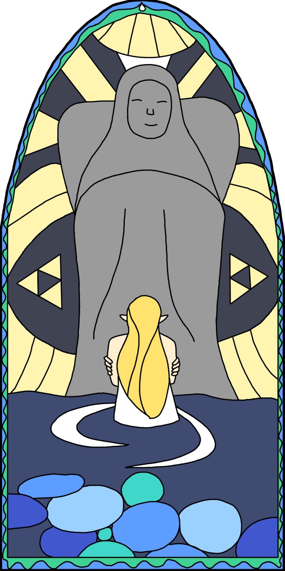
The idea behind this one is the irony of it all. These are meant to be works of holy scenes, or at least important moments leading up to the defeat of Calamity Ganon, right? But the artists (theoretical, in-world ones that supposedly made it and not me) would not necessarily understand everything that happened the way we do, seeing it in the game. They might just see it, and love the idea of her offering devotion to the Goddess constantly, even if the reality was that Zelda was hugging herself, feeling so useless and unheard by the Goddess that she never got her powers.
This was probably the easiest one to do, actually. But I can only say that in hindsight, because it was the first one I did each part for, so it never had the difficulty of the other ones to temper my opinion about it. But the Goddess statue and Zelda were fairly simple, so the hardest bit about the line work was figuring out what to put behind the Goddess statue and in the water. Even the border was so much easier and less repetitive to do than the other ones, but since it took me a little while to figure out what I was going to do for this one, it was actually the second one I did so I actually knew it was easier than the others. No crazy thoughts on the coloring for this one. It was only tedious, which is exactly just what I expected it to be.

The pairing of Zelda replacing the Master Sword on its pedestal to heal and Link drawing it the second time. Obviously, it is a big, momentous moment when the Hero draws it again on his journey as he prepares to fight off Ganon again. But I think it is just as important that Zelda replaces the broken and bruised sword to heal before she returns to the castle in preparation to hold off Ganon and let the land breath until Link comes back. I feel like those two moments, both preparing to go face Ganon, whether to hold him back for a century or to seal him away permanently( ? - permanently for this Princess and Hero, at least, I hope), are both important moments to both themselves and the story, that also beautifully mirror each other. It's no accident that in the picture itself, they are mirroring each other.
First thing to say about the drawing portion of this piece is that it was the research for references for it that I found that scene with the koroks acting out pulling the master sword. And, also, seeing as I had to watch and take adequate screenshots of not one but two cut scenes, that had a lot to use as potential references, it was by far the worst one as far as reference research goes. But once I got to the drawing... it took a little finagling to figure out the exact layout, and I had to convince myself to not include too many korok-related things since it's about the sword and not them, but it was fairly simple. Especially since I could just copy and paste the background and sword before making what little tweaks would be needed for each side. The border was the second-most painful, even with copying and pasting, because going in between the two different flowers was difficult, and I also traced any that I had to resize to fit. So basically a lot of stuff that was entirely my own fault. It is also the first to have any omission of details, but more on that later.

This scene was probably the first one I chose. It's just so obvious, when you're choosing religious scenes for Breath of the Wild, to choose the moment that Zelda awoke her powers.
This is the one that changed the most from what I imagined in my head. But that changed happened before I even sketched out the very initial ideas for this project, because between now and then, I did this sunshine piece (shameless self-promo), where I rewatched the blatchery plains memory and got all the reference I needed even for this project. It wasn't hard to say no, when I've seen it recently enough, that Zelda wasn't holding Link on her lap when she awakened her powers. Which is fine and great, because I love the way it did come out so much better. This was by far the simplest to draw and color, since it's largely so simple, though all the lines of the light beams shooting out or whatever you want to call it did get a little tedious on both parts. The worst thing about this piece (though my opinion on it is greatly tempered by how easy the rest of it was) was that the border was the worst. It was the first border that I did, because it was the only one that I had thought of ahead of time. But with a combination of I-didn't-think-about-it and it-would-work-as-well-for-triangles-anyways I didn't do any copying and pasting and was just struggling with the straight edge tool for a long time. Overall, still my favorite one to do, and I greatly appreciate how it came out.
Now, onto omission of details, because I feel like this is the one where it is most notable, even if it is not the only one. I omitted details for multiple reasons. One of the most obvious ones, I feel, is Zelda's bracelets. I've simply drawn them enough to know that I don't enjoy doing it, so I chose not to, though that specific detail was also partially omitted for the next reason as well. You may have noticed that none of the white lining on Link's Champion Tunic is showing, and that would be because of the (at least supposed) medium. I tried to include as many details as possible, but I felt like embroidery was too much for me/ stained glass. Would it actually be too much for stained glass? No clue, because I've never used that medium, but I tried to do a decent amount of research looking at stained glass pictures for this project, and that was the conclusion I drew. Those are the main two reasons, but there are also some details omitted for reasons of insufficient research/ forgetfulness/ laziness.
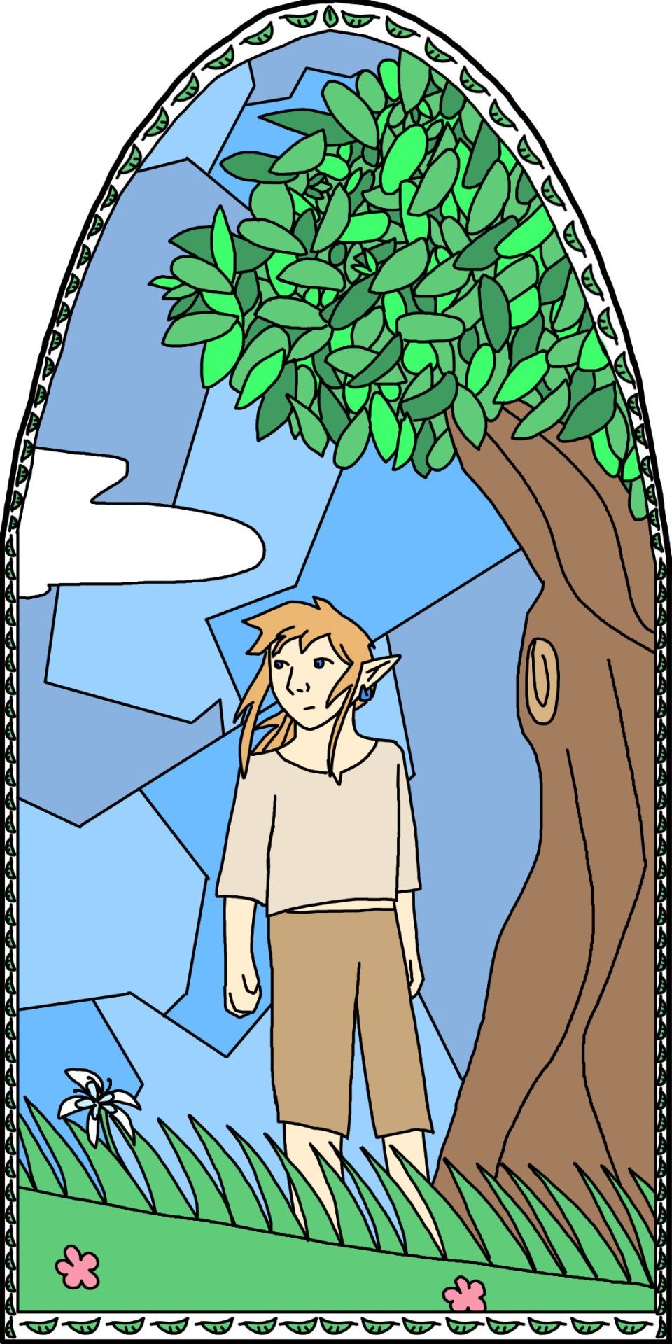
Simply put, the Hero of the Wild on his journey. To counterbalance the one of Zelda struggling for her powers. It's supposed to feel like he's still at the beginning of his journey, on the Great Plateau, looking towards Hyrule Castle. Not going to go too much into the thematic importance of this one, simply because I have a whole entire essay about this in my head that I hope to write someday.
Starting with the reference, I suppose: I pulled up Google, typed in "link botw" pressed search. Then it wasn't too hard to find a pic of him in his starter clothes. His clothes, which admittedly have a few details omitted. The drawing on this piece could compete with Zelda awakening her powers if it weren't for one critical thing: THE LEAVES. The tree especially. Let me tell you, I was so glad to be done drawing those. Coloring them was pretty ugh too but not as much. But the border as well. I suppose I would rank it middle of the pack, not as bad as triangles or floral, but still leagues worse than the two easiest. Copying-and-pasting wasn't too bad, both because of the limited variety of what I needed to do it for as well as doing it after the floral border and having some ideas on how to make it easier for that one. The biggest annoyance with the border, however, was the fact that I didn't save for a while when I was doing it and my art program crashed and didn't even autosave anything. So I had to redo a significant portion of the thing, which really annoyed me. All in all, feelings on drawing it land it pretty in the middle of the pack between easiness/ annoyance.

This is what the picture was supposed to be. But they hold the same thematic ground... is what I'd like to say, but the truth is that I didn't think all too deeply about the themes and reasons behind each picture while planning it out. But in hindsight I still hold that it is true that they cover the same thematic grounds, but since there was a window with only Zelda, I wanted to give Link the same courtesy to balance it out a bit more. Once I got the idea for this piece as I was starting to work on this project digitally (not that there were more than those very rough sketches traditionally), I decided to include it either way, knowing that the Link-and-Zelda-on-their-respecitve-journey/mission was the only one that made sense to replace it with. In fact, I even made a template for the final piece of how I would do it with six windows instead of five. But in the end, once I got to it in the course of the line work for the various windows, I saw that scraggly line that I knew was supposed to be malice and knew that I did not want to draw it. And I liked there being five windows better anyhow, so there's that. I still appreciate the general design and what-not for it, but I'm also glad that I didn't have to agonize over during all the agonizing parts like I did for the others, at least.

And finally, the centerpiece. The ultimate moment, the final showdown to close their story (we are ignoring BOTW2 for purposes of this artwork). Defeating Ganon. This would be the most important moment to them, the moment they finally won. The moment Ganon's influence is gone, no longer corrupting and suppressing Hyrule. Well, it's technically showing everything like a moment before everything was dissipated, but that's because you can appreciate the piece more in that context. But this represents when the Goddess' Chosen finally won over Hatred.
I chose this piece as the center for its representative, thematic significance, because in the final product, that is what people will appreciate, and no one will ever truly come close to appreciating all I went through while creating it besides myself, even if they are reading this. But, even if I for some inane reason chose the order of the pieces not on significance or artistic balance or anything like that but instead for my feelings on them after drawing them, then I still would've chosen this one as the centerpiece, solely for how polarized my feelings are on it. Zelda and Link were easy. The sky in different fragments came later, but not at all difficult. The border was easier than all the others by far, and no, it's not supposed to look like Navi, or fairies. It evolved from a couple of suggestions for that border from my sister, circles like the eyes and fire like the vague shape of everything Ganon, combined and sparing because that's what I needed at the time and that's what looked good anyway. Same for coloring on all of them. Even the reference was easy, because I already had the video I needed up for something else (that I was trying to work on but didn't really do it enough).
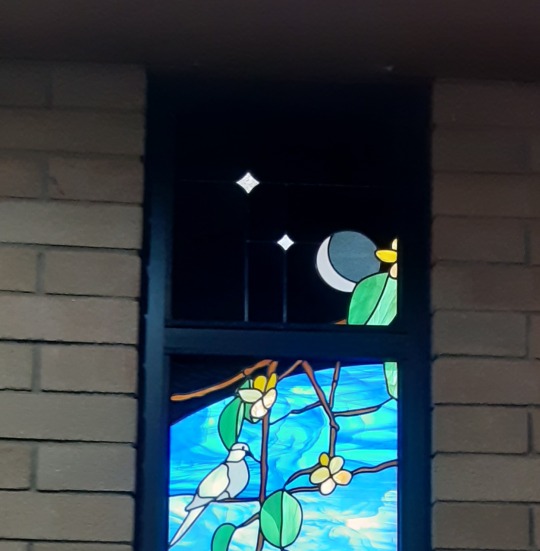
But Ganon. GANON. If I needed another reason to hate him, I have it now. Because he was so stinkin' difficult to draw. Every stage that I drew him. At first I drew a circle with tusks and eyes. Because I knew it would be. In fact, I didn't even complete drawing his body at all until the line art layer. I can't even imagine trying to do it well in a different style, because I feel like the limitations I had actually helped in this case, because I only had to draw his fragmented body instead of whatever mess that actually was. The only parts of it that were semi-okay were the eyes, tusks, and weird under-bitey teeth. Everything else was absolute misery. Coloring began with the teeth and tusks— the pure black parts. Pure black on glass? Would not have done it had I not seen it on some stained glass I actually saw in real life, as opposed to all the online research I did. But, at the same time, it was black, meaning there literally was no light getting through. Since I was making the color layer overall slightly transparent, I had to do it on its own separate layer, and it had all its own annoyances, all less worse than the rest of Ganon. To prove that it really existed, here's the picture I took of it:
Back to Ganon, for coloring everything else. Ugh. UGH. Ugh. That is the only word to describe it. Even after I figured out all the colors I wanted to use, which was a chore itself. Even after I figure out where exactly to put which colors before actually coloring the whole thing in, which was a chore itself. Just coloring all those small, finnicky, crooked little fragments... It was miserable and took ages. And I suppose here's as good as any place to mention how, to make sure the the colors were... perfect, I always went back, made the linework invisible, filled in any gaps or inconsistencies with it, and then put the linework up again to make sure it was all still in the lines. Horrible enough on the other pieces, but on this one... with all those finnicky fragments... let's just say I was very glad to be done when I was.
But then I finished.
I finished and the result was just so good, so satisfying beyond what the others were, that I almost don't care about any of that. It's my favorite part of the piece. It's my favorite, in spite of all the misery it caused me, or perhaps even enhanced by it. So, yes, I love this one. (Throwing what hatred remains after the product at Ganon because he deserves it and was the cause of most of it anyhow).
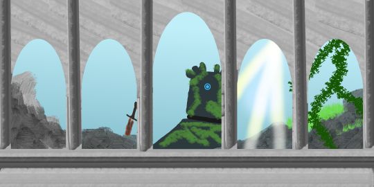
And the background ...could be better but this is what happens when I wait 'til the end of a large project like this to do the background. I've been working on everything else the past week and I don't feel like putting much more effort into the project. I wasn't even going to do the backgrounds behind the glass at first, but I wanted to show off the transparent bits more than just the sky. And I tried aligning what was behind each one to be fitting for the glass. The least obvious is probably the first one, meant to be ruins. And now my brain is kinda fried so I'm moving on to finish this.
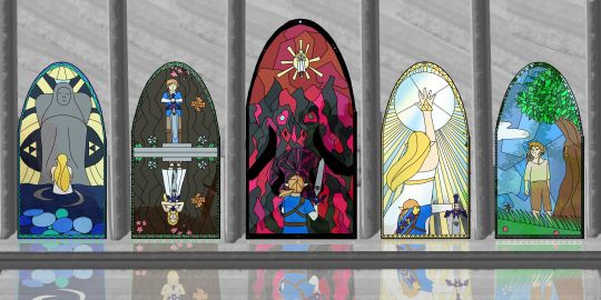
And the final product. I had to patch up the background a little more than what was there from earlier, and copy the color layer while removing the area of where the linework is before transforming it and lightening it up for the reflection, which really wasn't nearly as bad as I made it sound just there, but it was absolutely the final touch this piece needed. And it really brought everything together, making it so satisfying.
I guess that's the whole point about this, isn't it? How satisfying it is? I may moan and groan and write this whole rant for hours about how these projects take so long and drain you so much, and that's true. But once it's complete? It's so satisfying. And that's why these longer projects are worthwhile.
#I called my sister that gave me the idea and she said she likes it#and then I asked about the cat and she told me he's sleeping on my desk which he's apparently been doing for a week#this is an unapologetically long post but at least I'm aware enough to put it under a read more#ershmergersh this just really made my day#thanks zelmo for the sweet ask and rant enablement!#sorry it's taking so long I had very little of it written before and I had a lot more than that to rant out#for that something else I was trying to work on:#it's a botw2 speculation fic so I have a time limit before it's irrelevant and would greatly appreciate someone to help keep me on track#if anyone's reading the tags and is interested#random: I probably should have had more of a lunch than just cookies but none of the options were appealing so oh well#dinner better be fantastic#another example of my chronic laziness#rant#...but it's actually more like rambling#thank you for coming to my ted talk#lou writes#but more like lou rants amiright?
1 note
·
View note
Note
Hi:) I’m new to digital art, and I just purchased a Wacom tablet (the intuous draw because I’m just a beginner!) and I’m kind of hesitant. What if I completely suck at this?? What if this is going to end up being 10X worse than what I imagined it being?😓 I’m a traditional artist, and I’ve never been so good w tech, but everyone in my family has been telling me to try digital art out, and honestly... I’m really nervous:/ I’m scared my tablet will end up being a waste of money bc of my skills🙃
Hi Nonny! *hugs*
Firstly, CONGRATS! Getting a new toy is so much fun, especially when we are venturing on something new!
Secondly, Hi hello, traditional artist here!!
And therein lied my big problem: Digital is a COMPLETELY different medium with its own rules and the only limit is your imagination. Once I clued into this, It became a bit easier, but I still struggle with settling on a style I like, because it’s just like learning how to draw all over again.
How did you become good at traditional art, at being able to pump out art without thinking? PRACTICE. And this sounds counter-productive, but hear me out: STOP THINKING TOO HARD. This is my biggest problem, because I find I’m frustrated because I’m NOT good right away, that stuff isn’t going to turn out on the first, second, or one hundredth try. It’s going to take time, and THAT’S OKAY. You’re allowed to experiment and play with your tablet. I’ve actually learned, once I have finally just allowed myself to enjoy my art regardless of how shitty it looks, that I always want to keep practicing and trying out a new pic! I’m not fast and constant envy people who can get stuff done quickly and make it look amazing, but I also need to realise that I’m starting new, and that once I become comfortable with the tools, only THEN can I finally develop a style.
I’ve been trying digital work for 2 years. I’ve only recently finally found the will to “let go” and just “ink” my art and stop trying to make it look like my traditional stuff. It’s not going to look like it. But I’m experimenting every time I draw with new brushes and styles and pen pressures, and somehow I come up with something I’m satisfied with. And it keeps my art fresh and new; I’ve had a few people come to me privately and tell me that they love watching my art grow and change as I learn how to do digital work, and it means SO MUCH to me. Encouragement goes a long way into helping us grow.
So Nonny, DON’T think you wasted your money. PRACTICE PRACTICE PRACTICE! You didn’t become a traditional artist in one day, just as you won’t become a digital one. I KNOW it’s frustrating, I feel you, but it will click and you will find something you like. Try experimenting with brushes and pen pressures (there are LOADS of free brushes online), and you will soon find The Set that works for you! Watch tutorials on how to use the features of your program, and read how other artists do their work. It’s immensely helpful, and you learn things about the programs you didn’t know about.
Wacom also has an app that comes with it when you install the drivers that allow you to change the mapping, pen pressures, handedness, touch capabilities, and all the shortcut keys on it, so make sure you familiarize yourself with your tablet. It is going to be your best friend in your digital art toolbox, and you should learn how it reacts to how you draw. ALSO, a tablet is NOT a piece of paper; be GENTLE with it. This was another thing that I had to learn, because I was wearing out my nibs monthly. Experiment with the nibs on your pen, and DON’T push hard or you will cause damage to the both the tablet and nib. AND nibs DO need to be changed, just if you’re going through them monthly, you’re pushing too hard. These are my favourite nibs, and think they work the best AND I like the rubber tips on them. The spring in them helped me with my pressure issue and helped me learn to be gentler with the pen, and now I don’t push so hard and scratch the shit out of my tablet. These ones are my next favourite. I love the rubber tips on them. Just make sure when you purchase nibs they are FOR YOUR TABLET. As far as I know, all Wacoms come with extra nibs, you just have to find out where they are. Mine’s a Intuos Pro, and they’re in the base of the pen stand. The tablet I have at work is just a standard small Intuos, and I found the nibs hidden in a compartment on the back of the tablet (right at the top, there’s a cover you can pull off, they’re in there). ANYWAY, try out different nibs and you will find one you like too! The felt ones were great too!
Also learn the basics of the programs you are using: LAYERS ARE YOUR FRIENDS. What I love about digital art is that I can forever try out different “blueline” layers and keep them all to maybe refine later or just delete it! Layer Groups are the BEST thing ever, and learn to use them. I always have my layers grouped into “bluelines”, “sketch”, “lineart” and “colours”, all with groups under those (I should seriously show you guys one of my pieces’ layers palette) and sorted and named so that I can find what I need. Learn about Layer Masks; they’re EXTREMELY helpful in colouring. And play with the brush stroke features. It’s so daunting when you first start, but you’ll figure it out!!
I BELIEVE IN YOU NONNY! You and I can learn together, and watch our art change and develop into something beautiful. And yeah, it would be nice if it were sooner than later, but we can’t win them all!! Practice every day so you can get used to the paper-to-screen aspect of it (it weirded me out for awhile) and so you can get used to judging distances and how your pen reacts to your touches. STOP THINKING, and just do it, Lovely!!
Good luck, Nonny!!
45 notes
·
View notes
Photo
Shoukoku no Altair / Altair: A Record of Battles
Another series I will be liveblogging, this time a wonderfully detailed manga set in a fictional version of the Ottoman Empire/Turkey (and written by a historian! how rare!). I guess Captive Prince got me started on a historical fiction kick, and I’ve been eyeing this manga for over a month wondering if I should read it or wait for the anime that comes out anyway...I decided to pick it up.
There are 18 volumes of this thing, so I suppose I should liveblogging by volume unless the posts start to get way too long. Which they may, if I get my hands on raws. I am a huge language nerd, so.
Chapter 1
First off, after reading the blurb at the end of the fan translated first chapter, I found out that the ‘shoukoku’ part of the title is a word the manga-ka made up. Composed of the words for ‘general’ and ‘country’ (a country run by generals), the translator found the word stratocracy (a government ruled by the military) fit the description best. Which is why the fan translations use the ‘Turkiye Stratocracy’, which is great because there is no confusion if you know what a stratocracy is, or take a second to look it up.
Meanwhile, the official Kodansha version calls it the ‘Devleti of Turkiye’. ‘Devleti’ is apparently Turkish for ‘state’ (so the State of Turkiye). Very different, and both good. I love translation work for this very reason. I think I prefer using stratocracy. It’s true to the original, and clearly distinguishes this story as being an alternate version of Turkish history to those who know the Ottoman Empire was a monarchy. There are already quite a few unfamiliar words around.
But. I also find myself liking Devleti of Turkiye haha.
HM THIS WILL REQUIRE MORE THAN ONE POST. There is so much to talk about before getting to the chapter itself.
First: the cover
all of them are so beautiful. The amount of detail in every article of clothing from the hat to the jewels to the pattern embroidered around the hem. And the sword. I know nothing about Turkish history or culture (and forgot what little my american schooling taught about the ottoman empire), but a quick search for Turkish swords yields some examples of the more intricately decorated ones. The manga-ka is a historian/majored in Turkish history which. is great.
It’s a pity the Kodansha volumes are digital only?? I’d pay for a physical copy (but don’t hate myself enough to buy a Jpn copy...historical stuff has too many complicated kanji)
I wish I knew more about their style of dress because it’s drawn so well. I’ll look that up another time.
I really love the asymmetry with the glove he wears for his golden eagle to land on. It’s not in every illustration, but it even goes up to his elbow as it should for a larger species of bird, apparently. it’s just. so much great detail.
his shoes
He has this like teeny tiny waist that is totally out of proportion with his massive hats. Also: how do you even figure out where all those folds go in those clothes.
Also, it uses the Turkish word for ‘chapter’, faşil. I’m assuming that’s the right one, of course. Manga likes to change up the words they use for chapters depending on the setting.
ANYWAY FINALLY THE STORY
Why is one of the months called ‘sugar’ in Turkish (sheker, or şeker more technically)??
Look at him, striking a cool pose. I find it funny that he strikes all these confident poses, but he’s actually quite tiny next to everyone else. He probably does it because 1) he is confident in his own abilities and 2) he’s still a teenager in a world of adults, and it’s held against him in this chapter. His inability to do anything later frustrates the hell out of him as it is.
AND HERE COMES HIS BIRDIE. my favorite already
the fuck this type of bird was supposedly used to kill wolves
and it weighs 8-11 lbs depending on male/female
This kid is stronger than he looks. Although, his is male (named Iskander, so I assume), and the males weigh less (avg of 8 lbs) but still. I guess that’s why he has a male one. The females are massive and would probably dwarf his tiny self.
How is this not a wonderful shot, though.
Also, thank goodness for katakana or else I’d have no idea how to even approach pronouncing his name.
As for the situation itself, we jump right into things with a national crisis.
He looks younger when caught off-guard.
Tell me you did not carry that 8 pound bird aloft on your arm all the way here.
The official translation forgot Halil’s nickname/title “大都市” (large city/metropolis).
And this is where things get interesting. Usually in the peace vs. war debate, one side will always seem unreasonable no matter how hard the characters try to convince you otherwise, but I like how this one is set up.
On one hand you have the side that wants war, sees the enemy nation as a threat, and even throws in that ‘do you want to make a scapegoat of one of your countryman just to avoid war’, though can’t really tell if that’s sincere sentiment or not.
But then the old guy, Halil just says ‘yes, if it means peace’. Kind of a classic argument? Reminds me of Akatsuki no Yona, and the state of their country before the story starts.

this. just. his face. I needed to show the two together. Zaganos is obviously not impressed.
and therein lies the problem with politics: its not really about what’s right. I mean, everyone in the room can probably guess that their own soldiers weren’t responsible. But for all present except Mahmut, the meeting was never about finding out the truth.
Also, I love how he rants to Iskander, and even asks him a question directly as if he can answer.
o.o don’t ask me i’m just a bird
Halil calls him “Mah-kun” in Japanese, but the English version gets rid of this. It’s a pity, since it shows how close they are.
“You only just became a pasha, and now this. You must be exhausted.”
Dude, if he’s exhausted then what are you. You’ve had this position for 20 years.
And! yay! He’s angry at himself and his inability to do anything, rather than be angry at Zaganos. Shows that he really is more mature than he looks (especially with his grumpy facial expressions and petite self lol)
He looks just like his mother. D: poor baby iskander and mahmut
the amount of detail in this manga. see the rabbits hanging in the corner?
also about the next panel: holy shit he fucking heard that??? his mother getting killed right in front of him, and he managed to stay quiet. poor terrified child like holy shit. and he managed not to crush little Iskander
I’m not going to show it, but if you look closely you’ll see she was not only stabbed in the chest, but also had a hand cut off at the wrist. wtf
every panel is so pretty jslethasdk the amount of detail in every background
his expression here just kills me. he’s just coming to the horrible, heart-wrenching realization of what has happened and UGH
I just really like his range of expressions. He’s just so damn uncomfortable with his elder, a guy he obviously respects and has a history with, bowing to him like that.
How can your heart not break seeing this. All he has left is his bird, the bird whistle, and the container for holding the bird’s meat.
Oh you conniving bastard- I actually thought the Emperor was in on it until the second read through I’m doing now. It was hard to notice since the panel just cuts from one scene to the next.

TINY CHILD YOU. Mahmut is taller than Halil counting the headpiece but he is made to look so tiny in front of adults. I think he’s supposed to be around 17 at the moment?
Man, he had a plan. How the heck did he have time to prepare the animal blood anyway? What a classy way to deal with your enemies.
I’m also happy that the manga-ka can draw birds so well. Iskander looks lovely.
...And that is actually really fucking scary. Those golden eagles are huge and strong enough to take out wolves.
The subtle expressions are great. As is the exchange between Mahmut and Zaganos here. They will probably clash again in the near future, but it seems they’ve gained a little more respect/acknowledgment for each other.
And now THIS, this is very interesting.
It looks like a statue, and that is clearly Mahmut and Iskander. I won’t make any guess though, I’m usually dead wrong with speculations.
I love the lines in this though, so fluid with Mahmut and straight and angled with the knight guy.
onward →
#shoukoku no altair#the very long altair liveblog#image heavy post#long post#im sorry my thoughts jump around so much#i was more tired than i thought#altair vol 1
18 notes
·
View notes
Text

Art Summary: 2018
I finally have one of these! Yay! A piece of work that was started in each month. I didn’t do so well posting every month but I honestly got a lot farther than I thought I would! I’m glad to have something from each month.
Can’t say I improved much...or at all...I’d have to actually consistently practice for that to happen :P I don’t really care though. I’ve never been accused of being fast. I’m just being slow and inconsistent about developing this hobby. It’s really a win I can still stand to look at most of these!
Some may recall that I was pretty exhausted by my new job at the beginning of the year, but I am indeed settling in there nicely. It keeps me plenty busy though.
Thank you to every single person who left a comment on my work. They mean the world to me. I love hearing what details people like about a picture and what it made them think or feel :) I keep meaning to go back and save a copy of every comment--hopefully I haven’t lost too many in the nonsense over the ban.
January: My New Years painting of Zervis. I peaked early this year--that work was the only real deviation from my usual process. I still like it.
February: Natsu. Requests were fun! I’ll probably do that again sometime, though I am in no way lacking ideas yet (knock on wood). My icon is a colored version of that sketch but I never posted the full color cause it’s not actually done so it doesn’t look right full scale. Still like this one.
March: Cobra. An example of how my style fluctuates. Why is Cobra shaded when Natsu is not? Who knows. I didn’t set out to make them different. Still like it though.
April: Freed. More style confusion. I remember I had to cut a lot of detail from this one because I was trying to paint but also cell shade and it was just a mess. Freed turned out fine and I like it, but I don’t think these clean lines are really what I want to strive for.
May: Zeref.....I mean he’s okay but there’s also something ick about him. A fine post. I’m looking forward to doing better.
June: More Zeref. This one is at least more ‘comfortable’. Pitty I can’t reliably replicate that style. Still like these, but I find them kinda boring really.
July: Now there’s a good one! Natsu & Zeref! I still really like that one! It’s a redraw but oh well. Started as a pencil and paper sketch and evolved well into a finished digital piece. Again, if only I knew how to replicate that style. XD
August: And....momentum died. Ground to a HALT. August produced nothing. Image here is part of a sketch that did well in pencil and paper but did not survive attempted transitions to digital. It’d be such a cute original fanwork if I could just figure out what I want the finished product to actually LOOK like. I like this one, but it’s one of those pieces I just can’t get control of.
September: Success! Acnologia sketch looks sweet! I actually used some of my school learned techniques and natural skill with perspective to craft him. August’s piece is a struggle but this one was nice to work with. Thanks to @xelayy for the suggestion to draw Acno!
October: Ah....Nathan <3 Probably my first foray into Haven content after the show stole my heart in September. (It hasn’t given it back and I hope it never does.) Image is an incomplete work, just practice since I was directly copying from a screenshot. I even sampled colors from it but I’m still really pleased it was looking nice. His hair turned out so cool. Didn’t post anything this month.
November: Original work, sketch from some figure drawing practice I was doing. I forgot I was gonna go fix her arm...I think it’s probably too long. Didn’t post anything again.
December: Posted! Just a Natsu doodle I did at work on a sticky note.
2 notes
·
View notes
Text
Wednesday Roundup
Wednesday’s come and gone, and I’ve (finally!) finished writing up my first Roundup of my new semester of vet school! Though I must warn that as the semester goes on, I’ll probably have more and more difficulty getting these out on/around Wednesdays since I’ve gotten my surgery schedule for the next five months and low and behold, I’ve been assigned Wednesday duties lol
But how did my first Wednesday of the semester go? Well, it was definitely DC strong!

DC’s Detective Comics (2016- ) #948, DC’s Gotham Academy: Second Semester (2016- ) #5, DC’s Superwoman (2016- ) #6, DC’s Wonder Woman (2016- ) #14
DC’s Detective Comics (2016- ) #948 James Tynion IV, Marguerite Bennett, Steve Epting

As incredibly disappointed as I am to have Cassandra’s story pushed back again in ‘Tec, I really must applaud the marketing choice to utilize a short storyline in ‘Tec as the starting point to amplify the upcoming Batwoman book -- a strategy used in 2000 with a few Gotham books including Batman: Gotham Knights to promote Cassandra’s original Batgirl (2000-2006) book in the months leading up to its own launch. And as a fan of Batwoman who has been very disappointed in her lack of solo titles in the last few years, especially as both a Jewish superhero and a LGBT superhero, I’m happy to see her getting the spotlight.
But goddamn, Tynion and the team better deliver on that upcoming Cass story. I have been waiting for a year now for Cass to get her dues.
Anyway for the issue itself, it’s.... I’m torn, because I adore the original origins for Batwoman as written by Greg Rucka so much -- I have them in hardback copy on my bookshelf as we speak. And her identity as a queer woman was such an instrumental part of that story, as well as her familial relationships. And seeing that get twisted and ... turned, I don’t know what else to call it -- a perversion of that original relationship with her and Jacob to further retcon him to the Worst Ever and having her whole origin be a manipulation just... sits bad with me.
But at least we’re getting back to establishing what from her previous solo is still considered continuity. So yay that.
The art’s... okay. I think it’s good but the coloring choices are dull and you know me and my pickiness with color. The only real criticism I have is that Kate’s cape seems to conveniently evaporate from the shoulders down whenever the art wants to emphasize her figures. Convenient. Especially since Bruce has no such problem.
DC’s Gotham Academy (2016- ) #5 Brenden Fletcher, Becky Cloonan, Karl Kerschl, Adam Archer, Sandra Hope, Msassyk, Serge Lapointe

It’s hard to really talk too much about an arc in the midst of its storyline, but I will say that I am very very glad that at the very least, it feels like Gotham Academy has rediscovered its focus and, in that way, is showing its potential and strengths again. The story and characters were so gripping in the initial incarnation of this series that it’s been difficult to deal with its more recent meandering.
Fortunately, the focus on the kids again proves to be as powerful as ever, and the difficulties that Olive is experiencing being pulled by her loyalties in different directions feels very natural -- her trust has repeatedly been shown as hard earned and, as such, is difficult for her to go against once gained.
I also think I may be in love with Pomeline’s mom. Me thinks someone on the staff has also been a fan of Daria in the past because there’s some real channeling of Helen Morgendorffer in this issue.
I also love how Gotham Academy is able to give us the “lay person’s” perspective on Bruce Wayne that I have always suspected existed -- this wavering between corporate shill and Magical Money Plot Fairy.
One thing that’s getting hard to ignore, though, is the quality of the art. It’s not terrible, but even the original volume had difficulties with digital translation -- something about the resolution of the lineart has always been off and it’s making the new penciller’s work suffer even more than the old volume experienced, unfortuantely.. Maybe the digital pen they’re using is too soft? Or too hard? It’s hard to tell off the cuff for me.
Basically every image looks like it was saved in an unfortunate .jpeg conversion.
DC’s Superwoman (2016- ) #6 Phil Jimenez, Matt Santorelli, Jack Herbert, Hi-Fi

While I’m still very much in the camp of enjoying Superwoman, I feel like the inevitable return of Lois Lane!Prime is being drug out far too long, and I’m beginning to worry my confidence that she’s actually returning might have been slightly misplaced now that I’m catching up in other Superbooks as well. Still, I want to give this story its conclusion before I draw any lines definitively in the sand.
The art is still wonderful and as a 90s/2000s Superfan, it’s hard for me not to get wrapped up in my elation at seeing so many familiar faces returning and being treated with prominence. But I am getting more concerned about the treatment of disabilities -- the DCU as a whole has sort of lost any acceptable leeway in delivering stories about people overcoming physical disabilities with the refusal to better address the Barbara Gordon situation, and making Lena Luthor’s turn to evil about her own overcoming of paraplegia leaves a bad taste in my mouth.
I’m also beginning to feel a little... uneasy with how Lana’s PTSD and anxiety disorder are being treated at the moment. I’m really hoping Jimenez will course correct by the end. I still really like this book and think it’s good, but these problems are keeping it from genuine greatness.
DC’s Wonder Woman (2016- ) #14 Greg Rucka, Nicola Scott, Romulo Fajardo Jr.

Without question, Wonder Woman: Year One is going to go down as one of the greatest Wonder Woman stories ever told, and while everyone possible has called that from the beginning, that this team and this story could not have been beat, the fact that they were able to take Pérez’s origins for Wondy, the original origins from Marston, and still created something so new and so refreshing is a testament to the kind of comic book storytelling I have sorely missed.
It was fantastic to see Ares back and familiar, but also to see that Wonder Woman’s patrons are going to play a more significant role than we once saw. I’ve enjoyed Rucka’s work with the gods in the past so it’ll be fascinating to see where he’s going with all of this now.
We’re also finally, finally getting to the connection of Year One and Rucka’s other Wonder story going on presently and it’s a relief to finally truly feel a direction on that front. I’m still wary of the B plot, but for the first time I’m actually somewhat looking forward to it in two weeks.
This week for me there’s really just no contest for what I think was my most enjoyable comic -- I adored every moment of Wonder Woman #14, and even with a competitive week, there’s just hard to imagine something topping this book when it’s at its best.
But of course that’s just my opinion! I’d love to hear from you all on what comics you’re reading, your thoughts, or your pick for favorite!
#Rena Roundups#Wednesday Spoilers#SPOILERS#Detective Comics (2016 )#Gotham Academy: Second Semester#Superwoman (2016 )#Wonder Woman (2016 )
4 notes
·
View notes