#a tier ranking??
Explore tagged Tumblr posts
Text
Tier Ranking the Ranking Tiers:
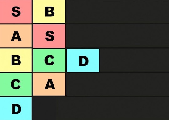
B is so Amazing!
A is okay but even in last it's not bad, it's just not as good as S.
2K notes
·
View notes
Text
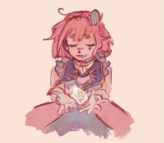
always by your side
#couuugh. whehezze#hold on#project sekai#emu otori#pjsk#prsk#proseka#ok thatsg enough RANK 96 COOOOOGUH WHEEEZE#literlaly cough wheez ei have fucking covid. i wanted to draw something nicer for the event but my hands rlly hrut snd my throat hirts and#i was sticking my head in the freezer in between matches.#omfg i didnt think the end sprint was gonna be so insane i didnt have enough energy. mfers made me spend 700 gems. nene please.#i never wanna open the game agaon.(guy who will open it tomorrow and sunday) 16 MIL POINTS.. pimh was only 9mil. for rank 80smth.#the hatsune miku colorful stage tiering economy is in shambles#'im never doing that again' [will do it again in august]#event was insane. started out ill -> only 1 rate up card -> charger broke -> assignments -> covid on the last day. Be fr#to my beloved sakurako and fixer i wub you. ill try to finish my nice profile but well honk mimimi.#NSIFFLKE. SNIFFLE. WAAAAAAH#this is so lazy but i havent drawn for myself literally in a week. other than doodles i did between matches#actually theyre like little bobblehead emus all over my sketchbooks i should collage them into anpost#idk how people get that subtle gaussian blur on their lines i tried it but it looks so obvious to me here.. maybe bc i used a thick brush..#ok wonderhoy i need to lay down so bad tylenol save me. I ACCIDENTALLY SWALLOWED MY LOZENGE IN THE MIDDLE OF A GAAAAAME
929 notes
·
View notes
Text
Honestly I think the death of Shinzo Abe is gonna be top 5 iconic assassinations of the 21st century. If not most iconic. I know we're only three decades in but Franz Ferdinand had less time to work with and his assassins started WWI.
206 notes
·
View notes
Text
DIABOLIK LOVERS 不夜城VILLANS Ruki Mukami Bromide

#Behold! Ruki's abs \(○´ ་།`○)ノ#not even going to pretend that my thirsty ass bought this for any other reason dhdjdhfg#that being said i do really dig the aesthetics#i'd for sure rank this high on my merch line tier list#anyway hope you all enjoy the view \(//∇//)\#diabolik lovers#dialovers#diahell#ruki mukami#diabolik lovers official art#ruki's abs#mine#ending august on a high note hehehe
211 notes
·
View notes
Text
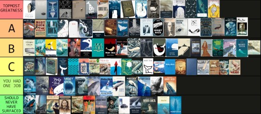
100 Moby-Dick covers ranked by your's truly. Thank you so much to all those of you who sent in contributions and helped make this completely out of proportion project a thing. Jars of angelic spermaceti for everyone! 🤍
As for the ranking, it is purely the result of my own personal taste in aesthetics and heavily influenced by my perception of the story. Add to that a generous amount of sentimentality, as shall be apparent.
What I have been mainly looking at in judging the designs is as follows...
- General appearance; is it attractive? 💕
- Does it help sufficiantly communicate the nature of the story (theme, genre, mood, plot)? ⚰️
- Is it canon? (Meaningful creative licence perfectly allowed!) ✅️
As for the tiers themselves, we have...
Topmost Greatness: this is something out of the ordinary, possibly genius and also I neeeeed it for my collection!
A: Good, good stuff, but might lack that very extra special something
B: Gets the job done, agreeable, totally okay.
C: It's not exactly bad and I'll let that oopsie over there slide, but I probably wouldn't pay much for this one.
You Had One Job: Yeah, you did.
Should Never Have Surfaced: Makes the Pequod tragedy look like a merry holiday.
Art thou ready?
TOPMOST GREATNESS
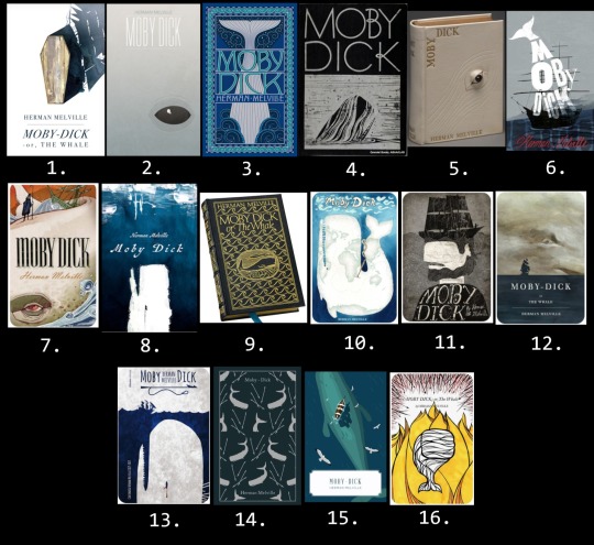
1. The most beautiful Moby-Dick cover I've ever seen. I was almost tempted to create a tier higher than Topmost Greatness only so that I could place it there.
2. Brilliant composition and color choice, despite its simplicity it hits me straight in the soul.
3. I remember drooling over this in the book store back in the day and considered reading it only because it was so gorgeous. Manages to be both crowded and clean at the same time. Story instantly recognizable.
4. The classiest of all time? Forever a winner!
5. I show the image of this one to people to make them understand the creative brilliancy that thrives within the Moby-Dick community.
6. Captures the mood in a fittingly crooked, awkward way that makes my heart beat faster. (Also reminds me of my copy of One Flew Over the Cuckoo's Nest for some reason.)
7. Another sort of awkward one, but I love the style, I love the surreal combination of drama and stiffness, pretty fitting the story itself. Makes 'Hab look a bit like the Grim Reaper.
8. The erratic painting technique gives me the perfect kind of crazy vibes.
9. Moby-Dick, a bibliophile's dream, topmost mood nailing, superior dark academia accessory... what more could anyone wish for in a book?
10. So well thought out and the claustrophobic feel helps to create an unsettling mood despite the otherwise quite cheery colors. Sorry, Madagascar.
11. Look, my two main areas of Moby-Dick interest is Ahab and rhe psychology, so... y'know.
12. Mood certainly set.
13. Guess I have a thing for harpoon/eye symbolism. Again that claustrophobic feel by leaving only a sliver of crowded surface.
14. First physical Moby-Dick copy I ever bought. All the books in this Penguin series are gorgeous, but to me this is one of the design winners regardless of the contents.
15. Unsettled in all this tropical serenity yet?
16. The boldness in color choice and to focus on the fire theme is as unusual as it is exciting, and the very modern touch makes it even more interesting!
A.
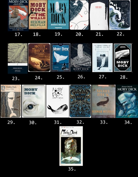
17. Not normally a style I'm drawn to, but somehow this manages to capture my interest. A successful nod to the painting at the Spouter Inn, lovely line work. My sibling got me this one as a locket for my last b-day.
18. My beloved companion, by now containing almost as much tape as paper. The 19th century poster design is irresistable to me. A white tail would've been even cooler though.
19. It's not that unique looking, yet the worn feel and harpooned Moby Dick simply gets to me somehow.
20. All the crucial elements skillfully and effectivly forged (no pun intended) together.
21. The way the psychology has been captured and the missing leg detail is yum!
22. Kind of busy but so unique and interesting! Yes plz.
23. Another classic! How could Kent's iconic whale ever fail?
24. Aiming for the adventure theme, it appears, and successfully so. Unusual color choice which I happen to be all about. Total vintage feel!
25. Again, not that much is happening, but the ropes, the character design, the inking... I love you, cover, and I need you in my life!
26. An often used scene, but the style gets to me so, so bad.
27. I'm not that much about the washed out color, but the rest is love.
28. Very basic, but also very nice and display friendly and I enjoy the vibe so much.
29. Almost made it to Topmost, but the positioning of the illustration gives off a cheap feel to me. Why couldn't you have used that gorgeous theme depiction to better advantage? Can one order a remake? Or a cropped poster?
30. Love the composition so much but the technique simply doesn't do it quite enough for me to move up one full notch. Still want it so bad for the collection though.
31. Runny ink on pure white is something I associate with Moby-Dick, don't know why. The blotchiness is a really great touch.
32. The design doesn't say much concerning the content, but nevertheless it is so pretty and am I correct when I say there's harpoon vibes?
33. Had that been a white whale, it would've ended up under Topmost!
34. My first reaction to this was that it's a really interesting piece of art, but I wasn't so sure I liked it as much in book cover form. The more I look at it, the more intrigued and enamoured I get. I want more of this.
35. Ahab and Moby Dick from Ahab's POV? Love the distorted psychedelic atmosphere, but another one with missed full illustration use potential.
B.
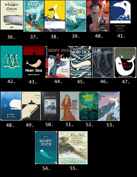
36. Brings back the menory of cigarettes and fear. Granny the Gregory Peck fan owned one of these and it freaked me out where she kept it on display ever after I'd been forced to watch the movie at age 6. Now I want one just for the hell of it.
37. Okay, so hear me out. I know it's a children's book, but the illustrator obviously knew the story. Love the tangling rope and that Ahab's prosthetic leg seems made out of whale bone rather than wood for once.
38. Nice modern touch, but that's straight up the New Bedford whaler statue, which kinda ruins it for me.
39. Lovely, lovely design, but I simply don't associate it with a story about suicidal tendencies, gore, and mass death.
40. A somewhat unusual character choice to pose on a cover, but hey, I'll take it! :D
41. Doesn't pop, but I do like me some traditional Japanese art vibes!
42. Elegant, but the huge M obscures the title text and the harpoon looks as if crossed with a sewing needle.
43. Basic, but the feel is there and I like the color combination for this story.
44. Love the art and it's impossible not to identify which story this is, but I have several Ahab design choice questions which won't leave me.
45. This whole thing is odd and busy, but I also really like it!
46. Speaking of Japanese traditional art. The lines and the moodiness is much to my liking.
47. Simple, spot on, nothing that extra.
48. If only he hadn't looked so damn happy about it as if Ahab was about to throw that harpoon like a stick for him to fetch. Untold plot line??
49. There is this whole sub genre of Moby Dick balancing the Pequod, a concept that certainly works, but by now it has to have that little extra something to seem truly special.
50. We have a less erroneous whale, folks! It may be a stock image, but Ishmael gave this one thumbs up, and so how could I possibly do differently? Nicely done!
51. First, I get strong The Old Man and the Sea impressions. Second, what kind of whale do you intend to kill with that thing, my dude? Points for canonical end game beard though.
52. I assume this is meant as a traditional Polynesian art style nod in honor of our dear Queequeg. The sports wear lining texture in the title letters confuses me though.
53. There certainly are plenty of canon here, but also, this is some odd mayhem and where are you aiming, Captain? Yay, ivory leg again!
54. Basic, works perfectly fine.
55. This is a really odd scene choice to pick for a cover, but I love this edition and its illustrations to bits. In fact, I'm planning on posting a review of it soon.
C.
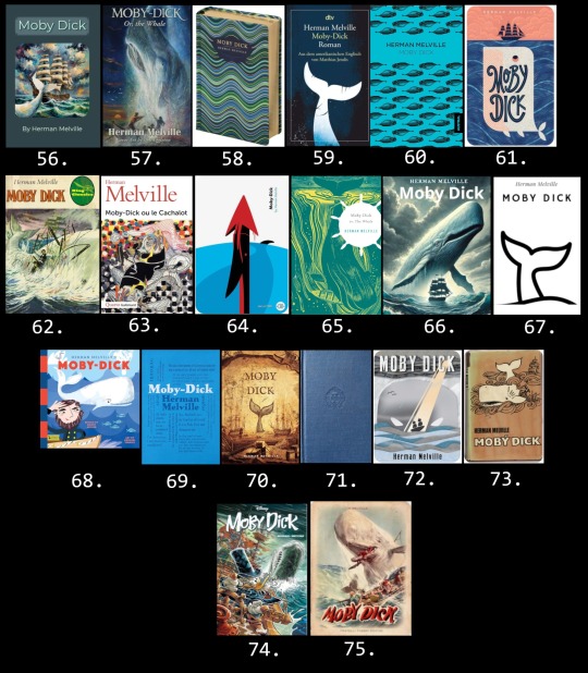
56. I haven't peeked into Melville's mind, but I'm pretty sure the Pequod looked quite different. The story is unmistakable though.
57. Nothing wrong with it, I guess, but way too messy for me to be comfortable with.
58. Not much to say here, but a perfectly nice-looking cover for any book.
59. Gets the job done, but not that inspiring.
60. Despite seemingly little effort behind it, this design based on a 19th century (erroneous) whale drawing could have gone straight up to A. You see, in the original image the (erroneous) whale has his penis (erroneous?) in full view, but on this cover it has been erased. How could I not have given a Moby-Dick book cover depicting dozens of (erroneous) whale dicks A? Alas.
61. Good, professional-looking cover, but judging by the illustration only, I would have guessed this was a children's book about the adventures of a jolly porpoise named Toni.
62. No spoilers to see here or anything. Is that a gold prosthetics??
63. This looks so much like a academic book on psychology. Not too far off, I suppose, but I wouldn't be able to figure out which famous story it is.
64. The Temple toggle harpoon was invented in 1848. Do with this information what you will.
65. Hey! That other cover from before! Have to say that the color alterations and helm sihouette wasn't an improvement.
66. A bit extreme for me.
67. I call this excessive simplicity. If you need a copy of Moby-Dick, you will recognize it at once, but it might not attract new readers merely in itself.
68. Just because it's a children's book doesn't mean the vibe has to be off, but I think it is in this case. Recently posted an example of this illustrator's adorable Ishmael here.
69. Where's the title? Confusing for a cover, but I would love this for a poster of mug! Also, the biggest words are Ahab, Queequeg, and Pequod, which I find mildly insulting towards a certain someone. What was he called again?
70. Cool whale picture which I really like, but the accuracy for Moby-Dick isn't really there.
71. It's blue.
72. I understand the idea and the illustration is awesome, but for me, the vibe is strangely all off and I get almost a comedic feel. Again, that's just me.
73. I often feel like an Ahab apologist and can often be somewhat harsh on the whale, but holy shit! A sort of red herring situation meant to make the reader think Ahab will be the winner?
74. It looks full of action and Scrooge's Ahab cosplay look is really neat, but I have... concerns.
75. I don't remember the scene playing out like this and Ahab is clearly not having it.
YOU HAD ONE JOB
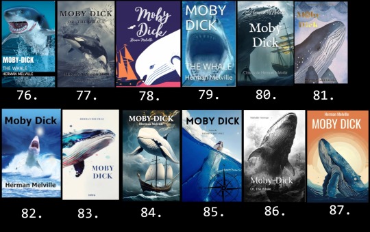
76. The exact face I made the first time I saw this kind of cover.
77. After all the people I've heard at the museum mistaking the sperm whale skeleton for an orca, I'm honestly surprised these fails aren't more common. The snowy setting is a nice touch.
78. Hast seen the white beluga?!
79. First shark Moby-Dick I ever saw and during my first week on Tumblr even. The nostalgia is real, shipmates.
80. Cool scene. Where is it from?
81. Come on! This is a fucking Wordsworth's edition!
82. My sentiments exactly.
83. No, it isn't.
84. At first I seriously thought this was some interesting modern sci-fi/fantasy take on Moby-Dick. Nope.
85. At least the person who did this one bothered to give it a traditional nautical flair.
86. The ocean is canon.
87. *screaming shark mode*
SHOULD NEVER HAVE SURFACED
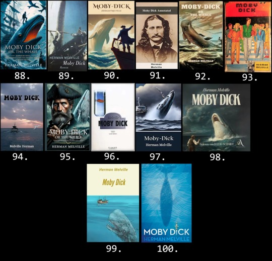
88. Someone's dad is balancing on top of a fire breathing eel whilst ravens are flying around and a poor guy has dark thoughts in the bottom right corner and... I dunno, man. "Whaling voyage turns fatal obsession" apparently. Moby-Dick the Prequel?
89. Whoa, dude!! I know you're angry, but holy shit!
90. "Captain Ahab? He went that way. Me? Just your average cliché 18th century pirate. If you don't mind me asking, sir, what sort of creature are you?"
91. By "annotated" they mean the truth about Wild Bill Hickok's one time side gig as a whaler. There's a fan fiction idea for ya.
92. What in the everloving AI fuck is happening here?
93. Friends, your guesses are as good as mine.
94. In the early 2020s, the ghost of Melville Herman set out to find the ghost of Moby Dick.
95. I guess we never learned what Ahab's dad died from back in the 18th century. Runs in the family and all that.
96. ?????????
97. If you download a public domain work to sell on Amazon for a possible extra buck, taking one minute to check the basic plot before slapping a stock image on it for a cover will be an actual long term investment.
98. "Lol! U overbite!"
99. Well, he is clearly a zombie whale, so maybe this is the sequel then?
100. And thus endeth MOBY D CK.
#moby dick#herman melville#literature#classic literature#ishmael#captain ahab#queequeg#moby dick spoilers#whale weekly#book tier list#tier list#moby dick tier list#moby dick projects#for fun#ranking#i'm dead
80 notes
·
View notes
Text
an eene genderbent au pisses me off bc what would their names even be?? keep the d’s?? or change it to like L or something??? bruhh


#ed edd n eddy#ed eene#eene double d#eene eddy#genderswap#genderswap au#guys look i can make an eene post without kevedd#im evolving#unrelated but yesterday. or twodays ago… one of my favorite youtubers ranked ed edd n eddy an F tier show an di have yet to recover#i have to mentally douse myself in eene content to recover
71 notes
·
View notes
Text
I made a tier list on how they would bark if they were dogs

Based on this image

(I searched for it a lot just for this stupidity.)
#happy tree friends#htf#htf nutty#htf lifty#htf shifty#htf pop#htf flippy#htf splendid#htf lammy#cro marmot htf#htf russell#htf disco bear#htf flaky#htf mime#htf the mole#htf handy#htf cub#htf toothy#htf cuddles#htf sniffles#htf giggles#htf petunia#htf lumpy#htf tier list#htf ranked#ranking#tier list
67 notes
·
View notes
Text

POV: you’re a mal and you just interrupted their study date session (rip)
(mini-rant and bonus under the cut)
i arise from the dead to share this because I am so brainrotted and also so goddam DESPERATE!!! I NEED people to read the scholomance series by naomi novik pls pls PLS i love them so much i'm actually going INSANE
also i tried out new brushes and a new way of coloring for this so idk how i'm feeling about it but i had fun i guess?? here's the flat colors before rendering because i like how it looks as well hehe

anyway i'm going to slowly spiral by myself about this series :DDD I NEED MORE PEOPLE TO TALK TO ABOUT IT AAA
#like what do you MEAN there are like 3 people in the fandom#i fear these two are joining the ranks of the top TIER book couples!!!#i do not bestow this honor lightly#dont get me wrong there is some wonderful art out there for the books but i need MOREEEE#so i took it upon myself to contribute SKKSKS#like flatout i haven't made full on illustration level fanart in a hot minute these days it's usually a huge bunch of sketches#but this series awakened something in me HAHFKJSLHF#A Deadly Education#The Scholomance#Scholomance#Orion Lake#Galadriel Higgins#El Higgins#like what even is their shipname???? oh my god HELP#my art#fanart#artists on tumblr
70 notes
·
View notes
Text
Seeing everyone upset about the end of the last episode meanwhile I’m ranking all the parents from most to least interesting/impactful if they died
#dndads#dungeons and daddies#noodly#dndads spoilers#anyways Rebecca is near the middle of the list#might make a tier list fr#who am I kidding no I won’t#this ranking is just vibes in my head
185 notes
·
View notes
Text
guys, i made a tier list for the new season!
#f1#formula 1#formula one#tier list#tier list maker#go rank the drivers people#and show me#its alsways fun to see#liam lawson#alex albon#max verstappen#oscar piastri#lando norris#carlos sainz#esteban ocon#charles leclerc#fernando alonso#gabriel bortoleto#george russell#isack hadjar#jack doohan#kimi antonelli#lance stroll#lewis hamilton#nico hulkenberg#oliver bearman#pierre gasly#yuki tsunoda
52 notes
·
View notes
Text
I'm sorry, but you really can't expect me to believe that
Azriel "Chain me to a tree, Rhys. Go ahead. I'll rip it out of the ground and fly with it on my damned back." Shadowsinger
is going to listen to Rhys pulling rank in the BC over Elain 🤭
#azriel#azriel shadowsinger#chain me to a tree Rhys#Elriel#pro elriel#azriel and elain#Azriel x Elain#Elain x Azriel#Azriel doesn't gaf about your rank Rhys#he's in love and he's going to get the girl#he's so hot#the graphic audio is top tier#ACOWAR#acotar#elain archeron
57 notes
·
View notes
Text
touhou birdfucker tier list

184 notes
·
View notes
Text
This took so, so long to complete. I'm not even sure why I spent two hours completing and revising this tierlist, but I did.. I'm not super confident in my every choice, but I think I did okay. I kind of worried I didn't have enough female characters in my S tier, but I would like to pray that nobody reads that as me being overly biased or something. Just getting that out of the way. Also, I made this by combining my opinions from comics i've read with opinions from media i've watched and from reading on wikipedia.

#tier list#my tier list#tier lists#dc#dc comics#comic books#comics#superman#wonder woman#martian manhunter#the riddler#lex luthor#captain marvel#billy batson#two face#the joker#just some of the characters i ranked here#dc universe#dcu#tierlists#guy gardner#green lantern#captain cold#jason todd#dick grayson#dc tierlist#leonard snart
44 notes
·
View notes
Text
I just finished the prologue for danganronpa v3. Here are my character rankings (don’t give me spoilers!! Im going in completely blind)

Ryoma said “better than prison” and I SCREAMED I ACTUALLY SCREAMED IM NOT EVEN KIDDING. I AUDIBLY SHRIEKED. I LOVE HIM SO MUCH
#danganronpa#danganronpa v3#also Monokuma is still like my all time favorite in the franchise but for the sake of this game’s tier list I had to bump him down#knowing him he will climb the ranks#also the red monokub is my favorite
71 notes
·
View notes
Text


DAVID MALUKAS | 2025 INDYCAR TRACK TIER LIST
#indycar#david malukas#aj foyt racing#btw here are the tracks he ranked in S tier: indy (oval) barber gateway laguna seca and road america#ciara.gifs
44 notes
·
View notes
Text

I mainly follow this sport for entertainment purposes and in a way this tier list shows who I’m most entertained by. It’d be different if I ranked their driver ability, who I support or what I genuinely truly think about them as human beings ngl
I also refuse to disrespectfully hate on drivers, because it’s not worth my energy, but I want to let everybody know that I could :)
A necessary addition to the top tier is Sebastian Vettel <3
#I wouldn’t take a bullet for any of them because I like being alive myself; I’m sure someone else would take the bullet for them anyways#alex is surprisingly high up but I simply couldn’t rank him mid; he’s too funny#i feel like this is a constantly changing ranking#I thought about being slightly more brutal but didn’t want to#I also feel like this is the last month where it’s appropriate to rank the 2024 grid#f1#formula 1#f1 tier list#this is my opinion#max verstappen#charles leclerc#lando norris#carlos sainz#alex albon
27 notes
·
View notes