#a different thumbnail is shown
Explore tagged Tumblr posts
Text
[tumblr blocked embedding of this video]
I have made a sex-free edit of the 2008 adult film To the Last Man.
The original version is more than five hours, but can be (and has been) cut down to about 45 minutes (including the credits). It's all plot and nice cinematography.
A couple of scenes I included have some of that aforementioned plot occurring alongside nudity. I censored the offending dicks and nutsacks, but left the bare asses. I think we can all handle some non-sexual ass. As a treat.
There's lots of murder, though.
#to the last man#fan edit#video#this is not a real gif#Porntendo#recommends#544 x 300#256mb#gay cowboys#30 FPS#On mobile#a different thumbnail is shown#Hmm#I showed this to my elderly mother#That's how clean it is#Can't embed now#Have to make a gif now#my video editing skills are subpar#but this was still fun to do
2K notes
·
View notes
Text
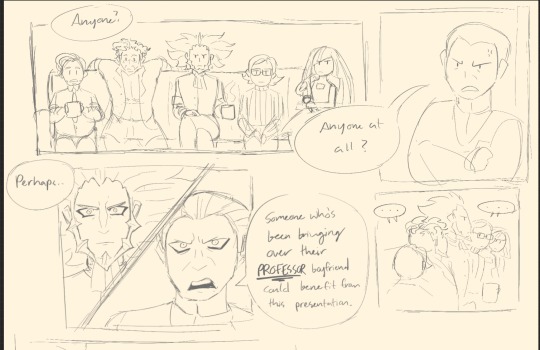
Guess what stupid comic I’m finally getting around to drawing
#wip#do not expect it to be good#like I think I’m mostly gonna leave it thumbnail-like with a few jumpscares of things actually drawn in#GIOVANNI GETTING CALLED HOMOPHOBIC COMIC WILL BE DRAWN#I WILL FINISH THIS#this idea has been cooking for like I think a year now so I refuse to not finish it#the gist is:#Gio has to present a PowerPoint on dating#Lys being an asshole as per usual#Gio crying sobbing throwing up trying to defend himself#everyone else is just living for the chaos#Ghetsis and Cy are there#they’re just not shown yet#Cy wishes he was anywhere else#Archie and Maxie make out session (them fighting)#Archie is trans because I love him#Rose got a different meaning about the name ‘Team Rainbow Rocket’#rainbowpufflez art tag
7 notes
·
View notes
Text
Good Animated Omens - Behind the Scenes
Here's a behind-the-scenes look at the walk cycles I animated of Aziraphale and Crowley (original post here).
I'll reiterate that the character designs are @lookitsstevie's creation! I made builds in Toonboom Harmony based on their designs, and then animated the builds.
Long post under the cut, organized into four parts. Feel free to jump around or just click through the images and gifs to get an idea of the gist. (At least take a look at Part IV, where you'll see a version of Aziraphale without his jacket and a closeup of Crowley's torso!)
Hopefully this is interesting even if you don't know the first thing about animation. It's not a step-by-step-from-scratch tutorial, but it might give animators some ideas to think about when trying this software!
I'm happy to answer questions about what I cover here - comments, DM's, or ask-box questions are all fine by me. If you like any of the new gifs and want to reblog it on its own, I can make new posts for those upon request! (I'd prefer you don't reupload them, but if you do please at least credit me with a tag to my account - thank you!!)
Part I: The interface and some basics
Above is a screencap of the software interface.
In the centre is the Camera window, where all the drawing and animating is done.
To the left, the Node View. It's a representation of how the pieces and layers that make the characters are grouped and connected to each other, which is what makes a character "build". Every piece in this window is called a node, and there are different types. Light blue "drawing nodes" contain the drawings themselves. Each drawing node usually has a green "peg" attached; the peg is used to move and rotate the drawing piece; you set a pivot point on each peg. Light grey nodes are groups that have more nodes within, and dark blue nodes are added effects (eg masks, the blur for the halo, etc).
Below, the Timeline - it's where keyframes are set and tweened. The red square dots indicate there is a new keyframe on a particular frame; the white dots indicate keyframes are on layers nested somewhere under the topmost visible layer. All the pieces of the characters can be found in the timeline and correspond to the pieces that exist in the Node View (and Camera). Typically you work with a collapsed view of the build layers in the timeline, which allows you to set keyframes on multiple layers at once.
To the right, a few tabs in this window - Tool Properties, Colour Palettes, and, shown on top here, the Library. The library is where you store your builds, so that you can bring in a fresh copy when animating a new scene. This library tab also has the Drawing Substitution window, which shows thumbnails of every drawing contained in a drawing node when that node is selected.
A second of animation is 24 frames long. Finished animation will often have keyframes on every second frame with the tweens removed, to help simulate the look and feel of traditional animation - this is known as animating "on twos", and saved time, money and paper in the old days. If you leave the tweens on, and/or have keyframes on every frame, the animation is "on ones".
My walks are on twos - it's the look I prefer.
When I say "tween" I'm specifically referring to the software feature that will automatically calculate and interpolate the path between two different poses/keys of a peg. An inbetween could be the result of using a tween, a new drawing, or both. On twos, an inbetween will look the same as any other keyframe on the timeline when you're finished - its relevance as a concept is during the process, not the end result.
Quality animation is achieved via a combination of moving/tweening pre-existing drawings using their pegs, and adding new drawings as hand-drawn inbetweens when needed. Toonboom Harmony also has nodes called "deformers": they offer a way to tween the shape of a drawing without needing to redraw inside the drawing node. (Part IV has the explanation for which pieces I used them for, and why.)
Part II: Navigating the builds
This is what their default poses with no animation look like.
Animation using builds is sometimes colloquially referred to as "puppet-style animation" because the way you can connect body parts to each other feels like making and handling a 2D digital puppet: you can connect a hand to a forearm so that they can move as a unit, and you can connect that unit to an upper arm to move the whole arm as a unit, and that arm gets connected to the torso, and so on.
When you want to connect two pieces, like a hand to a forearm, then you create another peg in the Node View and attach the two body parts together under that new peg. The screencaps below show the nodes that make up Aziraphale's and Crowley's entire builds inside their respective groups:
Things got a bit sloppy ... It looks extremely complicated, but once it's set up, you don't have to think about it too much when you're animating!
And I've zoomed in on the nodes that make their arms so you can see how there are pegs on top of pegs (all the green nodes), with wires connecting everything:
As I explained in Part I, new drawings are added and contained within a body part's drawing node (the light blue ones under the green ones), and the Drawing Substitution window is where you can see all the drawings that exist in a particular node. In the timeline, you set keyframes for moving the pegs, and you also choose which frame the new drawings will appear when applicable. You might have a lot of drawings stored in the nodes, but only what you set to appear in the timeline will be visible in the final animation.
You can select a body part in the camera view, and then find the corresponding layer in the Timeline or the Node View by pressing the "o" keyboard shortcut. If you select a body part by clicking on it, and then press the "b" keyboard shortcut, you will jump up to the next peg it's connected to. You can hide and unhide pieces using "d" and "a" respectively.
In the first capture above, I'm showing that the arm pieces can be moved separately or together, and you can see how the pegs in the Node View light up when I select them in the Camera window (hiding them turns them red). In the second capture, I pop down to the timeline to step back and forth between the poses - the light grey row (it appears between the rows of red dots) represents the hand's drawing node in the timeline.
Part III: Summary of animation process
In my head I imagined how their walks would differ from each other - Aziraphale bouncier but with very straight posture and limited arm movement, vs Crowley slinking and swaggering all over.
I also knew that I wanted the animation to look good for both a walking-on-the-spot version, and as a version walking across the screen (both versions are at the top of the post!).
Then I started doing some rough animation.
I set aside my finished builds for the roughs. For each character, I made a few drawing nodes and two pegs; a peg for the up-and-down upper body motion, which I tweened, and a peg for moving them across the screen. The legs and arms are drawing substitutions.
With these extremely rudimentary rough "builds", I worked out - how many frames long the walks would be, - how far the characters would move across the screen each step, - how much the upper bodies would move up and down, and - the key drawings of the legs and feet.
I didn't worry about animating clothing, hair, or Azi's arms in the rough stage. For those elements, the drawings would be spaced really close together and would be easier to figure out with tweens. (Note: this rudimentary setup would be sufficient if you want to clean up and inbetween characters by hand frame-by-frame instead of making full builds; my preference is build animation because the process is more fun for me)
Then I started working with the finished builds, using the roughs as a guide, and established the broadest motions first: the up-and-down motion in the upper bodies (I set a keyframe at the lowest point, a keyframe at the highest point, then tweened between them) and how far they'd travel across the screen. Then the feet were done.
I went back and forth between viewing them walking on the spot and walking across the screen to make sure that both versions worked. I also made sure they crossed the same amount of ground relative to each other.
After those crucial parts, I moved on to animating their arms, hair, torsos, clothing details, and finishing the legs, not necessarily in that order. I simulated twisting/rotating their torsos in 3d space by moving their waistcoats and lapels.
The first gif switches back and forth between versions (imagine a background scrolling by when they walk on the spot). The second gif is an example of bad "footslip" - they're moving at different speeds, and if you pay attention to their feet, Aziraphale appears to slip on ice while Crowley appears to slide forward on skates.
"You go too fast for me, Crowley!"
Part IV: Extras and details
Here is a version of Aziraphale's walk without his jacket, and a closeup of Crowley so you can see his swaying hips better:
One of the cool things about animating with builds is they lend themselves well to small modifications; the jacketless version took all of five minutes to make.
I'd be remiss not to include a close-up of Aziraphale's hair, the real star of the animation :) (Crowley's hair is also animated but I purposefully kept it understated since it's a much different texture.) And a closeup image of Crowley's snake tattoo:
The biggest unit for both of them are their upper bodies, which includes their pelvises. The up-and-down motion is only on one peg instead of on every single piece, which is handy because it means I can hide just that part of the animation when I want to work on the clothing details:
During the process of animation, I am often hiding then unhiding pieces like this so I can see what I'm doing.
Their clothing ended up being a lot of separate pieces, which I kept adding during animation rather than before, as it was hard to predict everything I needed. Their clothing also incorporates cutters (aka masks), and deformers (see explanation in Part I). In the next set of gifs the deformers show up as green outlines with handles and get turned on and off.
Aziraphale's torso functions as a mask for his clothing. The shape of his torso subtly changes via deformer. His lapels and waistcoat have V shapes that are masks/cutters (they cut a V shape out of those pieces); the same pieces that make the cutters also are used for the black lines of those V shapes via a special layering setup. The main shapes of his lapels are animated with deformers, and you can see how far beyond his torso shape they extend when I turn on the deformers in the second gif.
Deformers work best for shapes that change a little bit, and/or slowly. The minor shape changes in his and Crowley's clothes ended up being a great use case for deformers, because they pretty much tweened perfectly.
The reason I didn't use them on Aziraphale's legs was because those shapes change significantly between keys; I predicted I'd have to re-adjust every frame of a tweened deformer, so I drew the inbetweens by hand (halfway through, I realized I probably should have used them after all, but I was in too deep by then; hand drawing was fun though!). Deformers worked well on his bottom jacket:
Crowley's pelvis is layered above and below his thigh pieces and has a deformer. Also take a look at all the drawing substitutions for his hands:
And lastly the deformers on the hair:
Epilogue
I'm hoping the gifs all play at the same speed for everyone as they play for me. Hopefully the demo gifs are at least watchable, if not super clear... (I'll listen to feedback on the presentation of the information, for if I do similar posts in future!) Don't hesitate to ask questions about anything I covered, or about any details you noticed that I didn't elaborate on!
ko-fi.com/marieanimate
I'm shy about mentioning it, but I set up a Ko-fi account in case this post compels anyone to leave a small "tip" (but reblogging and sharing is just as good)!
Thanks for reading, and have a nice day!
#2d animation#animation#animated gif#walk cycle#toon boom harmony#toonboom animation#good omens#good omens fanart#ineffable husbands#aziraphale#crowley#crowley and aziraphale#aziracrow#animation process
908 notes
·
View notes
Text
[Major Outer Wilds/EOTE spoilers below the cut!]
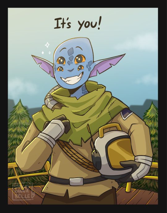
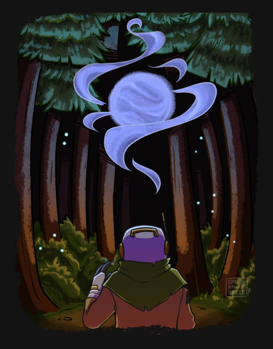
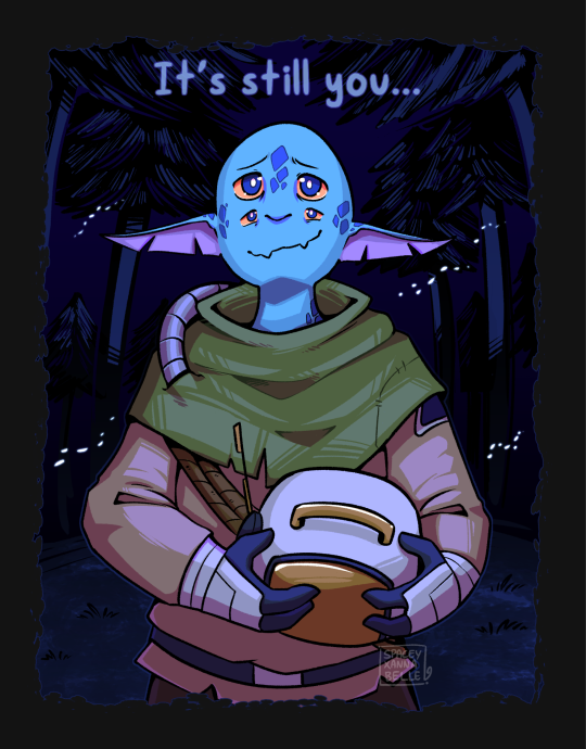
HUOHKAY, After chipping away at this for over a month, my Outer Wilds comic is finally done!!
Initially I wanted to do this in two parts, like how many other versions of this beloved Undertale quote have done. But in the middle of thumbnailing the sketch, I thought why not illustrate Hatchling's journey too and I further expanded this project, by a lot hfjdjg
Outer Wilds is such a fantastic game and truly one of a kind, I only hope I did the game justice with this comic I made
----
Some artist notes below, if you're interested in reading all of it!
I began this project around early August!
I separated each page to their own canvases so I don't have a ridiculously huge file size. And each canvas has a different name. From the first to the last, their names go: It's you > Nova > Loop > Lonely > Glade > Despite everything.
Glade was actually a really long canvas that I split into two, bc I wanted to experiment with like a vertical scroll thing. So the Glade pages were split into Glade A and Glade B
My favourite page to work on was page 2, the supernova was fun to make, especially with the pointilism brush that CSP had which made it way easier.
Page 4 initially had a way different layout before I settled with this one. As shown below here:
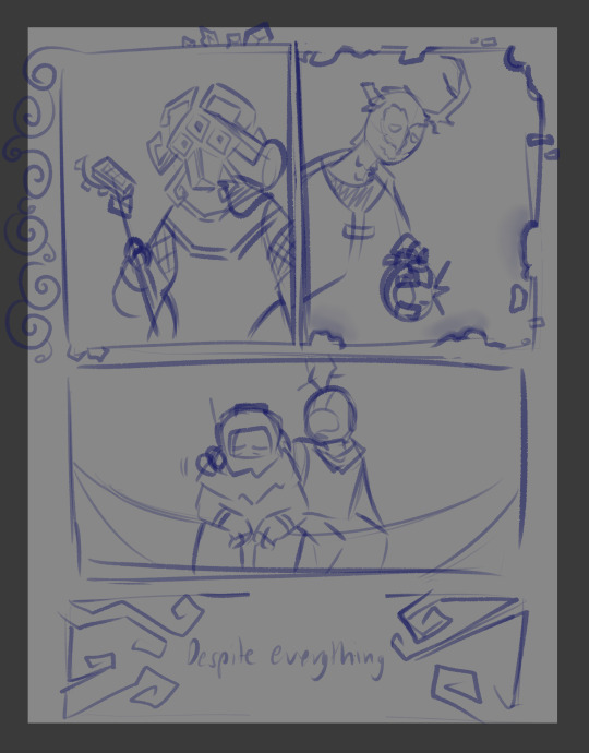
But when I did a second pass, I rearranged the panels and instead decided to illustrate scenes that Hatchling had with the two.
With Solanum, it's learning and translating her texts on the QM. With Prisoner, it's when you discover the truth and after the vision…
For the Gabbro and Hatchling panel, I changed it so that both are at a distance and facing away from the viewer. As like a sort of way to show that Hatchling is having the reality of the situation dawn on them and try to cope with it. I did name this canvas "lonely" for a reason ::)
My Hatchling's name is Pyrite, or Pyre ::)
#Outer wilds#Outer wilds spoilers#EOTE spoilers#echoes of the eye spoilers#Xan draws#digital illustration#Digital art#This was a learning experience for sure jdsjdh#Good god I'm gonna do something much simpler and less complex next#Holy shit this was a challenge to tackle#artists on tumblr#outer wilds prisoner#outer wilds solanum#despite everything it's still you#long post#outer wilds gabbro
552 notes
·
View notes
Text
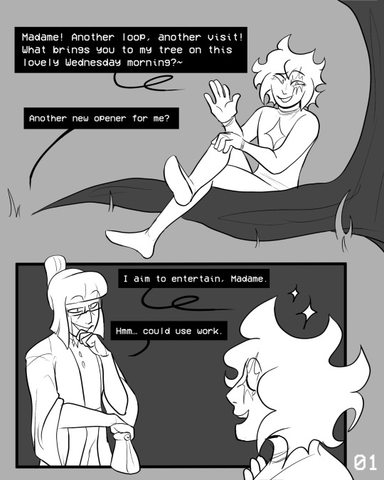
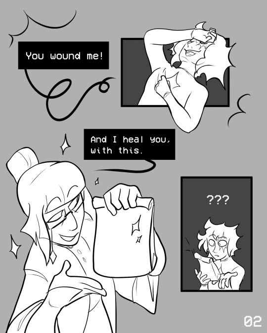
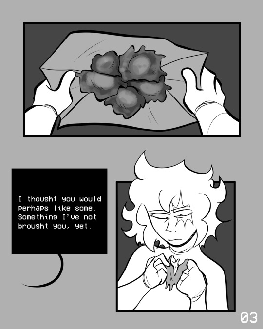
Fritters part 1! Dialogue by @wonder-of-the-stars !!!
Silly lil comic notes under line break
Page 1
-Added loops to loops speech bubbles because it's funny
-Odile's loops, do in fact, start on a Wednesday lolol
-The lil sketchy marks around Loop's neck and wrists are meant to imply a gradient/ they're in a weird it's clothes but also still skin phase.
Page 2
Loops hands out pose is supposed to mimic some of odile's in game sprites
Page 3
-Can you tell I've been reading dungeon meshi
-Fun fact I just used the initial thumbnail sketch I did for the fritters instead of cleaning up the sketch, I think it makes food look more natural/ better (in my style at least!!)
Page 4
-Tilted triangle panel was inspired by wonder! Thank you wonder
-Even angry loops still partially doing odile's hand pose
-Last 2 odile panels can be connected
-Random thing but I was struggling with that odile pose so much I just traced an old pic I did of loop lol (hey accidental parallels or whatever)
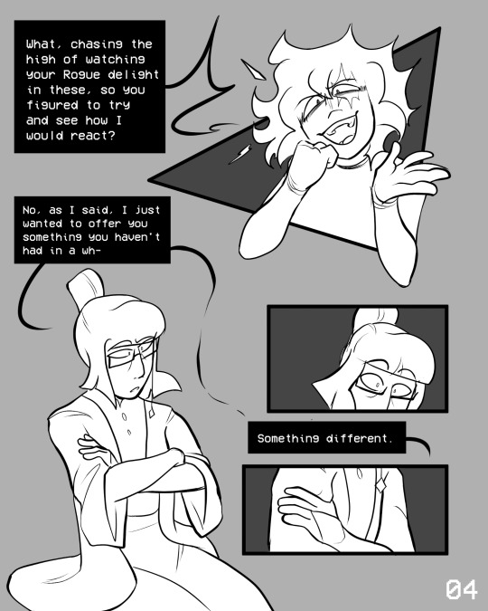
-This ones silly but with the last panel I thought it might be fun to have the gem Odile changes into a star post game in the frame- it's "something different" lol foreshadowing
Page 5
-I wanted to frame it as loop not directly being shown giving the peppers back/ still having the bag- do they give it back to her off screen? Let the peppers just sit there tauntingly refusing to eat them? Do they eat them when she leaves? Up to you!
-Loops pose is directly referencing one of their in game poses
Page 6
-Another in game pose
-Time has passed! This is the same day
#in tales of time#part 2 coming eventually#in stars and time#isat#isat spoilers#my art#in stars and time spoilers#in stars and time fanart#isat odile#isat fanart#isat loop#in tales of time au#isat au
535 notes
·
View notes
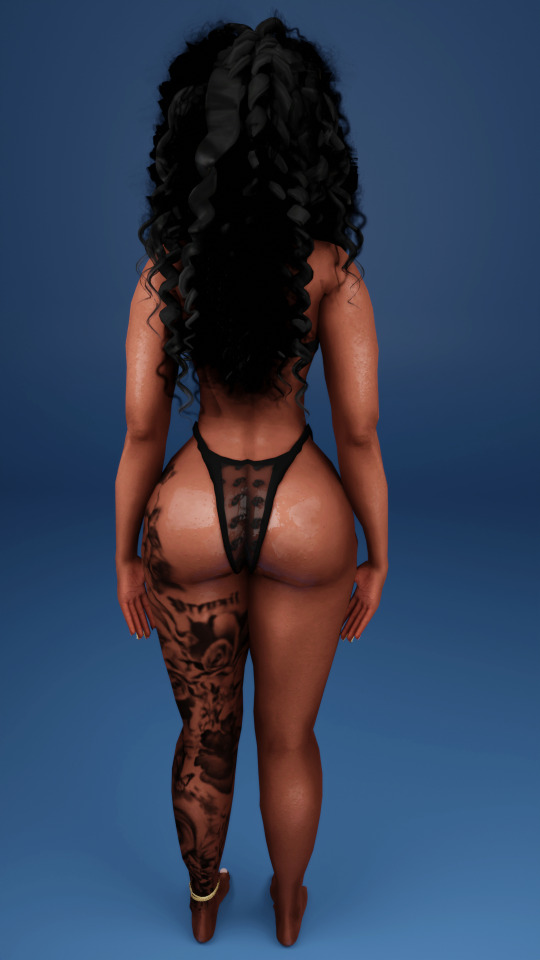
Text
Wavy Preset
Custom Thumbnail
Enabled for Occults
Teen-Elder
DISCLAIMER: Everyone's game is different when dealing with presets! So you MAY not get the same results as shown above!
Works great with these sliders but these ARE OPTIONAL:
Vibrant Pixels "Sliders For Days"
Black Cinema Sliders
Whibby "Peachy Thicc" and/or "Cornfed" Slider **18+ Site**
Cmar Enchance Butt Sliders
LUUMIA Hip Shape Slider
DOWNLOAD (Early Access, Public 11/5)
Do NOT Steal/Claim as Your Own!
DO NOT EDIT MY PRESET!
Do NOT Reupload or Put Behind Paywall!
Do NOT Convert without permission!
If you have any problems please do not hesitate to message me!!
@ts4presets @sssvitlanz
#afrosimtricsims#afrosimtricsimmer#afrosimtricsimscc#afrosimtricsims cc#s4cc#ts4cc#s4#ts4#the sims 4#sims 4 cc#afrosimtricsimmercc#s4 body presets#ts4 body presets#s4 female preset#ts4 female preset#sims 4 body preset
913 notes
·
View notes
Text
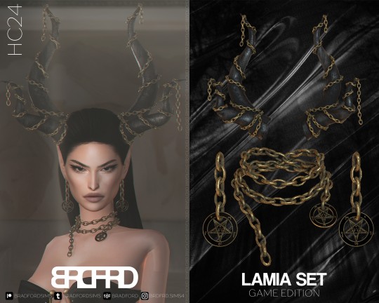
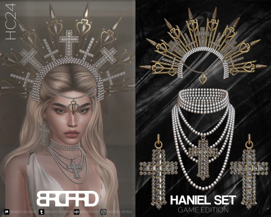
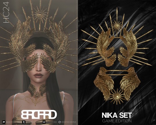
HALLOWEEN COLLECTION '24
LAMIA SET - GAME EDITION
New meshes
HQ/BG compatible
All LODs
2 swatches
Unisex teen +
Custom thumbnails
Disallowed for random
------------------------------------------------------------------------------
LAMIA SET - BLENDER EDITION* [SHOWN ON COVER]
New meshes
Set of HQ Textures (Albedo, Roughness, Metallic & Normal)
Material Nodes for customization
Tutorials included
HANIEL SET - BLENDER EDITION
New meshes
HQ/BG compatible
All LODs
4 swatches
Unisex teen +
Custom thumbnails
Disallowed for random
------------------------------------------------------------------------------
HANIEL SET - BLENDER EDITION* [SHOWN ON COVER]
New meshes
Set of HQ Textures
Material Nodes for customization
Tutorials included
NIKA SET - GAME EDITION
New meshes
HQ/BG compatible
All LODs
4 swatches
Unisex teen +
Custom thumbnails
Disallowed for random
------------------------------------------------------------------------------
NIKA SET - BLENDER EDITION* [SHOWN ON COVER]
New meshes
Set of HQ Textures (Albedo, Roughness, Metallic & Normal)
Material Nodes for customization
Tutorials included
-------------------------------------------------------------
DOWNLOAD THE COLLECTION:
GAME EDITION [PUBLIC RELEASE: NOV 20]
BLENDER EDITION
-------------------------------------------------------------
BRADFORD'S SOCIAL MEDIA:
INSTAGRAM /// PINTEREST /// PATREON
-------------------------------------------------------------
*WHAT IS BLENDER EDITION?
Blender Edition is a special edition that has more texture space (usually 2048x2048) and can be used only in Blender due to different UV Mapping. This edition allows you to create renders with more quality and flexibility than models exported from the game itself.
Archive with this edition contains .blend file, diffuse textures, normal maps and tutorials on how to use it.
IMPORTANT NOTE:
Blender Editions will be available to Platinum and Diamond members only. Early Access doesn't apply to Blender Edition since this edition weren't made for the game and is basically a separate 3D model.
186 notes
·
View notes
Text
• Cosmical Curiosities •
The weekend turned out a bit differently than planned, hence instead of sharing the simblreen treats through trick or treat asks, I have decided to share it in a post publicly after all 🙃 In any case, wishing you all a wonderful weekend, and upcoming week! 💛
It consists of 2 sets: - Cosmical Set - Curiosities Set
categories: deco, walls, floors
converted from blade & soul
walls & floors are a bonus
there are 30 objects in total
most are low poly meshes
most have 4-8 colour options
all are base game compatible
[ download ] Cosmical Set [ download ] Curiosities Set
Thumbnails of the objects are shown below:
Happy Simming! ♥
@sssvitlanz @fantasycclove @sims4-fantasy-cc-finds thank you for sharing :)
171 notes
·
View notes
Text
@kosmokhaos, I just want to thank you for helping me save potentially HOURS of work, because it worked !
Context : Previously, I had shown that I would need to replace 2000+ image files if I wanted to replace the preset thumbnails but kosmos suggested that I delete them instead, since they usually generate their own images.
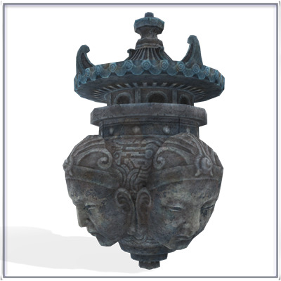
So, I deleted the thumbnails directly in the CasThumbnails.package and they appeard ! The thumbnails seem to appear with both your current default skin + default eyes, so if you have a different default skin and eyes than I, the presets will appear with those instead of the old thumbnails under here.
The old thumbnails :
283 notes
·
View notes
Text
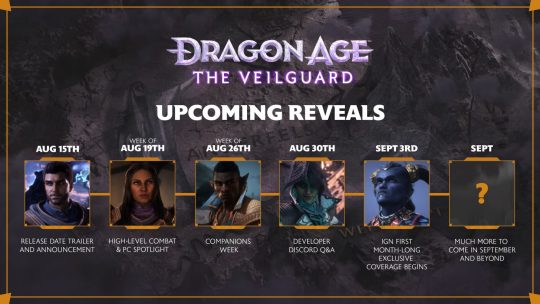
"Journal #3 Dragon Age: The Veilguard is coming October 31 Pre-orders Open Now Hello everyone, We’re excited to finally share the release date for Dragon Age: The Veilguard, which is officially October 31, 2024 worldwide! Please note, this is a simultaneous release; we will announce exact timing at a later date. We want to extend a huge shout out to the Dragon Age community for your patience and enthusiasm; we can't wait for you to jump into the role of Rook and embark on your journey to save Thedas. We know the wait has been long, but the wait will be worth it. In the meantime, we want to give you a hint at what's in store for you in Dragon Age: The Veilguard. You're leading a desperate fight for the future of Thedas with your companions, the stakes are higher than ever. So grab a seat and click on the thumbnail below to watch this brand new trailer (includes some small story spoilers). “As someone who’s been working on Dragon Age for over 15 years, I know just how much our community has been looking forward to this day, and I’m equally excited to share and celebrate that the game will officially launch on October 31,” said John Epler, Creative Director of Dragon Age: The Veilguard. “We wanted to give you the choice to really express yourself, and do that in a world full of adventure and danger. So whether you’re a Warrior, Rogue or a Mage, we can’t wait for you to gear up, gather your party, and set out for another thrilling adventure through Thedas this Halloween.” As a character-driven RPG, Dragon Age: The Veilguard offers you a crafted experience woven from the threads of rich storytelling and fantasy worldbuilding the franchise is known for. In this bold, heroic adventure, you will experience expansive and dynamic stories that navigate love, loss, and complex choices that affect relationships and the fate of each member of the Veilguard. In true Dragon Age fashion, these bonds of fellowship are the foundation upon which Rook’s journey is built, and it will be up to you to determine how their personal story unfolds. Pre-Orders Now Open Fans who pre-order* the Standard Edition of Dragon Age: The Veilguard for $69.99 USD‡ on PlayStation 5 and Xbox Series X|S, or $59.99 USD‡ on PC via Steam, EA App and Epic Games Store will receive cosmetic Blood Dragon Armor sets for Warrior, Mage and Rogue classes. EA Play Pro† members on the EA App will enjoy unlimited access to the EA Play Pro Edition* starting October 31st. Check out the full breakdown of the different editions we have available here: Digital Editions"
"- Standard Edition - Dragon Age: The Veilguard - PC: $59.99‡| Console: $69.99 USD‡"
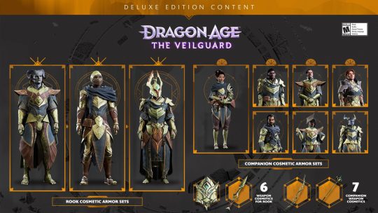
"- Deluxe Edition - Dragon Age: The Veilguard - 3 Rook armor sets (cosmetic only) - 6 Rook weapons (cosmetic only) - 7 Companion armor sets (cosmetic only) - 7 Companion weapons (cosmetic only) - PC: $79.99 USD‡ | Console: $89.99 USD‡"
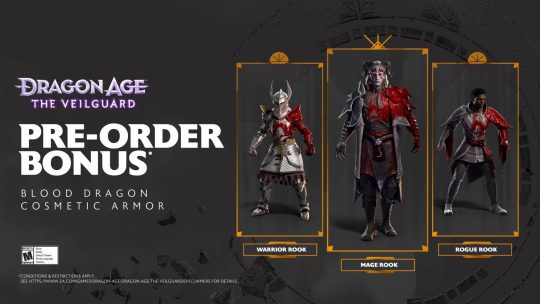
"- Pre-Order Bonus* - All Pre-Orders (Standard & Deluxe) will receive: - Blood Dragon Armor Set (Warrior, Mage, Rogue - cosmetic only)"
- “Rook’s Coffer” Edition (Does NOT include Game) - Lyrium Dagger - Thedas Map with Quiver Tube - Rook’s Deck - Potion Flask - Enchanted Die - $150 USD‡"
"- Vyrantium Pack by Scanavo (Does NOT include Game) - Exclusive SteelBook® Case (No Game) - ICONART™ Metal Print and magnet wall mount - Notebook - Collector’s rigid Outerbox Check in with your local retailer to find out about the availability of this edition in your region"
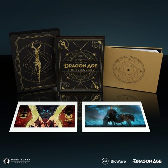
"The Art of Dragon Age: The Veilguard by Dark Horse (Does NOT include Game, Deluxe Edition shown above) - Standard Edition - 256-page art book providing a behind-the-scenes look at Dragon Age: The Veilguard - $49.99 USD‡ - Deluxe Edition - Includes extra prints - Includes exclusive slipcase - Alternate cover - $99.99 USD‡ - BioWare Gear Edition - Only available while supplies last, sold exclusively on the BioWare Gear website - Includes an exclusive print - BioWare Gear Edition alternate cover - $55.00 USD‡ What’s Coming?"
"ICYMI, we released our August Roadmap this week! Next week, we’ll have a dive into our game’s combat and more information on our PC Specs. There’s a lot more to come in September and October, too; so keep your eyes peeled on our socials. We're beyond excited to be on this adventure with you, and we can't wait for you to get your hands on the game. Chat soon. - The Dragon Age Community Team *Conditions & restrictions apply. See https://www.ea.com/games/dragon-age/dragon-age-the-veilguard/disclaimers for details. ‡Offers may vary or change. see retailer site for details. †Conditions, limitations and exclusions apply. See EA Play Terms for details."
[source]
#dragon age: the veilguard#dragon age the veilguard spoilers#dragon age: dreadwolf#dragon age 4#the dread wolf rises#da4#dragon age#bioware#video games#long post#longpost#solas#blood cw
170 notes
·
View notes
Text
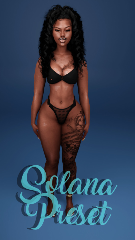
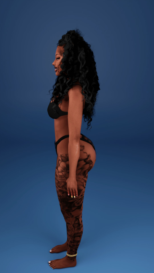
SOLANA PRESET
Custom Thumbnail
Enabled for Occults
YA-Elder
DISCLAIMER: Everyone's game is different when dealing with presets! So you MAY not get the same results as shown above!
Works great with these sliders but these ARE OPTIONAL:
Vibrant Pixels "Sliders For Days"
Black Cinema Sliders
Whibby "Peachy Thicc" and/or "Cornfed" Slider **18+ Site**
Cmar Enchance Butt Sliders
LUUMIA Hip Shape Slider
T.O.U
Do NOT Steal/Claim as Your Own!
DO NOT EDIT MY PRESET!
Do NOT Reupload or Put Behind Paywall!
Do NOT Convert without permission!
If you have any problems please do not hesitate to message me!! Tag me on Tumblr or on IG, I’d love to see your photos!
Download Here: 🩵
#the sims 4#black simmer#barbiesimz#ts4#urban sims#urban cc#urbansimmers#blender#blender room#sims 4 cc#sims 4 body preset#body presets#sza
381 notes
·
View notes
Text
there's no one else around (you're touching yourself) (18+)
summary: By pure accident, you stumble across the home page of your manager's brother's cam site. But neither of them have to know, right?
title from: "Wet Dream" by Wet Leg
word count: 2.1k
content warnings: MDNI!!! male masturbation mention, what is technically sex work, camshow/cam work, afab reader genitalia, vaginal/clitoral masturbation, rabbit vibrator you're my best friend, pillow humping ummm, don't think there's anything else
side note: HI BEAR WITH ME I FEEL LIKE THIS IS SHORT BUT TRUST WE WILL GET BETTER WITH TIME
You should not be here. By here, you mean Lip's cam site.
You stumbled upon it completely on accident. It had been a long week, and you needed to blow off some steam, and your friend had suggested looking into cam sites for something more interpersonal than just porn. So it was safe to say you were surprised when, in the top twenty for the local area, Lip Gallagher was streaming.
You only know it's Lip from the triangle tattoo on his chest that you have not stopped thinking about since you saw it.
You should not be here. You should not be entertaining the idea of watching your coworker, your manager's brother. Your mouse is hovering over the video, the stream playing in the small display on the sites front page. But Fiona doesn't have to know, right?
That's what you keep repeating to yourself as you go through the process of making an account (of course Lip would set his page to accounts only, why wouldn't he, it's the best way to insure money is made.)
That doesn't stop you from feeling slightly embarrassed by it. Fiona doesn't need to know, Lip doesn't need to know, nobody needs to know.
You make your user something meaningless, something he wouldn't be able to tie back to you. Once you get the minimum access... It's enough to make you blush, mouth going dry as you take everything in.
In most of the thumbnails, you can only see Lip's chest. In a few of them... Well, in a few of them, you can see more than just his chest. So much more.
There's a few items on his site that require a subscription fee and... Well, you're not ready to commit to that just yet. The streams will do, for now.
You're quick to roll out of bed and grab your headphones from your shelf, wasting no time connecting them to your laptop and putting them on. Once you're sure they're connected, you quickly click on the stream, not leaving any room for hesitation as the video loads.
It is. A lot.
The stream only takes a few seconds to load up before it's playing on your screen. You move by muscle memory, putting the video in theatre mode.
You haven't even looked at the live chat as it blows by, little pings and animations dancing on the screen. You're not taking in any of it.
All you can see is Lip. All you can focus on. The only coherent thought in your mind is him.
"Fuckin' hell-" Lip grunts in your headphones. Your eyes are wide as you take in everything you can. You can't even be bothered to get yourself off, you feel like you'll miss something if you tear your attention away from the screen.
You've chosen an interesting stream to start with.
Lip's body is framed perfectly. It's different from the other thumbnails, more of him being shown. His arm is extended, bracing himself on what you can only assume is the wall beside his setup. His chair is positioned sideways, a pillow folded in half and positioned snuggly in the angle of the chair. The leg closest to the camera is extended, giving him a firm footing as his other rests on the seat of the chair.
If you hadn't already taken your jeans off, you'd be fighting with yourself to get them off as quickly as possible.
You're glad that past you had the forethought to place your vibrator beside you, and all you needed to do now was take off your own underwear. Lip's home page was enough pre-game that you don't have to play with yourself too much to slip in the silicone toy.
You have to hit a few buttons before you land on the setting you want. Timing the grinding of your hips with Lip's movements and the rhythmic vibrations of the rabbit is tricky, but you manage to match the pace as best as you can.
Lip repeats this pattern of thrusting into the pillow, punctuating each one with a firm grind against it and then stilling before starting up again. The motions are enough to drive you mad, letting yourself shut your eyes and pretend the toy inside of you is actually Lip as he groans in your ear about how tight you are.
He encourages you and the audience to edge yourselves for as long as you can. To keep yourself dangling on that edge of release until he tells you to let go.
He gives you the clear right before he lets himself come. He doesn't have to tell you twice as you grind against the rabbit buzzing against your clit. The feeling is damn near overwhelming as you gasp softly, listening to the way Lip grunts out praise and curses.
You slam your laptop shut before you can watch him end the stream. Your chest rises and falls heavily, staring up at your ceiling as your brain registers what you just did.
Fuck.
The pit in your stomach when you see Lip walk in makes you feel sick. You knew he was working today. You're not sure why it jars you so much, but the overwhelming anxiety that seeing him gives you... It's enough to make you regret seeing his cam page.
He spends enough time talking with Sierra on her way back to the bar counter that you can cash out your register. Despite your rush to go, you get everything settled nicely in the pouch you need to take back to Fiona.
When you look up, your stomach drops when you meet Lip's gaze. You're quick to turn around and flee the front counter before he can leave Sierra's side.
"Fi am I good to go?" You walk into her cramped office like a whirlwind. You're already untying your small apron from around your waist and folding it in your hands.
"Yeah. Everything okay?" Fiona looks at you, brown eyes wide and searching your own. You nod quickly, tucking your apron in your waistband and placing your till money on her desk.
"Peachy," you tell her, placing your hand on her shoulder and giving a quick kiss to the top of her head. "I'll see you tomorrow, Fi."
Fiona gives your hand a quick size before you're slipping out of the office, stopping at the locker that stores your and Sierra's belongings. You're quick to swing the door open and grabbing your bag from the top shelf. The way you jam your apron into your bag is a little more aggressive than you usually handle things but you are determined to leave before you can run into Lip. Once you close your bag and slip it over your shoulder, slamming the locker door shut after you and turning quickly on your heel.
You're a bit too in your own head, not paying any attention as you head out of the small employee area, not bothering to check if someone else is coming back there.
That is your mistake, colliding hard with someone else. You're hands act on their own, grabbing at the shirt of the person you ran into to keep yourself balanced.
"Whoa-" Goddamnit.
You shut your eyes and momentary curse whatever cosmic being has it out for you today. Once you know you're steady you quickly let go of his shirt, bringing your hands close to your chest and step back a little.
It would be your luck that on your way out the door you would run into Lip Gallagher. The very person you're trying to avoid facing.
"You okay?" Lip's voice is caring as he speaks softly.
"Fine," you say, looking for a way to slip past him. He takes up most of the walkway, and there's that sour taste in your mouth. Your brain is sending mixed messages, guilt, and disgust at yourself, but your cheeks feel flush with Lip so close to you. Maybe it's his own body heat...
"Y'sure?" Lip asks you gently. "Y'look all..."
The gesture Lip makes is confusing, simply just motioning at your whole body, and it makes you want to disappear into the shitty paint job on the wall.
"Great. Just need to get home, so uh.." You gesture behind him, hoping he'll get the idea so you can brush past him.
"Oh shit. Sorry. I'll see ya tomorrow then?" Like he's sad he missed you on the shift. The sentiment makes your stomach flip, and you have to fight it down as he slips by you, his chest brushing your shoulder so you have to turn if you want to keep looking at him.
"Uh, yeah.. Pulling a double, so I'll be here all day." You're not at all keen on the idea, but one of the girls had practically begged on her knees for you to cover her shift.
Lip huffs and shakes his head with a disbelieving grin. "I'll see ya then.."
He does that nervous habit he has, scratching gently at his nose with his thumb as you give you a small wave as you leave. The interaction is only... Slightly bizarre, if you put it mildly.
Fiona slips out of her office, leaning against the doorframe as Lip walks over to the lockers.
"They seem... Off, to you?" Fiona asks Lip as he grabs his rubber apron. He spares Fiona a glance before he brings the apron over his head.
"Off?" Lip asks.
"I don't know... Like skittish? Flighty?" Fiona tries to explain the feeling that's nagging at her brain. You left in such a rush and left her no room for explanation when you brushed her off.
"A little," Lip shrugs. "Just seems like they wanted t'get out of here before gettin' dragged into more work."
Fiona hums softly, crossing her arms over her chest. Lip nods before shutting the locker softly before leaving the backroom, leaving Fiona to mull over your interaction.
The rest of your week follows the same cycle.
Going to Lip's site, getting off while he streams himself getting off, and then trying not to face him the next day.
The only one who really seems to notice your quick get aways everytime Lip clocks in is Fiona. The not knowing makes her fidgety and agitated, becoming noticeably short with people until eventually she snaps.
"Did you do something to piss them off?" Fiona grills Lip as they watch you bid Sierra goodbye before slipping out the door to the restaurant.
The look he gives his sister is offended. Offended that she would suggest he had done something wrong when he barely had the chance to talk to you this last week. It did strike him as peculiar that you managed to slip away whenever he clocked in or found a way to switch shifts so you two no longer worked similar shifts anymore.
"Why do you assume I did something wrong?" He asks. Despite his defensive position, he wracked his brain for any possible interaction that could have caused your change in behavior.
"Because they only ever leave like a bat out of hell when you come in!" Fiona exclaims.
"Well, maybe you should ask 'em, since I didn't do anything wrong." Lip says, glancing around the restaurant as he stacks dishes in his bin.
"Oh, don't give me that!" Fiona turns to him, lightly smacking his arm with the till pouch in her hands.
"What?" Lip jerks his arm away from her, as if it actually hurt. He's just merely offended by the action.
"I have asked 'em! They just say their fine and leave as quick as they can!" She sets the pouch on the counter beside the register and rests her chin on her hands.
"Maybe you did something." Lip shrugs, mouth quirking up to squish his cheek up so his eye squints slightly. Fiona turns to glare at him, but he's not looking at her. Busy doing his job.
"What would I have done that would piss them off?" Lip comes up to settle beside her, setting his bin down as if he really needs to give it some thought.
"Well, let's see-" Fiona cuts him off with a hard smack to the chest.
"Let's see nothing, asshole.." Fiona mutters, leaning against the counter as she stands up straight and watches the people walking by.
"It's gotta be somethin'." Lip shakes his head slightly, picking his bin back up.
"I'm gonna figure it out." Fiona promises her brother.
"Yeah, you do that. I'll uh, I'll be in the back doin' dishes while you try figurin' it out." Lip claps Fiona on the shoulder, gives her a quick squeeze, and heads for back of house.
Fiona huffs at him before glancing back at the sidewalk. She's going to figure it out, whether it's a big secret or not.
Fiona will find out.
#saltnsugarbear#too much salt (18+)#wet dream [ series ]#lip gallagher x reader#lip gallagher smut#lip gallagher fanfic#shameless fanfiction
119 notes
·
View notes
Note
You can't seriously be so dense that you can't see why trans people are not comfortable with Joon's thumbnail.
Idgaf what Lily did, idgaf that Joon was "respectful" in the video(not really, if he was truly respectful he would've censored her deadname, we are not asking for much here).
There is such thing as being covertly or accidentally transphobic, Joon being a cis man should be open to criticism and just change this shit.
Stop being dismissive of trans people just because Joon is on "our" side, it's embarrassing.
No, I get why people would be uncomfortable with the images. I still think it’s important to have the facts straight, that the photos used were photos Lily herself posted after coming out. There is a fundamental difference between posting images of a masking trans person (which is what people are assuming), and posting images of one who is out and transitioning.
I’ll also admit, the visuals where instances of Lily’s deadname was on screen did make me uncomfortable. The name is dead for a reason, and even Lily is owed that respect. But then I remembered the time where someone had had the decency to cut out Lily’s deadname, and Lily pounced on the opportunity to claim the screenshots used were faked specifically because said name was removed. It’s evidence, and Lily’s already shown that good faith doctoring is something she’ll exploit, so it’s getting left as it. I don’t like it, but I get it.
But let’s be real here. It doesn’t matter what I say. You’ve already made up your mind. It’s always always always going to be something. It doesn’t matter how much evidence is presented to you, you’re going to ignore it and tear into whatever hapless messenger brought it up to you instead. You already admitted it. You don’t give a fuck what Lily did. You don’t care that she’s tormented people for years, that she’s sexually harassed people, created multiple false identities to push people to do what she wants, that she’s completely sanitized her past actions and lies constantly about anything worthy of criticism she’s done. A youtuber was insensitive when presenting all this, so it gets thrown out the window, and Lily gets to go on another day where she has a platform and access to new people she can abuse.
Well here’s the thing. Lily is going to fuck up one day. Even if Joon’s video isn’t the final nail, Lily has a pattern of behavior. She’s going to keep doing what she does, and inevitably, she’s going to get caught. One day, she’ll damn herself enough that nobody will be able to defend her any more. Until then. ✌️
79 notes
·
View notes
Text
Time to post a bunch of wips <3
We got Sundayyy babyyy
Kirara hair accs for her maxis match hair and paws <3
Blade/Yingxing hair and Jane
Mavuika maxis match hair and outfit (That I will be gatekeeping forever /j......unless?) This Is one of the most annoying things I've done fr fr
Mona maxis match hair tied and untied + both outfits (currently has a weird thing going on with her hands and I'm crying)
Someone help her
This Ororon hair I made thats pretty cute heheeh (Old pic looks a bit different)
These two I've shown before
Reca full set plus maxis match hair
Luocha maxis match hair
Watchmaker that I'll post I swear his hair Is missing a thumbnail that's all
Bunch of Penacony furniture that I made cause I was Insane
That's about everythinggg hope you all enjoy <3
#wip#Getting thumbnails Is hard ok#I'm not gatekeeping tho dw#Or am I?#Penacony furniture Is posted on my discord server already btw#also yeah I'm gatekeeping the Mavuika a little bit cause no one will understand the pain It took to make It#not pictured the sexy sunday and reca outfits I made and don't ask
83 notes
·
View notes
Photo
TSM to TS3 Conversion of Random Medieval Garments
A TSM to TS3 conversion compilation of several previously unconverted clothes for all your Sims! I finished this project about two months ago but wanted to save it for a special occasion... and what's more special than a followers' gift? lol. Hope you like it!
This is part ONE of my 2000 followers' gift. Yes, there is more, and it’s coming very soon! :)
💖 💖 💖
————— —————
Based on my testing, I haven't found any issues with the clothes. They mostly use the same bone assignment system, and the only difference is how TSM handles skirts, which I adapted for TS3. If you come across anything, please let me know!
LIGHTING GLITCHES ONLY APPEAR ON CAS! (THE BURNT PAJAMAS LOOK ESPECIALLY BAD THERE)
* Note that teens and elders have neck gaps. This is sadly the price for having them available! For teens, try using this and this slider by gruesim! I might convert these for those specific age groups someday, but for now, I just activated them!
————— —————
ALL OG CREDITS GO TO EA AND MAXIS! IT’S NOT MY MESHES, AND IT’S NOT MY TEXTURES, I JUST CONVERTED THEM TO THE SIMS 3!
+ @aprilrainsimblr FOR THE EXTRA TEXTURES ON SOME CLOTHES & FOR DOING MOST OF THE WORK IN THE COMMONER WHITE DRESS! THANK YOU SO MUCH APRIL!
————— —————
NOTES (PLEASE READ):
As mentioned before, April played a significant role in this project, not only with her support but also with her contributions! The Commoner White Dress was primarily converted by her, and it comes in two versions: the regular one and one with a floor-length skirt! She also added extra presets to certain clothes, such as the Flowing Dress (purple), which has three lace variations! Once again, thank you, April!
IMPORTANT: Except for the burned pajamas for female Sims, you'll need to use the invisible shoes mesh by @danjaley, which you can find here! This is because TSM clothes have feet/shoes attached to them!
In the "Making Sims 3 Medieval" server, I saw an idea for making the Altar Necklace outfit (the one with the cross necklace and purple details) more historically accurate, along with directions on how to do it! So, for those who enjoy super realistic medieval gameplay, I included an edit aiming to achieve that, as shown in the preview! It's only available for male Sims. Hope you enjoy it!
The polycount for all the clothes is relatively low, as they were made similar to TS3's clothes. So don't worry about that and use them without hesitation!
All the clothes have 3-4 recolorable channels! They have many overlays, but I hope that won't bother you because I made everything I wanted to recolor recolorable!
These conversions have a different thumbnail style! I wanted to retain the original TSM thumbnails but added my logo to let you know these are mine! Here's an example thumbnail + the collaborative dress between me and April:
Now, to the download!
SimFileShare | Dropbox
☕ buy me a coffee or become a patron!
————— —————
Credits and Special Thanks:
@aprilrainsimblr for the extra textures, mesh work, and overall support!
Everybody at the “Making sims 3 medieval” server for the support and idea for the alternative version of the Altar Necklace outfit!
@danjaley for the circle braid hair and the headscarf - here and here
EA and Maxis - The Sims Medieval
💖 @katsujiiccfinds @simsmedieval-fantasy @kpccfinds @xto3conversionsfinds @emilyccfinds
657 notes
·
View notes
Note
I really like your art! Do you have any tips for drawing environments?
Ahhhh thank you so much!
I did some thinking before answering this ask... a lot of general drawing advice absolutely applies to creating backgrounds (such as using references, keeping perspective in mind, etc). But the #1 tool that especially helps me with environments is creating thumbnails!
I depend massively on the thumbnail process, especially for environments. I use them to resolve almost every major detail before painting the real thing! It makes it so much easier to experiment with colors, values, etc. and figure out the important stuff in your image. You want to keep them very blobby and sketchy so you aren't afraid to make big changes!
The thumbnail shown above for my shaymin drawing leaves very few questions about what the final should look like. It only took around an hour to create, and the time it saved me from making any mistakes is massive! This is especially helpful as someone who has immense trouble visualizing color schemes and has struggled numerous times trying to make color work after finishing lineart without a good thumbnail.
The more complex an environment, the more I suggest a thumbnail. Some of my recent zine pieces would have been impossible for me to complete without a detailed sketch to guide me.
Another big piece of advice, mentioned above, is USING REFERENCES! I think this is especially helpful for creating interesting and detailed backgrounds. Doing research on objects/props/scenes will enrich your drawing and make it more engaging to the viewer!
Here is an example of the reference I gathered for my lurantis+gloom drawing. I brainstormed different plants/items I thought would be fun to include with grass-type pokemon, and threw them together in a PureRef file! (I highly recommend using PureRef, it's an excellent software for making reference boards). Generally speaking, it's difficult for humans to conjure up exactly how a watering can/gardening tool/fence/flower might look like down to super specific details, so obtaining reference to fill in those gaps is essential.
Finally, advice that applies very broadly to all types of drawings: do lots of studies! Starting last year I have done 50 environment/scene studies, and they have been extremely helpful for improving my general skill and ability to compose backrounds! I can't recommend this enough to all artists!
And that's about it! I think it's easy for artists to be intimidated by drawing backgrounds, but it can be so much fun! Take it slow, do research, and create thumbnails for your drawing. And don't forget to do studies, they are good for you!
456 notes
·
View notes