#Trend Continuation
Explore tagged Tumblr posts
Text
Fibonacci Retracement: Forex Trading Indicator Explained
Fibonacci retracement is a popular technical analysis tool used by forex traders to identify potential support and resistance levels. This indicator is based on the idea that markets will retrace a predictable portion of a move before continuing in the original direction. In this article, we will explore the concept of Fibonacci retracement, how it works, and how to effectively use it in forex…

View On WordPress
#Fibonacci Levels#Fibonacci Retracement#Fibonacci Sequence#Forex Market#Forex Trading#Market Analysis#Risk Management#Support And Resistance#Swing High#Swing Low#Technical Analysis#Trading Indicators#Trading Strategy#Trend Continuation#Trend Reversal
0 notes
Text

definitelynottober day 5 - heavy is the hunger
#definitelynottober#definitelynottober2024#goodtimeswithscar#goodtimeswithscar fanart#gtws fanart#hermitcraft#hermitcraft fanart#tw blood#gif#animation#continuing my yearly trend of 'why did i do an animation for a day prompt' fjfhdkfuh#this is what happens when i get indecisive about poses and angles#i think about the vex lore alot
5K notes
·
View notes
Text


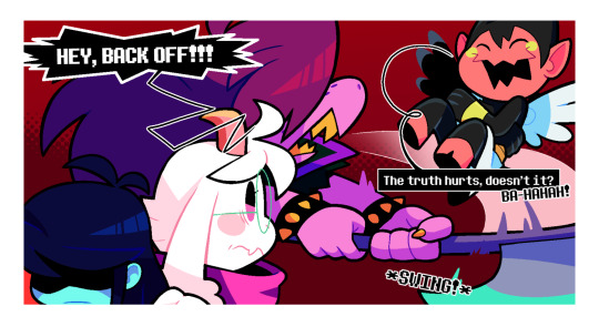
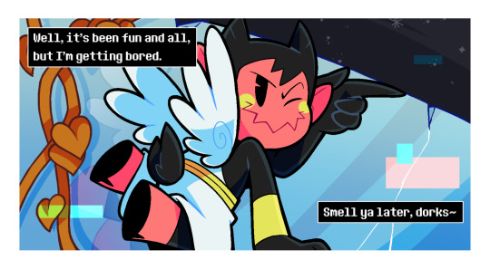
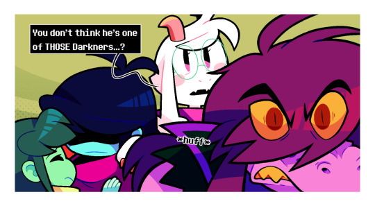
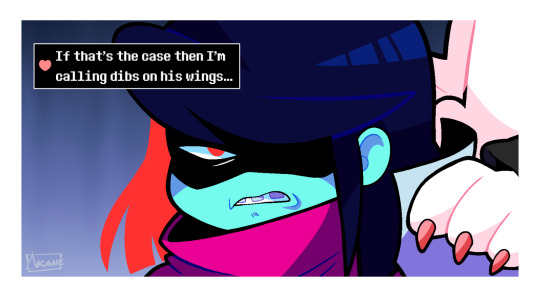
How to be an annoying little jerk 101
FIRST - PREVIOUS - NEXT
MASTERPOST (for the full series / FAQ / reference
#undertale#deltarune#undertale fanart#deltarune fanart#utdr#crossover#crossover comic#twin runes#twin runes comic#kris dreemurr#frisk#ralsei#susie deltarune#I see Susie is continuing the trend of defending Kris from people who try to bully them#in this case most likely because lesslo tries to pull the same stunt she did once#only difference being that for whatever reason it actually seems to be getting to them(?)#whereas with susie they just found it funny when she tried it#buuuuuuut this little freak actually seems to know Asgore very well#and by extension Kris too#sooooooo what's his deal?#those who have scoured the archives might already know who or what he is :)#anyways kris be out for darkner blood now#or whatever the heck they're made of#nobody talks smack about their family
3K notes
·
View notes
Text

Local cowboy gets the tables turned on him
#fanart#hsr#argenthill#argenti#boothill#honkai star rail#this is kind of a continuation to the thing i made with dan heng and boothill lol#boothill hsr#argenti hsr#based on a trend on twt lol#i ship like 7000 diff things depending on mood and the alignment of the moon#its so saturated on my ipad but then on my phone....
4K notes
·
View notes
Text


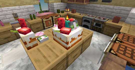
Yum! 🍰 Jellie cake resource pack is now available for download. Get this cute pastrie in your world!
⬇️⬇️⬇️
#resource pack#my pixels#Minecraft#jellie the cat#modrinth took so long to approve this project (understandable since it's holidays)#I submitted it like a week ago but it's finally here yay#continuing my trend of releasing things to the public that have been sitting in my files forever#goodtimeswithscar
1K notes
·
View notes
Text
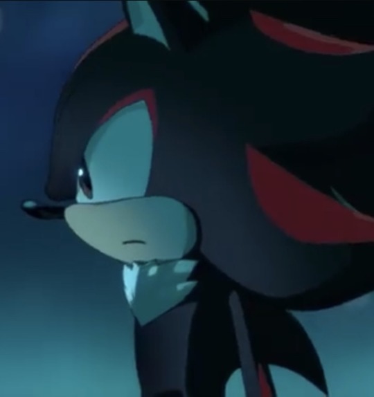
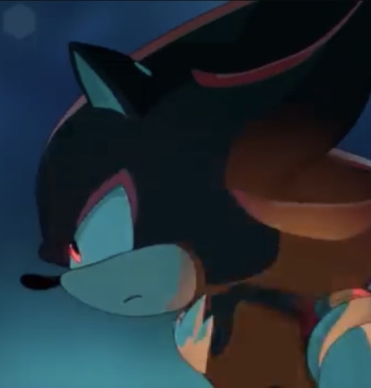
the choice for shadow to have softer brown eyes that only turn that vibrant red when he's using his powers is SOOOOO peak
#orion rambles#its such a cute decision i love it alot#makes me think of that one fan comic where sonic is like#“i'm not arguing with a boy with pretty brown eyes”#i believe sonic prime started that trend and i am so glad to see it continued#shadow dark beginnings#dark beginnings#shadow the hedgehog#sonic x shadow generations#shadow generations
2K notes
·
View notes
Text


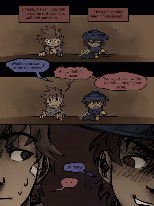


weeeeeeeee it's done!! I had this sketched + planned out wayy before any teasers and stuff were released (maybe you can tell?) but now it's done. yay!
I've just been thinking that since Kai is the only member of the team Jay hasn't met yet after losing his memories, it would be cool if he could maybe play a bigger role in getting him back... like, if Kai plays his cards right he might be able to earn his trust easier?? That's the vague idea.

^^ also plasma
#really if dr continues the trend of giving kai bigger things to do i'll be happy. its always nice to see him being important#ninjago#lego ninjago#ninjago fanart#ninjago dragons rising#ninjago spoilers#jay ninjago#kai ninjago#ninjago dr spoilers
730 notes
·
View notes
Text
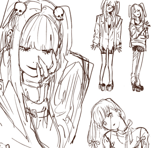
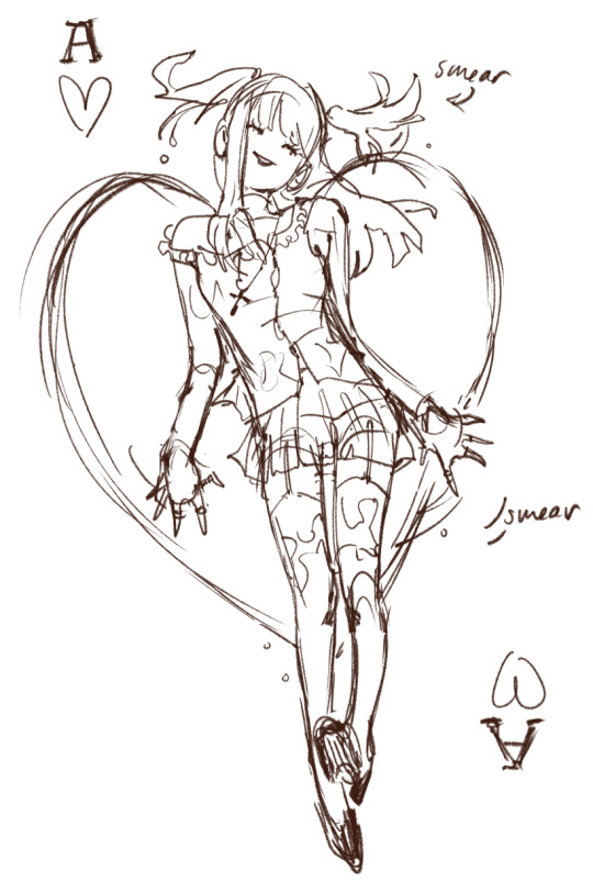
some lil misa misa wips ⋆♡✧⋆♡
#my art#amane misa#misa amane#wip#continuing my trend of drawing majority matsu and misa#can't help it#I just think they're neat#and they're so fun to draw
783 notes
·
View notes
Text


A bit ago I was looking through the g1 timeline wiki and I saw that Skyfire and Starscream now had a 5 million year old age gap and I was like oh? That makes their dynamic so much more interesting especially how innocent he was portrayed in fire in the sky, I also wanted to share my hc on why Skyfire never brought up Starscream again
#fun fact in the marvel comics it was skyfire that was created on earth and the dinobots that were deactivated for millions of years#the marvel comics released alongside the cartoon so thats pretty funny#ik they dont have ages but the concepts are interesting 👀#i dunno i like toxic skystar cause if starscream treats his trine like that I can only imagine how he treated skyfire#like he did look for him but from how fast starscream threw him away did he really like him or did he only like the idea of what skyfire is#I think starscream did think he cared for him in his own way but not in a way skyfire would want to be cared for#after all he did tell skyfire that he would be the second in command when he took over#I think#ehh dont quote me on that its been a while since i watched that episode#I do think Starscream would be like this without Megatron#he deserves the credit for all of the hard work he puts into being a ruthless war criminal smh#am I really going to continue the trend of creating long comics for all of my art that get over 1k notes?#prolly not but I was drawing this comic before I posted that haha#transformers#transformers fanart#transformers g1#skyfire#ratchet#starscream#jetfire#jetstar#skystar#mentioned at least#maccadams#edit I colored in the remaining panels they bothered me too much 😭#and i also changed my caption sorry for editing so much rip
573 notes
·
View notes
Text
Watching it 6 times in the theatres isn’t enough
I need more
‘’As usual have some shots without the text :)


I don’t even wanna know what some of yall will do with this image

#art#my art#fanart#transformers one#transformers#maccadams#optimus prime#orion pax#elita one#elita 1#b 127#bumblebee#badassatron#the mystery of where b heard the word ‘ass’ from continues#this was a trend that I couldn’t pass up#first thing he did upon getting a government job#I still have no idea how to tag for this fandom (#cross posted on tiktok#probably Insta too but I haven’t gotten around to that yet
991 notes
·
View notes
Text


silly little 8 page zine comic for class :)
#continuing the trend of posting shit that has not yet been graded lmfao. this is due next wednesday i just did it really early#skribbles
1K notes
·
View notes
Text
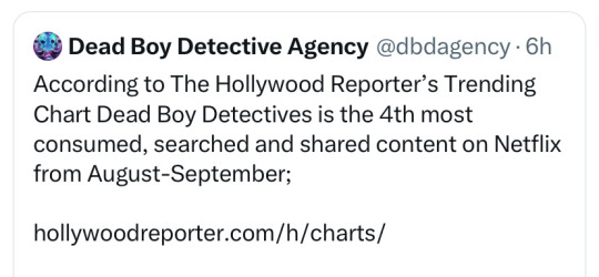

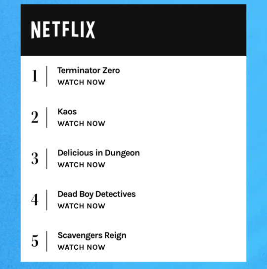
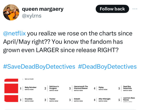
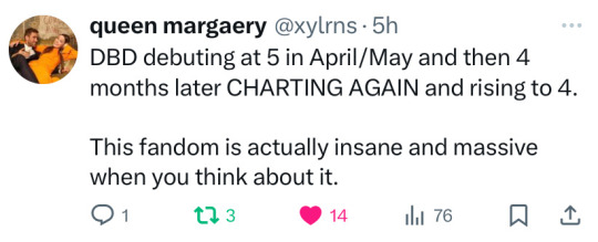
in case you were curious, dead boys did achieve charting again! and i do indeed find it very funny.
#dead boy detectives#note that this is certainly a rise in engagement due to the cancellation. however it's been a month of continued trending.#this report is weekly and tracks viewership hashtags and social media engagement#on twitter the show trends with over 6.5k posts per day#every day
893 notes
·
View notes
Text
Eddie, responding to a fan on a live-stream: Steve and I have been together for forever. We’re like… *trying to come up with a famous couple but can only think of Sid and Nancy*
Steve: Romeo and Juliet…except we didn’t kill each other
Eddie: They don’t kill each other.
Steve: Uh, pretty sure they did.
Eddie:
Eddie: Am I-
Steve: You’re not Romeo. Only one of us can climb a balcony and it’s not you.
#Robin in the comments: You are NOT Romeo and Juliet. you are AT BEST Bert and Ernie#Continuing the trend of Steve being mostly right but just misremembering the minor details#eddie munson tiktok saga#steve harrington#eddie munson
1K notes
·
View notes
Text
I think 90% of my gripes with how modern anime looks comes down to flat color design/palettes.
Non-cohesive, washed-out color palettes can destroy lineart quality. I see this all the time when comparing an anime's lineart/layout to its colored/post-processed final product and it's heartbreaking. Compare this pre-color vs. final frame from Dungeon Meshi's OP.
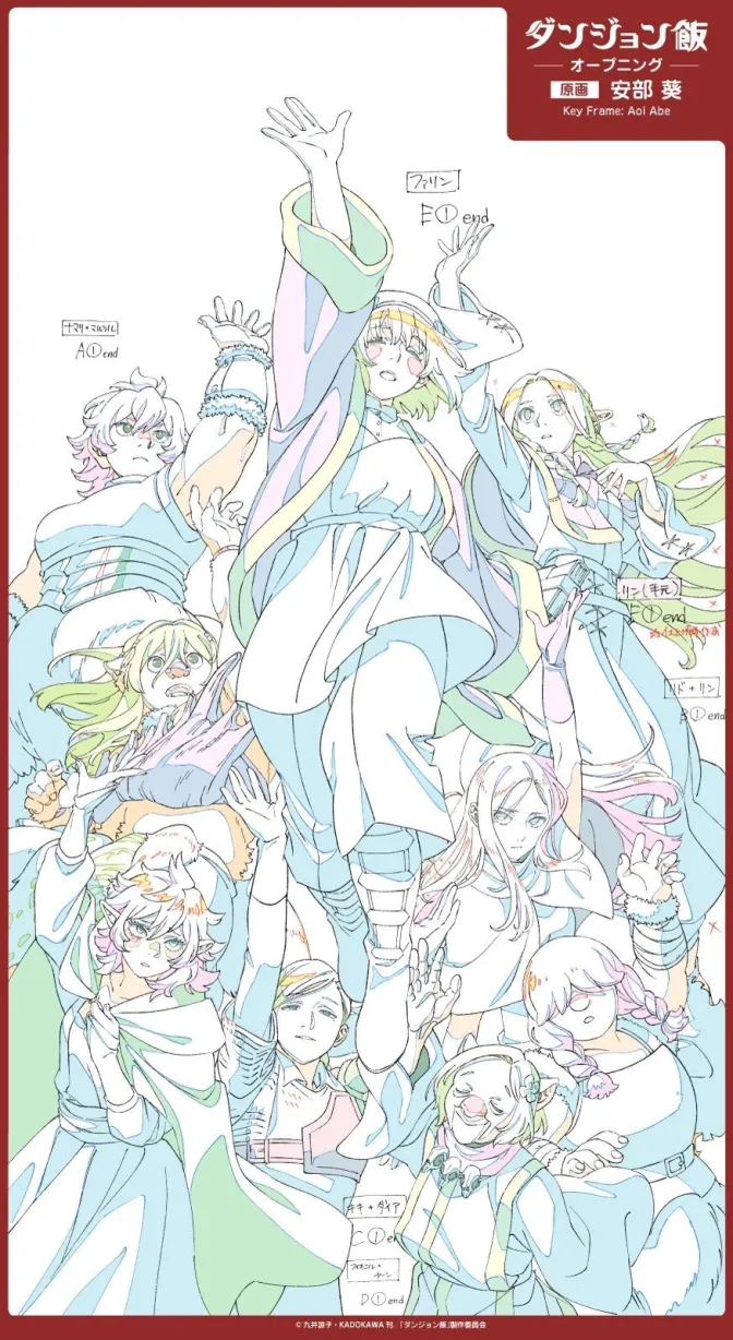
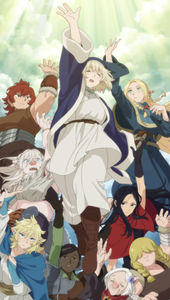
So much sharpness and detail and weight gets washed out and flattened by 'meh' color design. I LOVE the flow and thickness and shadows in the fabrics on the left. The white against pastel really brings it out. Check out all the detail in their hair, the highlights in Rin's, the different hues to denote hair color, the blue tint in the clothes' shadows, and how all of that just gets... lost. It works, but it's not particularly good and does a disservice to the line-artist.
I'm using Dungeon Meshi as an example not because it's bad, I'm just especially disappointed because this is Studio Trigger we're talking about. The character animation is fantastic, but the color design is usually much more exciting. We're not seeing Trigger at their full potential, so I'm focusing on them.
Here's a very quick and messy color correct. Not meant to be taken seriously, just to provide comparison to see why colors can feel "washed out." Top is edit, bottom is original.
You can really see how desaturated and "white fluorescent lighting" the original color palettes are.
[Remember: the easiest way to make your colors more lively is to choose a warm or cool tint. From there, you can play around with bringing out complementary colors for a cohesive palette (I warmed Marcille's skintone and hair but made sure to bring out her deep blue clothes). Avoid using too many blend mode layers; hand-picking colors will really help you build your innate color sense and find a color style. Try using saturated colors in unexpected places! If you're coloring a night scene, try using deep blues or greens or magentas. You see these deep colors used all the time in older anime because they couldn't rely on a lightness scale to make colors darker, they had to use darker paints with specific hues. Don't overthink it, simpler is better!]
#not art#dungeon meshi#rant#i'm someone who can get obsessive over colors in my own art#will stare at the screen adjusting hues/saturation for hours#luckily i've gotten faster at color picking#but yeah modern anime's color design is saddening to me. the general trend leans towards white/grey desaturated palettes#simply because they're easier to pick digitally#this is not the colorists fault mind you. the anime industry's problems are also labor problems. artists are severely underpaid#and overworked. colorists literally aren't paid enough to do their best#there isn't a “creative drought” in the anime industry. this trend is widespread across studios purely BECAUSE it's not up to individuals#until work conditions improve anime will unfortunately continue to miss its fullest potential visually#don't even GET ME STARTED ON THE USE OF POST-PROCESSING FILTERS AND LIGHTING IN ANIME THOUGH#SOMEONE HOLD ME BACK. I HATE LENS FLARES I HATE GRADIENT SHADING I HATE CHROMATIC ABBERATION AND BLUR
2K notes
·
View notes
Text
Incapable of not bragging on myself after today. My store sold 16K in beds between four people.
12K of that was me.
#ramblies#really lovely folks all day#continuing the trend from yesterday but if it weren’t for the hours I’d just be stoked about my job because I’m good at it and I genuinely#like helping people sleep better#I’m just also so damn tired
575 notes
·
View notes
Text


lando norris 🤝 celebrating a race win by getting shirtless
671 notes
·
View notes