#This applies to pretty much all versions
Explore tagged Tumblr posts
Text
Speed Racer is a franchise about how the evils of capitalism and international terrorism are defeated by the power of car themed autism
#Speed Racer#Speed Racer 2008#Speed Racer 1967#This applies to pretty much all versions#Speed himself is like autism incarnate in every continuity
40 notes
·
View notes
Text
Do you think that Usagi cries when one of the turtles plays Can You Feel the Love Tonight by Elton John for him?
#I’m talking the full version with the lyrics that very much apply to him#tmnt#katanashipping#leosagi#I don’t think so tbh but I do think he gets pretty emotional#he finally found the person he can feel all those things with and he’s very. just not quite crying but eyes wet about that as he listens#I just realized like yesterday that him listening to that song isn’t that out of the question
28 notes
·
View notes
Text
someone should've just bonked xue yang on the head like an old TV maybe it woulda fixed him
#alternatively he was bonked Too much and thats why hes like that#not really hes like that for [insert reason here]#xy#xue yang#he is pinned to my wall like a butterfly. or perhaps a beetle#if i wasnt so attatched to my current icon i'd rebrand. but alas. yanli pretty#mo dao zu shi#cql#mdzs#the untamed#it applies to all versions#a-qing should do the bonking btw
33 notes
·
View notes
Text
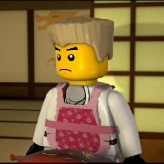
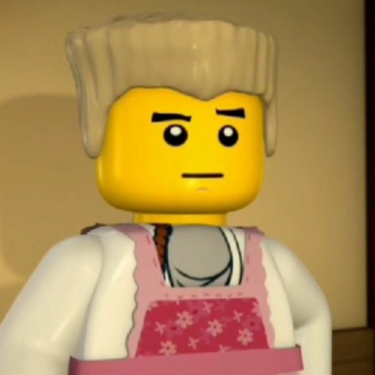
still haven't moved on from zane in this episode (aka I hit tag limit again and am unhappy about it)
#alek insanity#not gonna main tag this but prepare for a tiny rant#home is actually really good zane characterization and its super cool to me how it holds up to this day#s1 characterization is very specific to me because the behaviors displayed by the ninja there (mostly) isnt bc thats how they really are but#its due to societal pressure. cole originally being more 'stone faced tough guy' -> 'down to earth' -> 'really sensible easy to talk to guy'#is because hes always been a sensitive guy... but he felt he couldnt express that true version of himself. thats the whole thing behind his#true potential. jay going from s1 -> s6 -> now is less of societal pressure and more teenager figuring himself out but it still applies. ish#seeing how much the ninja have changed or grown from then to now is amazing because back then they all wore masks. they didnt know each#other all that well. but theyve gained that comfortability with each other and also have grown and matured as people#some seasons / eps characterization for certain people im not a fan of (lloyds random misogyny arc in s13) but i mean the overall trend here#and then there is zane. zane in home was pretty dead on to how he behaves now (at least... when it comes to his faults?) and i dont want to#say people skim over that but i am the sf proclaimed n1 s1e2 fan and overthink every scene. zane's early characterization is some of my fav#for him period. he also goes through a ton of traumatic stuff and a ton of bad writing bouts but why he acts so 'weird' or 'distant' has#always been a thread sewn in. he changed so much he stayed the same in a way... if that makes sense. -> ohhh the ninja get mail and he#doesnt? oh he has no family? he quite literally walks away from that situation. oh the ninja are yelling in his face and asking whats wrong#with him? he literally walks away from that situation. he says its to follow the falcon but seeing how he apologized to them by not only#baking a ton of pies (cough... the food fight is what led to him leaving at first) but he also found them a whole entire new house.#zane is unable to truly value what he does for others. insert him in s11 saying he 'tried' to fufill his goal of protecting others.#everything he has ever done still isnt good enough. then the ninja tried to apologize and he didnt really... let them.#that one post about characters putting on facades and that facade being how people really see them. even in fandom. thats zane to me#the guy who lies about being upset and avoids his problems ran away after being yelled at? and he said he wasnt really mad? that is a lie!!#him being a ~360 when it comes to his character development is neat to me because he never hid behind a mask in the same way the others did#cole wanting to seem tough vs being really soft? kai wanting approval so bad he starts being selfish? kai isnt selfish usually!#he is self centered but that is a whole different thing. just wanting to fit in and breaking free of that. zane's true potential came in the#form of 'i finally know why i am not normal' instead of 'i will be my true self'. zane never pretended to not be weird#(instert book) states he literally didnt know why people got mad at him. he just existed and it was 'wrong'. the mask he hid behind was#avoidance. he was pretty open about how he actually was (most of the time). when he was upset he would audibly sigh and walk away lol#but for him saying he wasnt upset / saddened by the ninja... it felt like a moment of selflessness. if that makes sense. he blamed himself#for the monestary burning down. so he didnt deserve the apologies (ish) in the virtues of spinjitzu zane is shown as the generous one iirc#he puts the needs of others over his own. he will bear whatever burden he needs if others are happy. at that same time he doesnt allow
18 notes
·
View notes
Note
Hello Favour :) I wanted to ask if you had any tips for poses and expressions? I found your art from the aggie (is that how its spelled?) event and Im OBSESSED! Your arts phenomenal, and your poses are so expressive! :D
Have a great day and thank you <3
HI HUNTER !!! sooo glad u enjoy my art i am honored . . . . for the aggie sketch i . i honestly just picked up this reference pic from pinterest xD literally spent an hour before the aggie planning that sketch out, searching for other pieces that had a sorta soft and sweet vibe and leaving those open alongside the ref so i can "Absorb it into my brain"

for tips regarding poses and expressions... IM JUST REALLY PICKY WHEN PICKING OUT REFERENCES TBH 😭😭 Like i wont stop searching until it fits the mental image i have and until it has the feelings im trying to convey in the piece . i also frequently use statues as inspiration too ig . went ham with explaining my thought process in the tags btw i got shyyy ^_^
#asks for ain#IS THIS ANYTHING . im reaaaaally bad at giving tips for poses n expressions SAWRRY#I DONT HAVE ANY PREPARED ADVICE WHEN IT COMES 2 THESE. I CAN ONLY PROVIDE MY THOUGHT PROCESS OTL#ITS BC BC . I SWEAR ITS JUST MY PERSONAL TASTE THAT MAKES ME LEAN TOWARDS THESE KINDS OF POSES YK#AND WHEN IT COMES TO EXPRESSION I JUST THINK OF WHAT FEELING IM TRYING TO MAKE THAT CHARACTER CONVEY#OR WHAT I WANT THE OVERALL PIECE TO FEEL LIKE#actually that can apply for how i think abt poses too#especially for ship art im very particular about how the characters should interact n where their hands should go#i think hands r important ....#also feelings . what u want ur viewer to feel when looking at the piece ur making i put so much thought into feelings ....#im mostly using duo pieces as an example here but it can also work for solo chara sketches tbh .....#like i think about what part of the character i wanna emphasize#most of the time i show off the face bc . well i think i draw pretty faces DFJHFGDF#but other times i might wanna show off a part of their body instead#like with pieces w scar sometimes i want to show off the Scitties . or his Abs . so i figure out a pose that emphasizes those ....#the focal point of the piece ..... bc i want u to LOOK there yk#but i also think about the attitude of the character and how they act ... if they're charming or smug or serious etc etc#gotta keep them Sorta in character after all (a bit of ooc is fine . as a treat . and if done well LOL)#im ESPECIALLY picky w how i interpret my characters too... very particular with my version of them that lives in my head#Understanding of anatomy would help lots too#forgot 2 mention that im an anatomy FREAK i love obsessing over proportions and getting them right and making them look nice#ANYWAYS U PROBABLY ALREADY KNOW ABOUT THESE GYAAAAA but still ..... i hope it makes u think about poses and expressions differently .......#like in a POSITIVE WAY !!! its sm fun to think abt poses and expressions tbh u can fit a lot of meaning into even the subtlest of details#tldr IM PICKY AND I OVERTHINK ^_^
13 notes
·
View notes
Text
tbh the thing that bothers me most about the prequels isn't so much that they exist (though it does baffle me, some of them are pretty good tho) but that the music doesn't match the actual game's at all. like. sequels consistently remix the original game's music. prequels don't do that at all. even for, like, fillbots, shoot-'em-up and micro-row, where the sequels' music is basically identical to the original's. none of the prequels have music that matches the actual game's. ,,, which actually makes sense given that prequel rhythm rally's music has test in it file name i'm pretty sure klsdfjfldksdfjdfsfs-
#puppy rambles#rhythm hell#megamix#doesn't apply to megamix's prequels. at least not as much#lumbearjack 2 and second contact kind of remix lumbearjack and first contact's music. kind of#catchy tune 2 and fruit basket 2 don't really remix catchy tune and fruit basket's though-#granted i'm actively listening to rhythm heaven music so. gimme a second actually#... yeah okay no catchy tune's music sounds completely different from catchy tune 2's#fruit basket's is closer to fruit basket 2 but still not sure if it's a remix of it in the same way as sequels usually are#me over here just casually pulling up rhythm heaven songs in my brain klsfdjkfdlsjsfdfdskjfsd-#anyways i like a good amount of the prequels actually. honeybee land's are all pretty good#machine land's. aren't as great. all of the prequels for megamix's new games are good tho#citrus land's good apart from prequel clappy trio i hate prequel clappy trio istg. prequel shoot-'em-up n micro-row are v good tho#barbershop land has prequel rhythm rally n prequel sneaky spirits. but also prequel flipper-flop and lumbearjack. so#win-lose situation there-#the prequels baffle me cuz it's like. are they trying to target megamix towards new fans or old fans#cuz it feels like both. like. they have easier versions of existing games. but also it's mostly returning games. so???#... though also i don't think they know what games the fandom actually wants klsdfjdfsklfjfdslkjfds-
3 notes
·
View notes
Text
When you put it this way, it's like a Mary Sue traumatic backstory fanfic.
Which proves that cringey traumatic backstories are just baked into our DNA. 😂
Look, we joke a lot, but really, "you were born evil, wretched, worse than the scum of the earth, and it took killing a god to make you salvageable, so now you'd better be grateful to that god and thank him 10,000 times a day for it and fill your thoughts with him 24/7 and abide by the letter of his every word, lest you suffer unimaginable torture for all of eternity" is a truly horrendous thing to believe about yourself and other people
#humor#idk tho i literally don't care#i think it's funny that there's so much hate over this little set of stovepiped off-brand Christian sect beliefs#but none over other religions#i just think if we're gonna make such a big deal over one of them then we should apply the hate and distain equally to all#drag all the religions through the mud#they're not more special or better than the flavor in this post#all the other religions have equally bizarre and problematic beliefs#this little version of Christianity is not particularly special or interesting#anyway having the basis of your religious 'history' being the so-called 'killing of a god' goes pretty hard core actually#I'd sign up to that one based on cool points alone..😂😂😂
59K notes
·
View notes
Text
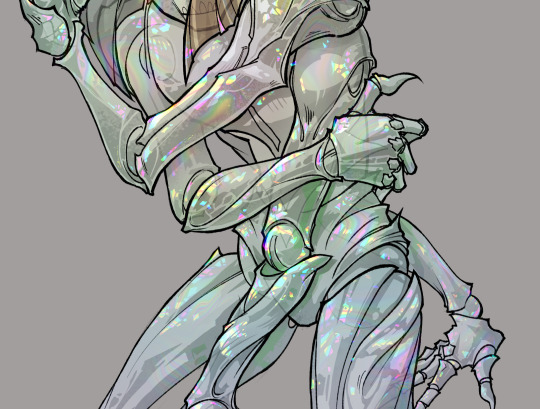
gonna show u guys a little opalescent highlight hack i threw together today
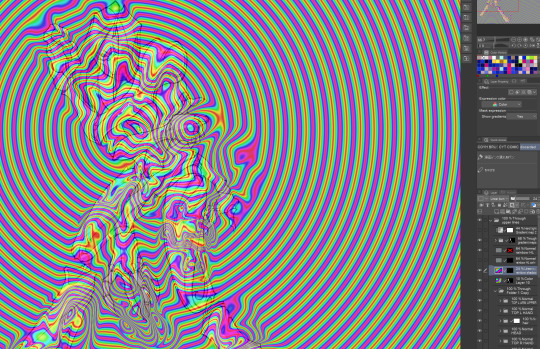
rainbow gradient above your main figure (i usually have all my main figure folders/layers in one big folder, so i can clip gradient maps + adjustments to it!). liquify tool to push the colors around a bit. STAY WITH ME I KNOW IT LOOKS STUPID RN I'M GOING SOMEWHERE WITH THIS
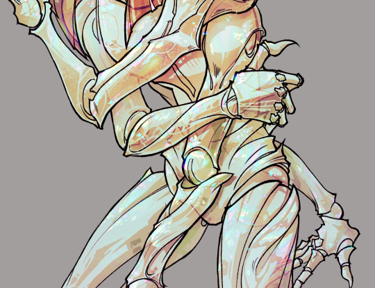
THEN: set it to add/glow (or the equivalent in ur drawing program), lower the opacity a bit, and apply a layer mask. then u can edit the mask with whatever tools you like to create rainbow highlights!!
in this case i'm mostly using the lasso fill tool to chip out little facets, but i've also done some soft airbrushing to bring in larger rainbow swirls in some areas. it's pretty subtle here, but you can see it better when i remove the gradient map that's above everything, since below i'm working in greyscale:
more granular rambling beneath the cut!
u could also just do this with a brush that has color jitter, but what i like about using layer masks for highlight/shading layers is how simple and reversible it makes everything. i can use whatever brushes i want, and erasing/redoing things is super low stakes, which is great when i often approach this stuff with a super trial-and-error approach.
example: have u ever thrown a gradient w multiple colors over an entire piece, set it to multiply etc, and then tried to erase it away to carve out shadows/highlights? it's super frustrating, bc it looks really good, but if u erase something and then change ur mind later, u basically would have to like. recreate the gradient in the area u want to cover up again. that's how i used to do things before figuring out layer masks!! but masking basically creates a version of this with INFINITE undo bc u can erase/re-place the base layer whenever u want.
anyway, back to rambling about this specific method:
i actually have TWO of these layers on this piece (one with the liquified swirls shown above, and another that's just a normal concentric circle gradient with much broader stripes) so i can vary the highlights easily as needed.
since i've basically hidden the rainbow pattern from myself, the colors in each brushstroke i make will kind of be a surprise, which isn't always great -- but easily fixable! for example, if i carve out a highlight and it turns out the rainbow pattern in that area is way too stripey, i can just switch from editing the mask to editing the main layer and blur that spot a bit.
also, this isn't a full explanation of the overall transparency effect in these screencaps! there's other layer stuff happening below the rainbow highlights, but the short version is i have all this character's body parts in different folders, each with their own lineart and background fill, and then the fill opacity is lowered and there's multiply layers clipped to that -- blah blah it's a whole thing. maybe i'll have a whole rundown on this on patreon later. uhhh i think that's it tho! i hope u get something useful out of this extremely specific thing i did lmao
12K notes
·
View notes
Text
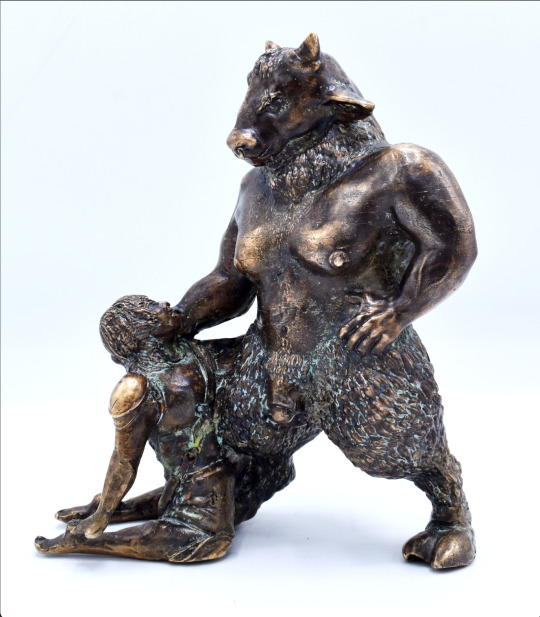


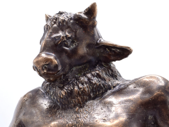
T4TM (Theseus4TheMinotaur)
lost wax cast bronze, patina & paste wax
2023
(process photos & info under cut <3)
my minotaur boy!! pls click on the photos for higher res! my thesis is focusing on trans men and creatures (how original ik) and this was last semester's final. i spent a lot of time looking at sculptures of the theseus/minotaur story, and yknow? a LOT of them are erotic! i'm pretty sure i saw some of them on tumblr a decade ago, and that's led to this now!
as you'll notice, the minotaur has a big t-dick! i wanted to give him breasts and an enlarged clitoris to present a very masculine trans figure. the boy on the bottom is also trans because i say so . the piece is about looking up to older, bigger, hairier trans men and seeing something awe-inspiring and beautiful. the minotaur was locked up by a cruel father for being different, and i think modern adaptations tend towards a sympathetic asterion (his name in one version)
making this piece was. so much effort. it took me about 3 months to get it all together - from clay model (plasticine) to 3D print to silicone mold to wax cast, and finally bronze pour into the shell mold. and then a TON of filing, sanding, dremel-ing, and various other metalworking techniques that probably took years off my life.
i started with sketches and made theeeeeee ugliest model ever:

then used a 3D scanner to get it digital, then spent a goooood month or two making him pretty in blender! then i spent an agonizing few weeks trying to get it print-ready, and fiiiiiinally did

^^^ an early resin printed draft of the model - you can see in the final that i added lots to theseus after some feedback, but sadly the nosering broke off every time i cast it so i just. let that be <3
then came the moldmaking, and then the wax dipping!! the yellow stuff is shell mold (ground up ceramic bits and algae soup, sticks to the wax, then silica sand in varying sizes on top) which gets the wax melted out, and bronze poured in!


then it's all metalworking, cutting stuff off, and working with hot metal. they don't tell you about all the bronze dust and how annoying it gets wearing a respirator AND goggles. but it is for me health, me boy. here's him all cleaned up before the patina:

and then i spray him down with various chemicals to make it "patina" (aka rust) in pretty colors. wait a few days, then apply paste wax to seal it and give it that shine!
then we get what you see above!!! the blue was actually unintentional, and i'm still not super sure why it looks that way.. but it's pretty so idc <3
thanks for reading!! if you ever have any bronze/casting questions, don't hesitate to message me! <3
#artists on tumblr#bronze sculpture#sculpture#greek myth art#queer artwork#jays0n arts#trans ftm#thanks for reading if you did! i put a lot of work into this project#it's defffff not perfect but i'm proud of what i did!!#if ur curious: my next one is a werewolf w his pussy out :)
8K notes
·
View notes
Note
imagine like simon goes into some sort of surgery and has to be put under anesthesia, and when he gets out hes like still high asf on it 💀 and hes being a lil silly goose
okay this is such a cute idea omg, this is 100% based off that tiktok audio where it's like "my wife wouldn't like you touching me like that" "i AM your wife."
thank you so much for the request nonnie, a forehead kiss for you MWAH MWAH
simon 'ghost' riley x reader
wc: 563
warnings: none really, lots and lots of that good ol fluff, mentions of surgery, goofy simon, maybe a little ooc simon (he's high so it's fine)
a/n: i hope this is okay, i'm feeling a bit rusty with my writing but i've finally got back some motivation and energy to do so after the past two months of low energy and bad mental health. if you guys want to know a bit more about it and my mental health (i don't see why anyone would but lmao) let me know, i don't mind making a post about it if you guys want an explanation of some sort or whatever. anywho, sorry this is so short but i hope you still like it!! <3
a/n 2.0: i recently applied for a part time job at a bookstore so y'all pray for me that i get this job because i want it so bad. i am just gonna decide that i WILL get this job, because why wouldn't i?
simon had been out of surgery for just over an hour now, being a soldier you 'd think perhaps he was going under surgery for some kind of wound he had inflicted upon him on the battlefield but no, he was just getting his tonsils removed after a bad bout of tonsillitis ended up with him developing really bad tonsil stones.
so here you were, waiting by his bedside for him to wake up. the doctor and nurses reminded you just as he had gotten out that he may still be a little, well loopy, off of the meds depending on how quickly he woke up. you waited in a chair at his bedside, reading a book when you heard the blankets of the bed rustling just a little.
looking up from your book you see simon starting to wake up and you reach out to grasp his hand, only for him to rip it away from you when his eyes were fully opened.
"uh, si? you okay, hon?" you ask gently, maybe he just wasn't feeling too well after waking up, or perhaps he wasn't wanting physical touch, that happened quite often and you always respected that space he may want when he wanted it.
"don't call me that." simon said, voice hoarse and scratchy from the surgery, he sounded a little angry.
"what?" you questioned, this wasn't like simon, you couldn't understand why he wouldn't want you speaking like this to him.
"i'm taken."
"i know." you replied with a short laugh.
"you should be touching me like that then."
it hit you then, he was woozy from the meds and didn't recognize you. the realization made you laugh a little more. you decided to have a bit of fun with this high version of your boyfriend.
"sorry about that simon. wanna tell me about your partner?"
"oh, (name)? they're amazing, you know they're so pretty. and they're funny too. they always know how to make me feel better, i miss them." simon replies, ranting and raving on and on to you about his partner, about you.
"you love them a lot, don't you?" you ask him with a smile, it felt so nice to hear all these lovely things about yourself, your boyfriend clearly unfiltered by the effects of the anesthesia he was under.
sure he definitely said sweet things to your face, but something about hearing it when he was basically high as shit made your heart pound a little more.
"i love them with my whole heart." simon replies, a goofy little smile on his face.
you can't help but reach out to gently caress his face at those words, body filling up with some much adoration for the soldier in front of you.
"hey! what did i say about touching me. i have a partner!" simon scolds, trying to dodge your touch.
"simon, love... i am your partner. it's me, (name)." you reply with a laugh.
simon takes a good long look at you when you tell him this, he stares at you, looks you up and down before letting out a soft and quiet "oh."
you begin to hear the beeping of his heart rate monitor speed up, his cheeks turning slightly pink as he stares up at you.
you couldn't help but laugh a little more at this. what a sweet idiot. your sweet idiot.
#ghostedéabha#éabha writes#éabha's 💌#ghostedéabha: ghost#ghostedéabha: simon riley#simon ghost riley fluff#simon ghost riley x reader#simon riley x reader#ghost x reader#ghost x reader fluff#ghost riley x reader#awnie's amazing nonnies💞
8K notes
·
View notes
Text
hey......what if. instead of tumblr making their own gaiaonline avi things......what if we just went to gaia online.......
#/mostly j but like#the site is Fucking Dead. the reason people left is because the creators. i think were forced to sell out? but they have the rights back.#they sold out either way. forced or not. and the new-old owners made changes that everyone hated & added stuff that completely obliterated#the economy. granted the economy is still fucked. and the best way to make money requires dedicating like 10 minutes out of your day#to find & collect all the daily rewards (there are a handful of forum posts that have all the dailies listed). most are items. few are good#some are money! or u can play one of their games thru like. an ancient version of WaterFox (firefox sister) & an old version of adobe flash#or thru adobe Air and thru gaia's very own app. which is ''being updated'' as of 2021......#i found it hard 2 play thru waterfox- the lag was fucking astronomical. it was gut-wrenchingly horrible. tho that might just b my experienc#the app is a lot easier to work with but the amt of gold/plat is usually wrong whenever i boot it up lol. either tells me an amt from like#a month ago. or it just tells me a completely bogus amt lmao. making money thru their game is its own struggle tho.#but besides selling stuff in the marketplace. there isn't really any other way to get money.#tl;dr the economy on gaia is still fucked. and to get anything good you have to commit to logging in daily. and even then it's gonna#take a while. But The Avis Are Cute. and imo they could use the traffic lmao#tho if yall DO decide to throw some traffic their way if ur old enough & qualified apply for mod/admin jobs bc their staff is TINY rn.....#it's pretty much ur average anime-centric forum. no frills. no glitter. just a good old-fashioned forum site lol#so hey..........maybe give gaia a try? ...... /not j?#like unless there are problems that i am completely oblivious to. tbf i dont spend a ton of time on there lmao. i'm in & out for the dailie#orignaletti
0 notes
Text
My Favorite Cheap Art Trick: Gradient Maps and Blending Modes
i get questions on occasion regarding my coloring process, so i thought i would do a bit of a write up on my "secret technique." i don't think it really is that much of a secret, but i hope it can be helpful to someone. to that end:

this is one of my favorite tags ive ever gotten on my art. i think of it often. the pieces in question are all monochrome - sort of.
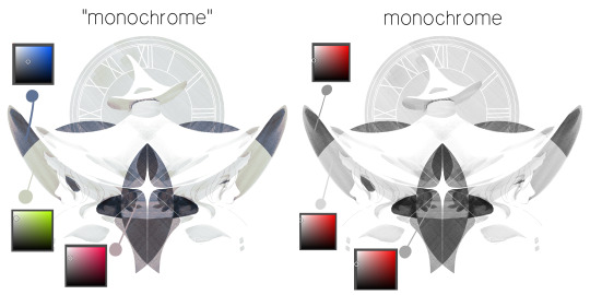
the left version is the final version, the right version is technically the original. in the final version, to me, the blues are pretty stark, while the greens and magentas are less so. there is some color theory thing going on here that i dont have a good cerebral understanding of and i wont pretend otherwise. i think i watched a youtube video on it once but it went in one ear and out the other. i just pick whatever colors look nicest based on whatever vibe im going for.

this one is more subtle, i think. can you tell the difference? there's nothing wrong with 100% greyscale art, but i like the depth that adding just a hint of color can bring.
i'll note that the examples i'll be using in this post all began as purely greyscale, but this is a process i use for just about every piece of art i make, including the full color ones. i'll use the recent mithrun art i made to demonstrate. additionally, i use clip studio paint, but the general concept should be transferable to other art programs.

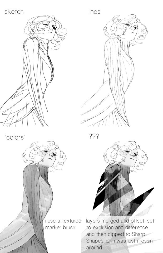
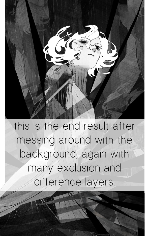
for fun let's just start with Making The Picture. i've been thinking of making this writeup for a while and had it in mind while drawing this piece. beyond that, i didn't really have much of a plan for this outside of "mithrun looks down and hair goes woosh." i also really like all of the vertical lines in the canary uniform so i wanted to include those too but like. gone a little hog wild. that is the extent of my "concept." i do not remember why i had the thought of integrating a shattered mirror type of theme. i think i wanted to distract a bit from the awkward pose and cover it up some LOL but anyway. this lack of planning or thought will come into play later.
note 1: the textured marker brush i specifically use is the "bordered light marker" from daub. it is one of my favorite brushes in the history of forever and the daub mega brush pack is one of the best purchases ive ever made. highly recommend!!!
note 2: "what do you mean by exclusion and difference?" they are layer blending modes and not important to the overall lesson of this post but for transparency i wanted to say how i got these "effects." anyway!
with the background figured out, this is the point at which i generally merge all of my layers, duplicate said merged layer, and Then i begin experimenting with gradient maps. what are gradient maps?
the basic gist is that gradient maps replace the colors of an image based on their value.

so, with this particular gradient map, black will be replaced with that orangey red tone, white will be replaced with the seafoamy green tone, etc. this particular gradient map i'm using as an example is very bright and saturated, but the colors can be literally anything.
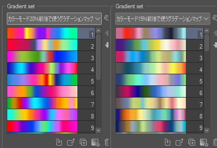
these two sets are the ones i use most. they can be downloaded for free here and here if you have csp. there are many gradient map sets out there. and you can make your own!
you can apply a gradient map directly onto a specific layer in csp by going to edit>tonal correction>gradient map. to apply one indirectly, you can use a correction layer through layer>new correction layer>gradient map. honestly, correction layers are probably the better way to go, because you can adjust your gradient map whenever you want after creating the layer, whereas if you directly apply a gradient map to a layer thats like. it. it's done. if you want to make changes to the applied gradient map, you have to undo it and then reapply it. i don't use correction layers because i am old and stuck in my ways, but it's good to know what your options are.

this is what a correction layer looks like. it sits on top and applies the gradient map to the layers underneath it, so you can also change the layers beneath however and whenever you want. you can adjust the gradient map by double clicking the layer. there are also correction layers for tone curves, brightness/contrast, etc. many such useful things in this program.
let's see how mithrun looks when we apply that first gradient map we looked at.

gadzooks. apologies for eyestrain. we have turned mithrun into a neon hellscape, which might work for some pieces, but not this one. we can fix that by changing the layer blending mode, aka this laundry list of words:

some of them are self explanatory, like darken and lighten, while some of them i genuinely don't understand how they are meant to work and couldn't explain them to you, even if i do use them. i'm sure someone out there has written out an explanation for each and every one of them, but i've learned primarily by clicking on them to see what they do.
for the topic of this post, the blending mode of interest is soft light. so let's take hotline miamithrun and change the layer blending mode to soft light.

here it is at 100% opacity. this is the point at which i'd like to explain why i like using textured brushes so much - it makes it very easy to get subtle color variation when i use this Secret Technique. look at the striation in the upper right background! so tasty. however, to me, these colors are still a bit "much." so let's lower the opacity.
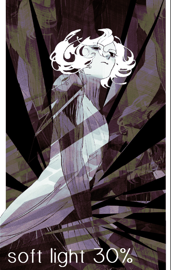
i think thats a lot nicer to look at, personally, but i dont really like these colors together. how about we try some other ones?
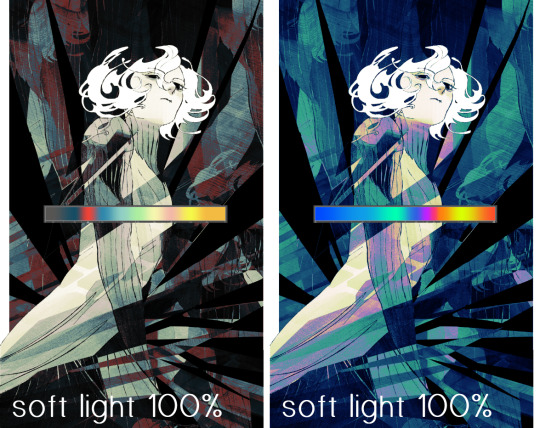
i like both of these a lot more. the palettes give the piece different vibes, at which point i have to ask myself: What Are The Vibes, Actually? well, to be honest i didn't really have a great answer because again, i didn't plan this out very much at all. however. i knew in my heart that there was too much color contrast going on and it was detracting from the two other contrasts in here: the light and dark values and the sharp and soft shapes. i wanted mithrun's head to be the main focal point. for a different illustration, colors like this might work great, but this is not that hypothetical illustration, so let's bring the opacity down again.
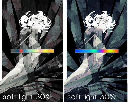
yippee!! that's getting closer to what my heart wants. for fun, let's see what this looks like if we change the blending mode to color.
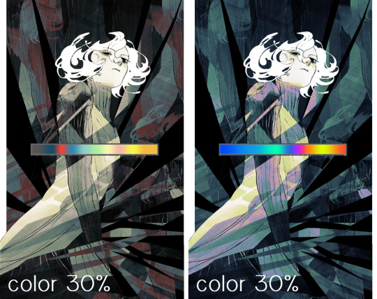
i do like how these look but in the end they do not align with my heart. oh well. fun to experiment with though! good to keep in mind for a different piece, maybe! i often change blending modes just to see what happens, and sometimes it works, sometimes it doesn't. i very much cannot stress enough that much of my artistic process is clicking buttons i only sort of understand. for fun.
i ended up choosing the gradient map on the right because i liked that it was close to the actual canary uniform colors (sorta). it's at an even lower opacity though because there was Still too much color for my dear heart.
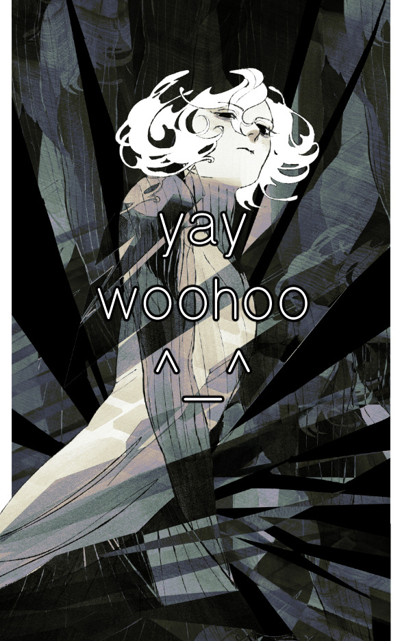
the actual process for this looks like me setting my merged layer to soft light at around 20% opacity and then clicking every single gradient map in my collection and seeing which one Works. sometimes i will do this multiple times and have multiple soft light and/or color layers combined.
typically at this point i merge everything again and do minor contrast adjustments using tone curves, which is another tool i find very fun to play around with. then for this piece in particular i did some finishing touches and decided that the white border was distracting so i cropped it. and then it's done!!! yay!!!!!
this process is a very simple and "fast" way to add more depth and visual interest to a piece without being overbearing. well, it's fast if you aren't indecisive like me, or if you are better at planning.

let's do another comparison. personally i feel that the hint of color on the left version makes mithrun look just a bit more unwell (this is a positive thing) and it makes the contrast on his arm a lot more pleasing to look at. someone who understands color theory better than i do might have more to say on the specifics, but that's honestly all i got.
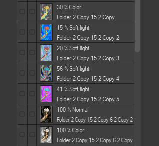
just dont look at my layers too hard. ok?
2K notes
·
View notes
Text
more gentleman thoughts, nsfw version 🫧 please read responsibly. f! reader ˚୨୧⋆。˚ ⋆
gentleman! dazai, who always knows the right words to say that’ll turn you on. whose long, slender fingers reach all the right spots in you, one by own inserting them until he has you stuffed. who gets you cumming from his fingers alone, but doesn’t stop there, hooking your leg over his shoulder and slipping his cock all the way in with no resistance. who can be sweet and slow or rough and fast- just tell him what you want, and he’ll give it to you. “good job, belladonna. already so wet, hm? i’ll make you feel so good.”
gentleman! chuuya, who gives you the most satisfying love life known to man. who, minimum, makes you cum 2 or 3 times before he fucks you. who sets the mood- candles, roses, and if you’d like, handcuffs, blindfolds, chokers… who absolutely defiles all of that beauty the second he feels you wrapped around him, pounding you hard and fast, getting off to the sounds of your pleas. who makes you cum from his length alone, making you dizzy with pleasure while he bends you over the counter. “comme ça, chérie? you feel so good. you’re not getting any sleep tonight.”
gentleman! ranpo, who drags out your orgasms. who wants to make you feel everything. who’ll kiss your pretty pussy through your panties first, watching how your arousal stains the fabric. who’ll slowly peel it away, making sure you feel his warm breath on you before finally putting his mouth on you. who wont move his head from between your thighs until your gushing, singing his name. who makes sure you cry out that he’s the best, that only he can make you feel this good. “you like that, sweetheart? hm? oh, i know i’m the best at it. here, let me prove it.”
gentleman! atsushi, who at first may not be the most experienced, but who learns how to get you screaming and moaning for him. who doesn’t fuck, only making love and making your pussy pulse with pleasure. who solely focuses on you, eating you out, for hours, softly kissing and sucking at your breasts, before finally slipping his cock into you. who thrusts rough and passionate, growling into your ear with an animalistic side thats expected of a tiger. who groans as you scratch his back, getting you into a mating press while he takes you. “c’mon, baby. just one more, please? you feel so good.” he’s said ‘one more time’ 3 times already.
gentleman! akutagawa, who blurs the lines between a gentleman and a pure, asshole. who wraps his hand around your throat, lightly applying pressure while he thrusts in and out of you. who gets you lightheaded, kissing your collarbone and placing a playful smack to your thigh while he fucks you. who makes you earn his praise, cumming around his cock before he even thinks about saying something nice. who leaves bruises, and tends to them after. “if you didn’t want me to spank you, why did you moan and ask for more? hm?l
gentleman! odasaku, who is perhaps the sweetest lover you have ever known. who honestly feels bad about ruining you, but can’t resist the way your makeup runs down your cheeks while he thrusts in and out. who runs his hands through your hair, tugging at it occasionally to pull your head back, leaving kisses and hickeys on your throat. who often books nice hotel rooms, but (much like chuuya) can make your apartment just as romantic. who is the king of aftercare, getting you anything you need, running you a bath, and reading to you while you fall asleep. “ah, so good, love. i’ll make you cum, i’ll take care of you. trust me?”
#bungou stray dogs#bsd x reader#bsd chuuya#bsd dazai#osamu dazai x y/n#osamu dazai x you#dazai smut#bsd dazai x reader#osamu dazai x reader#dazai x fem reader#dazai x you#dazai x y/n#dazai x reader#chuuya x fem!reader#chuuya x y/n#chuuya x you#chuuya x reader#chuuya nakahara x reader#ranpo x reader#ranpo x you#ranpo x y/n#bsd smut#atsushi x reader#akutagawa x reader#odasaku x reader#oda sakunosuke#atsushi nakajima x reader#chuuya smut#chūya x reader#nakahara chūya
559 notes
·
View notes
Text
It really is that damn phone (a rant)
(written nov 18th, 2024)


I was in my bed-rotting, depressed, don’t know what to do with my life nor do I care era up until this morning. And I’m starting to think it’s the people around me bc as soon as I’m not at work, I’m suddenly the most productive person ever.
I’ve been on a mission to become that dream version of myself (which for me requires some physical effort on my part) and shifting and I realized- wait the diff between the dream ver of myself and my dr self only have like slight physical differences. But overall, same mindset, same boundaries, standards & morals. Same person on the inside.
So I thought why make a big deal out of this stuff? Why make a big deal out of being in your dr physically. Stay with me now. Like I try to think of things to do and how to behave and react to stay aligned with my desired self which.. I think I try too hard and it ultimately burns me out. So then I have no discipline to continue- just little sparks of motivation every once in a while.
I’ve realized I feel most at peace when I let things flow without trying too hard. Like when I journal or have inner monologues, sometimes I think—why not shift my awareness to my DR? And suddenly, it feels so natural. Lately, I’ve been focusing on just moving my awareness there instead of worrying about proof or the physical. It’s really just about letting myself tune in, no overthinking needed. Of course, this can still be tricky sometimes (I get sidetracked a lot), but that’s exactly why I started this blog—to explore and share the process as I go.
Anyways, back to the title. It’s that damn phone. THIS IS WHY I SAY GET HOBBIES. I came off Tumblr—I’m not on it as much as I used to be. I queue up my posts when I find something I want to share, then I just focus on me. That’s why I love meditation. Because meditation can be anything. What I just said about inner monologues? You don’t even have to call that meditation—I don’t, most of the time. It’s just about shifting your awareness, and that can happen in a moment. No need for a long process. Just a shift in focus, and suddenly, you’re right where you want to be. I only recently started to grasp that actually.
My last shifting attempt. I’m gonna put the video for what I did and I felt soo close to my dr (the one I had back then) and like it just in reach of my fingertips until it wasn’t. I panicked I freaked out, I lost all hope and inspiration and I had no discipline because I thought “oh shit what do I gotta do now? Do I have to do something now? How do I do this more? How do I get this feeling more? Like what.. what to do… um shit..” and I never got close to that dr ever again. And I hate methods so.. imagine how shocked I felt.
Shaysplanett on TikTok (@shaysplanet)
And then I never tried again, yk why? We get comfortable, we get distracted by the 3D and suddenly we’re forgetting we have desires and we wanna shift to different places
I used to hate reblogging a lot of LOA posts at a time because this community is just things we already know repeated over and over and over again. I also thought to myself.. hm.. what could I post (loa-related) on this blog? And I couldn’t come up with shit. Because it’s nothing new. Law of assumption is nothing new. It’s just recycled shit over and over put in different, pretty words so more people would understand it properly but I think we understand and we’re just not applying. But yet here I am making this post: saying what we know already (and I probably will keep doing that bc it’s how I remind myself)
yeah.
All of this to say what we’ve all heard a million times before: you don’t wanna be thinking too hard about your desire and then end up being consumed by negative thoughts of not having your desire. The more time you spend scrolling and reading about loa and shifting, the most pressure you put on yourself and you miss the one thing you have to do: change your assumption/move your awareness. If you come to the point that you’re spiraling, STOP. Take a breath. Remind yourself that everything is going to be great. Do something else.
(posting this bc i plan to actually take a break from tumblr and finally listen to myself. if you see posts, its bc they're queued. hopefully i actually take the break this time. ps i think im starting to move away from looking at shifting solely from a loa standpoint)

#cherubofthenight#divine feminine energy#loassumption#loa#law of assumption#affirmations#loa rant#shifting#shifting blog#reality shifting#shifting community#shifting motivation#shiftblr#loablr#divider by fairytopea
736 notes
·
View notes
Text
I have gotten a lot of messages saying that they really love the presentation of CURSE/KISS/CUTE. Often the commenter in question can’t say what exactly it is about the formatting that they appreciate, but that it just reads well and looks good. Well!!! Allow me to bare my wealth of secret knowledge for you once and for all:
I sorta just did some research into book typography...?
Here’s something you should know about web development, alright: typography on the web is really, really bad. The tools we have at our disposal—HTML and CSS—are incredibly powerful, but they are set up to fight you every step of the way towards Good Typography. When you know what you’re looking for, you can fix all the common issues quickly and easily. But it’s not easy to know what to look for, because
problematic typography is overwhelmingly the norm on the web, and
good typography is invisible.
Here’s a screenshot from CURSE/KISS/CUTE episode 0:

Now, I don’t want this post to come across as prescriptive. It is not my intention to tell you, “This is what good typography looks like, so follow my lead exactly.” I made a lot of choices with the typography of my web novel: many of those choices would not make sense in other contexts. What I want to convey to you is what those choices are, so that you will know they’re available to be made.
I mentioned that the web “fights you” when it comes to good typography. What do I mean by that? Well, check this out:

This is how that passage of text renders “by default.” In other words, this is how a web browser would render that text without any input from me about what styles to apply. It kind of sucks ass! But it also looks pretty familiar, right? This is not that far off from how a lot of websites—even websites full of prose (looking at you, AO3)—render text.
I think the most illustrative thing to do here would be to walk you through my thought process and show you, step by step, what decisions I made to turn this unstyled text into the styled version you see in the novel.
So, first things first:
1. We have got to shrink that text column.
Computer monitors... are wide. They are wider than they are tall. They are so wide, and they have so many pixels. This means you can fit a lot of characters on them. If you wanted, you could just have a wall of characters from the left side of the screen all the way to the right side. Talk about efficient!!
You should never, ever, ever do this.
This is one choice that I actually will make a prescriptive statement about, because it’s supported by quite a lot of research: fairly narrow text columns are more legible. Specifically, research seems to support the idea that a width in the range of 50 to 70 characters per line is the most comfortable for people to read*. Every font is different, so it takes a little doing to turn that “characters” figure into a pixel measurement; I went with 512 CSS pixels for the maximum width of my text column:

Isn’t that just so much nicer to read already?
*A commenter reminds me that I’d be remiss not to point out that the research on column width legibility isn’t completely conclusive. You do want to limit the width of your text columns, but going over the 70 character-per-line recommendation isn’t necessarily the end of the world, and you might have good reasons to do so. I did not: as mentioned, one of my goals was to mimic book-style typography, and books by nature have fairly restrained column widths, on account of they’re books.
2. Picking a font.
I’m not going to give you the blow-by-blow on how I decided what font to use. The short story is that I asked some designers, and one of the recommendations I got was the free font Crimson Pro, which I took a liking to immediately:

It’s just an all-around attractive serif font, but one thing I really like about it for use in a novel is its highly-visible quotation marks. They’re just kinda jumbo! They’re real big! Easy to see! In a novel, those things aren’t just ornamentation. It makes a great deal of practical sense for them to stand out just a bit. It also has a fairly large x-height, unlike a lot of the more traditional options, which is good for legibility on a computer screen.
3. Adjusting the line-height
Web browsers default to a line-height of about 1.2em, which, as you can probably tell, is quite cramped. If you go and Google “optimal line height for legibility”, you’ll get a number of results right off the bat suggesting 1.5em. Sounds good! Let’s do that:

Well... hmm. That’s definitely an improvement, but between you and me, it actually looks a bit too spacey to my eyes. I wonder why?
I’ll cut to the chase: the 1.5em recommendation makes some assumptions about the font you’re using. In Arial, the letter “A” is about 0.6em tall; in Crimson Pro, it’s about 0.5em. That means that there’s no one-size-fits-all solution to spacing your lines, because different fonts have different amounts of empty space baked in. How annoying!
Let me tell you something about the kind of nerd I am. When I had this realization, I grabbed some books off my shelf and pulled out a literal micrometer. I started measuring the line-heights against various font features to see if there were any patterns I could spot in professional typesetting. Here’s what I found:

Almost every book on my shelf spaces lines such that the distance between one baseline and the next is about three times the x-height. How cool is that? I clapped my hands like a seal when I put this together.
Adjusting the line-height to match what I observed in the wild gives us this:

It’s a subtle difference, but to my eyes it feels just right. It’s almost like magic!
4. Paragraph spacing...
Let’s address the elephant in the room. Probably the most controversial choice I made with CURSE/KISS/CUTE’s typography was to opt for book-style paragraph indentation rather than web-style paragraph spacing—like so:

I did this for a few reasons:
It’s what I’m used to. I’ve read a lot of books, and this is just the way that books are formatted. I think for something aspiring to the title of “novel”, there’s value in making it look the way a reader probably expects a novel to look.
A novel has a lot of paragraph breaks in it. A paragraph in, say, an encyclopedia entry might go on for half a page or more; whereas it is unusual for a paragraph in a modern work of narrative prose to run for more than a handful of sentences, especially in any scene with dialogue. Because paragraph breaks are so common, spacing between paragraphs in a novel results in a lot of wasted space. Also, subjectively speaking, the additional space seems to me to lend an undue amount of weight to paragraph breaks. I’m just starting a new thought; there’s no need for a 21-gun salute, you know?
Having said that, here are some good reasons you might decide not to do paragraph indentation anyway:
Doing it right requires a bit of extra legwork. Notice how the very first paragraph in the image above has no indentation. That’s because it’s the start of a new section, and the first paragraph in a section traditionally goes unindented. This is an easy detail to miss, and it can be difficult to wrangle CSS into doing it for you automatically.
Web users don’t expect it. For the first decade of the web’s existence, there was no good way to do paragraph indentation; by the time CSS rolled around and made it easy, paragraph spacing had already become the norm. And while CURSE/KISS/CUTE may be a novel, it is also, specifically, a web novel!
But it’s my house and I get to make the rules, so I went with indentation. Incidentally, there seems to be a dire lack of research into the question of whether indentation or spacing is more legible for readers—but the data that does exist appears inconclusive at best. So, the choice really does come down to vibes.
5. The tragedy of justification.
You’ll note that one way in which I did not make my web novel look like a paper novel is the text alignment. It’s un-justified: the right margin is ripsaw-ragged.
This is because it is not possible to justify text on the web.
Oh, you can try. Look right here: there’s a CSS property for it and everything. Just turn on “text-align: justify” and...

Nightmare! The interword spacing on that first line is almost as wide as the indentation!
Reader, I’m afraid that your web browser is simply too dumb. That’s not the browser’s fault: robust algorithms for justifying text without creating these distractingly huge gaps between words have existed for many decades, and modern computers are powerful enough to run them in real time with little performance impact. It’s just, uh—nobody has ever bothered to implement them into web browsers. It is the damnedest thing.
I tried, I really did. You can mitigate this problem a bit if you enable automatic hyphenation, but browsers are unfortunately also kind of dumb at hyphenating. Firefox, for example, will refuse to hyphenate any word containing a capital letter, so any sentence with a lot of proper nouns in it is a lost cause. I tried manually inserting soft hyphens with a text preprocessor I wrote myself, but still these overjustified lines plagued me: when the text column narrows, for example on a phone, even hyphens can’t save you. The line-breaking algorithm is simply too naïve to optimize for well-justified text, and that’s not something you can fix as a web developer.
As a result, my heavy-hearted recommendation is to never use text justification. It’s just too distracting.
6. And then some extra stuff just for me

I added drop-caps because it looks neat and I made the ellipses spacier because I think it looks good when it, uh, when they are spacier. I think that looks pretty good that’s just my opinion though.
That’s all! Hope you learned something bye!!!
411 notes
·
View notes
Note
i know in the leech family that its a running joke that the mc is their cleaner shrimp and i cant help but think when its finally the leech parents turn!
Imagine mc and the leech family are going out to do some family bonding and the mc causally picks off some lint or hair off papa leech or mama leech and their mood just instantly brightens :D They go like “thank you dear! Is there anything else on me?” And the parents are just spinning around happy because their child-in-law is doing shrimp things with them! (Meanwhile jade and floyd are off to the side being like “what about me D:<”)
also may I be 🪸 anon or 💫 anon?
YEEAAAAH FAMILY SHRIMP!!!
I think it's a very sweet idea! Whether it's just one of the twins or both that you've gotten involved in, they both enjoy your fretting and picking at them. Floyd most often gets your attention, as he's always getting up to stuff and messy. However, he's more prone to scrapes from basketball and burns from cooking at the lounge, so he gets lots of attention from you. Floyd loves it, he loves being taken care of for once, instead of being feared or seen as a big bad eel. He needs loving too! He needs to be treated tenderly and kindly. Floydie just wants to be loved, and who better to do that than you?
Jade on the other hand will just get dirty when hiking and foraging, but rarely get any scrapes or cuts. He might bruise here or there depending on how it went, but over all you're more likely to need to clean stray twigs, leaves, and dirt for him. In fact, you'll find Jade approaching you after his extensions, every single time, asking for your assistance. Maybe join him in the bath and help him clean up? As his cleaner shrimp? Pretty pleeease? After all, the caretaker needs some caring too sometimes.
When you eventually get introduced to the family and properly fit into your place with the Leeches, with an appropriate shrimp merform! Papa and Mama Leech are just happy that their boys have such a sweet partner. You further solidify your spot when they learn about your “shrimp” tendencies. They think it's so cute! So imagine their delight when you start tending to them like you do their sons!
Papa Leech will often find himself get into...”scuffles” after work. Normally, the family doctor would be available to patch him up, but they were already attending to a patient of theirs. Here comes their resident shrimp, offering to patch him up! You babbling about Floyd and how he always got hurt from his activities at school, so it wasn't a problem. At this point, you're practically a pro! Papa Leech has stars in his eyes, though, he has the cutest child-in-law!!! And you've been doing this for his boys, for free??!! Screw Floyd and Jade if they ever break up with you (like they'd ever would) cause Papa is keeping you in the family for the foreseeable future. Not only are you convenient, but you care for him like family, he'd be a barnacle to let you go. If you're not already married to his boys, prepare yourself, cause he's already organizing the engagement and wedding. No, he did not ask his boys beforehand.
As for Mama Leech, she's been repeated described as a worrywart, and overly cautious, especially regarding her family. I think that, since you weren't brought up in the family like her boys, would be prone to keeping you at her side. If Papa and the twins are off for “work” then you can find her snatching you up for some mother-in-law time to keep you nice and safe! This is when she gets her own version of shrimp tending, via you doing her hair and makeup! She does love dressing up and looking pretty, and is delighted when you start brushing through her hair with your fingers, braiding it and softly applying her lipstick. It's been so long since her boys were little and played dress up with her! But here you are, so sweet and soft and gentle with her! She's now become attached, if you so much as try and leave the family, Mama is sobbing and begging you to stay, while also strangling her sons for what ever they did wrong (she knows they did something the little troublemakers).
I'd say that the twins only get mildly jealous, after all, the more time you spend with their parents the less they get with you! And you're their partner!!! They suppose they should be happy that you get along so well with their parents. Except Floyd. Floyd wishes to monopolize your time and will hide you away with Jade in a dark coral nook. He called you Shrimpy first, it's his right!!!
(I will dub thee 🪸 anon!! welcome!)
#mochi asks#twst#twisted wonderland#jade leech#floyd leech#twst x reader#twisted wonderland x reader#jade leech x reader#floyd leech x reader#leech parents#sweeties!!! the best in laws!!#🪸 anon
2K notes
·
View notes