#The only thing that will be a bit inconsistant for that might be my designs tho sndnannv
Explore tagged Tumblr posts
Text
Man, developing an AU is such a fun but wild experience, could sum it up like this

Still planning out what story arc to start with for the storybook au blog but it shouldn't take too long on my own terms as I'm usually pretty slow when it comes to sorting things out, apologies
[more text regarding storytelling and the hk blog in tags]
#I think one of my biggest mistakes when it comes to my first sideblog was starting out after the majority of things had already ended#Like Macy's character was already developed by that point#I think i'll put if in a really long hiatus status and once I sort the crk sideblog's arcs and story out revamp it#That would mean starting from scratch yes but I feel like jumping back in time to tell the tale unlike making a huge flashback arc is best#I really wanna show Macy's tale but in that state I can't figure out a way to continue (plus my hk brainrot is mellowing down)#Already planned out her past in the span of 3 years of keeping her as an oc and rethinking her backstory multiple times until it was#satisfying and I was happy with it#So if I start from the “”past“” it would be easier#Not gonna give up on the idea never ever but I cornered myself and can't really get out of it without a fundemental change#I hope this doesn't happen with the AU as well since I'm excited to reveal stuff and develop it#The only thing that will be a bit inconsistant for that might be my designs tho sndnannv#My artstyle is as consistant as my sleep schedule so that might happen hshchsnf#beetle's ramblings#somewhat an announcement?#ig???shcnsnvn#apologies for any spelling mistakes btw it's 11 pm at the time of writing and I'm a bit eepy sbfb#somewhat in the sillystring content cathegory soo#sillystring content
1 note
·
View note
Text
Let's talk about pre-Sinyala Coyle!!
Okay so, I’m really into character design, and I’ve noticed that a lot of people who draw pre-Sinyala Coyle tend to miss out some cool details about his Blackwell uniform. So, I figured I’d break it all down, covering 1950s fashion conventions, how Coyle blatantly ignores them, why he gets away with it, and some extra points about his overall dodgy behaviour. Because this post spiralled out of control.
Before we jump in, a quick note: Because of the comic���s style, there are definitely some inconsistencies, but I’ll do my best to piece things together. If you're into history, fashion, and Leland Coyle, stick around 🖤
First, some historical context.
Whether we like it or not, personal grooming and aesthetics have always played a big role in how we’re perceived. But in the 1950s, fashion wasn’t as focused on self-expression as it is today. Rather than standing out, most people aimed for conformity, with conservative ideals and public perception heavily influencing fashion choices. How someone dressed and presented themselves to the world immediately signalled their social status, character, and values. Maintaining a facade of respectability and adhering to social norms was a priority for most.
After World War II, being clean-shaven became a key part of a man's appearance. This was partly inspired by young men who had served in the military. Veterans accustomed to shaving daily carried the habit into civilian life. Of course, not everyone was clean-shaven, but facial hair was generally more common among older generations, as well as musicians, and actors, people who could flout convention without damaging their reputations.
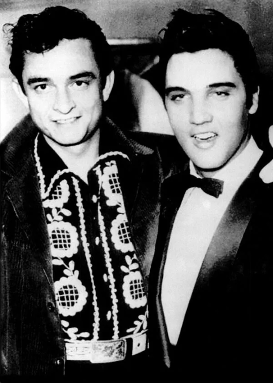
By the mid-1950s, however, facial hair started making a bit of a comeback, thanks to cultural icons like Elvis Presley and Johnny Cash. Alternative hairstyles, especially those associated with greasers, weren’t widely accepted in professional settings. Instead, they became symbols of rebellion, linked to actors, outcasts, and those who rejected the status quo rather than conventional, well-to-do citizens.
With that out of the way, let's talk about Coyle!
Thanks to the comics and in-game documents, we know that Coyle meets Clyde Perry in a Blackwell diner on February 16th 1956. Based on what we can piece together from his past, Coyle would have been around 33 years old at the time. Perry’s account of the altercation directly tells us that Coyle was well-liked and respected within his community.
Blackwell was (and perhaps still is) an extremely conservative town, where conformity to social norms would have been enforced through intense social pressure. The fear of negative judgment would have kept most people compliant. This makes Coyle’s deviation from 1950s conventions all the more apparent, though when we consider his past, things begin to make a bit more sense.
From both the comics and Coyle’s in-game dialogue, we know he had a troubled childhood (details to follow in a separate post). His adolescent delinquency eventually landed him in a military academy. However, his honourable service in the U.S. Marine Corps during World War II, combined with his undeniable charisma likely convinced most locals that he was a reformed man, paving the way for his position as a police sergeant.
His rough-around-the-edges persona may have only added to his charm, allowing him to get away with behaviour that might have otherwise raised eyebrows, such as openly flirting with a waitress or publicly beating a man senseless.
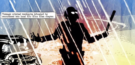
Although Coyle is primarily depicted as a silhouette in most full-body images, we can still piece together details of his uniform. Interestingly, his attire aligns more with a 1940s police officer than one from the mid-1950s. This could be a deliberate design choice to emphasize how both Coyle and the town he rules over are stuck in the past.
His uniform has a few key features:
Sam Browne belt – A leather belt with a supporting strap that runs over the shoulder and connects to a waist belt.
Standing collar & shoulder boards – Formal elements more common in earlier decades.
Shoes instead of boots – Just a note for the artists in the room.
Utility belt essentials – Includes a handgun, handcuffs, and a nightstick, which were standard for the time.
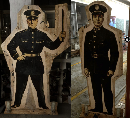
We get a clearer look at the general appearance of his uniform from some of the police cutouts in the Trials, though none of them feature a Sam Browne belt.
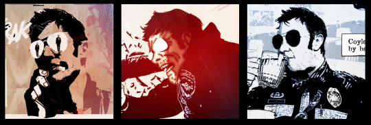
Coyle’s hair defies the social conventions of the time. It isn’t styled into any particular fashion and appears free of product, an unusual choice for a police officer, who would typically be expected to maintain a polished image, if not for personal pride, then at least for professionalism's sake. His hairline is noticeably receding, and it’s possible he combed it forward to disguise the thinning. By the time the events of the game take place, he’s completely bald, whether from stress-induced hair loss or simply shaving it once the recession became too obvious to hide. Pure speculation on my part.
His stubble, mussed hair, and unfastened top button suggest that when he meets Perry, he’s either finished work for the day or, at the very least, on his lunch break.
I found a few references of what I think Coyle's hair would look like because the comic is very bad at keeping it consistent. I went out of my way to find a guy with sideburns too. (Don't say I never do anything for you.) It's also worth noting that Julian Bailey, Coyle's VA had a receding hairline in years past. It's my personal belief that they used Julian's face as a reference for this younger version of Coyle.


As a ‘respectable’ police sergeant, he should present himself as buttoned-up, clean, and tidy, proudly representing the Blackwell Police Department and setting a good example for his subordinates. Instead, everything about his presentation suggests a man who sees himself as above reproach, someone who enforces social conventions but doesn’t feel the need to follow them himself. In fact, one could argue he’s rewarded for breaking them, receiving positive attention from women despite (or perhaps because of) his disregard for propriety.
Coyle placing his hat on the waitress is a particularly bold move, especially given the strict dating conventions of the 1950s. Historically, a man placing his hat on a woman's head was a flirtatious gesture, a subtle but effective way of ‘claiming’ her, particularly in cowboy culture (Coyle’s parents were cattle ranchers, cowboy Coyle is canon).
In this context, it’s unlikely to be a genuine display of interest. More than anything, it’s a power play, a deliberate act of pushing the limits of propriety while asserting his dominance. The real impact comes when Perry walks in, seeing Coyle has already ‘marked his territory,’ immediately undermining Perry and ensuring he feels off-balance in the face of Coyle’s effortless machismo.
At the comic's conclusion, while Perry is driving away, injured but alive, he looks back to see Coyle standing outside the diner, wearing his police cap. At some point, he must have retrieved it from the waitress, likely with a charming, offhand apology for making a scene. Coyle doesn’t need to kill Perry to send a message, because letting him live IS the message. And Perry hears it loud and clear.
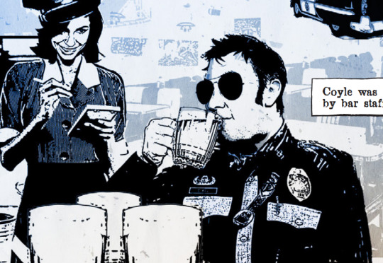
A quick side note, this isn’t so much about Coyle’s appearance, but rather his character.
When Oklahoma became a state in 1907, it adopted prohibition as part of its constitution, remaining a dry state up until 1959. Alcohol was largely banned, though moonshiners and speakeasies operated in secret, often with local law enforcement turning a blind eye. As a consequence, one of the only widely acceptable alcoholic beverages was “low-point beer” a drink containing just 3.2% alcohol, considered non-intoxicating under state law.
Perry states that Coyle ‘drank heavily’ before their encounter, but the fact that it was low-alcohol beer explains how he could be four pints down and still completely in control when it came to beating Perry.
It’s possible Coyle was pulling a deliberate ruse, letting Perry believe he was drunker than he actually was. If so, it wasn’t just about drinking, it was a test. Coyle may have wanted to see if Perry would try to take advantage of what seemed like a weakened opponent, only to prove that he was never at a disadvantage to begin with.
For a police officer to drink so openly in a conservative Christian town flies in the face of everything he’s supposed to uphold. Yet no one seems to care, or at least, no one dares to challenge him. Maybe it’s fear. Maybe it’s respect. Either way, Coyle knows exactly what he can get away with, and he enjoys every second of it.
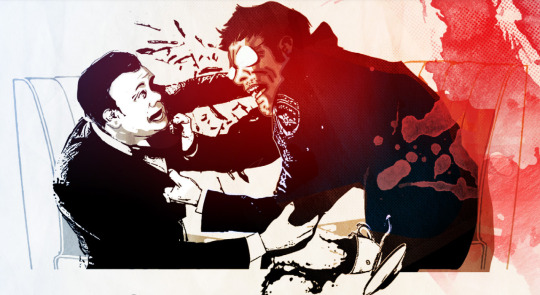
There are plenty of inconsistencies in the comic, and the art style doesn’t always make the details easy to see. Honestly, I could spend forever picking it apart and analyzing it, and one day, I probably will.
But in the meantime… I hope it's been informative. And I hope that some artists who draw pre-Sinyala Coyle will start depicting him in his Blackwell uniform. As much as I love a leather jacket, I’m a sucker for those military-style uniforms.
I hope you enjoyed this little dive into Coyle and his antics. Before I wrap up, I’m leaving you with a picture I annotated—it was meant to be the main image for this post, but... it’s awful. Apologies in advance if it hurts your eyes.
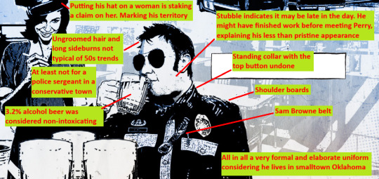
If you enjoyed my descent into madness, please inflict it upon your friends. I welcome friendly and constructive conversation in the comments. And hey, if you think I’m talking out of my arse, that’s your prerogative! This wasn’t meant as a critique, just the ramblings of someone who spends far too much time pondering the hows and whys of this man.
Well done if you made it this far, and thank you for reading!
As usual big shoutout to the Coyle Crew @misa-bun @decayinghost @soggy-bean for enabling me
#outlast trials#the outlast trials#leland coyle#outlast#sergeant leland coyle#officer coyle#sergeant coyle#not a shit post#i sure hope i get a good grade in coyle studies#something that is both normal to want and possible to achieve#I invented coyleology#long post#all my evidence is in the comic or the game#this is not a trust me bro situation
107 notes
·
View notes
Text
Jentry Chau vs the Underworld – Kit theory
Okay, so I recently finished watching “Jentry Chau vs the Underworld” and got a little hyperfixation about it, but I see that not many people are talking about this cartoon.
And since I don't have a chance to do any fan art for the time being, I'll at least do a little bit of writing.
A small disclaimer: This is not a super specific theory, but more of a loose thinking and musing about additional storylines, because I think these characters and the story had much more potential than was tapped, or they were given to tap. I know I'm probably reading too much into things, but let's just be delusional for 5 minutes. You know… for fun.
I guess I don't need to say there are spoilers?
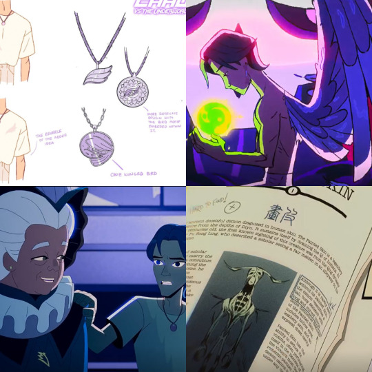
So, what if the plan for Kit's character was a bit different beforehand, or if we have some hint of what will happen to him next?
It's just that, I admit, I feel that his plot could have been handled better, more deeply (like many things in general), and I can't shake the feeling that there is a certain inconsistency that scratches at the back of my head - which is the bird motif.
1. The theme of a bird with 1 wing from another post
Link to the post.
When I saw this post, some way into the early episodes, I began to pay more attention.
It is about a mythical Chinese creature in the form of a bird with one eye and one wing, which has to unite with another bird in order to fly. The author of the post draws attention to this sense of incompleteness, of lacking something, which Kit has in regard to the lack of a soul.
The creature's other name is Jian, and it is also described as a good omen, a symbol of protection, a messenger between the divine and mortal realms.
2. His design
Link to the post on IG
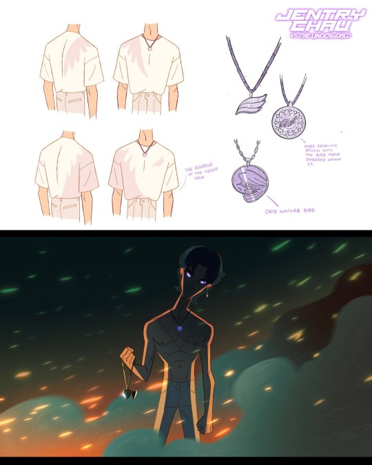
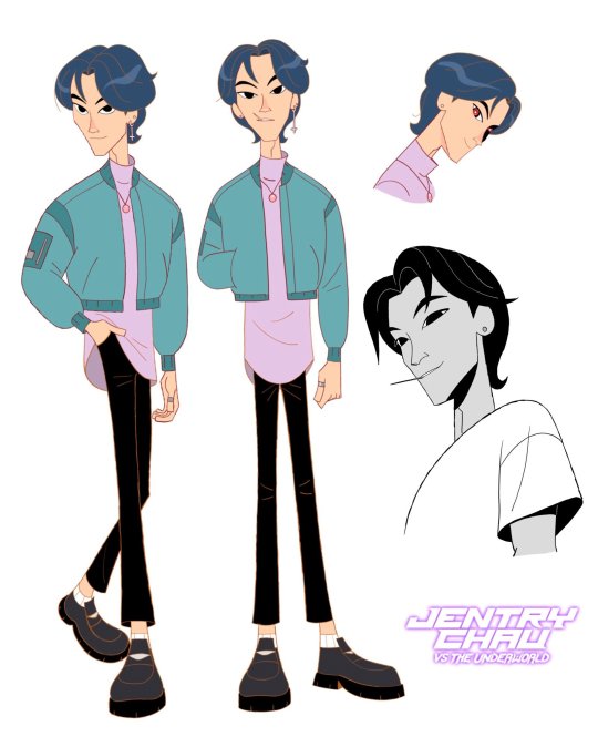
One of the character designers shared concept art of Kit, in which he has a medallion signed as using this very creature's theme. In the end, Kit appears to have a plain pink necklace.
However, the wing motif remains on his shirt.
In the shirtless art, we see a scar (which didn't make it into the series either), but it's on the same side as the missing wing would have been. Also, the design on the shirt.
Maybe the plan was to rewrite the Jian myth, where he didn't just have one wing, but lost it?
2 Kit's character in the intro
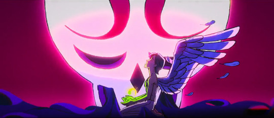
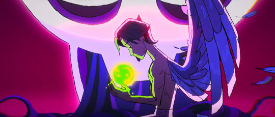
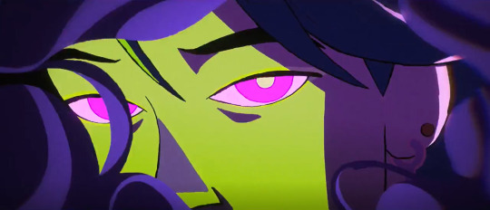
And while the design thing can be explained by the fact that it was an old concept that didn't make it into the final version, why were some of the wing motifs left, like his shirt (but about that in a moment).
The main question is, why was it left in the intro in such a literal way? Just for aesthetic reasons? Didn't they want to show what kind of demon he is right away? Why are his eyes purple when he has white ones in the show? On the other hand, Michael's eyes when he has visions are identical to those in the episodes?
In the post, the artist mentions that the theme of the one-winged bird is a tragic story, and yet Kit is a tragic character in a way, and that he looks so dramatic in the intro... But doesn't it seem a little off to you? I mean, as much as possible... it might have been the only reason to use such a motif, but all in all, why would one demon have the attributes of another demon/mythical creature?
4. The feather theme of the woman in the vision
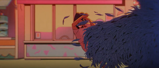
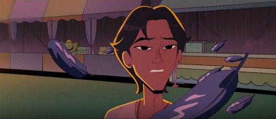
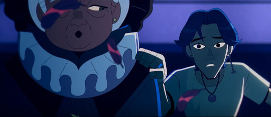
As I mentioned, there are still the feather/wing motifs.
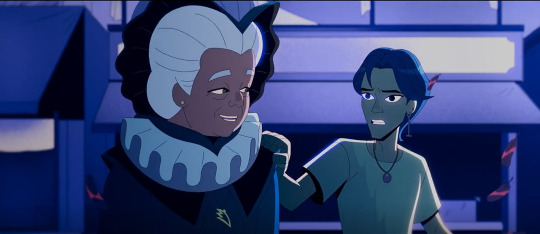
In episode 6, in the visions that Cheng haunts Kit with, there is a woman who first turns into dark feathers, and then has a medallion that might resemble a stylized wing.
They say everything in animation is intentional, so why?
5. Torn pages from the bestiary
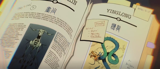


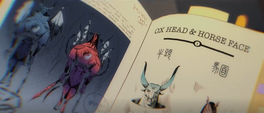
This is probably the least solid guess, nevertheless....
It seems that most demons in the bestiary have 2 pages dedicated to them. (Even probably Ed considering that the one on the page next to him is his picture).
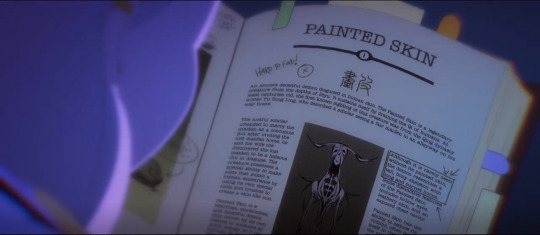
However, the Painted skin demon only has one page, and the next pages are torn out. I know that this could just be a hint as to the further plot of the episode, and the whole scene was just to show Jentry the missing pages. But if I remember correctly, they weren't addressed anymore in the plot (like a lot of things in general but well).
The point is that why would the pages torn out of BESTIARIUS contain anything about Jentry's powers if they originated from the Yellow Emperor and, as Gugu suggested, are worthy of a god. I would assume that the power that some mythical emperor might have possessed would rather have come from the Gods, which is why the demons fear it so much, or the Mogui who crave it so deeply, since such power is not available to Diju beings.
So what if these pages are a continuation of the Painted Skin Demon chapter. What if he wasn't always like this? Maybe there is a further (earlier) part of the legend? What if they combined two of the myths together? Like the Fallen Good Omen, for example, that's why he loves people so much and wants to be among them again.
Although in the scene at the end of the episode his chapter is already on another page, not next to the torn out pages....
6. Potential rebirth/return to the former form/getting his soul back from Diju
What if Jentry was right and the soul is not a uniquely human thing. I'm not saying that all demons have a typical soul, because they would probably have already figured it out. But maybe they can develop/ grow one? Or something similar to it. Gugu says they'll give them a funeral... all of them. That means Kit, as well. What if, thanks to this ritual, his soul could pass to the afterlife, or to Diju given that he did however kill some people and generally has things to repent for?
Maybe in a later storyline they could get his soul back, he could be reborn. Or, theorizing about bird motifs, he could return to favor as a good omen.
From other stories, like Journey to the West, we know how often Heaven liked to punish celestial beings (and that's how the one-winged bird is described – a celestial being, not a demon) by turning them into demons, or how often animal-like creatures escaped into the human world and took the forms of demons.
That's pretty much it. I just wanted to point out a few things that I found interesting.
What do you guys think? I haven't written anything like this for years and I feel a bit weird 😅
And please, if you haven't already, watch JCVTU. We need season 2. 💗
#jentry chau spoilers#jentry chau kit#jentry vs the underworld#jcvtu kit#jcvtu#jcvtu spoilers#jcvtu theory#fan theory
83 notes
·
View notes
Text
Runaan is kinda out of character in season 7 of The Dragon Prince
I decided to start this thread because I haven't come across anything similar yet and the issue is bugging me. I would appreciate your thoughts and opinions because I'm very curious if anyone else has had a similar impression or has any other ideas about where it might come from.
My feelings after watching The Secret of Aaravos were like, "Runaan is out of character. He's not himself anymore, not completely. Man, he's become less believable to me as a character." I started to wonder why. Here's what I've come up with so far.
1. Runaan started looking out of character for his age.
In The Secret of Aaravos, Runaan looks younger to me than in The Dragon Prince. And much younger. What's the logical point of that? Even if we assume that while trapped in the coin the aging process stopped for him (which is not confirmed in any way, as far as I know), still - Runaan should look at least the same age as in Season 1. Not younger. Sure, maybe the team just decided they preferred a slightly changed/"new" character design, but still - it makes me as a viewer confused. Because I look at Runaan and just think "why did he suddenly get a decade younger?".
And I know Ethari also seems to look a bit younger with her new hair compared to Season 3, but not enough to be confusing. It's entirely possible that a new haircut or different clothing can make you look younger (I believe that's what Ethari is going for). But Runaan hasn't changed a bit in his appearance, and he still - looks much younger.

Credits - I know, the artstyle depends on artist, but still - chrologically younger Runaan looks more like in season 1 than 7

Bloodmoon Huntress

artbook

season 1

season 7
I noticed that Runaan already looks a bit younger in season 1, when he's not serious, irritated, angry, etc., but still, not as young as in season 7. There are limits.


2. Runaan behaves inconsistently with his character.
I don't mean like all the time, but in very situations. In my opinion, it comes down to a few things:
A) in season 7, Runaan's facial expressions are often inadequate to the original character creation.
I really understand the plot situation (2 years in the coin, regaining freedom, Rayla, a chance to return to Ethari) and the fact that Runaan could have changed - become more gentle. And it's no wonder that he's often sensitive this season, after all, he's in the company of Rayla or Ethari.
But I have the impression that the creators wanted to show how much is going on emotionally in Runaan so much that they overdid it. And there's nothing left of the ''COLD AND SHARP as steel'' assassin. His face is so expressive, he constantly seems lost and sad (but like a puppy, not an elf who after 2 years of absence might not keep up with the world).
I love the scene of returning to Ethari and the subtle smiles when she looks at him after picking mushrooms or during dinner, and the fact that he's also shown when he's grumpy [ ''Runaan's expression sheet is the only one to not feature a smile. This elf exclusively broods'' (The Art of the Dragon Prince), ‘’ our favorite broody assassin’’ (https://thedragonprince.com/runaan-birthday/)] . Very interesting, after seeing him only on duty or in prison in Season 1. But most of what is in Season 7 seems to me to be out of place for a serious, composed assassin.
In my opinion, the flashback from Season 3 did a very good job of balancing Runaan's standard seriousness of his expressionless face (or just neutral) with a situation where tenderness towards someone close to him creeps in. It looked natural and very believable.


B) some gestures do not fit Runaan's previous portrayal
Runaan's body language this season is strange to me. Even if he is lost after two years, hurt, tired - ok, I understand. But while in Season 1 his movements were decisive, confident, and - I really don't want to refer to stereotypes, but I can't find a better comparison, for which I apologize - "masculine", in The Secret of Aaravos Runaan sometimes moves strangely "softly". Maybe it's the animation, maybe the choice of shots, their fluidity, I don't know. But for me, even during the mission with Callum, Runaan no longer has the confidence in his movements that he had in season 1.
Unfortunately, I will refer to stereotypes again, sorry, but these are simply the only comparisons that came to my mind.
Two gestures in particular do not fit Runaan's creation so far. The first, when he looks at Silvergrove, putting his hands to his chest, and the second, when he tells Ezran "And yet with grace and strength, you have managed to lead with kindness". I know what the creators wanted to show, but I think the way they did it does not fit how Runaan was presented to us. In both situations, he looks more like the archetypal delicate and sensitive princess, not like a composed assassin who deals with many emotions and changes in mindset. Don't get me wrong, I'm not saying that Runaan (or a man in general) can't be sensitive or delicate. I just think that it would be more consistent with Runaan's personality to show all of this in a more subtle way. For example, in the first situation Runaan might simply fall silent at the sight of Silvergrove, his gaze becoming softer and more thoughtful, camera focusing on his face (like when he saw a dragon egg or coins with Lain and Tiadrin in 1 season).


Apologetic but still self-aware worrior talks to king like that? It's hard to believe for me.
3. Runaan seems more like Rayla's brother than father
Because of his younger appearance, some indecisiveness in body language and a strange impression of "girliness" (again, sorry), as well as some plot situations, I stopped seeing Runaan as Rayla's father. At most an older brother, but it was really hard for me to convince myself that he was the same elf as in Season 1 or Bloodmoon Huntress.
And sure, I understand that maybe they wanted to show that now Rayla is taking care of him, that they are more equal, that Runaan allows her to take responsibility and prove herself. Still, the probably intentionally comical scene of Runaan resting and setting off to Ethari came across to me as if Rayla was scolding her siblings, not the adult elf who raised her. I understand that Runaan is impatient here and could have acted unwisely, but in my opinion it was a bit over the top.
In my language version, Runaan's voice actor changed - from someone with a ''typically male" voice to someone who sounds very "young". I know that this definitely affected my perception of Runaan, but then I watched all the scenes in English for comparison. It was better - now Runaan JUST LOOKED younger. But it still wasn't the Runaan from Season 1 or 3.
Summary
The more I think about it, the more I feel that Runaan's character in Season 7 is not consistent with what the creators presented in Season 1, 3 or the books (art book, Callum's Spellbook, Bloodmood Huntress).
I am deeply disappointed, because I followed this series mainly because of the Runaan, Viren and Aaravos storylines. And in each of them I see certain clashes and puzzling decisions of the writers. But nothing persecutes as much as the "new" Runaan - younger, more delicate (at times "girlish"), who says that he is Rayla's father, but somehow does not give that impression (cause he seems to be too young for that).
I do not understand these methods of the creators. I know what they wanted to show (maybe the confusion, the more delicate side of Runaan, his uncertainty, the change of previous beliefs about himself and his profession), but the way it was done does not convince me.
And although there are moments that I absolutely love and consider credible in the context of Runaan's personality (and the only problem is his younger appearance) - for me his character is no longer consistent with what we have seen and could read about him so far. In season 7 he's so often just looks like a lost, uncertain, delicate pretty princess to me.
I do not see in him that mature, determined warrior with the aura of a protector.
I feel more like I've met his twin brother - very similar in appearance, but very different overall.

season 1

season 7
#runaan#runaan tdp#ruthari#the dragon prince#tdp spoilers#tdp s7#the mystery of aaravos#moonshadow elf#character design#let's talk about#character changes#character consistency#thoughts#dissapointment
22 notes
·
View notes
Text
So I wanna ramble about the ii ep 15 trailer, maybe theorise a bit?? Idk
First of all, what is that behind Taco in this scene?

It could very well be hotel OJ, the colour scheme and window design line up perfectly but the placing of the trees throws me off

It could just be an inconsistency that I'm looking too deeply into 😭 but also why would Taco take MePad near hotel OJ?? Scratch that, why would Taco reveal herself in general? I get that she has no more direct ties to the game since Mic left, but she'd gain nothing from revealing herself
Second of all, the contents of this box

I'm actually assuming that these are Test Tube's belongings since multiple of the things shown look like her inventions, such as the tranquilising tracking dart blaster and others that were shown in the background during ep 3


They seem to align perfectly, I'm pretty sure that's one of the darts on the left
I can get how they have access to TT's stuff since a) she got eliminated, and b) she did technically give them all permission to use her stuff in ii14 as far as I can remember (even though it probably was at least a bit sarcastic), I just don't get why they'd have it all gathered in a box??????
The trailer does seem to focus to some degree on TT's inventions, with them being seen multiple times throughout the trailer via the box, Microphone's bow being stomped on by who I assume to be Taco and Suitcase wearing Mic's bow.


I think it's also fair to assume that the Suitcase invisibility clip comes before Mic's bow is stomped on.
Third of all, I'd like to point out how this trailer has themes of destruction. Said destruction can be divided in two main categories:
• Burning (there are about 3 other instances of burning imagery in the trailer if we don't count the thumbnail that I couldn't add due to the 10 img limit)

• And Taco's weird obsession with stomping on things (one picture of which was shown already)

I'd also like to count MePhone's line at the end of the trailer, "Don't mention that again," as adding to the themes of destruction since sentences like that are usually used to hide things or try to push them back, ykwim
Currently, my only guesses as to what'll happen in episode 15 is that they're going to burn either a few specific inventions or everything in the box. It's the only logical conclusion I can make for now, but even I don't think that's fully right. I mainly just wanted to talk about the stuff I noticed lol
If I missed anything, I'll update this (since I took a long break in between writing this, I might be kinda out of it lol). Feel free to add anything if I missed it 😭😭
@shadow-blackout
#inanimate insanity#ii#osc#object show#object show community#object shows#ii15 trailer#lightbulb ii#ii lightbulb#mephone4 ii#ii mephone4#ii mepad#mepad ii#ii taco#taco ii#ii knife#knife ii#ii baseball#baseball ii#ii suitcase#suitcase ii#lightbulb inanimate insanity#baseball inanimate insanity#knife inanimate insanity#inanimate insanity suitcase#inanimate insanity mephone4#inanimate insanity mepad#inanimate insanity taco#inanimate insanity 2#analysis
49 notes
·
View notes
Note
1st of all big fan, devoured RC!AU. It's fantastic
2nd of all, I could get lost in your sw resources tag that thing is awesome
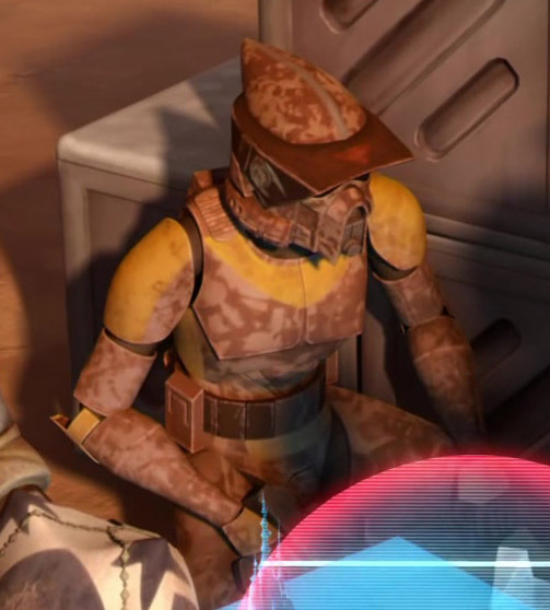
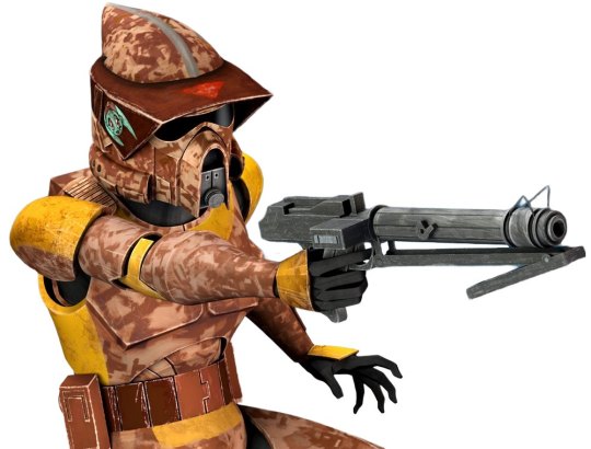
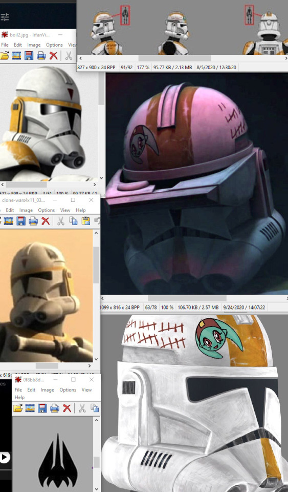
3rd Do you have any references for Waxer and Boil's buckets? (Sorry in advance if you've already posted them, and thank u again for all the boxer content 💖)
Aw thanks! <3 I haven't written in the main RCAU for ages, but I'm still plugging away at the Open Skies sub-AU haha 😂
Ah I'm glad that's been helpful! I mostly tag for my own organizational purposes and I know there are some gems in there—especially from @gffa and @fox-trot! My 'sw refs' tag has a lot of overlap, but also includes a lot of image references for fanart or describing things in fics, so that one might be useful, too?
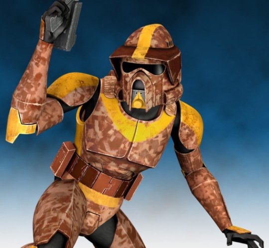
And yeah! I'm not sure if you want Phase I, Phase II, or their ARF helmets, haha, but I know I've got plenty of refs for all of those, so I'll toss them in here...
Boil:
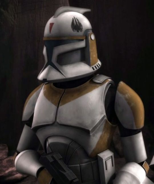
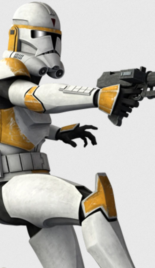
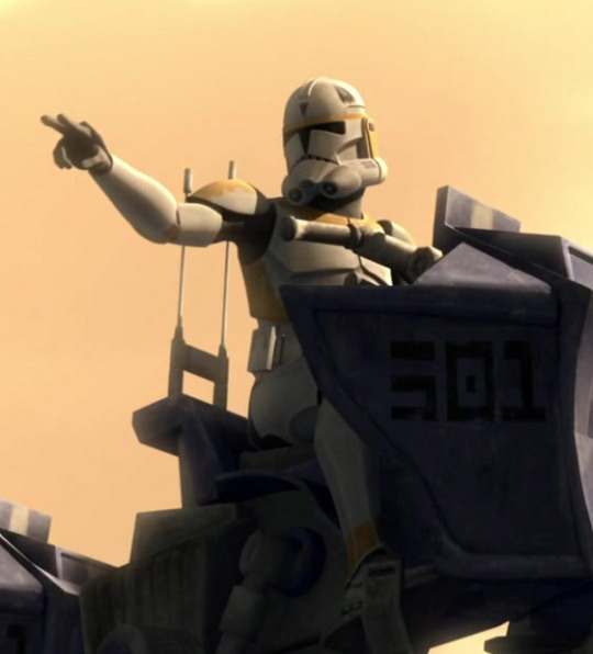
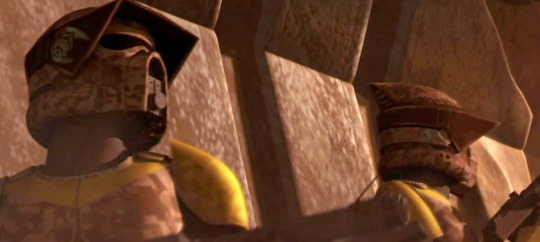
Waxer (The second image shows the back of his Phase I helmet, which is hard to find shots of, in the background behind Boil being awkward 😂 So he had the little droid silhouette on his helmet back then, too):
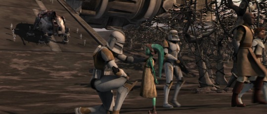
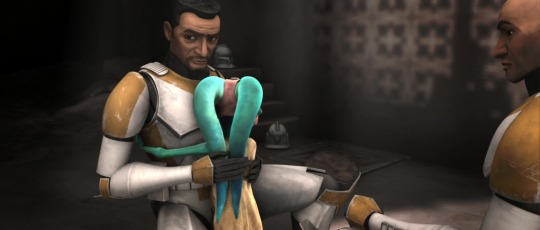
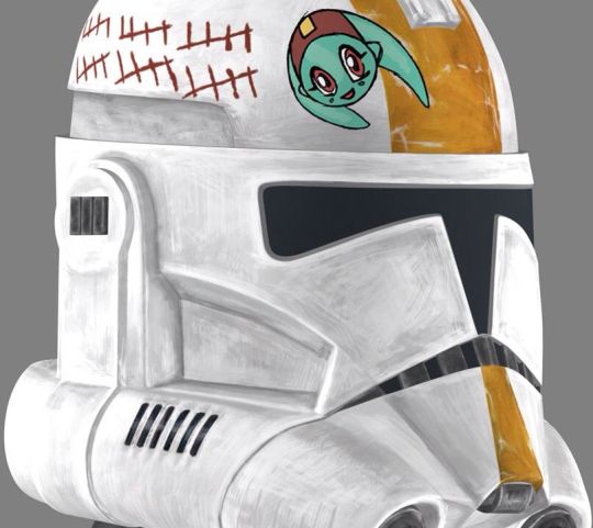
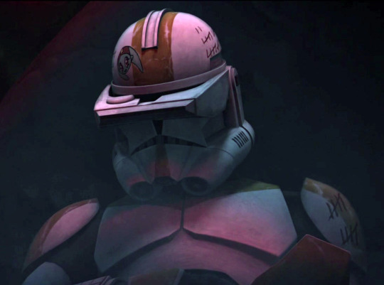
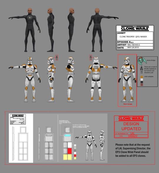
And some shots of both of their helmets (Waxer is on the far right in the last image—you can see his tally marks):
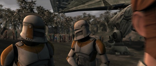
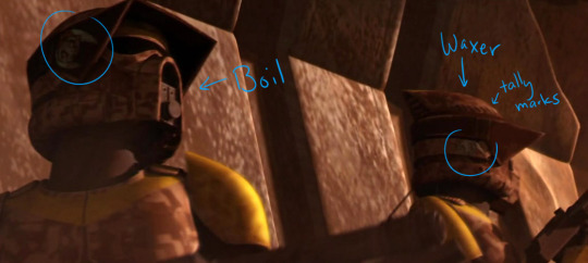

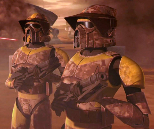
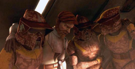
Their ARF helmets seem to cause a lot of confusion, as I've even seen merch that doesn't show the little Numa painting on Waxer's helmet, and most people seem to mix up who is who in that Landing at Point Rain episode (probably because the writers seem to have done so, as well, since they gave Boil the more cheerful dialogue while having Waxer complain—but maybe he was just having a bad day! 🥺).
There's also the horizontal band of gold paint Boil has under his visor attachment to match the paint on his regular helmets, as well as a grey stripe along the top of the helmet that's lined up with the red triangle on his visor attachment. Waxer has his 'crest' stripe of gold paint, of course, and it continues under his visor attachment a little bit, too. Then he's got his tally marks and snoot triangle. :D
One thing that I only noticed recently is the very faded ship silhouette (or however you interpret the black design on his other helmets) on the left side of his ARF one. In the second-to-last image above, you can just barely see something on his left side, but the only way I knew it was more than just dirt was because I have a little figure with the shape painted on it. Which is also not very visible:
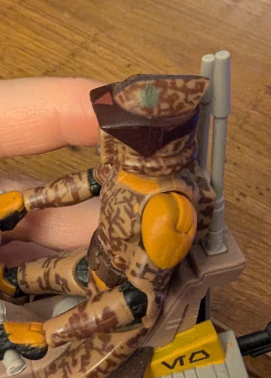
(Thankfully, I don't think I've actually done any images where you can see the left side of Boil's ARF helmet, so I shouldn't have to add that to any of them, haha. Hopefully I haven't mentioned anything about the lack of symbol in any of my fics, though... XD)
I'm still unclear what is going on with the paint on his and Waxer's spaulders in the ARF episode, because it's obviously faded/been scuffed in places, but sometimes, Waxer seems to have an unpainted right spaulder, and sometimes there's a stripe??? His little figurine is the opposite, though, with a striped right spaulder and an unpainted left one. Meanwhile, Boil's left spaulder looks like it could be all painted gold, like in the figure above, but other times, it seems to be a normal stripe??? Who even knows—I'm guessing that the texture for their models got messed up during the production of the episode, so they're inconsistent. Personally, I'm just sticking with 'matching stripes on both sides,' like the rest of their armor. 😂
Anyway, I hope that helps!
#asks#waxer#boil#arf troopers#tcw#clone trooper helmets#arf trooper helmets#oh‚ to have detailed high-res asset sheets for all of their different kinds of armor... the dream#sw refs#arf trooper waxer#arf trooper boil#save
17 notes
·
View notes
Note
I'm drawing your new bastard fish. Send help.
I didn't think this setting would get me to actually draw something as I rarely do, and am not very good at it, but I'm semi decent at pixel art. So here is Eclipse, the shadow under the ice himself, clutching with anticipation at the edge of an iceberg as he watches his prey on top of what they think is a safe zone. But he'll get them, eventually.
Eclipse - *Sinks below the water to instill the fear that he's out of sight but still lurking below just waiting for you to fall asleep or lower your guard*
The first one has my PenguinMerY/N, they're very small and the yellow parts near their eyes on their head are actually feelers or antenna like the decorative feathers some penguins have on their heads, but used to detect the movements of prey swimming far away and deep below. It helps them sense the ripples and disturbance of water, and also is the only reason they had even managed to run in time to escape alive from Eclipse.
- Food -
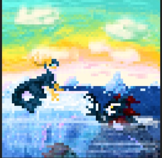
I also have a version with Eclipse and a normal human Y/N. The figure is simple and I put a rainbow for the face cause it's very difficult to get a detailed face or Y/N symbol in such a small amount of pixels so I didn't bother worrying over it.
- Eclipse and You -
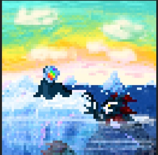
Here's one with just Eclipse.
- Just Eclipse -
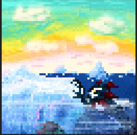
Finally here's one with the background. Yes I know there are inconsistencies with the water in a few but it wasn't until after I made copies that I realized I hadn't put any detail on the water in the background and unfortunately Pixilart doesn't allow me to edit things in a way to transfer Layers or copied things, or i was just dumb. So the water in the background and foreground might be a bit different in a few spots and images. But I dearly hope you like them and it's not annoying somehow.
- Frozen Seas -
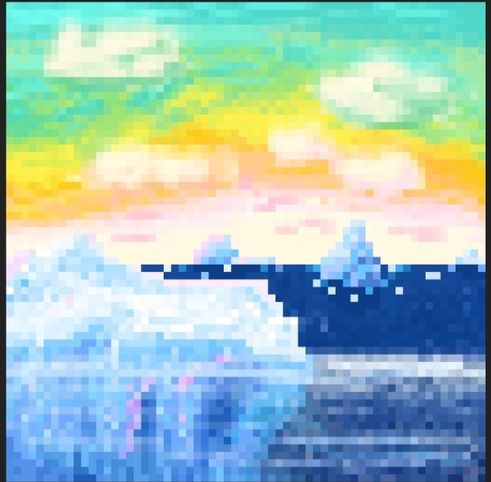
AHHHH I'M EATING THIS PIXEL ART!!!
Babe, these are incredible! I absolutely love pixel art, like, love love pixel art! This is such a treat!!! I adore your Mer Penguin design!!! I'm gazing so hard at the composition with Eclipse lurking below and the blend of deep blue with the white ice and the beautiful yellow-green sky! It captures so much emotion and the character's personalities!!! Ahhh, I'm eating this! It's so pretty and I adore it!!!
Thank you so much for sharing! ♥
#i'm crying#i love pixel art and with orca!eclipse?!!?#amazing#augh i love this#apex polarity#apex polarity fanart#orca!eclipse#inkofheart
71 notes
·
View notes
Note
Have you looked at the dragons from the Wings of Fire book series? I think the wing designs mostly get rid of the issue of lacking wing membrane along with generally just having some unique takes on different types of dragons. They even go as far as adding some bug dragons in the third series which is pretty neat.
Granted they all still have that 4 leg western dragon style design to all of them but all things considered they have some unique designs overall, especially for a kids book series. It definitely has had its influence on artists I think given that people try to draw up hybrids and their own tribe designs. My only complaint is that when people draw hybrids it's just smashing two of them together instead of really thinking about the different body parts they have.
yes, I've had a few previous asks about specific dragon types in Wings of Fire. I have never read the series. from what I can gather, it is a perfectly fine series and the designs seem to be stylized with a younger audience in mind, using visual tropes that make the different dragon types' narrative roles very clear.
I do think the designs are oddly inconsistent about the wings, because some of the dragon groups do have a patagium but others don't, and there is also an inconsistent addition of the elbow strut, which is a pet peeve of mine.
overall, the designs are fine. they do what they're made for and they're visually appealing and very well suited to the type of fandom that wants to make a lot of uniquely colored ocs with interesting features. I'm sure if I went on deviantart to look for Wings of Fire art, I would find a thriving community of young artists making dozens of dragon ocs with all sorts of color combinations and hybrid features.
I don't think there's a problem with letting people make their hybrids in ways that are a bit shallow and not well thought out. most of those artists are likely young teens who have just found their artistic passion! and mashing designs together is a classic fandom oc tradition, it happens all the time. sonic ocs? pokemon hybrids? sparkledogs? if the original Wings of Fire creators were being sloppy and thoughtless with hybrid designs I might have some critique there because they're professional artists working with a detailed world that has its own rules and they ought to be able to do something more interesting and thoughtful with their own hybrid designs. but for the fans? I'm not gonna step on the creative energy there, people can have their fun.
11 notes
·
View notes
Note
Please tell us the reason behind the pokemon choices! I get most of them, but am curious about Meowstic and Nihelego in particular. Is it for the nihilEGO pun?
OKAY i am on my iphone so i’m typing this from scratch again instead of my drafts. also it is night. tumblr decided to not give me notifs until now but it’s okay!! we ball😁
I’m unsure how much you know abt pokémon so I’m gonna do my best to explain but this is a lifelong special interest so i may miss some things^^
Quick going over the ones you didn’t ask about:
Mewtwo: clone created to replicate Mew, Went Horribly Wrong, ended up destroying the lab it was born in. It’s even a really long time since I’ve seen the movie but i believe the mewtwo there is neglected child core. This is REALLY Angela especially because in pokedex entries they often talk about the thing that makes mewtwo nothing like mew is that it’s “heartless”. poor poor angela baby…
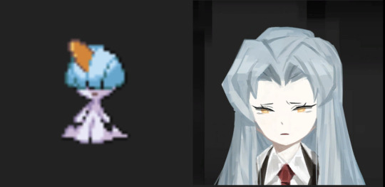
Mega Gardevoir: This is a mostly aesthetic pick. That thing really looks like her if it’s shiny (see image) and the colors match perfect. the way gardevoir is portrayed in pmd reminds me a lot of Angela. Gardevoir is about immense loyalty to a trainer (even if it ruins your life forever and the trainer does not care, as shown in pmd) and i read it as something about the script
Porygon2: Honestly this could be any of the mons in this line but Porygon is a digital being and the first fully synthetic pokemon which begins acting in ways which were not programmed as it evolves. Kind of represents Angela acting in ways a machine should not and breaking free of her predetermined role to me :)
Now onto the pokémon you actually asked about!! :)
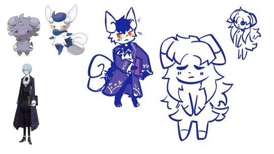
First up, Meowstic!
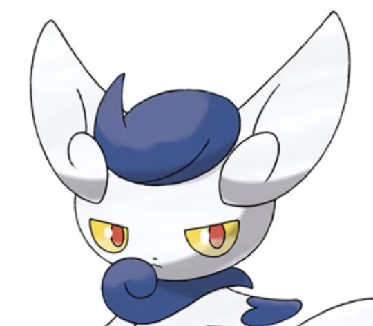
This first part is a small design thing but this thing has Angela’s face to me, especially with the yellow eyes with red pupils. Angela’s eyes are inconsistent in canon but I like to represent them with both red and yellow to represent both of her “parents” (sorry Benjamin… i love you but u aren’t included there😔)
This pokedex entry is one of the main reasons this is an angela pokémon to me, aside from vibes.
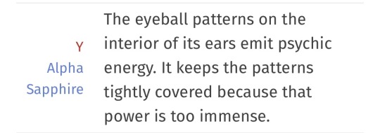
It has the same “closed eyes to repress” thing that Lobcorp angela has going on, just with repressing incredibly explosive powers instead of repressing The Horrors!
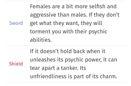
These pokedex entries are really goofy but they read very angela to me :) its unfriendliness is part of its charm!
Also i have no idea when i’ll ever get to post these so now is a good time as any to drop meowstic angela :)
Nihilego is a slightly different case because it’s tied less to dex entries and more to how it is used in the story of sun and moon. I haven’t played those games in YEARS so i might be a little bit questionable with my reasoning but this one’s really important.
Nihilego is intentionally designed to mirror one of the human characters in pokémon sun and moon.
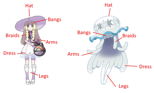
(image i found online. i see it somewhat differently but it’s close enough for this)
Anyway this human character’s mother has neglected/abandoned her in obsessive pursuit of this pokémon and other Ultra Beasts.
The fact this pokémon not only has a similar silhouette to angela but serves as a “replacement” for a human character in a parent’s mind while also being Distinctly Nonhuman… it’s by no means a perfect comparison but there’s Something There

This dex entry always gets me too… it’s just a girlie… :(
It really makes me want to replay sun/moon because i feel like my memory of the story being really shaky has me on the edge of a breakthrough about this thing… but it looks like angela and i can draw story parallels basically:)
I have No Idea if this is coherent but I hope it cleared things up a little ^^^
15 notes
·
View notes
Text
making character sprites as a one-person indie game developer
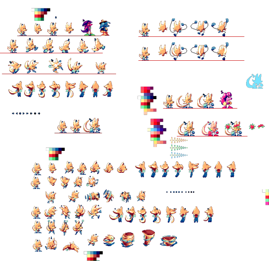
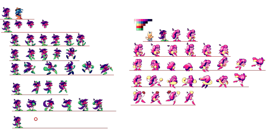
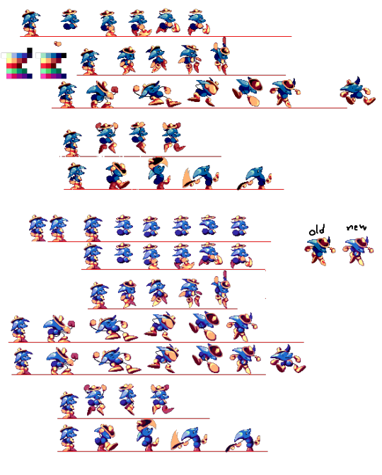
(huh. turns out this post on cohost didnt have a “read me” section”. o well. i will put the read me section Here, before any of da actual text. click it if u dare !!)
so, i've been meaning on making a Big post talkin all about how i actually Make my games and my processes n such ,but also ive been procrastinating on making it for so long that i thought i might as well just make One part of that post now .. and its about making the Character Sprites for my games .
So. these images are the (mostly) full sprite sheets of the three characters from my game UNITRES Dreams, taken directly from the big giant 'charactersprites.png' image that i used for nearly every sprite for Most of the game's development. some quick things to make note of: First off, Trees (the first one) was one of the earliest things i made for the game, and had their sprite sheet redone Twice since then.. this first picture doesnt contain the latest sprite sheet as the new sprites were done on aesprite and im too lazy to make a sprite sheet out of them right now.
Secondly, the Second character (the pink one), had two different designs, being completely redesigned as i didnt like their first design all too much. their redesign's animations was done in aesprite, but i made a sprite sheet out of em before so i was able to just put them here. Lastly, the Third character (the blue one with the big silly hat) remained mostly unchanged as their original sprites and design were pretty good, but they needed to be cleaned up and given better colors so i ended up polishing all of their sprites.
Anyways. it's going to be hard for me to explain my actual process, as i am Bad With Words, but i will try my best.. So. for Most of my time as a game dev, I've used Paint.NET for Everything. This includes backgrounds, tilesets, and every animation ever in all of my games. For my character sprites specifically, i usually start with making the color palette (which is a whole different process where i mess around with the RGB values until i get a specific color that i think looks pretty ... its hard to describe). When making a new character, i usaully start with an Idle animation, just so i have a good base to make all the other sprites on. I just make a sketch of the character, then i do the flat colors (as my games dont have line art), and once i have the colors i start doing the rendering , where i try to pull off a sort of Sonic CD-esque , celshaded style while Also including a bit of anti-aliasing and other modern pixel art techniques to give the sprites more Depth and make them look Sharp. Idk. it's hard to describe my process in words ... i Did make a video Years ago showing off my process, but its old and my editing in that video isnt the Greatest.
So., that's my process Lol . the only thing thats really changed is that Now i use Aesprite for making the Actual Animations , as making animations with Paint.NET is Really Difficult and Annoying , as i have No Idea how the animation will Look until it actually appears ingame .. which results in the early versions of each character's animations looking a little weird (such as Trees' first two versions, the first version of the Pink character, and the Blue character's animations.. .though the blue character isnt as bad as the other two and i kept their animations mostly the same in the final game LOL).
Something that people have kind of criticized about UNITRES Dreams' animations is that some of em dont exactly ... Look Good. a lot of animations are pretty Inconsistent , with characters like Trees having inconsistent sizes in some animations and the movement in animations such as the Pink character's walking animation and various other animations (Especially the ones made in Paint.NET) looking Unnatural.
And Well .. here's the thing about making animations and sprites for something like this. When you're the Main person making an indie game, you have Tons of different parts of the game that need to be worked on while having Very little time to work on others. On Top of making every single animation for UNITRES , i had to make every single Tileset and background for every single level, On Top of making the Level Layouts , Programming , and even making sprites for things like the UI. And you have to constantly Test the game to make sure everything works and things Look good.
So. i had very little time to work on the sprites, and i Knew this. Something you have to consider is that, not only are you making the animations for the main character , you Also have to make Tons of animations and sprites for Literally Every Other Aspect of The Game . this includes Enemies , Level Gimmicks , NPCs, And the UI .. so you end up having to work on Thousands of sprites by yourself in such a short time.
I ain't the best animator , nor the best sprite artist . But , for this game I chose an art style which is Kinda simple and comfortable for me, which made making things like tilesets and backgrounds so much easier for me. The character sprites specificially only use a few amount of colors ,but also i tried my best to give them as much depth and make them as Colorful looking as i could. Also , something you might notice is that all of the playable characters dont actually have a whole lot of animations .. each of the characters only have the Exact amount of frames and animations necessary for them to Look Good moving around the levels. Aside from a few Gimmick Specific animations that arent in the sprite sheets i posted , there arent many Extra animations or animations with Tons of Frames that i wish i could have added .. and it Kind Of Sucks . Having to split my time across Three Different Characters , i had no time to make any animations Too Crazy or Too Smooth , and i couldnt include any extra animations that could add a bit of personality to the characters ... In Fact ,the Idle "animation" isnt an animation , its just a still frame. I didnt have time to even make a simple waiting animation !!
It Is What It Is. For what its worth , Ithink Im pretty proud of the animations i did for UNITRES Dreams. while i think ive become a much better artist and animator since then, i still think some animations and some of the frames look really good ..just looking at some of the still frames is really nice .. so i think i did a good job, especially for a game that was made in 2 years and is Free. And Hey, while the animations in UNITRES Dreams may not be the best or have the most smooth animations , i Did get to experiment with making more smooth animations for TREES' ADVENTURE. while ,now, i think some stuff could use some work, i am Really Proud of how some of the animations look .. ididnt get to make Too Many extra animations (there still isnt even an Idle animation), i Did get to make some cool extra animations , such as individual animations for your Jump that are based on how fast you're moving . (the original post on cohost had a buncha gifs of da animations but im Too Fuckin Tired 2 post em here LOL !!!)
So Yea . the moral of the story: making video games is kind of hard and time consuming , Especially when you're like , the Only one working on them. just make sure to plan ahead and try not to overwork urself .. make what you can and do it when you can. Thats what i think , anyways.
#TreesThinks#UNITRES#UNITRES Dreams#art#artists on tumblr#artwork#pixel art#pixelart#pixelartist#pixel artist#game dev#gamedev#game development#game developer#indie game#indiegame#indie developer#indie game development#indiedev#indie dev
56 notes
·
View notes
Text
The Idaten Dieties Know Only Peace
By Amahara
A surreal Japanese action webcomic that is about a world where God-like entities (the Idaten) are born out of people's collective wish to survive, fighting against militaristic shaeshifting demons. Problem is, they already won against the Demon's in the past and many sacrificed themselves to seal them away, so the only Idaten around are lazy kids from the previous generation and the newer generation with no experience (hence the title). Which is bad when demons start cropping up again.
In my opinion - it has some fairly glaring problems when it comes to writing - which carried over into the anime that was produced based on the webcomic. The heroes are of the nominal, OP kind and seem to stay that way, regenerating from all damage; Demons are technically the underdog villains, and theres supposed to be irony in how they are more "human" than the Gods meant to protect humanity, but they and the empire they run is so objectively evil, and gross in some cases, that you can't really sympathize with them either. Humanity is kind of a third wheel race by comparison, due to focus, and are kinda mostly designated victims of violence/indifference.
I've only seen some of the anime, so I can't say much about the art quality of the webcomic, and both have been on hiatus for a bit currently. It also is not afraid of violence and adult subject matter, so keep that in mind about content, even if it's comparatively tame to other things ive seen.
I'm curious if you'd riff successful stuff of this nature, aside from this, ONE'S "One Punch Man" (which is very well written with majestically bad art), and Nimona (good art and world but...very inconsistent direction with characters and likability), I'm not overly familiar with webcomics that were popular enough to get substantial animated adaptations.
I have never heard of this, so of course it has gotten an adaptation. I think this might be the first ever japanese webcomic suggested to be riffed? Either way it sounds like it's plagued by issues not too unique to the medium. I think I can riff it eventually. Also jesus christ the name is horrible, I know japanese names are often trying to be as descriptive as possible but when I first saw the title I thought it said "Diabetes Deities Know One Piece"
3 notes
·
View notes
Text

Great Brown Dragons. I was going though this series of whatever my world had in it and dragons just happened to be first on the list. Never did finish the project. I accidentally had people believing that all I drew was dragons, when in reality, I draw everything that comes to mind. Everything from fantasy, to some sci-fi and even pet portraits and the occasional still life. I range from attempted hyper realistic to cartoons. Sometimes I actually manage what I'm going for. Sometimes not. I'm still a little inconsistent and have areas that I need to work on. Like lighting, water, transparent items, and a general increase in skill. I do not get to practice nearly enough to accomplish this anytime soon, but I keep trying.
As far as my dragons, I've decided to cut down a little bit on the variety in my world of Eden. I even borrowed two of them for another novel.
I'm still having problems with their designs, especially with their legs and feet. They need an update. The rest is fine.
I might redraw this one if I ever get the time. I won't make too many corrections in spite of my current ideas on what their limbs should look like. More like fixing little details and giving the dragon in the background a bit more space so his wing isn't cut off. That is the downside of drawing traditionally, a miscalculation of size of subject can lead to some unavoidable problems if I wish to keep the drawing as is. I can't simply expand my canvas if I find out that my drawing won't fit.
I am considering returning to traditional drawing again...the only problem is that I need to restock my pencils and the ones I love aren't cheap. Frustrating thing is that the set I've been looking at to purchase I've been ogling for thirty years and never once have I ever been close to buying it.
If nothing else, I'd like to experiment with coloring books, and again, I don't have enough of the right pencils.
I think I enjoy coloring the books digitally, but the worst part is that copying the pages into my computer is a pain in the butt and takes about a week to get it all done and sorted. So, now I think I'd like to only scan some of the pages and then traditionally color the books as anyone else would.
If only I could have the time though. I'm lucky to get even a half hour in the evening time before my final round of chores and then bed at three in the morning...because someone won't let me go to bed until she does.
3 notes
·
View notes
Text
Hey, I was negative on FE Fates earlier, so let me make up for that by saying some things I genuinely really like about it from a game design perspective. There's a lot of little improvements that seem conscious of ways FE games past haven't lived up to their full potential, and Fates does some very clever things to fix these issues.
Aching Blood
Odin's personal skill is kind of amazing. What it does is it boosts his critical chance by 10% when he's using an upgraded weapon with a name at least 12 characters long (or 8 kanji characters in the Japanese version). The effect is pretty small, but it directly rewards two behaviors that players might not otherwise do. It encourages them to forge their weapons, something plenty of players don't do in a lot of FE, and it encourages them to actually use the naming feature, getting creative and putting their own personal touch on the gameplay. Personally I love calling bronze weapons stuff like the Wusslance because of their low risk and low reward.
2. Ore
Speaking of weapon forging, the decision to make it use a separate currency from gold is kind of brilliant. I remember back in the Awakening days, a friend told me that forging was useless and a waste of money. Was it true? I don't know, but I can see how someone would think that. Because the thing about forging in Awakening (and most other FEs with forging for that matter) is that it costs money you could be spending on something else. Why would you use that mechanic if there are much clearer alternatives? In Fates, the currency for forging weapons isn't used for anything else, so you have no reason not to forge weapons. Now given, they do also cost another version of the same weapon. But I'd rather have one strong Wussbow than two middling Bronze Bows. I can make that choice.
3. Proactive Skills
Fire Emblem has a bit of a skill issue. Ranting about random activation skills is outside the scope of this post, basically they're fun, but their inconsistency means you can't plan around them. (Ask me about Miracle.) But my ire here actually lies with two skills in FE Awakening: Outdoor Fighter and Indoor Fighter. These give a +10% boost to accuracy and evasion depending on what terrain you're on. I kind of really don't like these skills, because they affect basically nothing about how you actually use the character. Most levels are either entirely indoor, or entirely outdoor. They affect whether it's worth using that character in a given map, but once the preparation phase is over you basically don't consider it. In my opinion, gaining a new skill should mean gaining a new way to engage with the combat, and not just provide an improvement to the thing you were going to do anyway. Fates understands this, at least in part. Outdoor and Indoor Fighter were replaced with Elbow Room and Natural Cover. The former gives a +3 attack boost on terrain with no special effects, and the latter gives a +3 defense on terrain *with* special effects. This fundamentally changes the way you engage with the game. With Cavaliers, it gives you a choice: Do you take the defensive boosts of cover, or the offensive boosts of open field? With Knights, it encourages you to find a place to fortify yourself, and even gives you a reason to stay on tiles with negative effects. I genuinely appreciate design choices like this, and i only wish Fates committed more.
#fire emblem#fire emblem fates#game design#also despite having issues with every weapon having a weakness#i do actually like the creativity behind the gacha weapons like peri's lance#i just wish i got those more often
6 notes
·
View notes
Text
Thoughts about Tokyo Mew Mew (2002)!
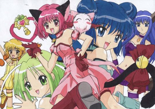
Tokyo Mew Mew is my most recent anime watch. I watched it to expand (even more) my magical girl knowledge. It was never dubbed to Latin American Spanish (as far as I know), so there's no element of nostalgia to my feelings about the show. Also, I hadn't developed object permanence in 2002, so I wouldn't have been watching anime anyway. I haven't read the manga or watched the newer version. I watched around two episodes, but I didn't like it enough to continue.
In short, I didn't love Tokyo Mew Mew. Mostly because I am not part of the target audience. The plot, the dialogue, it's all kinda flat and designed to be easy to follow for children. I believe it might be better enjoyed if you are around 11 or 13 years old. Under the cut, you can read some specific thoughts I had about the things I liked or didn't like.
Thanks for reading!
-Let's begin with the stuff I didn't like: the art style. Colors are way too saturated. The chimera anima creature design looks rushed... The proportions of the characters are inconsistent. Sometimes their eyes and hair are huge. I don't think the Mew Mew costumes are ugly, but they aren't pretty either. They are ok. The girls have appealing enough designs. Now, the guys. Damn, aren't they ugly? What do you mean the girls are constantly blushing or having crushes on these guys? None of them have appealing designs. The only one who is nice to look at is Aoyama.
-Again, the plot and themes are quite superficial. There are hints of deeper themes that never get developed. They want Zakuro to be an emotionally intelligent character, but most times she's only pointing out obvious stuff that the rest of the characters are too stupid to get. She had a point when she mentions how they are being forced to be Mew Mews, but she ends up joining the team very easily and the topic is forgotten.
-The guys, again, are so creepy sometimes. I am not even talking about Kishu, he is supposed to be creepy, I know. I'm talking about the blonde guy and the butler guy whose names I didn't care to learn. Especially around the episodes that revolve around Ichigo turning into a cat. What do you mean they are just allowed to say they will 'help her de-transform'? Ugh.
-Now, things I'm neutral about but want to mention: I really thought the blonde guy and the butler guy would be gay for each other. I was expecting a Touya/Yukito dynamic from them. They even had to have an episode making clear the butler is attracted to women. Haha, funny.
-One detail I found satisfying is that the passing of time is consistent. In one episode, they are celebrating Christmas and some episodes later they are celebrating Valentine's Day. Nice.
-The opening and ending songs are cool.
-I didn't love it, but I still liked it better than the newer version.
-Things I liked: Aoyama! The concept behind his character is really cool. It wasn't executed in a particularly good way, but I really appreciate the ideas behind it. His design is so generic and inofensive that you think there is no way he'll be relevant to the fight later on. They even foreshadow Deep Blue a bit when Aoyama expresses his slightly eco-fascistic views on humanity. I like that he admired Ichigo the same way Ichigo admired him from afar. His monologue about being bored and tired of pretending to be a perfect kid to avoid disappointing the people around him… unexpectedly relatable and sad to be in this show.
-Also, Ichigo and Aoyama's relationship is very wholesome. No drama, no misunderstandings, no secrets kept for long to create cheap drama. It felt refreshing to watch a romance between two kids just trying their best to be good to one another, and creating conflict for them in other ways. Very nice.
-Zakuro is the coolest Mew Mew, Mint is my favorite, but Pudding is the best. Sorry Lettuce, I kind of don't care about you.
-Mint is my favorite because she is a mean, spoiled, rich girl who learns to accept that she wants friends, to be loved, and to fight alongside others. And my brain just automatically roots for those kinds of characters. Mint even gets to telenovela-slap the main character to remind her of what is important. I have to accept it… that's cinema… Also, she's a lesbian.
-Pudding is the best character. That episode where she's sick, and it's revealed she provides for and takes care of her siblings all on her own… It's probably one of the best episodes of the whole show. It reframes how we met her as a street performer asking Ichigo for money. Ah, and she cries while asking the nearest adult if she can call her mom for a moment… Again, unexpectedly mature coming from this show.
And... I think that's all! Thanks for reading if you made it this far ^^
4 notes
·
View notes
Text
Voiceplay Visuals: This Is Halloween
So obviously I'm not the only one who loves talking about Voiceplay and analysing their content, but I wanted to do something a bit different from the kinds of analyses/reactions that other people do, both on here and on Youtube (and music theory isn't really my forte anyway). So I'm planning on making some posts just focusing on the videos (and Geoff's as well, eventually), rather than the music arrangement or vocals or anything like that. My credentials are being a Drama Kid during my high school years, and experience with this sort of analysis from my time in other fandoms. I'm not planning on doing every single video, and though I'm gonna go chronologically from mid-2017 onwards (why not earlier? Because Reasons). However, since I yesterday finished a fanfic based on Voiceplay's cover of This Is Halloween, (which I studied a fair bit to get details right), I might as well start there!

Oogie Boogie pumpkin just outside the front door! (And a Jack Skellington one on the other side I believe?) These pumpkin also shows up in the spooky Halloween realm the group are transported to after eating the candy.
Credit to one of the comments which said that Earl is wearing a cow onesie and Eli is wearing a rooster onesie, which more likely than not is a callback to their (extremely hilarious) Chicken Song performance. (J is wearing a CatDog onesie, I think Geoff is wearing a giraffe onesie? And I'm not sure what Layne's onesie is meant to be)
Again credit to a commenter (different one), pointing out that Eli deadpan elbows Layne in the back, pushing him down after he eats the candy (likely a not-so-subtle acting cue or something like that, but still very funny once you notice it)
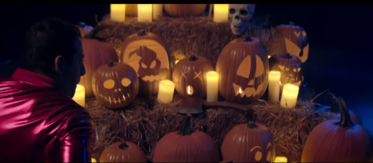
The return of the Jack and Oogie Boogie pumpkins, along with some other creatively-designed Jack-O-Lanterns! Peep the one on the far right, a little more towards the back; its 'eyes' say VP, and its mouth is the Voiceplay logo!
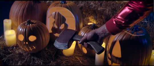
Also a little bit of foreshadowing, whether intentional or not: when Layne wakes up, one of the first things in his line of sight is the axe resting on the hay bales...

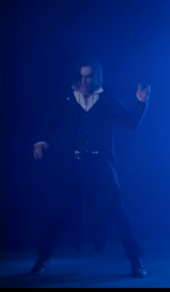
First of all, how many pumpkins were carved just for this video? Because a lot of effort went into making all those different designs for sure (and no, I'm not part of Voiceplay's Patreon, as the tier that lets you see behind-the-scenes stuff is like $8.50 AUD per month, rip). And second of all, this is a decent shot of how the group starts out upon waking up. J None is wearing a yellow plaid flannel quite similar to The Wolfman in Nightmare Before Christmas, and Earl is wearing denim overalls, like the behemoth character. Eli's outfit is of course representative of the Mayor of Halloweentown, but no spider bowtie or "Mayor" rosette (would've loved to see it, but eh no biggie). Layne I will get to in a moment, and Geoff a little bit after that.

I can't be bothered getting a better picture of it but Eli's half-concerned half-weirded-out face after J's helium-like vocal line is very amusing to me
On the "eyes glowing red" line, Earl's eyes (which are white at this point) flash red for a very brief moment, basically blink-and-you-miss-it.

The colour-change on Eli's left eye is so subtle that at first I didn't notice it at all, and then I only noticed it later on in the video, and only now, doing this analysis and taking a dozen screencaps, do I realize that it happens way earlier than I first thought (which explains why he takes his glasses off at this point I guess) (so uh, that's a minor inconsistency in my fanfic but it's fine)

Shoutout to the makeup/SFX people who helped with this video honestly, they did a super good job, genuinely!

(In which the frame-by-frame scrubbing technique comes in real handy)
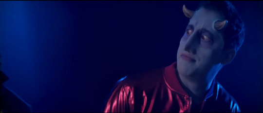
An interesting choice to have Layne go through a sort of "half-transformation" stage, where he has a horn and red eye on one side of the face, while the other side of the face is normal. I like it though!
People have said that Layne is meant to be the devil (who is in fact another Halloweentown resident, but honestly I think he's meant to be Lock, or at least a combination of the two, because this what the two characters look like:
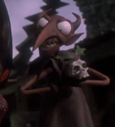

See how Layne resembles Lock more? In the outfit choice if nothing else (Also he's kinda sorta got the right face shape for Lock imo). Also, Lock wears a red trick-or-treating mask with horns on top!

Earl is really distressed about his hair falling out (not that I can blame him, really)

This shot/moment is probably one of the ones that stands out to me the most (other than Certain Other Ones for Other Reasons that I will get to in a moment), because J comes across as pretty mournful here, like he knows what's happening but he's feeling really sad/regretful about it? (Also I only just noticed Eli's face in the background and I'm not sure what to make of it 😅)

"pog" is not a word in my vocabulary 95% of the time, but this is basically just Pog faces right? (Geoff and Layne probably have the most fun of the group in this video ngl)
(Also I haven't yet touched on Geoff's transformations but I love the contouring work on his face!)
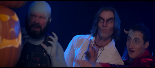
My god this video is comedy gold when it comes to pausing/taking screenshots

I daresay Eli ends up one of the least recognizable of the group by the end of it (other than J), and I wanna know how long that took to do

Geoff is the only one in the video who gets an outfit upgrade (Good For Him)
They didn't bother being movie-accurate with Geoff's vampire appearance, and honestly I'm definitely not complaining. (they made him hotter)
Layne did the music arrangement, but Geoff was in charge of the video production. How much say did he have over his own costume/appearance I wonder?
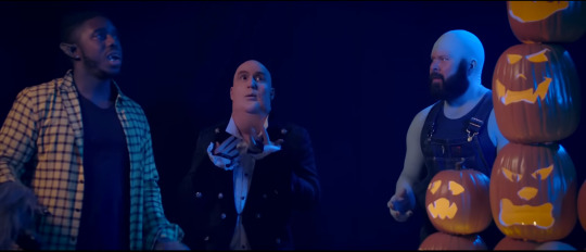
Visually speaking at least, nobody is even paying attention to him, they're just like "yeah that's just Geoff, normal behaviour, nothing new" 😆
I can't get a decent picture of it but shoutout to Layne doing a silly little run around the pumpkin stack, love that for him
Another small moment that a screencap wouldn't do justice: even as a vampire, Geoff still does his little self-conducting hand motions, which you might notice as he walks around the pumpkin stack, in the shot right after his "filling your dreams to the brim with fright" line
Also love Geoff's little almost-Elvis-like moves in the background for a brief scene. I know multiple commenters have mentioned it, but I'm yet to see a reactor notice it
Suddenly Layne is Concerned(tm) about Geoff's vampireness it seems?
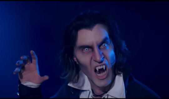
Also for someone who very much adores this guy, it took me an embarassingly long time to realise that Geoff's face at this point had become paler and his hairline had changed (and actually now that I type it up here, I think that might even be a wig? Oh dear)
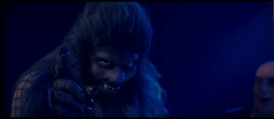
I don't really have anything to say about J's full transformation, but it would be unfair of me to not include him as well, and it's definitely a *very* impressive costume. Almost like one of those rubbery fully-covering-the-head costume mask things, but like it's his actual face?
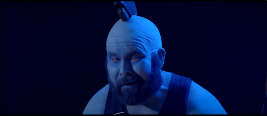
Is that tattoo real or fake, because I literally have never noticed it in any other Voiceplay video, but it's very realistic! (For that matter, what aobut Earl's upper-arm tattoo that kind of looks like a ring of barbed wire?)
I basically watch the This Is Halloween opening scene from The Nightmare Before Christmas every October, and same with the What's This scene in December, but I had never actually watched the movie in full until December last year. So basically when they had the axe-in-the-head moment in the movie I was like ohhhhhhh so that wasn't just a random moment that Voiceplay dreamed up for the video! (I had a similar moment with the Mr Hyde character and his Mini Mr Hydes in his hat in the movie, but in relation to Voiceplay's Kidnap The Sandy Claws video)

When Elizabeth Zharoff/The Charismatic Voice reacted to this video, she said that the kid at the end (Layne's nephew, apparently), was "adorable". Meanwhile Mortius' reaction to the end scene was "oh I didn't like that! It makes me feel like I'm next!" 😂
Also suddenly just realized that the "real world" scenes are in a different aspect ratio to the "spooky dream realm" scenes? Possibly intentional, but also possibly just due to them using two different types of cameras for the shots.
And that's a wrap! I was hoping to get this done and posted last night but it took longer than expected. Hope you enjoyed it, as I'm thinking of writing up at least one or two more now, and scheduling them for daily releases. See ya!
#Voiceplay#Acapella#geoff castellucci#layne stein#eli jacobson#j none#earl elkins#earl elkins jr#this is halloween#nightmare before christmas#the nightmare before christmas#acaplaya analysis#voiceplay visuals
9 notes
·
View notes
Note
lifelong dragon age fan but heard veilguard was more marvel cinematic universe than before - what are your thoughts?
This is hard to answer because calling something mcu is pretty vague. Do you mean like in terms of reliance on cameos? ironic quips? writing? I don't see Veilguard as any guiltier of cameos and quips than the previous games (which is to say: they are abundant). I've never considered the writing in the Dragon Age games to be masterpiece level, but I don't think this one is any worse than the others. It's a little tonally inconsistent at times, a little saccharine, kinda campy (an organization called the Shadow Dragons, really?), but again, no more than the previous games.
Honestly, the one thing that does remind me of the mcu is some of the armor sets. There's a couple that look like they're made of the same weird cheap padded leather that marvel costumes are.
There ARE criticisms to be made, but comparing it to the mcu feels buzzword-y.
In terms of differences from the previous games...
The aesthetic is far more varied and modern. Only the Grey Wardens look like something out of that sort of generic medieval fantasy look Origins had going on. It definitely feels like an extension of Inquisition's more creative design. Tevinter looks a lot like Kirkwall, but Antiva looks like 18th c. Italy. Every country/region has a unique look to it that I really like.
Combat is more action RPG than classic RPG. The thing plays like Mass Effect way more than Origins.
So far this feels like the least tonally dark of the series. It has its dark moments, but overall feels a lot cozier/safer.
Feels WAY less christian than the others
As for flaws, those mostly come down to the villains being completely flat and unmemorable (very Corypheus, but hammier), and clear signs of the game having been in development hell. You can tell that they had to retool a multiplayer game to a singleplayer one in limited time. You get these intros to new areas that look like they're ripped straight out of Destiny and certain plot items feel shoe-horned in to explain things that would make sense in a multiplayer game. There's a lot of environment reuse like in 2, but at least the areas are all packed with stuff, and you're introduced to them bit by bit (new paths unlocking) so it's not as overwhelming as Inquisition. You can't just stop and talk with your party in the hub area unless they have something to say. There's also some minor technical issues, a lot of clipping and the like.
I got a little off-track, but to answer your question: no, it doesn't feel any more 'marvel cinematic universe' to me than the previous games. I haven't finished it yet, or even gotten very far (only just got all the companions), so my opinion on everything I've said here might change, but for now, this is it.
2 notes
·
View notes