#The hue the colors
Explore tagged Tumblr posts
Visit Tumblr Blog
Explore Tumblr blogs with no restrictions, modern design and the best experience.
Last Seen Tumblr Blogs


Fun Fact
The KCSC sent more than 20K requests to delete posts related to prostitution and porn to Tumblr from January to June 2017.
Text
They are not leaving my brainn
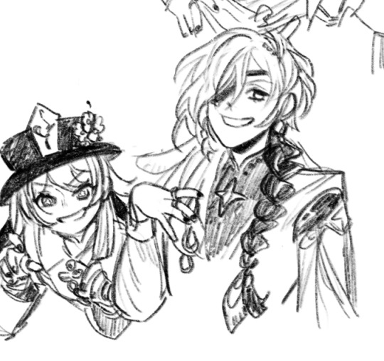
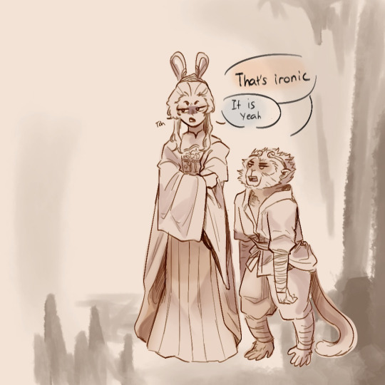
#Voted best three character designs#By me i voted#Listen their color palette is just *chef kiss*#Dear god kaeya give others a chance#He destroyed the competition#The hue the colors#It work off of his darker complexion#Kaeya#hu tao#candace#gensin impact#i have a lot to say but i can’t Englisch right now
325 notes
·
View notes
Text
⭐ Pixel Art Fundamentals - Hue Shifting
This technique is not uniquely specific to pixel art, but it's a very common term to hear when starting out watching those "dos and don'ts" videos. So what is hue shifting?
Hue shifting basically means to change the hue when making your shade darker or lighter. In this context, 'hue' = colour!
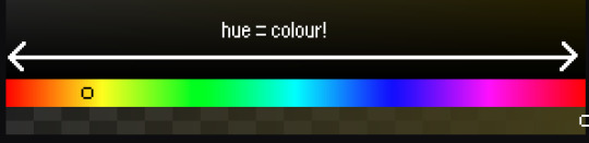
You may hear 'you need to hue shift more' when getting feedback on your art, but what does that mean really? Here are some examples:
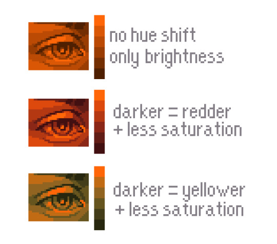
We can see even with just a bit of hue shifting, we have quite a different vibe for each drawing. In warm / daylight settings, no hue shifting can sometimes look a bit muddy or grey.
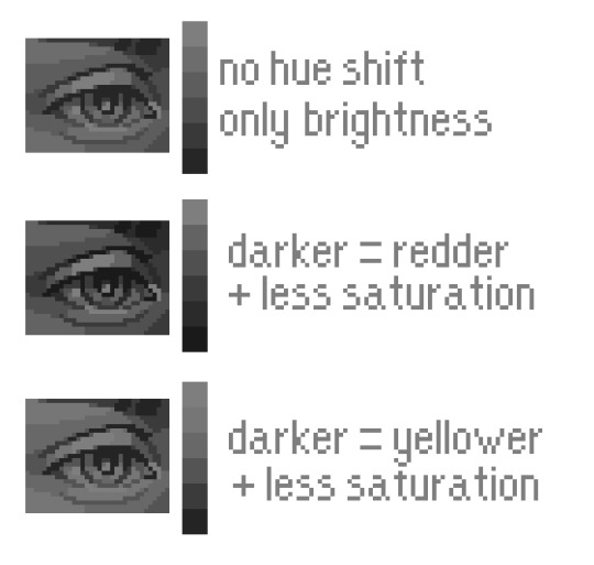
If we swap the image to grayscale, you can see that they look much the same:
As long as the hue shifted colours have a brightness that makes sense, they usually will work. You can get quite wacky with it.

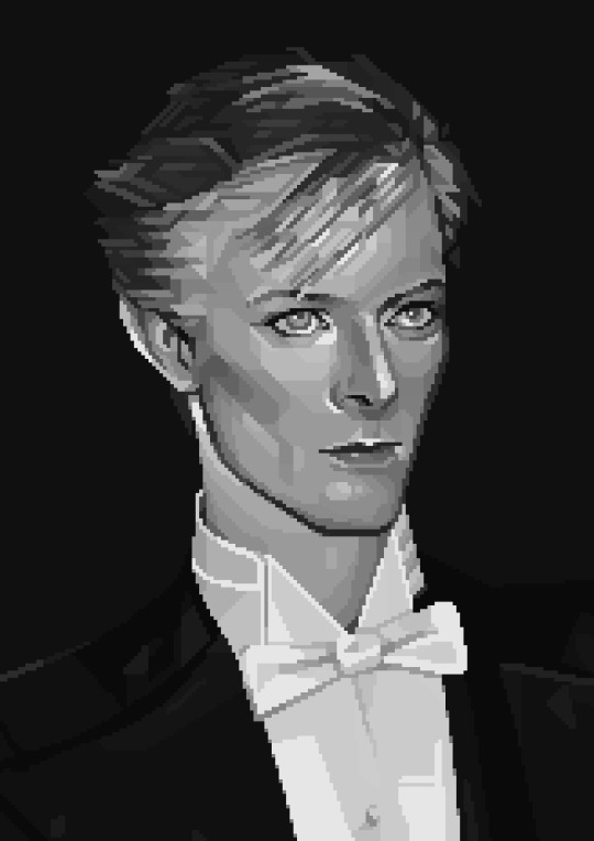
But is hue shifting always good? Not necessarily.
Below is some of my art where I intentionally didn't hue-shift at all. You can see it gives them an uncanny, digital, or photographic kind of look. As always, techniques are about your intention, or personal style.
I recommend trying different hue shifting methods! I especially love to use a cool blue or teal for the lighter shades.
Thanks for reading and I hope this helped a little! Have fun with it!!
⭐ Read my full pixel art guide here!
#pixel#pixelart#pixel art#pixel art tutorial#tutorial#art tutorial#colour theory#color theory#hue shifting#art#illustration#pixel illustration
5K notes
·
View notes
Text

I forgive him for being french on account of swag
#disco elysium#kim kitsuragi#disco elysium fanart#kim kitsuragi fanart#fanart#DE#proud of this one guys#though not entirely sure about rhe colors but weeeehhh its fine#i am yet to experiment with hues more#so this is good#my art
4K notes
·
View notes
Note
Forgive me if this comes across as strange, but I really enjoy the rich color you use for blood in your drawings. It's great for contrast against Machete's otherwise pale complexion, but it also really conveys the blood's vitality - it makes it feel alive and living, warm, even. That color, and all your art, really, is vibrant and full of life, enough so that it challenges the negative associations of death and injury that blood conveys. I just wish poor Machete had more of it inside him than outside
Thank you! I've never thought about it from that angle.
I know that realistically I should color the blood darker, maybe with a more maroon tint, but the visual intensity of vivid scarlet is just irresistable to me I guess. The excuse I tell myself is that in Machete's case, his white fur naturally provides the lightest possible background for that blood to sit on, maximizing the brightness and vibrancy it has to offer.
This is beside the point but I've also understood that anemia can affect the color of your blood if severe enough, but I'm not a medical professional so I can't really verify how visible that is to a naked eye. Not having enough hemoglobin makes it look diluted in a way.
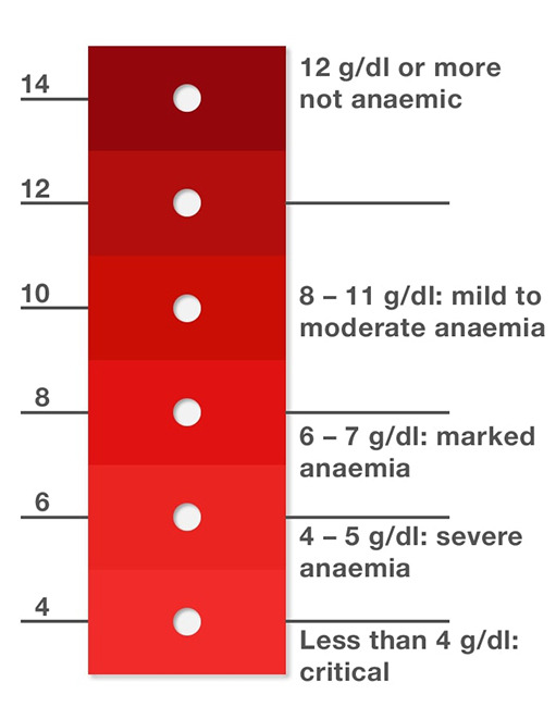
#not to ramble aimlessly about this but the color red and the theme of “blood=vitality” are central to his character in general#it's the color of his cardinal robes obviously and an eyecatching symbol of his accomplishments which are a crucial part of his identity#vivid red dye like that was exceedingly expensive so being able to wear it was a mark of high status#since he doesn't produce pigment of his own and doesn't have natural markings per se all color in his design#the hues of peachy pink and salmon even the vascular dark circles under his eyes#come from blood showing through the subtly translucent tissue#he struggles with an undiagnosed blood disorder and goes through regular bloodletting in a lamentably misguided attempt to cure it#a widespread and ordinary treatment at the time#and eventually gets assassinated and dies of hypovolemic shock#as a result of not being able to let go or escape his position in the church in time#answered#skespers#white dog syndrome
439 notes
·
View notes
Text

You know how most people in the Transcendental Cha Cha Cha Yaoi Club comment on how inherently ridiculous it is that the most generic and average human man would be able to attract what's probably one of the most powerful and musically-skilled cosmic entities in the multiverse and potentially The Void itself as well? I think we should explore that idea more, have some fun with it
#transcendental cha cha cha#tccc#tom cardy#tccc dj#tccc mc#in a wide existence full of so many unfathomable and gorgeous colors#why can't simple hues of brown and orange be a favorite?#update from the interplanetary ballroom:#local 4th dimensional guest hits the DJ with the stupidest pick up line in existence and then chokes on his drink a little#the DJ proceeds to have vivid daydreams of kissing him in the moonlight#also i'm absolutely a poly shipper with the void here but i'll deal with that later
1K notes
·
View notes
Text
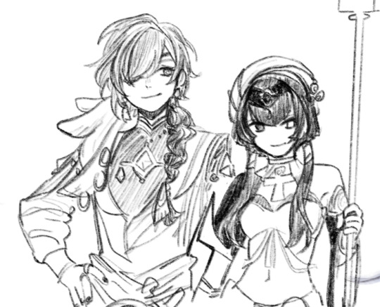
Nik and Ghost...NikGhost? *nods*

based on @on-a-lucky-tide about Nik Olympic press Ghost
#a whole page of them#the last pose in the olympic press is a bit weird cuz arms forgive me LOL#also Nekros' Nik kinda influenced me to make his hair more curly so ye curly hair Nik it is#also looking back at this the canvas color is a tad bit too close to the pen color hue so it looks#uh#too light? xD sorry about that too HAHA#okieeeeeeeeeee have this while i go work#gummmyart#doodle#simon ghost riley#simon riley#nikolai cod#cod nikolai#im easily persuaded see literally could ship Ghost with anyone with the right about of words#so#nikghost#captain john price#john price
579 notes
·
View notes
Text

Exotic birds discovered to be real founders of illegal aviary fight clubs scattered around zoos
#doodle from today#emperor penguin and toco toucan but I changed their natural colors to match them u.u#if narrator isn't green I get sick sorry guys#also tyler's red hue around the eyes is supposed to resemble his glasses hehe#so fond of them ❤️#fight club#soapshipping#the narrator fight club#tyler durden#fight club 1999#digital art#artists on tumblr#illustration#martyryo
433 notes
·
View notes
Text
I just want them to be happy T_T
#limbus company#project moon#my art#lcb heathcliff#lcb catherine#cathycliff#first thing on my new tablet!#colors are soo saturated there and have a lot more red hues#it was kind of a whiplash when i saw how dull and yellowish-green it was on my phone and monitor#anyway i have a lot of cathycliff doodles can't wait to clean them up a bit and post them#turns out it's really fun and a lot easier for me to draw on screen tablets
693 notes
·
View notes
Text
Today's gender is 'vintage' music artists posters
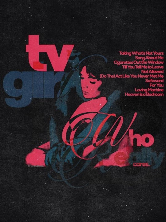
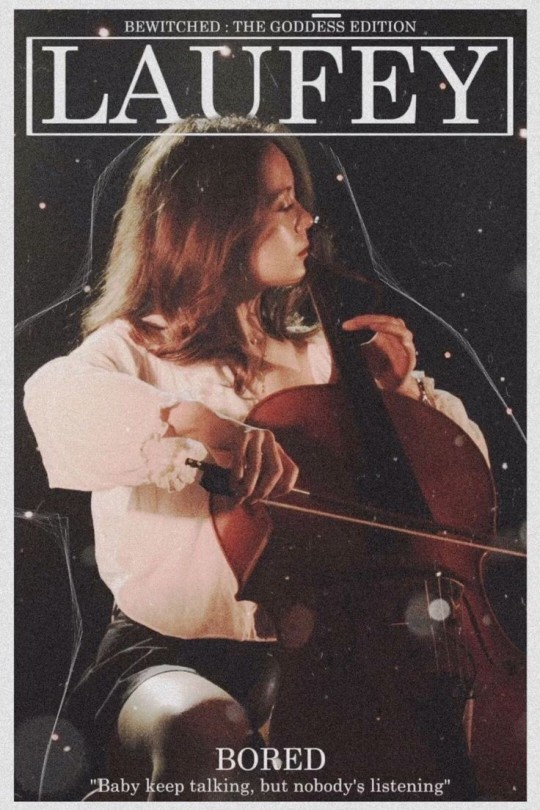
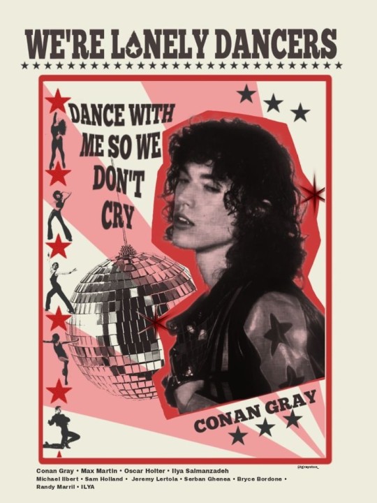
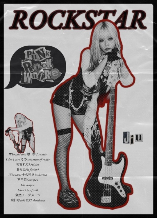
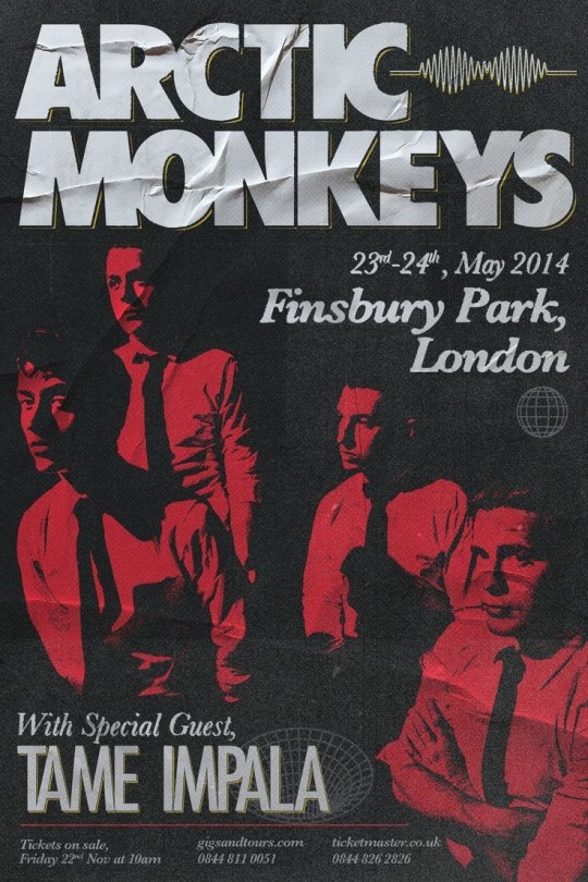
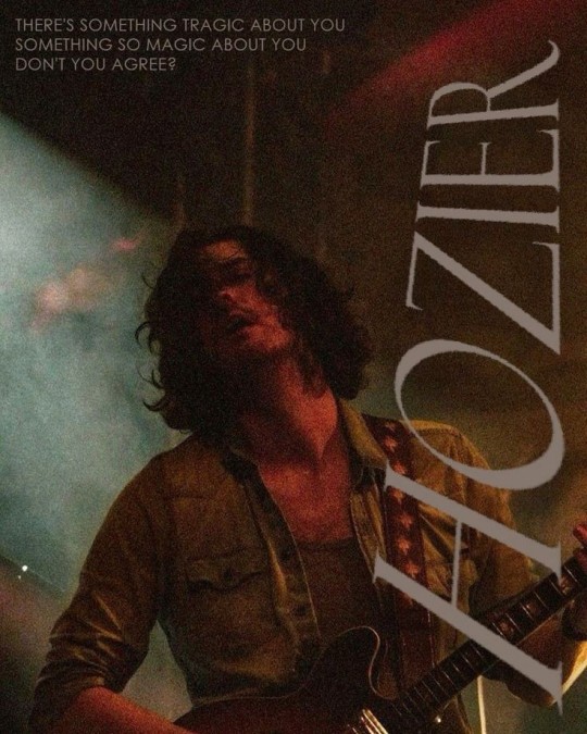
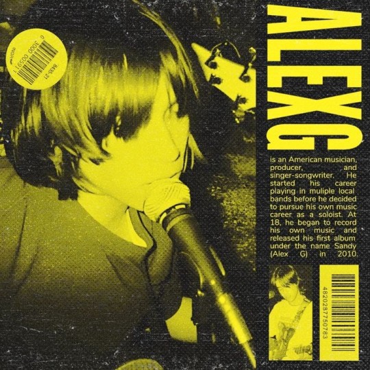
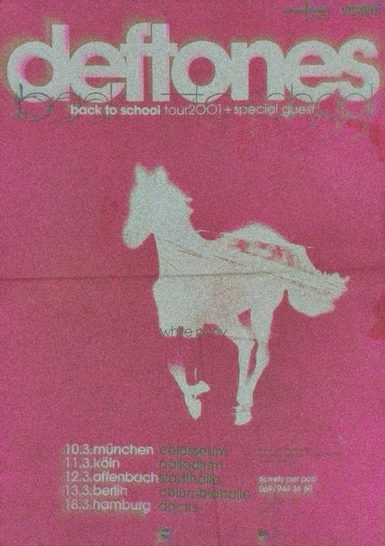
#people are so creative with these things I can't#EVEN IF IT'S SOMEONE I DON'T KNOW IT STILL HITS HARRDDD#love the Chappell Roan and Arctic Monkeys one#ALSO THE CONAN GRAY ONE??? AHHHHHRAA#music#music artists#music artwork#music aesthetic#music posters#band posters#chappell roan#mitski#tv girl#laufey#conan gray#mf it's GRAY. GREY IS THE FUCKING COLOR#or... hue??#dreamcatcher jiu#jiu#arctic monkeys#hozier#alex g#deftones
484 notes
·
View notes
Text
I think 90% of my gripes with how modern anime looks comes down to flat color design/palettes.
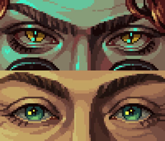
Non-cohesive, washed-out color palettes can destroy lineart quality. I see this all the time when comparing an anime's lineart/layout to its colored/post-processed final product and it's heartbreaking. Compare this pre-color vs. final frame from Dungeon Meshi's OP.


So much sharpness and detail and weight gets washed out and flattened by 'meh' color design. I LOVE the flow and thickness and shadows in the fabrics on the left. The white against pastel really brings it out. Check out all the detail in their hair, the highlights in Rin's, the different hues to denote hair color, the blue tint in the clothes' shadows, and how all of that just gets... lost. It works, but it's not particularly good and does a disservice to the line-artist.
I'm using Dungeon Meshi as an example not because it's bad, I'm just especially disappointed because this is Studio Trigger we're talking about. The character animation is fantastic, but the color design is usually much more exciting. We're not seeing Trigger at their full potential, so I'm focusing on them.
Here's a very quick and messy color correct. Not meant to be taken seriously, just to provide comparison to see why colors can feel "washed out." Top is edit, bottom is original.
You can really see how desaturated and "white fluorescent lighting" the original color palettes are.
[Remember: the easiest way to make your colors more lively is to choose a warm or cool tint. From there, you can play around with bringing out complementary colors for a cohesive palette (I warmed Marcille's skintone and hair but made sure to bring out her deep blue clothes). Avoid using too many blend mode layers; hand-picking colors will really help you build your innate color sense and find a color style. Try using saturated colors in unexpected places! If you're coloring a night scene, try using deep blues or greens or magentas. You see these deep colors used all the time in older anime because they couldn't rely on a lightness scale to make colors darker, they had to use darker paints with specific hues. Don't overthink it, simpler is better!]
#not art#dungeon meshi#rant#i'm someone who can get obsessive over colors in my own art#will stare at the screen adjusting hues/saturation for hours#luckily i've gotten faster at color picking#but yeah modern anime's color design is saddening to me. the general trend leans towards white/grey desaturated palettes#simply because they're easier to pick digitally#this is not the colorists fault mind you. the anime industry's problems are also labor problems. artists are severely underpaid#and overworked. colorists literally aren't paid enough to do their best#there isn't a “creative drought” in the anime industry. this trend is widespread across studios purely BECAUSE it's not up to individuals#until work conditions improve anime will unfortunately continue to miss its fullest potential visually#don't even GET ME STARTED ON THE USE OF POST-PROCESSING FILTERS AND LIGHTING IN ANIME THOUGH#SOMEONE HOLD ME BACK. I HATE LENS FLARES I HATE GRADIENT SHADING I HATE CHROMATIC ABBERATION AND BLUR
2K notes
·
View notes
Text
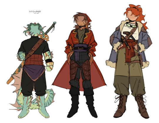
i imagine it's quite chilly in the black sea (for the lack of sun and color), so they're wearing slightly warmer clothes now uwu
+ thoughts
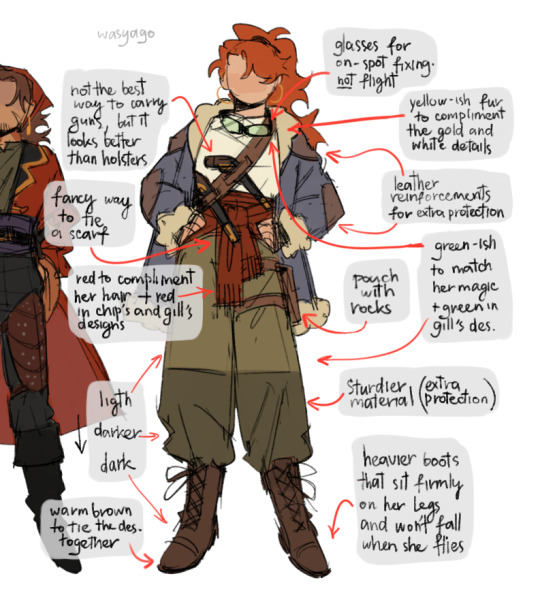
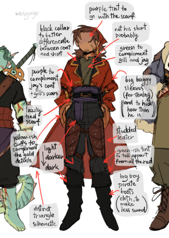
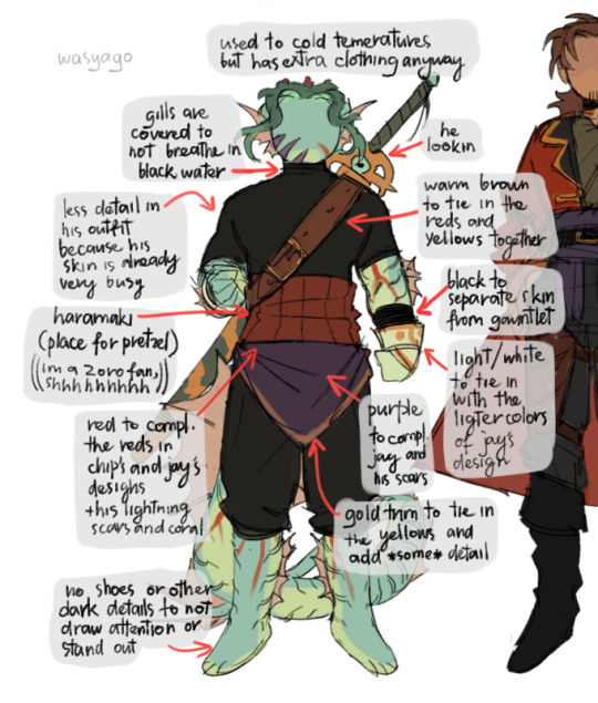
#i was meaning to only draw jay to try and figure out a design for her *once more*#but i was super happy with the first one i did so i drew the boys in slightly changed outfits instead#also yeah im VERY pleased with this outfit for jay. the colors look sooo good and exactly like i imagine them to look#the pants are not straight up green but they have this green ish hue to them that adds a lot i think#quite happy with chip's and gill's outfits too they're very sexy and cool hehe#gill in the turtleneck with short sleeves-- so good. and i gave him a haramaki!!!!!!!!!!! hell yeah the one piece fan in me is happy#and chip in the high waisted pants and these boots-- brooooo. slaying so hard. and he's wearing a proper shirt which is rare#also. there's a lot of typos in the explanations probably. um. yeah. not always looking at what i write#edit: forgot the actual tags whoops#jrwi riptide#jay ferin#jrwi chip#gillion tidestrider#my art#sketch
2K notes
·
View notes
Text

alt color for funsies
#my art#orv#kim dokja#i was sending this progress to mori in tears bc i was so mad different color scheme that didnt work with overall piece was too good#og color choices were set in stone i had very specific details in mind... comes KDJ looking beautiful in any hue shift....#PLEASE see source link to the actual finished art.... he's different there 😅
260 notes
·
View notes
Note
Has Wukong ever taken Sulkha out on a romantic date? If so, how’d it go?
Hello !!♡
Yes he has! Throughout his journey, he learnt his mistakes and made a better date each time.
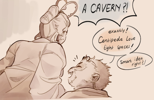
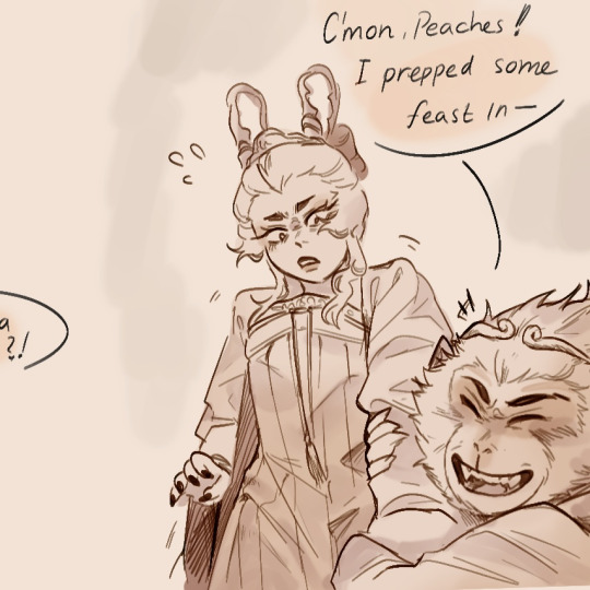
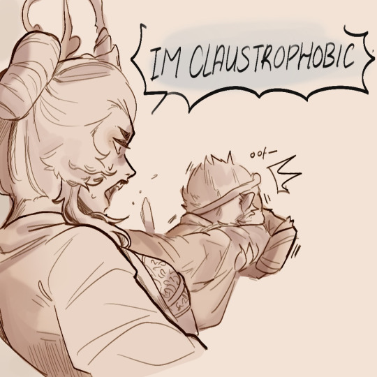
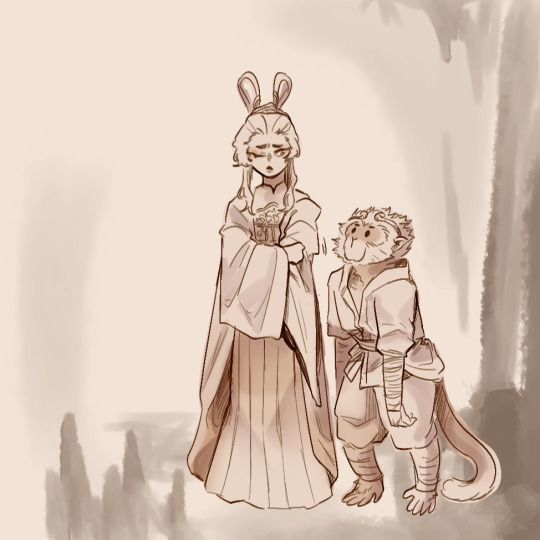
Usually they both spend time with each other just basking and spending quality time, some might call it a date but they dont really consider it as one. A date is moreso when a big thing has been planned by one of the two, thats what they call a date.
Their first ever "date" that the two agreed upon is when Wukong accidentally dragged Suklha to the cavern where she got ambushed by a previous lover. Traumatized her a lil. She gave him a chance and continued the date on a nearby meadow eating his beautifully chopped up fruits. They shared stupid stories they experienced during this.
Well Wukong didn't know it. Despite being her stalker for awhile. This was early on their relationship.
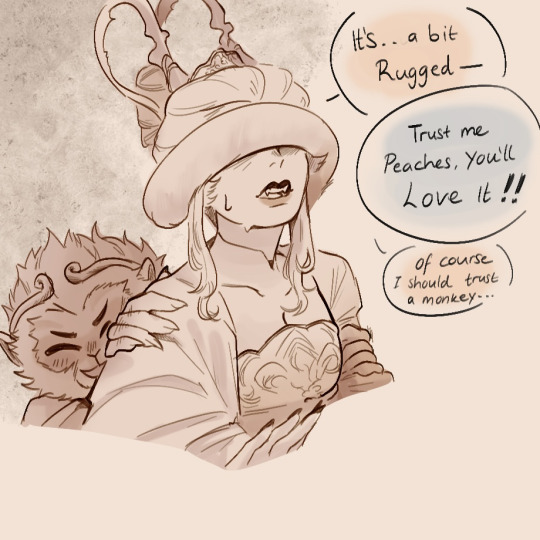
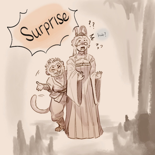
#¿ — ask#Suklha#🀄—suklha lore#✍️—doodles#📚—comics#smol wukong#so smol#hue#🙊#if u guys see me draw Suklha without her cloud collar#its before Wukong proposed to her xp#he was a stalker kdjdkd#yeah Suklha used to have long hair#NOOO NOT ME COLORED THE FIRST DIALOGUE WRONG#ignore it thx#sunwukong#sun wukong x oc#jttw oc
207 notes
·
View notes
Text
Doing something I have been meaning to do for months


Drawing a bunch of different alternates of Color
Original Color is by @/superyoumna
Mirrorverse Color by @the-cactus-taco
The Cat Cafe Color by @ask-the-cat-cafe
BSSMP color by @bad-sanses-smp
Static Hue by @ossiethegreat
(if anything inaccurate i apologize in advance)
#bssmp fanart#color!sans#color sans#othertale#othertale sans#static hue#tcc fanart#erm#idk if theres a tag#ask to tag ig?#i dont know if i should tag for the other ones ?#color variants#if theres a fanart tag i dont know about tell me lol#eyestrain#cw eyestrain#HOW DID MY DUMBASS FORGET TO TAG THAT#anyways#bright colors
344 notes
·
View notes
Text

Kokichi is doing the AoT thing, you know the one, it's under the cut.
Oh also I did some redesigns here for funsies

#danganronpa#danganronpa v3#drv3#danganronpa fanart#kokichi ouma#shuichi saihara#gonta gokuhara#en's art#actually I did the redesigns because I realized#i hate drawing characters who are dressed in a single color#I NEED MORE COLORS/HUES
362 notes
·
View notes
Text

Thank u for liking my Morro design. Here is more of her
More ⬇️
get yuried
#first time drawing him with yellowish hues#green is literally the worst color ever hate that guy#ninjago#morro ninjago#lego ninjago#morro wu#my art#francis wancis art#shes like if an unpleaant gradient was a lesbian#citrusshipping#lol#if u saw the first one no u didnt there was a line pissing me off#ninjago art
197 notes
·
View notes