#Ron Lim Artist
Explore tagged Tumblr posts
Text

"''NUFF SAID," INDEED.
PIC INFO: Spotlight on colossally awesome Galactus pin-up by Ron Lim & Joe Rubinstein, from "Silver Surfe," Annual Vol. 1 #1. January, 1988. Marvel Comics.
Anyway, I didn't notice it at first, but while every other character in said SS Annual was afforded their own summary and/or bio description, all Galactus was granted are the words "'Nuff Said." Only too true!
Source: https://comicvine.gamespot.com/a/uploads/scale_super/7/72459/8571981-silversurfer-a0001-49.jpg.
#Galactus#Devourer of Worlds#Galan#Galan of Taa#Marvel Comics#Marvel#Supervillains#Cosmic Beings#Sci-fi Art#The Devourer of Worlds#Cosmic Power#Pin-up Art#Ron Lim#Joe Rubinstein Artist#Silver Surfer Annual#Space is Deep#Illustration#Comics#Comic Books#1988#80s Marvel#Pin-ups#Ron Lim Artist#Ron Lim Art#Marvel Universe#Marvel Villains#80s Style#Joe Rubinstein#Silver Surfer Annual Vol. 1#1980s
3 notes
·
View notes
Text

ron lim sonic in mah style
#art#my art#artwork#fanart#digital art#digital drawing#artists on tumblr#fanartist#sonic art#archie comics#archie sonic#ron lim#shadow the hedgehog art#shadow the hedghog fanart#sonic the hedghog fanart#trans sonic#sketch
67 notes
·
View notes
Text
Badger #50 (1989) Die-cut Cover, Mike Baron Story, Ron Lim & Jeff Butler Artist
#Badger #50 (1989) Die-cut Cover, #MikeBaron Story, #RonLim & #JeffButler Artist Jeff Butler returns to this Anniversary. Badger, Ham, and Daisy find trouble while on vacation in the Yucatan Peninsula. SAVE ON SHIPPING COST - NOW AVAILABLE FOR LOCAL PICK UP IN DELTONA, FLORIDA https://www.rarecomicbooks.fashionablewebs.com/Badger.html#50 #FirstComics #KeyComicBooks #RareComicBooks #VintageComicBooks

#Badger#50 (1989) Die-cut Cover#Mike Baron Story#Ron Lim & Jeff Butler Artist#Rare Comic Books#Key Comic Books#DC Comics#DCU#DC#Marvel Comics#MCU#Marvel#Marvel Universe#DC Universe#Dynamite Entertainment#Dark Horse Comic Books#Boom#IDW Publishing#Image Comics#Now Comics
0 notes
Text

this one also has the first appearance of the infamous ron lim, even if its just a pin-up
#i actually really like ron lim's art#its really expressive and honestly cute. there are worse artists#''oh its goofy and janky'' and?????#you try drawing for a monthly comic#my posts#archie sonic posting#super special 10
1 note
·
View note
Text
Adds for games were always so inaccurate to reality.

#ron lim#silversurfer#Nintendo#Silver Surfer#Firelord#Possessor#Reptyl#Mephisto#Super-Skrull#Ron Lim#ad#artists#gaming
12 notes
·
View notes
Text
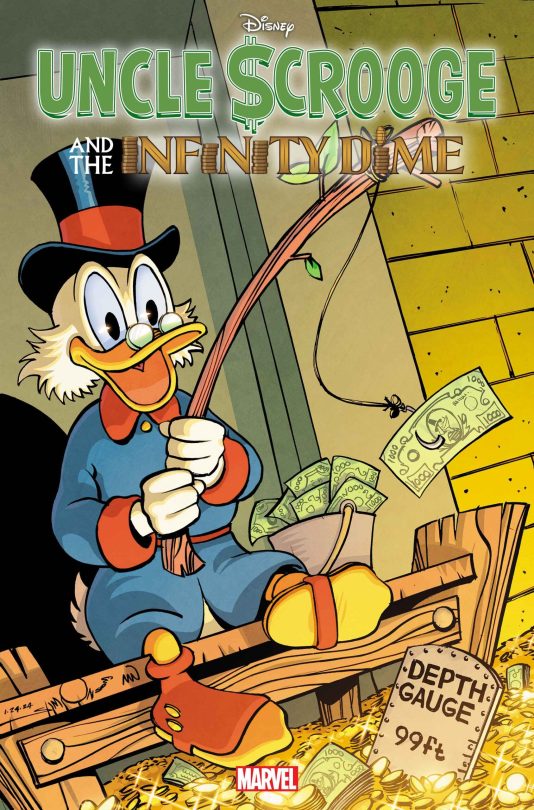
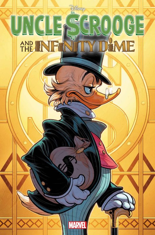


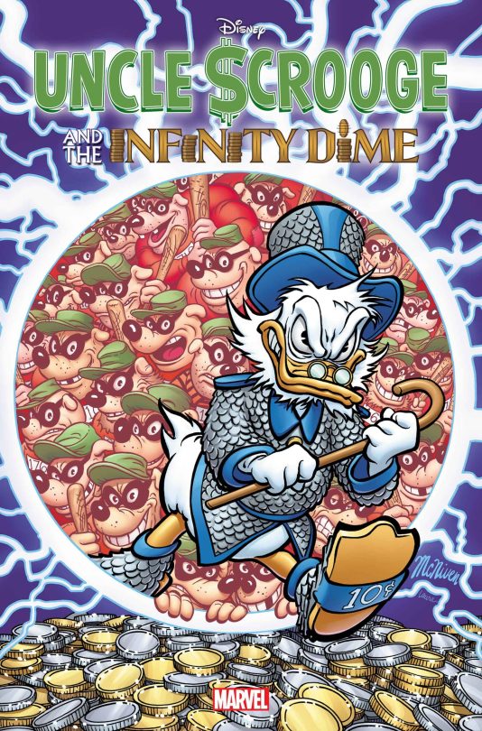

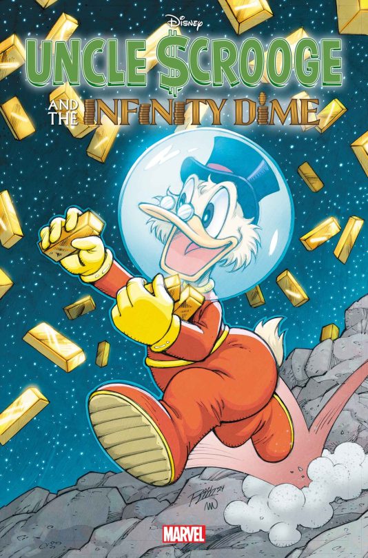

"This June, Disney comic book icon Uncle Scrooge headlines his first-ever Marvel Comic book in UNCLE SCROOGE AND THE INFINITY DIME #1. Written by legendary Marvel scribe Jason Aaron and drawn by an incredible lineup of celebrate Disney comic book artists, this one-shot will masterfully blend the beloved world of Uncle Scrooge with the hallmarks of Marvel Comics storytelling.
In addition to breathtaking covers by Alex Ross and Lorenzo Pastrovicchio, UNCLE SCROOGE AND THE INFINITY DIME will have a fortunes-worth of variant covers by some of the industry’s most acclaimed artists including Peach Momoko, John Romita Jr., J. Scott Campbell, Walter Simonson, Ron Lim, Elizabeth Torque, and Gabriele Dell’Otto. And like all of Marvel’s major launches, UNCLE SCROOGE AND THE INFINITY DIME #1 will shine as brightly as Scrooge’s treasure vault with a special FOIL VARIANT COVER by superstar artist Steve McNiven.
Announced last month, UNCLE SCROOGE AND THE INFINITY DIME #1 will see Scrooge embark on a time-honored Marvel adventure as he explores the Multiverse to stop a twisted alternate Scrooge from becoming the all-powerful and incomprehensibly rich Scrooge-Above-All! Along the way, the story will introduce exciting new takes on the iconic tycoon with a heart of gold and feature appearances by Scrooge’s nephew, Donald Duck; grandnephews, Huey, Dewey, and Louie; and his supporting cast of characters, including Gyro Gearloose!
See never-before-seen variant covers for the highly-anticipated UNCLE SCROOGE AND THE INFINITY DIME #1, on sale in June.
SUPERSTAR ARTISTS CELEBRATE SCROOGE MCDUCK’S FIRST-EVER MARVEL COMICS ADVENTURE WITH NEW UNCLE $CROOGE AND THE INFINITY DIME #1 COVERS!"
Source: Marvel
New covers comics related to Uncle Scrooge and the Infinity Dime from the Marvel edition that will be released in June this year. Most of these covers were drawn by LORENZO PASTROVICCHIO, PAOLO MOTTURA, FRANCESCO D'IPPOLITO, VITALE MANGIATORDI and others.
#uncle scrooge#scrooge mcduck#marvel#marvel comics#disney comics#comics#duckverse#ducktales#uncle scrooge and the infinity dime#beagle boys#infinity dime#comic covers#disney duck#disney ducks#disney dogs#disney duckverse#disney duck comics#duck comics#lorenzo pastrovicchio#paolo mottura#francesco d'ippolito#alex ross#steve mcniven#others#mona lisa#money bin#money
43 notes
·
View notes
Text
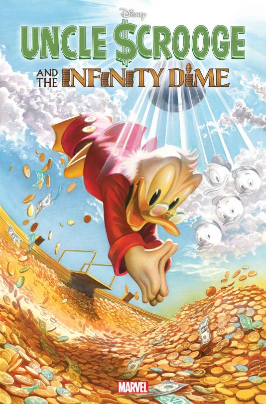


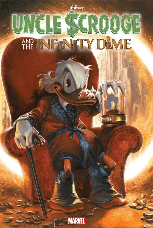
Uncle Scrooge and the Infinity Dime by Carl Barks, Jason Aaron, Paolo Mottura, Francesco D'Ippolito, Vitale Mangiatordi, Alessandro Pastrovicchio & Giada Perissinotto. Cover by Alex Ross. Variant covers by (2) Peach Momoko, (3) Walt Simonson, (4) Ron Lim, (5) Elizabeth Torque and (6) Gabriele Dell’Otto. Out in June.
"FOR THE FIRST TIME EVER, MARVEL AND DISNEY TEAM-UP TO BRING YOU THE STORY OF THE ¢ENTURY! It’s the story you never expected! One of the greatest characters in the history of comics leaps into his most epic adventure yet, in the manner only MARVEL can deliver! When UNCLE SCROOGE’S fabled money bin gets stolen by a shocking culprit, the world’s toughest duck must undertake a quest unlike any other, alongside a surprising array of allies: other versions of himself! An oversized special, from Marvel mainstay writer JASON AARON (THOR, AVENGERS) and a cadre of celebrated Scrooge artists! Also re-presenting the classic CHRISTMAS ON BEAR MOUNTAIN, the first appearance of Scrooge McDuck by the legendary DISNEY COMICS creator, CARL BARKS!"
#uncle scrooge and the infinity dime#uncle scrooge#marvel#carl barks#jason aaron#paolo mottura#francesco d'ippolito#vitale mangiatordi#alessandro pastrovicchio#giada perissinotto#alex ross#peach momoko#walt simonson#ron lim#elizabeth torque#gabrielle dell'otto#variant cover#one-shot#comics
38 notes
·
View notes
Text
Know Your Venom
A handy guide to differentiating all those spider-y symbols! (Part 1 of 2)
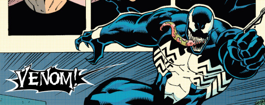
(Venom #150 "Malled!"; Michelinie, Lim)
Hey there, true believer! Are you tired of looking at comics with your favorite black-and-white wicked webslinger and not knowing who's beneath the goo? Fortunately for you, I'm here to help! We'll take a look through the years and hopefully give you some pointers on how to tell who's who. This isn't a foolproof guide by any means, but I hope it's helpful!
So, let's start at the beginning.


(Marvel Super Heroes Secret Wars #7-8; Shooter, Zeck)
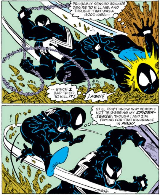
It's very important to me that people understand that the original black suit costume came from Spider-Woman (Julia Carpenter)! That's why I often, and will for the rest of this guide, refer to it as the Carpenter Symbol. Know your roots!
For the most part though, we see this design used as a mockery of Spider-Man by the first Venom, Eddie Brock.

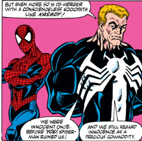
(Amazing Spider-Man #299, #331, and #362, by Michelinie and McFarlane, Larsen, and Bagley respectively)
The earliest artists for Venom all drew the Carpenter Symbol very close to how it originally was designed. You see this continued pretty much to this day, and so if you see a stocky guy in this look with biceps the size of his head - that's probably Eddie.
Early comics are easy, because the only other person to bear this symbol is Anne Weying, and her She-Venom look is. Well. Distinctive.

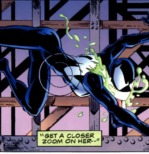
(Venom: Sinner Takes All #3; Hama, Luzniak & Palmiotti - Venom: Along Came a Spider #3; Hama, St. Pierre)
A few artists will draw the legs of the spider-symbol either much, much closer together (sometimes if the shot is tiny enough they'll just look like a solid mass), but others like Ron Lim will at times draw them further apart. For the most part it's pretty consistent though.
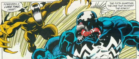
(Venom: Lethal Protector [1993] #5; Michelinie, Lim)
And then... we get into the 00s.
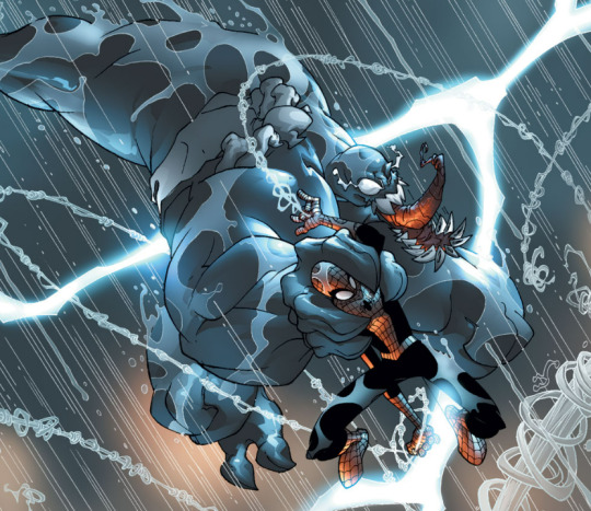

(Venom [2003] #16-17; Way, Skottie Young)
The above looks are pretty unique to how Skottie Young does Venom. And even then, Young's Venom nowadays looks less... like that. I'm not going to share a lot from this series, but we start to get a beefier-looking Venom. This would continue into Spectacular Spider-Man (2003) by Paul Jenkins and Humberto Ramos.
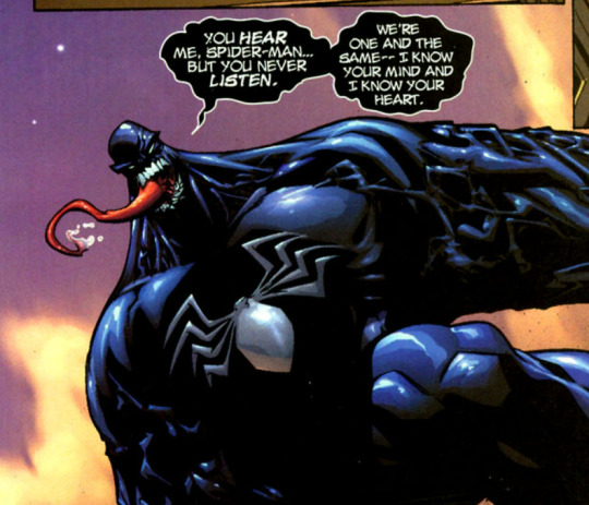
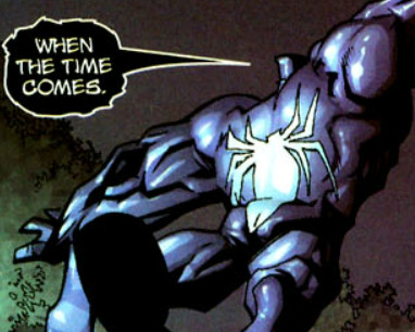
(Spectacular Spider-Man (2003) #3, #5; Jenkins, Ramos)
In some ways, you can kind of explain the inconsistency in the symbol by the fact that Eddie and the Symbiote's symbiosis was crumbling - but it's also just. Not that well-written as a Venom story.
And then we get into other hosts.
I feel obligated to point out that Trish Robertson was the first host of the Venom clone that would eventually become Mania - she literally only appears in Venom (2003) but she's almost indistinguishable from Venom.

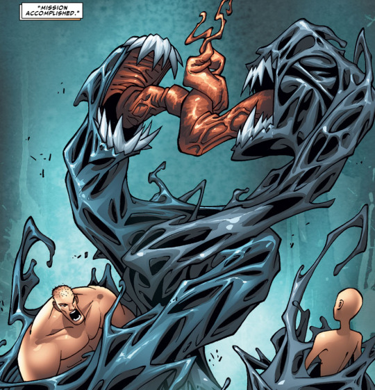
(Venom [2003] #16; #18. I'm not going to describe what's happening in these panels, I took too much psychic damage just gathering them.)
Best I can give you is; Trish!clone!Venom is slightly more grey-purple and that's all I'm gonna give you on this topic.
Angelo Forunato was only alive for 2 issues, and he has one look:
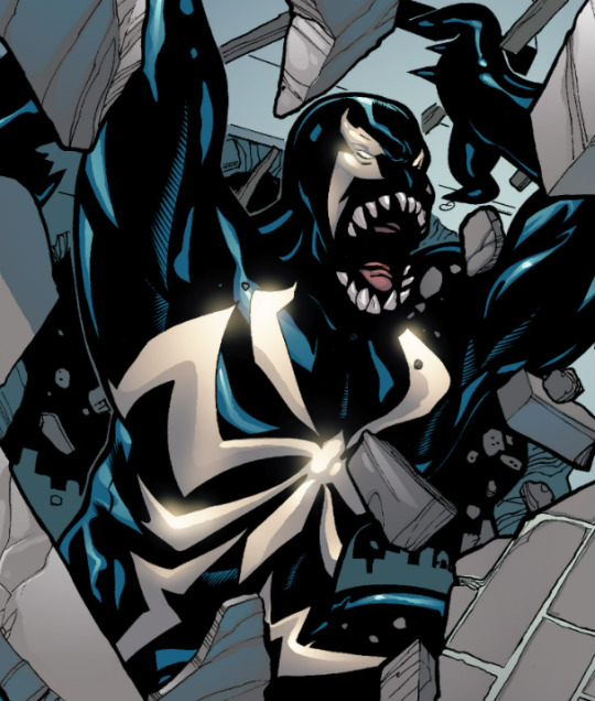


(Marvel Knights: Spider-Man [2004] #7-8; Millar, Dodson)
He's the first Venom we see fully deviate from the Carpenter Symbol. He also has really distinctive eyespots and the first instance of seeing an actual eyeball in the spot. The legs of the spider-symbol are fully separated from each other, and even extend down to the thighs.
The symbiote, displeased with Angelo (and having thrown him off a roof), next went to Mac Gargan, arguably the third or fourth most important Venom to carry the name.
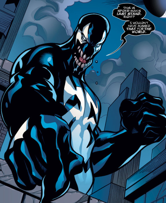
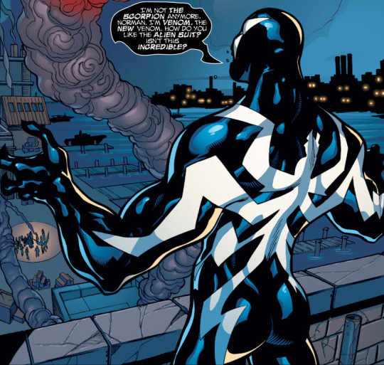
(Marvel Knights: Spider-Man #10-11; Millar, Dodson)
Beyond! is an interesting case in that it's the first time we see Mac!Venom with the Scorpion tail, which we don't really see again. It's an odd duck of a series overall, but it is kinda fun to see Mac utilizing some of the shapeshifting abilities. But, more to the point of this guide, you can always tell him apart by the white spider-legs going over the shoulders and up the arms.
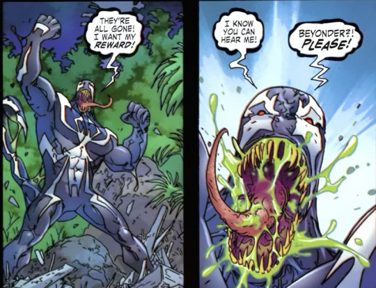
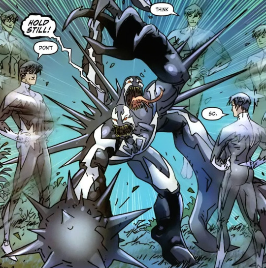
(Beyond! #5; McDuffie, Kolins)
Thunderbolts is when you really start to see deviations from the original Mac look. This series especially leans into a very grotesque-looking Venom, but usually there's still some semblance of the original symbol. That's what to look for. But if you see a chonky boy and it's in that mid-2000s art style? You're probably looking at Mac.
You also get variations on the way the spider-legs are drawn. Some artists make them a little skinnier.

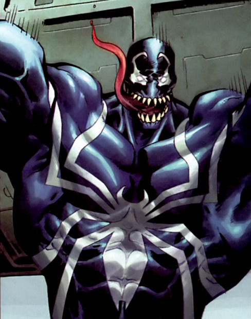

(Thunderbolts #114; Ellis, Deodato Jr. - Thunderbolts #122; Gage, Blanco - Amazing Spider-Man #570; Slott, Romita Jr.)
Here's where it gets tricky.
During Dark Avengers, Mac adopts the Carpenter Symbol (and a slimmer look) at Osborn's behest, and immediately starts looking anywhere between your classic Black Suit Spider-Man and Eddie's look as Venom. Your best bet during this era is to use context clues. Based on the art style for this era, if you're thinking "that's probably not Eddie", you're right. Eddie's running around as Anti-Venom.

(Dark Avengers [2009] #1; Bendis, Deodato)
And, yes, that means that this scene... is Mac Gargan. No other Venom would let Norman Osborn boss them around. Please, for the love of God, get this one right.

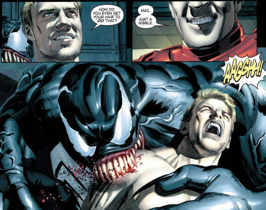

(New Avengers Annual #3; Bendis, Mayhew)
Mac keeps this look all the way up until he and the symbiote are separated, which leads us to...
Flash Thompson, AKA Agent Venom.
(Coming in Part 2!)
#venom#eddie brock#mac gargan#angelo fortunato#peter parker#marvel comics#trish robertson#kita talks comics
115 notes
·
View notes
Text


A whole buttload of Surfer based pinups in the back here... I made sure to keep track of artists this time.
John Buscema
Jim Lee
Rick Leonardi
Bruce Patterson and Kirkowood Studios
Jim Starlin and Terry Austin
Ron Lim and Bob Wiacek
66 notes
·
View notes
Text
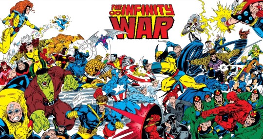
Infinity War Vol 1 #2 / Published: May 26, 1992 / Artist: Ron Lim
#infinity war#ron lim#1990s xmen#xmen#wolverine#gatefold#captain america#the avengers#hulk#xfactor#fantastic four#marvel#battle royale motif#guest starring xmen#crossover
33 notes
·
View notes
Text
Marvel Comics Reveals 9 "Infinity Watch" Titles
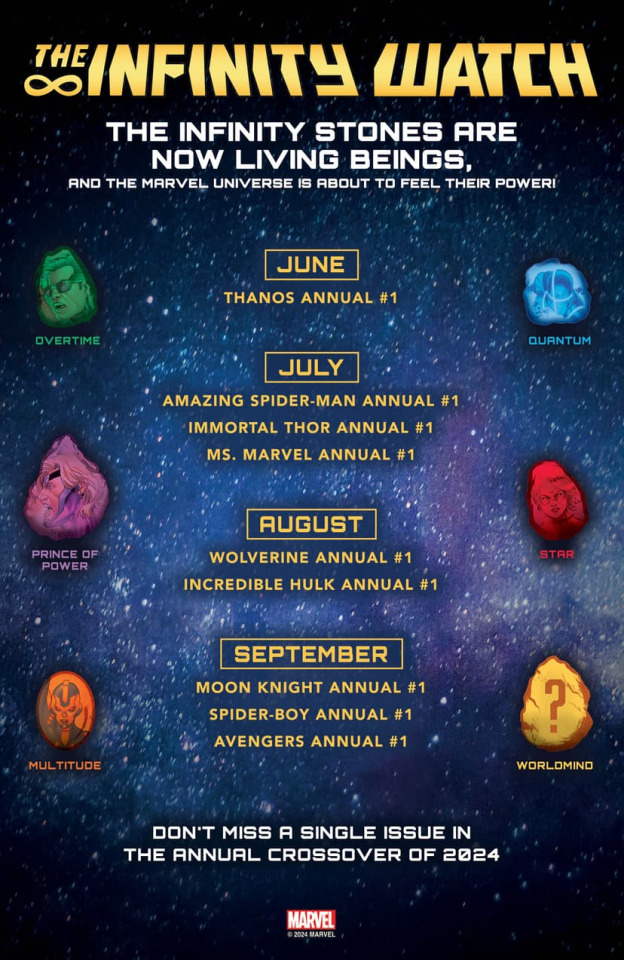
Marvel Comics' "Infinity Watch" event will take place across nine annuals as both established and newer Marvel characters battle to contain or control the power of the Infinity Stones, culminating with the formation of The Infinity Watch, made up of the stone's guardians. The event will introduce the bearer of the Mind Stone and will follow up with the other Infinity Stones' bearers - Star, Overtime, Prince of Power, Quantum, and Multitude. These Stone-Bearers will deal with their new powers, the mistrust from their peers, and, of course, Thanos.
The "Infinity Watch" event is spearheaded by writer Derek Landy. Landy will write key chapters in the saga and, along with artist Sara Pichelli, create backup stories in each of the nine annuals that follow the creation and pursuit of the Death Stone-Bearer. Covers for the "Infinity Watch" annuals are by Salvador Larroca
The saga begins in June with Thanos Annual #1 - "Infinity Watch" Part 1, from writer Derek Landy and artists Salvador Larroca and Sara Pichelli, on sale June 26, 2024.
In July the saga continues with Amazing Spider-Man Annual #1 - "Infinity Watch" Part 2, from writer Derek Landy and artists Ron Lim and Sara Pichelli, on sale July 3, 2024, Immortal Thor Annual #1 - "Infinity Watch" Part 3, from writer Al Ewing and artists David Baldeón and Sara Pichelli, on sale on July 17, 2024, and Ms. Marvel Annual #1 -"Infinity Watch" Part 4, from writers Iman Vellani and Sabir Pirzada and artists Giada Belviso and Sara Pichelli, on sale on July 31, 2024.
In August check out Wolverine Annual #1 - "Infinity Watch" Part 5, from writer Ezra Claytan Daniels and artists Yildiray Çinar and Sara Pichelli, on sale August 14, 2024, and Incredible Hulk Annual #1 - "Infinity Watch" Part 6, from writer Derek Landy and artists Geoff Shaw and Sara Pichelli, on sale on August 28, 2024.
Finally, in September we will see Moon Knight Annual #1 - "Infinity Watch" Part 7, Spider-Boy Annual #1 - "Infinity Watch" Part 8, and Avengers Annual #1 - "Infinity Watch" Part 9, with creative teams to be announced at a later date.
(Image via Marvel Comics - "Infinity Watch" Checklist)
#infinity watch#infinity stones#derek landy#sara pichelli#salvador larroca#thanos#amazing spier-man#immortal thor#ms marvel#wolverine#incredible hulk#moon knight#spider-boy#avengers#ron lim#al ewing#david baldeon#iman vellani#sabir pirzada#giada belviso#ezra claytan daniels#yildiray cinar#geoff shaw#marvel comics#TGCLiz
11 notes
·
View notes
Text

"NOW HE EXISTS AS A SCRAMBLED SIMULACRUM IN A SECRET SEPULCHRE..."
PIC INFO: Spotlight on pin-up art of Supremor, a.k.a., the Supreme Intelligence, artwork by Ron Lim & Joe Rubinstein, from "Silver Surfer" Annual Vol. 1 #1. January, 1988. Marvel Comics
So, I posted this same exact piece last month, but this one boasts a much darker shade of green than the last one, so, I thought it merited a re-posting. All in all, I still can't decide which one I like more.
Source: https://viewcomics.me/silver-surfer-1987/issue-annual-1/full.
#The Supreme Intelligence#Kree Empire#Artificial Intelligence#Supervillains#Pin-up Art#Marvel#Marvel Comics#Silver Surfer#Silver Surfer Annual#Joe Rubinstein#Cosmic Beings#Sci-fi Art#Kree#Silver Surfer Annual Vol. 1#1980s#Marvel Universe#Marvel Villains#80s#Ron Lim Art#80s Marvel#Supremor#1988#Supreme Intelligence#Ron Lim#Ron Lim Artist#Joe Rubinstein Art
0 notes
Note
okay so which artist’s style of archie sonic do you vibe with the most? people can say what they want about the changing styles but some of it actually is appealing to look at. To me it hits the hardest with some of the covers and it’s a shame we don’t get that anymore. The panels are just as good as times.
So yeah which issues/covers are your favorites?
Specifically Before the flynn era.
artists specifically i like spaziante, mawhinney's gag era/classic art is good but he didn't make the transition to modern era, steven butler is one of my all timers, as well as j axer... ron lim isnt my Favorite but i think hes underrated. and i LOVE manny galan's work on the knuckles comic as well its a shame he wasn't able to do the pencils for the whole title
#the majority of archie covers are spaziante so most of them are good lol#although there are a couple of stinkers
2 notes
·
View notes
Text

Comic Book Break: The Venom Symbiote
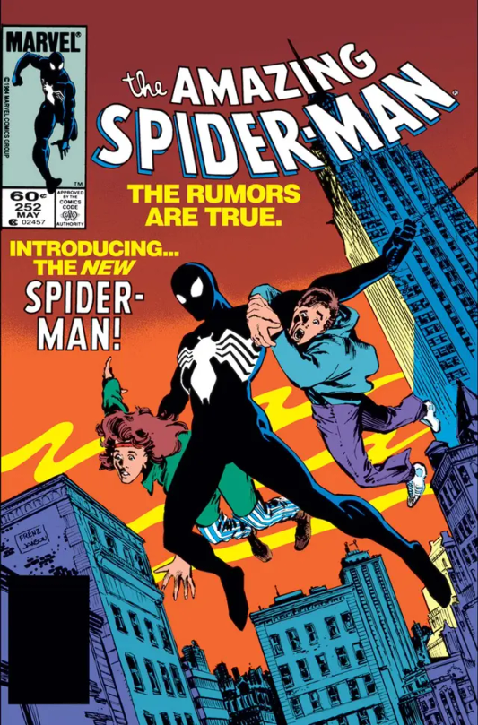
Featured art by Ron Lim: Covers for Marvel Tales #266-268 Mark Bagley: Carnage/Spidey/Venom Poster Ron Frenz: Cover for Amazing Spider-Man #252
I grew up as a Spider-man fan in the 90’s, which means I (predictably) thought Venom was the coolest villain of all time. My Dad introduced me to Spidey’s ‘modern era’ shortly after Carnage first hit the scene, which means the Symbiote villains were a hot topic. As such, my first introduction to both Venom and Carnage would be in the pages of ‘The Amazing Spider-man’ #365, and boy did that issue leave an impression.
You see up to that point my fascination with the web head was moderately new, and I remained largely ignorant to the finer points of his lore. My Dad had just begun to re-discover comic books for the first time since his childhood, and this particular issue was a extra sized anniversary edition, replete with a holographic cover, character histories, and even a handful of bonus stories that were framed around various side characters who could reminisce about Spider-man’s classic tales. It was a handy way to bring new readers up to speed, and it worked well enough on my Dad (much to my approval) for him to continue collecting until the Clone Saga ruined everything. ASM #365 also featured this absolute BANGER of a poster by Mark Bagley. Check it out!

That image was seared into my brain, and two things became abundantly clear to me 1) Those villains were unequivocally, the greatest characters in modern literature, and 2) I needed to know why. Obviously I asked my Dad who those guys were, and he proceeded to explain the basic premise of the Symbiote suit and it’s history with Spider-man. Needless to say, I became obsessed with finding an issue, ANY ISSUE, that featured Venom and/or Carnage; I wanted to know everything about these guys. The only obstacle that stood between me and my goal was my age, as I was still quite young, and I think my folks were just the tiniest bit leery of exposing me to a characters who looked and behaved like, if we’re being honest, bloodthirsty hell demons (or brain thirsty, as the case may be).
As luck would have it, my dad found a pretty fair compromise in the pages of ‘Marvel Tales’. MT was a series that featured reprints of classic-or-topical spider-man comics from days of yore, often with new cover art by a current artist. Since the introduction of Carnage was turning heads towards the Spider-man books (also around the same time the comic book speculators boom was taking off) it was a prime opportunity for Marvel to reprint the issues of ASM that introduced the original symbiote creature (written by Roger Stern). So, my dad bought me several issues (pictured up top, and immediately below) to satiate my curiosity for another year before I finally got finally see Venom himself, and in the mean time I was simply delighted to be reading the origin story as I went.

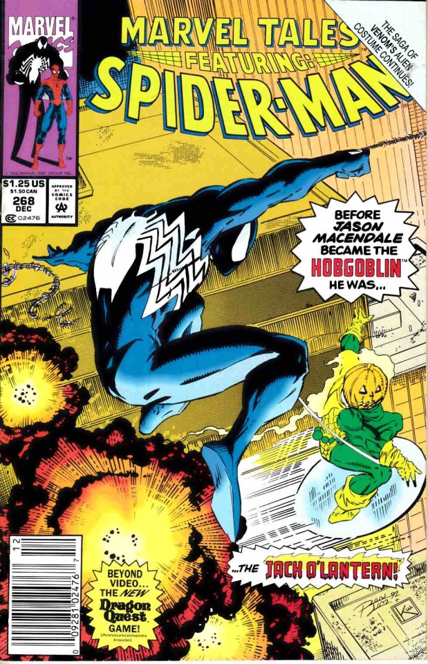
Since those days, my interest in Venom has wavered dramatically depending on the project/medium/who’s writing him, and I’ve found much of what’s been produced fairly underwhelming; but my admiration of the design for Spider-man’s black costume has remained steadfast. If I’m being (perhaps heretically) honest, I almost prefer the black costume to the original. Something about it just feels so correct for the character, and clearly I’m not the only person who felt as much. Despite some initial push-back, the black costume had garnered enough support by the end of the 8-issue symbiote saga, for it to be brought back as just a ‘regular costume, but with the symbiote aesthetic.’ From that point on, it would feature regularly for several years before Venom officially inherited the look.
And just to be clear, no I wouldn’t ever truly want to replace Spider-man’s classic look, but you gotta admit, the black suit looks mighty slick.
#spiderman the animated series#spiderman#black suit spider man#symbiote suit#venom symbiote#venom origin#venom#eddie brock#marvel comics#comic books#retrospective#marvel tales#the amazing spider man#carnage#maximum carnage#mark bagley#ron frenz#roger stern#ron lim#90s comics#scifi#80s comics#carnage symbiote#retro review#episodic nostalgia
8 notes
·
View notes
Text


J2 (1999) ISSUE 6
WRITER TOM DEFALCO | ARTIST RON LIM
#anyway#and i forgot elektra was a mother in some universes#and wild thing’s dad is LOGAN???#some of these comic writers put together the oddest characters just because they’re the opposite sex#maybe one day when i have the mental capacity to read comics without bullseye in them again i will find out#small bullsie appearance#i hope he had fun#also mayday and mary jane#cool#elektra natchios#daredevil#bullseye#lester#wild thing#rina logan#may parker#mary jane watson
47 notes
·
View notes
Text
I've noticed something that bugs me about how late Archie/IDW artists drew Sonic's eyebrows, though general fanart can fall victim as well
These are general observations of games. Note: this only applies to Sonic, Amy, Shadow, and Silver. Vector is a special case
Base head template

Let's imagine the eyebrow as a band, with a V shaped bottom
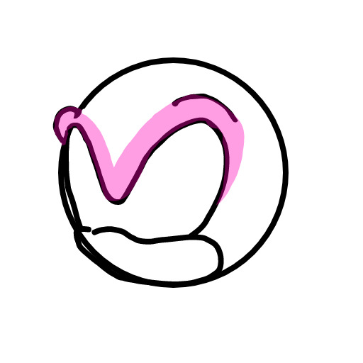
These are general ways you can raise or lower it. The pinched raise is a bit exaggerated, pinching hasn't been in Sonic Team art since 1993 (contrary to what Retro Sonic fans say)
Anger/stern

Surprise (exaggerated here)
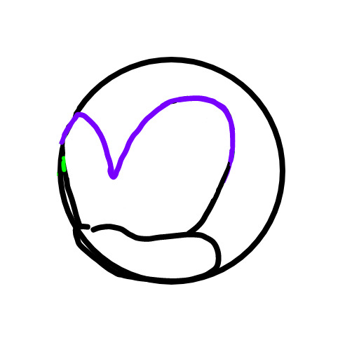
Sad (this literally is only in Oshima's 1990 model sheet. I don't think it'll be ever used)
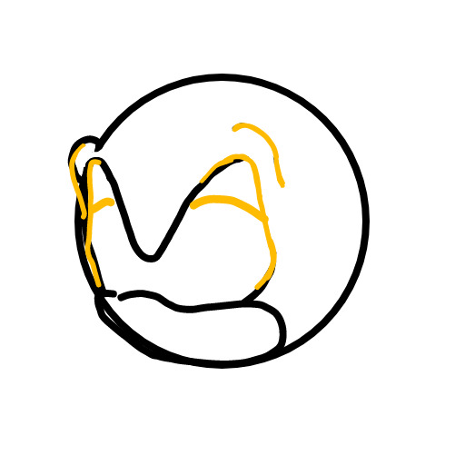
You'll notice this "band" doesn't intersect itself, only buckling when low
Yardley on there's a lot of cases it intersects oddly
Sonic's eye shape is entirely defined by his brow. Intersections are incorrect
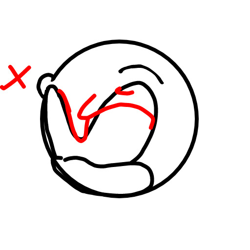
Similarly, his center brow is a rounded to point V, not a boxy U. Evan, Late ABT, and early Jack Lawrence have this issue. Alternatively, raising the center brow so high (seen in Ron Lim art to memetically bad effect, also some of Yardley)

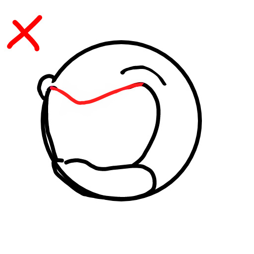
Finally, winking
The correct way affects brow center
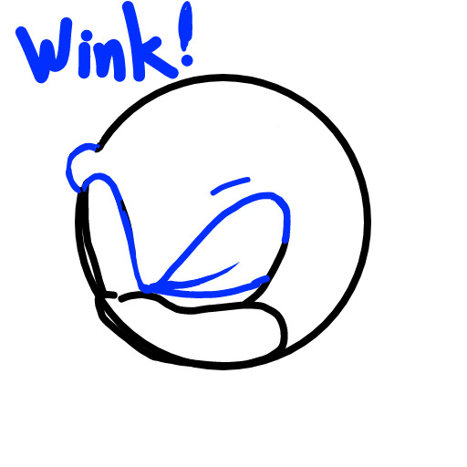
Most artists and devs try to avoid winking, so there isn't much reference. One of Marza's scenes in 06, and ingame Riders makes this error of unnaturally cutting it in half)

This admittedly makes Sonic a simple design, but ear posing, body language, assymrtric eyebrow posing, perspective, and mouth pose can still have it expressed nicely
@beevean @crusherthedoctor @aquillis-main
31 notes
·
View notes