#Redesign the Website
Text
#Redesign the Website#Determine the Perfect Goal#Refresh the Content#The Design Should Be Responsive
0 notes
Text

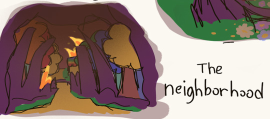
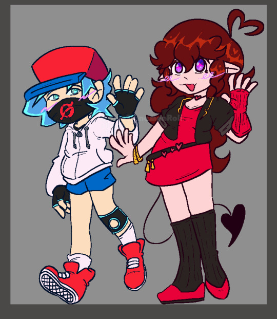
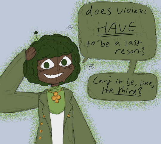
Artfight preppin with the cocky lesbian queen 🫡
#himbitchposting#my art#original character#digital art#artfight#redesign#illustration#hb oc#oc#oc art#knight#how tf do tags work on this website
57 notes
·
View notes
Text
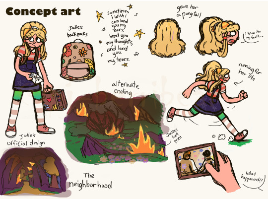
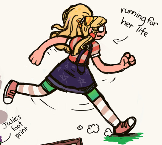
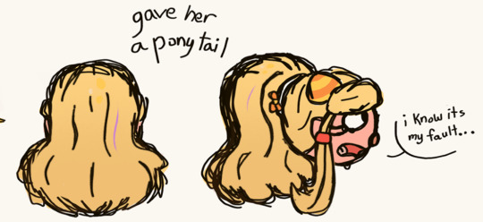
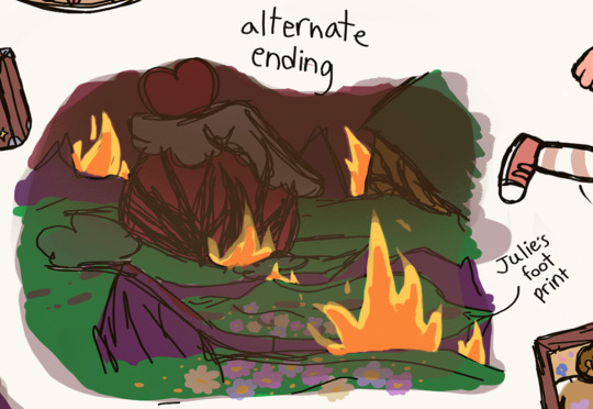
Julie's re-redesign!
Here's the sketch to the old version to now.
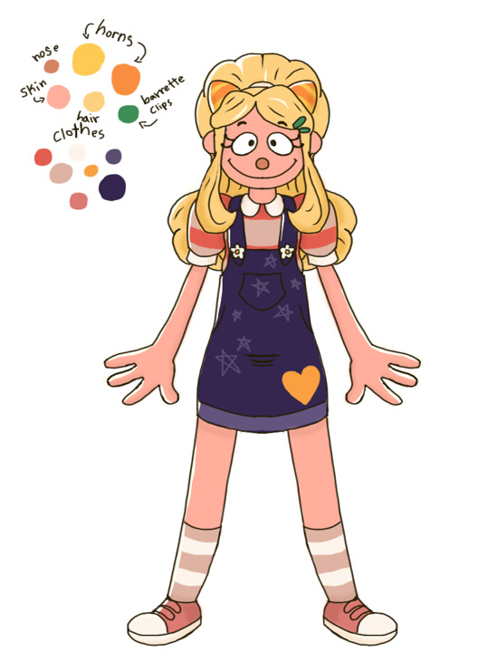
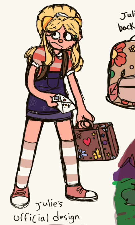
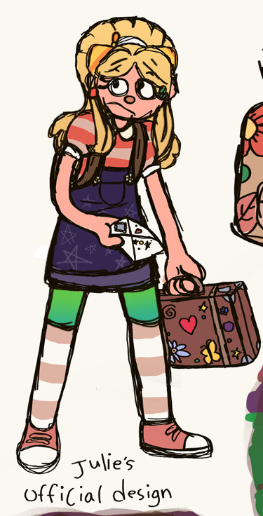
I had to redraw this lovely little lady because I didn't gave her enough stuff to work as a "design change" in the original. Since the update confirmed that her legs are actually the color of green and blue, I wanted to change it because I didn't do accuracy with PartyCoffin's characters correctly. Plus, her design by itself looks a bit boring so I add things into her hair. Of course, she likes decorating her hair a lot and I thought might as well try to redesign her hair too. I hope you like this small egg here, the sketch of Barnaby is almost done. Give me a few days or so to finish him.
Edit: Barnaby is sitting in my files, I can't get back to him cause of the other AU I'm creating.
Goodbye everyone and happy Easter! I didn't like this holiday long ago but now I have something to like about it.
Here's this thing coming back to haunt you!
#this is basically a redesign for everything of this original post#I thought it looked too plain so I redrew most of it#that and also I blew through the drawing in the original so some of the stuff didn't get finished#discord chat#discord server#voice call#voice cast#voice acting#official design#redesign#concept art#my art#art#fan art#welcome home#welcome home art#welcome home fanart#welcome home puppet show#welcome home website#welcome home arg#welcome home julie joyful#jullie joyful#welcome home au#it takes two au#it takes two#video games#gaming
70 notes
·
View notes
Text

#mlp#mlp redesign#twilight sparkle#twilight#art#digital art#artists on tumblr#fanart#2024#febuary#thinking of getting off of tumblr and just staying on insta and setting up a neocities#i love tumblr but i fucking hate the ceo#if i end up moving ill let yall know#..... also i gotta learn how to code a website bc i refuse to let my neocities site look like shit
45 notes
·
View notes
Text

Also some more art Ft my redesigns bc theyre special to me
(I promise hes taller than he looks here, his legs being mostly covered up just makes him look way more tiny, actual height diff under the cut ig)
#my art#❌do not repost my art onto other websites❌#❌please do not use my work without permission!❌#fnf#friday night funkin#fnf bf#fnf gf#friday night funkin bf#friday night funkin gf#i might eventually make pico but i always have a hard time redesigning him bc he already looks so awesome rip me ig
25 notes
·
View notes
Note
It occurred to me that the new (brilliant) image strategy might be partly due to a certain amount of ‘leveling up’ in anticipation of a very important and major publication debuting later this year and I must say I am SEATED for any and all other such moments in the TSSverse in the works!! So fun to watch your growth over the years! PROUD OF U BB!!!
LOVE YOU TY
#(psst spoiler but gaze upon the website as-is while you can folks bc a redesign is coming)#blog#tsser
24 notes
·
View notes
Text
SUMMER MERCH COLLECTION
BUY OUR STUPID SHIT


Use discount code “HOTCHIMPSUMMER” for the only discount we could afford to give you all without losing money on this
56 notes
·
View notes
Text
Rayfanpedia, the wiki for Rayman fanworks
Hello fellow Rayman fans! We are proud to bring you the Rayfanpedia, the RayWiki’s sister project dedicated to fangames and other fanworks by the talented Rayman community!
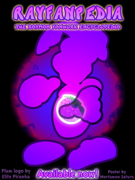
Explore the fans’ amazing projects and contribute to this new expansion of the Rayman Pirate-Community!
We already have pages dedicated to various fan projects, such as Rayman Redemption, ReDesigner, Revenge of the Dark, Scepter of Leptys and much more! Come have a look! :)
#rayman#fangame#fanwork#website#wiki#encyclopedia#fan#rayman alive#rayman redemption#rayman redesigner#mortamon#rayman pirate-community#video games#gaming
28 notes
·
View notes
Text
meu primeiro redesign!
[ br / eng ]
[meu primeiro redesign e como isso é mto confuso/my first redesign and how this is so confusing]
lição mágica aprendida hoje: paciência.
˚✧ antiseptic ݁ ੭
BR :
’ㅤㅤㅤok é estranho postar depois de algum tempo MAS EU JURO QUE TENHO FEITO COISAS!
primeiramente, percebi que eu não ia conseguir aplicar meus estudos se eu não colocasse em prática (obviamente?), então do q adiantaria estudar se eu não faria nada com isso?
eu estava navegando na minha maravilhosa shein com esse pensamento, quando eu parei pra analisar: POR QUE EU NÃO FAÇO UM REDESIGN DA SHEIN?
sim. eu fiz.
Este site é propriedade da Shein e é destinado exclusivamente para fins de estudo.
Todos os direitos sobre os materiais, informações e elementos gráficos apresentados neste site pertencem à Shein e estão protegidos pelas leis de direitos autorais.
ok pra começar: eu não fazia ideia do que fazer. não pensei em nenhuma teoria ou nada, eu só simplesmente fiz???
acredito que esse post vai ser o mais curto do perfil, mas irei tentar explicar meus processos pra não ficar tão sem conteudo. ao final do post, terá o link do resultado caso queira pular!
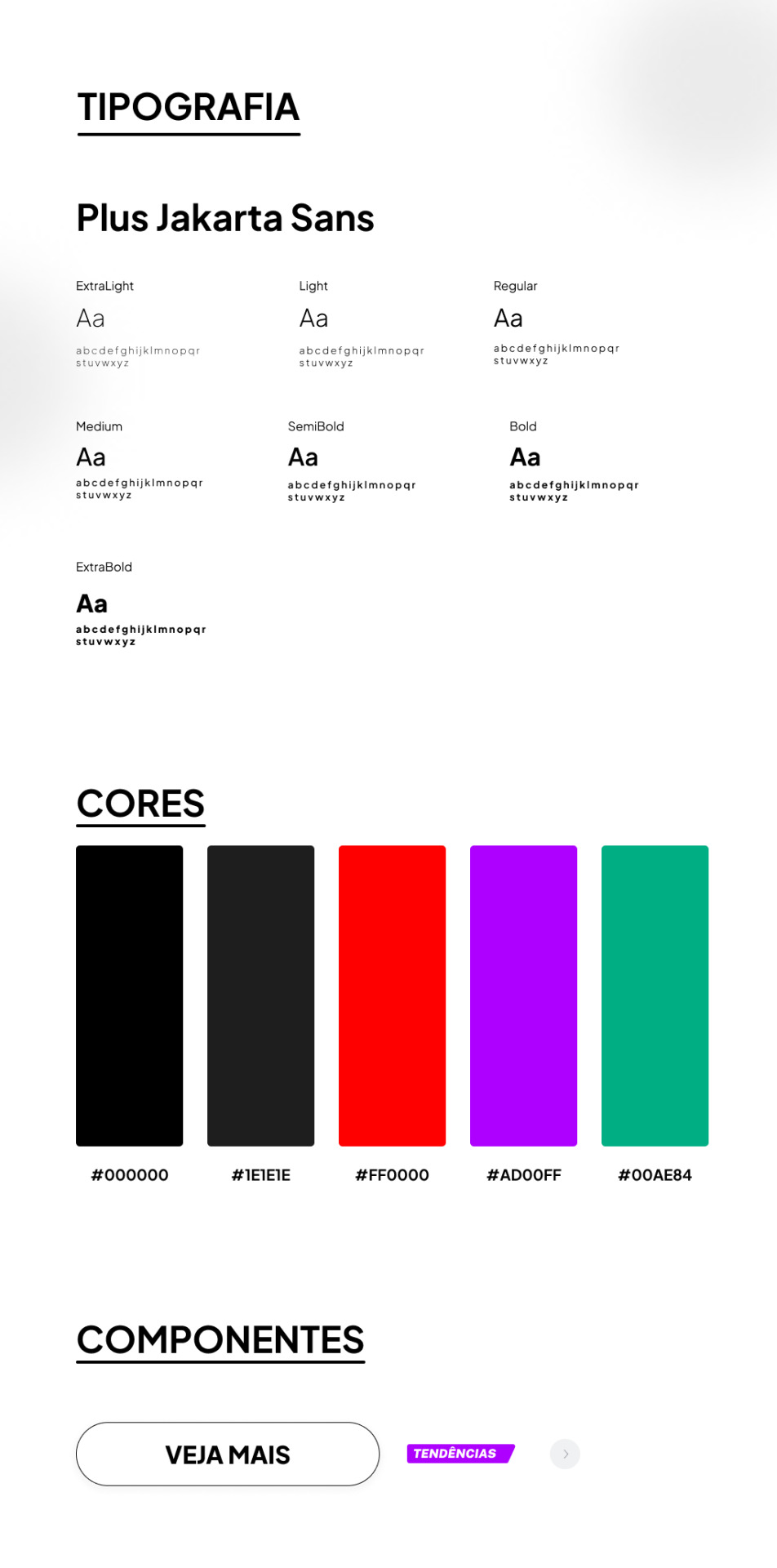
TIPOGRAFIA:
a escolha da fonte foi uma abordagem que precisava ser elegante e moderna, sabia que essa fonte foi criada sob encomenda do 6616 studio para um projeto do governo provincial de jacarta chamado ‘+Jakarta City of Collaboration’, lançado em 2020. ela se inspira em fontes como Neuzeit Grotesk, Futura e outras sans-serifs grotescas dos anos 1930, apresentando um contraste quase monolinear e curvas agudas.
a plus jakarta sans é caracterizada por suas formas modernas e limpas. ela tem uma altura-x ligeiramente maior, o que proporciona um espaço claro entre as letras maiúsculas e a altura-x. além disso, a fonte é equipada com contadores abertos e espaços equilibrados, garantindo uma boa legibilidade em uma ampla gama de tamanhos.
agora que te dei um contexto histórico dessa fonte, vou te explicar algumas razões que me fez escolher ela (não, não foi aleatorio ok). a fonte reflete uma estetica moderna e contemporânea, proporcionando espaços claros e legibilidade em vários tamanhos, tornando uma escolha versátil para diferentes elementos, desde títulos até textos menores.
CORES:
confesso que nessa parte não tenho muito a dizer, o preto é uma cor elegante e básica, tornando a comum. em termos técnicos, o preto é a ausência de luz ou cor. no espectro de luz visível, a cor preta absorve todas as cores e não reflete nenhuma delas para os olhos. legal, ne?
sobre o vermelho, é obvio que eu precisava de algo chamativo; o verde normalmente simboliza elementos da natureza, mas em alguns contextos ele também representa renovação, então, imaginei que essa era a melhor cor pra representar sobre avisos de roupas ou quaisquer coisas novas.
agora o roxo, não sei dizer o que me levou a escolher essa cor, confesso que entrei no site da SHEIN e dei uma boa olhada no motivo de ela estar ali e tudo o que me faz pensar, sinceramente, é porque ela é chamativa, o que faz o usuario ficar ansioso e pensar nossa meu deus TENDENCIA eu preciso comprar!!
CONCLUSÃO
esse foi meu primeiro trabalho concluído, de fato. tanto como webdesign como redesign, eu realmente gostei muito de ter feito e me diverti ao longo do processo, mas eu ficava ansiosa pra terminar e percebi que eu tentava atropelar algumas etapas, isso deve ser mais comum do que eu imagino e eu preciso treinar isso, mas tirando isso.... consegui trabalhar bem olhando as referencias do proprio site da SHEIN e acredito que fiz um retrabalho bom!
POR FAVOR SHEIN ME CONTRATA
dúvidas, sugestões ou críticas? me mande um ask, ele está aberto para qualquer tipo de coisa que tenha surgido durante o post. ♥︎
ah, e sobre o resultado final, claro....... eu postei no dribbble! provavelmente vai ser a plataforma que utilizarei em todos os meus posts para mostrar o design final, ent caso vc n queira ver meu monologo, basta pular direto pro final!
https://dribbble.com/shots/24251593-SHEIN-Redesign?added_first_shot=true
[meu primeiro redesign e como isso é mto confuso/my first redesign and how this is so confusing]
magic lesson learned today: patience.
˚✧ antiseptic ݁ ੭
ENG :
’ㅤㅤㅤok it’s weird to post after some time BUT I SWEAR I HAVE BEEN DOING THINGS!
firstly, I realized that I wouldn’t be able to apply my studies if I didn’t put them into practice (obviously?), so what would be the point of studying if I wasn’t going to do anything with it?
I was browsing my wonderful shein with this thought, when I stopped to analyze: WHY DON’T I DO A REDESIGN OF SHEIN?
yes. I did.
This site is owned by Shein and is intended exclusively for study purposes. All rights to the materials, information and graphic elements presented on this site belong to Shein and are protected by copyright laws.
ok to start: I had no idea what to do. I didn’t think of any theory or anything, I just simply did???
I believe this post will be the shortest on the profile, but I will try to explain my processes so as not to be so without content. at the end of the post, there will be the link to the result in case you want to skip!

TYPOGRAPHY:
the choice of font was an approach that needed to be elegant and modern, I knew that this font was custom made by 6616 studio for a project of the provincial government of Jakarta called ‘+Jakarta City of Collaboration’, launched in 2020. it is inspired by fonts like Neuzeit Grotesk, Futura and other grotesque sans-serifs from the 1930s, featuring an almost monolinear contrast and sharp curves.
the plus jakarta sans is characterized by its modern and clean shapes. it has a slightly larger x-height, which provides a clear space between the uppercase letters and the x-height. in addition, the font is equipped with open counters and balanced spaces, ensuring good readability in a wide range of sizes.
now that I’ve given you a historical context of this font, I’ll explain some reasons that made me choose it (no, it wasn’t random ok). the font reflects a modern and contemporary aesthetic, providing clear spaces and readability in various sizes, making it a versatile choice for different elements, from titles to smaller texts.
COLORS:
I confess that in this part I don’t have much to say, black is an elegant and basic color, making it common. in technical terms, black is the absence of light or color. in the visible light spectrum, the color black absorbs all colors and does not reflect any of them to the eyes. cool, right?
about red, it’s obvious that I needed something eye-catching; green usually symbolizes elements of nature, but in some contexts it also represents renewal, so, I imagined that this was the best color to represent about clothes warnings or any new things.
now the purple, I can’t say what led me to choose this color, I confess that I entered the SHEIN website and took a good look at why it was there and all it makes me think, honestly, is because it is eye-catching, which makes the user get anxious and think oh my god TREND I need to buy!!
CONCLUSION
this was my first completed work, in fact. both as webdesign and redesign, I really enjoyed doing it and had fun throughout the process, but I was anxious to finish and I realized that I tried to rush some stages, this must be more common than I imagine and I need to train this, but apart from that… I managed to work well looking at the references from the SHEIN website itself and I believe I did a good rework!
PLEASE SHEIN HIRE ME
questions, suggestions or criticisms? send me an ask, it is open for any kind of thing that may have arisen during the post. ♥︎
ah, and about the final result, of course… I posted it on dribbble! it will probably be the platform that I will use in all my posts to show the final design, so if you don’t want to see my monologue, just skip straight to the end!
https://dribbble.com/shots/24251593-SHEIN-Redesign?added_first_shot=true
#design#aesthetic#art#english#designinspiration#brasil#design ux#ui ux design#uidesign#ui ux company#ui#ux#redesign#shein#sheinstyle#design ui#web design#website#user interface#prototype#digital art#figmadesign#figma#creative#dribbble#dribble
8 notes
·
View notes
Text
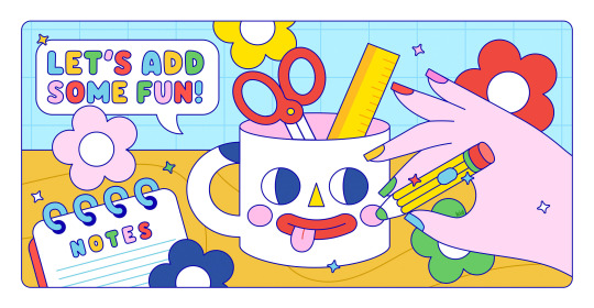
Finally had time to update my personal website ✨ Check it out!
#new website#website redesign#illustration#art#digital illustration#kawaii aesthetic#kawaiicore#colorful#kawaii#character design#artists on tumblr#digital art#kidcore#drawing#doodling#arts and crafts#making art#simple#cute#cuteness#cute stuff
10 notes
·
View notes
Text
Does anyone even remember GodRocks, or was that just a childhood fever dream?

Well, anyway, have a Gem redesign.
For a Christian cartoon from the early 2000's, this one was thankfully pretty decent. The premise was about a band of anthropomorphic rock people who sing a God and His Word. You think that be cheesy, and you'd be right.
...but cheese is delicious and this show's music slaps. (Look their albums up if you don't believe me.)
Besides, finding literally any palatable Christian content I could watch as a kid was like happening upon a floatie when you're stranded in the middle of the ocean.
Here's her original design, in case you were curious:

(It's not a great pic, I know, but I couldn't really find a better one.)
#godrocks#god rocks#i might be the first one to post GodRocks content on this website#wow#art#fan art#fanart#christian cartoons but just the good ones#underrated#slight redesign#redesign#character redesign#gem#gem godrocks
12 notes
·
View notes
Text
am i seriously analysing till's solo project website because i have nothing better to do? yes.
am i starting yet another personal project to redesign the website because while i like it i think it could use a bit more spice? yes.
will i abandon this after like 2 days? probably
am i gonna publish it? no, the original webpage took quite a while to make and if i were to publish my version that would be disrespectful, also idk if i wanna be sued lmaooo
it is very interesting to poke around the code though! especially for the button that appears when you hover over the trailer preview like here which i think is pretty awesome

with vs code and a bit of gumption i can do anything
#web design like game development is a big passion of mine#in a list of my top 3 things to develop it's number 2#and i do love a good bit of webmastery#medoh squawks#till lindemann#web development#i do mean that this won't be live anywhere: it's mainly just for me#to see if i can redesign a website without falling into what i would want (since i'm already building a personal site)#i wonder who built this site and the rammstein one too#whoever they are they did an amazing job i love the rammstein site sm#the 404 page is so funny like 'oops ve forgot to code zis page here have a tittencookie'
3 notes
·
View notes
Text
battle cleric send post
#it is criminal how little i draw or write or think about this guy cause hes GREAT hes so silly to me#i haven't drawn ANYONE for a while actually. i usually pride myself on writing or drawing something every day but i took a break recently#not sure why. but we are back on the grind!!!#rtgame miitopia#no matter how many times i redesign him hes keeping the coat. dont care. its his coat. its become a trenchcoat now and i really like it#hmm... i should get a trenchcoat#no i shouldnt i will look like a traffic cone#maybe the traffic cone look would suit me though#...no. my mom watched soupernatural and if she compares me to the superhell guy for the coat im gonna lose it. no trenchcoat for me#thats me misspelling it to a degree that it wont show up in tags. how do tags on this website work? idk but i am Not Risking It!!!#asher scribbles
23 notes
·
View notes
Text

Made a new icon!!
#been prepping for art fight#so ive been pumping out a ton of art to update refs on the website#so new stuffs coming when i can get around to making captions and tagging#new pfp#art#my art#artist#artwork#drawing#digital art#digital artwork#persona#persona redesign
3 notes
·
View notes
Text
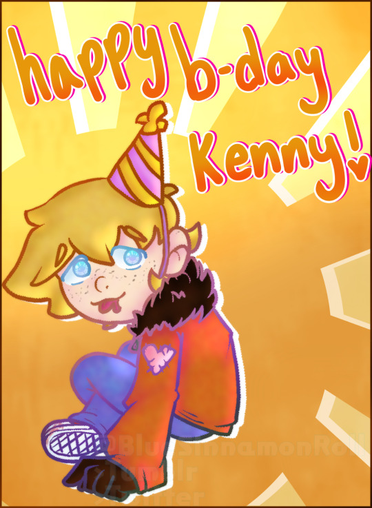
Me celebrating a fictional characters bday bc heheee silly:3c
#my art#❌do not repost my art onto other websites❌#❌please do not use my work without permission!❌#sp kenny#south park kenny#south park kenny mccormick#south park#kenny mccormick#teheee hes such a little guyyy#ft my slight redesign which i still havent posted refs for<3
25 notes
·
View notes
Text
#web design#website#web design india#website design#website design india#web designers#website redesign
3 notes
·
View notes
Last Seen Blogs

ddexterr1
DDexter

ask-bagnblue
Ask Bag N Blue
hip-eponymous-poor-boy
psychobilly cadillac
ilackallhonour
I Lack All Honour

carladuquette
champagne problems