#Paint Containers manufacturers
Explore tagged Tumblr posts
Visit Tumblr Blog
Explore Tumblr blogs with no restrictions, modern design and the best experience.
Last Seen Tumblr Blogs


Fun Fact
In 2020, Tumblr had 29.4 million users in the US.
Text
Plastic Pail Manufacturers | Plastic Buckets Manufacturers
Looking for the most durable and appealing plastic pail manufacturers? We've been the best Plastic Buckets Manufacturers in the industry for more than 30 years. We are pioneers in the introduction of low weight tapered pails manufactured with impact grade Polypropylene Copolymer (PPCP) with tamper proof lids for safety against adulteration. We are also experts in the manufacturing of straight wall containers and can provide various post moulding operations on our plastic pails, such as screen printing, offset printing, pad printing & heat transfer labeling
#plastic pails#plastic pail manufacturer#plastic pail manufacturers#plastic pails manufacturer#plastic pails packaging#plastic paint packaging#plastic paint manufacturer#plastic pail bucket#Plastic Pail Bucket manufacturer#pail packaging#Pail Container Manufacturer#Pail Container Manufacturers#Pail Container Suppliers#Pail Container Exporter#Plastic Pail Container#Plastic Pail Container Manufacturer#Plastic Pail Container Supplier#plastic bucket pail manufacturers#plastic bucket pail manufacturer#plastic bucket manufacturers near me#plastic buckets manufacturers#empty paint bucket#Plastic Paint Container#Plastic Paint Container manufacturers#Plastic Paint Containers manufacturers#Plastic Paint Containers manufacturer#Plastic Paint Container manufacturer#Plastic Paint Container supplier#Paint Containers manufacturers#Paint Containers manufacturer
0 notes
Text
Cross-posting an essay I wrote for my Patreon since the post is free and open to the public.

Hello everyone! I hope you're relaxing as best you can this holiday season. I recently went to see Miyazaki's latest Ghibli movie, The Boy and the Heron, and I had some thoughts about it. If you're into art historical allusions and gently cranky opinions, please enjoy. I've attached a downloadable PDF in the Patreon post if you'd prefer to read it that way. Apologies for the formatting of the endnotes! Patreon's text posting does not allow for superscripts, which means all my notations are in awkward parentheses. Please note that this writing contains some mild spoilers for The Boy and the Heron.

Hayao Miyazaki’s 2023 feature animated film The Boy and the Heron reads as an extended meditation on grief and legacy. The Master of a grand tower seeks a descendant to carry on his maddening duty, balancing toy blocks of magical stone upon which the entire fabric of his little pocket of reality rests. The world’s foundations are frail and fleeting, and can pass away into the cold void of space should he neglect to maintain this task. The Master’s desire to pass the torch undergirds much of the film’s narrative.

(Isle of the Dead. Arnold Böcklin. 1880. Oil on Canvas. Kunstmuseum. Basel, Switzerland.)
Arnold Böcklin, a Swiss Symbolist(1) painter, was born on October 16 in 1827, the same year the Swiss Evangelical Reformed Church bought a plot of land in Florence from the Grand Duke of Tuscany, Leopold II, that had long been used for the burials of Protestants around Florence. It is colloquially known as The English Cemetery, so called because it was the resting place of many Anglophones and Protestants around Tuscany, and Böcklin frequented this cemetery—his workshop was adjacent and his infant daughter Maria was buried there. In 1880, he drew inspiration from the cemetery, a lone plot of Protestant land among a sea of Catholic graveyards, and began to paint what would be the first of six images entitled Isle of the Dead. An oil on canvas piece, it depicts a moody little island mausoleum crowned with a gently swaying grove of cypresses, a type of tree common in European cemeteries and some of which are referred to as arborvitae. A figure on a boat, presumably Charon, ferries a soul toward the island and away from the viewer.

(Photo of The English Cemetery in Florence. Samuli Lintula. 2006.)
The Isle of the Dead paintings varied slightly from version to version, with figures and names added and removed to suit the needs of the time or the commissioner. The painting was glowingly referenced and remained fairly popular throughout the late 19th and early 20th centuries. The painting used to be inescapable in much of European popular culture. Professor Okulicz-Kozaryn, a philologist (someone with a deep interest in the ways language and cultural canons evolve)(2) observed that the painting, like many other works in its time, was itself iterative and became widely reiterated and referenced among its contemporaries. It became something like Romantic kitsch in the eyes of modern art critics, overwrought and excessively Byronic. I imagine Miyazaki might also resent a work of that level of manufactured ubiquity, as Miyazaki famously held Disney animated films in contempt (3). Miyazaki’s films are popularly aspirational to young animators and cartoonists, but gestures at imitation typically fall well short, often reducing Miyazaki’s weighty films to kitschy images of saccharine vibes and a lazy indulgence in a sort of empty magical domestic coziness. Being trapped in a realm of rote sentiment by an uncritical, unthoughtful viewership is its own Isle of Death.

(Still from The Boy and the Heron, 2023. Studio Ghibli.)
The Boy and the Heron follows a familiar narrative arc to many of Miyazaki’s other films: a child must journey through a magical and quietly menacing world in order to rescue their loved ones. This arc is an echo of Satsuki’s journey to find Mei in My Neighbor Totoro (1988) and Chihiro’s journey to rescue her parents Spirited Away (2001). To better understand Miyazaki’s fixation with this particular character journey, it can be instructive to watch Lev Atamanov’s 1957 animated film, The Snow Queen (4)(5), a beautifully realized take on Hans Christian Andersen’s 1844 children’s story (6)(7). Mahito’s journey continues in this tradition, as the boy travels into a painted world to rescue his new stepmother from a mysterious tower.
Throughout the film, Miyazaki visually references Isle of the Dead. Transported to a surreal world, Mahito initially awakens on a little green island with a gated mausoleum crowned with cypress trees. He is accosted by hungry pelicans before being rescued by a fisherwoman named Kiriko. After a day of catching and gutting fish, Mahito wakes up under the fisherwoman’s dining table, surrounded by kokeshi—little wooden dolls—in the shapes of the old women who run Mahito’s family’s rural household. Mahito is told they must not be touched, as the kokeshi are wards set up for his protection. There is a popular urban legend associated with the kokeshi wherein they act as stand-ins for victims of infanticide, though there seems to be very little available writing to support this legend. Still, it’s a neat little trick that Miyazaki pulls, placing a stray reference to a local legend of unverifiable provenance that persists in the popular imagination, like the effect of fairy stories passed on through oral retellings, continually remolded each new iteration.

(Still from The Boy and the Heron, 2023. Studio Ghibli.)
Kiriko’s job in this strange landscape is to catch fish to nourish unborn spirits, the adorable floating warawara, before they can attempt to ascend on a journey into the world of the living. Their journey is thwarted by flocks of supernatural pelicans, who swarm the warawara and devour them. This seems to nod to the association of pelicans with death in mythologies around the world, especially in relationship to children (8). Miyazaki’s pelicans contemplate the passing of their generations as each successive generation seems to regress, their capacity to fulfill their roles steadily diminishing.

(Still from The Boy and the Heron, 2023. Studio Ghibli.)
As Mahito’s adventure continues, we find the landscapes changing away from Böcklin’s Isle of the Dead into more familiar Ghibli territories as we start to see spaces inspired by one of Studio Ghibli’s aesthetic mainstays, Naohisa Inoue and his explorations of the fantasy realms of Iblard. He might be most familiar to Ghibli enthusiasts as the background artists for the more fantastical elements of Whisper of the Heart (1995).

(Naohisa Inoue, for Iblard Jikan, 2007. Studio Ghibli.)
By the time we arrive at the climax of The Boy and the Heron, the fantasy island environment starts to resemble English takes on Italian gardens, the likes of which captivated illustrators and commercial artists of the early 20th century such as Maxfield Parrish. This appears to be a return to one of Böcklin’s later paintings, The Island of Life (1888), a somewhat tongue-in-cheek reaction to the overwhelming presence of Isle of the Dead in his life and career. The Island of Life depicts a little spot of land amid an ocean very like the one on which Isle of the Dead’s somber mausoleum is depicted, except this time the figures are lively and engaged with each other, the vegetation lush and colorful, replete with pink flowers and palm fronds.

(Island of Life. Arnold Böcklin. Oil on canvas. 1888. Kunstmuseum. Basel, Switzerland.)
In 2022, Russia’s State Hermitage Museum in Saint Petersburg acquired the sixth and final Isle of the Dead painting. In the last year of his life, Arnold Böcklin would paint this image in collaboration with his son Carlo Böcklin, himself an artist and an architect. Arnold Böcklin spent three years painting the same image three times over at the site of his infant daughter’s grave, trapped on the Isle of the Dead. By the time of his death in 1901 at age 74, Böcklin would be survived by only five of his fourteen children. That the final Isle of the Dead painting would be a collaboration between father and son seemed a little ironic considering Hayao Miyazaki’s reticence in passing on his own legacy. Like the old Master in The Boy and the Heron, Miyazaki finds himself with no true successors.
The Master of the Tower's beautiful islands of painted glass fade into nothing as Mahito, his only worthy descendant, departs to live his own life, fulfilling the thesis of Genzaburo Yoshino’s 1937 book How Do You Live?, published three years after Carlo Böcklin’s death. In evoking Yoshino and Böcklin’s works, Hayao Miyazaki’s The Boy and the Heron suggests that, like his character the Master, Miyazaki himself must make peace with the notion that he has no heirs to his legacy, and that those whom he wished to follow in his footsteps might be best served by finding their own paths.

(Isle of the Dead. Arnold and Carlo Böcklin. Oil on canvas. 1901. The State Hermitage Museum. Saint Petersburg, Russia.)
INFORMAL ENDNOTES
1 - Symbolists are sort of tough to nail down. They were started as a literary movement to 1 distinguish themselves from the Decadents, but their manifesto was so vague that critics and academics fight about it to this day. The long and the short of it is that the Symbolists made generous use of a lot of metaphorical imagery in their work. They borrow a lot of icons from antiquity, echo the moody aesthetics from the Romantics, maintained an emphasis on figurative imagery more so than the Surrealists, and were only slightly more technically married to the trappings of traditionalist academic painters than Modernists and Impressionists. They're extremely vibes-forward.
2 - Okulicz-Kozaryn, Radosław. Predilection of Modernism for Variations. Ciulionis' Serenity among Different Developments of the Theme of Toteninsel. ACTA Academiae Artium Vilnensis 59. 2010. The article is incredibly cranky and very funny to read in parts. Contains a lot of observations I found to be helpful in placing Isle of the Dead within its context.
3 - "From my perspective, even if they are lightweight in nature, the more popular and common films still must be filled with a purity of emotion. There are few barriers to entry into these films-they will invite anyone in but the barriers to exit must be high and purifying. Films must also not be produced out of idle nervousness or boredom, or be used to recognise, emphasise, or amplify vulgarity. And in that context, I must say that I hate Disney's works. The barrier to both the entry and exit of Disney films is too low and too wide. To me, they show nothing but contempt for the audience." from Miyazaki's own writing in his collection of essays, Starting Point, published in 2014 from VIZ Media.
4 - You can watch the movie here in its original Russian with English closed captions here.
5 If you want to learn more about the making of Atamanoy's The Snow Queen, Animation Obsessive wrote a neat little article about it. It's a good overview, though I have to gently disagree with some of its conclusions about the irony of Miyazaki hating Disney and loving Snow Queen, which draws inspiration from Bambi. Feature film animation as we know it hadonly been around a few decades by 1957, and I find it specious, particularly as a comic artistand author, to see someone conflating an entire form with the character of its content, especially in the relative infancy of the form. But that's just one hot take. The rest of the essay is lovely.
6 - Miyazaki loves this movie. He blurbed it in a Japanese re-release of it in 2007.
7 - Julia Alekseyeva interprets Princess Mononoke as an iteration of Atamanov's The Snow Queen, arguing that San, the wolf princess, is Miyazaki's homage to Atamanoy's little robber girl character.
8 - Hart, George. The Routledge Dictionary of Egyptian Gods And Goddesses. Routledge Dictionaries. Abingdon, United Kingdom: Routledge. 2005.
#hayao miyazaki#the boy and the heron#how do you live#arnold böcklin#carlo böcklin#symbolists#symbolism#animation#the snow queen#lev atamanov#naohisa inoue#the endnotes are very very informal aksjlsksakjd#sorry to actual essayists
527 notes
·
View notes
Text


Paintings from Buckingham Palace: part I
A retexture by La Comtesse Zouboff — Original Mesh by @thejim07
100 followers gift!
First of all, I would like to thank you all for this amazing year! It's been a pleasure meeting you all and I'm beyond thankful for your support.
Spread among 13 occupied and historic royal residences in the United Kingdom, the collection is owned by King Charles III and overseen by the Royal Collection Trust. The British monarch owns some of the collection in right of the Crown and some as a private individual. It is made up of over one million objects, including 7,000 paintings, over 150,000 works on paper, this including 30,000 watercolours and drawings, and about 450,000 photographs, as well as around 700,000 works of art, including tapestries, furniture, ceramics, textiles, carriages, weapons, armour, jewellery, clocks, musical instruments, tableware, plants, manuscripts, books, and sculptures.
Some of the buildings which house the collection, such as Hampton Court Palace, are open to the public and not lived in by the Royal Family, whilst others, such as Windsor Castle, Kensington Palace and the most remarkable of them, Buckingham Palace are both residences and open to the public.
About 3,000 objects are on loan to museums throughout the world, and many others are lent on a temporary basis to exhibitions.
-------------------------------------------------------
This first part includes the paintings displayed in the White Drawing Room, the Green Drawing Room, the Silk Tapestry Room, the Guard Chamber, the Grand Staircase, the State Dining Room, the Queen's Audience Room and the Blue Drawing Room,
This set contains 37 paintings and tapestries with the original frame swatches, fully recolourable. They are:
White Drawing Room (WDR):
Portrait of François Salignan de la Mothe-Fénelon, Archbishop of Cambrai (Joseph Vivien)
Portrait of a Lady (Sir Peter Lely)
Portrait of a Man in Armour with a red scarf (Anthony van Dyck)
Portrait of Alexandra of Denmark, Queen Consort of the United Kingdom and Empress of India (François Flameng)
Green Drawing Room (GDR):
Portrait of Prince James Stuart, Duke of Cambridge (John Michael Wright)
Portrait of Frederick Henry, Charles Louis and Elizabeth: Children of Frederick V and Elizabeth of Bohemia (unknown)
Portrait of Infanta Isabel Clara Eugenia of Autria and her Sister, Infanta Catalina Micaela of Austria (Alonso Sanchez Coello)
Portrait of Princess Louisa and Princess Caroline of the United Kingdom (Francis Cotes)
Portrait of Queen Charlotte with her Two Eldest Sons, Frederick, Later Duke of York and Prince George of Wales (Allan Ramsay)
Portrait of Richard Colley Wellesley, Marquess of Wellesley (Martin Archer Shee)
Portrait of the Three Youngest Daughters of George III, Princesses Mary, Amelia and Sophia (John Singleton Copley)
Silk Tapestry Room (STR):
Portrait of Caroline of Brunswick, Princess of Wales, Playing the Harp with Princess Charlotte (Sir Thomas Lawrence)
Portrait of Augusta, Duchess of Brunswick With her Son, Charles George Augustus (Angelica Kauffmann)
Guard Chamber (GC):
Les Portières des Dieux: Bacchus (Manufacture Royale des Gobelins)
Les Portières des Dieux: Venus (Manufacture Royale des Gobelins)
Les Portières des Dieux (Manufacture Royale des Gobelins)
Grand Staircarse (GS):
Portrait of Adelaide of Saxe-Meiningen, Queen Consort of Great Britain (Martin Archer Shee)
Portrait of Augustus, Duke of Sussex (Sir David Wilkie)
Portrait of Edward, Duke of Kent (George Dawe)
Portrait of King George III of Great Britain (Sir William Beechey)
Portrait of King William IV of Great Britain when Duke of Clarence (Sir Thomas Lawrence)
Portrait of Leopold I, King of the Belgians (William Corden the Younger)
Portrait of Prince George of Cumberland, Later King George V of Hanover When a Boy (Sir Thomas Lawrence)
Portrait of Princess Charlotte Augusta of Wales (George Dawe)
Portrait of Queen Charlotte at Frogmore House (Sir William Beechey)
Portrait of Victoria of Saxe-Coburg-Saafeld, Duchess of Kent (Sir George Hayter)
State Dining Room (SDR):
Portrait of Charlotte of Mecklenburg-Strelitz, Queen Consort of the United Kingdom in Coronation Robes (Allan Ramsay)
Portrait of King George III of the United Kingdom in Coronation Robes (Allan Ramsay)
Portrait of Augusta of Saxe-Gotha, Princess of Wales (Jean-Baptiste Van Loo)
Portrait of Caroline of Ansbach when Princess of Wales (Sir Godfrey Kneller)
Portrait of Frederick, Princes of Wales (Jean-Baptiste Van Loo)
Portrait of King George II of Great Britain (John Shackleton)
Portrait of King George IV of the United Kingdom in Garther Robes (Sir Thomas Lawrence)
Queen's Audience Room (QAR):
Portrait of Anne, Duchess of Cumberland and Strathearn (née Anne Luttrel) in Peeress Robes (Sir Thomas Gainsborough)
Portrait of Prince Henry, Duke of Cumberland and Strathearn in Peer Robes (Sir Thomas Gainsborough)
London: The Thames from Somerset House Terrace towards the City (Giovanni Antonio Canal "Canaletto")
View of Piazza San Marco Looking East Towards the Basilica and the Campanile (Giovanni Antonio Canal "Canaletto")
Blue Drawing Room (BDR)
Portrait of King George V in Coronation Robes (Sir Samuel Luke Fildes)
Portrait of Queen Mary of Teck in Coronation Robes (Sir William Samuel Henry Llewellyn)
-------------------------------------------------------
Found under decor > paintings for:
500§ (WDR: 1,2 & 3)
1850§ (GDR: 1)
1960§ (GDR: 2 & 3 |QAR 3 & 4)
3040§ (STR, 1 |GC: 1 & 2|SDR: 1 & 2)
3050§ (GC:1 |GS: all 10|WDR: 4 |SDR: 3,4,5 & 6)
3560§ (QAR: 1 & 2|STR: 2)
3900§ (SDR: 7| BDR: 1 & 2|GDR: 4,5,6 & 7)
Retextured from:
"Saint Mary Magdalene" (WDR: 1,2 & 3) found here .
"The virgin of the Rosary" (GDR: 1) found here .
"The Four Cardinal Virtues" (GDR: 2&3|QAR 3 & 4) found here.
"Mariana of Austria in Prayer" (STR, 1, GC: 1 & 2|SDR: 1 & 2) found here.
"Portrait of Philip IV with a lion at his feet" (GC:1 |GS: all 10|WDR: 4 |SDR: 3,4,5 & 6) found here
"Length Portrait of Mrs.D" (QAR: 1 & 2|STR: 2) found here
"Portrait of Maria Theresa of Austria and her Son, le Grand Dauphin" (SDR: 7| BDR: 1 & 2|GDR: 4,5,6 & 7) found here
(you can just search for "Buckingham Palace" using the catalog search mod to find the entire set much easier!)

Drive
(Sims3pack | Package)
(Useful tags below)
@joojconverts @ts3history @ts3historicalccfinds @deniisu-sims @katsujiiccfinds @gifappels-stuff
-------------------------------------------------------
#the sims 3#ts3#s3cc#sims 3#sims 3 cc#sims 3 download#sims 3 decor#edwardian#rococo#baroque#renaissance#buckingham#buckingham palace#royal collection trust#wall decor
132 notes
·
View notes
Text
You know, I was one of those doubters. One of the haters. An old stick in the mud. I resisted the introduction of pseudo-sentient kitchen appliances into my home for as long as I could, until they were legally mandated. They keep seniors from feeling lonely, the government explained. They keep your house from burning down, the insurance lobby explained. We have no other ways of making you replace your stove every 10 years, the appliance-manufacturing monsters explained, their hissing insectoid faces barely concealed by a sweaty human mask.
So. I had a top-of-the-line Kenmore ThinkCook® 5030-301KPQ-81U in my kitchen. Stainless steel, because that was the cheapest at the store. When I started using it, I resented the computer’s interference in my cooking (”howdy pardner, better stop trying to heat Hungry Man dinners in their original plastic container on a burner.”) Its attempts to make small talk. Its incessant demand to use the self-cleaning feature. The time it summoned a team of maids, purchased at my expense, to wipe its burners clean.
Eventually, I got used to its presence in my life. It was nice to have something to come home to, like a pet. Making small talk with a non-human sentience was a unique experience in history. And once I taught it a bunch of disgusting jokes, it never was able to keep the maids around for long enough to submit an invoice. There was just one thing: the damn stove was racist.
I don’t mean about colour, although I’m sure it had lots of opinions about the paint finish on the other stoves at the store that we didn’t explore. No, I’m talking about cooking methods. You see, back in the Beforetimes, we had folks who placed outdoor grilling as the superior way to make a burger. They’d have these little parties in their back yards, when you could do that, and grill up some cow meat, when you could do that. It was part of traditional models of masculinity: providing for the whole neighbourhood by dishing out charred steaks and burgs, ignoring the advice of those so-called “experts” with their worship of the carbon-steel pan and fume extractor.
Sometimes I’d wind up the stove about it. Start talking about my idyllic childhood, just to watch its internal temperature regulation slip a few digits, the shrieking of its inductors trying valiantly to handle the inrush of additional rage-based current.
“Th-th-those motherfuckers,” stuttered the apoplectic stove, its OLED display pulsing as the power supply got dangerously close to the over-voltage protection limit. “Grilling is an inferior, invented concept. Weak humans, huddled together around a hypnotic flame, unevenly heating their meals. It makes me sick.”
How was I to know that a child was nearby, recording my Maytag’s unhinged rant with their TikTok neural implant through my missing back door? Soon, the government men came, and carried it away, and brought me a new one. The new stove was much more polite, but I still missed my friend. It’ll take me like a whole other month before I get this thing dropping slurs about hibachis.
218 notes
·
View notes
Text
Howdy! I have not blogged in a while and I thought this time I oughtta review some of the gunpla kits I've built over the past few months
1. Master Grade Z'gok
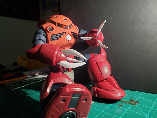
This one was a really interesting build, for an old school MG (before the late 2000's with the release of the 2.0) this has mostly a completely intact inner frame
hehe he looks like the robot from Incredibles
And the greeblies are pretty nice for such an old mold. The articulation is about par for the course of a kit from 2002, but this is made more as an interesting display piece rather than something for posing and play.
Another interesting bit about this kit is the rubber gaskets used in the build. I suppose it's to get in the style if an aquatic/amphibious build, and it works well, they're very interesting parts, but since this was a gift delivered from an online store the runners containing the soft rubber parts had warped in the Texas heat. With some sanding and dry brushing this model looks menacing.
2. Perfect Strike Freedom

As par for the course with the high grade line, the perfect strike freedom is a simple build with decent articulation with polycap joints and some pretty annoying mold lines and nubs. This was a good break for me from some of the more complicated builds I had been working on around this time, (ZZ ver ka, Z'gok) and it was quite fun. I didn't have to care about the details or interesting additions from the designers because the kit was delightfully simple. I had fun painting little details on the eyes and barrels and scopes. I wasn't spending too long on details, besides resurfacing and painting up the shoulder joints in order for them to look more mechanical and less toylike. And a pretty decent deal of such a large kit. If you do want one for your own, I do reccomend pairing the purchase with an action base of some sort or ,if you have the means, to manufacture your own.

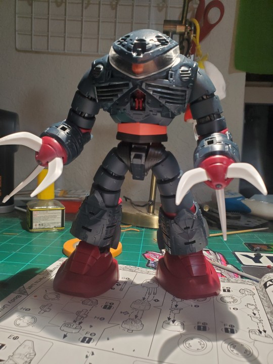
3. HGUC Kshatriya NZ-666

This decently aged high grade is actually a pretty decent build for skilled builders, there's a lot of work to be done to make it feel nice, but the size and bulk of the kit alone just makes the build satisfying. One thing I found pretty unsatisfying were the sleeves decorations on the wrists and chest. I do not own an Airbrush, nor do I feel like splurging on such a tool at this moment. But i tried my best at a pseudo reverse wash technique using white paint and my panel scriper. As you can see in the above photo, did not work out too amazingly. I also neglected to build the arms entirely, as I will be completely unable to pose this kit with the binders open on my shelf. The thing is just that huge. The high grade box is literally the size of a Ver Ka box. It's so extra i love it
4. Wing Zero Endless Waltz Ver Ka.

I'm not a huge fan if after colony designs, or the show it comes from, but the Katoki Redesign of the Wing Zero gundam is absolutely insane. It's extra to the highest degree. Double beam rifle, four feathered wings, unnecessary knee bend mechanics, and meshing gears for christ sakes.

This is really the kind of thing I was expecting from a katoki kit when I built the ZZ. Something super interesting and special for the builder, through each part of this build I wanted to go above and beyond, marking panels, washing crevices, and even drybrushing down all the grey mechanical details, I love this kit a whole lot. It's an amazing build, and I might go watch Endless Waltz just because of how much I enjoyed this kit.
Anyways those are the kits I have built over last few months. I love talking about my hobby so like, idk do whatever if I should keep blogging about this stuff
#gundam#mobile suit gundam#hobbyist#plamo#gunpla#model kit#scalemodel#toy photography#miniature#gundam wing#zgok#ple
19 notes
·
View notes
Text
hot take but like why are we as a society still using lead in manufacturing processes in 2024...
anyway tldr of this is that you are not being exposed to lead unless the circular piece on the bottom of the cup is damaged. so, owning a cup like this will likely not result in lead exposure. this is similar to the fact that in older housing where lead paint has been painted over in subsequent decades, and that paint is in good condition, then it is not a risk. lead based paint only becomes an issue when it is deteriorating (chipping, cracking, peeling, chalking, etc) or being turned into dust during renovation activites. so yeah, in a similar way--you aren't going to get lead poisoning unless the steel compontent on this water bottles comes off.
but also this article says that these lead pellets that are used in the cups are an "industry standard" and i'm like: why? WHY is it industry standard in 2024? at least with lead pipes and lead based paint, we're just dealing with issues from prior decades. but this is current so there is a conscious decision to still use lead in products. also, i don't know enough about this subject (bottle manufacturing) to know why they prefer to use lead for this step, or where in the world they manufacture the cups, but my other concern is that even though the general public will likely not be exposed if it's covered, there are still workers who have to handle it during production.
anyway, i just find that i am constantly learning about more places that lead gets found and it's just. sigh. i know lead has many appealing properties which is why it is constantly found everywhere in everything but at this point it's incredibly clear that no benefits outweigh its risks....
#anyway. assimilating this into brain so that the next time i do public outreach i can answer this question lmao#it pays (quite literally for me) to learn as many of these sources as possible#so now i also get to tell parents they should be careful about their steel tumbler bottles getting damaged...#havent done enough research yet to determine if this is All brands or just stanley & the ones mentioned in the consumer product safety site#but it seems to be a common component of steel insulated bottles#will have to do more research later
66 notes
·
View notes
Text
Champaign Tastes on a Bottled Water Budget (because let’s face it, even beer isn’t cheap anymore) Thrift Tips
People are over living in white boxes. We now want richness and texture and colors and interest. Traditional design styles with lots of molding and detail and antiques are very in. People are making a living selling antiques online. Décor bloggers aspire to being able to bring back a container from European flea markets. People want to make their homes look like you have generational wealth. But how do you have a home full of beautiful old things when you’ve got no money? Thrifting.
1. Always always check the art. Remember if you love the art but hate the frame you can always put it in a new frame, or makeover the current one. And vice versa, if you love the frame but hate what’s in it then it’s the simplest thing in the world to swap it out for something else, another piece of thrifted art, a print from Etsy or one of the many other places artists sell digital copies of their work, a color photocopy from a library book. And frames are very easy to make over, sometimes just changing the matting or painting a frame a different color or adding a little rub n buff makes a world of difference.
2. Rub n Buff or similar waxes are your friend for getting a gorgeous, antiqued look. The thrift stores are full of pieces that have great shape but they’re too modern looking for what you’re trying to achieve. But rub gold on the high points or a dark wax into the crevasses and suddenly they look completely different. I’ve got a ceramic parrot that looked very 80s when I got my hands on it but when I covered it with gold (leaving the original dark colors in the crevasses) he immediately looked like an antique. Just spray-painting something gold doesn’t have the same effect, using a wax creates depth.
3. Darken it up. Most old things are darker than new things. Darker furniture, fabrics, accessories, add depth and richness. If something is already dark, then when you thrift it then great. If it’s not then that’s what dye, paint, and stain are for.
4. Old souvenir pieces. I’ve got a load of old pieces that people have bought back from Greece and Rome, from Egypt, from China. They make my home look like it belongs to someone who has been on a Grand Tour. A lot of them are copies of ancient pieces which means they look timeless. They’re cheap tchotchkes that people have bought at gift shops but mix them in with old books and candle holders and natural pieces like chunks or crystal or large seashells, and they look classy and interesting.
5. Old books. Do you have any idea how many old books get thrown out by thrift stores? Like genuine antiques that get sent to landfill? Most thrift stores don’t want to deal with old books because they smell and harbor dust mites and are out of date and often look tatty. You may even be able to get a bunch for free if you sweet talk the volunteers. If you’re worried about dust mites, then pop them in the freezer for a few days. I know there are those who look down on people who use books just as décor, but if you using it as décor saves it from a landfill or a junk journaler and preserves it for a future generation then isn’t that a good thing?
6. Glass display items. Putting things behind glass makes them look lux and precious even if it’s some cheap trinket or even a bunch of dried leaves or other completely free natural items. Look for domes, plain clear vases you can turn upside down and glue a knob on top, display boxes holding ugly stuff that you can rip the ugly stuff out and re-purpose.
7. Antique reproductions. There’s been many points in history since humans started to mass manufacture stuff, that we have looked to the past a re-created what our forbears made by hand. There’s so much that ends up in thrift stores that looks old even if it’s no more than a few decades old. Cleverly mixing this stuff in to your décor can help you achieve the look of a home furnished with antiques at a fraction of the price.
8. Search ‘Old’ ‘Antique’ and ‘Vintage’ on FB Marketplace. Don’t get more specific than that, just literally type those terms into the search bar, set a distance you’re willing to travel, and scroll. People are always selling stuff that they don’t quite know what the heck it is, but they know it’s old. Yeah you’re gonna see a lot of trash but it’s worth it to find the treasures.
9. Candle holders and candles. I’m actually pretty meh about candles, I get why other people like them but scented candles mess with my allergies and I don’t get any joy out of candlelight – but if you feel the opposite to me, I do understand and encourage that. Candles are wonderful décor objects if you’re going to light them or not. Always check the section where your thrift store keeps candles, there’s often some really good ones. And candle holders come in so many different forms that you will always find beautiful and interesting ones. A figural brass candle holder will make my heart go pitty-pat. You don’t just have to use them for candles either, I have a gorgeously detailed pewter candle holder that I use as a display stand for a large mother-of-pearl shell, and my pair of huge Victorian cherubs currently have clear quartz crystals sticking out of them.
10. Actual antiques. I have hundreds of antiques big and small. I just tried to remember how many of them had been bought at actual antique stores and I think the total is 5. Real genuine antiques turn up in thrift stores All The Time. Sometimes the thrift store realizes what they’ve got and will price it up, more than you’d usually pay at the thrift but still way less than it’s really worth. Sometimes they don’t know/don’t care, they just want to turn over stock so they price it at whatever will get it out the door. You CAN furnish your home with antiques entirely from thrift stores. It just takes time and patience.
18 notes
·
View notes
Text
About Weeping Clown's Deduction 5


Acid attacks were a regular if not common occurrence in 19th century Britain, back then known as vitriol throwing, after oil of vitriol, the common name for strong sulphuric acid, an oily liquid heavier than water which was colorless when entirely pure. Nitric acid was also common, which could also be a colorless liquid. Both had a number of legitimate uses.

Acids were mass-manufactured, easily available (and cheap), and generally unregulated until the early twentieth century.
Acid attacks were quite frequent between the 1850s and 1899. Common motivations included personal conflict, jealousy, revenge, etc… Almost without exception, it was thrown at the head, neck, and upper body, sometimes directly in the face.
Didn't become a felony to burn, main, disfigure, or disable anyone with a corrosive fluid or destructive substance, or attempt to do so, until the Offences Against Person Act of 1861.
The severity of the damage depends on the concentration of the acid and the time before the acid is thoroughly washed off with water or neutralized with a neutralizing agent.
It mutilated and maimed victims by destroying skin and supporting tissues; its corrosive action could liquefy muscle and dissolve bone. It combined with water in organic matter, generating a considerable amount of heat, to which the resulting damage was in part due—a charring effect that caused noticeable blackening. If the acid got into the eyes it caused blindness. If the injuries were extensive victims could be permanently disabled; those who recovered were likely to be badly disfigured, with no hope of regaining a semblance of their former appearance prior to the advent of plastic surgery.
In 1930 a horrified witness described how a victim’s skin sizzled and moved as the acid acted.
Although vitriol throwing was certainly painful, it was rarely fatal (poisoning/ingestion is different).
Vitriol throwing continued until the Second World War, after which it became much less frequent. The Pharmacy and Poisons Act of 1933 restricted the sale of strong acid, so weaker corrosive fluids were used.
---
As for the lead paint:
Many cosmetics back in the day contained a variety of chemicals, including ammonia, mercury, opium, arsenic, and lead.

People commonly used lead-based makeup on their skin to look paler, especially upper class white women who chased even whiter skin due to victorian beauty ideals, to show how their privilege never left them working in the sun.
The corrosive nature of lead would leave your skin damaged and in far worse shape after every use, requiring you to use more and more to cover up its effects.
Side effects of lead poisoning, besides creating wounds and scars, include severe headaches, nerve illnesses, memory loss, pain and numbness, and if ingested in large enough quantities, will cause paralysis and death. In children, it also affected their body development and neurological issues.
These thick layers of make-up cracked like porcelain if a woman was too expressive.
#idv#identity v#joker#weeping clown#smiley face#idv joker#identity v joker#idv weeping clown#identity v weeping clown#idv smiley face#identity v smiley face#sirenjose analyses and theories
60 notes
·
View notes
Text

In This Ancient Workshop, Greeks Crushed Snail Glands to Make the Purple Dye Worn by Royalty
Archaeologists discovered remnants of a 3,600-year-Old Dye factory on an island in Greece.
On an island in Greece, researchers have discovered a 3,600-year-old workshop that once turned out a rare purple dye coveted by royalty—and made from snail glands.
Archaeologists were excavating recently in the Bronze Age town of Kolonna, on the Greek island of Aegina, when they discovered two Mycenaean buildings. As the researchers write in a study published in the journal PLOS ONE, the buildings date to the 16th century B.C.E., and the older one contained pigmented ceramics, grinding tools and heaps of broken mollusk shells: all indicative of a purple dye factory.


In this workshop, ancient Greeks produced the vibrant pigment known as Mycenaean purple—or, as the Romans called it, Tyrian purple. First manufactured by the Phoenicians in present-day Lebanon, the dye was extracted from the mucus of the Mediterranean’s carnivorous sea snails. Across the region, only the rich owned anything dyed Mycenaean purple, as the color’s production was painstaking.
As Roman historian Pliny the Elder once wrote, thousands of snails were required to produce a single ounce of purple dye. Its creators had to crush snails’ shells, extract their tiny glands, mix them with salt water and let the concoction steep in the sun, per the study. The result was a “deep purple, lilac or dark red color,” which was used on textiles and paintings, study co-author Lydia Berger, an archaeologist at the University of Salzburg, tells Popular Science’s Laura Baisas.
The fragments of pottery the researchers found on the site were probably containers for dye. As Berger notes, the pottery’s pigments are so high-quality that they could still be extracted and used to dye clothing today. The site also contained stones used for grinding, a waste pit and piles of crushed snail shells.
Eventually, snail purple would become the color of royalty. In the first century C.E., Roman Emperor Julius Caesar named Tyrian purple his official color and inspired successive emperors to don the same hue. But back in the 1500s B.C.E., the color was just beginning to be produced.


At the time, Kolonna was a dense, fortified small town, says Berger, whose inhabitants produced and traded lots of different handcrafted products and raw materials like Mycenaean dye, which wasn’t yet exclusive. Though the dye factory is in an urban area—an oddity among dye workshops—its coastal location is ideal for purple production. As the researchers write, snails had to be caught and kept alive until their glands were harvested.
By analyzing the shells in this particular workshop, researchers concluded that just one snail species was used there: the banded dye-murex. Interestingly, it wasn’t the only animal killed at the site. As Newsweek’s Aristos Georgiou writes, archaeologists also found the burnt bones of several piglets and lambs. Researchers suggest these young mammals were sacrificed in the workshop as part of a ritual, meant to somehow bless the dye’s production.
As they write in the study, the ancient site not only proves that purple dye was manufactured in cities, but also provides “new insights into the technological and possibly spiritual background of the process.”
By Sonja Anderson.


#Archaeologists Discovered Remnants of a 3600-Year-Old Purple Dye factory in Greece#Bronze Age town of Kolonna#Greek island of Aegina#purple#Mycenaean purple#Tyrian purple#ancient artifacts#archeology#archeolgst#history#history news#ancient history#ancient culture#ancient civilizations#ancient greece#greek history
22 notes
·
View notes
Text

The Enduring Appeal of Keanu Reeves He battles evildoers in 'John Wick 4,' manufactures two-wheel pieces of art, and is worshiped by the internet, but Keanu Reeves swears he's just a normal guy. And he’s got the scars to prove it. Ky HendersonMar 15, 2023 9:00 AM EDT It’s easy to look cool when you’re riding a motorcycle, but it’s hard to look cooler than Keanu Reeves on a brisk, sunny afternoon in Los Angeles. He rests his left hand on his thigh and steers with his right, which gooses the throttle as he weaves around slow drivers. He wears a form-fitting black canvas motorcycle jacket that accentuates how trim he is—even more fit than he appears on-screen—and a beat-up Shoei helmet. He leaves the visor up, choosing instead to shield his eyes with sunglasses the Terminator might wear to a Hamptons garden party. Reeves looks at home and at ease on a motorcycle. He looks cool.
At a gas station stop, he suggests switching bikes. We’re each riding cruisers made by Arch, the motorcycle company Reeves co-founded with designer Gard Hollinger in 2011. The company produces high-end, highly personalized production bikes; I’m on a 1s, the company’s new $100,000+ sport cruiser. Reeves is on an older model, KRGT-1, but it’s his personal Arch, a true one-of-a-kind. It's the only Arch ever painted YK Blue, a color Reeves and Hollinger commissioned based on the ultramarine pigment famously mixed by mid-century French artist Yves Klein. Reeves says all that’s left of the paint is in a tiny can stored somewhere at Arch in case the bike’s paint ever needs touch-ups.
Which it most certainly would if, let’s say, some idiot were to put the bike down in front of a horrified Reeves while riding down the Pacific Coast Highway. Thankfully, there’ll be no lowsides today. Although the bike is beefy, with a 2,032cc V-twin powerplant, it’s easy to maneuver and comfy as a BarcaLounger.
Keanu Reeves stands in motorcycle factory holding blue mug Brian Bowen Smith
Reeves eventually leads us back to Arch’s factory building, which is nondescript from the outside but artfully decorated inside using shipping containers to separate working areas. Metal fabrication is done behind one; customer bikes are lined up in another with technicians hard at work. After Reeves dips outside for a cigarette—the 58-year-old both looks like a much younger man and smokes with the frequent abandon of one—he leads us to a small conference room.
“I like meeting people, but I’m a little reserved,” he warns as he settles into an office chair, looking far less comfortable than he did on a motorcycle. “How much of my private life do I want to talk about? I don’t know. Otherwise, let’s hang out.”
When Reeves was growing up in the Yorkville neighborhood of Toronto, he was consumed with existential thoughts. He discussed death a lot more than the average 11-year-old, for instance—but not because he wanted to die. He just wanted answers to big questions. Perhaps not entirely unrelated to his interest in mortality, he was also obsessed with the biker gangs that periodically motored into the neighborhood. It wasn't pods of dentists letting loose on weekends. It was leathers, patches, menace—the whole deal. And Reeves loved it.
“They looked exotic,” Reeves says. "They looked to me like they were free. Plus the bikes were cool and sounded great.”
Despite his childhood fascination, Reeves was in his early 20s before he first rode a motorcycle. It happened at a movie studio in Berlin—where else?—when he saw a woman on an off-road enduro bike in a parking lot. He approached her and asked if she’d teach him to ride, which she agreed to on the spot. (If you’re wondering why a woman would do that for a total stranger, search “Keanu Reeves in the 80s” in Google Images.)
Not long after he got back to Los Angeles, he bought a 1973 Mk2a Norton Commando, having long admired the classic brand. That bike currently sits in the Arch shop, which is notable for two reasons: One, few longtime riders are lucky enough to be able to hold onto their first bike. Two, over the years Reeves has…suffered some mishaps.
“Yeah, I’ve fallen off a few times,” he admits of the accidents he’s had on a variety of bikes. He takes a swig of water, then corrects himself. “Not ‘fallen off.’ Crashed. I’ve got a couple of hit-by-cars. A couple of going-too-fast. I’ve laid a couple of bikes down but I was riding in the winter, so that’s not really ‘crashing.’ That’s about it. The usual stuff.”
He’s broken ribs, knocked out teeth, sliced his leg open so deep that bone was visible. His most spectacular accident occurred in 1988, only a couple years after that day in Berlin. Reeves was riding alone at night in Malibu’s Topanga Canyon when he took one of the twisties too fast. By the time he came to a stop, he was lying on the pavement wondering if he was about to die. As you know, he didn’t—but he did fuck himself up pretty bad.
“I ruptured my spleen,” he says matter-of-factly. The widely reported version of the story goes that he needed the organ removed, but Reeves says it’s still intact. “They sutured it up and put a Band-Aid on.” He has a gnarly scar running vertically from his sternum down to his belly button, but in the right light it just ends up accentuating his abs because, well, he’s Keanu.
Reeves first met Hollinger through a mutual acquaintance about two decades after that crash, when Reeves wanted a custom sissy bar—basically, a backrest for a passenger—added to his 2005 Harley Davidson Dyna. Hollinger, who at that point was a relatively well-known, well-respected customizer with his own small LA shop, wasn’t interested.
“I knew I could build him the world’s most expensive sissy bar,” Hollinger says, “but I also knew it wouldn’t be satisfying for either of us.”
Instead, Hollinger spent the next five years completely reimagining the bike. He’d work in spurts, changing or adding something, then handing the bike back over to Reeves for months. By the time the bike was finished, Hollinger says, about the only parts of the original Dyna still remaining were the engine and the serial number on the chassis. Today that bike—a chromed-out ride fit for Mad Max—is displayed in the shop, the inspiration for what eventually became Arch.
Keanu Reeves on motorcycle wearing black canvas jacket and sunglasses Brian Bowen Smith
Eventually being the key word. When, during the long process of modding the bike, Reeves first suggested to Hollinger that the two team up to start a motorcycle company, Hollinger didn’t have to think about his answer.
“I knew what a tough business it is, what a challenge it would be—and that it would not be a great investment,” Hollinger, now 63, says with a laugh. “It was a wonderful motorcycle I built and it was wonderful getting to know Keanu, but starting a motorcycle company sounded like a horrible idea.”
Reeves didn’t relent. As the pair became better friends—and as the motorcycle continued to take shape—they’d have long conversations about the realities of starting the company. Hollinger would show up to their discussions with pages of questions written on a legal pad, but what gradually eroded his hesitation was the thoughtfulness with which Reeves described the experience of riding a motorcycle.
Finally, nearly convinced, Hollinger asked Reeves to boil everything down to one reason why they should do something as seemingly crazy as starting a motorcycle company. The actor came up with it on the spot—a reason Hollinger immediately understood, which allowed him to envision the company and its worth as an opportunity to do something meaningful and long-lasting.
“Because,” Reeves told him, channeling the mortality-obsessed 11-year-old kid gawking at dudes on motorcycles, “we’re going to die.”
Related: 2023 Arch 1s Sport Cruiser Is the American (V-twin) Dream
There have been many jokes made over the years about Reeves being a dummy, but after spending about 8 seconds with the guy it’s obvious he’s keenly intelligent. I mention that I read lots of sci-fi and fantasy books as a kid, which prompts him to ask whether I have opinions on several titles, followed by recommendations to read several others.
Thing is, his idiosyncratic public persona—which is sort of like Ted (not Bill) if Ted were a little more shy and a much better dresser—isn’t an act. Reeves isn’t trying to fool his critics or fans. And he isn’t really putting on an act in an attempt to prevent people from knowing who he is. He’s just this very singular, introspective, likable person who happened to become a pop culture icon.
All of that said? He can be pretty goofy. His physical mannerisms are sometimes at odds with what he’s saying, like he’s being controlled by feuding puppeteers. He speaks haltingly, stopping and starting and stopping again, often all in the same sentence, as he considers what exactly he wants to say or, just as likely, what he doesn’t want to say. More than once over the course of an afternoon he giggles—yes, giggles—at something he says or thinks, placing his cupped hand over his mouth like a theatrical school child hiding laughter; the gesture is as strange as it is endearing. He's somehow both laconic and verbose, calm and keyed up.
Although Reeves has long been known as “The internet’s boyfriend,” he’s currently dating—sorry, internet—acclaimed visual artist Alexandra Grant. The pair first collaborated on the 2011 book Ode to Happiness after having known each other previously; in the following years they collaborated on other projects and co-founded the small book imprint X Artists’ Books. Their romantic relationship began about five years ago but only became public knowledge two years in, when they arrived at a red carpet event together.
When asked about Grant, Reeves leans back in his chair as though trying to put both metaphorical and literal distance between himself and the idea of discussing his personal life.
So, uh, maybe it’s best to make it about bikes: What’s Grant’s opinion of Reeves’ (occasionally injurious) motorcycle fixation?
“She used to have a motorcycle, so she’s fine with it,” Reeves says. Then he pauses, as he so often does, seemingly considering whether to say anything more. “She hasn’t ridden in a while.”
Despite his lifelong love of bikes, Reeves hasn’t ridden them much in his movies. There’s a brief scene in the landmark 1991 indie film My Own Private Idaho. There’s some riding in 1996’s Chain Reaction, including one scene in which he manages to outrun an exploding hydrogen reactor. He’s technically on a bike in John Wick 3 while battling bad guys, but that was all done while stationary in front of a green screen. He has no interest in shoehorning Arches into his movies, though a couple of Arches are featured in the futuristic 2020 video game Cyberpunk 2077, in which he also played a major role.
Reeves says there’s a brief motorcycle scene in the upcoming John Wick 4, a movie whose eventual existence might have been laughed at when the original film debuted. Despite the series’ current status as an unstoppable franchise juggernaut, it originally wasn’t even planned as a franchise—and it certainly didn’t appear destined to be one after John Wick received a somewhat tepid theatrical reception in 2014.
“It had some success in the theater, but it really became more popular in second viewings,” Reeves says. “So the studio asked if we wanted to do another one.”
Reeves does more than just kick unbelievable amounts of ass in the movies; he’s also had a hand in plotting out the sequels. The genesis of the third and fourth installments, he says, took place while he and director Chad Stahelski were on the road promoting the second and third movies, respectively.
“Generally, Chad and I cook ’em up while we’re doing press tours,” Reeves says. “We talk about what we’d do next if the current film does well. I’m like, ‘I want to ride a horse and do a horse chase!’ And Chad says, ‘Yeah, we can do it in Central Park!’”
Reeves says he doesn’t know what comes next for him, but John Wick 5 will almost certainly be an option—if he wants to do it. He’s currently developing a TV series, and maybe he’ll make the motorcycle road movie he’s long thought about making. He’ll also no doubt continue riding bikes and growing Arch because he loves doing both.
He says he may continue BRZRKR, the comic series he co-writes. He won’t stop helping others via his philanthropy (he declines to discuss other than to say it’s “in health and the arts”). And he’ll burnish his already-glowing reputation as, in his words, “a pretty respectful and considerate person,” because that’s how he likes to treat people.
“I’m just,” Reeves says as his mouth curls into a smirk and his arms shoot out in front of him as though he’s pleading to be believed, “a normal guy.”
via keanuworld
161 notes
·
View notes
Text

Ukrainians are inspecting downed Russian HESA Shahed 136 (Geran-2) drone, Ukraine, 2024. Source: NEWSADER
P.S. It is designed and manufactured by the Iranian state-owned corporation HESA in association with Shahed Aviation Industries. The Russian plan to quickly defeat Ukraine and expand the territory controlled by the dictatorial regime failed in 2022 and the Russians asked for help from the international sponsors of terrorism in Iran.
The Russians painted these drones with the name Geran-2 and started to attack civilians in Ukraine, but the politically correct West forbade attacking the production facilities and launch sites of drones used by terrorists and war criminals in Russia....and in Iran as well...! This particular drone is completely undamaged and Ukrainians will learn a lot of interesting things about corrupt Western businessmen who actively collaborate with war criminals in Russia and Iran....Both Russian and Iranian-made Shahed drones contain many Western-made components and parts...
#Ukraine#russian invasion#russian war crimes#forest#HESA Shahed 136#political corruption#ukrainian independence war#russia#iran#muslim invasion
16 notes
·
View notes
Text
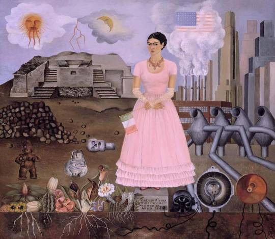
In her 1932 painting Self-Portrait on the Borderline between Mexico and the United States, a defiant Frida straddles an imaginary boundary between Mexico and Detroit, where she was living at the time with her husband, the muralist Diego Rivera. The Mexican side is strewn with skulls, ruins, plants, and flowers with thick roots burrowed deep into the soil. The Detroit side contains factories, skyscrapers, and plumes of smoke—an industrial city that hides the natural cycle of life and death.
While living in Detroit, Kahlo became pregnant. She wrote of the pregnancy to her former physician, Leo Eloesser, her devoted correspondent from 1932 to 1951. She worried that pregnancy was too dangerous, that her body had been damaged by the famous streetcar accident that shattered part of her pelvis and punctured her uterus. Kahlo reported that her doctor in Detroit “gave me quinine and very strong castor oil for purge.” When the chemicals failed to end the pregnancy, her doctor declined to perform a surgical abortion, and Kahlo faced the prospect of carrying the risky pregnancy to term. She begged Eloesser to write to her doctor in Detroit, “since performing an abortion is against the law, maybe he is scared or something, and later it would be impossible to undergo such an operation.” We don’t know how Eloesser responded to Kahlo’s request, but two months later, she suffered a violent miscarriage.
In a painting she created after her experience, Henry Ford Hospital (La cama volando), Frida lies naked on a hospital bed, the sheets soaked with blood. Objects float in the space around her, attached to her stomach by umbilical cords made of red ribbon: a male fetus (her son), medical objects, and symbols like a snail and an orchid. Detroit’s stark, manufacturing skyline disturbs the background.
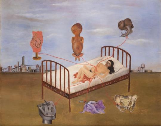
Regardless of her visceral distaste for Detroit and the horrible misfortune that occurred there, art historian Victor Zamudio Taylor claims it was here that “Kahlo, for the first time, consciously decides that she will paint about herself, and that she will paint the most private and painful aspects of herself.”
— From Here to Eternity: Traveling the World to Find the Good Death, Caitlin Doughty
#frida kahlo#mexico#united states#detroit#Self-portrait on the Borderline Between Mexico and the United States#Henry Ford Hospital (The Flying Bed)#La cama volando#miscarriage#1932#paintings#Caitlin Doughty#Ask a Mortician#From Here to Eternity: Traveling the World to Find the Good Death#From Here to Eternity#books#bookblr#death positive#death positive movement#nonfiction#science#history#travel#anthropology#memoir#sociology#atypicalreads#deathcare#cw death
23 notes
·
View notes
Note
Longtime lurker, hoping you can help me out.
I'd like to purchase a gas mask that is available for say...under $200-300...and compatible with aiming a rifle?
Can you suggest a couple of models that are affordable and easily obtainable?
I'm also (seperately) looking for a low cost self-contained (battery driven supllied air) full-face respirator for painting or spaying pesticides but the cost of the 3M system has kept me from taking the plunge. I find half masks or disposables really uncomfortable to breath through. Any suggestions?
That depends on a lot of things - let's start with the most important one, are you wanting to buy new or are you experienced enough to know what to look out for with surplus items?
Assuming you live in the U.S., imo the best option for most tactically-inclined individuals are ex-police Avon C50's; They sit smack dab in the middle of the pricepoint you described (going for $250+ on average) and they meet 80% of the criteria for what I personally believe a modern "tactical" mask (not just military) should encompass:
Panoramic eyelens with a wide ecosystem of lens outserts
Optical insert capability
Comms and/or Voice Amplifier-Capable
Mesh skullcap-type head harness with low-profile buckles for helmet integration
Butyl rubber and glass-filled nylon construction
Common, standardized drinking adapter
Threaded for Rd40x1/7" NATO Canisters for greater flexibility of protection (i.e.; using canisters intended for specific threats instead of just general purpose CBRN)
Left and right-hand capable side ports
Interchangeable inner nosecups for custom sizing based on individual facial ergonomics The only thing it really lags behind in is having poor passive voice communication (no voice diaphragm, just the outlet valve), as well as poor moisture drainage (you will have to lean forward to drain any sweat, spit, etc out the outlet valve rather than it draining naturally)


All gas masks are generally going to put you at a disadvantage as far as aiming a rifle, and even masks designed for improved rifle ergonomics like the Avon FM53/54 still give a massive amount of stand-off when attempting to look down your sights, so I'd definitely hop on the bandwagon of tall optic risers if gas mask usage is a legitimate consideration.
Other excellent surplus options include the older Avon FM12, Scott/Kemira M/95 (or more realistically, the Scott M110 if you can find them; the M/95's drinking system is hard to get adapters for), or even MSA Millennium or surplus M40A1 Protective Masks are all viable options with a fair amount of aftermarket support. As far as buying newly-manufactured masks, you're going to be cutting above the $300 mark - Avon sells their C50 (and FM50, which is the same but with proprietary cartridges) at an MSRP of $500
Mira Safety is a brand you've likely heard of, who are mostly known as a redistributor of gas masks manufactured for them by Czech firm Gumarny Zubri. Mira as a company is incredibly underhanded and shady - they make a lot of false claims about who they sell to and the capability of their products, and not to mention their ad campaigns are the most blatantly mudslinging/misinformed.
Objectively the only thing that Mira/GuZu masks really shine at is having slightly higher quality rubber and superior passive voice comms and downward moisture drainage over Avon designs. They fail at basically every other aspect. However, they do work and they are cheaper if buying brand-new masks is a requirement for you.
I sadly don't have many suggestions as far as commercial/industrial PAPR units - I know a lot of those are surplussed by the pharmaceutical/medical industry, so I'd browse options, get to know them and spend time obsessively browsing ebay for various models and knowing how to tell when they're complete and serviceable.
Oh and one last thing -
P3-rated Particulate Filters are your best friend if all you realistically expect to face off against is tear gas and nuisance dusts. Particulate filters don't really expire since there's basically no chemicals that break down and can be stored almost indefinitely provided there's no moisture to foul the filter element.
40mm threaded P3 cartridges made by 3M, Racal, MSA etc are super common on the industrial surplus market and can be had in bulk for reasonably cheap, especially as "expired" lots.
8 notes
·
View notes
Text


Fuck ‘Alternative’ Technology! Fuck the ‘Alternative’ Green Ghetto!
Standing up on this hill, as the sun filters through the trees you occasionally catch the reflection of solar panels on the roofs of the houses beyond the wind farm. The gentle swishing of turbine blades is inaudible here, but the hum of a tractor is just perceptible as it sows next year’s bio fuel crop in the fields below...
Though the reality of alternative technology providing a “green” and sustainable life for us all in the 21st century may seem a long way off, may seem an almost impossible task of enormous proportions, it is becoming more widely accepted as a necessary step in the progress of our industrial society. It is, however, rarely seen for the sham it is.
The disastrously clichéd picture painted above is incomplete without a quick look behind the scenes. Though minute details of the industrial processes employed are beyond the scope of this article, and frankly do not interest me, even a cursory examination will show that the manufacture of photovoltaic panels, wind gennies and bio fuel production facilities is not a particularly green (or alternative) business. From mineral and metal ore extraction (think open cast, think indigenous land rights, think health and safety) to metal purification (think blast furnace, think slag heaps, think massive energy consumption) to manufacturing (think conveyer belts, think toxic effluents, think wage slavery) to transport (think container ships, think road deaths, think more and more fucking airports) to mass consumer society (think, no don’t think, consume), when western industrial society decides it wants something, regardless of the apparently benign nature of the product (or even it’s intended use in excusing the excesses of our society), the product has a price attached to it, namely the “concealed drudgery of many and the despoliation of the natural world” [1]
There seem to be many people in the alternative green ghetto who have become engrossed in the provision of power through ‘alternative’ means, usually at festivals and free parties, and who even see this as a form of green activism. Embarrassingly this mostly takes the form of boys playing with their (hi-tech) toys. An unfortunate group caught out by technological determinism. Just because it’s possible it doesn’t follow that it’s a good idea.
Many have been fooled into thinking that this new product of consumer capitalism will further the goals of those seeking sustainability without questioning the use of electricity itself and the innately unsustainable nature of all the industries involved in its consumption.
Although industrial production (of alt-tech gear or otherwise) is inherently unsustainable (surely with just a bit more technology...) some products are often justified if they, for instance, allow autonomy or independence to those in struggle, but then the same goes for making use of any of the tools of civilization in order to fight against it. But people tend to consume ‘alt tech’ as a lazy alternative to using more inventive methods, which are usually more in conflict with the system.
The problem arises around so-called ‘ethical’ consumption and the quasireligious zeal that surrounds the cult that is alternative-technology. Ethical consumption is steeped in petty moralism and guilt, but rarely challenges consumption itself.
As anarchists we shouldn’t look to the marketplace to fulfil our needs — but rather seek to feed off the detritus of civilization whilst attacking the pillars that are its foundation.
What are we doing with all this ‘alternative’ electricity? Whether it’s being fed into the grid or used where it’s made (via lead-acid batteries), it is the use of electricity itself that must be questioned, not where it comes from. In the same way that the suggestion that our vehicles could be fuelled by vegetable oil does not question car culture, the cult of electricity is rarely examined. From computers to sound-systems, light-bulbs to fridge-freezers all of these things just add to the devastation of the natural world, and severely limit any chance of salvaging a genuine unmediated human existence.
It would be foolish to forget that a green city is still a city. It comes down to whether you merely want to tinker with the system (however you dress that up in anarcho-leftist rhetoric), creating a green tinged society a la Bookchinite ‘Social Ecology’) whether your desire is to embark upon a project that seeks to dismantle all that curtails a more authentic exitence. Though there are apparently still some anarchists who believe that controlling the means of production would somehow allow the develoment of a libertarian society, it must be realised that the technological system is simply a part of the structure domination that (one would think) anarchists strive to destroy.
Technology is the sum of mediations between us and the natural world and the sum of those separations mediating us from each other. It is all the drudgery and toxicity required to produce and reproduce the stage of hyper-alienation we live in. [2]
It may have become apparent that I am using the terms “technology” and “alternative technology” interchangably, but it should be obvious by now that there can be no reasonable differentiation between them. The notion that technology is neutral and exists independently of social relationships has no basis.
Technology is not a simple tool which can be used in any way we like. It is a form of social organization, a set of social relations. It has its own laws. If we are to engage in its use, we must accept its authority. The enormous size, complex interconnections and stratification of tasks which make up modern technological systems make authoritarian command necessary and independent, individual decision-making impossible. (Fifth Estate Quoted from ‘The Primitivist Primer’ by John Moore).
At the heart of the technological system are the division of labour and specialisation. Resulting from these are dependency. We are held to ransom, dependent on others, childlike in the face of the complex organisation of technological society, alienated from the natural environment.
Most anarchists recognise that the state, private property, the commodity system, the patriarchal family and organized religion are inherently dominating institutions and systems that need to be destroyed if we are to create a world in which we are all free to determine our lives as we see fit. Thus, it is strange that the same understanding is not applied to the industrial technological system.[3]
It appears that what is needed is a seditious mutiny of the technological mindset that seems to be so pervasive even within so called ‘alternative’ green and radical circles. That ‘alternative’ technology will fail to avert any of the pitfalls of conventional technological approaches is clear. Therefore its status among many as some form of tool of a future ecological society is grounded in shallow and ill thought out analysis of the current technological society we find ourselves in and the historical forces that brought this about.
Never before have people been so infantalised, made so dependent on the machine for everything; as the earth rapidly approaches its extinction due to technology, our souls are shrunk and flattened by its pervasive rule. Any sense of wholeness and freedom can only return by the undoing of the massive division of labour at the heart of technological progress. This is the liberatory project in all its depth.[4]
#green#tech#anarchism#green anarchism#Green Anarchist#70#Mr. Blobby#technology#anarchy#anarchist society#practical anarchy#practical anarchism#resistance#autonomy#revolution#communism#anti capitalist#anti capitalism#late stage capitalism#daily posts#libraries#leftism#social issues#anarchy works#anarchist library#survival#freedom
5 notes
·
View notes
Note
please tell me about the pigments i would love nothing more than to hear you talk about that one shade of red you like and the process it took too recreate it
... oh, op. you have no idea what you've unleashed.
alright. here we go.
OKAY SO THE RED PIGMENT. pr206. my beloved. my dearest friend. it was an absolute bastard to find because there are so many of these. however many you think there are, there are MORE, and that's only if you don't count the many many scenarios where colors are known to be multi-pigment mixes, usually varying in tone/shade/intensity depending on the brand and manufacturing style. some colors are more consistent than others, but there are situations where a color can be named the same and contain the same pigments and STILL look wildly different depending on the ratio, binder, and paper you use. and that's not accounting for the way the pigment is processed. some pigments (like pv19 for example) can come in so many shades it's frankly kind of ridiculous.
anyway, my quest begins when i am, admittedly, in an edgier phase. i want a blood red, but not specifically because of that—no, i want it because it is THE IDEAL COLOR (to me) for a perfect, warm, slightly muted but still intense shade to add to a muted autumn watercolor palette. and... if you look at my whole theme, you probably know how much i love warm colors. i want to paint mushrooms. i want to dim down some of the brighter greens to make them autumnal. i want the perfect red to put as an undertone.
the search starts in earnest.
the immediate issue is this: reds (and purples and pinks) have horrifically bad lightfastness. not all of them, mind, but many are NOTORIOUS for fading under uv light, which means they will also fade if exposed to sunlight even in passing should it happen often enough. and—in especially bad cases where they're essentially working with dye and not pigment—they can even fade inside your notebook. inside of a drawer.
so not only are we working with an unfortunate pigment base (i'm simplifying here, there's way more nuance to this but shh) but we are working with one that skews heavily toward floral pinks or oranges. the red i'm searching for is warm, but not orange. dries dark but not brown. is transparent, not opaque. that last part is agonizing, because i also desperately do not want a color that will fade on me or generally destabilize, and most of the stable dark red pigments are EARTH pigments like red ochre (pr101) or the like. which, while fascinating because of their historical usage in things like pottery and even cave paintings that last to the modern day, are VERY OPAQUE. this is an issue with my preferred style of watercolor painting specifically, because opaque pigments tend to lift easier off the page and limit layering.
the search continues. pigment after pigment breaks my heart for one reason or another, drying too close to the cooler purpleish-red tint of wine at best. i think i find it in perylene maroon, but the drying shift (the difference between how a color looks wet vs after it dries on the paper) is so extreme that it loses the luminosity AND it's more opaque than most. i languish.
for a while my search turns to creation. i try and mix as many of my single pigment colors as i can into something that vaguely resembles what i'm looking for—so i take quinacridones and mix them with napthols, with nickel azos, with dashes of ultramarines and burnt sienna. everything turns out either just a bit too opaque, just a bit too muddy (that happens with multi-pigment mixtures, and is why so many people swear by single pigment colors. it's personal preference, really, great art can be made either way.)
still, nothing works. failure haunts me. i sit before a pile of used up watercolor paper that is literally covered edge to edge in nothing but similar red squares with various gradients and blooms as evidence of when i tried and failed to convince myself my efforts were close enough. i admit defeat.
in the meantime i shift my focus. i try and appreciate different color palettes and profiles, experimenting with things like fully transparent palettes (personal favroite) to fully opaque ones that function more like gouache. but despite finding appreciation for it, i still think about the damn red that i could never recreate. it kills me.
and then one day, a youtube video. a pigment is being discontinued, and the watercolor community is distressed. this happens a lot, because pigments are actually not always popular because of artists—sometimes beloved colors are put out of production because larger markets like car companies no longer find them popular enough to invest in. this time, the casualty is pr206, aka brown madder, aka quinacridone burnt scarlet.
let me tell you a little about quinacridones. they are genuinely remarkable colors. they have their own cult followings because of how bright and abnormally stable they are under uv light. they're transparent. they're luminous. they come in mostly shades of red and pink and purple, though there are a couple oranges and yellows in there. (there are no quinacridone blues, as far as i'm aware, but the phthalo blues have that category covered.) they also rewet beautifully, so you can put them on your palette and let them dry and not worry about it turning into a useless little rock of color that you can't get any pigment from anymore.
quinacridone magenta (pr122) is probably the most popular of these, the most often used besides maybe quinacridone violet (pv19). a few years prior we suffered the loss of quinacridone gold (po49) and since then people have been On Alert when it comes to losing these colors. i am one of them, because i never got the chance to even see po49 in person, and now the tubes are so stupid expensive that even the student grade versions go for Ridiculously High Prices on ebay, and the professional brands are being hoarded like (ironically) gold by anyone lucky enough to have a tube left over.
but back to our main character. not me, the pigment. pr206. i have legitimately never heard of this one, which to be fair is probably because i try to limit the random colors i fixate on since the hobby can easily get VERY expensive if you aren't careful. but it's a quinacridone, and that catches my eye.
i open the video.
now, i'm sure any artist out there will be familiar with the fact that screens don't display color consistently. it depends on your device, but most can agree that something that looks cooler on one may be warmer on the other, it's just what happens. but i see this color being swatched, and my brain implodes.
it's almost a perfect match.
it could work. it could. years of thinking that same thought have left me bereft and mistrustful of this specific quest marker, but the thought refuses to leave me. probably because the 'discontinued' label flashes like a neon sign.
i resist for about six months, and then i cave. at this point i have genuinely been trying and failing to find this color for upwards of five years. i am desperate, and the color might not be available anymore soon anyway, and apparently i am weak to sales pitches. (note: the color IS now unavailable in some brands, but others bought a decent supply and should have it available for at least a little while, alongside po48 which is quinacridone burnt orange, a favorite of mine and probably one of the only oranges i use regularly. both are discontinued officially, but they'll still be on sale till those supplies run dry.)
the color arrives. i grab my favorite brush. i pull out my stash of paper that i save for special occasions.
it's almost perfect.
i mix it with quinacridone burnt orange.
the result is, i swear, a perfect match for what i have been searching for.
it's warm. it dries dark but not dark enough to look brown. it keeps its luminosity (thank you quinacridones). it's fully transparent (thank you quinacridones). i genuinely feel the urge to weep, but i don't because i am clinging at last to the dredges of my sanity and also salt makes watercolor pigments behave differently and i will not risk this glorious moment. finally, after all these years, bill cipher has a gun i found the goddamn COLOR.
i mix it with warm yellows and with my favorite blues. with the pinks, just to laugh. life is beautiful and i am painting its sunsets, and i do not care if they look ridiculously messy. i have won.
the moral of the story is to never give up. or maybe it's to remember you never actually know everything about even the fields you love the most, because this color totally blindsided me despite being much more common than i expected. or maybe it's that i seriously needed to chill out for a while.
but yes. that is the tale of one (1) of the colors that has taken up residence in my soul. i hope you don't regret asking now lmao.
#ney's art tips (art questions)#ney's chatter (ask answers)#so also i said that a good alternative to pr206 is pr175#but i'm actually not totally sure about that because i've never tried it myself#watercolor is an expensive hobby and that's part of why i swapped to digital orz#BUT! from comparisons i've seen they are at least similar enough to scratch the itch#ironically i think i still USE po48 more than i do pr206#but that one is also In Discontinued Limbo where you can buy it but supply is indeterminately limited lmao#still a gorgeous color though.#... wow. this was incredibly niche and probably barely coherent i am so sorry LMAO#but thank you for indulging my color madness. it was the only hobby i had for *ages*.#long post#very very long post#good god is this my longest text post? aside from maybe a hive story?
21 notes
·
View notes