#Mockups Made Easy
Explore tagged Tumblr posts
Visit Tumblr Blog
Explore Tumblr blogs with no restrictions, modern design and the best experience.
Last Seen Tumblr Blogs


Fun Fact
Tumblr has 411 employees.
Text

Selling on Society6 or TeePublic? Get pro mockups now!
#Etsy Success#Creative Fabrica#Etsy Shop Owner#Mockups Made Easy#Online Business#Sublimation Printing#Handmade Business#Etsy Marketing#Ecommerce Tips#Digital Products
0 notes
Text

Want more buyers? Professional mockups make a difference!
#Etsy Success#Creative Fabrica#Etsy Shop Owner#Mockups Made Easy#Online Business#Sublimation Printing#Handmade Business#Etsy Marketing#Ecommerce Tips#Digital Products
0 notes
Text
Sublimation sellers: Create mockups in just minutes!

Are you an Etsy or Creative Fabrica seller offering PNGs or sublimation designs? BulkMockify helps you create professional mockups that attract buyers and boost sales!
#Etsy Success#Creative Fabrica#Etsy Shop Owner#Mockups Made Easy#Online Business#Sublimation Printing#Handmade Business#Etsy Marketing#Ecommerce Tips#Digital Products
0 notes
Text
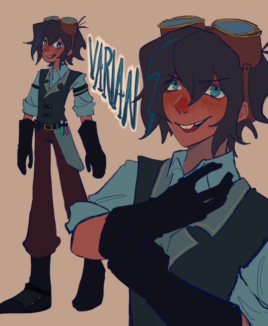
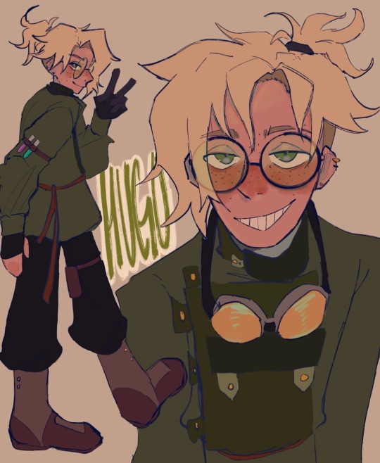
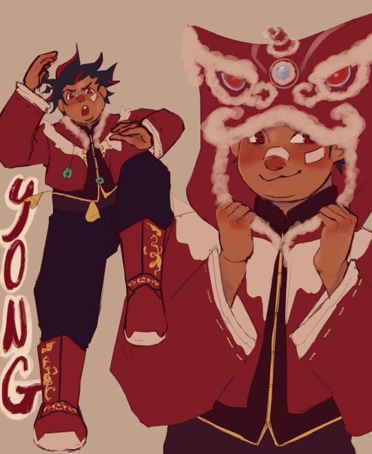
vat7k designs in my head...
i thought their canon designs were a eensy weensy bit Unpolished so i made these mostly for myself. erm if u rly want it i think varian is 19 here, hugo 19, nuru 18, yong 12.
i also made rhem all playlists and had to draw them a cover so thats what the last img is I linked each of em under my notes for all of em... Under the cut is Like a Huge Infodump of notes i have for each chara,,,,,,
i kept varians design basically the same, i dislike the design w the orange neck thing so i just Nuked it😭... Here's Varians playlist
Hugos design i just wanted to put him in something more Loose. hes a thief, a professional escape artist. i dont think wearing clunky metal is ideal for him. i also gave him a prosthetic arm (blond w no arm design trope!) but u cant see it in the ref so i added another drawing of him in his under layering👍 i vaguely referenced russian(?) clothes for him as well... Yeah not too much changed w him i just tried to make him slippery-er. Here's Hugo's playlist
yong came relatively easy to me, if it wasn't obvious i did rip gaming from g*nshin's hoodie. i thought the lion hood was Adorable and freaking perfect for what i had in mind for hos character. since the og notes said the fire kingdom is loosely Chinese inspired i basically just kept that. i mashed tgt a buncha diff dynasties though sorry for how inconsistent i was... i think he looks Okay. anyways i changed yongs role a bit, ill explain why im adjusting some of their roles later but i kept yong as the Jinx Type character. hes the eldest in his family and has a buncha younger siblings, hes a lion dancer and does performances w his family/siblings. he rly like special effects n keeps tryna incorporate his fireworks into their performances (it flops and he has to sew up the dmg) ill explain more of yongs role in another post maybe shrugs... Here's Yong's Playlist
miss nuru was a bit of a struggle for me i might share my full design process with her coz i did a Bunch of mockups for her😭😭😭... i didnt have a specific country of reference for her but i chose to make her vaguely south asian inspired. i also really wanted to keep the sheer fabric w the star / constellation map. i love that idea its so cute so shes still technically the navigator. but she also wields a sword too, fencing or whatever. (her and varian r Huge Cass fangirls which is probably why she started tryna use a sword (snuck out to watch cass compete) Okay ill talk abt this later) in my head, okay ill Probably make a whole nother post talking abt how im interpreting/writing each chara, but in my head i think nuru is the youngest and her kingdom's archivist. shes mostly in charge of like Her kingdoms history / artifacts / etc. ok im getting too side tracked ill save the lore dump for later but thats Nurus role in the party. Here's Nuru's Playlist
uhm below i made their character stats mostly to help me with planning / role developing. the yellow is their base stats the color behind is their end stats i guess. i was gonna explain my reasoning for their stats but ermm this post is kinda Really long so sorry😭... varian max int for obvious reasons, also max charisma just coz i feel like u kinda learn a thing or two being around a couple manipulators and spending time in jail idk shrugs... (also lets not forget the "ud b surprised what ppl would do for a cookie!") Hugo slippery guy, if a brick is thrown at him as hes running hes gonna try n run faster to shatter it, his mindset is Run Run Run! i think hes relatively agile too but yeah mostly a Speedster. i think he n varian got no Physical strength varian maybe just like A little coz Farm boy but I rly doubt quirin is making him do a Lotta heavy lifting. yong has incredible stamina and agility because hed a performer. nuru is the strongest coz this team would literally Flop without a proper Offense😭... i think varian n hugo r able to outwit plenty of their opponents but i think nuru is pretty good in a fight, same w yong. Yeah Okay Sorry for a Long Long Post thanks hope u guys enjoy
#vat7k#varian and the seven kingdoms#varian vat7k#hugo vat7k#nuru vat7k#yong vat7k#varian tangled#fanart#lizzysart
795 notes
·
View notes
Text
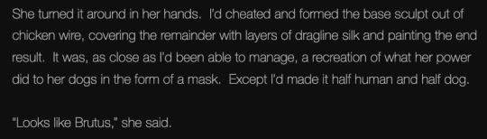
Homelander being obsessed with his sister HC II


Warnings: heavy siblingxsibling implications, Homelander being such a narcissist that he falls in "love" with his own sibling, dubcon, noncon, manipulation, stalking, basically all the horrible parts of HL come out to play, MC has blonde hair and blue eyes like HL, different plot than 'All I Ever Wanted, All I Ever Needed', kidnapping
I III IV V

Mother fucker would definitely find a way to lock you up in his personal apartment. It’s not easy to keep a supe that had the same powers as him as a captive. Through trial and error, Homelander would find a way to keep you hidden. His little secret
Has major mood change at work and a new skip in his step. All smiles and syrupy sweet voice.
Your parents and friends would go into immediate action to try and find you.
HL installs motion detector cameras throughout his apartment to keep an eye on you when he’s too far away. If anything happened, he knew he could be there in a flash
All day you were forced to wait for him until he got off of work (though does a hero ever really have time off?), like a pet. During that time all you could do was stare at the tv that HL had kindly turned on for you.
Of course you'd tried to escape in the beginning. But HL was faster than you.
Bored out of your mind from the constant stream of tv, you'd manage to wiggle over to the box that Homelander had shown you your first day there. You had time to really look at the contents though it was difficult without the free use of your hands. There were pictures of you as a little girl with your mom and dad. Lo and behold, you even found a picture of you on a young HL lap. Documents upon documents with Vought's stamp on them had you accepting the truth that HL was indeed your blood brother.
Homelander gives up trying to jog your memory once you inform him that you really don't remember much growing up. But you acknowledge him as being your sibling by blood.
"I believe you, but this doesn't condone kidnapping and keeping me here, Homelander." You countered, still not understanding why he went through all of this trouble. Just because you were his sister? That seemed too outrageous to you. Then again, you still didn't really know the real Homelander.
He corrects you. "John. You can call me John." He'd told you that several times but you just couldn't bring yourself to say such a simple name to this legend of a man.
Honestly, the whole abduction thing was a spur of the moment idea but once he found himself in the air with you in his arms, he made the decision that he was going to keep you to himself whether you liked it or not. That was the only way to make sure you wouldn't forget him again or leave him.
And some morbidly twisted feeling was growing inside of him every time he looked at you. You were perfect. Like he was. He talked himself into thinking that this was okay, that he was always meant for someone who was just as perfect as he was. And who better than you who has the same genetic mockup as he did.
He'd tell you all of this like it was the most simplest thing in the world. You gape at him in horror at his grotesque explanation.
Unnerve and discontent raised the hairs up on the back of your neck. What he'd said sounded a lot like him talking about incest. That roiled your stomach, making you feel sick.
He hated the fear he smelled on you in that moment, Homelander even pulls back from you and puts you at arm's length. You hate how he reduced you to someone so helpless. You also hate how much he really scares you.
Swallowing something thick in his throat, HL looks away from you with what you could only read as disgust. Maybe at you? Not for you though. For himself. He'd scared you and that was enough to shame him.
He'd mutter out an incredibly soft apology before leaving his apartment.

I'm thinking that as long as I have HC ideas of this, that I'll just be adding parts whenever the feeling strikes 🙂
#reader insert#reader insert fanfiction#homelander fic#homelander fanfiction#the boys homelander x reader#homelander x reader#homelander headcanons#the boys tv#the boys fanfic#the boys amazon#the boys imagine#the boys x reader#the boys tv x reader#the boys homelander#the boys homelander fanfic#the boys homelander fanfiction#the boys fandom#the boys tv fandom#the boys series
656 notes
·
View notes
Text
I've Got a Puzzle for You!
I've written something like 15 different (way too long) meta posts about When It Rains, It Pours. That's not counting the non-meta. (Someone asked me in a DM for a masterlist. I might make one at the end of the show. For now, just search the "my when it rains meta" tag on my blog.)
But if you only read my posts, you are missing out. People more poetic and brilliant than me have written quite a bit too.
We've obsessed over sweet coffee, sizzling sounds, feet, and so much more. We've analyzed all four of our main characters (multiple times and ways) and the people on the periphery. So what's left?
A WHOLE FREAKING LOT!
There's seemingly infinite tiny details that reflect their relationships like Kaori leaving Hagiwara to dry her own hair whereas Fujisawa dries Sei's hair for him (and then leaves). But there's big things left too.
I have at least 5 potential posts in my drafts (like why I think it didn't start at the museum for Hagiwara) and a mockup for a fanvid (that will probably never get made). But alas, I want to watch the show tomorrow which means I MUST write about space history instead of these beautiful men tonight.
So I'm leaving you with a puzzle - something tickling my brain that I haven't figured out yet.
The show already established that food is symbolic.


Hagiwara makes fried rice. Rice carries a lot of cultural symbols. At a minimum it is often a symbol of life and genuineness. It is warmth, home, and sustenance. He's offering Kaori himself and a home.

Kaori doesn't want the rice. She doesn't want Hagiwara's affection.

Hagiwara DOES eat the rice balls that Kaori makes for him, because he does want her affection.

Hagiwara refrigerates the rice. He's putting his affection on ice.

Fujisawa offers Sei yogurt.

Sei doesn't want the yogurt Fujisawa prepares.

Just like Hagiwara did, Fujisawa puts the food in the refrigerator.

Kaori gets and eats her own yogurt. Hagiwara isn't eating it.

But what does the yogurt represent?
Rice was easy for me. But every symbolic meaning I know of yogurt (balance, health, nurture, safety, worship), NONE of them make sense in the context of this show. So anyone want to try? Anyone want to help me out while I wait for the fight?
@respectthepetty @babyangelsky @iguessitsjustme @benkaben @dribs-and-drabbles @delesaria-blog Any thoughts? Anyone know a different meaning for yogurt?
EDIT: If you stumble on this version, I STRONGLY encourage you to check out the reblogs! The yogurt has meaning!
#I'm deeper than the Oedo line at this point#counting down the hours#i'm ready for my boy Hagiwara to fight for his love#and for Sei to free himself#I know the coming episode will be painful#but i'm cautiously optimistic about the future#so bring on the rain#when it rains it pours#futtara doshaburi#my when it rains meta
53 notes
·
View notes
Text
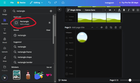
𓈒༷♪˚.✧ How to make a mockup like this for smaus, ocs, etc. (step-by-step tutorial ☆ no Photoshop, easy, free) (requested by @lovebittenbyevans) ✿
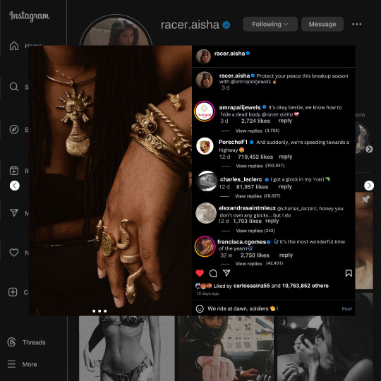
guys this took me two hours to make and you could probably get this done in like, 30 minutes :) I hope this is coherent <3 Please look back this image for comparisons, if my explanation is not well explained, etc.
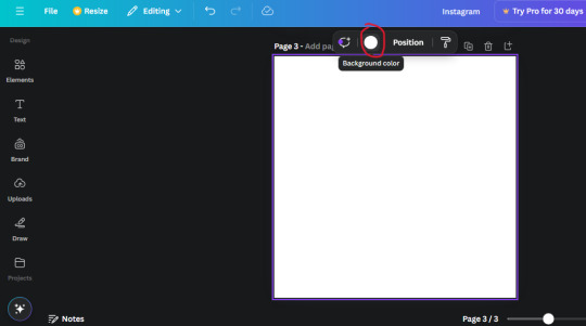
first of all, if you dont already have one, make a free canva acount. once you're signed in, hit the purple "create design" button on the sidebar. A pop-up will appear with different design template options. For this design, we want the dimentions to be 1080 x 1080, so you can either make a custom size or choose the instagram post (square) template by either searching or scrolling through the list.

2. Now you have a blank page. Zoom in with the slider at the bottom of the page if you need to (Mine is currently zoomed in 41%). Click on the page and change the color to an off black (hex code #111111).
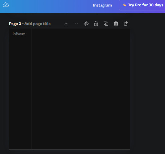
3. Now that the color is changed, click the "elements" tab and search "line". Click the shape and it will add it to the page automatically. These line are particularly hard to navigate and hard to get it at the right angle and length so this part might take a little longer than the rest.
4. stretch it from top to button and turn in a 90 angle so its straight on the left side of the page. Change the color of this as well to a grey tone (hex code #2F2F2F).
5. Now we'll add the Instagram logo. Click the "text" tab then click the purple "add text box" button. Write "Instagram" in the box and change the font to "apricots". This is the closest font I could find that resembled the logo font but if you find a better one, feel free to use that instead. Make the font size 19.3 (you can do this manually or do it in the text options). Change the color to grey color (hex code #707070). Add it to the upper left corner of the page like this:
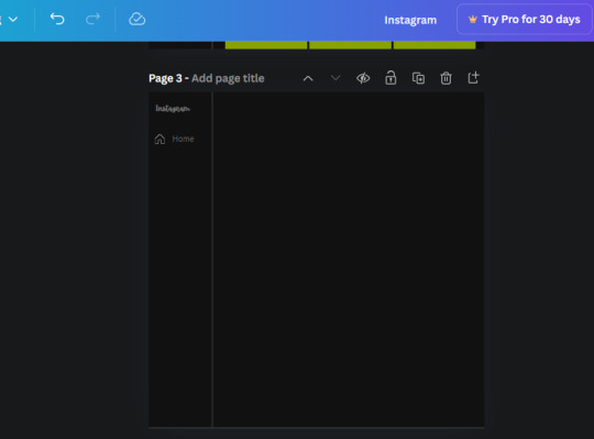
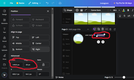
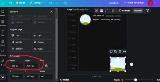
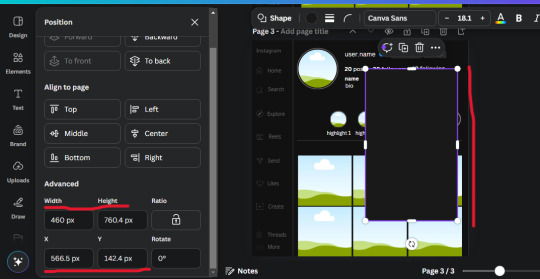
6. now we're adding icons and a menu inside the border we just made. Click the "elements" tab again and search for "instagram home icon" and add the element by sketchify to the page. Click the home icon, an options icon with pop-up above the page. Look for the "Position" button and click it. Scroll to find the advanced options and you can manually type in the width and height at 26.6 and 28.7.
Move it inside the border, under the logo (photo below). Change the color again (the hex code is #707070).
7. Open the text tab and add a text box. Change the font to Canva Sans and write "Home" in the box. Change the font size to 18.1 and align with with the house icon. It will look something like this,
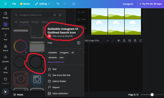
8. Go into the elements tab again and search "instagram search icon". Scroll until you find the one by sketchify and add it to the page.
9. Shrink it so the W and H is at 36.6 and 31.3. Move it below the home icon until a purple "67" pop ups and aligns under it. Change it to the same color as the Home text and icon (#707070). Go ahead and Duplicate the the "Home" text box and clicking it and a pop-up will show up then edit the text so it says "Search" and align with the searcch icon we just added.
10. You know the drill. We are continuing to search up more icons in the "elements" tab. Search "instagram compass icon" and choose the one by sketchify (are u seeing the pattern?). Add it to the page and change the width and heigth to 33.1. align it under the search icon just like how we did before and change it to the say colors as the other icons.
11. Do the same as before and write "Explore" in a text box and align it with the icon. We're doing the same thing for all of these.
We'll be using the same search prompt for all of these icons so just change the type of icon you're looking for like we've done before hand. Next look for the Instagram reel icon and add the outlined one by sketchify and change the W and H to 31.2 x 30.9. Change the color to the ones we've used before, align it underneath the icons above and add your text ("Reels").
12. The next icon is an outlined, "sent" one. W and H is 31.1 x 27. The text will say "Send". Then an heart outline by sketchify; W and H is 34.2 x 29.1 and the text is "Likes". Next is the "create" outline icon by sketchify, W and H is 36.8.
(p.s if you are struggling to align the icons and text correctly, shoot me a message and I'll send you the X and Y positions ;D)
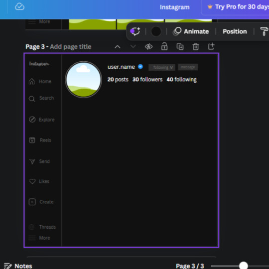
If you followed it through, it should look like this,
13. Now onto step 13, we'll be adding the Threads logo. You don't have to add this but to make it look more like the actual website, I will be adding it. Open the "text" tab and add a text box. Write an "@" symbol in the box and change the font to Nanum Sqaure and the size to 24.9. Add in the bottom corner below all the icons we just added to our page. We need another text box now (Color is still #707070), write "Threads" and align it to the "@" symbol.
14. We're adding another icon now. Search "Instagram menu icon" and find a wireframe menu icon by sketchify. the W and H are 42.5 x 24.6. Add a text box that says "More". It will look like this:
We are a quarter way done now :D
15. Search in the elements tab "circle frame" and look for the one with a little border around it.
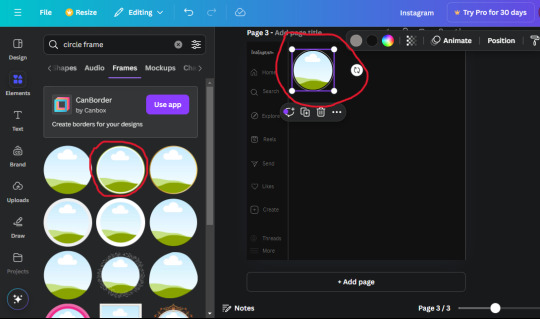
At first, the circle will be green and inside the circle will be white. Change the white to color of the background of the page (hex code #111111) then change the green to a grey color (#8D8986).
16. Add a new text box, change the font to Canva Sans and the size to 22.8 and the color is white. I just wrote "user.name" in the box. the W and H will be 153.3 x 35.7.
Enter the "elements" tab and search for a blue checkmark and find the icon by Victor Aguiar. The W and H is 28.1 by 28.
17. Search in the search box for a rectangular shape and add it to the page. Place it next to your username and checkmark icon and make the W and H to 149.6 x 38. Add another and place it next to the other rectangle shape. the W x H is 111.4 x 36.7.
Change the color of both boxes to #2F2F2F. Add a text box and write "following" then change the W and H to 82.6 x 21.8 and fit it inside the first box. Add a second text box and write "message" in it then change the W and H to 77.8 x 21.8. Change both text colors to #7A7A7A

18. Add another text box. Write "<" and turn it upside down and place it beside the "following" text inside the rectangle. Adjust the size as you need to. I also like the round the corners to around 8 so its not so pointy and square.
19. Add 3 new text boxes. Write the amount of posts, the amount of accounts you're following and the amount of followers your have. Write "20 posts", "30 following" "40 followers". Bold the numbers and change the text W and H to 116.4 x 32.7. These are just place holders that I use.
20. Open the "elements" tab again and search "frame". Choose the first one.
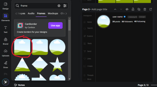
We want the height and width to be 268 x 252.4. Place it at the bottom of the page but we want some space between the frame and the page.
Now we'll duplicate the frame we just placed (the icon between the comment and trash can on the pop up above the frame). Place it next to the previous frame but we want to leave a bit of space between them like this:
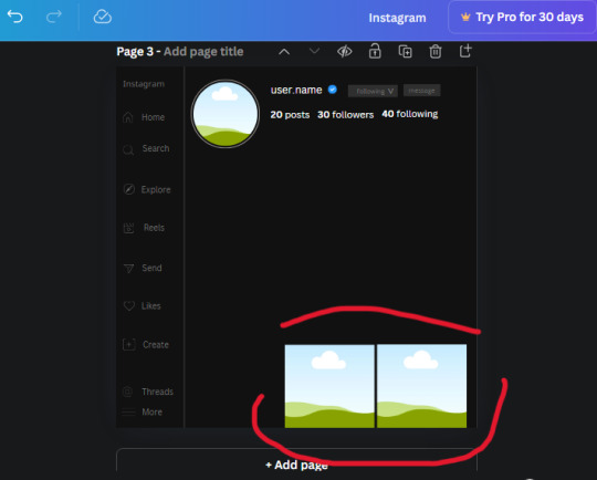
If its a little wonky, don't worry. You can always adjust it so it looks right.
Duplicate the frame again and place it next the second frame you just placed, same distance between. Make sure they're even. Now we have a row.
Select all three frames and duplicate them. Move them above our original frames but leave a little space between them.
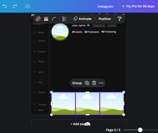
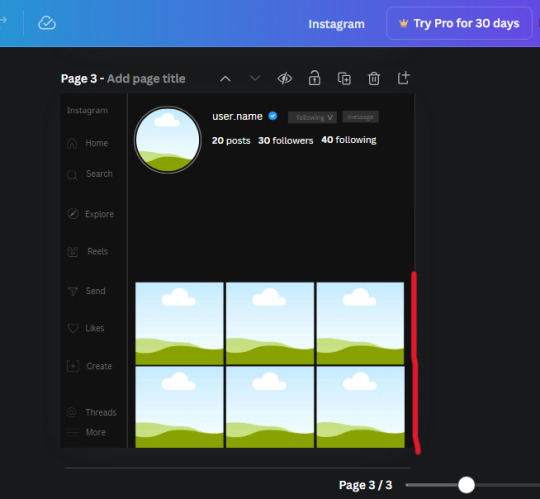
Again, if they're uneven, adjust them as you need to.
21. Select the line again from the elements tab. Stretch starting from the top frame to the last frame and make the color grey (#2F2F2F).
Because the line is stupid hard to navigate, use something like a text box to mark where you want it to end like this:


Delete the text box and the line with be where we want it.
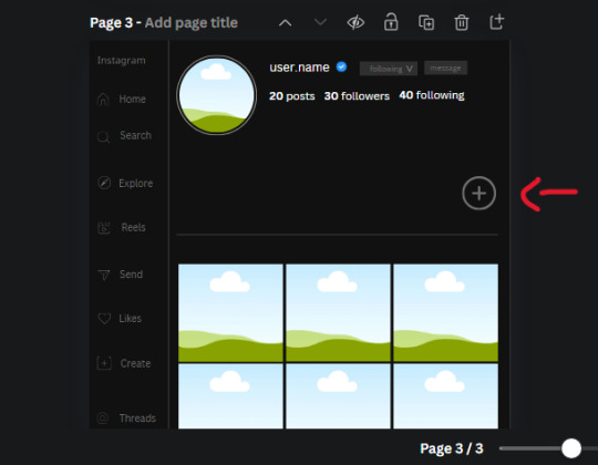
22. On to the highlight reels. Seach for "add button" and find the one by Barudak Lier.
Change the heigh and width to 81.1 and move it above the border.
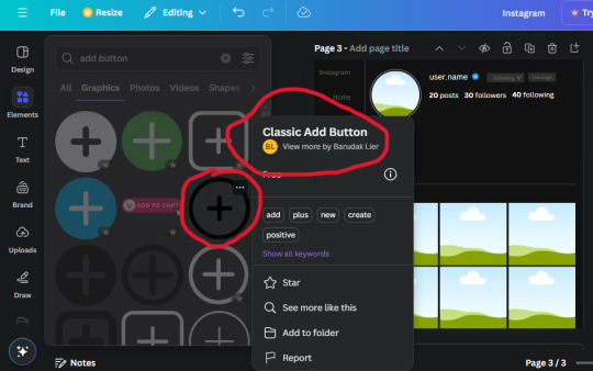
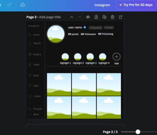
Search for circle frames now and add this one to the page (The same one we used for the pfp), change the width and height to 85.4 and move it next to the add button. Since this is a generic, blank template, I add about 4 of these highlight frames but you can do however many you want. You can change the border color to a gradient or leave it grey.
Add a text box now. The font will be Canva Sans, the size will be 18.1 and the color will be white. Change the text to "Add" and place it under our add button. Make more of these text boxes to place under the circle frames. Depending on which frame its under, write "Highlight 1", "Highlight 2", etc. etc. or you can give them different names and such.
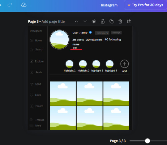
23. Add another text box, write "name" and bold it, change the size to 19.1 and the W and H to 69.2 x 28.8. The font will be Canva Sans and the color will be white. It will go under the amount of posts, followings and followers.
Add another box. The font is Canva Sans, font size to 20.1, the W and H is 40.8 x 31.3 and the color is white as well. This is our "bio". Place it under "name".
Yay!🎉🎉🎉 You're halfway done!
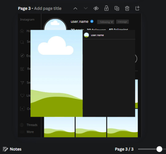
24. Search for a shape in the elements. Look for the rectangle again and add it. Change the width and height to 460 x 760.4 and the color to an off black/grey color (#191919), placing it like this:
Get the same kind of square frame we used before to make the profile grid and make it the same size as the rectangle we just added. Place right up against the rectangle like it's its other half. Add another line like before and span across the upper half of the black rectangle as a border then add a circle frame inside the border.
Add a text box, "user.name" and align it with the frame. The text is white and the W and H is 111.5 x 25.9
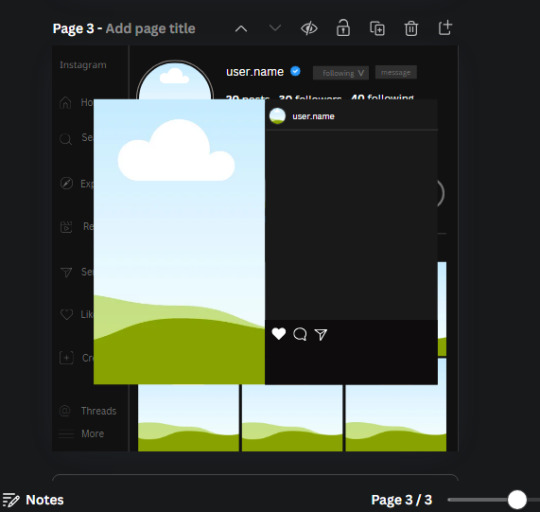
25. Add more circle frame along the inside of the rectangle to resemble the comment section. Make sure the W and H of the frames are 46.1.
Add more text boxes that align with the frames you just made and write "username" again and bold them. Add even more text boxes that align with the usernames and write "comment". These are place holders for when you decide to use this template.
Add another rectangle on the lower part of the rectangle and make the color black. and search for "instagram heart icon", "instagram comment icon" and "instagram send icon". Make sure the lines are thick. Find the heart icon by sketchify, and the the comment and send icon are by Mirazz Creations. Make the lines white and make sure the W and H are the following:
Heart icon: 38.7 x 32.9
Comment icon: 35.2 x 35. 8
Send icon: 35 x 32
Next, look for "instagram bookmark icon" and find the one by Adricreative. Change the color to white and the W and H to 29.7 x 40.2. Move it to the other end of the rectangle.
26. Now add three circles frames and change the W and H to 37.2. Move them below the heart icon and have them overlap each other some. Then, add a text box and write "liked by username and 1000 others". Change the font size to 13.6 and change the font to Canva sans. the color will be white. Align this with the three overlapped frames.
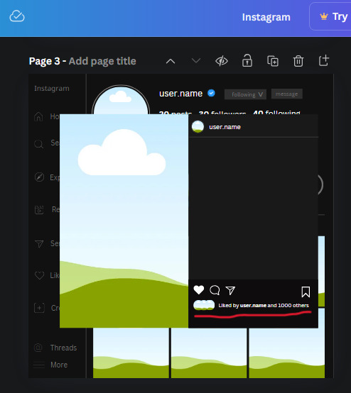
27. Look in the elements tab for an emoji icon and choose the one by Soni Soukell from Noun Project. The W and H will be 32.8 and the color is white.
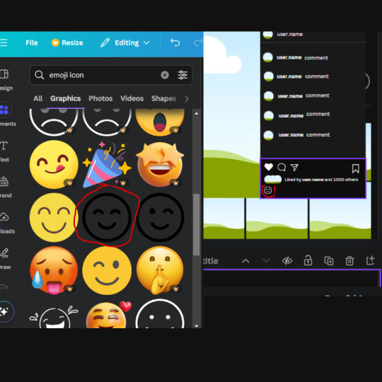
Now add a another text box and write "Write a comment". The color will be white, the font size will be 14.2 and align with the emoji icon you just placed.
Search for "next arrow button" by Pixeden and make the W and H 42.8 then add it to both sides of the post.
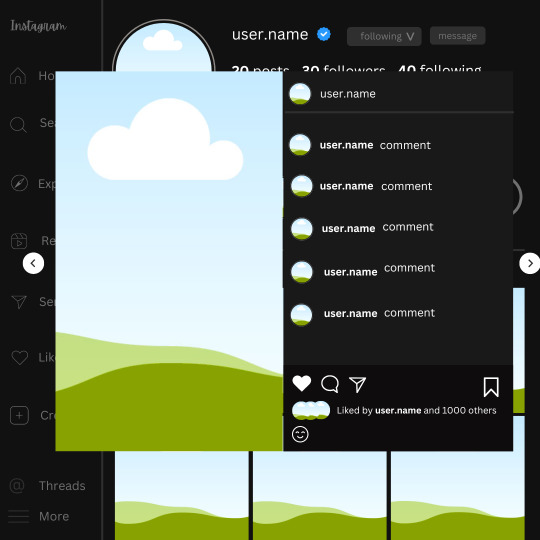
And you're all done with your template! All that is left to do is fill it but before doing that, duplicate the page so you always have an extra blank mockup if you want to use it again.
To fill the frames, upload an image (or use a Canva stock photo), drag and hover it over the frame and it will fill the frame.
Hope this was helpful and you you successfully made one :D <3
#requests#text#smau#template#mockup#moodboard#instagram#instagram moodboard#instagram mockup#graphic design#canva#psd#free tutorial#tutorial#instagram au#social media au#free psd#photoshop#resources#fanfiction resources#graphic design resources#graphic design tutorial#psd tutorial#photoshop tutorial#au#au ideas#mockups#digital design#digital design tutorial
95 notes
·
View notes
Text
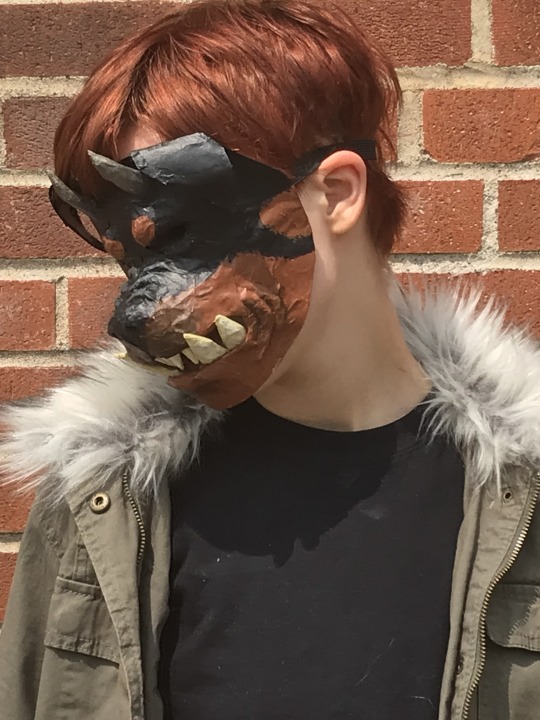

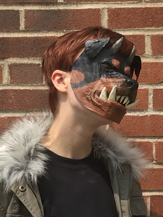


rachel lindt cosplay!!! WIP images and more info under cut
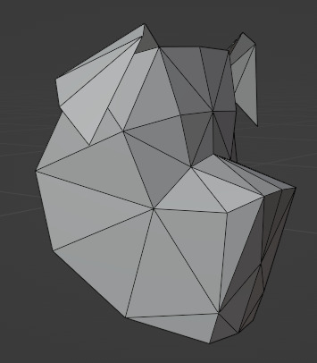
i used blender to model a rough dog head shape. it's super low poly because i used the export paper model addon (comes with blender, u may need to enable it in settings) the addon makes a PDF that can be printed and taped together. i found it works best with lowpoly and all triangle objects.

i printed several mockups on printer paper to get the size and fit right, then printed it on cardstock. forgot to take a photo before i started paper mache-ing it sadly. i can share the .blend and .pdf files for the mask if anyone wants them, although they aren't very polished.
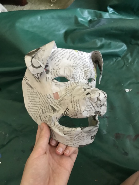
i used paper mache (newspaper and elmer's art paste) to add definition to the cheeks, lips, nose and eyebrows of the mask, and to make it more durable. i'm especially pleased with the shape of the nose, and the wrinkles on the nose and around the mouth. rolling newspaper into a tube and holding it down with a single layer of gluey newspaper worked well for finer details. i wish i made the eyeholes a little larger since this mask isn't too easy to see out of. but the mouth hole incidentally makes it easier to breathe and talk wearing the mask.

i painted the mask with acrylic paint and added teeth, made of newspaper rolled into cones, wrapped with masking tape, covered in paper mache and painted. i formed the horns in a similar way. painting the mask wasn't too hard, it's all solid colors except for the muzzle and horns.
this is supposed to be the mask that taylor made for rachel. (it turned out slightly lumpy which i think kinda works to my advantage since it's a homemade mask in-universe :P) i misremembered and thought it was a hybrid between a normal dog and a transformed dog, not a normal dog and a human. i like my idea better tbh. (also why would taylor make it from chicken wire that sounds so poky and unpleasant to work with)
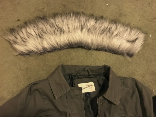
the outfit is clothing i already owned or bought from goodwill. i added a fur collar to a jacket i had. i traced the collar onto newspaper to make a pattern, cut it out of fake fur, and jankily hemmed it and sewed it in by hand. i don't enjoy working with fake fur, cutting it is so hard. i have a lot of respect for fursuit makers.
455 notes
·
View notes
Note
Just out of curiosity, you make the mockups for your faux sticker set by yourself from scratch? or maybe mofidy existing ones?? I Think they look very good and add so much to the comms and you even theme them to suit the characters instead of using the same one over and over, like wow that takes some effort!! Your art is amazin! Do you reccomend some tutorials/tips and tricks/sites for mockups like these?
Hi! Thank you so much, I am so glad you like these! To do these I most often use stock images and public domain images alongside textures and scans of objects (notes, paper, scribbles, book spreads etc.) I made myself and mofidy them into digital collages. I also sometimes use preexisting mock-ups for graphic designers and just edit the hell out of them to make them suit my patchy aesthetic, but I prefer to just use the previous method of putting images together, because it gives me more of a field to work with. It does take a bit of effort, yes, that's why I don't make them for every commission post but I like to create them anyway as much as I can, to visualize a digital product in a semi-realistic way :-)
If I want to create a specific effect, I often just search up some photoshop tutorials or just experiment with filters untill i find something exciting or nice graphically. There are a lot of places that offer free textures to use, for example sites with materials for 3d modelling that offer these things - which I love to use in my work. But they are super easy to create on your own as well traditionally. I often take pictures of scraps, dirt and the like to later put into these types of images. You can also find that many museums and art institutions offer public domain images (of artwork, documents and the like) from their collections!
All in all, the process of making these comes from my need to explore how all the effects, filters etc. from digital programs can be used to achieve interesting visuals. I am by no means any authority on the topic though, I mostly just explore and if I like something - explore it more.
Sorry for the long anwser, but i think this is something other people would also enjoy to know!
Thank you again!
74 notes
·
View notes
Text
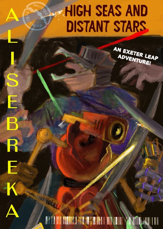
Happy Secret Samol @humanmorph !!! Yo ho ho a pirates life for you!
Id in alt text and also below the cut for legibility
Image one: An Alise Breka book cover. The illustration (meant to resemble an oil painting) features Leap and Figure A back to back, Figure A closer to the camera and Leap behind them. Leap is in a tie dye hoodie, Figure A has a dramatic collar welded to their round torso. Each are holding a sword and fending off attacks on all sides. Laser beams zip across the screen. The title of the book is “High Seas and Distant Stars” and is written on a yellow band across the top of the page. There is a simplified drawing of palisade as a logo for Palisade Publishing. There is a barcode across the bottom left.
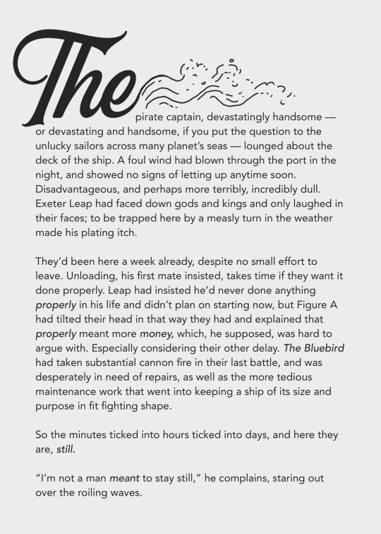
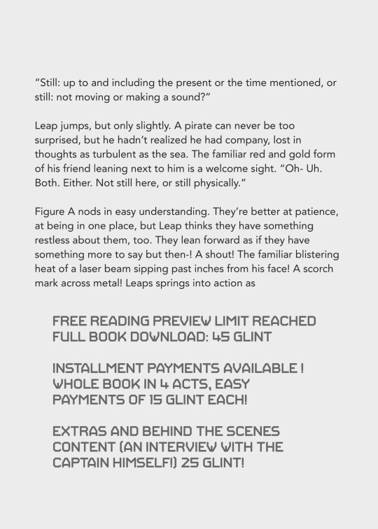
Image two and three: Mockup of the inside of the book. Text reads:
The pirate captain, devastatingly handsome — or devastating and handsome, if you put the question to the unlucky sailors across many planet’s seas — lounged about the deck of the ship. A foul wind had blown through the port in the night, and showed no signs of letting up anytime soon. Disadvantageous, and perhaps more terribly, incredibly dull. Exeter Leap had faced down gods and kings and only laughed in their faces; to be trapped here by a measly turn in the weather made his plating itch.
They’d been here a week already, despite no small effort to leave. Unloading, his first mate insisted, takes time if they want it done properly. Leap had insisted he’d never done anything properly in his life and didn’t plan on starting now, but Figure A had tilted their head in that way they had and explained that properly meant more money, which, he supposed, was hard to argue with. Especially considering their other delay. The Bluebird had taken substantial cannon fire in their last battle, and was desperately in need of repairs, as well as the more tedious maintenance work that went into keeping a ship of its size and purpose in fit fighting shape.
So the minutes ticked into hours ticked into days, and here they are, still.
“I’m not a man meant to stay still,” he complains, staring out over the roiling waves.
”Still: up to and including the present or the time mentioned, or still: not moving or making a sound?”
Leap jumps, but only slightly. A pirate can never be too surprised, but he hadn’t realized he had company, lost in thoughts as turbulent as the sea. The familiar red and gold form of his friend leaning next to him is a welcome sight. “Oh- Uh. Both. Either. Not still here, or still physically.”
Figure A nods in easy understanding. They’re better at patience, at being in one place, but Leap thinks they have something restless about them, too. They lean forward as if they have something more to say but then-! A shout! The familiar blistering heat of a laser beam sipping past inches from his face! A scorch mark across metal! Leaps springs into action as
FREE READING PREVIEW LIMIT REACHED
FULL BOOK DOWNLOAD: 45 GLINT
INSTALLMENT PAYMENTS AVAILABLE !
WHOLE BOOK IN 4 ACTS, EASY PAYMENTS OF 15 GLINT EACH!
EXTRAS AND BEHIND THE SCENES CONTENT (AN INTERVIEW WITH THE CAPTAIN HIMSELF!) 25 GLINT!
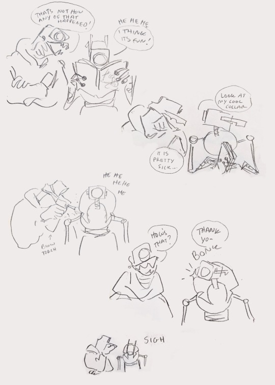
Image four: A series of sketches of Leap and Figure A.
First sketch; Leap has his arms crossed saying “Thats not how any of that happened!” as he looks over Figure A’s shoulder as they read the book. They laugh and say “I think it’s fun!
Second sketch; Figure A points at the cover and says “Look at my cool collar” as Leap leans forward to look at it and says “it is pretty sick…”
Third sketch: Leap welding a big metal pirate coat-like collar onto Figure A’s torso as they giggle
Fourth Sketch; Leap grins and asks “How’s that?” Figure A says “Thank yo-“ but bonks their face into the collar as they turn their head
Fifth sketch; very small at the bottom of the page. Leap has a hand over his mouth. Figure A’s head slumps forward as they sigh.
#fatt#my stuff#friends at the table#id in alt text#Exeter Leap#Figure A#secret samol 2023#secret samol
217 notes
·
View notes
Text

High-quality product visuals = more customers!
#Etsy Success#Creative Fabrica#Etsy Shop Owner#Mockups Made Easy#Online Business#Sublimation Printing#Handmade Business#Etsy Marketing#Ecommerce Tips#Digital Products
0 notes
Text

Stop struggling with mockups—BulkMockify makes it simple!
#Sublimation Tumbler#Etsy Print On Demand#Custom Designs#Printify Success#Online Entrepreneur#Mockup Creation Made Easy#Creative Fabrica Designs#Sublimation Graphics#Etsy POD#Printables For Sale
0 notes
Text
Create Eye-Catching Product Listings in Minutes

https://bulkmockify.com
BulkMockify is your one-stop solution for mockups—tumblers, mugs, apparel, and more. Create professional visuals in bulk with ease!
#POD Business Blueprint#Digital Business Growth Tips#Etsy Selling Efficiency#Bulk Mockup Boost#Etsy Smart Selling Tactics#Profitable Etsy Strategy#Sublimation Selling Made Easy#Etsy Marketing Made Simple#Printify Selling Secrets#Etsy Earnings Growth Tips
2 notes
·
View notes
Text
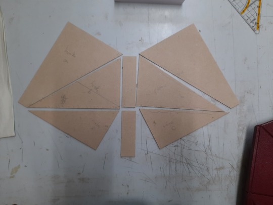
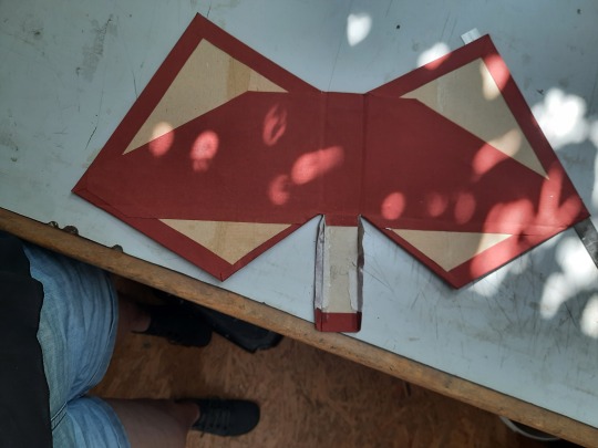
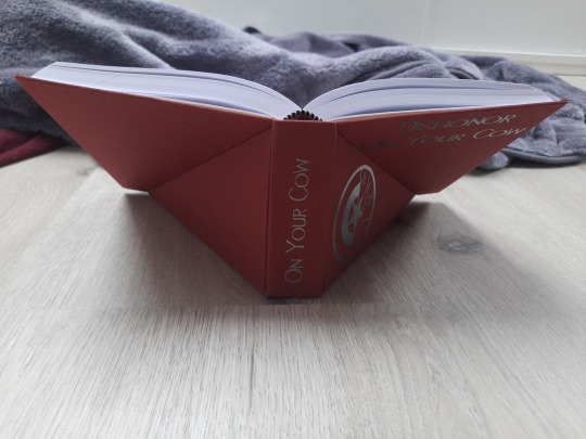
Lectern Book Case!
After this tiktok video with a suprise find of a lectern bookcase made it's round and @spockandawe made two very cool and helpful posts about their process, I wanted to try my hand at it:
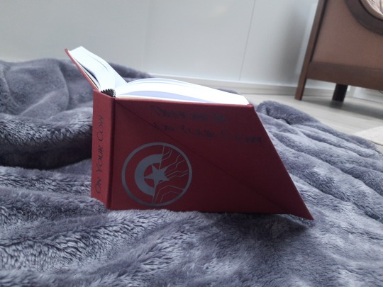
This is Dishonor On Your Cow by mandarou for which I did two versions. One is sewn and one is assembled with the Lumbecker glue technique. I used that one for my experiment, which I regret in hindsight, but alas.
About my process:
I tried following the measurements spock did, but to be honest my brain didn't want to do the math so I found a slightly rougher solution.
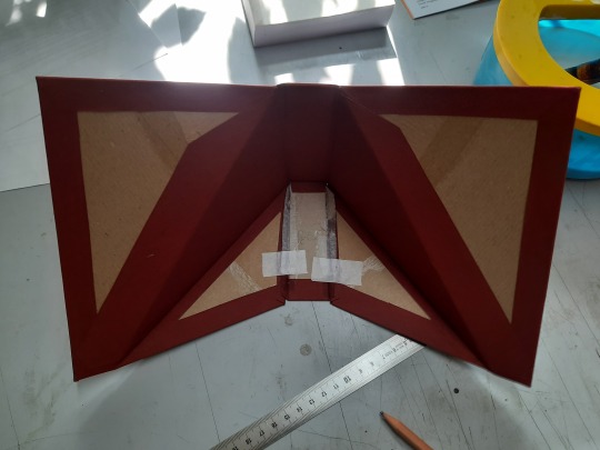
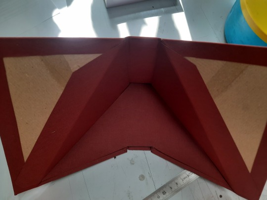
First I did a mockup to see how the single parts should be assembled and what would be possible obstacles. (I recommend doing that! It was very helpful)
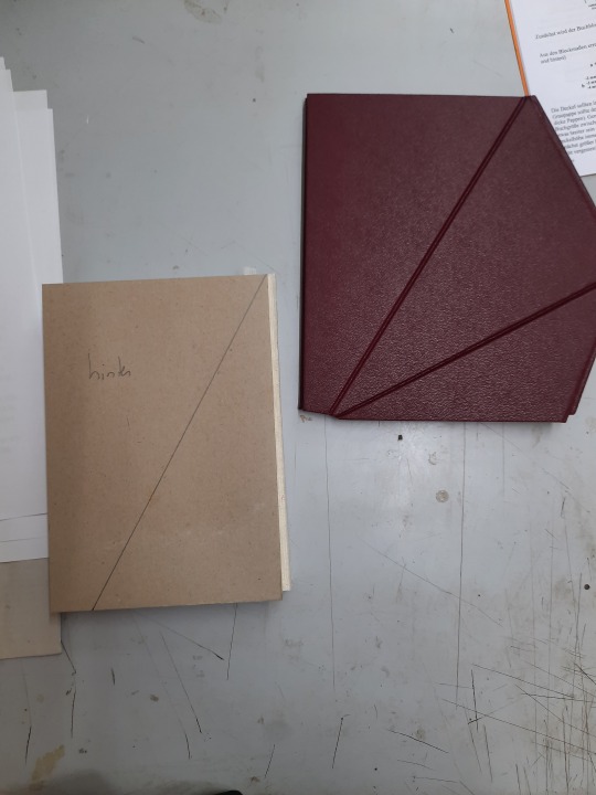
on the right is the mock-up on the left is part of the real one. You can see that the edges of the three pieces don't line up very well.
To get the pieces for the case:
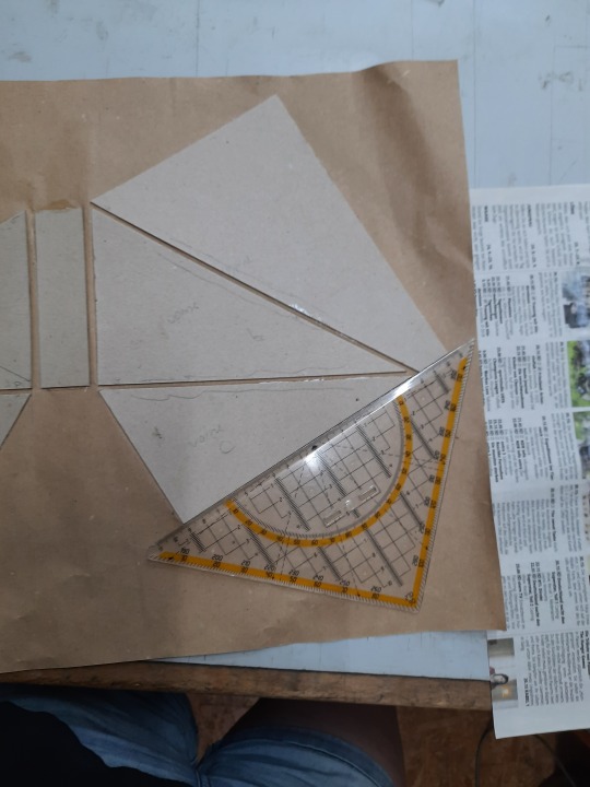
this was my sketch:
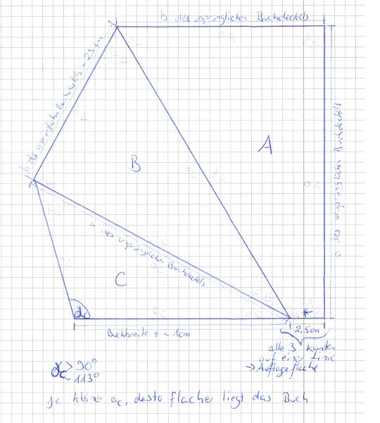
Pieces A and B I got by cutting the piece I would for a normal case:
Side a is the length of your book block plus 2x3mm and side b is the width of your book block minus 2mm (because of the hinges).
(I guess whatever measurements you're normally working with will work here as well.)
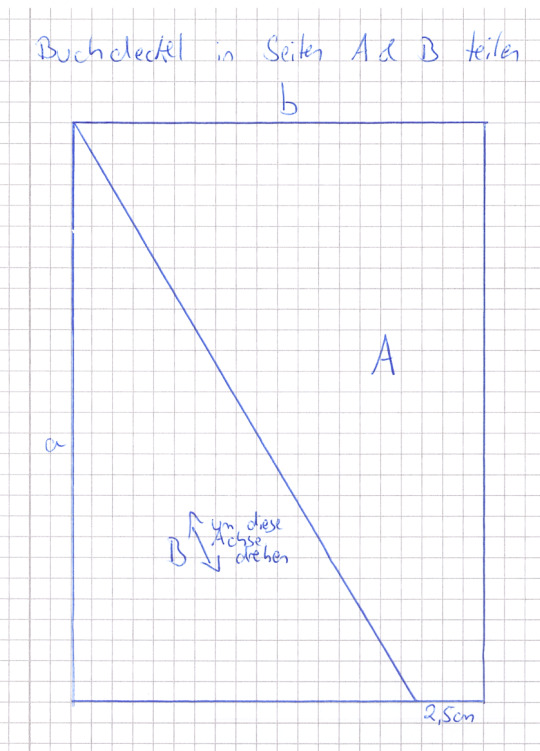
Then I measured 2,5cm from side b and drew the diagonal, as you can see in the picture. Piece A is already oriented right. Piece B has to be flipped (marked with the arrow).
And piece C you get by making one side as long as the corresponding side from piece B and decide on your angle gamma. (That's the only real math I used here). I took 113° but it doesn't have to be precise. It just influences how steep the book will stand, later on. (I would use one above 90° though).
Then I arranged them and cut the two spine pieces:
You can see that one spine piece needs to be as long as piece B and one as long as piece C. The width depends on how thick your book block is. I also wrote on the pieces which side is for the front and which for the back. This also helped with putting it together with the right side up, because I confused this one time and it's really easy to assemble it wrong. Then I marked down, which sides would touch later on (one side for piece A and C respectively, piece B gets cut on two sides. Don't worry it will look, like it's too short) and cut away 1mm to allow space for the hinges.
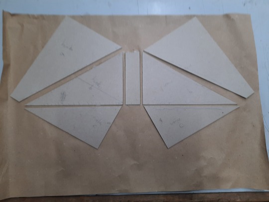
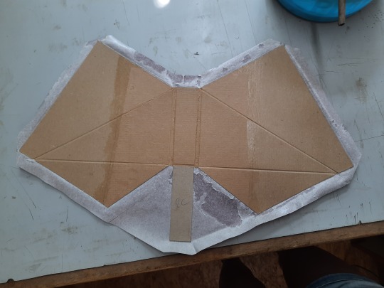
Then I glued everything except for spine C on package paper. You can see that I left space for the hinges. Normally I do 7mm. I did this for the spacing between Pieces B and Spine B . Pieces A and C I aligned so that the meeting point between them would be a straight line, as to avoiding the problem that arose in the mock-up. See here:
I also made sure that the pieces would align on the left side as well. The spacing was a little secondary. It's not that important.
Then I trimmed the packagin paper, glued the bookcloth on and added spine C:
I made sure to use the bone folder to really impress the hinges from both sides.
(Additional tip. Before you do that, test if you assembled it right)
I added a piece of cloth in the middle (you will be able to see parts of the inside of the case when you open the book), I cut away the excess fabric to the sides of spine C and folded them outwards and glued them down. I left them up along spine C.
Then I brought the case in position and used those fabric flaps to glue it into this position. Afterwards it won't lay down anymore, so do your decorating and everything else beforehand.
Lastly, I cut a piece of cloth for the bottom because you will be able to see it as well, when you open the book:
(Just do an approximation and then cut it down piece by piece. Unless you're really good with measuring and angles. :D)
Then I assembled the book. I put the book block inside and marked where side A would be on the endpapers. I only glued that part because the rest will have to disengage from the case (That's also the only part that doesn't need an inner lining):
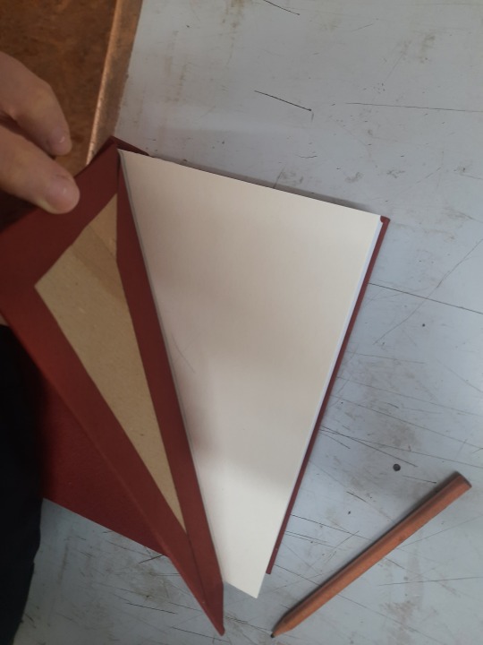
And this is the finished book
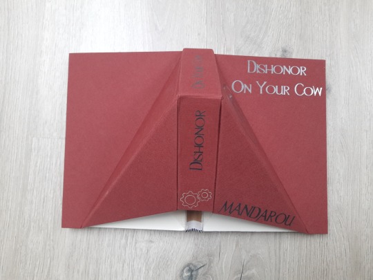
You can see part of the spine. Next time I would conceal that as well.
I also highly advise against using a Lumbecker binding. This kind of case puts a lot of stress on the book. Mine is falling apart already. I think a sewn book block would hold up better.
Anyway, it is very late and I tried my best describing the process. If anyone wants more details or a better version of the sketch, hit me up :)
83 notes
·
View notes
Text


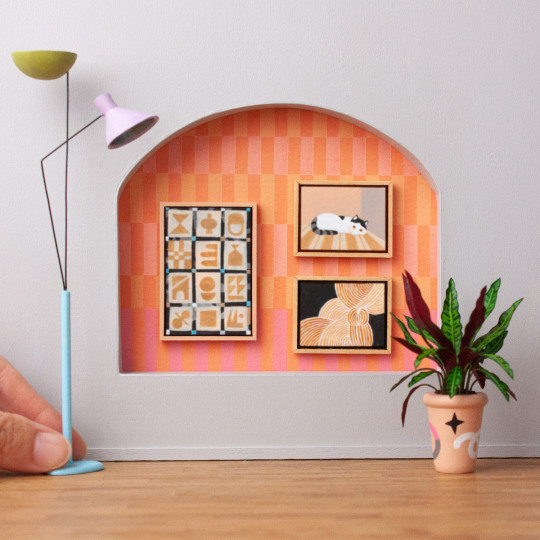

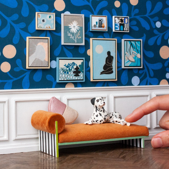


Just a lil photo dump of some of the miniature paintings I've created in the last few months :3
I've made all of them available as printable downloads if you want some easy modern art for your miniature setups/dollhouse, and half of them are also available for purchase as tiny originals.
On a side note, I'm kinda tempted to recreate some of them in actual scale 😅... so I guess these also kind of function as tiny mockups?
#dollhouse#miniature#tiny art#miniature painting#modern art#postmodern#postmodern art#home decor#honey thistle#portfolio#furniture#home design#dalmatian#art print#wall art#wall decor#pdf download#painting
215 notes
·
View notes
Text


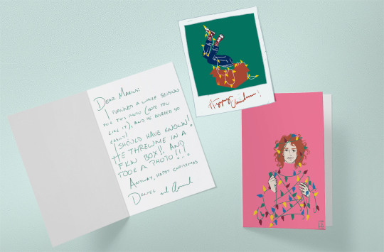
I KNOW I am so not active here BUT you all (my 3 followers) know that Christmastime is for me to pick all and any suggestion or promt and make some fanart of my fave fandom: the Vampire Chronicles.
With the promt by @cup-of-lixx of "snow" and "new traditions", this year's Holiday fanart is around these guys having the "new" tradition of sending Christmas cards to Marius. I've been working is negative space lately and the style of these is very retro, inspired by old Christmas photos and magazine covers, as well as the work of ICONS Coles Phillips, René Gruau and David Aja.
Up you can see the little mock ups I made ( I don't know if Tumblr is lowering the quality or if you all can see these right when clicking), and of course here you can see the full illustrations by themselves.
Happy Christmas everyone!


For the cards I used the template Greeting Card Mockup With Easy To Modify Design from ZippyPixels.com
#fanart#VC#vampire chronicles#lestat de lioncourt#cup-of-lixx#my art#armand#daniel#daniel molloy#christmas fanart#holidays
53 notes
·
View notes