#Logos designed by me
Explore tagged Tumblr posts
Text


Logos
[Personal Projects]
1 note
·
View note
Text
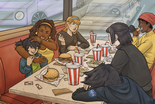
Lineart by @ovytia-art which was such a blast to color - I love the entire vibe of all of them hanging out together so much @green-with-envy-phandom-event
#greenwithenvy2024#danny phantom#i picked it for Dani originally but i really do love seeing all of them interact together it makes me really happy to see#fun fact the flats (including background) took almost 4 hours. + i had to spread that up over a few days due to eye problems slowing me dow#but it was so so worth it. no one else will really understand but working on it gave me the same kind of goofy fun stress free feeling as#when me and my friends hang out at our dennys. i have a newfound fondness for nasty burger.#anyway do NOT look too closely at the car background because i /know/ they're messed up perspective just. hush.#i designed some nasty burger logos for this based on the canon sign! it was very fun!!!! and i reused them for another piece#dp jbee
2K notes
·
View notes
Text

This month in Archer’s Monthly: A highlight on the young women and rising stars of the archery world!!
#Feeling like I need to try out making more in-world media bc this was unbelievably fun!!#ALSO!! TELL ME THAT THE TARGET IN THE LOGO ISNT CLEVER#glad I got this all done in one day tho bc I think I would’ve overthought it otherwise lol#cissie king jones#arrowette#Arowette dc#young justice#young justice 1998#dc#dc comics#magazine design#logo design#typography#illustration#digital illustration#commissions open#dc fanart#yj98
740 notes
·
View notes
Text
okay it might be cuz it's like nearly 4am and im going out of my mind a little but can i PLEASE nominate the tianjin optometric center for favorite logo design of the fuckin year

It:
is deeply visually distinctive
can easily be adjusted for vertical, horizontal, rectangular, square shape as needed
recognizable in any colour
frieze patterns BEAUTIFULLY in a way that's reminiscent of traditional pottery or woodcarving
and here's the kicker:
it's the symbol that this hospital uses on all of their visual test charts
at this center, you don't read what each letter is on the seeing chart, you indicate what direction the E is facing
#also these prescriptions are almost too accurate#they're too good#i'm saving them for when my glasses inevitably break on me bc I don't want my backup glasses to be a downgrade#idk man its like four am#four am is when mia talks about her vast amounts of joy in regards to deeply boring subjects such as logo design principles
456 notes
·
View notes
Text

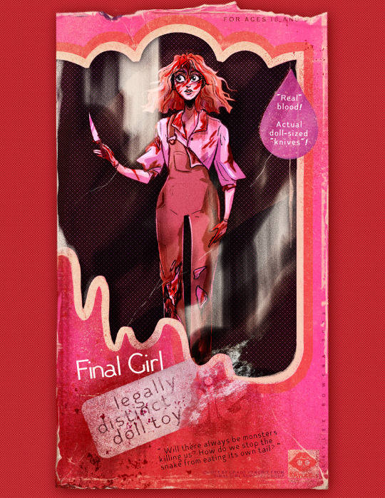

horror barbies legally distinct pink-themed horror dolls available now from your local t-shirt store!
#kaylee.art#horror art#horror illustration#gothic horror#slasher#final girl#gothic#barbie art#came back wrong#living dead girl#gothic heroine#bonfire#barbie horror#Definitely Not Barbie though. for sure not barbie#thanks to bonfire for being very chill with me updating these designs mid-campaign to not have them taken down haha#figuring out how best to obscure the logo while still keeping the vibes of the piece was fun! even if i do miss the fun text stuff#i did with the logos i do think the individualization there is neat!#scheduling this post at midnight so i don't keep forgetting to post it. hi from 12-hours-ago kaylee! hows it going future-tumblr?
3K notes
·
View notes
Text
Let's do this one more time REDHOOD REDESIGN YIPPEEEE 🎊🎉🎊🎉
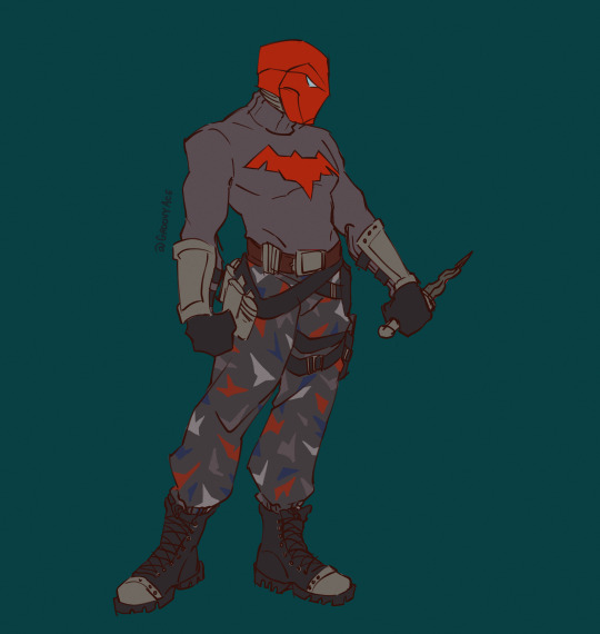


I will be posting notes on the design choices in this one later. Screaming into the void.
#jason todd#redhood#dc comics#dc#arkham knight#just so we all know his red bat logo is on the back of both of his jackets#there he is.#the guy ever#dc needs to do better with his modern designs#none of that shoulderless sweater vest bullshit#dont even get me started on the muzzle and the crowbars#sorry for my modern comics jason lovers#but i couldnt be silent any longer#thefridge
655 notes
·
View notes
Text


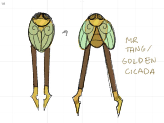
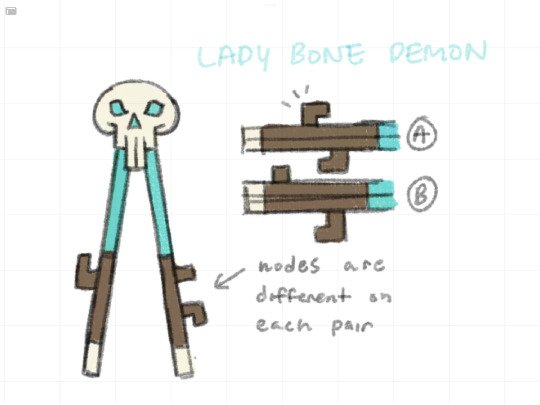

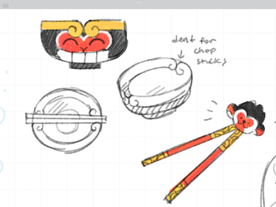
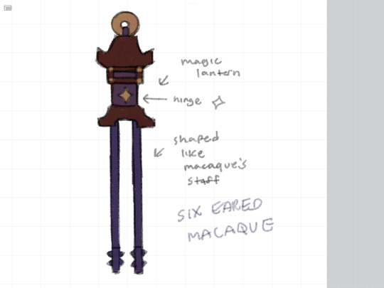
Lmk themed training chopsticks :) hire me Lego
Thank u @ritz-writes for help designing the monkey king and tang chopsticks!
#this isn’t all of them but i just picked which ones I liked the most lol#Cher suggested making macaques have the lantern cause I originally had it shaped like macaques logo#mei and LBD was probably the most fun for me to design#the circlet on wukongs bowl was partly for design and partly so the parts where the circlet curls acts as a chopstick rest#like where u put your chopsticks in the little dents on a noodle bowl yknow#I haven’t used my training chopsticks in fucking years so I had to keep redoing the hand poses. still dont know if its quite right#but when I was a kid my mom had to blow on my food while it was in my mouth bc I ate it while hot and didnt blow on it LOL#my art#myart#doodles#Lego Monkie kid#lmk#Monkie kid#lmk six eared macaque#lmk macaque#lmk monkey king#lmk sun wukong#lmk ne zha#lmk nezha#lmk xiaotian#lmk MK#lmk xiaojiao#lmk Mei#lmk golden cicada#lmk tang#lmk lady bone demon#lmk lbd
2K notes
·
View notes
Text
I want to be clear that I’m talking about this not to be mean, but because it’s something that has bothered me for years now, and have wanted to talk about for a while.
This Spindlehorse logo:

Is (in my opinion™) one of the least appealing designs for a logo and icon I have ever seen. I think it is so poorly designed, to the point that it took me around 1–2 years to finally see what it was—the “spindle horse” crammed into a tiny box.
Even then, the only reason I was able to figure it out is because I finally saw a version of it that was bigger. It looks even more muddled when it’s smaller—which I would assume is usually how people see it, and was the only place I saw it for a long time:


The way its legs are SO THIN makes them just look like zig zagging lines—the way they’re cut off by the circular logo kept me from realizing they were even connected to the body. They look really random and it’s completely unclear as to what they are.
The horse’s mane being the same color as the background heart kept me from realizing it was supposed to be just that, and the horses head is so slim and it’s eye is so big that I thought its head was part of the trademark big eyelashes a lot of Hellaverse characters have. 
For the longest time I thought the logo was like. An owl type bird’s profile? But a really weird abstract one—with the horses’s mane being the beak and then the horses head being the eyelashes?

Even then, I still had NO idea what it was supposed to be, until I saw the larger/non-cut off version of the logo. The heart in the background is also weirdly off center? Not that everything HAS to be centered but it doesn’t really add much to the overall design. It’s just a random heart in the background.
What’s odd to me though is that Spindlehorse DOES have, what I consider to be, another logo that is much easier to understand visually while also being WAY more appealing:


I really like this logo! I think it’s really well designed!
You can see clearly what it is, it has a really nice form and use of empty space. I love that the hip bone is also a little heart, it gives the design a little bit of extra character to it.
It is a simple design that is still unique and really pleasant to look at. You can immediately tell what it is, and even though the design is simple, it has enough variation to give it a personality, like the heart hipbone or the curl in the horses’s tail.
I just. Have NO idea why this isn’t the logo or icon used on all their channels. I think it’s genuinely a really good logo, and it’s weird to me that it’s not the logo used for Spindlehorse’s shark-robot shop and YouTube channel.
Obvs the company can use whatever logo they like, but I just find it REALLY ODD that the official channel continues to use the old one.
#spindlehorse critical#spindlehorse criticism#design critique#art design#I genuinely don’t understand#helluva boss critical#Hazbin hotel critical#like the second logo is also a circle. it would be so easy to just. have it be logo#watch me post this and they update the logo on the channel this week#which honestly they should!!! I would love that!!!#im not trying to be mean or rude it’s just confusing
130 notes
·
View notes
Text
How I go to sleep remembering Oda said in a modern setting Franky would be a pilot and Robin would be a flight attendant so therefore Frobin is real:

(The proof cause you know I come with receipts)

#to briefly speak on the others: Luffy firefighting like all good shonen protagonists would yup yup#Usopp graphic designer name is def Sogeking and the logo is the mask trusttttt#Zoro policeman boooooooooo hissssssss this is liek Daichi from Haikyuu all over again#Nami and Chopper both working early education makes sense they do NAWT play bout kids lemme tell you#Sanji as a beautician would tell every woman client that she’s perfect just as she is and also to break up with their boyfriends#Brook as a detective is kinda sending me 😭😭 all I’m picturing is Inspector Gadget#one piece#strawhat pirates#monkey d Luffy#roronoa zoro#op nami#usopp one piece#black leg sanji#tony tony chopper#nico robin#cyborg franky#soul king brook#frobin
144 notes
·
View notes
Text
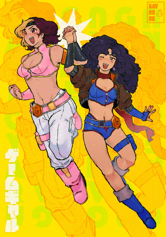
the power of friendship!!!
#game grumps#game gyaru#game grumps fanart#fanart#lavrose art#art#illustration#these designs are so cute to me regardless of the fact that they are the anime girlsonas of 40y/o men#i honestly kinda wanted to draw some cute anime girls with bodonhonkaroos so this is the result#also wanted it to look a bit comic book-y so the signature is traced from the comics code authority logo LOL
199 notes
·
View notes
Text

youpi ni omakase! ー⭐️
#started drawing youpi as a way to shake the dust off my linework because i didn't feel in-shape enough to draw people#but then somehow i ended up drawing rin anyway 💭#he gave me a bit of trouble when i realized his legs were completely different from what i was thinking (i thought he had one wheel per leg#but he's really cute!! shouma's soft shape designs have some real character to them :0c#it's fun that he has the same palette as the team logo#like how sevenger and earth garon are the motifs for storage and skard#krsketch#ultrasketch
135 notes
·
View notes
Text
it's probably decently obvious that my main lemon demon design was created BEFORE seeing any fandom depictions (or even really that much official art past the logo) because of how violently he stands out in comparison to other designs. it's a little obvious that my inspiration was self-contained and it granted me a bit of creative freedom along with a completely different train of thought while designing him. his three eyes however is very much a relic of 2022 because I was designing a lot of demons with asymmetrical faces at the time and well, why not make another
anyway here's a comparison of him to my most recent lemon demon original design (where it's a bit more obvious I was influenced by somewhat of a fandom culture)


extra bonus rambling under the cut
my general design process has actually stayed relatively contained with a few exceptions like soft fuzzy man's color and weirdly neil himself. yeah sorry chat neil is the first guy that was highly influenced by someone else's design you can shoot me too if you'd like. but I legitimately believe he's the only real example because every other character that has a design remotely similar to someone else is likely due to us both following a similar source material (like my cabinet design being based off polybius) or there being only so many ways to interpret the design (gef the mongoose would've fallen into this category if it wasn't for the fact I made him Joker colors)
in general I tend to follow a mindset of how "weird" I can make a design or how much I can push a lyric/implement it into a design. I also like to twist around the convention and try new things. a good example of both of these apply to my doctor amnesia design.


really the main things going through my head were "well he didn't state HOW many eyes", chosing an eye color that often is overlooked in conventional beauty standards to elevate them and cause you to think, while leaning into the somewhat otherworldly nature she's depicted in by giving her blue skin, a color I associate with the song.
another fun thing I'll do is create a "design pipeline" where I'll take an attribute and run it through a list of connections before we end up in a place long past where we started or just combining a bunch of traits that could be interpreted that way, resulting in designs like this.


though wolfgang isn't my weirdest design, he definitely did not start where we ended off. I believe before the wizard of oz theming for clown circus was set in stone (a choice that has EVERYTHING to do with oz explodes and an element I'll explain later), he was some kinda mirror object head that had absolutely nothing to do with his current namesake. since I wasn't satisfied with that design, I kept a relative aspect of the personality and shapes and thus ended up creating a really interesting take on a character who is largely depicted as... well there's no really good way to say this, but Bad.
since I was working with a new fresh aspect I started by making him a wolf... and then connecting him to "there's a robot in my head". this kind of connected the dots to ultimately make him associated to the tin man, since no one was connected to that character for the wizard of oz element and it was up for grabs (this is also how he somehow got associated with toasters via connecting the previously mentioned song to "what's in the toaster", etc etc). these pipelines of connecting songs that aren't normally related, but making them Work in a believable way makes designs more interesting for me and gives them a bit more purpose and personality. I think this is what ultimately makes people get a bit lost on my interpretations considering they aren't super simple by just being about One Song, but by being about multiple that aren't originally related in the source material. just like how I connected dr amnesia to when he died, explaining a bit of her more mildly supernatural or off-putting elements by making the man in that song her father.
the final real design element that I focus on is the strange rule I follow in terms of how these characters are shaped. there's a massive sort of "alice in wonderland" theming going on in terms of how human/humanoid designs look in contrast to designs that look less and less human. their proportions become more cartoon and shaped, their sizes are affected etc etc all while the human/humanoid characters stay relatively normal next to each other with more believable design elements.
here's the horrid long strip of nearly 100 different character renders next to each other to get a general idea on what I'm talking about

the silhouettes of the human characters "pop" less because they're supposed to contrast to their nonhuman counterparts. which isn't something I normally do, but given the source idea of a sort of "wonderland", I think it works in this specific context.
in conclusion: I'm design autistic and like to use designing to try new things, which is why I fucked that lemon up. sorry about that chat
#guy on the right is completely unaffiliated with the ncu which is why I don't think about him that much sorry ld#also imagine him with half circle black eyes like the logo design because that's legitimately the only colored art of him#nobody has ever actually asked me about this before so I will no longer wait for permission#debating whether or not I should even main tag this I want this self contained to my followers#but it's late so I'm sure no one will see this anyway erm#edit: fuck it it took like ten morbillion years to write the bonus stuff I'm main tagging#lemon demon#mos text post
84 notes
·
View notes
Text

More art inspired/for @playedcrowd5610 ‘s Danny phantom x transformers fic. Sorry not sorry, I’m having a blast drawing them. Though I may have gotten a little to into the bottom part lmao
This one is pretty self explanatory, Danny’s grumpy Soundwave won’t let him help, one cus he’s tinny he’s just a squishy baby and two cus he doesn’t want the autobots to get any ideas. Danny doesn’t just dip cus that would make Soundwave disappointed and he dose NOT want that
If you enjoy Danny phantom or transformers, I definitely recommend you check out their fic https://archiveofourown.org/works/60521740/chapters/154507732
Also some close ups cus I said so


#I haven’t finished a full drawing and actually liked it in two years I am freed from my curse#let’s jsut pretend this happened in season one cus I forgot to draw his logo#actually I noticed like halfway through but decided i wasn’t doing all that#I love the fact Danny is the youngest sibling in both his family units it’s great#danny phantom#danny phantom x transformers#transformers#rumble#I haven’t draw as much fanart for the main fic because prime designs scare me#while g1 dudes are just like#squares#peak character design
118 notes
·
View notes
Text

#Hal strider#lil hal#homestuck#i dunno man I was doing sketches to try and figure out a hal design and this fully colored drawing appeared infront of me hours later#Also made like a hal logo thing#Anyway#her hair is fiber opticts but i ran out of steam to make it sparkly#Also hatsune miku decal to match Dirks sholder tat#If i ever draw a robot WITHOUT a plug tail somethings horribly wrong
130 notes
·
View notes
Text
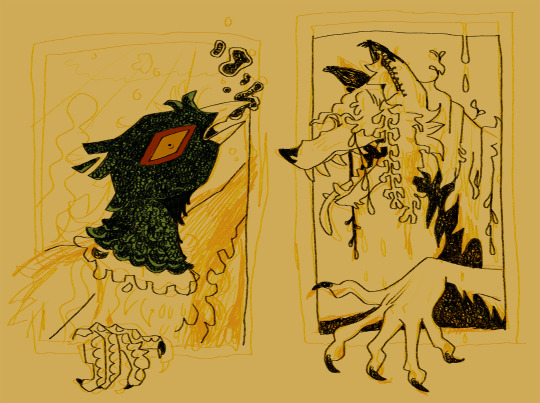
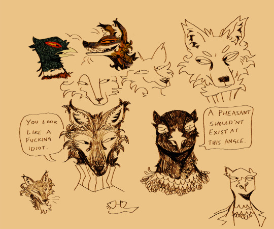
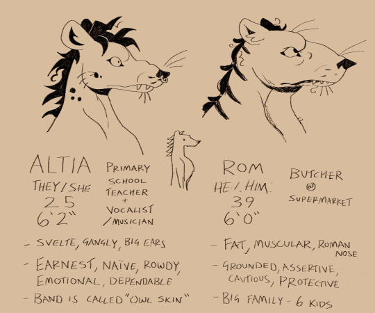
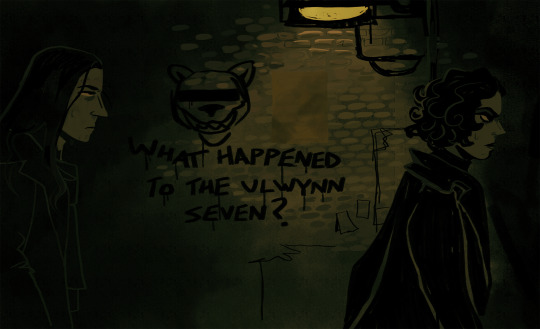

always forget i can drop off my messy wips and behind the scenes prep work on this blog right here.....until now
#my art#wip#so much of my process is making pure garbage and being in denial about it until it starts to take shape#maybe this is a universal feeling but also a lot of people have nice-looking sketch stages and can sketch well. not me baby.#1000 horrible doodles where i question whether i understand any fundamentals. five good concepts. one good concept that makes it out alive#but also sometimes i butcher it and start devolving into an upset ape#also graphic design is not my passion but coming up with fake adverts and horrible diy band logos and unsettling conspiracy graffiti is
64 notes
·
View notes
Text
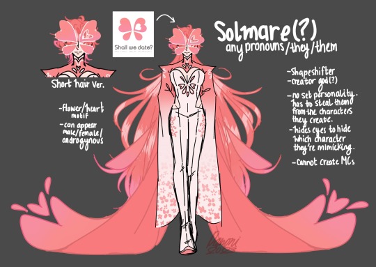
u know what, fuck u
*otome-fies ur otome company logo*
#idk what made me do this#I was looking at the logo and thought… that’d be a sick mask me thinks#what have I DONE AAHHHHHH#character designing is my passion#this design isn’t my best but who cares I like their hair#ntt solmare#solmare#obey me#wizardess heart#bloodinroses#shall we date#shall we date ninja shadow#shall we date the niflheim#shall we date destiny ninja#shall we date ninja assassin#obey me nightbringer#obey me one master to rule them all#I’m not naming all of the games I’m not#fanart#me thinks#also yeah I know that’s not the… actual solmare logo but#everyone calls them solmare so yeah#ch: solmare
407 notes
·
View notes