#IF IT MAKES MY BRAIN WORK
Explore tagged Tumblr posts
Text
i have so many tabs open rn in an effort to get me to write SOMETHING that is PRESENTABLE
because i have written things !!! I HAVE !!! THEY ARE HALF FINISHED IN MY TUMBLR DRAFTS
#im gonna vibrate out of my bones#i am also going to use that one comment from dal i just saw scrolling through their megamind tag#about one of my fics and them being excited#and SEE#IF IT MAKES MY BRAIN WORK#im so sleepy tho probably not today#TOMORROW HTO I DONT WORK I WANNA WRITE LET MEKLNSFKJSKFSDLF
4 notes
·
View notes
Text


Last part whoo!!!
PART 1 / PART 2 / PART 3 / PART 4
#I should clarify that I’ll be continuing to work on this au#this is just the final part to the intro essentially#thank you everyone so much for reading as well!!!#it’s been really cool to see that I was firstly able to make a comic at all#but also that everyone seemed to actually understand what I was trying to convey#like it was dumped directly from my brain and somehow we’ve ended up on the same page#so that’s cool :)#my art#gravity falls#twins in time au#Stan pines#Stanley pines#Stanford pines#ford pines
14K notes
·
View notes
Text


#tmnt#teenage mutant ninja turtles#rottmnt#rise of the teenage mutant ninja turtles#my art#rise of the turtles#rise of the tmnt#meme redraw#raph should be scolded from time to time#reminder they have one brain cell that ping pongs between the 4 of them like the DVD logo screen#april should start a tiktok where she casually mentions all the jobs she's had#and then makes an off hand comment on why she got fired#comments would be wild trying to piece together her work history
8K notes
·
View notes
Text
Fem!reader x 141
Honestly might be able to to something with the gross stuff I saw at the hardware store I used to work at (except make it hot and 141)
Imagine you're a cashier, the only one with early morning availability so you're there at 5:45am for the 6am start. It's always the worst kinds of contractors there: rude, tired, dirty, leering gazes and sexist comments
You're pretty sick of it, but you get paid a bit more than minimum wage and you're done by 11am so, you take it with a cheery smile and fast service
The 141 contracting company starts spending at your store. So much, in fact, that your manager personally takes you aside to mention just how much they do - nearly a million a year - and how no matter what, your job is to be nice and please them
Well, you can do that. You've dealt with crazy, awful old contractors screaming in your face about lumber prices at 6:30am more than once, heard them talking about your tit's or your ass right in front of you - you can handle it
Until the masked one comes in first and hes huge, dark hoodie and cargo pants hanging low on his hips. He hands you 3k in bills only there are bloodstains on them and he watches you closely the whole time you count them out
It's... not a first, but the look he gives you makes you shiver. Pale eyelashes, tall, intimidating
The second is nicer. Too nice, in fact. He charms you before you're even fully awake, and your shift goes by quickly thinking about that winning smile and the way he'd touched your fingers while he handed you a stack of bills... not to mention those soft brown eyes
The third is... intense, for 8am. He rolls on the balls of his feet, stares at you harder than the masked one. He offers to buy you a hot chocolate at the coffee shop next door and grins like you made a joke when you decline
Their boss is fucking dreamy. Even you have to admit it, trying not to look up at his mustached, frankly porno-esque face. He's huge, as tall as the others but thick, with a little pudge around his belly. He trudges in with thick workboots and a stained t shirt, pays for 24k worth of material with a lazy smile on his face like it's nothing
You might ask head cash to move you to the garden center after all...
#141 x reader#simon riley x reader#kyle garrick x reader#johnny mactavish x reader#john price x reader#based on a true story only i wanted to kms when i worked at that store#genuinely contractors are the worst most disgusting kinds of men#so this is healing <3#imagining a nice contractor#lmao#i used to work 6 - 11 am#also this is so lazy#pls forgive me for how lZy it is#lazy*#idk#hehe#drgnfly writes#im trying to use my brain its so hard#anyway john takes u out on a date makes them all jealous#or maybe gaz charms ur pants off#U PICK
4K notes
·
View notes
Text

Ladiessss
#radioapple yuri make my brain go brrrr#I’m tired#so much work to do#it was nice to draw this couple#hazbin hotel#my doods#hazbin hotel fanart#alastor#radioapple#lucifer hazbin#rule 63 au
5K notes
·
View notes
Text


"no one told me back then that i was in the glory days."
[ jojamart mockumentary #14 ]
[ prev || next ]
#stardew valley#stardew valley fanart#sdv shane#sdv sam#jojamart mockumentary#my art#this was inspired by an anonymous ask i received saying:#“Do you have any art of Shane outside of work? Maybe with the hens more in his element?”#and naturally my brain popped up with this idea#of shane at work and also not with the hens#:(#but it made me reflect on the other aspects of shane that we know about#i wish i knew more about his time as an athlete#also!!#the reason i made that poll a few days ago is that the school semester is starting up#i am a part time student in addition to having a full time job#so i'm not 100% sure if i'll have room to make new art#but i don't want to stop posting (at least that's how i'm feeling at the moment)#so it might be fun to highlight my process!!
3K notes
·
View notes
Text

good luck, sixer
#my art#artists on tumblr#gravity falls#gravity falls fanart#stanford pines#ford pines#fiddleford mcgucket#bill cipher#billford#fiddauthor#fiddleford hadron mcgucket#book of bill#that one anne hathaway bi iconic photo#was wrecking my brain on how to make this piece work when#one of them is a fucking triangle#the book of bill
4K notes
·
View notes
Text
SAME FUCKING PICTURE


#i love bitches who dress up as Joan of arc!!!!!!!!!!!#like my brain had already connected that chappell and gerard are similar BUT THIS BRO#THISSSSSS#started working on a suit of armour recently and i might have to make it slightly joan of arc inspired now#chappell roan#gerard way#joan of arc#chappell roan vmas#my chemical romance#mcr#swarm tour#god i love ranting in the tags :D
3K notes
·
View notes
Text
ALPHA KIDS: Draw your best friends!

DIRK: I'd say I'm better at one on one character interaction work of the more intimate variety, but I think this piece came together nicely. DIRK: Fun for the whole family style wholesomeness, any motherfucker in the radius of a screen displaying this image will instantly get hit with a sore case of heartburn and their tear ducts will clock in overtime at the weeping factory.

ROXY: im so proud of these i think these are my best designs yet :3 but omg dirk callie and jake were SOOO peculiar about their damn designs over my shoulder. jake wanted me to clarify that even in pink pen form his little guy is BLUE. so there. sigh this is the one occasion they could take notes from janey.. JUST LET LE ARTIST WORK!

JANE: Boy! I don't draw often but I always was fond of calligraphy growing up. I was kind of inspired by all of the other's works, but especially Calliope's swirls she puts in her art. It's very fun to add!

JAKE: Im not quite the best with posing, but i find the head very fun to study! Especially skulls.. so good ole calliope makes for the perfect muse! (hehe)

CALLIOPE: i realized i hadn't ever made a piece with Us in the same place at once. u_u CALLIOPE: bUt since it's reality now here's all of Us together, United at last! ^u^
==->
#homestuck#alpha kids#dirk strider#jake english#calliope#jane crocker#roxy lalonde#dirkjake#callieroxy#my art#zan0tix#This was so fun tho Im dipping my toes into homestuck writing.. be prepared.. projects are in the works people#I have detailed explanations and references for jane and jakes styles and why they look that way but basically.#For jane i referenced her handwriting and june and jades art styles#and jake loves comics! and he very quietly observant (brain ghost dirk) without knowing it and he had bold fast hand writing so i think-#hed be a good sketcher#I SHOULDVE BEEN THERE IN THE 2010S MAN. I SHOULDVE BEEN MAKING STUFF LIKE THIS BACK THEN. whatever#making up for it now </3
3K notes
·
View notes
Text


what if i broke all the bones in your legs actually
#ramble#please let this be a fucking joke#i cannot imagine being this out of touch#YEAH IT'S ALMOST LIKE ART TAKES FUCKING EFFORT AND THE MAJORITY OF PEOPLE DO ENJOY IT ACTUALLY#the phrase 'labour of love' exists for a reason#i sat and watched my grad film on repeat for days when it was done bc i was so proud that my hundreds of hours paid off#I DON'T MAKE ART TO SIT AND LOOK AT IT#I MAKE IT BECAUSE I PUT TIME AND LOVE INTO IT AND I GET TO LOOK AT IT AND BE LIKE I MADE THAT WITH MY HANDS!!! AND MY BRAIN#GOD FORBID YOU PUT A SECOND OF WORK INTO ANYTHING IN YOUR FUCKING LIFE ANYMORE YOU USELESS FUCK????#i'm so sorry i'm unreasonably mad about this#is it crazy for me to say that you should have to do some things in your life?????? god forbid you read your own emails#what are you DOING how fucking LAZY can you be????#and that is NOT a word i ever want to use but this is the DEFINITION of lazy#kids with adhd aren't lazy. tech bros wanting the exact same things that people have worked years for at the push of a button are lazy#i actually need to go and put my face in grass i'm so upset#thankfully. basically every musician who saw this shut it the fuck down and told him he was an idiot so that's nice
2K notes
·
View notes
Text
It didn’t matter how long or short you were apart, Simon always brought something back for you
After each and every one of his deployments, though all you ever asked for was for him to return to you in one piece, he would find you a small souvenir, a token, a postcard, or some sort of little trinket from whichever corner of the glove he found himself in this time, keeping it near and dear to him until his feet were back on familiar ground and he could put it in your familiar hands
You had told him that it wasn’t necessary, but when he simply blinked and ask you if it made you happy, your reply was an instantaneous ‘yes’, to which he replied ‘then yes, it is necessary’
You loved and treasured all of them, multiple shelves throughout your shared flat adorned with the items that reminded you of the fact that he was always being reminded of you wherever he went
It didn’t take very long for Simon to become enamoured with your reactions each time he presented you with his newest find, wondering if whatever he picked out would make you gasp and cover your mouth, make you roll your eyes and smirk, make you laugh and squeeze his arm, each time was a guessing game that had his heart skipping a beat or two in anticipation
Soon enough, he decided he didn’t really need deployments as an excuse to surprise you, or any reason really, other than to see you smile
And so, trips to the supermarket made by Simon alone more often than not began including cupcakes in your favourite flavour
He’d come back from the mailbox and drop a single flower from someone else’s garden onto the table in front of you
Your nearly finished perfumes and lipsticks would magically find themselves replenished
But being Simon, his gifts didn’t always need to be extravagant
On the rarer occasions when he was only on base for a day, he’d often bring you back something simpler, if not sillier, like a paper clip or a sticky note with a terribly drawn doodle he’d stick to your forehead (god forbid he ever bring home a bullet casing, bragging about how he was thinking about you while he practiced shooting loads today-)
Sometimes he’d bring home a book he saw laying around the common room he thought you might enjoy
Other times he might walk into a room and notice you eyeing the hoodie he’s wearing, pulling it over his head without hesitation and offering it to you before you could even think to ask
Most of the time though, Simon was great at bringing home takeaway for dinner, a favourite sight of yours to behold as he walked through the door of the flat
Empty handed or not, so long as he was home with you , you were happy
#quick lil drabble to feed you lovelies while i work on pt six of wife at first sight and the stalker fluff fic because i heard yall#quick as in wrote it in less than twenty minutes didn’t proofread really hoping my brain makes sense#love yall#call of duty#call of duty fanfic#call of duty fic#simon ghost riley#simon riley#cod fanfic#simon riley x reader#ghost x reader#simon ghost x reader#simon riley x you#ghost x you#cod simon ghost riley#simon ghost riley x reader#call of duty ghost#cod simon riley#simon riley fluff#simon fluff#cod fluff#cod x reader#simon ghost riley fluff#simon ghost riley x you#readwritealldayallnight
2K notes
·
View notes
Text

i wonder where yarnaby was when the doctor got ... yknow
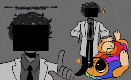
#also not rlly a final human design for him it’s pretty basic#i like the face censoring but i could work on his hair better#i did want to make an AU where yarnaby protects the doctor from being turned into a brain#(even though i dont think he deserves any protection from my beloved ..)#would be an interesting scenario#poppy playtime chapter 4#poppy playtime#yarnaby#dr sawyer
980 notes
·
View notes
Note
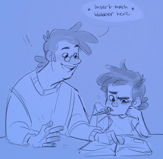
twins in time continuation of that blue doodle comic thingy, but fidd is forced to take care of stan when Ford gets into the portal stuff, leaving him behind.


I reckon he teaches him math…
#I’m realising you meant to make it MORE angsty up in here and lemme say I love how your brain works#I have yet to decide how ford getting stuck in the portal works with this au#I’m getting more and more into it I might need to actually sit down and flesh it out smh#but yknow fidds being a dad and all#I dunno maybe having lil Stanley around makes him stick around ford for longer#or maybe he just yoinks him outta there bc ford should NOT be around a kid in that state#more accurately bill shouldn’t be around kids…#OOOGH THOUGHTS!!!#my art#ask#twins in time au#stan pines#ford pines#stanford pines#stanley pines#fiddleford mcgucket#gravity falls
5K notes
·
View notes
Text


look at them. they're in love.
#all my love to batcii for making me fall in love with this type of sunlight lighting in art. one day i will manage it the way sas does#ive been actively working on this since august 2024#ive had the desire to draw it since march 2022#not a single other art has taken me this goddamn long its genuinely been eating away my brain#ive looked at it so long i cant even figure out which parts i like and dislike anymore its all blurred together in my head#hp#jegulus#marauders#jegulus fanart#regulus black#james potter#james x regulus#regulus x james#james potter fanart#regulus black fanart#Marauders fanart#Mine#My art#*
872 notes
·
View notes
Text
I love being a FREAK OF NATURE. i love being a QUEER. i love being a FAGGOT. i love being a SEX FREAK. i love being a DOG FAG. i love being TRANSGENDER. i love being SO NORMAL <333333
#i love you t4t tumblr you all make me feel so normal#hate being surrounded by cis het ppl 90% of my day#also Hi my brain meds are working now and I love being alive ☺️#jasperbarks#:3#ftm puppy#t4t puppy#puppy sub#bark bark bark
4K notes
·
View notes
Text

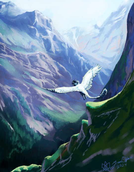
Leap
#grace makes art#digital art#landscape#clip studio paint#artists on tumblr#sphinx#gouache brushes make brain go brrrrr#y'know I never could get brushes like this to work in photoshop#they'd always drag the whole program down#they work great now#not sure whether it's my new machine or clip studio but I'm happy either way
4K notes
·
View notes