#I'm not tagging the inhumans
Explore tagged Tumblr posts
Text
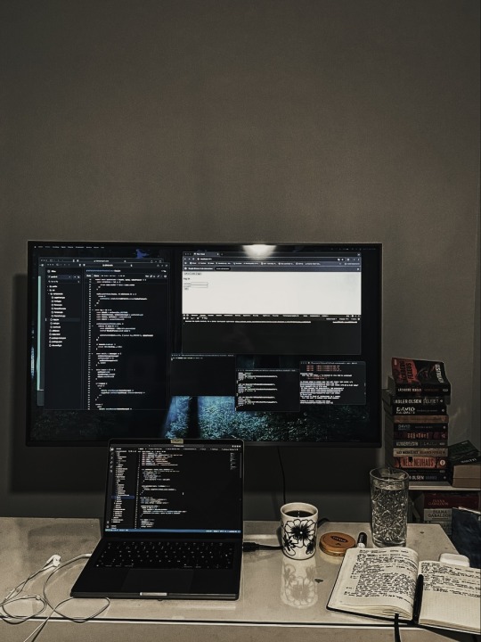
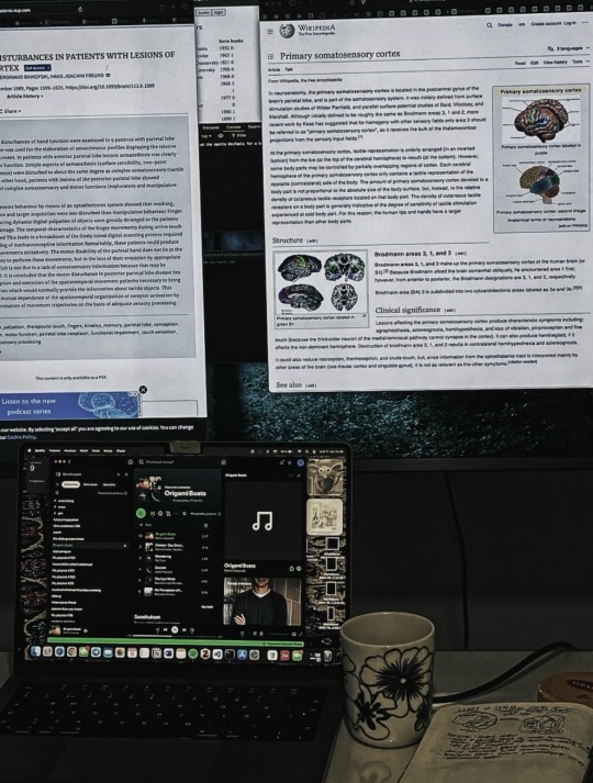
me, a responsible being, working on the coding project as I should vs. me, a dysfunctional shithead, getting distracted by reading about brains (once aGAIN damnit (it's my favorite "I need to study my field but bc I should do that it's an impossible unthinkable feat now, so I'm reading about something else to fool my brain I'm still being productive"-topic))
#but after my thesis me & brains have been on a break bc got tired reading abt them during that (bc I had a topic that sorta allowed me to#sidetrack to brain stuff also) but seems I'm over the brain overload now#yay? i guess#also no one who actually studies medicine/brains/etc. yell at me abt wikipedia and like ''why are u studying that like that''#I'm just going through the wikipedia & reading article abstracts path; nothing serious#also my procrastination has reached inhuman levels like it's a full-time job now#bc I have like a chill week's worth of work to do and then I've done the courses for my bachelor's degree#but sending in that ''heyy i'm done with the courses let me graduate''-thing fills me up with sO MUCH anxiety & dread I'm working so slow#now (even tho couldn't send that in for like a month bc gotta first wait the courses to be graded and stuff so in actuality I should#not be slowing down even a bit bc I need to finally be done with this damn degree asap; gotta move on and should've ages ago (it's actually#super bad how late I'm with it (1.5 mf years jesus christ; I'm not even like a little bit proud abt getting a degree anymore like I'm sorta#just embarrassed if I have to tell ppl like ''yea I graduated'' bc dude ?? only now?? u were supposed to be done with that 1.5year#ago what have u been doing (fuck if I know) so I'm keeping it like ''if anyone asks'' basis)))#(the tags and parantheses started a life of their own lol sorry abt that)#studyblr#studyspo#bookblr#booklr#study#november 2024#2024
590 notes
·
View notes
Note
like the motogp unlimited moment where joan is kinda terrified of him and marc looks like he's trying to figure out whether he can muster the energy to eat him
😂😂😂😂😂😂
This one is going to carry me through the day. Picturing cat marc contemplating with his tail swishing if he wants to raise his paw and squish this thing or go back to nap.
(extremely belated follow up to this)
referring to this clip from motogp unlimited, on the off chance anyone hasn't seen that masterpiece yet - in which we get to see mir on camera criticising marc for his towing addiction, mir panicking about the media reporting how he criticised marc for his towing addiction, and then mir telling first the honda guys and then marc himself how the media had made up that he had criticised marc for his towing addiction
say what you will about that show, but this clip is just absolute perfection. it has been living rent free in my head from the first time I saw it. the editing is on point... how it completely stitches up joan with the juxtaposition between him literally criticising marc and him insisting he totally hadn't been criticising marc... the way it cuts to a random clip of marc entering a building with the air of a trigger happy warlord, as if he's about to order joan's execution... joan talking to the honda guy - the "you'd better say to his face" line, mir visibly deeply unhappy at this response... hard cut to mir's tremulous explanation to marc. mir's gaze wandering somewhere bottom right while marc is serving full cannibal realness and is staring right at mir with a wide grin and dead eyes. the painfully obvious relief on mir's face when marc accepts his explanation. if you told me marc was sky high on painkillers during this whole conversation, I would not question it for a moment

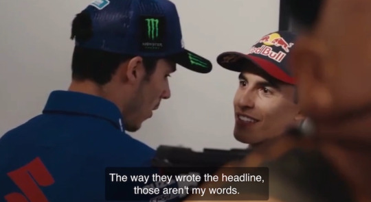
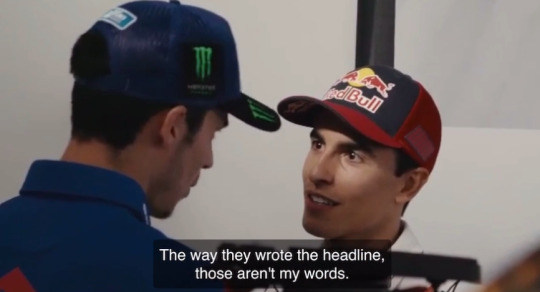
this is not a grin I would want levelled at me. it's the kind of grin where I'd start worrying if I might find myself chopped up in pieces in the other guy's freezer in the immediate future. at this point in his life and his career, marc had bigger things to worry about than being criticised for something he had been repeatedly criticised for already and would be criticised for again countless times. this whole episode does matter in the vague sense that mir was the defending world champion who had replaced marc, but realistically it's just not the sort of thing marc will have spent more than two minutes thinking about. which was really mir's best hope - that marc simply could not be bothered to make space in the freezer for him
I compared this moment in the mind games post to casey suffering a mild case of headloss because he thought valentino had deliberately hidden his tyre compound from the competition (bridgestone had run out of paint) - and there is something to how your reputation for mind games can become so strong that eventually you don't really have to be doing any work because your competition will freak anyway. marc isn't actually doing anything in this clip... he's just vibing. admittedly he's doing so in that uncanny valley ever so slightly inhuman way he has about him, like he's currently hashing out the logistics of sauteing your liver, but he is just vibing
#my ask response rate is genuinely atrocious i'm SORRY#it's just gotten to a critical mass where working through the inbox/drafts is a somewhat daunting prospect#either it takes three days or three months i fear#//#brr brr#batsplat responds#current tag#yoro#conventionally attractive marc completely rolls off me#but inhuman horror movie marc who looks like a local demon animating a shop window mannequin? oh yeah that's the stuff
134 notes
·
View notes
Text
Broke (2016): BBC Sherlock is a phenomenal piece of media and anything that seems like a flaw just hasn't been fully explored yet
Woke (2020): BBC Sherlock is an incredibly flawed series run by an egotistical writer, it never deserved the hype and is actively bad on so many fronts (especially representation)
Bespoke (2024): BBC Sherlock is flawed and bogged down by increasingly poor writing, which many fans refused to see while it was airing, leading to hugely misplaced expectations (particularly for the final series), AND it has the seeds of some compelling characterizations and portrayals, some genuinely solid performances, and touches--albeit imperfectly--on complexities that are still being discussed today (particularly as it relates to the relationship between Sherlock and John). The huge cultural impact of the show has created a massive pendulum effect in its public perception, leading to most people today remembering a caricature of the show (whether positive or negative) rather than appreciating its nuanced merits and failings...that being said Season 4 sucked
#these just sum up my personal takes at the years in question and also what i'm seeing on tumblr/other social media#bbc sherlock#sherlock holmes#and i actually have a lot more thoughts to share on this series#specifically relating to the cultural impact#there is SO much about the show that goes unappreciated in hindsight because of how public perception of it has soured#and i totally fell into this as well--i still regularly rewatch hbomberguy's video absolutely dismantling the series and he isn't wrong!!#but what i'm saying is that i think it's easy for us to look at a piece of media (especially one so massively popular) like sherlock...#with very black-and-white lenses. it wouldn't have become so popular if there wasn't something inherent in it that resonated with people#and that's being buried (and i totally forgot it) because 'sherlock is cringe and problematic. can't believe i liked that'#which again it IS full of issues and those are well-documented as they should be. future portrayals should not repeat those mistakes#BUT being able to impact so many people is a merit in itself. and that's only possible because of other genuinely good things about the show#yes the way they handled the relationship between john and sherlock was riddled with problems YES it was often queerbaiting#AND the way they portrayed that relationship had a deep effect on me. i saw a lot of myself in sherlock and the complex way he loved john#the nuanced feelings he had about john's marriage to mary. the part (in s4!) where john calls him inhuman for not feeling romantic love#there was genuine intention and care put into some parts of this show and it comes through in scenes like those. they impact people.#and because of this realization i'm going to (eventually) do a rewatch of the show. i'm much older and i want to see how i'll view it now#but i want to go into it--and i want everyone who engages with it still--to have an open mind and evaluate it for what it is#not what we expected it to be (secret episode anyone?) or what the cultural drift has turned it into (the tiktok of sherlock's mind palace)#but the messy problematic somewhat-heartfelt massively significant and ultimately meaningful piece of media it actually was#anyway that's my thoughts would love to hear y'all's perspectives#funny how after all this time making a sherlock post still feels like i'm poking a bees' nest lol please be kind!#kay can i just catch my breath for a second#kay has a party in the tags
75 notes
·
View notes
Text
Idk man the more I think about it the more I feel like the idea of Vax becoming not just de-orbed but brought back mortal is like, maybe the most simultaneously literal and figurative Monkey's Paw allusion one can get, on top of missing the core themes of every main campaign character Liam has played.
#unfortunately due to some prior missteps I'm not confident it WON'T happen but i think there's no way to do it WELL#anyway this is really about how being weird about vax's story is now just an instant block#at least if you do it on my posts#i considered responding but it really is just like nope bye I don't think you have anything I'll miss#cr tag#anyway i would respect twisted cordeceps inhuman vax coming back. *fleabag voice* this is a horror story
57 notes
·
View notes
Text
lays down and stares at the ceiling. really wish it was as easy for me to ignore casual exorsexism as it seems to be for so many of you
#rant in tags ->#obviously by 'you' i just mean. gestures vaguely#and this is both passive-aggressive and genuine. i really wish i could do anything OTHER than notice-#-people making new binaries and forcing everyone into 'fem' or 'masc' and positivity posts only celebrating trans men and trans women#and the discourse regarding the term transandrophobia completely ignoring our existence without again forcing the masc/fem box#and the weird lack of popular non-binary headcanons for characters unless again using the masc/fem box#and mocking and stereotyping and 'haha weird names' 'sock it/fae/paw' 'catgender teenager' 'theyfab' in posts EVERYWHERE.#have you ever noticed how so many posts that need a 'idiot trans person' strawman go directly to non-binary stereotypes?#have you ever noticed that people use transmasc/transfem and trans man/trans women as synonyms?#have you ever noticed a complete lack of acknowledgement of non-binary people's existence in TME/TMA posts?#have you ever noticed how most 'non-binary positivity' posts that are spread around are jokes about being creatures or freaks?#have you ever noticed the implications of thinking of non-binary people as inhuman regardless of their identity?#i have. i literally cannot fucking stop noticing. i'm exhausted.#anyway. stop calling me transmasc.#vent#exorsexism
29 notes
·
View notes
Text
sometimes i think about writing a post-canon human loop who, by the time they rejoin the party a year or two later, has become terribly addicted to alcohol. but even though i'd probably find it satisfying to write i think it would be miserable to read lmao
#it would work better as part of a larger post-canon arc#but i can't put it in my main post-canon fic bc loop is decisively inhuman#and i'm not gonna write TWO epic post-canon sagas#i've also considered doing this in a modern au but i think being headmates would motivate both siffrin and loop to be more careful about#their alcohol consumption than they otherwise would be#alcohol#thoughts about loop#thoughts#waiy#isat spoilers#for my one tag lol
31 notes
·
View notes
Text
Would you guys want me to post fanfics on here if they're still monster romance?? I asked this before for a one-shot and people said yes but this would be a long series I'd be posting weekly so I feel like I should gauge interest again.
#I really love this thing but i don't want to clog up ppls feeds if they're not into it#ig people could just block the story tag if they didn't want to see it#anyways if yall did want it it would start going up in about a week and some change#Part of me rlly wants to post it here just to make other ppl excited about my favorite boy lol#I hate the way the polls make you type a question#like I just added a paragraph of context I don't need any more lol#also its kind of a dubiously monstrous subject but he's inhuman and deeply offputting so I'm counting him and no one can stop me#also it would be Cole from dragon age fanfic I maybe should have mentioned this
52 notes
·
View notes
Text
I wish people talked more about headmates that act out the trauma the system has been through. I wish people acknowledged more often that we exist. And I hope that anybody reading this who does that in their system knows that your role in it doesn't make you unlovable if you don't want to be.
#Rambling#Plurality tag#OO.Jon's tag#I've spoken extensively about my role as a persecutor regarding this amongst our friends.#I don't trust people on Tumblr to not attack me over it so I'll leave it at that here. But I do wish people talked about it more.#It's so isolating. I know it's a common thing in traumagenic systems but I never see anyone talk about it. I rarely get to hear from other#persecutors who do that. So many systems will just lock people like me away.#If I were locked away we wouldn't be able to process what I'm helping us process. Not to mention that it's just inhumane.#I'll get off my soapbox in these tags. But I love my fellow persecutors if you wish to be loved.
25 notes
·
View notes
Text
If you think that it is okay to make s*x a duty for your wife even when she doesn't want it and push her to do so, you're a vile man and not a patriarch and certainly not a Godly man.
#tumblr offered me a page in the tags...and I'm close to throwing up about what that 'man' posts in his blog#he talks of church and God but his words are evil and cruel and inhumane#he thinks women aren't humans and their own beings#God save all women from such men
59 notes
·
View notes
Text
Man if Marcy keeps ending up with like child protection services in all these fics over her parents being slightly distant then my parents should be in JAIL
#idk if I'm wording it correctly but this goes hand in hand with some posts I#I've made abt Marcy's parents not being super great but also not being like...#like i didn't imagine them as outright abusive or deserving of losing custody over her#and people kept reblogging them and tagging them as abuse?? 😭😭#like if THAT is abuse. then what the fuck what up at my house#c'mon! her parents growing to kinda hate her because they couldn't stand her personality and failing to fulfill her emotional needs#while still always making sure she always had her material needs met#and doing their best not to blow up at her#resulting in them always acting mildly annoyed towards her#is not *really* abuse. right? like that's just how pretty much every parent feels tbh#like i've never seen a parent who genuinely likes their kids. every parent i know is either sick of them or morbidly depressed#like wondering why the hell they chose this life for themselves#some parents are just better at being optimistic and focusing on the nice parts than others#but not all have the mental fortitude to smile through the disgust and resentment they feel all the time#which tbh is an inhumane thing to ask from a person. parents are humans too and there's only so much a person can repress#i'm convinced parents like the boonchuys only exist in fiction#i just imagine Marcy's parents as being average parents who just don't always have the patience a kid like Marcy needs#like over here my parents are breaking my assistive devices and spying on me while i'm in the bathroom and I never considered that abuse#i just used to drive them insaneeeee back in the day lol#just like with friends and couples. sometimes parents and their kids aren't meant for each other y'know? and maybe that's just Marcy's case#i do know that's my case#but strangers online are here crying abuse for less#so now i'm like. hehehehe. say what now#personal
7 notes
·
View notes
Text
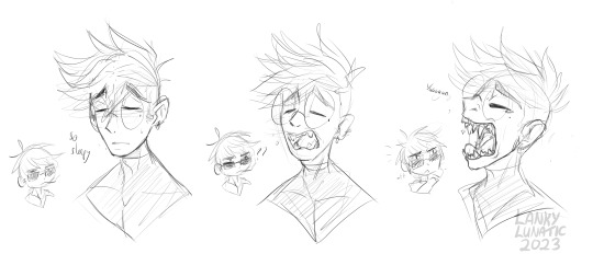
Small doodle to do with something from an rp with a friend :3 I gave himb sharp teef becaues nobody can stop me doing so The extend outward when he opens his mouth wide enough, ie. a yawn :3c He just an eepy deepy plant boi
#god what is consistency in art style?#this is entirely self indulgent you can move on#shoo nothing to see here#stop looking at me like that#vash#vash the stampede#vash trigun#trigun#wolfwood#wolfwood trigun#nicholas d wolfwood#idk why I'm tagging so much these are just doodles#might clean them later#sketch#my art#anyway wanted to give him some leetol inhuman traits because it itches brain so good#just love the idea of big ol chompers#and chompers that extend for big bitey#trigun stampede
134 notes
·
View notes
Text
Ep 4 :)
#I LIKE Dostoyevsky. I like how mysterious and unreadable he is. What is his goal!!!! Why does he do what he does!!!!!!! He's very cool#I think knowing his ability now REALLY adds to his character. Him being so smart so manipulative so disruptive in the way he–#seemingly kills people on touch! Only added to this impression of him being “demon” and “inhuman”#But now that we know his ability you realize... That's all his doing; no ability.#His ability in a way does help humanize him by reaffirming that except for the moment he dies– he's got no superpower at all!!!#It's just him.#And yet at the same time also solves the exact opposite role of dehumanizing him because if it's not his ability that makes him like *that*#then he's even different than other ability users!!! Then‚ if not an ability user‚ if not a non ability user: what is //he//?#It's all SO compelling!!! Also makes for an extremely insightful narrative parallel with Dazai#Not an ability user not a non ability user. Not good not evil. (I feel like Dostoyevsky does exceed the definitions of good and evil as–#much as Dazai does. If he causes evil‚ yet does so with the intention of bringing salvation to humans– is he really *simply* evil?)#Both have these borderline superpowers that make them extraordinary beings (we can call it super intelligence‚ but it goes from controlling#their own heartbit to everything else) but are unrelated to their respective abilities! Once again making them neither this or that#I find Karma's words at the end to be extremely insightful.“Ace was evil for sure‚ but this man isn't even evil.#He's a being from the beyond. A being that exceeds human limits.” Like!!! That's all that there is to it!!!!!!#Back to this chapter / episode. There's some themes / worldvies once again I don't agree with but narrative wise I think it's extraordinary#I feel like after the Guild arc the writing really matured a lot and this is a kind of preview of what the doa arc is going to be like#(aka very very well written especially if compared to the previous arcs)#The plot twists of this episode are all so unpredictable and exciting!!! I think it's remarkably witty how it takes advantages of previous–#clichés - villains always revealing details about their own ability in a way that is quite baffling - to actually surprise the audience.#It's so effective. How skillfully unpredictable Dostoyevsky is to the point you can never guess what he will do next!!!#Him killing Karma is... Idk so so soooooooo interesting. I could talk about this forever but I'm being very dispersive in the rable and–#running out of tags. The whole episode you're sorta rooting for Dostoyevsky. He's very cool and comes out charming in the way he keeps–#surprising the audience. He looks bothered by Ace's disregard of other people's lives and that makes him sympathetic too.#But then he kills Karma out of nowhere and it's an “Ah! You fell for his lies too– remember he's nothing but evil. He cares just as little#about life as Ace does”. And then??? Karma in his last words is himself so generous in his words to Dostoyevsky. It's baffling.#And it almost feels like thenarrative is once again turning around and telling you you should root for Dostoyevsky.#It's endlessly fascinating.#I have more to say about the worldviews I don't share and the art style Dostoyevsky was portrayed with this episode (love it!!)#But alas ran out of tags
7 notes
·
View notes
Text


THIS IS MY ROMAN EMPIRE. 🖤
#(Forget what I said earlier about the Inhumans and the Targs!)#I'm making a playlist rn! (Of course.)#Skarlet ILY babygirl but you're a dumb whore. 🥺 <3#my roman empire#mkx#mk11#mk2021#reiko x mileena#reiko x skarlet#skarron#erron x nitara#outworld royal mess fam#mortal kombat#mk tag
17 notes
·
View notes
Text
personally although i know she wasn't ready for it at the time it was discussed, i do love the idea of daisy becoming director of shield
#i love and respect mack so much don't get me wrong#it was good for the way the show went#and i know daisy sees herself as more of a foot soldier#but she has so much potential as a leader#and just? daisy cleaning out shield from the roots up.#everyone is trying to remake it but the rot is always there in some way and she wants it to be Better#for the people they protect#for inhumans & superpowered people as well#who don't deserve to be taken advantage of#sorry i'm finally doing character tags and i got lost in the brainrot looking for daisy quotes#daisy “i'm coming home” “shield is my home” johnson#being able to build it into something sm better after fury leaves for good
4 notes
·
View notes
Text
Fuck it Friday
Tagged again by @theotherluciferr ahhh <3 <3 <3 We must share a similar time zone cause it is also Saturday for me but currently 1:30pm.
No idea what the rules of what you should share in these tag games are, so I decided to put up a snip from the next chapter of 'Lifeline' because I just had to laugh writing this and the chapter will be out tomorrow anyways. And also I have to go to work soon.
"Buck!" Christopher's loud voice from right beside his elbow startles him. Buck jumps, nearly losing his balance as his shoulder slips away from the door frame. He manages not to fall, catching himself on the doorframe and pulling himself upright, his other hand splayed dramatically over his heart. "Jeez, Chris, you scared the sh- uh, daylights, out of me!" "That's cause you were too busy pining after Dad," Chris retorts, rolling his eyes with a sly grin. "I called you like four times!" "You what - Pining after - I was not -" Apparently, his brain has forgotten the concept of how to English in the wake of Chris' accusation. "Do you even know what that means?" "Ugh, I'm thirteen, Buck, not three. Of course I know what it means. And," Christopher gives him a smug look. "You were totally pining." "Dios mio, how is this conversation even happening right now," Buck mutters, trying to ignore the heat building in his cheeks. And as if triggered by the sound of Buck using Eddie's favourite Spanish phrase so casually, Chris succumbs to uncontrollable laughter. He bends over, his laughter echoing through the room, a joyful chorus that even Buck's good-natured grumbling can't suppress.
I discovered how to find my mutuals but still have no idea who to tag and don't wanna in case it's bad form or they've already shared or anything so yup o.o
#fuck it friday#buddie 911#my writing#lifeline fic#buddie fic#the inhuman pterodactyl screech of 'lucifer tagged me again!' created some hilarious confusion in this house this morning#my family thinks I'm insane on a frequent basis anyways
8 notes
·
View notes
Text
what came first, the body dysphoria flare up or the internet deciding now was a fantastsic time to show me transmasc content
#rin rambles#tw i get real heavy in the tags#SLAMMING. MY. HEAD.#HHHRGHHGHHH I GET SO ANGRY AT MYSELF#WHICH I KNOW IS STUPID AND POINTLESS BUT ARGH#every time i like. even have the twinge of these emotions. my brain is like ah.#so you're a failure? you're a fucking disappointment? man. sucks to be you. you should do something about that dysphoria. OH RIGHT.#and then i cry a little in Adoration it's okay#it doesn't feel okay. but like. ah.#i just feel like a disappointment to God. like He gave me this body and i hate it. and i hate that i hate it.#idk i just feel like i'm in so much pain. and then i try to talk with other Catholics about it and i'm seen as a wounded animal. or inhuman.#and they're like 'your dysphoria isn't causing you the anguish it's something else' LIKE IT CAN BE BOTH?#is it so bad to say that YES i am sad that i can't transition? that this causes me grief? but i follow Christ because ultimately He is worth#that pain and suffering?#is it bad to say that love is a sacrifice? and that the whole point of sacrifice is that it hurts?#where was that one post about the ai generated Bible verse. bc it wasn't /totally/ theologically correct but ough.#it made me feel things. i know God sees me and loves me. despite everything. there is love
9 notes
·
View notes