#I’ve never colored lineart like this before
Explore tagged Tumblr posts
Text
TWO DOODLES I DID :D


Who else should I draw?? (I’m planning on doing Jack next)
#I’ve never colored lineart like this before#I like how it looks tho#still kinda annoyed I messed up eclipse’s rays-#sams eclipse#tsams eclipse#eaps eclipse#laes earth#sun and moon show#lunar and earth show#the lunar and earth show#…#tagging these characters are confusing#laes art#inks art#art
15 notes
·
View notes
Text
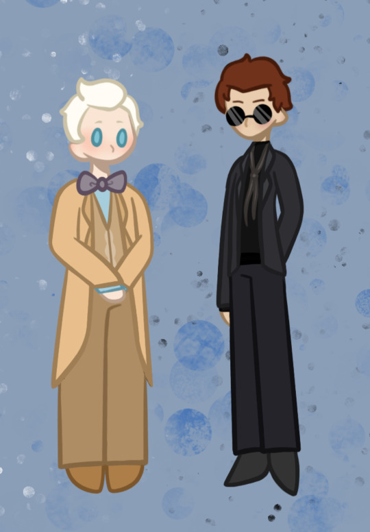
Behold:
the Goobers
#AHHHUGHHHHHH#LOOK AT THEM#THEYRE JUST#YES#EVERYTHING ABOUT THEM#Funny story when I was sketching this piece out Crowley looked like a worm on the string :P#I always have a difficult time drawing aziraphale and I don’t know why#The Lineart was soooo fun to color#I’ve never done anything like this before#maybe I should start doing it more 🤔#Neil gaiman why must you do this to me#to us#the fandom#We’re all suffering#he’s probably just sitting in his room cackling because he knows how the fandom feels#I love the story of how good omens was created#thinking about how terry pratchett never lived to see the tv show and didn’t think one would ever be created#sad 😔#Aziraphale has blue eyes right?#I guess I should have checked before making this whoops#Goobers#aziraphale#Crowley#GET MARRIED ALREADY#good omens#good omens fanart#ineffable husbands#Anthony janthony Crowley#Aziraphale ziraphale fell#“I’m not gay Crowley”
60 notes
·
View notes
Text

“May we meet again in a better life.”
#this was originally gonna be lineless but I decided that would’ve been very much not fun#so it’s just messy lineart now#but I spent. sooo much time on this so it’s getting posted here#fe awakening true ending you live in my heart forever and ever#fire emblem awakening#chrobin#<- implied#the background was my favorite part of this believe it or not I’m really happy with it#first time drawing lucina and morgan actually… I should draw them more#chrom I’ve drawn before (*why does he dress like that*) but never in color#robin I draw all the time soooo oops pff#but anyways. pretty happy with this even though it isn’t my exact original vision#soupghost art
14 notes
·
View notes
Text
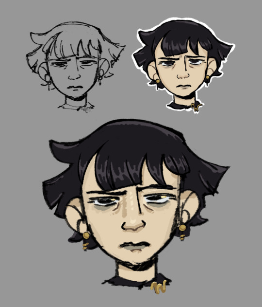
Yesterday I watched Cartoon Saloon’s short “Screecher’s Reach”, and thought Daal’s hair was almost exactly like how I envision Mathilde Lachance’s hair, so I decided to try and draw her. Today I stopped cleaning up the sketch after about an hour because I got bored, so it’s going here.
#nevermoor#nevermoor fanart#mathilde lachance#idk if anyone’s ever drawn her before (which makes sense bc no description) but I wanted to give it a shot#I’ve always envisioned her like. goth former art student. just the vibe of a pretentious 20s-30s artist who is also kinda goth. for funsies#when I said this blog is where I ‘dump’ my fanart I am being serious. bc sometimes I just quit part way through. lol.#I always try to be one of those ppl that ‘renders’ just by cleaning up their sketch + flats and then I always get bored and stop doing it#I need to stop avoiding doing lineart bc I actually enjoy doing it. when I do otherwise I just end up w a bunch of half finished stuff loll#anyways. I haven’t drawn in ages bc college sucked all my time and energy. but I just graduated 💪 and I’m excited to get back into things.#especially nevermoor stuff!!! bc I have so many ideas!!!!!#fun fact for if you’ve read this far: I like giving wundersmiths bright golden eye highlights when I draw them. just for fun!#the gold of wunder goes sooo well w the black/purple color scheme of morrigan. genius idea from jess. that’s why I always love drawing mog!#I may never draw stuff but rest assured I’m always thinking abt how I would draw nevermoor ppl/places/things and why#I have so many thoughts and my nevermoor brainrot is also is where my art/animation brain and media adaptation brain get to combine#I am going to be insufferable when (if?) the movie starts being made and I am not even sorry#anyways. enjoy this lq image. bc this is a screenshot and I have a problem with drawing way too small lol. oops.
51 notes
·
View notes
Note
hiii!!! loving your locket comics!!!!!! just wanted to ask a few questions about your process, if you dont mind :D
whats your general process like?
do you do thumbnails, how do they look like?
roughly how long does it take you to complete a comic panel or page?
how detailed are your sketches? do you do multiple?
do you have any specific techniques for lineart?
do you typically use references for your comics?
generally, how much effort and focus do you put into your comics?
do you have any advice for drawing comics?
sorry for for the absolute bombardment of questions, lmao. just really enjoy your art and comics and very interested in the behind the scenes!! feel free to skip any questions (or this whole ask) well wishes and salutations!!! :D
Hello! I'm so glad you enjoy my comics, and I totally don't mind breaking down the process!
For a normal comic page, I would likely actually write a script since it's much easier to keep track of dialogue and actions. But since these are short, I just write it into my thumbnails.
Step 1: Thumbnails. Easily one of my favorite parts, since I get to throw all my ideas down. I do these comics on a 2-panel grid, so I don't have to worry about actual paneling, and it allows me to focus more on the setup of each shot. Think of it like storyboarding!

Step 2: Add cleaner thumbs if needed. I actually made 3D models of Deadlock and Ratchet's chest in Blockbench, so I often trace them to save myself some time! (It might look insane, but I promise, for me, it's not.)
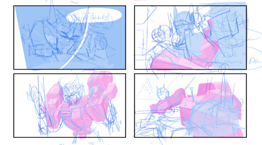
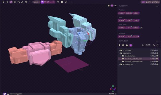
Step 3: Lettering! I actually like to get the lettering out of the way right away since it can take a while. Ever since I started treating lettering as its own form of art, my skills have gotten better, but it also takes much longer.

Step 4: Clean sketch! I'm just now finding out that people think I’m doing lineart for these? I am not… these are all just clean sketches. Maybe doing the blackwork gives the illusion of lineart?

Step 5: Color! Most of these comics are in black and white to save time, but it also lets me focus on values and shot framing again. I add my glow overlay to the eyes, and boom, done!

Roughly how long does it take you to complete a comic panel or page?
It really depends on how complicated the panels are. I like to step out of my comfort zone. I know the Grimlock and Misfire one took longer because of how many panels there were and the fact that I was drawing characters I’d never drawn before, but I’d say it usually takes around 5-8 hours for a whole page.
Do you typically use references for your comics?
I'm literally the reference GOD- we all know this. But yes, I love using references and doing character studies. I have yet to do a study on LL Drift, but I have a few references of him that I’ve made.

Generally, how much effort and focus do you put into your comics?
I mean, I wouldn't say I don't put in a lot of effort? I put in enough. I don't know… there's a point in the clean sketch process where you can kind of just turn off your brain. I'm passionate about comics, but we can all agree there's a point in a drawing where you just zone out.
Do you have any advice for drawing comics?
I think being able to balance dialogue and visuals is super important. I don't know if you guys have picked up a graphic novel from Barnes & Noble recently, but if you open a page, you'll see a character sitting with the biggest bubble you've ever seen, filled with paragraphs of text. While I get it—being a novel as much as it's graphic—I personally like to visualize emotions more. If it means adding two more panels to make an interesting dialogue setup, I don't mind doing it. Another thing to remember is that not all panels need to have details or 100% effort. Sometimes you need to simplify and move on, and that's okay! Those two extra panels that are giving you a better stage setup might be the ones that need fewer details and less time. I would consider my comic page work and my 4-panel work very different. One is about paneling, setup, and visuals, while the other is very much like storyboarding. Both are skills you learn with practice and study.
118 notes
·
View notes
Note
You probably have already made a post about this (in which case I apologize for bothering you) however I really love how you render and color! Do you have any tips?
Hiiii so I probably indeed already answered something like that but it’s probably time for an #update + realized i can put pictures and it would probably help actually. Slay okay.
THE BASICS: have brushes you like. I have my faves, they’re in my #brushes tag (click below), you might also see them on the screen of my paintings in wip lol. Typically i thicken them up for rendering AND, now this is integral to my liking of rendering these days + the look: COLOR JITTERING. In procreate that’s tap brush -> color dynamics and i adjust the stamp & stroke jitter in the « hue » category. I have my fave brushes quadruplicated as thicker No Hue, 3% color jitter, 5%, 13% depending on the desired look. What this does is give intrinsic interest, variation and depth to your colors, and that way you can have more fun when colorpicking. This will come back again later.
STEP 1: a lineart you like. Doesn’t have to be clean tbh some of my fave linearts from current works were quite messy. ALWAYS colored.
STEP 2: on a layer underneath the lineart, put down flat colors. See what % of color jittering brings you the most #joy. I will do flat colors or i will sometimes already define some areas of light and shadows.
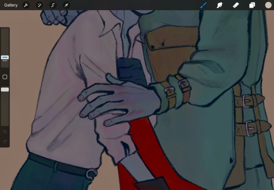
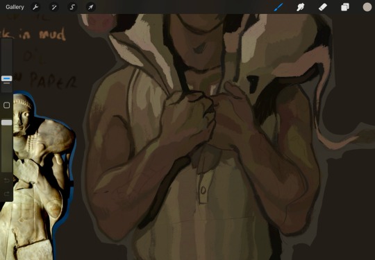
^ you can see the subtle color jitter in the « white » of the shirt and the green of that first image. Second is to show the already defined areas; if i know i want a different hue on here. something else for some pizzazz: tint a color with an adjacent one. not really visible in these screenshots but in matador, at some point, i added an orange tint to burakh's sleeve, the one closest to the red cape.
STEP 3: the shadows. On the same layer as above (you can duplicate it before this so you can always come back to it later if you need to redo), put down your shadows; the trick: COLORPICK FROM A PIXEL WHERE THE COLOR OF YOUR LINEART AND THE COLOR OF YOUR FLATS INTERSECT. You might have to recolor your lineart (use the « alpha lock » feature of your layer or something of the sorts) until you’re satisfied; i typically redden it in the face and hands.
STEP 4: put down the highlight. I typically do highlights the complimentary color as the shadow: if shadow bluer, the highlight is redder (-> pinker), etc.
STEP 5: now this is the scary part. Before proceeding if you’re #scared, group your lineart and colors, duplicate the group and merge one of them so you can always come back to them unmerged. MERGE YOUR LAYERS. You heard me. Merge lineart and color. From then on…
STEP 6: render. Render, render… PATIENCE… est mère de sûreté bien sûr. Here’s my secret: I NEVER BLEND. I ALWAYS COLORPICK. COLORPICK where two colors meet and you’ll have the perfect transition color.
tip: always have an all-black layer set to color mode above all layers that you can toggle on and off to check your values.
This is more of a fun thing i like to do even if i haven’t done it often: use some hints of a geometric brush to add interest when using an « organic » brush (or vice-versa, I’d guess, but i rarely render with geometric brushes). Exemples again:
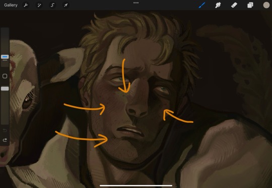
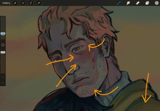
And well Das Preddy Much It… Your Turn Now….. and because i realize a short demonstration is better than a long speech, have a speepvideo of the two pieces I’ve used as exemples one after the other (matador first to 44 seconds in, moschophoros second). the very beginnings are cut because we’re focusing on the above steps.
Your turn……. To play.
#ring ring (answers)#anonymous#faq#<- we'll guess...#brushes#<- the ones i use in there#rendering#tutorials#<- eeeeeh........
74 notes
·
View notes
Photo

Transformers: Mosaic - "First Night"
Earliest evidence posted on October 7th, 2007
Story - Shaun Flaherty Art - Michal Solarz Colours, Letters - wadapan
deviantART
wada sez: I found the clean lineart and original script for this strip chilling on Shaun Flaherty’s deviantART, and figured I may as well finish the job. This is another straightforward story, starring Quickstrike after he joins the Predacons in “Coming of the Fuzors”. The monster he runs into is itself a fusion of Terrorsaur and Scorponok, who fell into the lava inside the Predacon headquarters during the quantum surge, and were last seen Transmetallizing... Rather than drawing inspiration from their toyline-only Transmetal forms, Solarz has drawn a horrific monster with all the organic material burned away. For the coloring, I went for a heavily gradient-based approach to crudely evoke the CGI rendering of the cartoon. I decided to color the Terrorsaur/Scorponok fusion as white-hot metal, rather than bringing in any tones specific to those characters; this was as much a shortcut as it was a storytelling choice, honestly. I’m pretty pleased with how the lava effect came out, I’ve never done something like that before! Finally, I took the opportunity to switch out the fonts from the dialogue, and to add a title to the first panel, using fonts that recall the actual opening title credits from the cartoon. As Quickstrike’s original toy has a lot of sentimental value for me, I was really glad to be able to bring this strip to life. If I’m being honest, though, I find the writing a little strange—in the show, Quickstrike is a very talkative villain, but here he’s a meek and silent victim. Weird choice. The artist has also pushed the Beast Wars characters towards a much more robotic style, with things like Quickstrike having a separate conduit connecting his cobra head to his torso, and Megatron’s bladed weapon appearing as a grabber claw. This second change in particular is notable because the original script actually calls for Megatron to stab the monster, not shoot it! You can read that below, and see the original art.
CAP: "Welcome to the Darksyde, Fuzor. CAP: "Try not to get lost." Panel 2. Over Quickstrike's shoulder, we see a pool of lava. In one spot, the lava burbles. NO DIALOGUE Panel 3. A grotesque, Transmetal amalgamation of Scorponok and Terrorsaur bursts from the lava toward us. It breaches the panel borders as if it is leaping out of the page to attack us. NO DIALOGUE Panel 4. Toward the left side of the panel, Quickstrike steps back defensively; his "hands" shield his face. He is just out of reach of Scorponok/Terrorsaur's claw. Toward the right side of the panel, we discover that Megatron has driven his whiplash cutlass through Scorponok/Terrorsaur's mangled torso, preventing its attack. NO DIALOGUE Panel 5. A close-up of Megatron. He looks down at Quickstrike, smirking. MEGATRON: I believe you belong to me now. Panel 6. A close-up of Quickstrike. He looks up at Megatron, meekly. SFX/QUICKSTRIKE: gulp MEGATRON (OP): Yes...


#Transformers#Transformers Mosaic#Maccadam#Beast Wars#unpublished#Shaun Flaherty#Michal Solarz#wadapan#Quickstrike#Terrorsaur#Scorponok#Megatron
21 notes
·
View notes
Note
Just saw your sketchbook post and I am amazed at how clean it all looks O_O /pos
So I was wondering, what materials do you use for your traditional drawings (all the stuff from sketch to final piece)?
BOY AM I GLAD YOU ASKED THIS *ahem*
Behold 😌
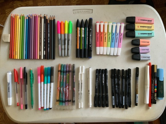
For the sketchbook pages, I mainly stuck to these materials though ^^ these guys are my…
PRIMARY MATERIALS
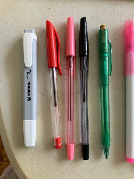
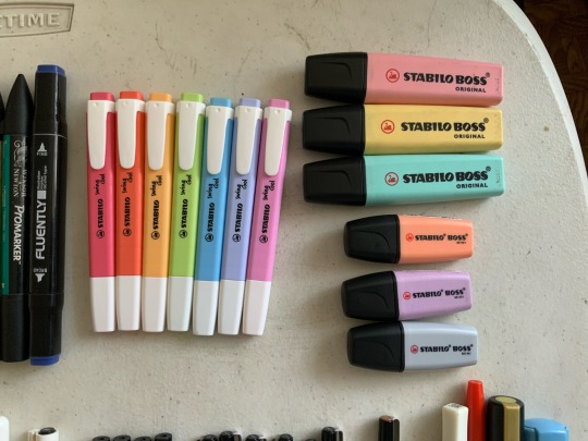
The green mechanical pencil on the picture on the left has 0.7mm colored lead in it! I alternate between blue and pink colored leads depending on what fits the overall color of the piece better.
Once I finish up the sketch, I line it with the black pilot ballpoint pen! I really like the control and feel of ballpoint pens for traditional lineart, because it gives a sort of variety in pressure I can’t seem to achieve with normal fineliners. I like to switch up the colors of the lineart too sometimes, hence the pink and red ballpens.
Then once the linearts done, I color them in with the stabilo highlighters, as pictured on the right! These guys are my FAVORITES. Sometimes when I’m just freely sketching I use the grey or peach mini stabilos. Although, they do tend to be a bit runny, ‘cause they’re meant for quick highlights and not multiple strokes over an area ^^; so you do have to be careful and quick when coloring with them to get an even coat of color!
Sometimes, though, when there are other colors or textures I want in a drawing, I use my…
SECONDARY MATERIALS
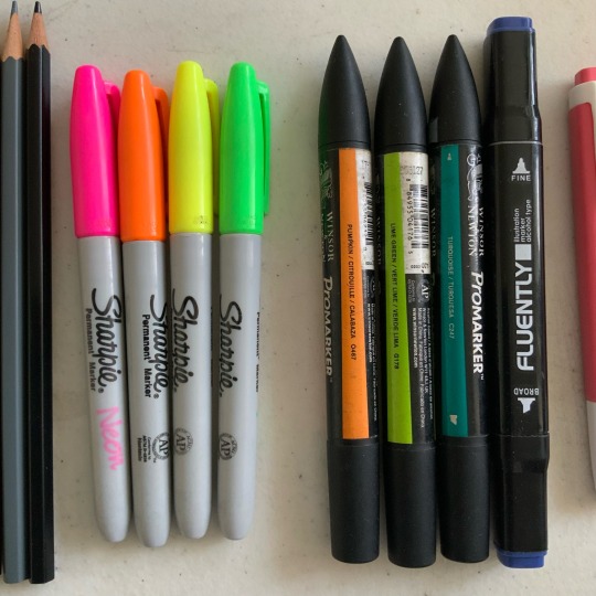
Pictured above are all my alcohol based markers! The four on the left are neon sharpies for when I need that extra eyestrainy kick. The three promarkers with the pointy cap were from when I was a freshman in uni and wanted to collect a full set of alcohol markers, but these were the only colors they had in stock and the college supply store ✌️ I’ve since given up on that dream because they were really expensive ;; they’re really good for sunny grassy scenes though! The last dark blue marker was from a set of other blue markers, but the others have since dried out… I use it when I really wanna darken up a page, like for night scenes!
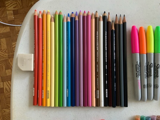
This is my prismacolor set! I like to pair these with the markers, going in after the initial layer of color to give a bit of variety or shine. Some examples of when I use them would be for adding blush or giving hair a glossy sheen 👍
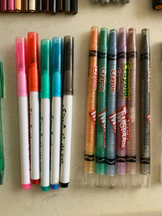
These ones are my “fuck it” materials lmao
I use these when I really just wanna scribble something down wildly. I had these since I was in gradeschool and its quite frankly a miracle they still work? Oh, and the red and yellow twistable crayolas are missing because I vaguely remember giving them to some childhood friends for some reason 🤔
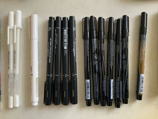
My fineliners and gellyrolls! Haven’t used these much recently tbh. I’d used them for class before, but I never really likes how flat the thickness tends to be :/ the brush tips and chisel tips are cool though. I used them for that one yellow bdubs doodle to try and see if my opinion of them has changed ^^ it hasn’t. Moving on…
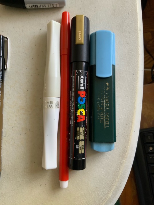
Lastly, we have the special materials! The ones that don’t really go into any sets, or have nice applications. In order from left to right:
Wink of Stella - A brush pen that applies glitter through some sort of black magic. No idea how she works but I love her
Red Marvy Art Director 1400 - A red fine tip marker. Can’t go wrong with a bright red marker 👍
Golden Posca - My only posca marker. Figured if I should get one it might as well be something special.
Faber Castell Blue Highlighter - I use this alongside the stabilos. It has a really nice deep blue color ^^
And well! That should be everything! ^^ Thanks for giving me an avenue to gush about my materials lmao 🥰
89 notes
·
View notes
Text
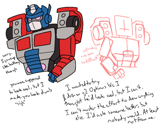
*sigh* I don’t know. I don’t even really know why I’m posting this in the first place, I don’t really like it
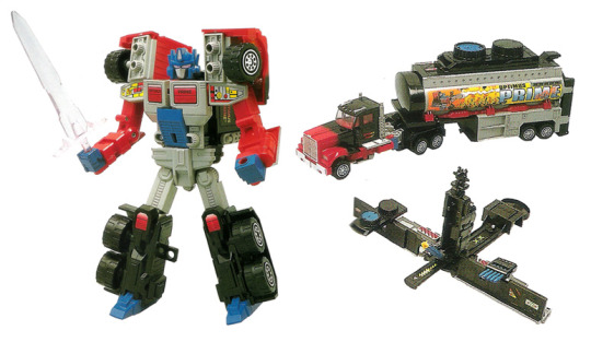
I’d say what it is, but you can read what’s on the tin. I thought it’d be cool if I drew that g2 Optimus design, because I think it’s cool looking and Optimus might look good in black and red, and with pink eyes
This was my reference by the way
But no, I couldn’t figure out how to make him look right. I thought maybe I could try sketching him in another style, but no, that didn’t work either. But I finished the sketch and thought it looked halfway decent, but when I went to do lineart I realized it wasn’t. But halfway through lineart I just gave up and slapped it together, slapped some colors on him, wrote some stuff on the page, I guess to fill up the black spaces I know I wasn’t gonna fill with actual drawing, and now we’re here
It’s the fucking arms I tell you. I still don’t know how they’re supposed to work, and I don’t know how to pose them either. So they look like shit. But I can’t just not have them, so they have to be there
And I don’t really know what’s happening on the shoulders either, particularly the wheels. I know I made them too small but I don’t know how to make them look how they do on the toy either
I considered trying a more stylized art style since the 3D was fucking with me, but my brain couldn’t figure out how to do that either, so I’m stuck doing the same thing over and over again, drawing in circles and wondering why I’m not getting anywhere, while simultaneously being unable to figure out what I’m doing wrong
So now we’re here. It looks bad. The shoulder pentagons are too small. The face is too tall. The colors on the face are all wrong. The arm is all off anatomy wise. I forgot to color in the black on the back despite going in and adding lines for them. The grill’s off. The chest doors don’t look like doors the open up, they look stuck to the rest of him. He barely looks 3D because I’m bad at doing this
But I got far enough, and I knew that even I start over on a new canvas, I wouldn’t want to delete it by this point, so I might as well finish it instead of having it taunt me every time I see it. So here we are, as I’ve said multiple times
I really wish I was better at drawing Transformers. I should be at this rate, it’s been a couple months. But no, I don’t know how to improve and I keep staying with the same mediocre art, because I don’t seem to like trying. I do try, but it’s not improvement, it’s just me making the same mistakes over and over again. Like with arms and the joints
Why can’t I get better? Am I just not trying? I don’t know how to try better
I have thoughts I want to share with people because I think they’re neat, and I know any thoughts I do have will only gain traction and be seen if there’s art attached, at least here on tumblr, and because I am an artist, I have to try and draw them. Especially because I’m anti-social and a cheapskate, so I can’t ask someone I know who can draw Transformers good and I won’t commission anyone for it either. I’ll only get what I want if I do it. But I’m bad at doing it
So it’s either write it out and see some people like it, but it’ll only be for the next couple days before it gets forgotten and I too forget about it, and it’ll never do as good as if I did draw it, or draw it but not as good as it needs to be, so people won’t really care about it anyways. Because my flat drawings aren’t really good anyways, just mediocre, and I write too much on my drawings and go on tangents, meaning people probably aren’t gonna reblog it with their own thoughts on anything I said either
But this is just me being greedy anyways. No one’s entitled to give me their opinions, especially when I know my thoughts are stupid anyways. I don’t really know anything about Transformers, not like other people do, I’m just some casual person who just got here and should just go back to Cookie Run at this rate, but is stupid and keeps thinking that maybe she’ll get good at this and have opinions people actually care about
And don’t go on here telling me that I shouldn’t put so much emphasis on what other people think, so long as it makes me happy. It doesn’t work like that with me. Drawing the thing’s only half the fun for me, and sometimes that varies. The real fun comes from telling people about the thing I made, and the ideas I made for it, especially when they tell me what they think of it. If I draw something and nobody sees it, and I don’t tell anyone about it, what was the point of me drawing it? Even if I enjoyed it, heck when I do, I’m even more motivated to show it to people, because I’m proud of it, or that pride comes later when I see people really do like it. These things are intrinsically tied together for me, I can’t separate them
What’s even the point of all this? I’m just complaining at this rate about basically nothing, at least nothing to do with what I drew. But I don’t like what I drew. But I made it so I have to show it, at least to get a semblance of what I was going for out there. I’d like to think maybe if it did, someone better could get what I’m going for and do it better, and I can see it better, but no one ever does. I’m not good enough for that. Maybe some people did, but not anymore, I’ve grown too big for my britches. And also we’re not in the same fandoms anymore
And I write all this, but it feels almost performative. Like I’m putting on an act of frustration and disappointment and anger and whatever other emotions I can’t quantify right now. Because this’ll still be on the post. I’m still gonna post this. I’m still gonna diligently put my tags in it like any other post. Like I’m doing this for show. I’m not, but I’m making a deal of it publicly online, aren’t I? So I must be doing this for attention
*sigh* Well I suppose it’s my own fault
I’ll probably try to attempt this again some day, maybe even later today or tomorrow (actually probably not, I work tomorrow), because I never got out what I wanted, but I can’t figure it out right now and I’m too lazy to make it any better. So take this not very good quality art that I really shouldn’t even be posting, but hey, it’s content, isn’t it?
#I don’t know I’ve been a bit frustrated at myself all day#though this is part of the reason why#I can’t do my homework right I can’t understand Latin right I refuse to read what I need to for class#despite all the free time I have that I should be capitalizing on#and I’ll say I’m bored but I won’t touch the stuff that actually needs doing because I’m lazy#and on top of all that I don’t even have anything swimming around my brain to think about#or draw for that matter#this was the best I had and now look at it#*sigh* I did have a couple thoughts when drawing this design though#specifically how I imagine this Optimus to be younger and somewhat less experienced as a leader#but also is pretty adept at fighting#like he’s a soldier who’s character arc is learning to be a better leader since that’s what he is now#maybe I should save that for the better version of this#if I ever make it#I don’t know sorry about all this#I’m still posting it anyways because laziness#transformers#transformers g2#optimus prime#my art#rant
9 notes
·
View notes
Text

Joan is a fun character of mine who’s evolved from a lot of self imposed rules


The first ever Joan was conceived of in like 2017 for a game of dnd, and like literally everyone else I chose tiefling bard (Named JOAN ELTON bye.💀 )some strange things I held myself too were that she had a BEAK! What were snaggle teeth before became a squid beak. I also refused to color her hair or sclera, nor would I give her pupils, both became black with no highlights, blending into the lineart and obscuring her eyelashes. She was kind of like a Jack o lantern (Honestly! I still dont hate this, I think it’s pretty distinctive for a character, but it gives me less room for details so over time I’ve shifted away from it)

Overtime her beak has become less obvious, her horns are closer to the skull and less rounded. rather than a mean gnarly smile she’s got a more bedroom eyed expression and a mole. She’s a bit more mature these days, but I’ll never forget her origin as an apathetic, childish, nasty, ruthless, immoral liar. Even if recent Joan has dropped her strange beak for a small smirk the beak is still canon to me. We went from tooth to beak to tooth. Its a cycle, it’ll be back one day.

Happy 8 years Joan?

10 notes
·
View notes
Text
JUNE UPDATE
WASSUP BROS AND HOES, IT’S ME, YOSA FRICKING JAE. BACK AT IT AGAIN WITH ANOTHER UPDATE ABOUT THE JMC 🔥🔥🔥‼️‼️‼️
Last time, I remember saying it’ll be different and things will spice up, and I am indeed gonna provide more stuff piled into these updates because the debut comic is taking so long. I wanna make sure you all get full when consuming these updates instead of being like “oh, nothing happened lol”. I have a good chunk of shit to talk about that’s outside of the comic itself, but it’s like behind the scene stuff about it :3
With that out of the way, let’s finally get started!
The Comic

(W.I.P OF THE OFFICAL DEBUT COMIC)
The comic is slowly making progress, the first thing that’s changing is me showing progress of the comic itself and giving ya’ll w.i.ps in order for me to give you guys content to look over, and because I just want ya’ll to see it yk? The honest truth is that it’s moving slow because of burnout. It was huge and made me wanna give up on the comic and leave the fandom, I was struggling for a good while but my best friend told me it was best to take a break and recharge instead of pushing further. They told me to do something else so I can regain my motivation and passion for the project, and she was right, because I’ve been having fun hanging out, watching her play Stardew Valley, and letting loose without the pressure for the debut comic to come out. I have to prioritize my health and well-being before anything else, and I know the comic will be done!
Also for you all to know, the team I had disbanded, and right now I don’t have a full official one to help with the debut. I have amazing friends that have helped look over the script, one did some sketch compositions, one helped fix up grammar in the script. They helped me greatly and I’m so grateful for them and their loving support even through all of the rough patches. For the most part, I’ve been doing everything on my own, and it can get stressful easily because of how much I’ve had to change my plans and shuffle around when the team disbanded. I’ve been the one doing the scripting, sketches, lineart, color, management, and just everything. Even if I try to act like things are fine behind the scenes, I definitely got more anxious and depressed after events occurred, so this break (not hiatus) has helped me recharge after going through a bit for this comic. To end this section on a good note, I’m feeling so much better and I’m recharging absolutely greatly, I even renewed my love for Donnie after a friend drew him 🦐 Sooooo…The JMC is still in good hands.
Bonus Content: The Villain
YosaJae, what is this? This is the section that’s hella new, the place where I show you guys some cool concept art, ideas, and plots that show the origins of the JMC or even scrapped/cut content. Today we’re gonna talk about the villain of Arc 1. Fun fact, two were created at the same time but one of them was finalized to be the primary villain for Arc 1!
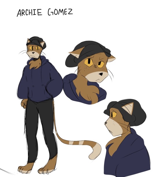
(First ever concept art of Archie Gomez)
Here he is! The cat himself, ✨Archie✨ I needed some variety and needed an anthropomorphic character since Rise has lots of their mutants and yokai. Archie was a character that was a lot more serious and hella threatening but he was toned down after more arcs were created. For some reason, I included freckles because I originally thought, “Ginger people…..” then included the freckles to make him more recognizable. Let’s just say that they weren’t as rememberable as I thought because I forgot them after a while-

Fun fact, Archie was originally gonna be a native Spanish speaker but not be able to speak English. The actual conflict was gonna be about the turtles and Archie fighting due to language miscommunication, but it was later scrapped because of the issue with translating each of his sentences and being truly accurate with his dialogue. He also at first was a one off character that would never return, but he was popular that he became the reoccurring bad for Arc 1.
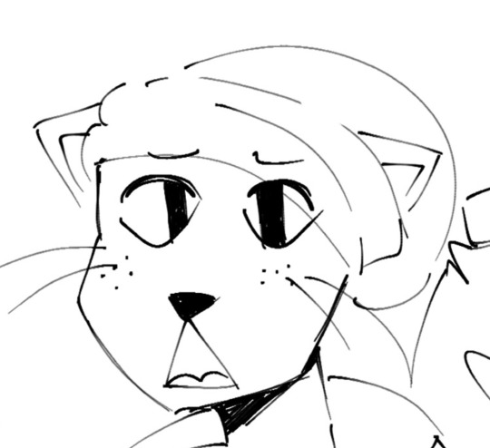
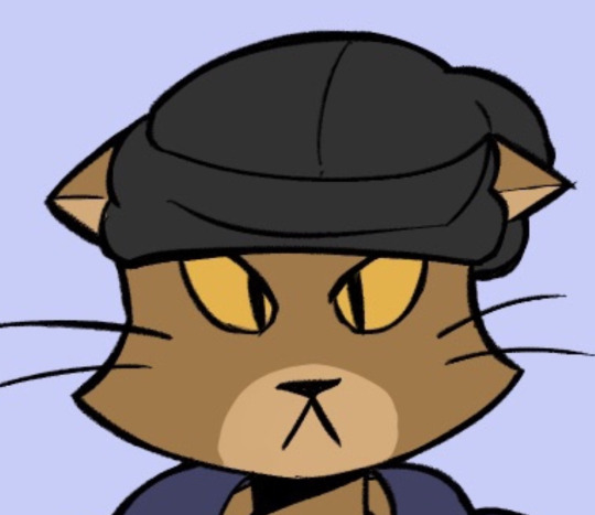
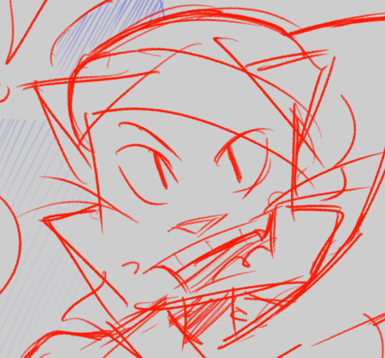
(Archie Gomez Evolution 2022-2024)
Archie had went through a good bit of design changes over the years and I changed him to be more easier to draw by giving him a more unique silhouette by drawing his head as a pentagon instead of a circle. The transition was at first a circle to triangle, but then the shape was too complicated to recreate so I had to go with a pentagon (as an accident at first too). That changed him A LOT but I was hella happy with the way he turned out because he started to look more unique and iconic. Pretty cool, eh~?
Aaaand that’s it! Thank you all for stopping by and coming in to read this update! I hope it was fun to go through and very refreshing. I wanna make my updates more like this instead of what was said above. Especially because this is taking so long, I wanna be able to go over behind the scenes with you all since ya’ll at least deserve that; I can’t keep being mysterious about the comic since it is taking years for it to be made, but it’s trial and error so I gotta do this in order for it to be worth the progress. I’m strong, I can do this! Hopefully your day/night is amazing, and take care until next time 😋🫶💜
#rottmnt#rottmnt oc#rise of the teenage mutant ninja turtles#rise of the tmnt#tmnt oc#oc#oc x canon#jmc update#jmc related#jmc#comic update#art
15 notes
·
View notes
Note
if I’ve already sent this ask before I’m so sorry, I’ve got adhd, but how did you find your art? (I’m in my questioning phase)
hihi!!! no problem! i think i have some kind of glitch with asks bc when i go look for them it says i have 3, but when i check it, there isn’t any so im sorry if any of u have ever sent asks and i havent answered them it’s probably bc of that😭
but anyways lets get on it!
finding you art style is not smth simple at ALL. ive been drawing my entire life!!! and ive had a bunch of different styles until now, they kinda used to change every few months or so, i was always happy with them but it never really lasted??? and i always had at least one part of the process of it to dread doing, for example, coloring.
it wasn’t until recently i FINALLLYYY found a style im 100% comfortable in.
it really takes experimenting and finding what elements of creating art you love and enjoy the most. for me, i used to mostly do traditional art, just pencil or ink sketching and i would OCCASIONALLY color them. so i really used to enjoy kinda the messiness of the pencil on trad mediums and stuff? and i never rlly found a way to translate that element to digital art which is the one i enjoy the most now.
brushes are very important! it depends on the look you like. since i like that pencil feel, i use a pencil looking brush! (softy from esbenlash’s procreate brush set) and i also got a paper feel screen protector for my ipad to enhance the experience🔥
i found i mostly enjoyed doing lineart and didnt rlly look forward to coloring, i didnt find my past styles enjoyable bc they kind of felt restricting in that area? since i didnt find a way to make it more abt the lineart and less abt coloring that i liked (ofc theres plenty! i just didnt find one for me)
so tbh i think what mostly influenced the style i enjoy the most now is film, and baroque art!
i had recently seen:
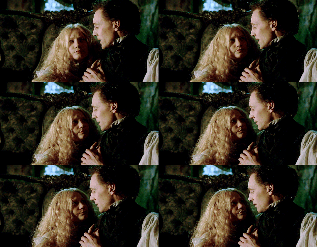
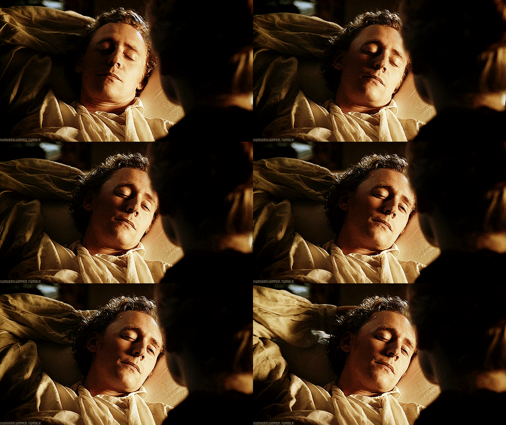
Crimson Peak (2015)
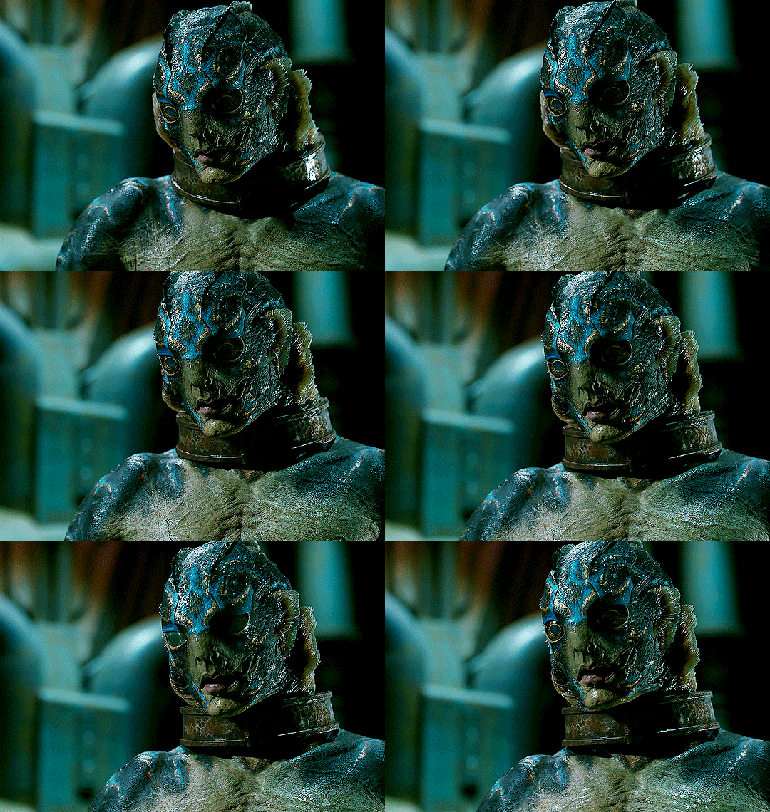
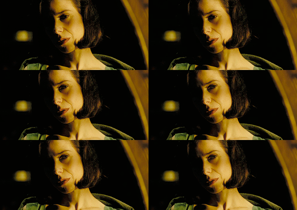
The Shape of Water (2017)
and ofc


Stranger Things DUHHHHH
and i fell in love with the way the lightning was, heavy dark shadows and moody lights, and tried to match my style to it and found that it highlighted all the things i enjoy doing the most while drawing! so thats where i am now
special mention to the one movie im obsessed with currently


The Crow (1994)
also has the similar style
all that + experimenting, studying other’s art i liked and finding elements to integrate to my art, ANDDD music also played a huge part in it. so as you can see for me its about kind of combining aspects of every single piece of media i like 😭
its not gonna be the same for everyone, but its always good to have a guide so i hope this was useful for you and anyone else! im always willing answer any art questions :)
don’t worry too much about speeding up finding your style, it’ll come to you eventually, so focus on enjoying the moment and learning, take mental notes of what you like and don’t like!
sorry this is kinda long as hell… but i like rambling
#perfect opportunity to show off these shots from my fav movies teehee#art truly is all one!#i love getting inspired from multiple medias and combining it into drawing#ari answers asks
20 notes
·
View notes
Text
So these are wips i’m working on currently cause I figured I should probably post more stuff.
I’ve decided to use a scene from the movie “The Forbidden Kingdom” for this comic.
Wukongs red eyes are driving me crazy honestly, but I’m too stubborn. I’m determined to make it work.
This would be the first time i’m drawing Macaque, so I decided to play around with his look and gave him long hair. Though I’m using lmk characters and Macaques looks are kinda based on the show (mostly for the scarf), I do want to create my own look for him. So the lineart may look one way but the color pallet probably won’t reflect lmk mac.


Next this is my Wip for Tripitaka from before he meets the group as low-key part of a series of drawings that started with my first Wukong drawing [click here for that] I don’t know how I feel about it currently though and I might scrap it for a drawing referencing his backstory cause I feel like not enough people explore that part of the story.
Also I never mentioned this but despite drawing Monkey D Luffy from One Piece all the time, and my vampire sona wearing a sailors captain hat, I HATE DRAWING HATS! And this particular head-dress is extremely intricate. A lot of cartoons simplify the head-dress, but if you look it up, it’s really detailed. I wanted to be accurate and maybe flew too close to the sun attempting it, so in the future it may stay simplified like it is here.

#character design#comic#sun wukong#journey to the west#jttw#lego monkie kid#six eared macaque#macaque#lmk mk#tripitaka#tang sanzang#xuanzang#the forbidden kingdom
11 notes
·
View notes
Text
Replies
Replieeees, mostly twst-related.
Starting with the one related to our Lilidia sketch from yesterday!
Anonymous asked:
I love how Lilia’s just like, “heheheh, legs >:3
And then Idia is just so confused
Poor Idia doesn’t know how to react lol Lilia’s legs are this powerful…
Anonymous asked:
Hello! I discovered your art recently after getting back to twst and I've been trying to learn to draw digital too. I really really like your art style, specifically the way it looks in the eyes. I just wanna learn how you draw! Do you do lineart first then color? Or color first then lineart? What art program do you use? I really like how you draw Idia and his hair, It's pretty hard for me to draw him because of his hair D: If you could give me some tips that would be great, thank youu💞💞
This is very sweet of you, Anon, thank you for your kind words! I am very happy you like my art style. And I love talking about drawing a lot, so ironically I have either posts or videos for pretty much every topic you’ve mentioned, so I’ll give you some links!
Firstly, to answer your questions: yes, I do lineart first and then colour. Sometimes I draw lineart digitally, sometimes I just colour a scanned pencil sketch (I wrote about this process in this post).
I draw in (pirated) Photoshop, and I do pretty much everything in there: clean scans, draw, do lettering, etc; but I think there are a lot of better alternatives to Photoshop now.
I also have a tutorial + speedpaint of Idia’s hair specifically, I hope it’s helpful! <3 And just in case, here is the post where I talk about how I colour regular hair.
I’ve also done a couple of speedpaints, and in the last two I sprinkled some notes throughout the video to explain what I am doing at any given moment.
I think this is it; if there is anything else you’d like me to talk about or if you have any questions, feel free to ask.
Anonymous asked:
I know you don't ship them since they're both bottoms but we need to address the sexual tension between Vil and Leona during the Cloudcalling event. I know people joke that they're divorced but it really does feel like that right now. (Maybe the reason they divorced was cause the realized they're both bottoms lol)
I haven't seen the event, sorry. You can see the things I've watched in my pinned. As well as the request not to mention to me ships that I don't like, which wasn't there before because I either forgot or didn't feel it was necessary I guess, but now it is there.
We never talk about ships that we actively dislike, but I feel like Vil and Leona are one of the closest things I have to a notp. You had no way of knowing that particular fact though, so no worries.
Anonymous asked:
(links)
The links. Sorry
(It’s about Pinterest links). Don’t be sorry, Anon, and thank you so much for the links! <3
9 notes
·
View notes
Note
Hi! I really like your comics in general, I’m not usually one to follow webcomics but yours are apart of the exception! I really like your artstyle and something I don’t really see brought up often. It’s amazing to go back to the first page of FYR and see exactly how much you improved in your art, anatomy and backgrounds. The first page is so different than the current page! And I think it’s amazing to see that growth within the comic! It’s also amazing how gradually you see the improvement, it shows that you’ve been consistently working on the comic and I respect that work ethic a lot.
Also, big fan of how you draw pokemon and how even pokemon of the same species have clear differences within them with color/patterns/size. Like RAUGHHH that’s my JAM when it comes to pokemon designs! It makes them feel like actual animals I could step outside and see!
I don’t really have any questions or stuff about the lore specifically, my question is more on the technical sense. I’m a big believer in the art itself is just as important as the characters and story itself. But how do you panel your comics? Do you have any tips? I have plans to start up my own comic but even though I’m an artist I’ve never really done a comic before ^^
Keep up the great work! I eagerly look forward to the next updates.
Thank you!!! Yeah, 6 years really makes all the difference huh. :'D I'm really happy w where my art has gotten, I think I've been improving faster now cause my bestie @zeropro started redlining my page sketches somewhat recently, for all my comics not just FYR. So thanks to her influence and help, I think the comics look really really good now!! I've been studying art p hard since I started comicking, I've come p far but I still have a lot to learn. Zero has taught me a lot. Thank you for helping Zero!!
I panel FYR just w a straightedge tool. When starting a page, I lay down the sketch and panel over it, I draw in the panels as pink and then turn them white after I finish the lineart and set up the colorblocking. CotL is different, on recent pages I actually changed how I panel the comic, I now use FireAlpaca's paneling tool to draw them. It's like super easy and way faster than what I was doing before lol. I believe Tinysweetbunny uses the same tool for Pipe Up. The panels are always one of the highest layers in the stack, the only thing that goes above them are generally speech bubbles and dialogue. Keeps it clean.
6 notes
·
View notes
Text
Omgggg
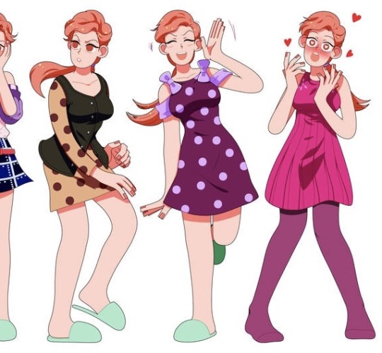
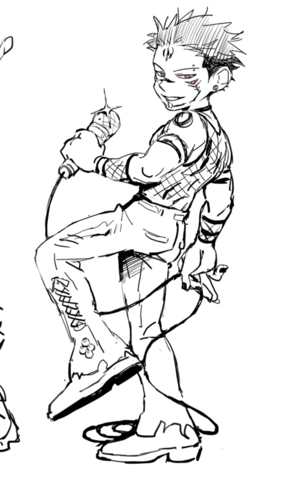
Sksjsks I went onto my insta and saw that someone liked this… old Jolynes from like, 2015-17 or so that I never got to finish (they’re all on my old laptop… I will rescue my files one day… this was my old cartoony style. I’ve revamped it a LOT. It used to be so much more loose… I kind of wish that it still was because it made the style look more simplistic and free? I’ve always been a huge fan of simple art styles!) I remember making an attempt at drawing every canon Jolyne outfit that I could find (at least the official colored drawings, not the ones from the manga since that would’ve been too much for me. I have the Jojoveller (I bought the Jojoveller back when it first came out from Japan and paid like, almost $200 for it orz….. should’ve waited for the price drop lol. I have every JJBA artbook tbh. But that helped me track down most of the official Jolyne stuff. Not all but a lot of it!) I’d drawn up at least 20 outfits at this point. At least I think so? These were just some of them. Hopefully, I’ll be able to retrieve my drawings again… the faces that I used to draw on my old style used to be so ugly, sorry.
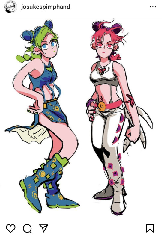
Here’s an example of this same style but revamped to now lol…
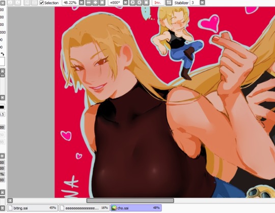
(Yuki wip…. The bodies have more standard anatomy but the hands are still blocky like??? The faces are prettier tho…. Has it lost a bit of personality? Maybe… I do like my new style tho… But could I still even call it a cartoony style, especially since it looks more anime than before :/…. Uh, I’m thinking too hard on this :(….)
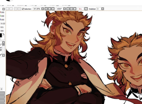
Another example is this Rengoku… it’s a little diff from the Yuki one despite being the same cartoon like style? (Barely cartoon anymore…) I don’t usually draw the nostril slit for this style but I did so for Yuki since it just looked better… idk if I’m gonna start doing that or not, I’ve literally been driving myself insane over deciding if I want to start drawing nostrils or not… for this Rengoku, it’s definitely more accurate to the style that I was pushing for but hm….. Similar to these Makima’s…. I didn’t draw the nostril…
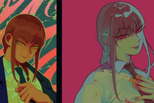
I like to keep the ears very simple in this style as well and again, look at Makima’s hands. They’re supposed to be blocky like this hehe. The Yuki wip is more of an improvement of this same style but I’ve been so all over the place with it… I feel so bad, omg. The most polished example that I could find immediately of the original cartoon style was of these Shinobu’s… see how round and free everything is!?
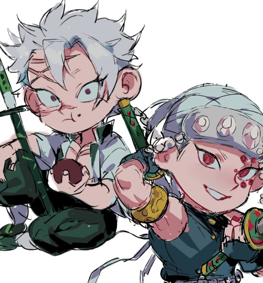
Don’t even get my started on the chibi styles…. I have a handful… because I’m indecisive. The Sukuna wips are from a new chibi style that I’ve been thinking about and I rly like it… The Kak/Oc chibi was for a commission that I had sm fun drawing for. I still like the style! I’ve always loved when artists left the pupils white for some reason? I wanted to do that, too! I forgot to color the lineart in the girls skirt lol….
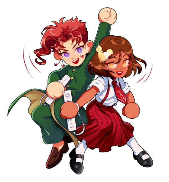
This style with Sanemi and Uzui is rly cute to me as well… I will not be retiring it. I kind of hate the old chibi style with Josuyasu tho. Hideous to me. And overly complicated. I don’t really like chibi styles that have TOO much going on, especially if they’re not as cute since chibi’s are supposed to be cute. I said ugly but beauty in art is subjective sjsjs… if they’re pretty and cute than idc. So I technically have three chibi styles that I like.
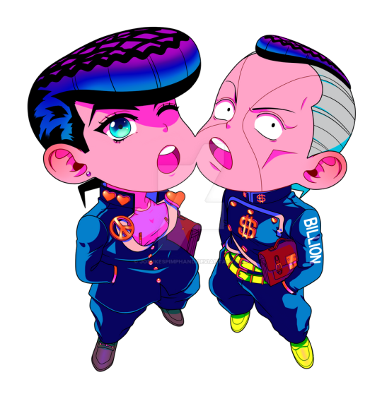
Ohh actually, I have two other chibi styles….. fuck, I just don’t have any pics of them that I’ve uploaded, only saved as files. One isn’t really a serious style at all tho, they were for fun (experimental) and the chibi that you can see hanging in the corner of Yuki in the wip above is of another simpler style as well…
#whaaaaaaaa#rambling#my art#sorry I’m always yapping!!!#an artistic Journey haha… I hardly ever talk about my artistic thoughts so…
9 notes
·
View notes