#I want to give tips on making art on mobile
Explore tagged Tumblr posts
Visit Tumblr Blog
Explore Tumblr blogs with no restrictions, modern design and the best experience.
Last Seen Tumblr Blogs


Fun Fact
Tumblr has been banned in Indonesia for providing people with access to pornographic content.
Note
any tips on making art on mobile 🙁🤕
i don’t have a digital pen for a bit aswel since my old one broke and i also accidentally may have broken my ipad aswell so…
OOF I feel you on breaking a device you use to draw on. I've done it before and was suffering for a solid week
as for tips, as much as I would love to give any, I have never drawn on mobile 😓
#spuirrel asks#I want to give tips on making art on mobile#but I don't know any#I've never drawn on mobile
5 notes
·
View notes
Note
Could I perchance ask for more toons getting a love note for valentines pretty please
Slides you a 🍪
Various toons getting left a love note pt. 2
Hmmm hmmm I still have art stuff I have to fin8sh but I wanna write so bad but I also wanna sleep this world is so cruel
Characters: finn, boxten, looey, Poppy
Notes: gn reader but it's heavily focused on the toons reactions, valentines day WOO it's late but shoosh it's never too late for love, short post, toon reader, written on mobile
CWs: none

FINN
He's already thinking of how to speak to whoever his admierer is before he's done reading the note- and yes, of course he's going to be throwing in fish puns when he meets them... if... he can just figure out who it is
Big stupid grin on his face. He's so excited as he's going around trying to find out who it is his water is sloshing around... beware of any random splashes of water on the ground
Keeps the letter tucked in his vest to keep on hand for when he DOES find you/find out it was you... will whip it out when he (lightly) confronts you
BOXTEN
Visibly looks around his room as if he's not the only one in there... sure the doors still open, but still!
He quietly stews over it for a LONG time- so long it might make you think it's a wordless rejection. In reality he doesn't know what to make of it... who? What? Why? Why letter? Huh?? What does he do??
Cosmo and sprout make him feel just slightly more confident about it when he let's it slip during their group baking... gives him just enough confidence to try to probe around... not that cosmo wouldn't accidentally spill the beans that boxtens trying to find his secret admierer... whoops
LOOEY
It genuinely does make his day. His week actually. But the heavy feeling of not knowing who wrote the letter leaves him on his toes... he wants to causally bring it up to see if anyone would have a reaction that give him any tips, but... it makes him feel awkward
Would it make it look like he's fishing for attention..? Over a note? No... he doesn't think he likes how that may make him look... he'll just... find another way...
Visibly thinking about it, he's quieter than usual as he rereads the note over and over to try to find any clues- in the handwriting or the way the words are ordered
POPPY
Oh she is going to be snooping around to try to figure out who left the note- and she's got a sneaking suspicion it's you the moment you start clamming up
The girls™️ are going to be hearing about this... she may not let them read the note itself-- that one almost feels a little too mean-- but she's definitely going to be talking about it
Even if she doesn't return your feelings she's incredibly kind when rejecting you- incredibly mindful of your feelings and reassures she won't let it ruin the friendship
#finn x reader#dandys finn x reader#dandys world finn x reader#boxten x reader#dandys boxten x reader#dandys world boxten x reader#looey x reader#dandys looey x reader#dandys world looey x reader#poppy x reader#dw x reader#dandys x reader#dandy's x reader#dandy's world x readed#dandys world x reader#x reader#canon x reader#canon x you
123 notes
·
View notes
Text
some general is5 observations & tips having done every ending currently available and some souls level 10 runs
a lot of maps, particularly bosses but also regular ones, happen in two phases and make it difficult to use one set of units for both phases. because of this you essentially want to have an A team and a B team who can swap for each other as needed. there's usually only one chokepoint to defend, but you do want two sets of units who can defend this chokepoint.
my personal checklist of things I need is this:
a way to quickly get rid of spines of epoch, both to free up tiles and to get plans early on for more options
someone who can bait (seeds of withering, bind casters, stun snipers, those guys who call in drones, mobile artillery, corruption tanks, ch14 lasers, lich wizards with their necrosis field cast, sankta jumpscares)
helidrop damage
aoe damage
someone who can just hold a guy for a while and ideally can also take the manfred cannon
a healer who can heal without needing skills for it and a healer who can heal without needing to attack enemies about it
low priority but less of a luxury the further you go: dedicated anti-air damage
not strictly necessary but convenient: some source of spare bodies to feed to vore sarkaz
bonus: block 4 for duck lord maps, low-altitude hovering counters in case a bunch of flying treasure chests try to be funny, elemental damage to melt reborn creations
phantom with his IS module covers half of these points by himself so he's like playing easy mode. I took him for fun on my first several runs and then stopped bringing him for a bit so i could learn how to actually solve these maps.
there are a lot of holes and collectibles and inspirers to combo with shift gaming (50% increased damage taken for 10 seconds after being shifted lmao) but I'm just not very shifterbrained so I haven't done much of that
for spines of epoch elemental and true damage are the easiest but any arts damage is generally fine. aciddrop is my favourite for this job though, a lot of sarkaz enemies have innate res so physical damage is better early on and thanks to her high minimum damage she can reliably take out the spines even at e1 and stays relevant on later floors after enemy def starts scaling. aoe damage (be it splash or chain) is good because lots of maps have big groups of enemies but also because it lets you somewhat circumvent the taunt on spines by still hitting enemies around it.
all three bosses counter fast-redeploy strats in some way (locking up units / +3 dp cost / increased redeployment time on manual retreats) but there's so many maps where taking out priority targets fast makes things easier that fast-redeploys are still really strong picks. in general someone you can drop on a guy to immediately deal a bunch of damage (executors, dreadnoughts, musha, surtr, etc) works extremely well against every midboss and is a great asset in face-off nodes.
you generally don't need a lot of dedicated block in is5 but you do want at least one sturdy defender (ideally two on the principle of having A and B teams) and someone who can handle cannon jumpscares, as well as a bunch of extra melee bodies that can be less durable (your vanguards, your bait, your summons, etc). passage blockade is much easier if you can just hold one of the knights for a bit while you wear down the other, and having a bunch of spare bodies makes past the aquapit free as hell and the norport civilians in epochal gaps much easier to manage. I like to bring poncirus because she's very bulky for a vanguard.
between necrosis and corruption you don't want to solely rely on skill-based healing or attack-based healing, you either need one of each or just a healer that heals. a wandering medic isn't a requirement the way it was in is2 and arguably is3 but it gives you more leeway in deploying around spines of epoch. swire the elegant wit's s1 is notably unaffected by necrosis because it's technically always active, and she's very good at holding a guy.
26 notes
·
View notes
Note
i am so so sorry for the sheer amount of headcanons i'm making you crank out, HOWEVER... i am so curious as to if you have any headcanons for nina and natalie as a duo. i love the way you perceive them and write them it genuinely makes me so happy
i had to doodle them . ok. lets go..
nat was one of the first people nina met from jeff, since she and jeff lived in the barn together.
nina thought nat was a lesbian when they first met . that is literally the only reason why she wasnt mad jeff was living with a woman.
although nina was like, one of the ONLY people to notice toby/nat tension and was sooo heartbroken when she realized they were never getting together..... but then was relieved they didnt get together when she got over jeff because 'well i can't be the only single one!'
again, natalie grew up with 0 girl friends, only hung out with her brother and boys. even after meeting the creeps, theyre still mostly guys. so she's just kinda really awkward and weird around girls. not in a like, 'oh girls r so annoying' way but like... she just doesnt know how to fit in. she just feels so different in the worst possible way and always has.
and nina is very girly, outgoing, touchy, friendly, cute, etc. so it was very like UMMM?!? idk. natalie kept snapping at her, assuming she was fake and weird and just trying to get something from nat, but nina was so persistent and just. friendly. it started making natalie feel warm.
nina's presence started to heal natalies inner little girl. she had it stolen from her time and time again, from her dad, her brother, her peers - the operator, too.
so the two are eventually actual friends. they'll text and play mobile phone games together. sometimes they'll just sit on call and nina will be talking her head off while nat does her own thing at home. one time nat was at tobys cabin and nina was talking about toby on speaker and toby walked in and was like 'hey nina' .... nina almost threw up she was so embarrassed.
nina loves visiting nats bar because everyone is always talking to nina and giving her attention and buying her drinks, and at first nat was irritated but it kinda got nat some better tips since the customers started realizing ninas her friend. so nat was pleased. LOL
nat was never the type to go shopping, but she'll follow nina around and sit while nina tries on clothes and carry around all her bags that she buys LOL... ninas made jokes about nat being boyfriend material and nat just flatout says smth about how nina should get over jeff cuz he would never.
nat is friends with jeff but she's oddly comfortable just telling nina that he's a piece of shit. and ninas always like NOOO U DONT GET IT U DONT SEE WHAT I DO and nats always just .. not... impressed..
nina's always inviting nat out to try new foods. nat grew up just eating bread and noodles with butter half the time so it's fun. nina always tries to pay bc 'well i invited you!!!'. sometimes toby tags along but he feels a way abt going in public places..
nina rarely visits jack cuz she has no reason to, but nat is friends with him so sometimes nina pops in and she's always like ^_^ HELLO TALL MYSTERIOUS SLIGHTLY MONSTEROUS MAN... <3... nat smacks the back of her head cuz she's being dumb and drooling over a bunch of rando freaks. ... . ok i love nina and she owes jeff nothing but she is def not loyal LOLLLL AND SHE HAS THE RIGHT TO FAWN OVER EVERYONE she's a fangirl at heart.
they watch a ton of shows together. nina got nat into horror kdrama stuff, but they have to watch in dub cuz nat cant read the subtitles fast enough . . . at first nina cringed but now she doesnt care.
nat's painted/drawn nina several times, and nina almost cries everytime. she's put the drawings up on her wall before but anytime nat's at her apartment, she takes it down bc 'i dont want my art on ur wall stop it' LOL... kinda rude but whatevs.
ugh theyre just so fucking cute guys im sorry i love them . holds them. brushes their hair.
#asks#creeped#natalie ouellette#clockwork creepypasta#creepypasta clockwork#creepypasta#creepypasta headcanons#nina the killer#nina hopkins#nina the killer headcanons#clockwork headcanons#sweetart#creepypasta art#creepypasta fanart
276 notes
·
View notes
Note
I want to start doing Alt Text for my art—specifically my cosmere fanart—but I don’t know where to begin.
Any suggestions?
Anon I have stars in my eyes!! I'm so happy you asked, so I kind of went overboard with my answer!
Literally how to add alt text:
On desktop, click on the kebab menu button in the bottom right corner of the image after you upload it into the editor. That gives you the option to "update the image description". You can even edit it after it's been posted! On mobile, it's basically the same: add the image to the editor, click the kebab menu button in the bottom right, and tap "add alt text".
Figuratively, how to write alt text:
So alt text is first and foremost an accessibility tool. In my experience, the people who rely on alt text the most are people who are visually impaired or blind, faceblind, can't understand facial expressions, and those who have spotty internet.
Let's do some examples! I'll put all the IDs in each image's alt text. (To view alt text without a screen reader: On desktop, hover over the lower left corner to find the alt text button. On mobile, the alt text button should always be in the lower left corner of the image.)
What's important to know about this image?
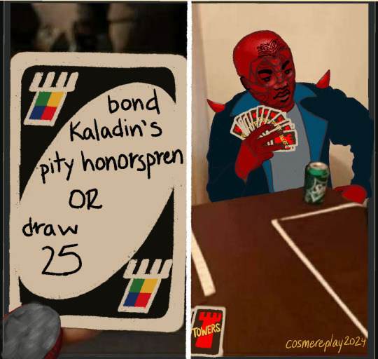
It's a meme. Please do not just say "It's the X meme" because chances are very high that the meme has never been described. DO describe the image as though the person doesn't know the meme!
Who's in it? If you want to go lighter on detail you can just say "Rlain". If you want to go heavier on detail (like I did in this alt text) you can describe his uniform, the fact that he's in Warform, the fact that this warform has two shoulder spikes, carapace on the back of the hands, and skull carapace. The level of detail here is up to you. Considering this is a meme and generally people take it in pretty quickly, you might go light on the detail to focus on the humour. I didn't in this one, but you could, haha! I tend to err on the side of overly detailed with my IDs.
What's the facial expression? I simply tell the reader that Rlain looks disappointed because that's helpful info for those who can't read expressions.
Who's the artist? This is generally pretty easy, as chances are you'll be describing your own art. Put your name on the art, and put your name in the description!
Here's another example:
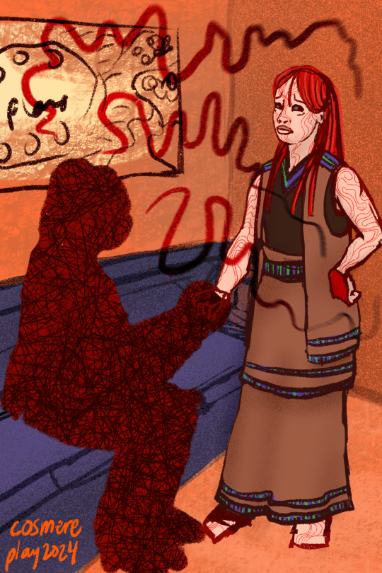
This one's a little more abstract, a little more artsy, so in my alt text I spend a little more time with the detail. You might notice I describe the vibes of Jaxlim's style of speech rather than what they look like literally. So I say "the lines lose their rhythm and falter" rather than something like "flowing jagged lines that start around Jaxlim's head and wander in front of Venli and over her head". For me, I feel the first version makes it easier to get across the meaning of the piece, which is more what the conversation will be about. I didn't mention Venli's form or the colours of the room or the vague map on the wall because they don't give relevant information about the meaning of the piece.
All that being said, those are mostly style tips. At its most basic and most meaningful, alt text is simply saying what's in the image. If you're describing what you see, you're doing it right!
If you are interested in improving your skill at image descriptions/alt text and you'd like feedback or help, you can always send an ask to @cosmere-described or even join the Cosmere Described discord! It's open to anyone who's interested in improving the amount of alt text in Cosmere fanart!
20 notes
·
View notes
Note
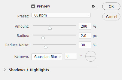
sorry to bother but I was wondering how you make your gifs so smooth and get rid of pixelation?
Hi, anon! Sorry for the late reply! And no worries, you're not being a bother at all. ^^
Regarding your question, these are some of the tips I can give which I typically do on my GIFs:
Use video sources with higher resolution
In all honesty, I am not doing that much to make my edits look smooth and HD. I just always make sure to download videos that are not less than 720p. I typically download 1080p but 720p would suffice since the suggested width for images here on Tumblr is 540p.
Use good editing apps
I use Photoshop which is a good app but if you're not using this, you may use Photopea (this is like an online version of PS). There was a time when I didn't have a PC and I tried making GIFs on my mobile phone but even when I'm using high-resolution videos, the output was not as good when making it on PS. I also used Photoscape before. This was my first app when I was still starting making GIFs and oh boy, the quality is just... XD Anyway, PS is good with the compression of images when you're saving the frames as GIFs even when resizing the file to a smaller scale.
Maintain the original size until the export
I've seen tutorials where they are already adjusting the size at the beginning of their edit. I personally don't do this because this contributes to the reduction of the quality of your GIFs. And if I want to crop (because I want a different width and height compared to the original), I will see to it that the height is the same with the original (only the width will change).
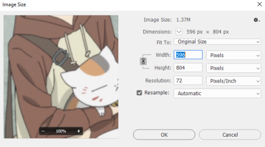
Take a look at this example:
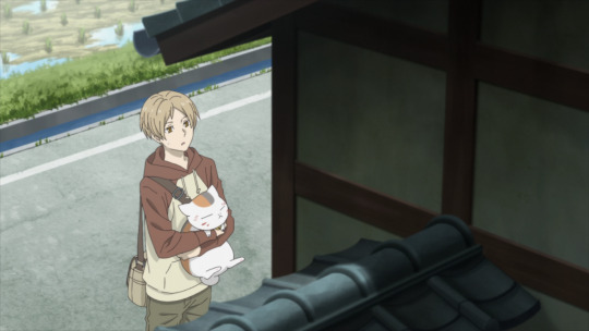
This is a 1920p x 1080p image but I wanted to crop it to a 400 x 540 aspect ratio. What I would do is after cropping the image, I would resize the image to make the height 1080p again.
After cropping, this is now the dimensions of the image:
Then I will revert the height back to 1080p (the value of the width doesn't matter):
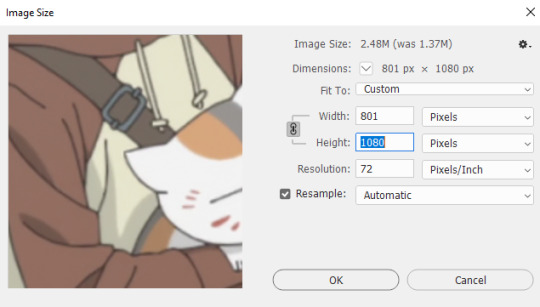
Of course, 1080p is just my preferred resolution. You can select a lower resolution but not lower than the original image or the final size of your GIF.

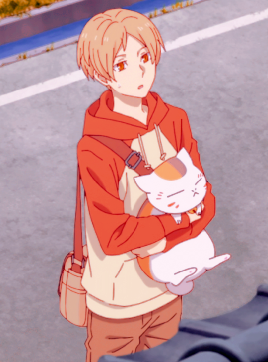
As you can see, even without further editing, the image already looks good and does not appear to be pixilated. Then after cropping, I will apply my coloring. If I save this as it is using 540p width, this is how the GIF's gonna look like.

As you can see, there is almost no difference between the 540p (width) gif and the 1080p (height) image. That's because I only resized the image during export and not in the middle of editing.
Use sharpening tools to make your GIFs look HD
The key to fooling the eyes is to make them look in a different direction. XD So what do I mean by this? Like I said, I'm not doing that much to remove pixelations from my edits. I just make it so people will focus on other stuff. If you don't want them to focus on the pixels, let them focus on the line art.
Just a reminder that this last tip is only applicable to anime GIFs.
In my case, I always start with frame animations, then later on convert to a video timeline. And then I will convert the frames to a single smart object so I can apply filters to all the frames at the same time.
These are the steps I do when I sharpen my GIFs.
Apply SMART SHARPEN. (Filter > Sharpen > Smart Sharpen)
These are my preferred settings but you can also explore your own.
[Comparison of GIF without sharpening filter and with sharpening filter]
2. Apply POSTER EDGES filter. (Filter > Filter Gallery > Artistic > Poster Edges)
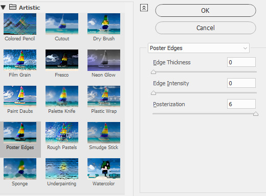
These are my settings. You can adjust the Edge Thickness if you want to have thicker art lines. As for Edge Intensity, it's better to set it to zero to avoid adding unnecessary details to the shadows of your image.
[Comparison of GIF without sharpening filter and with sharpening filter]
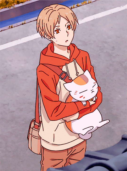
3. Apply POSTER EDGES again.
This is an optional step. I typically use this whenever I want the art lines to be thicker. I use the same settings in the second step.

[Comparison of GIF without sharpening filter and with sharpening filter]
And that's about it! I hope this helps! By the way, this is just my own way of sharpening my GIFs. If you're not using PS or Photopea, you might want to check other tutorials that are specific to the app that you are using.
35 notes
·
View notes
Text
How to make a good character reference

First and foremost, a good character reference is one that clearly and concisely tells you about an OC. Not only are they helpful to keep your art or descriptions of them consistent but if someone else will be drawing or writing about them, then a reference is typically a necessity so they can draw the character accurately. I’ll be going into how to make both a good visual and written reference, as well as tips that apply to both of them.
Special thanks to Lotus and Calico for giving some additional perspectives for me to think about, as well as anon for suggesting this topic!
Good Visual References
A reference sheet is a way for artists to easily see a character’s design for drawing them. At its simplest, this can be a simple, full-body illustration with little embellishment but some people will do full turnarounds (front, side and back views) or additional outfits for a character with props and other illustrations for a more artistic reference sheet. Regardless of your approach, your reference should clearly show a character’s basic features and, typically, the clothes they most often wear (whether that is a single outfit or multiple).
Adding notes to the sheet can be very helpful, such as a character’s height, specific facial features or a description of the kind of clothes they wear (like colours, aesthetics, fashion style and clothing preferences). If a character is often seen with a prop or item (such as weapons or mobility aids), then it’s important to also include those in your reference and make a note on the frequency of their use. Finally, if your design has pieces of clothing or props that have specific terminology, it can be helpful to include that terminology so it’s easier for others to search for more references.
Flat Colours vs Shaded/Rendered: I’ve seen some people complain about references that are shaded or rendered as it can often make it hard to colour pick from the reference. This can easily be remedied with a colour palette that is clearly labelled for what colour is used for what part. Using two of my own references as an example, you can see that my reference sheet for Eren doesn’t have any shading, making colour-picking easy. Comparing that to my reference sheet for Vex, the art for him is shaded but this is remedied with a clear colour palette on the left with labels saying what that colour is primarily used for. As a final comparison to a reference sheet that I feel fails in this regard, my sheet for Eris (nudity warning) has several outfits that are fully shaded but do not have a full colour palette outside of their basic features. However, since this character would be drawn in many other different outfits and the sheet was for personal use only, this doesn’t bother me too much.
Complicated designs: For designs with complex elements such as lots of accessories or intricate tattoos, it can be helpful to draw a larger version of these on the reference. This makes it a lot easier to draw them consistently in future as they’ll be clear and you won’t need to spend time zooming in or around your design. Additionally, if you character has a tattoo or very specific fur markings then it can also be helpful to create a transparent version of them. This way, anyone drawing your character can use that transparent version rather than drawing it by hand or, for those that do want to draw it by hand, they again have a very clear design to reference. Also, it can be helpful to have a simplified design for people with art styles that work better with less detail or for animating purposes.
Mannerisms: This is more so for references that will be sent to other artists for commissions, requests, gifts, etc. It can be helpful to have a small section on what a character’s mannerisms or way of holding themselves is like. This gives artists a jumping off point for ideas on poses or character interactions as a blank slate can be hard to come up with ideas for. It’ll also mean that if, for example, you have a shy character then they won’t be mischaracterised in art by being drawn with an overconfident posture. It’s best to use simpler words (such as annoying vs vexatious) as it can become confusing for people for who English is not their first language.
Good Written References
A good written reference can be split into two types.
The first is for describing their appearance, typically used for sending to artists when you don’t have an existing visual reference. For this, it can be helpful to go over the points of what I wrote for a visual reference and just translate that to a written description. Bullet points are the easiest way to do this as it gives artists something quick and easy to reference but it can also be helpful to link to images to give a better idea of what you want.
Pale skin with light freckles.
Lavender hair that gets slightly lighter at the tips and slightly darker at the roots. It is mostly-straight, shoulder-length and covers some of the face. Two small horns poke out of the top of his head.
Grey-blue eyes. Should look sleepy or lidded.
Thin-framed glasses with a simple, silver glasses chain (optional)
Black cassock with a black pellegrina and white collarino/tab collar.
For formal occasions, Vex may wear a purple ferraiolo with black, embroidered trim.
Purple stole with a symmetrical design.
At the bottom of the stole is the Leviathan cross.
Around the chest, there are the five alchemical symbols for fire, air, spirit, earth and water (in order from top to bottom).
Has a rosary with dark, wooden beads and small ivory beads in an alternating pattern that ends with an inverted cross (also known as the St. Peter’s cross).
Wears platform boots with metal toe caps.
Without the boots, Vex comes to 5’3”. The boots make him a lot taller, around 5’6”.
Sometimes wears half-palm gloves made of black leather.
This is the basic written reference that I had for Vex before I drew him a reference sheet. It makes it clear what they look like and any artist working with the description would be able to draw him semi-accurately from this alone. It can be hard to balance the necessary amount of detail with keeping things concise - large paragraphs can be overwhelming and even off-putting to others.
The second type of written reference is a reference specifically used when writing. While a lot of the same principles apply, you’ll often want to go into more detail regarding the character’s mannerisms, way of speech and dynamic with other characters. There are numerous great guides on how to write a good character reference or profile, all using different approaches. Personally, I like to use these five categories for writing a character’s reference.
Basic Details: This includes a basic description of a character, as well as their name and any other surface-level details about them such as age, date of birth, gender and sexuality, basic personality traits, etc. If the setting is fantasy or sci-fi, then I would also include anything that would fall under this category in-universe, such as species or magical alignment. This section is not for digging deep but more to give an overview on the character.
Personality: It can be really easy to boil down a character’s personality to a few simple traits like in the first section. However, characters will often act differently in different scenarios and have specific reasons as to why they act a certain way. How do they act when they’re alone vs when they’re around others, both those they trust and those they do not? Do they mask certain parts of their personality? What fears does the character have and how does that impact how they go through life? These are all things that can heavily influence how a character behaves and talks.
Mannerisms: Here, you’ll want to describe your character’s body language and demeanour such as how they walk and carry themselves, as well as first impressions from strangers. You can also go into any habits a character has, including whether they are aware of those habits and perhaps try to hide or overcome them.
History: A character’s past will usually define a lot of how they conduct themselves in the present. Here, you’ll want to include information on their upbringing, influential moments (or “canon-events”) in their life and their caregivers, if applicable. This can add context to certain behaviours or actions from the character.
Relationships: Finally, go into important relationships for the character. When I say important, I mean write about relationships to characters that are either contextually relevant (such as to the current scene or overall plot/story) or characters that have had a large impact on them. For example, the barista that you character always gets coffee from probably isn’t going to be relevant… unless you’re writing a coffee-shop romance where the barista is likely to be a recurring character. A character’s family that doesn’t appear in the story may not be relevant now… but the way that they influenced the character’s upbringing is relevant when it comes to establishing their backstory and foundational relationships.
General Tips
Non-human/original species: If your character is not human or is an original species, make sure to include any key features that are unique to that species and link to any relevant design documents for them. It’s a lot easier for someone to use your reference than it is to go searching for that information themselves.
What actually makes your reference good? This is hard to answer because what I think is good is probably contradicted by countless other people. Also, some advice for one kind of reference won’t necessarily be helpful for a different kind of reference. A good foundation for a reference will always be what you find helpful.
Keep it concise: Oftentimes, there’s so much information that we hold about an OC in our heads and it can be tempted to include absolutely everything into their reference. But remember that the key purpose of a reference is to make it easy to understand the main points about a character or design. Regardless of if you go further in-depth, always make sure to have a clear overview of them at the very beginning that can be easily referenced.
#oc#oc posting#character development#character reference#sorry this is a little later than planned! the insomnia-hypersomnia-hormonal-seasonal affective disorder was going WILD
41 notes
·
View notes
Text
also i yap a lot about my patches n shit but like. if any of u have any questions and want to make your own BE MY GUEST i would love to answer
i was blessed with having very cool irl friends who taught me everything i know but i would love to help that knowledge go further
so here’s some basic stuff about what i use/do/tips and tricks. I'm gonna be linking sites to give you a point of reference for the materials i'm talking about, but buy local if you can!! these materials are common in art stores n stuff
MAKING PATCHES
You can make fabric paint with equal parts cheap acrylic paint and fabric softener!! More fabric softener is better than not enough (otherwise it dries too solid and tends to chip away from the fabric with time, which means you have to retouch it more often. annoying stuff.) get a couple of good layers *in* the fabric and works from there, work it into the fabric so it doesn't just dry on top of the fabric.
As for stamped patches, if you've never made stamps before, i recommend this material. It's a lot softer and will get you used to the whole process. Once you're used to it, you can move to the grey stuff which is a whole lot cheaper. You're gonna need carving tools, some of my friends use old wood carving tools, i use this one, interchangeable blades, and the blades can be stored in the handle. As for ink, i use this stuff (black and white). To roll the ink onto the stamp, i use an old picture frame for its glass panel and roll out my ink on there with a brayer, then roll it onto the stamp. I know some friends who use a lint roller and old comic book pages tho and it works well! (you can use the page until it starts to absorb too much moisture and gets fragile)
For fabric, i use old jeans people give to me or thrifted material. For black fabric i usually thrift old uniform pants for a couple bucks and disembowel them into big leg panels. if you're going to do this MAKE SURE IT IS 100% COTTON OR POLYESTER. none of that elastane/spandex/anything that stretches shit. it will not only make stitching HELL but it will also stretch and crack the design you put on it. not good. no fun.
WHAT DO I MAKE?
i really love this post by whyenn-reader, i recommend reading it!!!
Overall, my number 1 piece of advice for making patches look good is take your time. work on your design, sketch it out, make it in a cool font, develop your idea. you'll end up with a cohesive pair of patch pants/patch jacket with patches you are individually proud of. there's no rush.
ATTACHING TO CLOTHES
I usually sew my patches on with dental floss, SUPER durable, will not break, and survives better than you'd think through the wash. I wash my clothes on low heat and dry on low though, but w those settings my patches have come out completely unscathed. You could also use fishing line but like. dental floss is cheaper lol. waxed, flavored, doesn't matter (though i scrape off a bit of wax by passing it through my nails just so there's a bit less wax)
I use these needles, but one of my friends with mobility issues uses curved needles like this!! tbh on bad joint days i also use these but i still prefer straight needles because i’m so used to them and it’s not exactly the same movement!
As for patch pants or crust pants: USE LOOSE PANTS AND MAKE SURE THEY ARE STRAIGHT LEGGED you will thank yourself later! stitching patches onto stuff will make it contract a bit so make sure you have room for that. And it's easier to fit patches onto straight legged pants since they dont have a weird pattern (especially if you want to do a big patch, you'll have to take those weird shapes into account and it wont fit like you think it will!)
also: DON'T USE PANTS THAT STRETCH! pants that stretch with your body movements + patches and stitches that don't stretch = broken stitches, possibly ripped pants and just overall a Bad Time
Overall it's a good idea to put political patches on the front of your clothing. if someone who disagrees sees your patch and reacts to it, you will see their reaction and will know how to behave with this person. PARTICULARLY IMPORTANT FOR ANY PRIDE PATCHES!!!
also kind of related, yes patched clothing is cool but it is also a unique piece of clothing!! don't wear them to protests!! (fight the urge, i know it's hard!!!!)
I am also a big big fan of making extra pockets on your clothes! I have a bunch of internal pockets in my jacket, and special lighter + sticker pockets on my pants!
MENDING
Patch pants and jackets are cool and all but my favorite way of modifying clothes is mending them!! use contrasting colors, have fun :D
here's a darning guide
ALSO. rit dye is your best friend. i stock up on black dye and do a batch every once in a while. also when thrifting i keep this in kind because i can basically dye any non-synthetic materials to pitch black. cool shirt or cool pants but not my color? get dyed idiot. for those worried about staining their washing machine, that method is usually just for very large items. i always dye my stuff in my (metal) sink with hot water (according to the instructions on the bottle) but u can also do that in a bucket. then you just do a wash cycle w some old towels that you don't mind staining a bit. EZ ---
ok that's all i can think of, i'll edit if i think of something else
#resources#solarpunk#patch jacket#punk fashion#punk#mending#crust pants#crust punk#punk patches#lino patches#patches#battle jacket#diy or die#diy punk#diy fashion#guide#sewing#punx
48 notes
·
View notes
Text


Hello! Welcome to the official Double Dead Studio Tumblr, the solodev behind Reanimated Heart, Another Rose in His Garden, and Pygmalion's Folly.
Reanimated Heart is a character-driven horror romance visual novel about finding love in a mysterious small town. There are three monstrous love interests with their own unique personalities and storylines.
Another Rose in His Garden is an 18+ erotic Omegaverse BL visual novel. Abel Valencia is an Omega who's hidden his secondary sex his entire life. Life's alright, until he meets the wealthy tycoon, Mars Rosales, and the two get embroiled in a sexual affair that changes his life forever.
Pygmalion's Folly is a survival murdersim where you play as Roxham Police Department's star detective, hellbent on finding your sister's killer... until he finds you.
Content Warning: All my games are 18+! They contains dark subject matter such as violence and sexual content. Player discretion is advised.
This blog is ran by Jack, the creator.
Itch | Link Tree | Patreon | Twitter
Guidelines
My policy for fanwork is that anything goes in fiction, but respect my authority and copyright outside it. This means normal fan activity like taking screencaps, posting playthroughs, and making fanart/fanfiction is completely allowed, but selling this game or its assets isn't allowed (selling fanwork of it is fine, though). You are also not allowed to feed any of my assets to AI bots, period, even if it's free.
Do not use my stuff for illegal or hateful content.
Also, I expect everyone to respect the Content Warnings on the page. I'm old and do not tolerate fandom wank.
F.A.Q.
Who are the main Love Interests in Reanimated Heart?
Read their character profiles here!!
Who's the team?
Jack (creator, writer, artist), mostly. I closely work with Exodus (main programmer) and Claira (music composer). My husband edits the drafts.
For Reanimated Heart, my friend Bonny makes art assets. I've also gotten help from outsiders like Sleepy (prologue music + vfx) and my friend Gumjamin (main menu heart animation).
For Reanimated Heart's VOs, Alex Ross voices Crux, Devin McLaughlin voices Vincenzo, Christian Cruz voices Black, Maganda Marie voices Grete, and Zoe D. Lee voices Missy.
Basically, it's mostly just me & outsourcing stuff to my friends and professionals.
How can I support Double Dead Studio productions?
You can pay for the game, or join our monthly Patreon! If you don't have any money, just giving it a nice rating and recommending it to a friend is already good enough. :)
Where do the funds go to?
Almost 100% gets poured back into the game. More voice acting, more music, more trailers, more art, etc. I also like to give my programmer a monthly tip for helping me.
This game is really my insane passion project, and I want to make it better with community support.
I live in the Philippines and the purchasing power of php is not high, especially since many of the people I outsource to prefer USD. (One time I spent P10k of my own money in one month just to get things.) I'll probably still do that, even if no money comes in, until I'm in danger of getting kicked out the street… but maybe even then? (jk)
What platforms will Reanimated Heart be released in?
Itch and then Steam when it's fully finished. Still looking into other options, as I hear both are getting bad.
Will Reanimated Heart be free?
Chapter 1 will be free. The rest will be updated on Patreon exclusively until full release.
Are you doing a mobile version?
Yeah. Just Android for now, but it's in the works.
Where can I listen to Reanimated Heart's OST?
It is currently up on YouTube, Spotify, and Bandcamp!
Why didn't you answer my ask?
A number of things! Two big ones that keep coming up are Spoilers (as in, you asked something that will be put in an update) or it's already been asked. If you're really dying to know, check the character tags or the meta commentary. You might find what you're looking for there. :)
Will there be a sequel to Pygmalion's Folly?
It's not my first concern right now, but I am planning on it.
Tag List for Navigation
Just click the tags to get to where you wanna go!
#reanimated heart#updates#asks#official art#crux hertz#black lumaban#vincenzo maria fontana#grete braun#townies#fanwork#additional content#aesthetic#spoilers#lore#meta commentary#memes#horror visual novel#romance visual novel#yandere OC#prompts#another rose in his garden#abel valencia#mars rosales#florentin blanchett#pygmalion's folly
142 notes
·
View notes
Text
SDV Aesthetic Mod Recommendations (1.6 Edition!)
I’m back with more mod recommendations that work with 1.6! This time, we’re gonna focus on stuff that mainly just changes how things look: recolors, portraits, animal skins, etc. No major gameplay changes, but the visual changes can really enhance the experience or make the game feel totally different! Again, links will be in a reblog. And you can check my ‘sdv mods’ tag for my other recommendation post!
So starting off, recolors. I have three that I really love: Vibrant Pastoral Recolor, DaisyNiko’s Earthy Recolor, and Starblue Valley.
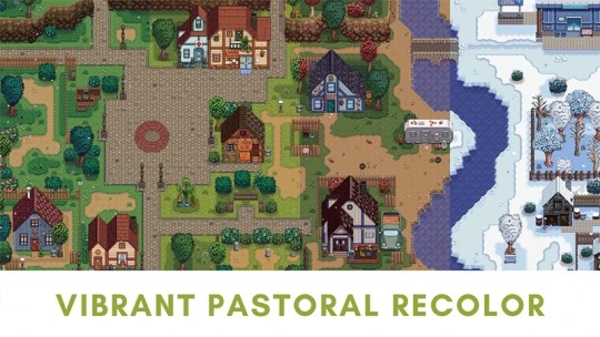
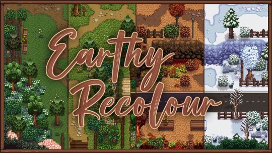
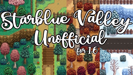
They all tone down the saturation and give everything a softer, more natural look. Vibrant Pastoral is probably my favorite because it makes the scythe-able grass look like it’s full of wildflowers! Also of note, Starblue Valley’s 1.6 update is a work in progress, so some parts might not be properly recolored. It’s such a pretty recolor, but you might want to just track the mod for now while they’re hammering out the kinks.
Next up, portraits! First, I wanna talk about Seasonal Outfits.
I love that vanilla has beach and winter outfits now, and this mod takes that ten times further! Not only are there outfits for every season (with matching sprites), there are also unique outfits for festivals! I love all the Halloween costumes for Spirits Eve! There are seasonal mods for Stardew Valley Expanded and Ridgeside Village too!
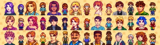
Next, Nyapu’s Portraits.
I love the cute, old school Harvest Moon vibe these have, but one of the really great things is that Nyapu has made portraits for almost every modded character in existence. I’m fussy about getting my portraits to match, because it’s just weird when you’ve got totally different art styles for different characters, and that is a non-issue with this collection! If there’s a character mod, there is probably a Nyapu portrait. SVE and RSV are just the tip of the iceberg! Also Nyapu is a real life farmer when they aren’t making adorable portraits, which I think is just cool!
I made a post earlier about Elle’s Cuter Coop Animals/Barn Animals/Cats/Dogs/Horses, but it’s worth mentioning again because they’re just too cute and the huge variety of different colors and species is unmatched.
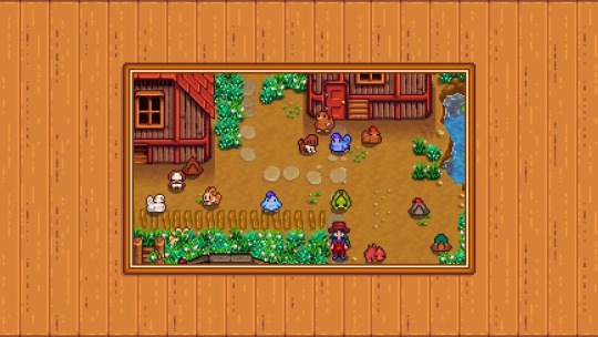
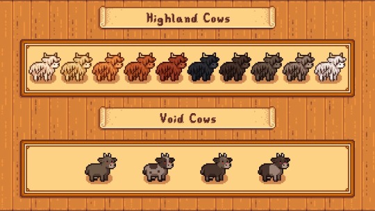
And I mean. Highland cows. Just look at them. Elle also has mods for seasonal farm buildings and farmhouse kitchens with lots of different options! You really can’t go wrong with any of Elle’s mods.
And speaking of farm buildings, one of my absolute favorites is Gwen’s Medieval Buildings, and matching mod, Gwen’s Medieval Craftables.
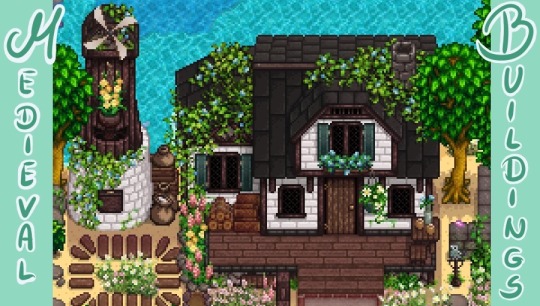
The antique, overgrown vibes are just gorgeous.
If I do UI recolors, I usually just pick one that matches my recolor (Vibrant Pastoral, Earthy Recolor, etc) but I recently discovered Lavender Dreams UI Recolor and I adore it.
The colors are just so nice and soft, and the accents of moss and leaves in the menu is just delightful.
I’m on mobile and running out of pictures, so I’ll just talk about the next three that change your character. First is Female Farmer Overhaul. Despite the name, everything is available to any gender, although the style is definitely more feminine. It adds a lot of new hairstyles, clothes, hats, and has the option of short or long sleeves so you’re dressed appropriately for the season!
Next is Animated Hair. It makes your hair move as you run, use tools and so on. There are lots of hairstyles and it just looks so nice!
And one last one, Expressive Elf Ears. Like Animated Hair, they move around with your character! They are so floppy! If you want a little fantasy flavor to your character, they’re a must.
And that’s all for now! I might do content adding mods next time!
62 notes
·
View notes
Note
Hiii!!! So, I watched your Dead Man animatic and was IN LOVE with the art. Do you have any tips on how to draw like you? (sorry if it seems like I'm trying to copy you, I just really love it and want to improve my art >< )
i cant really give a 1:1 guide but i can try. most of this is only gonna be applicable to digital art, but in the case of that animatic (and a lot of my other art) i dont do lineart and i think that's a big part of the style. i just do a sketch and then refine the details usually & thats what i did for that whole video. i assume thats part of the appeal anyway. using black for shadows (IN MODERATION) is another one. i dont use a soft brush very often nowadays, but if you like the animatic art specifically then just using a soft round brush without much pressure sensitivity will get you a similar look. not NO pressure sensitivity, but just a lil
the program i use is autodesk sketchbook, specifically on pc, but the mobile version has all the same stuff pretty much. i also remember using HUGE canvas sizes for that whole video, which you wouldnt really think makes a big difference but it increases the quality of the image since its literally a higher resolution and makes all the smaller details a lot sharper
i use lots of reference and i tend to trace the shapes of poses so i can get them down easier (with stock photos or free to use pose reference like adorkastock's stuff, not other people's art)
idk if the blood is of any particular appeal to you but i remember a lot of people saying they liked how i did it, and its a lot of just putting down big chunks of red and then erasing at random (usually in one big stroke) until i get something i like and then repeating that until i get a bunch of splatters
its been a while since i made that vid so i cant remember my process super clearly but i hope some of that is helpful at least. my styles changed a bit since then
11 notes
·
View notes
Text
Tips for Spn Artists posting on Tumblr 😄👍🏻
I see a lot of new artists posting Spn art and it can be a struggle to get your art out there. Or you might be new to Tumblr and not sure how best to put yourself forward.
I post Spn art and do a lot of bangs when my health permits. And I have picked up some tips that I have found helpful for posting art tumblr 😄 so I thought I would share.
Please feel free to take any of these points or leave them as suits you!
✨Personalise your header and icon. Bots will often make posts with popular tags and stolen art, to try and gain followers before throwing out the spam links, but some clues the account is a bot is not having personalised headers and icons, not having a long history of posts (more than a few days), and not talking about their art or fandom. So make sure you don’t look like a bot ��
✨Interact with accounts you enjoy. Like, comment and reblog your favourite accounts and they will likely return the favour and you will get more followers. The first way your post gets noticed is by your followers. Interacting isn’t always easy if one is an introvert or doesn’t have much time for social media, but do what you can where you can.
✨If don’t have many followers then the next best thing is to use tags more. People follow key tags to find new posts from blogs they are not aware of. I recommend using the ‘Spn fanart’ tag on all your art posts. Also be sure to include: common ship names, the character names, and key words like: cute, funny, angst, angel, wings, etc 👍🏻 😄 this will help people find your posts, so be sure to tag consistently!
✨Make a personal art tag, it could be ‘your name art’ or something as wacky as you like. But tag all your art with it! If someone sees your art post out in the Spn fanart tags and they like it, they can click your art tag to see the rest of your art posts.
✨Don’t include links to outside webpages unless absolutely necessary. If you are posting for a bang, reblog the bang master post for the story which has the links to ao3, but then make your own art post and only link to the tumblr master post. Tumblr often hides posts with links to outside webpages (so that the porn bots sending you to spam websites get minimised, but unfortunately this also minimises links to ao3 or shops 😔). Links to another post inside of tumblr are ok tho! So to keep your art post from being hidden from searches, only link back to the master tumblr post with the story info. If people want to read the story they can follow the ao3 link from there. But it’s better that they actually get to see your art (the ‘advert’ for the story) in the first place so that they know it exists!
Also keep this info in mind if you are linking to your shop or your other socials. Your direct followers will see your shop posts but because of the external links the post might be hidden from searches. Consider doing a mix of posts with direct shop links and ones that get the info out there but link back to a pinned tumblr post or bio post with the outside link.
✨Don’t crowd your art. Many people view tumblr on mobile so your pictures will look small. People can’t really see the details if you put 2 images side by side. Put one image on each line and consider making some cropped images to show close up details of your favourite bits. You need to catch people as they are quickly scrolling past, so be sure that you make it easy for them to see what you are offering.
✨And finally don’t be afraid to do reblogs. It isn’t rude to reblog your own work, it’s helpful. Dashboards can get very busy and even if people follow you, your post might be burried a long way down if they don’t get back online multiple times a day. Reblogs will give them a chance to see what they missed. As long as you are not posting on the hour every hour, most people appreciate 2 or 3 reblogs at different times to save them having to scrolled back for days! 😄 and don’t forget that tumblr is multinational. Time zone reblogs can be helpful.
✨oh I forgot one more thing! Don’t put yourself down! No piece of art is perfect! Ever! But Michelangelo doesn’t start off by apologising that the statue of David is out of proportion. And neither should you! Let your work shine where it shines and don’t bury it in put-downs before you even give others the chance to enjoy its triumphs! You deserve better and so do they!
Those are the main points my friends. If you have any other helpful tips that you want to share, feel free to reblog this and add on points. We were all new to this hellsite (affectionate) at some point. And life is already hard for us struggling artists so whatever we can do to help each other is a good thing 💛
Stay awesome my friends, and happy Arting 🙌🏼😄
#supernatural#spn fanart#artists on tumblr#tips#art#tumblr#helpful#posting tips#bangs and challenges
40 notes
·
View notes
Note
Heyy, I’ve been reading your wonderful one piece works for a while — and I couldn’t stop wondering how are you actually doing those magnificent headers?
Like… hello? The great quality, with additional 3D-alike details I could catch by my eyes? I got only Ibis Paint X on mobile, since I’m only a young man that literally two months ago went on a life-time ‘adventure’ of living alone in a small apartment.
In short — I got no money to pay for additional graphics/drawing programs, not yet at least
Hello!
Thank you! I'm glad you enjoy my writing - I'm curious to know what's your favorite piece / part? Also I'm so happy you like my headers? Makes it feel worth it to spend time on them! :D
I have excellent news for you, I used a mix of Canva and Photopea. They're both FREE!
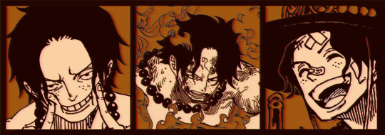
I'll be explaining the process for making these two kinda? The full tutorial is below the cut, to be courteous to the other folks, hope you don't mind?
Though I am hearing that Canva has given people some grief. But Photopea is just *chefs kiss*
If you've ever used photoshop, Photopea is essentially a free photoshop, and it even has the automation tools! An absolute lifesaver when you have multiple layers you want to export (but that's for larger projects not this)
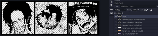
I'm going to assume you have basic knowledge of layers in digital drawing programs for this. If anything isn't clear: ask me, I'll clarify!
//-------------------------------------------------
My General Process is:
Search for official art / images
bring it into canva / photopea
crop / arrange images to match the dimensions
select a thematic color that is associated with the character
separate the foreground from the background
mess around and test things until they work
//--------------------------------------------------
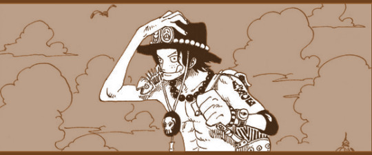
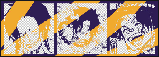
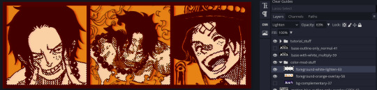
Given "Louder than Words" is the latest one I've made, I'll start with the process for it.
Dimensions: 3000 x 1055 px dpi: 96
//-------------------------------------------
Let's Get Crackin'
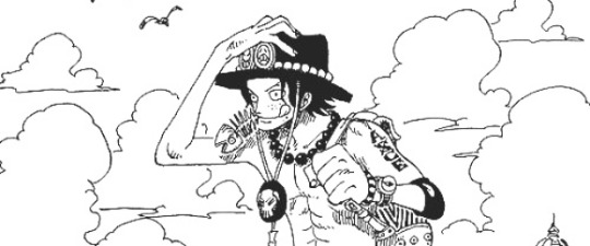
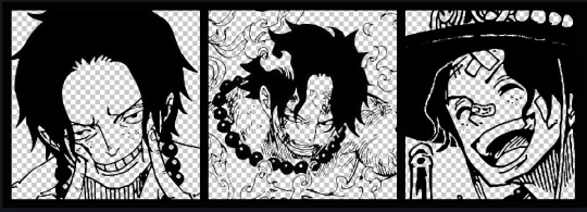
Alright let's grab some official art so we're not using any fanart without the artist's permission
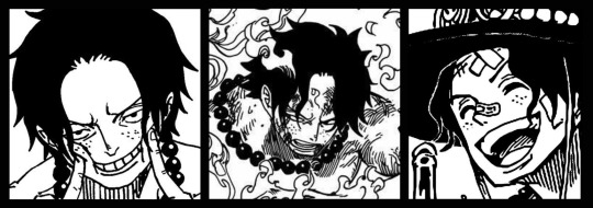
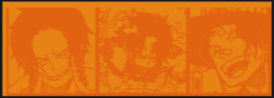
I try to pick images that feel relevant enough to what I'm trying to make. For example: the image for the Matching banner shows the ASCE tattoo which is super important in that fic
2. Let's arrange them onto a banner where each individual image has the same/similar dimensions to the rest
That's probably part of why you like these. To a certain extent they have similar dimensions, so they have a uniformity that's pleasing to the eye! (It's not perfect because I threw perfectionism to the wind because this is tumblr not my portfolio) Tip: if you have 3 images and only 2 that have similar dimensions, and the 3rd one can't be cropped logically: but the one that's a different aspect ratio in the middle!
3. lets arrange them in such a way that the borders all feel like they're the same/equal width/thickness
you might find that you have to shrink some images for this, that's fine.
ALTERNATIVELY: if you're going with one image crop it so it's just the relevant info and it matches the dimensions (3000 x 1055 px)
We have our base! Now let's add some color, and direct the viewer's eye together!
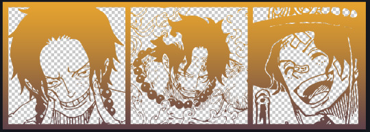
4. pick out a color that you think matches your character / vibe - that color is going to be your background Given I'm making an Ace banner: orange is the color I'm going with
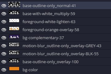
I went and named my layers for this lol. The numbers represent the opacity, and they aren't important. I just kept changing the opacity until I liked the way things looks. But here's the secret to the 3D feel:
Motionblur (+ moving it about)
Separating the foreground and background and dulling out the background.
I'm going to show you my process so you can see the effects, but first let's give you some quick skills:
//------------------------------------
SKILLS / THINGS I THINK ARE HELPFUL
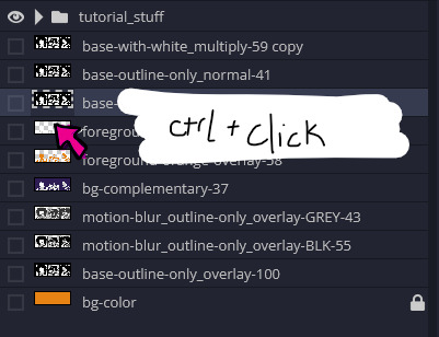
//------- Select Similar
magic wand -> select something -> right-click -> select similar This works best when you have high contrast images (like manga panels that are black and white). You can select the black or the white areas. Depending on what works better for you. TIP! Invert selections with ctrl + i Say you know that you want to select everything but Ace's face in the second panel. Select his face with the magic wand then ctrl + i, and that's the only thing NOT selected

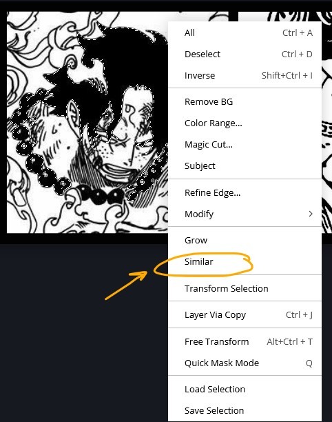

TIP!!!!!!!!!!!!!!! Please, please, please, duplicate your original image and work on the duplicate layer. This helps you SO much. !!!!!!!!!!!!!!!!! TIP! Check your selection tolerance! This could be why too little, or too much is being selected.

//------- The Move Tool
Shortcut key: v While the move tool is active, you can nudge the stuff on whatever layer with your arrow keys Shift + arrow key = 10 px move (generally)
//------- Layer Locking
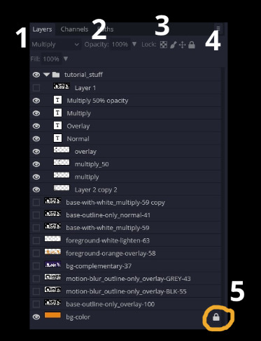
1- Layer Blending Mode (see Overlay vs Multiply vs Normal) for how this can affect results) 2- Opacity: how see through it is / isn't 3- Lock Transparency (it's the little checker board) 4- Lock Layer (looks like a lock) 5- Lock icon that appears when anything on the layer has been locked More on 3 Lock Transparency: You can only paint on / modify what's on that layer. You CANNOT add anything to any area that is already transparent Here's a demo of what you can do with this power:
Here's the original Image - notice how it's just the lineart with a transparent background.
It's powerful: abuse it
//------- Overlay vs Multiply vs Normal
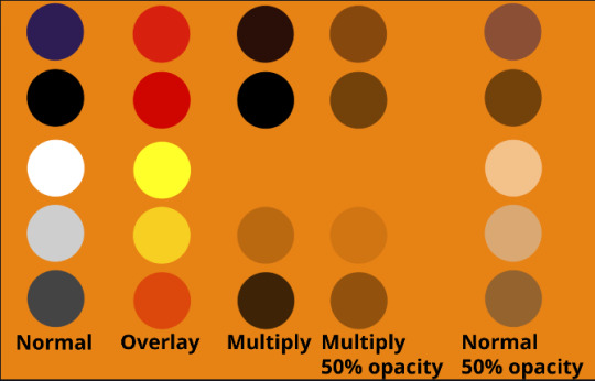
I think seeing this is the best way to visualize how different modes can affect the color.
//--------------------------------
Back to the Tutorial
!!I IMPORTANT NOTE !!
Please play around with the opacity slider to figure out what opacity works best for you on the multiple different layers we're about to make / work with. It's up to your own style to figure this out. Next: please feel free to not follow all of it. Add more layers, add less layers, take the base principles and go wild! :D
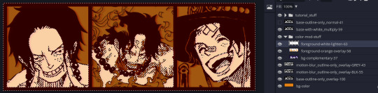
5. Separate the lineart from the background and save it as a new layer 6. Duplicate it and set it to overlay, or set it to overlay immediately
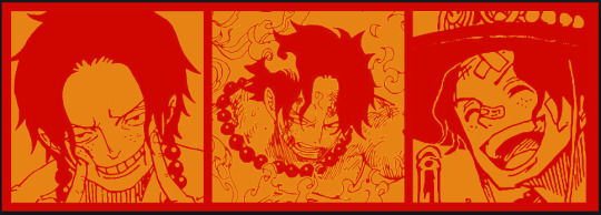
7. Duplicate that lineart layer twice and set the blending mode to overlay 8. lock transparency on the top one and change it to be a dark grey 9. Apply motion blur to both:
Main menu bar -> Filter -> Motion Blur I made it so that the grey layer was blurrier than the black layer
10. More them around a little to give it a "3D effect" as you called it.
It creates shadows under the lines - I was aiming for an effect similar to chromatic aberration (chromatic aberration is a valid way to add punch to your stuff too!)
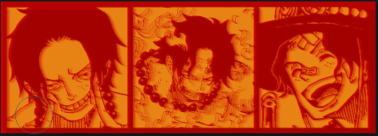
So this is what things look like now - painful, but let's keep going
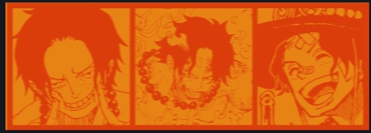
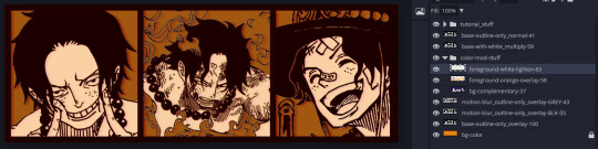
11. Duplicate the ORIGINAL / BASE lineart layer, that you DID not apply motion blur to -> set the blend mode to multiply (reduce opacity for it to actually take effect)
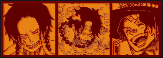
okay that's less painful here's what the layers look like right now:
let's bring more focus to Ace's face, and push the background farther away:
12. Use the magic wand tool to quickly select large areas of the faces / focal area / foreground and the lasso tool to refine things
TIP! Hold shift + click -> add to selection Hold Alt + click -> subtract from selection
13. On a new layer with blending mode -> lighten, fill that selection to be white
If you look at it, you'll notice that it is ALREADY starting to draw our attention to his face, but the background is kinda aggressive, so let's dim that down
TIP! Right-click on the gradient tool to find the paint-bucket tool

TIP! Sample All Layers: Turning this option off makes it so that you only work with the content on THAT specific layer. Turning it on makes it so that it is working while taking all other layers into consideration.
14. ctrl + click on the "white foreground" layer to select the contents of that specific layer (pink thing is your mouse)
15. ctrl + i to invert selection and ON A NEW LAYER (layer mode -> multiply) fill that with a complementary color
16. I did one last thing where I took the original base (before we separated the lineart) and added it to the very top and played with the opacity to get something less in your face (layer blend mode was set to NORMAL)
And that's it!
More considerations that I take:
I want the banner to be "thin" or not square, so it doesn't take up too much screen real estate on people's devices
I don't want readers having to scroll too much to get to my writing (which is the whole point of the post, let's not waste their time making them look for things)
I want the banner content to be relevant enough?
ie: with Matching: I wanted the ASCE tattoo to be visible. With matching I wanted Ace to not look too happy in some of them.
I'm also trying to avoid spoilers, I hated getting things spoiled, so I'm trying to be careful that the images I pick don't spoil anything really.
Congrats on starting life on your own! I did that whole living by myself thing too! Tip: keep the pantry stocked with lentils, beans, pastas, baking essentials, rice. They really come in a clutch when you're hungry.
#photopea resources#photopea psd#tutorial#tutorials#tumblr banner#photoshop#photoshop tutorial#digital art#fuck adobe#adobe photoshop
33 notes
·
View notes
Note
Hey I saw your post about hand tools to get into art for those with disabilities. My brother has been looking into getting into drawing again. He loved watching me draw growing up, and because he was just a little younger than me it never occurred to me/us to look into hand mobility aids til now. And I really want give him a chance to develop a passion for it.
He has multiple osteochondromas and it affects his fingers, they’re kind of… locked? In a curled fashion if that makes sense? He doesn’t have issues with grip, but it does strain his hands. He says he sometimes has trouble with his wrists, but it’s mostly just his fingers. He thinks the ‘egg’ cushion grip would work for him. But I was wondering if you would happen to know what other options would specifically be best for him? We’re both kind of clueless in this category.
Hey!!!
So I'm not sure what the best would be but I have tips for finding the best shape that can work!
So you could first try finding a bumper pack of pencil grips, try searching "kids pencil grips" "disability pencil tool" "writing aid grips" and other combos of those words and you can find packs they make for schools to give to kids, try often have a bunch of different shapes in there for around £10-20
Alternatively you could try getting some tissue and tape, and use them to shape a grip around the pencil, wrapping tissue around the pencil and taping it in place and keep going until you're at a desired thickness/length/shape, and then take that and have a look online for similar shapes for a more sturdy grip !
Or you could try self adhesive tape, or vet wrap, (about £1 for a roll and lots of colours) and use that to get a good fit and shape, plus the added bonus is that that way it's cheaper, squishier and you may like it enough to not bother with buying one that's the same shape!
I hope that helps!!! I wish ur brother luck 🫶
13 notes
·
View notes
Text
Actually no let’s dissect this new layout as someone who has used Twitter for a bit @staff listen up @wip @changes
I used Twitter for about a year because a lot of my mutuals at the time did, and you know what?
I hated the layout.
I didn’t like how I had to keep tabs on my friends because the algorithm would show me shitty stuff I wouldn’t want to see and was so hard to curate a feed
I’m fairly certain I ended up blocking a lot of people because they kept liking pictures of boobs and I didn’t want to see that shit and Twitter never let you turn that off
I ended up blocking people who kept getting recommended because their art made me sick and I didn’t want to see untagged nsfw on my feed
And the side bar sucked, it took me a while to figure out how to post in the first place
And don’t get me started about having a trending tab always right there and how it would set off my anxiety because every day it was just “here’s a new thing to make you want to jump off a cliff!”
Twitter and the way it works is designed to get hate clicks and engage on outrage, is that the method you want to follow?
Especially for a website who’s users are very loudly against that and also like privacy and will literally use outside resources to fix the ‘improvements’ you made because you didn’t think a toggle feature was worth it
Also putting the stuff on the left or right does not draw the eye, why? Because that’s where your hands are. Blocking the features you want to engage with. My eye is drawn up so putting your stuff there works best! It gets attention. Not to the right where my big ass hand is blocking the post button. (This is also why you should put the mobile post bubble back in the bar where it belongs but that’s a topic for another day)
I understand tumblr is in debt hell, but users have stated many times that if you just ask for donations like ao3 they’d be happy to donate
Hell, crab day was thrown around to be just like that.
Listen to your users or they will all leave for the websites you’re poorly emulating.
Tumblr is surviving because it offers an experience NO OTHER WEBSITE DOES
Taking that away just means tumblr is not unique, and users would rather try their luck with a website that’s doing this better.
Like Twitter, or tic tok, or Instagram.
Lean into your uniqueness and just ask for donations like an adult, just a little add that shows up in the add rotation that’s like “like what you see? Why not throw a dollar in the tip jar?” Like frame it like giving money to an artist so they can keep doing what you love, it’ll be charming!
Tumblr will not find success or even break even if you try and appeal to newcomers, every new social media is confusing to newbies, but you know what they do? They learn, and they adapt. And changing everything is going to make you loose legacy users who again, would LOVE TO DONATE MONEY TO KEEP THIS HELLSIGHT STANDING AS IS.
Or do you just not care about the users? The users who have the money you need.
I don’t want to watch tumblr die a slow and painful death like Twitter is.
And you know there’s something oddly poetic about tumblr, the quirky kid, tearing itself apart just to fit in with the popular kids which won’t work out and only lead to hollow friendships that can turn on a dime when you could have found meaningful relationships with the other weirdos who like your quirks and flaws and would have been ride or die for you.
But no we gotta be like Twitter so let’s chop off our arms and legs becsuse that’s what they’re doing
Tkdr listen to your users and open an donations sight so you can keep being tumblr and get money for it okay? Okay. Thanks for coming to my Ted talk
#tumblr ui#tumblr update#tumblr#tumblr staff#it me#long post#I’ve been here since middle school don’t make me leave please
49 notes
·
View notes
Note
Hiii Andy! I've adore your art for years and your characters. Their designs are so lovely!! And expressive!! I was wondering if you had any tips for a cohesive character design? Or even advice on adding little asymmetrical details or features? And help is greatly appreciated! Thanks! Wishing you all the best!
HELLOO!!! AAAH Thank you so much for such a thoughtful question, this makes me so happy to hear! I'm so sorry it took me so long to get back to you, it turns out I have way too many things to say about this topic AKLSDHFKLSDG
(pls take this readmore<3)
For the starting point in a design, I try to stick to whatever rules apply for the setting the character is in, and their role in that setting.
Basic colour theory is always at the back of my mind, as well. I tend to use analogous and complementary colours when I design my characters and their closets. Analogous colours keep a palette contained and feeling similar to itself without being monotone. And then using colours that are complementary to that elsewhere in the design adds contrast while still maintaining that feeling of cohesion :D
The intended use of the character also heavily affects what can make a design cohesive or not - it's very dependent on art style and medium. (A design for use in animation would be extremely different from semi-realistic TTRPG concept art. The rest of what I've written skews more towards the second option!)
I consider the colours, shapes and materials that make sense for what I want to convey about the world, and how the character would want to be presented in it. The Dogwood characters are my current exercise; Mel's clothes fit him perfectly since he works a labor intensive job on the farm, and his identity is wrapped up in it so he never strays far from heavy cotton, straight cut. Ryan and Park both wear ill-fitting clothes in completely different ways (Ryan, butchly. Park, autistic and transly) - and they each have work uniforms. Ryan's work uniform suits her gnc appearance (welding coveralls/safety gear), while Park's uniform completely transforms him into "Just Some Guy" and that changes how others read him, too (cashier). And they all shop at Local Thrift Store / Farmer's Surplus / The Walmart 1hr Outside of Town. Their styles give them each a distinct silhouette, and their levels of social comfort as well as public expression contribute to body language, colour choices, and shapes that make them stand apart from each other despite living in the same small bubble. COHESION!
Asymmetrical details and features are my FAAAAV THEY ARE SO FUN, I find inspiration for these in people-watching, nature documentaries, architecture, my reflection, my friends.. <333 This part is also fun to tie in to the character's setting! Springboard questions like. Are they prone to injuries? Magical injuries? Do they have like, modern dental procedures available? Do they give a shit about crooked or crowded teeth? Are they missing a tooth, or did they chip one? Do they smile a lot and have crow's feet/other wrinkles? Do they get a lot of sun, and do they have/use sunscreen? (Even finer wrinkles.) Did they have acne as a teen? Do they still? Are they in a combat-heavy setting, with the scars to show it? Even more uniform features like freckles aren't symmetrical.
Clothing is really good to use to play with asymmetry - maybe the character rolls their cuffs but one is coming undone a little. Jewelry of all types is also great for asymmetry since it can go anywhere on the body!! Facial and other physical deformities or injuries are also incredible to see, and should be researched to find out if they impact other parts of a person's overall health and mobility outright. The different skin texture of a birthmark, for example! I noticed in certain photographs, the subject's red birthmark changed the texture of the skin, so I started drawing Orson with one drooping eyelid on the side affected by his birthmark. The more you look, the more you find!
Before I get too carried away. I try to use asymmetrical details and features as a way to boost that "world setting" cohesion, and to bring attention to parts of the character I am personally endeared by or want other people to notice. Mahon's snaggletooth is an eternal fav, which made me draw him smiling more, which made me more prone to drawing lines around his eyes. And since the anchor is in his left hand, and he tries to hide it subconsciously, I put thumb-holes in his left sleeves, which he plucks through as a nervous fidget, and as a result, his clothes pull a little across his entire body :D ITS VERY FUN to find the right jumping-off point that lets specific details click into place. For Mahon especially, since so many of those details are derived from the setting and his role in it!
Asymmetry and symmetry are just tools at ur disposal. Asymmetry tends to be more comfortable and natural. Symmetry gives a sense of stability and can be pushed for a sense of power, a sense of being uncanny, rigid, etc. Asymmetry can also be pushed into uncaniness depending on what it's applied to!! (But as a matter of personal taste, I find asymmetrical details to feel more natural and inviting than perfectly symmetrical ones. Which. Again. Depending on the character's purpose, could equally contribute to a cohesive design!!!)
OMG ok my final thought. Asymmetry can also be used as a balancing tool which yet again lends to a sense of cohesion. Adding a detail on the left while leaving it out on the right, repeated throughout with different details where applicable. Loam's colour spots, archery gear, scars and jewelry are all areas I've played with this idea.
#asks#i hope this helps even a little!#if u want to zero in on specifics pls dont be shy to ask#I HOPE YOU'RE DOING WELL!!!! wishing you the best TOO!
37 notes
·
View notes