#I want to draw some proper character designs for them and others sometime. I also have a couple of short comic ideas
Explore tagged Tumblr posts
Text
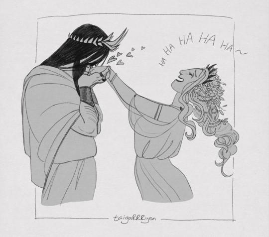
Little treat for myself <3
#hades × persephone#hades#persephone#greek gods#greek mythology#am I basic? yes#am I ashamed of it? no#I want to draw some proper character designs for them and others sometime. I also have a couple of short comic ideas#what I don't have currently is TIMEEE#but that's okay#taigartyen#sketch
85 notes
·
View notes
Text
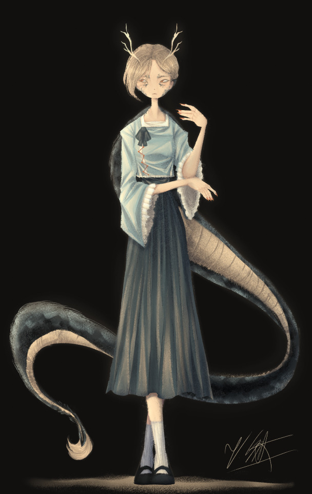
[Click for better quality]
Ok so as a sort of followup to that Yachie drawing, I did one of Yachie as well. I already had a pretty solid idea in mind (though tbh drawing her wasn't as fun as drawing Saki) but I'm overall pretty happy with this drawing.
Artist's Notes;
So I knew that I would never forgive myself if I completely missed the oppurtunity to give Yachie face scales, which is something that I haven't really seen many people do yet. I do feel like I could've pushed it a lot more, but I'm liking the direction my take on her is going.
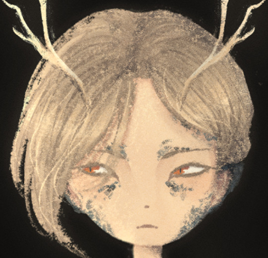
I also wanted to take this opportunity to talk about some of my headcannons for how Hell's fashion works since I've had this on my mind for a while. So ever since I refined my own design for Zanmu, I really liked the idea of having there be some connection between her and Satori in their clothes because they're both the defacto "leaders" of their respective Hells, and then I had the idea of having Hell's fashion trends mimic real life history where it mimics whatever the upperclassman are wearing in someway? I've always been really fascinated with the idea of how Modern Hell works as a society and also how Old Hell was impacted by it's abandonment, and while I am aware that the animal realm isn't exactly Hell and is moreso it's own thing right next to it, I imagine that there would be some overlap in the fashion and culture due to their close proximity to each other. Of course, I still kept a lot of elements in from Yachie's original design, the only thing I really added to the outfit was the jazzed up sleeves and the bottom of her shirt as well as those cool triangle things ZUN added to her shirt in 19. I also have her some nice and sharp nails since I thought they fit her. I also tried adding some scales onto the tips of her ears though tbh IDK how well they read. Her colour palette also ended up becoming a lot more teal than I had anticipated, but I honestly like it as I love it whenever people make Yachie's colour palette and design a lot more teal. I also wanted to try and differentiate her face from Saki's, though I do plan on experimenting more on how to avoid same face syndrome, as it's a problem that haunts me in my dreams. There's not really much I can say here aside from "hee hee clothing rendering go brrrrrr" and how the Clip Studio Paint charcoal brush is really all you need for any given piece and it is literally the only brush I use aside from the occasional airbrush for lighting (sometimes) and the blend tools. I've been doing a lot more simple character art recently and I've just been waiting for a cool enough idea for a full blown piece.
Though now that I've talked about some of my headcannons about how Modern Hell works, I really just want a Touhou manga spinoff about Modern Hell. Like, please ZUN I'm begging you, just do it, it would be so fucking cool because Touhou 17 is literally the only time in modern Touhou when we've been to Hell proper, does modern Hell have any settlements of Oni and other Youkai? Does it have cities? Towns? Villages? What's the technological level of Hell? How do they keep sinners from pulling a Touhou 17 and summoning a fucking god to save them? Where do all the characters associated with Hell as of right now fit into everything? You can't just drop a character like Zanmu who is stated to essentially be the king of fucking Hell and then not elaborate further on how she fits into the general framework of Hell! Is she officially the king or is this more of a "true mastermind using the official king/ruler as a puppet" type deal? How does the Animal Realm fit into all of this? Did Hecatia purposefully create Hell so it would be right next to the Animal realm? Did it just appear there on it's own once Buddhism started popping off on Earth or was it established once Zanmu established Modern Hell? How long was Keiki a problem for, and how did that affect the rest of Hell? Seriously there are so many unanswered questions here and I don't know if I just need to read an interview Zun had where he was asked these same questions and if so please tell me because these questions have all been stirring in my brain for quite some time and I really wished we'd just get a new fucking manga instead of going over the same settings in Gensokyo over and over and over and over again dear god. Like, I get that there's still a lot to explore with what we already do have, but it would just be really nice to see the Animal Realm get a little more explanation as to how it fits into the overall grand scheme of Gensokyo's worldbuilding because that would just make such an already interesting idea for a setting in Gensokyo so much better.
I'm hoping to get the drawing for Keiki done before Touhou 17's 5 year anniversary, though I am willing to postpone that and take my time on it and I also have something coming up where I won't have access to my main drawing tablet for a while so it might be a while until I post again, maybe, who knows, consistent posting schedule? Who are they, I've never heard of them. I do fully intend on talking about my thoughts on Touhou 17 though, even if it's a day or two late, it's Touhou 17's birthday month so it still counts! Also because out of all the Touhou game anniversaries, this is the one I care about the most because Touhou 17 was the first Touhou game I played and 1CC'd(???) on normal, and even though it has plenty of flaws (i.e. the many missed opportunities for it's gameplay, how unbalanced the mechanics are and also screen visibility), I'm always going to have a bit of a soft spot for it and I think that the game's strengths make up for some of it's weaknesses in my opinion.
146 notes
·
View notes
Text

Next up is Owen Mercer aka Boomerang Jr, son of Captain Boomerang and the speedster of the TrWh Outlaw team! Get ready for another long post you guys, god my hands are hurting this week arrughhh.
Owen's a fun character to draw and has a fun personality in general. He's more angsty and dark in the comics but since Digger finds out about him early on, Owen's much more happy in this au. Digger and Owen have a fantastic father-son relationship and Owen really looks up to him. Digger is so happy he found Owen but is kinda frantic on how to raise him, being a villain isn't the best job for a dad. Not sure what age Digger discovers him, maybe 10 or so?
That mini version of Digger's outfit is what Owen would've worn if he was discovered even younger (he's 4-6 in that doodle), preteen Owen would've found that outfit a bit too silly for his tastes tho.
Honestly I'm not sure if Owen even lives with him, since Digger is a rogue and probably in jail more often than not, Owen might still be in foster care. I don't remember if Owen was shown to be adopted in the comics, he was already shown to be an adult. Btw, concerning Owen's age*, I'm slightly lowering his age to better fit with Jason's age group (he's 12 to Jason's 10). He, along with Jack Moore, are the oldest of the team, too bad Owen doesn't care about acting his age!
While Owen loves hanging out with his father, he also likes to hang out with the Flash aka Barry Allen. Barry has been mentoring Owen on and off (much to Wally's dismay) and has been slowly pushing him towards heroism. He's knows Owen's got a good heart and see's that he has the potential to access the speedforce. Owen's a character that's caught between two worlds, rogue and hero. Does he want to follow in his father's footsteps or go follow Barry?
What a conundrum, but this is a problem he had in the comics. His struggle to figure what to do with his life. Actually, I think I heard somewhere he was actually created with the intent to replace Wally as the Flash but they dropped that plot point, leaving him adrift in the comics. Let me know if that's wrong tho!
Captain Cold aka Leonard Snart isn't helping matters as you can see in that vague threat up there, I'd like to better define that relationship between those two but I'd need to read more comics with Leonard to do that.
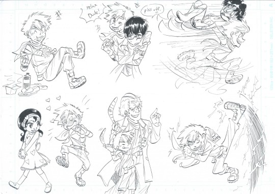
Here I have Owen with some of his friends and his dad. I said in my last post with Rankorr, that he and Owen's friendship is a nod towards the famous Green Lantern/Flash partnership. Owen's always trying to get Jack to loosen up and have fun, Jack sometimes finds this annoying but is slowly letting Owen in his life. You can see up there Owen giving Jason a ride someplace, bet Jason wishes he took the bus lol.
You can see Owen gushing over Para Dice, his canonical girlfriend from Rebirth. Owen at some point meets her in Australia and has an instant crush on her. Para is a rather mysterious girl, but has taken a liken to Owen as well. Still too young for a proper romance tho, plus Owen would need to sharpen up his speed skills if he wants to make this LDR work.
There's Digger training Owen in the art of the boomerang, rogue or hero, any son of Cap. Boomerang will be a learn to toss a good boomerang!

Another drawing of these two, aren't they adorable?
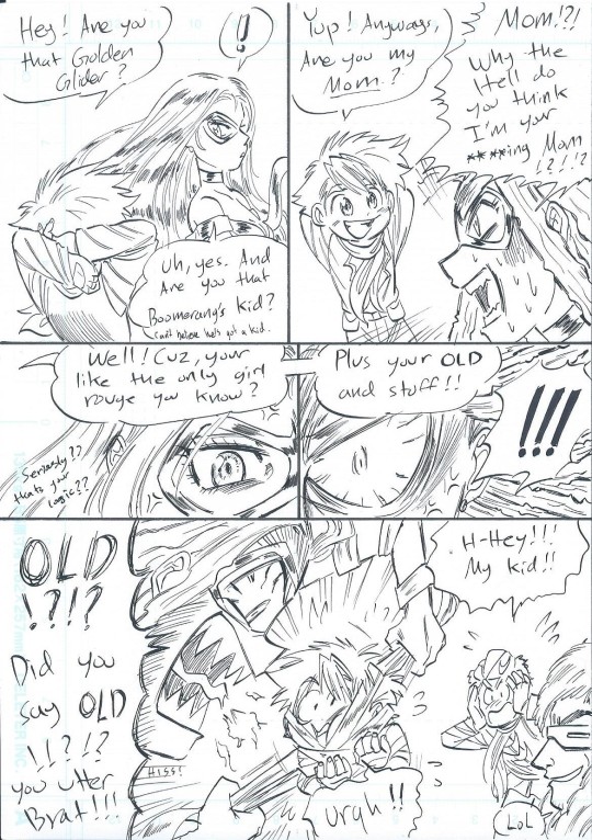
Here's Owen bother poor Lisa Snart aka Golden Glider. Owen can be a little insensitive, tho he's never actually malicious in intent (usually). Always thought it was weird that Lisa was considered a candidate for Owen's mother, she didn't seem old enough for that (Owen was like early twenties). Anyways Lisa thinks he's an annoying little twerp...
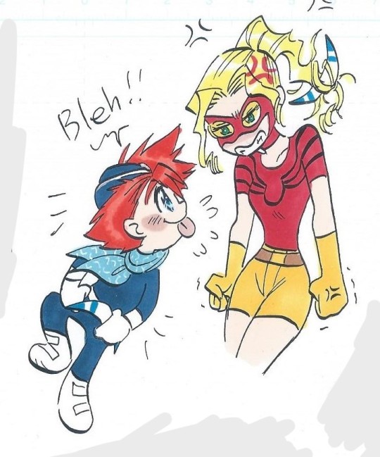
...and not the only one. Here's Owen bothering poor Jesse. Also you can see I messed up on her shirt design, wasn't really thinking about what I was drawing I guess. I do that sometimes lol.
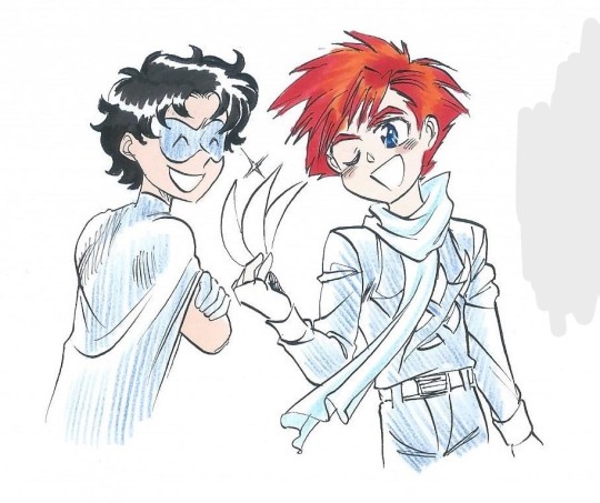
On the nature of Owen's and Jason's relationship, they seem to quite like each other. Neither of them had many friends before the team, and find easy camaraderie in having simple boyish fun together, which is something they kinda needed in life. You'll sometimes see them making complex plans for the next prank (Lori is invited as well).
In team dynamics, Jason can find Owen tendency to not take fights seriously kinda annoying. While Owen can sometimes disregard Jason's leadership (should Jason be leader that day I mean) due to him being younger. Friction isn't common between them though, perhaps because they got a lot in common.
From being caught between opposing morality, difficulty in finding a niche in the DC comics, even in trying to discover who their mothers are. Its can be validating to know people who understand what your going through.
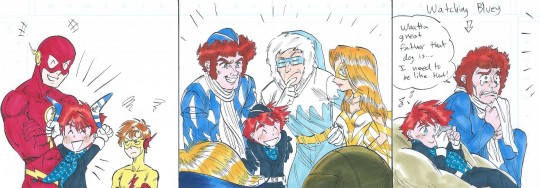
Little more focus on Owen's relations, I said that Barry has been trying to steer Owen towards good but I also think that Barry just thinks that Owen is just a fun little guy in general. I'd think they get along pretty well, Wally looks so pissed tho. There was this one comic where Hal had Wally as a sidekick for a day and Barry was pretty jealous. Guess the reverse is happening here. Wally's a favored target for Owen's pranks, so this whole situation is just very annoying to him.
Here's Digger introducing Owen to the rogues, Leonard looks befuddled at all this (Digger got a girl preggo? crazy).
Wanted to have Digger and Owen watch cartoons together, so I looked up Australian cartoons, found something called Bluey. Apparently it's super popular, even adults like it. So I found some free cartoons on youtube and yeah. It really is that good. Look it up if you want to see some fun, relaxing cartoons with smart writing!
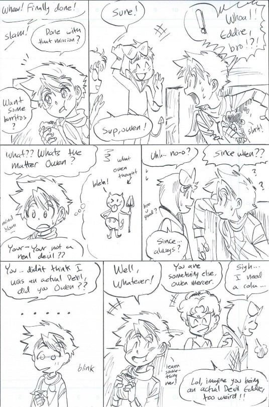
To finish off this mass of words, here's Owen being a goofball with Eddie and Jason. I'm slowly finding that Owen's got a pretty fun dynamic with most anyone I draw him with. So that's been fun.
All this and I still haven't gone into Meloni and Bart, but it's best if I leave that for later. Anyways, hoped you like all that!
*About Owen's age, the comics never specified what his age actually was. All I know he's in his twenties but still younger than Dick's age group. Young enough to be unsure of his place in the world, but old enough that his 'relationship' with Kara to be weird. I guess it'd be less weird in my au with a smaller age gap, but that's still not happening.
#DC Comics#Owen Mercer#Captain Boomerang#George Digger Harkness#Barry Allen#Leonard Snart#Para Dice#John Moore#Rankorr#Lisa Snart#Jesse Chambers#Jason Todd#Eddie Bloomberg#my art#Training Wheels au
37 notes
·
View notes
Note
Please say more about the awful Asian designs in Danny Phantom. I'm not Asian but I'd love to have a rundown on the elements that make them offensive so I can avoid and critique those elements in other works. And also you deserve to speak your mind about it
im gonna mostly talk about southeast asian designs since thats what i am and the most familiar with and also what i feel are the show's worst transgression with their casual depictions. tw for racist imagery im gonna link pictures.
there's not much to say about the designs aside from, you know, everything but things to note are the unnatural yellow tone for the skin and closed slanted eyes. veggie burger (fan name for the bg character in the middle) also suffers from the huge nose that sometimes shows up in racist depictions. the straight edge/cut hair as well is somewhat stereotypical. this one isn't as bad but in conjunction with everything else its not ideal. i will give the smallest molecule of credit that at the very least dp never gave any of these bg characters buck teeth.


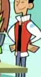
some depictions are better than others, but theres still missteps happening in one aspect or another. kwan's eyes in a lot of shots/episodes can be too skinny and even too slanted, the girl in the middle is almost perfect but her skin is too yellow (she looks kinda okay on my computer screen but i remember when watching dp on my tv she looked real brightly yellow), and principle ishiyama (who was weirdly forgotten about pretty early on in the show and was replaced by lancer doing most of the school stuff despite not being principle?? which is a whole other issue with how dp treats its poc characters) the same usual notes about the slanted eyes but also the upturned nose is pretty reminiscent of racist japanese art during ww2. again it is not the worst way to draw a nose but combined with everything else in this show's depiction of asian characters its not great, they are on thin ice man.
not to mention, principle ishiyama is the only character here with brown eyes. this is a problem that extends to all poc characters in dp and to my knowledge i think ishiyama might be the only one with them tbh. this is, again, a whole other issue though.


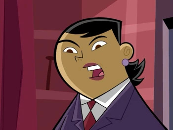
i think the thing that bothers me most about these designs though is that dp is very clearly aware that these depictions are bad. the only difference between the first set of characters and the second is one singular thing: they have a clear speaking role.
suddenly when theyre not stock background characters, dp knows how to act when drawing them. i cannot for the life of me find the image of it, but the last jock guy in the first set gets a speaking role in reign storm (he's cosplaying phantom) and he is drawn with proper open eyes! (theyre also blue but whatever) it just makes me sad that this was a clear choice they made.
the show also went in a different direction in the final product, but early development stuff was really drawing from a lot of japanese/asian influences like danny was originally gonna have a motorcycle (pulling from ghost in the shell) and was even referenced in the show via the akira motorcycle reference (which i once again, for the life of me, cannot find. danny took johnny 13's motorcycle and did the classic akira slide i think it was in million dollar ghost?? idk whichever one where the giw are trying to blow up the ghost zone). danny's name was originally gonna be jackie, named after jackie chan, this i assume was given to jack fenton afterwards. and i think the show having a more martial arts direction with the action was also gonna be a thing? that one could be wrong dont quote me on that, there was an episode where danny and vlad have like a weird ninja fight though im pretty sure.
either way my point here is that they wanted to pull from all these influences and it was prominent enough during development that they sprinkle references to it throughout the show and yet their portrayal and treatment of asian characters in the show is so abysmal it just feels Bad™, you know? i cant really put it more eloquently than that, like its very take and no give with it.
it overall just puts a bad taste in my mouth, and its sad that it still affects people years later. like i mentioned in the tags of the post that started this discussion with that whole old trend of putting yourself into the bg of dp screenshots, i felt alienated by that. and its not the people who participated's fault obviously but most of the people i saw participating were white fans (going off of how they drew themselves) and it made me a bit mad that they were able to enjoy the style of the show in a more carefree manner than i ever could. i didnt want to ruin anyone's fun obviously, but a small part of me wanted to bring to light how i wasnt on equal ground with them in that situation.
#seance#considered putting this under a read more but i decided i dont want to give people the choice to just not look at it
444 notes
·
View notes
Text
Been thinking about my experiences as a POC within fandom while also being an artist and how much that sucks sometimes. This is primarily in regards to the Redacted fandom, but could be applied to any other fandom honestly.
Proper "fussing" under the cut (for those who would rather not see):
Sometimes, I really stop and think about what it must be like to be a white person in fandom, especially when you're an artist. To see yourself reflected in the spaces you exist in all the time. There are some exceptions to this, of course. For example, lack of body diversity is just as much of a problem in my opinion (Like fat people exist. Disabled people exist. Fat, disabled people exist. You can draw them, y'know? /rhet) But generally speaking, it's not difficult to find designs that probably look like you. There will be blondes, brunettes, redheads even— It's everywhere you look.
I don't think most people realize how isolating that ends up feeling though.
Because it's not just the fact that most of the art/designs you'll stumble upon won't resemble you. It's the fact that the prevalence dictates how everyone else interacts with fandom too.
Do you know how much it sucks seeing a post saying "So we all agree that Asher's blonde, right?" and knowing that most people are thinking of a white guy and nothing else?
Or noticing how Alexis, a generally "hated" character in the fandom, is the only vampire most people are willing to make visibly brown?
How about the fact that Gavin, the "thrilling" and "sexy" incubus, has so many black and brown designs— But I can count the non-white Lasko designs I've come across on my hand?
People can do whatever they want. I've said it before, and I'll continue to repeat it when I make these rambles. If you want to make every single design you have varying shades of white and never stray from that, that's your prerogative. But for the love of god, I wish I didn't feel like I was fucking crazy for talking about how much that shit sucks to see as a person of color.
On top of that, do you know how frustrating it is to watch white artists get praised for generic diversity when POC artists have been consistently bringing forth such compelling, stunning designs to table? Like I see the kind of shit that gets praised in this fandom and what doesn't. Racial ambiguity or the slightest addition of a curl gets treated like it's revolutionary— And that's only if it's the "correct" character. It has to "make sense", right? The same way Sam has to have sun-kissed, golden skin even after he's been turned, or the way Guy has to be white because there's no way someone with that personality could be anything but.
Do you know what it's like to be filled with such a sense of joy because someone made a design where a character had your skin tone or hair texture or facial feature? Like, I genuinely have a strong reaction whenever I find a black or brown design in this fandom because they're so rare in comparison to everything else. And when I really stop to think about that, I realize how fucked up of a phenomenon that is.
I love the designs that I've made, but I've also noticed which ones "do better" comparably. I don't change much of anything with how I go about posting or promoting them. The only difference is that some of them fit what is considered widely "canon" in fandom. And the others... don't. I go out of my way to make every design POC in some regard, and you can usually tell visually even without the addition of colors. I'm not gonna stop doing that because I know why I started in the first place. But fuck, it does start to hurt seeing white artists with the same general white designs get hyped up endlessly while I internally debate if I should even make another character look like me or not. If it'll even matter to anyone but me.
Some days, I just really wish it didn't feel like shit being black in this fandom. I hate knowing that I'm gonna post this, and I'll probably get responses for other people of color primarily.
But maybe putting this out will help that pill get easier to swallow.
#PK Rambles#Fandom Wank#If you feel “targeted” by this post: Maybe just ask yourself why? /gen#Because I promise you that your brief discomfort will fade with time#And my isolating exhaustion will continue to seep deeper and deeper into my bones#I'm just really fucking tired in a lot of ways
88 notes
·
View notes
Text
COCO'S REVIEW: BLUE'S STORY
Welcome to Coco’s Review! Where I review and breakdown episodes, movies and etc and overthink every tiny detail and/or give my thoughts and opinions :D !! THE STORY I’M ABOUT TO DISCUSS HAS TOPICS ABOUT S/A AND OTHER DISTURBING TOPICS PLEASE PROCEED WITH CAUTION !! Ok so this may not be something you’d expect me to cover but I wanted to discuss this series on my blog for a while now! Today I’m discussing Blue’s Story by Victaton!

Blue’s Story is a series by Victaton over on youtube that mixes gacha life 2 character designs along with animation. I like to think of the gl2 designs as character models and Victation expands on it through animation. The series doesn’t have proper episodes, its installments mainly continue music videos that go in a specific order. The story is about Blue, a man in his early 20s entering the company his older sister works in with a positive attitude only for it to fade away as a lot of women in his new job want to get in his pants and cause irreversible trauma on the poor guy. This series is meant to show how abuse in the workplace can happen and how s/a can be done anywhere and by anyone. It seems to be a response to the misconceptions of how men who are preyed on by women are not valid victims of s/a and how they should’ve enjoyed it or that only women can be victims (which is never true). Though keep in mind I’m not qualified to determine if the way the story conveys s/a and just abuse in general is shown accurately because I have not had these experiences myself but my heart goes out to the victims in the world who could resonate with Blue’s Story and I wish for nothing but happiness and peace for you guys. You all are very strong and deserved much better<3
I can tell Victation really touched people’s hearts and according to some people in the comments who are victims the story is pretty accurate to some experiences and some research has been put in this series which I heavily appreciate. So I’m happy people can feel seen with this!
So with this series I want to start off light and mention the animation- AND MY GOODNESS DOES THIS SERIES HAVE AMAZING ANIMATION!
I really love this art style that Vic has going on here
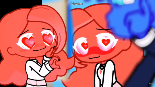
Like I said the gl2 designs seem to make the base and Vic uses their art skills to expand on it It really gives a dynamic feeling and you can hardly tell it’s gacha
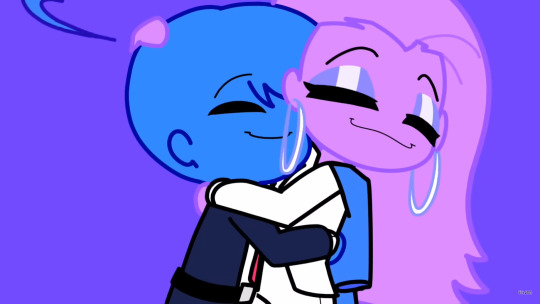
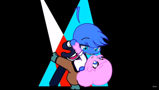
Vic has a lot of dynamic poses and a great understanding of body language with these!

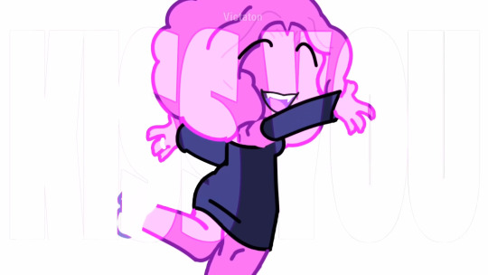
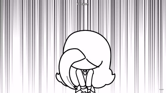
AND THE EXPRESSIONS<33 I LOVE THE WAY VIC DRAWS FACIAL EXPRESSIONS! IM SUCH A SUCKER FOR VERY EXAGGERATED AND STYLIZED FACES


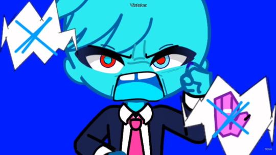
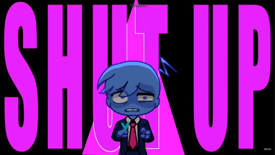
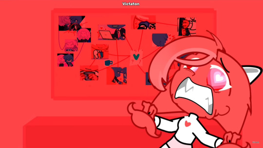
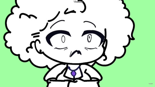
And I’m not even showing the best parts! But I want to keep it as a surprise for those who are interested in watching the series. I just couldn’t stop praising the visuals enough! Vic is the most experimental gachatuber I’ve seen when it comes to the visuals!! I hope to talk with them sometime to get some tips or to post how their creative process works because THE ART IS SO GOOODDDDD! AND THE CHARACTER DESIGNS RADIATE SM PERSONALITY AND ADD TO THE SYMBOLISM AND UNDERTONES OF THE STORY! It’s so fun to see :D and the color associations are a very interesting character design choice! It helps add a very colorful look to what is otherwise a very heavy story and makes it very easy to distinguish the characters and give them certain color motifs. Anyway I want to talk about the characters in Blue’s Story! Mostly by order of their debut! And I’ll only talking abt the characters that have a big impact on Blue (So I won’t be talking abt Magenta or her brother) and the ones that don’t have a definite character (So the red eye people won’t be mentioned) Anyway now that that’s established the character I want to talk about first is well- Blue himself! After All this is his perspective we’re following

Also quick appreciation for the silly little Blues that Vic draws<3 Anyway Blue is the most interesting character I’ve seen in a gacha series. I like how Vic doesn’t use Blue as a representation or a role model for victims to take after but a person who goes through his own stories and has room to be human. You can see his descent in his own trauma and self loathing in his story. Which leads him to make mistakes and have a difficult time navigating his relationships and how to make meaningful connections. Seeing him go from confident and upbeat to quiet and reserved is so heartbreaking. What I find so great about Blue is that not everyone can relate to his situation but his thought process is near universal. I can relate to having to be in survival mode when it comes to relationships after being done dirty by different people. Not to mention people would do the same things Blue did, they just went through different experiences. It’s a really great touch to the writing. What’s also interesting I find about Blue are these different personas of different ways he handles the trauma caused by all these women.

This is sorta a mix of my interpretation of what these versions of Blue are plus what Vic actually calls them From left to right 1.Hypersexual Blue (confirmed) 2.Heart Eyes Blue (confirmed) 3. Reality Blue (not confirmed) 4. Cyan Blue (confirmed) 5. Numb Blue (not confirmed) I’ll expand more on these personas when I do a character study on Blue (which is something I REALLY wanna do sometime)
Next up is Pink Who is the first character we meet when Vic started this series
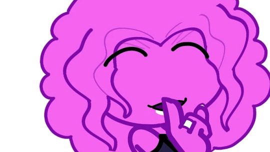
Pink is a married woman around Blue’s age who he engages in an affair with. And one of the women Blue has a significant relationship with throughout the series since Pink was the first one in the workplace to have her way with Blue. A truly manipulative bitch 💀 I don’t have much to say about her because Vic themself made a video discussing the women in Blue’s life and their thought process on writing them(?). So I’ll just give my thoughts! Pink is a very interesting case of the “Abused to Abuser” situation and not to mention how she’s not one dimensional. She’s an abuser to Blue but also a victim to a different man. (her husband) There are scenes where she is being a nice person (highlighted with her scenes with Lilac) but what’s preventing her from being good is her philosophy of how men cannot be victims. How could they be? To her the most heartless person she knows is a man, while it’s close minded, it’s understandable but not excusable why she perceives men this way. Which I find very interesting! There’s also a cool animation choice with her lipstick color! Her lips are white when she’s doing nice things or is not perceived as a bad person, then grey when it’s more neutral (I think) and finally black when she harms Blue. Hence why her kiss marks start from white to black.
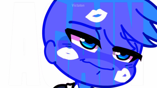

What’s also interesting is that Blue pursues her first! Since he started out so confident and upbeat he wanted to try and shoot his shot with an attractive woman. But backs off when he learns that she’s married, but things didn’t go as planned. But I find it very interesting how that’s how things started. Next we have Purple who is the CEO or just the boss of the company Blue works in
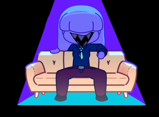
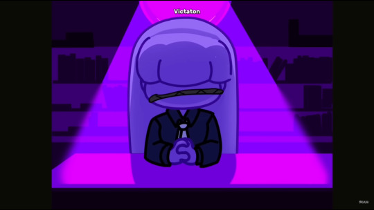
Purple imo is definitely the most uncomfortable character to watch (what am I saying ALL the abusers make things uncomfortable to watch) but Purple just gives me a chill up my spine. Especially with her design, it has been confirmed by Vic that Purple is in her 40s and would prey on much younger people. First she attempted to prey on Red (who is confirmed to be 19), but was unsuccessful then went after Blue, and was successful.
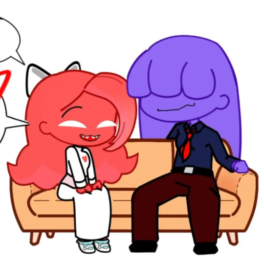
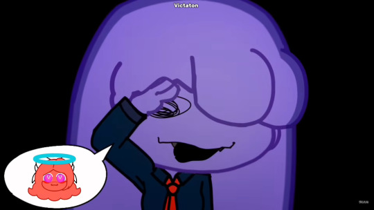
Not to mention she’s very inconsiderate of her workers, example in the second part of “Baby Hotline”.
Up next we have Red! Who is my personal favorite in terms of how she is written and her design! (I do not condone her actions)
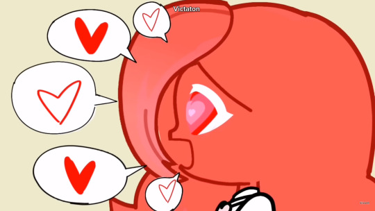
I love how Vic went for a more cutesy innocent look for Red!
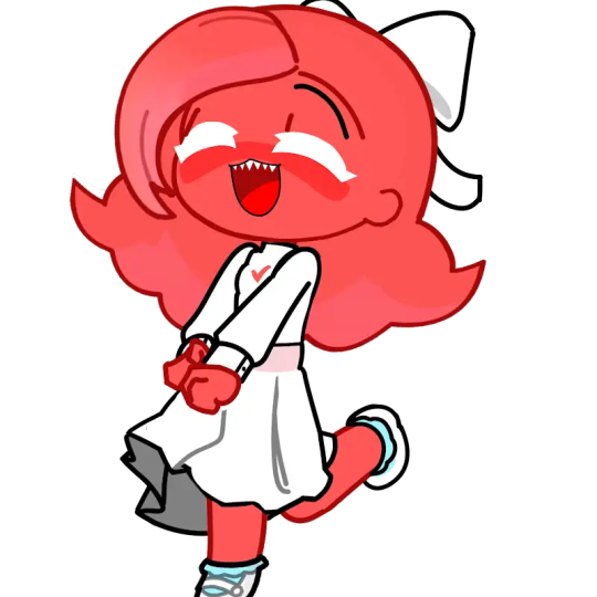
But not without giving her sharp black nails to show how harmful she is
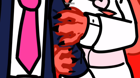
It really nails the message home on how anyone can be an abuser no matter how they look like. I also want to appreciate her little heart eye effect that Vic does with her that’s constantly looping like HOW DOES VIC DO IT- IT LOOKS SO DIFFICULT TO PULL OFF- I’m guessing it’s green screen With Red she is an obsessive stalker who has feelings for Blue and is constantly pursuing him even if he doesn’t return the feelings. It starts off as an innocent crush but turns into something more harmful. I don’t have much to say that’s not been said by Vic on their video. I just really want to appreciate how well designed she is and I rly like the heart motif she has. You can tell she’s a naive girl who can’t understand how harmful she is. I’ve met someone who was my equivalent to Red and while thankfully I had people who managed to protect me, doesn’t mean the harm did not get to me. While they were not as intense and Red, I was still being harassed verbally and I just didn’t feel safe. ALSO HOW DOES VIC DO HER HEART EYE EFFECT I NEED ANSWERS Now we have Lavender who is Blue’s SISTER
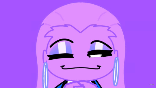
YEAH THATS RIGHT- SHE IS BLUE’S SISTER And I swear everytime I see her I just want to punch her in the goddamn face and wipe that stupid smile off her face- Lavender is an example of non-physical s/a and incest with how she had sexual thoughts about Blue and would show it through more subtle actions. Not to mention she’s also a bystander to Blue being abused by other women and doesn’t do ANYTHING about it. As an older sister myself with my own little brother- Lavender ENRAGES ME! I could never imagine doing what she did to my own brother. He drives me crazy but I’d protect him no matter what. What is fascinating about her design is definitely how her eyes are constantly closed, as if she’s turning a blind eye to the harm Blue is a victim of and/or how she’s hiding so many things. Especially with how she only opens her eyes when she’s preying on Blue.
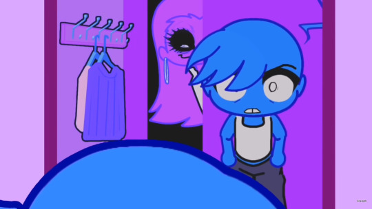
SHE'S JUST AS TERRIFYING AS PURPLE Lastly we have Lilac! Who debuts in the same video as Lavender
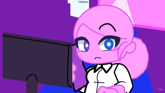
WHO IS THE ONE PERSON THAT DOESN’T TREAT BLUE LIKE SHIT She’s a very fun character! She’s a single mom who works in the same company as Blue. She has a lot more significance in later installments so I won’t spoil but I just love her<3 She’s so sweet I just can’t- it’s such a breath of fresh air compared to the toxic waste Blue’s been getting from the other women. Her relationship with Blue is so interesting to watch and I am just rooting for them to at least stay friends.

(Also she looks so pretty here) AND THAT’S ALL THE CHARACTERS!!
Overall I really enjoy this series but I do have some gripes with it. The pace is definitely a bit much- so much can be happening in a span of a few mins. And there are stories that could rly benefit a longer time limit. This problem comes up most with “Baby Hotline” where I hardly understood what was happening. Like I got the gist but I didn’t get the specifics. It can be difficult to keep up with. So yeah the series could work with a longer timeframe- “Sweet Little Bumblebee'' is a great example! Not everything is too fast and everything makes more sense while “Baby Hotline” tried cramming a lot in one minute. Well the first part of ot, the second part of “Baby Hotline” was at a much better pace in my opinion but still a bit hard to keep up with at first.
Anyway in conclusion! Blue’s Story is a really interesting story that deserves the recognition it gets and is worth your time if you are into really deep stories with heavy subjects!
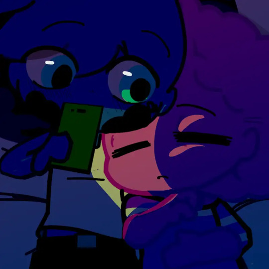
(Credit to Vitaton for all the art presented) This is Coco typing.. Thank you for reading!
30 notes
·
View notes
Text
⚠️The drawing base does not belong to me!! I found the base on Pinterest!! (It’s a bit hard to find the original owner and their proper credentials on Pinterest but just for now know that it wasn’t created by me!!) All characters don’t belong to me either!! They all belong to @just_a_carrot!! As extra precaution I’d like to say that 🥕s design wasn’t really original, it was very HEAVILY inspired by how some other artists draw 🥕!!⚠️
Uhhhhhhhh 🥕….Is this you?


Pffft this was so silly 😆 Lots of love to anyone reading!!
Phew!! Guess what!! Pot fiiiiinally posted!!!! Pffft uhhh idk if anyone noticed my disappearance but I guess I’ll explain anyway???? Uhhhh I mean I don’t really have much to say?? Sometimes I just don’t have the time to reblog or post anything ig HAH! I’ve been making a lot of doodles though!! I doubt I’ll be posting any of them though 😭 After Art Fight I wanted to start getting more into art and such because I really enjoyed making art for people and trying to make them happy!!!! So really I’m trying to spend the small amount of free time I have to fixing parts of my art that I don’t like (MOSTLY anatomy because…you know….I don’t like bodies and bodies don’t like me 😭) I’m glad I finally built up some art and can finally have something to post!! YIPPEEEEEE!!!
I love bases. I haven’t said it online before because I haven’t posted anything about making art based off of bases but there’s just something about them that I LOVE!! I saw this base QUITE a while ago but today was the day that I said I was actually going to draw it. The original plan was actually to just post the base and say “This is totally 🥕” or something like that HAH but in the end I realized…wait…I like bases so that I can draw them….WHY DON’T I JUST DRAW THIS ONE AS WELL????? And thats how the abomination was born hehe 😭
🥕s SONA(???) IS VERY CUTE!!!! I enjoyed drawing it heh!! I’m not used to drawing carrot people??? So I’m glad I got to test something!! Atleast I can also differentiate their sona from other peoples as well!! WHICH IS A GOOD THING!!! Also they may be an artist and a writer, but they also CODE AS WELL?? CODING ALL OF OW??? KFJLKSJDF 🥕 HAS A MANY OF TALENTS AND PROBABLY SUFFER A LOT BECAUSE OF IT 😭 KLDSFLKJDF ALL OF THEIR WORK IS AMAZING GAHHH PLEASE SHOW LOTS OF LOVE TO 🥕 PLEEEEEAASSEE!!! 🙏💖 I was going to color 🥕 in the drawing but for some reason I just thought it didn’t look good and I didn’t want to ruin the drawing anymore so I decided to keep it as it was!! KDSJFLKDJF I HOPE YOU LIKE HOW I DREW THEM!!!!
Hmmmm….welp not much more I can say!! Be aware for more posts I guess? There is still one post from Art Fight that I still have to share GRAH SORRY ⛵️!!!! I’LL BE SURE TO POST IT SOON!!! It has been a TERRIBLE HORRID week and I’m just excited for it to pass 😭 At least I had this to take my mind off of everything so I really do hope you enjoy it heh!!!
Lots of love to you 🥕 and anyone else reading once again!!! 💕💕
#our wonderland#ow#ow: orlam#fanart#art base#KLDJFKLJD THIS WAS FUN HEHEH I HOPE ANYONE READING HAS A WOONNDERFULLLL DAY!!!!!!!
16 notes
·
View notes
Text
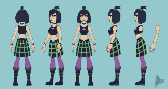
Road to 3D- Sam Manson (Part 1):
Model sheet
Part 2: Character Modeling
Hi! On my recent posts of my 3d models I got many asking questions about how I made them. I'm currently working on a 3d Sam model from scratch and so I thought I can document my process here and add some thoughts through my process.
Before I can model anything in 3d I need a reference and a plan. For characters this means I need to create a model sheet, so here we are.
Some disclaimer first before I continue:
I'm just a self-taught hobby artist not a professional or proper art student. The infos I write here down are just the things I do and can be completly wrong or different in a professional setting.
This is not a tutorial or a step-by-step-guide for character design or how to make character sheets in general. Just additional things that I pay attention to when I make a model sheet for my 3d models.
As someone who just does 3d modeling in my freetime for 2 1/2 years I see myself still as a beginner. I'm still in a experimenting with different techniques and artstyle. This and the following posts describes just stuff I do for this model, it could be some other method next if I feel this didn't work out that well. Nothing is set in stone.
I do the 3d models just for myself for practice and for fun, you cannot download them anywhere. I just post screenshots and do sometime animations to archive my progress.
Under the cut are my thoughts of how I approach a model sheet for a 3d character:
First things first I search for references and make some rough sketches to decide how I want the character to look like. I found this image of a character on pinterest ( anyone knows who the artist is? I cannot find the original source) and use this as a reference for my Sam model.
After the inital phase I first draw the front side of the character. For a 3d model I need a symmetrical neutral character in a T-pose, an A-pose or a standing pose in which the arms doesn't obscure the body. This makes it easier to model and rig them late on.
Speaking of obscuring the body it's also better to have a character without their clothes on and in multiple angles. It is easier to model the character's full body first and then model the clothes around it as an anchor point.
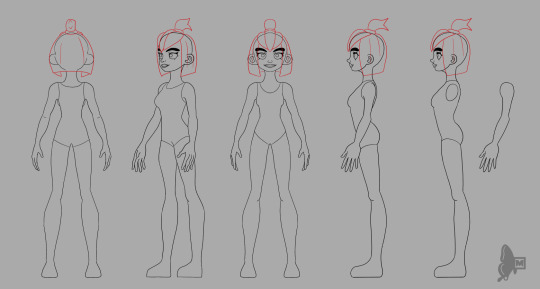
The most import angles for me are the front and side view. The other angles are more for the details to get the likeness right. I try to model the front view most accurately and the sideview is more for the proportions. I don't often see people only from the side view so whatever I draw from the side cannot 100% be accurately be modeled like that. I also made a different side view on the right with the arm seperated from the body, this makes it easier block in the form of the body and it's easier to model the arm and hand seperatly because hands are not only difficult to draw but also difficult to model.
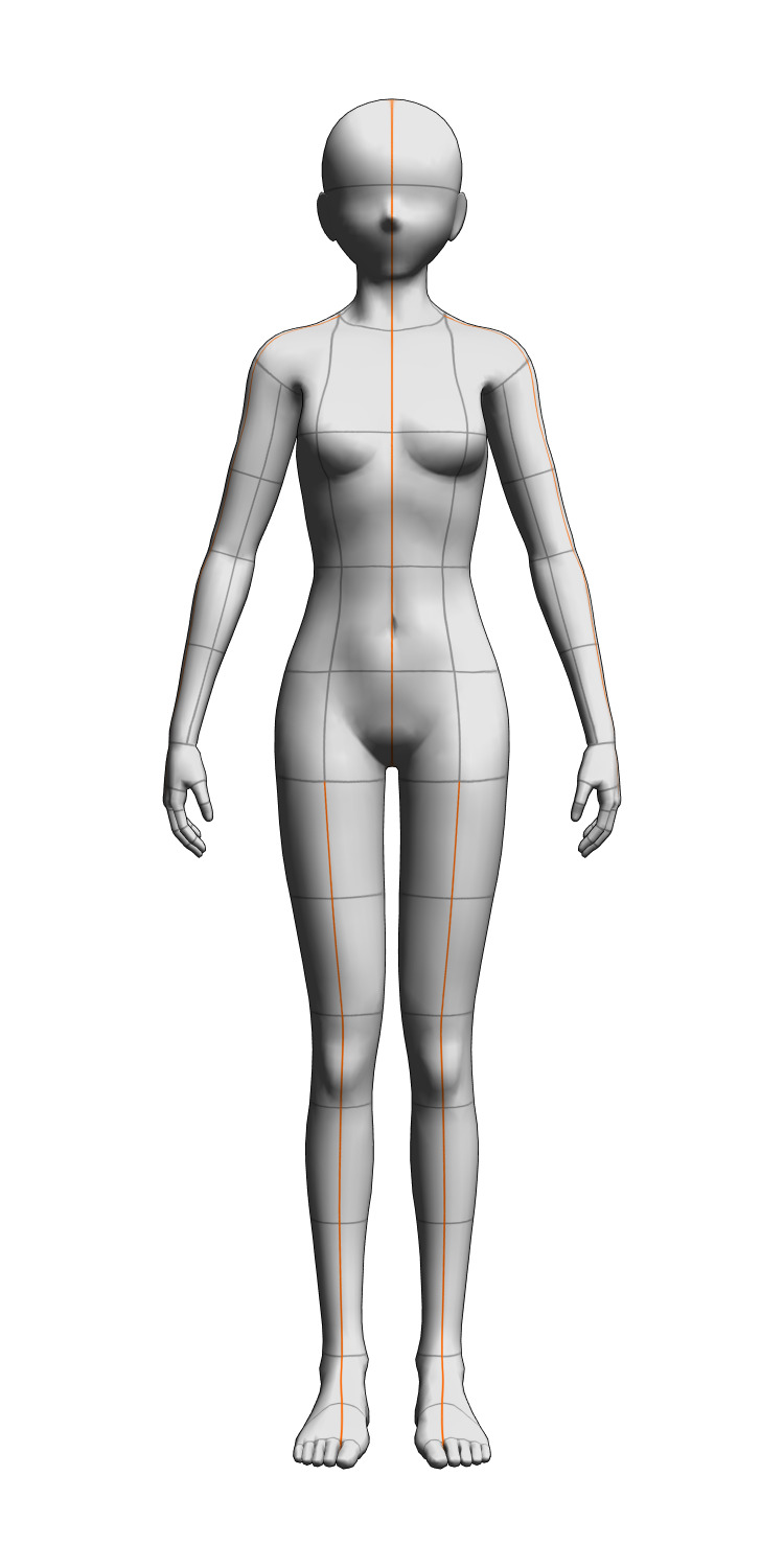
For the different angles I use a mannequin model in blender as a guide and reference. Clip studio paint (the painting program I use) has also 3d mannequins but I personally find them difficult to move around so I prefer to use blender for this.
When I'm finished with the model sheet I also make a quick turnaround animation to see if anything looks consistent enough.
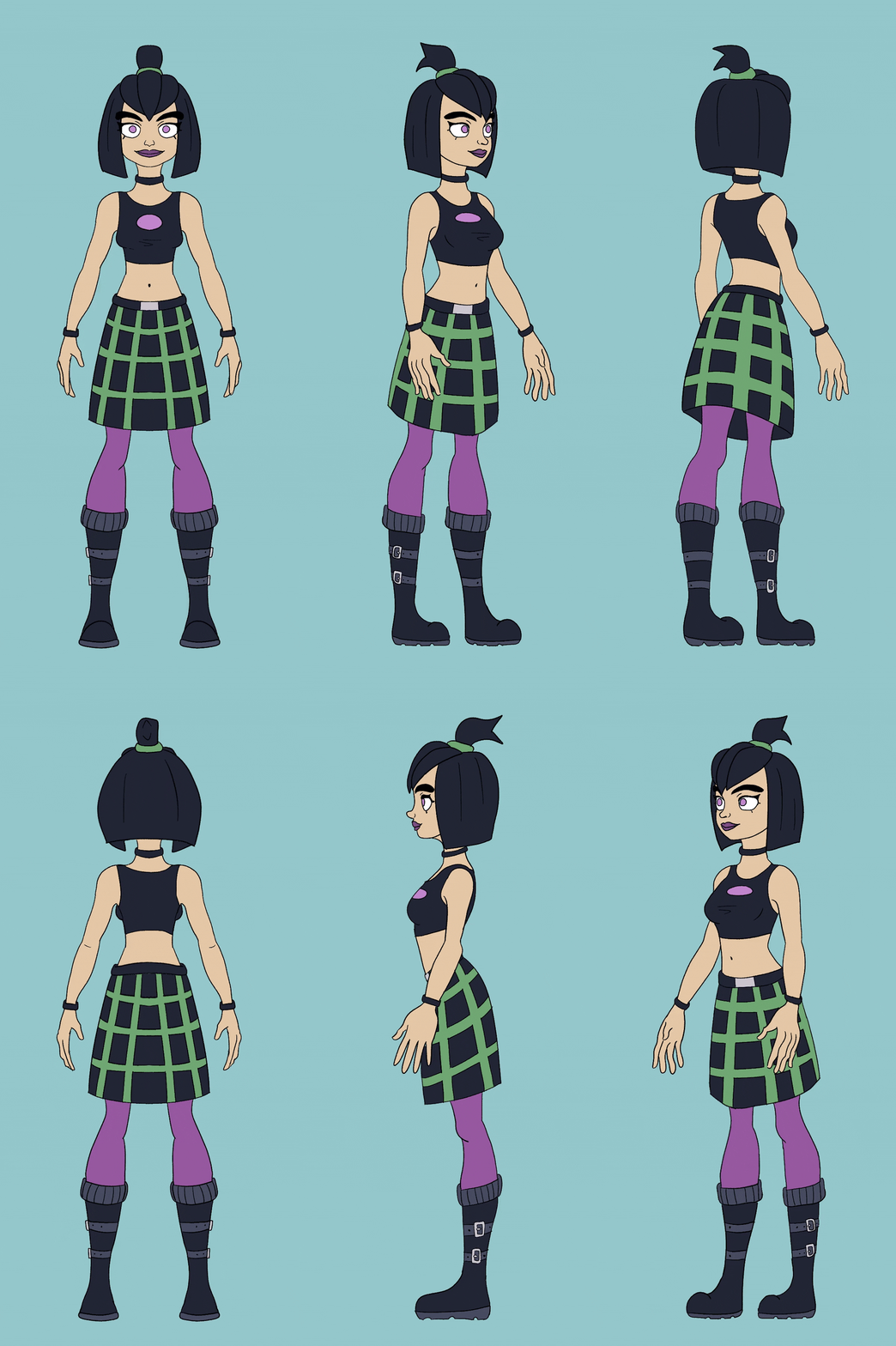
Yeah that's it. Now onto the modelling process!
41 notes
·
View notes
Text


please do, come join us PLEASE. i love this au so much it's so fun like genuinely.
but!!!!!! idk how designs work but :3 For the most part, they all look like their game designs, obviously. im only gonna do Micah n Arthur for now, since they're the main characters of this AU, but i might do other characters later on.
Micah still looks the same, same hair and same facial hair, and same body shape. His hair only gets greasy when he forgets to shower, but otherwise it's pretty soft and healthy, and whenever he wears a cap, he pulls it into a short ponytail. He still has the same staring problem and same heavy bags under his eyes. I like to think he wears glasses, but sometimes he just doesn't, so it's 50/50 if he'll wear them. He will, however, wear them around Arthur because he once called him 'handsome' when he was wearing them and it did wonders to his ego.
He generally wears comfortable clothing, both online and in person. Sweatshirts, worn out and well used, often colored in a washed out red color, and sweats (off whites or grays) are also common. Half of the time he wears flip flops with white socks that are in desperate need of some throwing away. He has a couple of hair ties he has on his wrists at all time for either 1. his hair, or 2. to play around with. I think he'd be a big fan of energy drinks, or straight up alcohol whenever he needs a quick booster.
However, I do think Micah does know how to dress himself if he needs to go to some fancy event. Let's not forget he comes from a line of lawyers, and I imagine his daddy drilled into his sons on how to properly dress themselves because "no son of mine will dress like a slob." So he definitely knows where to get suits and has tailors phone numbers written down, so when he's needed at some event that requires proper clothes, he comes in looking well-groomed. He probably carries Arthur around like some arm candy.
Speaking of Arthur, he still pretty much looks the same as he does in the same. I think everyone in college looks a bit younger, but still the same appearance as they do in the game, if that makes sense. Anyways, he still has the same hair cut but his beard is more trimmed, more of a stubble really. He has an almost soft and quiet vibe to him, as in he's a chill guy who looks kinda grumpy lmao. Blue is still his favorite color, he probably also wears sweatshirts like Micah, but wears jeans instead of sweats. When he is at home, he definitely mostly wears shorts, and also wears sandals with socks, like Micah. Probably wears some sort of cap with either some stupid fish joke on it, or a little deer. He always has a tired look on him, because he's almost always tired of dealing with everyone's shenanigans when he just wants to sit down somewhere and draw something.
He probably has some hair ties on his wrists, too, because he happens to know a lot of people with long hair. Anyways, I don't think he's really that deep into his family's shady business. While his dads were a little confused when he chose to study art, they were actually pretty supportive and fund his tuition. Well, more so Hosea than Dutch, because Dutch had been expecting him to follow in their footsteps. Still, he does drill some law facts into Arthur's brain.
Anyways, that being said, since Arthur isn't that deep into the family business, he doesn't really attend any fancy events. That's more of John's job, who does end up following in the lawyer path. But, considering Micah eventually does work his way into Dutch's good graces - which leads to a semi-friendly rivalry between John n him (which could be a nod towards the events of RDR) - Micah gets a higher position and rank within the company, he's forced to attend several events, which he despises. But he does deal with it, and gets cocky and in a pleasant mood whenever Arthur joins him, mostly as his arm candy.
Whenever he does attend these events, Arthur wears a basic and simple suit. Of course, considering he comes from a wealthy family and his sweetheart does have money, it's simple but of high quality, tailored to fit him. And goodness gracious, does it really emphasize his beauty.
#reaction youtuber!micah au#modern college!morbell au#morbell#micah bell x arthur morgan#arthur morgan x micah bell#AHHHHH
18 notes
·
View notes
Note
Who is your oldest (like longest had) OC? When did you come up with them, or tell us what the inspiration was!
my oldest oldest OC is Diana, she's a sailor moon self-insert who's the princess of the entire galaxy (as opposed to usagi's pathetic reign over juuust the solar system lmao) and she was sailor star. To be fair thgouh, I did make her before i saw season 5 and that season ruined my entire lore and I kind of dropped sailor moon for a while after that akjfhkajsf but when i was 9 or 10 i started making this sailor moon season 6 comic where my oc was the main character obviously but i was also obsessed w like 5 other certoons and anime so it just all meshed together. also all the other characters wouldnt stop commenting on my character being sooo tomboyish and how she was seen as one of the boys and one conflict was her not wanting to be girly when she transforms... I WONDER WHAT THAT MEANT FOR ME.........🏳️⚧️
my oldest OC that i actually have like. well recorded inspo and history of (drew him lots, still use him sometimes) is saph.
he was my sonic self insert at first. in the very beginning he was sonic's long lost sister ♥ back then he used to work for eggman. also i only knew about sonic from sonic x and only the first 2 seasons existed in germany at the time i watched it, so i thought 1) shadow is one of eggmans minions 2) shadow is an ugly jerk and i hated him lol.
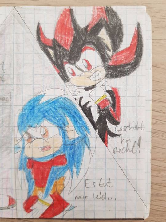
(the rest is under cut bc this came out suuuper long)
same story as last oc. at first trying hard to be girly, (also holy shit i found the poerfect img for this)
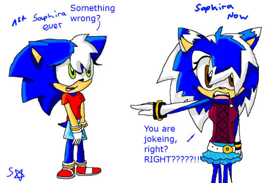
but that's uncomfortable so i'm making the oc edgy. (notice the "MALE NOSE!!!!") at this point the backstory was that he's a "clone" of sonic shadow and silver.

no wait even better. run around naked like the boy characters.

everyone always confusing the giiirl for a boooy and i genuinely got some hate for my character design bc i shipped him w shadow and wow u cant have a homo OCxCanon ship ewww lmao but oh well.

someone once dared me to do a genderbend and then i just changed the color from white to black and they were angry i didnt do a proper genderbend. while the anti version of the character was a proper girly girl with pink and sparkles and smiles and rainbows and skirts and frilly tops and stupid hairstyle. and ppl complained the anti looked more like a genderbend. (below is the "anti". i can't find the genderbend anymore)
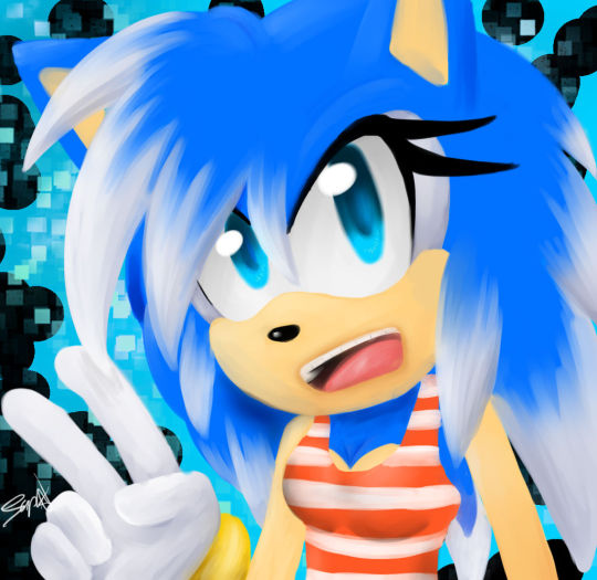
for me it just was my first crack in the egg bc hey. i don't want to be preppy, i want to be emo. but im not allowed bc girls are not meant to be edgy. and im notally not projecting on the boy version of this character more than the girl one. nope.
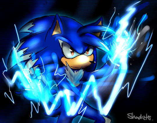
with every year i reduced the hair pieces at the front lmao but ya after my egg cracked i focused more on making him cool andkeeping him gender neutral. Then i used him to prcess a lot of my ongoing hardships in life. the redesign also being bc of a big shift (well. yeah me transitioning socially lmao)

he's unfortunately associated a lot w that painful time so i don't use him a lot anymore

he came a long way though im proud of him. here's one of the most recent drawings together with his brother (also has lots of lore on how he happened but im not feeling like it rn to go on that tangent)

8 notes
·
View notes
Text
Mini Mahou March Year 4 Week 1
Hey everyone and welcome to the third week of Mini Mahou March! You can find the main post for the event here X.
The Prompt for the week of March 2nd-8th is…
Hime Lolita Phantom Thief/Kaitou!
The sub-genre of magical girls that needs more love, the phantom thief has a long history of non-magical girl entries such as Lupin and Magic Kaitou. MGs include Shadow Lady, Saint Tail, Kamikaze Kaitou Jeanne, and the recent Phantomirage.
Magical girl Kaitou often steal with good purpose- returning stolen goods like Saint Tail, or exorcising demons like Jeanne. With a much smaller pool of inspiration to draw from, there is very little consistency in designs for these characters, although they always have a way to make a quick escape. They often leave behind a calling card, sometimes as a form of cheeky flirting with their officer rival.
Hime Lolita, or Princess Lolita. If you know magical girls you probably know Lolita fashion- Rococo inspired, distinct silhouette, frilly and feminine. Hime lolita is extra frilly and a bit more mature with a lighter color pallet.
I’m only looking for a visual character design, something as simple as a single fullish-body picture, but you are more than welcome to go as wild as you want with trinkets, backstory, information, alt outfits, all that good stuff. Also I say girl but girl boy nb other as long as it’s a magical humanoid gender be damned, thumbs up. (Also nothing 18+ please. Your characters can be, just not your art for this)
Make your post and tag me before end of day March 8th (11.59EST) and I will be re-blogging participants here next Sunday/early Monday, with everything tagged Mini Mahou March.
Saint Tail uses stage magic to distract while stealing stolen goods and returning them to their proper owner while leaving calling cards for her crush who is the detective trying to catch her. Shadow Lady uses a magic eye shadow pallet to transform into different forms depending on the color, and steals, well, for fun until the plot happens, while the local cop is in love with her thief form. Kamikaze Kaitou Jeanne transforms with assistance from her mascot to remove demons from pieces of art which makes the art disappears, and her rival is transformed boy who wants to stop her (and her best friend is the obligatory cop) D.N.Angel is the long accept magical boy, and he transforms into his older alter ego to steal magical artifacts made by the ancestor of the obligatory cop who has his own magical alter ego and there’s a love square.
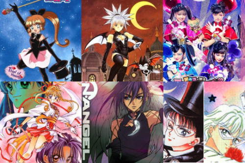
So uh. Complicated romances & police enemies with possible overlap in those categories, transformations range from ‘new dress’ to ‘new body’, stealing is good sometimes. It’s not my fault there aren’t more Kaitou MGs we deserve this sub-genre c’mon Toei. Pierrot? Anyway there’s always non magical girl kaitou like Skye from Harvest Moon or whatever is happening in Persona 5. Masks are generally not a magical girl thing beyond proto-senshi and a couple of weirder male-target series, but it is a thief thing so your call.
Robin Hood Lolita? Scarlet Pimpernel but Frilly? How many weird thief tools is she hiding under her big skirt? Are the ribbons removable to use as getaway ropes? How fancy is that kaitou mask? Maybe some wings- with bows?
24 notes
·
View notes
Note
How do you come up with your papercraft models? Specifically, how do you decide what sorts of 3D shapes to use, and then how do you translate those into 2D (the flat/unwrapped model) It seems very difficult, but I'd love to see your process when it comes to conceptualizing/designing this, if that's alright ^^
It’s most alright anon! I knew somebody would eventually ask about this and I have no problem giving a general explanation of the process I use. I won’t go too much in detail since I don’t feel ready to make a proper tutorial, or I simply feel that there would be easier ways to carry this out. Take in mind I am not a professional and this process was self taught :p
The programs I use to make them are nomad sculpt (for the model itself, and imo it is easier to understand than blender) and procreate (for the first step and the addition of pellets for gluing + colored designs).
1st step is to create a blue print. The blue print will be necessary for later when you are modeling and also keeps track of the character’s scale. What I do is to take a frontal image of the character I am creating (in this example, yes man) and then trace the parts I will want it to be divided in. The objective here is to simplify the character as much as possible so that people don’t work with complicated shapes.

2nd step is to use this blueprint on nomad sculpt and set it as a background. With this you can now have a reference of the location and size of each piece. However, it is up to you to decide the width and additional shapes the back of the character may have. In my opinion deciding these for yourself is way easier than having to draw an accurately measured second blueprint of the side view.

Once you have the model ready, for the 3rd step you’ll have to start to trace the polygons of the model in procreate and arrange them properly. I’d say this is the most tedious and complicated step of the process since I literally take PICTURES of each part and I need to ensure their scale matches with the part I begin with. It’s not easy to explain, but just consider it as a method of “manually” creating your own UV unwrap. I am aware it is possible to unwrap it and instantly receive the polygons for me to trace but my method allows me to decide where each polygon will be positioned. This is an example of what I do with the current papercraft I’m working on.

And lastly once you have all of the pieces traced you can go ahead and add the small triangles or trapezoids (I call them pellets) on the sides so the papercraft can be glued together. It is important to consider the place where you draw the pellets because sometimes it can be hard to glue them if they’re positioned in a certain way. As for the colored designs, I just draw them manually like usual and use some personal techniques to ensure they fit altogether.
That’s basically all the process I taught myself explained from the surface, and all of it surged because I didn’t have a windows device where to download Pepakura designer (popular papercraft designing program). Since I will need a device with windows for later on in my career I will hopefully get to download Pepakura and have an easier time with the models, but for now this is what I do and it surprisingly works well enough. If you (or anybody) have any other questions I’ll gladly be up to answer them, and thank you for asking this too :3
10 notes
·
View notes
Text
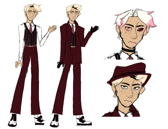
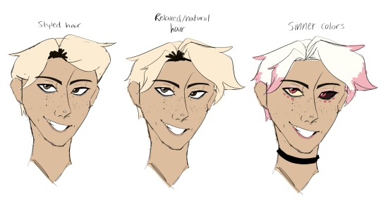
Human Angel Dust design!! I wanted to try my hand at making a design for how I think Angel would have looked before he died in 1947 or how he would look as human Anthony!
Below are design notes -
I took some inspiration from the fashion of the 1940s and tried to give him something that wouldn't look too out of place in the era. His general silhouette, jacket, shoes, hat, and styled hair take after the time period.
His outfit with the jacket is just the more formal version of the other one. I think he prefers to go without the jacket, gloves, and hat but his parents like him to look more proper.
However, I also wanted to include some hallmarks of Vivziepop's designs so I included stripes and mostly focused on a red/pink color palette. I was gonna give him the bowtie he has in the show but it looked ugly so I went with a normal tie instead lol.
Angel's body shape is based on the way he looks as a demon. I made his legs really long and his general build rather skinny to match his shape in Hell.
I gave Angel heterochromia with two different shades of brown to reflect his eyes as a demon. I also gave him freckles because his extra eyes as a demon remind me of them lol. He has dimples simply because I wanted to give him some haha!
I gave Angel two hairstyles because I wanted to have one that was more time period accurate and one that was more true to the character and his sinner design. His styled hair is pushed back and what his family prefers his hair to look like in my version of the world. His regular/natural hair is based on his fur as a demon and is what I think he would prefer to wear his hair like as he canonically likes to be comfortable and dress casually. I gave him dark brown roots because I just believe that he would be blond but not a natural blond haha. Hair dye wasn't super commonly used in the 1940s but it existed and I wouldn't put it past Angel to be a salon regular.
I do think he looks a little young considering that he died sometime in his 30s but I added little wrinkles under his eyes. I also gave him really heavy eye bags both to show a bit of age but also just general demeanor.
The demon color designs are just for fun and not at all what I think he would actually look like pre death lol.
Also just as a note - This is Anthony before he died and not a human version of how I think Angel Dust as he is presented in the show as a demon would look. I definitely think Angel has a much more modern and feminine style in the show than what I drew here.
These drawings are pretty loose and not at all finished but it was a fun challenge to design a pre-death Angel! Hazbin has very much been on my mind so I've been doodling Angel Dust a lot lol!
Might design some of the other sinners as humans as well!
#art#fan art#fanart#angel dust hazbin hotel#hazbin hotel angel dust#angel dust#my art#myart#hazbin hotel#hazbin#drawing#design#character design#human angel dust#vivziepop#doodles#sorry i yapped forever on this one guys lol#i just love him
28 notes
·
View notes
Text
FOP: A New Wish e16?, 18-22
well would you lookit that, new episodes. thanks internet for telling me...since i don't watch cable live...but man, we are starting the wonky releasing aren't we? e17 was e16, but now e16 is 2 episodes after e17?? the more things change, the more they stay the same eh? lol
Episode 16: Lost and Founder's Day
yeah like i said, wonky episode ordering. i know they sometimes air out of production order, but this? this is also a full 22 min episode?? nice. i guess that's why it's so out of order...wouldn't have that problem if you didn't split 22 min eps into 11 min ones, just saying...
huh, and description is saying that Dale is the new Crocker...yeah, i can easily see that...it's the plot of s2 of the Santa Clauses
so story time proper now
oh right the Dimmadome hat, because Doug founded the town, du how'd i forget that.
aww Dev is still glasses-less. but lol smart watch that can't tell time, classic
pfffft the mentioning of Poof and Cosmo's slip of the tongue, that's great. nice that they acknowledge that Cosmo had him. but wait, did they just admit that they left him alone for 10,000 years while on vacation? it hasn't been 10,000 years...but still, you left your son at boarding school this entire time??? guys
oh hey recurring wish characters, just chilling in the wild, not drawing any attention for weirdness...why'd Mark have to hide in the past again
pfft Dimm n' Out Burgers
Doug got gold in 1953...the original series was like mid 90s...???
oh Hazel's gonna wish for others, now we're pulling Live Action plots...but also Wishmas...but also standard, and was that the standard kid hurray that FNaF uses??
dawww Dev :( i mean i know we knew the statute wasn't gonna be good, but poor Dev. and wow laying on the Poof referencing heavy; if i hadn't been spoiled that he's returning it wouldn't be a surprise because that is not foreshadowing, that's a neon sign
and hat montage...ok...at least it's not a musical number i guess...and it is a nice commercial break spot, because *double length episode*
heh snarky Dev. but also daww protecting Hazel
and dawww 3rd act breakup?? Dev hunny
but now we have terminator founders' day statues. this is getting crazy again, and i love it
ha! callback to the "oh great the wand not working noise". also callback to Cosmo was right
pfft "Dill Pickle Dimmadome". just a dumb joke, or Rugrats shoutout, you decide!
huh just now realizing that the non-Roman Dimmadome was French, very obviously a French trapper, so...are the Dimmadomes also Canadian?
dawwww Hazel be nice to Dev! he did save you
HEY! Poof is back! yes, yes, he's Peri now; very grown up, not a questionable foreign slur, i know. and he's Dev's fairy????? ok i did not see that how he came back; i expected him in an episode or two. but how interesting that the spoiled rich kid who's parents don't love him gets the purple fairy...again...
well, i guess i can see why this was produced as e16, but aired after e18 since that's sort of a big plot point
Episode 18: Work Her Magic
so chronologically this should be before Lost and Founder's Day...lets see is that matters. because this series does have some ongoing continuity to it...
synopsis has the standard plot of kid thinks parent is overworking so wants to spend time with them. doesn't sound like Add-a-Dad, so that's good
adult Hazel design? huh
heh the puppet replacement is back...and having an existential crisis??? O.o this show man...i love it
hey design for Antony
interesting montage
wait what was the name of the building??? E-Lidder+Acey Publishing. oh, ok, it went by so fast i thought it was E-Leddy, as in similar to Mr Turner's boss at the pencil pushed factory office thing. idt there's a connection, carry on
there's no Un-Wish Island for Hazel, but instead a cosmic void...filled with neon glitter...Mad Muse Mythos??? O.o
ah well, the ending was good enough. this was a low magic, personal growth episode, which is always grade a good. but you know...i feel like there could be a wish uprising in the future, just like Un-Wish Island...oh and no, idt this being aired out of order in comparison to Lost and Founders Day matters at all
Episode 19: Crock to the Future
so many pun titles, i am loving it. but Crocker is back??? did he get demoted to janitor after his affair with Vicky (heh yes i will never forget the worst part of Odder, and neither will any of you so it will never happen again)(also this is NOT the Odder timeline so i know there's no correlation...other than the cosmic multiverse deciding to punish him for eth actions in an alternate reality lol). but...since the internet spoiled that there's an adult AJ, this is sort of a missed opportunity to have it be adult Kevin...not that i want Kev to be a carbon copy of Crocker, but still. would help narrow the timeline more (gimme adult Chloe! gimme proof there's no Sparky!!), seeing as Poof is grown and present, so we know it's not a Channel Chasers timeline...
anywhos, actual episode!
AJ!!! Anthony James Junior is AJ's full name??? and he's into Paranormal Science/ uh...that doesn't really track, but AJ!?
but also, claiming that the experts said a ghost containment unit was impossible...so this is not the same universe as DP, since that is confirmed as possible. i know it wasn't really a connected universe before, but confirmation that they are separate is nice...though i say that and watch as Jack and Maddie end up in a background shot coming up lol
wow their paranormal detector works
AJ!! "remember him from the original series?" lol but yeah this has got to be 20 years in the future minimum...
hey there's Mark and his ship on that mural!
IT'S CROCKER!!!!!! and he looks so OLD! zomr i love it, he looks so much like Dolores and Albert. and he still has the FaIrYgOdPaReNtS!!
huh we acknowledge that Crocker was their godkid, nice
Wanda, why would you think Crocker covering eth building in a net is impossible? he afforded to do that back on a teacher's salary, he can certainly do that on a janitor's
Timmy name drop!
so Crocker does this every year...AJ knows his old teacher works for him. neat!
well this was actually a very fun cameo episode! i highly approve!! shame Kev didn't show up to pick Crocker up at the end, and it'd mimic how Denzel was with Dolores, but better since Kev isn't fairy crazy...i liked Kev lol
Episode 20: Battle of the Dimmsonian
description says Dev and Hazel magic battle. so...it's Remy Rides Again
oooo Dev's the wishy-washy wisher, that's neat. it goes to show that even he doesn't know what eh wants or needs
waitwiatwait "remember episode 13 when i was horse and you were a cowboy hat" e13 of NW was Stany Danky and was there cowboy wear in that? e13 of the original series was Christmas Everyday and...no i think it was only Maria that was a cowboy there. hm.....
oh are they going to follow the "fairy godparents can't out other fairy godkids" rule??
Brindle Folk people lived in Dimmadelphia before settlement huh? ad they have a lot of antlers...and a spirit named Viozalia...and that looks like a portal....otter-deer fae nice (i see what you meant saying i had a lot to work with in these new episodes lol)
hey that looks like a ghost portal...fae spirit...yeah that tracks...heh called her a demi-god wow. wrath of the underworld? what is this show?? i love it!!
hehe Viozalia tricking Dev into giving her the staff; classic fae.
"what to do if your kid tries to start the ghost apocalypse" that is actually a thing that they though could happen/has happened before?? also ghost apocalypse, and child possession, this is amazing
the family reveal was fun lol
dawww Dev not knowing how friendships work
hehe Ghostbusters references all around
that was actually a really good episode. very enjoyable, plot progressive, character progressive, very spoopy. A+ team
Episode 21: Patty Possum's Party Playground
is that a FNaF reference??? and did they forget that they already have Mikey Mozzarella's?? and description says Hazel wishes eth animatronics to life...it is FNaF holy crap!!!
Patty Possum looks like a female Mikey Mozzarella...
and if Winn watched her show in daycare, it's at least a 5 year old franchise
man i love Ski-Ball
Patty invited the children onto the stage to be her new posse...she's gonna try to keep them isn't she...
ah another instance of Cosmo and Wanda being idiots and loosing their wands the most stupid way because if they didn't there'd be no plot
haha yup there it is, she's keeping those children. time to survive until 6 am kids
wait what was the tunnel graffiti?? Miss you Mom...with 25 tick marks and a skeleton, oh...i thought it was something cooler. carry on
ok i am so into this musical number. the background music is actually going good this ep
dawww lesson of the week time; friends are friends even when they are apart
oh no the possum is stealing not-Timmy to stuff him into a suit to be the new turtle or something! lol
ok, so this was fun. didn't go as dark as the other spoopy episodes, but it was still fun, and filled with fodder.
Episode 22: A Date to Remember
this one's description sounds like a Lovestruck light...but hey more returning characters!
oh actually it seems like it's got some Apartnership mixed in too actually...huh...neat
hey, Cosmo's referencing their first date from "Floating with You" from School's Out: The Musical. you guys did your homework a bunch
wait she made that wish...oh geeze Hazel Marty McFlyed herself...oh wait no, not time traveling, but basically yeah
heehee 2d versions of stuff that happened, love it
what happened to Cupid?? O.o this character is like, 100% different than the original. are we saying that Cupid isn't a person but an office/title now? so this isn't the same Cupid?? redoing Father Time was since since he wasn't a highly established character, but Cupid was, and since we had April Fool reffs it's not like you guys never saw OG Cupid
all the sports jokes are going over my head. i don't sport ball.
but you know, the message that love isn't just a point game, and that Angela still had free will to choose despite the game saying otherwise, that's great.
so other than the confusing character...it was ok
Episode 23: Lost in Fairy World
the kids get lost and fairies have to find them before Jorgen finds out? is it now illegal to bring your godkids to Fairy World?? i mean, tat should've been a rule from the start, but why now?
heehee family brunch of candy. and Dev's first Fairy World exposure, nice. but you know what, this is actually really cute and clever setup giving Peri to Dev. Dev's an only child with an absent father (and no mother in sight), so he gets a single godparent. BUT he also happens to also get 2 grand-godparents and a godsister/aunt in the form of Hazel. Dev gets the big loving family he wants so badly. meanwhile, Hazel started this by loosing her brother's friendship when he moved away, and feeling distant from her parents; well she got herself 2 more godparents for the attention, and now has a godbrother and godnefew/goduncle and godcousin/brother (i know technically it works one way but the dynamics of the personal interactions feel the other so just role with it). she's gotten back her family she thought she lost. this was really good story telling here.
anywhos, Fairy World!! oooo map...with several locations....ooooooooooooo
Cosmo and Wanda being over bearing parents to Peri is great. and Peri saying Dev's his first godkid...eh...i guess he's technically right since we only saw him assigned to Dolores in Fairly Old Parent before...
ok we're going on a world tour! first stop: Star Dome. it's...a wand garden? i feel like we established wand production in the past but i can't recall when... second stop: Rainbow Highway. not much to it third stop: Dollfins. it's...dolphins, but dolls...wut? this seems silly fourth stop: Wings n' Thangs. it's a factory...mk...well since Norm did have wings stapled onto his back i guess wing manufacturing is a thing
Jorgen seems stupider than he used to be...i blame the sweater vest
the kids unwished themselves? wait what?? THAT'S the Hocus Poconos?? Wish storage...Unwish Island...the glitter void where the puppet went...is that this place??? I...hu...and there is an Un-wish dragon. i...hm...
pfft ok i'll give the dragon the meta joke, that was funny
and i guess this new system does make sense, seeing as Timmy got Un-Wish Island because his Wish Storage was over willed, so dumping the unwishes in a designated area with something to destroy them does make sense. now i'm hoping there's a rebel Gary here and we go Mad Max with a smattering of other unwishes lol
pffft Fredanator head, nice. i guess it's cameo time....holy crap that was a skeletal snake!Vicky in a milkshake glass O.o show!! i love you
wait ate a godkid again?? O.o!!!!
lol Dev learning no lessons. he's trying guys, he's learning...slowly lol
ok not a bad episode. very much a cameo game. still loving this show, looking forward to next week's crop.
9 notes
·
View notes
Note
Hello! I was wondering but... what do you think about gender-bend Octavinelle?


I mean… I don’t have much to comment on for general genderbend AUs other than the characters’ physical appearance would be different? I don’t think much else change about most characters, because gender doesn’t necessarily equate to personality. It really depends on the individual interpretations of the AU; that's what gives it charm and makes it fun.
I guess that since Octavinelle are more “animalistic” (ie half fish), they’d perhaps have more aggressive personalities (since I believe that at least female octopuses sometimes kill their mates and eat them)? I don’t know if the change would be that significant though, since Octavinelle is already pretty aggressive in their business tactics. I certainly have a difficult time imagining Azul as that aggressive (or some human equivalent of it), especially considering that (s)he and Jade try to keep up a veneer of professionalism.
For the most part, Jade would still be Jade but just perceived as a “refined lady” instead of a “refined gentleman” before she backstabs you. Floyd would still be Floyd and probably not give a rat’s ass about who sees her acting “unladylike”. I also see the twins’ preferences for how they wear their clothes carrying over; Jade is all proper and tidy, Floyd is messy, carefree, and experimental. Azul would try to capitalize on her cuteness to convince desperate simps to hand her their money (idk, selling octopus bath water or finally getting into streaming as a source of revenue like he said he wanted to explore in episode 6).
I like seeing the different designs people come up with for genderswaps, but I guess my preference for fem!Octavinelle would be with long hair?? Just because long hair gives the nice imagery of a mermaid’s hair pooling and fanning out in the water, it’s so mesmerizing to watch.
(Pspspspspspsp have some doodles of f!J word I made recently 🤡 The second drawing features genderbent Raven just because I felt like it--)
#twst AU#twisted wonderland AU#Octavinelle#Floyd Leech#Jade Leech#Tweels#Azul Ashengrotto#twst genderbend#twisted wonderlsnd genderbend#P.S. I also want to add that gender isn’t binary or the same as sex#but the way genderswap AUs work… it kind of makes those incorrect assumptions anyway#AU#notes from the writing raven#question#genderbend AU#f!Jade Leech#twst oc#twisted wonderland oc#m!Raven Crowley#my art
101 notes
·
View notes
Text
BluShroom20 rambles about her Left 4 Dead 2 modding, since the game is still being pulped by exploits

Technically this could be Modded L4D2 Team doodles 2.5
The Left 4 Dead 1 Survivors don't get much of my attention in my L4D2 modding shenanigans for a few reasons. The character choices changing around a lot more being one of them.
Zoey is Inkling Girl because I'm a longtime Bowser Jr./Inkling shipper and that goes along with the Zoey/Ellis dynamic. Long ago I brainstormed a fanfic idea and everything, but it never went anywhere. She doesn't have a proper portrait though, which is one of the big reasons I want to make my own portrait mod someday.
AkiRen's spot was based on the fact I originally used a full Persona 5 survivor pack to get Akechi over Nick, and that's the spot he was in. This is noticeable in old videos/screenshots of the group, where you can still see the portraits of the other Persona 5 characters.


Eventually he was moved from Bill to Louis in order to make room for Peppino. Prior to the move, I had the TF2 Medic over Louis. I do miss having the TF2 Medic; the modmaker going out of the way to give each mercenary specific cosmetics to better match the survivors they went over was a nice touch.
Francis was a tricky one. For a decent chunk of time I had Black Frost over him, as a reference to it being one of RTGame's signature Personas in his playthrough of P5R. Eventually I wanted to add a bit of "realism" to the cast and landed on the idea of Lance from Epic Battle Fantasy. He fits the "hating nearly everything role" so why not.
Just like how I don't exactly have a model or modding expertise to insert myself over Rochelle and use Alyx Vance instead, Lance's stand in is currently a Lethal Company employee. Lance from Pokémon would have been a similar "same name, vaguely similar appearance" moment but he's not there last I checked.
Before Lethal Company, I did temporarily replace Francis with Sho Minazuki from Persona 4 Arena. Fun Fact: He shares English voice actors with Teruteru Hanamura (Todd Haberkorn)! I found this out while working on my Teru voice modding and thought having two characters voiced by the same person would be funny.

Outside the game, I have made drawings that attempt to blend some personal tweaks mixed with the survivors they replace. These range from simple things like Akechi having his gloves and striped tie, to giving other custom designs to the outfits (mainly done with Bowser Jr.). The L4D1 cast didn't get as much thought put into theirs.

I felt weird drawing Lance sleeveless since he doesn't exactly have arms full of tattoos like Francis, so I gave him the red jacket he wears in EBF5's epilogues (which is likely just the Casual Shirt/what he wore in Brawl Royale but redesigned).


I've yet to dress up Lance as a Lethal Company employee to match how I sometimes drew myself as Alyx Vance, but that might come someday.
Also shout out to @candymagnolia drawing Bill Peppino
Oct 13 2024: Updated post with a bit more detail and more mod links :)
#Modded L4D2 Team#the drawings of blushrooms#doodle#Left 4 Dead#Blu Blurbs#long post#L4D2#EBF Lance#because this mainly was about him at first#blu once again rambles about brainrot#i forget how i worded that other brainrot tag i had lol
5 notes
·
View notes