#I wanna get better at!!!! anatomy and posing!!!!
Explore tagged Tumblr posts
Text
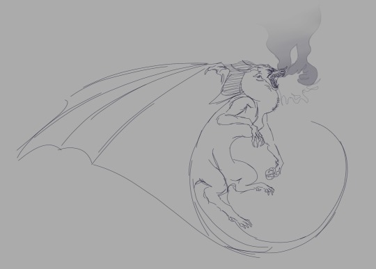
trying to learn how to do different poses hehe
#wof#wings of fire#skywing#skywing wof#i absolutely suck at tags#and drawing fire#its still really fun though ngl so thats okay#i wanna eventually learn how to get better at fire but im more focused on anatomy n posing at the moment
329 notes
·
View notes
Text
i literally only draw girls kissing so to fix that i’m trying to do pose studies to improve at anatomy/art.. so that i can draw girls kissing more efficiently ofc 😁
#i did a pose study of d/onghan from we/i i don’t think it turned out too bad#it was actually kind of fun#so i’ll definitely keep doing it#🧸#i really wanna get better at anatomy so i can draw cuddling poses 😣
3 notes
·
View notes
Text
Doing art has been kinda difficult lately even though I have so much free time and that's why I'm really really happy that I love my last drawing so much ^^
#i also had a lot of fun with it and i did it really quick!!#also extra proud cause instead of using a reference picture and just copying the pose like i usually do#I actually did most of the anatomy myself and used references for most specific parts#i think im getting better with anatomy which has been one of my biggest problems for years!#yay yay#i may draw more ossn tomorrow cause they are very dear to me#i wanna draw other hq characters too and go back to mha (haven't draw anything in a while) at some point#but for now im taking it easy#step by step#sorry I've been taking so much around here lately i hope that's okay!!#i wanna be more present hehe#axel talks
3 notes
·
View notes
Text

that's it i'm officially DEAD and in tears omg zu.. oh my GOD zu omg i'm i can't even TYPE i'm shaking so hard it's so!!!! i'm so!!! ahjgzdyhagahgfd ZUUUUUU<33333
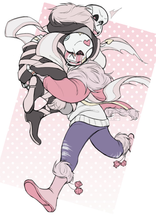
Happy birthday @yuriyuruandyuraart! ◟(๑•͈ᴗ•͈)◞
Ribbon (pink!Cross) & Buns (pink!Killer) by yuriyuruandyuraart respectively ;3
Cross from xtaleunderverse by jakei95
Killer by rahafwabas / rahaf-wabas / rahofy-sketch
+ the transparent one ehehe <3
#reblog#other's art#buns#ribbons#fanart#and oh my god you drew me fanart oh my god oh m#i JUMPED when i saw this like LITERALLY almost fell out of seat good GOSH#i had to shake myself cause i couldn't even see the piece clearly without tears blurring my vision aughghg ZUUU#i'm i can't stop CRYING your words mean SO!!!! MUCH!!!!!#how can you even say these things when i've known you were literally the dictionary definition of a kindhearted bean#literally before my blog was even MADE like come ON zu#and hearing you say you planned to draw my babies?? for years??? a knife in the chest wouldn't make me cry as hard as that#this day was already getting better and better but now it's just beyond perfect hhgjgf ZU zu zu hear me out#the tags under your art aren't for funsies they're a NECESSITY#if i have to go insane over those intricate tiny details then so do YOU!!! and you WILL hear me sobbing about it or i will perish#i can't believe how many people think i'm energetic hhh i'm literally so tired all the time xD#i am enthusiastic when it comes to art and characters tho!! like i'm unhinged about YOUR art you sweet sweet little goose<333#it almost looks as if buns is escaping from his panel into the dashboard and AGYGGYGU i CAN'T zu i can't i can't#CRYIINNG over your pose waaa it looks so ALIVE and interesting and and and!!!!!!!!#SO pleasing to look at :'((( don't get me STAAARTED on your anatomy i don't wanna type up an essay#but also who am i kidding LOOOK AT THE BOOTS!!!! THE LEGS!!!!! THE LITTLE PERFECT HANDSSS AND THE BAND-AIDS#and the expressionss your beautiful stunning expressions...lemme steal your lineart please please please???#this is so good i genuinely feel my lungs constricting trying not to sob my eyes out goooosh zu- you have no idea how cool you are huh#what else can i SAY when i can barely see the screen i'm just. SO happy :')c#seeing my designs in your style is such a pleasure i literally couldn't ask for anything better for my birthday<3333#i love this i love you and you art sm muah muah thank you thank you THANK YOU#amazing art<3333
587 notes
·
View notes
Note
Hey! I just wanted to say that I absolutely love your drawings ! It has so much life in it, and I don’t know how you come up with those amazing designs for Link but they’re incredible! I never have enough imagination, lol 🥲😅. Seriously, what you do is so great that I’m at a loss for words… Anyway, I support you wholeheartedly, so keep up the amazing work!
Also, if you don’t mind, I’d love to know how you manage to create such dynamic poses and expressions in your drawings; I always struggle with that, haha.
Aaaaaa,I know I’m talking a lot, but are you still working on “Reversal of Fate”? If so, I’d love a little drawing of Link, if that’s not too much trouble 🥺☺️. But if you’re too busy, that’s totally okay too! 😊
WAAAAHHHHHH!!! Thank you sooo much this really means a lot like actually 🧡🧡🧡🧡 I love your art it’s so nice to look at and I get super excited when it pops up on my feed!!! (I especially LOVE ur sksw Zelda and Link designs ^^)
I also value the reversal of fate link fanart you did so much,,, 😢😢😢 Your support means sooo much
I feel as tho ur art already is so fluid and fun so idk if this is actually gonna help u much :( but if it does in any way then yipeeeee !!
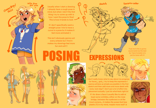
Something I wanna add for improving posing (or anatomy, it really helped me with it) is doing figure drawing! There’s great online websites with models that u can sketch and just get better at doing good posing quick :D Or using reference in general,,,, my art is so messy tho, there’s so many better artists you should look for help to haha IM SO SO SORRY IF THIS DIDNT HELP AT ALLLL
About reversal of fate, yes I am still working on it!!!! I haven’t been posting about it because there are some lore asks I’ve gotten that have been kinda intimidating me so I’ve been quiet about it ehehe
Here’s some rof Link (right one is a sneak peek at a piece I’m working on which I’ll probably post in like so long from now bc there’s so much I have to work on urghhhhhh) ;)
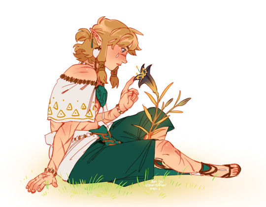
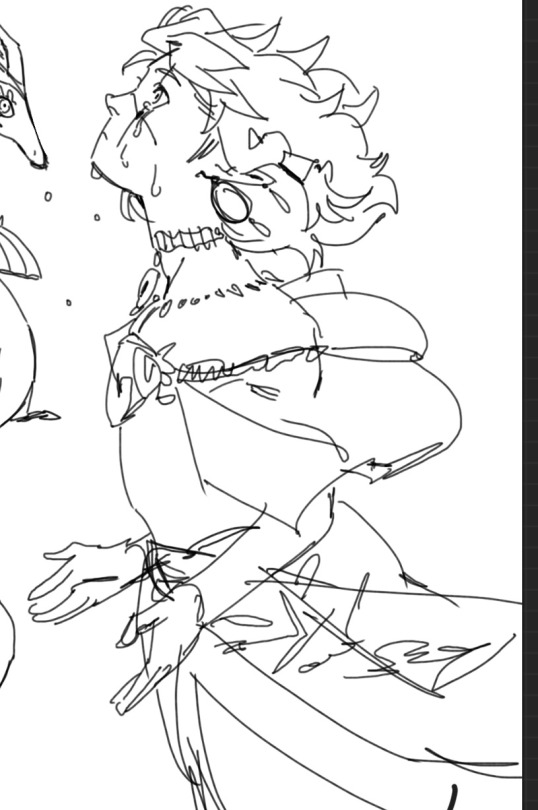
Thanks for the lovely ask 🧡
#art#bad art advice lol#drawing#legend of zelda#link#zelda fanart#digital art#fanart#zelda#link fanart#ask#my art#reversal of fate clowns0up#reversal of fate#rof link#Loz rof#art tips#drawing tips#sneak peek#tloz#Loz#totk#switched au#Zelda au#au#totk au#the legend of zelda#doodle#Sketch#doodle requests
232 notes
·
View notes
Note
Archer how to anatomy? I've attempted to draw the same pose 3 times already..I'm getting better but the arms are so fucking hard to draw..
I'm probably the last person on earth you should be asking for anatomy tips but here are the things that has worked out for me cause I am lazy and hate practicing fundamentals so most of this was just passive learning accumulated during just years of drawing in general
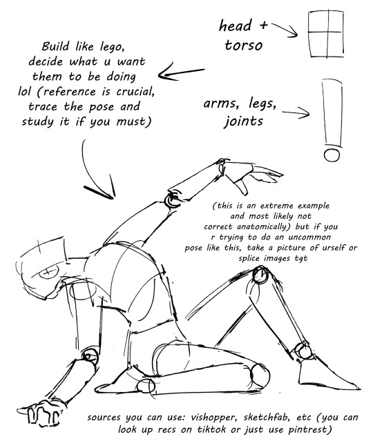
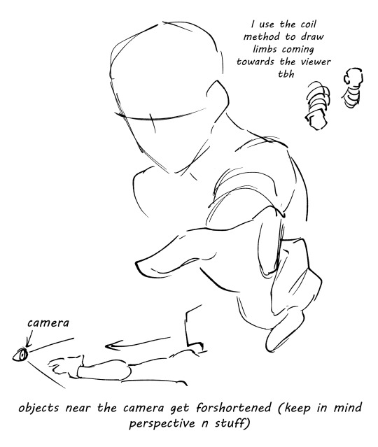
Also more things to keep in mind:
-Bone and muscle structure: learn how the muscles connect (especially when drawing busts, learn how the muscles of the neck overlap) and how the bones affect visual appearance on the skin (protrusions such as shoulder blades and collar bones)
-Proportions: learn the proportions of the body
"but Archer, what about stylization like chibis?" Even then, stylization requires a degree of understanding about the anatomy of whatever being ur drawing. For example, if your character has an arm or hand that is bigger than the other intentionally, fine, that's how the design is. But if it's not intentional, its not an art style. That's a mistake.
Basically don't let pride get in the way of learning tbh (my dad flamed me on this enough ( mf my greatest hater fr)) (I am still struggling with this don't be me and actually learn from ur mistakes and study)
But what if you don't wanna practice all that bullshit and jump straight to the fun part and draw your favs?
Use them as the character practice. Obsession is the pathway to glory.
But, of course, take everything I say with a grain of salt, I am no professional and just so happened to be able to stumble my way through shit without many ppl directly telling me "wow you suck ass at drawing *insert death threat here*"
Most importantly, reference the masters or whatever artist inspires you. If they have speed paints, watch how they construct the body and how they render it
#everyone's art journey is different and this is just what worked for me personally#the most important thing when creating art is to have fun#I consider myself a very amateur artist tbh my skill is quite lacking so if my advice is bs then please forgive this sinner#archerdoodles#ask
111 notes
·
View notes
Note
Oh uh forgot to ask in the previous ask (the one with the digital piece of candy and scurrying and stuff)
How do you draw art so good
Like
Is there a method you use or is that just the style you've gotten over time?
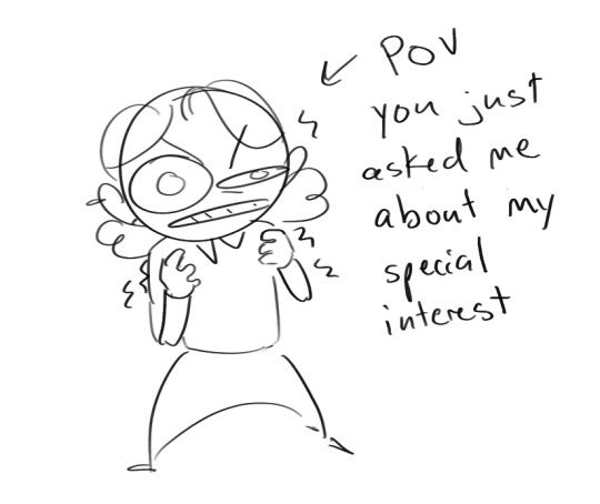
you've activated my trap card
I'm just gonna preface that this tutorial is from someone who was not professionally trained and didn't have a lot of free time for art, so a lot of the tips I have is short cuts I use to get the best results quickly
If you genuinely want to get better at art then please look at references and practice that is always the best
However if you are like me and only really do art for fun but want to go faster then these are for you pfppt
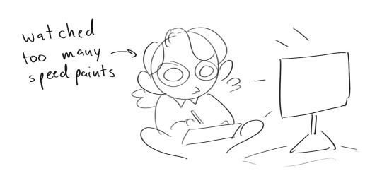
Overall I'd say my style is influenced by speedpaints I would watch when I was younger, I like analyzing how people do things and what makes something look "good" to me
I always recommend watching them because they will often have techniques you've never seen before or do things a certain way that you can try out yourself
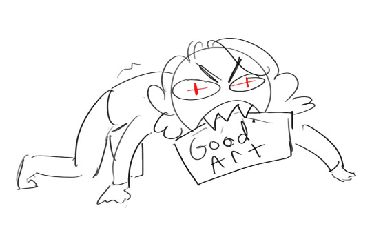
I consume good art, it feeds me
but seriously it can be super helpful when developing your own methodology, or just generally trying something new
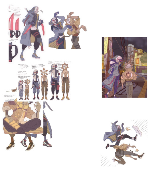
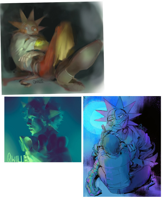
Usually it starts with me pulling some references from artists I really admire and sort of sketching out how they do the things I like
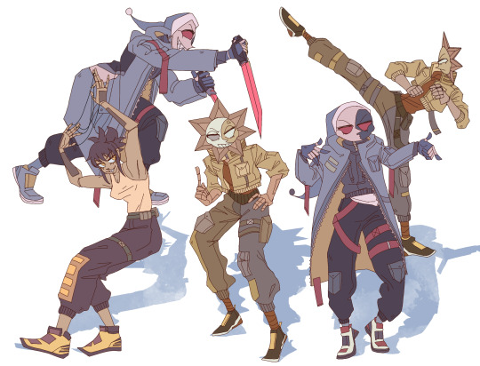
For example 8um8le has like super good anatomy and poses so I focused on trying to replicate how they do that
venemous-qwille is super good at color and pulling focus so that's what I focused on in my study of them
In general I'd say my process is sketch -> silhouette -> color -> shading -> render
I really don't like doing lineart lol

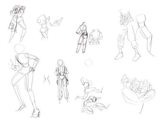
I'd say for the sketch the most important part is using references and just kind of fudging it until it looks correct anatomically/physically
General rule of thumb is spend time on areas of interest, and keep non important areas light (like the stitching on his pants)
I don't do lineart because I think its unnecessary for most paintings I do
I naturally tend to put more time and focus on areas of interest (like hands and feet) and if you use a brush with opacity for the sketch, those areas are naturally going to be darker in the final sketch
Of course this is gonna be different for everyone but it's what works for me
Sometimes I do a really really sketchy layer underneath my sketch/lineart, just so I know where everything is going
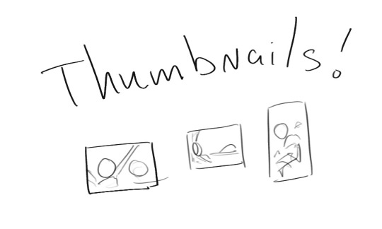
Use thumbnails! They are great to help figure out the general layout of things and what pose I wanna do
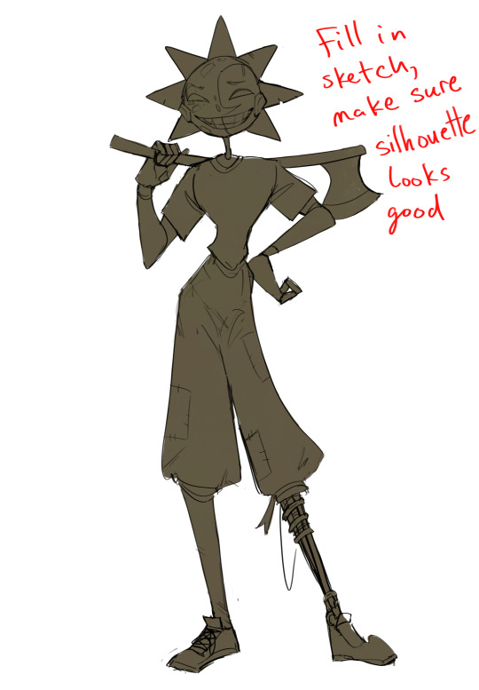
Next is what I call the "silhouette" layer
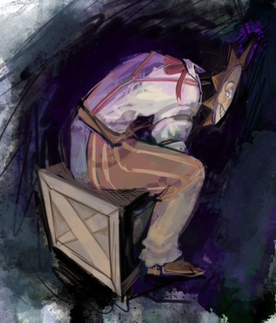
This is super important for me cause it helps me refine the figure and make sure the pose/anatomy looks correct, also depending on what color I choose for the silhouette helps guide what colors I'm going to use on top
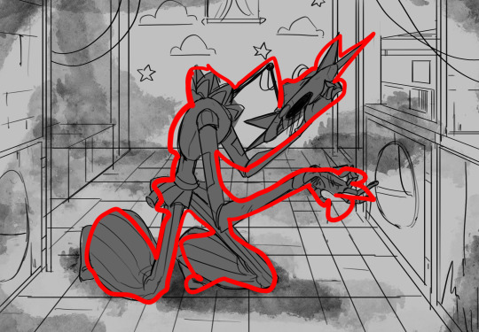
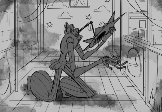
This piece is a good example of how it works. The silhouette shows me how the figure interacts with the background, how the pose looks and if its any good
The silhouette layer doesn't have to be super clean, as long as it follows the sketch decently well and shows where the figure is then its fine
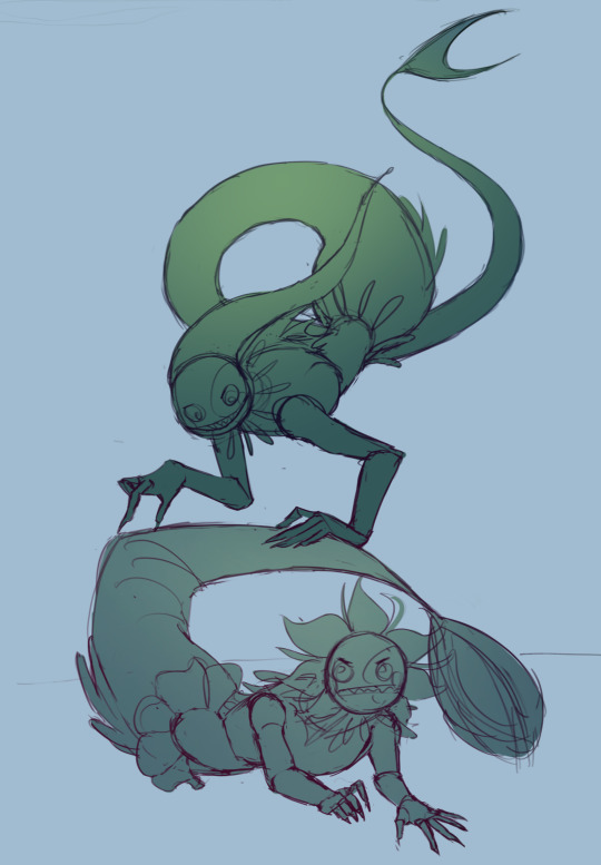
I also sometimes make the silhouette layer multiple colors to help guide shading and vibe
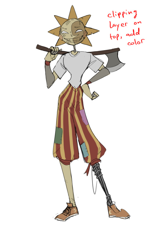
Next is the coloring layer. I usually make this a clipping layer on top of the silhouette layer, or I change the silhouette layer to alpha lock, either way it saves me time on coloring everything in

Sometimes I am super rough with the coloring too, using like an airbrush or my fav watercolor brush just to generically block in color where I want it
Works out cause most objects have like a bounce light to them from surrounding objects, so this is sort of a cheat I use to get that effect without all the work lol
Also don't be afraid to have the lower silhouette layer shining through, having multiple colors sort of subtly shining through the piece helps lots
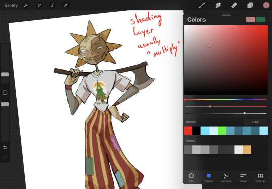
Next is the shading layer, this is usually another clipping layer, usually set to "multiply"
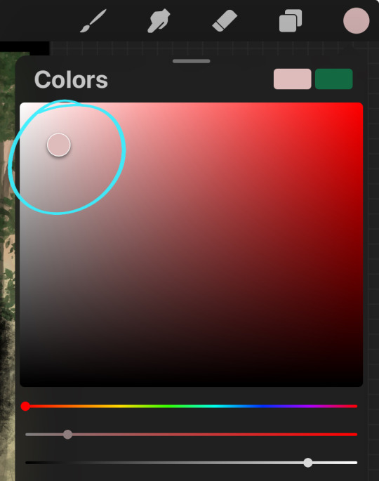
The colors I pick here is usually within this range, any color works, just depends on the piece and vibes.
Since this piece is set in a sunset forest I choose a more desaturated orange for the shading layer
I know there's a whole thing about multiply layer being a crutch (and it kind of it) but it is a useful tool when you just want some darker values across the piece but don't want to go through the process of color picking every single darker shade
Also in my opinion it looks better than picking a darker color and setting it to a lower opacity, idk I just think the color has more "depth"
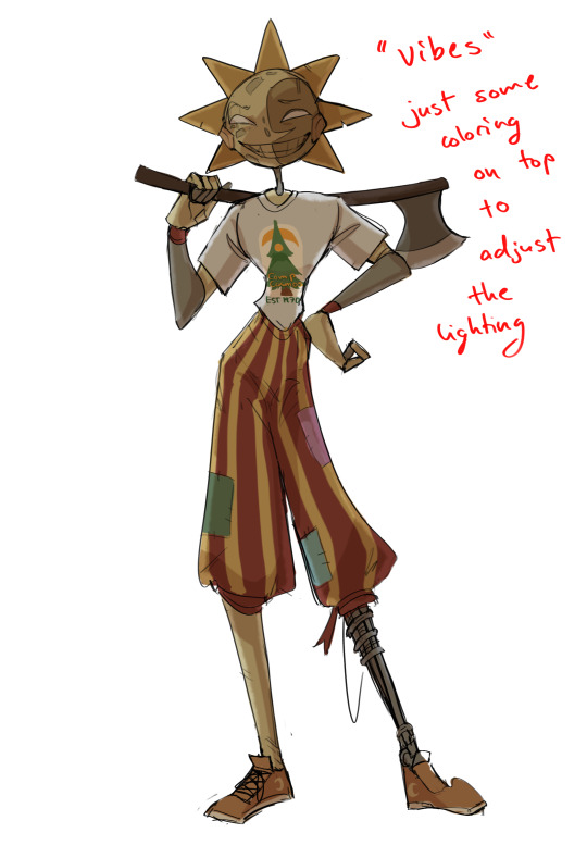
Next is the hardest to explain, sort of the vibes layer
Usually its just a layer of more concentrated color on top of the normal color and I fudge with the settings and values until I get a result I like
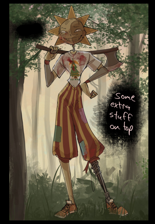
Next is the longest step, is the "extra" or the render stage.
Usually I add a background before this step so that if I need to merge the figure better with the background I can
If I render with a white background but he's supposed to be in a dark forest, its going to mess with the lighting severely
Also this is when I add more "vibe" layers on top to get the figure to match the background better
Backgrounds in general I recommend checking out @/derekdomnicdsouza on instagram he's got lots of great tutorials for breaking down backgrounds simply

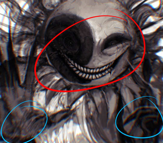
I'd say general rule for the rendering layer is to focus on the areas of interest and spend less time on areas you don't care about
I even blur stuff out on the edges I don't want people to see, partially to save time on fixing mistakes in areas I dont care about (oop), but mainly to help draw the eye to the areas I do want people to focus on

Theoretically parts of the background should like mesh with the characters, parrallel lines are a no no unless they are directing a viewer to look somewhere, things that are perpendicular help bring things together
tbh I'm still not the best at layout and probably need more practice, but overall this is what I like doing
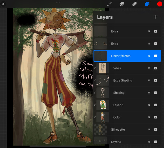
Overall this is what my layer set up ends up being
Sort of a sandwich with the lineart/sketch as the "meat" lol
Color and basic shading below the sketch, clean-up and rendering on top
I like this method cause it's super flexible if I ever want to try something different or try to replicate someone's style
I can make each step less or more messy depending on the end result and can add a lineart layer if need be. Also if there's a part that is straight up not working or needs to be removed its super easy to do cause I can just paint over it on the "extras" layer, color picking from the surrounding area to get the same vibe
Generally rule of thumb for my style is: get the initial layout of colors, form and shading to look good, then the rendering should be smooth sailing
Really the best advice I can give to get better at art is to enjoy what you're doing and become very very obsessed with drawing a silly little guy
You'll eventually get very good at drawing them pfptpf
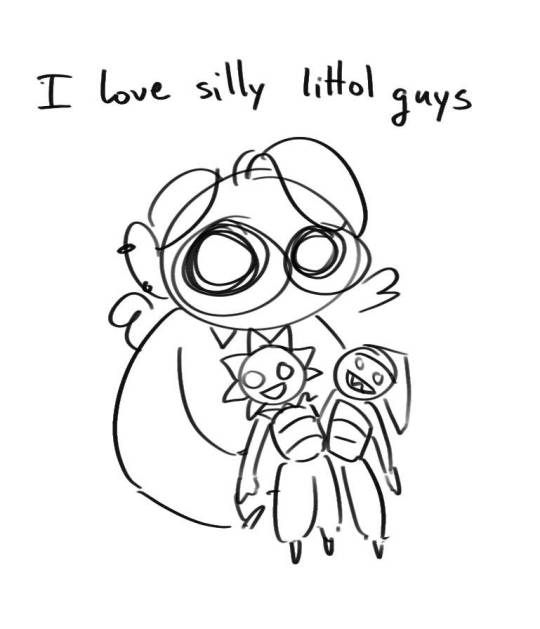
#sundrop#moondrop#long post#art tutorial#fnaf sun#fnaf moon#I draw them way too much holy guac#ask#this is for you asker#idk if anyone else is interested in this kind of stuff#i apologize for ranting lol#also me struggling to spell silhouette like 15 times
116 notes
·
View notes
Note
I just wanted to say I think your art style is awesome! I was wondering if you had any tutorials on how you draw anatomy in your style (hips and legs especially)? Sorry if there's already one posted and I just didn't see it 🥲. Happy New Year :>
thanks for the kind words. i tend to draw people pretty stylized and then some so a good bit of artistic licence gets used. these tips are just what i use so feel free to take them with a grain of salt. with anatomy in particular you can kind of talk in circles because human/animal bodies are that complex so ill just zone in on the points you specified. here's a little image with a bunch of pointers:

the above image condenses a lot of the points I'd make, but basically the key parts are to start with the bare essentials and build up that complexity. using a line of action is a good way to get a quick, rough start. you draw a line out in the general direction of the pose and do your best to adhere to it to give the pose a sense of flow.
you can also draw smaller, thumbnail versions that throw a lot of caution to the wind but capture the basic energy of what you're going for. even having a tiny little stick figure version of your idea can make for a good guideline of where to take it forward.
when it comes to actual limbs, you wanna consider how they integrate and work together, kind of like how chains do. you can see on some of the parts of pear i've drawn out these wireframes to kind of portray how the mass of her legs works in a three dimensional space. for aspects like the waist/hips, i use that X technique i highlight above a lot, particularly for the lower torso. a lot of the times, even when drawing a character totally naked, imagining them wearing things like skintight underwear can help a lot to guide you in the right direction.
its also a good idea to consider things like gravity and weight to a degree. humans are essentially big meat sacks and gravity is always pulling down on that, but theres all kinds of aspects that effect that, such as character build or clothing. pear technically isn't naked in this, but i've tried to imagine her as such and take that into account.
if you are drawing digitally, don't be afraid to take advantage of the convenience you get with that workflow. you can retry and iterate on things a lot faster that pen and paper, and do things that aren't really feasible at all when it comes to editing and modifying your existing work. things like resizing certain bodyparts, instantly flipping the canvas, or using selection tools to completely adjust the positions of parts of your drawing. to give you an example heres a timelapse with all the little edits i made just to this demo drawing:

you don't have to use these techniques linearly, either. sometimes ill have a really solid idea for a piece in my head, and go back to basics with certain elements if they’re not coming out right or i just want to brush them up a bit more. some of the tutorial-y parts i added in i didn't actually use during the drawing but often do use so they're there just for demonstration. not every drawing i do starts as building blocks or a really basic version, often ill just start with a face and build it out from there.
i always encourage liberally using references (this can include yourself) and trying out stuff like life drawing or looking at things like existing photographs of real people/places/things if you can, the more you use learning material the better you'll draw up a mental inventory in your head that you can rely on more and more. some of these tips are things i've learned from other artists over the years (the chin one especially i remember seeing a tutorial about lol), so this is a lot of knowledge i've amassed from other sources over time myself. there are plenty of times ill use all sorts of reference material and its all in service of arriving at the final destination as smoothly as possible. learn by doing, as they say. hope this helps!
967 notes
·
View notes
Note
I love your artstyle!! Do you have any tips for drawing?
thank you so much! i'm really happy you like it!!💗 as for tips, what i would say would change drastically depending on what kind you're looking for, but some very general ones:
draw what you love and want to see most, regardless of whether anyone else wants to see it. if you don't enjoy what you're drawing it'll never come out as good or genuine as something your whole heart and soul is in. i mean you'd think this would be a no-brainer but sometimes i've had to sit back and ask myself 'if no one was ever going to see this except me, would i actually spend time drawing this?' and i was surprised by the answer
that said, it is also completely valid if your motivation for drawing is to draw for other people! there have been plenty of times where i was too artblocked to draw my own ideas but was still able to draw commissions or gifts and enjoyed it simply because making other people happy with my art makes me happy.
don't get too caught up in having a consistent art style. in my experience this 1000% hinders you
having your sense of anatomy degrade over time without you noticing because you keep drawing the same types of characters is a very real thing! if this is a concern to you be sure to draw a variety
follow a billion artists that you like the art of and you will have endless inspiration injected directly into your brain every time you open social media
my favourite practical tip for those who draw at a desk: keep a small mirror next to you at all times. absolute game changer for quickly referencing hands
if you're drawing digitally, make the canvas huge! in my experience this lets you draw messier/faster and you can't tell at all when you zoom out. if you tend to get stuck spending unnecessary amounts of time micromanaging pixels (me💀) keep it zoomed out while drawing
related to the above point, messy drawings can have far more expressiveness in them than neat and polished drawings. nowadays i never do lineart and go straight from 'barebones stickman pose' to 'varying-levels-of-coherent sketch' and use that as my lineart. sweet freedom from the sketch-looks-better-than-the-lineart phenomenon
if your goal is to improve, then you really do have to scrutinize your art, figure out what you're not satisfied with, and commit the time to focusing on it. 'practice makes perfect' kinda rubs me the wrong way because of how much i've seen it interpreted as 'just draw everyday and you'll magically improve' but genuinely it won't get you very far if you don't actively think hard about what you're trying to improve and take the steps to do it. is this a hot take idk. also hand in hand with this, not every artist is trying to improve and you shouldn't feel bad for this! maybe you just wanna make a little headshot doodle of your fave blorbo and that's your only drawing goal ever. awesome. maybe you know your art has flaws but it's passable enough to convey what you want and you're perfectly satisfied with that. (this is the stage i'm usually at). also awesome!
don't hesitate to draw something because you think it's out of your skill level. the worst that can happen if you draw it is that it comes out terribly but you learned something and can always redraw it better in the future. the worst that WILL happen if you don't draw it is that you'll never draw it. and then it will sit in the back of your brain haunting you for years. it's not like i'm speaking from experience or anything aha
look up 'hand stretches for artists' and do them if you draw a lot unless you wish to summon the wrath of the carpal tunnel demons
of course, these may not necessarily work for you, and most importantly(!) these are coming from the perspective of someone who is primarily a hobbyist. some of this won't be practical for people who need to build an audience, maintain a consistent style for work, etc. these are just things that have personally helped me over many years of drawing :)
99 notes
·
View notes
Note
idk how but you draw in the Oso-san style so good i need to know your secret please
HAHA thank you very much!! im glad you think so :D unfortunately im not very good at explaining how i work, but ill try my best to show what i mean!!
once again this is long as hell. you know the drill at this point
to be honest, half the battle i fight with drawing in the osmt style is just. Looking at it. the ososan art style actually fluctuates pretty wildly depending on what you're looking for, whether that be the mobile games (for instance, tabimatsu and hesowars look nothing alike in terms of style despite both being the same source material), official art and merch, or even the seasons of the show itself!
using ichi as my example here since i draw him the most, but its pretty easy to play spot the difference with the varying styles. even within a specific season you can do this across episodes, especially with season 1!

when i draw, i tend to be a bit sacrilege and use references across different media; usually ill use the show [especially season 2, if only because its a bit more "uniform"] as reference for the actual features and colors/poses/etc, but i like to use hesowars to reference proportions, since they seem to be most consistent there.
SOMETHING IMPORTANT TO NOTE: theres a WEALTH of fanartists that have styles that are INCREDIBLY similar to the show, so be careful to check your sources! these artists deserve credit for their hard work, which they often don't get since their work is reposted under the guise of being official art.
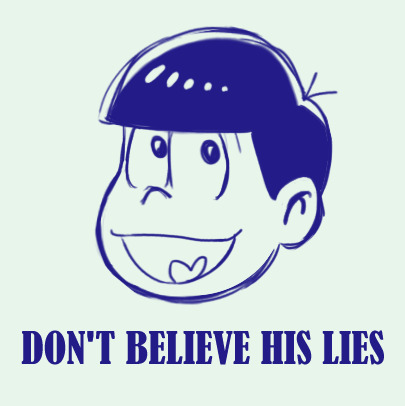
once you've pinned down the exact style you'd like to emulate, and the character you're looking to draw, its really just a matter of finding references, which is pretty easy! you can scrub through different episodes for good angles/shots, or if you're going for one of the game styles the AU wiki has most of the games catalogued to my knowledge. if you're looking to draw an oc, use characters you think they would look similar to in the show. if you really wanna waste your time, though, you can always scrub through crowd scenes in the show to see if any background characters might look like what you're going for; the season 3 episode Mt. Takao comes to mind, there were a lot of cute mob characters there.
using keiko as my example here, you can see that i pulled her features from multiple different characters to get her to look right in the style. with ocs, its important to reference a number of different characters, since the likelihood of a background character being a 1:1 for your little guy is unfortunately pretty low. there WILL, however, be a lot of characters that look KIND of like them. the key is to figure out what parts go where!
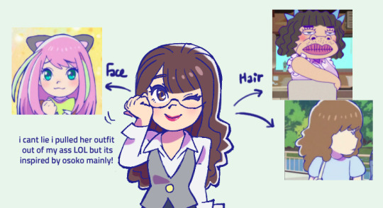
to this point, most prominent ososan women have very similar stock anime girl faces with very minor differences, so if youre looking to make a cute girl oc, most of the womens' faces can be used somewhat interchangeably. if you want your cute girl oc to have a more unique face, though, the movie gave us some women with more unique faces in the form of the NEETs' old classmates! theres also no harm in referencing male characters faces in this regard. #butchswag #kiruminikuya
BUT. going back to the assumption that you're drawing a canon character, today I'll be drawing oso for my example
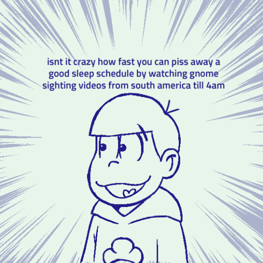
when you're first getting a feel for the style, tracing some of your references can actually be a really great way to acclimate yourself to the characters proportions and features. think of like when you were a kid, and would trace over pictures of pokemon or cartoon characters so you could draw them better. its basically the same principle! this was especially helpful for me when it came to eyes; they vary the most wildly of any other trait that characters have in ososan, so going over the different shapes to get a feel for each of them was very important.
when you trace, though, I recommend doing so a bit more loosely, sort of like if you're doing a photo study for anatomy; block out the basic shapes and do small markers for different features (i.e small lines to denote where the eyes start and and, distance from nose to mouth, things like that), and from there draw the rest on your own.
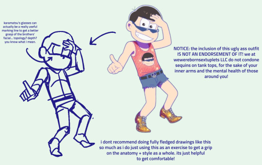
after long enough you'll get a feel for the basic placement of where everything should go! the eyes and nose are undoubtedly the hardest when it comes to the sextuplets, since they shift around a LOT between games/seasons/etc. so don't feel bad if you have a hard time with that, since there isnt really a "right" answer with how frequently it changes. i still fuck it up all the time myself!
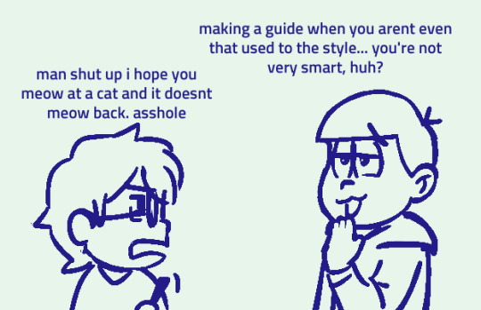
as for some basic tips, heres some stuff i try to keep in mind when drawing them that just helps the finished product look a bit nicer!
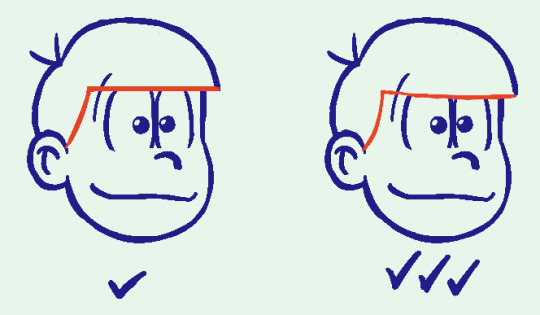
when drawing the hair + fringe line, its important to swoop it downwards a little bit; the flat across look Can work, but if you're not careful you risk showing the tops of their eyes, which is um. ew! ick! nast!
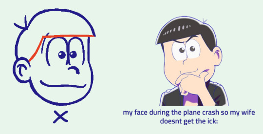
when a matsu is facing forward, their hair will usually tend towards one direction to keep the silhouette. in most screenshots i saw, the bowl cut points left! that said, dont be afraid to point rightwards if its better for your specific drawing!
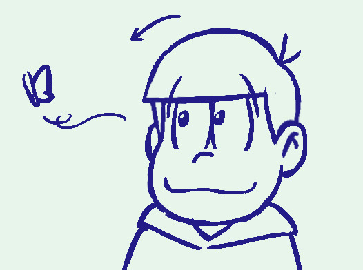
and lastly: USE THE LIQUIFY TOOL. LIBERALLY. i am not joking when i say this has saved my ass so many times, its hard to get the placement right on the facial features and even harder to get everything to LOOK good, so if its available to you i HIGHLY suggest just squishing everything around with a liquify tool until it looks right. you can always go back and correct the blurry lines. its really a life saver
BUT YEAH! i dont know if this was very helpful but i hope you're at least able to gain something from it :-))
79 notes
·
View notes
Note
Hello i need tips for getting better at art and well your art is great...soo uhm...please :'>
i hope you understand that this is a really broad question, but I'll write a few general concepts that I think about. If you have something more specific you wanna know I can give more helpful answers.
Words are pretty important in learning. One part is knowing color theory/proportions/whatnot. The other is actively applying that in the art you create and see. If can describe the particulars of your enjoyment ("I like the sharp and simple shapes", "I like the bold lines and how often the line weight shifts to show off the contours") it's sooo much easier to give yourself some direction and make meaningful progress.
Don't get attached to your process . Too often I'd never touch the mannequin or lineart once I got to the next 'step'. I isolated those parts from each other so I can be organized and clean. But to make something 'fun' and 'spontaneous' you gotta let those parts weave in and out of each other and avoid linearity. Nowadays I'm still adjusting proportions and shapes in the later stages. My layers are a mess, but the vibes are much better. It's also very much why I love thick lineart.....
If you want something to prioritize, gesture drawings are always a good bet. You learn a lot on how to capture the energy of a pose or character (using line of action, shapes, etc) which is very appealing and can overcome faults in proportions, anatomy, etc.
And have your own blorbo you want only the best for ofc ofc.
72 notes
·
View notes
Text
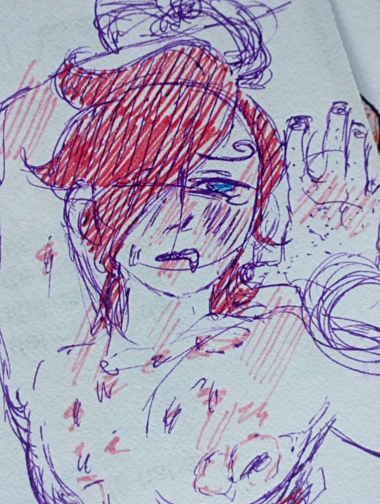
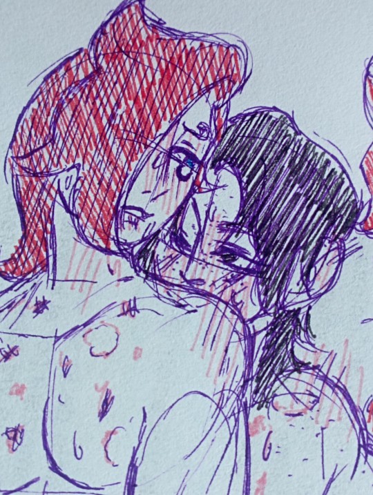
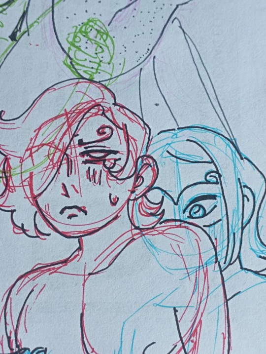
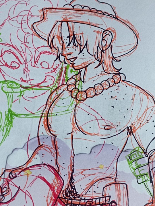
I would recommend drawing nsfw stuff from time to time cuz it's fun and challenging
People ain't lying when they say "draw porn if u wanna get better at anatomy" they just gotta add posing and body language and whatever else
#one piece#vinsmoke ichiji#acechiji#portgas d ace x vinsmoke ichiji#one piece acechiji#op acechiji#portgas d ace#portgas d ace x masked deuce x vinsmoke ichiji#masked deuce x vinsmoke ichiji#portgas d ace x masked deuce#ace x deuce#masked deuce#deuchiji#acedeuchiji#suggestive
64 notes
·
View notes
Note
as an artist who just wants to get to drawing the pretty clothes and is terrible at posing i am forever enamoured by your poses..... they have so much energy and movement!!!
was this via art study, a general knack for anatomy or do you just enjoy posing specifically? and do you have any tips?
(i was just wondering bc your pose work is always so dynamic :D (your lighting also slaps /pos))
this is one case where it's a secret fourth thing lol. I have never successfully studied a single thing in my life, I am not at all a naturally "gifted" artist (and as well I reject the idea altogether), and posing has never jumped out to me as its own task in drawing at all! the way I do anything art-related, and posing specifically, is a lot more mechanistic than how it's perceived I think; I've just assumed this came as a function of how narrative-forward I see art, and how much I focus on comic work.
what folks talk about as "posing" I usually think of in two terms: composition and character acting. composition is how the figures fit into the intended frame, and character acting is the actual motion that'll be portrayed. you can see how that logically works itself out! there are more words than stars in the sky written about composition already, I honestly don't think there's anything I can say that'd be more useful than words from artists like thomas romain. character acting is itself more a matter of writing than visual art to me; you've got a guy and they probably do things, you draw them do those things, that's really it. the rest of it is just, figuring out weights and accenting in a scene, shape language, line flow, discipline-specific stuff like that; since no matter what I'm drawing I always mentally think of it as a comic thing, I usually try to insist on the strong points of that medium, one of which is colloquializing shapes to imply the entirety of a movement through a single panel. I don't always succeed at this! I hope to do better in the future. but it's how I approach this matter.
I think sitting down with your art to think about like, how you're approaching it and what you're in it for would help with troubleshooting a lot of the times. it's helped me before! I'm a completely hedonistic artist, I don't draw what I don't want to draw. what is it exactly about posing that's giving you a hard time? is it something you can do without? usually it is. if it's the thinking up a pose part, you can copy poses from high fashion magazines and sewing pattern models and just photos you find. if it's the fitting a pose into a nice looking complete picture part, don't make it a nice looking complete picture, do it sketchbook style, collage a buncha stuff together. if you never want to think about posing ever again, that's what stock bases are for! make urself some or get some from an artist and just draw the nice clothes.
if ur committed to figuring out posing and wanna ease urself into it, I find prompt lists are pretty good for giving ur brain a ground to build on top of and start asking questions. it's also a good exercise to sit down before drawing a thing to ask urself what u want it to be like, genre-wise: is it gonna be a comic cover, or a family photo, or a professional photoshoot, etc. these things have their own visual languages, and keeping that in mind will direct u on how to frame and choose the movements for ur piece. or, if that's overwhelming, drawing characters running is always good! there's plenty of character acting involved in there, it shows off the physicality of the clothes nicely, and it's decently easy to frame.
(I am similarly mechanistic about pretty much every other aspect of drawing lol, lighting/shading included. fully a case of "if it looks alright I put it in, if it doesn't I don't do it". I still struggle with it every time I do colors, but what can ya do. if the piece asks for it that's what it'll get. thank you very much for the nice ask!)
#not art#ask#ngl when u mentioned in ur ask that u like drawing clothes but not the poses I immediately went that is in fact a whole discipline#that's fashion sketching! I don't Like that discipline because the point is the clothes (and also every mainstream example of it#is an artist drawing the thinnest skinniest most featureless figure ever lol) but art that is just about drawing clothes#definitely exists#I find generally keeping art modular is a good practice. most things in art you can fully do without#if you don't wanna do lineart you don't have to do lineart! if you don't wanna color you don't have to color!#nothing about drawing is an obligation. school is made up. don't make it unfun for urself!#you can't get good without getting comfy. honestly you don't even have to get good you can just draw for fun forever#''improvement'' is for people with somewhere to get to. if ur just hanging out sightseeing why hurry and miss the sight#I've said here before that I like giving characters clothes and usually that's read as ''I like drawing clothes'' but#there's a whole second half of that sentence folks seem to gloss over usually. which is ''I like drawing characters''#and honestly the ''clothes'' part is sequentially secondary to the ''character'' part. it's actually all character art to me lol#if u give me a featureless nothing base model to give clothes to I would not be able to do it. that means nothing to me#thats why knowing what ur up to with art is important I think. when u know what ur in it for u can focus ur search for materials#and references and tutorials etc. u can separate the art u like looking at and the art u like doing#and u know u don't have to feel all kindsa ways abt other people doing art that u like looking at but would have a Bad time making#hope this has been helpful at all! no refund if it hasn't sorry that's store policy. my house!
23 notes
·
View notes
Text
COMMISSIONS OPEN!!
Heya! Wanna throw money at me to make me draw something?? Well, for just $20 an hour, now you can!
Read below for price estimates and FAQs, and if you’re interested, please email me at [email protected] to get started!
PRICING INFO
Because I’m too lazy to come up with complicated price structures, I’ll just be charging a flat rate of $20/hour for any work I do on the art piece. The clock starts when I pick up the pencil or digital stylus and ends when I put it down.
This does mean that prices will vary, depending on how time-consuming each art piece is, but I can give you some rough estimates.
Upper Body Sketch: Approx. 30 min = $10 for one
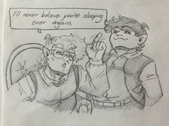
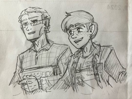
It takes me about half an hour to draw a bust or upper body sketch. This time can be shortened if I’m already familiar with the character design, or lengthened if I’m drawing an unfamiliar character or doing some weird perspective stuff.
Every additional figure would probably take another half an hour, adding about $10 each.
Full-Body Sketch: Approx. 1 hour = $20 for one
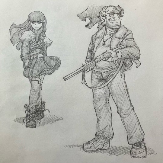
Drawing an entire figure is a little harder than just drawing the upper body, so this one might take longer. Again, this time can be shortened or lengthened depending on my familiarity with the character, how complex the design is, and whether I’m doing any complicated posing or perspective.
Adding additional figures can take anywhere from 30 minutes to 1 hour, adding $10-$20 each.
Animals: Approx. 1.5 hrs = $30 for one
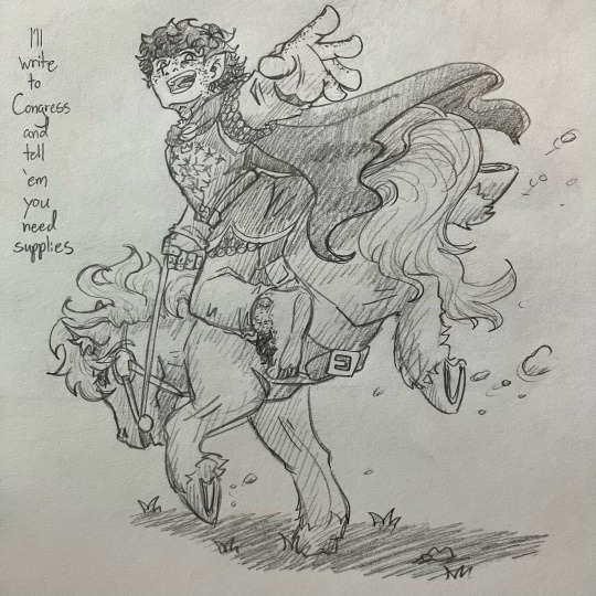
Animals are not my strong suit, though I have gotten better at drawing them over time! However, the extra time studying reference photos and trying to get the anatomy correct can stack up quickly, so you’ll want to be aware of that if you’re commissioning something with an animal involved.
Posters: Minumum 3 hrs = approx. $60
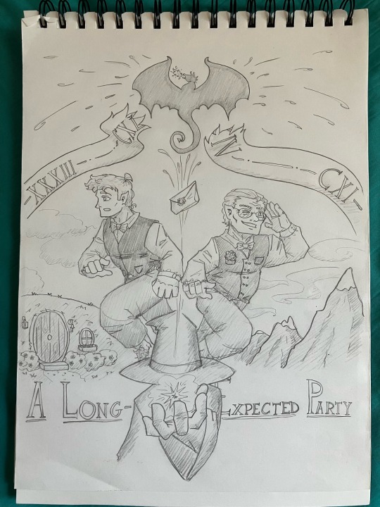
Posters take a little extra time—and usually some trial and error—to plan the layout in a dynamic way. They also take up an entire sketchbook page and tend to include multiple people and some extreme perspective to add visual appeal. You can expect a poster to take about three hours minimum to complete.
Multi-Panel Comics: Minimum 4 hrs a page = $80
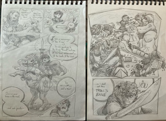
Drawing a comic big enough to cover an entire sketchbook page can take me anywhere from 4 to 6 hours of work. If drawing a long-form comic, I will probably divide the work over several days. Brainstorming will happen on the first day, when I’ll plan out how many panels I’ll need for the comic, and then I’ll get in contact with you to tell you an estimated price before I proceed.
Digital Coloring: Minimum 1.5 hrs = add approx. $30
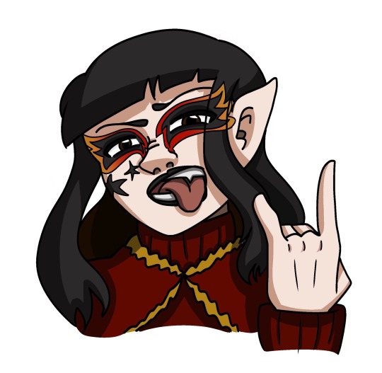
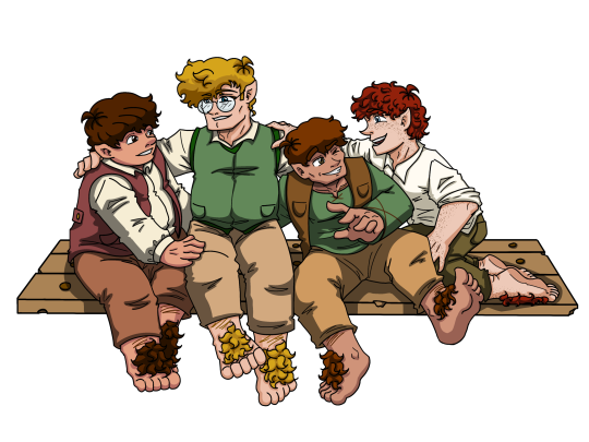
Coloring things digitally takes about double the time it would to sketch; I’ve noticed it takes around two hours to color a simple image, with another hour added for each figure involved. This first image took me about an hour and a half to outline and color, while the second took about five hours.
Add to Redbubble Shop: Subject to Redbubble Pricing
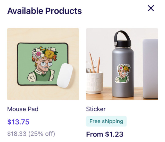
If your commissioned artwork is Lord of the Rings-related, I can put it into my Redbubble shop, where you can have it printed on stickers, t-shirts, journals, mugs, and lots of other products! I won’t charge any extra fee, but you will have to pay whatever price Redbubble asks. Full disclosure: I receive only 10% of the profit from Redbubble sales; the rest goes to the website to cover manufacturing and shipping costs.
FAQ
No NSFW
No nudity or sexual content
Canon ships only
Will draw gore/injuries
Will draw OCs (please provide references)
Will draw for other fandoms (please provide references)
The artist reserves the right to reject any commission without disclosing the reason
The artist will give price and progress updates over the course of the process
You, the commissioner, have the right to terminate the project at any time and for any reason
If the project is terminated halfway, you will be charged for the artist’s time, but the artist might give a discount for incomplete work
Payment will be calculated at the end of the project and rendered using PayPal
Once again, if you’re interested, please email me at [email protected]!
#art commissions#commissions open#my art#HEY GUYS WANNA HELP ME RECOVER FROM A $700 MECHANIC BILL I HAD LAST MONTH?? 8-D#oh and also i wanna get back into art lol#gotta get the ball rolling somehow#love y’all; thanks for your patience on my hiatus 💚
36 notes
·
View notes
Note
Asking for a friend, but do you and Llama have a specific place you look for spicy art references? Or is it just lots of questionable googling, or yall are just that damn good drawing bodies? For research purposes...
Ps thank you for all your art 🙏🏽
i wish there was a magical place but yeah, don't underestimate the power of simply googling something! This really goes for all art doesn't matter if sfw or nsfw. I think i mentioned before how nsfw art doesn't always mean you have/use nsfw reference. Figure drawing sites can help you out a lot, making you better at inventing your own poses! And they often have nude models for anatomy practice.
Looking at my last 3-4 posts there's really nothing in there that I used a lot of reference for. Sure sometimes you see a picture and go oh yeah i'm gonna draw my blorbo JUST like that, but hoping for 1:1 reference of what you have in mind will make you stuck searching for the 'perfect' ref forever. I know tumblr used to have a lot of blogs that post nice tasteful images that are probably lost forever now, twitter isn't the same.
Just google the thing! try it! it can be as simple as...'person sitting in office chair' if i feel like i'm stuck with a pose. Google a tiddy, google chair sex if you want to, no one will stop you. It can be as simple as that.
Here's one example of a picture inspiring a pose, but i didn't rely on it for anatomy reference. I don't think I looked at this pictures even once while drawing. I probably scrolled past it on twitter and it simply gave me ideas.

I hope this isn't too demotivating, i wish i could say here's the magic pot of all your reference dreams. I feel like some people get a little too stuck in that thought that you need/or will find a 1:1 reference for what you wanna draw, but you wont. Stop looking for a magic place, sometimes it can really be as simple as googling! I think improving your figure drawing skill will really help you a lot more! ( Yeah that's where the getting good part unfortunately comes in)
#art talk#i know it's not the answer most people hoped for but FIGURE DRAWING FIGURE DRAWING FIGURE DRAWING#figure drawing can be your blorbos
124 notes
·
View notes
Note
How do you draw eyes and mouth expression and hands I'm a young well not artist yet but I really could use some guidance
[sorry is this is to much I really don't wanna be a nuisance but thank you for your time]
I’m not too great at explaining but I’ll try
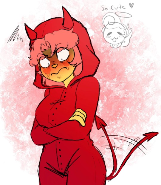
I’ve been told that my art style is like western cartoon and anime mixed together. Not everyone’s art style is the same. Mine has more exaggerated features and body proportions.
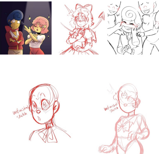
It depends on the expression. Sometimes I stretch the face, other times I squish it a bit. I usually stretch the face to make a bigger surprised expression. And squish to make them appear cuter or when they’re angry.
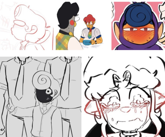
Also don’t be afraid to REALLY exaggerate the expression. Break their features a little. Be more cartoon and anime logic.
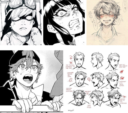
It also helps to know the human body just enough to know where wrinkles are on the face. Like when you furrow your brows and scrunch up your face wrinkles appear. Adding a little bit of wrinkle to your characters face can add more to their expressions. Along with making the eyes wider and the iris smaller.
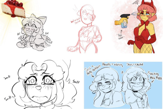
I also like to use Millie’s eyes to make her more expressive. I make her pupils hearts when she’s adoring something. Stars when she’s super excited. I make her pupils small black dots when she’s startled, scared, mad, annoyed, and irritated. And when she’s crying I like to make her eyes a bit wobbly looking.
Also looking up references really helps too. I recommend using the app Pinterest. It’s super useful and is what I use for references and designs.
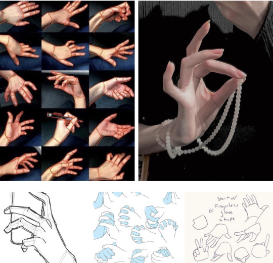
As for hands I don’t really know how to explain it- but getting references is really helpful and don’t be scared to sometimes trace the lines of the hand. It helps you learn the anatomy. I personally make a rough sketch, another sketch, and keep going until I feel like the hand looks good enough. It took me awhile to draw hands like this so don’t worry :) also looking at your own hand also helps sometimes!
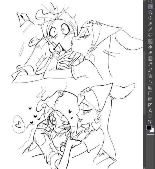
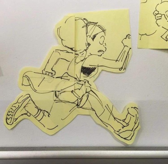
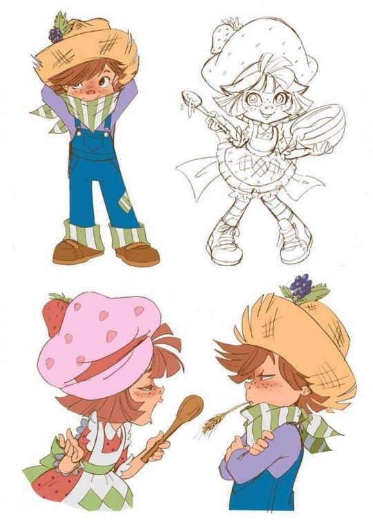
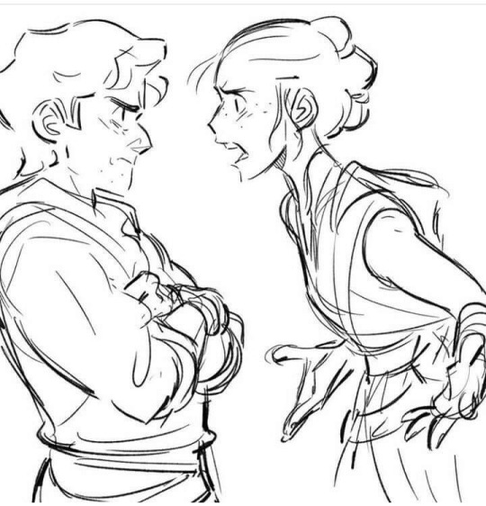
Also exaggerating poses a bit or a lot can help make your drawing more expressive too-
As for mouth I kinda just…draw a cat mouth and go from there lol
I think that’s all I can explain right now. I hope it helps at least a little bit! Make sure not to push yourself too much on improving your art and style. Everyone’s art journey is different. Some did art for a short time yet is better than some who has done art for a long time. It also depends on if you actually do some art studies. But drawing just for fun also helps so much. Drawing every day improves your style. Try pushing yourself out of your comfort zone sometimes too. We’re all still learning so don’t be afraid to make a few mistake. Keep up the good work! :)
89 notes
·
View notes