#I think the lineart is making it look flat
Explore tagged Tumblr posts
Visit Tumblr Blog
Explore Tumblr blogs with no restrictions, modern design and the best experience.
Last Seen Tumblr Blogs


Fun Fact
Tumblr was acquired by Yahoo for $1.1B in 2013.
Text
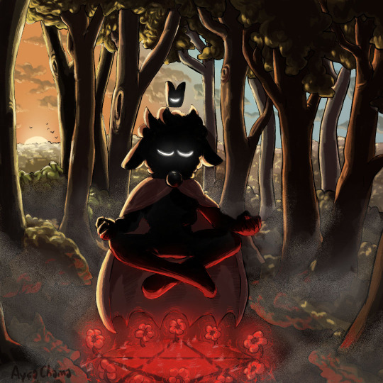
Meditating.
#cotl#cult of the lamb#cotl lamb#cult of the lamb lamb#🐑#baah#we say meeeh here#aychama#I heckin love drawing the bell#🔔#idk how to draw fog#👍#maybe I shouldn’t have done the lineart#I think the lineart is making it look flat#time for another style change for my next one then!#*cries*
325 notes
·
View notes
Text

Hera design for that game I'm making. She's still a rough sketch technically, but I'm also not the most experienced in pixel art 😅 Especially at this size (150 by 200 was original canvas size). Hilariously, smaller is sometimes easier.
Her hair is one of my favorite details, it's braided close to her head but the ends are left loose to be a hair sculpture reminiscent of peacock feathers.
@creatingblackcharacters Thought you might enjoy this one!
#yes i'm aware that the impressive feathers are typically associated with male peacocks#but peahens can actually grow them too!#plus i just think it looks cool#she deserves it <3#other aspects of her design might change with time (they all feel a bit simplistic rn) but this is the core of it tbh#i also hate lineart btw#it always feels so fucking FLAT#i can never make it look good#and i didn't wanna stress myself out and make myself hate it#sometimes you gotta keep your art more like a sketch to be happy with it
43 notes
·
View notes
Text
You ever go a while without drawing so your afraid to do it out of fear of learning you've regressed or forgot how to, only to put it off more as a result and pretty much ensuring that will happen?
#i think i need to play around with my “style” in the background before i make anything big#ill be honest i dont think i have much of my own style. just a “near canon art style with flat lineart/coloring”#something needs to change#cause i think my last few felt more flat and lifeless cause i leaned too much into that#maybe give it more of a “rough” style#or play around with proportions and stuff. so it doesnt look like im just drawing their in game models. i need to stylize them#idk
3 notes
·
View notes
Text
My friends call me an artist but I don't have nearly enough decent pieces. I need to make a goddamn portfolio instead of sketchbooks. I need to make bigger pieces instead of A5 size shit but there is never any fucking time. I have not finished any thought out piece since 2021.
#im gonna redraw the good concepts i drew before and didn't come out the way i wanted them to#also im gonna stary drawing more of the ocs and maybe pain them among the paintings im thinking of redoing.#i also need to repolish my anatomy and perspective shit because i need everything to look more alive#i always used to make concepts that conveyed so much depression and used it as a vent tool but i dont want things to look so flat anymore#i need things to look like theyre moving#and since im so obsessed with thin and precise lineart i think i might invest in a tablet so even tho i start with a small drawing ill be#able to zoom in and make very fine lineart and get lost in the detail of shading without straining my eyes and getting migraines on A4 paper
0 notes
Text
maybe i will stop lining my art . maybe i will just color under my sketches after cleaning them up alittle
#txt#im so demotivated by lineart it always feels so stiff#but i move and adjust my sketches so much the lines get blurry n inconsistent :< and my sketch brush is not great with smaller details#so i rely a lot on lines to fix eyes and to all be crisp and not blurred by transform or liquify#but ... more fluid lines .. sketchy quality .. tasty ..#i suppose i could go the other direction and move towards lineless or semi-lineless#color first then add important lines?#i know i would go much slower doing that tho my lineless stuff needs so much.polishing#ahhhh i should experiment#i want to figure SOMETHING out tho cuz as it is my lines make my stuff feel so flat#i guess i could also try more line weight variation but i always end up carving my lines back down to consistency#hmm .. thinner lines maybe ? more painterly coloring? the issue with just using my sketch is that my fast coloring wouldnt work on it#much to think about#like my current way of doing things is hypothetically efficient because im the most used to it so ican get it done fast#but thats WHEN i feel.like doing it. and i find myself.lately just sketching and not wanting to finish things cuz then i have#to line them#but also i worry about my finished stuff looking unfinished and sketchy lines wouldnt help#but ALSO a lot of my favorite artists have sketchy lines and a lot of them dont even color! AHHH#its late its art crisis time im not SORRY !!!!#<- talkin to no one
0 notes
Text
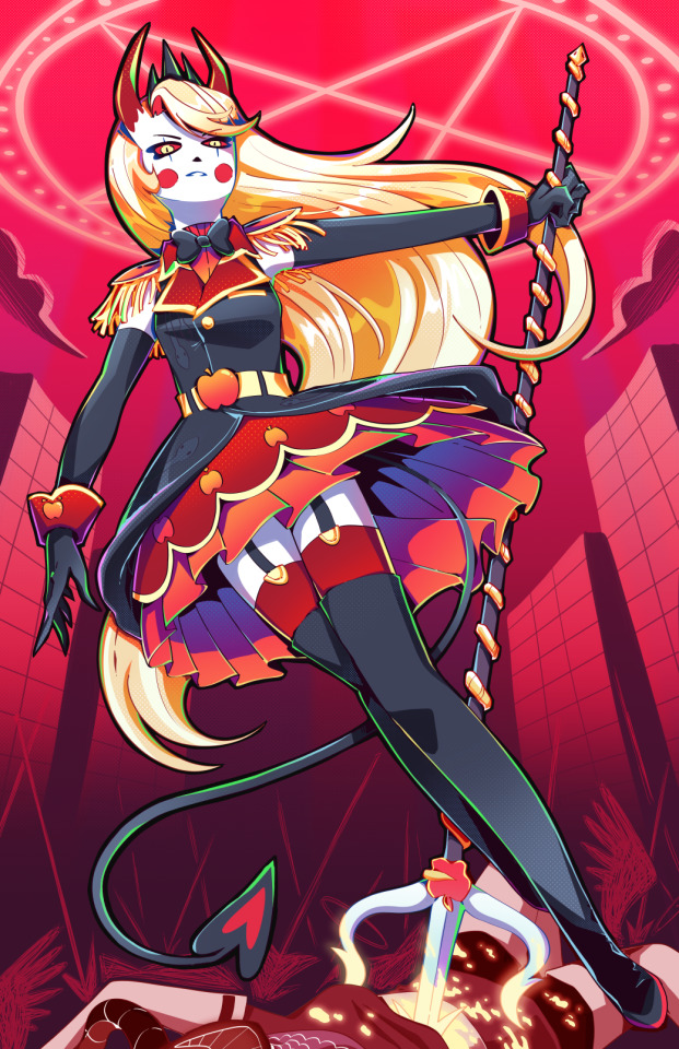
Holy SHIT am I proud of this. It took a day and a HALF to work on it. I really just wanted to draw a cool badass picture of Charlie in a cute dress, and somehow I ended up with my best piece I think I've ever done!!
To see the process, click the 'read more' below!
Otherwise:
Main blog over here
My Etsy Shop!
Originally, I wanted it to look more like a royal portrait, a good excuse to draw a pretty dress.
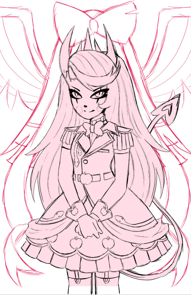
I adored the dress design, but it was an extremely flat image, so despite taking like. 5 hours to design it and work on it, I rethought my plan, switching to a far more dynamic pose.
I also made sure to add tons of flow lines, both from her hair, to her tail, to help bring the eye all around the canvas.
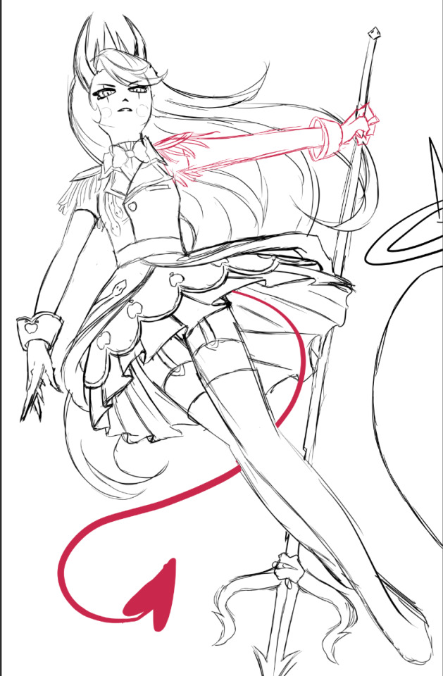
I did a billion sketches, but this is what I ended up on! Originally I had her right arm holding the pitch fork behind her back, but it just never looked right. I also took a risk and did a facial angle that has always been extremely hard to get right, and somehow I managed to make it look nice!
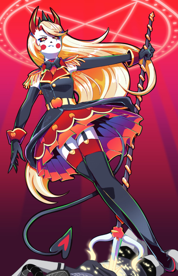
After adding the lineart, colors and all of that, I knew quickly I didn't want the angel to stick out as much as she did. I wanted her to fall into the background instead, since she was just on the border and I didn't want any attention really taken from Charlie. So I changed her shade to red, and from there I added more of the background details!
Okay I did leave some inbetween screenshots out but it's past my bedtime. I hope this was fun to look at, at least!
Final product once more!
#charlie morningstar#artists on tumblr#hazbin hotel#hazbin hotel fanart#hazbin hotel season 1#hazbin#vivziepop#cqart
1K notes
·
View notes
Text
I think 90% of my gripes with how modern anime looks comes down to flat color design/palettes.
Non-cohesive, washed-out color palettes can destroy lineart quality. I see this all the time when comparing an anime's lineart/layout to its colored/post-processed final product and it's heartbreaking. Compare this pre-color vs. final frame from Dungeon Meshi's OP.


So much sharpness and detail and weight gets washed out and flattened by 'meh' color design. I LOVE the flow and thickness and shadows in the fabrics on the left. The white against pastel really brings it out. Check out all the detail in their hair, the highlights in Rin's, the different hues to denote hair color, the blue tint in the clothes' shadows, and how all of that just gets... lost. It works, but it's not particularly good and does a disservice to the line-artist.
I'm using Dungeon Meshi as an example not because it's bad, I'm just especially disappointed because this is Studio Trigger we're talking about. The character animation is fantastic, but the color design is usually much more exciting. We're not seeing Trigger at their full potential, so I'm focusing on them.
Here's a very quick and messy color correct. Not meant to be taken seriously, just to provide comparison to see why colors can feel "washed out." Top is edit, bottom is original.
You can really see how desaturated and "white fluorescent lighting" the original color palettes are.
[Remember: the easiest way to make your colors more lively is to choose a warm or cool tint. From there, you can play around with bringing out complementary colors for a cohesive palette (I warmed Marcille's skintone and hair but made sure to bring out her deep blue clothes). Avoid using too many blend mode layers; hand-picking colors will really help you build your innate color sense and find a color style. Try using saturated colors in unexpected places! If you're coloring a night scene, try using deep blues or greens or magentas. You see these deep colors used all the time in older anime because they couldn't rely on a lightness scale to make colors darker, they had to use darker paints with specific hues. Don't overthink it, simpler is better!]
#not art#dungeon meshi#rant#i'm someone who can get obsessive over colors in my own art#will stare at the screen adjusting hues/saturation for hours#luckily i've gotten faster at color picking#but yeah modern anime's color design is saddening to me. the general trend leans towards white/grey desaturated palettes#simply because they're easier to pick digitally#this is not the colorists fault mind you. the anime industry's problems are also labor problems. artists are severely underpaid#and overworked. colorists literally aren't paid enough to do their best#there isn't a “creative drought” in the anime industry. this trend is widespread across studios purely BECAUSE it's not up to individuals#until work conditions improve anime will unfortunately continue to miss its fullest potential visually#don't even GET ME STARTED ON THE USE OF POST-PROCESSING FILTERS AND LIGHTING IN ANIME THOUGH#SOMEONE HOLD ME BACK. I HATE LENS FLARES I HATE GRADIENT SHADING I HATE CHROMATIC ABBERATION AND BLUR
2K notes
·
View notes
Text
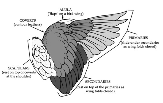
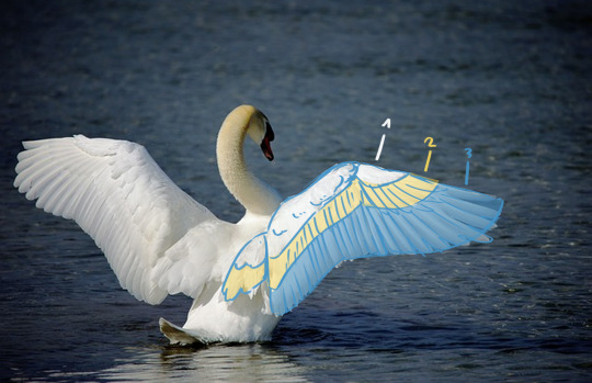
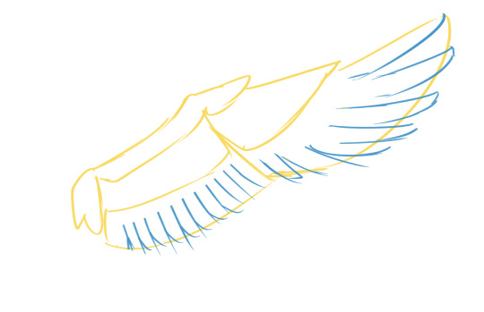
Wing tutorial~
Since it has been asked, I made a little breakdown on how to draw wings.
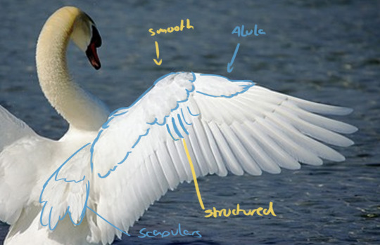
So, first thing to understand is wing anatomy. I used a swan wing as reference for my artwork. Divide the wing into blocks of feathers. There's sort of three layers to the feathers outlined in the second picture, and these divided along the top joint of the wing where it folds. See the second image. Make sure you bring in these nice, flowy shapes here!
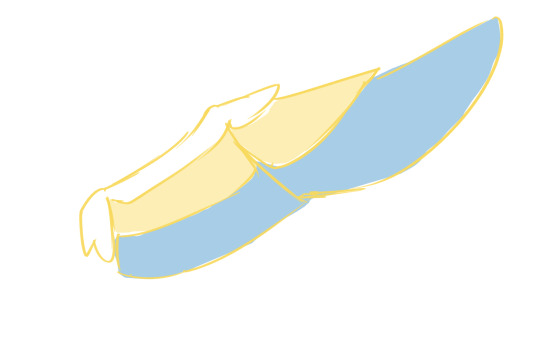
Now that you have these big shapes, you can cut into them and make the individual shapes of the primary and secondary feathers (layer 3.) also make sure they overlap correctly depending on if you are drawing the wing from the front or the back. make sure you stick with a nice rythm and have the feathers get gradually bigger as you get closer to the tip. Like this:
when you go ahead and draw that layer 2 of coverts, make sure that every feather you drew for the bottom layer has (approximately) a feather overlapping it (so you have pretty much the same number of feathers in each layer) and that they line up nicely. But you can also make them a bit more ruffled. Like this:
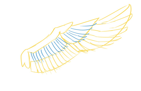
Other than the flight feathers, the very top part of the wing is very smooth, with shorter, more rounded feathers (almost half-circles!). They can lie very flat or also look a lot more fluffy. think of them almost like overlapping scales. There is also the Alula at the top of the wing, a sort of extra feathery bit that sticks out over the primaries. also don't forget the scapulars which cover over the shoulder blade and are on top when the wing is folded. The Scapulars also have two layers of feathers. (see first graphic).
From there, it's only a matter of lineart and shading or however you want to finish your artwork. Hope this helps with the structure! Drawing wings folded together is a whole other story that I'm not going to get into here... lol.
TL:DR: understand the structure of wings and use references to get it right, work from big shapes to small shapes.
Edit: I demand to be tagged in the results, I desperately need to see more wing art. ÒwÓ
#art tutorial#art tips#art resources#art help#drawing tutorial#wings#wing tutorial#good omens#how to draw#angel wings
2K notes
·
View notes
Text
my second claim for the @sanjiartcollab !! outfit 345!!

i definitely took the concept and ran with it lol (like it’s def the same outfit but u can tell i had waaayyy too much fun with it xD)

closeups on my favorite details:
his entire head/face
i don’t know if it’s immediately obvious but i made his face and neck flushed as if he were a little embarrassed. i think it has a nice gradient :)
also very proud of the hair shape i came up with. i originally tried referencing a buuuunch of different artists i like, but coming up with my own style more directly based off the outfit ref worked a lot better
(btw i didn’t forget his pubestache i just don’t like drawing it lol)
the school bag keychains (there was gonna be a merry keychain too, but i wasn’t sure where to put it :/)
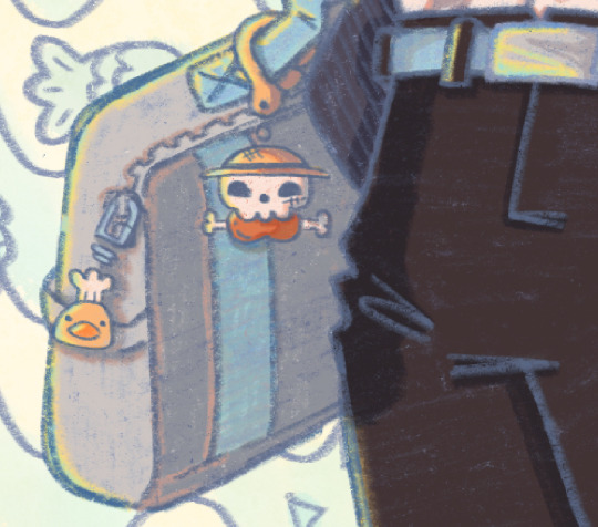
uniform id/nametag
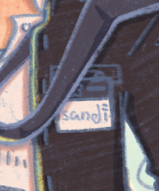
not part of the actual outfit, but when i was looking for references for a gakuran jacket there were some with ids pinned to them, so i thought it’d be a good opportunity to add sanji’s official signature on it. which btw, how tf does one make a kiss mark done in pen??? does this guy just smudge ink on his lips???
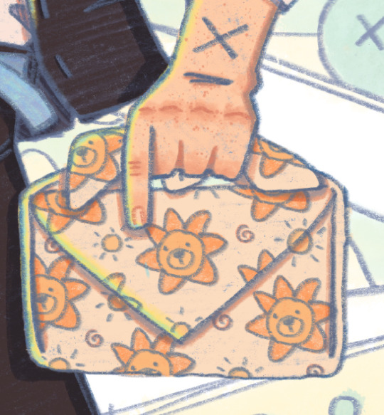
furoshiki wrapped lunch box (sanji made pirate lunch boxes for everyone :D)
east blue crew!! they’re like cute lil stickers :] (def inspired by @michelmims ‘s art)

+ just sanji and the lineart!


the comic/lunchbox panels all have each character’s favorite food! (meat on a bone for luffy, fish and chips for usopp, seafood pasta for sanji, onigiri for zoro, and mixed fruits for nami)
also i would like to thank god himself, eiichiro oda, cause if i hadn’t studied his art so heavily in my last collab piece i wouldn’t have realized the power of halftones in shading! also also, watching op fan letter helped me figured out how to pick good shadow colors (basically; cool colored shadows on warm colors, and warm shadows on cool colors!) my shading’s not perfect but it’s definitely not flat anymore :D
is it obvious i really like this piece lol xD
AS ALWAYS PLEASE CHECK OUT THE COLLAB SERVER!! EVERYONES SO NICE AND COOL AND THERES GONNA BE NEW OUTFITS TO CLAIM IN JANUARY!!!
#also i worked waaayy too hard on those yellow-blue highlights pls appreciate them#sanjiartcollab#sanji art collab#black leg sanji#blackleg sanji#vinsmoke sanji#one piece#one piece fanart#art collab#one piece art collab#sproouts.jpeg#artist on tumblr
239 notes
·
View notes
Text
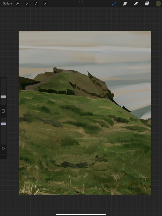
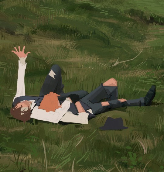
i got a few asks about my process :0 so yea i took some screenshots mid-process of my recent cliff-skk thing just for that
m gonna preface everything by saying that i did have a ref for the environment!! i avoid color dropping from the image and tracing cuz i do want to hone some digital skills. also saying i'm doing an "environment study" when i'm really just drawing skk makes me feel better abt myself
when i don't have a reference, i tend to do some thumbnail sketches in my sketchbook. here's some random stuff of past work, where i rawdogged everything:
but whatever, back to the cliff-skk. i'll also post a timelapse of it for easy ref, but detailed stuff is under the cut :)
first i did some rough sketches on an orangeish background (underpainting etiquette, i find it helps things feel brighter and keep a stable tone when choosing colors to lay on top), and I quickly lined skk :)


then I laid down some flats for the background, again really eyeballing the reference for hues. afterwards i thought it was a bit bright, and i wanted a more sepia/nostalgia feel to it, so i hue adjusted everything to something more uniform


then i lay down flats for skk + the ocean, which i both had to color adjust a lot (you might see that in the timelapse), and then i jump straight into rendering the background. when i render, i always prefer to do it over something lineless, so i turn the sketch layer off. i rarely do lineart for backgrounds.
i also used to render the characters first, but i've found that it's just not a great approach—especially for art where characters and background are interacting, knowing the hues and shades of the environment is crucial to effective rendering on the character that doesn't make them look out of place.
when i'm rendering, i really try to keep in mind tenants of contrast, perspective, form, and light/shadow. ex, stuff "closer" to us has more detail; the hill in the back is minimalist (in comparison); the shadows lean cool-green while the light leans gray-yellow. rake brushes really carried me here idk... my fav brushstyle forever


eventually i reach a point where i'm satisfied (or bored) with the background. for the last stages i usually have the subjects hidden so i can really perfect the details—but then for super duper final details, like the little leaf specks and grass strands, i unhid skk so the poppy details could work around skk. then i get to rendering the characters :)
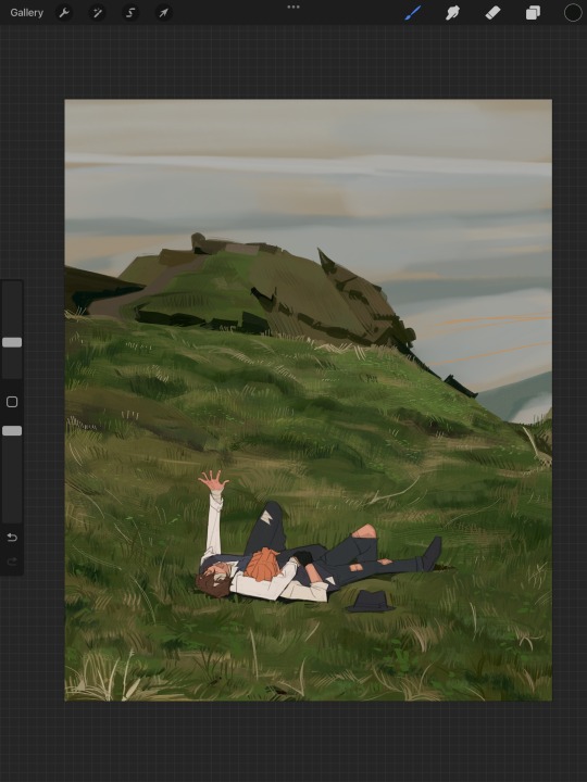
i forgot to take ss of all the stages when i rendered skk, but here's something from... about the middle of the process? i tend to render characters with the lineart hidden as well, sometimes bringing it back just to clarify things, but ultimately i prefer to define things by form than by line. that's just me tho idk, idt it makes or breaks anything, just a preference
again rlly just thinking about cool/warm, reflective tones (the greenish shadow on chuuya's left inner leg, sky-gray blue on dazai's vest), really just slotting the subject into the environment. after i finish rendering the characters, i usually return to the background and add some stuff—in this one i defined the waves a bit and put some grass around skk
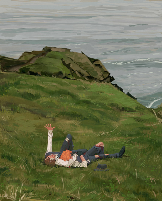
and yeah then we're done idk LOL. sometimes i run the file through camera raw (photoshop) to do some color adjustments—i find that my iPad displays colors super differently, usually making things a lot lighter than they are (u can see how dark the timelapse is...), so i find myself lightening my work a lot. i also sharpen and add noise as needed :)
i think my process has changed a lotttt even in this past year. it's kinda crazy!! it's always fun to do these and just reflect a bit on how i work. mostly just mindless insanity until it kinda works.
thanks for sending in an ask. and if u read all that, thanks to u too lolol
178 notes
·
View notes
Text
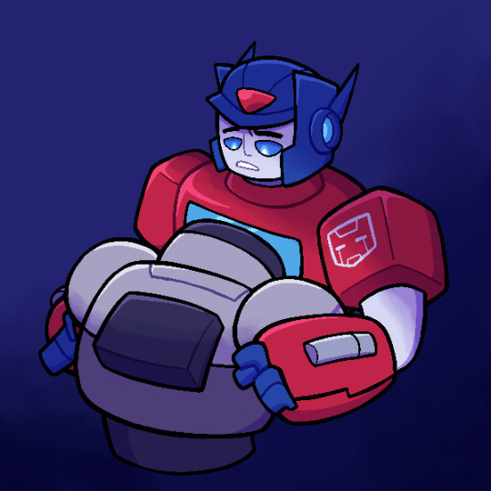
God I wish I had a good caption for this, but I do not. Best I can think of is “I depend on you”, but it also has nothing to do with the blue and yellow drawing at all
But in any case, this is a thing I drew today
I was trying and failing at giving Lux a good alt mode design, and that paired with other things was making me really discouraged, and I sort of ended up just starting to draw this, and then I ended up liking where it was going, which brought up my mood today, so that’s good
As such, I don’t actually have much context for what this scene is
It’s also featuring some more 3D elements in the design, since attempting to draw Transformers One again has put that back in my head, though since I still don’t know exactly how the forearms/hands work, it’s a bit less effective than I would have liked. But I’m slightly less sloppy with the anatomy I think, yay
I’m also now noticing Megatron looks a bit off, but I think part of that is that his arm is obscured by Optimus’, and while it made sense in the sketch, it looks a bit weird now
I also had to slightly change Optimus’ expression from sketch to lineart since the correct placement for his eyebrows would have made it so you don’t see his full expression, so I had to bring them down. It sounds minuscule but his eyebrows higher up did change the expression (it had more shock than the current more quiet concern)
I think I’m realizing that the sketch might have looked better than the final version, at least to me. Oh well
I also may or may not have went ham on lighting and shading, probably to an unnecessary degree. It’s just that this was the only image on the canvas and I really liked it, so I wanted to spiff it up, make it more nice looking
This is a version with significantly less of it, and also a white border because I was considering that before I realized it made it look a bit too sticker like. But I just think the flat colors on their own have merit too

Anyways, like I said, I don’t really have much context for this image, since it was just something I made to make something
Best I can come up with is this interaction happening sometime after Kiloton’s death, with Megatron still not over it and coming to Optimus for comfort. Optimus is a bit shocked at first (not to mention he’s got his own currently unrequited feelings for Megatron that he really doesn’t want to act on right now when Megs is emotionally vulnerable), but he chooses to comfort his friend anyways
Or alternatively, this is Megatron feeling overwhelmed about his whole lie about his infection and the terrible questions the truth brings, and again, going to Optimus to feel better. Optimus does the same in this scenario, it’s just that he doesn’t really know what’s bothering Megatron, since he refuses to tell him the truth. But he’ll be there for him regardless, hoping one day he feels comfortable enough to tell him
But yes, thing I drew that I quite like. Probably would be more impactful if the majority of the description wasn’t me just talking about the design process and my own personal nitpicks
#I do wonder if these descriptions of mine ruin the vibes sometimes#particularly with pieces like these that aren’t just sketches#but oh well I like rambling#I was debating whether to post this tonight or tomorrow since it’s getting late#but screw it I decided I would be doing my homework tomorrow morning so might as well do this instead#also it means I’ll get more notifications in the morning#I did also draw an Alpha Trion design at work today#though I think he ended up looking too young so it might not be his default#but I’m closer to getting him done#also I have a new potential reference for Elita in the form of Marino#honestly at this rate I think I’m redesigning her for the sake of doing it at this rate#her design’s probably not that bad as is#anyways getting off topic#sorry I did not talk about the characters here enough#transformers#transformers au#transformers x#optimus prime#Megatron#megop#my art
117 notes
·
View notes
Note
Hello :D
I have been following you for the last year or so (a few days after I got my Tumblr lmao) and I absolutely love your art!
I have been wanting to study your art style for a while but don't really know where to start,,,
Could you please show me a small portion of your art process, if it isn't too much trouble of course. Thank you and have a nice day!
hello. oh my god. this took forever to find.
im sorry it took 2 WHOLE FUCKING MONTHS for me to respond to this but i wanted to put it off until i felt happy with my art process again, so here it is
my fall 2024 rendering tutorial!
(this will be very very long)

FLATS AND WHATEVER YOU WANNA DO WITH LINES GIRL. then make sure to recolor the lineart to better match your base. trust me it helps, bold dark lines are Not your best friend when rendering. wait for that post-rendering
i start off with a doodle or a sketch, and then filling it in with flats and other details such as blush

FIGURE OUT YOUR LIGHT SOURCE. FIGURE IT OUT GIRL YOU CAN DO IT you can make it as simple as possible, make it as big as possible, dont even THINK about the details.........just make it really fucking big so you at least know where the shadows and the light goes THEN add smaller shading details LISTEN TO ME. LISTEN TO ME OKAY!!!!!!!!
my key point with this is for you to learn lighting fundamentals.
it's SOOO ANNOYING but alas......they are all correct. it helps a lot.
one thing i also really want to point out is that i like creating a big shadow shape first before fixing up the little details (such as folds and whatever) because it helps me focus on the way the lighting actually works instead of tunnel vision-ing into making the shading make sense on the clothing.

contact shadows (i dont remember if thats what theyre called okay) theyre fucking ugly because im not actually thinking sorry 💔
okay so basically:
contact shadows (if that's what they're called) are the spots in shading and lighting where light will NEVER hit.
shadows are still influenced by the colors and lights around it (it's why a blue shadow and a yellow shadow feel completely different, despite both being shadows) so it's not always COMPLETELY dark.
BUT! there are small points in shadows where light never hits, and they're almost always super dark or pitch black.
it's hard to explain shadow and light so briefly for a tutorial, but you'll notice it when watching fundamental studies and when trying it out for yourself


YES i unclipped the multiply layer YES its ugly and terrifying but it makes coloring the multiply layer easier okay the colors merged w multiply so now it looks cool and has depth overlaying colors that actually make sense
so basically what i did was color the multiply layer that i used to shade the overall drawing
adding a band of red/orange/yellow around where the light hits, and blue where the shadows get big and wide, gives it a fake ambient occlusion effect in the way that a person would get if they stood under the sun with a clear blue sky
the colors don't have to make sense, especially because i never draw backgrounds, but coloring the shadows really help it give a sense of depth and extra subtle detail and effect that just helps make the painting look nicer
around the end, i also put in colors (in an overlay layer with a low opacity brush) that actually make sense in context of the drawing, which is the lit cigarette and the yellow eyelights
mostly because none of the colors were making sense and i needed to actually make use of the lighting that DOES exist in the drawing lol

adding a muddy golden yellow pin light layer (opacity turned down to like 40-50%) to make the light colors less ugly lol
i SWEAR by the fucking pin light layer style. it's so useful and so so underrated.
i used an almost brown-ish gold color on stop of all the layers, and with the pin light layer, it helped make the bright (almost blue-ish) white colors more warm and more yellow. it just helps make things more warm (something i prefer)
i could probably show what it looks like without adjusting the layer opacity to truly show off what i mean (like in the coming section) but i sadly forgot to do that lol


make a layer on top of your drawing with this color in these ranges YES the drawing is fully merged NO don't be afraid, the base was fucking ugly anyway 💔 make this layer into an exclude/exclusion layer style TRUST turn down your exclusion layer opacity from a range of 10% to 40% literally until you're happy with the contrast and the way the color over the drawing. use your eyeballs. i know you can do it im so proud of you
this is pretty self-explanatory instruction-wise, so i'll go into why i do this instead
i really like art that seems like it has low contrast, with almost mid-gray shading and lines. i don't personally use dark and bold lines and shading, unless i find it necessary for the tone of the piece, so using this method helps lower the contrast of the art and make it look "pleasantly muddy" in the way that it's easier and softer on the eyes.
the inverted blue color also helps makes things warmer!
the exclusion layer style is still a bit of a mystery to me but i really like the effect it gives, even if i don't completely get how it works lol
if you want an alternative method to this, and if you have access to it (because i primarily use sai and sai only),
i absolutely encourage you to play around and experiment with gradient maps.
there are so many out there you can make yourself or even get from others that just give the painting an extra amount of depth and color variation. they're SO fun.
personally, if sai2 gets a gradient map update, it's over for y'all it will literally be so over no one will be able to stop me


then i merged everything and actually adjusted the contrast back up because it was looking too muddy for me 💔 but the color adjustments are still there so all hope is not lost here's a comparison of the adjusted contrast in black and white (adjusted on the left) (newly merged layer without adjusting the contrast on the right)
as you can see, i actually turned the contrast back up (despite talking all about how i liked things with less contrast lol)
i wanted to demonstrate that doing adjustments should be done in moderation, and is why i adjust layer opacity often when making color effects
you are free to play around with colors to help your style, but don't lose your initial idea and colors along the way.
you still need to trust your own colors and intuition!
along with that, i just want to say that it's completely okay to change your mind mid-painting, and it's okay to make somewhat drastic changes.
don't be afraid to change things you don't like or change your mind about certain aspects way later on
that's basically the whole thing of this!!! don't be scared!!!

now im gonna hold your hand when i say this..........but you need to learn how to render by yourself. it seems like i can teach you but i literally can't, because rendering is different on every piece and depending on how clean your base is. i have to render A LOT because of how fucking ugly my sketches are LMAO to simplify it, think of it as obsessively cleaning up every detail you can see, but with a color picker and a clean, hard edged brush. if you have shit lineart, you don't have to redraw it cleanly over and over, just paint over it. that's basically what rendering is
THIS especially is where you need to be brave and stop being scared.
like i said, i can't teach you how to render, and it's something you have to discover yourself because rendering is something that will always be personal to every single piece you make. the way you render on every piece is different.
on one piece, you will barely need to render, and on another, rendering is more than half of your ENTIRE process.
don't be afraid to paint over your old art.
rendering is a process that's both very perfectionist yet also very careless.
find your balance and just go for it.

and then that's it……..u did it………..now yuo know how to paint and render. it's literally just layering shading and lighting knowledge until you think it makes sense and looks okay lol additional note: since i render in only one layer (you don't HAVE to do this, but it'll be harder for you…), i also made slight adjustments with the transform (and liquify, if you have it) tool to make things more proportionate. (i drew the head too big lol)

if you compare the finished piece to the final unrendered base, you can see that a LOT changed, including a bit of subtle proportion adjustment.
particularly, the sleeves changed A LOT (because i really didn't like them)
but it's also over all cleaner and more coherent, instead of having haphazard colors and shading just thrown about.
rendering is when you finally use all 100% of your brain to finalize and figure out where the shading should go, where to clean up your lines, where to ERASE or ADD BACK in lines, and make sure all your colors look coherent.
it's not as intimidating as it seems, i only use a hard edged brush with a little bit of color mixing and my color picker.
it's like dragging and dropping colors to cover up mistakes, it's really quite fun when you get used to it
i wish i could explain it clearer but it's hard to describe without visuals!
i hope this helped, and i hope all my yapping isn't annoying (art as a special interest beloved)
have fun studying and trying to render in my art style!
#long post#art tutorial#rendering tutorial#art help#art tips#tutorial#kia doodles shit#artxstic-scr1bbles#tutoriel
197 notes
·
View notes
Note
I found your Tumblr recently and omg I love your art style., it's so inspiring :D I just subscribed to your patreon because I need more haha.
I was wondering if you have any tips for colouring your artwork?
Thanks so much for the extra support! I’ll go into rendering a face with a reference pic below (because I think that’s what people practice/look at the most) with an absolutely quick and dirty breakdown
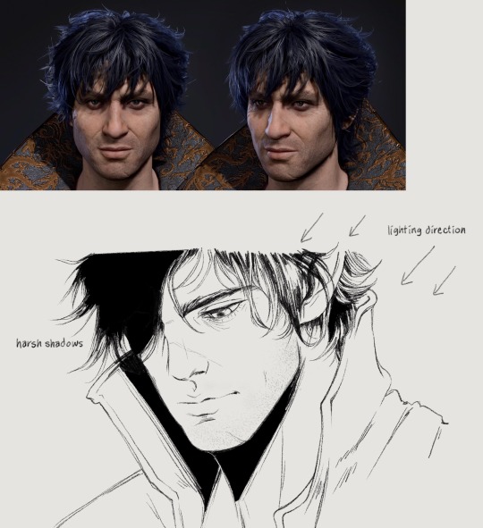
I already incorporate the heaviest shadows into my lineart a lot of the time, but I still have to think about shading where the light hits when coloring happens
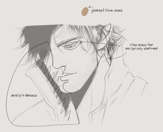
Since this is coming from top right, the left half of his face will also be heavily shadowed. Understanding 3d planes and how it affects a shadow assists with getting lighting down correctly. I’ve outlined the obvious quadrants that I’ll typically shade with the darkest color. But before that you have to lay down a flat, a color I grabbed from the front of Gortie’s cheek- I think this is a very mid tone. Using a mid tone first is how I think most everyone colors/shades. I can’t say this is how I always do it, sometimes I like to work dark to light, sometimes I start coloring from the top or bottom or side, it depends on what feels good and I get distracted very easily. If I rewatch my timelapses I can see where I got bored of an area for a while and jump somewhere else/come back later
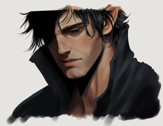
If I know I want to fully render something I don’t bother with cell shading. Not saying this is a good practice, in fact don’t do this until you have lighting practice under your belt.
Colors- go with the reference picture and grab colors from the areas of the face that you’re shading, but increase or decrease the saturation as needed
Forehead- I darken the hairline and add shadows for the loose strands of hair. This is something simple I’ve found elevates the 3d aspect
Eyes- look at eye makeup tutorials, no joke. It’ll show you where to add highlights to make the eyes pop. This is a stylistic choice, but I like my characters looking like they walked out of Sephora. I’ll give them eyeshadow and add a highlight to the upper lid and the inner tear trough. For the actual iris I shade really simply just making the lower part brighter than the top
Nose- bring the bridge forward with the lightest color, add a shine to the tip, darken the side and carry that to the cheek
Lips- upper lip dark, lower lip not, add a shine, I dunno what else to say about this sorry 💧
Chin- shade under the lip and bring the shadow down in a crescent shape
Everything else is sticking to the personal character’s features, like shading his cheekbone and laugh line. I also add a blush tone over the cheeks and nose (again stylistic)
Link to Timelapse: https://youtube.com/shorts/q7E-g05W0m4?si=shZFpHQwNuyO6Qt1
youtube
I’ll try to do an actual infographic later when I have time because I keep getting asked about coloring. Just know that I’m still learning new stuff every day and these things should be taken as a “this is what I’m doing now” sort of thing!
150 notes
·
View notes
Note
Any advice for drawing torties? That fur pattern is the bane of my existence

If your stripes look flat, it might just an issue of needing to draw them more like they are wrapping around the cat's body to give the look of a 3d shape? You can also try exaggerating the thick and thin part of the stripe by making the ends more tapered (aka more line variation!)

As for torties, yeah those are tricky haha; as always reference photos are a great place to start:
I think what really helps make a cat look like a tortie is spiky edged patches, and a lot of them:

Compare this to say, a calico, who has much more rounder and defined areas of colour, and less small bits/fragments of color:

ref photos used are from unsplash: tortie 1, tortie 2, the calico with goats
I draw the "spiky patches" in two different ways, and sometimes I'll use both on the same cat; one's not better than the other it's just what look you'd prefer for the cat! (that first method is with my 'speckle fade' brush and the other is with my triangle lineart brush)

The spiky jagged edges also helps with that illusion that there's a lot of small fragments in the coat pattern, without actually having to draw a looot of fragments. Now lets put it on a cat!
I think the first two on the bottom with just orange n black (which is like the bare minimum for a tortie) still makes them look like a tortie! The amount of colour variation kinda just depends on how you want the cat to look!

I hope that helps a bit!!
commission info || ko-fi (tip jar)
100 notes
·
View notes
Text

*hhheeerrree's Ballora!
More under the cut >:)
This was a bit of experimentation I did over a couple days in lectures -- it was a lot of fun, and I like how it turned out! As with previous Balloras of mine, I had no reference, but I had determination. There ended up being several versions:
Pure Lineart [Black & White]
I just think it looks rather neat :D

Fully Coloured & Shaded
This is where things diverted a little from my initial... vision. Which wasn't much, just that I was considering leaving it with flat, much paler colours. I didn't even attempt that though, sadly (I had too much fun with the saturated colours). Some other day.

Static! Yay!
Inkeeping with classic fnaf fanart tradition, you have to try adding static at least once.

Sister Location camera screens???
I made this one purely out of self-indulgence and curiosity. It did not work. But hey, at least I spent fifteen minutes tediously removing all the text and map from a random image I found :D

Timelapse! (it be small, sorry)
(I will likely make an actual video at some point for this)

Details
Not sure how long this one took - 4-5 hours at most.
Software was ClipStudioPaint
And yes, I broke her arms because I didn't want to draw them. :)
Have a great day!
#five nights at freddys#sister location#fnaf#ballora#art#fanart#fnaf fanart#fnaf sister location#digital art
52 notes
·
View notes
Text
A word of advice to every artist out there who thinks they have to draw a certain way. I see things like this often: I hate drawing hands, I hate rendering, I hate linearting, etc., etc., etc.
One of my teachers in art school taught us something: if you don't like to draw something (regardless of how good at it you are) find a way to do it differently. Why draw if you don't enjoy it? Don't make your life miserable uselessly. He said, for example, that he really, really didn't like drawing hands. So he developed a style where his shapes were so stylized, and his hands so unlike anything you had seen. And, technically, his hands look weird. But! They are always consistent. You know it's intentional. It's his style. Weird is good. Weird will make you happy. (That doesn't mean he can't draw a realistic hand, it was his job to teach after all. But he just didn't like to draw them, and that's fine.) The same thing you can say with rendering, for example. You don't have to render! You can do flat color. You can do no color. Don't like to color? Black & White! Or cross-hatching. Or simply only lineart/sketch. Don't like to lineart? Do blocks of color with no lineart. Or just paint instead! Or use your sketch instead of the lineart. For myself, I don't like to draw detailed eyes, or noses. See how simple I draw them? That's why! I also don't particularly like to shade, and as you can see, my shadows are pretty generalistic and not very precise. Sometimes I do pieces where the light comes a bit all over the place and I enjoy that feeling of 'I don't know where this takes place, I'm disoriented by how this space works'. Sometimes I don't feel like linearting and I clean up the sketch with a soft eraser brush and that gives a different feeling to the piece, and I often like it even more. What I do focus on is color, because that's what I enjoy the most. Seeing all those bright colors together makes me happy!
What I am saying is, don't force yourself to do something you don't like to do. You'll feel miserable. Art is supposed to be fun. That's all. Happy drawing!
71 notes
·
View notes