#I really like the green highlights especially on 3 and 4
Explore tagged Tumblr posts
Visit Tumblr Blog
Explore Tumblr blogs with no restrictions, modern design and the best experience.
Last Seen Tumblr Blogs


Fun Fact
Tumblr.com rank in the US is 25.
Text
Ichigo Kurosaki but as Cat Noir
Well, his name is actually Hell Cat, but that’s not important. Basically I’m trying to design an Ichigo Kurosaki superhero look based on a black cat. This is for a Miraculous Ladybug AU, so he’d have the same power source as Cat Noir from the show.
I’d liked the green highlights from Lady Noire’s suit (who is Ladybug but with Cat Noir’s powers), but I worry I might have gone too far on some of the looks. Number 3 was my original design actually, and the others are variations, some of which I like better than the original.
Some choices I plan on keeping are the jacket and the tail. The jacket is cropped, and I’m keeping this as a vague reference to season 1 of Bleach where Ichigo just wore crop tops. The tail has a chain segment in the middle which is supposed to tie back to Zangetsu.


(I promise these are just mock-ups to get the design and coloring right, it will look much better when I actually work on it)
I’d also love to hear your thoughts on why you picked which option you did.
Or if you liked some aspects of multiple, please let me know what you think.
#I think I’m having the most trouble with him is that cat noir’s outfit is entirely black and not very detailed#but I also can’t pull much inspiration for his canon attire since shinigami clothes are not great for superheroing#I really like the green highlights especially on 3 and 4#but I also like the (relative) simplicity of 5#there were actually more designs than this I just didn’t post some of them because I didn’t like how they looked#so it’s these five choices#I might try to design more of the no green looks#but not tonight#also sneak peak of orihime (ladybelle) and chad (tortuga) in the back#I’ve actually finished the drawing of orihime and uryu (kitsen)#so I just need to solidify Ichigo’s design and figure out Chad’s colors#and do Rukia (honeycomb) but her design is complete I just need to draw her#bleach#ichigo kurosaki#poll
3 notes
·
View notes
Note
Hullo! I’ve been watching a bunch of your Timelapses and I was wondering how do you always come up with the colours for your pieces? They’re always so cohesive and pleasing to look at (I almost exclusively work in greyscale so if I’m using colour it’s always a lucky guess and it never looks quite right)
Hey there!
I have to be honest that most of the time I don't actually know what I'm doing and that I have no idea how most of my pieces are gonna turn out. My work process is usually based on "Fuck around and find out", haha. I'm happy to know that it apparently doesn't come across that way, though.
A lot of it comes very naturally to me simply because I've been drawing non-stop for so long, but I can give you some small tips that really help me:
1. Have as many references as possible!
Here's what my reference sheet looked like for the Jayvik piece:

It helped me a lot to understand the overall color scheme I wanted to convey. Lots of very cold tones, pinks and very light blues and greens. These colours sorround Jayce and Viktor throughout all of season 2 and I wanted to keep them, especially since in my piece they are lying in the glowing hexcore.
Don't shy away from using references, get as many as you possibly can! Look at other poeple's art too and try to understand how they work with colours.
2. Work with complementary colours!
Since I paint a lot of romantic illustrations I want them to look pleasing and comforting, which I can accomplish by using complementary colours! You see this a lot with couples that are blue and red coded, for example. And I wanted to do the same thing in the Jayvik piece! For that I used the highlights in their hair!


Viktor's highlights are a soft pink hue.


While Jayce's are a soft blue hue.
The colour wheel works perfect for figuring out if two colors compliment each other because they are literally right across from one another!
3. It doesn't have to be true to life.
Pretty self-explanatory, but I thought I'd add it in here anyways. It's important to understand how colour and light works, but you don't always have to follow the rules. Does the rim light look cool but it makes zero sense? Who cares! Keep the cool rim light! Just have fun and fuck around.
4. A little trick to make your life easier!
I'm not excatly the best at colour theory, I still struggle with it quite a bit, but here's a little trick I like to use from time to time:
If you want all your colours to look coherent, take one specific color as your flat colour. Choose a hue that you would like your piece to have. Like this:

Now you choose whatever colours your characters have and paint them in. For example, here are the skin colours I chose for Jayce and Viktor:

Looks off, right? These colours don't fit the overall piece at all. So what do we do?
Turn down the opacity! It's that easy, wahoo!

I went from 100 Opacity to 72 for this specific illustration. And look at that!

It's so much nicer already! Now you know what colours to use as your actual flats! Just repeat this with every other part of your illustration and you'll have a great starting point. :)
I really hope this was helpful! I'm not an actual teacher and I don't have a proper illustration degree, so some things might not be completely accurate, but I thought I'd try my hand at this anyways!
#teacher han is at it again#if I talked bullshit forgive me#I just hope I was able to help at least a little bit haha#I'm always happy to give some tips!#art process#art tutorial#color tutorial#colouring#illustration#tips#my art#arcane#jayvik#tutorial#anon#ask
752 notes
·
View notes
Text
2024 BL - Top 10 Trend Report
In last year's trend report I said:
"I think Taiwan has the chops to give us something as good as The 8th Sense or Old Fashion Cupcake but in their style, and I would like to see them exercise their talent for good rather than just profit."
And Unknown happened.

I asked for it, they gave it to me. I could not be more happy. So anyway, I just wanted to crow a bit.
And now...
2024's TRENDS!
1 Trope Subversion Levels Up
My Stand In went so far as to subvert the whole damn romance genre. But in general we saw a lot of BL recognizing, highlighting and calling out it's own absurdities and tropes. From Korea commenting on the Dead Fish Kiss to Wandee Gooodday actually promoting green flag behavior (the real deal).

It was an interesting year for meta commentary, it kind of whole scale left parody behind (say goodbye, Japan) and entered almost every BL from Thailand, even the ones who should have left it alone. (Side eyes Mame.)
2 Old Tropes Revisited
Unknown revisited the step-brother trope (as did Addicted Heroin of course). But there were other old ones we haven't seen in ages, like kidnapping for love, kissing on rooftops, and all the dub con (Blossom). Love Sick rebooted with very little modernization (except where it counted) right up to and including no kisses. Mix Up even did "trapped on the rooftop" which I haven't seen in over a decade.

And then Wimpy dropped. And it felt like I was reading yaoi in my tiny attic bedroom in the 90s.
3 BL Enters All the Workplaces
I love how many adult leads and sides we are getting, even from Thailand. By which I mean, BL outside of a school setting. We still have high school and university set stuff, but that used to be ALL we got. I don't mind school settings, but I like that we have some kind of balance going on these days.

We are starting to get not just cubicles and offices (as Japan foretold) but all kinds of workplaces from retail to authors to the film industry.
4 BL Passes the Sniff Test
He smells good has always been a trope that I love. It was one of my favorite things about Bad Buddy. But this year it felt like every third BL trotted this one out. I was delighted by it. Of course I was. But it happened A LOT.

Century of Love was a key use of it since smell is so coupled to memory, I thought they dealt with it particularly well. But even Japan and Korea deployed the sniff test.

(Seoul Blues)


(Blue Boys) Same actors, different characters.
Pitt Babe
Century of Love
Meet You at the Blossom
Soul Blues
Blue Boys
Dangerous Romance
This Love Doesn't Have Long Beans
Cosmetic Playlover
Sunset X Vibes
Monster Next Door
Secret Love
Perfect 10 Liners (technically a 2025 show, but the sniff happened in 2024)
5 Fewer Shipper Characters within BL
Negative trends are always harder to call (it's easier to track the presence of something over the absence) but I'm still calling this one.
In a discussion of The Shipper @heretherebedork and I got into a discussion about this. It really seems like both we are getting less "female shipper" characters and/or they are evolving into overly interested but very supportive female friends instead. Softening, if you will.
I think partly this is because there has been a general decline in this archetype in yaoi over the past 5-10 years, but also they tend to incur pretty bad reactions in fans, and Thailand (especially) tends to pay attention to that kind of thing.

Unfortunately this also means we are seeing a worsening of the "no female representation at all" backbone of BL. We Are, which I loved, didn't have a single female character. Not even a throw away.
6 The rise of the green flag seme!
The seme (active attacker in the relationship) got a lot of green flag action this year. We saw lots of Dommy boys, Daddy types, and players asking for permission, trying to communicate, talking about safe sex. Particularly out of Thailand.

To make sure this is clear, green flag means he communicates about the relationship and sex, takes no for an answer, asks for permission for (almost) everything, and doesn't do things like (just spitballing here) take a hotel room key and go into the other mans private room when he's not around (or asleep). Okay? Christ on a cracker. (When it comes to flags Mame has red/green colorblindness.)
Some examples:
Alan from Pit Babe
God from Monster Next Door (except for the one journal reading incident)
Sun from Sunset X Vibes (almost too far)
Yak from Wandee Goodday
Latte from Knock Knock Boys
7 Japan Came to PLAY

Japan came to play and will not leave the field that they built. I may not always like JBL, but when I love it, I REALLY LOVE IT, and when it hits it hit hard (pain or joy). And even when I don't like it, it always gives me a lot to think about.
We had 19 JBLs in 2024:
Sahara-sensei to Toki-kun
At 25:00, in Alaska
Dominant Yakuza and Wimpy Corporate Slave
I Became the Main Role of a BL
Love in the Air: Koi no Yokan
Takara's Treasure
Although I Love You and You
I Hear the Sunspot
Living With Him
Love is Better the Second Time Around
Love is Like a Poison
Perfect Propose
Cosmetic Playlover
Sugar Dog Life
0.5D
Let's Eat Together Aki and Haru 2
Mitsuya-sensei no keimakutekina ezuke
Happy of the End
Ossans Love Season 2
Japan had 18 total BLs in 2023.
17-15 in 2022 (a couple I couldn't get hold of and a couple I just don't think are BL, so 2022 is vague).
7 in 2021. <- THAT was when the big jump occurred, 3 years ago. Which might have more to do with the pandemic than anything else.
But back to now: 19 in 2024 means they are actually just increasing their production gradually and in a steady way, as might be expected. In round numbers we didn't see anything unusual.
BUT
The series they've been airing in 2024 are running longer (for them) and being aired over longer periods of time. Not to mention getting better and quicker distribution.
By which I mean, Japan used to have more shorts and movies, less actual series with full run times (by their & Korea's BL industry length standard) on streaming platforms. So I think it's JBL runtime and distribution that is experiencing real growth. And the consistency of that runtime.
In other words, it feels like there are more JBL airing because we have access to most of them (for a change) and they're running long enough to cross into each other (which has been rare in the past).
What's almost more interesting to me is...
8 What the hell happened, Korea?
Korea cut back on their BLs in 2024. I am not sure if that's money drying up, a crack down within the industry over there, the political situation, or something else.

Still, it was wild to see such a stark fall off in production. They had 18 BLs in 2024 but fully half of them were shorts, and more than half were poor production quality than is prior standard. By contrast they had 21 in 2023, but only 1 was a short, and most were very high production (getting 8/10 or higher from me).
Since Korea tends to produce some of my favorite shows, it's no surprise I had no 10/10 BLs at all in 2024 with so little KBL's stepping up to the plate.
I sure hope this isn't a trend but it feels like it might be.
9 Why the hell is the not-kiss back?
Korea doubled down on being a pain in 2024 by bringing back the "they don't actually touch lips and we pretend they did by panning around the back of the head" with the camera. (Jazz for 2 sides, example. Yes, I'm still mad.)

Then Thailand did the with Addicted Heroin. AND with Love Sick.
What is this, 2016?
Color me annoyed. I thought we saw the last of that nonsense with Make It Right.
I remind you all, if they would kiss if they het but they don't kiss when they gay, it smacks of a phobia and I'm salty about it.
Yes yes, there are actor (idol, age) excuses in play. But they should cast differently if this is going to be a problem.
End of discussion.
No really, I don't wanna talk about it. I just want it to go away.
10 The rise of Great Grandmas
We have had cool grandmas before in BL but in 2024 we had so many of them. The Sign, Love for Love’s Sake, Monster Next Door, Jack & Joker, Every You Every Me, The Rebound, Wandee Goodday.

(thanks to @small-dark-and-delicious for bringing this one to my attention)
See the comments for additional discussion of the "why" behind some of these trends as well as a few I missed.
(source)
2023's Trends report here.
#2024 bl#bl round up#2024 bl trends#trend report 2024#unknown the series#taiwanese bl#japanese bl#korena bl#what happened to korean bl?#My Stand In#wandee goodday#Century of Love#thai bl#daouoffroad#green flag seme#jazz for two#grandma in bl#bl grandma
249 notes
·
View notes
Text

Tribune Echowatcher (Ls1)
My design musings below
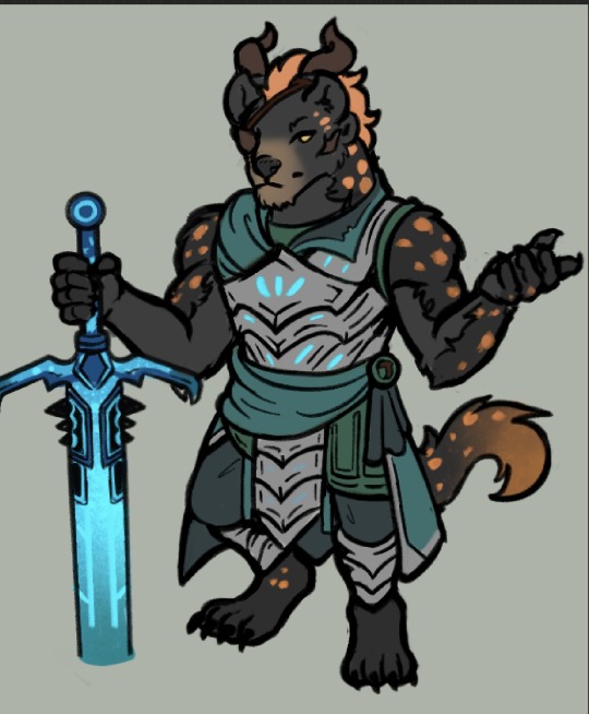
Literally only doing this bc I love Leo soooo so so so so so so much. I also in general just love character design So!
1st. I Know I wanted to push the limits of what Charr Look like, I know theyre big ""cats"" but whenever I design ocs I like to push boundaries and play with what aesthetic restrictions exist.
Hyenas came to me (i think, it was 6 years ago when I originally made him so my memory is foggy) because I saw Hyenas around Ascalon and thought, what a fun concept to play with.
I knew I really wanted the very clear shape of hyena ears to stay while also keeping the charr 2 ears, my only choice was to kind of shift the horn placement around. You can see that his ears cover half of the horns, and that theyre a further back on his head in general asba result. I really didnt want to limit myself with the shape of charr ears bc even though I love them, having a character with very clear rounded Hyena ears was too charming of a concept for me to drop.
2. I inverted the colors of a Hyena! Hyena cubs are actually born with black fur and then get a lighter shade as they grow as with many animals, but I thought it would just be a fun way to play with a more unique color scheme, a primary black/gray fur with orange highlights than simply keeping a more realistic and usual color pallet.
3. Spotted Hyenas have some shaggy fur! Its so cute! Its thinner around the neck which I thought was another key feature of the animal that I wanted to translate onto Leo.
4. His armor is definitely not what I consider to be super unique, I needed a ls1-HoT quick armor to draw him in, so I just threw shapes together. I did however want to keep his color coded: Green. Originally I was trying to find some huge complimentary color to add to his outfit but realized that the orange of his mane and spots was already complimentary enough that adding a different color or more to his outfit would feel like Too much. Thus I went with homogenous green/blues and silver for the metal color.
5. His nose...his head shape...his more "Canine" Features I guess are just huge charmpoints to me. Yes this is me just gushing about my love for my own character but if you clicked read more thats ur own doing. Ive said this before but Leo is Heavily Mexican coded, this plays into both his design and lore in a lot of ways.
Xolotl is the Nahuatl god of death, hes a dog! Dogs being a bit of a symbolism for companions in the afterlife and guides was really important to me, so its why I do really adore what canine features Leo does have (I know Hyenas arent canines but you can see the same kind of shapes.)
Id gush more but thats the big ones....
Leo became a Tribune of the Blood Legion, because bangar wanted one of his own reporting back on the growing power of the Pact and the Pact Commander that was less of a loose canon than Rytlock, especially as theyre investigating draconic threats with the underlying ulterior motive. For now, hes playing along.
52 notes
·
View notes
Note
Howdy!
I am here to talk about Viv's horrible character designs.
From an animator perspective, they suck.
Here's why
1. The characters have way too much detail
For animation, more lines equal more work. You're going to be drawing them over and over, and it just creates more stress and work for the animators.
For example, I took one of the most egregious designs in HB (Beelzebub) and simplified it to be animation friendly.
(Can't send it here but I'll probably make a post about it or something.)
2. There's too much of 1 color
WHY IS THERE SO MUCH RED??
Especially since they're in a primarily red background, they don't stand out AT ALL.
Like how am I supposed to see them if they blend in to the background??
3. I have no idea what half of them are supposed to be
Charlie is based off a doll?
Alastor is based off of a deer?
Katie Killjoy is based off of a praying mantis?
Angel Dust is based off of a spider?
Beelzebub is supposed to be well... Beelzebub?
When designing characters, they need to be clear on what they're supposed to be! And no, explaining it on Twitter does not count.
4. The animation reference sheets are garbage
No wonder there's so much animation errors. There's no facial expression sheets, lip sync guide, nothing. It's just a 4 angle turnaround sheet where the character is in complex poses all the time.
If you Google Lackadaisy's animation reference sheets and then look at HB's, it's like night and day.
I'm more than willing to send some examples (along with the edit I did) if you want
So yeah, what are your thoughts?
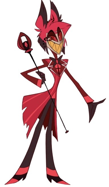
These are all great points! I think you summed up the main problems very well, but I'll elaborate on each of them. I'm no expert at character design or animation by any means, but I'll do my best to explain my points!
First of all, like you said, the character designs are way too complicated. Anyone who knows even the slightest amount about animation knows you want to simplify and streamline your designs as much as possible to make it easier on the animators. Vivzie is way too obsessed with her Deviantart OC lookin'-ass character designs to actually do this, even though it would seriously help to make the animation process way faster and easier. Beelzebub is seriously the best (or worst?) example of this.
I feel so bad for the poor souls who had to animate this. There are just way too many moving parts here, from her multiple arms, her wings, her markings, to her freaking lava lamp hair and tail?? It's just awful. And so many of Viv's designs suffer this problem, I could go on and on.
Like, I think it actually is a nice looking design, as a still image. Maybe not for the demon Beelzebub, but as a general furry OC, I think she's cute. But that's beside the point. I would love to see your redesign of her!
Next, the RED. So, most of the characters we see in Helluva Boss are red-skinned imps, which has been a common depiction of demons for centuries. One big problem I have is that there's little contrast in these designs. Let's look at our three main imps.
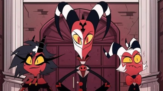
Aside from some white and yellow highlights, they're all mostly red and black. Their color palettes aren't distinct in the slightest! And, I mean, come on. Red accessories against what's almost the exact same shade of red skin? Really? It just doesn't look good. A little contrast here and there goes a long way, like... maybe make Moxxie's bowtie blue? Or Blitz's pendant green? I don't know, anything to help each character stand out, and help give them more visual intrigue.
It doesn't help that most of the backgrounds are primarily shades of red, too. Here's a few screenshots I found that really show this problem.
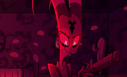
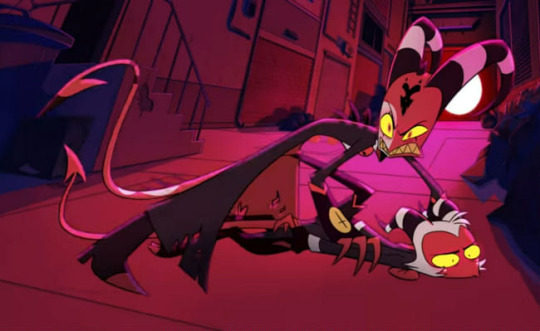
Look at all that fucking red. Like you said, there's such little color variation that the characters blend into the background. Now, to be fair, I did specifically choose these screenshots because I think they really highlight the problem, but this really is what so much of the show looks like. Granted, we do have a bit more variety in the different rings of Hell, each with their own main color, but this is still too much red, considering how much the color comprises the main characters' designs.
Next, like you said, Vivzie is really bad at making characters actually look like the things they're supposed to look like. Let's take Alastor as an example!
Oh boy! More red and black. So, Alastor here is supposed to be a deer. What's the first physical characteristic that comes to mind when you think of a deer?
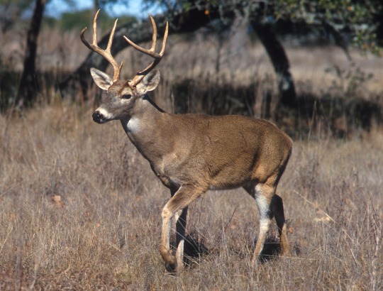
Yeah, those big, impressive antlers! So... where are his? Oh, they're those tiny little forks on his head that are almost entirely obscured by his stupid emo hair. Like, come on! Giving him bigger antlers would have made him look so much cooler and more intimidating, and it would have been a great focal point for his design! It's such a missed opportunity. (I know he has bigger antlers in his scarier "demon" form, but you still could have made these a little more impressive.) And don't even get me started on those ears... they look more like fox ears or something. Like you said, a good design shouldn't need to be explained through supplementary material. We should be able to tell what a character is supposed to be just from looking at them!
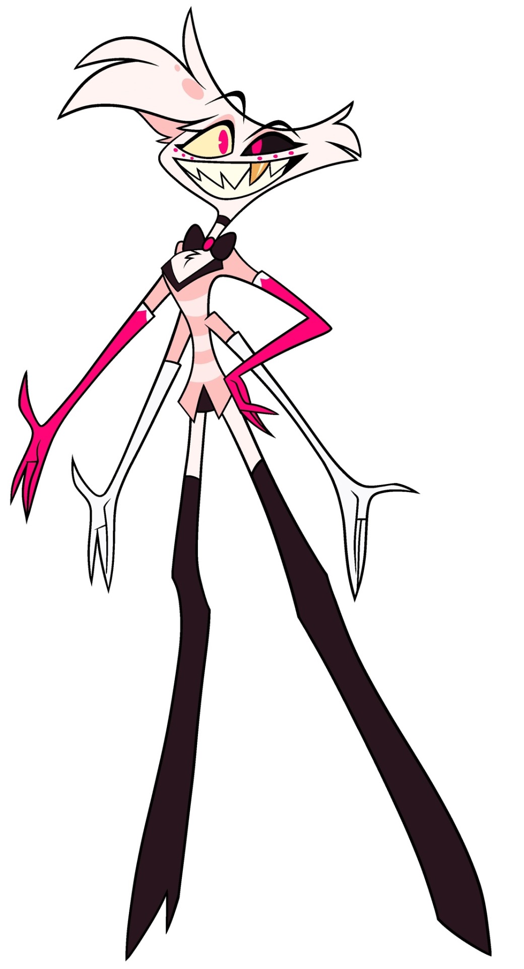
Another great example is Angel Dust, who, despite being a spider, lacks so many distinct features we associate with spiders! He only has six legs instead of eight, he doesn't have pedipalps or chelicerae, and he also lacks that big old spider booty, which I think is such a missed opportunity, considering he is supposed to be in the sex industry. He isn't even remotely shaped like a spider, he looks more like a fuzzy stick bug or something.
Part of me feels like Viv is too afraid to make her characters look unique, so she just goes with the same, skinny humanoid design for just about everything. It's such a shame, because I really do think she is a talented artist who can make some really interesting designs. But then again, she also gave us Beelzebub, so... maybe not.
As for the reference sheets, maybe I wasn't looking hard enough but I couldn't find any official ones for the main characters, so if you could send those my way I would appreciate it! Though it honestly wouldn't surprise me if they were bad. I did look up Lackadaisy's and found them pretty easily and...
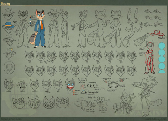
This is so freaking comprehensive and detailed, it's incredible! Look at all those poses and facial expressions!
Comparing Vivzie's works to Tracy's feels kind of unfair, since Tracy has been working on Lackadaisy for 17 years, and it really shows. This is leaps and bounds above Helluva Boss and Hazbin Hotel in quality. Rocky's design is tight; it's detailed, but not overly complicated. There isn't an obnoxious overuse of highly saturated colors, and there's such nice contrast between his fur, his eyes, suit, and tie, making his design very nice to look at. You can also tell so much about his personality and the world he lives in just from his appearance. It's such a good design, and Rocky is just one example from Lackadaisy! All of Tracy's designs are memorable and stand out from one another, unlike so many of Vivzie's characters, whose designs honestly feel interchangable.
So much thought and care has gone into Lackadaisy, and I seriously cannot wait for the full series, as well as all the other amazing indie animated series that have been coming out recently. It's sad that Helluva Boss is seen as the pinnacle of indie animation, when there are so many other series out there that are just.. better! Lackadaisy, obviously, but we've also got Digital Circus, Murder Drones, Monkey Wrench, and so many others that deserve way more appreciation than what Helluva Boss receives. And that's just from an art direction standpoint, we aren't even talking about writing. That's a whole other can of worms.
All of that being said, it's obvious that a ton of love and hard work went into Helluva Boss, and I hold absolutely nothing against the animators and artists at Spindlehorse. These poor design choices are a hallmark of Vivzie's art style, and they're simply working with what they've got. There is such wasted potential here because it feels like Vivzie is too afraid to step outside her comfort zone and design something that isn't a brightly colored, sharp-toothed twink, or skinny anthro wolf girl.
Anyways, that about wraps up my thoughts. Thanks for the ask, this was fun to delve into! And again, I'd be very interested in seeing you post your redesigns! 👀
174 notes
·
View notes
Text
I just finished watching Skam (Norway) today and let’s just say I’m not kidding when I say this is one of the BEST shows I’ve ever watched. I did take a lot of time to watch all the seasons (spanning over one year) but I enjoyed each and every moment of it. Well, some a little less than others. Hence, I have some thoughts and please forgive my yapping.
Okay so Season 1. I actually liked it quite a lot. The acting was good, and it gave a nice start to the whole story.
The getting together of the girls was the highlight obviously, but I really liked the portrayal of Eva in this, as a kind of lost teenager who doesn’t have a lot of direction in her life and is mostly dependent on her boyfriend.
I did think the Isak plot line in this was a little badly done, but I guess it was necessary for the big reveal in the end.
I think the fact that Eva was able to resolve things with Ingrid was very unrealistic, considering they had literally been besties and she basically stole her man. But really idk.
Talking about Jonas, he was majorly gaslighting Eva during the season so I think their relationship was a little immature. Classic right person wrong time.
Penetrator Chris is SO HOT. Especially in that mf smoky eye makeup istg. But he’s a giant asshole and we do not support him.
Season 2. Okay. First let’s start with the showstealer. Eskild my man. I don’t think Eskild is appreciated enough in the whole series but I absolutely love him!! He is so mature, and is such a good friend. I love the dynamic between him and Noora and even him and Linn.
Now let’s address the elephant in the room because why not? I did not like Noorhelm all that much. William never had much of a character development and we never get to see him expressing a lot of emotions. I forever stand by the opinion that Noora was too good for him. Many people talk about William’s support of Noora’s decision to not have sex, but really, that’s like settling for the bare minimum that can be expected from a decent person.
I think the dickhead of a brother had more personality than William. So in conclusion, season 2 did not really impress me but I’d watch it again for Eskild.
Eva hooking up with Chris?? The guy she cheated on her ex with? Can’t say I like this.
Season 3 is SO well done. There’s no question about it. I love Isak’s slow acceptance of his sexuality. From being a closeted gay guy who made homophobic comments to fit in, to a happy and out gay guy in a relationship.
Absolutely adore the boys. Jonas, Mahdi, Magnus. I especially loved Magnus and his take on the whole situation.
Eskild coming in and stealing the show yet again?!!
Emma and Sonja are VICTIMS. As much as I love Evak, they fucked their girlfriends over pretty bad and I hate them for it. Also, Emma is soooooooooo pretty.
The story of Even. His whole character portrayal. The picturisation of his mental issues. Chef’s kiss.
Minute by minute??? Are you trying to kill me here??? It is SO wholesome and they both have matured so much, especially Isak, dealing with his sexuality plus his boyfriend’s mental issues so delicately.
Their chemistry. Their chemistry. Their chemistry.
Sonja should NOT have apologised.
Overall, this season is tied with the fourth as my favourite.
Season 4. Sana is my favourite character hands down. She is portrayed so well, we see all her insecurities, beliefs so beautifully.
Yousana is my favourite couple. Evak is a close second.
The understanding between them, the intellectual conversations, the level of maturity. Just wondrous.
I did think the whole situation with the russ bus was overdone. I never really understood why Sana was so involved with it in the first place. This could easily have been summed up in one episode leaving time for more Yousana development.
Yousef is such a green flag omg. He’s literally the cutest out of all skam boys( my opinion). I just wish he had more screen time.
Elias and Sana??? Whatever bits and pieces we got to see of their relationship were GOLD.
I. Love. My. Girls. So. Much. I just wish Sana was shown interacting more with all of them, not just Noora. Also Yousef and Noora working together to thaw Sana??
I canNOT stress this enough. Yousef and Sana are the best couple ( besides Evak obviously). The chemistry, the flirting, everything was done so right that it got me blushing furiously through the screen. And they managed to do all this without showing any kind of physical contact. Just lovely. The way they counter each other’s opinions with such delicacy and respect makes me believe that they are definitely going to last.
The situation with Even and Mikael and all the balloon squad boys should have been given more screen time.
The way Sana’s faith and her relationship with her family were handled are commendable. We see the dilemma, the cogs of her brain working, and how she accepts her fate and doesn’t sway from her beliefs. I strongly believe that her and Yousef will handle their differences maturely and still come out to be a strong couple.
I SWEAR SHE AND I ARE SOULMATES?????? Cutest shit I’ve ever seen.
Sana and Isak’s friendship means so much to me. In Season 3, we see her rising above her opinions and respecting homosexuality. Here we see Isak figuring Sana out and helping her see beyond her strong opinions. And wdym Sana??? You are best buds.
Okay. The last episode. I absolutely loved it. It’s one of the best season finales I’ve ever watched. We go into the lives of all the girls and some of the guys too. I literally teared up at the Eskild and Linn part!!( idk why they still address Chris as penetrator Chris when his face is literally on the screen like people we know it’s not our girl?? Idk I find it extremely funny). I wish they had shown more of Vilde and Chris’ friendship in the past and not just the final episode. The Even part was absolutely incredible. His insecurities, his fears, and we see him pacifying Isak and not the other way around. Yousef texting Sana from Turkey?? And saying he’ll take her there?? My heart melted.
I literally don’t think Noorhelm is going to last long even though they have reconciled. Something just seems off. Joneva is back??? Didn’t really like the buildup but I guess they could be a good couple as they are more mature than the last time.
Okay. So that sums it up more or less. My favourite was season 4, closely followed by season 3. My favourite characters were Sana and Eskild, they were just so amazing. I related to Sana fiercely all through the show.
Thanks for coming to my ted talk. Feel free to give your own opinions please!!!!
#skam norway#ramblings#skam noora#noora sætre#vilde#sana bakkoush#isak valtersen#isak x even#noora x william#sana x yousef#yousef acar#jonas noah vasquez#eskild
51 notes
·
View notes
Text
10 more Disney hot takes/unpopular opinions (Part 4)
Check out part 3 here.
"I See the Light" is my least favorite Disney duet--I don't know why, but it isn't emotional or impactful to me like other duets. Perhaps it was due to not being emotionally invested in Flynn like I was supposed to be at this point, and his and Rapunzel's different personalities making them feel almost like father and daughter rather than love interests.
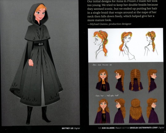
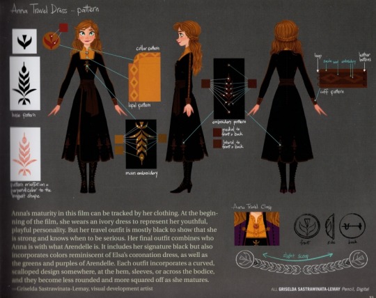
2. Anna's "Frozen 2" look is very boring--It's wildly disappointing that they opted not to give her her double braids because they seemed too childish. This is only three years after the first film, and while I love seeing her hair down, I would've enjoyed her having her two braids as well when traveling. And don't get me started on her main outfit; the black look being chosen to show maturity/seriousness could've easily been a darker green or magenta to keep with her main look rather than going with black, especially since Kristoff's look is black (and also boring; it's just recoloring his look from part 1).
3. The post-renaissance era is very disappointing--No seriously. I'd save "Fantasia 2000" and maybe "The Emperor's new Groove" and everything else can be erased.
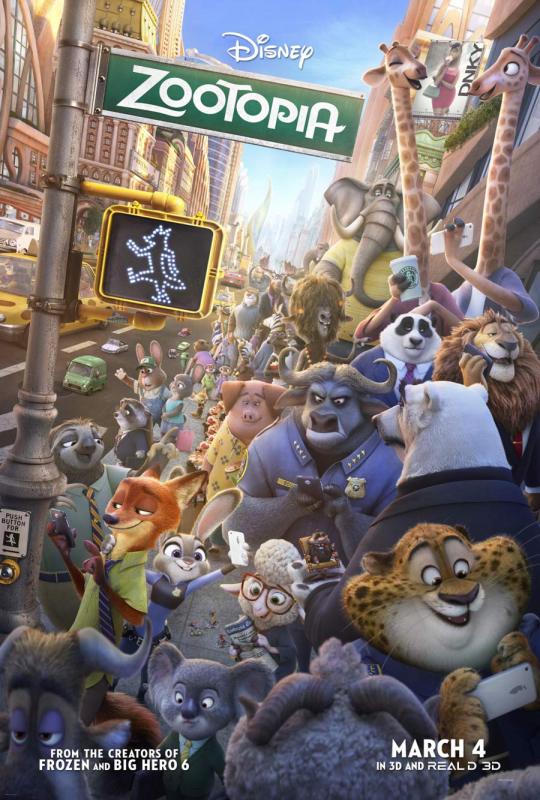
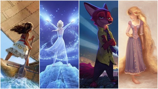
4. "Zootopia" is the best Disney movie of the 21st century so far--Given that I tend to appreciate Disney's musical films more and don't usually care for animal-centric films, this surprised me just as much as anyone else. However, the message, while not 100% transferible to human racism, was so impactful and emotional to me. I can only hope the sequel does it justice.
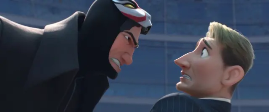
5. Yokai is the best "modern" Disney villain of the revival era--To clarify, by "modern" I mean that he isn't written like classic Disney villains as only having "evil" as their only setting; his villainy has a meaning to it, serving as a cautionary tale to what the hero could become. TBH, I think it was better done than the "Know Who You Are" message with Moana and Te Fiti (see my other hot take post). Granted, I do think some of his sympathy was removed when he tried to kill his students, but the message and overall theme itself is very good to me.
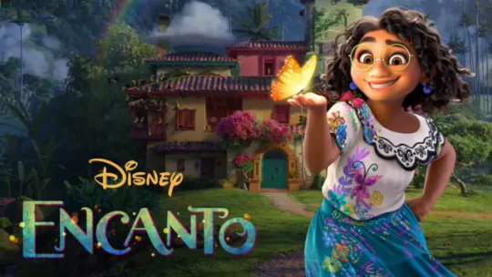
6. "Encanto" was good, but not great--Don't get me wrong, I loved most of the songs, and the animation was phenomenal as well as the message, but the film felt like it was overstuffed. With twelve family members, it was inevitable, but trying to give lessons with Luisa and Isabela along with giving Dolores a romantic arc felt underwhelming since they weren't major characters with Mirabel, who's main thing was feeling left out and isolated. If they wanted to incorporate other arcs, they'd have to be more included in the narrative, and you can still have Mirabel feel isolated; you can be around others and still feel like they don't get you or listen to you.
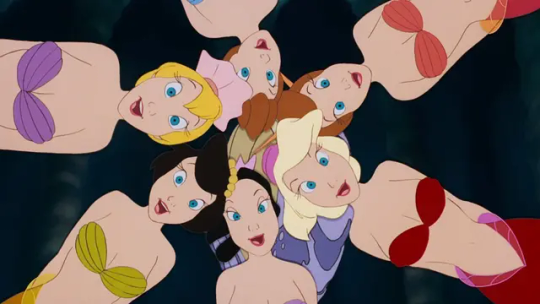
7. Ariel's sisters should've had more relevance than just being plot-accurate--I never really thought about this until the live-action remake, but yeah. Ariel's six older sisters don't do anything and don't exist except for the fact that the source material said she was the youngest of several sisters (thus where we get the title from; I think the fairy tale only gave her five, though). While this is more of a modern Disney idea, I would've liked it if Ariel AND her sisters became human, and each of them grow closer to Ariel upon seeing why she likes the human world so much, and further highlight the anguish Triton feels at driving all his daughters away. That said, due to the amount of characters in the film, perhaps condense the six sisters into one to three of them, and they could still have their hair cut as their payment to Ursula. In fact, perhaps because of this trade, their time on land is shorter than Ariel's (but they don't belong to Ursula until the third day is up), allowing them to get King Triton and disrupt the wedding at the last minute.
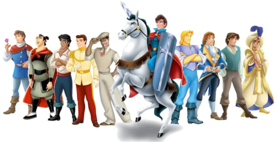
8. The Disney prince line should be more relevant--It baffles me greatly that this hit the backburner in contrast to the princesses. The unnamed prince Charmings could be given names and more fleshed out personalities, and their books/stories could be promoted just as much as the Disney princesses. There is other merchandise to be used besides dolls (even if that is the money maker).
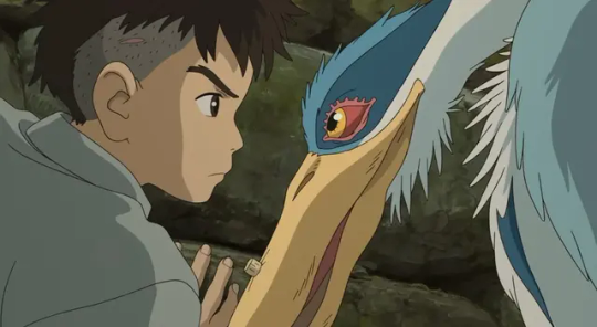
9. Disney needs to consider PG-13 animated films--Animation in the western world seems to be synonymous with family/young audiences, 3/4 times, while Japan has shown that animation has huge potential in the young adult market. I desperately hope that "The Boy and the Heron" being so acclaimed inspires Disney to be more PG-13--not just for the rating, but because the story benefits more from the mature content. Note: this is more for violence/scary imagery than innuendo or profanity.
10. Disney should be more sparing when they hire celebrities for films expected to start a franchise--This is a personal opinion of mine, but while I don't think celebrities should be excluded from major motion animated films, I do think companies, particularly Disney, should use them carefully. These are for two reasons: if you hire a well-known voice actor, the character's voice may not sound as unique for a major property since the voice is somewhat ubiqitous thanks to the actor's work. Secondly, hiring a celebrity actor known for live-action productions, it may be hard to meet their schedule or salary desires when you want them to return for a short, sequel, and/or tv show. Not saying it happens every time, but I do have concerns about that, especially when I thought "Wish" was going to be something spectacular and show up more in Disney's merchandise.
#disney#disney animation#disney princess#disney prince#tangled#rapunzel#flynn rider#frozen#frozen 2#anna#big hero 6#big hero six#bh6#marvel#marvel comics#yokai#mirabel madrigal#encanto#zootopia#studio ghibli#the boy and the heron#magnifico#king magnifico#wish#the little mermaid#arista#aquata#adina#alana#adela
15 notes
·
View notes
Text
Finished the Knuckles Show and uhhhhhhhhhh it’s certainly a show.
There’s good stuff buried in every episode especially where Knuckles is concerned. They set up a very interesting arc for him and just didn’t really explore much with it. After the first episode Knuckles is shoved to the side CONSTANTLY and is made the B plot more often than he should be as the TITULAR character.
Every criticism that said Wade takes over the show is correct.
After episode 1, Wade takes over every A plot and Knuckles is only ever in the B plot that has either minimal time focused on him or he’s just straight up not around (episode 4 is the worst offender here but it’s an issue from eps2-6). They actively write Knuckles out of the plot constantly and it’s very frustrating.
If you like Wade and enjoy his personal journey about his family then this’ll be fine. I, for one, thought it was interesting on its own but 100% it has no reason to be here in a SONIC MOVIE KNUCKLES spin off show. This is not Knuckles’ show. It’s Wade’s and that’s the biggest let down.
Knuckles IS there but that’s it, he’s just THERE.
And it sucks because Movie!Knuckles himself is very well crafted and very entertaining and engaging to watch. The show is at its strongest when it’s about Knuckles and spending time with him. Episode 1 is the only episode that it feels like what it was advertised as - the Knuckles show.
Sonic, Tails, and Maddie only show up for the first episode and never come back. Which is wild because part of the plot is Maddie has grounded Knuckles and he sneaks out but there’s never any consequences shown once he gets home nor do we see how anyone reacted once they noticed Knuckles is gone. These three are just abandoned after episode 1.
Tails has like 6 or 7 lines, my boy deserves sm better LMAOO
A big highlight, however, I LOVED Sonic in this one episode. The way you can see and FEEL how he’s grown from movie to movie and in this first episode is very well done. He’s truly becoming the Sonic I know and when he and Knuckles had their conversation on the roof where he tries to help Knuckles see the beauty in Green Hills, his home - that entire scene was PURE Sonic’s golden heart on display. He does still have his jokes that remind you Ben Schwartz is his actor and that he’s a silly kid but he IS still Sonic at his core and I loved that. It made me very sad we didn’t get to see more of him but I appreciated seeing Sonic handled this way. It makes me very eager to see how movie 3 goes about him considering everything Shadow brings to the table and how different of a threat he’s gonna be for Sonic.
Episode 2 is alright but GOOD LORD episodes 3-5 are such a waste of time. There’s good sprinkled in them in isolation but as full blown episodes, a waste. You can skip most of what’s happened and be fine.
The big climax fight in the finale just HAPPENS. The plot armor literally comes bursting through the wall and yanks Knuckles out of the plot for way too long and we only get TRUE and INCREDIBLE Movie Knuckles action (his fire fists which were insane btw) in the last 5 minutes and it only lasted like 2 of those 5 minutes.
Overall, it’s not entirely unwatchable but it’s not worth a majority of people’s time. You don’t need this for movie 3 so if you wanna skip it - I’d recommend that. If you really watch though, I’d only say watch the first episode and the finale and just google the context for what’s in between bc eps 2-5 are total slogs after a while.
If you like silly dumb fun - this is the show for you. But it’s not the show many Sonic fans may have wanted or expected.
I’m not angry or anything like many people have been. It’s not worth getting angry over. I’m moreso just disappointed because I can see a good show about Knuckles hidden in there. They just opted to give more time into Wade for whatever reason.
Just an overall let down imo.
Knuckles deserved better❤️
#i was so bored half the time ughhhh#i felt so bad but guys#it just wasnt worth it#anyways movie 3 save me save me movie 3#sonic the hedgehog#miles tails prower#knuckles the echidna#knuckles series#sonic movie#sonic movie 2#sonic movie 3#sonic movie spoilers#knuckles spoilers#knuckles series spoilers
35 notes
·
View notes
Note
i luv ur dr art recently @_@ if you don't mind me askin who are ur fav dr characters design wise (not personality/story?)
LOVE when people ask me stuff like this yes - i'd gladly <3
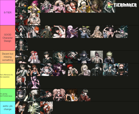
Only included DR, SDR2, NDRV3 - we'd be here forever if it was the entire franchise. Also only accounting for their ingame default outfits
The placements on each tier is deliberate, the closer the character is to the top of that tier, the higher they are. I judge them by: >Prominence of the Talent, its practicality >Relevance to the character's identity/personality >Colour and aesthetics :]
[ramblings undercut]
[S-TIERS]
Like Gundham for example is an S-Tier design as it ticks all above boxes whilst still in a school uniform. The Four Dark Devas are important to the design, they go with him everywhere and the 5 of them are a UNIT which shows his strong connection with animals. I love the bandages and the eye-scar as it has a double meaning that indicates yes he works with animals (they can be rowdy), but as a character Gundham builds onto this detail using these scars to create this dark angsty facade. Aesthetic-wise by his hair he has a unique character silhouette, and I like how his purple is made the focal point by the blacks and whites of his uniform... both reinforcing the villain-facade and highlighting the importance of the Four Dark Devas.
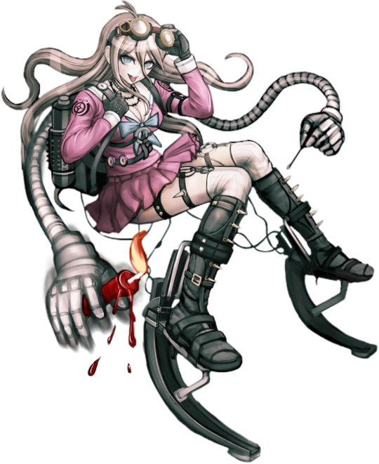
Similar reasonings for the other Top 2 of Souda and Miu this time toppled with the strong yellows and pinks in their design. It's eye-catching and easily conveys what their talent is. (I really wish they kept Miu's promo-art backpack into her regular sprites, imagine her emoting with 4 arms isn't that awesome >:] )
Honorable mention to Impostor (Twogami) as well. While the regular Togami design is... mid. I really appreciate how contrasting Impostor's colours and accessories are down to the necktie and poses! Like yes they are impersonating Togami, but their values and personality as a person are not the same. The deception of Togami's dark clothing vs honest white suit of the Impostor's. Impostor fucking CLEARS regular togami any day on all accounts I will die on that hill.
[GOOD CHARACTER DESIGN]
A lot of the talent indications on this tier are more subtle in compare to S-tier but they get the job done and they do it in a pleasing way (I like the colour palettes on Chiaki, Mikan and Ibuki for example). Like I loveeee Sonia's uniform especially for it's simplicity. And yet the design still alludes to the Princess talent by elegance in the bow, the brooch, her crowned braid and how the shape of her skirt resembles that of a puffy princess gown. I also think the reds in the design like Snow White are a cute touch!
To me, Sonia should be the standard in what a Danganronpa design SHOULD be in accordance to detail.
[BAD CHARACTER DESIGN]
[ie the Green and Blue tiers] Reasoning why I put them here mainly because of wasted potential, either too basic (in a sense it doesn't tell much about that character) or not practical in any way for their talent... I HATE Ryoma's stripe leggings ik he went to prison but the execution of the concept looks awful.
And I hate Akane's and Sakura's outfits particularly cuz you KNOW why they made those skirts so short and I hate that. We could have gotten awesome gymnast of martial artist outfits but no......
I added Kiibo in that bottom tier because structurally even as a robot he is a visual nightmare if you're an artist trying to draw him. Especially when most of his suit is different shades of black and complicated chest cavity. And I despise the way that it looks like these robo-plates are attached on top of what looks like fabric long sleeves and pants as if the designer was too scared to fully commit to him being a robot. He is NOT 3D-optimised and he is NOT animator-friendly I'd throw up if I ever had to deal with him.
#ask stufff#stufff rambles#danganronpa#dr#sdr2#ndrv3#this is so unnecessarily long idc i love talking about design details i will have this#i was gonna start COLOURPICKING... and ANNOTATING dude shits serioussss
43 notes
·
View notes
Text
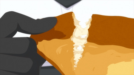
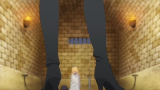
'Tis Time For Torture, Princess Episode 1: You Need To Be Watching This
Do you like food? Do you like shenanigans and humor? What about great animation and direction? I'm sure most would say "that sounds like Delicious In Dungeon", and you wouldn't be that wrong. However, and this is a potentially really hot take, I think that the first episode of 'Tis Time For Torture, Princess is considerably better than Delicious In Dungeon's, and I'll explain why.
Let's lay some groundwork though. The staff on this series is surprisingly fresh. The lead director, Youko Kanamori, is a first timer in the position. Similarly, Hasegawa Mami is also brand new to being the director of photography for an entire series. There's also staff like Narumi Konno who are somewhat fresh in terms of their experience with color design. Then there's the 4 character designers and 2 cuisine designers, plus the rest of what you'd expect.
There's a lot of new talent on this series, and they're hungry to prove themselves. I really really love seeing new staff members, especially women (because of the nature of the industry), get a shot at big roles like this. And I mean, they're proving why they should be here.
Narumi's color design is very striking and full, always finding the right balance for each scene.
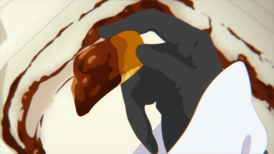
You'll get traditionally colored (yet still satisfying) scenes like this, but then you'll get a wonderfully novel approach to coloring in a dank and dark prison.

I love the coloring on the floor, it reminds of what oil spills end up looking like, and that idea of it being "dirty" and the ground and walls being covered in that layer of grime adds a lot of fun color to the episode.
Narumi just has a lot of range, though their second ever series being The Vampire Dies In No Time certainly helps with that. However, it's a pretty clear difference in color design between the two. Where The Vampire Dies In No Time leans heavily into its fantasy and simplicity, 'Tis Time For Torture, Princess makes a case for a more believable fantasy style- idealized, even. It's far less noisy of a color palette, but it has such intense range. I really really love it.
I also really really love Hasegawa's composition. The vast majority of the time you don't really notice it there, but when the humor or situation calls for it, Hasegawa breaks out some incredible composition work which wonderfully highlight the characters involved.

Also, they choose a slightly different style for the color shifts in their images. You can't really tell in the above so here's some better examples.


Rather than the more typical Magenta-Green shift you tend to see, Hasegawa opted for the less common/likely Blue-Red shift for their chromatic aberration. Of course, you can still pick out some greens and magentas in the more glaring aberrations, but it just shows Hasegawa's attention to detail, which I really love.
I mean, they're pulling out composition work that looks like it came from a high budget Gacha Game trailer.

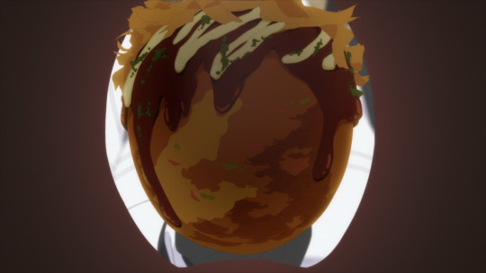
And the praise doesn't stop there, just look at the food. Makes complete sense why they'd have cuisine designers on board, this food looks irresistibly delicious.


And then there's the incredible character acting.


I think it's arguably the most interesting aspect of the episode, truthfully. Largely because there's a total of 4 character designers (two main and two sub) in charge of the designs, and there was a total of 8 animation directors on the episode (1 chief, 7 regular, 1 food). Of course, 3 of those animation directors comprise half of the character and cuisine designers.
And that's interesting for two reasons. It's likely that the designers are rotating episodes. That is, 3 on episode one and then the other 3 on the next episode. And secondly, 7 animation directors is a surprising amount considering how "inconsistent" the Princess' model is (just look at all the different images in this one post). However, I strongly believe that it's 100% intentional. The designs look too good to be the product of simple off model issues, and their appearances too well timed with the events of the episode.
So we arrive at the conclusion that the animation direction and designers for this show are pulling some seriously cool stuff.
Finally, we can do storyboards. Gosh, it took long enough haha. I'll make it quick, Kanamori really prefers the super close ups to mask facial expressions and leave a lot of interpretation up to the viewer, and that sort of close up work pairs effortlessly with the obsessive focus on food.

But that's hardly the half of it. Kanamori also loves strong perspective in her layouts, and she makes that very evident when playing into the humor or intensity of a moment.


That of course also means that she imparts a fair amount of first person perspective to the episode as well. It's really amazing, Kanamori, much like many of the other high level staff members, is perfectly aware at how fluid Torture Princess is, and she expresses that wonderfully with all the different ideas employed with her boards.
And just one last little piece. The big troll/monster fight at the start? It absolutely lives and breaths Kanamori's experience in storyboarding for Ousama Ranking. You feel their incredible awareness of scale and size and it creates the feeling of a monster of unbelievable size that the Kingdom is forced to fight against.


Anyways, this is all to say that 'Tis Time For Torture, Princess has an all around incredible first episode that promises viewers that the series desperately wants to be one of the best of the season. And I wholeheartedly believe that.
#tis time for torture princess#hime-sama goumon no jikan desu#姫様“拷問”の時間です#anime#anime and manga#anime review#anime recommendation#anime reccs#delicious in dungeon#dungeon meshi#food anime#food manga
28 notes
·
View notes
Text
Ein's Art Log #1
@lixenn!! Here's the timelapse I recorded for my rarepair week submission! I'm just gonna start this log series because I wanna study art more and take notes of it here in this blog. And maybe it will help people with their drawings? I'm putting my notes below ↓↓↓
Draft & Lineart
First, for this art, I used a base made by Ging (깅). Using bases like these are always useful for a lot of things and it also forces me to draw things (like poses, hands, etc) I wouldn't normally draw by myself (if its up to just my hand with zero braincell input, I would just draw the characters facing 3/4 to the left over and over). Also a lot of them are just so *chef kiss*, god bless Korean artists. They're so good, especially with how they do the figures and anatomy!
I just adjusted the base a bit to match the characters' heights, since Kurumi is taller than Chrome by like 6cm.
Then when making the drawing a draft layer over the base, I usually use bright colors like green, red or blue (most often green). I usually don't think about the draft too much even if it turns out ugly, I think it's actually better that it turns out ugly and messy.
Otherwise, if the draft looks slightly more decent than expected, then I'd become too lazy to draw a more proper lineart. Whenever I remember to do so, I also use a gray-colored background so it's easier on my eyes, especially since I drew this after work.
For the "lineart", I used a brush called 촉펜 (MTL says it's "Touch Pen" in English; Content ID: 2050169). I recently started using this for doodles/sketches, it feels nice. It was free when I downloaded it, but it costs 10 Clippy now.

Anyway, I used a little bit more braincells for the "lineart" now after the draft, but then I didn't really try that hard to make it look clean, since I'm rushing to finish it as fast as I can. I just made sure that the outside lines are connected just enough for easier selection & coloring later.
Coloring & Shading
The coloring is where my experiment actually started! I usually go ahead and color them one-by-one per each color and part, but to be quicker, I used the Magic Wand selection tool to select the area outside the background, then inverting it so now the selection is at the characters *except* the background.

I then used the the bucket tool to fill the selection with the color I use as the base skin color. I still keep the selection there for further coloring purposes.

Just from here, I added another layer on top for the shading of the skin! For the shading, I used a brush called Yuri Watercolor (Content ID: 1889385). This one's really a paid brush, but I liked it a lot so I got it hahaha.

I do plan on replicating on doing this on IbisPaint one of these days! My plan so far is to use the free watercolor brush there, lower the brush opacity to around 60-70% and then draw the shading on a clipping layer set to the Multiply layer effect.

After shading, it looks like this now! I didn't mind the colors bleeding through the non-skin parts (except for two parts: the neck shading that would bleed to the face and thigh shading that would bleed to the skirt). I also used this brush to color Chrome's eye. Huhu I can't remember how I did it, helpskjfbjsbf
Then for the coloring of the hair and clothes, I just used the soft airbrush! I tried using the Yuri Watercolor brush for it too, but I couldn't quite grasp it yet on how to use it for coloring/shading those parts. I guess I know what to study next hahaha
When coloring the hair (and clothes), I did color the middle parts but didn't really full-on color till the edges to make that fading effect at the edge.


For the shading, I added clipping layers above and used the watercolor brush again!
For the hair highlights, I used the soft airbrush again. I just used a white color on a Soft Light layer effect to add a faint highlight on their hair (showed on picture on the left). Afterwards, I added another layer above with the Add/Glow effect and turned down the opacity to around 50%, to put more shine to it (showed on picture on the right).


Additionally, I also added a paper texture layer at the bottom! I also grouped up all the lineart and color layers into one folder and set the layer effect to Linear Burn.
Finally, after a bit color corrections/adjustments, blur filters (post-processing stuff, maybe for a different post?) and adding some decorations, the drawing is finally done! KuruKuro my beloved 💖

That's the process I'm playing around with so far, but I think I can still improve on it. I'm also planning on making a page on my wiki to compile my resources, references and such (maybe some free to use assets too). But anyway, that's all for now!
7 notes
·
View notes
Text
sad to say but sometimes i am a hater (and in this post the thing i am a hater of is specifically the neo diamond cutters in da idw comic of sonic)
now i dont MIND them as a team and i was hyped at first! but thats kinda. decayed. under the readmore are my thoughts on them (long & rambly)
theres a few reasons to it: the visual designs next to each other, the team dynamics, the way tangle is treated in those dynamics, the reason the team even formed, the way they had tangle take the diamond cutters name so insensitively… i really *don’t* like them as they are that much, although i still dont ‘hate’ the team as a concept
visual designs: their color schemes overlap so much and not necessarily in a good way. every color used on one is used on the others in some form, which kinda blends them together instead of building separate identity. looking at other 3-man sonic teams highlights this: not just sonic tails knuckles being distinct primary colors, but even team dark that overlaps in black and reds is still distinct thru shadow and omega’s body shapes, rouge having pink instead of red, AND having different concentrations of each color. the neo diamond cutters/NDC have two majority white characters, both of whom wear yellows and browns and warm tones, and then one character who is yellow and brown and warm and wears cold gray tones. their shapes do stand out with tangle’s stripes and tail, lanolin’s puffs, and whisper’s angles, but still all the white is super same-y (and it gets worse when silver teams up with them). and the character designs aren’t bad on their own - but they’d work so much better together to be tweaked imo, maybe by working more purple into tangle’s design with her eyes (which is a color neither of the others use), and finding a way to give whisper a bit more of a peppy outfit (her extreme gear fit works SO well for this, the blue is cute on her and works great with the gold in a different way than it works with tangle’s white and purple with gold), and then lanolin can kinda stay the dusty down-to-earth tones, maybe work in green somewhere..
then my next point….. why does tangle stay with them i know the reason they gave her is she wants to stick close to whisper, but why is she back in a team with authority over her and responsibility and specific missions? isn’t that why she left the restoration - besides to be free to go find whisper, to be able to go where she wants and be helpful where she feels she’s needed? i can’t see tangle being content with this setup for very long, especially as it is where lanolin is clearly like their commander/boss. seeing that scene with lanolin slapping the paddleball out of tangle’s hand instead of asking her to stop - based on what they show in the comic, lanolin went right to smacking around instead of communicating, and based on what tangle says, didn’t even communicate to tangle that she wanted her to stop. tangle, who HAS been shown to be fairly good at self-correcting and staying within boundaries with whisper. it’s sure not the only part of their dynamic but the fact it was there is, man,, additionally tangle herself is getting slandered this arc, particularly by recharacterizing her as a rookie who hadn’t done any fighting until sonic showed up - issue 4, tangle’s introduction, explicitly contradicts this by showing tangle already easily handling badniks before sonic and her even first see one another!!!

for the purpose of this NDC team layout where lanolin and whisper are Good At Things and tangle is the rookie who needs their training and doesn’t even know how to fight, they’re scratching out the parts of tangle that made her so cool and fun! and it’s so frustrating seeing the character i like being written so wrong, i want to make a separate analysis post just for how recent issues contradict or build friction with recent tangle vs how she was in earlier issues.
additionally, if whisper’s trying to move on from her past and the diamond cutters, the better way to show that narratively isn’t by forcing whisper into another team, it’s letting her function outside a team, with her friends - the way tangle does. so instead pushing tangle into whisper’s box having a team, it grates all that down into ‘but what if they were secret agents sorta’. (oh, and all had wisps except tangle. is she allergic to wisps or something, or are they trying not to give tangle anything else special because she has her tail, despite whisper having *5* wisps not being too many?)
i guess i dont really have a conclusion besides ‘i hope tangle realizes she isnt having a good time here and that adhering to the standards other people hold for her instead of playing to her own strengths is holding her back and goes and spends time with literally anyone besides whisper and lanolin’, but i really wish this team hadn’t started at all, or at least ended up as a one-off instead of a recurring unit that isolates each member from anyone else in the comic unless they join the team. it pulls tangle and whisper away from potentially more interesting situations and interactions with other characters and pushes them into a structure, even ignoring what the writers had to break (ie tangle) in order to force them into that structure. and tangle clearly came out the worst among the three of them, but i think they all kinda hurt for it.
and hey, if you disagree- well first, why did you read all this if you knew i was just gonna be hating on the thing you like?- you’re free to share your standpoints! i’m not committed to thinking of NDC as Bad and Awful, but the things done with them have made the comic less enjoyable to me, so i’m not inclined to like the team very much. and i don’t dislike the characters themselves, just this specific way they’re stuck together. even lanolin, my least favorite, still has good points but is kinda kept in her ‘unlikable’ state by being stressed and put supervising the other two when she doesnt like it.
#hater mode#this is not a post made to be enjoyable unless you think like i do#feel free to reblog if youre inclined to just dont bash anyone who likes or doesnt like whatever#leori words#i didnt edit or revise this or whatever either so i hope it comes across like i mean it
6 notes
·
View notes
Text
Difference between BotW and TotK Zelda:

1. The most obvious is the eye shape, this was especially pronounced to me in the memory where she's having tea with Sonia and Rauru. I was sitting there like... something is different. They've changed the eyes from ovals to semi-circles, and lowered the outer lashes. This cuts off a bit more of the iris, and makes her eyes seem less... fake? If you look at her eyes without the eyelids or eyebrows you can see what I'm talking about.
2. They've actually darkened her skin a little bit. It makes sense since she's outside more and not stuck in a castle for 100 years. The tan looks good imo.
3. Her hair is the same colour (though they toned down the highlights). The detail has been increased though, bery noticeably on the front dangling parts. They don't look as plastic anymore.
4. Again with the eyes, they've made them slightly more green. BotW has a little bit of turquoise in there.
5. The shadows on her skin have been detailed more, her whole neck and left ear are shadowed in BotW whereas TotK has the light reflecting off parts
They're little upgrades but I think they really add to the design and wanted to point them out since i see a lot of people talking about her new hair/ clothes.
32 notes
·
View notes
Note
Hi there! I've belatedly seen your question about coloring, and I'm someone who likes to tweak color, so in case it helps, I thought I'd write up some things I might do. I don't know if you have the same tools I have, but I saw you use Color Balance, so I've used that for an example below. I usually start by adjusting lighting levels so that the lightest and darkest points are where I hope them to end up. Then I'd adjust color hues which in your case was using the Color Balance tool. I might also adjust the saturation or vibrance because too much can cause colors to get extreme quickly. Here are some quick settings I did in Photoshop.
Levels: dark point=19, mid point=1.37, light point=249, output levels=18 to 255
Color Balance: shadows red+13, green+5, blue-4; midtones red-8, green-9, blue+3; highlights red-60, green-28, blue-25
Saturation: reds-8, master-4
Here's the result:

I know it can be hard to translate setting between different apps, so I wonder if this will be helpful at all, but feel free to ask me questions if you're so inclined 😊
~ Dani
WOW, your results are incredible! Thank you so much for taking the time to play with this and to offer some tips! Adjusting lighting before trying to adjust colors hadn't occurred to me at all.
I'm using Adobe Premiere for the video editing, so same software company at least, but I couldn't find any lighting level settings like what you described. Through Googling, it looks like a setting called "Lumetri Color" is typically used for lighting corrections and it's broken out differently.
I have to go to work pretty soon, so I haven't had sufficient time to really dig into it and play with it, but I did mess around with it a tiny bit. I'll play more this weekend and see if I can get closer to what you were able to accomplish.
For reference, my original adjusted version (which I can see now looks soooo horribly orangey compared to yours!):

As a starting point, I just clicked the friendly "Auto" button on the Lumetri Color tab to see what it would do. A little better, still pretty orangey.

Then I tried to make some of the color adjustments that worked for you. It looked like your adjustments had been based on my adjusted version, so I'm not sure if my attempt at making it a direct mathematical adjustment was the right way to go, but I tried to add your adjustment #'s on top of my adjustments. So for example, I'd had Shadow Red set to -10 and since you said you added 13, I changed it to 3. When I changed all 9 settings it didn't improve too much, definitely nothing like yours:

But while applying those changes, I noticed that before I applied the last two (highlight green and blue), it looked closer to what you had. Still not there yet, but closer.

Once I have time, I'll play with some of the Lumetri sliders and stuff a bit more. It may also help just to have your beautiful image as a reference point. Thanks so much!
Addendum: Additional Efforts
I spent some more time playing with this. I present two versions for your judgment.
The first version isn't exactly like yours, but it looked pretty close to my eyes. So I was happy for a minute or two. Then when I started watching the video instead of just staring at the still frame, I felt like it looked a little too green. Maybe that's because I've spent so many hours staring at my previous orangey version that my idea of what looks normal is skewed.
So in version two I adjusted the Tint setting. I feel like this looks a little better, especially when I watch the video, but I don't trust my judgment at all. My color judgment was bad before, and now I think my eyes are permanently warped from staring at different shades for so long.
I'm including both versions below. For each version I'm including a side-by-side comparison with your example vs mine. I wanted to include a video clip for both, but it looks like tumblr limits it to 1 video, so I only included the video for version 2.
Please don't be afraid to tell me they both look horrible! I feel sort of like the proverbial monkey hitting a bunch of random keys and hoping I might hit upon Shakespeare by pure random chance. 😅
Version 1

Version 2

14 notes
·
View notes
Note
Mon mon mon your top 5 vice versa quotes/ top 5 visually pleasing vv scenes
ISMAY THESE ARE SUCH INTERESTING QUESTIONS BUT I HOPE YOU KNOW THEY MADE ME GO THROUGH AN EXISTENTIAL CRISIS ESPECIALLY THE SECOND ONE (hence the really late reply SORRY!!!!!!!) SO HERE GOES NOTHING I GUESS
TOP 5 VICE VERSA QUOTES
1. “even though there’s only a little pink, jigsaw completed his drawing with other colors, just like our story. we might focus less on our love one day, but i’ll still understand you, care for you, and want the best for you.” “are you trying to say that one day we’ll love each other less?” “that’s not what i mean. im saying, even if one day you have to devote yourself to what’s really important to your life, rather than spend your time thinking about me, i’ll understand and give you my full support.” – puen in our skyy episode 2 [just for this dialogue alone i had to accept the fact that i will never love a pairing this completely in my life ever again literally no one compares to puentalay]
2. “and he paints my life pink forever.” – talay in episode 12 [QUITE POSSIBLY THEE MOST LINE OF ALL TIME]
3. “if this can be used to wipe away dust, i should use it with your heart. i think your heart hasn’t been used in a long time.” – puen in episode 3 [LIFE ALTERING TRANSCENDENTAL MOMENT IN HERSTORY IM SORRY BUT THIS IS SIMPLY HIGH ROMANCE TO ME]
4. “we all have our own pain that we are enduring. you can’t compare your life to theirs and judge them on what they should do.” – kita in episode 9 [KITA THE UNSUNG HERO OF THIS SHOW I LOVE HIM SO MUCH]
5. “whoever puen is seeing is his personal business. im his fan, not the master of his life.” – gyo in episode 12 [print this line, project it on a wall, make a powerpoint out of it, tape it everywhere, put it in a billboard, spread it]
TOP 5 VISUALLY PLEASING VICE VERSA SCENES
(i ended up going with a mix of colors and framing and cinematography to pick these and IM STILL NOT FULLY CONVINCED)
1. the bucket hat reveal in episode 10. not only this is one of the most scenes in television history (second only to puentalay reuniting in episode 11), but it also takes the crown as the most visually stunning. the pink/red contrasting the black/blue is simply beautiful.
2. the glasshouse kiss in episode 4. I SWEAR IM NOT JUST FINDING EXCUSES TO KEEP POSTING THIS SCENE IT'S NOT MY FAULT IF IT'S PERFECT IN EVERY SINGLE WAY. one may ask, 'why didn't you pick one of the two other glasshouse scenes then', to which i say ONCE AGAIN NOT MY FAULT IF THE OTHER SCENES DON'T HAVE PUENTALAY DRESSED IN CONTRASTING COLORS AND PUEN HALF HIDDEN BY THE GREENERY BEING SLOWLY REVEALED.

3. talay drowning in episode 1. I KINDA FEEL BAD PICKING THIS SCENE SINCE IT’S TALAY DYING BUT. look at how pretty it is. when i see all these gorgeous shades of blue (with a hint of pink in some shots!!!!) i can understand talay saying “let me appreciate these beautiful colors a little longer.”
4. the secret island in episode 10. at first i didn’t want to put the same episode twice, however i just can’t leave out this scene if we’re talking about visual elements. color wise it may not be as remarkable as other moments (although the touch of green against the neutral tones of the sand and the sky and the water is [chef’s kiss]), but the cinematography here is honestly breathtaking.
5. friend credits reuniting in episode 6. this is a shorter scene compared to the others but i absolutely love the way they were able to highlight the yellow in such a clever way, not only with the lights but also with the sparklers and the curtains against the black and the white/light blue.

#THE FACT THAT I DIDN'T PUT ANY PINK SCENE IN THE TOP 5 IS KILLING ME#but unfortunately i don't think they can compare to these five#ANYWAY VICE VERSA THE MOST BEAUTIFUL SERIES OF ALL TIME SO TRUE#thank you so much for asking me these ismay!!!!!!#hope you're having a wonderful day!!!!!! 💜💜💜💜💜#vice versa#ismay 🤍#m: ask
6 notes
·
View notes
Note
hi!!!! i really really love your art and it's been a really big inspiration for me lately ^_^ i just wanted to ask if you'd be okay with maybe going through your usual art process?? every time i try to draw i just end up getting frustrated since i never know where to start 💔if this is too much to ask for feel free to ignore me and i hope you're doing well regardless!!! 💕
thank you for such a sweet ask wow what the heck ૮(꒦ິཅ꒦ິ)ა❤️🌈 i hope you’re well too and i’ll gladly share my process!! i love oversharing anyways….!!! (although i often dont know where to start and it takes weeks for me to gather up the energy to even start aufhijfjghhh)
💖CRITICAL STEP before i do anything at all: surf pinterest for inspo!! 💞💕 it can be inspo for art styles, ideas, or just ~vibes~ (if that makes sense lol?? 😸) but ever since i started actually sorting my boards my feed has become a lot more colorful and cute and inspiring…! 😸😸 i especially like seeing all the unconventional art styles on there!! it’s where my cartoony-ish style originated from ( •ૢ⚈͒⌄⚈͒ •ૢ)💖💓🌸🌷🍃

sometimes i come across a post on twitter that i GOTTA manifest into a drawing, so even though twitter is very rancid and negative, it can be good! sorta!! but yeah i try to start out drawing with a solid idea of what i wanna do in mind, or else it’ll just end up being a generic right-facing 3/4 portrait LMAOoo…….. 🤠👍
❤️colors: generally i will give up after i have a sketch and slither off to binge horror novels, but RARELY i might proceed onto the coloring stage… i have this disorder in which i need to maximize the vibrancy of every pixel on my screen or i’ll Die. 🪦(ɷ ꒪ཀ꒪)ɷ for shadows, i rarely use black unless i reallyyy need to; i just do dark purple! 🦄💜🔮🪄 for highlights, i never go for pure white; usually it’s cream or neon yellow, but sometimes skin will have these little light green spots to stand out (this is actually a color theory thing i learned from oil painting… green vs. red!) 😸🍏🤝🍎😸
🧡overlay: i have at least 2 different layers set to overlay, so i can augment color vibrancy EVEN MORE and make things ✨glowy✨ like a 💥flash bomb💥!! on my first overlay layer, i go over dark colors with either dark brown or dark purple, set to a very very low opacity (practically transparent) to make things DRAMATIC, and then lose all my marbles on highlights at regular opacity!! my other overlay layer is for me to go crazy with the rosette brush, which looks like those comic book dotsies! ٩(๑′∀ ‵๑)۶•*¨*•.¸¸♪
💚touch-ups: after i’ve given up on my drawing and accepted that this is the most i can do, i proceed to do even more to it by slapping filters on it in picsart and picmonkey. my go-to filters in each app:
💙picsart: indie 2, usually set at 30% (it makes colors EVEN MORE NEON as if they weren’t eye-searing enough QAQ💧). i used to bypass their dumb af membership thing to access their gorgeousss glitch filter for my backgrounds, BUT THEY REMOVED THE ABILITY TO SCREENSHOT INSIDE THE APP so i hate picsart lol 😸🫶 indie 2 slaps fat cheeks tho
💜picmonkey: my true love!! they don’t hide their BEST FILTERS behind pretentious subscriptions 😁 okay i’ll stop complaining… 😁😁 so much Good Kush in this thing like lux, lightleak (makes things purple and glitchy!), splendor, lush…

💖and then i’m done FOR REALS and i post it and i don’t draw for 3 weeks while i writhe in guilt nyahaha (ง˙∇˙)ว=͟͟͞͞➳❥
i hope this helps!!
33 notes
·
View notes