thishazbinamistake
195 posts
Call me Nabs, they/themCheck out my Carrd for more info:https://thishazbinamistake.carrd.co
Don't wanna be here? Send us removal request.
Text

got jumpscared at the mall
#I knew it was only a matter of time#hazbin hotel critical#hiiii umm I lost interest in the Vivzieverse ngl#I'll probably return at some point if something crazy happens
13 notes
·
View notes
Note
I love how the Helluva Boss fandom likes to paint Stella as this irredeemable monster who probably gets off to stabbing homeless people to death, but when comparing her CANON ON-SCREEN actions to the rest of the cast… her “villainy” is on par with everyone else’s shitty actions, probably even less so. That’s not to say she’s a good person, just that by this show’s standards, she isn’t exceptionally awful.
Stella slaps her husband? Okay, Loona slapped her coworker into a wall and violently beat her dad for trying to offer her polite constructive criticism, then kicked him in the balls and shoved a book in his face when he tried to hug her, and we’re meant to feel bad for her. She physically abuses her imp servants? So does Stolas, and it’s even implied that they’re terrified of him in the season two premiere. She hired a hitman to kill her husband? Protagonists literally kill people without caring for their innocence for money. And even with comparison, a lot of these guys appear WORSE. STELLA never coerced anyone into a sex deal, but her HUSBAND, the character we’re supposed to LIKE did. STELLA never sexually harassed and stalked her staff, but BLITZØ does.
So why is Stella treated like the worst thing imaginable? Simple. She’s mean to Stolas and doesn’t want to repent, therefore she’s the worst of the worst.
This, this, this.
Stella's like the antagonist in a Jack Chick tract who isn't any more significantly flawed than anyone else around her, and she's actually a lot less flawed than some, but her cardinal sin is that she didn't REPENT. She doesn't like Stolas and no one, not even Stolas's own teenage daughter, is allowed to commit an atrocity like that.
105 notes
·
View notes
Text
there is something so crazy about being so unlikable that an entire school dislikes you and continues to talk bad about you years later. how do you manage that.
270 notes
·
View notes
Text
Hazbins bad character design
I feel like there is a definitive lack of varitey when it comes to the designs in HH as well as a problem of characters' designs not fitting them or what the show wants us to assume about them.
I've said it before and I'll say it again (like lots of other ppl already) but the designs in HH specifically mostly don't work. They're fine if you look at them disconnected from the show. Maybe as just random characters who don't really have to carry a show visually. But they don't work if you actually put them into context and into the background of Hazbin Hotel.
Obviously this stuff is very objective and if you do like the designs thats fine (which I shouldn't even have to say). Also I didn't study art or character design and I don't think you have to to be good at it/be able to form opinions on it and this is mostly just me compiling what I don't like while using some basic knowledge on how shapes, colours etc work.
(rant under the cut)
One problem I really have is, that as soon as you have a design there are immediate assumptions about the character. In the sense that if person A is very muscular and fights against person B, who is maybe slimmer or less buff, you would probably immediately assume that person A wins, atleast in physical combat. Whereas person B would probably be the assumed winner in a stretching or flexibility competition. Often characters are designed with these assumptions in mind. Muscle, height, weight, age, clothes etc. give way into assuming stuff about people, their condition, lifestyle or personality.
The expectations that are set up by the design choices are usually either picked to genuinely represent something about a character or to be subverted and shock/confuse the audience.
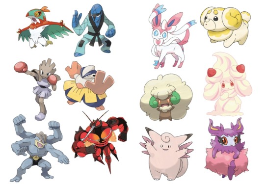
Like how a lot of fighting types in Pokémon will either be more muscular or have other details relating to certain fighting styles/sports and the fairy types are usually pinkish, fluffy and cutesy. Because these elements are something typically associated with these types and when we look at them we can pretty easily tell which type they're supposed to be.
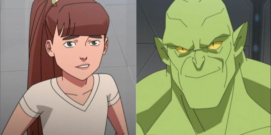
Otherwise, Monster girl from Invincible is drawn as a twelve year old girl, so it subverts expectations when she turns into a big green monster and generally doesn't stray away from violence, because it's something you wouldn't have assumed about her from her appearance.
In Hazbin Hotel most of the time the character designs don't necessarily fit what they're supposed to be and they also don't use the other design choices as subversion (the one that would probably count here is Nifty with looking and acting very childlike usually but then also acting violent/crazy sometimes).
The first thing would probably be that characters don't look their age mostly.
Charlie and Valeria (Vaggie, but I really don't wanna keep calling her that so she gets a new name) look fine as they're supposed to be around 20. Rosie and Carmilla also look alright for what we can assume their ages are supposed to be. But Alastor is in his 30s or 40s (what it says on the fandom wiki) and he looks around 20 as well. The same thing goes for Lucifer. He looks so young that he could also count as just Charlies brother or friend rather than her dad, because he doesn't look like he could be the dad of a 20 year old. This makes the song "Hell's Greatest Dad" a bit awkward because these men are singing/competing about who is better as Charlies father but they don't look a day older than her. Husk also looks way too young for someone in his 60s-70s (again from the wiki).
The body types being all the same also doesn't help.
Mimzy and Adam are pretty much the only more relevant characters who aren't like all the others in terms of body shape. All the other relevant women in the show have a tiny waist and either big boobs/big hips or just a slimmer build in general. All the men have thin waists and then broader shoulders.
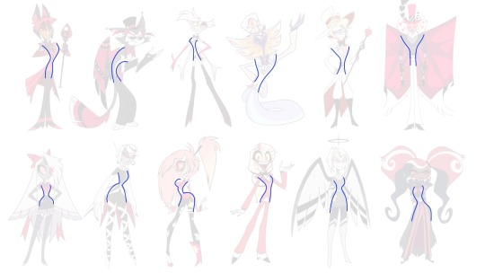
And for some characters it makes sense. Like Angel is really flexible and his more lanky body fits with being a spider. But why are Lucifer and Valentino like that? Other than the fact that Viv doesn't like drawing muscles there is really no reason for them too being build like every other skinny man there. Valentino is supposed to be intimidating not just by how he acts but physically too. He seemingly has a bit more muscle than others but his arms are still super thin and look like they could snap if I look at them wrong. I'm not trying to say that abusers all have to be buff, but simply from a design perspective the scenes with him would be a lot more effective if we saw him actually have a big physical advantage over Angel and others, even when he isn't necessarily threatening them. As soon as he comes on screen, we could see him as a much more intimidating presence, especially when all the other characters look like sticks. Or they could make it so, that he hides his muscles under his coat and when we get the reveal of him actually removing it, it's more shocking and immediately makes the situation more tense.
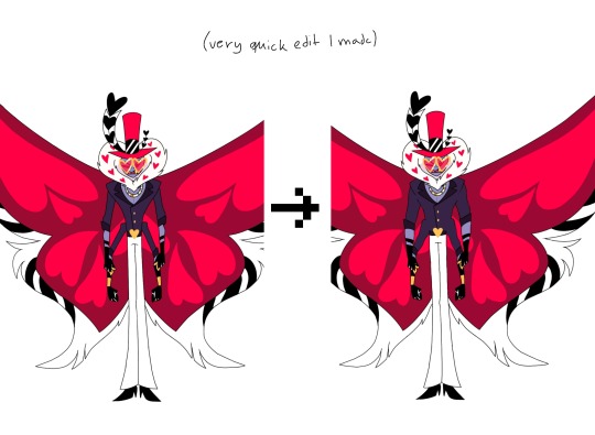
Lucifer could've had a more confident frame as well. He's the king of hell and the strongest being in hell, so just for the diversity I would give him some muscles too. Husk is also super skinny and for someone who only sits around and drinks alcohol all day, he should definitely have a beer belly (please I swear to god I wanna see more men with bellies, Mammon was great). Also for Valeria and Lute and pretty much all the Angels I don't get why they wouldn't be more buff either. Valeria is a fighter, she's Charlies bodyguard but she looks like all of the other women there. It's stated that Angels fight so wild because they don't know they could get hurt. And while I know that the Angels can really only get hurt by angelic weapons, having this whole reveal that they can be injured would've definitely suprised me more, if they actually looked like they couldn't be injured in the first place. But then again, Valeria looks like her arms would break as soon as a breeze hits them too hard. In some episodes her thighs look a bit more muscular, but not notably and she also doesn't fight using her legs (like Carmilla) so only her thighs being bigger sort of doesn't make sense. In general, she or Lute don't show any difference to the women who aren't physical fighters. And obviously just to have a more interesting show to look at, including different body types would do a great job at making these characters stand apart from eachother more.
While we're on the topic of diversity, another obvious thing that makes the characters redundant and borig (sometimes ugly too) is the reused colour pallette. Colour coding is probably one of the easiest things when talking about character designs and it's something atleast Helluva Boss understands.
What effect warm/cold tones have or what feelings we associate with different colours is a great way to bring stuff about characters across without being too on the nose. Obviously colour can also be used to either connect characters or to make them very distinct. Shape language also plays into that of course. In Inside Out the emotions are mostly characterized by their respective colour and by their distinct shapes.
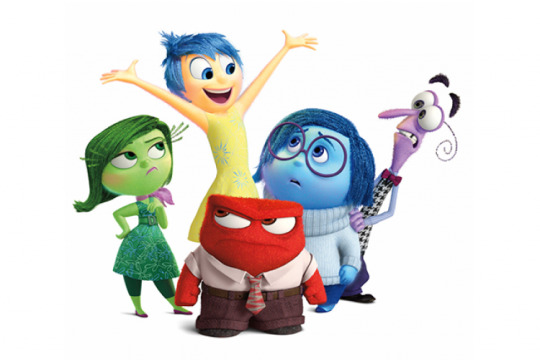
Joy = yellow (bright colour often associated with the sun/light)
Sadness = blue (cold colour often associated with tears/rain)
Anger = red (very strong colour with aggressive association with fire or when someone turns red because of anger)
Fear = purple (light colour here, mix between red and blue as fear often falls into a more angry or sad feeling)
Disgust = green (colour of most dirt or puke or other stuff people usually see as gross)
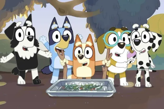
Or in a show like Bluey, where different patterns, shapes and colours show the breed of the dog and also how characters might be related to eachother (same breed/mix of breed = usually related).
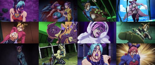
Or how colours can be used as lighting effects to create cool shots when the colour pallette changes all of a sudden. In JJBA these changes happen often when someone is in distress or unsure of themselves. Also in tense moments to make them seem more exciting and interesting.
Hazbin Hotel has very limited range when it comes to the colours of the main cast. All of them feature some form of red and that usually in combination with black or white (if they aren't just purely red like Alastor or Rosie). This makes them not stand out from eachother and creates very similar colour pallettes which get boring once you've seen them repeated over and over again. It also makes the visual connection between characters who are actually related (like Charlie and Lucifer) a lot less strong because so many characters share similarities already.
Also they just hurt to look at sometimes because the background is mostly red as well and with a lot of them being very overly detailed. People have also spoken before about the show being pretty inaccessible for colour blind/vision impared people due to these issues with the colour.
And now you might say that it's hell and therefore it makes sense for all of them and the background to be red. But firstly, I don't think that there is a definitive source which decides that hell is red and can only be shown/interpreted as red. And also there is another show, also set in hell which actually does a much better job at that and actually shows different colours in hell. Like in Helluva Boss the rings are all colour coded.
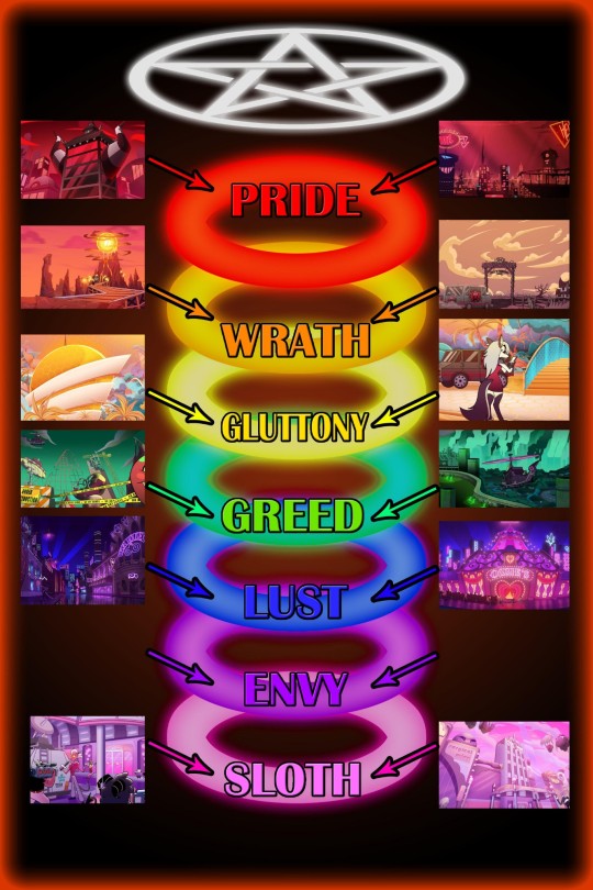
And I know, that HH plays in the pride ring fully, but imagine how cool it would've been to see sinners have colours similar to the sin(s) they committed. This could lead to them looking distinct from eachother and the background and would also lead to us being able to assume stuff about them, if we're familiar with the colour coding. In "Hell's Greatest Dad" they do a fun colour change with different light and it's really refreshing and I just wanted to see more variety like that (of course I kinda get that the colour changing isn't really part of the shows design but it was pretty cool to see in that song).
There also is the issue with characters that are supposed to be animal-like sinners not looking like the animal they apparently take inspiration from. The thing is that the animal/object parts don't necessarily have to be visible to understand a character. But in the show, how sinners look in hell is often influenced by their life on earth. Vox's head being a TV is because he was a Tv-show host when he was alive. Nifty also is supposedly a bug, which makes sense because she hates bugs and probably hated them in real life too. But that is where it would be great to actually have Nifty resemble a bug, instead she has no features of one and just looks like a regular humanoid sinner. The same thing happens with Alastor being a deer, Valeria a moth, Charlie goat-like and Angel a spider (also Mimzy is apparently based off of a chicken). Like I said, the animal inspiration isn't essential to the characters, but emphasizing these design elements could help the characters stand out instead of them all just looking like sort of human characters. Sir pentious and Husk work the best in terms of presenting their animal inspiration (though pretty much everything else about Husks design sucks ass).
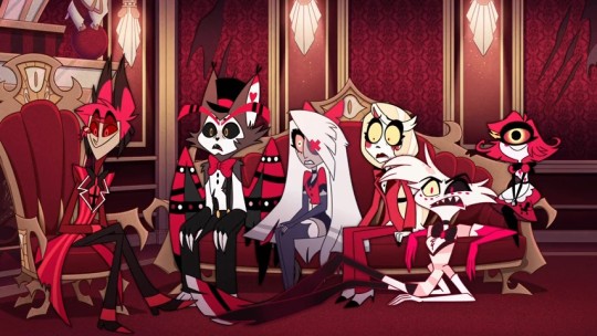
And then there are complaints about the characters that are supposed to be people of colour not having any features that resemble their race. It's just a bit weird when a mostly humanoid sinner doesn't really seem to resemble how the person looked in real life. Black characters have really desaturated and sometimes just straight up grey skin in HH. Alastor is probably the most egregious in that regard, but also Emily has just light blueish gray skin and no textured hair or other black features like the nose or lips or palms. Velvette and Sera have darker skin but also no other features (except for when we see Velvette's natural hair texture in like one shot at the end of the season). I know there are other things wrong with how Voodoo is presented in HH or with Mimzy's design often being seen as a jewish caricature, but I don't wanna focus on that fully, because I feel like there are people better suited for talking about that (black people or jewish people ofc).
In general HH is a show with pretty bad designs (imo). That's actually a thing I prefer about Helluva Boss, because there the designs are mostly okay or actually sometimes pretty good. Striker is probably my favourite design in both shows (he reminds me of Dillon and that's cool).
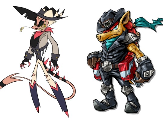
I like Mammon, Asmodeus, Octavia and Loona as well. I would still probably change a bunch if I were to redesing the HB cast but they overall look more solid than the HH cast.
This was another post which pretty quickly became an excuse to talk about other media I enjoy. I might do that more often, because comparing elements of HH or HB to other stuff makes it kinda easier to articulate my feelings. Also just because I enjoy talking about other stuff too.
219 notes
·
View notes
Text
Vivziepop liking tweets about how stella fans are delusional abuse apologists while liking threads about how there’s nothing wrong with idolizing a rapist oh girl.
174 notes
·
View notes
Text

(Link to thread)
This whole playbill situation keeps getting sketchier and sketchier by the day. A simple response from Viv to this individual saying something like "Don't worry, we're working on it!" would have gone such a long way, but instead she decides to do the one thing she does best and just block absolutely anyone who questions her, no matter how polite and non-confrontational they're being. Does she really not realize how incredibly suspcious blocking someone over this makes her look?
I'm no law expert but I really hope someone takes legal action against Viv and Spindlehorse over this, because at this point this whole thing is starting to smell like fraud...
202 notes
·
View notes
Text
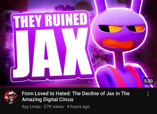
There's something rlly funny about the biggest Hazbin/Helluva shill on the platform preaching about bad character writing lmao
#look everyone the Vivzepop dickrider just discovered actual asshole characters that doesn’t have a sad traumatic backstory for the first#<EXACTLY lmfao
390 notes
·
View notes
Text
its pretty annoying and not surprising that hazbin fans are like "oh people cant handle valentino"
when the issue isnt "oh valentino is so evil" its "valentino is both a very poorly written villain and also blatantly vivziepop's abuse fetish. any time a scene involves angel dust being abused she gives all the directing to her storyboarder who ships angelval and calls it her rape ship. the story literally bends backwards to force Angel dust into an abusive relationship that can be easily resolved by Charlie mollywhopping Valentino. Half of Angel Dust's audition sheet was just stolen angelval fanart. She gets actively angry when people sympathize with or like Stella and then enables her fans who defend Valentino or talk about how hot the music video where Angel Dust is being raped is. She celebrated a remix of Poison by repeatedly showing images of Angel Dust being sexually abused and literally said she want the video to look "cute and sexy". She also made a mockery of his abuse. people can handle evil characters. nobody thinks Alastor is taking it too far despite being a cannibal. you dont get to make a character a rapist and then handle him as well as noncon ao3 fanfic and then act surprised when people have strong feelings about it.
202 notes
·
View notes
Text
Bruh...


Imagine being such an insecure WOMANCHILD, that you block your fan (not an unhinged stan or a critic that has any ill intentions mind you) OVER A LIGHTHEARTED AND ADMITTEDLY VERY FUNNY AND WITTY JOKE.
I don't really care if Viv simply blocks her critics, because that is a far better and more mature approach than arguing with them or letting her fanbase defend her like rabid dogs.
But how dumb do you have to be to disrespect your fans, a. k. a. the people, who essentially gave and are still giving you fame and money, over something this comically and childishly stupid.
Like, seriously, this is just shooting yourself in the foot, especially if Viv keeps shit like this up (which seems likely, considering her similar reaction to "my name is Caine, I am your bitch").
I honestly feel bad for this person (Vaggie pfp), because being blocked by the creator of one of your favorite shows must hurt.
893 notes
·
View notes
Text
“It’s an art style.” Not ever drawing any plus sized characters isn’t a style, it’s a choice. It’s avoiding something that might be difficult because you’re not accustomed to it, because conventionally models and references overlook it so you have to make more of an effort. This excuse holds no water, I don’t want to see it being used to excuse these designs.
48 notes
·
View notes
Text
I think another reason "It's hell" is an irritating excuse is because the hell in HB/HH is heavily inspired by the Christian hell and has figures from the bible there.
Do you people who use this excuse just think every non-Christian says "fuck" 100 times a minute and makes sex jokes like a 12 year old that just learned the word penis? Do you think every non-Christian is just a sex obsessed asshole who assaults people and treats them like shit?
See, that is the problem. Every single character is exactly the same copy pasted 100 different times in 100 different fonts. And yes, it's hell, but you can still make it clear that certain behaviors are in fact bad in some way or another, which the show does not do!
188 notes
·
View notes
Text
Helluva Boss please PLEASE move on from the "Soft sad UwU gay abuser is sad because his victim doesn't love him" we don't care! Wasn't this show supposed to be about demons running an assassination business? Can we go back to that?? I don't care about this gay soap opera!
375 notes
·
View notes
Text
Viv’s hell ain’t no hell
what I mean by it is that in vivs hell there is no punishment “BUT EXTERMINATIONS!!!” Yeah ok and? That’s it? Their punishment just comes once a year? Kinda fails as an eternal punishment, since literally the overlords are having the time of their life’s in hell , they are powerful, influence people, they’re “punishment” is non existent, there is no REASON for hell if all they get is a slap at the wrist
and again Viv’s hell encourages sinning with the constant drugs n shit, again hell is meant to PUNISH SINNERS???? It feels more like a worse version of earth , literally in the songs hell is forever Emily literally says “These innocent people”…girl they’re in hell for a reason, they aren’t there cause they took candy from a baby they’re in hell cause they did some real fucked up stuff
Hell feels less like a punishment people who deserve it like valentino don’t even get a freaking punishment instead just getting powerful, the only “punishment” they have is, sometimes getting killed (somehow???) living in only one ring and turf wars I guess, and … well that’s kinda it but still I guess everyone has their own interpretation of hell my only gripe that it’s less of a punishment really
193 notes
·
View notes
Text
Stolas is currently the main character of Helluva Boss, receiving more screen time than anyone else in the show. Vivziepop is giving him ample attention because she wants to victimize him as much as possible in a poor attempt to make him "sympathetic."
However, all she's done is make Stolas into the most unbearable character in Helluva Boss, with Blitzo, Octavia, and Stella suffering the most. Instead of exploring the pain he's caused them, the show blames and villainizes them to make him into an "innocent victim" who's "incapable" of doing wrong.
Stolas has become the main character of Helluva Boss, and the worst one because of it.
154 notes
·
View notes

