#I played around with a couple different overlays
Explore tagged Tumblr posts
Note
How do you make your stamps? :0
Disclaimer: this is an obscenely long explanation, with pictures. Efficiency is stupid
So, for the static ones, I make a 99x56 px file on ibis paint x. Other programs are probably available online but I don't use them.
After that, I either upload an image I want to make into a stamp, or I draw one.
Then, I find a frame I want to use. Ill upload them here but let it be known I stole all of these right from deviantart


Most of them are from Lil-Devil-Melii on deviantart. The rest i have no idea. They're not all 99x56px but you can crop the canvas it's fine
Make sure to erase the edges of the picture , so they're transparent. It's not as cute otherwise
Upload those frames over your image in whatever art program you're using and viola, stamp.
For moving ones, it's a lot harder. Mostly because I refuse to download Photoshop.
There are a couple ways to do this. Some are simple animations, like with flashing text and whatnot. For these, you download the individual animation frames from your art program. Make sure it's transparent.
Then, upload each frame to ezgif.com under the option "GIF maker." You can play around with how fast each frame goes and whatnot but in the end, it'll be a stamp with some rad text that moves. This is easy, and doesn't make me want to shit my pants and cry. If you're new, do this. This is fun. This is good. This does not kill me inside
I made that↓ stamp with this method :)

this next one is how we turn gifs into stamps. This one makes me sad. It involves math and sucks. But we gotta do it. For the vibe
First, grab your gif. I'm using this cow gif because it's awesome

Then, I resize it using ezgif. Literally everything for this will be using ezgif. I am a simple man
At this point you should decide what frame to use. I'm using this one because its the first one I clicked

Figured out what size the inside of the frame is. That's what I resize the gif to, so the edges can be transparent. The inside of this one is 93x50 px, so those are the dimensions I'm making the gif.
Figure it out by putting the frame into ibis paint and realizing the canvas to fit just the inside of the frame, then seeing what the dimensions are. But there could be easier ways

Woah it's so small now
Then, still on ezgif, I go to the "crop" option.
Make sureeee to upload the smaller gif
press the button that says "extend canvas size", and then put the "width" and "height" as the dimensions for your FRAME. This'll put a bit of a transparent border around the gif. For this frame, I did 99px and 56px.
The "left" and "top" boxes show how many pixels the cropping happens from the edges of the canvas. The formula for finding that is
(width of gif / 2) - (difference between gif width and frame width / 2) = left box
For me it's (93 / 2) - (6 / 2) = 43.5
Then you do the same.for the height, which for me ends up being 22 from the top
This is reallyyy touchy and annoying though
Here's my result , with no visible difference

Okay so THEN you go to the "overlay" option, under "effects." And upload your frame. If the cropping was done right, you shouldn't have to move the frame at all and can just download it
Here's my result:

if you don't care about transparency, you can resize your gif to be the same size as the frame, and then put the frame over it. But I'm a slut for transparency
Anyways. I'm sorry if anything was unclear, it's two am. And I hope this was helpful :) these really are fun to make once you get it down
also if anyone has an easier way to make stamps from gifs, please god tell me
#web graphics#old web#neocities#custom#custom blinkies#stamps#page decor#web resources#da stamps#deviantart stamps#blinking gif#How to#tutorial#How to make stamps#Spacehey#deviantart#rentry graphics#old internet#early internet#stamp collecting#ezgif#stamp making#stamp template#Stamp frames#blinkies
6K notes
·
View notes
Text
Astro synastry observervations 1
Disclaimer: These observation are the niche ways in which a placement may manifest, it is the way I’ve noticed it in others, the people around me, celebrities, myself and in studies. It is not the doctrine wide broad way the placement occurs for everyone.

Chiron conjunct ascendant in synastry can make the Chiron person avoid the Asc person as much as possible, whether it be eye contact or conversation, just being near the ASC person. They also treat the Asc person differently to everyone else, almost like they’re afraid of them or something.
Moon conjunct sun in synastry has beautiful reputation of being felt seen but it also can be negative, it can make the sun person believe they know everything about moon person like how they feel, giving them unwanted advice and thinking they understand the moon person well, all while the moon person feels extremely misunderstood by sun and mis represented and that their advice was useless. Sun person may even try and diagnose moon person because they feel like they have a special ability to know them
3rd house synastry can have you wanting to talk ALLLLL DAYYYY with that person. You can even end up having conversations with them in your head when they’re not even there imagining what they would say or what you could tell them. If mars is here, this is the person you practice how the conversation, debate or argument would have gone in the shower or something
Mars in 6th house overlay can make the house person view the normal basic things that Mars person does to be arousing. For an example if Mars is lightly playing with a stress ball, house person will find the way the ball is being held is really hot and want to be in its place or just find small things like this arousing.
Venus conjunct Jupiter is the most beautiful placement for synastry in my opinion. Venus person has so much love for Jupiter and gives so much everyone can see how much they love Jupiter person, Jupiter’s presence alone can make Venus just sigh in awe. Venus is attracted to Jupiter persons optimism and luck especially concerning themes the house Jupiter lives in. Jupiter person can sometimes not even realise how much they are loved but just know they are appreciated by Venus. This placement to me really does personify pure type of love. These are the people who will do anything for Jupiter and Jupiter just wants to magnify Venus.
Your deepest romantic partners may have your birth city along their Venus line in Astrocartography.
When someone has a sign in Venus it doesn’t strictly mean they’ll only be attrattracted to that sign, but rather it’s the qualities that the sign has in other people
Noticed people who have someone’s Venus in their 8H the planet person can be so respectful to you and make sure that you are well looked after. I really like this dynamic and is my most favorite synastry placements.
Highly saturated 10H stellium in the composite chart can make the both of you unable to communicate to each other without a third party and for your relationship to be the main focus of your image, like you may have had someone else tell your partner that you liked them and that’s how you ended up as a couple, or you may gauge the importance of your relationship not on what you feel or think but- based on what others believe your relationship to be. If people say you two look cute together you will assume all is well between you both but if people say you’re terrible together even if you feel happy you will actually believe what others say your relationship is.
Moon in 5th house overlay will have moon person kicking their feet and giggling like a 13 year old with the house person. They can be the most delightful company to have, can be someone who you spent your childhood with or makes you feel like a child again.
Pluto in 12th house synastry can have Pluto person challenging house persons beliefs to an extent that they’re being disrespectful and forceful. They may degrade the house person for what they believe in, I’ve also noticed that when the Pluto is in sag they can act high and mighty over the 12th house person because sag rules wisdom and higher knowledge, because they’ve done the research they feel like they have the right to critique and degrade 12H belief system and ways of life. 12 house is very sensitive and HIDDEN area so the house person can find their behavior unwanted.
Venus in the 7th house synastry can really have the Venus person giving all they have believing they have found the IT person. ESPECIALLY IF THEIR VENUS IS CONJUNCT PARTNERS MARS. This is because Venus is in its home, native feels safe expressing their love and can feel like they’re meant for this person.

Planets in the 12th house of the synastry chart shows what that person does to you behind your back. For an example Mercury here could indicate the person gossips about you, talks about you when you’re not there. Pluto here can indicate they power-trip or manipulate you without you knowing
Sun- can brag about you, take credit for your work, even say you piggy backed off of them, try to outshine you when you’re not around
Moon- can project their emotions, insecurities on you, feel a lot of emotions about you they dwell on privately, feel dependent on you but don’t show it to you ever, this is like the ex who keeps your clothes long after you break up. Or a friend who plays victim to others and tells their version of the story.
Mercury- analyse and critique you in private, share your secrets with others, discuss opinions about you that they don’t share with you directly
Venus- secretly idealize you, they may secretly have a crush on you, can even want to be you out of envy or admiration, secretly admires you. On the flip side can flirt and seduce you for malicious reasons without you realizing, like in those tv shows where the popular guy dates the weird girl as a dare
Mars- hold back a lot of anger, resentment and bitterness towards you, can be passive aggressive, this is like the Regina George burn book energy.. acting lovely and engaging in person but has so much malice within them you don’t know about, can push or trigger you to anger purposely to get a reaction out of you and you don’t know it
Jupiter- blocks you from getting praise, promotions, blessings, can hold back saying anything nice about you, force their values on you, can deep down feel superior or wiser than you so they subtly guide you to see things their way without being upfront about it, it’s like trying to emigrate into a new country and they bend you to their culture but no matter what you do they’ll never accept you
Saturn- can be very judgmental about you when you’re not there, can act like they literally don’t know you when interacting with others, this is that “I’m embarrassed of them” placement, like a private school student pretending they come from a rich family and ignoring their mother when she comes to pick them up in a Toyota, or a weird anime girl being bullied by her childhood friend because she didn’t want to be affiliated with the weird friends status. it can be very intentional where they try to make things harder for you and ostracize you form others.
Uranus- they literally will rebel against you, this is like a Heian period usurper, except you’re the king. Will challenge you, destabilize you, push you to rebel even, that’s what they do when you’re not around, they push your limits, even putting you into circumstances that you prefer to prepare for, this is like the friend that hosts a surprise birthday party or attempts one of those traumatic YouTube pranks on you like “I CHEATED ON MY WIFE PRANK 4K‼️”
Neptune- project qualities you don’t have onto you, treat you like a person but dehumanize or objectify you when you’re not there, can drug you, can mislead you, keep secrets withholding information to create confusion around their real intentions to you, this one screams situationship or someone who didn’t get access.
Pluto- can try to psychologically manipulate you, deprive and dominate, make you dependent and addicted to them without knowing, can be very envious of you, be possessive
Neptune in person Bs 1st house can make the planet person fetishise the house person, especially if the person B has Neptune in their first house as well, since a Neptune conjunct Neptune synastry makes the planet person fantasise about the best qualities person B has and idealise them.
Mars in 3rd house synastry turns conversations into verbal sparring matches—sharp words, playful teasing, and debates that feel almost like foreplay. The Mars person’s energy can feel invigorating to the house person, but it can also come off as aggressive or argumentative. This placement often leads to mental tension and excitement, with both people constantly challenging each other’s ideas. It’s the kind of connection where you argue for hours, then end up laughing and feeling closer than ever.
Venus square Neptune, Venus person thinks Neptune is everything they’ve been looking for, like their ideal soulmate. They romanticise Neptune to the point of putting them on a pedestal, seeing beauty and perfection where it doesn’t exist. Meanwhile, the Neptune person might not even realize they’re misleading Venus—they’re just existing, but Venus is wrapped up in a fantasy. When the illusion breaks, Venus feels betrayed, like “How could you lie to me?” even though Neptune didn’t promise anything. Neptune might quietly leave Venus wondering, “Did I ever even know them?” There’s a reason why this placement is known as “rose-colored glasses”. I think it’s like when fans meet their favourite artists and they end up being different to the image they portray
Sun in the 6th house overlay can make the Sun person feel like they have a job to fix the house person.The Sun person might try to give the house person advice on everything: their health, routines, work habits, even their diet, like “Have you tried waking up earlier?” or “You’d feel better if you changed this.” The house person might appreciate it at first but eventually feel like the Sun person sees them as a project rather than a person. The Sun person, meanwhile, feels like they’re helping—they don’t realize they might come off as critical. This can also make the house person feel nervous or self-conscious around the Sun, like they’re constantly being evaluated and being around them feels like they’re at work and their neat freak boss is micromanaging.
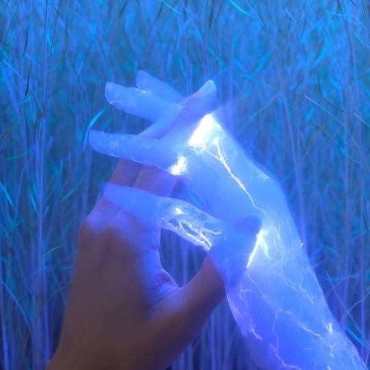
Venus in the 2nd house overlay makes the Venus person love the house person’s possessions, taste, and even their voice. Venus might compliment the house person’s things endlessly, like “You always dress so well,” or “You have the best taste in music.” There’s something about the house person’s values, style, or even their physical body that Venus finds irresistible. On the flip side, this can make the house person feel like Venus only cares about their surface-level qualities—like they’re being admired for what they have rather than who they are. This can turn into “I feel like you love my things, not me.”
Uranus in the 7th house overlay can feel like falling for someone you never expected to fall for. Uranus person brings an electric energy to the house person that feels exciting but unstable. The house person might feel like they can’t predict Uranus’ next move, which can be thrilling but also nerve-wracking. This is that “I’ve never met anyone like you” dynamic, where both people feel drawn to each other in a way that defies logic. Over time, the house person might feel like Uranus keeps them at arm’s length, refusing to commit or settle down.
Venus Sextile Mars Synastry is one of the sweetest aspects for physical and romantic attraction. Venus is naturally drawn to Mars, thinking “I like the way you move, the way you act—it excites me.” Mars, in return, feels appreciated and energized by Venus’ affection. There’s an effortless rhythm here: Venus brings charm and softness, while Mars adds drive and excitement. They both feel seen and desired without having to try too hard. Unlike harsher Venus-Mars aspects, the sextile creates a playful, flirty dynamic. Mars might tease Venus in a way that makes them blush, and Venus will respond with just enough sweetness to keep Mars coming back. It’s that “You don’t need to chase me; I’m already here” energy. This aspect is natural chemistry without tipping into tension.
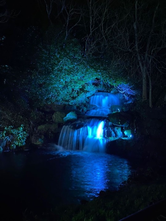
When Jupiter lands in someone’s 7th house, the house person feels like Jupiter brings luck, joy, and optimism into their relationships. The Jupiter person can make the house person feel like “Maybe love isn’t so bad after all,” as they bring warmth, generosity, and a sense of expansion to the house person’s idea of partnership. This is the placement where the Jupiter person sees so much potential in the house person, encouraging them to believe in themselves and their relationships. The house person might feel like Jupiter is their good luck charm—like everything is brighter when they’re together. Cons are that Jupiter might unintentionally make promises they can’t keep or come across as “too much” for the house person, overwhelming them with positivity or expectations. This placement often makes the relationship feel like it’s meant to be, as if Jupiter walked into the house person’s life just to show them what a good partnership can feel like.
Venus Square Jupiter screams “You’re too much, but I love it anyway.”This placement can feel like a rollercoaster of indulgence and excess. Venus sees Jupiter as someone greater-than-life, full of warmth and generosity, but also overwhelming at times. Venus might think “Do you really care about me, or are you just like this with everyone?” Whereas Jupiter can feel like Venus is too focused on minor details, like “Why can’t we just have fun without overthinking?” This placement often creates a dynamic where one person loves to give, spend, and shower the other with attention, but the other feels like it’s too much or misplaced. It can also lead to arguments about money or values—like one person wants to splurge, and the other wants to save. Despite the tension, there’s a lot of affection here; the challenge is in finding balance between excess and stability.
Mars in the 7th house makes the Mars person bring a lot of energy—both passionate and combative—into the house person’s relationships. Might find yourself asking why you both argue so much. The house person might feel like Mars is constantly challenging them, either pushing them to grow or picking fights over small things. Mars, meanwhile, feels like they’re just being honest, like “I’m trying to help you stand up for yourself.”This overlay can create a lot of sexual tension, as the house person feels both attracted to and frustrated by Mars’ directness. It’s the kind of dynamic where you argue one minute and make up the next, but if handled poorly, it can feel like constant friction in the relationship.
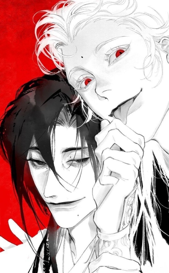
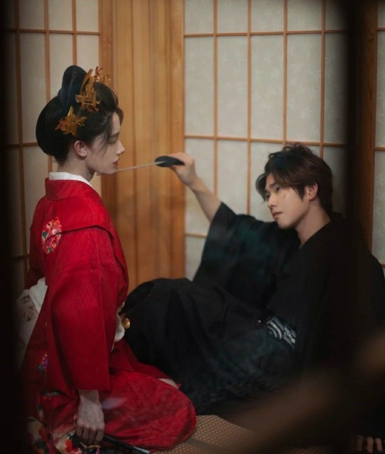
Mars in the 8th house overlay causes so much tension that never leaves the room, it’s intense and magnetic—the air feels heavier just from being around each other like a glance communicates more than intended, Mars is like the aggressor detective, house is the suspect in question, Mars will do everything to unveil house person but they can’t, it screams Sherlock and Moriarty energy. The house person can’t help but notice Mars, like “Why do I feel like you know all my secrets?” Mars person’s energy triggers something primal in the house person—they might feel exposed and aroused, but also a little uneasy, like Mars sees right through them. Mars, on the other hand, feels like the house person is a mystery they want to unravel. It’s the placement where even small gestures from Mars feel intimate, like brushing against their arm, and the house person thinks, “Do they know how much they’re affecting me?” This connection can lead to intense physical attraction, almost obsessive—where the two can’t stop thinking about each other even when they’re apart. But this is the 8th house, so there’s always the potential for power struggles, jealousy, and intensity that burns out.
Ascendant square mercury creates tension between two people, where Mercury person might say things that unintentionally rub the Ascendant person the wrong way. The Ascendant person might think “Why do they keep misunderstanding me?” while Mercury feels like they’re being perfectly clear. This aspect is common in relationships where you debate or bicker a lot, as Mercury analyzes and questions the Ascendant’s behavior or appearance. The Ascendant person can feel like Mercury doesn’t respect their way of expressing themselves, while Mercury gets frustrated by the Ascendant’s emotional reactions.
For Venus in the 10th House the Venus person brings beauty, charm, and social status to the house person’s public life. The house person might feel like Venus enhances their reputation, thinking “People admire me more when I’m with you.” This placement often creates relationships where one or both partners are seen as a “power couple,” with Venus boosting the house person’s image in career or social settings. On the negative side, the house person might feel like Venus is too focused on appearances, valuing the relationship for what it looks like rather than how it feels.
#astrology#astro notes#astro posts#astro placements#astro community#astrology observations#astro observations#astroblr#astro#8th house mars synastry#8h synastry#mars in 8th house synastry#astrology synastry#mars synastry#astro synastry#synastry#8th house synastry#7th house synastry#5th house synastry
1K notes
·
View notes
Text
gif tutorial
i was asked to make a tutorial for this set i made, so let's get right into it!
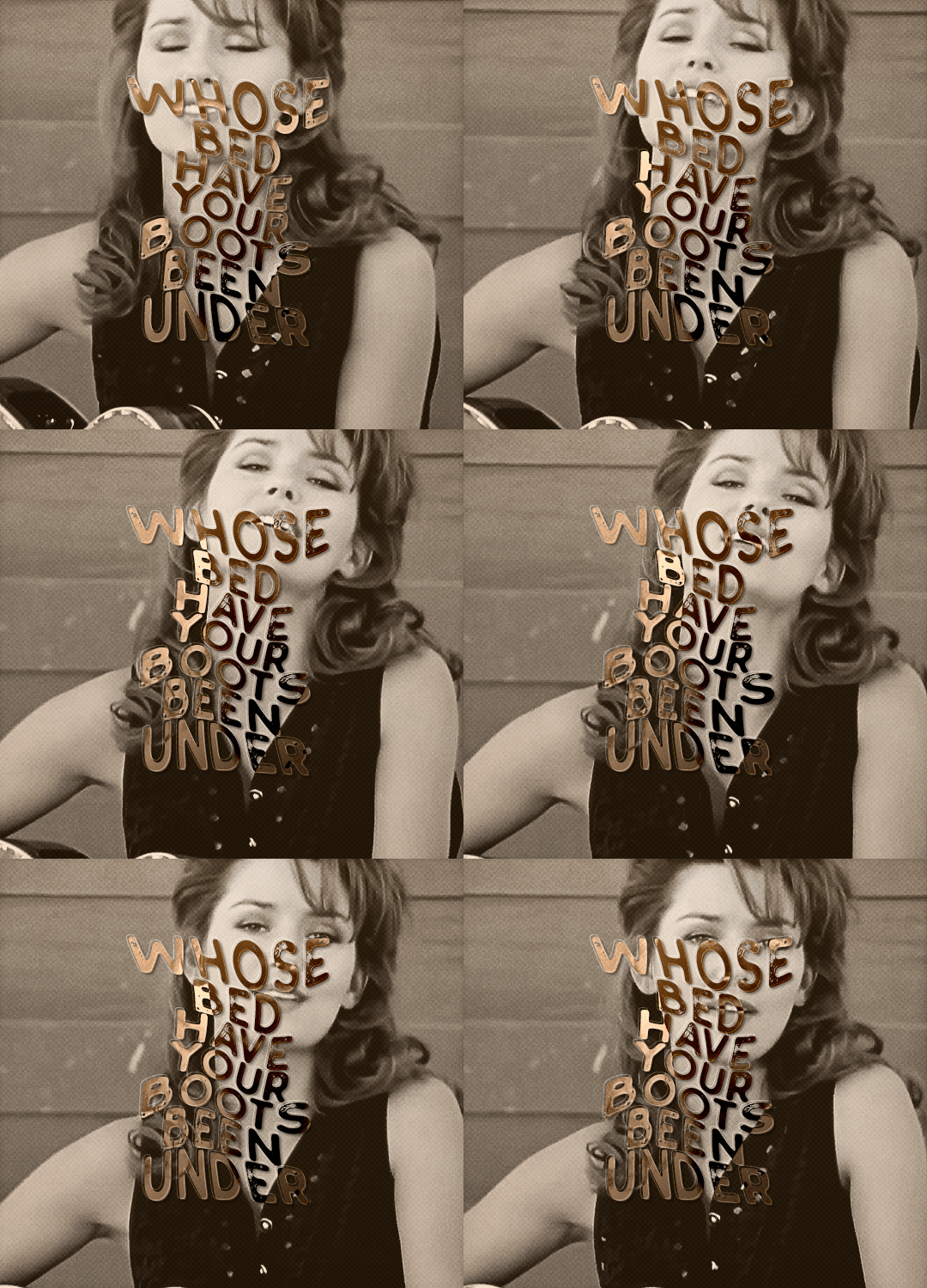
first things first, i downloaded the music videos from youtube in 1080p using 4k video downloader. unfortunately, the quality of youtube videos always seems... not great, to put it simply. plus these music videos are from the 90s, so they've been upscaled to 1080p after the fact. all of this works against us, but i've definitely worked with videos of lesser quality than these, so at least there's that!
when i gif, i import video frames to layers rather than screencapping. this comes down to personal preference. after everything has loaded, i group all my layers together and set the frame delay to 0.05. i then cropped my gif to 540x500.
the next step in my process is sharpening. i did play around with my settings a bit given the quality of the footage and the dimensions of the gif. i compared both @hellboys low-quality video gif tutorial to my regular sharpening action and my vivid sharpening action and in this case, i preferred my normal vivid sharpening action. i used this tutorial to create the action for myself, and you can find other sharpening tutorials here. this action converts my frames to video timeline and applies sharpening.
once my gif is sharpened and i'm in timeline, i begin coloring. i wanted to simplify the amount of colors used in these gifs, again because of the video quality -- i knew it wasn't going to have the crispness i would normally like for my gifs. here are my coloring adjustment layers and their settings (not pictured: my first layer is a brightness/contrast layer set to screen) (explanation in alt text):
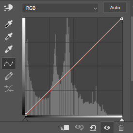

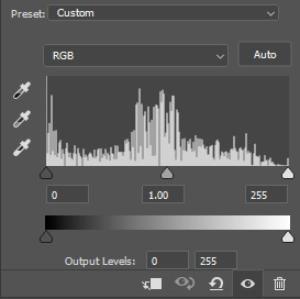
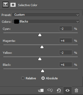
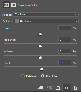
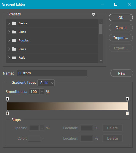
all of these layers and their settings will vary depending on your footage and its coloring (and obviously, feel free to make the gradient map whatever colors you like if you aren't going for this exact look).
pretty basic coloring, especially with just slapping a gradient map on top (my beloved), but at this point, i still didn't like the quality of the gif, so i added a couple textures/overlays.
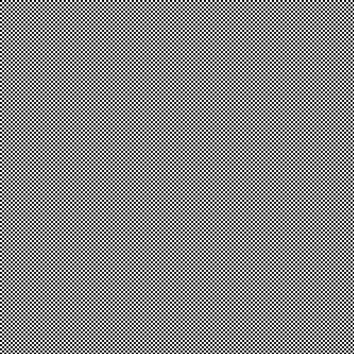
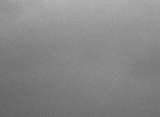
i put the left one down first and set the blending mode to soft light and the opacity to 8%. depending on what look you're going for, you could increase or decrease the opacity or play around with different blending modes. i like using this texture with lower quality footage because even when it's sized up a bit, it adds some crispness and makes things feel more defined. for the second texture, i set it to overlay and 75% opacity. we love and respect film grain in this house.
now for the typography! sometimes i really enjoy typography and other times it's the bane of my existence for the sole reason of just how many fonts i have installed. anyway, here are the settings i used for this set:
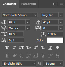
make sure the color of your font is white and then set the blending mode to either difference or exclusion. i can almost never see a difference between the two, but for this set, i used exclusion. below are the blending options (double click on your text layer to bring up this menu or right click and select blending options).
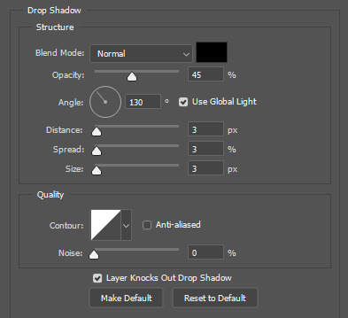
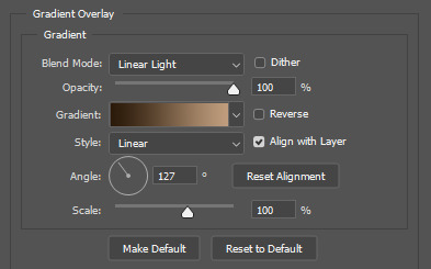
now we have to add the warp effect. with your text tool still selected, click this icon at the top of your screen:

from the dropdown menu, select twist. these were my settings, but feel free to play around with different warp options and their settings. the ones i use most often are flag, fish, and twist.
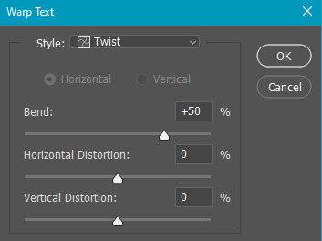
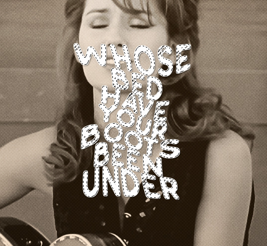
this last step is completely optional, but it's an effect i use in most of my sets with typography. duplicate your text layer (select the layer and ctrl+j), turn off the layer effects (click the eye icon next to effects), and set the blending mode to normal. right click on the layer and select rasterize type. right click on the layer icon itself and choose select pixels.

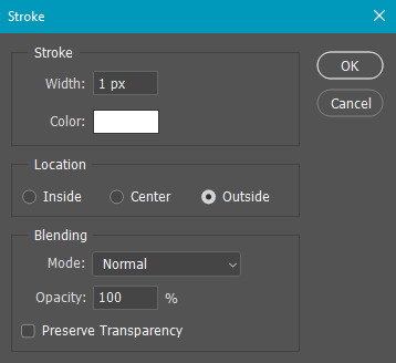
at this point, you should see the moving black and white dotted line showing that only your text is selected. then go to edit > stroke. here are the settings i almost exclusively use.
this is what your text should look like now:
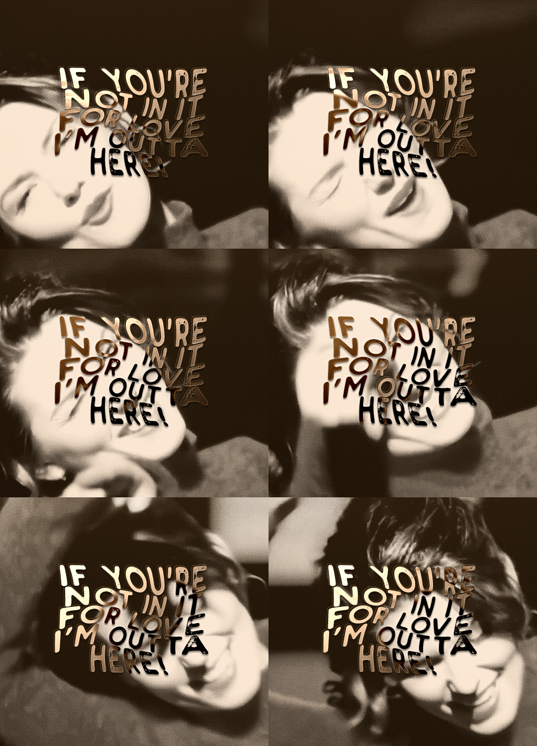
using ctrl+T, move the layer off the canvas so you can't see any of the text anymore. you should be left with only your outline. click anywhere on your canvas to de-select the text we just moved. use ctrl+T again as well as your arrow keys to nudge the outline over to the left 2px and up 2px. this is personal preference as far as the positioning, but i almost never move it any other way. you can leave it like this, which i sometimes do, or you can set the blending mode to soft light like i did for a more subtle effect.
and that's it! rinse and repeat for each gif in your set or use a different warp effect on each gif to switch it up! if you have any questions about this tutorial or would like me to make one for anything else, please feel free to ask any time!
#gif tutorial#my tutorials#gifmakerresource#completeresources#dailyresources#chaoticresources#userdavid#coloring tutorial#typography tutorial#tutorial#photoshop tutorial
279 notes
·
View notes
Text
It's Just a Game, Right? Pt 2 Redux
Masterpost
"Okay, so. Like I said before, the first video is pretty basic.” Bernard tells Tim. He’s got his laptop perched on his lap and Tim leans into him as he clicks play.
He’s not wrong, either. The video in front of him looks like it was made with movie maker software from at least a decade ago. Hell, Tim’s pretty sure he remembers using a couple of those transitions in elementary school projects. The background remains stagnant, for the most part, with just the pictures at the center of the screen and the text beneath them changing. The pairing pretty obviously is supposed to be a caption for the videos, but the letters are a jumbled mess. Still, it feels familiar.
“Yeah, that’s definitely a Caesar cipher,” Tim mutters. He’s seen enough of them used by shitty two-bit rogues to recognize the patterns on instinct. It’s a bit harder to determine the exact amount of shift just by looking – especially since the shift amount seems like it’s changing on the different captions. Presumably the ciphers have already been solved, so Tim turns his attention away from them for a moment.
Looking around the screen, he can spot hints of distortion against the blank background. It’s blurry, almost invisible to the naked eye, but there’s not really any reason for it to be there naturally.
“The background looks weird,” Tim says.
“Oh yeah, there’s a text overlay on the video. It’s real blurry but somebody identified it as a poem. Something by Emily Dickinson; I don’t remember what the name was, though.”
“Hmmm. Did anyone recognize the song?” It sounds off, but it doesn’t seem to be random notes either. In fact, Tim almost feels like he could hear it on the radio.
“Yeah, a couple people recognized it as Space Oddity, only its been transcribed in a different key. There’s also some random discordant notes in there, too.”
“Heavily modified audio. Doesn’t sound like it’s poor quality, though.”
“True.”
They let the video finish playing. It’s not very long; they were probably timing the visuals to the song, rathen than the other way around. Tim stares at the finished video for a few moments. He’s never really had time for ARGs before. They weren’t exactly very big when he was younger, and now he spends so much time solving rogue shit and actual crimes that he doesn’t really need to go seeking out more puzzles to solve.
“So?” Bernard prompts. “What do you think?”
Honestly, the vibes aren’t the best. It’s clearly intended to be creepy in a way that’s probably exciting for most people, but just sort of reminds Tim of a rogue.
"I can see why you called it basic," Tim says.
“Yeah, it really didn’t seem like it was gonna be much at first.”
“Okay what does the decoded text say?”
"Here," Bernard switches tabs, to an impressive document with screenshots of the actual video, and loads of color-coded notes. “This is a copy of the community document so far.” Tim leans in, and considers the transcriptions.
Honestly, the transcriptions seem pretty basic, too. They’re all simple captions; just a name for the person or location in the image, and some semblance of a date. Notes next to each transcription denote the cipher used. First, a shift of four, then twenty-five, then seven, then nineteen. It’s a simple trick, scrambling the cipher between captions. Even without a key, Caesar ciphers are pretty easy to solve – there’s only ever going to 25 possible solutions, after all. Changing up the key ensures that it takes a lot longer to solve.
“Odd choice of content, too, honestly?” Tim says. It seems so simple, so benign, in comparison to the upsetting music.
“What do you mean?”
“I mean, imagine if a novel started with that. They’ve literally made their first video just about names and setting.”
“Huh. Yeah, that is odd.”
Tim lets Bernard consider that, and turns back to look at the document. It’s pretty obvious from the lack of mention of a solution path that they brute forced it. Which, that could be the intended method of solution, but there could also be a key hidden somewhere in the video. Possibly, that’s the point of the poem, or of the music choice. But either of those are something that’ll take further looking into.
Tim may have taken a few years of piano lessons as a kid, but he’s certainly not capable of transcribing music himself, so he’ll probably have to hire someone for that. The document also names the poem as A lane of Yellow led the eye. Tim sits up, reaching out to pull the laptop towards him.
“I’ll see if I can’t get someone more musically gifted to look at the audio. For now, I wanna know more about that poem.”
34 notes
·
View notes
Note
Hi, i love Regina gifset especially the text
https://www.tumblr.com/itwasmagic/749567705846251520/i-am-what-i-am-cause-you-trained-me?source=share
would you please post a tutoria for making this text with those colors?
hi! thank you so much, I've never been asked to do a tutorial before 🥹🥹 this is pretty easy but i overexplain things so if it doesn't make sense just let me know!
&& please let me know if this worked ok for you!
*assuming whoever is reading this already knows how to make a gif in photoshop*
I'm pretty sure I used the font Elephant for this set that you linked.
tl;dr if you have a lot of photoshop/text editing knowledge already: create a layer of text > duplicate it > select the bottom layer > go to blending options > add a stroke > ok that > set the layer fill to 0% > reposition the layer a couple of nudges to one side and a couple of nudges down > select the top text layer > go to blending options > add a drop shadow > add a gradient > ok that > set the top layer to difference > enjoy <3
if you want a more in depth tutorial with screenshots:
add your text to your gif with whichever font, size and placement you like
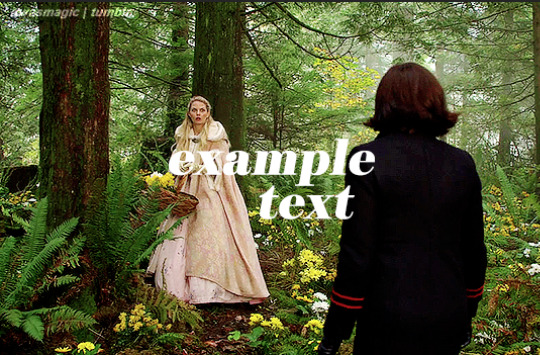
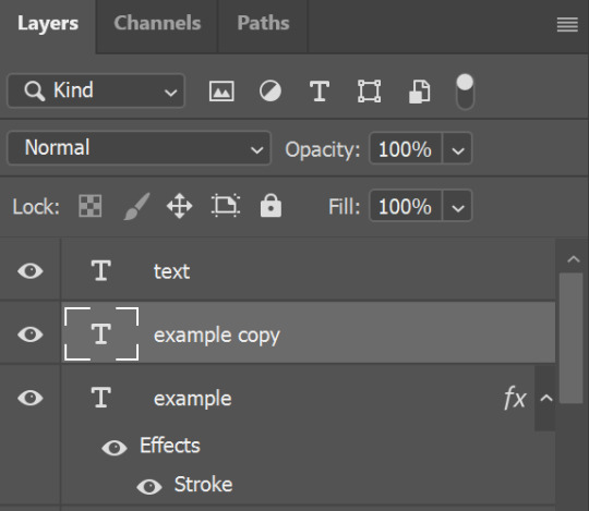
make sure the first text layer you want to edit is selected and press ctrl+J to create a copy of the layer (or right click > duplicate layer... > ok)
select the first text layer again

double click the layer (or right click > blending options), tick the stroke box and use these settings:
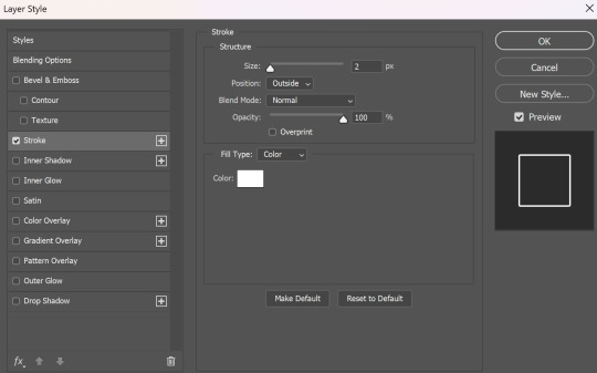
press ok
change the fill to 0% (leave the opacity at 100% because you still want the layer itself with the stroke/outline to be opaque but you want the text colour/filled in part of the layer to be transparent)

make sure the 'move' tool is selected

use the arrow keys on your keyboard to move the text layer with the stroke (i did 3 to the left and 3 down but do whatever works with your chosen font and size (edit: i think i moved it a few nudges right for the original set rather than left just make it up as you go along with me jfngkf)). it should look like this:

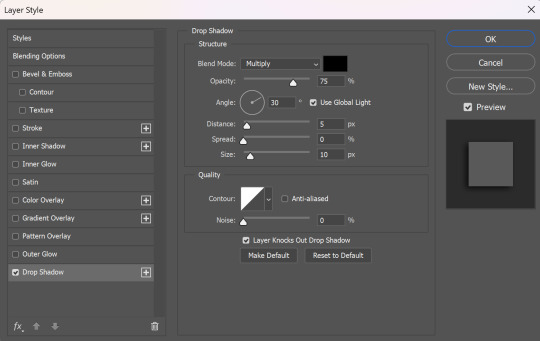
select the duplicated layer you made above the first one
double click the layer (or right click > blending options) and tick the box for drop shadow. I pretty much always use these settings:
then tick the box to add a gradient overlay, it doesn't matter which colours or angle you use, you can play around and adjust it to whatever makes sense with your gif, so if you think the gradient would look better horizontal or vertical or at a different angle, just change the number of degrees it's at until you like it.

click the coloured box next to the option that says 'Gradient:' and this box should pop up:

to change the colours click the little coloured box under the gradient bar you want to change then the box underneath called 'Color:' should light up for you to click on, then either pick a colour or paste in the hex code

for the colours in the set you linked i used #9fb552 for the lighter green and #2f4f2b for the darker green then press ok
if you want to adjust the colour fade, you can drag the coloured squares along the bar or click somewhere just under the gradient bar to add another colour (you could add a third colour or another shade of the same colour, play around until you like how it looks! you can always go back into it at the end and keep adjusting once you can see how the whole thing looks put together.)
ok everything when you have it how you want it, then your text should look like this:
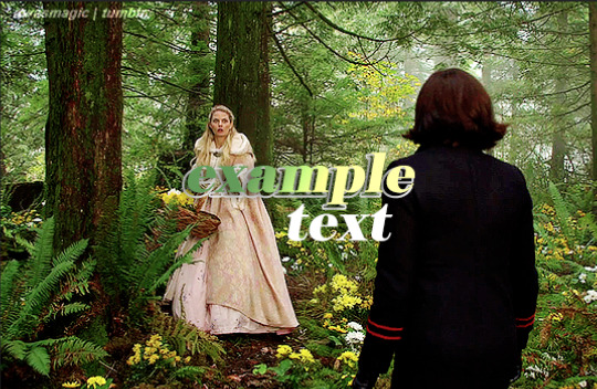
now change the blending on that same layer to 'difference'

the text should now look like this:
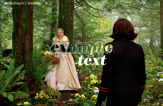
*note, the colours may change when they're blended differently, so like i said earlier you can go back and play around with the colours or shade you picked until they match your gif
if you have another text layer you want to look the same rather than repeating all of the steps, duplicate that one too, use the move tool to reposition the lower layer again and right click > copy layer style > right click > paste layer style on the corresponding layers


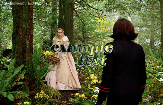
now when you play your gif, the text should look like this:

and you're done!
#answered#anonymous#userssam: tutorial#gifmaking#resource#tutorial#gif tutorial#text effect tutorial#text tutorial#photoshop tutorial
65 notes
·
View notes
Note
I'm sure you've heard already but ppl on Twitter tearing sentiment about Louis entering relationship with Armand for protection TO SHREDS. Going off how flirty Louis looked on the date. I just have two question for them:
1)What is that happened after that date that would've made Louis change his heart? (Sarcasm) Yes, Louis clearly boldly flirted with Armand there (lets ignore lestat third-wheeling and Louis taking photos of lestat with Armand being at the side). And AFTER he nearly died by Armand's hand. And Assad confirmed that Armand was planning to kill him, it wasn't just a sham. So, it's understandable that Louis started to look at Armand differently there.
2)"it's also the beginning of the ultimatum with Armand and the beginning of the darker side of their relationship" from Jacob's mouth. They need to look up definition of ultimatum. It's a CONDITION usually combined with a threat. We're being NICE when discuss this scene because I haven't seen single person imply that Armand was pressuring Louis into sex. All I saw people saying this situation happened unintentionally on Armand's part because he's used to power plays, toxic relationship etc
People are sooo hypocritical in this fandom. They SWEAR they love toxic love stories but get scared by toxicity. Bet same people who are pissed about this believe that Louis didn't want sex in ep6 and that he did it to appease lestat. Picking and choosing where to see abuse and where don't.
Also it seems like some give more importance to reviews than cast's interviews. I read reviews and read about tender romantic loumand in Paris.
I also heard Hannah saying that cage in bedroom was intentional. I also read jacob saying Armand is dark looming presence and that he serves function to Louis and that Louis becomes dissatisfied. There was a lot in Jacob's interviews actually.
Reviews and interviews don't always say the same thing, sometimes even contradict each other (Assad and Eric mentioning devil's minion and reviews saying there's nothing between them). And you would think people will focus on words of someone who WORKS on the show, but they prefer to hear only things that support their headcanons

Tbh, I have been taken aback by how willingly everyone is jumping/hating on that post (and, I mean, I have pointed out the same thing???), because... it completely dismisses what Assad and Jacob have said...
AND it completely dismisses Jacob's acting there.
Really look at him. I'm not going to pull up the gifs now, it's the current episode, go look at Louis' face and expression and body language... and then remember what his "inner Lestat" said.
And we all know how good an actor Jacob is, right.
I mean. The fandom dismissing what cast and creators say in favor of accusations is nothing new. God knows I've ranted about this. But... I mean... how can you think Louis, after Armand almost kills him... would just happily enter a relationship? When he just asked to be decapitated??? When the only thing that stopped him - was Armand's comment that Claudia wouldn't be around for long.
THAT is, as far as the tale is currently spun, what made Louis stop. Literally.
Jacob said that it would go darker from here and I... don't doubt it. But I think some people are not prepared, lol.
Dubai is a golden cage, by intent and set design as stated. And Louis was "the little birdie for the next 50 years".
Or does anybody really think the overlay with the coven telling Claudia that was a coincidence....
Or wonder why AMC did not promote Loumand as a couple... at all.
I'm just glad the gag orders have dropped away, at least I can listen now to Assad, Jacob, Sam and Rolin telling it like it is.
#Anonymous#ask nalyra#iwtv s2#iwtv#amc iwtv#interview with the vampire#interview with the vampire s2#amc interview with the vampire#interview with the vampire amc#iwtv amc#louis de pointe du lac#armand#loumand#jacob anderson#iwtv cast#sam reid#assad zaman#fandom wank
68 notes
·
View notes
Note
how do you do ur pngs? I just wanna know and if u can, can u make a tut?
Hi!
I just use canva! I honestly just use the ios or discord avatar template
I use the background remover and magic grab ...which lets say if I have downloaded a sticker sheet, magic grab allows me to get lets say a couple stickers and separate them from the sheet (good for individual stickers) (re like grabbing individual elements from something like this)
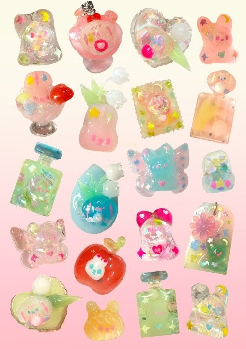

I now have around 2000 pngs or so, so that in itself is like my own personal database, which I do find ways to reuse clips I've made. Which helps with efficiency and making borders and pins for my pinterest.
Some pngs where I've played around with different layers and elements is really just a matter of practice. I love mixing up styles too
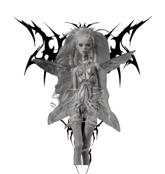

But I love playing around with the transparency of layers also! I've been making wallpapers using the shuffles app re pinterest and love using overlays, so same premise. This png I used the background and image, then played around with transparency
Lastly, for dividers, I just changed the layout format to let's say 150/200 pixel height and 2000 pixels length, then add images (I did miss the editing a bit, but below shows the point)

Hope this helped :) thank you for the question! Lastly images for pngs are found from the web/namely pinterest!
42 notes
·
View notes
Text
The stream is focused on Donnie showing off his Bo Staff skills, he was tempted to bring out his Tech Bo, but stuck to just turning on an AR overlay that simulates the features of his Tech Bo.
His model is in loose purple pants, a black tank top, his mask tails have studs in Ace colors and a couple space charms, he has on combat boots with purple laces. His tail when seen has a few bands on it that keep shifting colors with the LEDs in the room.
Donnie was taking a break to talk to chat and answer questions as they come in, while Shelldon and River move some stuff for a demonstration Donnie had planned later in the stream.
"Hmm, I see some of you are asking if we Dungeons & Dragons, well many an attempt has been made to play, but like many have faced... Scheduling is D&Ds greatest Boss. So we haven't been able to play. Traditionally Speaking of course!" Donnie with a flourish walks close to the camera with his phone out, "Behold! A custom D&D messenger App!"
The screen of his phone shows a Title Screen that reads 'D&D Chat App. BETA PHASE Vers. 4.10.18.1' with a cycling set of simplified drawings of different class types on smartphones. Donnie taps on the screen and after a few seconds goes to a menu that reads out select session with each 'File' having a start date, a class and level. And a couple have a 'New Message' notification on them.
"This is a game that as you can see is in BETA, it simplifies D&D down, and we do actions over texts, like the online version, but it's condensed to be more basic, and we don't all need to have the app open to play." Donnie says this as he opens a file with new messages, it's apparently one called 'Purple Reptile Club' and it's alerting him to take his turn. "To the others helping with the testing, the big up and downside to this is, that the next actions can take Seconds or Days to complete because it all depends on the others in the game to actually check in and make their move. But this is why it's still more in closed BETA."
He reads over chat as some questions are flying by, taking a drink while looking at what they're saying.
Donnie catches one question to answer, "Yes, I am aware that it loses alot of the story telling elements this way, but you do what you can to accommodate the needs of the Party. Plus if we get a bit lost it's not to hard to Back Read. Though there is a feature to summarize the story so far, but it's still a bit buggy, Red used it the other day, and it gave him the summary for a different game being played be the tech team." Donnie puts his phone down, and goes back to were he was standing originally.
"Now, let's put that talk to the side, and I can show you some newer moves that I learned from my dear Papa." Donnie then uses his Bo to pick up a bucket by the handle on each end. Before calling out to his Robot children to start tossing something.
The next few minutes are filled with Donnie maneuvering the staff with buckets around to catch all the items being thrown at him. With accompanying sounds of the items hitting the inside of the buckets.
The audience was amazed watching him then toss the buckets into the air, and catcha them right before they hit the ground.
All while holding an air of confidence, and a slight smirk on his face.
Some screenshots are taken, and practically traded around on the Discord, and the Fan Forums.
----------------
Masterpost
I don't know if this app idea is an actual thing, but I wanted to come up with why my turtles haven't mentioned D&D if at all. Because they really don't have much free time to actually play, and the App idea sounded like it would work or make sense.
Then just say it's a closed BETA thing. Or something.
#VTurtles!#vtuber au#rottmnt au#rottmnt donatello#rottmnt donnie#rise donatello#rise donnie#rottmnt fanfiction#tmnt au#tmnt fanfiction#rise of the teenage mutant ninja turtles#teenage mutant ninja turtles#rottmnt#tmnt#tmnt 2018#rise tmnt#rise of the tmnt#tmnt rise
20 notes
·
View notes
Text
Graphics tutorial requested by anonymous
All made with adobe photoshop 2023 (you can find free downloads of cracked versions on here occasionally, photopea.com is also good I've heard) I'm assuming basic knowledge of photoshop/similar editing platforms and their tools, but you can always message me or comment if you are confused about anything!
Also, I used keyboard shortcuts sometimes to change the size of a brush or toggle the brush options, I'm not going to annotate this because it's a lot but here is a resource for basic photoshop keyboard shortcuts
Firstly, the sizing of your edit matters! Max sizing for best quality on Tumblr is 1280 x 1920. If you want to put to put two images next to each other sizing should be 640 x 960.
Next, always try to find the highest quality picture of whatever you're using. Good resources include taylorpictures.net, 4k Taylor Swift, and if I can't find them here I do a google image search of my photo to see if any other websites have a bigger/hq file.
This video is a couple clips I screen recorded for you to see my process and demonstrate a few different tools I use regularly. I added timestamps for you to follow along as you read the rest of this.
Here's a photo of my workspace I am working with and what I will do first is cut out Taylor from this photo and move her to my correctly sized canvas. There are multiple ways to cut out an image in photoshop, the easiest I've found is the select subject function and using the quick selection tool (see toolbar beneath the photo). Other tools include the magic wand tool, lasso tool, and quick selection tool which I will show later.
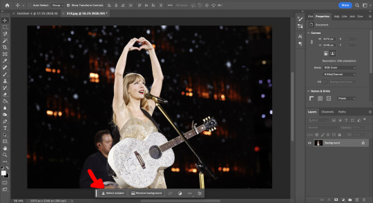
Now you will see that my selection isn't perfect, so I will use the quick selection tool to fix a few areas that I'd like to manually select/correct. This isn't totally necessary at this stage as you can always perfect your cutout in the next few steps, but it does help save some time.
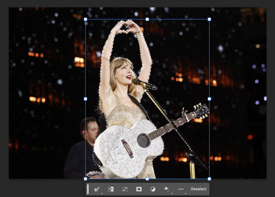
This is where I'll use the quick selection tool to either subtract or add to my selection. There are keyboard shortcuts to toggle between + and - to make this quicker.
See my screen recording of the process from 0:00-1:07
Now that we have our image selected and cut out, I copy and paste it to my canvas I want to work with (size 1280 x 1920) and this is what I've got:
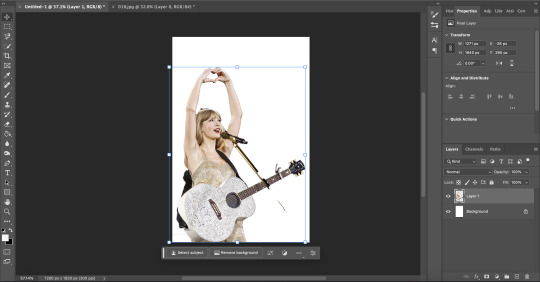
As you can see there's a few spots that need cleaning up in order to make our cutout perfect. You can do this with the eraser tool, magic wand, quick selection, or lasso tool.
See my screen recording of the process from: 1:08-3:50
Now that we're happy with our cutout, we can play around with it in any ways we want! Typically you're gonna do things like change the background color/texture, add elements with the square/circle tool to create what you're looking for, overlay elements and/or textures, and finally recolor it to your preferences.
This part is where you can try new techniques and play around to find what you like. I recorded some of my process of playing with different ideas and elements until I got to something I was happy with! The video explains the tools I was using as well
See my screen recording of the process from: 3:51 - the end
I hope this helps you with creating graphics in the future! The fun thing about photoshop is there are multiple ways to get what you want done. I showed you my way but there's plenty of other techniques and methods out there to try if you're unable to achieve what you want!
Best of luck and feel free to reach out to me if you are struggling/have questions! <3
#Tessa talks#requested#my tutorials#this took forever pls share!!!#photoshop tutorial#graphics tutorial#photoshop
46 notes
·
View notes
Text
Trivia Tuesday
Who says Trivia Tuesday is only for written works?
I have been putting this off for 3 months but I wanted to share this compilation of my favorite moments from my Daylight video for Griffin x Valtor and do some commentary on them, talk about the process behind this video.
*I chose to overlay the song from the beginning instead of making you listen to the different segments that go with the footage smashed together in a cacophony. Here's the full video if you want to reference which parts of the song correspond to the respective segments.
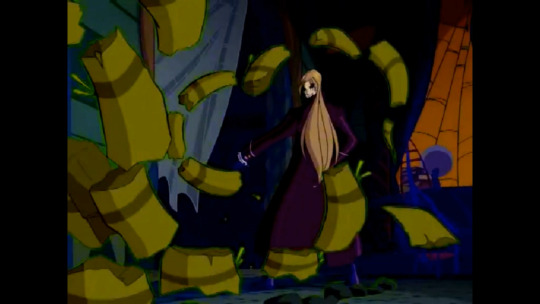
There is no reason for me to bring this up other than that in the og video the line "you and I drink the poison from the same vine" just so happens to play while this is going on. I swear that was not on purpose. I chose the vine attack against Valtor because of the dark green glow around the stem which looks like Griffin's magic in order to make this more convincing... and then I realized that this moment happened right as that lyric was playing.
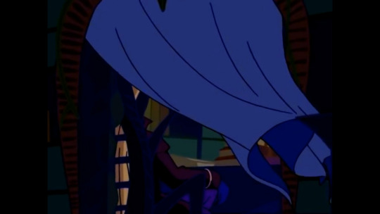
This whole segment starting from Griffin and Faragonda and then switching to Valtor in his lonely tower before Griffin contacts him because she wants to talk to him too and can't tear herself away is just so wistful and nostalgic and the music (especially in the actual video) only adds to that vibe. They're both brooding - out of the daylight - because they despise their obsession with each other but still can't help it.

I especially love that he proceeds to break into Alfea to talk to her and she blasts him with a vortex of books because she sensed his presence (I just didn't include that part in this compilation because then I'd have to post the entire video). It is a headcanon that I've had for a while that because they were partners for so long and the Dragon Fire is the most powerful magic which created the whole universe, Griffin has learned to home in on his magical signature because she can distinguish it from anyone else's.
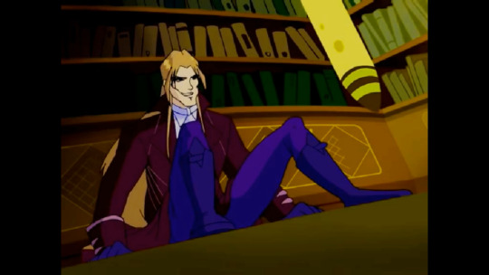
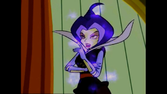
-- Join me. -- A horrible idea.
I find this moment utterly hilarious. I don't really have anything else to say about it but I guess I can share the process of picking the dialogue for the video. Valtor's lines were easier to pick because they mostly come from a couple of scenes but I had to scour the entire season 1 (aka every scene with Griffin) to figure out which of Griffin's lines can be useful and then I had to piece together actual conversations from them, the one above being my magnum opus.

I simply enjoy the way I made these two different scenes fit together into one to make it look like his whole "teleporting in your chair" shtick happens right in front of Griffin's and the viewer's eyes. This is why I love video editing!

This one! Oh, this was a legendary moment for me! A whole new step in my video making career. I feel like I unlocked a whole new part of my brain when I realized that I could use the mirror effect to showcase Griffin's spell creating her clone. I have never used the mirror effect before and finding such great application for it that adds to the story (because I wasn't sure my idea with the spell was coming through before I came up with this) was certainly a highlight of my video making process.
Kind of on the other end of the spectrum this is here because I wanted to explain that the vortex is the portal that Griffin opens to sneak back to her office and catch Valtor off guard while he's watching her clone. I wasn't sure all of that was clear but I was running out of ideas, mental energy and remaining seconds from the song so I kind of had to speedrun that if I wanted to fit everything in the video.


I thought Valtor deserved a taste of his own medicine (aka payback for the illusion spell he used on Griffin, Faragonda and Saladin at Light Rock lake). Is this scenario realistic? Mayhaps not. But! Griffin used to study under Lysslis with him so she could have picked up some very convincing illusion magic too!
I'm thinking that perhaps I would have been able to provide more insight into the video and my thoughts on it if I had written this back in January when I could still remember the process of making this but it is what it is. I got to talk about it again and rediscover some of the joys that this particular video brought to me which was fun! And now this post works as a throwback to refresh all our memory on my latest efforts in video making before we see where I go from here.
15 notes
·
View notes
Note
hi jenna gif questions for u 💜 what's your favorite part of making gifs? what's the most valuable thing/tip/trick you've learned? what's some of your favorite gif sets you've made?
hi ida!!!! sorry i took a couple days to answer this i wanted to wait until i had some time to think about it before i answer! i loooove these questions tho so thank you so much for sending them 💜💜
my favorite part about making gifs is probably coloring and like...that moment when i get the gif to look exactly how i want it to. i like to play around with coloring and try a lot of different things with it and that can be so fun! i think over the last like 6-8 months my coloring has really improved a lot and i've been having a lot of fun learning new ways to do things! but i actually had a really hard time coming up with an answer for this question because i mostly enjoy the entire process! the only part that i don't really enjoy is picking out the frames for each gif. i always start with way too many and then i have to cut stuff out and i hate that part. also it's reaaally hard sometimes to not end up with like 20 gifs cause there's so much i want to include!!!
okay im gonna cheat on this one and give a few things i've learned since i started that have been sooooo valuable to me. first is the importance of having a good quality download to start with. i think my gifs got significantly better when i finally downloaded all of the episodes in 1080p instead of using the screen recording on netflix like i had been before. second sharpening is so important! i did not do any sharpening on my first gifs i made! sharpening makes the gifs loook sooo sharp and crisp and pretty. third and kind of similar to sharpening was learning/figuring out how to use the camera raw filter. there's sooooo much you can do with camera raw filter (coloring sharpening lightening). and finally one thing i learned that i think made my coloring look significantly better was to try not to lighten the gif too much and/or to figure out ways to lighten darker gifs without it messing up the background too much (sometimes when they're lightened too much it will like pixelate the background and it looks awful)
and finally (in order of when they were made from oldest to newest) here are links to some of my favorite gifsets:
Bloody Dean Throughout the Seasons Set - this one actually came out really good considering the fact that it was made only a month after i first started making gifs! if i remember correctly it's the first set that i ever used sharpening on.
6x20 F+TM King Set - this one is a favorite mostly just because i love the song so much and tmwwbk is one of my favorite episodes. i think some of my favorite sets to make are the ones that i add lyrics to.
2022 Nov 5th Set - i was really happy with how this one came out! it's so hard to get gifs from episodes over different seasons to look the same! and this one had gifs from 12 different seasons! also i think this was the first set i ever made that got over 1000 notes which i remember being really excited about!
Laughing Dean Set - this one is a favorite purely based on the content of the set. it feels like injecting serotonin every time i look at it<3
1x12 Faith Set - another one based on the content of the set. i just love this episode so much.
Season 9 Dean Set - i LOVE the coloring in this set! and season 9 dean is so beloved to me. he is just so beautiful and bloody and sad.
2023 Cas Day Set - another f+tm lyric set! i love the space overlay that i added and the blue-pink of the coloring so much!
4x18 Destiel Every Episode Set - i loooove this scene so much! this gif series has by far been more popular than any of the other gifs that i post and this set is definitely the most popular in the series. no other set has ever even come close to getting 4k notes like this one did. also i really like the purple coloring a lot<3
14 notes
·
View notes
Text
Smaugust Week 1 Smaugust Week 2 Smaugust Week 3 Smaugust Week 4 - you are here!
Day 22: Enchanted — I went more abstract with this one... you can't see the dragon for the shroud around it... nor can it escape. I'll update if I come up with something more concrete, but for now, this is it. Sorry this is a pretty slow start for week 4.

Day 23: Labyrinth — Combined with an overlay of yesterday's excuse of an entry. ;w; That there is a hexed chicken turned into a dragon and it haunts this hedge maze. >v<;; My brain's mush at this point, not a good sign. Let's see how tomorrow goes.

The plot thickens... turns out this cursed hedge-maze chicken is... the Final Boss (Day 24). I did a different color palette for this one, partially because I felt bad for defaulting to a foghorn-leghorn color scheme on the above. The background suffered a bit this round, but I really tried for a more dynamic dragon to make up for the past couple days. I like the sense of motion the radial blur gives, but it robs of some work I honestly put into things. ;w;


Afterthought... I should have opened this whole smaugust project with a disclaimer that I'm obscenely loose with my rules of what can be a dragon and have much, much too much fun hybridizing... this should be the end of the chicken-dragon, though. =v=; b
Day 25: Bioluminescence — Ah, the difference the weekend makes - I've felt significantly better about these last couple entries. >v<;; Have a dragon that's used to being considered drab and not conventionally pretty being comforted with the company of the shiniest. Per most of my dragons, there's some chimerification here, since I can't help myself. ^^;

Day 26: Fanart — Oof, and just like that, the work week strikes. It's just a sketch today - I bit off more than I could chew, exploring an alternative design for characters from an old children's show called Dragon Tales. Zak and Wheezie are the main focus, drawing inspiration from hognoses, while Ord, also featured is built around a beaded lizard in a screenshot redraw of this:


I took some liberties of course, since I was picking animals to inspire more detailed drawings of these guys, and also just went and gave Wheezie a look more so saying: "tf just happened?"
Day 27: Eclipse — Started overworking this and decided to stop - I wanted to do a lindwurm like creature coiled up in the night sky, and bathed in the light of a lunar Eclipse, almost becoming the lunar body itself? The concept was not very thoroughly planned. ^^'

Day 28: Chained — Another workday defeat (if the muse strikes, I may give this an honest retry without being confined to the tail end of my day), but I decided to try a small animation at the expense of any detail or drawing I'd be proud to share. ^^' A depressed cooped up little apartment dragon, looking out the room window before dropping its head, defeated and in tears... it's stuck somewhere, not chained physically, but definitely confined.

Day 29: Aurora — Phew - alrighty, overdid it on blurs and add glow effects, and not sure it's on point with the directions, but I wanted to have fun with this. >v<; Have a cosmic serpentine dragon that flies through the night sky with a body-length mane of shimmering lights. Another concept I wouldn't mind coming back to and putting more work into. ^v^

Day 30: Wood —I got carried away again, but liked the idea of another 'tree mimic', if we may? Or just a fantastical tree that looks vaguely draconic. >v<; Had trouble deciding between Cherry and Wisteria, I guess, and the colors/continuity for the backdrop got completely out of control. @v@; On the upside, I found different uses for that custom brush I made. X'D

Day 31: Mirrored — Okay - done with Smaugust, and some days were better than others, for sure, but I had fun! I went for a cutesy entry for the finish line. Played with bronze/patina tones for these two buddies, and kept it simple, aside from overdoing different brushes for texture. XD

2 notes
·
View notes
Note
top 5 gifsets you've made!!! <3
Ask me my "TOP 5/TOP 10" anything!
Aaa, thank you, that's a really good one! Let's see...
The post-ATVS Malstarion set - probably one of the most significant gif sets in my arsenal, both from the technical standpoint (overlaying 3 gifs in one using different methods which made my computer creak and sweat) and its subject matter (and, of course, its relation to Above the Vaulted Sky, which is extremely important to me.
The 'beloved consort' Malstarion AU set - another challenging gif set from technical perspective BUT it was so worth putting in all of that work! It pushed me not only when it comes to photoshop, but I also went as far as modding a BG3 mod to replace an NPC with Mal for that blurred shot in the last gif. This also belongs to the sort of.. 'category' of more elaborate sets I've made for Malstarion like the set for Astarion's nice simple plan or the 'violent delights' set.
My Original BG3 Characters set - I really really liked the original set for the companions made by @onewingedangels and wanted to use that beautiful template and give it my own twist. With Anya's blessing, I went and played around with colors, finding the perfect combinations for me characters.
My 'cast intro' set for VENA CAVA - I am really happy with how it turned out! I wanted to translate the fact that it's very much a gothic vampire story into a set of gifs. And it was also a lot of fun dressing them all up for these little 'intro' shots. Now, I need to work as hard on actually writing and posting the fic, oops.
It's honestly a toss between the BG3 cast meme summary set and Lae'zel's reaction to Astarion romance - I was really just having fun with the footage and got some funny ideas that got me incredibly excited to make those! It's also when I started to seriously play around with colors and go a bit crazy!
Also, since all of these are for Baldur's Gate 3, I wanted to sneak in some honorable mentions from previous fandoms! These are a couple of my favorite sets from different media: the 'greatness' house of the dragon set, the teal Yennefer of Vengerberg set, the red Tissaia and Yen set, and my 'evil' Dany set from when the show decided to do all that and I needed some copium lmao.
5 notes
·
View notes
Text
Yugioh's extra deck summons ranked purely based on how much I like them
From the perspective of someone who has seen all six Studio Gallop series, all of Studio Bridge's current episodes, and whose only exposure to the game is Duel Links and the occasional master duel with his sibling. Also I'm including ritual summon even though it's not an extra deck summon because I feel like it.
7 Pendulum
Pendulum in the anime, and probably the game at the time is incredibly broken. Nowadays though, it has the opposite problem: it's been nerfed to the point of hardly being usable, especially in speed duels. So I almost never use it.
6 Maximum
I haven't ever played with these as they haven't been added to Duel Links so they're quite low. Anime wise though, I like them. They fit the mechanics of rush duels well. Sevens mostly knew not to overplay and fusion was treated as an equal to maximum in the second season. Go Rush meanwhile... definitely missed the memo and made Maximums too overpowered. Oh well, still kinda cool.
5 Ritual
I always kinda viewed this as the less versatile and less creative version of fusion, since you always need at least three cards in your hand and a lot of ritual monsters I've seen aren't worth that price. However, lately I've been practicing with a couple decks in Duel Links that can use them fairly effectively so it's grown on me.
4 Synchro
My most special monster (aka: the ace card in my personal original deck) is a synchro monster that feels as thought it fell out of the sky for me. It and the tuner I found fit the deck I'd built so well despite me having no prior knowledge of the card. Other than that and a couple other decks though, I find most synchros a little too gimmicky to use without building my entire deck around it or using a specific synchro archetype like Blackwings.
3 Xyz
The first summoning mechanic I ever mastered, and the one I built my first real deck around. It's a bit simple and quaint feeling but I like the overlay units and ranking up gimmicks (even if I've never done the latter) and its straightforward summoning requirements make it fairly versatile.
2 Link
This one took me a while to get the hang of and while I didn't think I'd care for it at first, it's grown on me a lot to the point of using it in some way in just about every deck I build since some link monsters aren't picky about their requirements. It's very versatile and also hella fun for combos.
1 Fusion
I am unhealthily in love with fusion. When I see it in the anime, I squeal with joy because more than any other summoning mechanic, fusion represents two or more monsters joining together to become more powerful. I love it conceptually, as from a design perspective it leads to a lot of creativity. There's a lot of variety in how a fusion summon can be done, from different fusion spells, to cards like field spells or monsters that bypass the need for a spell that make this mechanic a lot more versatile than you'd assume at first glance.
6 notes
·
View notes
Text
Okay, I watched the live-action One Piece.
I actually don't hate it.
(Mostly.)
the things they did wrong
The fishmen. The makeup is really, really horrible. They went for "realistic"-looking skin and it just does. not. work. And the prosthetics are just bad. Really, really bad. Arlong isn't big enough. He keeps threatening to bite people but his mouth is so small relative to the rest of his face (especially because of said prosthetics) so you can't really take it seriously. It's just bad, y'all.
The den den mushi. Sooooooooooo creepy. The texture is awful and they need better puppetry.
The emotional moments don't quite hit it like the original story does. Each of my absolute favourite moments from the original have been changed juuuuuuuust enough to not give quite the same punch.
Luffy doesn't feel like Luffy. There's a very specific sort of whimsy that Luffy exudes and this guy just doesn't have it. To be fair! it is a very difficult thing to pull off! But it's also, like ... really integral to the whole story. He's got the wrong kind of smile and we never hear him giggle. He should be 100% guileless and he's just not quite there. Nami doesn't feel like Nami. She's not expressive enough, or bossy enough. She keeps trying to be the holding-everything-in-stoically type and that's just not Nami. She holds back as far as information goes, especially in the beginning, but her feelings are pretty much on her sleeve otherwise. Zoro's personality is off just a bit. He's just a bit too grumpy. We see him smile like twice. We never see him get really excited, and the one time he gets moderately excited he's still pretty stone-faced about it. Also, not letting him get genuinely happy about booze makes him come off less as really enjoying one vice and more just being a sad alcoholic. And he doesn't fully commit to the crew soon enough. He's the type to be all or nothing, so he needs to be all in from the get-go. Sanji can't do a French accent, which is kind of hilarious because he just sort of goes for An Accent and so he'll start a sentence with something that's, like, vaguely British? but then if the sentence is long enough he'll find Vaguely French halfway through.
Everyone is too old. Kaya is supposed to be 18 but that actress is in her 30s for sure. Even the kids are kids that are too old for the parts they need to play.
Except for Mihawk, who's a bit too young. Also his fake beard doesn't look great.
Some of the effects for things like Luffy stretching and Buggy coming apart. Again, tbf, this was always something that would be a problem in a live-action recreation, so it's only a minor annoyance. But there's definitely a couple of little things they could have changed that would have made a big difference in believability.
A lot of the crowd shots have a case of Main Character Syndrome. This actually helps the audience pick out important people at Gold Roger's execution, but it's kind of funny when you see Zoro among his classmates at the dojo or Nami and Nojiko with the rest of Coco Village and are like "HMMM I WONDER WHO THE MAIN CHARACTER COULD BE."
Trying a bit too hard to interconnect everything. They keep both Buggy and Arlong relevant for too long (Buggy by keeping him after his arc, Arlong by having him show up early). Garp being around for the whole show is sort of interesting and funny but it makes me wonder if they're even planning on getting to Water 7, and how they're gonna do that if they do.
the things they did right
Verbally acknowledging Zoro as the first mate. The original never dies that even though he totally is.
The wanted posters. They did a great job of recreating the posters, and the little effects they do overlaying them when they introduce new characters is fun.
Pretty much everyone's physicality. Especially Zoro and Sanji. They're very accurate to the original. Just the way Zoro stands and walks is 100% Zoro. Captain Kuro managed to be cool and creepy instead of looking stupid. Usopp's face is surprisingly spot-on.
On a related note, the fight scenes were well-choreographed. And there were a few cool shots where the camera followed someone who was jumping around.
Anything that can be a practical effect is a practical effect. It doesn't always pay off *cough* fishmen and den den mushi *cough* but it usually does, and I very much appreciate the effort.
Each arc is one episode long. 'Nuff said. Y'all know how long these damn arcs can stretch.
The Vibes. They did a really, really good job of making it ridiculous without making it ridiculous, if you know what I mean. A lot of that is thanks to the abundance of practical effects. A lot more is the lighting. They also had fun with camera angles and focus/blur to just keep things feeling not-quite-real in a way that helps rather than hinders the suspension of disbelief. They also made the show overall darker than the original, which I usually hate but in this case it really works: You can't take things like the Chop Chop Fruit or Zoro's penchant for cutting people up out of a cartoon and into a live-action without it automatically getting creepier, so leaning in to that was absolutely the right choice. It also kind of made Buggy's arc feel more real and high-stakes.
All the little details. There were a lot of them. All the characters are at least vaguely the correct nationality from Oda's Q&A tidbits. When Zoro is laid up, Nami reads him Liar Norland. You can see Mihawk's ship in the bay outside of Roger's execution. At one point you can hear "Binks' Sake" playing in the background. Just about every single costume was accurate to the original, and the sets were incredibly detailed. There are so many little details in every single bit of it that tell you that the people who made this were paying attention, and frankly that alone makes me far more inclined to forgive any mistakes I feel they've made.
3 notes
·
View notes
Text
Poster development and ideas
I want a cool stylized poster using an actual picture of my sculpture and using various tools in photoshop to give it a cool stylised look. As such, I looked at a few old movie posters and some previous student work for reference before I took the pictures.


This stood out to me most and I knew I wanted to create a similar effect on my own work. I also wanted to make it a warning or something informative to give people directions in case of disaster, similar to how this student did it.


These are all posters from the Left4Dead game series, which is a world ravaged by an aggressive zombie virus that mutates people into various types of infected and turning most people into violent sprinters. This is one of the first things I thought of when wanting to make a poster with similar.


As for real world examples, Polio is up there with one of the scariest diseases I could think of and so I had a look at some of the posters that might have been around during that time for some inspiration on layout, slogans and any other relevant design elements. I particularly liked the "Research will mean Victory!" slogan and the guidelines on the left poster.


I also looked at older stuff from the world wars mostly regarding slogans that discouraged careless conversation and sharing of secrets.


Starting off the creation of the actual poster, I took a few pictures and played with lighting and sprayed water over it in an attempt to highlight certain features. The above image is the one I like the most and want to take into photoshop to manipulate.


I applied a filter using a "cutout" style and it gave a similar effect to the previous students' poster further up.

Once I achieved my ideal effect, I moved onto gradient mapping to mess around with shadows and colour overlays.


I put a few different combinations of words into google translate until I got a name I liked, then found a couple of fonts that I thought would fit. I wanted something that matched the serious nature of the proposed creature for the headline and something more relaxed for a slogan or tagline.


I brought it all together and changed the gradient mapping on the sculpture, which left me with something that I thought brought a satisfying contrast to the yellow background and the red highlights.

After some slight adjustments and spell checking, this is the finished product. The simple colour palette and use of different fonts all comes together to create an effective and eye catching poster with a simple but satisfying set of contrasting colours.
0 notes