#I love doing grayscale artwork
Explore tagged Tumblr posts
Visit Tumblr Blog
Explore Tumblr blogs with no restrictions, modern design and the best experience.
Last Seen Tumblr Blogs


Fun Fact
Post activity is at the highest at 4:00 pm EDT; notes peak at 10:00 pm EDT.
Text
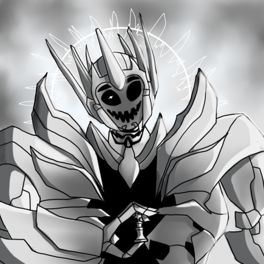
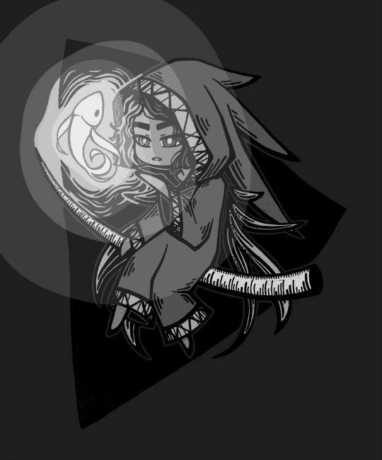
"Beware the Immortal Jester."
#maccadam#transformers#transformers prime#digital art#optimus prime#alternate universe#fan art#the thirteenth prime#the grim dark archives#ehehehehe#spoilers and shading practice all combined into one#I love doing grayscale artwork#so much easier than colored stuff#not to mention its easy to make it cheery or dark with little effort
179 notes
·
View notes
Note
Hii first of all, I FUCKIN LOVE YOUR ART! ITS GORGEOUS AND IM SURE EVERYONE CAN UNDERSTAND YOU REALLY GIVE YOUR SOUL INTO THAT🤧 Your color palette looks so good, What do you pay attention to when painting? (Like when do you think its better to use multiply or something like that and etc.)
first off, I'M HAPPY YOU CAN TELL THAT I PUT MY SOUL INTO MY ART!!! im genuinely in love with drawing and am always finding ways to make creating art enjoyable and impress myself with what i can achieve and learn :D
second, thanks for asking your question!! i dont mind answering it, but my response is quite long. here's my thinking process:
(you specified layer modes like multiply, so im gonna gear my answer towards that a bit) 1. REFERENCE SEARCHING IS KING. color is actually extremely hard for me, so i search around for artworks with palettes i'd like to use and study how an artist uses it. some situations i have a clear idea of what i want, but usually the images in my head are extremely vague, so i borrow palettes from various other artworks that fit the vibe of what i want. an example is this one. my main palette reference were from these artworks. im looking at this artist's use of high saturates and how drawings are overlayed on top of each other. while looking at references, im asking myself how is this artist using warm/cools, where are these warm/cools placed, if their illustration used any form of texturing (like halftones, hatching), how do they use their palette to render form/shape/gradient, when/where do they saturate/desaturate their colors. those questions inform my decisions when using colors too.
2. USING LAYER MODES WHEN NECESSARY. i used to be reliant on multiply for everything, which atp i dont do since i can definitely push colors more first before using layer modes. only when i feel like my current colors are lacking do i start tinkering with tone curves and/or brightness/contrast/hue/saturation/luminosity settings. and if that doesn't work, then i start using layer modes. using layer modes do help with achieving certain effects, color corrections, or when i want to fuck around and find out. i think having a better understanding of what these modes can do makes you more decisive on how you can properly utilize them and to achieve a particular look (like using multiply for a cel shaded style). here's an example:
this leads into my next point:
3. BALANCING OUT VALUES. big thing that makes an illustration hard to read is if values blend together which affects the hues and contrast. i check for what elements need to be distinguished from one another and if it can be read clearly. using layer modes can either help with this or not help at all. it's very dependent on the type of layer mode. here's this example where i applied pin light:

back to #2, there are various instances where i'm using layer modes for quick color corrections and/or to help with readability:


other times, i start off having my entire subject in gray and to figure out main shadow/lights (similar to the multiply cel shaded process i linked ealier). im thinking about what this should look like if i only used 2 value tones:


when in doubt though, i check my artwork in grayscale to ensure values aren't overly blended into each other, especially if i didnt start with grayscale like this one:

painting for me takes into consideration a lot of different aspects. im thinking about how colors should interact, where/when to give contrast, checking/balancing out values, etc, but im also making it a time to study off of how other artists use their colors through the references i collected.
hope this answered your question! lmk if there's more :]
#answered art process questions#answered asks#this one took me a couple of hours to form out my thoughts while editing in examples ngl
149 notes
·
View notes
Text
Ok I'm going to post this, possibly ramble (it's expected) and then SNOOZE.
I finish once again, another Love interest reference. Does the crowd cheer? Will I stick with this design? Who knows.
---

---
Sooo.. they're grayscale, kinda. A hit of cyan on them. I didn't wanna stay too long on this one because I rarely draw them at all. Unless it's for something.
They go by any pronouns. I didn't know exactly what to do with them. I wanted to keep them fem presenting, and she still is. But, I guess I hit them with the "androgynous wand" or something.
Mostly every character I draw has that look somehow. Huh.
But anyways, I thought about what each third thinks of Berry.
---
(Heart): Refers to Berry with she/her. Explodes with the idea and thought of having a partner. Feeling his need to be the most bestest person ever for them. Even if he's not an expert at all. Nor has any idea on what is "normal couple behavior". Sees saw the best in her. His hatred and love intertwined afterward. Man's a hopeless romantic.
---
[Mind]: Refers to Berry with he/him. Doesn't or didn't find it all that exciting at first. Knowing something bad would come with this. But with that in his head, Mind kind of developed an attachment towards Berry. Not a strong one, not even of romantic intent. But something to experience. Or maybe it was romantic. He didn't know. Nor cared. Was too busy handling everything to think about it, and now hates Berry even being mentioned.
---
{Soul & Whole>: Both refer to Berry with any pronoun. They both have somewhat of the same view. Merging Mind's thoughts, and Heart's, it becomes clear. But, there's one thing that's missing.
Hate. The Sun and Moon hate them. Yet the Star and Vessel don't.
It doesn't make sense to them. Any of them.
---
I could add more but I'm tired and I can't think of anything else, or I'd be just explaining stuff I've written.
I also don't know what this could be considered. Since this technically is a running narrative across different artworks and fics. Not in any particular order of course. Because I just like drawing!
(Trying to sit and think to make multiple chapters and plan stuff is difficult.. <:3 )
---
Sooo yeah.
You get androgynous, genderless Love interest. Cool beans./lh
*I return to the depths.*
---
#chonny jash#chonny jash fanart#chonnys charming chaos compendium#chonny jash love interest#cj love interest#love interest#Also since I've thought of this name for a while#this little story or whatever will be called#A Haiku Hidden In The Sand#(I'll have to find and tag every single post that's relevant with that now...yipee)#but I might as well start organizing stuff already#makes it easier#so yeah.#not now though#idk when?#but enjoy#Moon's rambles
10 notes
·
View notes
Text

Who saves you, Hero?
"It's okay...I'm okay. I have to be. I am the Hero after all."
---------------------------------------------------------
Recent events from the new DLC inspired me to finally finish this piece off my to-do list~ :) Story related artwork! Paaain. Kota is clearly exhausted and roughed up, he has not slept for quite a while. Please, Kota, don't keep things bottled in....
I love this piece. Love love looovveee!!
Info on this piece:
I kept Kota and Fu grayscale, with only hints of color. This is how I originally wanted to draw the story when it came time to move it from the written stage to the drawing stage (and slowly over time, the color will start returning to the panels, this is to show Kota's mental state and how he views others/the world.) But this most likely will be scrapped in the final version of my fanfic/fan comic.
The Moon is different and doesn't look like the moon you see on Earth. That's because here, we are in Fu's Temporal Pocket, where his home/laboratory is located. His home literally just floats around in a dark void. Here, Fu can make it anything he wants, so we have a false moon and galaxy theme! Even though none of it is real, Kota still thinks it's spectacular. :,)) The chapter this comes from is untitled at this time and the dialogue may also change with it.
No Font Version:
Continuation of this piece~
#myart#dragon ball xenoverse#dragon ball z#xenoverse 2#dragon ball#dragonball#xenoverse#drawing#dragonballxenoverse#sketch#xenoverse oc#dbz xenoverse#kota x fu#fu#kota breifs#moonlight shadow
17 notes
·
View notes
Note
can i ask how you practice colors? i love how you did that recent link drawing^^🙇♀️✨️
Thank you so much for your kind words. I'm glad you love it, Anon!
As for your question about practicing colors… first, Thanks for asking!
my best advice is that working with references is an excellent way and do it your way! but here's some of my style
I use real life photos like landscapes as references. (artworks also help) to see how light interacts with objects.
look for a strong light source like find where the light is coming from and which way it shines.
Use a grayscale layer to help focus on lighting before applying colors.
also, I try to limit my palette color like don't use too many shades. but depending on the art style!
there are many ways you can learn and practice! I hope this helps you a bit!
10 notes
·
View notes
Text
I decided to digitally paint over some old artworks I have of Kato and Halcyon (my OCs) laying around.
Kato on their first journey into the Underworld. They're sitting on a floating tree branch from their collection(they love collecting unique items). Halcyon and Basile are not with them since they stumbled upon a certain Path by accident and wanted to do a little solo exploration.
The outline and the grayscale.
These pieces are pretty old, so their designs have changed somewhat since then.
Check out Halcyon's piece!
#character design#oc#worldbuilding in progress#original world#digital art#art#traditional art#original character#illustration#artists on tumblr#original story#oc art#doodle#my art#worldbuilding#original universe#oc artwork#drawing#digital drawing#my ocs
32 notes
·
View notes
Text
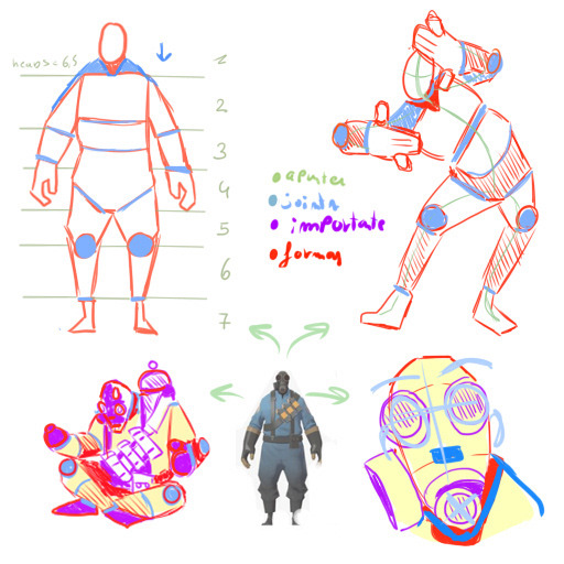
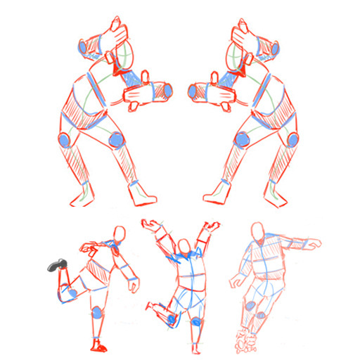
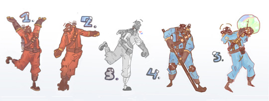
COURSE PRACTICE AND FANART OF PYRO FROM TEAM FORTRESS 2
2024 artwork Program:Paintool sai 2
INSPIRATION Team fortress 2 character named Pyro the pyromaniac.
GOAL Lineup in 5 different poses the character in this case this being Pyro.
PROCESS First some studies of the character itself his body anatomy, proportions, . . . Afterwards figuring out the poses with some real life references. Then by using the model we created of his basic body anatomy we move the joints to create the poses and that will serve us as a sketch. Secondly making the lineart and colouring it i used 4 methods;
The full colouring method
Flat colouring method
Grayscale method
Sketch method in colouring with little or no shading
REFLECTING: I love how it turned out and really liked using the anatomy study of the body to create the desired pose with the joints my favourite must be 5. as it has the most emotion transmited with the second being 1. whats the most finished and detailled here i tried some new shading in the pants and i love it. The most thing i liked doing was adding the wrinkles to the clothing. 3s left leg looks weird so maybe i should practice perspective next time.
8 notes
·
View notes
Note
I love how you capture gojo through your artwork and the way you paint! You’re my favorite gojo artist. How do you pick your color palettes and how color your art from grayscale? I’m trying to change my rendering techniques but am struggling big time. Do you have any tips? 💜💜💜
sorry this was a tough ask to answer i know its old😭
so what i can recommend is to first: have a folder of pieces you like the color palette of and study how the colors are laid out. try to tie your observations back to color theory as well.
next the best hacks i learned were the hsb and gradient tools. some ppl may consider gradients a cheat but hey if it works it works. hsb allows you to slap any color as ur best guess and then keep adjusting until it hits The Spot.
you can also use the curve tool at the very end (or during if you want, it’s your journey) to make final tweaks to contrast and saturation. Sometimes i just go wild on it to see if anything cool happens.
to go from gray scale to color you want to learn the color blending layers and what they do. But most important I recommend learning what Overlay can do for you and your loved ones.
Color blending layers are how you apply color.
When working with overlay in a grayscale to color setting you want to remember that your base is literally 100% desaturated. So the color you apply over that needs to be as saturated as possible! Try to stick to bright saturated colors for the most part and avoid dark and desaturated colors on the overlay layer unless working in shadows (dark) or highlights (desaturated).
Tbh I think practice a lot even if its a struggle. Don’t give up. And you don’t have to get there immediately. what i did in the beginning was heavily rely on gradients and color blending. As i got more comfortable with the color blending layers I started doing my rendering in an off red pinkish color. This was easier for me than direct transition to grayscale because the bit of color allowed me to color parts like skin with less struggle.
experiment!! i only talked about overlay bc in my understanding its what’s used by most grayscale artists. but literally every color blending layer has something to offer and you should take the time to find what works for you.
#ask#also i didnt mention this but dont use color picker for coloring anymore#use………*leans in v close* the smudge tool
29 notes
·
View notes
Note
Shoppy talky, feel free to do all or none: where do you get your cute ideas, how long does it take to make something on average, what program and pens are you using when you go digital, do you color drop or eyeball it, what makes you happy and what's kinda flustering about the hobby in general, who do you love drawing most and from which angle~.
I could (and did) read this in Graham's voice haaaaaa~
1 - where do you get your cute ideas It depends? Comedy-wise, it almost always stems from either a- A conversation that was between me and someone else laugh or b- it made ME laugh. I ah... I have a weird rule where if it doesn't make me laugh, I don't make it. However, the cute ideas? It's usually inspired by seeing prompts or thinking of situations that has me kicking my feet, something that makes chest feel all warm like a big ol' hug and a comfort I desperately want to give the character. (Sorry if I'm vague... even I'm trying to think where I get it from.) 2 - how long does it take to make something on average Haaaaaa that one is tricky if only because it depends on the work? Like, okay... drabbles and quick prompts is no more than a few days (rarely, but sometimes, its on the spot), but a comic page, colored doodle or a longer fic takes easily a week at the shortest and a few at the longest. Sea of Adventurers and 3adv as a whole can easily take a few months if only because I'm a perfectionist and tend to revise. A lot... act 8 has been in the works since like, September? And as I write this have only finished chapter 2 of Sea of Adventurers. Out of three.
3 - what program and pens are you using when you go digital So for my basic drawings, I use Clip Studio Paint and honestly I use the generic g-pen or texture pen (depending on I guess the theme? Like the anniversary page was g-pen, but my recent KQ comic was texture pen). However! When I do a comic page, I use both CSP and Medibang.... I prefer the comic font/texture Medibang has but I looooooooove the cleanliness of CSP so I do all my roughs/lineart on CSP (sometimes even color on it) but I transfer it to Medibang for that grayscale coloring/texture.
4 - do you color drop or eyeball it Both! Like, for characters that pre-exist I've color in the past (e.g. Guybrush, Graham or Neese), then I'll pull up either their original source material and color drop. However, if it's one that never existed (e.g. 3adv!Zelda or Mako) then I eyeball the colors until it's appealing to me. However, once it's set and I'm repeating them several times.... color drop~
5 - what makes you happy and what's kinda flustering about the hobby in general What makes me happy is really having the ability TO create? I know it'll sound vain but honestly, there's nothing that delights me more than knowing if there's something I want to see, and I'm not seeing it, I can pull up a computer or sketchbook and get to making what I want (that was literally what stemmed 3adv haaa). I also love seeing how people react to my artwork as a whole... sometimes I'll get comments about it that makes me really sit and go "wow, people like my stuff" and it makes me happy. But on the other side of the coin, the flustering part about it... there is a few things, but it boils down ti having the time and energy and motivation to create. Like, sometimes I want somebody else to come up with the idea and the drawing and so on and so forth. Sometimes my bouts with depression gets the better of me and I can't bring myself to create. Sometimes I find myself with an idea that looks so cool in my head but when I try drawing/writing it, it's just... garbage. And it's frustrating. (And then I boot up Final Fantasy when I grumble how I should be working on making it work). And sometimes it clicks for me at 2 in the freaking morning and I forget to write it down and poof! Gone it goes. Like my sleep.
6 - who do you love drawing most and from which angle~ Hmm... while I do love drawing Link (especially in action shots) and Graham without his hat, I have to say it's my two favorite captains: Guybrush and Number One. Especially from like... the 3/4 angles because of how their hair is floop.
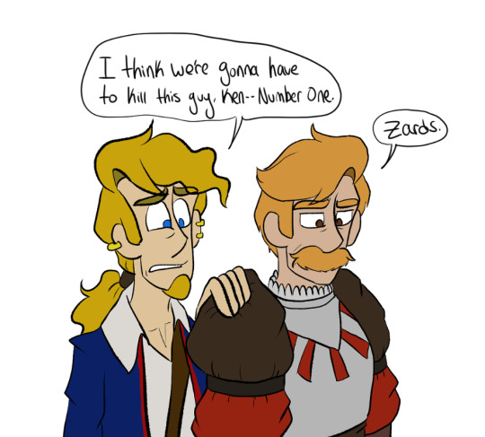
Also Guybrush lowkey became ten times more tolerable to draw once I fixed his hair for 3adv and I really really really really love drawing No1's stache.
7 notes
·
View notes
Text
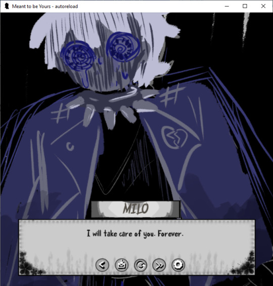
Perfect Love VN Devlog #3
I did a couple more drawings for the mini CGs, but I haven't been very motivated about it unfortunately. The real solution is to stop drawing so much and start figuring out other ways to show what happened. NOT because I'm lazy about it, totally not. That just means more black screens, but there are like almost 100 separate images for mini CGs, so I think you all have been spoiled enough.
I've decided for the main CGs for each ending, I'll mix the last choice (which is related to the color blue or red) into the mix, so for example for this CG, the last choice was blue, so the main color scheme is blue and grayscale colors. Plus I get to work on my lineless coloring/artwork so it's a double benefit to me. I was going to use the Action Editor plugin thing I saw on Visual Novel Design's youtube page, but I couldn't get it to work the way I wanted, so maybe I'll try it again another day.
That being said, I did code in the different name boxes I had for some of the characters. I need about three more of them, one of which is for Milo Pre to fit with the symbolism of eyes and whatnot. The symbolism of eyes is fairly important in the game since most characters don't have "their eyes open" to what Eris is doing. Of course except Eris. Thus the Heterochromia... Sort of.
Okay that being said I did get most of the sprite coding for about 3 of the eight endings (minus the secret ending or the "Perfect" ending, as I will call it), which is of big benefit to me since I kind of just used a bunch of background images for one of them. Don't...don't worry about it.
Also got bored and added in a bunch of things to the code for Mari (specifically you, yes, I'm looking straight at you right now) which you can all figure out whenever I get the game done. It's not super relevant to the story (or so I say, but should you really believe me?) but it is fun to do. I mean, in addition to the OTHER things I hid in the code but don't worry about that, you probably will not remember anyways (except if you're Mari, I say, looking deeply into your eyes).
Hopefully I can get at least threeish more endings for sprites done next week and/or some of the GUI for the save and load pages because THOSE are a huge mess right now because I changed the aspect ratio of the game. Whoopsy Daisies.
Oh and if you want a cameo or something in this game in terms of your name or a nickname you'd use, do tell me. I will add it in and it doesn't take me too long to code in a little message for you. ;3
32 notes
·
View notes
Text
Applying tutorials to Your Work
Hi! I've got a lot of things cooking back in my studio, but since it's a Wednesday I thought I'd share some helpful-ish advice that I've gained since being an artist since like, middle school.
Tutorials are awesome bits of knowledge! But something I rarely see get addressed is how to add it to your own workflow.
Artist all work differently, so usually after I see a tutorial I make a big canvas by dragging in MS Paint (If you can, some tutorials only work in the program of choice) and start following the tutorial.
For example, I love manga screen tones. I've seen so many tutorials on how to do them in CSP & Paint Tool SAI. Ergo, I wanted to apply this knowledge to my current artwork. I open a huge canvas in CSP. Download the brushes/materials I need and try them out on some line-art I scanned in.
This is how it looked before. I did my usual Black & White trad. inks for lineart and added turn white to opacity feature on.
After following the tutorials as close as possible, here's how it ended up looking.
Because my style is more cartoony/simplistic with cell-shading I applied my grayscale then converted this into screen-tones using a layer feature in CSP.
Now, what if a tutorial doesn't apply well to your particular flow/ style choices? Take what else you've learned from the tutorial & apply it using your established methods.
I didn't use gradients because it looked to different from my usual line art. I didn't use special brushes because it looked too precise. It's okay to fiddle with the key points of the tutorial until you find a good fit.
I like to think of it like class notes - You get the key concepts first. Then, you turn around and apply it through trial and error.
Note that if you haven't found a workflow that you like that it's time to apply the tutorials in high gear.
Half of my art journey was finding what I liked as far as rendering drawings. Do I like cell-shaded work? Do I like realism or more graphic-styled cartoons? Do I like bright colors or muted colors? Etc.
Happy Drawing! :D
#tutorial#art tutorial#art hack#art tip#artist#artist life#artist tut#tut#art flow#artist rendering#apply tutorials#blog post#helpful#steph talks art
0 notes
Text
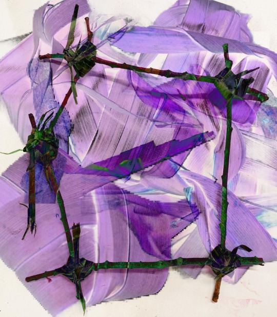


I decided to take my maquettes into digital media and show my process of what I do. I started by getting the images I wanted to use, the close up of the knotting and the full scale maquette. I cut around the edge of edge image so that they would overlap each other nicely and then started blending them and messing around with the colour and levels. I wanted to create a lot of depth within this work, like you are being pulled in and I am very pleased with the outcome and having the harsh straight lines adds visual interest and frames the focal point nicely. I love the pops of purple helping to lead your eyes around the artwork. I enjoy the grayscale at the top right making it more mysterious and leads your eyes to it and seeing the bright light shining through resembling hope.
0 notes
Text
Painting Prposal edited
The concept of my idea is to signify human emotions in a series of five paintings. I want my paintings to have movement and make you feel what the painting may be feeling, even though it may be a different emotion to anyone, the key is to make you feel an emotion through my artwork. The artists that influence me the most when doing art are Lenoid Afremov and Claude Monet. Claude Monet uses lots of pastel colors in his work that makes his work look very soft and alive while Lenoid Afremov is a painter that uses a lot of color in his work and you can feel the emotions through his paintings. When looking at Lenoids work I think to myself that is what I want to do, his work makes anyone feel what he has felt while doing it, as long as anyone who views it can feel an emotion he knows he did a good job. My work is about experimentation, I like exploring and playing with my paintings. I take a lot of time and patience trying to make my art the best it can be. Even though it takes time along with mistakes in the process, I enjoy doing it because it makes me happy and it makes me wanna keep doing what I love. I will be using acrylic paint and using different color palettes some will be colorful while others will be all grayscale. First I will make sketches to plan out my ideas then transfer it onto the canvases and work on it for as long as needed. To move further on each painting will be a scene from my memories that conveys more than one emotion.
1 note
·
View note
Text
moving day ⬦
4 notes
·
View notes
Note
All right, I’ve got a question I’m curious about for REASONS…
When our dear Astrid first sees Silco’s tats, with the description, my brain thought it was grayscale/black, without the red. Maybe me brain pan was off that day, but can you confirm?
Also - Astrid’s new coverup tat…gimme a bit more deets as I’m VERY tempted to do some spicy work with them in the bedroom, looking at themselves in the mirror.
Like I said, Inky - REASONS. 🖤🥃🥃💋🐀🌹🥀🕯
Oh oh oh how you tease me so Jenni 🤭
I originally pictured Silco’s tattoos in greyscale, and that’s also how I wrote it:
Your lips part softly in both surprise and wonder. The tattoos are beautiful. Not too big or ostentatious. Just artful, and intricately detailed. Two roses, one on each hip, rendered in greyscale. Each one crowning a carefully designed tangle of leaves, swirls, and thorns which flow in a vee beneath his trousers.
However, most of the fanart of DWM Silco’s tattoos has that gorgeous pop of red and I think it looks equally as good with colour. Also all the interpretations of the design itself have been so different, and I honestly love them all.
Basically what I’m saying is please feel free to interpret them however you’d like. I guarantee I will be salivating regardless of colour or style.
In terms of Astrid’s tattoo
Two unfurled roses, haloed with a laurel of leaves.
What I have in my mind is something along these lines:
But once again, it’s totally open to interpretation. The only point I will make is that in terms of artwork, if Silco’s tattoos are also visible then Astrid’s must also match in style and colour/grey-scale. Otherwise it wouldn’t be a grand romantic gesture would it 😘
#ooooo I can’t wait to see what you’re up to#👀👀👀#inky answers#drink with me#Silco’s hip tattoos#Silco#Astrid#tattoo
25 notes
·
View notes
Note
sorry in advance if you've already answered a question like this but i just wanted to ask, how do you improve on drawing?? i think especially for things like coloring, shading, and lighting , its been difficult for me to be happy with how it looks because compared to the sketch (that i think already looks nice) the colors just seem sort of flat and muddy and i feel like i dont have a good grip on what colors to put where and how to make it look unflatt if that makes sense! just curious on maybe what kinds of practices and studying you do for this(if any))<33 obv you dont have to answer if you dont want to, and thank you for being one of my inspirations, love youu<33333
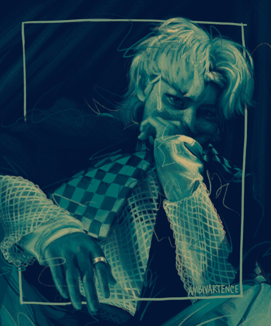
hihi!! for simply shading/lighting, i would suggest you only work in black and white until you're totally comfortable with developing values. why? marco bucci explains it really nicely in this video but basically if you have good values u can have absolutely garbage nonsense colors and it will still make sense aka when i did this lol:
i'm guessing you're more interested in colored artwork though since black and white drawings can't be "flat and muddy" bc theyre in grayscale lol. for coloring, this is so tough for me too so i thought about this for a day or so and i came up with 3 tips that might help^^ 1) getting colors directly from photo reference or color reference, 2) manually adding filters/color harmony, and 3) studying color theory
i always work from photo reference so it informs a lot of my coloring/shading/lighting and often when i don't understand what color I'm looking at i directly just eye drop it and realize that what i thought was purple was actually just a gray-red. working from an actual picture helps make sure my colors don't look strange and while i used to think eye-dropping felt like "cheating" when i worked digitally honestly i've learned a lot from it and honestly if i stare at a color long enough i can get it pretty accurately now but i'm just too lazy so eye-dropping just speeds up my workflow (plus i hate digital color pickers anyways they r not built for artists and i wrote an entire paper on it in college once lmao) anyways here's an example of a color study i did by directly eye-dropping from a gif with @quokki's incredible coloring (love u ale <3)
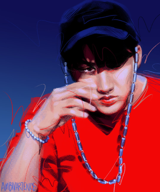

if you're not working from a picture directly, you can still use other pictures or artwork as a "color reference" which I used to do a lot. i like to look at art from other ppl with pretty colors and create a color palette to use in my own drawings. for example, the color palette for this felix painting came from a piece (idr which) by Simón Prades on instagram but this palette is really easy to use since it's linear values it's like working in black and white but comes out looking cooler LOL

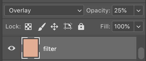
Recently for my lee know kiki's delivery service drawing i felt that the colors seemed a little flat n muddy to me because it was in an animated flat coloring style (lol) so I added a filter layer (just a flat apricot color set to overlay at 25% on photoshop) that livened up the whole thing and made it feel more cohesive. It's a pretty subtle difference to other people but made a world of difference to me :) it helped take the muddiness out of the shadows of his face and the glass reflection and took the painting from gloomy rainy day with stale bread to warm sunny day with fresh bread :]

and finally if u are interested in actually studying colors and lighting and shading and stuff these r some of the youtube videos and channels that i think do a great job explaining these very cool concepts:
pre-realism vs post-realism is a cool video about the difference between the mentality of how beginners draw vs how experts draw and kinda blew my mind tbh i think the big color takeaway from this video is that something that kids would color (like green grass) might actually be a totally different color to an artist's eye (dark yellow, red gray, even a super desaturated purple) depending on a realistic lighting situation
nathan fowkes did a 3-part guest talk series on understanding color temperature and relationships: (1) (2) (3) also not coloring but i love his video on value massing
this lecture on what charles bernard calls "the mother color principle" takes the "filtering" tip that i mentioned earlier to a much more developed level (it's an hour long so just skip through it.. u get the gist of what he's saying in a few min but the whole demo is also cool too)
i mentioned him earlier but marco bucci has many 10 min digestable videos about color on his channel that i like :) (also this lighting/value video is great too)
sorry i don't really know exactly how basic or advanced i should cater my advice but i hope this helps some anon^^ lmk if u have questions or if u ever want feedback my inbox and dms r always open
#ask#anon#my questionable advice#damn this makes me want to go back to art school i remember this time last year i was watching so many of these videos and actually studyin#n now ive just been so lazy n only doing black n white again LOL#also rereading this i hate how i write i sound so peppy and prescriptive these r just my two cents!! sorry its so long#its just all the vertical media
25 notes
·
View notes