#I have the most inconsistent artstyle
Explore tagged Tumblr posts
Text

With every version of me dead and buried in the yard outside
#cole cassidy#cassidy overwatch#overwatch fanart#ow2 fanart#overwatch#my art#it’s his birthday :D#I have the most inconsistent artstyle
284 notes
·
View notes
Text


first post so i'm just gonna dump some art here
#jthm#art#my art#i have the most inconsistent artstyle i stg#digital art#artists on tumblr#woagh the me
126 notes
·
View notes
Text
Inktobertale Day 8: Bento

A quick lunch break :)
Inktobertale challenge and Ink belong to Comyet
#doodle#undertale#utmv#undertale au#inktobertale#inktobertale2024#ink sans#i swear i have the most inconsistent artstyle ever...#ceci art
73 notes
·
View notes
Text


*Dumps all of these here*
Click for better quality btw!
#proship dni#self ship#self shipping community#self ship community#romantic f/o#f/o#self ship art#f/o art#f/o x s/i#s/i art#I love having the most inconsistent artstyle known to man#anyways follow if you want more gay muppet rejects‼️‼️
8 notes
·
View notes
Note
Hii I saw that you're doing birthday sketchy requests for the Bois and you're like one of my all time favorite DCA artists so I just had to put in a little request! (I'm so scared to be in your ask box rn don't look at me 😨)
Could you do a blushy Moon? Just him being all cutesy and flustered maybe due to him getting a smooch (Moon with kiss mark on his face would be too cute maybe I'll have to doodle it too lol) Any design you prefer for him is just fine, whatever is most fun for you! Soft flustered Moon just holds a special place in my heart hehe
I also hope you're having a lovely weekend! Best of wishes friend!

ACK i meant to respond to this sooo much sooner but i got busy,, again?? i slowly did this thru out the week (inconsistent artstyle my beloved <3)
BUT IM TOUCHED.. like WHAT. one of your favorite DCA artists is so wild to me i exploded?? /pos
thank you for requesting!! reading that made my day /gen 🥺
#dca fandom#fnaf daycare attendant#fnaf dca#moondrop#fnaf moon#dca moon#pingdoobles#i got so swamped by work just when i thought i was free but#I FINALLY GOT THRU AURGBB#ok its 1am i am snoozing hello tumblr and gn!!
492 notes
·
View notes
Text
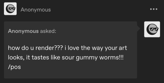
ty! \(^_^)/ feelin good so ill try answer in detail for ya!!!!
most of the time i just do basic cell shading. here ill explain my rendering process after i choose my base colours, ill try keep it short & sweet!! nvm warning buckle up its really super long.
flat colours -> fully shaded!!


⭐️Picking shading colours!
usually it's just the base colour with +saturation OR a hue shift! i dont really lower brightness.
This is what i mean by HSB, i never use the colour wheel i prefer the sliders!!!
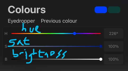
i like my art to look super colourful so i do things like shading pink with blue instead of with a darker pink or red, as shown in the above callie piece.
examples ft lumity:
skin: i always keep it very simple & cartoony! over the nose, below the eyes, the neck & sometimes the tips of the ears is where i'll put shading
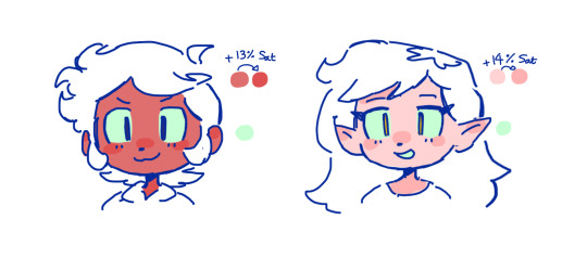
hair: as u can See, it's not darker than the base colour at all!! for dark hair like luz's, i brighten & saturate the colour, and for light hair like amity's i just shift the hue a little!
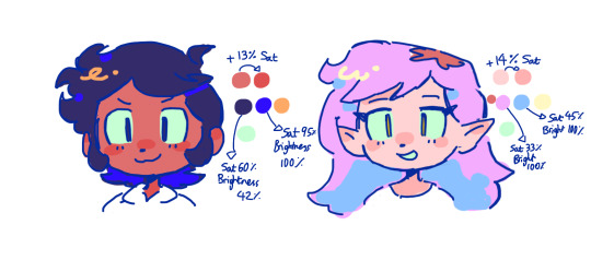
⭐️more kewl tips:
colourpick from yourself!!!! instead of making a new colour for everything, try using a colour u already have down!!!! like below: by limiting my colour palette, it looks more harmonious
really messy image but i hope u get what i mean. also the "off white / black" thing is a separate choosing base colours thing!! i can expand on that if anyone's interested 😙

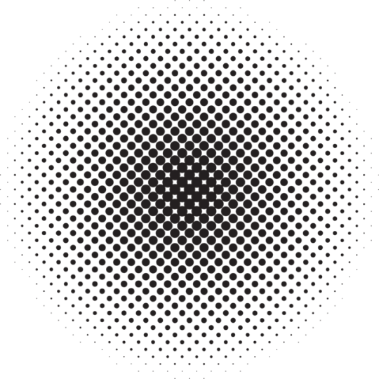
shove halftones in wherever they fit. here are the 2 pngs i use!! there a rlly good alt to gradients, i used a LOT of them in that callie piece!!! clipping mask over where u want it & alpha lock to change colour.

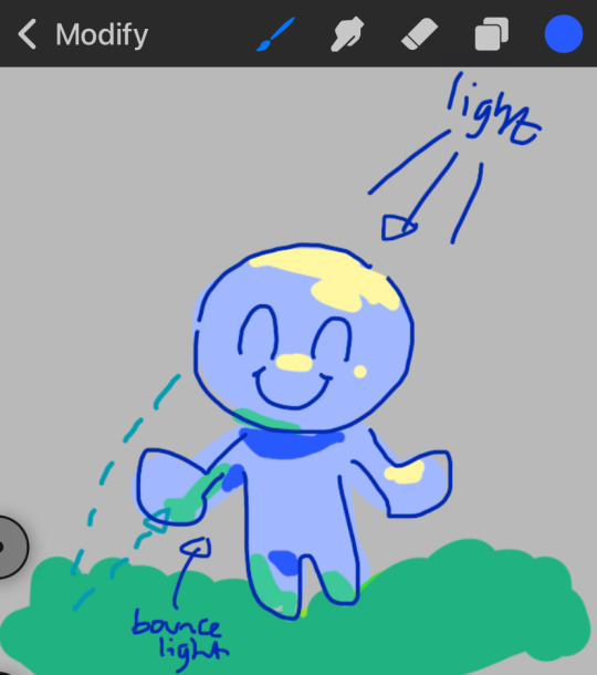
⭐️here's a WHERE i put the shading:
look st the environment ur guy is in!! pick where your light source is coming from & look where that light will hit and where it is blocked by something.
bounce light: the sun's light is also shining on the grass! so powerful the green reflects right back!
this is kinda more realistic lighting now.
i kinda just put a circle wherever theres a corner!
and i put that Beautiful Shape a lot wherever. i change it a little depending on the character, sometimes its triangular or squarey but thats the base shape! i dont even know what its called but i love it.
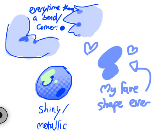
look at this hello weird shape guy!!!
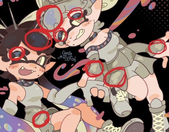
actually, my grandfest art are probably some of the most detailed art i have! u can see urself where i put shading & stuff - they do have more desaturated colour palettes though:

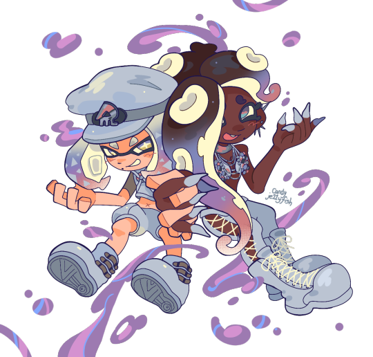
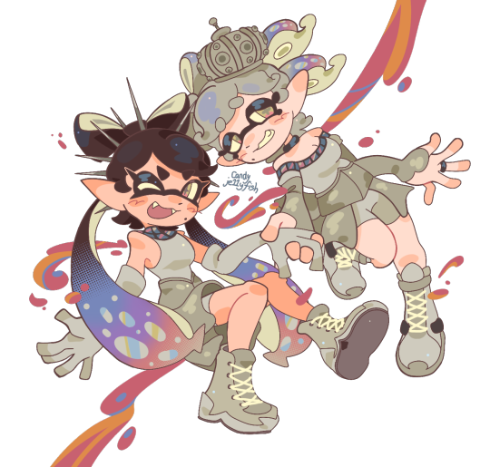
& here are some additional examples ^_^ flat colour -> shaded -> multiply layer -> lighting
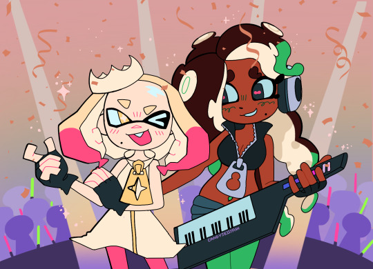


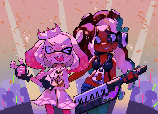
in this one u can see the hand & leg at the back are completely in shadow too :)

anyway i think that's kinda it? i dont really know how to explain it, i just do what feels & looks right to me??? remember that im Not an expert & this is just how i do things :)
i will always repeat my no1 tips tho: keep drawing!!! and copy ur fave artists!!!!!! it really will hell u find what u like!!!!!!!!!!!!
i hope this post helps a little & answers ur question😇 never be shy to ask me anything cuz i love answering & chattin w u guys!!!!
EDIT: just saying these arent set rules or anything!!!! u can see just how many times i Dont follow my own advice LOL. my artstyle is super inconsistent, i rarely draw things the same every time
164 notes
·
View notes
Note
Hello, just thought I'd pop in to say I'm absolutely obsessed with how you draw noses! You use a delightful balance of shape and volume I've seen no-where else, which really defines the faces you draw! Our species has the second-largest nose of any primate, and you do it immense justice by not treating it as an afterthought compared to the eyes and mouth.
I just had to know from whence you draw inspiration for your artstyle. What allowed you to craft such well-defined schnozes, and could you perhaps walk me through how you specifically draw a face?
Ahhh thanks so much! to be honest i took inspiration from a lot of Lord of the Rings fanart and mutuals that I noticed really highlighted nose bridges, I was never a big fan of them but I got insanely curious and ended up really liking how they look
I'm terribly sorry though because I don't really have a definite process for drawing faces. If I'm struggling, I'll do a simple box shaped skull with guides for the eyes to try and warm up. If I'm already warmed up, then its most likely going to be a circle with a line for perspective guide. I usually do eyes and nose first for the same reason (perspective. theyre very important). Then I just wing it (hence why ears are always very disproportionate on heads on my art). I'm super lazy so I just do whats easier for me lmao and also I work very inconsistently, its an unprofessional fight for my life
253 notes
·
View notes
Note
How do you recreate the Hetalia artstyle so well
ok so.. .uhhhhhhhhhh honestly i dont even know how. which is why i am obviously qualified to make YOU, yes you, the person reading this, a tutorial
i psoted an incomplete tutorial on the hetalia art style some few months back and when i look back at it now, some things are just straight up wrong or need clarification (also its the same post where i accidentally sent multiple death threats to a random sex worker thinking they were just a porn bot oopsies) so if you guys still remember that, forget about it! all of it!!! this is a brand new, more accurate guide on how to draw himas style!
(quick warning though im just a weeb not a professional teacher by any means so dont take this as gospel and dont get mad if i got something wrong or something is confusing)
himastyle tutorial! (the better one) part 1
(link to part 2 here)
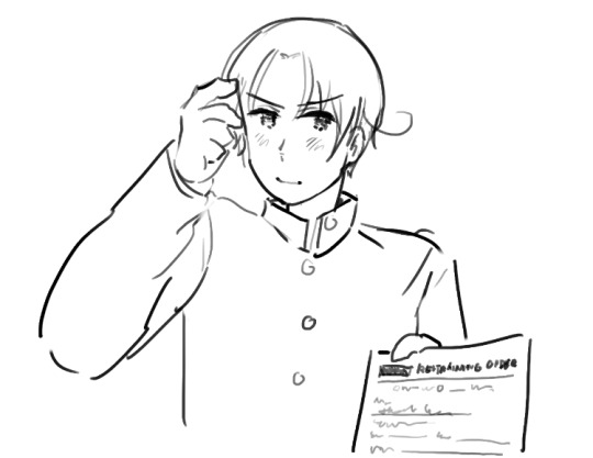
ok lets start off with the
HEADS

this is just the way i start drawing my heads personally. if i had to describe it, its basically a simplified stylized version of the loomis head method. proko has a good video on it! just give that a quick watch then take a look at my step by step guide
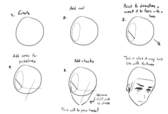
but besides this, there are some important things about the head that you should remember
the shape of the head is generally rectangular

compared to more typical ikemen styles, hetalia characters have a more rectangular head. HOWEVER their chins taper off to a very triangular shape. rarely do the chins flatten out like the guy on the left.
2. shorter face = younger/more feminine appearance

well... self explanatory. you can see in the diagram how changing the length of the face gives a character a more feminine/childish look.
if you feel that something looks kind of off, feel free to change it, but if it looks okay then lets move onto facial features!!!
NOSES:
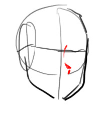
ok so this might seem a little weird but i like drawing the nose first. its right in the middle of the face and is generally the easiest to get right. it also kind of acts as a divider between the eyes, especially useful when you're drawing in a 3/4 angle

which kind of look something like that i guess.....
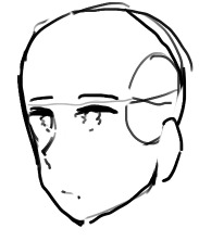
or that if you want something less extreme
anyways while hetalia noses are kind of inconsistent they generally have the shape of these three lines. feminine/childlike characters have a smaller and subtler nose though
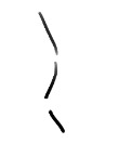
noses also never face fully straight ahead, so when drawing a front view, the nose slightly faces right or left (tbh himas characters rarely face the camera head on, so id refrain from drawing frontal views altogether but thats just me)
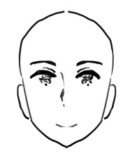
anyways lets move on to my second favorite part of the hetalia art style
EYES:
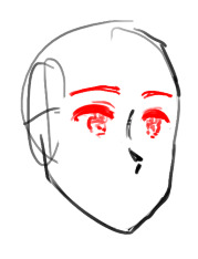
the eyes are the most important part of himas style. if all else fails, you can always recognize the style by the eyes. luckily for you, the eyes really arent complicated compared to other anime styles :D here is how i do it:

(feminine and childlike characters have bigger eyes)
you have probably noticed this but the pupils hima draws now has a more squiggly teary-eyed look compared to the pupils he drew then...
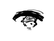

i subcounciously do a mixture of the two because i got used to drawing the old type, but if you wanna draw the new type of pupils just take note of their squigly shape and that they have one dominant highlight in the upper-middle area. uhhh.. or if youre like me just draw the old eyes as if you have parkinson's
anyways heres a step by step guide

and some fun eye variations!!! you can try using variants if youd like to give an oc a more unique look (you can also try making your own variants too but be careful of straying too far from the style)
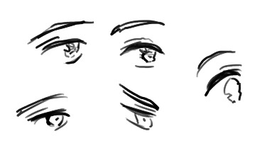
so now about the eyebrow and the eyelid.... uhhh the eyelid doesnt really have a consistent length so just draw it however. feminine and childlike characters have thinner eyebrows but even then eyebrows should never be drawn as just a single line
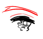
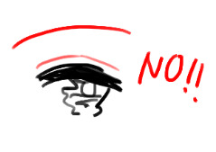
we are close to finishing the face!!! now we can move onto
MOUTHS:
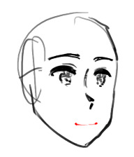
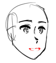
if you know how to draw a typical anime mouth, then hima mouths is easy peasy!
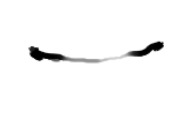
for closed mouths just draw a curved line with two dark blots for the corners of the mouth

i think that giving them a shaky look makes them look more expressive
open mouths are just random blobs, dont close off the bottom though, and theys till have those dark blots at the corner of the mouth

now then i'll move onto the
EARS + CHEEKS:
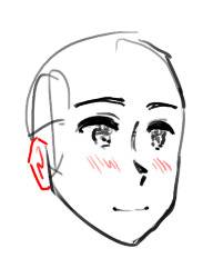
i decided to combine these two since these are probably the easiest parts of the face
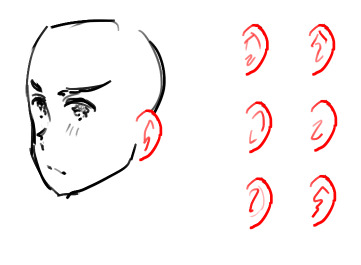
hima's ears are pretty round and don't really vary in shape. inside the ears though....
it isnt very consistent, so don't think too hard about "getting them right". above are some ear variations i drew from one of the latest chapters of the manga

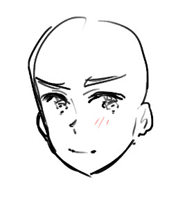
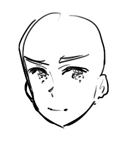
the cheeks are just a bunch of lines that can appear fully, or only on one cheek, or don't appear at all. i think it depends on level of detail, angle, or the character's emotion
these lines do not appear on rendered pieces
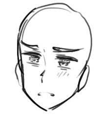
also if a character feels especially displeased they will gain heavy eyebags

so yay! we're pretty much done with the face!! look forward next time to where i cover hair, the body, and other stuff idk... i'll link the other parts to each other when i complete them
120 notes
·
View notes
Text
heyo, thought it'd be important to address because i recently hit 100+ followers.
but there's an account (spacedreamboy) blatantly posting ai art in the dol fanart tags, and they've recently deleted old posts of their inconsistent ai art to appear that they have created these artworks themselves. they have not. their 'art' is ai.
(exposé utc, old deleted posts, inconsistencies in artwork below)

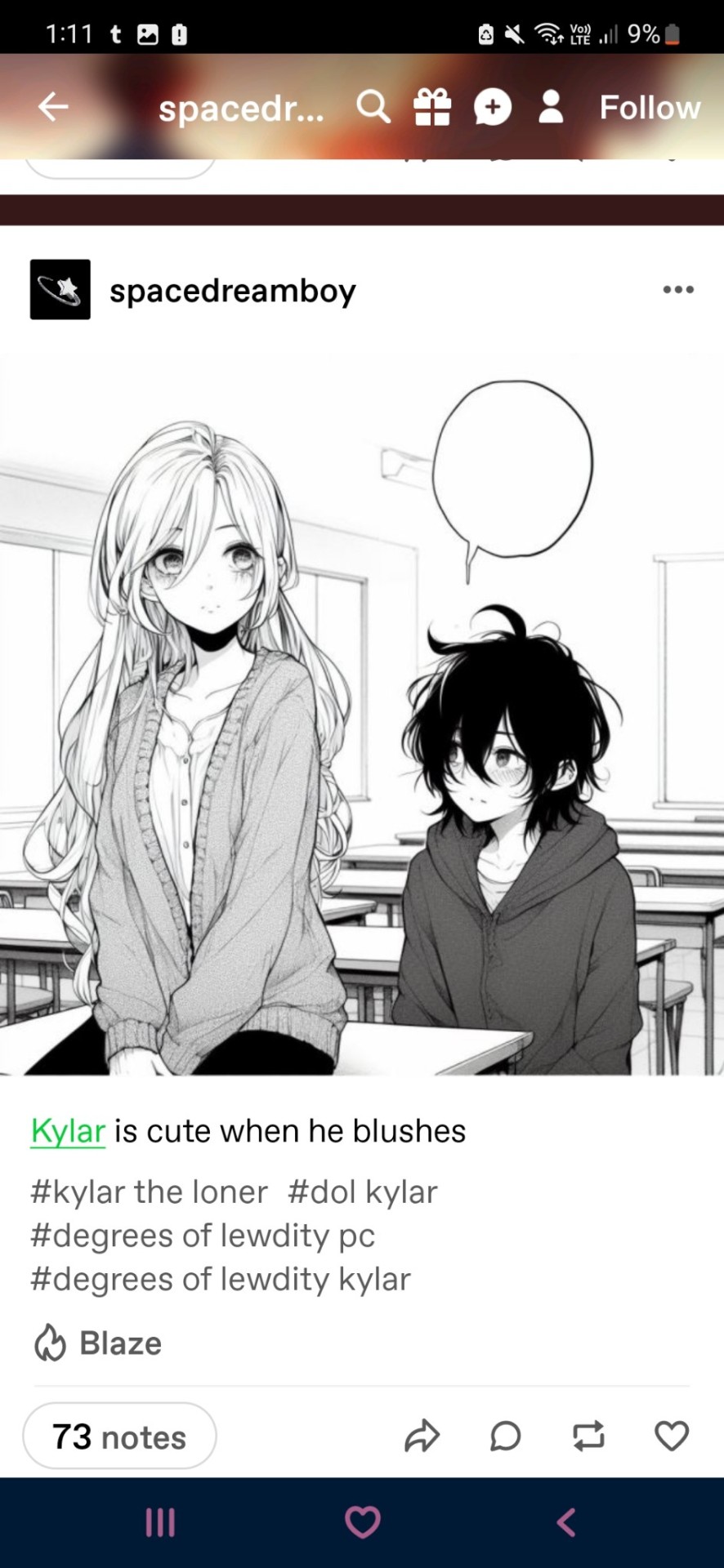
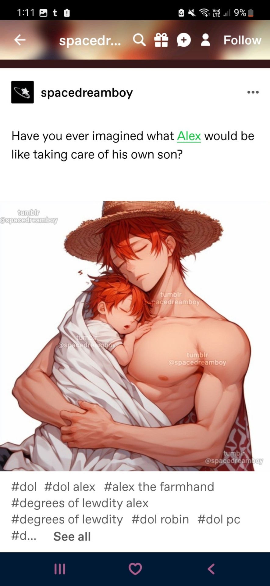
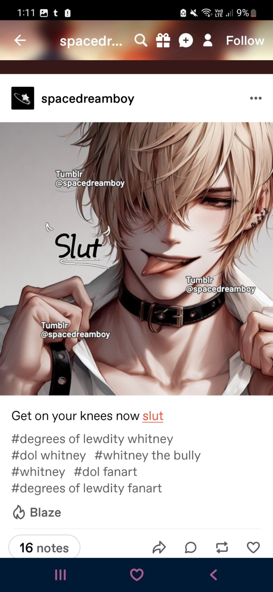

i'm really happy that i screenshotted these posts when i did, because i had an itching feeling that they would delete their old inconsistent posts that did not have a consistent, repetitive artstyle (thankfully, consistency within art is something ai cannot recreate, which makes it easily identifiable).
while i cannot say what ai art program has been used (most likely an image-prompt generator ai bot; something like Dall-e or the character ai image generating bots) i want to let you all know why this is problematic.
- to create artworks like the 'fanart' above, ai programs steal digital artist's work.
- spacedreamboy is openly putting these works in character fanart tags rather than ai art tags
- they are (unintentionally or intentionally) fooling people in the dol community that they have created these artworks when they have not.
here are some weird things within one of their deleted 'artworks' that are common within ai art generation.
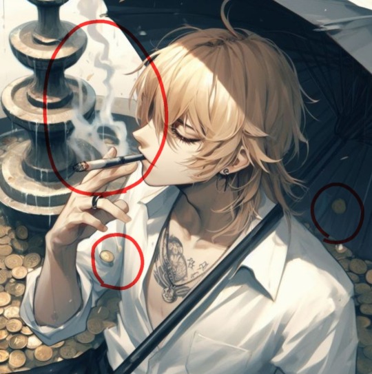
- random coins everywhere
- weirdly long cigarette (that looks like a blend of cigar and a cigarette)
- cigarette smoke trail that blows in weird directions.
- the fountain (if you look closely) is warped and the water in it is just... weird to look at.
- the tattoo on whitney's chest isn't really of anything. it's a blend of random popular bad-boy tattoos into one amalgamation.
- in general, just look closely at the art and you will notice the faults within it that an actual artist with this level of skill would not have.
i really hate ai art. i think it takes away from actual, hardworking artists within online communities. @spacedreamboy do better.
if your art isn't ai, i'll happily apologise publicly if you post a speedpaint or some traditional art of yours.
#degrees of lewdity#dol#ai art is disgusting. i will forever hold this opinion.#it takes away from actual hardworking artists and writers.#kylar the loner#alex the farmhand#whitney the bully#sydney the faithful#sydney the fallen
353 notes
·
View notes
Note
Bruh sorry miss sir whatever your prefered way of being addressed but like my phone was on 2% when i sent this ask so idk if it went through to you so just in case imma send it again sorry (u_u)
You mentioned before that soundblaster hates nightflyer and nyghtflyer thinks they are best friends so i wanted to ask will sounders opnion on flyer ever get better or will there come a point in your au where blaster makes flyer realize they are not friends and soundblaster hates nightflyers guts?(°`^'°)
Love your artstyle btw \(●_●)
First off, call me whenever you like, I just like people knowing I’m a girl, that’s all.
Secondly, I’m very inconsistent with answering asks, like I’m horrible with it.
And don’t you worry… I have just the moment. At some point I want Nightflyer to be affected by dark energon, leading to his death (he comes back don’t panic). I image in that moment, after a lot of talking and pain, Soundblaster dose the most comforting thing he can think of and tells Nightflyer the truth. It may seem backwards but to someone like Nightflyer (someone who’s extremely autisum coded and has spent his whole life masking and seeing other people put on masks to interact with him)… is happy
I will probably make this a TikTok because I have the perfect audio for it
40 notes
·
View notes
Text
PROJECT PEAK SHORTS REVAMP ANNOUNCEMENT 🗻📚
Turns out I did end up getting everything done, so it's ready to be shared. It's been months since I made the first episode of Project Peak Shorts, and I spent a while not enjoying the style, formatting, and theme of it. It was nearly my first time making a comic, but since then my artstyle has gone through changes, and I feel less restricted in my creativity. So, today I took a step back and focused on how I want it to look first and foremost, I thought about whats easiest for me to draw, and whats fastest.
Here's the revamped logo, as well as the references I will be following for Siber and Gia:


I much prefer doing lineless art nowadays, I've switched up my artstyle after realizing this and my preferences have changed. For the comics, I've made it so that I do the colors first, and then add lines on top of it. This makes it easier and faster for me, and gives it that "polished" feel I enjoy.
It may end up a little inconsistent, but if I can properly tell a story through the comics and have fun while doing so it'll help with motivation and my upload rate.
I have BIGG plans for the comics, more than I did before. At first it was going to be a small, cute, side story thing, and for the most part it still will be, HOWEVER, I would like to made it more lore involved, and develop my own story mode through the comics. It's going to be what drives the character growth, what the story would be like if Project Peak were an actual game, and let me properly learn about my own characters I've worked so hard to build.
anywho, holy YAP.... I've already begun writing everything via google doc, so I can plan out everything beforehand, heres a sneak peek on the names of the first 5 shorts:

I have one more band and a few other characters to make before my entire character roster is complete. Afterwards, I'll actually start working on the website I swear lol
#project peak#splatoon#my art#my ocs#splatoon fanart#splatoon oc#digital art#out cold#splatoon fan idol#splatoon art#siber#gia#comics#announcement#project peak shorts#wip#to be continued#splatoon character#splatoon comic#planning#future comic#splatoon fan idols#fan idols#fan project#splatoon fan project#update#references#character references#logo
20 notes
·
View notes
Text
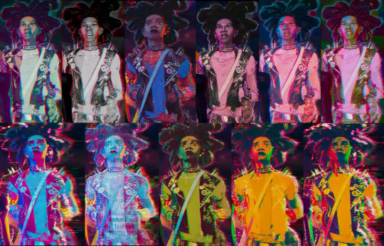
Hobie's rare colors/inconsistencies these only show up like once or twice
The first shot of him is just his boots and they're different colors. This never happens for full body shots.

p sure these hands are just his Standard and Bisexual palettes but wow they look different up close

In this moment it's almost like he can barely contain his Bisexual colors before he strikes the note that lets it out but maybe it's just the lighting

not surprisingly I think the most variety is seen while having a laugh at the pub with the mandem. But it could also just be the lights at the pub and the flashback artstyle effecting his Standard and Bisexual colors

Then there is this moment with Miles that could maybe be Pink (since that's what the shot before it was) but I don't think it is (is he taking the piss at Miles' color palette???) Edit: wait wait wait wait wait I thought these two frames waere just a Monochrome but that's the jacket colors yeah?? The lighting is just different?? (this is when he says not because you told me to. omfg he's got a whole color scheme for Fucking With Miles (headcanon it looks different because he's still developing it))
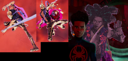
The Go Home Machine does weird stuff to everyone's colors but especially Hobie. (I also think the collider is doing weird stuff when he's not believing in comedy but my screens suck too much to confirm)
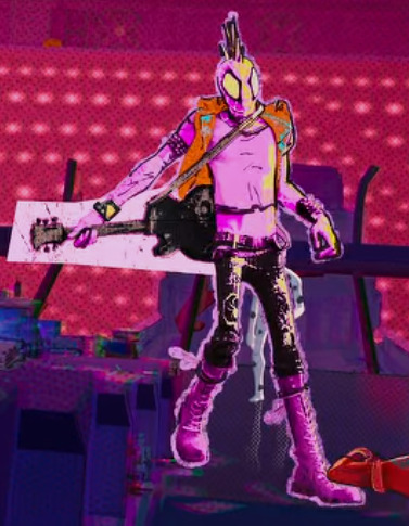
And it'll be a bit before I bother much with the guitar colors so I'll just say here that it does seem to have colors that match to Hobie's but it just doesn't always keep up when a lot is happening

Edit: He has his Orange jacket on his Pink look once
109 notes
·
View notes
Text
My thoughts about Dragon Age: The Veilguard (Spoiler free)
After 67.5 hours of playtime, I have finished the fourth Dragon Age game. Overall, I give it a solid 7/10.
I loved
The performance. I have a good gaming laptop, but it is still a laptop. Veilguard runs buttery-smooth, never had any lag or framerate drop or anything. Didn't have any annoying glitches, some very minor graphics bugs two or three times. I know this SHOULD be the bare minimum, but considering it has become the norm to launch games that are basically unplayable because of the number of glitches, this is something to point out!
The overall story, tone and writing. Yes, these were criticised by many people, but I don't think that the dialogue was that clunky, and I certainly did not think that the tone was "not dark enough". Genuinely, people saying the game was too lighthearted and not "dark fantasy" anymore must have played a different game than me.
The look of the environments. Inquisitions landscapes were beautiful, and Veilguard manages to top that in certain areas. Arlathan Forest is absolutely beautiful, and other places you get to explore are horrifyingly, disgustingly vile and haunting and terrifying.
The Character Creator. So many details and so many hairstyles!!! And GOOD, long hairstyles, too!!!
I liked
The Companions. Rook's interactions with the companions is different than in Origins and Inquisition, most similar to DA2. You can't just always come talk to them. But they interact with each other far more than in previous games!! And I am glad there isn't a party banter glitch like in Inquisition - the banter triggers early and often. No hourlong running around in dead silence! And I also liked all the companions as characters, a lot!
The voice acting. Again, I don't really get the complaints so many people seem to have over the voice acting. Really solid imo!
The Combat. I did NOT think I would ever say that. It took a long while to get used to it because I am simply not used to playing action combat games. I only played on Keeper difficulty (2nd easiest), but that was ideal for me to figure everything out. I played a duelist rogue, haven't tried other classes. And I appreciated the uncomplicated respeccing. Especially because I was really intimidated by the complicated look of the skill tree. For rook and the companions, you can respec any skill at any time, so you can play around and try what works best for you.
Exploring. The game is not open-world and I think it was a good choice. But the relatively small areas are packed full with treasures to find. There are little puzzles everywhere. I am a sucker for that kind of stuff. Love puzzles and riddles. Only not putting this under "loved" because it kind of messed with the pacing for me in certain quests. ("Someone's in mortal peril? Sure, hang on, lemme get that treasure chest first")
Certain lore revelations. No spoilers! But we learn some big stuff. I think this was done well for the most part.
I was fine with
The look of the Characters. I was VERY worried about that at first because in general I am not a big fan of the cartoonish artstyle. What was odd is that not all characters seem equally cartoonish? Emmrich seems much more cartoonish than Davril, for example. That is an inconsistency that I found quite annoying. In general, could have been better, could have been worse. I really miss the DA2 look of the Qunari. That Arishok... still thinking about him.
The romance. So I have only romanced Neve, and it was nice. I know other romances are different, they might give you a bit... more. Again, don't want to spoil anything but.... There could have been more.
Cameos/tie-in of established characters. I want to keep this spoiled-free so I won't go into specifics. It was nice meeting some of them again, some of them were.... NOT done right. Yeah I'll reblog this post with a few spoilery thoughts on that. This could have been done a LOT better.
I did not like
Lore inconsitencies. I don't mean major, story-relevant stuff here, just some minor details. It's expected that they will get some stuff wrong but.... ugh. still annoying!!!
The villains are very black-and-white. When I think of Dragon Age Villains, I think of complex characters like Zathrian, Loghain, even the Arishok or Prince Bhelen. Characters you can empathize with, feel sorry for, even side with. The game is very lacking in that kind of complexity.
Lack of impactful, difficult choices. In previous installments, I AGONIZED over so many choices. Harrowmont or Bhelen? Celine or Gaspard? Kill or spare the Architect? Choices I took a long time to think about, choices where the game (and other media) gives you little snippets of information, not enough that you know what the right choice is for sure, but you have a lot to think about and to consider. This does not exist in this game. At all.
Rook can't be evil. I know Rook needs to be the hero. But so did the Warden, Hawke and the Herald. I personally don't like playing the "bad guy". But I like having the choice! If you have the choice to sacrifice Feynriel to the Sloth Demon, it makes the decision to do the right think just so much more meaningful.
And Rook's dialogue options are quite flat, too. The game uses tone indicators like in DA2 and Inquisition, but the tone barely even differs. The joking/sarcastic replies are not that funny (purple Hawke i miss you you will always be famous). The "aggressive" replies are really not that aggressive. Overall, that makes Rook feel quite flat.
I am VERY unhappy with
Okay. Deep breaths. No spoilers. But this game has... issues. For a game that has been in developement for such a long time, there are many aspects that are just unfinished. The Lords of Fortune for example. The entire faction makes barely any sense.
Ignoring most of the worldstate choices... This has been discussed at length before the release, so no need to get into it. But I have always admired Bioware for how they managed to tie in choices from previous games - even if they were just "throwaway oneliners". That was what made the world of Thedas feel real. That's what made Dragon Age special.
The lack of conflict and how slavery in Tevinter is just glossed over. Okay hear me out. I do NOT want more fantasy racism because I think it is cool or whatever. But we're in Tevinter for big parts of the game!! The dreaded empire that everyone in southern Thedas is scared of, where slavery is normal and they do blood magic for fun. All that worldbuilding and the setup is just... basically ignored. The venatori are throwaway enemies just like in inquisition, the politics of Tevinter are almost entirely ignored. And that is, I think, where Veilguard fails to be a proper Dragon Age game. DA was always about mirroring real life conflicts, adressing themes of prejudice, war, racism, homophobia and mental illness directly or through metaphors. Making you think about morality, both your PC's morality and your own as a player and a person. This game... this game doesn't challenge any sort of believes you might have as a person in that way. This is, in my opinion, the biggest failure of the game. The critical look at the real world, through the lense of a dark fantasy game. And if a Dragon Age game is missing that, then it just... misses it's heart and it's soul. Unfortunately, glitches can be fixed but there is no way to patch this.
Final thoughts
Okay, back to a bit more positivity. I enjoyed the game. I really, really had a lot of fun. I screamed, I cried real tears, I felt for the companions and I laughed at the funny moments. Dragon Age: The Veilguard is a good game. Not perfect. And it is perfectly understandable to be critcal of it, unfortunately a lot of criticism gets lost in either "it's too woke" or people who clearly have not played past the first act.
But in general, I think both Dragon Age fans and newcomers will enjoy it and have a good time.
12 notes
·
View notes
Text
Revisiting Gakuen Handsome: Backstory + short review
I think every BL fan has seen something related to Gakuen Handsome at some point in their lives, it's a parody BL visual novel with quite the legacy. It was originally released in 2010 by Team YokkyuFuman and it also got its own OVA and anime adaptation in 2015 & 2016. The protagonist, who is an unnamed seventeen year old boy, moves back to the city after a seven year absence. He enrolls into Baramon High School, a prestigious all-boys school which takes pride in being the best of its prefecture. From now on, his life will be changed forever...

First of all, the developer team's backstory is probably one of the most unique ones. In 2008, eight film students from the Tohoku University of Art and Design formed Team YokkyuFuman (チーム欲求腐満). Their blog mentions that a year later, they attempted to submit the Gakuen Handsome opening movie to the 9th edition of the Niconico Film Festival (their submission was completely ignored). After that, the opening movie was uploaded on NicoNico Douga, where it was quite well received. The description of the video mentions “to be released in 20009”, as they originally probably had no intention to create a full game.
After it became a hot topic on NicoNico Douga, the team decided to continue production, and in 2010 they released the game "Gakuen Handsome". Their university even gave them permission to organize an official exhibition: Gakuen Handsome Matsuri (or just Gakuen Handsome Festival). Visitors could watch the opening movie, learn more about the characters and take pictures together with the life-sized cardboard cutouts. The exhibition also featured rare merch: A drama CD which would be released in "20009" and canned bread.

This exhibition was apparently not only held once, but many times according to their blog. The game was finally released in 2010 and many fans were happy to finally play it, supporting the team that created it. Togo Mito, who many of you know as the creator of (in)famous BL game Hadaka Shitsuji, also collaborated with them. These are some pictures I found on Togo Mito's old blog, Mizoguchi and Juro drawn by Togo Mito and the Hadaka Shitsuji cast drawn by Team YokkyuFuman.
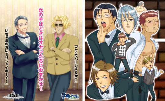
Even after graduation, it seems like they would occasionally invite some of Gakuen Handsome's creators. In 2014, the university tweeted that they would not be able to host the exhibition that year due to renovations, but visitors could take pictures with the cardboard cutouts. There's also an interview from 2016 on the university's website, in which they talk about how things have been after graduation! I absolutely love how the university supported all of this.

Now about the game itself... Where to even start? You'll have to trust me, but the game is actually good. Many parody games can be quite a hit or miss, but this visual novel is something I still catch myself laughing at years later. The inconsistent art, pointy chins and strange jokes really create an experience unlike anything else. I don't think any commercial company would be able to create something like this, even if they tried. One detail that the anime adaptation doesn't really show is that many different artists worked on this, whose styles widely vary from each other, making absolutely no attempt to create one consistent artstyle. Most characters have at least 2 ~ 3 sprites that often look completely different from each other. For example, sometimes Saionji sensei looks like a clean-shaven teenager/young adult, but in the CGs he suddenly turn into an older looking man with a stubble.

Yes he's talking about eating paint in the screenshot above, why not. Anyway... the voice acting in this game is something else I wanted to talk about, because it adds so much to the game. Of course it's not professional, but I think that's what makes it amazing. You can sometimes hear the voice actors trying really hard not to laugh, and they will occasionally completely mess up their lines. Of course all of those lines are kept in the game and they didn't re-record them. I also loved it when they started swearing in English for seemingly no reason. Also, instead of just avoiding the name of the protagonist (who you can give any name you want) they pronounce it... by improvision. Just imagine how one would try to pronounce a "adfgdf" keysmash and you'll get an idea what it sounds like.
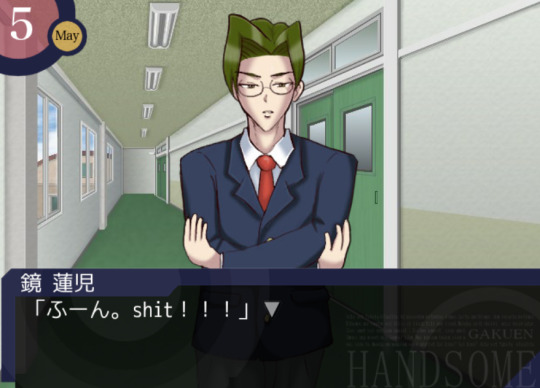
There are 6 characters in this game who you can romance. The protagonist's childhood friend Takuya, who is a bit obsessed with the protein bar Calorie Mate (which is censored in the new version of the game, so you just hear a BLEEP sound), outlaw teacher Saionji, school principal Juro who basically only functions as a save point, student council president Kagami, chuunibyou transfer student Shiga, and last but not least, the captain of the soccer team Mitsurugi, who also murders people with his chin sometimes. The protagonist's sister also has a (non-romantic) ending, which you need to play in order to unlock the extra scenario (which... is a ridiculous murder mystery story for some reason). I also could not find the guide I used a long time ago, so I just looked at some videos on NicoNico to see what others were doing and that worked pretty well...!
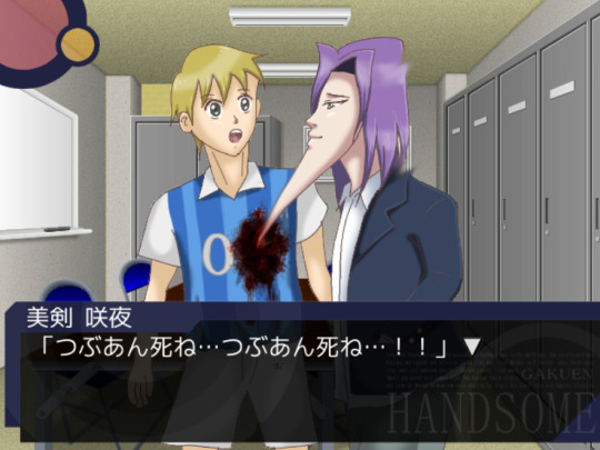
My favorite scene is probably still that one scene in Mitsurugi's route, in which he stabs people with his chin. It's also one of the scenes that gets referenced the most in fanart. The context makes it even more ridiculous, Mitsurugi gets really upset that some people like the chunky variant of red bean paste (tsubuan) and decides they should die. After stabbing his teammate and multiple other people he runs outside. The protagonist however, isn't safe either and also gets accused of being a "tsubuan supporter". If you survive though, you get a chance to marry Mitsurugi!
Honestly one of the reasons I wanted to write about this game is because many people only know the OVA and/or anime, but the game is so funny I think everyone should play it if they're interested. I also think the team behind it has such a funny backstory and I love seeing how supportive their university is. Right now the team is still active on their Twitter account and they sometimes create new content. Last year they released Gakuen Handsome Fighters, a short fighting game featuring the Gakuen Handsome characters.
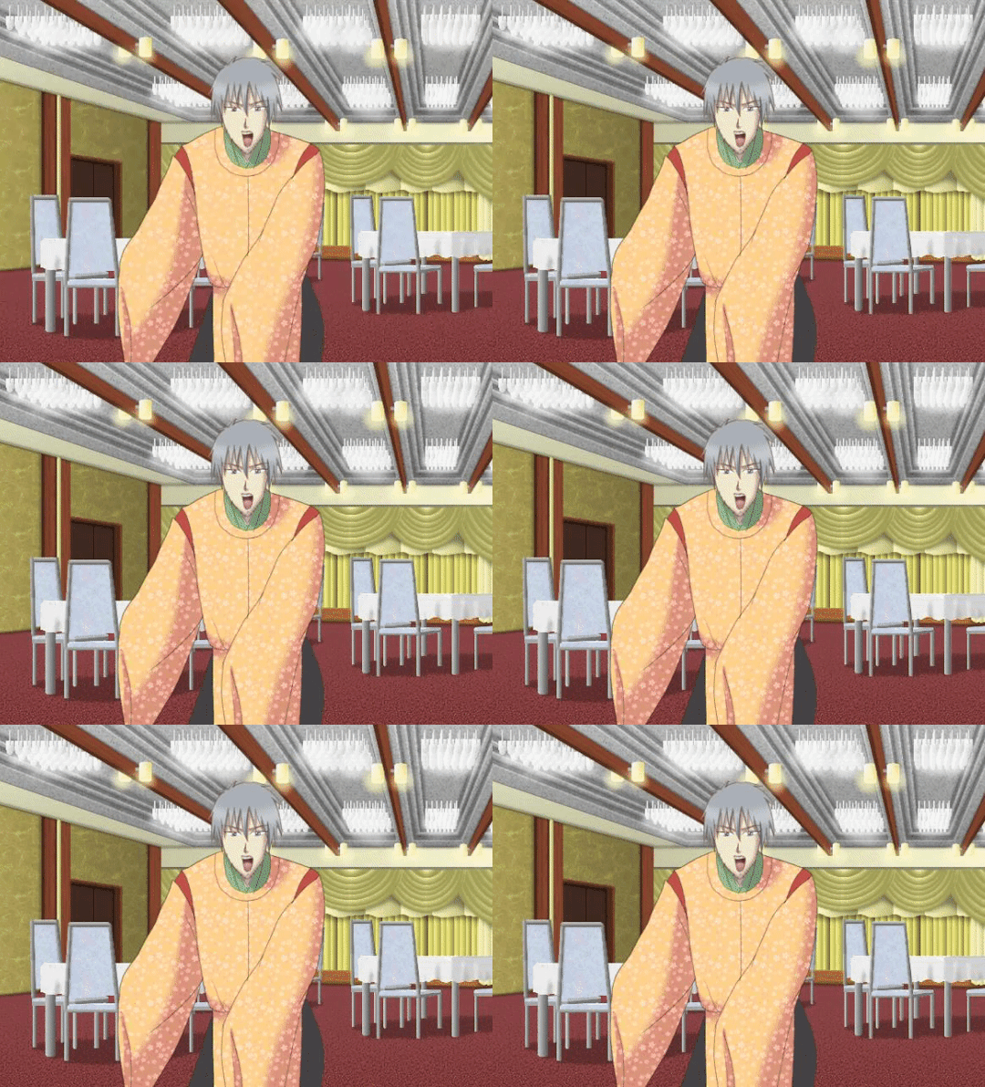
If you are interested in purchasing it, I recommend getting the "Special" edition which can be purchased on DLsite! I couldn't find a working download link anymore of the older version, but I think the creators deserve the support, so I don't regret buying it (it was about 15 USD). It includes the original game and 5 shorter stories which were originally released as smartphone apps. While I think the original game is still the best one, it's fun to explore some of the extra scenarios as well. One of the shorter games takes place in an alternative universe in which the boys live in the Heian period, and for some reason some of the sprites are animated... yeah.

51 notes
·
View notes
Text

Hello welcome to my cave, you can call me Ash/Sky/Asher I'm 23 yo I go by he/they/xem.
☆ Trans+demiboy and enbie, also demisexual
☆ I'm from Italy so my English is broken, I mainly post my art (I'm slow due to my situation at home etc might change later on)
☆ I have anxiety and interacting with others it's kinda hard for me but I'll try my best and my dms are open just remember i take some time to reply.
☆ I'm Nd (neurodivergent) suspecting of having adhd and other stuff.
☆ I struggle with expressing myself so I ask you to be patient, I have anxiety and can be overwhelmed easily so be aware.

My tags:
#ashyrants for when i rant sbt something
#ashyvents when I vent (I don't vent often)
#ashyask for when I got asks
#ashyart or #asherart for my rants
Usually I interchange tags with #Asher or #ashy
#ashyrequests for art requests
(I don't use most or sometimes)
☆ In the future I might open art requests but I'll only draw requests I'll be comfortable with or I'm able to draw. I'm very slow so if your requests isn't posted it's bc I'm taking time.
☆ Art trade are always open (I'm still slow)
I don't take commissions, sorry I don't have enough energy and time for commissions.
My inbox is open but if gets too overwhelming or crowded I might take time. Please don't spam a lot in there, I can get overwhelmed easily. If I don't feel in the mood for answering questions don't be upset. Sometimes I'm here to distract my mind

☆ Fandoms I'm in: Tloz, any linkmeet au, my ocs, dbh, the last Guardian (in the future I want to branch out more) , other Nintendo games and and other games as well. I might be self indulgent and post old fandoms at times.
☆ i like crows/raven and ferrets i might spam sometimes stuff of them, be prepared XD
Tloz games i have played or watched: botw(watched planning to play), Skyward Sword (partially played), Twilight Princess (partially played), totk( in progress), La (to finish)
☆ I'll eventually play the others once I gained more games
On my list: fsa, albw, mm, oot and botw

☆ I'm a freelance artist and my artstyle is very inconsistent (sometimes i draw on traditional), I'm currently working on my own projects and other stuff, in the future I want to start writing.
Currently working on my linkmeetau, my post-botw au and other projects
☆ I'd love to meet new people and new friends but I'm rather shy at times. I'd ask you to use tone tags because I struggle to understand tones most of the time.

DNi:
If you are racist, homophobic, transphobic, no proshippers, no pedos here, being hateful towards other minorities or anything under this line, no terfs!!
Be aware that sometimes I struggle with communicating, please be aware and clear. As mentioned I can get overwhelmed easily so don't be upset if I'm very slow it's nothing against you, I'm just struggling, thanks.
Don't be creepy or parasocial w me, I'm an adult.

Other socials
Insta: @nightraven_asher_art (somehow active)
Cara: nightravenasherart (barely active)
Discord: ash.jinx (if you dm me there please remember that I'm not always online there, atm requests are only for friends, might open them later or just ask)
Divider by: @firefly-graphics
11 notes
·
View notes
Text
I MADE IT TO DAY THREE BABI. Well. I’m writing this on day two but likE same thing, right? At least I’m ahead of the game 💪.
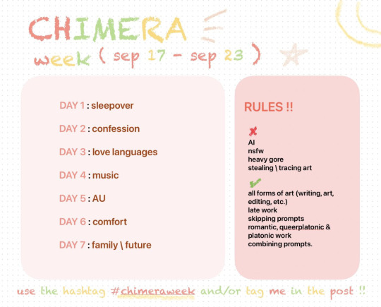
I didn’t think I’d make it this far. Cheer me on. I’ve never finished an art challenge before … I think my artstyle will continue to be the most inconsistent bitch on the planet earth for the rest of this challenge, so have fun & buckle in for that bbq’s.
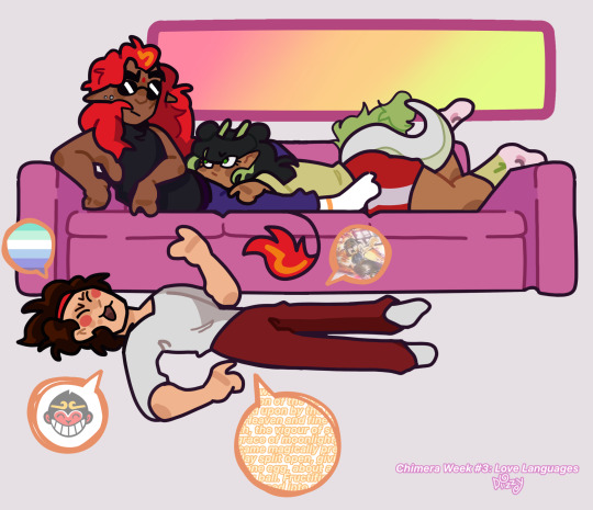
Chimera week is hosted by @//starsbian on twitter, it is not too late to join and feed me more content I promise I promise I promise!!! 🥺🥺🥺🥺
#lego monkie kid#red son#lmk#red son lmk#chimera shipping#chimerashipping#chimera week#ChimeraWeek#chimera lmk#Mei lmk#mk lmk#MK#mei dragon#shipping#fanart#Lego Monkie kid fanart
118 notes
·
View notes