#I have a lot of drawings/process videos like this would you want to see more??
Explore tagged Tumblr posts
Text
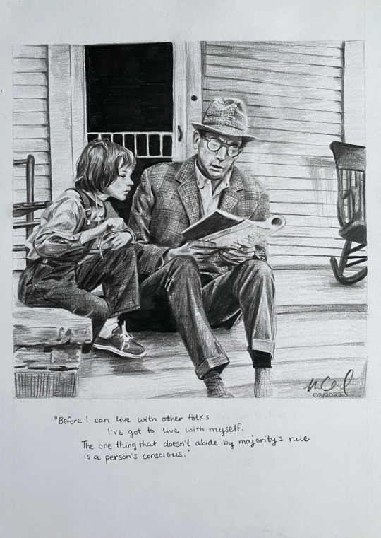
To Kill A Mockingbird illustration & process💓🙏
Tbh I absolutely LOVE doing full illustrations like this…it’s been a while but they’re my FAVORITE THING TO DRAW😇🙏😇🙏 I need to do more…
#to kill a mockingbird#my art#art process#illustration#Atticus finch#scout finch#yes I am stupid there is a typo in the quote😭😭😭😭😭😭😭😭😭😭😭😭😭#but I wrote it with my 14b pencil which is impossible to erase🤡#tbh I did this in 2022? I see things I would fix/do differently now#I have a lot of drawings/process videos like this would you want to see more??
127 notes
·
View notes
Note
Would you be alright to ask how you found out that you had executive function disorder?
Basically my entire life I have been known as a serial procrastinator without any real explanation. When I was a kid I had a lot of trouble taking care of basic things, and I would constantly shirk chores and school assignments and really anything in between, but if you actually asked me why that happened it was never because I didn't want to do them. It even extended beyond obligations. I still remember not quite understanding why I couldn't ever finish drawing a comic, or start a long-term project and see it through to the end. I would start fanfiction and then just leave it within the first few paragraphs. I literally had no reason, and in fact it always sincerely frustrated me that I just couldn't bring myself to do things that should be really easy. I genuinely believed for my entire childhood that I was just kinda lazy and I held on to a lot of guilt for that. Of course, the problem really started to settle in a new way once I realized that I was in my early 20s, living on my own, with every reason to have grown out of it by now, but it still never got any better. I still struggled with doing things that I knew would only take a couple of minutes, I still ached over projects that I had no reason to not just start making but couldn't quite pull myself over the barrier towards actually doing it. And I still had no explanation that wasn't just "I am fundamentally broken and unexceptional". So, once I was living on my own and the problems really started to compound (since, yknow, not getting anything done holds A LOT MORE WEIGHT when you're an independent adult), I decided to look for other people who were going through these things and see how they managed it. I eventually ended up on a YouTube channel called How To ADHD where the host made a plethora of videos that all just instantly clicked with me and seemed to explain so much behavior stretching back all the way to my childhood that I NEVER had an explanation for. Everything she talked about was like, one-to-one my experiences. So then I basically immediately started the process of actually getting an official ADHD diagnosis, which I have now since gotten Twice.
1K notes
·
View notes
Text
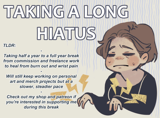
I'm going to a post full details under the cut, but a short run down:
I've sort of vaguely mentioned this here and there but this year I'm forcing myself to go on a long hiatus. Its been something in the plans for years now, but I can't put it off any longer because 2024 was the worst wrist pain I've dealt with and I don't want to risk permanently damaging myself if I haven't already.
If you're waiting on a comm, don't worry! My hiatus won't officially start until I've finished them all up (estimating April-May to finish up everything), so just bare with me!
Character Sheet comms are staying open
If you're able and willing to support me during this break, please check out my shops or my Patreon!
Ko-Fi - Physical/Digital Merch + Donations
INPRNT - Physical Prints
Patreon - Process Videos and WiPs
Full details and extra info under the cut
So this has been a long time coming but this year I’ll be taking a long hiatus. This is something I’ve wanted to do for years but I can’t put it off any longer due to how bad my wrist pain was in 2024. I’m feeling incredibly burnt out as well and my turn around times growing longer and longer is a very clear sign of it. It also means I’ve had a growing anxiety that if I continue at this pace I will end up doing permanent damage to my body, if I haven’t already. Creating art is the one thing I know I want to do for the rest of my life, be that drawing for myself or helping other people see their visions come to life, and I don’t want to put that at risk.
So I can’t put my hiatus off any longer and I’m making this year the start. If you are still waiting on a commission from me, don’t worry! I am going to keep working on them and my official hiatus time won’t start until everything has been finished up. I’m estimating April to May to get everything cleared off the table since I’m going to work at a steady pace. Character sheet commissions are going to remain open, they are not in high demand and I can put them in a queue and so should anyone have interest in one during my hiatus, it could be something I pick up when I need the extra cash. However all other types of commissions are going to be unavailable for the foreseeable future.
I am aiming for a 6 month long hiatus at the least. If I can go longer I will aim for a full year break. Freelance and commission work has been my main source of income for over 10 years now, so during this time I may also look into getting a part time job so I don't have to rely so heavily on art, which will also affect how much I’ll be able to take on in the future. I’m not quitting art during this hiatus, I do want to keep drawing and creating! But I will be working at a slower pace, creating for myself, experimenting and trying other projects. I also have more merch ideas on the list to work on! I’ve got some plush designs I want to have made,namely a new Zenos plush that will have doll fiber hair that can be brushed and styled.
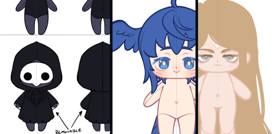
I will also design more tag style keychains with more XIV characters (like the Scions and other major NPCs), since people have really liked those a lot! I’ll also plan out some other ideas and maybe design some original design plushies or other merch. We’ll see!
If anyone enjoys my work and wants to help support me during my hiatus, please check out my available merch. I have prints on INPRNT, and a variety of items on Ko-Fi (limited prints, artbooks both physical and digital, keychains, stickers, etc.), I also have a patreon where I post process videos of illustrations. You can also drop donations of my Ko-Fi. I will be adding a goal that I’ll set at a high amount I don't expect to reach, just because I personally want a visual of donations or purchases during my break. Even small donations would mean a lot. If only 10% of my followers on twitter or tumblr bought a single Ko-Fi donation, it would be a substantial amount of money. I say this not to guilt folks into donating, but to point out small donations can still have a lot of power. And so I appreciate any support at all!
Thank you so much if you read this entire message. It means a lot to me and I hope a good long break means when I’m able to get back to commission and freelance I’ll approach them with much more vigor and skill!
328 notes
·
View notes
Text
I use a trick in my art that I don’t see people talk about often: erasable pens!
Most people seem to use pencil to make their guide lines, and then go over what they want to keep in ink or paint. I’m a watercolor painter, though, and if you go over pencil with watercolor paint, it seals it in.
If your pencil drawing is good, that works out fine, but my drawings are not. I don’t draw freehand, so I’m usually tracing a reference image. In addition to my lines, I mark out where my shading and highlights are going to be, which is all very helpful when painting, but I don't intend on keeping it in the final image.
This is where my Pilot FriXion pens come in.
They're "erasable" pens. They've got a rubbery bit on the end of them, you rub that on your pen lines, and they erase. But how it actually works is using the heat from the friction to somehow turn the ink invisible... which means you can skip rubbing the eraser on it, and just use heat directly, such as from a heat gun that a lot of crafters have (or just a hair dryer will do the trick too.)
As you can see in the video, I drew out some shapes, and then painted them with watercolor paint, using the lines to put my paint where I wanted it. Then I point the heat gun at my paper, and you can watch the lines vanish, leaving just the paint behind.
What this looks like in my process is this. As you can see, I've outlined all the lines of my subject's face, but I've also got areas that I filled in to indicate where I would need to shade more heavily, like along her jaw, on her neck, and in the inner corner of her eye; I also created directional lines for a crisscrossing pattern on her bonnet.

In the final version, once I was satisfied with all my painting, and I had gone over the lines I specifically wanted to keep in a permanent pen, I pointed the heat gun at it and watched the lines disappear. Now only the shade remains, and the pattern on the bonnet isn't as harsh; I've also used the pen to let me paint a plaid pattern on her cape.

If you look closely, you will see the shadow of lines within the shaded parts. Sometimes, the indentation of the pen tip on the paper will cause a slight relief drawing situation even after the ink disappears. You just have to remember to draw lightly.
I found the pens at Target for not too much money in the 0.5 size, and I just got some 0.38 finer line pens since I need to do more detailed work on my current piece.
Anyway these are SO easy to use, and I really enjoy being able to do art at the skill level I'm at, and doing it like this allows me to. Have fun with art!
525 notes
·
View notes
Text
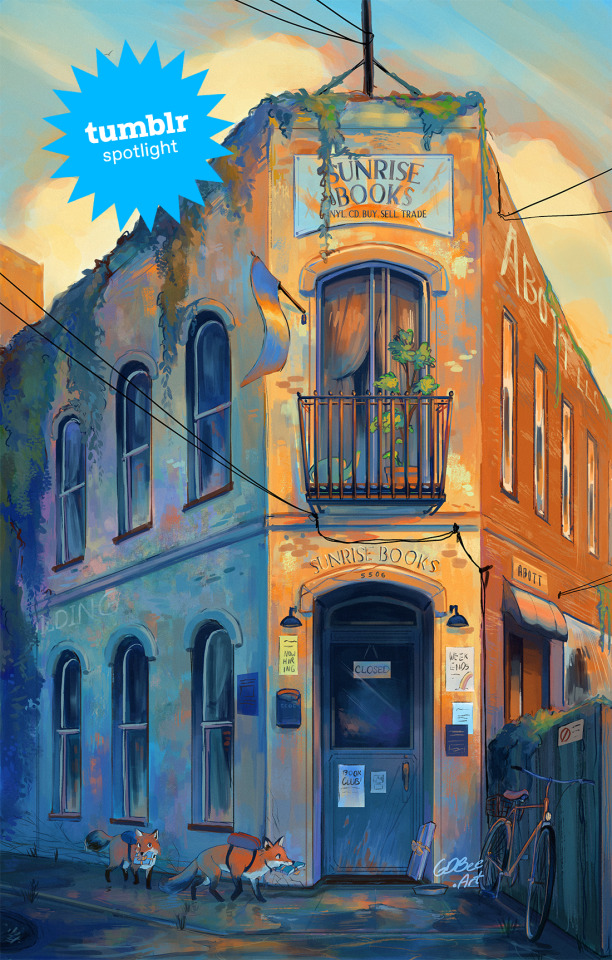
Creator Spotlight: GDBee Art (@prinnay)
Geneva Bowers is inspired by the wonders of the natural world around us, and enjoys manipulating colors to create art full of mood and feelings.
Check out our interview with Geneva below!
How did you get started with art? Did you originally have a background in art?
I’m going to say yes because that’s all I’ve known how to do. It started because I wanted to draw better horses than my sister, and it just spiraled from there. People started asking me to draw things because they saw me drawing horses. I was like, well, I can draw things that aren’t horses, and then it was just kind of all I did.
Have you ever had an art block? If so, how did you overcome it?
I have one right now! Honestly, with time, and I also collect art books; I think I have a couple hundred. If I really want to draw something, then I just flip through those and try to steal some ideas.
Which three famous artists (dead or alive) would you invite to your dinner party?
I mean, of course Van Gogh…I’m really inspired by Impressionism and Post-Impressionism, so I would invite Van Gogh, Monet, and Julie Dillon to a dinner party.
Have you ever wanted to dive into another medium before?
Yeah, actually, I currently am! I’m trying to do more traditional painting. I used to do a lot of acrylics, but I haven’t done it in years, and now I’m kind of bad at it. I’m trying to get into actual impressionistic art with oils and oil pastels. I’m like failing, but you know, you get there. Just fail until it looks presentable.
If there is one thing you want your audience to remember about your work, what would it be?
I guess it’s more of a feeling. I create art because I’m inspired by things around me, like certain video games. For example, I have been inspired by a Japanese RPG called Chrono Cross on PlayStation 1. They make me feel a certain type of inspiration to create something, so that’s kind of like what I’m hoping to leave behind.
Have any of your projects surprised you with their outcome?
Yeah! I did this Weapon Faerie series where I took three prompts: a weapon, a winged insect, and an herb, which I combined to make different characters. So, a faerie with a spiked club or a butterfly faerie with a katana. I made 13 of those, and they kind of took off! I wasn’t expecting that at all.
What is the hardest part of your process?
My whole art style is coloring, like the way it’s colored… but I hate the coloring process, haha. I like doing the color combos, but I don’t like the blending and shading. That takes like one-trillion years. It’s the part where I’m most likely to give up. You know how art kind of looks ugly before it looks good? I’m trying to trust that process.
What do you wish you knew when you started creating art that you know now?
I guess one big thing would be knowing how to use lights and darks. When I do color, it is definitely colorful, but when you switch it to black and white, you see that everything’s the same tone of gray. I’ve learned that if you just use some brighter colors and some darker shades, you create a bigger impact in the end. So, now, when I paint something digital, I make it black and white for a moment to see where all the hues are, and if something is weirdly dark or not dark enough, I can change it.
Who on Tumblr inspires you and why?
Oh, @feefal definitely inspires me. She does a lot of spooky art.
1K notes
·
View notes
Note
Any tips for new or returning artists?
I’m hoping to discover my own art style this year (from scratch, no references) by just throwing myself into learning anatomy, drawing random characters, and praying I can figure out how to add depth to pieces.
I have very minimal artistic experience and my work has improved significantly from where I started years ago, but not even close to where I’m hoping to be.
I can freehand faces and tweak the anatomy accordingly but I feel limited. Maybe it’s (in part) because I’m using an iPad, apple pen and Procreate? I recently added the paper-feel screen cover and that’s helped significantly with control.
Do you draw on paper to help your muscle memory? Honestly, ANYTHING helps. I watch videos on anatomy and art all of the time — I just don’t know if my brain is absorbing it correctly 😭
Hello! I don't know if I can say anything in particular to the returning aspect of your situation since I've drawn pretty consistently all of my life, but if someone else has had that experience of picking the skill back up after a long break, feel free to share your thoughts in the replies!
I'm not fully sure what you mean by "hoping to discover my own art (...) from scratch, no references", but if it means trying to whip up a style from thin-air and blocking out all outside influence or take any inspiration from existing art that you like... Uh... Don't do that! I don't see the benefit. All art is a derivation of a derivation, I can assure you that by compiling a folder or collage of your favorite works, borrowing and reworking aspects that you like, you WILL land on an original style and have learned so much more about it in the process than if you hadn't done that at all.
Also I can assure you that drawing on procreate/ipad is not a hindrance whatsoever, plenty of professional artists prefer it over display tablets. @wolfskulljack-art comes to mind as someone who has created several incredible tour posters for Metallica, all in her ipad.
I must have drawn on paper a total of 10 times in the last 5 years, I have no idea if that's bad or not... It Probably is, but I'm at peace with it, LOL. Generally when it comes to improving ( and I know that this is a frustrating answer) the secret is to just draw a lot. There is no class that is going to take you from amateur to Caravaggio, it takes time and takes making "bad" art. A lot of bad art. When it comes to learning anatomy, I think the best thing you can do is draw a lot of real-life human bodies from reference while consulting an anatomical diagram or model of some kind. Otherwise you will just making a bunch of lines without ever understanding their purpose.


I don't think you need to be an expert at the human body AT ALL before jumping into stylization and making confident, art, but if you do something like this whenever you draw I think you will end up learning a whole lot. Muscle memory (no pun intended) will come to you naturally!
I also have a lot more tips in my #tutorial and #advice tags that you can look through if you want to, otherwise, I would tell you to just do more drawing and less looking for the perfect tutorial or golden advice. A lot of artists get very boggled down in learning in the most correct and effective way, and while there are pointers that can be given, they tend to be very straightforward🤷 and the rest falls on you to follow through with!
265 notes
·
View notes
Text
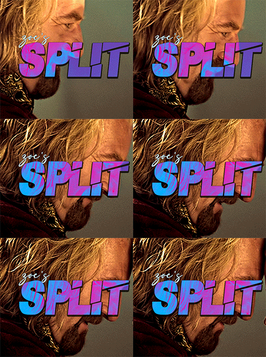
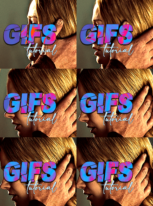
i always get questions when i do a split gifset, and it's a deceptively simple process so i thought i'd try to show how i do it! i don't know if these types of gifsets have a more universally recognized name, but that's what i call them so that's what i'm going with.
i'm going to write this assuming you have a solid familiarity with photoshop and making gifs, but please feel free to send me an ask if anything is unclear. i use video timeline/smart objects so will be showing that (here's a great general tutorial on giffing with timeline). i will also be talking A LOT about gif dimensions, so first let's briefly go over the limits and theory a little bit.
a 1 column gifset can accommodate gifs 540 pixels wide
2 columns = 268 pixels each with a 4 pixel gutter between
3 columns = 177, 178, 177 pixels with 4 pixel gutters
i'm mostly going to talk about 2 column split gifs here (what i will refer to as 2x1 from now on - 2 across and 1 high), but the process is the same for 3 column (3x1) and so on (1x2, 2x2, etc).
so, why would you even want to make a gifset like this? i mean, let’s face it, generally, bigger is better for gifs on tumblr, and there are obvious incentives to 540 width gifs over 268 or 177/8 width, especially since the upload limit went to 10MB. but even 10MB isn’t much when you’re talking about high quality footage. gif making is a constant balance between quality (whatever that means to you: frame dimensions, sharpening, coloring, etc) and file size. split gifs are a cheat to that limitation >:)
i personally believe an untapped frontier of tumblr gifmaking is playing with dimensions and time. that sentence makes me sound like an old-timey sci-fi villain, but you get the idea: gifmaking is an art and there are many fun and interesting ways of exploring the medium. you can do a lot with 268 pixels! longer frame loops to gif longer scenes unbroken, bolder coloring on a wide shot you don’t want to pare down. and, a shorter x axis means the y axis’s bang goes a lot further on a buck. also just if you have a 2 column set but only 5 gifs so you need to make one take up 2 slots. there's a lot of reasons but the most important one is it's fun :) here are some examples of other split gifs i've made: x, x, x
this isn't so much a limitation, more of a shift in how you think about gifs, but it's important to remember that each gif should ideally be doing something still. when making split gifs, it’s easy to pick a wide scene without thinking about how it’ll be split down the middle, and then you’re left with a lot of something on one side and a lot of incongruous nothing on the other - or you're left with a person cut in half awkwardly in the middle. so while a split gif can still be a whole scene, you shouldn’t ignore the break and what it means to the bigger picture. now this is personal preference, but i like to play with the break and make it a part of the gifset. mirrored movement, subjects trapped on either side but still talking to each other, a bird flying from one side to the other. fun with frames! it can be another way of drawing attention to specific images/moments/feelings happening within the same shot.
SIMPLE SPLIT GIFS
to more narrowly define what i’m calling “simple split gifs,” it’s one set of frames split down the middle into two separate gifs that are meant to play concurrently, side by side.
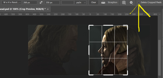
first thing's first, crop your gif and uncheck delete cropped pixels if it is not already (very important). i'm cropping it to the 1x1 size, in this case 268x350. if you need to see how the full size will look, you can try it out with 536 first. but this one is pretty easy, this is the exact center of the frame (the left boundary of this crop is the center line) and both their heads fit within their respective 1x1 crop.
then color as you normally would. if your scene is very different one side to the other, it might be easier for you to color on a wider crop and then either crop again or copy paste your coloring to the smaller crop version. i do that with the 2x6s, but it's usually not that big a deal to color the 2x1s with just the small crop on your canvas at the time. this scene is very symmetrical, both in movement and colors, so i'm good.
now the fun part! once you've got one side how you want it, save/export as you normally would. at this point i also like to make a mental note of how many frames there are.

so i have 49 frames and it's still only ~3MB! this is just an example that i picked from my rotk fancy set, otherwise i probably would have made this gif longer.
then onto the other side, so i ctrl + z my way back to my smart object video timeline. to get to theoden i just drag and drop the smart object 268 pixels over. since this one is in the exact center of the image, it even helpfully guides me (this can get annoying if you are NOT giffing the center of the image fyi, but you can always manually go pixel by pixel too if you need to with your <- -> keyboard buttons. just always remember where you started and count accurately). i can never move around my smart object without hiding the adjustment layers on top of it, so you'll see me do that in this screen recording.
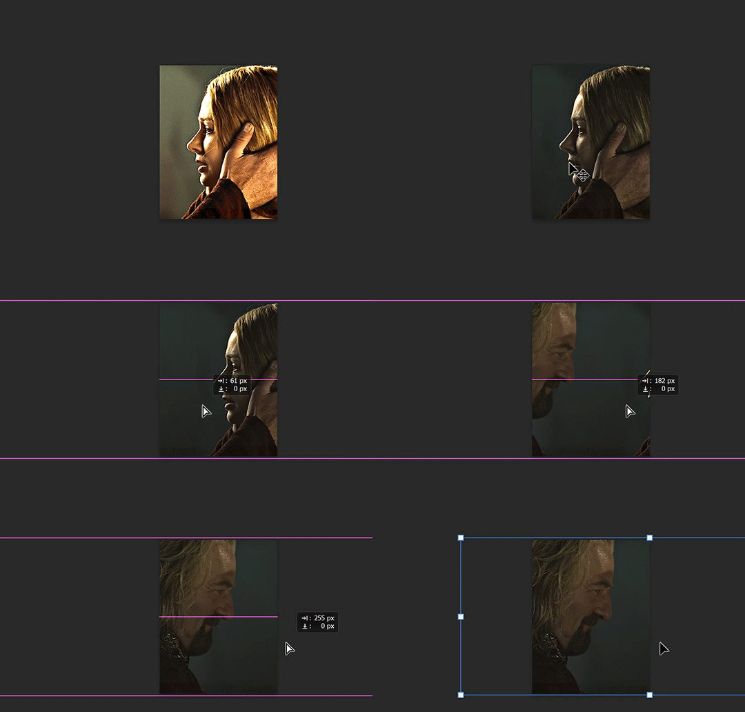
see how it corrected me when i dragged it a few pixels down by accident, and with all those pink guidelines? sometimes photoshop is good 😌
then make sure you still like the coloring, adjust whatever needs to be adjusted, but watch out! don't make any major changes because it still has to match the other side. and export again.

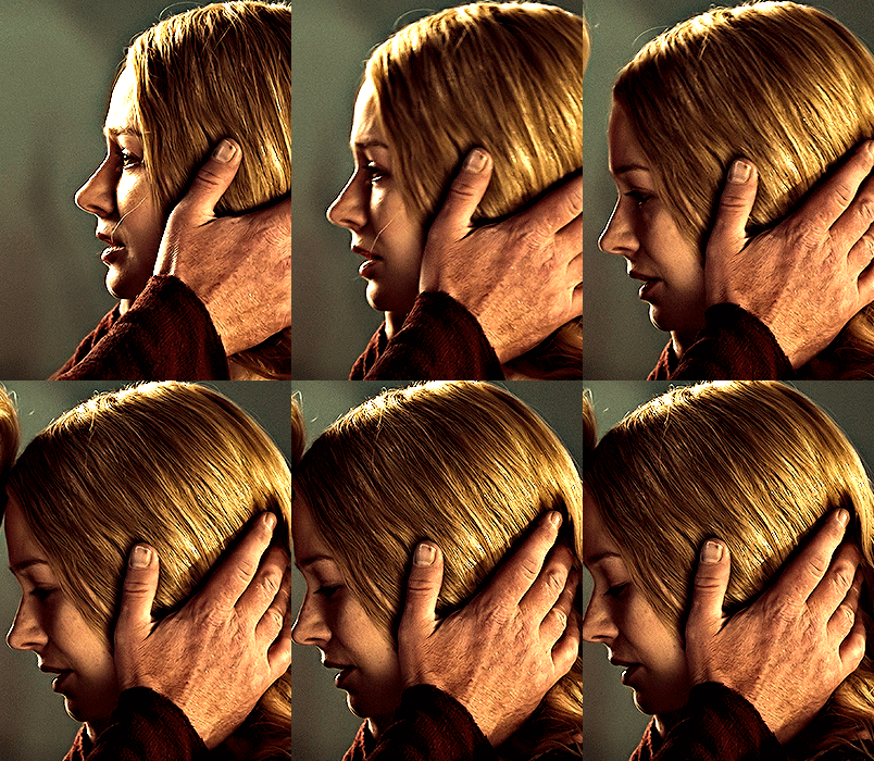
what we perceive as 1 series of frames chopped down the middle is just 2 separate gifs with the same frame rate. when tumblr loads the images, it will run concurrently in the post (even though it never does in the draft post 🙄). and that's it!
COMPLEX SPLIT GIFS
again i'm making up terms, but i call anything with more than 2 components a complex split gifset. i've tweaked some things in the process as i went along, but this is generally how i did the lotr series. these sets are basically just many split gifs with transitions. and here's where endurance becomes a factor :) there's a lot of prep done blind. but if set up well, it will be fairly easy to pull together by the end.
first i decide on my dimensions, using my upper bounds to determine how big i'm going to go. since lotr has very nice large file sizes, i can go pretty big without sacrificing much in quality. i decided on 3 rows of 350 pixel height gifs and it's worked well for me. that means my biggest gif will have a total height of 1050 pixels - fun! you could also do 8 rows, with two 2x2s or just a series of 2x1s that transition to 1x1s. there really is no limit to this except your imagination and source material.
i cap everything i'm going to use before i even open photoshop, then do all of them at once. uncheck delete cropped pixels, then i make my gifs! this is where i spend 90% of the time on this set. every gif should be the size of the smallest 1x1 gif (268x350 for me). i make all 10 into a fully colored, separate psd. (and then i usually go back through all of them a few times to get the colors to match better 😅) for the bigger ones (2x1: 536x350 and 2x6: 536x1050), i just crop them as if they were 1x1 but always thinking about how they will look when big. this gets tricky when i do the big one :) my lazy workaround for that is to basically make it twice: one cropped as it will be and one full size for me to color. then i copy and paste all the coloring layers onto the small one and voila, i know that the coloring in the upper right slice will also look good on the bottom left slice 1050 pixels away because i saw it on the full size version.
coloring is probably the biggest thing i'm thinking about with this kind of set. the whole idea is that these gifs are using the same colors, more or less, throughout each phase. even with the 1x1s, they're still part of a larger color concept, and they should (🤞) work with each other.

in a pinch, i like to eyedrop a color from one gif and add it as an accent to another. one of my 1x1s had a much more muted color palette originally, but i wanted it to have deeper blues and yellows to complement the 1x1 that would go next to it, so i added some gradients on lower opacity over it, color picked from other gifs i already colored.

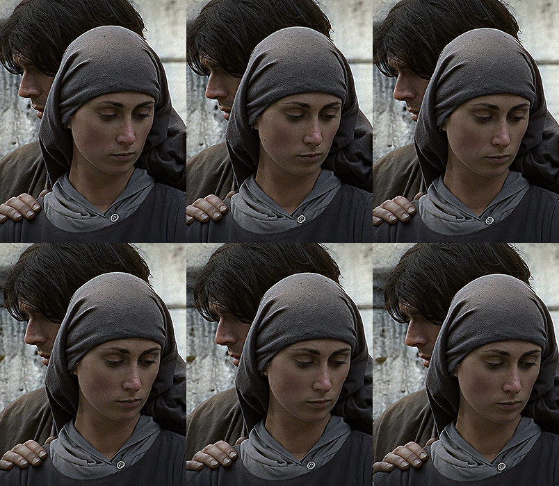
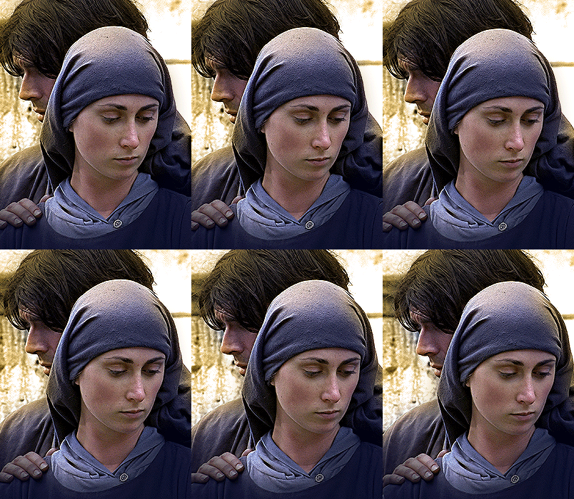
i keep my coloring and the smart object in separate folders to help me in the final step of combining everything, and then i trim everything down to my lowest common denominator of frames. you might think you need to keep frames pretty minimal if you're doing 3 phases with transitions like this, but there's more room to work with on a small gif, in terms of file size. i usually do 30-50 frames for each phase, with the assumption that i'll be adding a transition on each side of each gif that will eat up some frames (i usually do 4-6 frame fade transitions). for the rotk set my final frame count was 129 and i never went over 8MB on a gif, so there's plenty of space play around with things :)
and then, combine! whatever order you start with, you are stuck with (unless you're getting even more complicated, but we won't go into that lol). for these sets i go small 1x1 -> medium 2x1 -> big 2x6. i like to think of it in phases from this point on. small is the first phase, then medium, then big. then i put in the fade transitions, chopping up the first phase gif so the last one will fade into it, restarting the whole cycle seamlessly. i'm just doing a quick and dirty fade here, but here's a tutorial if you want more explanation on transitions.
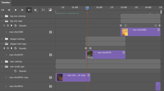
at this point i save this psd as its position, "top left" or whatever (usually it's a psb by this point too 🥲), just in case i need to go back to it. then i export this first gif and move on to the rest.
it's the same concept as a simple split gif: drag and drop the smart object to the new position, but now there are multiple phases to keep track of. folder organization has been key for me to keep everything straight. i move through the gifs in a backwards S, starting with the top left. but you could go any direction, just gotta stick with it and remember your counts. in my case, i'm always thinking of 268 pixels over and, for the 2x6, 350 up/down. it's a tedious process, but it goes quick (apart from waiting for photoshop to load each time you export).
i did this series as a color concept aesthetic kind of thing, so my theory was by using the same-ish colors throughout, that would save me in the end when it came time to export. there's only 256 colors max to work with on a gif, and that's usually what gets me over the 10MB limit. but as i said, i have never even gotten close to the size limit on this series. it's pretty hard to reach the limit on 268 pixels, but not impossible. (i did run into that on the emma set i did, and that was hell. but also not an impossible fix in the end.)
and that's it! if you try any of this and have trouble, i'm happy to help if i can but mostly this is a "click around and see what works for you" kind of process. and feel free to tag me on your split gifsets :) i love seeing them <3
#*lotrsplit#*#split gifs#gif tutorial#photoshop tutorial#usergif#allresources#chaoticresources#completeresources#photoshop tag
293 notes
·
View notes
Text


Nicktoons unite main 4 in their respected styles ( minus jimmy neutron i'll explain more below)
i feel very mixed about these but it was still fun either way studying all of these cartoons respected styles. the final does make me happy, seeing all of them together ^__^ 💞
below i will explain my thought process working with each style so get ready for a wall of text:
first before anything you may be asking: why no jimmy neutron style!? it's because i tried and gave up! i was starting the rendering process for timmy and i hated it so i just didn't continue! no point of making myself miserable for something thats harmless fun style studies. but have these as a little treat:


Fairly Oddparents style: the easiest style to work on and research for, fop style is not that complex. i should also add i didn't draw each style in one sitting i drew each character together and then edited them all, so that might be the reason why some look better then others, i just got good. but i'm saying that because the character i started with was spongebob! specifically because i was tired of ppl thinking dp style and fop style are the same and how spongebob would look the same in both styles, just a flat square. which is wrong! fop style is very different! i would prob describe it as a flat paper style. has sharp and rounded thick lines. the main source of research i used for it was the designer for fop was Ernie Gilbert. he has designed a lot of iconic characters for the show and i highly would check out his work, this is his website
Danny phantom style: now this one was tricky, prob the hardest one to figure out and i honestly don't think i really DID figure it out. the possible reason is i am still trying to go through the show atm myself, but i'd doubt it. they all just look off to me, just a little. which no need for me to work myself in a circle trying to make it "perfect". im no professional character designer! especially not Stephen Silver.
Spongebob Squarepants style: this one was tricky but in the opposite way to dp style, where i didn't know what to reference! to start off the show is mainly nonhuman characters, so finding character refs were hard. the refs i did use were the mermaids and the superheros, so i used that for timmy. but in the middle of working on jimmys i was watching a video of someone ranking every single spongebob ep and TURNS OUT in the later seasons, i think season 13, there were human designs! (technically elfs but whatever).


and weirder thing is how they draw patchy but im not going to get into that. i am assuming that style is for characters that are supposed to be real life humans up on land in that universe (but why not just use real life humans? idk, maybe tom kenny is getting to old for the role). BUT ANYWAY, i used the elfs for a main source for jimmy and danny, they turned out a lot better then the timmy in my eyes. i wanted at least one of them to have the black eyes but they all have bright blue eyes and the show usually always colors blue eyes. i get ahead of myself cause there was a lot more factors i still had to figure out. like the line art. the show doesn't have a clear line style like dp or fop, its just relatively consistent medium lines. so i just went with more recent show stuff then older stuff since it's HD.
ok but thats basically it, i can prob go on more but i'd feel no one gaf. i made these for fun and it was fun making them! i love all of these shows a ton so it was nice looking up the designers and artist for these shows. support the artists!!! fuck bitch fartman!!!!!
#nicktoons unite#nicktoons#nickalodeon#spongebob#spongebob squarepants#danny phantom#danny fenton#jimmy neutron#jimmy neutron boy genius#timmy turner#fairly oddparents
362 notes
·
View notes
Note
hello!! i love your art so much, your colors are beautiful and your characters are just so 👁️👁️ and i adore seeing them on my dash :)
i had a question about how you do the details on your fabrics: how do you keep the patterns on clothes on a body looking so,,, clean and readable while also making it make sense on the form under it?
like the cape/sleeve(? idk what it is but it looks cool as hell) on the magnolia commission pattern looks so cool and it's still readable on the fabric (like, if i wanted i could probably do a silly sketch of it) BUT ALSO it seems to make sense with the folds so it doesn't just look unnatural and stiff?
i'm so sorry this is kind of a long ask but like. would you be down to talk about your process for patterns on clothing? it's cool if you're not, that's totally fair, just figured i'd ask
have a wonderful day!!
OOOH Thank you so much for the ask!! I wanna do a more in depth tutorial, but I tend to make patterns in two different ways, with one being fully hand-drawn and the other playing with mesh transforms or the... Uh, liquify CSP tool? Let me find examples

This is an example of a fully hand-drawn pattern. No trickery here- Only trying to eyeball everything. It's kinda a lot of work to draw it manually, but it's the more convenient option if the character I'm drawing doesn't have files for the patterns, or if the files are a bit too different from my usual style, as they could potentially not look great with my linearted or painted style
And then- For cases such as Nolia's cloak, I did the entire pattern as a separate file, then placed it using Photoshop's mesh transform!

Here's a WIP file from when I placed all the patterns after finishing the lineart, where you can see them in full contrast. I tend to keep my patterns in different files- The black parts here are not joined with the base color of the cloth, so I can bring nice highlights and texturing when they're meant to be golden inlays, for example. Now, the Photoshop mesh transform is a bit finnicky to use, and I don't have any proper step by step of it- I could potentially record how I do it someday. But let's take the humble cylinder and demonstrate it quickly:

So, the mesh warp tool is the one on the right- You can see these sort of blue lines creating a mesh. I'm sure CSP has it in it's pro level or something? Correct me if I'm wrong. You play around with the different sections, move it to the right place, and put it on the cylinder. This is a very simplified form. You can make many subsections to your meshes (that's 3x3- you can have stuff such as 20x20) for when you have multiple folds.

And then you can just shade your pattern accordingly so it fits the volume of the drawing, and- ta-daa!
This is by no means an easy method. Sometimes you can get away with the Liquify tool (which CSP has and it's very decent), which I've used when the pattern in question was over a simpler surface with few folds. It takes some practise to use that well, and it isn't gonna be the best for complex ones, but it's also an option. Let me do a lil compilation of some patterns I've done and which tools I used for each!
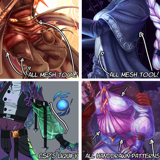
The tool I use highly depends on the time I have, the level of finish for the drawing, and so on. CSP's liquify is probably the fastest but gives simpler results, drawing them manually works better with some styles and more organic/less geometrical patterns, the mesh tool takes a bunch of time but it's great for small repeating patterns that are meant to be very precise or geometrical.
If people would be interested in it, I may someday do a video tutorial of me doing a pattern and then putting it over a folded cloth. I do hope this can help a bit tho!!
116 notes
·
View notes
Text
Villainous x reader who's a sleepwalker (someone who moves, speaks and walks in their sleep)
DR FLUG🧪:
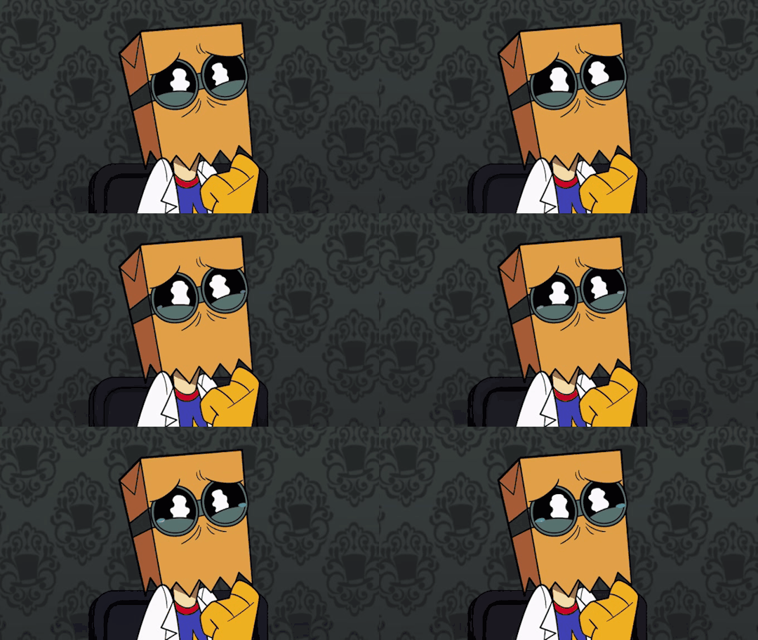
First time he found you walking around the manor at night he though you were suicidal. He was scolding you when he realised that your eyes were closed and that you were asleep.
He's the one you can trust to actually protect you from yourself when you are wandering in your sleep.
Every time Flug catches you out of your bed at night, he carefully guides you back trying not to wake you up.
I won't deny he hasn't experimented a bit with you in that state.
After the first night of the discovery, having already processed your strange behaviour, he started following you without interacting, observing what would you do or where would you go.
The experiments had determined that sometimes you formulate complete sentences, though really incoherent or direct nonsense 🤌👀
Some examples of what he has heard coming out of your mouth are: "omellet, picke omellet please." "Help wanted, this ship is empty" "yes sir the cow is asleep".
Those are some examples of the bullshit you are saying while asleep.
Flug is the typical dude that is taking care that you don't end up in some kind of mortal danger. 🫂
Will actively try to make you go to your room again and if he doesn't manage to do that, he will try to tie you up in the sofa or smth.
Overall, he is the one who worries about you the most and the only one who will not reprimand you in the mornings.
Talking about mornings. When you manage to wake up the next day, having a little bit of headcahe (you've been hitting your head with door frames all night) he will try to encourage you to lock your bedroom at night.
He's really curious about what the hell are you dreaming about. I mean, the shit you pull at night are really some piece of work, he's curious 🤨.
You have asked him to give you a chest camera so you can record what you do at night. You guys watch it together once a week.
All in all, he is the only one who actively care for your well being.
DEMENCIA 🦎:
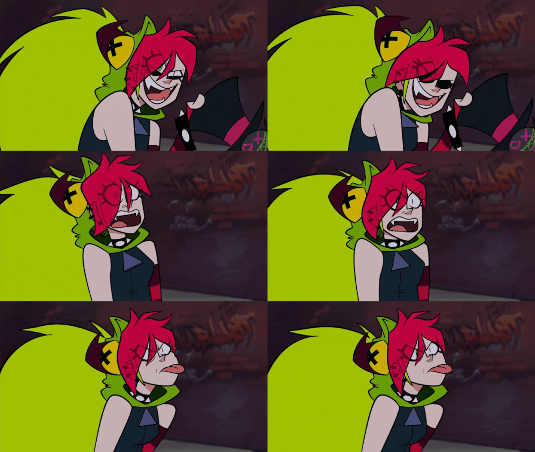
A menace.
The moment she realises you're sleep walking, the moment she starts messing with you in your sleep (but lovingly ☺️)
If she sees you get to close of falling through a set of stairs, she will stop you so you don't accidentally break your neck.
Demencia draws stuff in you face like a fake moustache or something written like: Dem is the best. (When you wake up and realise that the marker is permanent you are going to seek vengeance)
Has a lot of videos and photos about you, and of the constant nonsense you spill.
At night, whenever your talking in your dreams and saying the most outrageous and out of pocket stuff, shes there listening to you.
And the worst? She will answer and keep a conversation with your sleeping self.
Smth like this:
Reader: *mumbling* ketchup pajamas are in the cabinet on the Pacific. The Italians have been slaved.
Demencia: yeah girl you go!! Fuck that Mario plumber 🪠
Will not shut up about the shameful shit you do while sleeping. She's laughing at you and mocking you but will still vigilantes you in case you get to risky at night.
She will lend you her straitjacket some nights so you can be safe at one place without the risk of waking up in a forest. 👌👏
In conclusion:Demencia will have WAY more fun than Flug with your condition but still acknowledges that you can get hurt and tries to avoid it. (Almost always)
BLACK HAT 🎩:

He didn't really know how to react the first time he catched you wandering his manor at night. 🧐
Just as Flug, he though you had a death wish but also quickly realised, by your apparent drunken walk, that you were asleep.
Doesn't really interfere at first, just follows you and quietly watches. BH is genuinely entertained by your strange behaviours.
Has tried several times to interpret your mumbling and murmuring but at some point he realised it was complete gibberish.
You somehow managed to enter his office at night from time to time. (Apparently you know how to pick locks while sleeping 🫣🤗)
One night you were on the floor against the wall of his office saying something stupid he could barely understand when you suddenly started changing languages.
Reader: Yeah, stop it mom this is not guacamole. Sabes que no me sienta bien para el páncreas und ich habe Magenschmerzen. Bitte Krabbe. 🦀
BH: what the fuck-
That when black hat wanders why did he even let you in (he didnt, you picked the lock again)
After understanding your apparent almost suicidal way through his home he started to block some doors from your acces so you couldn't reach a tortuous death.
Once he catched you trying to enter a iron maiden he had laying around 💀🙈
This doesn't mean you're completely safe though.
I see him as the typical who magically transports you to a remote place so he can observe how you manage. Have fun trying to get back when you wake up ;)
The worst he has done was waking you up in the middle of your nightly walks scaring the shit out of you. He casually did it just a few steps near a set of stair which made you fall off.
After making sure you were in fact still alive he just laughed like a freaking maniac, dragged you to flugs rooms and after waking him up with a scream he left you there to be attended by him.
Whenever he sees you coming out of a room you didn't know about the night before or just entering the main gate after the night he just assumed you were in your own dreamy world. 🌚💤
Has transported you to your room every time he hear your near his office. Sometimes he even bother to open the door to see what the helm you're doing. 👀👀
Basically doesn't really intervene unless he's to bored or deems it absolutely necessary.
505 🐻:
He didn't really noticed your habits because he tends to sleep really well
But one night, he woke up to get a glass of water and he saw you walking in front of the bosses office trying to Transpass the door. 👻👻
He didn't quite understand what you were doing until he got close to you and saw your closed eyes .
He still didn't knew you were asleep so he started interacting with you trying to deduct why we're you acting so strange..🥸
Once you finally woke up, startled and confused, you explained to him that you were sleeping and to not worry to much.
Spoiler alert: he will worry to much.
Doesn't really understand why you do it but since you are so confident he will trust your judgement.
If 505 catches you out of your bed, you can be sure he's hugging you and carrying you back to you room, sometimes he has even dragged you to flugs room and lays you on the floor.
Flug almost tripped with your unconscious body in the morning. What a great way to get up 😃🖕
Doesn't care that you talk while sleeping. Since you don't have outbursts, you just tend to mumble, he can sleep peacefully even if your having a full blown rant about different types of hydric sources.
#villainous#x reader#demencia#dr flug#black hat#headcannons#villainous 505#idk man#x yn#black hat x reader#Dr flug x reader#demencia x reader
60 notes
·
View notes
Note
A few months back, I asked if it was okay to write using Clora and Seb. Finished the work - thought I'd lost it on my hard drive and a virus scan located it.
Not sure if it's sad or happy, but the basic premise of it is Clora getting frustrated/upset at Sebastian and Sebastian comforting her, Sebastian getting upset at a predicament Clora's in and Clora comforting him, and them both getting frustrated/upset and having to comfort each other.
If you'd rather I didn't post it, that's fine too, but just wanted to test the waters and double check that you'd be okay with it if I gifted it to you via AO3, or see if you wanted a sneak peak of it before posting it.
OMG im so happy you were able to find it and recover the work you did!!😭🙏 AND YES OF COURSE YOU CAN POST IT AAA I CANT WAIT TO READ IT!! you can DM it to me first if you want, but i also dont mind if you post it straight away on ao3!! IM LOOKING FORWARD TO IT SM AAARGHHHA💖💖💖IT SOUNDS ANGSTY WE LOVE THE HURT/COMFORT I HOPE MY HEART CAN HANDLE IT🥺💖💖TY AGAIN FOR USING CLORA AND SEB AND TAKING THE TIME TO WRITE SOMETHING ABOUT THEM😭

@sunshine-goblin AAA THANK YOU!!! im honoured its your fav fanfic AND ALSO THE LONGEST YOUVE READ BAHAHAA fr, when you say its as long as four books in lotr it rly makes me realize how insane i am😃👍 aw IM GLAD I COULD INSPIRE YOU TO DRAW MORE AND WRITE AS WELL😭 I was curious so i creeped you and everyone go look at their HL blog @sunshines-legacy your MC is so cute and so is your art🥹💖 as for tips on writing a longfic and brainstorming and motivation and stuff, my motivation was my brainrot and unhappiness with the canon story/ending LMAOO, and looking at the story of the game and playing around with what i was unhappy with/what i WISHED could have happened instead, was a lot easier than just coming up with plotlines from scratch. but something i highly recommend is just OUTLINING and making a timeline, one of my fav parts of writing was just putting on some cafe ambience in the background and doing stream of conscious type word documents where id just barf ideas and then worry about making it pretty later....like look at how many versions of the same chapter i have BAHAHA or like different renditions bc i couldnt decide if id wanna keep a scene/what order, so id make a timeline and keep smoothing things out until i was happy with it and whatnot


brainstorming is defs my fav part of the process and the most helpful part to me. just getting a blank document and writing stuff you want to happen without worrying about how it connects to the story, and then a lot of the times as i was doing that id just keep going and it would kinda tie itself together/id come up with a solution as i was writing / once the ideas kept flowing. so basically : TIMELINES AND OUTLINES I VERY MUCH RECOMMEND, but very low pressure and barebones ones. for example, this is what my outlines/brainstorming look like


its honestly just me talking to myself LMAO, and a lot of the time ill interject and be like "OH YEAH AND THEN THIS CAN HAPPEN" as the ideas come while im writing BAHAHA. its a super fun process and honestly nothing feels better than just getting hit with that flash of inspo, and since its all very low effort theres no pressure to actually write well and its just a chill fun time AND GOOD LUCK WITH YOUR OWN PROCESS / WRITING💖💖💖it can be difficult but HOPE U HAVE FUN TOO💖💖

@a-little-lysdexic WAIT REALLY?? LMFAOO OMG THATS CRAZY....SAME BRAIN...🤝🤝...that would trip me up so much if i were you omg BAHHAHA but aside from having similar tastes in names, IM GLAD YOU LIKE MY ART AS WELL, TYY💖💖💖

THANK YOUUU im glad you're liking it!!! and that its taking over your life BAHAHA💖💖 the video you're thinking of was by @silverxstardust for chapter 13 of my fic, and you can watch the video here! (AND TY AGAIN TO SILVERXSTARDUST FOR DOING THIS!)
youtube
#ask#yapped so much#IM SO EXCITED TO READ YOUR FIC ANON U DONT UNDERSTANDDD#also for anyone interested in updates on my living situation i am currently in a dingy and sketchy af motel#but we went to a viewing for a place yesterday and we loved it so we just paid the deposit immediatley and started filling out the forms#we paid the deposit to put us on top but its still not confirmed whether we have it but I HOPE SO GAHH ITS THE PERFECT PLACE#and the perfect location we dont drive and theres literally a grocery store right outside#we wouldnt be able to move in till october 1st tho so all my stuff will just stay with uhaul and im going back to my moms on tuesday#I NEED MY MOMMYYYYYY ive been eating like such trash LMFAO#and between hopping between hotels and airbnbs and taking ubers to our viewings#me and my roommate have spent like the equivalent of 1 months rent just in the span of like a week#feelsbadman#we dont think about that tho tralalalaala#now that we have a place i can relax and stop apartment hunting and start drawing and writing again woo
114 notes
·
View notes
Text
Someone asked me a question earlier, but it wouldn’t let me respond to it so I’ll try my best to sum up some of the things they asked me. they asked me about my comic making process. I should be honest I’m almost a complete amateur. I wanna say I’m self-taught, but that’s not to take away from all of the YouTube videos and tutorials that I’ve watched online. Somehow I just ended up putting them together and into what I have now.
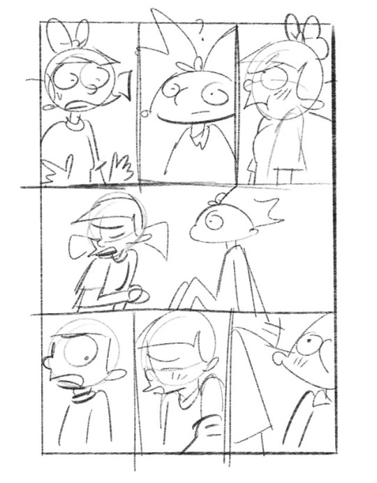
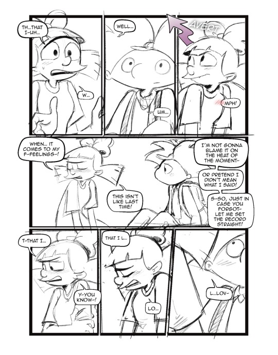
To start off with I almost always try to write my script first. after the script, what’s most important to me is the expressions on the characters faces. I think more than anything that gives me the best direction to my writing. As you can see with my first image, sometimes it can be as simple as just drawing stick figures this just gives me a directional idea of how my paneling’s gonna look. I’d say on average. I do up to three drafts the first draft direction. The second draft is a better idea of that direction and the third draft is all the cleanup so it’s ready for line art 
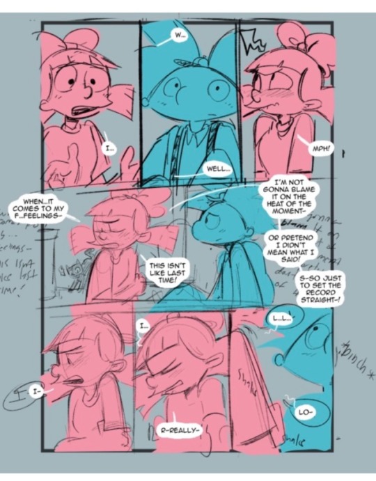
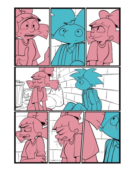
I usually separate my characters by specific color. This is so when I go into color, it’s easier to see which characters need what.
You can call me a bit of a cheater, but I like to use closed lines when I draw my characters. that way I can use a reference layer to just fill in the colors instead of having to do it manually or using my magic wand tool. 

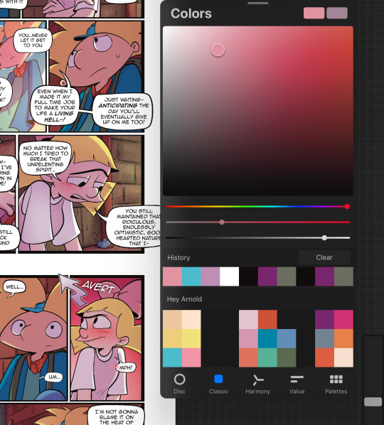
I also utilize the pallets on Procreate to pick their colors
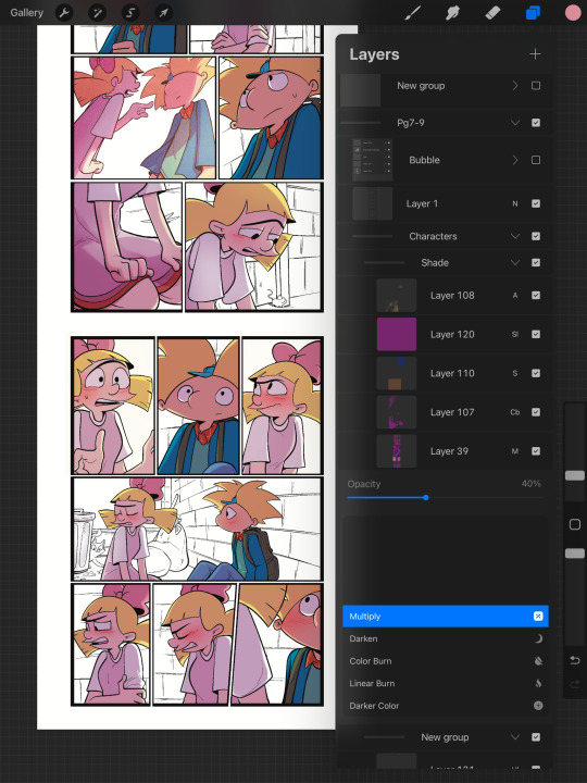
When it comes to shading, I like to use multiplayer layers and erase out the lighting. I might use some ambient lighting here and there with a dark pinkish purple this is going to depend on where your scene is taking place, but since mine is an alleyway, my multiplayer layer is at 40 opacity. For the characters, I usually use my syrup brush to blend in some of the less harsh shades. When it comes to my backgrounds, I like to use my glowing brush to erase out the lighting.
I still myself have a hard time drawing backgrounds I struggle to find where to put my characters in place some people find it easier to draw the background first and then the characters and although I do agree, that’s easier to establish the shot, I need focus on my characters. So what I usually do is draw my characters in a box and then draw that box in a space and that space becomes my background.
 I play around a lot with the Procreate effects that they have I use a pen called, burst for dramatic feelings, like a burst of energy or a burst of emotions I might use a comic dotted layer for something more comedic or action based. 
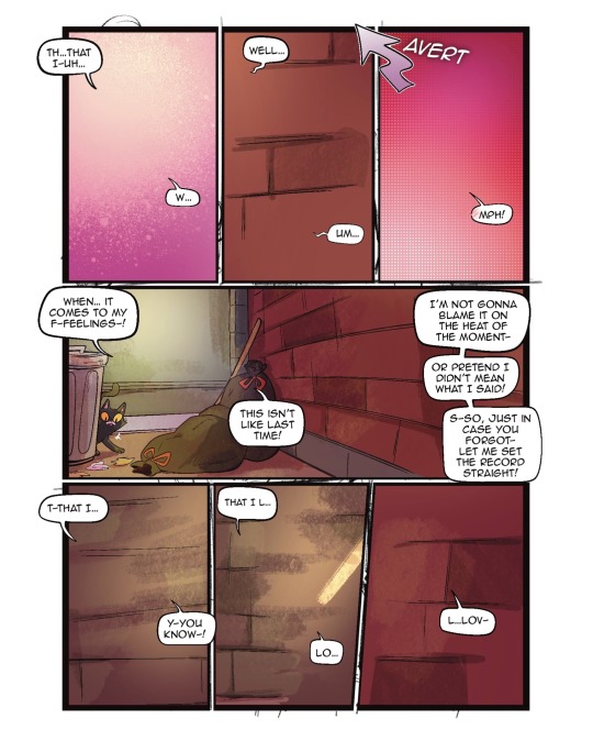
When it comes to brushes, I use a pencil for the sketch, a gloaming for the shading and syrup for the outline. Those are the main pens I use and everything else is effects. 
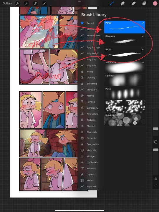
My organization isn’t always the best either, but this is how I usually do it. Panels and bubbles are at top, including the special effects like for example if I were to write the word ‘shake’ If Helga was shaking or blush, if Arnold was blushing, this would be in the bubble layer.  under that would be panels under that would be characters and in that folder I would have line art, then lighting and shading then color and that follows the same formula for background. 
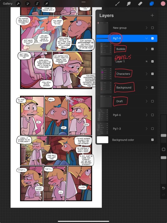
This is a general breakdown of what I do in my comic, and I couldn’t say at all, but I hope it gives you an idea of what I do. again I’m no professional and you should take all my advice with a grain of salt. My best advice is learned by doing I think if you looked at my first chapter and saw my latest chapter, you’ll see my improvement and my paneling in my expressions in my establishing shots and in my color shading. So if you wanna make a comic, just make it and learn as you go, your first one isn’t gonna be a banger more than likely but it’ll be the best learning experience, in my opinion. If you guys have any questions, I am an open book! Feel free to ask me anything.I stream on my TikTok when I make my comics so if you want to watch the process, you’re more than welcome to tune into that but I’m not gonna lie. It’s a bit tedious to watch 😂 I’m @eden_fries on most platforms.  
#arnold x helga#helga pataki#hey arnold#web comic#helga g pataki#fanart#comic#my art#fan comic#my comic#the process
56 notes
·
View notes
Note
i’ve sent this request to river-rat69, but wanted to see how you would potentially interpret it >_>
exploring interests with jack and finding a common one? like art? perhaps?
just a cute idea idk
Finding common interests with Jack
Author note: That is super cute! I'm note sure if this is what you had in mind, but I hope you enjoy it nonetheless.
I will also note, I know a common opinion is that Jack is like a child in an adult body, but I always read him more as like an adult with minimal world or social skills.
Can be read as romantic or platonic.
Rating: General
Genre: Pure fluff
Please be kind to your mind ❤︎

I feel like if Jack wants to make a connection with someone, he will try anything at least once.
He's a 20-year-old who has never had to make friends before. Cas and the Winchesters are family, thats different. Friends he has to make an effort for. (At least in his head.)
If he thinks you really enjoy something that he doesn't, he won’t want to hurt your feelings. He wants you to like him.
So even if he doesn’t enjoy something that much, he’ll try to pretend.
It’s up to you to figure that out and stop him from torturing himself.
He’s too nice, loyal to a fault.
Although, the many sceptical questions and the suspicious looks are a dead giveaway.
“Is it supposed to smell this strong?” Yep “And I can’t eat it?” No, Jack, it’s soap! “And we’re wearing gloves because? It’s dangerous, yep, got it.” “Is this what a headache feels like? NO! It’s fun! If you like it, I like it.” “It takes HOW LONG to cure?”
Probably stay away from things like candle and soap making.

He likes stability, so I think having a set day each week, or a couple of hours each night to do stuff together, would be ideal for him.
He’d love bonding over shared interests in films and TV.
He doesn’t have to eat, but I think he would enjoy trying new foods.
So: having a weekly film night would be awesome. Where you can both veg out on the couch together, eat whatever new or different foods you find at the supermarket, and watch horror (primarily zombie) and/or sci-fi films together.
Or spend the weekend binge-watching The Walking Dead or The Cornetto Trilogy (+ Paul, non negotiable).
Video games too: Left 4 Dead, Fallout etc
Then fall asleep where you're lounging, talking about your faves and your fan theories.

I don’t know that he would be into making art, per se, but I think he would like crafts.
I feel like Jack would really like those diamond painting thingies. Or just like, bedazzling things in general.
Like, I can see him contracting some weird cosmic-being version of the flu, being quarantined with an Angel!Reader and it being like that one episode of Malcolm in the Middle.
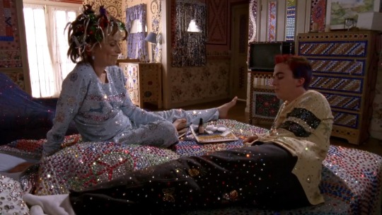
Also legos. Just things that take a lot of attention to detail, something that can take his mind off of the constant pressure he is under, that you can really focus on, but that has a cool pay off at the end.
Animation as well, both watching (more 2D stuff like Batman, Invincible, Nimona)
And doing– probably more like stop motion, with again, legos, or claymodels.
(I’m totally not projecting because I am an animation nerd)

He would, however, enjoy art galleries and museums.
Being able to admire and learn about things created by humans throughout history would be so astounding.
Would like to have you with him so you can observe, learn, and discuss together.
If you’re interested but unable to go with him, he’ll memorise everything so he can relay it all to you later, or pick up a bunch of leaflets for you to read. Or he’ll make a note of all his favourite parts so he can take you there another time.

He would have a similar sentiment if you are an artistic person.
He doesn’t want to draw or paint stuff with you, but he would like watching you and your creative process (if you don’t mind being watched)
Like absolutely fascinated by your ability to create something from nothing. Something that evokes emotion or tells a story – wow!!
Your number one supporter. Gift him your art, and he’ll put it on his bedroom wall.
Those galleries I mentioned earlier, he’s buying you both tickets to go see your inspirations shows or displays.
Wants to look through all your old works, he doesn’t care if that horse you drew when you were 12 is the wrong shape and has wonky eyes, he thinks its so cool that you tried, and practiced, and learned. That’s human ingenuity.
You’re so cool.
#jack kline#jack kline x reader#supernatural#headcanons#supernatural headcanons#jack kline headcanons#gilverrwrites
143 notes
·
View notes
Text
So, someone asked for a tutorial of this animation so, why not?
I need to say first that I'm not a profesional animator, I'm a selftaught artist and I'm terrible at teaching/making tutorials so maybe this isn't the best example of how to animate.
Having said that, this was my process:
I first drew the important key frames, in other words, where I wanted point A and point B to be. No details, only body and head (I have no save of the original frames but basically no bells or ribons nor ruffles)
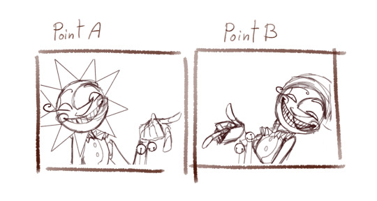
Then I needed a frame in betwen to conect them
I added a bounce effect duplicating the images, squeezing and stretching it a little (I have no save of this part but I have a video on my phone from january of last year, sorry it looks a little bad, I had to crop it)
I slowed it down so you can see the bounce
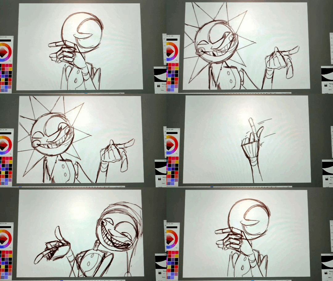
It's just like 3 frames each bounce
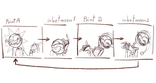
Now, to animate all the frames I started from A to inbetween 1,
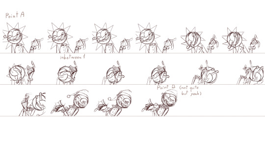
then later to point B and closed the loop with inbetween 2.
To make this easier I drew a "rute" on the background
It looked something like this
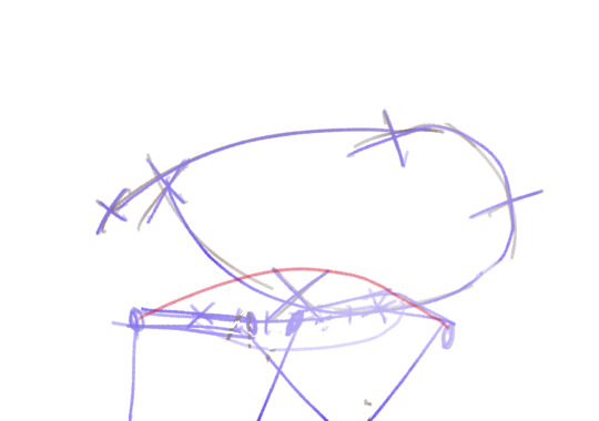
and with the animation

It's a process of trial and error. While you are drawing the frame you don't actually know if it's the correct pose (unless you are some kind of god), so you have to draw the inbetweens, check how it looks in movement, spot where it lack/exceeds frames or where it needs more space between frames... untile it's finished and you get something like this.

As you can see only 8/46 frames aren't drawn. These 8 frames are little "stops" for the images so the character is still.
Some of these frames has the character still but something else is moving, like Moons hat.
Finally, I got to animate the details: sunrays, hat, bells, etc. Each of these objets has its own physics and this part enters more in how I belive the physics would behave like having in mind the mass of the objet and the inertia.
Example:
The hat has a lot of inertia because fast movement so: it moves faster and it takes time to stop.
The ribons and ruffles has less inertia because even though it is still fast is a slower movement so: it moves fast BUT stops fast.
Note to add: the faster and objet moves the less frames it needs to be drawn, sometimes it may need to draw the character/object deformed to look right. The slower it moves the more frames you'll have to draw and the more precision you'll need to make it look right.
Some cursed frames:
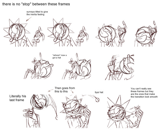
Some "still" frames:

Another note to add: this is animated at 24fps, this means every 1 second has 24 images. Most cartoons and movies are animated at 24-25 fps, this not only aplies to 2d animation but also 3d and stopmotion.
Fun fact: the human eye perceives between 30-60 fps, however animating at 30 fps or more can give an unnatural feeling to the animation.
At last, here is the animation clean up that I never finished

I added a couple of frames to make it a lil' more smooth.
Hope this crapy tutoria helped somehow.
Now I'm going to bed and hope when I see this in the morning it looks decent.
1K notes
·
View notes
Text

Oh boy, VaM is kind of a trial and error experience LOL I couldn't really show you how to use the interface and stuff without a whole video or something, but it's not THAT difficult to get a hang of if you just give yourself a day or two to play around, not to mention the number of tutorials you find out there. Luckily, if you only want to use it as a reference software that makes the process far easier (to this day I have no idea how to animate on that thing, since that's not what I use it for)
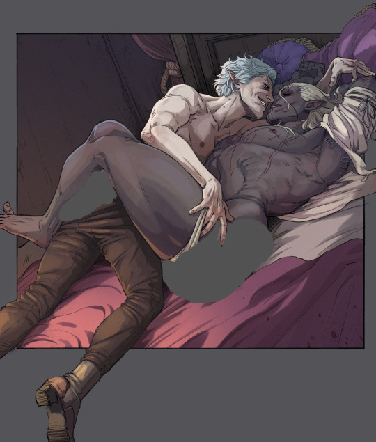
As for how I use it, it's pretty self explanatory - if there's a complicated pose I want to draw but I'm either having trouble with it, or just want to double-check angles/anatomy, I will use it as a resource! I use for most of my "proper" pieces (y'know, the nicer looking ones) and every once in a while for my silly comics if I'm having trouble with a pose.
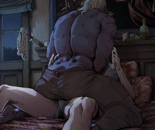
Lets use this drawing for example (the character on top of DU drow belongs to @namespara )
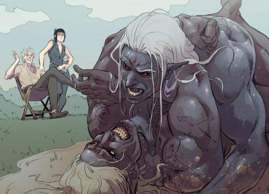
I don't draw a lot of mud-wrestling (shocking, I know) but I had an idea of the kind of pose I wanted them to be in. So the very first thing I did was make a rough sketch of what I was envisioning:
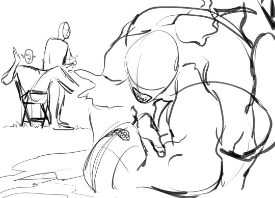
I often do a rough sketch first, even If I know I'm going to be pulling the program up because A) It's less tedious than adjusting the models over and over again until I pick a pose and B) because sometimes I'll decide I don't need the reference, after all, and so that's 30 minutes I'll have spared myself of playing around on the software.
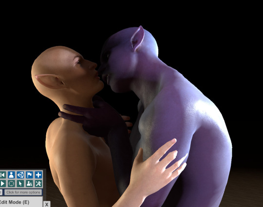
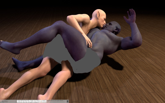
Now, this is a pretty complicated pose! It's in a weird angle and the bodies are making contact in ways I'm not used to depicting, so I did choose to whip out VaM for this one. I went into the program and after some messing around, I flopped my little dolls together like this:
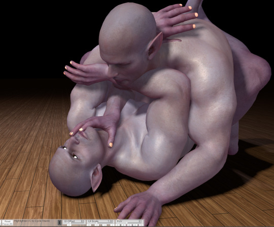
Now something really cool about VaM is that you can completely customize your models, and if you have the patience, I would definitely encourage you to do so! Obviously, you don't have to make picture perfect replicas of every single character you have, but as you can see here I have made a DU drow "decoy" to help me better understand some of his features when I draw him: he has a strong brow, a short nose, a square jawline - these are all going to look a very specific way from certain angles, and I might not always be sure of how to draw it right! So it's useful to have models that bear SOME semblance to the character so you can better understand how different viewpoints will affect their bone structure and mass.
Also thank fucking god for the elf-ear slider. Figuring out how to draw those shits from certain angles was a huge pain in the ass when I started drawing DnD races.
So, with the reference in hand, I go over the sketch again:
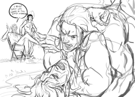
Now you may notice that I don't stick to the reference 100%. There's three reasons for this:
posing on VaM is tedious as hell. You can get something incredibly natural looking and picture-perfect to reference from if you wish, but it's going to take you hours to do. So, for the most part I just slap guys together until the results are "close enough" and use that.
In my opinion, you should always aim to ENHANCE your reference material, not replicate it exactly!
While VaM is a PRETTY DANG GOOD source of anatomical reference, it isn't perfect, I often supplement it with further reference from real life resources or make tweaks based on my own knowledge where I catch it falling short (and, antithetical to what I just said, I sometimes fuck the anatomy up further on purpose if I think it looks better that way LOL it's all jazz baby).
Then lines, color, yada yada. I don't have a tutorial on that and I don't think I could make one, because my process is chaotic as hell, but I do at times use Virt-a-mate as loose reference for lighting too when coloring - waaaaayyyy less so however, because that process is even more tedious and I feel like I often get better results by just winging it. It is a feature of the program though, and I'm sure it would be helpful for someone who has a difficult time visualizing lights and shadows. I only started using this program a few months ago, so I happened to already have a pretty good understanding of that kind of thing and just don't personally feel like I get much out of that particular mechanic.
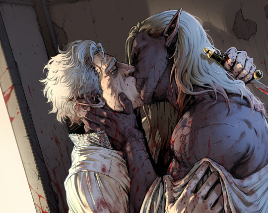
Here's a few other examples of pieces that I made reference for (WARNING: Suggestive)
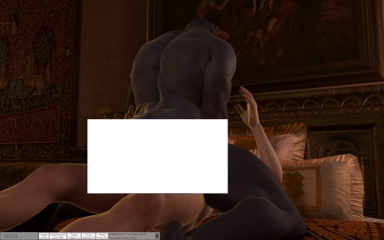
Now, for the question many of you may want to ask:
"Can I trace this junk?"
And to that, I say: Buddy, you can do whatever the hell you want with the reference material you created.
However,
If your goal is to learn and improve your art, and to recreate realistic proportions and anatomy from memory, tracing won't help you.
Developing your own style, your muscle memory, and personal technique will all be hindered by choosing to trace instead of drawing from observation, so I would encourage against it. Hell - even when tracing is employed as a technique, it's usually by high-skill realism & concept artists who are looking to either cut some corners, save time, or just double-check their own proportions in order to improve further - if you try tracing as a beginner, you will most definitely find the result to still look stiff and "off".
So trust me, there is so much more to be gained from drawing from observation. Make note of tangents, compare proportions, use all the elements of the picture to dictate where and how things should go - it will be a far more rewarding experience.
Hopefully this has been helpful! VaM is a really cheap program (you get it on the guys' patreon for I think 8 dollars, just google it!) and it's definitely been worth my money as an artist since I found it. Learning to use it can be a little intimidating at first glance, but as I said above you only really need a day plus one or two tutorials to get a hang of the interface.
A fair warning though, IT IS A SOFTWARE MADE FOR VIRTUAL SEX/ADULT ANIMATION So when looking it up expect to see a some spicy content.
#Funfact THIS is the post that got me flagged last time so i'm really tempting fate right now LOL#ask#art#tutorial#resource
678 notes
·
View notes
Note
i know you have probably been asked this so many times — but what brushes do you typically use? any helpful videos i can reference to get portraits and overall realism sketching down, maybe ones that you used starting out? or just.. tips overall?
artists like you and m0cktails really inspire me to try and pursue a different route with my art, one that was totally unexpected but pleasantly rewarding when i tried it out!!! you have a great eye for features and overall composition of a piece, i started being a fan due to your ghostsoap art but i honestly think ive started to like seeing your OCs too haha
please don’t feel pressured to answer i know i kind of asked a lot!!
Hey there! I've briefly reviewed some of the brushes I use in some posts here and here! For the most part, I stick to one standard brush, as well as the airbrush and some other 'effect' brushes as I need them. I'm a photoshop devotee, unfortunately 😔, so a lot of my process is futzing around with their admittedly stellar editing tools
Truthfully, I don't have any concrete tips or videos for this sort of thing. I started out as a pencil artist, doing more and more realistic portraits the better I got, and then eventually turned to digital art (a bit reluctantly) So a lot of that was just self-taught; finding my own way how to implement certain techniques, and amassing a foundation that would allow me to draw all the stuff in my brain, lol
As for advice--I'd say to learn how to evolve out of your comfort zone. It's good to know what type of style or subject matter you feel you're best at--this is a natural inclination most artists have, and it informs the pieces your mind wants to create. But try pushing the limits of what you think might be 'too tedious' or 'too advanced'. More often than not, the thing holding your art back is that gut instinct of 'I can't do this, so why bother trying'. I used to feel this way about hands (enemy of the state, confirmed) And yeah, the easy cop-out is to just shove them all in pockets or behind backs etc. But in learning how to overcome that obvious challenge, I grew to really appreciate the way a hand can shape a composition. In fact, I have to hand it to--💥 ✋
Anyway! My next bit of 'advice' would be to go absolutely bonkers nuts with references. Don't listen to any fraud or fool who says using references is cheating !!!!! They lie!!!!! I swear, my art only looks the way it does because I am a reference hound who spends hours and hours on google/pinterest/stock sites for the perfect angle of the perfect pose, just so I can relate it to the image I have in my head.
For realism--look at real stuff! This sounds dumb, but it helps. Start paying closer attention to people around you; their faces, the way the light accents certain things, unique features, etc. I'd suggest figure studies if that's something you're into (I don't do studies, personally, because I just jump into massive pieces and can't do anything simple 😅 welp) but it does help immensely to study humans in real life and try to translate that onto the page
So yeah. Tbh, the best method for improving art is to simply DO IT. And the fact that you're seeking out further advice and tips means that you have some motivation--so use it! Hope this helps <3
30 notes
·
View notes