#I don't even have a green highlighter here I had to use blue and yellow
Explore tagged Tumblr posts
Visit Tumblr Blog
Explore Tumblr blogs with no restrictions, modern design and the best experience.
Last Seen Tumblr Blogs


Fun Fact
In February 2021, Tumblr had 518.6 million blog accounts.
Text

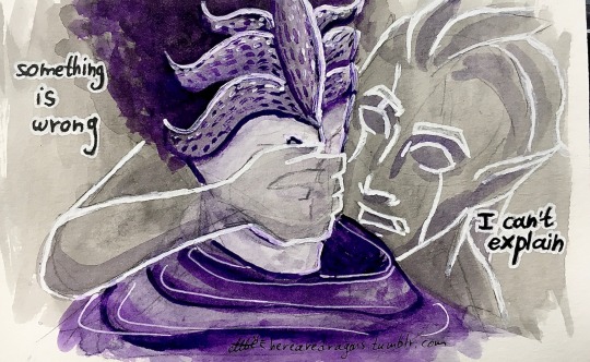
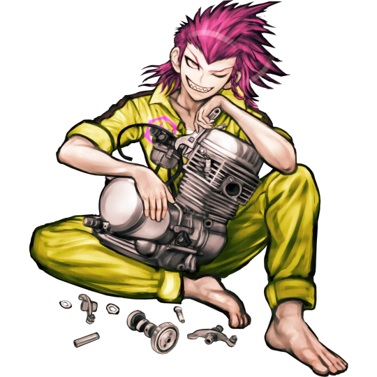
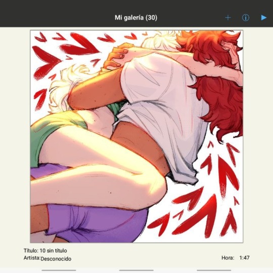
Quick doodle
#I don't even have a green highlighter here I had to use blue and yellow#might post something from my drafts later too (I have more than 30 things in there)#I'll be home tomorrow tho (I have like 5 asks waiting to be drawn)#Anyway#this post was an excuse to tell you a story. so today we had to go to our village to vote#it's very warm and sunny outside. not exactly ideal to travel with but ok#so while we were in the car I suddenly see a cockroach on my leg. I freeze. then i flick it using a bit more force than I should have and it#went 'flying' right on my sister. she started panicking n screaming and all. we stopped the car so we could search for it#we stayed like that. stopped by the road for like 7 minutes. in the sun. we started taking stuf out of the car etc lifting the seats#finally my father managed to find and kill it#thats it#now I'm getting ready to go to the theater (the only good thing happening today)#mlp#my little pony#star trek#star trek the original series#star trek tos#spock#s'chn t'gai spock#spony#sponie#fanart#art#traditional art#doodle
36 notes
·
View notes
Text
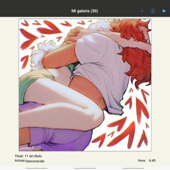
impromptu form of '24 retrospective where i was like i wonder if i did a vivacious cerulean / blue drawing each month? only noticed [none] for october when i got to the point i would've copy/pasted it lol
#naturally not a planned thing like ah gotta get a Blue Pic in there. i just do a lot of them b/c i like it#glanced at the year prior like More Months either w/o something blue or w/o drawings at all. alas#here april was All Blue & july had other more usual Lighter Blues but i picked the lsoh one#also in that bluer & darker than usual coloring kind of balancing out ''not many drawings here; unhoned sketches; desaturated'' lol#big year for sort of getting on that [very light yellow highlight] like kind of Lighting type effects as well#next most popular color choice is probably pinkish purple / purplish pink; not a big surprise with that one#& ofc in picking the exact Blues each time like the slight variation even here w/this pattern & established preference#always still feeling it out & having fun w/the flexibility. while the rare choices like Green; much less sure how i'd wanna use that#meanwhile the trend already continues into january '25 of course#noticing at least desktop tumblr's thumbnails don't have that like mini Slideshow icon in a corner if there's multiple images / a photoset#that is less Information to be sure....also the [none] in october is also like No Drawings period besides simply no blue ones. as more info#there was also the light yellow highlight tayston lying down drawing in april; though i chose the Variety of this solid extra tealy pic....#which is also tayston to me in the inspiration while drawing it lol#certainly if i had included that one then really All These Pics save the more solid may/june ones would have the sorta Lighting going on#the highlights as it were....which is fun to note
3 notes
·
View notes
Note
I was wondering how achieve such a wonderful textured finish on your pieces? They are wonderful and I love their resemblance to aged photographs and the speckles of colors in the backgrounds. Your art is mesmerizing :)
you can see some of the texture brush sets i use in my #info_asks tag but i have some more (procreate) tips aside from just brushes
also hi i made this whole thing and then stupidly hit ctrl z to erase ONE word and i lost the entire bottom half of the post and all my image descriptions so fuck you tumblr i had to make this twice
to get a faded photo or old digital screen look, consider duplicating the canvas (once all the layers are merged) and using a gaussian blur tool on the new duplicated layer. then set that to low opacity to add a misty sort of look. looks nice in combination with some chromatic abberation and a small bloom effect. then a subtle noise filter on top:
for faded print effects, it's really worthwhile to learn how to use layer masks. you can use a layer mask to non-destructively 'weather' blocks of colour or lineart, without erasing the layer itself. the weathered ink/block print effect here was made using layer masks which means that if i just hide the mask, the lineart becomes solid black again and easy to alter or colour in:

for old paper effects you can just set a paper texture on multiply over the art sure, but you can also combine it with the blur & bloom thing, a really subtle drop shadow and canvas tilt, and highlights to make it look like an aged photograph of a card. this originally had a transparent bg but i'll post it here with a white bg so that the drop shadow is more obvious. the scuffed edges of the card (left) were hand drawn, simple white stucco brush. the bigger patch of scuffed ink (top right) was a texture stamp.

for block print looks you can move the colour layer out of alignment by a few pixels - but only after you're absolutely sure you're done with it, otherwise you'll get something like this -

i forgot to erase out her eye before i moved the red layer so now her eye defeats the 'look' of a misaligned print. the black lineart and red layer were also given the same layer mask treatment as described above to make them look faded or like the ink didn't stick down right to the paper
you can do this with multiple colour layers too. if the colour layers are separated and set to multiply (as in this cmyk example), it'll leave halos and edges around each shape which mimic old comic book print
just to show what you can do WITHOUT any special brushes, here's a piece of one of my mez tarot cards from before i got any extra brushsets at all. for this one, i added a green tint over everything to mimic a sun-bleached or faded print (my actual goal wasn't 'medieval illustration' but actually 'trading card from the 60s that got left on someone's windowsill for decades'). the background texture is the procreate noise brush. the texture under the green lion drawing is the procreate concrete brush (to make it look painted onto a wall). the lettering and lineart is procreate's 6B pencil. but to properly aim for The Look of it being a printed physical object, i also used a perspective blur so that the edges are out of focus, and metallic gold highlights which don't match the lighting of the actual illustration and appear to be catching some other external light. that texture was made from the procreate noise brush
it's pretty simple compared to my later stuff but i still really like the effect
in terms of colours, you need to keep them unified so that they all appear to be acting under the same external light source, like if someone is holding up a torch to a painting then the painting colours will be glazed with firelight even if there's no painted fire. a really easy way to do this is to slap a multiply layer over everything in one shade - grey-yellow for a weathered paper look, or greenish blue for sunbleached photos. this unifies all the colours of the drawing. or you can apply a gradient map at a low opacity so that there's only a subtle change. or just do it by hand - if you want everything to be slightly tinted yellow, just pick the colours you normally would, but move the colour wheel towards yellow to get a yellowfied version of the base colour. easy
it's really important to consider how fading and weathering can affect printed colour. white paper yellows, black fades. you will rarely see pure black or pure white. which means you can use pure black or pure white to add external effects like the white scuff marks on the hierophant card. if the whole drawing is yellowed from age but there's some white somewhere, it's an easy shorthand to show that the scuff mark or whatever was not originally part of the drawing (great way to add some nasty stains lol)
#info asks#i don't have like a specific set of steps i follow i kind of freestyle it every time#obviously i have favourites i like to use but like that sphinx drawing? don't ask me how i did it because i don't remember#i just played with it until it looked nice. the blue dots are ... some sort of effect layer i don't remember which
651 notes
·
View notes
Text
AGOT reread prologue -> catelyn I
i said before that i wanted to "liveblog" my reread of agot that im doing while following a podcast, i guess this is that! I say "liveblog" because I'm annotating as I read and this is more a reflection on that and general thoughts, it would be too disruptive to actually write every time I had a thought to share! long post incoming
brief heads up that if i quote something and the text is colored, that's the color tab I used when I read the book initially. I have 7 colored tabs when reading agot and they are:
yellow - world building details / foreshadowing
orange - simply pretty or funny
red - sansa / jon / jonsa related
blue - any of the other starks centric
green - literally any other character
purple - marks deaths
pink - daenerys related
For the sake of this reading post, both "yellow" and "orange" tabs will be in yellow should I quote them. Having read the book already once I'm not sure if this is exactly how I should've set it up, but hey it there. I'll probably change is for ACOK, who knows.
Sometimes I'm going to quote whatever I tabbed without comment, but not always. Only if I simply think the line is good / pretty.
Prologue
Having the POV character be Will instead of Gared or Waymar is sooooo smart. Despite being high fantasy I like that we aren't dropped into the brain of a Knight right away, but also Will being a hunter is best equipped to actually notice all these little details being told to us.
i have a lot of things highlighted that are simply wonderful to read. I know we talk about it a lot, but George really is an amazing writer, like an actual delight to read. Like this quote:
"Will could sense something else in the older man. You could taste it, a nervous tension that came perilous close to fear."
On a craft level its so good! It tells us something about both Gared (his fear of whatever is in the woods, currently being covered by surliness) and of Will (how observant he is, using all his senses, but also how intuitive he is), and on top of all that it reads so smoothly.
because of my color coded tabs it literally made me giggle to highlight the description of Waymar as "...grey-eyed and graceful and slender as a knife." knowing I'm only thinking of Jon and jonsa. Sorry Waymar, you're beauty is only important to me for ship reasons.
Another thing that struck me as very Jon like happens only a couple lines later:
"It is hard to take orders from a man you laughed at in your cups, Will reflected... Gared must have felt the same."
Despite currently doing a reread of AGOT, I've never read past this book, but this feels so Jon to me. His status as a beloved bastard creates all that tension with his brothers, I imagine the more status he receives the more his brothers feel this. Jon is capable, but then so is Waymar. Doesn't stop Gared and Will from not taking him seriously.
If this chapter had been in Waymar's POV it would have read like a detective novel. He's clearly very analytically minded, but poor Waymar that brain and bravery isn't going to do you any good here.
"It burns, it does. Nothing burns like the cold. But only for a while."
Both Will and Gared have this instinctual fear of the Other's despite not knowing they're real. Like they can feel something is about to happen. I don't believe either of them is from the North, but I wonder if the longer you spend in Beyond the Wall, the more the magic of the place gets to you.
The entire fight between Waymar the the Others is perfect. Waymar's bravery yes, but more importantly it's the perfect introduction to what will be The Big Threat Beyond The Wall for the entire series. They're so nonhuman but not in an animal way, in a Fae way. Cruel and so beyond even a strong man's power, inescapable. Will hiding in the tree was smart and all but him being smart and observant like a hunter and still dying really pushes the idea again that no man is a match for these creatures.
Bran I
Being reminded instantly that Bran is only seven in this book broke my heart so bad. Still such a baby, and on his first big boy duty, watching an execution. If I think about it too long I'll start to get mad at Ned even though he's trying to do what he can to prepare his son's for adulthood.
"He had taken off Father's face, Bran thought, and donned the face of Lord Stark of Winterfell."
Ned's first and last actions in the book being a beheading fuck me up so bad. Every action he takes in these early chapters damns him in some way down the line, no matter how noble the intentions.
"Jon was fourteen, an old hand at justice." is such a silly and yet sad thing for Bran to think. It's so younger brother of him to assume Jon at 14 holds all this knowledge inside him, considers him wise, but Jon is just a child too. It's sad knowing that Jon is expected to act like a man, will be considered a man soon.
"Jon's eyes were a grey so dark they seemed almost black, but there was little they did not see. He was of an age with Robb, but they did not look alike. Jon was slender where Robb was muscular, dark where Robb was fair, graceful and quick where his half brother was strong and fast."
Whatever could all these details mean! This is one of those details from all those Jonsa metas that really fucking got to me. Like three pages before Waymar is described the exact same way, and I'm not meant to connect them in my mind? And then eventually we find out Sansa had a crush on Waymar? idc if I'm grasping at straws it feels real to me.
I love that immediately after than Robb and Jon show just how young they are and race to the bridge. It's one of the last times they'll allowed to be kids.
"Bran thought about it. 'Can a man still be brave if he's afraid?' 'That is the only time a man can be brave,' his father told him."
I think that quote is like a thesis statement for the Starks as a family. I know their words are Winter is Coming, but all of them are eternally brave in the face of their fear. Even Catelyn, so proud of being a Tully, is a Stark in this way.
People always bring up the 'the man who swings the sword' bit from this conversation between Bran and Ned, but the more important bit is just after. "A ruler who hides behind paid executioners soon forgets what death is." This is about the Starks yes, but more importantly it's about Westeros and everyone in it. Like. I can't articulate how important it is, but this is what Ned is trying to teach Bran, not just that Bran should take responsibility for his decisions by fulfilling them himself.
Theon is such a shit, but also Jon snarking him back "I see [a direwolf] now" is the start of Jon's dry ass humor. Why did people make me think Jon is all duty and somber monologues, this kid is funny!! And he continues to be after this iirc!! Jon funny canon please remember this people!!!
The direwolf being impaled on antlers is maybe the least subtle foreshadowing of any in this series and yet it feels so smart to me! To plant this here before we know the Baratheon sigil. And that from the eyes of innocent seven year old Bran this means almost nothing, other than him remarking on how gruesome it is, but later is superstitious Catelyn's eyes it takes on new meanings!!
"He loved Jon with all his heart at that moment. Even at seven, Bran understood what his brother had done. The count had some right only because Jon had omitted himself."
For all that Catelyn has no reason to like Jon, in other circumstance she might love the guy. "Family, Duty, Honor" right? That's all Jon is! Here he is, putting his little brother's wants above all else, even as he struggles with not being Ned's trueborn son. To voluntarily bring it up so that Bran can have a puppy... the family>duty>honor is in the room with us, coming from one Jon Snow!!
Ghost's eyes being open = "but there was little [Jon] did not see" yeah, yeah exactly! soul wolves are here besties!!!!
Catelyn I
Catelyn is that girl, I'm sorry she is the superior POV in this series. First of all she's very smart, always thinking and making connections. It's why we get this infodump from her right away, because Catelyn really can't think of being in the Godswood without comparing it to her childhood home. Second of all I love the way she is religious. Most religious characters in books and film are sort of boiled down to religious zealots or someone deeply conservative. For Catelyn it's simply part of her, a part that will never go away. She doesn't feel at home in the godswood of Winterfell because those aren't her gods, but she doesn't call them fake. They simply aren't hers. She's spiritual, it's why she see's the antler in the direwolf as a sign and takes it seriously ("dread coiled in her like a snake...") when Ned won't. I just think it gives her a unique perspective in this story, one that leads her to be almost genre aware.
"...but the red eyes of the weirwood seemed to follow her as she came."
oh no i hope we don't find out that someone is using the trees to watch people that would be so creepy /s
"'Beyond the Wall?' The thought made Catelyn shudder. Ned saw the dread on her face. 'Mance Rayder is nothing for us to fear.' 'There are darker things beyond the Wall.' She glanced behind her at the heart tree, the pale bark and red eyes, watching, listening, thinking it's long slow thoughts."
like this! there is no reason for Catelyn, a woman raised in Riverun, to fear beyond the wall more than Ned, who was born in the North. I know he spent a lot of his childhood in the Vale, but you can't tell me baby Ned wasn't told stories of what's out there. But it's Catelyn the eternally superstitious who believes them. And she's right! Always right, my poor Cassandra.
She's also so politically minded. Ned is nothing but excited to see and old friend. It doesn't even worry him that the King is making an unannounced visit. Catelyn though, she knows. Jon Arryn dead, Robert coming, the direwolf. It might aswell be in neon flashing lights to her!!
Alright, that's it for now. Daenerys I, Eddard I, and Jon I should be next, with a three a week pace is all goes according to plan. This took me way longer than I thought it was going to but it was so much fun, and as long as it continues to be fun I will continue to make them!
#cringekind rereads agot#asoiaf#a game of thrones#jonsa#but no heavily. im just tagging it that so anyone who has jonsa blacklisted doesnt get jumpscared#mutuals already know i fuck with them tho so im not that worried about it#the second one of these is going to come quikly because the podcast im follow comes out mondays so the next one and all that come after#should be posted on sundays
19 notes
·
View notes
Text
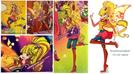
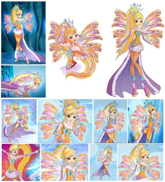
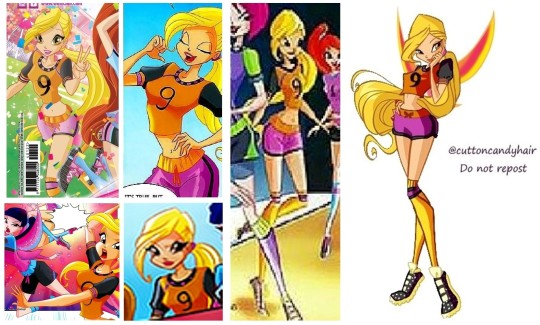
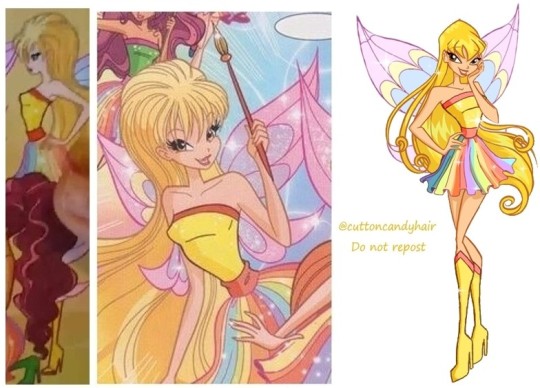
ranking ALL of Stella's transformations
27. Enchantix (S8)

Who knew Stella's Enchantix could be butchered to this extend? The colors are nauseating. It's so ugly, I'm gonna cry.
26. Magic Rock
What even is this? They didn't even try to make this outfit look good. Those colors- just eww.
25. Sirenix (S5) Underwater

The person who suggested turning Stella's beautiful, blonde hair this highlighter shade of green needs to be taken off the design team. The entire team needs to think over their life choices...
24. Crystal Sirenix
It's not the worst ever look. It's just- Crystal Sirenix. Forgettable and barely worth existing.
23. Magic of Sports
I don't have anything to say about this. A football trikot with wings. Neither any pretty.
22. Paintix
Not a fan of this on Stella. The outfit looks like it was designed by a child so it hits me with nostalgia, but- I don't know- not a fan.
21. Magic of Joy
I mean- I think it's nice. Can't really tell, since there's only this one blurry illustration of it.
20. Sirenix (S8)
Pretty. Pretty forgettable. Also, a downgrade from the original Sirenix.
19. Travelix

It's a cute outfit. It just doesn't make much of a transformation...
18. Onyrix
Stella in blue! Hell yes! Stella in this particular shade of blue? Ehhh.... I hate it, sorry. If it were a different color I would have loved this look.
17. Cosmix
Arguably the worst Cosmix. I hate this shade of pink on Stella. Especially on the pale Stella of season 8. Other than that, I think her Cosmix is kinda okay.
16. Charmix

The charms are way too much on Stella's base transformation. I love Stella's Magic Winx, but the extra elements kinda put the look off balance.
15. Butterflix
I hate the skirt, but her top had me enchanted. If the skirts weren't so childishly poofy and less uniform, Butterflix could have been such a successful transformation. I just think Stella looks nice, even in this version of Butterflix.
14. Dreamix
Stella's Dreamix has a very mature look. I like it, but I wish the orange fabric had more of a golden shimmer to it, like in the artwork.
13. Greenix
The outfit itself is really boring, but the colors- chef's kiss. The color scheme makes this rank way higher than it's supposed to be.
12. Foodix
Stella in yellow is always a highlight. I love this look for her. Just look at her, can you look away? I can't.
11. Harmonix
I wish they had used the colors of the artwork in the animated series. While I like Stella in yellow, the shade feels disconnected to the rest of her color scheme. But the overall look is pretty cute. Despite it being Harmonix.
10. Sirenix (S5)
I adore the colors of Stella's Sirenix. Especially the purple streak in her hair. Very chic. The transformation used to rank higher up my list, but I find it to be somehow lacking in depth.
9. Tynix
I'm not sure I love this color of her hair, but I do like the overall look. I strangely like Tynix, even though the transformation doesn't offer much in terms of personality.
8. Sophix
Sophix was originally rather low on the list. Then I looked at it for a while and realized it's actually awesome, take away the pink sleeve elements. Having undestood that, I appreciate it a lot more and it took it's rightful place here on the list.
7. Mermaidix
It's perfect. There, I said it. This transformation is worthy of first place. It's probably so low, because it has so many details and I like simplicity. But kudos to the designers to make something this detailed work so seemlessly.
6. Mythix
Stella's Mythix, like all 2D versions, is actually pretty cute. I like how the comic version has her normal hair color. It looks much better and warmer, in my opinion. This transformation deserves a lot more love, despite it being very simple.
5. Bloomix
Bloomix designs are too busy for my taste. Despite that, and the weird little ponytail, this design still counts as great. I adore the colors and the wings.
4. Lovix

I adore it. Always have, always will. I forgot how much I love this transformation. I really gotta make some Lovix fanart soon.
3. Magic Winx

Maybe this is up here only because of nostalgia, but I just love it. It's simple but does it's job. I have no criticism.
2. Believix
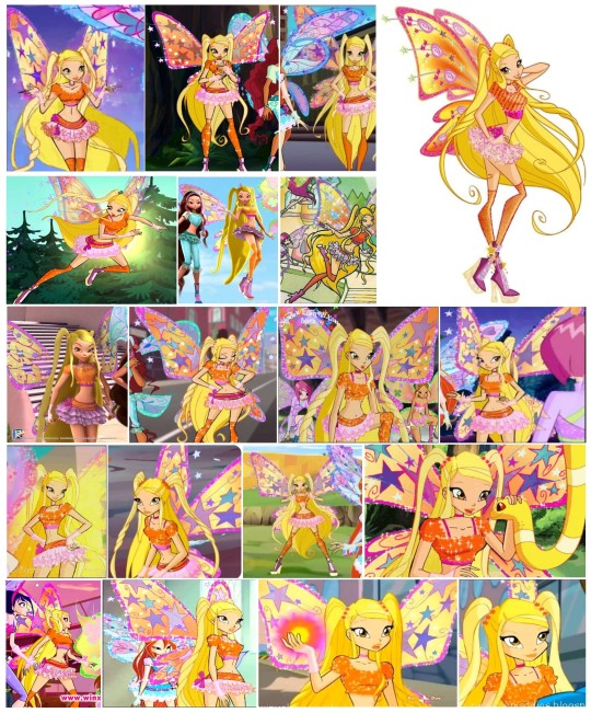
The weakest Believix of the bunch, but It's still a great transformation. I don't neccessarily love her skirt, but that's just me picking this look apart. It's awesome.
Enchantix
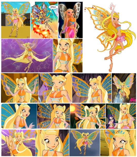
Just too beautiful. Maybe the most beautiful transformation of all. I can't not look at her. Deserved 1. place.
10 notes
·
View notes
Text
work at night

see the whole drawing here
summary: Someone might have ended up too deep in thought while doing work stuff *checks notes* at night 🙄 In fact, so deep that its wife ended up waking up and wondering where it is.
a little scene idea i've had for cynosure for a while hehe <3 will obviously change a bit once i actually get to it, but, well, here's version one i guess? definitely not written at night noooo why are you looking at me like that
"What's up?"
Tobias turned around at the sudden voice and noticed Klara leaning on the doorway. "I- uh-", it looked around, as if collecting its thoughts to formulate a proper answer.
"Is that my wool shirt?"
"Um. Yes. It's the first thing I found on the floor. It was dark and I didn't feel like switching the lights on to look for something else. Very comfy, especially now that the heating is glitching...again,"it replied, smiling, "Though the best part is that it smells like you."
"Well, it..." Klara's voice was closer this time, her hands gently touching it's shoulders, "...looks good on you..."
"Oh, stop it," it chuckled and leaned its head to kiss her fingers.
"Someone doesn't like compliments..."
"Mmh, or do I... As for the first question, well... I woke up. Realized I forgot my meds. Went here to take them," it started listing its steps, folding a finger on its hand on each step, "And then I- um. I got some kind of an idea, I think? Erin asked me to look at a specific part of the code, which she doesn't remember writing. No one does. So I wanted to see and take a look myself. Then I decided to just go look at the whole thing and. Um." It shrugged with a smile on its face. "I guess... Here I am?"
"Honey, that's- Do you know what time is it?"
Tobias froze for a moment, then glanced at the clock screen on the microwave.
3:37 am.
"Oh, fuck," it muttered.
"Thought so," Klara chuckled and gently wrapped her arms around it while softly kissing the top of it's head. "Aren't you tired, honey?"
"Maybe a little? I swear I didn't notice, I- Fuck, I forgot to switch the clock feature back on," it muttered and brought up the settings panel, "Switched it off at work because it felt like time was going soooo slow during the meeting, it felt a bit annoying. I know that sounds a bit childish, but, well..."
"No, I think that's a fun decision. As long as it makes you feel better..." she murmured in its ear and kissed its neck softly. "Meetings are like that sometimes... Nights are the opposite. You feel like it's taking very little time but in reality time flies so fast..."
It nodded, leaning its head somewhat lazily, smiling as Klara's lips moved down to its shoulder. "But, um, thing is, I found something, and didn't want to leave it for tomorrow. What if I forget about it or miss some specific thought I had tonight if I won't write it down, things like that," Tobias said quietly, gesturing at the hologram, "Really couldn't get up or anything."
"Please tell me you haven't been sitting on a kitchen counter looking through some work data for hours. During night."
"I won't tell. But, well..."
"God, Tobias, I can't even explain with words what I'm thinking right now."
"Mm... Well, um, mind if I finish going through this document? It's the last one, I promise."
"You can't be serious..." she sighed and leaned her head on its shoulder, "Fine. But I'm staying here."
"Ooh, won't hear me objecting or anything."
It scrolled through the file to find the part it was reading before being interrupted, and quickly typed a small note near the paragraph before it continued reading.
"Why do you use a grey highlighter?" Klara murmured.
"Um. I don't know, really. I usually pick whichever color looks nice," it opened the highlighter settings, "Really love using this warm yellow tone, you know, like dandelions. Or this light orange one. Or this one, reminds me of sand or something. Or the sky blue...And this fun matcha green."
"You're adorable..."
"Trying my best..." it said while adding another note, and smiled as she kissed its cheek.
"You know, looking at you doing all this makes me think if I should get the hologram thing too... It's pretty fun, watching you wave your hands around and typing on some not existing keyboard."
"Mmh... do you want the actual device or do you want to watch my hands?"
"Take a guess."
"It gets warm sometimes. A bit weird feeling, you know? Maybe I should've bought the newer model. But it's kinda nice."
"Honey, I meant-"
It stopped reading mid-paragraph and reached with its left hand to gently stroke Klara's cheek. "I know what you meant, dear, I'm just joking," it turned its head a little for a moment and smiled at her, before turning back to the hologram. After a moment of reading a few more paragraphs, it sighed and said, "I'm sorry, Klara, I know it's weird for me to care so much about some work stuff. Man, even saying it out loud feels odd, you know? But I just want to finish this thing, because someone else would have ended up doing this tomorrow. Along with other tasks as well. And, um... I don't know. I thought I should do it myself?"
"Oh, sunshine," she murmured against its shoulder, "You know you should put yourself first, sometimes, right?"
"Mmhmm... but why shouldn't I if I can and want to do it?"
Klara moved a little to kiss its cheek, "You're a good person. Maybe a bit too good. Definitely better than what this project deserves."
Tobias half smirked and half bit its lower lip, thinking about the last sentence, before continuing to read the last paragraph. It felt Klara's hands slowly move off its body, giving its shoulder a pat before she moved next to the sink. Half concentrated on the text, other half listening to the sound of water filling an empty glass, it highlighted a few words and tapped its wrist to close the interface.
It jumped down off the kitchen counter, only to go sit on its other side, facing Klara.
"Honey? You mentioned going to take meds, didn't you?"
"Uh, yeah."
"Did you take them?"
"Uhhh... um," it sat quietl, trying to remember what it was doing before. After a moment, it answered, "I don't remember," with the last word turning into a yawn.
Klara shook her head and picked up something near the sink. Turning around to face it, she gently handed it two pills and kissed its forehead. "You know, you should get one of those little pill boxes to put them near the bed."
Tobias chuckled and swallowed both pills, quietly refusing the glass of water. "Please, they won't all fit in there."
"I'll get you three of them tomorrow."
"Klara, please, don't be ridiculous," it murmured and leaned towards her, "The packages are somewhat visible here in the kitchen. Most of them. And besides, we don't always sleep on the bed anyway."
She cupped its face and smiled. "Fine, if you say so," she said, though Tobias could see that she was still going to go buy them. As it leaned into her right hand, while smiling as she gently stroked its cheek with her left thumb, Klara continued, "You sure you're okay?"
"What do you mean?"
"Well, um, stress-wise, for example? It's been a while since you've had sleep problems this bad."
It looked at her, getting lost in own thoughts again for a moment, before realizing that it had lost control of its face, that was now showing a small frown. "I'll be fine, don't worry, honey," it smiled and gently kissed her hand, "You know I'll tell you if I'm not doing well."
"You better," she said, then added, "Please."
"I will."
"Mmh," Klara sighed and stroked its hair. "Now, how about we finally go back to sleep?"
"Oh, I thought you'd never ask."
#my writing#my art#writeblr#writers on tumblr#writing community#oc writing#🔍 cynosure#🔍 ch: tobias#🔍 ch: klara#klara while they're going to bed: *I* am the workaholic one in this relationship#toby (probably being carried by her or something): uh huh yea i'll leave it to you i'm tired#oc ship#oc x oc#original character
18 notes
·
View notes
Note
i think i fooled myself into believing i sent an ask before whoops can i get 5, 7, 17, 25, 31, 33, 39, 40, 43, 45, 50!!!
5. If you could make only one of your OCs popular/known, who would it be?
well honestly Selene is already what I would consider a popular oc because like. more than a handful of people know who she is and have said nice things about her and people have ??? drawn her ??? unprompted ??? which is WILD shoutout to the Selene fandom once again. so if I had an option to make one (1) oc popular on a larger scale it would probably be her because I already know she'd click with people (and also she's my favorite and I'd never get sick of talking about her/seeing other people talk about her).
but also as a secondary option, Aqun and/or Adina because I feel like they have some fun nuance to them and I'd be kind of curious to see different people's takes/opinions/interpretations of them
7. Are your OCs part of any story or stories?
BDJDBSJSHSJSBSJDJDKS well?????? yes?????????
most of them are part of the story of their associated videogame, and then there's all the fic I'm writing. I do also have some non-fandom characters/settings rotating in my brain, but it's nothing concrete enough to talk about
17. Any OC OTPs?
no OCxOC ones, but a lot of OCxcanon ones tbh. if we narrow "OTP" down to One True Pairing as in "I can't envision them with anything else" then it's Selene and Edér (surprising no one) and Mae and the Devil of Caroc (which also shouldn't be surprising). if we interpret it as "favorite ship regardless of whether this PC has other ships", then I'm adding SolAqun to the list bc they've also been on the brain lately. the holy trinity of Doomed Yaoi, Undoomed Yuri and Impending Doom Het Ship
25. The OC that resembles you the most (same hobby, height, shared like/dislike for something etc?)
funnily enough probably Aqun. we look nothing alike but Aqun🤝me (multicultural, multilingual, single child, STEM, Logic and Rationality as a coping mechanism, inclined towards Making Things, burning hatred of Social Overcomplication)
31. Pick one OC of yours and explain what their tumblr blog would be like (what they reblog, layout, anything really)
Adina would 1000% be on here and her blog would be red-themed with yellow/blue/green accents, have a custom HTML theme she edited herself with artwork BY her, and it would be just all of her interests in one big pile with a barely functioning tagging system. she posts her vitaar designs a lot and her pfp is Her Actual Face with her favorite vitaar design up to date. she uses all caps/keysmashes a lot and vibes perfectly with tumblr's more absurdist kind of humor. Funny Nonsense comes to her effortlessly
33. Your shyest OC?
LORENZO. he's trying so hard to figure out how to People and having the physique of a Death Omen + an evil voice in his head is not helping. also he was a slave for the first 24-ish years of his life and old habits of Be Quiet Be Helpful Don't Speak Unless Spoken To die hard
39. Introduce any character you want
making you look at: the guy from the previous question. he's a runaway slave. he's a Ghost Bard. he was briefly possessed by the god of death and killed everyone in his master's estate with a song. he can sing ghosts into existence. he's haunted by his evil past life. he doesn't speak Aedyran (Eoran English) that well yet. HE'S SHY.
40. Any fond memories linked to your characters? Feel free to share!
@curiouslavellan I have to shout you out again because brainstorming Selene and Helaine plotlines in real time in DMs has been one of this year's highlights for sure. the people don't even know about the soul merging in POE1 and the Selene Is Dead drama in POE2. they don't even know about the werewolf au (well. one other person knows about the werewolf au)
43. Do you have any certain type when you create your OCs? Do you tend to favour some certain traits or looks? It’s time to confess
I'm going to be real, my OC creation process IS just like. *spins wheel* so what's the source of YOUR deep set feeling of alienation
45. A character you no longer use?
shoutout to this girl who is an old creepypasta OC of mine. I still care her
50. Give me the good ol’ OC talk here. Talk about anything you want
subjecting you to the mental image of Aqun and Eldritch Wolf Solas chilling together in some nice scenic place. they never got to do that but I think they should have
#thanks for the ask!!!!#oc: adina saar#oc: aqun adaar#oc: watcher lorenzo#oc: watcher selene#herearedragons speaks
14 notes
·
View notes
Text
Spray-Painted Spiders (A PunkFlower ficlet)
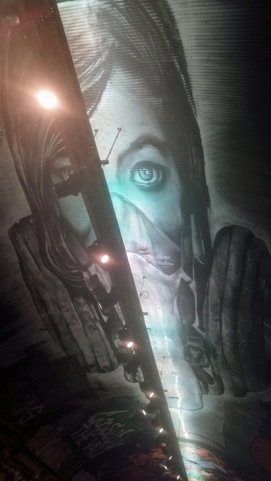
A/N: In my day job, I work not far from the Leake Street tunnel, a tunnel in London's Southbank totally covered in amazing graffiti. One day, I was walking through and couldn't help but imagine how Miles might react to the place, and this little fic started to write itself in my head...
Originally I was going to have Gwen and Pav join them, but I decided to keep it simple, just Miles and Hobie, and then it turned PunkFlower-ish ;) How to impress your artistic, graffiti-loving crush, by Hobie Brown: bring him to the Leake Street tunnel :D
Pics of the real tunnel after the fic!
---
Miles' whistle echoed around the walls of the tunnel, every inch of them covered in colourfully-painted portraits and landscapes and swirling abstract patterns.
"So people paint... this whole tunnel?" he asked, gaping at their surroundings. "Don't the cops stop them?"
Hobie shrugged fluidly. The two of them were in casual clothing, spider suits tucked away underneath, and the dim light illuminated the smirk on Hobie's face. "They try," he said. "But we're persistent. Besides, they don't like to come down here too much. It's considered an "unsavoury" area."
Miles was busy leaning back to marvel at the ceiling, which was covered in an intricate black and white design. "Woah, how did they get up there?"
The longer his eyes travelled over it, the more the geometric design started to resemble something... familiar. Something like a series of spiralling, interlocking spider webs. "Did you...?"
Hobie's smirk was decidedly wolfish now. Miles was glad that the dark concealed his pink cheeks. "It could use some flair, I think," he said. He unslung the backpack on his shoulder and took out a can of red spray paint, which he presented to Miles with a flourish. "You up for it?"
Miles reached out to accept the spray can, and their fingers brushed. He answered Hobie's grin with his own. "Yeah, man."
Under cover of darkness, masks pulled down to cover their faces, the two Spiders leapt lightly up the walls and clung to the ceiling. Miles stared at the black and white canvas that stretched out below him. It wasn't often that he built on someone else's work, but this design... Colour leapt into his mind's eye, weaving in and out of the spaces between the webs. He could see it so easily. Mesmerised, and not even aware of Hobie watching him, Miles shook the paint can and got to work.
Hours later, the faint glow of sunrise was creeping into the mouth of the tunnel as Miles and Hobie beheld their completed masterpiece. The webs seemed to glow, highlighted with bright shades of neon green and yellow, while in and around the strands crawled spiders in vivid blue and red. Down the walls, spiders crawled and hid in the crevices of the other artists' work, even scuttling across the floor.
Miles eyed his last strokes critically, adding some pale blue highlights to a hanging spider. It was Hobie's turn to give a low whistle, and Miles looked over to see him nodding slowly in approval.
"It looks good. It looks really good."
Miles thrilled inside, even as he tried his best to play it cool. "Not bad, right?"
He could no longer see Hobie's face beneath the mask, but there was a smile in the older Spider's voice as he answered, "Not bad at all."
Miles took a breath to say something more - and then a shout cut through the air.
"HEY!"
The two half-turned, muscles coiled to spring at the first sign of danger. A police officer stood at the entrance to the tunnel, mouth hanging open. "What the hell..."
Hobie reached out a hand, and Miles took it without a second thought. "Let's Scapa Flow," he said in an undertone, and though Miles had no idea what that meant, he got the message. He squeezed back, and Hobie pulled him along as they sprinted into the dark of the tunnel.
Footsteps sounded and a whistle blew, but the officer was no match for the two Spiders. As soon as they got far enough into the tunnel that they'd be hidden from view, Hobie fired a web and leapt into the air, and Miles followed him. Soon, they were out and swinging through the silvery grey London dawn.
There was no-one around to notice the two figures that alighted on top of the stationary Ferris wheel overlooking the river. Miles was panting a tiny bit from the sudden chase, and with a glance at Hobie, he raised his mask. Hobie followed suit a second later.
"So, d'you like it, then?" Hobie asked.
"Like it? It's amazing. Your world is amazing," Miles couldn't help but enthuse. Playing it cool had kind of gone out the window, but he was too suffused with adrenaline and the thrill of the moment to care. He saw Hobie smile, genuinely pleased.
"You know you can come here any time," Hobie said.
"You mean... like Gwen comes here any time?" Miles couldn't help cautiously checking. Hobie glanced over and raised an eyebrow.
"Maybe a bit different to that," he said. Miles looked at Hobie's profile, wondering if it was the pink glow of sunrise touching his face or something else. He thought he knew what Hobie meant, but he wasn't sure how to be sure. Looking back across the water, Miles was searching for the right words when he felt soft lips press against his cheek.
He turned, surprised, and Hobie drew back a tiny bit, but still so close, his dark eyes searching Miles' features. "Too much?" he checked.
Miles smiled, knowing that he didn't need to find the right words after all. "Just right," he said, and leaned in to kiss Hobie on the mouth.
---
A/N: Scapa Flow = go (Cockney Rhyming slang)
In the real Leake Street tunnel, graffiti is actually legal, and it's quite a tourist hotspot, but since this is Hobie's world I decided to make it a more underground, subversive spot. But I kept the London Eye so that they could have a romantic moment afterwards on top of the Ferris wheel ;)
The tunnel really does have artwork on the ceiling - probably not painted by Spider-people, but who knows :D Here are some photos from my recent visit (the artwork changes every time):


#ficlet#fic#Across the Spiderverse#Spiderman atsv#atsv fic#Across the Spiderverse fic#PunkFlower#FlowerPunk#Hobie x Miles#Miles x Hobie#Hobie Brown#Miles Morales#Spider Punk#graffiti#street art#Leake Street#Leake Street tunnel#does this count as bring your fandom to work
92 notes
·
View notes
Note
i luv ur dr art recently @_@ if you don't mind me askin who are ur fav dr characters design wise (not personality/story?)
LOVE when people ask me stuff like this yes - i'd gladly <3
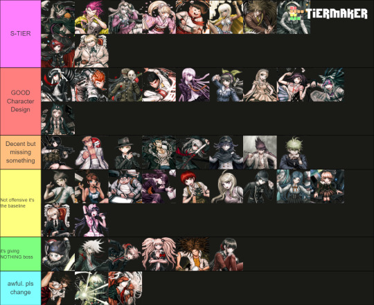
Only included DR, SDR2, NDRV3 - we'd be here forever if it was the entire franchise. Also only accounting for their ingame default outfits
The placements on each tier is deliberate, the closer the character is to the top of that tier, the higher they are. I judge them by: >Prominence of the Talent, its practicality >Relevance to the character's identity/personality >Colour and aesthetics :]
[ramblings undercut]
[S-TIERS]
Like Gundham for example is an S-Tier design as it ticks all above boxes whilst still in a school uniform. The Four Dark Devas are important to the design, they go with him everywhere and the 5 of them are a UNIT which shows his strong connection with animals. I love the bandages and the eye-scar as it has a double meaning that indicates yes he works with animals (they can be rowdy), but as a character Gundham builds onto this detail using these scars to create this dark angsty facade. Aesthetic-wise by his hair he has a unique character silhouette, and I like how his purple is made the focal point by the blacks and whites of his uniform... both reinforcing the villain-facade and highlighting the importance of the Four Dark Devas.
Similar reasonings for the other Top 2 of Souda and Miu this time toppled with the strong yellows and pinks in their design. It's eye-catching and easily conveys what their talent is. (I really wish they kept Miu's promo-art backpack into her regular sprites, imagine her emoting with 4 arms isn't that awesome >:] )
Honorable mention to Impostor (Twogami) as well. While the regular Togami design is... mid. I really appreciate how contrasting Impostor's colours and accessories are down to the necktie and poses! Like yes they are impersonating Togami, but their values and personality as a person are not the same. The deception of Togami's dark clothing vs honest white suit of the Impostor's. Impostor fucking CLEARS regular togami any day on all accounts I will die on that hill.
[GOOD CHARACTER DESIGN]
A lot of the talent indications on this tier are more subtle in compare to S-tier but they get the job done and they do it in a pleasing way (I like the colour palettes on Chiaki, Mikan and Ibuki for example). Like I loveeee Sonia's uniform especially for it's simplicity. And yet the design still alludes to the Princess talent by elegance in the bow, the brooch, her crowned braid and how the shape of her skirt resembles that of a puffy princess gown. I also think the reds in the design like Snow White are a cute touch!
To me, Sonia should be the standard in what a Danganronpa design SHOULD be in accordance to detail.
[BAD CHARACTER DESIGN]
[ie the Green and Blue tiers] Reasoning why I put them here mainly because of wasted potential, either too basic (in a sense it doesn't tell much about that character) or not practical in any way for their talent... I HATE Ryoma's stripe leggings ik he went to prison but the execution of the concept looks awful.
And I hate Akane's and Sakura's outfits particularly cuz you KNOW why they made those skirts so short and I hate that. We could have gotten awesome gymnast of martial artist outfits but no......
I added Kiibo in that bottom tier because structurally even as a robot he is a visual nightmare if you're an artist trying to draw him. Especially when most of his suit is different shades of black and complicated chest cavity. And I despise the way that it looks like these robo-plates are attached on top of what looks like fabric long sleeves and pants as if the designer was too scared to fully commit to him being a robot. He is NOT 3D-optimised and he is NOT animator-friendly I'd throw up if I ever had to deal with him.
#ask stufff#stufff rambles#danganronpa#dr#sdr2#ndrv3#this is so unnecessarily long idc i love talking about design details i will have this#i was gonna start COLOURPICKING... and ANNOTATING dude shits serioussss
43 notes
·
View notes
Text

for anonymous
Program: Photoshop 2020 Required Knowledge: How to make a gif, general familiarity with PS
tbh anon i think this tutorial will be a little disappointing! i don't really do anything special to my gifs. I'm not sure if you're wanting just a general coloring or something more in depth, so I'll do a little mix of everything.
This got super long i'm sorry
Basic Coloring
Relighting the Gif: As you may have noticed, a lot of tv nowadays is dark asf, and even if it isn't too dark, the lighting is just off. So I usually fix this with a Curves Layer. It offers me the most noticeable lighting change than any other method I've tried thus far. So after sharpening and cropping to suit your tastes, add a Curves adjustment layer. Clicking on the White Eyedropper, I then pick a spot on the gif that is the brightest. Sometimes I have to zoom in reallllly close to find a singular pixel thats lighter than all the others. And sometimes the lightest spot is too white and doesn't change anything, and if thats the case then I'll click around a little to see if any other spots offer a change in lighting that I like. I'll repeat this step with the Black Eyedropper but for the darker parts of the gif.
Hue/Saturation: This changes depending on what I'm giffing. For Live Action, I never do more than 10 on the Saturation line. For Anime, I usually do 20 but sometimes I'll do less depending on how the 20 looked. For Live Action with POC, I will do 10 and then open another H/S layer and adjust the red/yellow parts on the H/S.
Vibrance: I start with a Vibrance layer of 30. If I had to take out a lot of red/yellow, I usually duplicate this layer at least once.
Levels: Once I get the main adjustments out of the way, I go back to the Curves layer and add a Levels layer directly above it. On the Levels layer, I use the drop down to go through each color (Red, Green, Blue) and adjust the levels of those colors individually. I personally prefer cool toned gifs, so I usually add quite a bit of blue and red and take out green, but adjust as necessary.
Selective Color: Optional I don't always do this, it depends on the scene and how it already looks after the other four layers. But I do like a strong contrast so I will often Add a Selective Color layer above the Levels layer, choose Black from the drop down, and on the Black slider I increase it to 100. But sometimes thats wayyy too much and I'll do less as needed.
Black and White
For B&W recoloring, I'll do a Curves layer like above and then a H/S layer. On the H/S I'll lower the saturation completely.
Simple Recoloring
Simple as in I'm adjusting a few colors to bring them out more.
To start with and to get a basic grasp of what colors are in your gif, I'll open a Hue/Sat layer and crank the Saturation allll the way up. This will show you the main colors that make up your gif and which ones you need to change to reach your desired outcome.
After muting or deleting the H/S layer, I'll do small adjustments inside a new H/S layer focusing on the colors I want to change, then I'll add a Color Balance layer. Usually I only adjust the midtones and highlights, but it all depends on where the colors are that you're changing. Again, I like cool tone gifs so I'll take out a lot of yellow/green.
From here you can go to Selective Color and adjust the colors up or down as you need.
It's also helpful to add a Gradient Map. With Gradient maps one end should be white or black and the other end the color you want to bring out. Set the gradient maps blend to Overlay and lower the opacity to about 10-25%. Put this layer underneath your recolor layers.
Adding Gradients
On some gifs, it's helpful to add a Gradient layer to achieve a certain look.
Clicking on the Gradient layer, set your gradient and then change the blending layer to Color or Hue. Both of these will give different effects, but it's also a good idea to play with other blending modes to find what you like. From there, I usually lower the Opacity to 30-50%, duplicate the layer and change it to Screen and lower the Opacity on that to 30.
Honestly I don't do a ton of drastic recolors and I always feel kind of insecure about it? I'm very unconfident in my drastic recoloring skills. But if you have any further questions please feel free to ask!
Even if I don't know the answer, I'm sure I know someone who does.
Hope this was helpful in some way anon!
14 notes
·
View notes
Note
A doll tumbles off a shelf as a song begins to play from nowhere. “ Disappointment takes us by surprise…Even though by now I think we should have realized, everyone is dumb.” The small toy, a strange combination of a pink princess animal and a pegasus, begins to walk on its plush legs towards the quintet of brothers. The la’s and dumbs play with each step.“There must be something in the corn flakes” As the song plays its eyes blink, and it reaches up into the air with its tiny fingerless hands.
She grew, her fluffy plush arms lengthening. “Making it hard for us to think straight,” Hands came through the material and they transformed into sleeves. “Aaaahh” The colors go from soft pink to a sparkling silver with neon pink embroidery forming spirals along the sleeves, and soon a vibrant blue and highlighter yellow sets of thread join the pink.
“I just wanna go from here!” Her eyes blink to the beat and transform with her face into human eyes that are a little too big, and a little too cartoonish to be normal. “Close my eyes and disappear”. They have heart pupils set against green eyes.
The legs flexed and narrowed and combined together into 2 stocky human legs, and bright red platform boots with green laces replaced her fabric hooves. They had some sort of magic shimmer to them as she tapped her feet to the song. “I just wanna be the comic relief,” She threw her arms in performed exasperation, mouthing along to the words and beginning to dance. “Making jokes, not taking any responsibilities!”
Her cute tail exploded into confetti which circled her body like a magical girl transformation. “It's waking up inside of the dream.” Once it rose to circle her head her new outfit was fully revealed, a glittery silver and rosy red party dress, completely with a ridiculously oversized bow on the back, more embroidered spirals trailing across her body, and lots of glitter. Don't know what to believe-” She posed for the “woo!” And grinned. “Maybe that's why…”
“Disappointment takes us by surprise,” She met each of their eyes as she danced. “Even though by now I think we should have realized…”
Everyone is dumb- dumb, dumb, dumb, dumb, dumb, dumb…”
The new being leaped into air, flipped twice, and landed inches from Blinky’s face, sending him sprawling backwards. The song faded into quiet background noise, but it wasn’t gone. Her hair was ginger and tied into cartoony heart shaped buns with purple ribbons. “I’m back! Your Mother says hello, and I say it’s been too long!” Her voice was clearly…Shadow’s??? She twirled around and revealed a childish plastic wand. “Abra Kadabra and Gobbledygook! I give you all a freebie off the book!”
A flash of light shot out of the toy wand and their couch burst into a much larger and more comfortable pullout couch bed, complete with blankets. “You’re welcome! I can’t stay long but I wanted to give you something, since our connection to you has been interrupted so rudely by the asshole up there. Hopefully the rest of us can reunite! You can call me Shiney now.”
The five stare at the figure, huddled together at some point during the transformation out of caution. Wiggog bares his teeth threateningly, wrapping Karaxis up protectively. He frantically tries to help Blinky up after he stumbles back with a confused expression. Pokotho and Nibblenephim have backed away together, clearly as frightened as the rest of their brothers. Nibbly audibly growls in an attempt to sound like an animal.
She poses as the song ends and says things. But they’re much too focused on the insanity that just happened to listen.
When the toy wand transforms the house’s old couch into a pullout, they marginally relax, but it’s not enough. The figure’s voice is oddly familiar, but they can’t think about that through their defensive positions.
Blinky shields his eyes, discomforted at the bright colors that contrast sharply against the dull reds and browns of the house. He squints, trying to piece together where this person came from. Tinky, for his part, is staring through his brother’s arms with a mixture of confusion, a twinge of fear, and awe. The bright colors attract him, but he can’t bring himself to move, either. She’s saying things about his father and…mother? He can’t really get it. She turned their couch into a bigger one, that looked a lot more comfortable, so he guessed she was nice…
Who the fuck are you?!?
#(WOO SHADOW!!! 👏👏👏 sorry they don’t recognize you immediately :( /j //OOC)#The Lords in Black#Wiggog Y’wrath#ask blog#rp blog#hatchetfield rp#Blog Event: Hatchetfield Citizens
31 notes
·
View notes
Text
"A coloring game inspired by postmodern artist Sol LeWitt."
I was browsing Blick Art Supply's art lesson ideas for projects I might want to do, and as soon as I read this one, I knew I had to share it on Tumblr.
I think we should all do this and post our results. It looks like a really fun game.
I also think it would be a fun game to play with a group of friends in person. With friends, you can also make up your own sets of instructions in addition to or instead of the ones I have here.
You do it on a gridded circle, or on graph paper. If using graph paper, do squares wherever it says "ring."
Preparation (altered slightly by me from Blick original for use on Tumblr rather than in classroom. The link takes you to the original)
start with a gridded circle or graph paper (or draw your own gridded circle on blank paper)
2. Gather a bunch of colored pencils, markers, highlighters, crayons, etc. Some of the spaces are small and some are large, so gather lots of tip types/thicknesses
3. Remember: 1) There are no winners and no losers. 2) There is no "wrong" way to interpret given instructions. 3) You are encouraged to think "outside the box." Try to think of a unique way to complete an instruction that probably won't be the same way everyone else is doing it.
Use the set of instructions below. I've provided the one from Blick, as well as one other I found with a web search.
Post your result so we can all compare.
I don't know if it would be best to put our results as reblogs, or use a hashtag so the post doesn't get too long and we can all see each others even in different reblog chains. Maybe both?
Blick Instructions 1) Color one ring gold. 2) Color one half ring blue. 3) Color one half ring orange. 4) Make a black and white checkerboard on one section. 5) Make a striped ring. 6) Make a fat ring. 7) Make a skinny ring. 8) Make zebra stripes in one section. 9) Color a quarter ring with a dark color. 10) Color a quarter ring with a light color. 11) Color a pink piece that looks like a slice of pizza. 12) Make a section that is blue and green striped. 13) Make a section that is red and yellow striped. 14) Outline a section with black. 15) Outline a section with red. 16) Outline a section with green. 17) Make another checkerboard section. 18) Make another zebra striped section.
Another set of Instructions 1. Color one ring purple. 2. Color one half ring blue. 3. Color one half ring orange. 4. Make a black and white checkerboard on one section. 5. Make a striped ring. 6. Make a thick ring. 7. Make a thin ring. 8. Make zebra stripes in one section. 9. Color a quarter ring with a dark color. 10. Color a quarter ring with a light color. 11. Color a pink piece that looks like a slice of pizza. 12. Make a section that is blue and green striped. 13. Make a section that is red and yellow striped. 14. Outline a section with black. 15. Outline a section with red. 16. Outline a section with green. 17. Make another checkerboard section. 18. Make another zebra striped section.
#the conceptual art game#artblr#this looks like so much fun#i really hope that some of you do it with me#things to do with friends#art games#coloring#drawing#art#fun#Sol LeWitt#Blick art lessons#I'm well past k12#and we had a good art class curriculum in my k12#and i took art classes in college too#but I'm always looking to learn more#and recently I've been getting very into art#and these little lesson plans are great ways to DIY an art education#or continuing art education#even if you already had one#they also have non-lesson project ideas#I don't work for Blick#I just think it's a great resource
4 notes
·
View notes
Text
Pumpkin picking
Sooo this is the fic ive been working on!! It's a silly lil huntlow/hexsquad fic that takes place the day before TTT!! Also it's my first fic posted here, so don't be too harsh pls
---------------------------------------------------
"So, are we there yet?"
"Hunter, this is your third time asking", Amity sighed. "However, are we there yet?"
"Yeah, it's right over this hill!" Luz said. "But i wanna do a dramatic reveal, so you have to climb up the hill first, and i'll show you and you all will gasp!"
"Whatever makes you happy", Amity said. She hasn't seen Luz smiling much in the past couple of weeks, but this brought her so much joy, so Amity didn't mind some theatrics.
Luz stood on the top of the hill, covering most of the field beside it with her arms and body. She was wearing a red shirt with some bats, a black denim jacket, a pair of black shorts, her usual white boots and unmatched striped socks. It was pretty warm for Gracefield that autumn, so she took advantage of that. Luz watched her friends line up in front of her and took a good look at them - they all decide to wear halloweeny outfits for the ocasion.
Amity was wearing and orange turtleneck, a black skirt with buttons and black heeless shoes. She tucked her hair back with a headband, Sabrina Spellman-style, and looked determined(and extremely beautiful). Gus stood next to her, and he was practically shaking with excitement. He dressed up in an orange sweatshirt with a pumpkin face drawn on it, a pair of black jeans and black converse shoes. Hunter slightly calmed Gus by putting his hand on his shoulder. Hunter himself was wearing an orange shirt with another white long-sleeved shirt under it, light blue jeans and a pair of red crocks, which looked horrendous, but Luz was happy that Hunter was discovering his fashion sence(even if it's awful). Willow, who was standing beside him, was rocking a long black dress with many layers. She tied her hair into a small ponytail, and, for some reason, her footwear of choice was a pair of yellow rubber boots. Luz perfectly knew the energy that was sparking between Willow and Hunter - these two, for sure, wanted to hold hands, but couldn't bring themselves to do it. Vee was absent - she said something about dishes to wash, but Luz was pretty sure it was her strange secret fear of pumpkins.
"A-a-and, you can look!", Luz put her hands down, and the gang saw a field of pumpkins.
"This is not as exciting as i expected..." Hunter said.
"This is just as exciting as i expected!", Gus yelled.
"Okay, first we need to split! I'm going with Amity and Gus," Luz said with a sly smile. "And Hunter is going with Willow! Okaythatsitthelastonetogettothefieldisaloser!"
After blurting it out, she grabbed Amity's and Gus' hands and ran down the hill. Hunter and Willow rushed after them. They gave up almost immediately and decided to walk slowly and take their time.
The first minutes alone with Willow were awkward. Her eyes were so green, full of confusion and wonder. She had a beautiful smile on her face. All the orange around them highlighted her black dress. All Hunter could think about is how much he wanted to hold her hand. And all he did was trying to stare at pumpkins, not at her.
But then she said:
"Look, this pumpkin looks exactly like our abomination teacher did after we beat their team at flyer derby!"
That just made Hunter burst out laughing and broke the tension.
"Can we not choose this one then? That guy creeped me out. Maybe we should take that one that looks like a coffee cup."
"A cup of pumpkin spice latte!"
"Exactly!"
"I love pumpkin spice," Willow said, hiding her eyes away. "Maybe we should get some someday. Like, um, just the two of us..."
Hunter knew what that meant - Luz watched all those crappy romcoms all the time, and when one character wanted to date another character, this is exactly what they said. This meant a lot.
Willow wanted to date him.
Willow wanted to date him!
This thought filled Hunter's entire mind and heart. His face was so red he was sure it's actually on fire. Panic overtook him, and the best he could do is say:
"Yea...um...i need to go to...wash my flowers and...sorry..."
He walked away, slowly at first, but then just started running.
What was he running from? A girl he really, really likes liked him back... Maybe that actually was the reason. No one's ever looked at him like Willow. No one talked to him like her - like she knew everything about him, and accepted all of him. And that novelty was scary, even though Hunter knew that-
He tripped and fell on his face. Great. Absolutely what he needed right now.
"Oh my titan, dude, you found the best one!"
It was Gus' voice. Hunter turned around and saw Luz, Amity and Gus. The latter was holding the pumpkin Hunter tripped on.
"I totally agree!" Amity said. "It's big, and tough, and just the right color!"
Willow reached the group. "Does anyone want to ask Hunter if he's okay, guys?"
"I'm fine", Hunter replied. He looked at Willow, who was so worried about him, and still cared deeply about him even after he ran from her, and added: "And yes. I'd love to go with you very much."
"Go...Where?" Luz said, confused.
"It's a long story," Hunter said. He stood up. "Let's grap this pumpkin and head home."
Him and Willow were holding hands the entire trip back.
#not art#the owl house#toh#the owl house fanfiction#the owl house fanfic#toh fanfiction#huntlow fanfiction#huntlow fic#winter fic#luz noceda#amity blight#willow park#gus porter#hunter wittebane#huntlow#hunter x willow#winter
26 notes
·
View notes
Note
Hi hi, hope you're doing well!! Wanted to ask if you could explain how you pick colours! They're always so appealing to look at... (If you could also explain how you pick blush colours it'd be great! I never manage to pick good ones, no matter how hard I try :'))
hi anon, i'm doing fine!! it's summer right now where i live and that's healing all my problems (◡ ω ◡)
i have recorded the process of some of my drawings and everything is posted in my youtube channel (in twitter too), so i'll drop the link here and try my best to explain the coloring part to you. the short answer is that none of the colors you see in my drawings are similar to those i initially picked.
i try to keep my lineart loose but i pay attention to the outlines so i can quickly select the outer parts, invert the selection and fill it with the bucket tool. my base colors are all 100% opaque and i don't use any fancy brushes here.
as to how i pick colors, i never use the color picker tool, i eyeball everything. that's important for me because i tend to make all of them warmer: the greens are dark yellows, the pinks are light reds, and everything that's close to blue is very desaturated. i do this even for drawings that turn out much different later, unless i have a very specific vibe in mind from the beginning. i also never use pure whites for anything, and if something is black i make it part of the lineart.
then i always color my lineart!! there's no trick to that, the layer is in normal mode and i just paint it with a darker color than what's below it. i usually add the shadows and highlights at this stage of the drawing too. you're going to kill me for this but shade with gray set in color burn or linear burn (never multiply). i just don't want to think about color variety at this stage because it makes things more difficult for later. sometimes i add textures and some basic color correction here (curves, color balance, layers set in overlay, etc.) but i mostly leave that for the next part.
as to how i choose blush colors, i usually pick the base color and move it towards the saturated end of the color wheel, and a bit more pink. sometimes i add a multiply layer and airbrush hot red over the base colors at low opacity. coloring the lineart with hot colors surrounding the blush areas helps a lot too :)
i also almost always duplicate the lineart, blur it and set it in linear burn (i paint this layer in a light gray). this adds a lot of depth to the drawing, especially if later combined with the bloom effect.
the key to why the colors in my art pop so much is that i don't enjoy drawing as much as i enjoy postprocessing pictures 😂🤣😅👌✌️👍 once i'm satisfied with the "base" colors i merge everything except the background, open a new canvas and go crazy with filters and textures. that's why i use ibispaint X even if i do the lineart elsewhere (krita), and even if it works a bit wonky with big canvases.
i do something different for each drawing here, so first i'm going to explain my reasoning so that you understand my process: i used to have a problem of using very strong colors that overshadowed my beloved lineart into which i had put a lot of effort, so my goal nowadays is to make everything look less contrasted without losing the visual impact of saturated colors. that way the lineart remains a strong point and not just a way to separate one color from another.
what i usually do is duplicate the new merged layer, set it to exclusion mode, add a gradient map and play with the opacity. then i duplicate that and do the same thing with another gradient or another blending mode. i tend to add like 3-6 layers of bullshit over my drawings, including textures and other filters like "bloom" or "sharpen". i understand everything that's going on there but i don't think too deeply about it, i just pick whatever looks best.
for the final touches i always pull up the saturation and contrast (since a lot of it gets lost in the process), and i usually have to manually change some colors (ibispaint X has a filter to do that) or tweak the curves. then i add chromatic aberration, noise set to overlay and little polka dots set to linear dodge.
here are some comparisons of the before and after of recent drawings. the 1st one is very subtle, but you can clearly see how much warmth and depth it gains it gets after all the postprocessing. the 2nd one is so different that i understand why you're curious about how i pick colors. i don't think i can replicate that look just from picking nice colors, there's a lot more going on!! the 3rd one personally feels like it had potential lost (i liked the yellow highlights), but the colors were too strong and all over the place, so the finished result looks more intimate and calm and i like it a lot more.

thank you for the interest anon, i'm very happy that you like the way i color things and i hope i have explained myself. good luck with your own journey!!
24 notes
·
View notes
Note
Mon mon mon your top 5 vice versa quotes/ top 5 visually pleasing vv scenes
ISMAY THESE ARE SUCH INTERESTING QUESTIONS BUT I HOPE YOU KNOW THEY MADE ME GO THROUGH AN EXISTENTIAL CRISIS ESPECIALLY THE SECOND ONE (hence the really late reply SORRY!!!!!!!) SO HERE GOES NOTHING I GUESS
TOP 5 VICE VERSA QUOTES
1. “even though there’s only a little pink, jigsaw completed his drawing with other colors, just like our story. we might focus less on our love one day, but i’ll still understand you, care for you, and want the best for you.” “are you trying to say that one day we’ll love each other less?” “that’s not what i mean. im saying, even if one day you have to devote yourself to what’s really important to your life, rather than spend your time thinking about me, i’ll understand and give you my full support.” – puen in our skyy episode 2 [just for this dialogue alone i had to accept the fact that i will never love a pairing this completely in my life ever again literally no one compares to puentalay]
2. “and he paints my life pink forever.” – talay in episode 12 [QUITE POSSIBLY THEE MOST LINE OF ALL TIME]
3. “if this can be used to wipe away dust, i should use it with your heart. i think your heart hasn’t been used in a long time.” – puen in episode 3 [LIFE ALTERING TRANSCENDENTAL MOMENT IN HERSTORY IM SORRY BUT THIS IS SIMPLY HIGH ROMANCE TO ME]
4. “we all have our own pain that we are enduring. you can’t compare your life to theirs and judge them on what they should do.” – kita in episode 9 [KITA THE UNSUNG HERO OF THIS SHOW I LOVE HIM SO MUCH]
5. “whoever puen is seeing is his personal business. im his fan, not the master of his life.” – gyo in episode 12 [print this line, project it on a wall, make a powerpoint out of it, tape it everywhere, put it in a billboard, spread it]
TOP 5 VISUALLY PLEASING VICE VERSA SCENES
(i ended up going with a mix of colors and framing and cinematography to pick these and IM STILL NOT FULLY CONVINCED)
1. the bucket hat reveal in episode 10. not only this is one of the most scenes in television history (second only to puentalay reuniting in episode 11), but it also takes the crown as the most visually stunning. the pink/red contrasting the black/blue is simply beautiful.
2. the glasshouse kiss in episode 4. I SWEAR IM NOT JUST FINDING EXCUSES TO KEEP POSTING THIS SCENE IT'S NOT MY FAULT IF IT'S PERFECT IN EVERY SINGLE WAY. one may ask, 'why didn't you pick one of the two other glasshouse scenes then', to which i say ONCE AGAIN NOT MY FAULT IF THE OTHER SCENES DON'T HAVE PUENTALAY DRESSED IN CONTRASTING COLORS AND PUEN HALF HIDDEN BY THE GREENERY BEING SLOWLY REVEALED.

3. talay drowning in episode 1. I KINDA FEEL BAD PICKING THIS SCENE SINCE IT’S TALAY DYING BUT. look at how pretty it is. when i see all these gorgeous shades of blue (with a hint of pink in some shots!!!!) i can understand talay saying “let me appreciate these beautiful colors a little longer.”
4. the secret island in episode 10. at first i didn’t want to put the same episode twice, however i just can’t leave out this scene if we’re talking about visual elements. color wise it may not be as remarkable as other moments (although the touch of green against the neutral tones of the sand and the sky and the water is [chef’s kiss]), but the cinematography here is honestly breathtaking.
5. friend credits reuniting in episode 6. this is a shorter scene compared to the others but i absolutely love the way they were able to highlight the yellow in such a clever way, not only with the lights but also with the sparklers and the curtains against the black and the white/light blue.

#THE FACT THAT I DIDN'T PUT ANY PINK SCENE IN THE TOP 5 IS KILLING ME#but unfortunately i don't think they can compare to these five#ANYWAY VICE VERSA THE MOST BEAUTIFUL SERIES OF ALL TIME SO TRUE#thank you so much for asking me these ismay!!!!!!#hope you're having a wonderful day!!!!!! 💜💜💜💜💜#vice versa#ismay 🤍#m: ask
6 notes
·
View notes
Text
Theater kids.
A bunch of students sat in an empty classroom as a teacher started talking.
"Aight kids, I guess you're all here for the theater club?" The teacher, Mr. B, asks.
There are around seven students in the class, all of them nodding at the same time. Some knew each other, some didn't, but they all had something in common: they saw the 'THEATER CLASS' flyer in the school and decided to join.
The teacher, Peter B Parker, was a biology teacher who also had a special interest in scenery art, and after some years he was able to open his own club. Even if there were only seven students, it was more than enough for him.
"Let's start with taking attendance to see if everyone who signed up is here." Mr. B says while looking at the paper that was on the table, "Hobie Brown?"
The mentioned raises his hand, his clothing style drawing everyone's attention. He was dressed in a black leather jacket that had spikes on it, a blue shirt below it. He wore a collar similar to the jacket and tall boots, even if he already looked tall. His hair was incredibly well treated, it was amazing.
"Great! Miles Morales?"
The boy raises his hand. His appearance is more normal, a plain shirt with soft blue jeans and sneakers. His afro hair and brown eyes made him look cute, in somes opinion.
"Peni Parker?"
A girl raises her hand, and her big eyes draw everyone's attention to her. Her short black hair and uniform-like clothing helped her brown eyes highlight more. She seems to be sketching something in a notebook, clearly concentrated.
"Peter Benjamin Parker?— Oh look we share name and last name."
A boy raises his hand, his clothing also drawing people's attention. It wasn't wild like Hobie's, but it was colourless, all black, grey and white, which shocked people. "Please call me Noir to avoid any confusion." He says calmly, avoiding eye contact.
"Nice, okay— Peter... Porker?"
A boy with curly pink hair and black eyes raises his hand, his clothes being also basic. Just a red shirt and blue pants, nothing our of the ordinary. "Call me Ham!" He says while laughing a bit.
"Sure thing, uh next is..." Mr. B takes a breath, "Sorry if I pronounce this wrong... Pav—Pavitr... Prabjakar?"
"Call me Pav, it's easier!" A boy says while smiling brightly. His hair is really shiny and looks like he takes a good care of it. His clothes consist of a plain white shirts with soft gray jeans and gold-like bracelets.
"Yeah, sounds good. Finally, Gwen Stacy?"
A girl slowly raises her hand. Her unusual haircut is what draws the attention towards her, as well as the rainbow bracelet that she's wearing. The rest of her clothes are a white shirt with a black jacket and soft blue jeans. She's sitting a bit farther away from the rest, which weirded out the teacher.
"Amazing, we're all here! So, just in case you don't know me, I'm Mr. B, but here you can just call me Peter—if the other Peter's don't mind—and I'll be your mentorteacherwhatever thing." The teacher introduces himself while standing up, going to the back of the class. "Now... Let's make a little play, okay? No script, just that by pairs you have to find out which is the right wire to cut. Easy, right?"
Peni stares as everyone already has a partner, feeling left out once more. She wants to make friends, that's why she joined the club, but she feels invisible most of the time. Maybe if she was better, more noti—
"Hey, wanna pair with us?" The curly haired boy—Ham, if she remembers well—asks Peni, apparently he noticed how she was alone. He was paired with the monochromatic boy, which seemed ironic looking at how many colors Ham wore.
"Sure!!" She says, going with them.
"Are the pairs done?" Everyone nods, "Okay then, you three can start." The teacher says as he puts down the box with wires.
The three of them crouch down to the floor to see four wires: yellow, green, red and blue.
"Oh wait, we don't get any hints?" Peni asks while turning around to see the teacher, who shakes his head, "Oh great."
"Which one do you think it is, Noir?" She asks the older, who is sitting and looks confused.
"Uhhhhh... the gray one?" He replies while looking at the box, eyebrows frowned and everything.
"There's not a gray one! Oh great, we paired up with the colorblind dude!" Ham exclaims, cutting a random wire.
"That was... the right one, impressive." Mr. B says, taking the box in his hands, "Also, are you seriously colorblind?" He asks Noir, who sinply nods. "That explains so much." Everyone laughs at that.
"Okay, next, Gwen Stacy and whoever teamed up with her." The teacher says and both Gwen and Miles step forward, looking at the box that now has an orange wire instead of a red one.
"Which is it?" Miles asks Gwen as she takes the box in her hands.
"Judging by how they are connected, and the fact that this is so badly done I can see which one isn't attached to the end, it's the green one." She says after two seconds of analyzing the box, and cuts the wire. Turns out she was right, and they both won.
"Incredible, such a way of quick analyzing!" Mr. B says, changing the green wire with a white one, "Yes this is terribly built." He sets the box on the floor. "Finally, Hobie and Pav."
Everyone looks at them weirdly when Hobie takes the box in his hands, not even looking at it. He proceeds to smash it in the floor, breaking the box and the wires.
"That is not how you had to do it." Mr. B says while picking up the pieces left on the floor.
"You said it wasn't scripted!" Hobie exclaims, looking at him directly.
"Maybe you shouldn't take it as a 'I can destroy it because you didn't say otherwise'!"
And they started fighting. In the meantime, Peni is able to sneak up on the both of them and steal the box, completely disassembling it to keep the nails for herself. Pavitr starts talking with Miles and Gwen and they end up being friends. Both Ham and Noir sit on the floor while they talk, only to end up being joined by everyone else.
#across the spiderverse#atsv#miles morales#pavitr prabhakar#spiderman atsv#spider noir#gwen stacy#peter benjamin parker#peter b parker#hobie brown#spider punk#spider ghost#peter porker#spider ham#peni parker#sp//dr
44 notes
·
View notes