#I actually kept a lot of the original colouring
Text

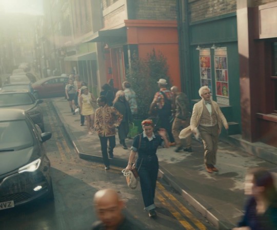
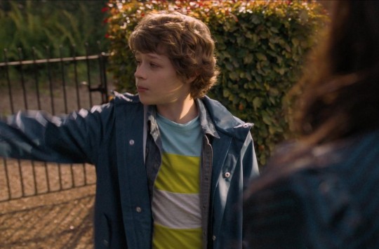
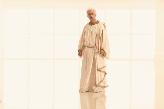
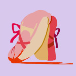
Mina costume redesign!! Hate her original costume so so much like actually what the fuck was horikoshi thinking
#i just hate the original#so much#actually what is horikoshi smoking to give some kids the coolest fucking costume#and others something that looks dug out of the discount bin at the halloween store#mina got done so dirty with the swimsuit leotard fuckery#and her colour scheme was so ugly too#i tried to desaturate most of it#and im sorry the beige had to go#ik i gave her more skin than momo#but minas a gymnast#she would fight tooth and nail for the mobility#plus she also needs her skin like. a lot#this applies to bakugo too#like. you need to be able to use the sweat#why are you burying it#also i kept alien queen because its a BANGING hero name midnight was dead wrong im sorry#didnt do a back view for this one because im gonna be honest i got lazy#its a lot of work#and i cant be bothered at this hour#yeah!!#mina ashido#ashido mina#mha#bnha#my hero academia#boku no hero academia#chiquilines draws
76 notes
·
View notes
Text
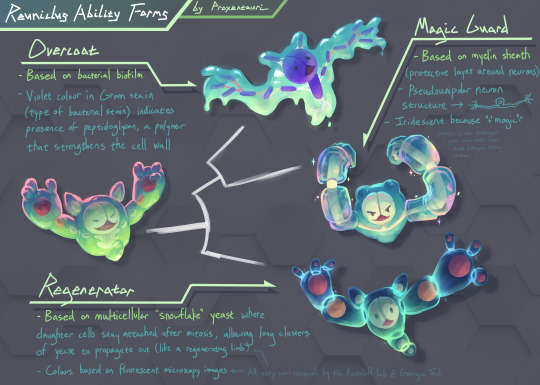
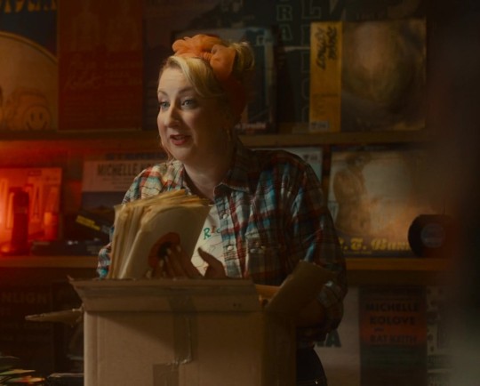
when i saw @n0rtist's ability forms i had to do reuniclus.....i hope it's not too late to be featured in the video! :0 we may have crossed from ability form into actual alternate form territory (see the original colours below the cut to see how crazy different they could have been)
as someone in evo microbio this was insane amounts of fun to do and i was able to pull inspo from places i'd never think to reference in my regular art!
itemized essay explaining the science and my design choices in more detail below the cut:
Ability Form 1: Overcoat
The science
Based on bacterial biofilm, which is basically when a bunch of bacteria get together in the same spot and start excreting this sticky slime stuff that structurally keeps the bacteria together (and also act as a medium for sharing useful resources between the bacteria, like enzymes, nutrients, etc.).
The design
The strings connecting the bacteria is based on what the slime stuff looks like on a microscopic level, specifically in electron micrographs like this one
The violet colour of the (rod) bacteria in the biofilm is a reference to Gram staining, which is a type of bacterial stain used to classify bacteria into two groups: bacteria that contain peptidoglycan in their cell walls (which stain violet) and bacteria that don't (these stain pink). Peptidoglycan is this pretty chonky polymer compound that's used to strengthen bacterial cell walls, so I thought it fit the role of Overcoat (which protects your Pokémon from things like weather)
Ability Form 2: Magic Guard
The science
Based on the myelin sheath, which are these segments of tube-like insulation that surrounds your neurons (see picture here). Mostly people talk about how it makes your neural signals propagate faster, which is true, but this ability form was more of a reference to its general protective role; it physically and electrically insulates your neurons. (Surprisingly I could not find a super good primary source for myelin providing physical protection, so don't cite me on that, but given it's literally a physical barrier this seems like a pretty safe assumption.)
The design
The entire body is based on a pseudounipolar neuron, which just means it only has one part extend out of the main body but shortly after it splits into two long parts (axons). I could have made it a bipolar neuron I guess (two parts extend out of the main body), but having a neck made it look a little closer to the base form's body
I wanted to give it dendrite fingers but it looked too creepy. I'm not sure if the three long fingers I gave it in the final design made it less creepy.
Since Overcoat and Magic Guard are both shield-type abilities, they're drawn as more closely related on the the phylogenetic tree (white thing in the center).
Ability Form 3: Regenerator
The science
This one is the most hype imo. In 2015 Dr. Will Ratcliff did this pretty sick experiment about the evolution of multicellularity (since at some point a long time ago life was single-celled) where he kept propagating the same single-celled yeast for a mega long time, and eventually the yeast evolves a multi-cellular "snowflake" form where after undergoing mitosis, the resulting daughter cells don't split, but stay attached, resulting in the yeast forming these clusters that create these cute little branches. I don't know where I was going with this. Oh right, the branching out reminded me a lot of regenerating limbs, so that was the inspiration for this one.
Anyway this is like one of my favourite experiments ever, there's some pretty good news articles out there about if you want to learn more about it!
The design
The segments are yeast cells, and the balls within are the nuclei.
The colour scheme was based on this fluorescent microscopy photo of the snowflake yeast. Originally I had the nuclei be bright orange in reference to this other microscopy picture but I thought the colour scheme was deviating too much from the base form for an ability form lol.
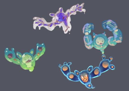
Speaking of here's the original unhinged colour drafts:
if i did commit to the full alternate form i think the biofilm one is poison, myelin one is fighting, yeast one is uhh...dude idek, i mean the fluorescent microscopy vibe is pretty strong so maybe electric lol? it's giving ghost vibe too though
i was originally planning on citing stuff but it's a tumblr post and I've already linked Ratcliff's work and i want to go to bed lol. If any of the science is wrong just call me out i'll fix it. otherwise, i hope someone out there appreciates the science references !! it's 8am good Night
#art tag#biology#evolutionary biology#microbiology#reuniclus#pokemon#ability forms#biology art#i guess#bacteria#evolution#nintendo#pokemon fanart#pokemon gen 5
305 notes
·
View notes
Text
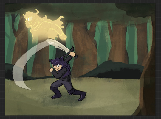
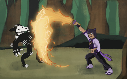
HOWDY EVERYONE- so excited to FINALLY be able to show off my piece for this year's Bumbleby Big Bang!
Unfortunately no accompanying story as of yet- but I really hope you guys get to read it someday! The premise involves Yang cursed to be trapped inside a sword, which was an idea I KNEW I had to make move.
Details and development stuff under the cut!
Lots of fun collaboration with the author, Celeste! We worked together to find the look-of-picture, Blake's outfit, how the Grimm look, the style of the sword, the whole shabang! I'm really happy with how it all turned out!
When I first saw all the prompts, even before claims opened, I got to work on a handful of exploration pieces based on some of the summaries, to decide which of the stories I was interested in would be the best fit. Here's the initial idea for this one I put together over a lunch break:
After showing Celeste, we got to work finding the look we wanted! Went back and forth a bit and found this great look for Blake! Also shoutout to Pinterest boards for visdev inspiration I love you Pinterest boards.

Just about everything stayed to final anim, with the simplification of getting rid of that purple cloth hanging from her belt, (since I already had the rope ends to think about working with), and the light purple strap across the chest, since leaving it out would simplify the linework on her chest.
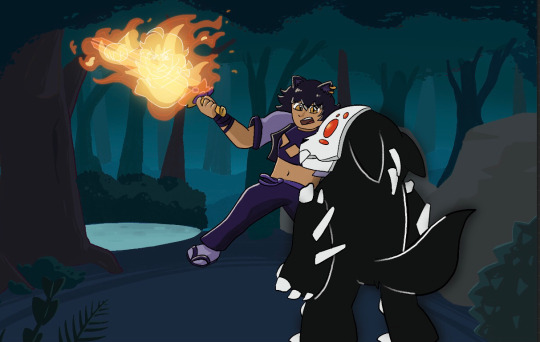
The sword also went through a bit of change! Celeste had the idea of Yang making the sword catch on fire, which I LOVED. I went with a split design so we can see the fire more clearly start from the hilt and grow to cover the whole blade.
And from there we brainstormed animation ideas! I went all over Youtube for video reference of sword work (that would be complex enough to be interesting, but short enough to be manageable). I found something we liked from Motion Actor Inc., a channel I've used LOTS for both personal and professional work (I work in 3D Animation, for those who don't know). I edited this together, to see the action from multiple places at once, which gave me the idea for that camera move that's in the final anim!
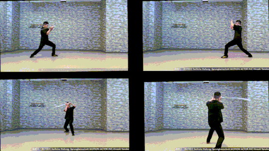
Now for the fun part! Make that badboy MOVE. For the cam turn, the first frame she's in the air I'm referencing the top left video, and the frame she lands I'm referencing the bottom left one. While she's airborne I'm just inbetweening that! No reference for the Grimm, just wanted it responding to her attacks, but I end up tweaking the roughs later on to make the block feel stronger.
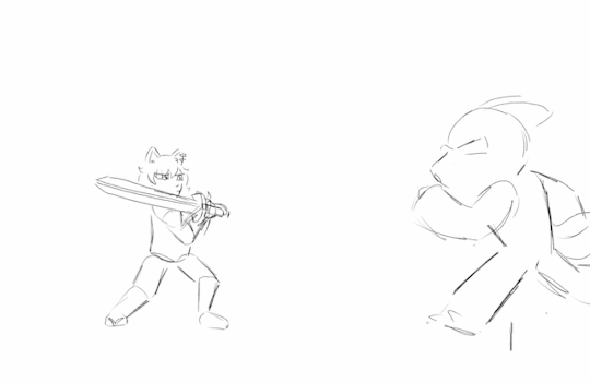
Then from there we had to actually figure out Grimm designs! Nimona had just released, and Celeste and I loved it, so she asked if I could take some inspiration from Nimona's shadow form! GLADLY. Here's what I came up with!

I was going between how the movies and comic designed Nimona, really loving the almost liquid shadow of the movie, but also how the comics had this broken up/held together rougher form. Celeste liked the second to last one the best! The original plan was to have it leave a wispy shadow trail like the concept art, but to simplify the animation we left it solid instead!
Next up is tiedown! Basically just getting the roughs more on-model, so the lineart comes out nice and clean. I've also transferred the new Grimm design to the base from earlier, and fire's also outlined orange so it reads clearer. (SPOILER- if you look REAL close here, you can see Yang visible in the fire! I liked the idea of Blake's slash also doubling as Yang throwing a punch. The idea is in the concept art earlier but now it's working with the action.)

Next step- final look of picture!! I asked Celeste for sources of inspiration to draw from when thinking about environment design, and we got Nimona, She-Ra, and Owl House! Used each of those as springboards for shading style, colour palettes, and how the fire would look!

From there, we kept the straight trees/bush/lake/foreground greenery from the first one, the blues from the second, and the fire from the third!
Once I had this frame, it was a matter of working backwards and making the background work pre-camera turn (which was ABSOLUTELY the most challenging part of this process). Learned a lot doing this! Procreate isn't quite equipped to make something like this efficient, but I'm pleased to say that Dreams would make something like this easier in the future (keyframing objects instead of hand-drawing/spacing duplicates by hand, for example).
From then on it was just colouring the lineart, adding shading, and finishing up the background! Beginning-to-end this whole process was beginning of July to end of October!
I had an absolute BLAST putting all this together. Here's to next year where I find a way to do something even more ridiculously complicated!! It's fun!!!
#rwby#bumbleby#bumbleby big bang#bbb2023#blake belladonna#yang xiao long#(technically!!! look at the fire!!)#officialrocketart#officialrocketanimates#greatest hits#HOOO WHAT AN UNDERTAKING#so glad I came up with an idea pretty outside of my comfort zone but having the CLEAREST idea on how to execute it#means things went smoothly it just took a Long Time#AND I LEARNED LOTS#hope you guys can read the story one day!! its dope!!#bonus bonus fact for tag readers i didn't put in the post proper: i showed the rough pass to ANIMATION INDUSTRY COLLEAGUES for feedback#shoutout to ioana and v love you both lots#ioana for tightening up the rough pass and suggesting i smear the sword#and v for notes on my sword smears#okay i hope you guys enjoy!!!#it has been true for ages now but The Bees Motivate Me To Create#and in these trying times i thank them for that
394 notes
·
View notes
Text
so the cat's out of the bag! i was lucky enough to paint the art for the upcoming cast reunion. you can check out the poster here! but i thought it'd be fun to share the painting, some detail shots, chit-chat a little. so here it is!
detail shots underneath
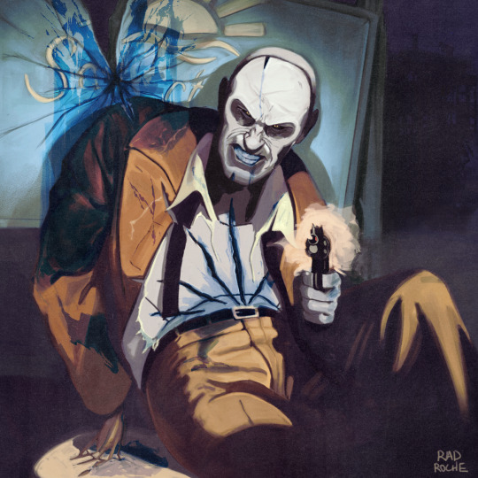
this one was a lot of fun to do! that centre line is the focal point, so i had a lot of leeway with how loose i could keep everything outside of it. a really thicc paper overlay hides all sins
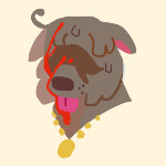
head! it's pretty different from how i normally paint him, but pulp heroes tend to be really built! broader than how i usually do it. blood is pouring from his mouth but don't worry about it. he's fine

torso! now we're getting gory! easily the part i had the most trouble with. initially, i was gonna do the clawmarks along his dress shirt with the wounds underneath poking through, but between the cloth fabric, the flesh (which is almost the same colour and value as the shirt!), the bleeding, making the cloth look wet, it ended up way too busy!! so, the shirt had to go. please, dry your tears. those claws tear up other clothing around the canvas and i was originally going to carry that over into the belt and pants, but when i painted it and took a step back it veered more into pulp romance than it did noir. speaking of...
pants drapery! you can see what i mean about loose painting. the pants are very rendered while that arm is a block of colour. that broken finger was actually a mistake, but i really like how it looked, so i kept it in. he's also double-cheeked up on a thursday afternoon. the style demanded it, you understand. let's never speak of this again. talking about style...

here's the original cover i was asked to riff on! originally i misunderstood what the sign was going to be, but when i fixed it it turned into a real bob ross happy accident because it means that, with a little tweaking, i could sell it as a fractured shoulder! yay! on and off, this took about a month. i'm thrilled to finally be able to share it!! crazy this is gonna hang in the va's home, right?
#fallout 4#fallout#fo4#death shroud au#nick valentine#gore cw#rochedotpng#learned a LOT doing this eager to unleash it on my other art#thanks for the kind comments!
275 notes
·
View notes
Note
is it true that they removed mentions of tintin journaling/actually mentioning his job/etc when they redrew some of the older tintin comics? i swear i remember seeing examples of that once but i have no clue where to find them again
I definitely know which post you're talking about, but I can't find it either. I'll try to compile what I remember and/or know about offhand...
For the most part, the most references to Tintin being a reporter come early on in what are considered the "newsprint editions" of the comics. The first nine albums were serialized in Le Petit Vingtieme and Le Soir Jeunesse, and these pages were later re-collected and coloured (and occasionally cut down/rewritten) for what are now known as the "Casterman editions".
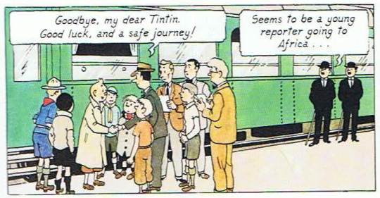
Tintin being a reporter is all over Land of the Soviets, and it's introduced as early as page 1. It's the silliest album, but it's also the only album thoroughly revolving around Tintin going on a reporting assignment.
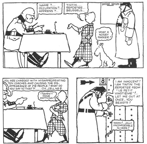
(Soviets pg. 4. By God, look at that guard in the upper right. He looks like the RESPECT! butler)
Tintin is still a reporter in Congo, but it's scaled far back in the redrawn Casterman edition. In the latter, it's kept to one mention in the very first panel, which was also turned into the first appearance of Dupont and Dupond:
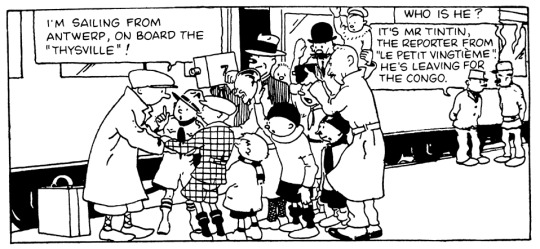
(Congo pgs. 1)
Meanwhile, the newsprint edition has a scene where newspaper agents try to scout Tintin as a reporter, I guess because his stories are just that good. He ultimately declines, claiming Petit Vingtieme is paying him way more than what they offer.
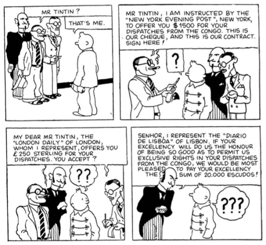
(Congo pg. 17)
Now, I'd had a theory that the series just became too plot-focused to keep pausing for references to Tintin's writing, but Reddit user XenophonOfAthens made a good point about Herge being forced to pause discussion of the press and current events after the nazis shut down Le Vingtieme, thus moving Hergé and many of the same staff to the nazi-overseen Le Soir and Le Soir Jeunesse. Tintin had been introduced as Le Petit Vingtieme's boy reporter who child readers could follow along with, but now with a new (heavily monitored) publication, mentions of the "boy reporter" slowly phased out.
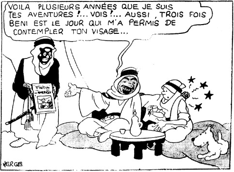
One of the more significant edits to Tintin's reporting comes in Cigars of the Pharaoh. Sheik Patrash Pasha originally says he's followed Tintin's adventures for "several years" and presents a then-new Vingtieme publishing of Tintin in America.
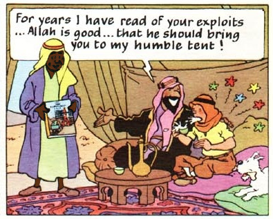
In the colour edition, he instead presents Destination Moon. This album was in production at the time of the redraws, and it was one of the first albums to be published outside of Europe...but now Tintin's reaction is especially visceral, since that album involves him going to the moon with two people he hasn't met yet.
(Cigars B&W pg. 39, Casterman pg. 15. I also gave the Sheik's servant in the latter a quick edit because it was somehow worse than the 1933 version)
The last reference to Tintin's reporting for a long while was in The Broken Ear. We are now in the Soir era:
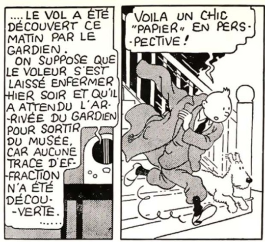
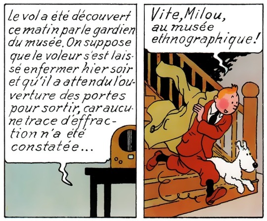
(Broken Ear pgs. 2)
This line never made it past the newsprint version. Tintin hears the news about the museum theft, and originally, he remarks that it'll make for a nice report...but in the reprint, he's just declaring that he'll go to the museum. I feel like the wording in the original could have referred to something specific about the comic's run in Le Soir Jeunesse, but it also could have been removed under the assumption that the reader would be going into this book knowing Tintin is a reporter. He does have a notepad with him through the rest of the page, but without that context, he just seems like a busybody.
I feel like there were a lot more references to his reporting in Le Journal Tintin, which is where the comic moved its publication to. This adds credence to the possibility that readers would be picking up these books knowing Tintin was a reporter, thus it being less of a focus within each album's plot. There do seem to be little hints throughout the albums about Tintin being a reporter...one of these is a moment in Explorers on the Moon where Tintin describes the moon's surface to ground control, and as a writer myself, this to me feels like him gathering his words for a future story:
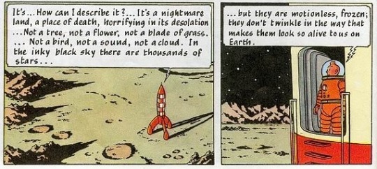
(Explorers pg. 24)
However, Tintin's reporting is brought up in an album one more time, decades later, in Picaros. Tintin is referred to as a reporter on televised news, so this is at least some confirmation that he does submit journalist work, at least off-camera or between albums:
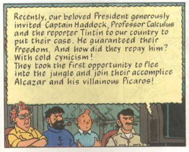
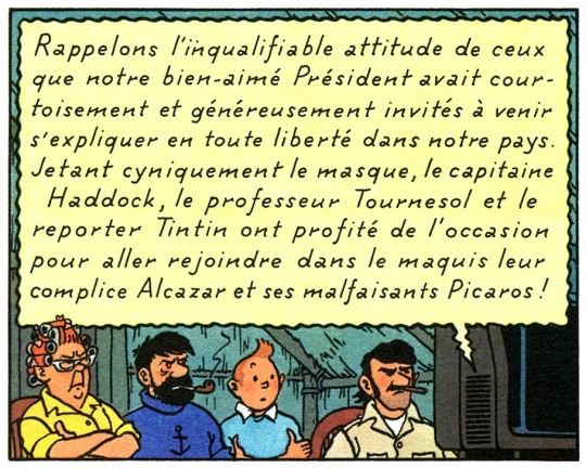
(pg. 47)
In short, Tintin's reporting started to fade off suspiciously during an era where nazis were breathing down Hergé's neck, then got a little lost in translation, and then ultimately came back.
My theory for Tintin's reporting slowly becoming less important in the albums happened either due to 1. Hergé and co. becoming more interested in writing about other things, 2. the series being moved to a vanity publication that discussed Tintin being a reporter outside of the canon comics, or 3. it got phased out during the Le Soir era because Hergé's supervisors didn't want to promote a gonzo journalist as a hero during a time with heavy political censorship and turmoil. It's completely up in the air.
77 notes
·
View notes
Text

Ok, so this has been in my drafts for so long that everything I had originally written out for this feels kinda meaningless to me now so I re-wrote it... I thought I would hit this a lot sooner but in true Tumblr fashion, they kept dicking me over.
But anyway ranting about Tumblr aside, in all seriousness (and yeah I know I say it every time) I'm super grateful to all of my lovely followers, even if at this point a fair amount have probably not been active for years (and i'm like 90% certain there's bots still among them too). You guys have stuck around through all my hyperfixations, both the good and terrible, and I appreciate each and everyone of you both new and old.
So to celebrate this milestone I'm gonna be doing some requests, So, if you wanna take part send me a request or two:
🕹️ Colour Palette Meme - Pick a colour palette + a character/ship/show/whatever.
📼 Make Me Choose - Send me 2 or more things to choose between.
🎞️ Timestamp Roulette - Send me a movie or a show ep and I'll blindly pick scenes from them to gif.
👾 Icons/Headers - Send me a character or whatever and maybe some colour options for some icons and headers.
And something for my mutuals only;
📸 Character Photoset or some other gifset of your choice 😘
(I wanted to do a surprise gifset for y'all but despite having been active and mutuals with some of you for years and knowing most of your interests I still don't feel I know y'all well enough to actually do that 😅 and yeah I know it's my own fault for barely talking to anyone while you guys all talk to each...)
Now here's a little list of shows/movies I can gif:
Stranger Things (nothing that involves the zionist actors please!), Yellowjackets, Fallout, Fargo, 911, Marvel (main MCU movies up till Endgame and some other stuff), there's others too like certain movies and stuff but these are the things i can for sure gif, feel free to ask about other things ;)
Tagging some much loved mutuals under the cut (if i don't tag you know it will haunt me forever but i never know who to tag...)
@lengthofropes @nikossasaki @iero @buckysbarnes @buckleydiaz @miwtual @vinmauro @neverevan @softasawhisper @emblazons @corrodedbisexual @sidekick-hero @danesdehaan @avadaniels @mcbride @emziess @deanncastiel @thefreakandthehair @stevesjockstrap @tommykinardbuckley @alivedean @dirtbagdefender @padme-amidala
57 notes
·
View notes
Text
Hazbin Redesigns pt.2
These characters are mostly ones, whose designs I never had big problems with, I just had different ideas for them sometimes.
Sir Pentious is female in my AU because her backstory requires it. Also I thought she would be cute as Ms Pentious. I made her colours more earthy and gave her a more serious look, since she will probably be an antagonist (she is still very excentric, she mostly pretends to be serious). I gave her design some elements that resemble steam and clouds to fit with her inventor theming. I kept the eye hat thing because I think it's fun.
For Cherry bomb I kept a lot of stuff from her original design. Her colour palette, her tights, her shoe situation and her hair looks pretty similar too. I toned the brightness down and made her look more Punk (because i'm pretty sure that she is supposed to be Punk). I gave her a prosthetic since I can imagine that she would loose a limb in an accident with her bombs. Ms Pentious made her the prosthetic (she and Cherry are officially dating here and are both antagonist from how it is now). I tried to make her look chaotic and spunky so her design was very fun to figure out.


The main issues I have with Velvettes original design is that she doesn't look like a demon really and pretty much just like a human with weird eyes. Also she suffers from the fact that Viv makes all her black characters grey. I made her a Vampire/Bat Demon because Vampires are creatures of the dark and it reminded me of how people on the internet often are. For her outfit I was mainly inspired by fashion dolls like Monster High. She is supposed to look modern and like a fashion influencer. Her redesign is very bright and obnoxious kinda to reflect the overload one can get from the internet and trends.
I wanted to make Vox older and boxier looking. He is an old TV show host who is upset that he has to stay current with the trends to keep being relevant, even though he doesn't view modern television as "real" television. He is jealous that Alastor can afford to keep his older format and style. I gave his outfit a similar colour sceme to that of Alastor. Vox is meant to look slimy and kinda pretentious. Other that that he isn't so neon anymore and has a less modern TV as a head.
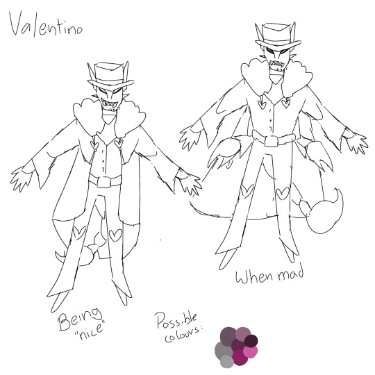
I have some ideas for Valentino but I didn't make the effort to actually make a full drawing for him, because I didn't want to (not for him). Also he probably won't really appear in my AU (still figuring out wether the Vees will even be important at all). He is not a moth here because Vaggie is already a moth and I didn't see the need for two (not related) characters with the same gimmick. He is a scorpion, since they're more intimidating. His outfit isn't all too different (from when he opens his coat in the show). Val would be more muscular and in general more menacing and still very manipulative.
Final character lineup.

Feel free to ask questions/give suggestions for my redesigns/rewrite.
#hazbin hotel#vivziepop#hazbin hotel redraw#hazbin hotel redesign#hazbin hotel critical#i dont support vivziepop
124 notes
·
View notes
Note
For neopet's review's would love to hear your thoughts on lenny's! I think they have some really nice color's


Lennies are one of many bird Neopets, but they do have one thing that immediately helps them stand out: their anatomy, which is more akin to a shorebird or emu than the standard songbird. Originally their head feathers were part of a jester's cap of sorts, and while the jester idea was lost over time (if it was even intentional to begin with), the distinctive head and tail feathers remain.
Color-wise they're about as simple as you can get, using one primary color with an accent (orange in the base colour, variable otherwise) for the legs and beak. They can get away with having no markings because of their very lean bodies, and the wings also help break things up a bit.

Lenny didn't really change in any notable way with customization, outside of becoming a little less excited and vaguely gaining a fist, which isn't too noticeable due to them having wings.
Favorite Colours:


Faerie: I really like how the faerie Lenny is vaguely based off a peacock (though unlike peafowl, this is a gender-neutral design), but it doesn't take it overly literally, serving more as an abstract reimagining. The Lenny's default three tail feathers are still there, but they've been made much longer and given a side span of other tail feathers to join them. They also have beautiful layered wings with secondary eyespots and much more pronounced head plumage than an actual peacock. The color palette is also beautiful, using blues, teals, and magentas together with lots of layering and markings. Really nice.
The UC/styled version is a bit better than the converted, as while both are similar, the converted inexplicably kept the three tail feathers where they are normally, along with missing the cheek feathers and slightly loosing the wing eyespots. Plus, of course, the pose is much nicer.

Burlap: The burlap Lenny was the first ever burlap pet, and was in fact the design shown in the "choose a new colour" poll that burlap originates from. I feel like over time this colour has unfortunately become too much like plushie 2.0, but this original concept is fantastic—ultra creepy, with dead black eye buttons, tattered burlap wings, and miscellaneous pieces of junk for the legs and beak. (The scrap metal in particular was completely lost over time for this colour, and is really something they should bring back in the fold.) Awesome option for people who like creepier colours (it's me, I'm people who like creepier colours).

Relic: Relic pets sometimes get way too overblown, but this one is really nicely balanced—just plain, nicely shaded stone with lots of little cracks. There's some moss, but it's kept to the minimum and is carefully placed in a surprisingly realistic way. The tail feathers are the real standout however; instead of making improbable thin stone ones, they're instead a few budding roses. Love it.

BONUS: The only reason the mutant Lenny is a bonus is because... it's not really that mutant-y? Like, that's just straight-up a vulture (reinterpretated, much like the faerie Lenny, which I always like). Even by Lenny standards, the only real differences are clawed wings, shorted legs, different tail feathers, and a single backwards-facing head plume instead of two.
However, technicalities aside, this is a gorgeous design. I really like the layered look of the wings, and I appreciate that it's not 1:1 a real vulture, lacking any pink or black in the design and having clawed wings. Artwork's the same as it was pre-customization, so it unsurprisingly also looks great.
43 notes
·
View notes
Text
Creation of the Pan Flag

Copied (with grammar/spelling mistakes) from my twitter thread about it for posterity.
I was going to do this for Pride weekend but you know, life, so: I wanted to talk about a thing. I created the #pansexual flag, a thread.
Back in 2010, I was 20 and tumblr was my main social playground. I was active in various spheres, and I was learning.
I'd been IDing as bi since I was 13, but moved away from bi as an identifier and took up pansexual soon after discovering the term, bc I felt it fit better.
This is mainly bc the simplicity of pan being defined as attraction to any/all genders was extremely appealing to someone really coming into this new way of expressing their orientation like tumblr allowed. It felt right for how I wanted to relate to and express my orientation.
The bi communities I had access too often saw heavy discussion related to attraction parametres of "bi" - convos at the time I didn't really recognise for what they were: bi people working hard to define bisexuality on their terms, tackling intra-community transphobia, (cont)
(cont) and developing within a social space where more expansive gender experiences and identities were becomes more well known and understood.
My switch of labels was about finding something that felt truly right for me, but it would be dishonest to pretend the decision wasn't impacted by the politics and "discourse" I was involved in at the time.
There was no popular pan flag, and the offerings were frankly... ugly. To me. Various shades of purple, P letters, P symbols incorporating gender symbols, infinity symbols. They didn't feel consistent with the other pride flags.
So on a whim, I decided to design one. I designed it to be pretty, honestly. That was a primary function of it, to have s/t I liked to represent my identity. No point pretending I was trying to be super innovative and deep: I wanted something pretty to plaster on my blog.
Pink, yellow, blue. A strong magenta, a strong gold yellow, and a light cerulean. The pink not too purple, the yellow not too bright, the blue not too cyan. Hex FF1B8D, FFD900, 1BB2FF.
Pink and blue, because of their gendered traditions, and yellow, a generally non-gendered colour, to represent nonbinary folks etc.
I created it anonymously, on a side blog away from my main handle. I was already running LGBTLaughs which was proving very popular in tumblr and didn't want to monopolise queer blog space, I suppose.
I didn't expect it to take off. It proved popular on tumblr, and for a few years the flag kept getting added to the Wikipedia 'pansexual' page and then removed. Eventually it snowballed and ended up in use well beyond tumblr.
As I've got older I've realised a lot of people would be interested in knowing this part of modern queer history, and more about modern flag creation in general, and that it's worth documenting. Not for credit so much as for posterity.
So, that's that. The first time I saw a pansexual flag in real life at my city's Pride parade I may have had a little cry.
Twitter Drama
Best viewed on the original twitter thread, for the full documentation (I may update this with fuller documentation down the line) but here's a rundown of drama surrounding the flag.
First, to set the stage:
posted about designing the pan flag
said i was cool with bi/pan lesbians
said i was cool with kink at pride
Thus followed, in varying intensity 2020-2022:
misgendering
suicide bait
general harassment/pile-on
"called out" on r/pansexuals
blasted on sapphics for satan (fb)
now sworn enemy of of lesbian kpop avi twitter
claims the original pan flag was transphobic in meaning
multiple "new" pan flags designed to displace the one i designed
claims i stole the flag from a medieval indian kingdom, and subsequent vandalisation of wikipedia for the actual state of kerala
vandalisation of the wiki page for the pan flag, resulting in it having to be locked
103 notes
·
View notes
Text
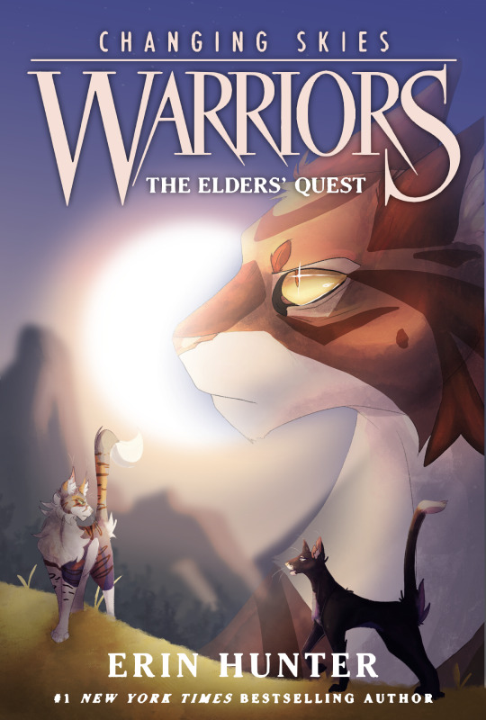
Ok gang I needed to step in I can't take this anymore.
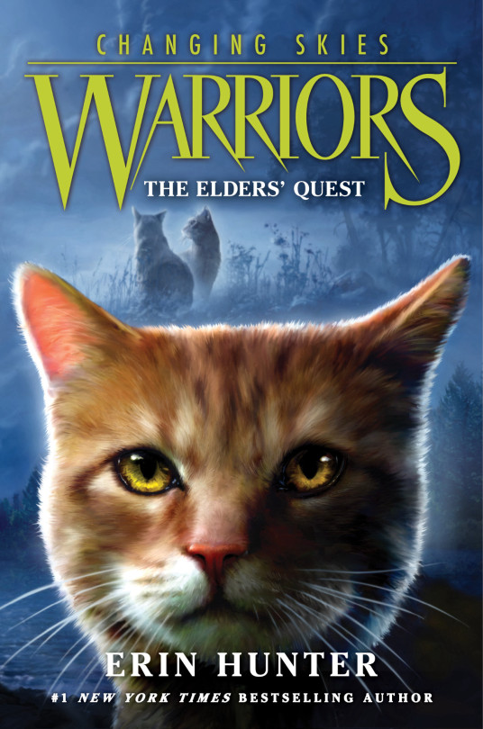
The recent Warrior Cats covers and field guide art have been driving me nuts and when this cover dropped something inside me just snapped are you happy Erins I finally did proper fan art of your furry soap opera are you happy now. I used to really like the new artists covers I was his number one defender but now I,m just genuinely concerned if they're giving him any time.
Here's a ramble of my thought process if yall are into that:
I see a lot of the time with people redesigning covers that they take a completely formula to the actual books and illustrate an actual scene. I love these but I have absolutely no idea what goes on in this arc so I would have to keep to the floating head formula. Since there's no official design for Moonpaw yet either I kept the characters the same (i would possibly have replaced Crowfeather with Moonpaw although looking back having Crow there for "the elders quest" might fit more). I myself have no designs for Leaf, Tawny or Crow so i just slapped on whatever. I did have the thought to reference The apprentices quest cover at one point, as I feel like this arc will just be full of references (Following a "friend since arc one", recycled plot points, the book being called the elders quest.. If they call a book "Out of the wild" you all owe me one million dollars/hj) but uhm that was boring and i had a different idea anyway :3
I wanted to put a spin on the usual floating head formula (literally)(I just made it profile instead of front facing) and i would like to imagine the rest of the books in this arc would follow this formula with a different character each time. I originally wanted to keep the blue colour scheme, but it was not giving gang im sorry. I can only shade with purples and yellows forgive me. The excuse i realised i could make half way through is that a sunset fits the name "changing skies" way better that a blue gradient. THE SKY IS LITERALLY CHANGING ITS RIGHT THERE. I also added the faint stars in the sky as reference to the problems with connecting to starclan tee hee. I was originally going to draw Leafstar blind but decided against it as i dont know how she loses her vision and I dont like drawing blind characters with milky eyes when its not accurate... I compensated by obscuring her pupil with a sparkle because she deserves to feel pretty
Yeah i think thats it
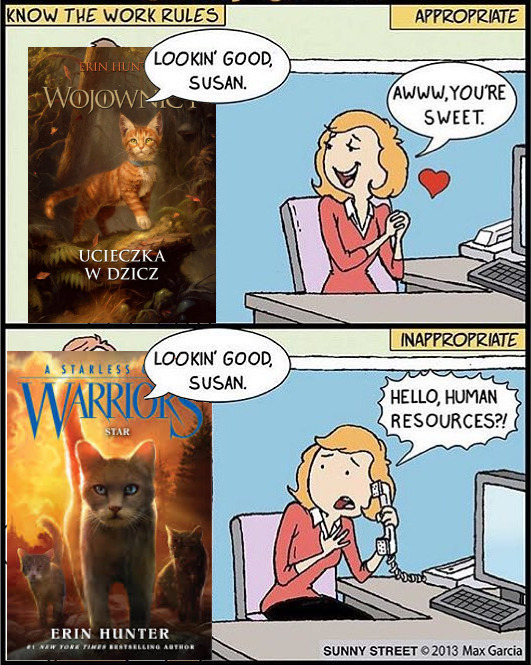
Obligatory Polish cover appreciation moment:
#artists on tumblr#warrior cats fanart#warrior cats#wc art#crowfeather#tawnypelt#leafstar#the elders quest#changing skies#warrior cats cover#warrior cats redraw
35 notes
·
View notes
Text

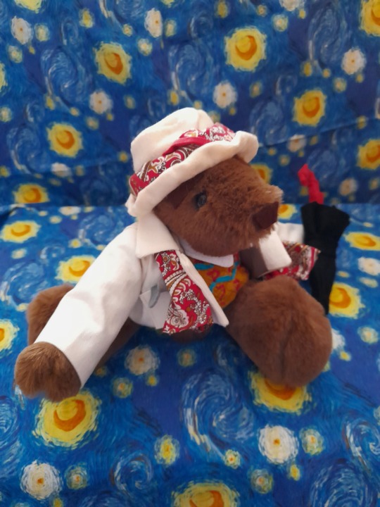
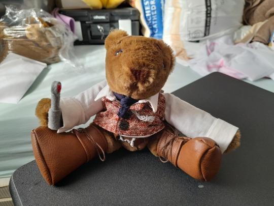
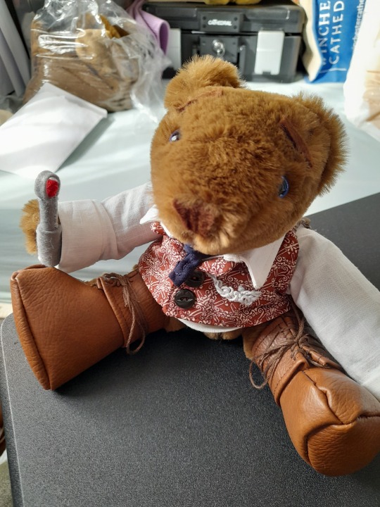
Bears, bears, bears! Bears everywhere! And Doctor Who bears at that, made specially for and presented by me to Paul McGann, Sophie Aldred and Sylvester McCoy at Portsmouth Comic Con.
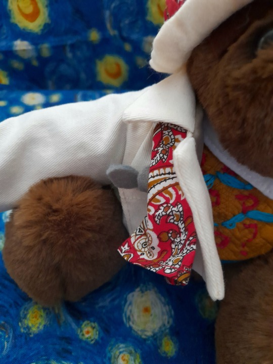
As most of you probably know, I document my bear-making activities on here and I made an Eighth Doctor bear a couple of years ago, followed by a Seventh Doctor last summer. Ace was a new one, and because of that I ended up making two, the first as a prototype that I kept for myself, working out the details of the costume, particularly the jacket, and the second for Sophie.
Back in February when I decided to make Anne Bearleyn I found that my usual type of fur was unavailable so I had to go looking for another, ending up with something that while it looked lovely was fairly hellish to sew as it shed everywhere. It was all I had when it came to making the first Ace bear, however, and so I went with that. Afterwards, having got covered in fluff again, I tried to find something similar to the fur I’d used for most of my previous bears, but when it arrived and I started putting one together decided that when compared to the bear I’d just made it looked cheap and nasty, which was definitely not what I wanted for this particular project. Consequently that fabric went on a one way trip to the bin and I ordered more of the other stuff, resulting in what I’ve termed a ‘furpocalypse’ when I decided to cut and sew three more bears in one day:
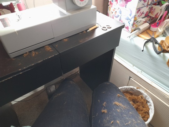
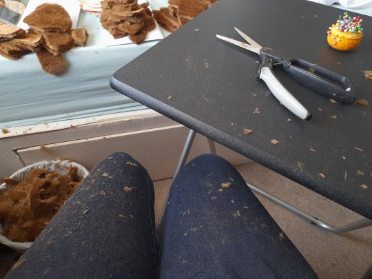
I had to vacuum both the room and myself four times, and clean out the sewing machine twice! That fluff gets everywhere, even up your nose! It was worth it in the end, though, as the result looks so nice. As the pile is quite thick I had to glue on the noses and use felt for eyebrows as thread just vanishes, but I think that actually looks better and allows for more expression.
I made a second set of Ace clothes while I was waiting for the fur to arrive; the first jacket had been a bit too small and I’d only had satin to use for the lining which disintegrates as it’s sewn, not something I wanted to give someone as a gift. It was a painstaking job to replicate the badges and decoration on the jacket with felt and embroidery thread, but I was pleased with how it turned out:
The costume is based on one from Remembrance of the Daleks, the skirt and t-shirt made from jersey and the decorations on the latter also of felt. She has a plait, rucksack and baseball bat, as well as a nitro 9 canister in her hand/paw (which I actually swapped out for a better one on Friday but didn’t take any pictures of it). The nitro is attached with velcro and can be exchanged for the bat. My only tiny niggle is that I made the jacket lining the wrong colour, only realising it should be orange when I started rewatching Sophie’s episodes last week, but that’s just my perfectionist side at work and her new owner didn’t mind.
“Aaaaaace!” You can see my original Seventh Doctor bear here; I changed a few things working on the new one, this time using blue eyes and making the jacket in cream rather than brown, mainly as a contrast with the darker fur but also so he would match season 25 Ace. I decided to use red paisley for scarf, tie, hatband and handkerchief, adding a red trim to the last two. The jumper once again took a couple of hours’ work, and as this was a present for Sylvester this time I did embroider question marks and chevrons all the way round!
For the umbrella I cut out several long triangles and stitched them together in imitation of a real brolly, using a bit of a skewer covered in felt for the pole (that’s not the word but I can’t think what to call the middle of a umbrella for the life of me!), to which I attached some jewellery wire pinched from my sister (shh!) twisted into the shape of a question mark. That was then covered in yet more felt. I’ve made a lot of things from felt lately!
And voila: one finished Seventh Doc bear:
I do hope Sylvester spots that he even has spoons in his pocket. 😁
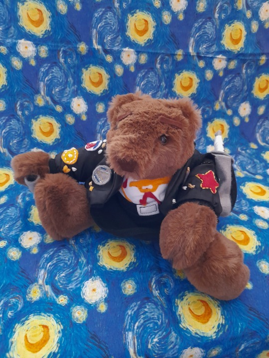
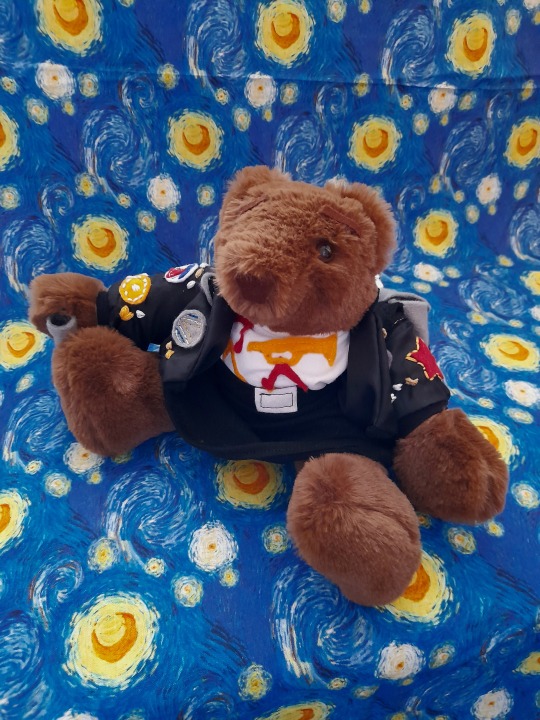
Last but not least, we have Eighth Doctor bear, which I actually started first but I didn’t have enough fabric for his coat so he had to sit and wait while I worked on the others. My original is here; he’s gone through a few costume tweaks as I’ve tried to improve on things and this time I mainly used scraps left over from my own cosplay and made them up in the same way: shirt, scarf, waistcoat, belt and gailters are all the same as mine, and the coat is identical material but from a different source.
His shirt and waistcoat both fasten with buttons, and I made the watch chain and belt buckle from embroidery thread. It took several attempts to get the boots and gaiters right, and I went from having quite a large piece of faux leather to something about a quarter of the size, most of it ending up in the bin! Unlike my Eight bear he has a sonic screwdriver, made from - yes, you guessed it! - felt. Fortunately the TVM sonic is quite a simple design, unlike the other one I made which can be swapped with this one to go with the Dark Eyes outfit I ran up on an impulse because I had scraps left from my own jacket and put in the bag with him; hopefully Paul will find it as that DE sonic took me two attempts to get (somewhat) right!
I changed the shape of the lapels on this new coat so that they were more like the real one, and I also took some pics of him in his Dark Eyes gear:
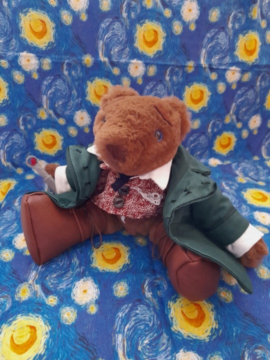
I confess that he was the one I found it hardest to give up. Look at him:
And he matches me!
I had to keep telling myself that I couldn’t keep him, I’d made him for Paul, but it wasn’t easy!
Finally, a few pics of them together:
I was so, so pleased with the way these turned out. Along with Bush (about whom I’ll post separately), these are the best bears I’ve made so far, and I’m glad that Paul, Sophie and Sylvester were just as happy with them!
#long post#sorry#sfs’s adventures in sewing#my bears#doctor who bears#eight bear#seven bear#ace bear#doctor who#eighth doctor#8th doctor#seventh doctor#7th doctor#ace mcshane#paul mcgann#sylvester mccoy#sophie aldred#i do wish i’d been able to get some pics of them with the bears but never mind#maybe another time
39 notes
·
View notes
Note
i adore your paintings so muchhh
would you happen to have any other tips or tutorials for your process? anything from thumbnailing all the way to final render
Thank you 😭♥ I appreciate that a lot!!
To start with I've got my advice tag (both new and veeery old stuff lol), & my youtube has a couple of speedpaints on it, one with commentary including process, brushes etc
In terms of general stuff about how I approach painting, I tend to tailor the method to the desired outcome. I talk about it more in depth on this post here, I also link to some references & tutorials that I really enjoy/recommend!
Besides that though, I guess I can do a little walkthrough of the Whisper & Tangle painting I uploaded a few months ago, since I tried something new with it that I pseudo integrated into my workflow & could be fun to talk about? 🤔

SO yes, I do always thumbnail when I'm doing a bigger painting, and they're definitely not pretty LOL. I usually use the colour fill lasso just to block in basic shapes and values with a gradient map slapped on the top -- I ended up swapping the values around in the end because it let me use the fireflies as the sole light source, making it more character focused! Then it's the usual process of resketching it all & flatting in the base colours (I also added Whisper's wisps hehe), then adding shading:
This is how I usually approach it, w/ all the shading layers clipped to the original flats to preserve editing. Multiply, screen & overlay are the most common layer modes I use while doing this, and if I'm ever struggling I'll sometimes add a gradient map too in order to unify awkward colours etc. The new thing I tried for this painting was doing what's often nicknamed as a 'clown pass' -- which is using hard edged shapes to create an easily-accessible selection mask for each part:
It looks Super funny but I actually found it very helpful, and I ended up using it to select & cut out all of their body parts onto seperate layers, which were then alpha locked. It meant I could go ham w/ large or textured brushes, smudges etc without worrying about losing those edges, or accidentally over-rendering and screwing up the anatomy in the process!!
I've kept doing something similar since, though it's a bit more dialed back; mainly using the lasso select to chop it up directly and preserve specific/necessary edges, grouping up similar body parts on a single layer etc.
After doing all that, I sat down and started rendering. The background was all blocked in & detailed with a hard round brush and these amazing brushes from Devin Elle Kurtz. There isn't anything super insightful that I think I could type on how I render, but I do have that speedpaint I mentioned earlier that'll probably shed more light. It's just a lot of eyedropping & painting, rinse and repeat
When rendering is done I usually add a concoction of adjustment layers, as well as an overlay w/ a noise texture on it. I also sharpen it all after doing so! These are the ones that I ended up adding for this painting:

The dupe & blur is a fun thing that doesn't always work, but it looks super neat when the painting itself calls for it, especially when paired w/ that noise texture. It can make stuff look like an old/low quality photograph or recording -- here's another example w/ a shadow and amy doodle I posted a few months ago:

That's about it for this painting, the majority of the time spent on it was honestly me rendering those damn leaves 🥲 Very tedious but worth it & it was a really good learning experience. I'm not sure if any of this will prove useful but thank you so much for sending in the ask, & if you (or anyone else reading this) wants a similar breakdown for a different painting of mine, please do let me know and I'll try my best to do one!! 🥺💞
#tutorial#kinda. i'm counting this as one... i should really start a new tag for these sorts of posts because theyre super fun#art breakdown#maybe??#either way thank you so much ♥
137 notes
·
View notes
Text
All The Colours In Good Omens: Version II
Part 1: Black to Gold
Even when I put together my original big colour meta back at the end of October 2023 I knew things were going to change on it. Over time it became pretty clear we were way off-track with several of the colours, and I didn't have anything for orange, which does actually appear in a significant amount in S2. There was also a bit of effort to try and incorporate the colours seen in S1 with what was appearing in S2, and to see if there was any consistency. Then I wrote the Passion of Jimbriel, and several particular religiously-themed colour-associations kept appearing, so I went on a search for a more biblical-based interpretation of colour. As a result of this, some colours have more-or-less stayed the same, some have expanded considerably in their range of meaning, and some are completely different! But I think you find the results interesting, nonetheless.
Basically, interpreting the colours in the two series is not a simple task. The colours used in S2 differ slightly to S1. For example, in S2 there is a lurid green associated with Hell (for reasons, which I will explain,) that is not used in S1. But there is also a dark green used elsewhere that turns out to have a different meaning that is not associated with Hell at all, so context becomes very important when trying to decide what it means. Rather than try and fit all the colours into one post, I'm going to split things up and take as much room as I need to explain it all this time.
BLACK
Biblical Meaning: Darkness, sin, Earth, affliction, humiliation, calamity, death, mourning
Additional: Suffering, punishment, Satan
Black doesn't automatically mean a relationship with Hell. The demons don't all wear entirely black, they are actually dressed in a lot of colour, but they do tend towards the darker shades. The colours they do wear reflect individual qualities or characterizations. For example, Lord Dagon is dark blue to reflect their fish god avatar, but it also reflects their senior authority and power. Furfur is in shades of dark green with a few tiny red highlights.
Historically black had an association with wealth over time, as it was difficult to obtain and dye black cloth. In out modern era we would tend to associate it with power and authority - or just looking "cool."
One interesting combination to mention is Aziraphale's magician's costume - black, gold and white. It's the only time we see him, an angel, wearing black. Originally it looked like he was clothing himself in mystery, but I would now say its a combination of calamity and humiliation. I've included a GIF set from S1E1 with the duo discussing Warlock's 11th birthday party in the park, plus recall Arizaphale was heckled from the audience in 1941 when his turnip trick failed. (I guess we could argue this one, its still up for debate!)

Black is also associated with the Horseperson Famine, who rides a black horse. Nobody is getting anything to eat tonight here - or the rest of the week, for that matter.

RED
We originally had red a a single colour, but it's more complex than that and needs to be split into two shades, scarlet and the darker crimson. (I will do pink in another post.)
We can still associate it generally with passion, romance, the Left Hand Side (the sinister side or demonic side), goats, sin, and the archangel Michael on the LHS of Jesus.
The Horseperson War and their parallel character Pepper from the Them both wear red as well. War is said to ride a red horse.
RED - Scarlet
Biblical Meaning: Royalty, blood of humanity
Additional: Martyrs, prostitution, wealth, power, revolution
Scarlet is a lighter red than crimson, just to differentiate between the two colours. It's the colour on the back of Crowley's collar.
Jesus was dressed in red during the Passion to mock him as a king, but he when he appears in imagery such as the sign on the Resurrectionist pub below it reflects his future status as King of kings. It also reflects his connection to humanity, through the blood he shed.
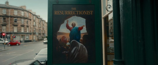
Prostitution is connected through the mention of the Whore of Babylon in Revelations, but the connection to revolutions is a more recent one that may be worth including in anticipation of S3. Wealth and power also belong here, particularly in historical connections.
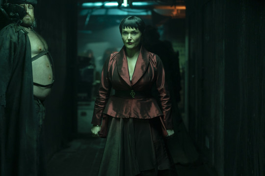
RED - Crimson
Biblical Meaning: Splendor, victory, sin
Crimson is the colour that Shax wears, the darker of the two shades of red. She comes across as being hungry for success and eager for promotion, both of which tie in with the concept of victory. Her darker red is also mixed with black.
ORANGE
Biblical Meaning: Fire of God, deliverance, passionate praise
Additional: sacrifice
Originally I did not have an interpretation for orange, and did not think there was a lot of it present in S2. Then it was pointed out that Maggie's shopfront was orange, she herself wears orange several times, a lot of the extras wear orange and Beezlebub's sash is orange, too!
Yellow and orange have some cross-over in meaning with sacrifice, but I'm going to do my best to separate them and I'll explain where the fuzziness comes into play in yellow, as I think it sits best there.
Both yellow and orange are also associate with fire, as flames are seen as yellow and orange, not red. The "Fire of God" is alluding to presence of the Holy Spirit.
YELLOW
Biblical Meaning: Faith and Glory of God, anointing, joy, presence of God, fire
Additional: Illness/leprosy, God's judgement and anger, sacrifice, optimism, faithfulness in awaiting the return of a loved one
Yellow is probably the most controversial colour of the spectrum. It's the colour of Crowley's eyes, and we know Aziraphale painted the walls of the bookshop to reflect this.
But let's turn all your preconceived ideas on their heads.
It's one of the colours of fire, so it is closely associated with the presence of God, but also the expression of God's anger.
It is the colour of clear olive oil used for anointing.
On the negative side it is associated with illness, in particular with leprosy.
It is the colour that the traitor Judus Iscariot is often depicted wearing in art.
And it is the colour of saffron and marigolds, both associated with sacrifice in more than one religion. Saffron as a colour can vary in colour from pale yellow to deep orange, and so can marigolds the flower. The flower is named after the Virgin Mary, as in "Mary's-gold," and the array of petals are supposed to be symbolic of the the rays of light that crown her head, relating to the giving of her self to the Ineffable Great Plan, so to speak.
Here's Norman, leader of the yellow team at Tadfield Manor, giving his speech that includes the line "...bugger off and tend to your marigolds." I've shown in other posts that there is the allegory of the Great War/Glorious Revolution being played out here, and Norman is the analogue of Lucifer. Right after his speech he runs out and is felled by a shot to the heart: a sacrificial loser, as all the yellow team and demons end up being.
Adam wears a t-shirt with two yellow stripes on it in S1. Combined with the blue, he does appear to be anointed for a larger role in the story.
Aziraphale's hat-bands are yellow after the 1827 Edinburgh incident. Both in 1862 and 1941 his hats have a yellow ribbon around them. While this could be related to a Heavenly aspect, fanon has it that it's part of his expression of his feelings for Crowley. The tradition of using a yellow ribbon to show that one was waiting for a soldier to return from war was started around the late 1700's.
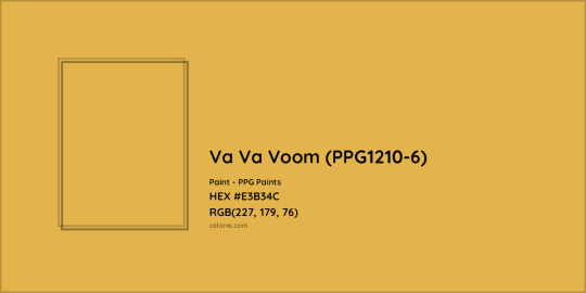
It is confirmed that the name of the colour used inside the bookshop is indeed called Va Va Voom. While it could be many things, the one thing it is not is fear.
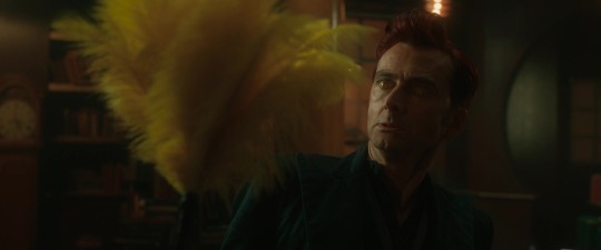
Neither is this example - it's more likely to be fire - cleansing fire. Jim is cleaning with it.
GOLD
Biblical Meaning: Glory, divinity, holiness, eternal deity, altar, beauty, precious, kingship, majesty, righteousness
Additional: Trial of Faith
Gold is usually associated with Heaven and the divinity of the angels in Good omens. Most of the time we see the angels with some trace of gold on them. The most obvious examples were the golden collars and trim on the robes in the Job minisode in S2E2. They even wore golden sandals on their feet.
The archangels and Aziraphale all have their golden rings. Here is Michael with their ophanim ring.
We also have the golden lions that occur in several locations in S2, representing the royal house of Judea that Jesus is said to belong to.
The most interesting use of gold has been on Crowley's "throne" in S1. "Nice chair," Hastur comments at one point.
Oh, and I can't forget this one, either:
This series on colour continues in the following posts:
Part 2: Green to Purple
Part 3: Silver/Grey, White & Brown
Part 4: Tartan Colours Review
#good omens#good omens 2#good omens meta#good omens analysis#colour meta#black#red#orange#yellow#gold#color meta
47 notes
·
View notes
Text
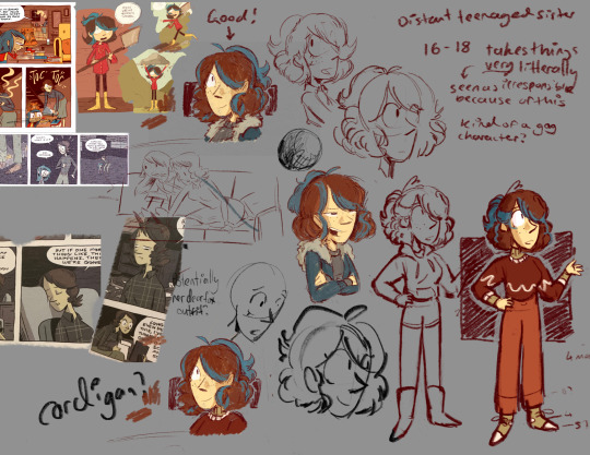

Early concept sketches of Midnight Giant Lauren! You can see me figuring out the style, colours, as well as Lauren’s outfits, plus a little Hilda that I wanted to include but gave up on cause I couldn’t get her to look right.
Johanna switches outfits about 3 times in this comic, so I wanted Lauren to do the same. Also, since Johanna’s deerfox outfit in the flashback is based off one of her looks in mountain king, I wanted Lauren’s to as well! So one of these outfits will be repurposed for teenaged Show!Lauren in the deerfox later down the line, which I think is fitting because she’d be around the same age in the flashback as Comic!Lauren is here
I didn’t talk much about my design process in the original post, so I’ll make a couple notes on that under the cut!
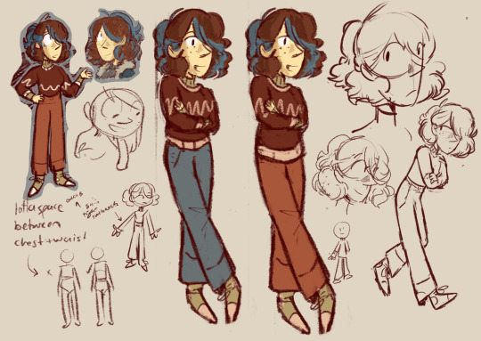
Here’s the final product for reference-
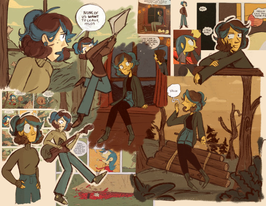
Though Johanna changes outfits about 3 times in this comic, one of these outfit changes is just the same outfit but with trousers instead of a skirt. So I wanted one of Lauren’s outfit changes to be more subtle, keeping most of the same items of clothing but only changing the jumper!
In terms of her outfits, I tried to add a little bit of a late 2000s - early 2010s vibe, which I think makes her fit in a lot more
Whilst this style still features quite noodley characters, it allowed me to bulk up Lauren much more than the troll did, so I took advantage of that and started adding in juuuust a little muscle! But she’s still kind of twig looking, so I brought back the same trick I used in the troll and gave her a big ol’ pile of logs and a heavy axe to weild in one of the sketches just to show that she’s a strong girl. I swear I tried to think of something other than an axe but it’s surprisingly hard to think of heavy objects that a character would just be. Carrying around lol
Looking back at this design a few months later, the biggest thing I’d change is I’d make her look a bit younger. It’s a little hard to design a unique character when you only have two points of reference lol, one of which is an adult and the other of which is a child, so I think I made her look a bit too much like an adult, oh well!
One thing I kept though to help her look younger is her freckles, same as Hilda! I love freckles but I swear I never use them in character designs. This design feature disappears from Hilda in the later comics, but I wanna keep them for Lauren for as long as I can tbh…
I mentioned before that I thought it would make sense for Lauren to go through a couple different hairstyles before reaching her final one in these early comics - the designs in the show are based off the ones in stone forest, which was the most recent comic to be released at the time the show came out. The style and characters designs had changed a lot from the early comics, and one of my favourite things about reading through the series is seeing how the designs changed and progressed before reaching those “final” versions, so I’m kinda reverse engineering Lauren’s design process to get that effect here, and I think one way that’d be shown is through her hair. Here her style is getting closer to the final version, her fringe has been lifted so it no longer covers her eye, and she’s got more of a curl! But her strands fall a little differently, so we’re not quite there yet…
I struggled a LOT with colouring this one, and that’s because I got the colour count wrong! One of the most overlooked ways to emulate a style is to count how many different colours appear per character - Hilda The Series generally has 6, 2 for hair and skin, and 4 for outfits, though the number can change. I miscounted here and thought the comics had 4 outfit colours like the show, but they actually only have 3. Once I realised that it made things much easier, though I still sent a little over it with some varying shades of green in her shoes. These kinds of rules generally aren’t firm, and might not even be one’s the original artist is even aware of, but when you’re trying to emulate someone’s work these little things can make all the difference
Show!Lauren probably doesn’t play guitar, I’ve mentioned before that I think she’s decent at piano and I stand by that, but I thought it was fitting for Comic!Lauren lol
That’s everything I can think of right now!
#hilda#hilda the series#art#my art#netflix hilda#hilda netflix#digital art#fanart#doodle#drawing#Hilda lauren#Lauren hilda#hildafolke#Hilda comics#character design#hilda oc#oc#my oc#sketch
84 notes
·
View notes
Text
THE D'AMICO CRIME FAMILY RELATIONSHIP MAP.
Content warnings: brief mention of sexual abuse, cartoon imagery of blood, cigars, cigarettes, discussion of struggling to transition, discussion of physical trauma. This AU is centred around a criminal organisation and by default involves mature themes.
Over hours, through a painstaking design process, I created an illustrated map detailing the relationships between frontal characters in my Simpsons alternate universe, The Good Ones. A lot of love and effort has been put into this, so I hope you guys like it! If there are any characters you'd like to see drawn, just let me know.
More info and close ups of icons beneath cut!
I know I always say this, but interactions, especially questions would mean SOSOSOSOSOSOSO much to me, as I've put so much thought into this and would LOVE to yap to interested people about it. I know art is done for oneself, but it feels really good to share my creations and hyperfixations with the Simpsons community :)
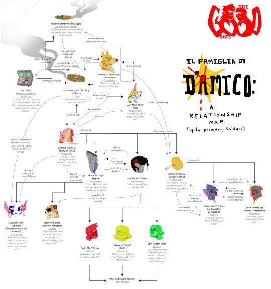
For every character, I drew a little icon and wrote a line of dialogue, in order to give some inside into their personality and traits in a concise way. A few further explanations and elaborations are given below!
Valentina 'Tits' Albertini
Her icon is a visual pun, featuring two Great Tits drawn in the colours of the transgender flag.
Aside from Memphis, Valentina is the only other explicitly genderqueer character in the AU's focus (Lucy-Mae is heavily implied to fall under the nonbinary umbrella, but she never personally feels the need to explore it further, and is happy with identifying as female). Her former nickname was a play on how ballsy of a person she is within the mafia - though Cora is a wildcard, she makes very rash decisions: Valentina is both calculated and bold, and her current nickname is a crude (fittingly), but well-spirited adaptation introduced by Memphis. After coming out, she experiences backlash from Tony, who is concerned her late transition will impact the image of the mob. Memphis, being a trans man, asks him why Valentina is any different from himself, and in the heat of the moment, Tony exclaims that half the people in their own family have no idea that he's transgender, which leads to some tension between the two. Tits' main character arc revolves around her exploration of gender and gender expression, and the character that plays the biggest role in it is Tony's son, Michele (purposefully drawing parallels between Tony and Memphis' own relationship, and showing social change between generations).
Michele 'Softfoot Mikey' D'Amico
His icon is a nod to his (in this AU) love of ballet, and how he uses it to his advantage in his role as an underboss.
Michele is a simple evolution on Tony's canon son, Michael D'Amico. In this AU, he's been aged up to 23, and instead of having an unconventional love for cooking, has an unconventional love for ballet dance. Most all of his other traits have been kept the same, however, aside from the obvious fact that he's more rational and mature than his in-canon counterpart. He's straight, but is portrayed as very effeminate - and comfortably so. Mikey really just is a girlboss who never fails to (sometimes literally) slay.
Cora 'Connie the Howler' Mezzasalma
Her icon plays on her nickname, portraying a dog with some of her key characteristics, such as a matching necklace given to her by her adoptive brother, as well as a splatter of blood - presumably from one of her usual 'errors'. Her nickname refers to the colloquial term howler, meaning a laughable mistake.
Frankie's awkward adoptive sister of Greek origin, Cora was initially made with the sole purpose of providing a dynamic for Frankie, outside of his relationship with Johnny (which is still the primary relationship explored), but she really grew as a character. Initially I made the name 'Connie the Howler' on the fly as a sort of female version of 'Frankie the Squealer', but I ended up actually putting the effort in to rationalise it and bring it into her character. The result was an awesome little dynamic between two characters who were equally stupid, but in very different ways. She may be responsible for a number of incorrect hits, as well as a good few accidental deaths and injuries, but at the end of the day, she's a silly girl at heart who really synergises with her brother's anxious energy.
Maximus 'Legs' Legman & Luis 'Louie' Walters
Both of their icons refer to an car accident the both of them got into, wherein Legs, ironically, suffered severe damage to his legs (resulting in the amputation of his left one), and Louie underwent significant cranial trauma.
The two do admittedly have a closer relationship because of the shared experience, though they both experience significant impacts. Notably, Louie develops Broca's aphasia (yes, I know the injury is on the wrong side, that's my bad), a form of non-fluent aphasia where one's quality of speech and grammatical structure is significantly diminished - even though the words are in your head, you cannot get them out, usually due to damage to the area of the brain responsible for the production of speech. Louie really struggles in the aftermath, and has a difficult time adapting to his disability. Thankfully, he's got his friend there to help him through it.
#I'm really obsessed with all my babies#the simpsons#god this took so long#memphis yamamoto#my art#art#fiction#artists on tumblr#my oc#the simpsons fanart#oc#my au#aus#design#relationship map#character map#mafia#organised crime#original character#original art#character#the simpsons oc#simpsons au#fat tony#johnny tightlips#frankie the squealer#vittorio dimaggio#dan gillick#interactions appreciated#asks open
23 notes
·
View notes
Text
ALRIGHT!I JUST WATCHED THE MIRACULOUS MOVIE AND I HAVE THOUGHTS! There will be spoilers ahead, so tread carefully
A list, in no particular order, just how they pop up in my head:
The animation was STUNNING! Just, props to the animators, I enjoyed the movie visually SO MUCH! From the use of colours and lighting, to the way they used all of that to upgrade the characters: it was absolute perfection. (though some of those close up shots of Hawkmoth were A Lot. But that was probably the point)
The absolute chaotic energy that both Tikki and Plagg (but mostly Tikki, cuz unfortunately. there wasn't a whole lot of Plagg, which I understand due to time, even if it is sad) is FANTASTIC! I adore Chaotic Tikki so much. She has my whole heart! That little scene of Tikki pushing Marinette's hand to Adrien's? Lovely. Tikki explaining absolutely nothing to Marinette when they first meet? Perfection. Just. Give me more Chaotic Tikki, please!
The soundtrack? WONDERFUL! I kinda knew it was a musical, I think, but I completely forgot, so when Marinette sang those first few notes, I had to catch up a lil, but DAMN I was excited! (sad we didn't get Ce Mur Qui Nous Separe (I don't know the english name oops), but it was still fun!)
On that note: Adrian having the most Disney Princess I Want song in the movie is just perfect. No other words needed. Best choice they could have made there.
ALSO on that note: Marinette's singing voice? BEAUTIFUL! It fits so well! I just couldn't help but enjoy her songs, if only for that.
BUT I didn't have to, because the music itself, without the lyrics was just so well done!
Slightly less good: The hawkmoth song was missing some flavor, in my opinion. It started out, and I was EXCITED cuz it started so HARD and then it didn'treally deliver, I think. It kind of kept in the same range and didn't really go up, ya know?
I really REALLY liked Marinette and Chloe's relationship. The way Marinette fired shots back at Chloe, and they actually seemed to be becoming more frennemies? Amazing. I wish we would've gotten more of that in the tv show, considering earlier seasons Chloe and her character developpement, but I really enjoyed it here, in the movie
I'm happy we got to see Gabriel and Adrian actually confronting each other. Both Adrian standing up to his dad (although the timing was a little off, more on that later), AND Gabriel finding out his son is Chat Noir and the resulting Crisis. At least there was some emotional pay off there! (looking at you, season 5 finale)
NOW on the timing thing: There just wasn't enough time. I understand that they wanted to do the superhero origin story for people who aren't familiar with the show but do go to see the movie, but I feel like they just didn't have the necessary time to create the emotional tension needed for the end scene to actually hit as hard as it could have. We got to see a hint of Adrian and Gabriel's relationship, and what was shown was great! But if we had gotten a little more of that perspective and tension, it would've felt better to watch Adrian stand up to Gabe and his parenting skills. And consequently, enjoyed more of the end scene with them figuring out each others identities. Genuinely, I was happy we got at least some pay off there, but it felt too easy. (which again, makes sense due to the limited time, but I feel like they should have made choice: either the Big End Fight with Hawkmoth, OR the Origin Story. And since they did kind of set up a possible sequel, I feel like the choice could have been made)
With the feeling of too easy: I had the same feeling of Marinette and her finding confidence in herself and Ladybug AT THE END! The sudden change during the montage, I liked and felt like it made sens, since we then, during the big battle, get Marinette's insecurities over only being confident when she's Ladybug and all that. That is wonderful and so in line with the core of who Marinette is as character, no matter what version of her we get, that I love it very much. I would have enjoyed a liiiiitle more time with the Angst, but it's allright!
MOSTLY CUZ: that scene where she's dragging Cat Noir's unconcious body onto the debris of the Eiffel Tower, and she goes 'Don't. Touch. Him.' through tears and with a broken voice? AMAZING! When I tell you I Went FERAL! My children! absolutely STUNNING
The actual fight of the end battle? Marinette surrounded by flame and a Paris that is falling apart? Ladybug in Hell, essentially? GORGEOUS! Cat Noir running up the Eiffel Tower to fight Hawkmoth? Stunning! The Eiffel Tower slowly collapsing, as Ladybug watches and cannot Do Anything to stop it? HEARTWRENCHING!
Marinette revealing herself to Adrian at the ball? AMAZING SCENE! (although i laughed and had to utter 'Real Subtle, Marinette' when I saw the ladybug wings on the back of the dress, which was, againg, stunning). The way the scene was framed like the rejection scene? WONDERFUL!
The glitter on Chat Noir's mask? I loved it! Such a fun little detail we don't get in the show!
Did not like the Plagg farting scene. Just. No thanks. It's cheap comedy and that runtime could have been spent better, with a better characterisation of PLagg and his relationship with Adrian. But whatever, it's fine.
THE LADYNOIR CONTENT AND BICKERING! JUST FANTASTIC! ladynoir stans got FED this movie, and I am HERE FOR IT!
So yeah, that was an incomplete list of my thoughts on the movie! Overall I really enjoyed it! I really liked this version of the characters and their relationships. They feel a lot more genuine and real in comparison to the tv show, in some ways. I had so much fun watching it, and will probably go a second time, to see how it'll feel like on a rewatch. And just to enjoy the vibes. I do hope we get a sequel, because I am Curious. And would love more Natalie content.
#miraculous movie#mircaulous ladybug#chat noir#gabriel agreste#chloe bourgeouis#tikki#plagg#ladynoir#marichat#adriennette
99 notes
·
View notes
Last Seen Blogs

theexceptionalconservative-blog
THE EXCEPTIONAL CONSERVATIVE SHOW

ememacaa
shishamo
theexceptionalconservative-blog
THE EXCEPTIONAL CONSERVATIVE SHOW

rasfness
rasfness

fortifiedwagers
curtain call.