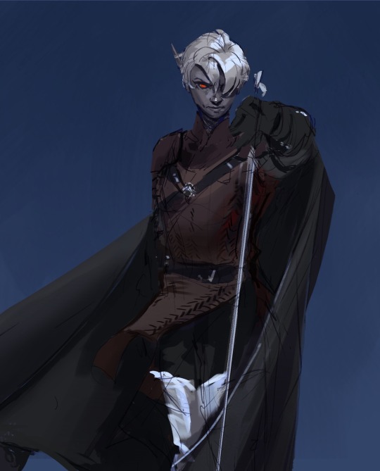
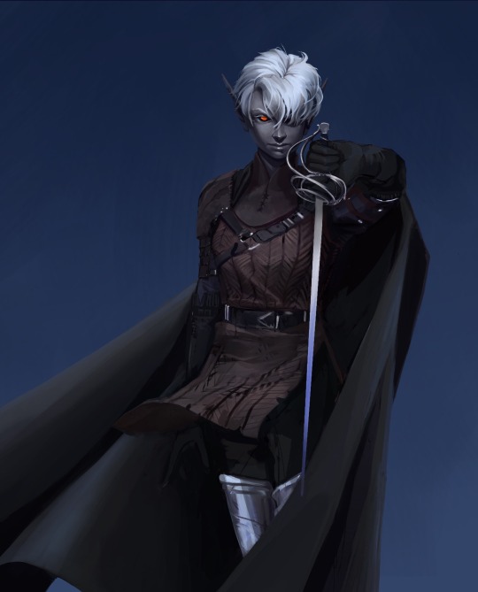
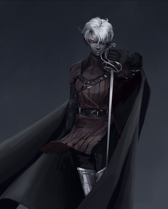
#I FEEL BAD THAT I DON’T HAVE SOMETHING WITH LOTS OF COLOR but like sketches should be fine right hehhehehehhe
Explore tagged Tumblr posts
Text
Happy 10th anniversary to the most handsome lady ٩(๑❛ᴗ❛๑)۶
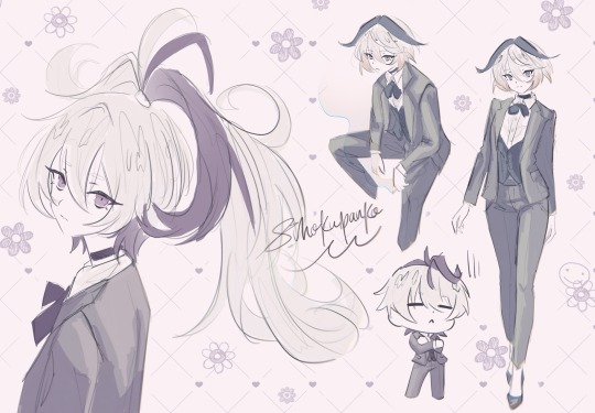
#vocaloid#art#fanart#vocaart#procreate#cevio#vflower#flower friday#v3 flower#v4 flower#cevio flower#フラワ誕生祭2024#flower誕生祭2024#SHE’S TEN ALREADY I THOUGH SHE WAS TURNING 7 THIS YEAR I’MA CRY DHDHSNJS#I love her so much it actually hurts#the serotonin I get when I listen to her is just#I FEEL BAD THAT I DON’T HAVE SOMETHING WITH LOTS OF COLOR but like sketches should be fine right hehhehehehhe#also yes I’m the badass that decided she gets to wear a suit#I drew my favorite flower designs so far :DDDDD#it’s almost 2am I’m gonna be so exhausted in the morning#anyway happy birthday oh handsome one (step on me /j)
96 notes
·
View notes
Text
got the posting anxiety bad tonight
#click clack#ok a peak into my thought process and anxiety here we go#ok so the art is almost done and up to standard I would post onto my art blog#BUT for some reason the thought of posting art of my ocs there scares me#because even tho it’s my art blog in my mind it’s the equivalent to a art gallery that demands being detached????? from the art#like once I share it there it’s no longer ‘mine’ but to the public#and my ocs (plus the stories that go with them) are like the closest to my heart and relinquishing them feels like a lot#a part of my imagination that I spent so much time with developing over the years to be placed up for judgement…#so then the solution could be to put it here on my personal! the online space cozy enough and filled with other posts that could easily bury#the original posts I put here#but there goes my other dilemma. i don’t want them too associated with my personal for if one day i do muster up something for publication#my big fear is that ppl will find this space and go thru everything. the fear of being perceived and judged 😵💫#all the hypotheticals and anxiety for something that may not even happen#dumb mind problems my head made up 🙄#anyway writing it out helped lol I’m posting it to my art blog I decided 👍#I have to work on getting that blog to be comfortable space to post… i should lower that silly self imposed standard I set for myself#and be whatever about ppl being aware of my online presences#maybe… [grinding my teeth] I should post my messy sketches onto my art blog…#I should take my friends suggestion and make a website to feature my ocs…🤔#idk my only other solution that doesn’t feel viable to mitigate the anxiety is to slowly introduce my ocs in the background of setting art#just a slow drip until they are in the forefront#bleghhh whatever much ado about nothing it’s like I never posted my ocs ever when I have indeed posted them before on both places ( º_º )#I’m realizing it happens too when I post too much fanart in a row… I have curator disease??? 🫨#or something I used to be very particular about what order I reblog stuff like it used to be by color and content balanced out#I still do to a lesser degree… but it used to be pretty bad#post order compulsion????#the fear of being abrupt and incohesive in between posts…#if you read this far thanks you can now see how much this consumes me 🙃
7 notes
·
View notes
Text
Astro notes.
random astrology things I’ve noticed.
don’t try to start an argument with a virgo mars!!!! these individuals never really care enough to argue UNLESS you’re saying something that they know it’s wrong. they won’t let you get away with it. they will explain you in detail why you’re wrong in a passive aggressive way. making you feel really dumb lol they love being right
mercury in pisces. most find it hard to express through words to say exactly how they feel so instead they do it through music, songs,, art, sketches, some hand-made gifts. any kind of act of love. and they love those kind of things too. they find it more meaningful.
leo risings usually have a good sense of style. they want to look nice, wear nice clothes, nice jewelry. they tend to be super shy and quiet too, they have a hard time opening up to people. which is weird bc they have alot of charisma and people usually gravitate towards them, mostly because they’re fun to be around. but sometimes they care too much about what people think of them and that can stop them from being themselves.
moon in capricorn are so hard on themselves. whenever I think of this placement, it reminds me of that knot on your throat when you’re trying so hard not to cry. just holding back the tears. that’s them. all the time. and it’s not just tears they’re holding back, it’s also the words they never say when they’re really upset, completely avoiding any kind of interaction. or the good news they don’t ever share because they’re too afraid it’ll go away. or just anything that they keep to themselves bc they don’t want to bother anyone else. They’re also really intuitive!!! I feel like Capricorn is not known to be intuitive like that but it’s the fact that they can read people very well, they see right through people and they’re always ready for what’s going to come next. this placement can definitely make someone much quieter than usual, no matter the sun sign.
libra risings are extremely social and likable!!! this people love the attention and you definitely notice them from afar. they’re so good at fitting in. they have such grace to them, which is such a Libra thing but having this sign as your rising, it’s the way you come across to other people. They really try to stay out of drama and usually the ones to be cool with everything and everyone. they adapt very easily to their environment which can be good or bad. very easily influenced. they also like aesthetics a lot. visuals mean a lot to them. they want to make sure they look good at all times and they’re big on words meaning they like compliments a lottt!!! they look better with neutral and pastel colors. physically they tend to have longer faces and a fuller bottom lip from what I noticed, usually leaner body type. even if they’re not super fit, they have a good body distribution.
gemini risings just like any other air sign, also love to interact with people (sometimes) but they tend to be more reserved. they only open up once they comfortable then they don’t ever stop talking lol they’re super bubbly and curious. and can often be super observant. you can kinda know they don’t like you if they don’t talk you a lot lol because they truly loveee to talk. it’s a little difficult to spot them right away because they tend to blend in with other people but once they open up, you can see the their Gemini coming out. they tend to have small facial features, they can even be shorter in height. and there’s a more reserved look to them, kinda like virgo. but unlike virgo risings, gemini risings look somewhat more approachable and relaxed.
mars in pisces easily catches feelings because they won’t ever stop thinking about that one person. Most of the time they don’t even know the person that well but it’s just how they feel. And they tend to have a very sweet approach to love, lots of emotions, kinda like not being able to fck around with other people once they’re in love. They also feel like they have to vocalize it to get over it. They can’t really move on easily, no matter how fucked up the situation is.
mercury in any fire sign (leo/aries/sagittarius) are always having to tell people it’s just a jokeeee lol they tend to be very direct and their type of humor is usually so stupid, it sounds like their making fun of everyone but it’s also usually their love language. they love when people match their energy, they feel free to say anything and they lovee ittt!! another thing is If they don’t fck with you, they won’t even bother to talk to you, they might even talk sht about you or make little comments like that, they need to make it lol
moon in pisces struggles a lot to open up. it’s such a weird thing because they wear their heart in their sleeve so everyone knows they’re not doing well, people notice there’s something off, you can even see it in their face and eyes, but a moon in pisces will never be able to fully talk about it. it’s almost like talking about it makes it real and they don’t want any negative feelings. We all know they live in their own dream world, where it’s safe and peaceful and happy. and it’s all good until reality hits. And they hate it. they want to crawl back in bed, fall asleep for days. listen to some loud music and just close their eyes. They need to shut their minds off so it’s very common for them to develop escape mechanisms. can be really bad habits that make them feel so good. they really need to keep their mind clear and out of any negativity because everything they think about too much becomes real. a lot of popular music artists atm have this placement and you can kinda see how well they blend in with whatever is going on. you can see their genuine interests and opinions in their songs and performances.
moon in the 5th house ppl are creative!!! whatever their hobby is, they make sure it’s done right and they’re usually so good at it. their delivery it’s amazing. they express how they feel in such a dramatic way.
venus in aquarius is an interesting placement. it reminds me a lot of venus in virgo and I do think they have a lot of things in common but I still think venus in aquarius is more complex than that. They need reassurance in any way possible because it makes them feel safe but they are too afraid to committing to someone and having to emotionally depend on someone. And it’s not that they’re disloyal, if anything they’re one of the most loyal placements. they love imperfections, they love the real and raw. they understand there’s more to people and they accept people. but they’re afraid of it. they don’t think someone will be able to love their imperfections, so as soon as they start feeling too much, they take a couple steps back. they suddenly need some space. or at least that’s what they think they need. they don’t like to detach but they do it when they feel unsafe or unloved. and it’s always something that they can’t even understand themselves.
#virgo mars#mars in pisces#pisces mars#mercury in pisces#virgo rising#libra rising#leo rising#moon in capricorn#capricorn moon#gemini rising#moon in pisces#pisces moon#mercury in leo#mercury in aries#mercury in sagittarius#moon in 5th house#venus in aquarius#aquarius venus#mars in virgo#astrology notes#astrologia#zodiac signs#astrology#leo#pisces#virgo#libra#gemini#aries#sagittarius
1K notes
·
View notes
Note
could you do a blackberry x adventurer fankid if you havent already pretty please :3
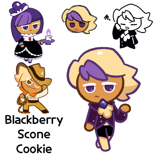
I can’t really say that I made this because of the aforementioned “I haven’t drawn anything in a while” post, it’s just because I was scrolling through my requests and remembered that I was in the middle of drawing her before and thought “might as well finish”
Anyways sorry, this is Blackberry Scone Cookie
So if I’m being perfectly honest, I don’t entirely know what her deal is. I know that, unlike her father, she is very willing to acknowledge that she’s rich and uphold that side of her family. She’s also at least outwardly, very similar to her mother in being generally reserved in her emotions. I think one idea I had for her is that she does cool things, she just does with a disinterested face, which kind of just heightens the coolness
Okay so I’m gonna be completely honest, I am now going to just make something up as I write. That top part was in part for me to figure something out
Outwardly, she seems disinterested, but she has plenty of emotions, you just either need to pay attention to her actual words instead of tone, or you just need to get close enough to her for the mask to fall. She also has quite an interest in stories of magic and in mystical artifacts, though she prefers simply reading about them over going out to find them. Also, despite her interest in the subject, she just doesn’t have that much of an ability for magic/the occult, and has difficulty seeing ghosts (best she has is that she can sometimes see Onion), which is one of the reasons she sticks to simply reading about them rather than going out herself
While she has respect for her father in how he goes out on his own to seek out treasure and artifacts, she just doesn’t understand why he hates his rich life. Her only real guess is that he sees it as clashing with his adventurer persona, which she thinks is kind of stupid. She’s also pretty much the one running the estate while he’s gone (she’s an adult by this point) and being the one to actually deal with things such as house guests. Not to say Adventurer was an absent parent, and he’d actually take her along when she was younger on some of his expeditions, but he can disappear sometimes now
She doesn’t hate her parents, and it’s not like they were horrible parents to her, but she feels distant from her mother due to her lack of ghost abilities, and some amount of resentment for her father for being so attached to this persona of his and his disdain for his actual heritage, especially since she’s fully accepting of it and it unintentionally makes her self conscious about it
She’s not super sure of her place in the world, but for now she’s just trying to do her job as a member of a rich family
Hm, so I ended up writing more on her than I thought I would. Ah well, not a bad thing. Well, design time
So her name’s Blackberry Scone due to me headcanoning Adventurer to be some sort of shortbread or biscuit (I know they’re the same thing in other countries, but I’m unsure as to what kind of biscuit he is now). Scones are kind of like biscuits, add some blackberry and there you go, blackberry scones
A potential name was Blackberry Cobbler, but I think I prefer scone, especially since I made her more rich-seeming
Blackberry scone:
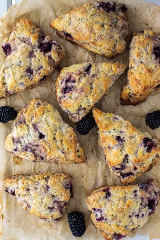
So almost everything I made of her, outside of the small sketches and some of the colors, I made a couple weeks ago while waiting at the dentist’s office, and I mostly blocked her out of my mind after that as a result. So I don’t really remember a lot of the design process
I feel like I gave her that hairstyle to make her look “cool”, but then I kind of threw that aspect of her character away. But I still like it, so she keeps it
Also, her suit was originally a bit more reddish, but I changed it today to make it more purple so it’d fit with the color of the scones. They don’t really look that red, so I changed it. But I think now the colors may not all look the best together
I feel like I may have made her colors all a bit too similar to each other, and/or not given her enough, but I don’t really know what else to change
Also when I came back today, the thickness of the lines was bothering me. Maybe it’s because I’ve been dabbling with the Syrup brush now, but I think I need to play with line width more now, since some of the smaller things like the brooch feel like they have too thick of lines
I don’t think her design is necessarily bad though, it’s mostly color wise I have issues with
And yeah, that’s Blackberry Scone, I hope you enjoy her
#I’m kind of bored so I don’t know what to do now#maybe I’ll draw another but I’m not sure#or finally get around to writing Mochi’s description and giving him a character#who knows#cookie run#cookie run kingdom#cookie run ovenbreak#blackberry cookie#adventurer cookie#adventureberry#that’s their ship name right?#cookie run oc#fankid#fanchild#blackberry scone cookie#my OCs#my art#requests#answers
75 notes
·
View notes
Note
If you don’t mind me asking, what’s your comic making process? I find it hard to make comics that look eye-pleasing to read and yours are like candy.
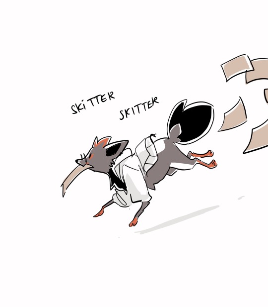
Ah, comics! Dig under cut to see some old wips as I attempt to explain my nightmare thought process to you.
For making a comic AESTHETIC and APPROACHABLE:
I've noticed that it's easier for people to be pulled into a comic if I set the environment first and foremost, so people have some vague context for the scene. Of COURSE that's not always necessary ( there are a lot of comics that start out without environmental story telling and it works perfectly) but I've always liked having a lil illustration before digging my rat claws into the meat of the story.
For example! “Emmet and Elesa have a clandestine meeting in the library at 4 am.”
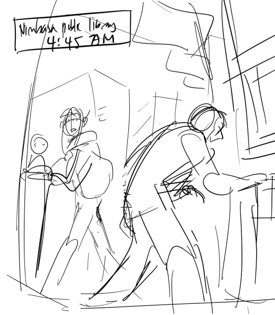
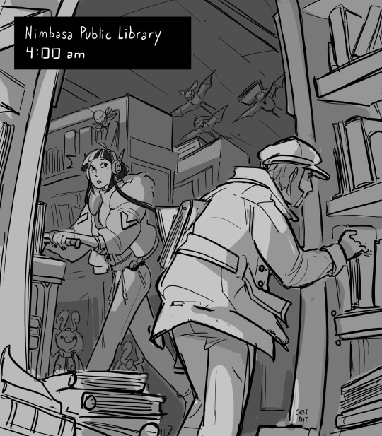
The sketch was sort of the jumping point to where I wanted to go with the comic. I wanted to a. explain wtf is happening and b. draw a nice conclusion about what the f is happening.
You don't need to make the environment available in every panel too! I'd suggest making your first panel tell all the environment detail you need and then like... slowly removing irrelevant detail from there. And then hit folks with the background again at the end. (So basically, you don't see the library in this comic until the beginning and a bit towards the end. I have tricked you! aha!) So that's one tip i have. For Readability: Anyways, to make a comic easy to read, spacing is super important. Dialogue tends to cramp a shot by a WHOLE lot. For example! Remember the "Lamp is told she's beloved (and has a tsundere moment over it"? That used to be TWO panels. Man. Nightmare fuel. Lemme find it. (This is the rough. I Lined It, realized the pacing is off, and then withered. Please don't look at it too hard.)
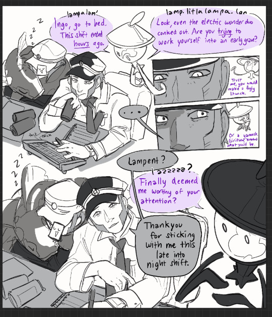
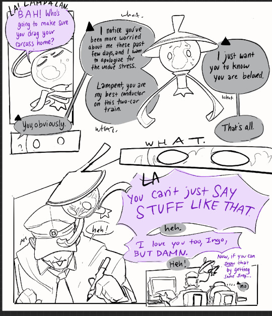
So here's the thing. This READS. But the sheer amount of dialogue in the beginning is fatiguing for me and the "you are beloved, Lampent" NEEDS that oomph of both characters realizing that over the span of years, their relationship stopped being antagonistic and started being family instead. Some folks are fine with blocks of dialogue, but I have the attention span of a patrat on candy. I will not make it. SO! To match the almost moody atmosphere, I stretched the comic out. I stretched that bad boy out a LOT. And I got this out of it.
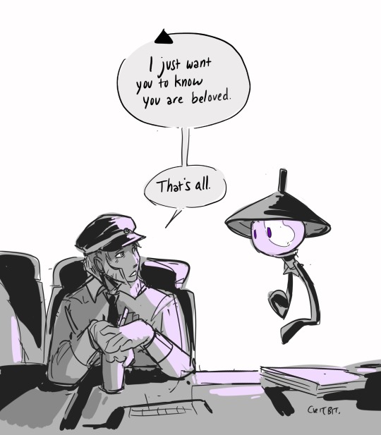
Something to keep in mind in comics is there's always going to be one or two iconic lines. Lines that make people FEEL things. Those lines deserve their own panel, their own shot, their whatever. A good story has lulls in its conversation. If you can replicate it, you're winning. Character Blocking:
So basically no, it's not all witchcraft. It's only a bit of witchcraft. Another thing that helps is differentiating characters if they're on the same panel is by solid blocks of color. I have, for the longest time when working on storyboards, blocked characters different tones in order to help differentiate them. Don't be shy! Do that if it helps your comics read! Ingo will always be darker shaded then emmet. The angry nightlight will always have some hint of purple on her (unless I forget). The first goal in a story is to convey information, hehe. Here's an example of color blocking! (This is from a VERY old botw comic I did for linktober in 2021.)
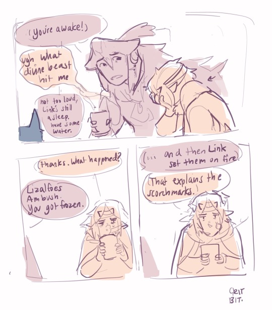
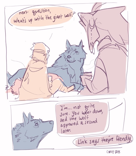
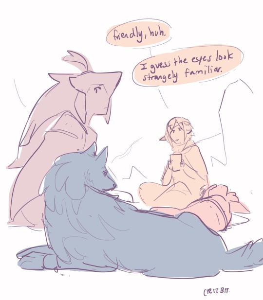
It's, ah, rather rustic compared to what I do. usually. I know! BUT the primary goal here is to convey where the characters are in relation to each other. And the fact they're color coded makes life easier for both reader and artist. Alright! That's all the tips I can think of off the top of my head. Time to get off that soap box, haha. Overall: Basically, my work process is-- draw a story telling image/ write a funny piece of dialogue. Build the comic around that. Pace it so the important lines stand out. Color code the characters for max visibility. And then four to twelve hours of lineart, but that's neither here or there.
Thanks for coming to my unregulated rambling!
#tutorial#but hideous and mostly cobbled from limestone and willpower#ask#mailbox#critterbitter#wip#botw#just some comic stuff!#submas wip#critterbitter screams into the void
326 notes
·
View notes
Note
guhhh…. could you maybe give some pointers on how you render I adore it
thank you so much 🥹! it’s important to note I use procreate and mainly use the mercury brush for my rendering. buuuttttt we’re doing this on ibis paint on my phone because I don’t have my ipad with me, but the process remains mostly the same!
this is a bit lengthy so read more under the cut :3
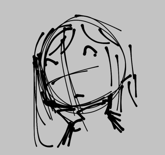
1. rough sketch
this is just a base sketch and can look rough as possible or even just be a few lines, what matters is that we get something down on the canvas to make better later!
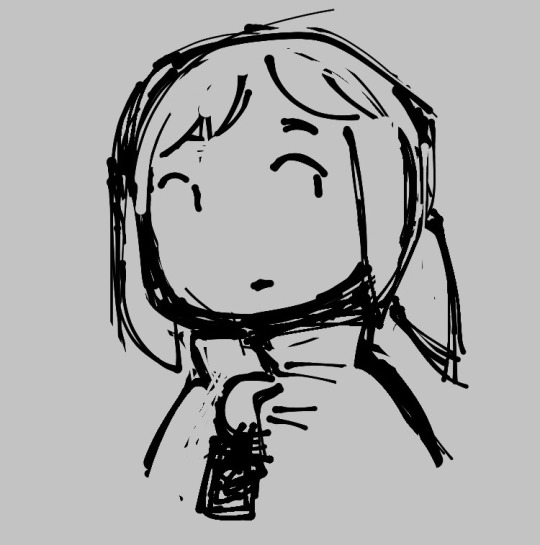
2. line art!…sorta
I don’t typically do the traditional lining as I’m awful and shaky with lines, so I often just clean up the sketch or make messy lines and render them up later! any way works though, the point here is you just want a cleaner sketch or lined form!
3. flats and shading or other doohickeys you may add
I do my flats with a big brush and lasso tool it all, I may also do minimal shading here.

4. merge those bad boys (layers) together
this is where the magic happens. I grab my lasso tool and begin to make shapes and highlight along with bigger blocks of shading. I like rendering this way because my brain doesn’t have to do too much work and can easily make new forms with just shapes.

5. color changes (can be done at any point in the coloring process)
one thing about me is I am indecisive as FUCK. I may like how one set of colors looks but then prefer another color, color balance is your friend! feel free to play or mess around with different hues or warm or cold colors to get the colors you want, I’m more partial to saturated colors.

6. final rendering touches along with cleanup, as well as going over lines and adding more flair
this is where I add a lot of triangles or hatching, decided to just do hatching here. this is where most cleaning happens.

and with that we’re done! I hope this was easy to understand I apologize if not I am terrible at explaining things 😭 but I hope this helps anyone who’s getting more into rendering or learning how to! this is just my process and isn’t the end all be all, feel free to switch around steps or just do things your own way, that’s the beauty of art we all do it differently!!
#long post#asks#asks open#artists on tumblr#rendering process#tutorial#hat kid#hoping I made no grammatical errors I will sob endlessly#unun art
25 notes
·
View notes
Text
Constantine XI Alter (Saber)
>Spoilers for Constantine’s Interlude<


Foreword: This was supposed to be a sketch, I swear. But on another note, I am alive! Just slowly working up to writing after a few hectic weeks. But the train is moving, just very slowly which I imagine is nothing new. One thing I HAVE been getting up to is my painting of portraits of my blorbos for their birthdays. I suck at drawing anything festive, so I hope the quality of the piece makes up for it, hehe… I have Constantine’s done and I am extremely proud of it.
Buuut that’s in February, so let’s get into my explanation and thoughts on this hypothetical of my boi! Starting off with…why he looks like this.
(I would also like to note that I haven’t ran this through TTS yet so there probably is some grammatical errors and for that I will apologize in advance, I will iron them out soon.)
Fixed it! And I added a few more lines just to explain things further.

On the Subject of Appearance:
Alright, obvious and iconic Alter color palette aside, what’s up with the vast amounts of white? That’s because… Our guy wears black mostly in his first ascension and then dies it down in his second by adding a LOT of red, so it’d make sense that his alternative would be set apart by having him wear and have the color white. Plus it illustrates just how DIFFERENT he is compared to Micheal, how opposite or perhaps opposing he is. But more on that later.
I also tried making his hair look significantly messier than Constantine’s to set him apart and make him look more scary with his wild hair, especially in his third ascension. I looked at a panel of Yhwach from Bleach to see how I could do that since his hair looks so COOL but I couldn’t quite get it to how I wanted it thanks to the pencil I was using admittedly not being the best for that sort of thing. Now if I had used monoline instead then maybe it could’ve came out better…
(Also I was planning on this being just a sketch so I wasn’t really thinking of coloring anything until his second ascension when I realized I would have to in order to communicate how different he is from Constantine and it kinda snowballed from there. Oops… You might be able to tell, but I was looking at Saber Alter’s sprite from Stay Night for ideas on how to color him. Now. I just noticed that I forgot his crown for 3rd ascension and I did try adding one recently but it looked kinda bad… So we’ll just leave him without it for now. I could justify its absence by saying that it broke when he was altered and it basically signals his now ironically unholy nature, but I had to speak truthfully first.)
Now, about the cracks on his skin. THAT is marble. Sections of Alter’s body are petrified marble with a few dry cracks in the skin. Why? Because of the legend circulating after his death of him being a marble statue. It’s like how Hans has mermaid scales and how Okita will forever have tuberculosis, Alter’s body along with several other things were affected by how people saw him. I’ll get into it more later.
But! There are some cool things, or not cool rather, to note about the marble patches on his body. Like how a lot of pain he’d feel is nullified by it thanks to lack of, y’know, nerves. This also goes for sensations in general as he wouldn’t know if you were tapping him on the shoulder or were pouring boiling water on that spot. Sections of his body cannot feel but can still move just fine. It doesn’t impede his movement at all. It just…cracks a lot.
If you ever see him stretch and pop his spine, you will not only hear the snapping of bones but also stone splitting. Don’t worry, it’ll fix itself so you don’t have to worry about him sustaining major damage from just moving around. It’ll just take some getting used to on your end.
Now. You may have noticed that the marble patches grow more the further into his ascensions he is, to the point where his armor receives patches of marble on it too. Now this wouldn’t even be something to mention if not for the fact that I’d like to think that anything new he wears in his 2nd and 3rd ascension starts petrifying slowly over time. Not all the way but enough to the point where it gets to be a chore doing laundry. Just a neat addition to what is already there.
But yeah, that’s all I got for his design so far. On to the next!

On The Subject of Class and Gameplay:
If you play JP or have Clairvoyance then you already know why its not the obvious choice. Because his legend mentions specifically that the angel who wakes him up will give him the sword he used on his final day. So it’d make sense that his class would change to Saber.
Now. In this hypothetical where I’m the one designing him as a unit. I’d imagine his gameplay to be like so:
2 Buster Cards with 5 hits, 2 Arts Cards with 4 hits, and 1 Quick card with 3 hits. Five hit Extra Attack because he’s cool like that. Same card numbers but different hits on most.
His NP would be an Offensive Buster NP whose description looks something like this:
Legend of The Marble Emperor (EX):
Increase Buster Card Effectiveness for 3 Turns, Increase ATK for 1 Turn, Inflict Curse, Deal Major defense ignoring damage to one/all enemies, Restore HP by 2,000 (effect increases with Overcharge), Apply Resistance to Death by 5000% for 1 time (non-stackable) and Apply a stackable Guts for 5 turns that restores half of Constantine XI Alter (Saber)’s HP upon Death.
That is one hell of an NP that not only hits hard but also provides major survivability which is what Constantine is all about. Now, I could quite decide if he should be a Single Target or an AOE but I do imagine his gameplay to be your awesome clutch soloist unit for CQ’s, Advanced Quests or boss fights. Is this really cool hypothetical NP a showing of my massive bias? …Maybe. But that’s not important, onto the skills!
Skill 1: The Ends Justify The Means (A) [Cooldown at LV.10 is 6 Turns]
Increase Buster Card Effectiveness for 3 Turns, Increase ATK for 3 turns for All Party Members and Apply Target Focus to All Party Members Excluding Constantine XI Alter (Saber) for 3 Turns.
Skill 2: Demise Privilege (Alternative) (C) [Cooldown at LV.10 is 7 Turns]
Increase NP Gauge for Self by 50%, Gain crit.stars per turn for 3 turns, Remove 2,000 HP from all Non-Roman Party Members and Restore HP by 3,000 to self, Apply Guts to self for 3 Turns.
Skill 3: The People’s Wish (Alternative) (EX) [Cooldown at LV.10 is 6 Turns]
Apply a State Where Upon Hitting an Enemy, Inflict Curse (1,000 DMG) and Disastrous Curse for 3 Turns, Apply Special ATK to enemies with Curse.
As you can see, Alter is a very selfish DPS that drains HP from his non-Roman allies to keep himself alive along with inflicting curse stacks for damage over time. He’s be a nice pair up with Van Gogh for that last thing. And much like his NP, he really wants to live and it’s going to be difficult to kill him. So yes! Soloist in the form of a Saber.
Is his kit too cracked? …Maybe. Maybe not. I’ll let you all tell me what’s what.

On the Subject of Composition:
Constantine XI Alter is a Saber class servant comprised of three parts.
The first and the largest portion—the base, if you will—is Constantine’s ideal self, dreamed up during his final years of life in the late 1400s. As we are aware, Constantine utterly despises how weak he thinks he is. He hates the fact that he feels like he wants to breakdown and cry so much, he hates the fact that he’s terrified of dying, and most of all he hates that he isn’t strong enough to take the current crisis in stride like he believed his idols would have. Thus, Constantine saw his ideal self as a man who would not feel fear in times of crisis, would not cry when he was losing, and would not break under pressure. A truly stoic and strong leader that can handle any sort of disaster, that is to say: an emperor who wins for his people and survives.
The second part that makes up this servant are the wishes of the people of Constantinople. After Constantine’s death, a rumor floated around that the emperor had not died. He was rescued by an angel at the brink of death and turned into a statue. He would then sleep in a hidden cave underneath the Golden Gate of Constantinople awaiting the call of an angel who would restore his form and give him the sword he used in the final battle. It was a lovely thing to hope for and believe in, thus that rumor turned into a legend backed by the hopes and dreams of the people. It is this that would have completed this variation of Constantine had it not been for…
The third and final part is less of a ‘part’ per se and more of a distortion of what already existed. A wild, vengeful anger and grief corrupted what would have been the lovely culmination of the ideal self of Constantine plus the people’s hopes and dreams and twisted it into a cold automaton hellbent on continuing the existence of Rome as he knew it no matter the cost. These intense negative emotions came from the one and only Constantinople herself. When our favorite emperor perished and the Ottomans took over, there was no one as thoroughly stricken by grief—if we ignore George and Constantine’s remaining family—as Constantinople. It was pure agony to watch her people be murdered, enslaved and violated for days with the subsequent rebuild and installation of new buildings hurting too. But the most painful thing of all was watching her subjects slowly disappear one by one: people she watched grow up and live life for centuries on end vanishing never to return until all that was left was a large group of strangers who now occupied that space. It was maddening to say the least. The result was a lot of time passing and the events of Constantine’s interlude (yes, I read a summary of it and it could not come sooner for me.) While Constantinople WAS forced into slumber through the battle, much like the emperor she is so deeply connected with, Constantinople made a final last ditch effort to have her and Constantine’s wish come true. Thus the creation of an Alter of Constantine XI as well as a new singularity set shortly after the death of the real Constantine came to be.

On The Subject of Personality:
Alter is barely like the man we are familiar with, he would be practically unrecognizable if his face and voice were different. The most glaring difference is the lack of any expression on this man’s face. The muscles on his face only move for three reasons: he’s speaking, blinking, or the boiling rage underneath his skin has erupted upon the mention or appearance of the Ottomans. He just carries that same deadpan expression no matter what happens, good or bad. This is due to Constantine’s wishes to be a truly stoic man down to his core. Though, thanks to the distortion caused by Constantinople, most of his other emotions have been muted to make room for the, and I quote: “Boiling Rage™ that is 100% necessary and important to the restoration and maintenance of the Byzantine Empire. Yup, totally required. Why? Because screw you that’s why!”— Constantinople, circa Right Now. I kid, I kid. But really. Alter is either having tiny tinges of emotion flittering around in his skull sometimes—you know like the alleged to exist fruity taste of La Croix—or pure and absolute anger, no in between. Thankfully, for masters, the percentages of the anger are incredibly low unless for some odd reason you have Ottoman Turks appearing left and right in your area.
Unlike our friend Micheal, or any sapient being really, Alter doesn’t really…have opinions. He’s just neutral about most things in the world and mostly shrugs at whatever he’s interacting with. Good weather? Okay. Great food? Okay. Amazing friends? Okay. The milk went bad and the store’s closed right now? Okay. You stepped on the corner of five different Lego blocks on your way to the bathroom? Okay. Your pillow is scorching hot and you can’t sleep? Okay. Several hundred people just died in utter agony? O—you get the point. I’m sure you know one exception that Alter has, but allow me to provide you with one more and we’ll get into another in the next section.
The red earrings on his ears, cracked beyond belief yet still hanging just fine… Yes, Alter likes those. That’s why he hasn’t taken them off or let them shatter. Why? Well… He vaguely recalls someone important to him gifting him these. That man, after helping Constantine put his on, took out another similar pair and placed them on his own ears. He then said: “Now we match! Plus, I’ll be able to pick you out in even the most dense of crowds, my lord, as these earrings are one of a kind.”
(Yes, I headcanon that George gifted Constantine his iconic red earrings and has a matching blue pair for himself so that they both kinda match but hold their individuality all the same. A nice little thought that warms my heart.)

On The Subject of Speech:
The way this man talks is so dry and bland that one would think that Alter is bored out of his skull by simply existing. His voice is so flat and borderline monotone, no effort to emphasize anything or even to make digesting the info any easier. And to make matters perhaps worse he doesn’t talk much and tends to make what little he does say compact. It’s a flavorless way of communication that only changes when, you know, the Boiling Rage™ surfaces.
You know how in Constantine’s Bond Profile #1 it states that he “sometimes speaks more roughly in times of duress?” (Or “a more crude tone” if we’re reading the fan translation.) Yeah, well that’s no longer a sometimes. He still doesn’t talk much but man is he swearing and being rude as hell when he is pissed. The imperial decorum that our Micheal lives by has gone out of the window and will not be seen again until Alter calms down. No, he won’t apologize to anyone. Don’t bother, it’s a fruitless endeavor.

On the Subject of His Knowledge:
Alright, what does Alter know about himself? He knows that he was crafted by Constantine to be the ideal version of him. He knows about the legend surrounding his death and that being the reason for the petrification on his body. And he knows about Constantinople messing with his Spirit Origin and his current reason for existing and the objective that comes with it. …That’s it. That is all he knows.
Nothing about his personal life or his family or his best friend who had his back throughout it all, nothing. In its place are vague and fuzzy vignettes of familiar people he can’t put a name or face to that appear in his mind’s eye from time to time.
Now, as for his opinions on what he knows… Uh, I’ll just get the one with the least words on it out of the way first. The petrification thing? Yeah, he could not care less. The patches of marble on his body don’t limit his mobility any and yeah, the petrifying of his clothes is kind of annoying but it’s slow enough to where it’s not that big of a deal. It’s whatever for him.
Now. As for his creation—that being Constantinople messing with him and him being Constantine’s ideal self—he has a…not very good opinion on the two. And by that I mean he absolutely hates them both.
He hates Constantinople for twisting his already good spirit origin into what it is now and placing within him an undying anger. He also hates her for basically using him as a tool to get what she wants all because the ‘real’ Constantine rejected her wishes, essentially using him as a replacement. A simple means to an end… Yeah, even someone as dry as Alter isn’t happy with her one bit and immediately rebelled against her the moment she turned her back on him.
He hates Constantine for cursing him with the ridiculous traits of being stoic down to his core as well being the ‘perfect’ emperor for his people, the one who wins and survives. Because of that, not only does he not FEEL anything at all but he also has this immense pressure in his very soul that he MUST have Rome survive at all costs and that he must solely devote himself to that cause with every fiber of his being. Yes, the severity of those traits were caused by Constantinople’s anger and grief distorting him but the base traits were all on Constantine.
Now, in Constantine’s defense (because I am a Constantine defender), he had no idea that this would happen let alone that an Alter of himself based on what he saw as his ideal self, the emperor his people deserved and would suit them best, even existed in the first place. It was a dream to him. A dream of a man who was much better than he was, doing way better than he is and winning all at once. That is all that Alter was to him then and what he was to Constantine before the singularity. And upon seeing the cursed man before him, he could not feel worse about himself if he tried.

Endnote: Whew… That was a lot! But I think that was I’ve got on Alter. As you can see, I’d been doin’ a big think on him and he was a very fun character to design both artistically and in writing.
Whew… That was a lot! But I think that was I’ve got on Alter. As you can see, I’d been doin’ a big think on him and he was a very fun character to design both artistically and in writing. I hope you don’t mind the crumminess in the piece, if you can even call it that. I wasn’t joking when I said it was supposed to be a sketch hence the noticeable climb in effort across the ascensions.
In other more exciting news… I have 10 followers! Ten whole people! That’s enough to get one of those long tables at the fancy restaurants with!
It’s quite the milestone, one I was not expecting. So, to celebrate, I’m going to bypass the order of things I WANTED to get through with before I did this sort of thing—since I didn’t think I’d get 10 followers, honestly. But, I will be dropping a poll sometime soon—before the day’s end Nope, way too sleepy right now.—of a few headcanons you guys can choose from for me to do next! And not JUST for Constantine, Mehmed, or Sannan—no, no. I will also be tacking on my two other blorbos that I have neglected to mention, them being Hajime-chan (my strongest Saber) and Izou (my strongest Assassin.) So it’ll be Multi-Core Headcanons (haha), five people in one list. And don’t you worry, it won’t be like, one paragraph long or anything half-assed. That shit will be long, like 4k minimum per person which would—if I strictly hang around that number—would be a 20k long HC list.
So case in point! It’ll be a celebration and I implore you to vote.
But yeah. That’s all for this post. I’ll also be posting something else shortly after that is NOT the poll but a nice occurrence for lil’ ol’ me. If you have questions, comments, a desire for elaboration or a keyboard smash of your thoughts, let me know! And I’d like to thank you all for indulging my delusions today and before today and I hope you all have a great day.
—Redline, over and out!
#constantine xi#kōnstantînos xi#constantine xi fgo#kōnstantînos xi fgo#fgo headcanons#fgo headcanon#fate series#fate grand order#fgo#fate go#fate/go#Constantine XI Alter#Kōnstantînos XI Alter#Redline CAN draw?!#I also recently learned how to use pencil for lineart so that’s neat#I do kinda still prefer monoline due to its crisp#I also suck at giving names to things#So his skill names might be cringe#And I have no clue what his NP name could be#Also System 0 and Melting Away from Umineko were my jams for this#That soundtrack is excellent and I will never get enough of Harpsichord and Violin Rave Music#edit: shoot shoot I forgot the spoiler tag SHOOT
27 notes
·
View notes
Note
Hi I’m a big fan of your work (and your fairy tail art work is just yesss!!!) I was wondering do you have any tips on procreate? I’m struggling with the colouring like how you add the color as well shadows and light (do you have any tips or step by step guide XD )
Oh, hello!! 😯
You're my first ever ask! So...thanks for asking! 😅(And thank you for the compliment!)
Onto your ask, I'm not the best teacher, so bear with me. I’ll try to explain the basics.
I start coloring by first adding a neutral color base layer by using the free hand selection tool. It’s much quicker to fill in a selection with a color, rather than coloring by hand.
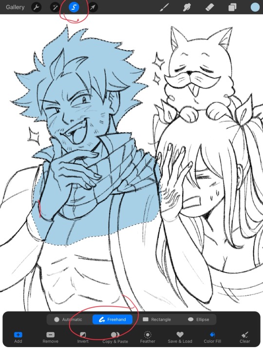
Once my base is done, I begin coloring each character one by one using clipping masks. Each color has its own layer.
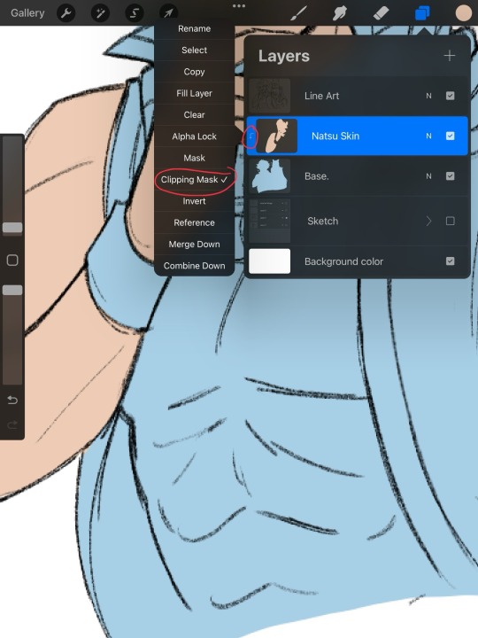
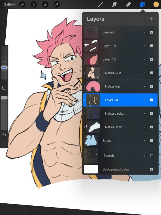
Then, I merge all the layers together after the character is completely colored!

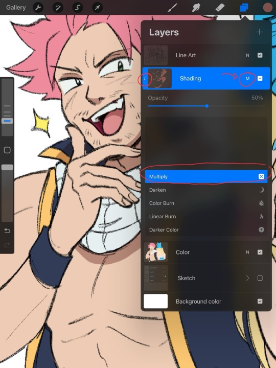
When I’m feeling lazy (which happens a lot 😆) I just shade using a multiply layer, and clipping masks. I usually pick a shade of red or blue. If I can’t decide on the shadow’s color, I’ll toggle with the hue, saturation, brightness bar until something feels right. Also, when shading, it’s important to pick a direction where the light is coming from. I tend to choose a top-down diagonal angle. Don’t get too focused on making it look “real”. Shade in chunks, without getting lost in the details. Especially when drawing cartoonish characters.
Highlights and line-art color changes are last!
I treat highlights like shadows. Don’t over complicate it. I mostly stick to adding them to hair in simple drawings.

I like to add color to my line art to add a bit of depth and softness. Just alpha lock the layer your line art is on, and you can change the color very easily! Just color over the line art after you alpha lock the layer.
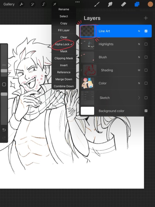
And voila! A Nicolette style colored sketch! Hope this helped you out!! <3

(Please someone make Natsu shave…it’s bad)
26 notes
·
View notes
Note
Hey! Your art is so bright and colorful! And I wanted to ask you, can you make a drawing tutorial of Beheaded, Bobby? Or maybe speedpaint? I think, it would be intresting. Do you use some references? The scarf's colors are soooo good :D
Aaaah!!!! Thank you (人 •͈ᴗ•͈)
Sorry this took so long I was really not knowing how to respond this and had to give it time uuuh
Let’s see if I do well, I’m not good at making tutorials but I can talk about my key points of how I draw the beheaded, I think that could work(?)
First of all yes I do use references like a lot, weekly I do pose studies, then if I like any of those I actually use them and I draw over them and boom you have a beheaded (or something else), i love references it makes things more smooth and it helps me get an idea of the final results. And even if I don’t find what I need I take a picture myself to use as reference ,yippee
Anyway so about beheaded....
I do two key points when I draw them,first I always ALWAY start by the scarf I dunno is key for me
It helps me emulate a “neck “ and also helps shaping the shoulders,I always like to leave a black gap as if making it feel it’s empty inside, also it helps to work on a mood you can see how the beheaded scarf helps me shape their emotions in a weird way(?)
After that is the shapes I always make the beheaded waist thin as to mark the silhouette
It also helps me know what direction the body is going and the overlaps of the pants add some sort of style…I guess?
But yeah…uuuh and I made a speed painting although it is a bit weird cause I retake an old sketch and midway I forgot what I was doing (?) you can clearly see it so sorry if it’s wonky,I also painted in greys scale that’s why it looks weird sometimes, it’s easiest to think on lights when you only have one color
Here you go
I hope this works,. I DUNNO
I'm really dumb at explaining things sometimes...
I’m real bad at this thing sooo...
But thank you so much!! Like for real it means a lot ✧◝(⁰▿⁰)◜✧
💜✨
16 notes
·
View notes
Text
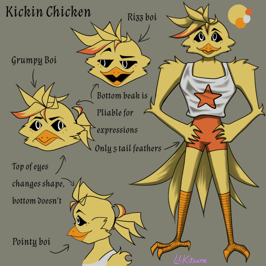
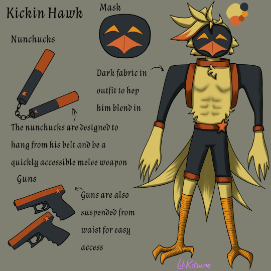
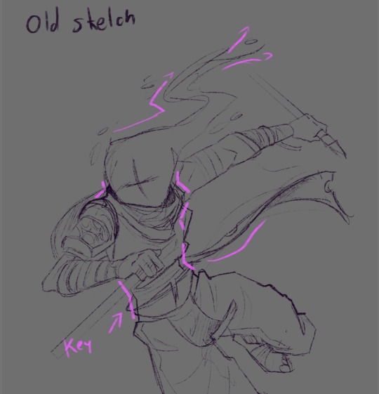
Officer it’s this one right here he crashed my drawing program and refused to cooperate
@neodracunyan here’s the criminal the one who broke my drawing program so bad I’m going to have to archive everything and clear its data again and it hasn’t even been 3 months since I last did that for spring cleaning. I love how he came out in the end but he crashed my program 5 times while I was working on him and has caused it to lag and crash constantly ever since. I adore this boi but I will always have hard feelings for his reference sheet. He looks so smug about it too.
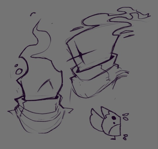
Below the cut is my usual ramble as well as the sketches and shape study for this one. (He has taught me many things completely on accident)
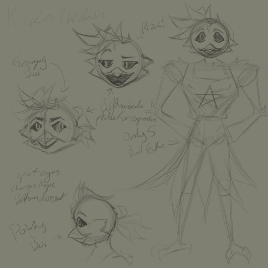
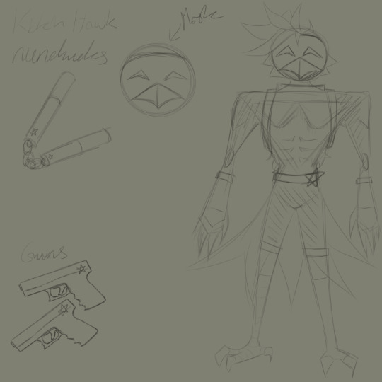

So let’s talk about this.
I started by sketching up a kickin that will never see the light of day fate just looking up my reference images and eyeballing it.
That kickin was really really ugly.
I know saying these things about one’s own art can seem degrading and derogatory but believe me when I say I got a second opinion and they agreed that chicken was ugly.
And they didn’t even know I was showing them my own art so I know it’s true.
So then I did the shape study and figured out why this wasn’t working the same as the others.
Then came a lot of trial and error of pushing different combinations of these shapes and builds together until I got a siluette that seemed to work (this was the one I used for the final version of kickin)
Then came the face which was also a matter with which I struggled but eventually figured out.
Despite all of these setbacks I do really like how kickin came out in the end (especially the side profile view) and once all of the struggles were through I really really ended up liking how he came out .
So let’s actually talk about this design now shall we?
Let’s start with the kickin hawk design. This design benefited from the fact that I knew who kickins partner is before choosing colors so I decided to make his grey clothing pieces blue toned in the same shade as bubba. It’s not super noticeable in the reference sheet because it’s surrounded by its complimentary and cross-complimentary colors (orange and yellow) making it look far more desaturated than it actually is. My intent is for the rest of the dark critters to have this same partnering motif from here on out in their color palettes (bubba will get kickins yellow, Bobby will get craftys cyan/teal color, and picky will get something green for hoppy) this will add a sort of visual synergy between each partner set making it more clear when they’re together as a group who the usual pairs are. (Instead of redoing catnap and dogday to fit this rule lets just say that their synergy thing is the red smoke bc when I designed them I didn’t know they were going to be put together as an individual pair instead of being with the rest of the critters as a group.) the idea for how kickin hawks weapons work is that they’re magnetic (either the holsters or a specific point on the weapon itself) and depending on which weapon it is will attach to a different point on his belt (think like polarity the nunchucks won’t attach to the spot where the guns go because the poles in its magnets don’t match the ones for the guns to attach to. This also means that if an enemy has a huge magnet they are guaranteed to never get all of kickins weapons because some of them will have opposing polarity and be repelled by the magnet instead of attracted to it a.k.a science is cool sometimes) The mask is for similar reasons to dogdays because of the fact that bubba uses lots of chemicals and gases similar to catnaps when fighting and kickin doesn’t want to deal with the loose gases effects (at that moment at least I feel like kickin would absolutely be bubba Guinea pig whenever he has a new variation to test) I also dyed some of his feathers with streaks of the reddish orange color because I feel like the moment he got the freedom to choose his appearance he’d go and change it. And uh yeah that’s about it for kickins ramble but if you have questions about the design choices feel free to ask ( while some of these guys may bite I won’t!)
#digital art#drawing#digital illustration#new drawing#artists on tumblr#fanart#smiling critters#kickin chicken#smiling critters au#would you believe me if I told you that while I was struggling with this one I completed another one of them#I’m thinking about releasing that one on Friday#so stay tuned bc at this point I think I’m just going to end up doing the rest of them
24 notes
·
View notes
Text
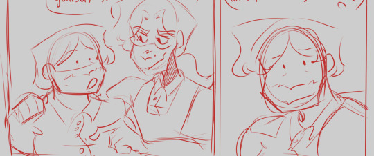
JUNE UPDATE
WASSUP BROS AND HOES, IT’S ME, YOSA FRICKING JAE. BACK AT IT AGAIN WITH ANOTHER UPDATE ABOUT THE JMC 🔥🔥🔥‼️‼️‼️
Last time, I remember saying it’ll be different and things will spice up, and I am indeed gonna provide more stuff piled into these updates because the debut comic is taking so long. I wanna make sure you all get full when consuming these updates instead of being like “oh, nothing happened lol”. I have a good chunk of shit to talk about that’s outside of the comic itself, but it’s like behind the scene stuff about it :3
With that out of the way, let’s finally get started!
The Comic

(W.I.P OF THE OFFICAL DEBUT COMIC)
The comic is slowly making progress, the first thing that’s changing is me showing progress of the comic itself and giving ya’ll w.i.ps in order for me to give you guys content to look over, and because I just want ya’ll to see it yk? The honest truth is that it’s moving slow because of burnout. It was huge and made me wanna give up on the comic and leave the fandom, I was struggling for a good while but my best friend told me it was best to take a break and recharge instead of pushing further. They told me to do something else so I can regain my motivation and passion for the project, and she was right, because I’ve been having fun hanging out, watching her play Stardew Valley, and letting loose without the pressure for the debut comic to come out. I have to prioritize my health and well-being before anything else, and I know the comic will be done!
Also for you all to know, the team I had disbanded, and right now I don’t have a full official one to help with the debut. I have amazing friends that have helped look over the script, one did some sketch compositions, one helped fix up grammar in the script. They helped me greatly and I’m so grateful for them and their loving support even through all of the rough patches. For the most part, I’ve been doing everything on my own, and it can get stressful easily because of how much I’ve had to change my plans and shuffle around when the team disbanded. I’ve been the one doing the scripting, sketches, lineart, color, management, and just everything. Even if I try to act like things are fine behind the scenes, I definitely got more anxious and depressed after events occurred, so this break (not hiatus) has helped me recharge after going through a bit for this comic. To end this section on a good note, I’m feeling so much better and I’m recharging absolutely greatly, I even renewed my love for Donnie after a friend drew him 🦐 Sooooo…The JMC is still in good hands.
Bonus Content: The Villain
YosaJae, what is this? This is the section that’s hella new, the place where I show you guys some cool concept art, ideas, and plots that show the origins of the JMC or even scrapped/cut content. Today we’re gonna talk about the villain of Arc 1. Fun fact, two were created at the same time but one of them was finalized to be the primary villain for Arc 1!
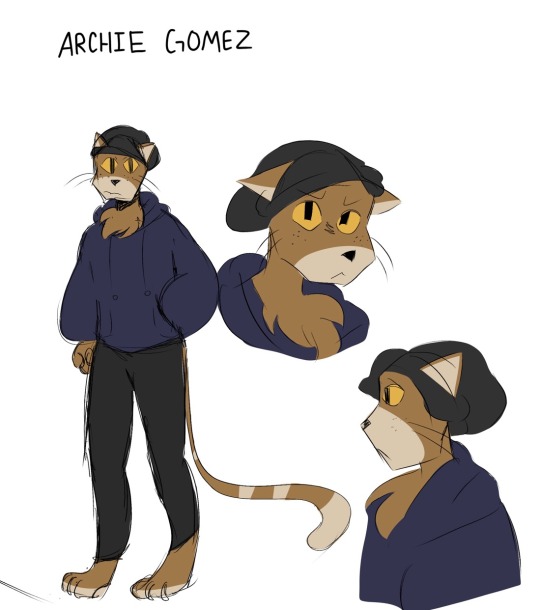
(First ever concept art of Archie Gomez)
Here he is! The cat himself, ✨Archie✨ I needed some variety and needed an anthropomorphic character since Rise has lots of their mutants and yokai. Archie was a character that was a lot more serious and hella threatening but he was toned down after more arcs were created. For some reason, I included freckles because I originally thought, “Ginger people…..” then included the freckles to make him more recognizable. Let’s just say that they weren’t as rememberable as I thought because I forgot them after a while-

Fun fact, Archie was originally gonna be a native Spanish speaker but not be able to speak English. The actual conflict was gonna be about the turtles and Archie fighting due to language miscommunication, but it was later scrapped because of the issue with translating each of his sentences and being truly accurate with his dialogue. He also at first was a one off character that would never return, but he was popular that he became the reoccurring bad for Arc 1.
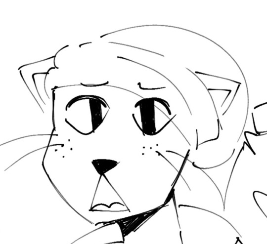
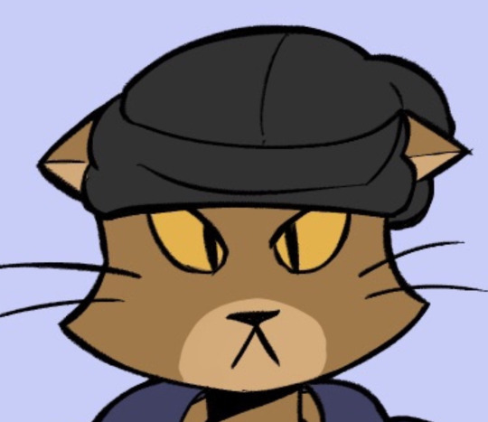
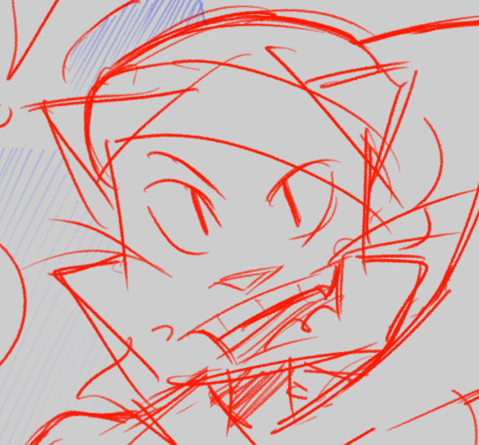
(Archie Gomez Evolution 2022-2024)
Archie had went through a good bit of design changes over the years and I changed him to be more easier to draw by giving him a more unique silhouette by drawing his head as a pentagon instead of a circle. The transition was at first a circle to triangle, but then the shape was too complicated to recreate so I had to go with a pentagon (as an accident at first too). That changed him A LOT but I was hella happy with the way he turned out because he started to look more unique and iconic. Pretty cool, eh~?
Aaaand that’s it! Thank you all for stopping by and coming in to read this update! I hope it was fun to go through and very refreshing. I wanna make my updates more like this instead of what was said above. Especially because this is taking so long, I wanna be able to go over behind the scenes with you all since ya’ll at least deserve that; I can’t keep being mysterious about the comic since it is taking years for it to be made, but it’s trial and error so I gotta do this in order for it to be worth the progress. I’m strong, I can do this! Hopefully your day/night is amazing, and take care until next time 😋🫶💜
#rottmnt#rottmnt oc#rise of the teenage mutant ninja turtles#rise of the tmnt#tmnt oc#oc#oc x canon#jmc update#jmc related#jmc#comic update#art
15 notes
·
View notes
Text

(a colored sketch of four characters. from left to right there’s Gene who has dyed green hair and an orange jacket, Casper who has long flowing hair and pale skin, Saint who wears round sunglasses and a simple T shirt, and Tab who has curly orange hair and snakebite piercings.)
(tumblr compressed the hell out of this, click for higher quality)
It’s far past time to introduce the main characters for the moon book (intro) so I can finally talk about them! I’ll be sharing plenty more about them as I develop the story now, but here’s some basics for now.
Saint 🌙 19, he/him, 4w5, ENFP, the protagonist!
Saint has a rich creativity and passion for storytelling. He loves to play piano and sing, the latter of which he’s supernaturally good at. He’s not very talkative and doesn’t share his stories often, but whenever he does there’s a gravity to his voice that pulls listeners in.
Saint’s best and only friends are Tab and Gene, but sometimes he feels like they’re just humoring him. He feels like an outsider around anyone except himself.
Because of a medical condition, Saint has periods where his senses are dulled to the point where he can’t perceive the outside world. So he turns inward. That’s what caused him to have such a weak sense of belonging, as well as surround himself with stories.
Tab 🪐 19, they/them, 3w2, ESTJ 🏳️⚧️
Tab loves academia and used to excel in every class- until their senior year. They’ve got a great memory and will happily learn and repeat back information all day, but the second the advanced classes they took got into more abstract ideas, they started failing. They can be inflexible, stubborn, and a bit blunt, but damn if they don’t get things done.
Now they’re retaking their senior year, which has ruined their hopes of getting into a good college. That was, until they met Casper who got them into the supernatural and ghosthunting… if they can find concrete proof of the things that exist beyond earth, they’d be able to get into whatever college they want.
Tab has a lot of friends that come and go, but the closest to their heart are Saint and Gene. They also have a rotating cast of passions, but their most consistent are history and guitar- which they learned to spend more time with their friends by starting a band.
Gene 💫 17, he/him, 9w8, INFP 🏳️⚧️
For most of his life, Gene has neatly fit into the persona of a quiet nerdy academic that the world projected onto him. But as he’s growing up, he’s starting to realize it doesn’t fit as well anymore. He’s an idealist with strong values, and a deep optimism + compassion. He’s young, he’s still growing into himself! He wants to change the world!
Now he’s just been accepted into a fancy college that’s sure to lead to a promising tech career. The only problem is, it’s across the country and he’s starting to feel a growing unease about leaving his friends behind to sit behind a desk taking orders from a boss for the rest of his life.
Gene adores his brother, Saint, and he’s been friends with Tab since they were kids. He plays the drums in their band and follows Tab around on all their adventures.
Casper ⚡️ 22, he/her, 7w6, ???? 🏳️⚧️
Casper is a high energy person who loves to experience new things, meet new people, do everything she can regardless of how good of an idea it may be. He’s always doing something with his hands; that means fiddling around with technology and more recently, crocheting.
After getting to a bad accident, Casper’s soul left her body. But before her body died, it replaced that soul with a rogue bit of cosmic dust that was similar enough to work as a replacement. He’s doing his best to recover as fast as possible so he can go back to his normal life, but it’s becoming harder and harder to pretend that’s an option. Casper isn’t able to do many of the things she used to, she doesn’t even feel like the same person anymore…
Meanwhile, the person that became her new soul isn’t pleased about this situation, either. Being stuck in a body is horribly limiting, their similar feelings of frustration bleed together and make the separation of the two even harder to maintain. But that’ll all be fine if they just ignore it :’)
Powehi 🌟???, it, 7w6
Powehi is an alien, the intangible manifested consciousness of humanity’s collective voice. It dives from body to body, seeing the world through earthling eyes until it stayed too long in Casper’s dying body and was trapped. It thinks very highly of itself and the things it can do, so to be condensed down to such a limiting form is… difficult. It’s mostly been sulking and ignoring everything.
Saint is its favorite earthling, so it blessed him with a piece of its power and visits him in his dreams. It hasn’t been able to do that recently, and even though Saint doesn’t realize Powehi is more than a figment of his imagination, he cares for it and is starting to get worried.
Powehi never had a name before meeting Saint, it’s usually just called the Voice.
#wip: moon#writing#character intro#oc intro#writeblr#excited!! I like these guys#I’ll do the minor characters soon but there aren’t really that many#oc: saint#oc: tab#oc: gene#oc: casper#oc: powehi#Spotify
10 notes
·
View notes
Text
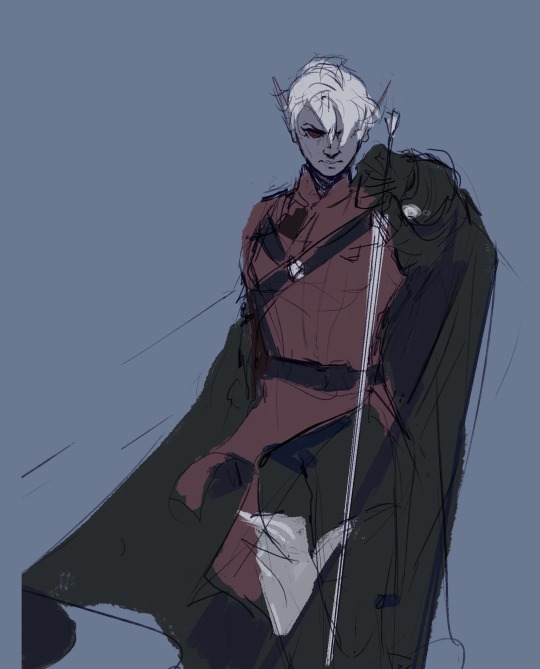
Hey y’all, here are some process stages for one of the more recent illustrations I did!
My sketches have never been very detailed. I remember being inspired for a pose while scrolling through pintrest and just threw some lines down on a page. I think more about the general pose and feeling I want more than the worry of anatomical correctness because I know I’ll fix it as I go.
In the next stage I establish stronger more contrasting colors and start to define the form of some shapes. The anatomy is still bad so at this point I’ll start to use the warp tool to move things around and adjust proportions. I also end up using the selection tool to cut various parts of the figure apart in order to put them back together in a way I like (I do not recommend doing this lol the sooner you can establish a solid foundation the better because it’ll save you a lot of work as you go. I just have a really hard time seeing my mistakes until I have something visual to work off of.) I alternate using the warp tool and selection tool and painting again and again until I get something relatively presentable like what I have at stage 3!
At this point all I have left are color adjustments and tweaking some small details. I usually don’t make such drastic color changes at the end of my work because I’ll have found my desired pallet through rendering. However with this one I wasn’t yet sure if I wanted a strong blue bg to contrast the orange of Lucéena’s eye or if I wanted the eye itself to be the main point of color. I knew I wanted the eye to stand out so I thought it was worth trying some things. That’s also why I decided to leave some parts messy in the final piece. I wanted the most well-rendered area to be Lucéena’s face to bring attention to that new shines eye she has.
I hope this was interesting and insightful!
With every illustration, I start off with a loose sketch. At this stage I’m not worried about perfection, my lines are more to serves as composition guides so I know where things will roughly go. If there are parts of the illustration that I know I want to put a lot of detail into (such as the face) I will often give that part more time. Then, I jump into colors by laying down flats behind the lineart and then beginning the process of refinement with a new layer on top. At this stage I would have 4 layers, 1 as the bg color (the blue expanse), 2 as the flats of the character, 3 as the line sketch, and 4 as the rough detailing. After this the number of layers I uses depends on how much of the illustration I want to preserve from itself or how many layer filters I end up using (to tweak color and lighting). Still, my illustrations always start with these 4. Once I get to a rendering point similar to stage 2 I start worrying more about the “correctness” of my structure and how I can make the anatomy more realistic. To do this, I like to duplicate then merge all of my layers, excluding the bg layer. Now I have my character one one whole layer and the expanse of blue on another. I have the individual layers still on hand if I want to refer to my og sketch but at this point having them all as one is easier to work with because to tweak the anatomy of a character I usually cut them up into parts and move/warp them to be more precise. Is this the most effective method? Probably not, but I rely a lot on the warp tool to get the exact shapes that I want. And seeing shapes for me is a lot easier when I have some color and value to work with. (I’m not a very “line visual” person if that makes sense XD) The rest of my process is a combination of rendering and adjusting details with the warp tool. At the very end I did some color adjustments (seen between stages 3 and 4) to see if I could get them closer to the initial feel that I wanted. Because I drew this to showcase Luceena’s new magic eye I wanted that to be the focal point of the illustration. So not only is that the place I put the most detail into, it’s also where I wanted the most color to be. I thought that having a blue bg would contrast nicely with the orange of her eye, but I ended up desaturating the whole piece and let that one note of color stand by itself. Lucéena also received her eye in the Shadowfell so the grey, drab vibes ended up fitting perfectly!
#art#digital art#wip#art process#dnd#dungeons and dragons#I was asking some friends for their thoughts on the desaturated version (never be afraid to ask for a second opinion!)#and we joked that this was Lucéena’s villain look because I don’t usually make her quite so angry#she has a resting bitch face tho so I mean this is prob what she loks like all the time lolo#I think her hair is kinda growing out since I first established her design#it didn’t always cover her face so much I think??#what is consistency let me draw my self-indulgent character traits#which means that all of my characters have to have long hair or at least long bangs so that it can be sexily flung over their face#in the heat of battle#and i love givig luceena in particular messy hair because thats a Vibe
69 notes
·
View notes
Note
I just saw that insane Sasha Nein art you did, where he’s smoking and his mom is in it. I have to say that was some of the COOLEST ART I HAVE EVER SEEN ON THIS SITE, EVER. And I saw that you said you draw on your phone?!?! I’m actually begging you to tell me what app you use pLEASE (also I have always wanted to know how to render but I don’t even know how to start is there any in progress shots you can show so I have something to go on ;U; ty)
GYAHHHHH THANKSS YOUI wwhhh… I had written more in response to this but… Tumblr crashed and deleted it so… Im trying to remember all the points i went over haha… But… Yes… I do draw on the phone with my fingers. The key? Ibispaint… Its really good. You just gotta believe in yourself…. Its rlly not that hard :)
But… On rendering, i feel like everyone renders differently… It really depends on yout artstyle… But i will gladly go over my process (again(thanks tumblr)). Ill be using a different piece as an example (the one of sasha? I didnt render that in my normal way. Just kinda Drew Shapes) -
So i always.. sketch it out. Roughly. Get the details down, yes, but this part will pretty much be invisible, so it doesnt have to be perfect. (yees there was gonna be red string but i didnt like it so. Goodbye red strintg.. Sorry boyd) In this piece (and some others) i redid the sketch a few times to get everything placed and sized how i like it…
After this..? I just put in the colors under the sketch. Here, id like to get them relatively like how i want them to be (though sometimes ill just put in a single color and choose the colors WHILE im rendering)… Its Good To Keep Them Messy I Think
And then… I put all the layers into a folder and render it all on a new layer…. Its that simple… Some people will do it on a bunch of layers to keep all the different elements separate, but i feel its confusing and youll get tripped up in all the layers… I simply use one. Sometimes ill make a new layer if im not feeling confident about a detail, but, usually, its just one. The colors i laid down? im simply colorpicking those and making them more defined, usually blockier.. And dont worry! Its easy to move things around, having to repaint some stuff isnt as bad as you think (ESPECIALLY if you dont use lineart. I hate lineart sometimes😌)
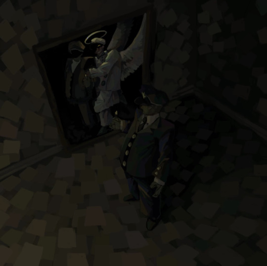
And its done after i get alll the details i want in (sometimes, you dont need to detail everything. Focus on whats important! If you like..). Well, the drawing part is, atleast. I usually run it over with some special brushes i made to make it look more scratched up and dirty. Then i do some chromatic abberation shenanigans! And some noise. Then… Its done :)

Though… if there is one thing i must say…… You can wiggle around the hue and saturation a little while rendering it makes it more interesting and flavorful… You can wiggle it around ALOT to make things look holographic…. Oh! and keep it simple… And also desaturating colors a lot combined with the context of other colors around them can do some crazy stuff… I can make orange look like green 🕴️ (Okay that was . More than one thing. And?)
But really..:: Do what YOU want. Its your art :) I cant tell you what to do! Do all of these things. Do none of these things. Just do what YOU want to. Nothing I or ANYONE says dictates what you must do or what is correct in your expressions.
Yay!
7 notes
·
View notes
Note
Abyss Monarch/Octopus x electric eel
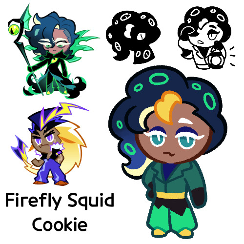
Got another one done today, this is Firefly Squid Cookie
I was gonna say that this one was the first to have a “new” character at the time, aka one that only existed after I started, but no, apparently that honor goes to the request for Scorpion/Prune Juice
Though interestingly enough you can tell that this was from the beginning of the Wandercrab update because the anon isn’t sure whether the name is Abyss Monarch or Octopus, since we weren’t really sure the name situation until the second half. I also vaguely recall saying this anon had foresight since this was before abysseel blew up
Anyways sorry, let’s get into Firefly Squid herself now
So Firefly here works as the lighthouse keeper in Wandercrab, as well as generally just checking to make sure the lights work. She has a particular affinity for light, possibly due to her own bioluminescence
She’s generally a very chill lady, someone you can just talk to about your struggles while she patiently listens and gives you advice. Plenty of residents go up to her while on the job (since that’s what she’s usually doing) to do just that. She’s not one of particular high energy though, choosing to spend her off time either relaxing over a drink or taking naps
However, you should never try to approach her when there’s a particular absence of light. You may see something you’d rather wish you hadn’t…
Anyways, now let’s discuss design
So Firefly Squid’s name comes from the firefly squid itself, which I got as a suggestion. It’s a cephalopod like Abyss Monarch, and it glows like Electric Eel (or at least the Cookie himself). I also learned today that it’s apparently edible, so I guess it fits in even more with being living food
The original name I was going to use was Blue Ring, named after the blue ringed octopus, because octopus, as well as yellow and being incredibly venomous. But I got the suggestion Firefly Squid and I ended up really liking it, so I switched over
Firefly squid:
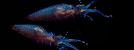
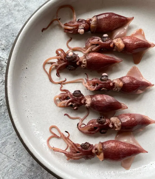
I’m especially noticing now, she looks a LOT like Abyss Monarch and not much like Electric Eel. My bad I guess. If I ever make a second one (though I don’t know how likely that is since Electric Eel fankids tend to have a VERY limited available list), I’ll make that one look a lot like Eel
She originally had hair that was more zigzaggy, but it didn’t look right to me and I eventually changed it, and now it’s almost entirely Abyss Monarch. I did at least try to make the gradient lighter at the bottom more like EE and have the yellow of the tentacles be from his yellow, but it’s not that noticeable
Her hair was also red for most of the coloring process, since that was the color I could find firefly squids
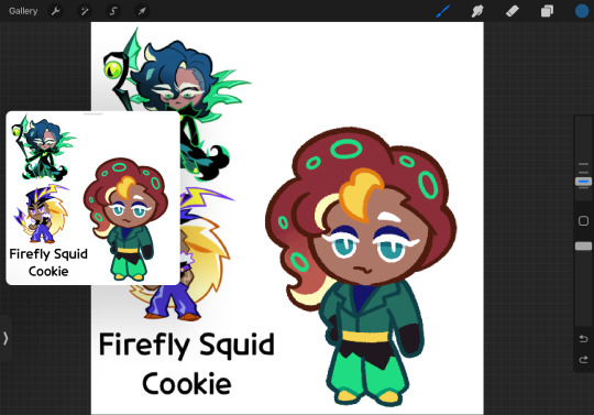
I did eventually decide to change the colors, since Abyss Monarch and Electric Eel don’t necessarily adhere to the colors of their respective animals, but I still ended up going mostly blue. I did try to hue shift it to a more purplish blue though
I was kind of just messing around with her design. I’m not really even sure what that pattern on her pants is. Yeah it looks like just a pants design, but I only decided that at the end and the shape is on the same layer as the rest of the lineart, so that was a lot of fun trying to color so it doesn’t look like that
I also feel like relatively, she looks pretty normal compared to her parents. Other than her glowing rings on her hair she doesn’t really have much going on in her design, or at least nothing out of the ordinary. She just looks normal. That’s kind of why I added the eye thing on the sketch, to maybe imply that there’s more going on with her, but that’s probably more like an in post fix
I know I spent most of this design section complaining, and while on some level, her design has issues, when I look at it without thinking about them, I really do like how she turned out
And that’s it for Firefly Squid, I hope you like her!
#we’ll see if tomorrow brings as much productivity in the fankid scene#maybe it will but who knows?#anyways#cookie run#cookie run ovenbreak#electric eel cookie#abyss monarch cookie#abysseel#cookie run oc#firefly squid cookie#fankid#fanchild#my OCs#my art#requests#answers
68 notes
·
View notes
Note
hey just a quick question what sort of materials do you use , like markers fine liners paper ect because all of your drawings are so neat and my markers bleed a lot so do you have any recommendations for mediums?
Markers- I am currently using Shuttle Art - Art Markers that are ok for beginners but you cannot refill their ink. If you are planning on doing marker art for the long run I 100% recommend you to invest in Copics since they ARE refillable and are honestly a lot better quality.
Liners- I usually use Microns since they come in many different sizes and the bigger tipped ones are like sharpies but without alchol and thus without the bleed.
Paper- really any Mixed Media paper is fine as long as you know it’s thick enough to not bleed too bad, I also put a piece of printer paper underneath the original paper THEN i put a flat sheet of paper to make sure nothing bleeds to the other sheets as seen below:
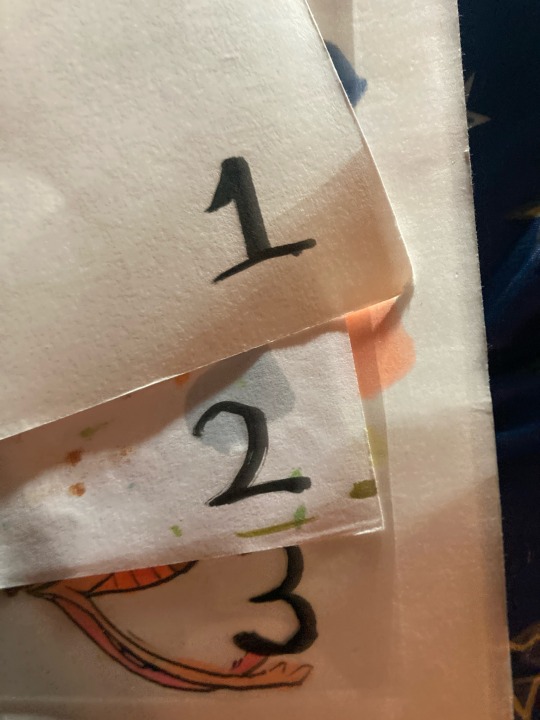
1: the paper I will be drawing on
2. The piece of printer paper that catches stray ink
3. The sheet of plastic I put underneath the printer paper to make sure I don’t stain the sheets underneath
That’s really all the materials I use so here’s some tips and tricks:
1. As someone who is always really heavy handed with my sketches i used to find it a really big issue when Id color in my sketches and the marker smears the graphite leaving an ugly grey blob. But I also had an issue with lining the drawing with microns THEN coloring it in and finding that the markers smeared the ink making it an ugly black blob. So I’ve kinda done a happy middle where I line the sketch with a really light 005 micron THEN coloring it in, and if I don’t like how thin the lines are after I color it in then I can go over with thicker lines without the worry of them smudging.
2. If you’re having problems with bleeding (I’m guessing you’re using alcohol markers) then I recommend adding small parts at a time then seeing how they bleed. If you’re coloring a smaller part I recommend using less pressure thus leading to less ink put down and less bleed.
3: use layering to your advantage. The marker pack I use only has 51 colors which may seem like a lot but really isn’t which means I have to layer a lot. When you get a pack of markers I recommend trying to blend for the colors you want but don’t have to learn a feel for what you can blend in the future. For example in this drawing:
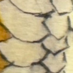
I know that in this drawing I need a dusty tan-ish color that I don’t have in my marker pack, BUUUUT i know that I have pale yellow and a warm grey and that will probably be a good thing to layer for my drawing, but I always test it out before using on the official drawing. It is never good to go in blind.
4: swatching out your colors beforehand:
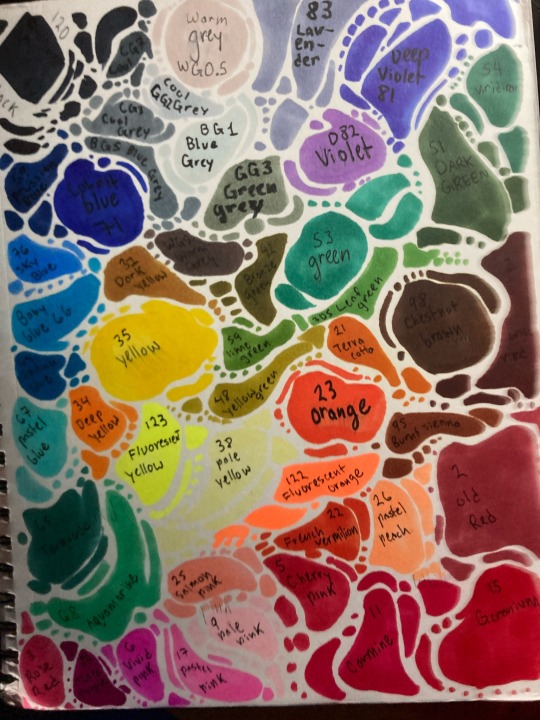
Pages like these are really important for knowing what kinds of colors you have and knowing their names, most color names are on the cap/side of the marker and I recommend writing the color name right next to or in the color so you know which one it is. This is really helpful if I’m coloring something and need to know what color would be right for the drawing.
Annnnnnnnnd I think that’s all I need to cover… that ended up being a lot longer then I expected but just remember that while these are my recommendations you do not need to follow them! Rules are meant to be broken and if you find one of these tips stupid then you can 100% ignore it.
#alcohol markers#markers#multimedia paper#micron pens#microns#drawing tips#coloring tips#sketch#coloring
6 notes
·
View notes