#Graphic design tutorial
Explore tagged Tumblr posts
Text
𓈒༷♪˚.✧ How to make a mockup like this for smaus, ocs, etc. (step-by-step tutorial ☆ no Photoshop, easy, free) (requested by @lovebittenbyevans) ✿
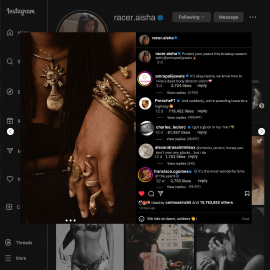
guys this took me two hours to make and you could probably get this done in like, 30 minutes :) I hope this is coherent <3 Please look back this image for comparisons, if my explanation is not well explained, etc.
first of all, if you dont already have one, make a free canva acount. once you're signed in, hit the purple "create design" button on the sidebar. A pop-up will appear with different design template options. For this design, we want the dimentions to be 1080 x 1080, so you can either make a custom size or choose the instagram post (square) template by either searching or scrolling through the list.

2. Now you have a blank page. Zoom in with the slider at the bottom of the page if you need to (Mine is currently zoomed in 41%). Click on the page and change the color to an off black (hex code #111111).
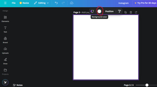
3. Now that the color is changed, click the "elements" tab and search "line". Click the shape and it will add it to the page automatically. These line are particularly hard to navigate and hard to get it at the right angle and length so this part might take a little longer than the rest.
4. stretch it from top to button and turn in a 90 angle so its straight on the left side of the page. Change the color of this as well to a grey tone (hex code #2F2F2F).
5. Now we'll add the Instagram logo. Click the "text" tab then click the purple "add text box" button. Write "Instagram" in the box and change the font to "apricots". This is the closest font I could find that resembled the logo font but if you find a better one, feel free to use that instead. Make the font size 19.3 (you can do this manually or do it in the text options). Change the color to grey color (hex code #707070). Add it to the upper left corner of the page like this:
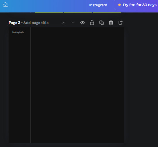
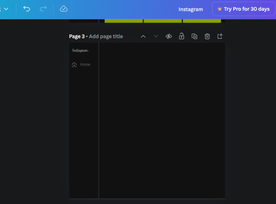
6. now we're adding icons and a menu inside the border we just made. Click the "elements" tab again and search for "instagram home icon" and add the element by sketchify to the page. Click the home icon, an options icon with pop-up above the page. Look for the "Position" button and click it. Scroll to find the advanced options and you can manually type in the width and height at 26.6 and 28.7.
Move it inside the border, under the logo (photo below). Change the color again (the hex code is #707070).
7. Open the text tab and add a text box. Change the font to Canva Sans and write "Home" in the box. Change the font size to 18.1 and align with with the house icon. It will look something like this,
8. Go into the elements tab again and search "instagram search icon". Scroll until you find the one by sketchify and add it to the page.
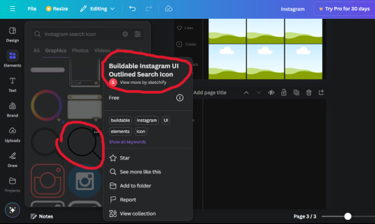
9. Shrink it so the W and H is at 36.6 and 31.3. Move it below the home icon until a purple "67" pop ups and aligns under it. Change it to the same color as the Home text and icon (#707070). Go ahead and Duplicate the the "Home" text box and clicking it and a pop-up will show up then edit the text so it says "Search" and align with the searcch icon we just added.
10. You know the drill. We are continuing to search up more icons in the "elements" tab. Search "instagram compass icon" and choose the one by sketchify (are u seeing the pattern?). Add it to the page and change the width and heigth to 33.1. align it under the search icon just like how we did before and change it to the say colors as the other icons.
11. Do the same as before and write "Explore" in a text box and align it with the icon. We're doing the same thing for all of these.
We'll be using the same search prompt for all of these icons so just change the type of icon you're looking for like we've done before hand. Next look for the Instagram reel icon and add the outlined one by sketchify and change the W and H to 31.2 x 30.9. Change the color to the ones we've used before, align it underneath the icons above and add your text ("Reels").
12. The next icon is an outlined, "sent" one. W and H is 31.1 x 27. The text will say "Send". Then an heart outline by sketchify; W and H is 34.2 x 29.1 and the text is "Likes". Next is the "create" outline icon by sketchify, W and H is 36.8.
(p.s if you are struggling to align the icons and text correctly, shoot me a message and I'll send you the X and Y positions ;D)
If you followed it through, it should look like this,
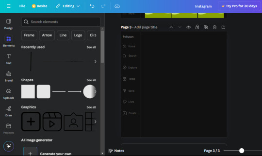
13. Now onto step 13, we'll be adding the Threads logo. You don't have to add this but to make it look more like the actual website, I will be adding it. Open the "text" tab and add a text box. Write an "@" symbol in the box and change the font to Nanum Sqaure and the size to 24.9. Add in the bottom corner below all the icons we just added to our page. We need another text box now (Color is still #707070), write "Threads" and align it to the "@" symbol.
14. We're adding another icon now. Search "Instagram menu icon" and find a wireframe menu icon by sketchify. the W and H are 42.5 x 24.6. Add a text box that says "More". It will look like this:
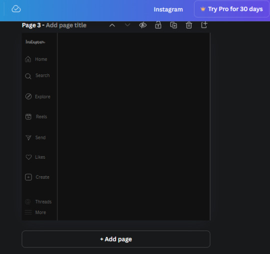
We are a quarter way done now :D
15. Search in the elements tab "circle frame" and look for the one with a little border around it.
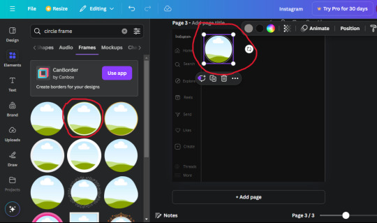
At first, the circle will be green and inside the circle will be white. Change the white to color of the background of the page (hex code #111111) then change the green to a grey color (#8D8986).
16. Add a new text box, change the font to Canva Sans and the size to 22.8 and the color is white. I just wrote "user.name" in the box. the W and H will be 153.3 x 35.7.
Enter the "elements" tab and search for a blue checkmark and find the icon by Victor Aguiar. The W and H is 28.1 by 28.
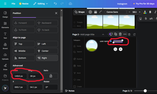
17. Search in the search box for a rectangular shape and add it to the page. Place it next to your username and checkmark icon and make the W and H to 149.6 x 38. Add another and place it next to the other rectangle shape. the W x H is 111.4 x 36.7.
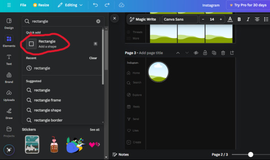
Change the color of both boxes to #2F2F2F. Add a text box and write "following" then change the W and H to 82.6 x 21.8 and fit it inside the first box. Add a second text box and write "message" in it then change the W and H to 77.8 x 21.8. Change both text colors to #7A7A7A

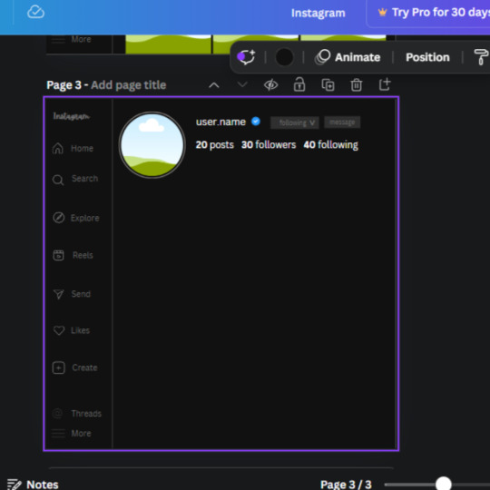
18. Add another text box. Write "<" and turn it upside down and place it beside the "following" text inside the rectangle. Adjust the size as you need to. I also like the round the corners to around 8 so its not so pointy and square.
19. Add 3 new text boxes. Write the amount of posts, the amount of accounts you're following and the amount of followers your have. Write "20 posts", "30 following" "40 followers". Bold the numbers and change the text W and H to 116.4 x 32.7. These are just place holders that I use.
20. Open the "elements" tab again and search "frame". Choose the first one.
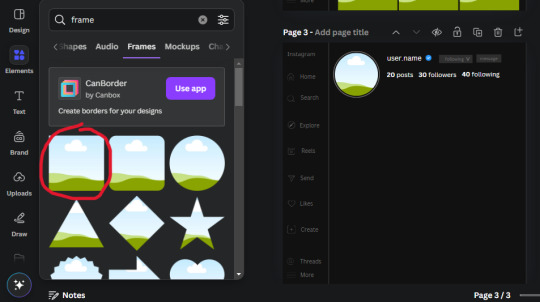
We want the height and width to be 268 x 252.4. Place it at the bottom of the page but we want some space between the frame and the page.
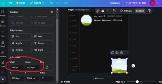
Now we'll duplicate the frame we just placed (the icon between the comment and trash can on the pop up above the frame). Place it next to the previous frame but we want to leave a bit of space between them like this:
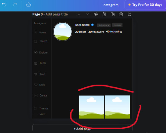
If its a little wonky, don't worry. You can always adjust it so it looks right.
Duplicate the frame again and place it next the second frame you just placed, same distance between. Make sure they're even. Now we have a row.
Select all three frames and duplicate them. Move them above our original frames but leave a little space between them.
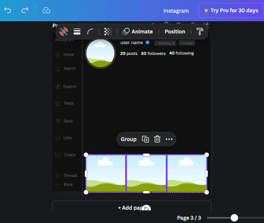
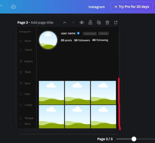
Again, if they're uneven, adjust them as you need to.
21. Select the line again from the elements tab. Stretch starting from the top frame to the last frame and make the color grey (#2F2F2F).
Because the line is stupid hard to navigate, use something like a text box to mark where you want it to end like this:


Delete the text box and the line with be where we want it.
22. On to the highlight reels. Seach for "add button" and find the one by Barudak Lier.
Change the heigh and width to 81.1 and move it above the border.
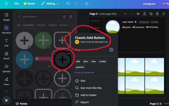
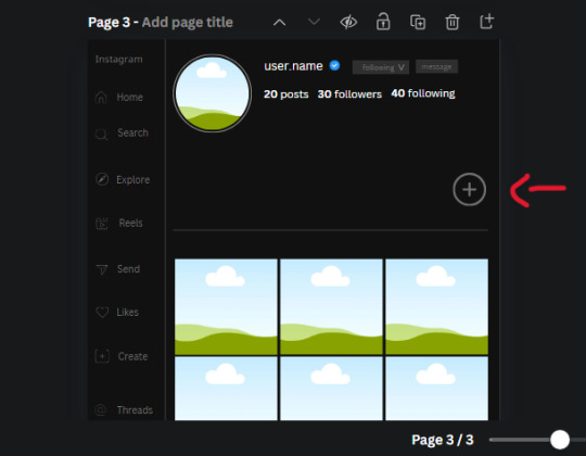
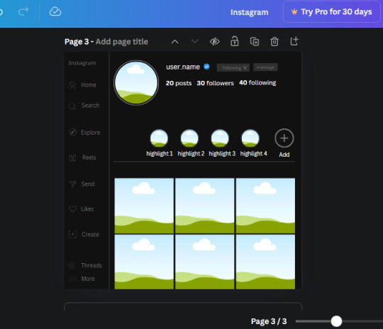
Search for circle frames now and add this one to the page (The same one we used for the pfp), change the width and height to 85.4 and move it next to the add button. Since this is a generic, blank template, I add about 4 of these highlight frames but you can do however many you want. You can change the border color to a gradient or leave it grey.
Add a text box now. The font will be Canva Sans, the size will be 18.1 and the color will be white. Change the text to "Add" and place it under our add button. Make more of these text boxes to place under the circle frames. Depending on which frame its under, write "Highlight 1", "Highlight 2", etc. etc. or you can give them different names and such.
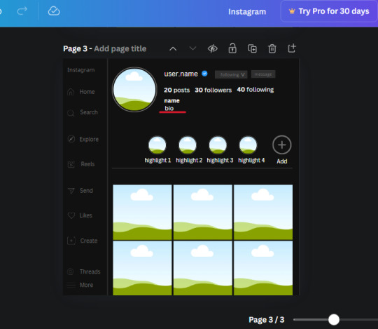
23. Add another text box, write "name" and bold it, change the size to 19.1 and the W and H to 69.2 x 28.8. The font will be Canva Sans and the color will be white. It will go under the amount of posts, followings and followers.
Add another box. The font is Canva Sans, font size to 20.1, the W and H is 40.8 x 31.3 and the color is white as well. This is our "bio". Place it under "name".
Yay!🎉🎉🎉 You're halfway done!
24. Search for a shape in the elements. Look for the rectangle again and add it. Change the width and height to 460 x 760.4 and the color to an off black/grey color (#191919), placing it like this:
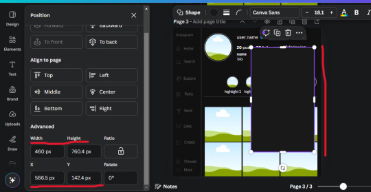
Get the same kind of square frame we used before to make the profile grid and make it the same size as the rectangle we just added. Place right up against the rectangle like it's its other half. Add another line like before and span across the upper half of the black rectangle as a border then add a circle frame inside the border.
Add a text box, "user.name" and align it with the frame. The text is white and the W and H is 111.5 x 25.9
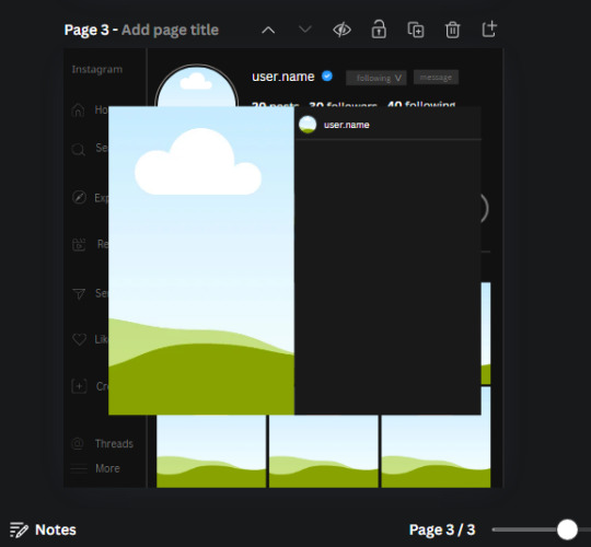
25. Add more circle frame along the inside of the rectangle to resemble the comment section. Make sure the W and H of the frames are 46.1.
Add more text boxes that align with the frames you just made and write "username" again and bold them. Add even more text boxes that align with the usernames and write "comment". These are place holders for when you decide to use this template.
Add another rectangle on the lower part of the rectangle and make the color black. and search for "instagram heart icon", "instagram comment icon" and "instagram send icon". Make sure the lines are thick. Find the heart icon by sketchify, and the the comment and send icon are by Mirazz Creations. Make the lines white and make sure the W and H are the following:
Heart icon: 38.7 x 32.9
Comment icon: 35.2 x 35. 8
Send icon: 35 x 32
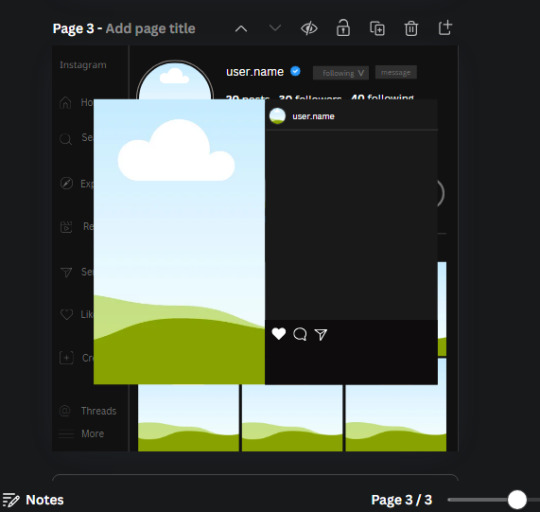
Next, look for "instagram bookmark icon" and find the one by Adricreative. Change the color to white and the W and H to 29.7 x 40.2. Move it to the other end of the rectangle.
26. Now add three circles frames and change the W and H to 37.2. Move them below the heart icon and have them overlap each other some. Then, add a text box and write "liked by username and 1000 others". Change the font size to 13.6 and change the font to Canva sans. the color will be white. Align this with the three overlapped frames.
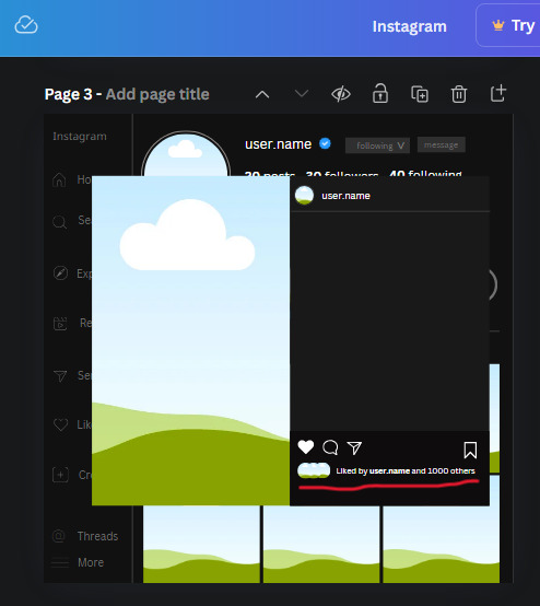
27. Look in the elements tab for an emoji icon and choose the one by Soni Soukell from Noun Project. The W and H will be 32.8 and the color is white.
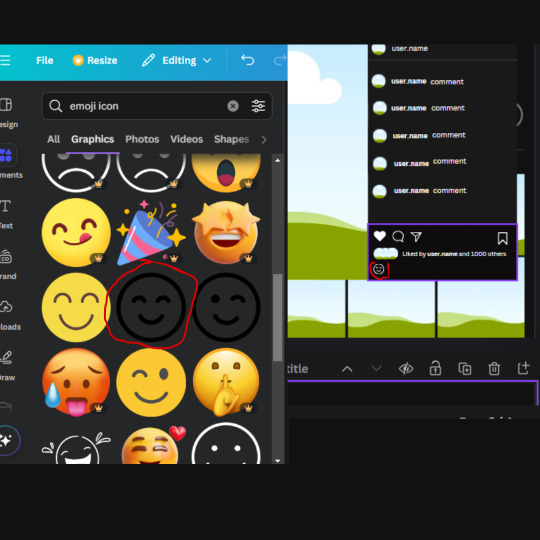
Now add a another text box and write "Write a comment". The color will be white, the font size will be 14.2 and align with the emoji icon you just placed.
Search for "next arrow button" by Pixeden and make the W and H 42.8 then add it to both sides of the post.
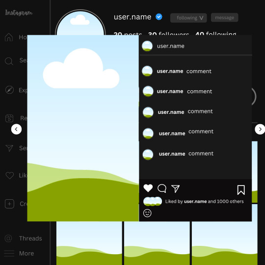
And you're all done with your template! All that is left to do is fill it but before doing that, duplicate the page so you always have an extra blank mockup if you want to use it again.
To fill the frames, upload an image (or use a Canva stock photo), drag and hover it over the frame and it will fill the frame.
Hope this was helpful and you you successfully made one :D <3
#requests#text#smau#template#mockup#moodboard#instagram#instagram moodboard#instagram mockup#graphic design#canva#psd#free tutorial#tutorial#instagram au#social media au#free psd#photoshop#resources#fanfiction resources#graphic design resources#graphic design tutorial#psd tutorial#photoshop tutorial#au#au ideas#mockups#digital design#digital design tutorial
118 notes
·
View notes
Note
how do u make ur graphics? ^_^
Thanks for asking! I’ll give a quick tutorial here on how to make pixels.
1. Find the Image you want.
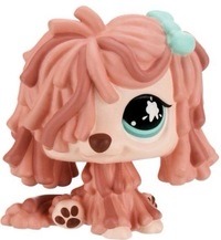
I think this will be fairly simple, just find what you want. If it doesn’t have a transparent background you will need to follow step 2. For this example I will be using this LPS below;
2. Remove the background.
If your background is already transparent, ignore. But if not you would want to go to remove.bg and upload the image of your choice.
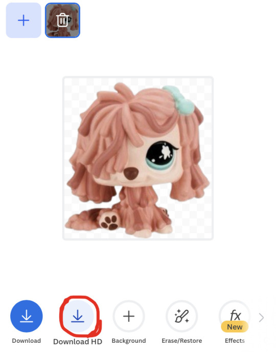
Don’t click “Download,” instead click “Download HD” for a higher quality image. Once it pops up click on the image and save.
3. Go to Ibispaint
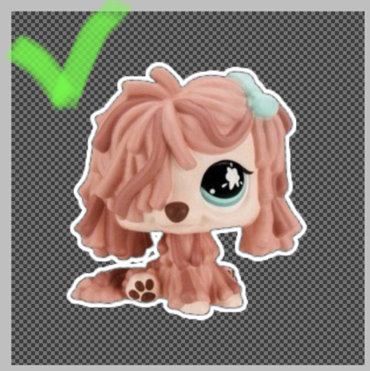
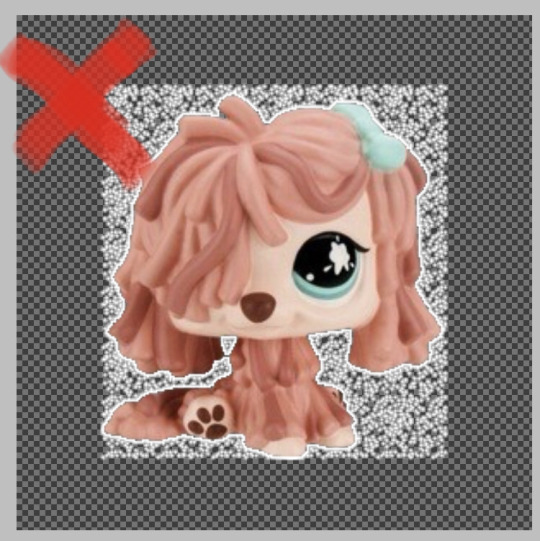
Wait, didn’t we already clear the background though? No. When you make it transparent it will still have invisible dots.
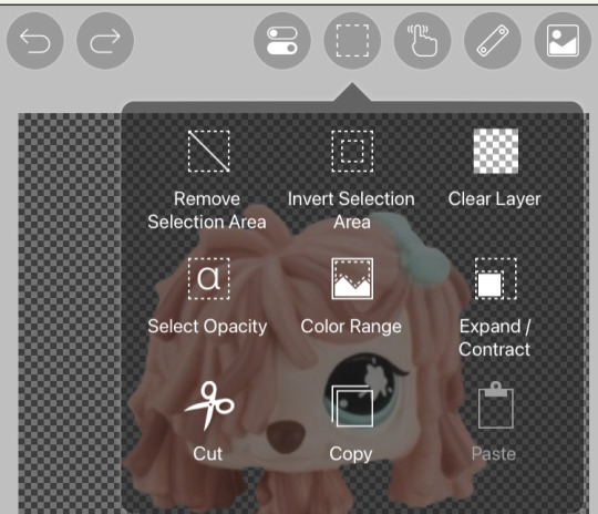
Open Ibispaint and open a canvas at least 100x100 (I use 300x300.) and import your transparent image. Open the second button on the right and you will see a drop down option. You would want to click select opacity, invert selection area, then clear the layer 3-4 times.
The example below presents before and after. Congrats if you did it right!
Now, if you want to animate it you can put it at different angles etc etc. It’s up to you. Save both frames with a transparent background.
4. Final step, animating it!
Now that we have our images we want to make a pixel go to Ezgif.com then click “Gif Maker”
It will ask to upload your static images, once you uploaded your images it should look like this;
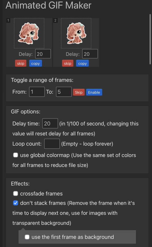
You can crossfade or not stack frames. It’s up to you. Personally I just use one frame at a time.
And now we have our gif! You can stop here if you wan’t but here are some optional choices that I personally do.
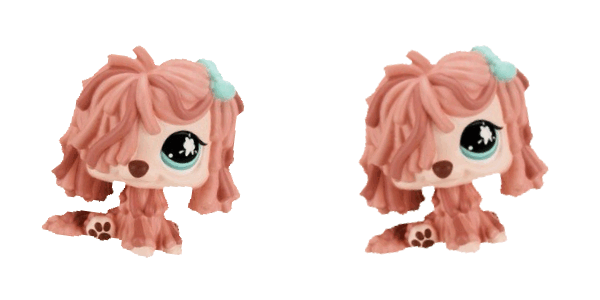
Extras:
To edit how fast it goes, click the “speed” button and it will show you some options to edit speed. “% of current speed” and “hundredth of second between frames.” I use % so we will use that for the example. You can do whatever percentage you want though I would suggest 20-50% of current speed. I do 40% for all of my pixels.
To edit the size of it, click “resize” and it will show width, height, and a percentage. The only thing you would need is width or height. When you type a number into either it will auto resize to fit with that number. You can do any size, but I suggest 50x50-100x100.

And there you go! I hope this helped someone and I’m open to more tutorials! I can do more graphic tutorials if needed, I don’t gatekeep :)
#🌸﹕yapping#rentry#rentry decor#rentry graphics#tutorial#pixel graphics#graphic design tutorial#idk how to tag#heh im so helpful…
86 notes
·
View notes
Text
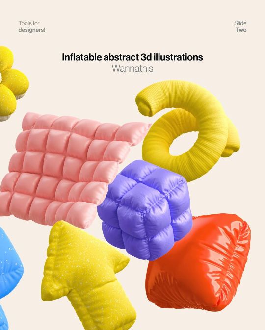
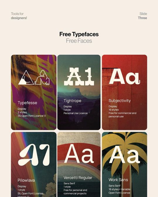
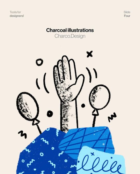
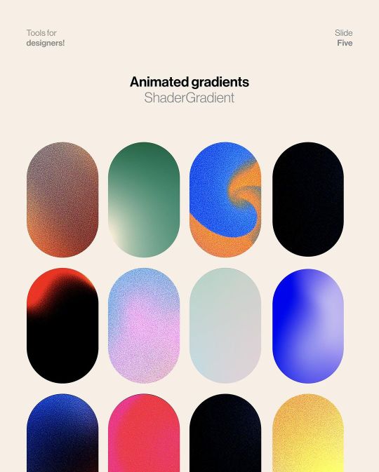
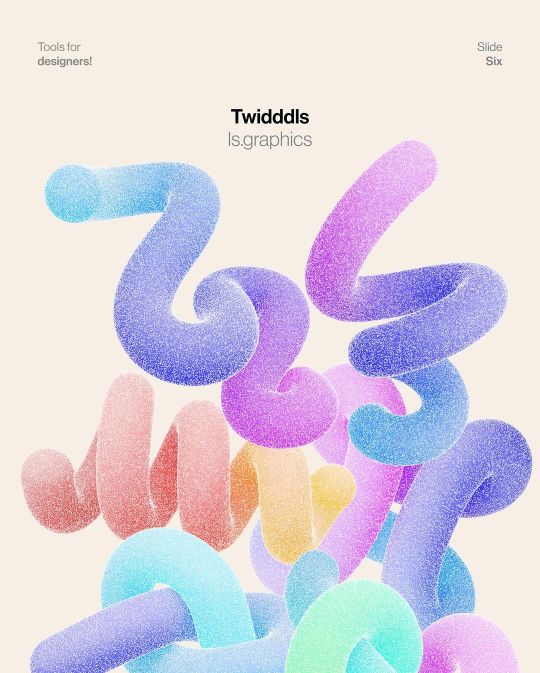
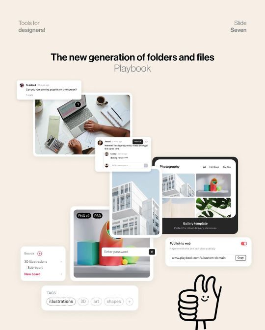
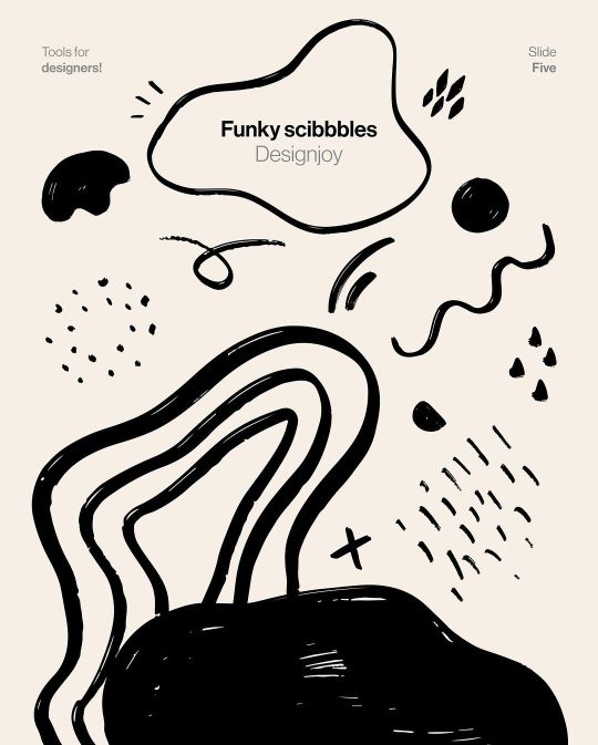
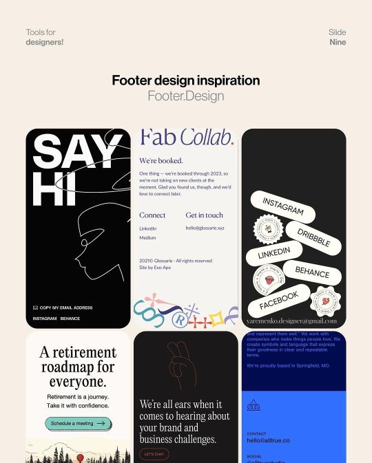
Eight Tools for Designes
#graphic design#education#adobe illustrator#graphic design resources#typography#graphic design tutorial#diseño grafico#graphic design tips#adobe illustrator tutorial#graphic designers#designers resources#tools for designers
50 notes
·
View notes
Video
youtube
how to create beautiful Illustrative Indian Wedding card in Canva | Step...
#youtube#Canva#canva design#canva tutorial#canva tips#Indian wedding card#indian wedding#Wedding card#Wedding invitation#graphic design tutorial#Canva design tutorial#tutorial#learn design#design tutorial
2 notes
·
View notes
Text
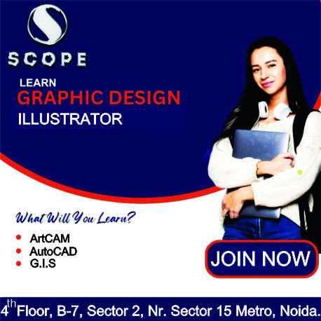
#marketing#artificial intelligence#ecommerce#interiors#commercial#graphic design#illustrator tutorial#illustrator#graphic designer#adobe illustrator#logo design illustrator#illustrator logo design#graphic design tutorial#graphic design basics#adobe illustrator tutorial#learn graphic design#logo design#how to learn graphic design at home#adobe illustrator tutorials for beginners#design#illustrator tutorials#graphic design tips#logo design tutorial#adobe illustrator tutorials#how to design logo#artcam#artcam pro#artcam 3d design#artcam 2008#artcam beginner tutorial
2 notes
·
View notes
Text
A list of the best Graphic Design RSS Feeds
Here is a collated and fairly up to date list, of the best graphic design RSS feeds for your RSS Reader. The list is updated regularly. Email over the URL, if you wish to be included. Last Update: 14/06/2023
3 notes
·
View notes
Text
#graphic design full course#graphic design#graphic design course#graphic designer#how to become a graphic designer#graphic designing course#complete graphic design course#graphic design courses#graphic design tutorials for beginners#graphic design for beginners#graphic design principles#graphic design tutorial#learn graphic design#graphic designing#full graphic design course#free graphic design course#graphic design free course#how to be a graphic designer
0 notes
Text
youtube
#After Effects tutorial#Social media post animation#Animation techniques#Motion graphics#Adobe After Effects#Design principles#Typography#Keyframe animation#Color theory#Engagement strategies#Digital creativity#Graphic design tutorial#Social media marketing#social media post animation after effects#motion graphics templates#adobe after effect tutorial in hindi#motion graphics#motion design#motion graphics designer#animated graphics#motion design studio#Youtube
1 note
·
View note
Text
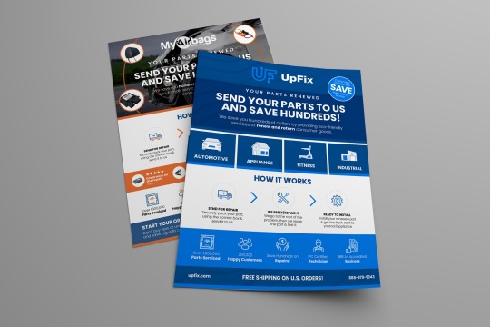
An Awesome Print Ready Flyer Or Magazine Ad
Are you looking something similar for An Awesome Print Ready Flyer Or Magazine Ad Creative thinking
Postlistd Flyer Or Magazine Ad https://postlistd.com/ads/an-awesome-print-ready-flyer-or-magazine-ad/
Fiverr Flyer Or Magazine Ad https://www.fiverr.com/shimpy1998
Fiverr Flyer Or Magazine Ad https://www.fiverr.com/shimpy1998/design-stylish-print-ready-flyer-or-magazine-ad
#flyer design#flyer#tech flyer#flyer designer#graphic design#graphic design tutorial#poster#poster art#poster design#poster designer
1 note
·
View note
Text
youtube
Generate Saleable Graphics with Ai and Make $1711 in Week
For details visit: https://www.moneymakkr.com/vizualai-all-in-one-visual-design/ 🚀 World's FIRST-EVER ChatGPT-4 & Stable-Diffusion Powered Cloud-Based Platform Vizual ai! 🌟 Create high-quality graphics, stunning AI visuals, and captivating 3D AI cartoons – all from simple text inputs! 💥 Simply pocket a whopping $1711 in just one week. Want proof? Visit: https://www.moneymakkr.com/vizualai-review/
vizualai #AIInnovation #EarnBig
✅ 100% ChatGPT4 Powered ✅ Keyword To Video (Never Seen Before) ✅ Cloud Based Platform ✅ Text To Image Generator ✅ Text To 3D Cartoon Generator ✅ GPT4 Powered Emotion Based Content ✅ 1800+ DFY Graphics Templates ✅ Content In 35+ International Languages ✅ Create VSL′s, Sales Copies, Emails, Ads Copy Etc UNLIMITED.. ✅ Millions Of Searchable Stock Videos, Vectors & Images Happy Earning!
#vizualai#AIInnovation#EarnBig#vizual ai#free ai video enhancer#ai visuals#free ai video upscaler#can i create my own ai#ai powered image generator#free ai text to video#artificial intelligence#graphic design tools#graphic design tutorial#Youtube
1 note
·
View note
Text
========================================================
[tutorial: build your own neocities/nekoweb page]
========================================================
a beginner's guide for making your very own home on the indie web—retro, personal, weird, and 100% yours.
this ain’t an average wix, squarespace, or tiktok aesthetic.
we’re talking full html/css with soul and attitude.
[ prerequisites ]
------------------
> an idea
> basic text editor (vscode, notepad++, or even notepad)
> account on https://neocities.org or https://nekoweb.org
> some gifs or tiles you love (dig deep or make your own)
> optional: image host or gif repo (or self-host everything)
[ feeling overwhelmed? read this. ]
-----------------------------------
you do *not* need to know everything.
html is not a mountain. it's a garden.
you plant one tag. then another. then a style. then a button.
you can build your site piece by piece.
and every piece is a portal to somewhere personal.
you are allowed to make broken pages.
you are allowed to use templates.
you are allowed to start over as many times as you want.
this is *your* world. you control the weird.
[ step 1: create an account ]
-----------------------------
> neocities: https://neocities.org
> nekoweb: https://nekoweb.org
register a name, log in, and enter your file manager.
this is where you upload your files and see your site live.
[ step 2: your first file - index.html ]
----------------------------------------
make a new file: `index.html`
basic starter:
<html>
<head>
<title>my weird little corner</title>
<link rel="stylesheet" href="style.css">
</head>
<body>
<h1>welcome to the void</h1>
<p>this is my page. it’s strange. like me.</p>
<img src="mygif.gif">
</body>
</html>
> upload to the dashboard
> boom. you’re live at
https://yoursite.neocities.org
or https://nekoweb.org/u/yoursite
[ step 3: add a style sheet - style.css ]
-----------------------------------------
create a file called `style.css` and upload it.
here’s some nostalgic magic:
body {
background: url('tile.gif');
color: lime;
font-family: "Courier New", monospace;
text-shadow: 1px 1px 0 black;
}
img {
image-rendering: pixelated;
}
marquee {
font-size: 20px;
color: magenta;
}
link it in your html and the vibes activate.
[ step 4: decorate it like a haunted usb ]
------------------------------------------
> use <marquee> for chaos scrolls
> embed gifs from https://gifcities.org/
> steal buttons from https://cyber.dabamos.de/88x31/
> set up a guestbook at https://www.smartgb.com/
> loop audio with <audio autoplay loop>
> add fake errors, 90s web lore, random link lists
[ step 5: resources, themes, and comfort ]
------------------------------------------
> templates & layouts: https://numbpilled-themes.tumblr.com
> glitchy gifs & buttons: https://glitchcat.neocities.org/resources
> layout builder: https://sadgrl.online/projects/layout-builder/
> free tiled backgrounds: https://backgrounds.neocities.org/
> beginner html intro: https://www.w3schools.com/html/
> pixel fonts & cyber assets: https://fontstruct.com/
remember:
you don't need to know js. you don't need to be a coder.
you just need a mood, a direction, a dream.
the html will follow.
[ bonus concept: shrine pages ]
-------------------------------
> a page just for one character you love
> a room to house digital fragments of your identity
> embed quotes, music, images like altars
> call it shrine.html and link it from your homepage
[ closing mantra ]
------------------
you are not here to be optimized.
you are not a brand.
you are a ghost inside the machine,
carving your initials into the silicon void.
welcome to Your website.
========================================================
#webcore#old web graphics#neocities#web graphics#carrd graphics#carrd resources#rentry decor#rentry graphics#carrd moodboard#carrd inspo#neopets#indie#indie web#early web#webdevelopment#web development#web resources#web design#old internet#old web#oldweb#nekoweb#transparent gif#tiny pixels#pixel gif#moodboard#tutorial#html page#html theme#htmlcoding
206 notes
·
View notes
Text

Tutorial on how I cutout my PNGs!!
I use Ibis paint X for this entire process and get all of my images off of Pinterest.
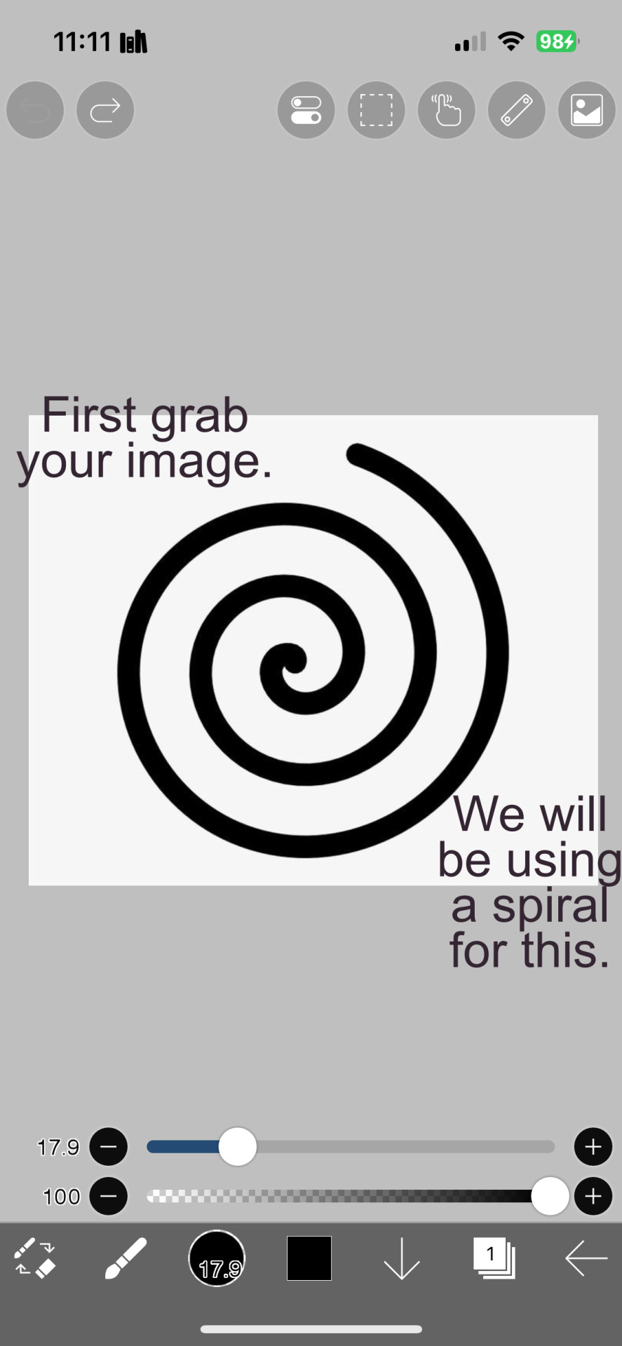
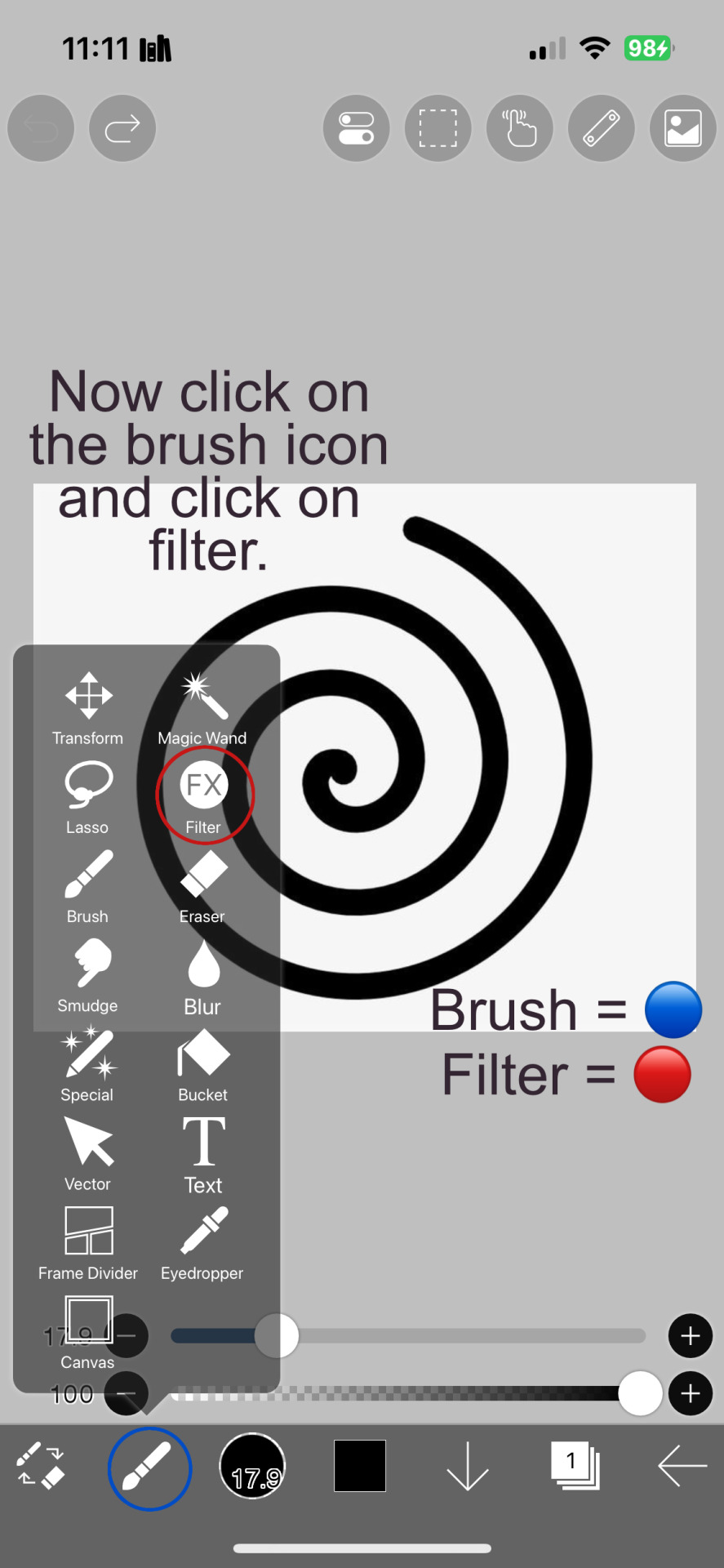
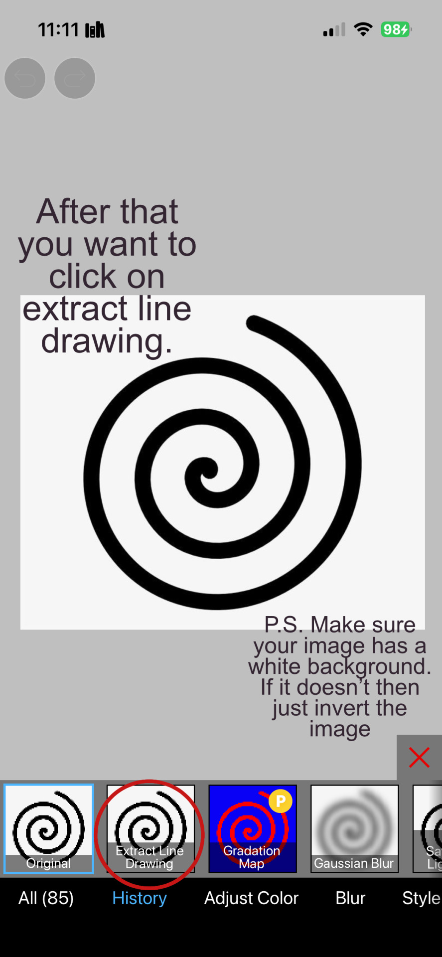
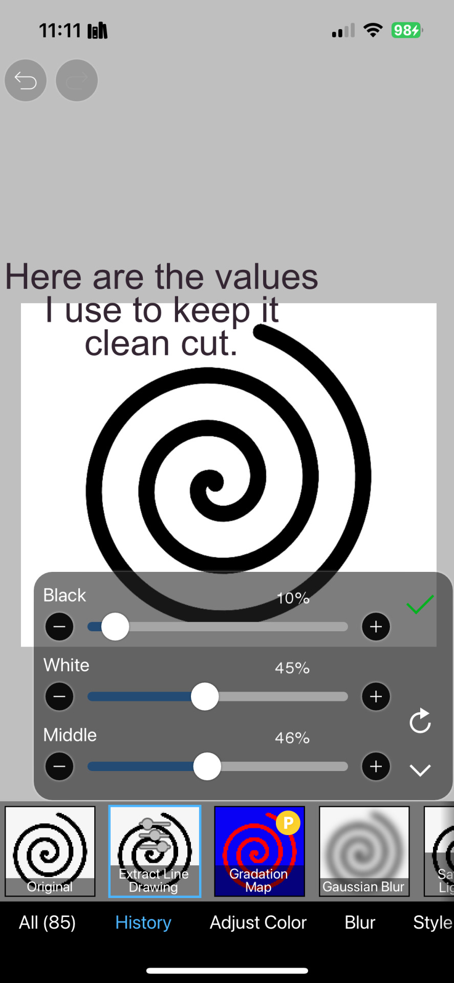
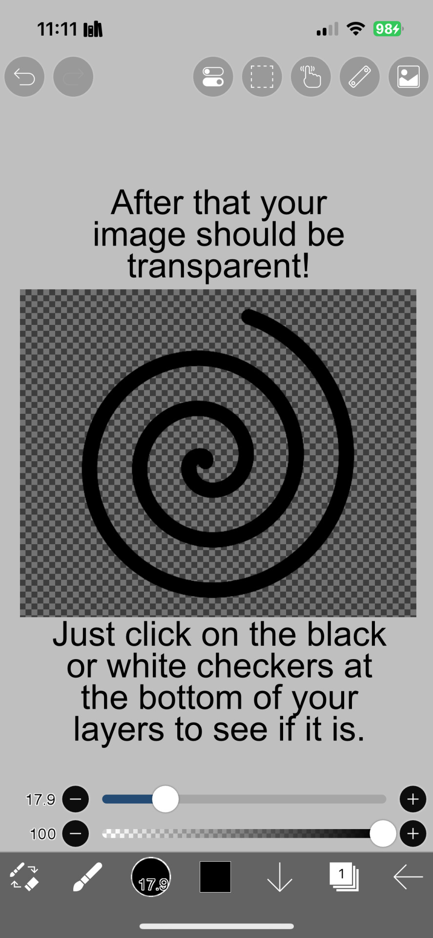
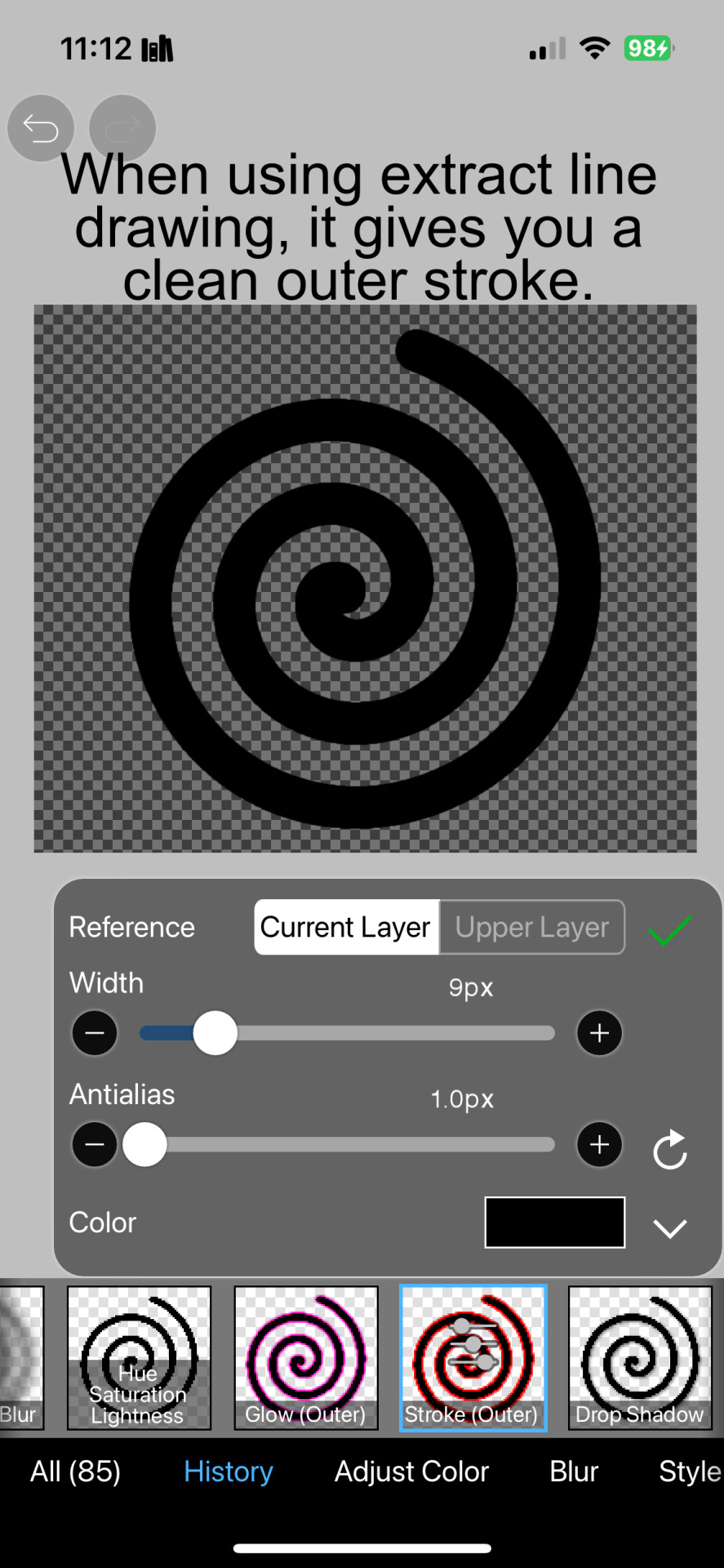
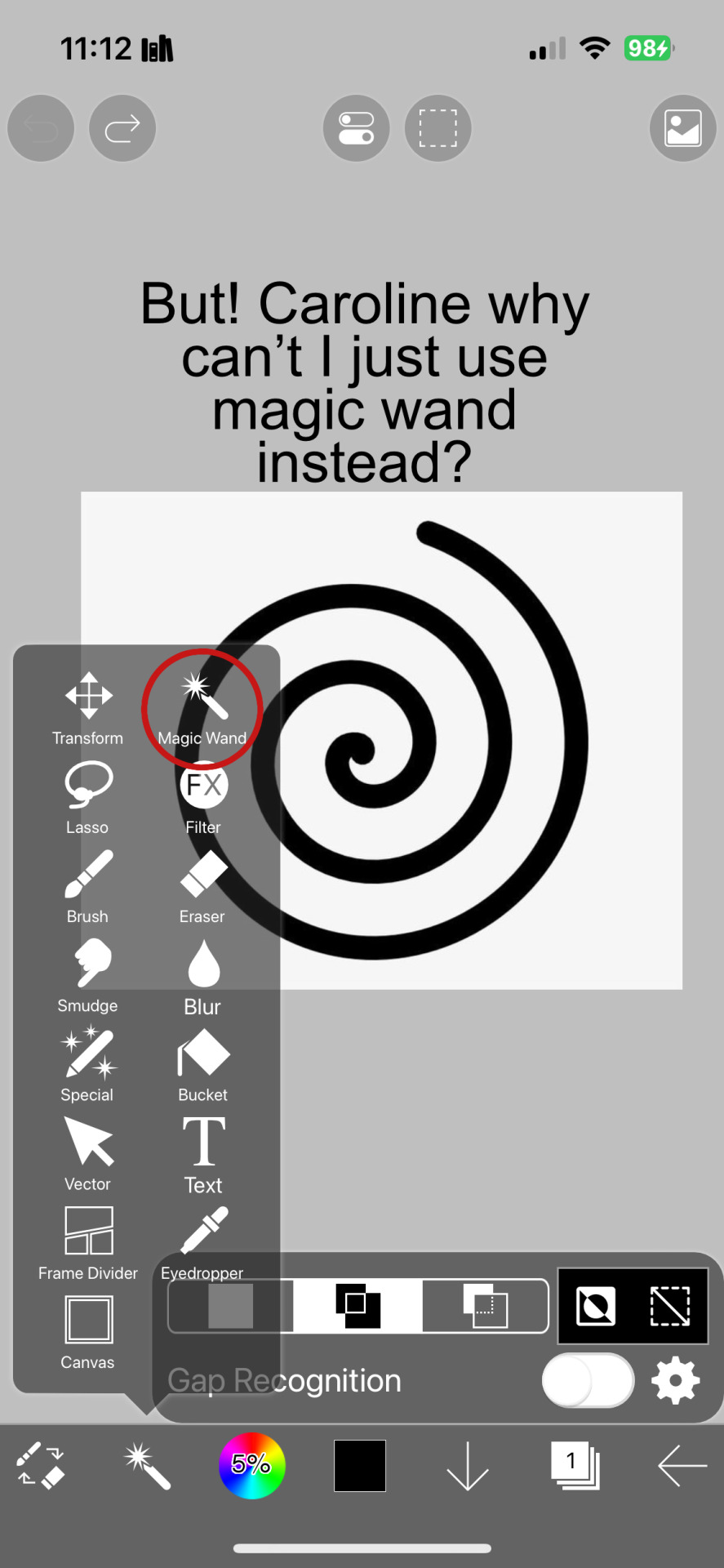
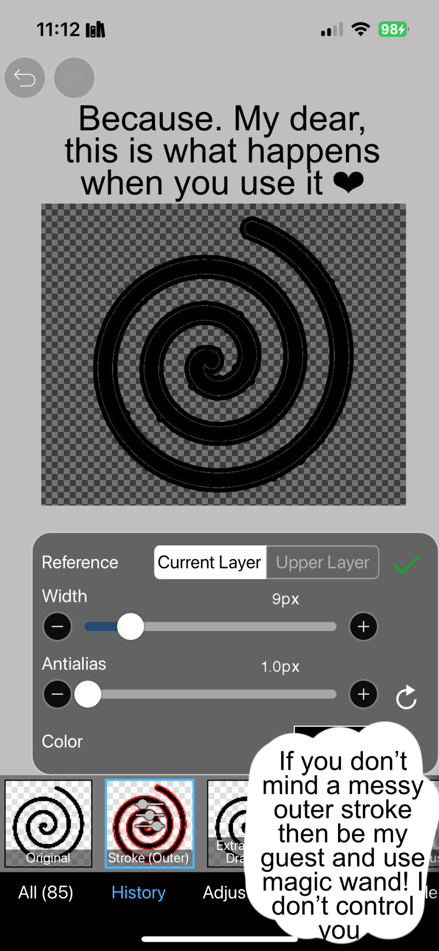

And hopefully this helps! Sorry if I didn't explain certain things well enough or the image ID text is confusing. I don't include it all too often.
#png#answers#rentry decor#rentry#puerileds#transparents#tutorials#talking#my stuff#decor#carrd decor#carrd resources#rentry resources#carrd png#rentry png#gfx#vector#vectors#graphic design#design#pinterest png#ibis paint#carrd stuff#rentry stuff#editblr#Is this enough tags
154 notes
·
View notes
Text
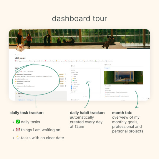
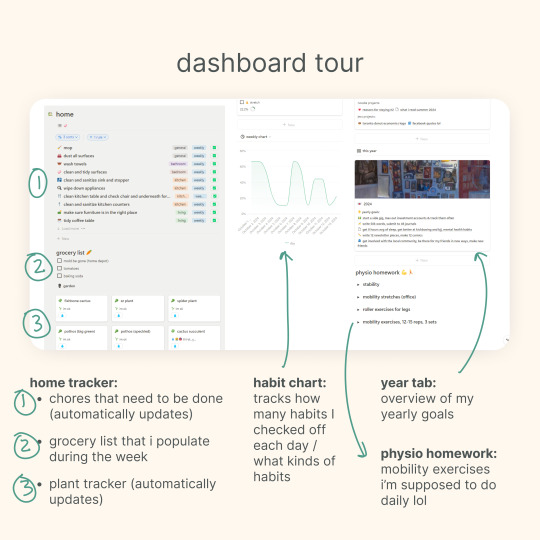
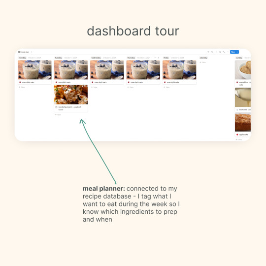
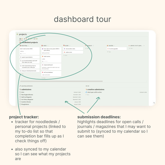
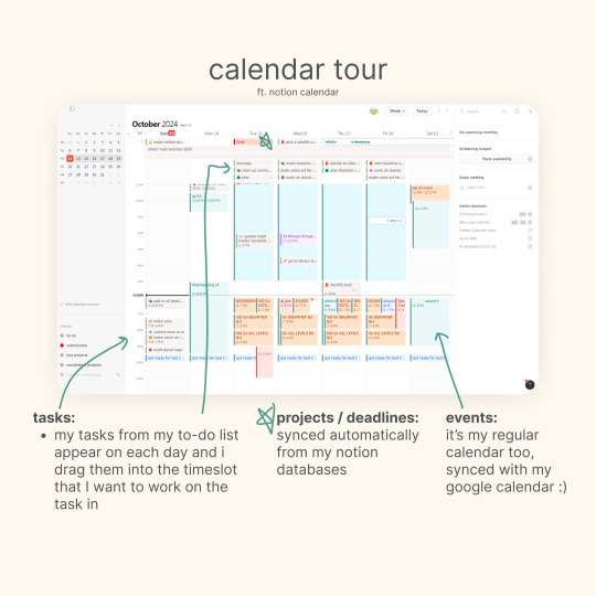
i got an ask about my updated notion setup, so here's a quick tour of my main dashboard and my synced calendar! 💗
other posts that may interest you: making a dashboard in notion (with template) | my notion tag | my other free notion templates
176 notes
·
View notes
Text

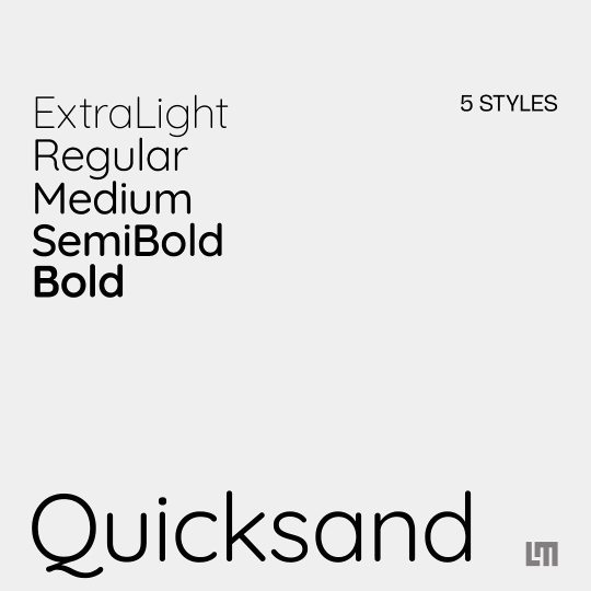
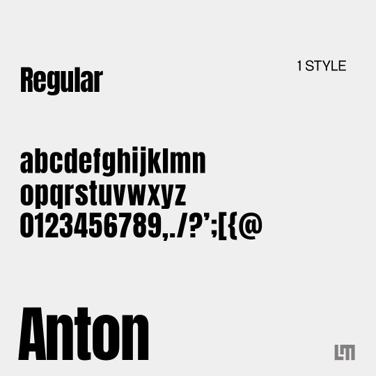
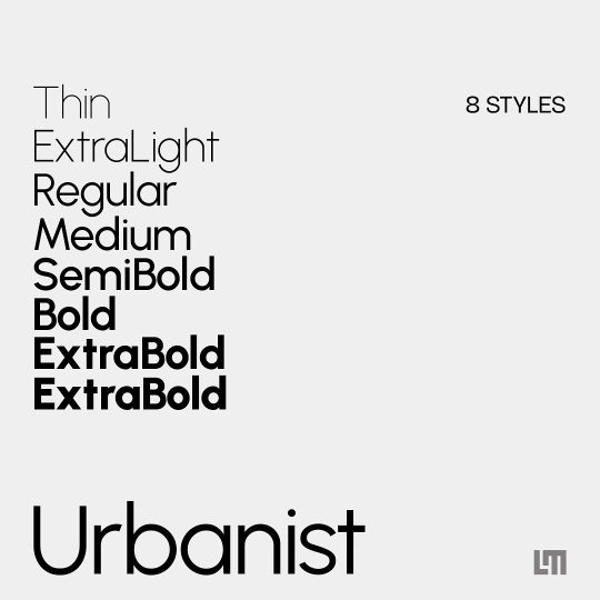
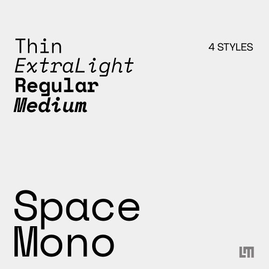


#graphic design#typography#diseño grafico#graphic design tips#best fonts#free fonts#google fonts#education#educate yourself#graphic design tutorial#good typography#typeface#graphic design resources#cool fonts#fonts#google
10 notes
·
View notes
Video
youtube
Creative Canva Hacks: Animated Text Tricks in Canva | Colors fading text...
#youtube#canva#canva tutorial#Canva tips#canva design#canva design tutorial#Canva design tips#canva animation#Canva text animation#tutorial#learn design#animation#text animation#graphic design#graphic design tutorial#animation tutorial#animation tips#youtube video
2 notes
·
View notes
Text
Tutorial: How-To Create Striking Gradient Shapes & Waves for Adobe Illustrator for iPad

In this tutorial, we will explore step-by-step instructions and tips to create striking gradient waves and shapes that can enhance any project, from digital illustration to web design and marketing materials.

Starting off you'll want to open Adobe Illustrator on your iPad, and select 'custom size'.

Create a canvas that measures at 3000 x 3000 points.

Set the colour mode as 'RGB'.

Select the 'Pencil' tool, and then select 'Paint Brush'.

Select 'Calligraphic' brushes, and scroll down until you find the 15 pt. 'Round' brush and select it.

Select the 'Fill' option and set the colour value to none.

Select the 'Stroke' option and set the colour value to a colour of your choosing.

Select the 'Smoothness' option and set it to the maximum value (10).

Draw a wavy line.

Select the 'Stroke' tool and choose a new colour.

Draw another wavy line over the top of the previous.

Select the 'Stroke' tool and choose another new colour.

Draw another wavy line over the top of the previous two.

Select the 'Selection' tool.

Select all of the shapes.

Select the 'Repeat' tool.

Within the 'Repeat' tool, select the 'Blend' option.
Tip: If you have a keyboard connected to your iPad, you can use the keyboard shortcut 'Command+Alt+B' when objects are selected to blend them.

Now our gradient wave shape has been created!

Once the shapes have been blended, you can manipulate the spacing of each shape with the three dots in the middle, each one represents each of the lines.

Move each point around until you feel comfortable with their spacing.

We may want to make some alterations to our shape such as changing the rotation, shape, size, order of lines. Here’s how we can do that.

Select the 'Selection' tool.

Drag and select the shape.

Select the 'Object' tool.

Select the 'Release' option.

Now the objects are unblended they can be altered or manipulated to our liking.

To put our gradient wave back in place, first select the 'Repeat' tool.

Then select the 'Blend' option.
Congratulations on completing the tutorial on creating striking gradient waves and shapes in Adobe Illustrator for iPad! You've taken significant steps in enhancing your design skills, learning how to apply gradients effectively, and bringing your digital artwork to life with vibrant colours and dynamic forms.
Keep Practicing - As with any creative skill, practice is key to mastery. Continue experimenting with different gradient combinations, wave patterns, and shapes. Find new ways to enhance your designs.
The more you practice, the more confident and proficient you will become.
If you're interested in supporting me, or checking out some free eBooks, Wallpapers, and more. Please consider checking out my Ko-Fi page: https://ko-fi.com/spikeeager
#freebies#guides#guide#how to#howto#how-to#how-to's#how-tos#art guide#art#design#illustration#art help#art tip#art advice#art tutorial#drawing tips#graphic design#creative#unique#marketing#tips#artwork#art process#digital painting#drawing#illustrators on tumblr#illustrator#illustrative art
140 notes
·
View notes