#Easter color palette
Explore tagged Tumblr posts
Text

ever experience a love so genuine?
#digital art#procreate#artists on tumblr#digital drawing#procreate art#artist boost#mlm art#irl me#boyfriends#couple#coupleart#boyfriend#Easter color palette#spring#spring colors#queer#gay#gay couple#gay art#queer artist
2 notes
·
View notes
Text


colorful wizard trio
#my art#these were doodles that turned into alot more than doodles#wizards#wizard tag#yellow wizard uses she/her#red wizard uses he/him#blue wizard uses she/they#im not sure how to feel about these but the coloring was fun to do#there’s a palette Easter egg in here if you can guess where i colorpicked from
143 notes
·
View notes
Text
mirror yumyum’s (lack of) creativity knows no bounds (he likes to paint all of his eggs yellow every easter)
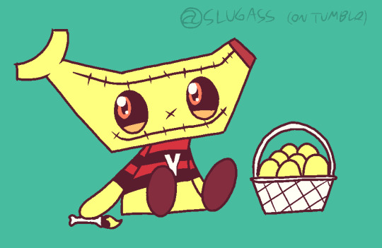
[IMAGE DESCRIPTION:
A 2d, brightly colored drawing of Mirror Yumyum, An extremely stylized boy with a banana for a head, wearing his usual red-and-black striped shirt with a white letter “Y” on the middle, yellow pants that are the color as his body, and brown oval-shaped shoes. He also has round orange eyes with black sclera.
He is sitting next to a white basket of eggs painted the same yellow as his body, with a smiling, proud expression on his face, with shiny eyes, Holding a paintbrush with yellow paint on it and a femur bone for a handle.
Everything has a thick, dark brown outline. The background is a solid teal color.
\END IMAGE DESCRIPTION]
alsodo not steal this
yes orange text because no yellow text by default blehhhhhhhhhhhhhhhhh
#midnight horror school#fanart#my art#art#easter#mirror yumyum#yumyum#yumyum mhs#stitches cw#stitches#<finally tagged that!!!#food mention#(bc he is a sentient banana)#may be eyestrain??#also yes i took back the reverse stripe color idea maybe he switches between those two styles bc why not#also his eyes are orange instead of lightish brown bc i used a limited-ish palette#anyways my adorable horrible baby snob child waaaaaah#ask to tag#do not steal thisssss
17 notes
·
View notes
Text
The chicken (animal) is truly the most awesome beast. Thousands of years living alongside humans, come in many varieties with their own colors, they are cute & can be held, roundie, they have tiny knives on their feet, they got that funny red comb & wattles, they make swag af noises, + they are cool guys.
#em.txt#i love you chickens#i wish i had chickens in my life#this isn't even like. like there's this one called the easter egger#& they're related to a chicken that lays these green eggs & the easter egger has a huge palette lf known egg colors#so yours might only lay pink eggs or only brown or only green etc & they have beards#sometimes chickens are transgender. shout out#they can be small#or very big which is great i love you chickens
2 notes
·
View notes
Text
Controversial opinion but Arkham Asylum > Arkham City
#i started with City back in 2011 and got maybe 75% done with it#and only recently played Asylum#but I prefer the Metroidvania vibe it has and I love that it has a color palette that isn't washed out#arleen sorkin harley is always an added plus in my books as well#also i blame city for every single design choice made with harley since new 52#asylum may have been the beginning but arkham city harley is just.......ughhhhhh#finally this is me being petty but no scarecrow :(#(yeah i know there's the easter egg in the boat but shut up.....)
5 notes
·
View notes
Text
✶Clowncore Is No Joke✶


From whimsical and colorful characters to dark and mysterious figures, clowns embody emotions and narratives that captivate and intrigue audiences of all ages.
Adding some clown pieces or makeup to your outfit can surprisingly affect how you feel.
Embracing the whimsical and playful nature of clown attire can be a liberating and mood-boosting experience for some people.
Here are a few reasons why incorporating clown elements into your look can make you feel good.
1. Creativity and self-expression-Dressing up as a clown allows you to explore your creativity and express yourself fun and unconventionally. Putting on colorful and exaggerated clothing or makeup can help you tap into your playful side and spark your imagination.
2. Confidence boost: Wearing clown pieces or makeup can be empowering as it often involves stepping outside your comfort zone and embracing a bold and unique style.
The transformation into a clown character can give you a newfound confidence and help you break free from self-imposed limitations.
3. Laughter and joy- Clowns are typically associated with laughter, happiness, and joy.
By embodying the spirit of a clown through your outfit, you may feel more lighthearted and carefree. The whimsical nature of clown attire can lift your spirits and bring a smile to your face.
4. Social interaction: Dressing up as a clown can be a great conversation starter and icebreaker in social settings.
People are often drawn to the colorful and eccentric appearance of clowns, which can lead to enjoyable interactions and connections with others.
5. Escapism and stress relief- Transforming into a clown can offer a temporary escape from the stresses and pressures of everyday life.
Stepping into a whimsical and fantastical world through your outfit can provide a much-needed break and a chance to let loose and have fun.
Overall, adding clown pieces or clown makeup to your outfit can be a playful and uplifting experience that allows you to embrace your creativity, boost your confidence, and spread joy to those around you.
So go ahead and don that colorful wig, oversized shoes, and bright red nose – you might find it brings a smile and a spring to your step!


#clown#buggy the clown#clowncore#clown oc#clownblr#clown girl#clown makeup#style#stylish#happiness#happy#happy easter#love#self love#clothing#clothes#nana osaki#fypfypfypfypfypfypdypfypfypfypfypfypfyfpfyfpfyp#tumblr fyp#fypツ#fyp#fypage#fyppage#fypシ゚viral#colorful#color#bright colors#color palette
6 notes
·
View notes
Text
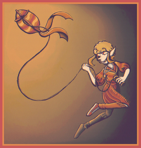
Happy Easter Everyone!!
Prompt number 6: Kite Flying
Palette: May Flowers
Tried to still do it in my style even with the limited color palette!
#corrinnecreates#art#digital art#artwork#oc#color#sproutfight2024#artfight#kiteflying#kite#may flowers#limited color palette#happy easter#easter
2 notes
·
View notes
Text

Children with Easter baskets at White House - Harris & Ewing - 1931 - Library of Congress
Click HERE for original.
#vintage#photography#vintage photography#palette fm#gfp gan#library of congress#harris & ewing#1930s#colorized#easter
8 notes
·
View notes
Text

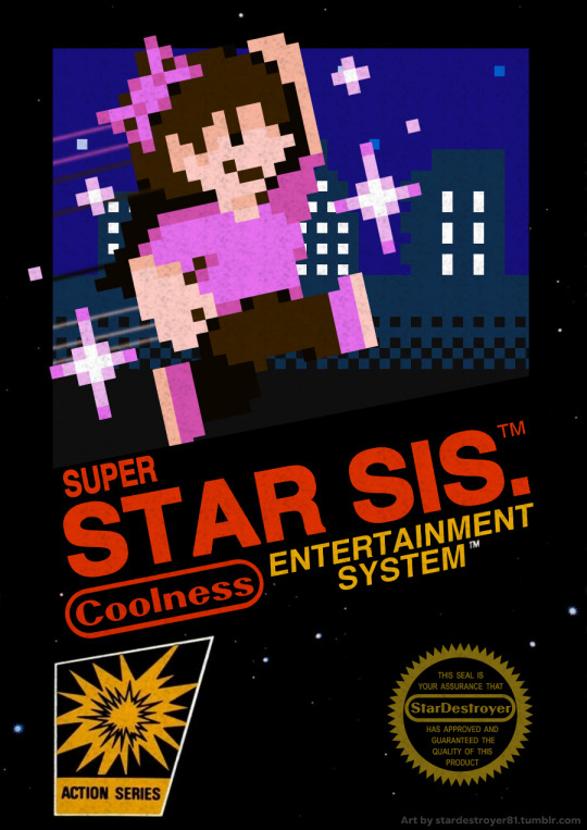
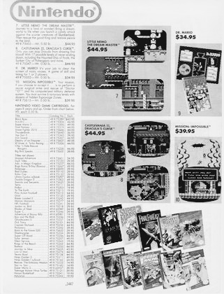
I've been on a Super Mario Bros. kick lately from having snagged a copy of the standalone game at a game store in-town (Now, I have three versions of SMB on NES!), and seeing how the simplicity of the game's visual style has grown on me, I wanted to attempt spriting in its style... and who better to sprite than myself? 💖✨
But that's not all! Not only was I able to craft a SMB-styled sprite of yours truly, but I also went the extra mile and designed an entire NES black box for a StarDestroyer81 twist of Super Mario Bros... Super Star Sisters! There's a lot of little details to share about the above three images, though I'll save those for the tags! Seeya down there if you're interested in reading on!
#Star's Art#Super Star Sisters#Super Star Sis.#Super Mario Bros#SMB#NES#NES Box Art#Sprite Art#Coolness#NOW YOU'RE PLAYING WITH SHE/HER POWER!!!#One might wonder why I drew myself with a blue shirt and bow combo as well as an alternate version where they're pink#I like to think that it's my equivalent to Mario's color palette changing once he collects a fire flower!#Moving onto the second image...#I've always wanted to make an NES black box design and this was an EXCELLENT excuse to finally create one!#There's a lot of little references in it that I'm very proud of. Specifically the 'Coolness Entertainment System'#Longtime followers are bound to get a kick out of that one!#But there's actually one VERY small easter egg hidden in the box art that might take some looking to notice.#Go have a second look at it and see if you can spot it then come straight back here to find out what it is!#If you still can't find it... take a look at the cityscape. More specifically the building on the far right#It's the same building from the intro to Mega Man 2!#Lastly... for those wondering why the third image is included...#Take a very close look at the game selection on the bottom right.#SUPER STAR SISTERS WILL BE REAL IN ZERO SECONDS
16 notes
·
View notes
Photo

Moodboard Mondays Spring
Moodboard Monday - Spring/Eastery Free to use for any adopts, references, color dabs, inspiration or anything else. Let me know what you guys think as well input highly appreciated and if you use it, I would love to see what you make with these :D
Thank you so much for considering, bidding and enjoying Feel free to check out my other socials below
Deviantart | Patreon | Facebook | Twitter | Instagram | redbubble | website
2 notes
·
View notes
Text


My favorites of the bunch
1 note
·
View note
Text
More clever easter eggs in Arcane s2:
We see a blue gemlike object embedded in Jayce's wrist, which seems to be exacerbating his rage:
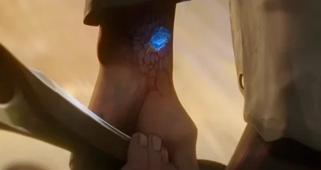
This is clearly meant to reference the Play button in the League of Legends client:

Likewise, Viktor's restorative powers are mostly white with a smattering of other colors, a subtle reference to the color palette you might see when uninstalling League from your computer

407 notes
·
View notes
Text
while we’re all brainstorming ideas for how ‘velma’ could have been a good ‘edgier and more mature modern take on scooby-doo’, i have an idea!
the mystery gang are given more 21st century redesigns. no more bell bottoms, some of them start wearing sneakers, shaggy wears a baggy hoodie, stuff like that.
they still have their usual color palettes and individual styles (shaggy’s clothes are baggy and comfortable, daphne is stylish and fashionable, etc), but they dress more like present-day highschool students. but, obviously, no designs are too detailed that they’re hard to animate and their designs shouldn’t date the show by being too specific to the trends of the 2020’s.
but, in one episode, crystal cove high has a “60’s themed” school dance, and the mystery gang attends in their original outfits!! maybe some extra 1960’s flair could be added just for fun, too. and the episode could have other references to the og series as well. the episode could have other 60’s references and easter eggs scattered throughout the episode.
later in the episode the gang has a classic benny hill theme chase with the villian, and, when it stops, scooby says “reja ru!” (deja vu). then fred, being a himbo, leans over to daphne and says “since when does scooby speak italian?”. daphne naturally gives him a “???” look, but before anyone can react to what fred or scooby said, the trap goes off and the bad guy is caught. episode continues from there.
there’s so much potential with the mystery gang. it sucks that velma (2023) hates its source material so much.
#i’m gonna go rewatch mystery inc to remind myself what a good scooby doo show looks like#scooby doo#hbo velma#velma hbo max#scooby gang#mystery gang#velma 2023
5K notes
·
View notes
Text
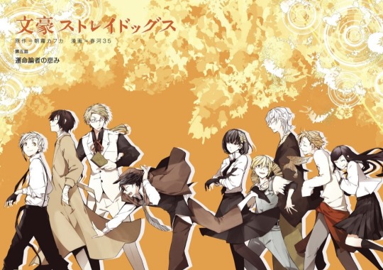
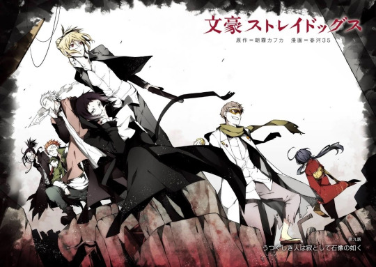
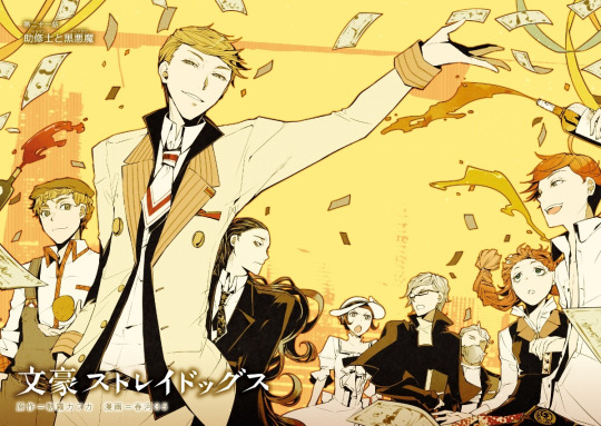
BSD Color Spreads Vol. 1-24
My second collection post! I really admire Sango Harukawa's art, so I just thought I would make a little post to gather all their color spreads in one place. They're very well drawn and fun to analyze as well because of the easter eggs hidden in them. My personal favorite is Volume 15, because the muted color palette along with the jagged cuts give it a look that's very fitting for this arc! It looks almost collage-like?
Here are the color spreads!
Vol. 1:

Vol. 2:
Vol. 3:
Vol. 4:

Vol. 5

Vol. 6:
Vol. 7:

Vol. 8:
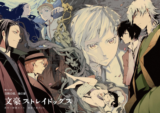
Vol. 9:

Vol. 10:
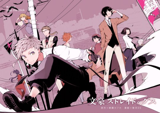
Vol. 11:
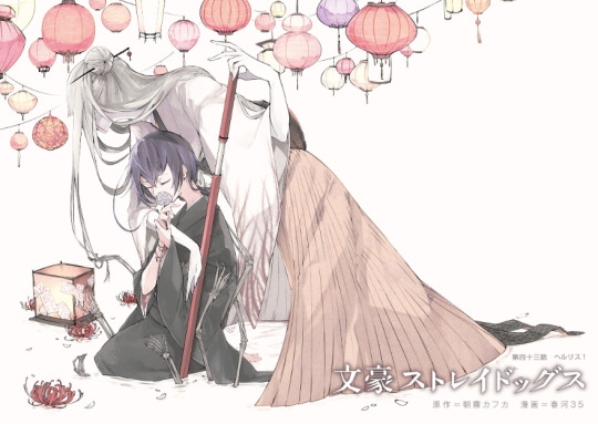
Vol. 12:
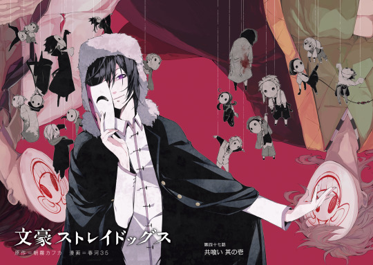
Vol. 13:
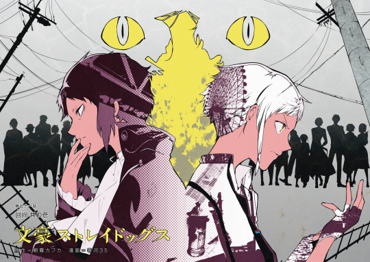
Vol. 14:
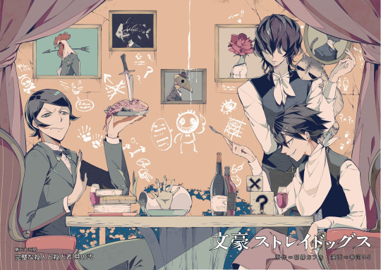
Vol. 15:
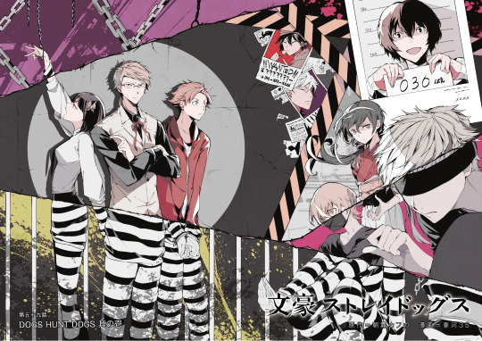
Vol. 16:
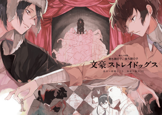
Vol. 17:

Vol. 18:
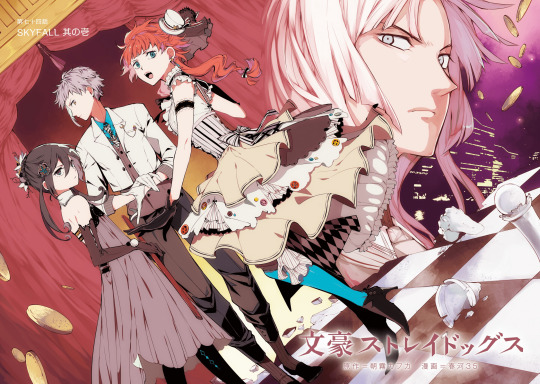
Vol. 19:

Vol. 20:
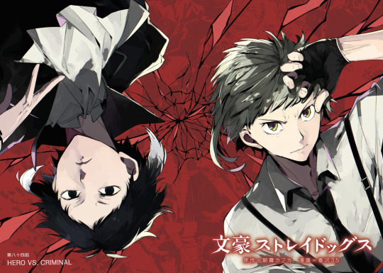
Vol. 21:

Vol. 22:
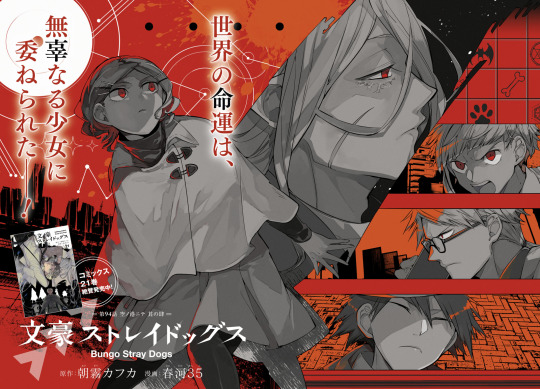
Vol. 23:
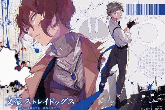
Vol. 24:

#bungo stray dogs#bungou stray dogs#bsd#bsd manga#bsd art#bsd anime#sango harukawa#bsd color spreads#bsd official art#armed detective agency#rats in the house of the dead#port mafia#guild bsd#hunting dogs bsd#kafka asagiri#collection post#bsd fyodor#bsd dazai#decay of angels
939 notes
·
View notes
Text
Tkachuky Derby & Hughesapalooza - 2024
*click for better detail- apologies for the lighting and general quality of the pics 😓!!*
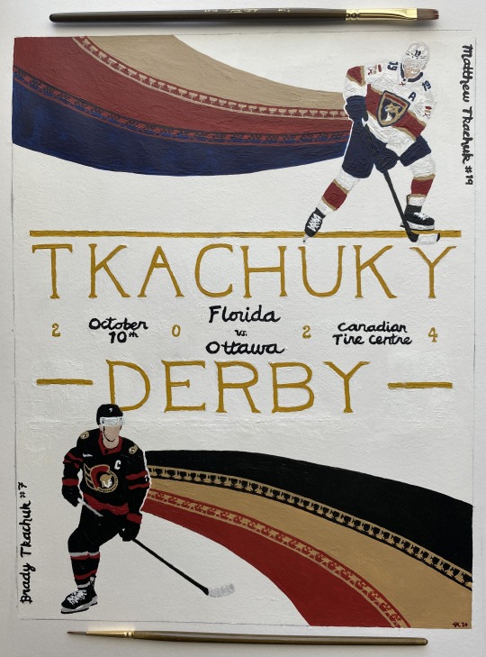
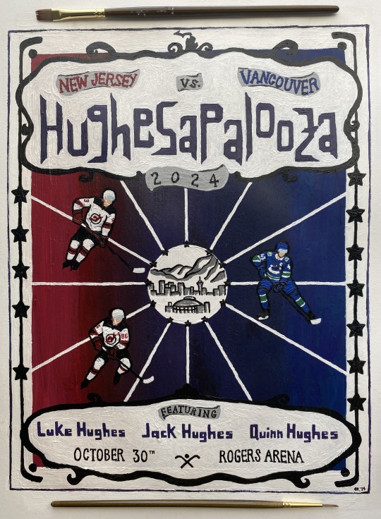
acrylic on paper
please don't steal or repost 💚
inspired by this tweet specifically (plus credit to the earliest twitter mentions i could find):

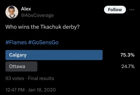
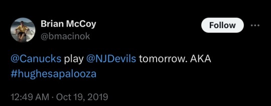
Made these for my fellow brothers bowls enthusiasts!! Especially those who know it’s all about the intricate webs of familial narratives in athletics. and the concepts of destiny and talent. and brothers as both allies and adversaries. and the bonds between siblings. and…
links to inspo, reference images, and other thoughts below the cut!
THEY'RE DONEEEEEE!! 😭🙌 i spent probably 2-3 full days' worth of time from concept sketches to final products. so much paint. so much frustration. they're still not perfect - there's little issues on both (if you notice something, i promise i'm aware of it!!) but 'fixing' stuff in acrylic often leads down a rabbit hole and i just had to call it and be done.
there's intentional little details on both - let me know what you catch! hopefully you can see them okay 😅
*i know they play each other more than once per season but i only wanted to make these for their first '24-'25 meetings)*
Let's get some whimsy up in here now, boys!
Derby:
team colors - Panthers Senators
matthew reference
brady reference
Kentucky Derby posters inspo
I wanted to keep the derby poster more 'clean' graphically. lots of derby posters have sharp lines of color and lots of movement, so i knew i wanted large swaths of the team colors somehow (thanks to the ppl that voted on my poll for what the team color shaping should be! i did follow the winning choice lol) chose poses where they look like they are moving in the direction of the 'flow.' generally wanted to keep focus on the idea of matthew vs brady, so i have them 'looking' across the way. was originally going to put in outlines of skylines for cities relevant to them, but that proved to be way too big of an undertaking so i scrapped that idea and came up with some different references. put some detailing for each of them that i'm reallyyyyy hoping you can see when you like zoom into it, but here’s some closer pics:
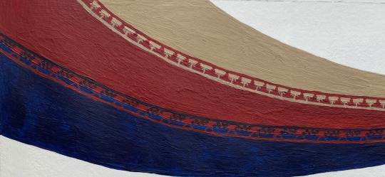
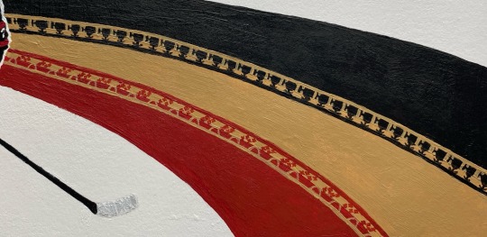
their last name is ukrainian for weaver, so i wanted to put a little nod to that somehow. not sure it will translate/be clear to viewers, but i limited myself by making the poster so damn small...*I* know they're there and can see them lol if it's not clear to ppl i will come back here and explicitly say what they are lol
Palooza:
team colors - Devils Canucks
luke reference
jack reference
quinn reference
Music posters inspo
inspired by lolla/music posters. wanted a more 'fun' vibe overall. while the derby poster would be more for say like, putting on a wall or hypothetically used for marketing purposes, palooza was more marketing poster and maybe on a t-shirt, too. definitely wanted a calligraphy type font for the name - just felt it out and came up with that shaping. tried to reference lolla a bit. used the devils and canucks coloring - and combo of those (did you notice?) - for the palette. wanted it to be a bit more pop graphic-ish (and hopefully not too cartoony). used some hockey/venue shapes and references, as well as some little hugheses-specific easter eggs...fun fact: the reference pic i used for jack is the EXACT SAME as his nhl25 cover. they just edited it to have the devils' home jersey colors. (i was like wait a second....i know that pose. bc i've been staring at it trying to paint it for hours!!!)
some pics of the palettes and initial sketches:
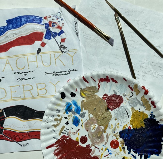
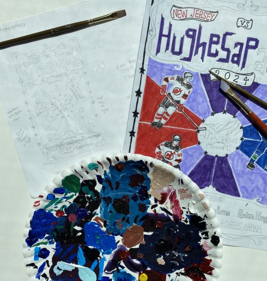
If anyone has fun nicknames for other nhl brothers bowls, i’d be open to making more posters! Lmk!
If u read all this just know i love u and hope you have a good day 🫶
#AHHHHH i'm scared but here they are#hope y’all like them 🫣#lmk what details you notice 👀 (me praying i painted them good enough and that they’re even visible/noticeable)#me#tkachuky derby#hughesapalooza#hockey art#tkachuk brothers#hughes brothers#matthew tkachuk#brady tkachuk#luke hughes#jack hughes#quinn hughes#panthers#senators#devils#canucks#nhl art#blue.art
123 notes
·
View notes
Text

Why does she look like this. The color palette. The little girl plastic toy tea set look. She looks Easter themed. The buttons on the front. The horrible clashing green on the arms. The NAIL POLISH. It looks like a six-year-old girl's toy box threw up all over it. The swirly detail on the arm overlaps the top rivet.
All of the other 2.0 bosses look fine. They're completely serviceable. Haltmann 2.0's mech looks great. What the fuck happened here. The other guys are all recolors or have like super minute changes. Not whatever this is. Why did they choose to go above and beyond on this one. Why in this direction.
I'd love to see the concept art for this one. What did the others look like to where this was the best one they made.
#to clarify tone i'm being hyperbolic here. i dont like this design but it's not actually worth getting worked up over.#there's a cohesive aesthetic going on here. it's not one i like but these are artistically valid choices.#susie haltmann
137 notes
·
View notes