#EDIT: added image ID in the alt!!
Explore tagged Tumblr posts
Text
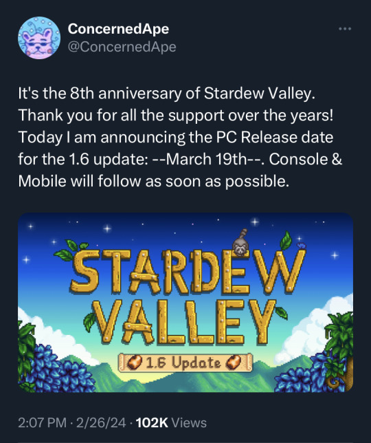
1.6 is coming—see you march 19th!!! 🥹🌱
#stardew valley#can you imagine pouring blood sweat & tears into a game#releasing it for like $15#and then working for 8 more years to add more content without asking for a cent more#for what could have easily been several dlc packs#i love you stardew valley i love you concernedape i love you indie games thank you for being my home all these years#EDIT: added image ID in the alt!!
25K notes
·
View notes
Text

been a while
#cosmic chatter#sonic#sonic the hedgehog#my art#doodles#gotta get back into the swing of drawing him...#id in alt#edit: added a image description
464 notes
·
View notes
Text
Why in the world do so many memes/joke images do nothing but remind me of this man.
How can a game be so good with a protagonist who’s literally a walking meme (I say this with so much platonic affection 💋)

Plus the original image:

#this is how I cope with seeing extreme irl uncensored gore on my tumblr#I will be making more#also felt like I should have added shading or something to break up the appearance of the jacket#but whatever yknow. yolo#disco Elysium#de#disco elysium fanart#de fanart#de Harry#harry debois#harry disco elysium#disco elysium harry#harry de bois#harrier du bois#edit: ended up adding beer/dirty smears to the jacket anyways#and some hair shading#barely#meme redraw#id in alt text#id in alt#described#described in alt#image description in alt
447 notes
·
View notes
Text
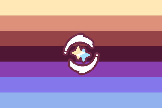

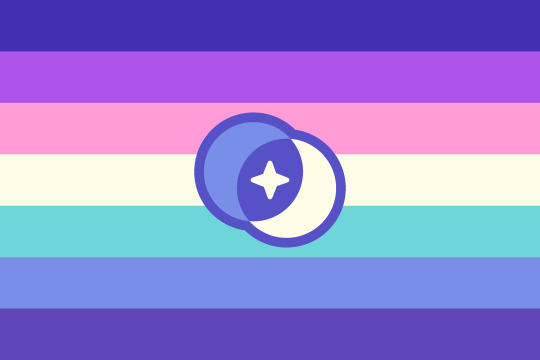
cenelian4cenelian | turian4turian/veldian4veldian | lesbian4lesbian
cenelian4cenelian : a cenelian person who prioritises or prefers relationships with other cenelian people. Can also be used to describe a relationship between two or more cenelian people.
turian4turian / veldian4veldian : a turian/veldian person who prioritises or prefers relationships with other turian/veldian people. Can also be used to describe a relationship between two or more turian/veldian people.
lesbian4lesbian : a lesbian person who prioritises or prefers relationships with other lesbian people. Can also be used to describe a relationship between two or more lesbian people.
(Alt flags and symbols at the end of the post.)
(Also thanks to @julietianboy for the image ids (link).)
──────────✦──────────
I saw this pretty bi4bi flag, and didn't find any cenelian4cenelian and turian4turian flags, so I made some :3 (I did find a couple of lesbian4lesbian flags, but I wanted to make a alt one in the same style as the others.)
──────────✦──────────
The designs for all these, like mentioned, are inspired by this bi4bi flag.
The stripe colours just come from these cenelian, wintergreen turian, and aurora lesbian flags. I added extra colours so they'd have 7 stripes, and adjusted the colours to be brighter. (There's not really any reason for this, I just went with what felt fitting / looked nice with these flags.)
The symbols are also kind of inspired by the bi4bi flag. I liked the idea of overlapping symbols in the middle (which is also kind of like the overlapping gender symbols commonly used). I just chose suns for turian, moons for lesbian, and stars for cenelian. And I think the overlapping connects to the "4" and relationship part of the terms well. Since turian and lesbian can include nonbinary people, I added stars in the middle of the suns and moons for nonbinary (people who wish to be included under those orientations). The cenelian4cenelian symbol is a bit different. When I think of two stars, my first thought is having two stars rotate around each other, but that doesn't really match / make sense with the overlapping symbol style of the other two, so the final design here is a combo of both of those ideas.
I kind of just went with a more artsy style for these flags. The stripes don't have any specific meanings, and the symbols I picked based on nebulous "this seems fitting and nice" ideas, so not my usual flag style I guess. That's also why I didn't include plain stripe versions, since these flags really rely on the symbols to make some sort of sense / be distinct.
──────────✦──────────


turian4turian/veldian4veldian | lesbian4lesbian
While making these flags, I came up with two designs, one with sparkles on the outside, and on in the middle. Having the sparkles on the inside makes more sense, but I like both sparkle designs, so here's alt versions that use sparkles in the middle and on the outside. Extra sparkly versions haha.
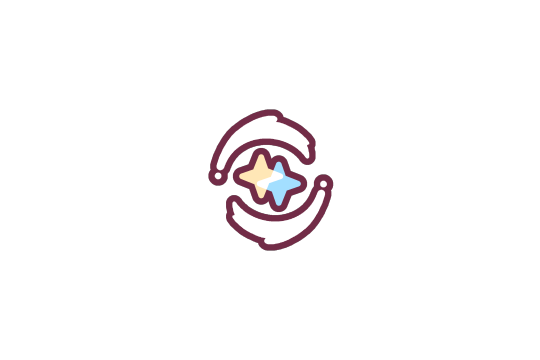






Here are the transparent cenelian4cenelian, turian4turian/veldian4veldian, and lesbian4lesbian symbols if anyone wants them. I included outline and no outline versions, plus versions with transparent space around them. The transparent space ones are made so that you can overlay them on a 2000x3000px flag and they will be centred, same as on my flag.
#cenelian4cenelian#cenelian#turian4turian#turian#veldian4veldian#veldian#lesbian4lesbian#lesbian#pride flag#new flag#alt flag#no image id / alt text because I don't know how to describe the symbols#and I also just feel too overwhelmed to try to write a image id for all of these#edit: added image ids / alt text thanks to julietianboy
77 notes
·
View notes
Text
The Techno Merch Store has released collaborative merch with Phil!
Coin
Shirt
Hoodie


[Image ID:
Four images.
The first shows text on a dark green background, reading “TECHNOBLADE x PHILZA. 14 Days, 12 Hours, 42 Minutes, 12 Seconds. This item will only be available until June 16th!” The text for “Technoblade” and “Philza” are stylised in their respective merch lettering styles.
The second shows a coin of a stylised Techno head in the style of the Aggro merch, with his pig nose replaced by a hardcore heart and his crown coloured dark green.
The third shows a dark green shirt with the coin’s design printed on it. The sleeves have text reading “Technoblade never dies” and “Technoblade x Philza”.
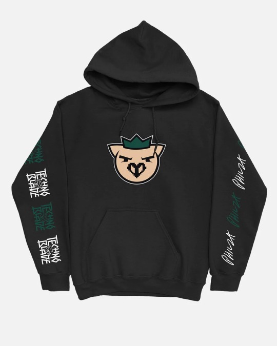
The fourth shows a black hoodie with the coin design on the centre and “TECHNOBLADE” and “PHILZA” in green and white on the sleeves.
End ID]
#ph1lza#philza#technoblade#mcyt#image id#no id in alt text#edit: I MISSED THE HOODIE 😭 added that in#mod luna
212 notes
·
View notes
Text
This post is made with speech to text because my hand hurts from typing so much today. Please forgive any typos or speech to text swapping similar sounding words.
If you would like to start writing your own image descriptions, feel free to ask any questions.
The main things to keep in mind is that they should begin with some variation of image description start or ID, and end with some variation of image description and, and ID or something like that. This distinguish the image description from the caption or anything else.
Image descriptions should not be written in italics, bold, all caps, or any colors. If text in the image is in all caps, write it in regular case, and simply note before or after it that it's in all caps.
Image descriptions should describe all images in the post, without skipping any. This includes images that are nothing but text.
Plain text image descriptions in the body of the post are more accessible than alt text alone, because many people who need image descriptions cannot use alt text, and Tumblr is known for its glitches, so the accessibility of the alt text all by itself varies widely over time.
It is more accessible to have the image descriptions indented than not, because this helps to visually separate the image description from the caption. Having brackets or parentheses at the end is also helpful for this. This allows people to easily distinguish between the caption and the image description if they need to.
If you are an artist, writing image descriptions for your art will give you full control over the image description, and will allow you to correctly identify details that others might miss. This gives you the opportunity to show which parts of your art hold meaning to you and are important to notice.
If you are describing real people who are unknown to you, unless it is specified within the post or you are already aware, please do not assign any gendered terms to them, or any " male presenting or female presenting" terms like that. This is completely unnecessary and leads to misgendering. It is best to simply describe visible facts about the people. Hair color, length, clothes and style, pose, expression, the light or darkness of their skin, things like that. Do not assume that someone is white simply because they have light skin.
Do not use image descriptions to lie to the audience in any way and do not use image descriptions to make jokes where the audience reading the image description is the butt of the joke.
As an example, if there is a very clearly fake screenshot, do not say that it is simply a screenshot, or if a photo is very blatantly photoshopped, do not say that it is simply a photo. Say an edited photo, a badly edited photo, a screenshot with editing, something like that to indicate the changes have been made and then what you are going to be describing is not the natural version.
As an example, you would say a crab photoshopped to be driving a car. Rather than a photo of a crab driving a car.
Unless you are transcribing a text within the image, do not use meme speak within image descriptions. Do not refer to dogs as doggos for example, unless it is to specify that the dog in the image is, within the image, labeled as a doggo. Do not describe someone walking downstairs as breasted bubbly downstairs, even if it is an actor humorously walking down the stairs to imitate that sentence. Describe the facts of the movements, and then you can make the comparison for clarity.
If someone adds an image description to your post whether this be an original post or a reblog that you have added an image to, it doesn't matter how many notes to post already has, please copy and paste that image description into the original post or your original reblog. If it is a new post that has only a few notes from friends, after you update the original, you can just ask your friends to delete the reblogs of the inaccessible version and reblog the new one. Most people who are good people and care about disabled people will happily do so.
Keep in mind that image descriptions are accessibility tools. Treat them as such.
Anyone can write image descriptions. You do not need any special qualifications or training. As long as you are willing to take constructive criticism if you make a mistake, an image description written by someone who's new to it and honestly doing their best with good intentions is better than no image description at all.
I'm sure I'm forgetting some things, so please feel free to add on more tips and advice.
#made with speech to text#image descriptions#accessability#disabled#cripplepunk#neuropunk#autistic#adhd#if you care about disabled people#start writing image descriptions#especially if you're able-bodied
1K notes
·
View notes
Text
Image descriptions tips & tuts masterpost
[Plain text: Image descriptions tips & tuts masterpost /end PT.] (Tuts is my short for "tutorials" btw)
For when you want to make IDs but don't know how!
Formatting your image descriptions
Image descriptions tutorial
General guide
Describing memes
More detail isn't always better
More tips on describing images (including art)
Yet more little tips
Starting out with your image descriptions
The job of an image description + tips
How to *keep* doing IDs (from someone who does a fuckton)
Friendly reminder
Easy image descriptions to do for begginers
(Edit: added by @anistarrose:)
How to get help writing IDs if you can't make them yourself
IDs for screenshoted tags
Visually impaired person talks about IDs versus ALT text
Why longer is oftentimes not better. At all.
Extra tip: Tagging your posts as "described" or "undescribed" might help people who need the IDs to filter inacessible posts out if their dash.
[Image description: The "let's take ibuprofen together" meme, edited to say "let's make tumblr more acessible together". /end ID.]
Note: If you have any good posts to add reblog them or send them to me and I'll add them to the original post 💪
#acessibility#image descriptions#masterpost#described#alt text#fun fact sometimes i put ids before the images too#because its cool#and sometimes it looks better#the first five posts are what i advise for starters#but all of them are good#tip 2: tagging keyboard smashes as “screenreader unfriendly” is also good for avoiding people's screenreaders from#crashing when they try to read it. i heard that they do that
641 notes
·
View notes
Text
Day 2: Discover
“They paint the world full of shadows... and then tell their children to stay close to the light. Their light. Their reasons, their judgments. Because in the darkness, there be dragons. But it isn't true…in the dark, there is discovery, there is possibility, there is freedom in the dark once someone has illuminated it.”

Edit: very helpful image ID from @etoilesombre added as alt text!
#inktober#inktober2024#black sails#james flint#captain flint#my art#fanart#I knew this quote was coming when I first watched the show and I still got shivers#pls don’t expect anything else this high effort for the rest of the month because I did this days ago
147 notes
·
View notes
Text
You added an "image description" to my post - now what? (FAQ)
[Plain text: "You added an 'image description' to my post - now what? (FAQ)". End PT.]
While I'm literally always willing to answer (good faith) questions about image descriptions, alt text, and online accessibility writ large, I also know lots of people have social anxiety about sending DMs, doing IDs "wrong," or just not knowing what IDs are for in the first place. Hence, this FAQ.
If I added an ID to your post and/or asked you to do so, and you're confused about any aspect of that, this is where to start. You can absolutely still reach out to me, I just thought I should consolidate as many answers as possible.
"What is an ID and why does it matter?"
IDs, or "image descriptions," are a description of the content of an image, and can range from a transcript of a screenshot of text, to a description of a detailed piece of art. They should be in plain text, and placed on the line immediately following the image (unless it's alt text, more on those pros and cons later).
Before we can answer "why it matters," there are two brief but crucial pieces of prior knowledge we need to establish for this whole post.
Blind people use computers, and navigate the Internet, with technology like screen readers and Braille displays.
Blindness is a spectrum. Partial vision is common. Some blind and low vision people can't make out all the details of images, but can read enlarged text.
Now, we're ready to answer:
IDs are primarily for blind and low vision people, who need text alternatives to images as they use screen readers and/or enlarged text to navigate the internet.
IDs help others too, including lots of neurodivergent people. Check out this post (link) and the notes for more examples (dyslexics, migraine sufferers, people who can't interpret expressions, people with slow internet...)
IDs are important because without them, the Internet really sucks for people who need them. You probably don't realize how many undescribed images circulate on Tumblr every day, with no way for a lot of disabled people to engage with those posts.
A blind person talks in more detail about all of this here (link).
"I reblogged your ID, is that enough?"
It's not that I don't appreciate it, but editing it into the root post and then reblogging that is much more impactful, for a variety of reasons. It means people who need IDs don't have to dig through the notes for them, it means that Tumblr can't glitch by failing to load the notes and make the ID functionally disappear, and it means all people who find the post in the tags or on your blog will be sharing the accessible version.
To explain visually, the best thing to do is something like this:

[ID: two mock-up Tumblr posts to illustrate adding an ID from the notes to the root post. A blog named "your-blog" posts an image of text reading "something cool you posted" with the caption "check out this cool image I made!" In the notes, the blog "image-describer" reblogs with an ID, which is highlighted. This version of the post is labeled: "original post, reblogged via ID writer."
The second version of the post is from "your-blog" again, where they've added the ID directly under the image, with the same caption below the ID. This version is labeled "updated root post, with ID copy-pasted. End ID.]
"My commentary first, or ID first?"
Include the ID right under the image, followed by your commentary. Unless you're putting your commentary before the image itself, a sighted person will see "image, commentary" in that order, so to ensure the post flows the same way for screen reader users, use the order "image, ID, commentary."
Commentary frequently assumes that the reader has seen the image, after all! A person might not even realize the image is described if the ID is buried too deep, because they might lose patience and skip the post. Or, to explain visually:

[ID: two mock-up example posts with an ID, one formatted well and one poorly. They both start with an image, which is just the text "screenshot of a tweet or something." The first post includes the ID immediately under the image. Below, it continues: "commentary blah blah blah get a load of this guy can you believe it." The post is labeled "Like this!" in green with a check mark.
The second post includes the commentary first, then the ID after the commentary. It's labeled: "Reads awkwardly, deprives screen reader users of immediate context" in red with an X. End ID.]
"I want to make a change to the ID, is that okay?"
Yep! If you want me to change it on my blog too (whether it's characters' pronouns, some typo, etc), just message me.
"What if someone else adds an ID to my post? Would they also be okay with me editing it into the original post like you are?"
Almost certainly! I can't speak for everyone, but I've literally never met an ID writer who wouldn't be okay with it — because we all have the shared goal of maximizing accessibility. If you're unsure or nervous, you can always include credit, but most people are even fine with going uncredited.
"I put your ID in the alt text, is that enough?"
I will never tell you not to use alt text when the alternative is an undescribed post, but I really strongly suggest putting it in both the alt text and the post. Some people who use screen readers prefer the flow of alt text, for good reason — but it's also poorly implemented on Tumblr, and it can glitch and disappear on reblogs, in drafts, or just apropos of nothing.
Moreover, when a low-vision person or anyone else wants to read the alt text directly, Tumblr's display options aren't great. (Unless you use XKit Rewritten's AccessKit, which I will always plug, but that's not an option for mobile users.) Long alt text often extends off the page and gets cut off. Tumblr used to use a terrible eye-straining purple background for it, and could always do that again with no warning. It's just not ideal.
Here's a visually impaired person talking more about the pros and cons (link).
We're in need of a compromise, so what can you do? One option is to include the same alt text as image description (placing the ID directly under the image as always, because remember, flow for screen readers is important). I like to lead with "ID from alt," in order to clarify to screen reader users that they can skip the ID, and help differentiate it from the other option I'm about to describe. This should be self-explanatory, but here's an example of a post I did in this style (link).
Option two is to include a short description in the alt text, and a more detailed explanation in-post. This can let screen reader users instantly know that the post is described, and decide whether they're interested enough in it to stick with it, but it maintains an in-post description for others to benefit from too.
Example of me doing this in a post about IDs (link)
Example of my mutual describing art like this (link)
Also, it's the style I follow throughout this exact post! Take a look!
As usual, the ID is directly below the image in all these cases. This means screen readers move immediately from the alt text to the full description, and the post flows the same way it would for a sighted person.
If you're here because I wrote an ID for you, it might be easier for you to put it in the alt text and the post body identically. That's perfectly fine! But if you're confident writing one short sentence for the alt text and including my ID in the body, you can always go for that too!
"Do I need to keep the brackets or the words 'image description/ID' in the alt text?"
Nope, no need. Brackets are purely for the visual distinction, and most screen readers preface alt text with something like "Image" that fulfills the same purpose as the "ID" label. It's not the end of the world if they're there, but it's redundant, so feel free to remove them.
"Can I put the ID under a read more? Or in small text?"
Please don't. Read mores are glitchy, and oftentimes have to be opened in a new tab. Accessibility that requires jumping through extra hoops isn't accessibility. And worse, if you change your URL or get deactivated, that read more link is usually just gone for good, and the post is undescribed again.
A blind person talks about read mores, and why not to put IDs below them, in more detail here (link).
The exception is if the image itself is below the read more, of course. Then putting the ID below the image, also below the read more by extension, is fine.
You should also write your IDs in text without any fancy formatting (by which I mean, you should write them unformatted, just like the text I'm using in this paragraph). Small text, italics, colored text, and so on are bad for low vision people or others who read the IDs directly such as with increased font size. You should not use them for IDs.
The only type of formatting you might want to consider is an indent. As far as I know, indents are a perfectly accessible form of formatting that shouldn't mess up any screen readers, or impair readability — while still helping IDs stand out from the rest of the post. Indents are optional, but can help non-ID readers know what parts of the post they can skip, which can be helpful for anyone who gets overwhelmed by a lot of text. To demonstrate:
[ID: sample description that stands out from the rest of the post. End ID.]
And one more time, just to drive the point home: IDs always go immediately below the image!
I demonstrate the issues with fonts and small text in this post (link).
"Why do you sometimes copy italics and stuff as plain text? Is that a screen reader thing too?"
Same reason IDs shouldn't be in small text, italics, et cetera — because of sight readers with low vision. Font in weird styles, or in a fixed size regardless of device settings (to my knowledge, this includes headings) isn't very accessible, so I try to provide an accessible transcript.
Colored text is sometimes even inaccessible to sighted people using certain Tumblr themes! (I'm speaking from experience with regards to the lightest shade of blue text on the default white background, actually!) If Tumblr gave individual users the option to disable small text and colors on their dash, then I'd tell you to use them to your heart's content, but as it stands, they're not very accessible.
"Okay, I want to make my blog more accessible, but I don't feel capable of writing IDs on my own. How can I get help?"
Good news, this is my absolute favorite question! I strongly recommend the People's Accessibility Discord (invite link here, please let me know if it breaks).
It was created for this exact purpose of crowdsourcing IDs (and answering questions about them). I talk about it more in this post (link), but I also describe an alternative if you're like me and have massive social anxiety about Discord servers.
TL;DR: ask in the post if someone can add an image description, and edit it in once someone does! If you've read this far in the post, you're clearly an expert on how to do that.
In that post, I also recommend text extractors like OnlineOCR (link), OCR Space, and Google Lens to extract text from images and save you typing if it's just a twitter thread or something. I would always spot check the text, adjust formatting, and remove superfluous characters, but it usually saves you lots of time when you might not normally have the energy to describe something.
Lastly, a lot of description blogs take requests! I don't unless I specify otherwise, because I easily run out of spoons, but @accessible-art is a great example of a blog that does this for non-fandom art, and there are lots of fandom blogs out there that do similar.
"I want to learn how to write image descriptions for my posts! Do you have any resources?"
This is my image description masterpost (link). I get a little scared about linking it because it's long, and a lot of the linked posts are long too, and I don't want to overwhelm people — so please, start with the first few links to get the broad strokes, and then feel free to treat the rest like a index. That is, peruse it if you're looking for answers or advice on a specific topic!
While learning, keep in mind that different ID users want different things out of IDs, and that's okay. Some people, including many blind people, care quite a bit about color, but others don't, and that doesn't mean either is wrong about the types of IDs they prefer versus ones they find unnecessary.
Blind People Still Like to Know About Color, as a blind person explains it (link)
Overall, blind people have a massive range of lived experiences, and all the other people who benefit from IDs broaden that range even more. Generally, no one involved wants huge walls of text, but some people prefer super-minimal IDs, while others prefer a nice handful of (relevant) details. It's stuff like the difference between "Two characters hugging in a cozy-looking house," versus "Two characters hugging with their eyes closed, both smiling. Their house looks cozy and cluttered, with warm lighting."
Neither of those is objectively wrong, and there will be people who prefer either. Nor is it wrong for you, the ID writer, to make a subjective judgement, such as on the "cozy" mood. You don't want to misrepresent things, but subjectivity is usually unavoidable on some level, and therefore fine. Likewise, you don't want to let the ID get so long it's a slog to get through (here's an example of what NOT to do), but if you're describing a complicated image like some art might be, it's okay to add some details. Just start with the important stuff and general idea first.
The purpose of an image also matters. With memes, shorter is almost always better, and excessive detail is annoying (post with examples). You don't need in-depth detail to appreciate most quick jokes. But on the other hand, art is often shared for the purpose of appreciating the details. This post goes into detail about how context matters, and how longer IDs make sense for art sometimes. It puts it better than I could, so I really suggest reading it if this is something you're wondering about! Key word: not length, not brevity, but "relevancy."
In my opinion, IDs are easiest to learn by doing, but also by starting small. If you want to build up your "description muscles" and confidence by just transcribing screenshots of text, that's perfectly fine — and also, the path that myself and a lot of people I know have followed.
Lastly: follow some described blogs! Check out how other people do it! Writing IDs is an art, and though it has a few hard do's and don't's we've gone over, we've also gone over how it's subjective. Everyone brings a slightly different style, with a different level of lengthiness, and it's great to learn from multiple sources. Here's one list of blogs like those (link)!
"Why would this matter if I know I don't have any blind people following me?"
Consider the cycle of inaccessibility (link). If no one ever accommodates blind people, then of course you're not going to see them on Tumblr, in fandom, or in whatever internet circles! There are blind people who might want to use Tumblr, but left because they weren't welcomed and accommodated (link). And blind people aren't the only people who need image descriptions — again, consider this post, especially this addition (link).
Worst case scenario, even if you have no one who can benefit from IDs following you, and no people who need IDs would follow you even if you included them, you're still helping people who do maintain accessible blogs to do so — and moreover, normalizing image descriptions in general.
"I don't think blind people would be in this fandom. I mean, there's a huge visual component!"
Described comics and webcomics exist. Audio descriptions for TV shows and movies exist. Disabled people who find creative ways to play video games exist. People who watched a playthrough of a video game by a person who happened to read out the dialogue, and give descriptive commentary on the action, also exist. People who lose their vision over time, or gain other reasons to rely on IDs over time, also exist.
"Where can I learn more about blindness and related accessibility issues, especially from blind people themselves?"
Wonderful question — check out @askablindperson and @blindbeta for starters! BlindBeta focuses on blind characters in fiction, but discusses accessibility too, and both these users have wonderful and very informative pinned posts! I'll link a few additional posts/tags below, from both these bloggers and others:
BlindBeta on Myths That Harm Blind People
"For a lot of blind and visually impaired people, sight is a conscious effort."
Variation in blind experiences and accessibility needs
Ask A Blind Person's tag on Braille
113 notes
·
View notes
Text
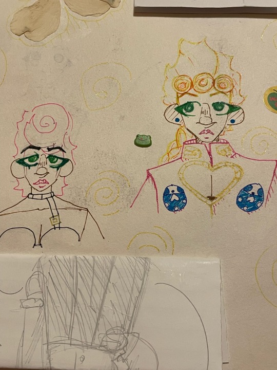
old art compilation!!! (Jojo edition) This is all from 2023 :]
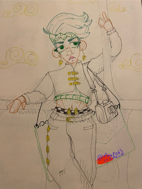
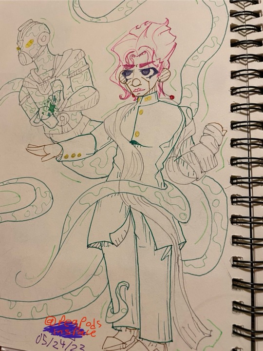
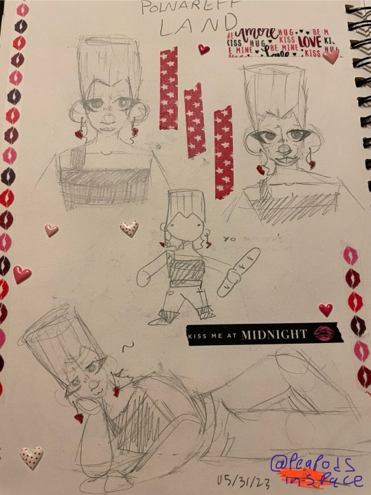
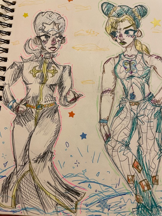
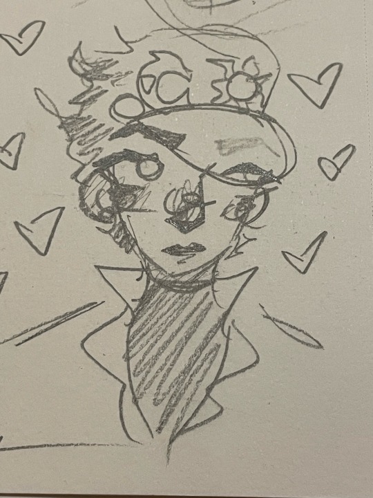
[Image ID in alt text]
The first photo is my first ever jojo fanart !!
The scribble stuff is me adding my url over my signature btw!
#my art#art#doodles#jjba#jjba fanart#traditional art#old art#golden wind#vento aureo#jjba part 5#jojo part 5#stardust crusaders#jjba part 3#jojo part 3#diamond is unbreakable#jjba part 4#jojo part 4#giorno giovanna#trish una#rohan kishibe#noriaki kakyoin#hierophant green#jean pierre polnareff#stone ocean#jjba part 6#jojo part 6#enrico pucci#jolyne cujoh#jotaro kujo#described
54 notes
·
View notes
Text
[ID: Three photos showing many keychains made of different kinds of material, made to look like Windows error boxes, with a large red and white X icon, and an unintelligble error code. The blue outline for the box is in a fluffy material, while the box itself is flatter and seems to have a rough texture. They have a blue loop on the top, with small chains in blue, white, and red. The first photo shows one keychain by itself, then the second shows more, then the third shows a pile of them, staggered so that they match the visual glitch that would appear if you dragged a window's error code box on your screen. End ID.]


Lab Update: Uh oh.
#Please copy and paste into the original post for accessability#no credit needed! It should just stay in plain text like it is now#without being put in italics bold or color#and go directly below the image#and above the caption#Image descriptions are for the visually impaired and blind#the way subtitles are for the deaf and hard of hearing#a plain text image description in the body of the post itself#is more accessible than just ALT text.#The image description should not go under a read more as that is inaccessible#and if you change your URL or delete the original post#everything under the read-more will be lost forever#feel free to edit and fix any mistakes#the ID should be added to this specific reblog and the original post#and then when you update just reblog one of those ones so it still has the ID :)
20K notes
·
View notes
Text

ALRIGHT YALL THE VOTES ARE IN!! here are the winning prompts for jetko week 2024!
🎀 RULES:
- any art is welcome as long as it consists of Jetko (fics, art, video/photo edits,etc.)
- no nsfw (no sexual themes, fics included)
- whitewashing art will not be shared
- potentially triggering topics must be tagged accordingly
- IDs are encouraged
- including other ships is okay, as long as it's Jetko centic
- No AI

🎀 FAQ:
-"IDs" are image descriptions! you can add alt text by clicking the three dots at the bottom right of your image before posting
- Jetko week will start on sunday August 25th
-Ao3 COLLECTION (make sure you are logged in to be able to post to the collection)
-i do not own these prompts if you wanna do your own thing (not follow the rules) based on these prompts that is fine but it will not be added to the collection and pls do not use the hashtag/ tag the jetkoweek account
-i am also hosting this over on Twitter if your preferred platform is over there
-there are 2 prompts per day solely for variety, you don't not have to create for BOTH PROMPTS per day! (Unless you would like to) You also don't have to do EVERY SINGLE PROMPT and if your running behind, DONT WORRY! admin will still be sharing jetko week post even after the official week, just don't forget to tag! (I would tag the account just for better chances of me seeing)
Links are embedded in the underlined words!

That should be all! Have fun and as a reminder PLEASE, DONT FORGET TO TAG! you can tag ME or use the hashtag #jetkoweek or #jetkoweek2024 and please reblog others work ❤️ please leave any questions in the inbox 🍰HOPE WE HAVE A HAPPY JETKO WEEK🍰
#jetko#atla#zuko#avatar the last airbender#jetkoweek#atla jet#jetko week#jet and zuko#zuko and jet#jet/zuko
52 notes
·
View notes
Text
Live Emotion Management Letter
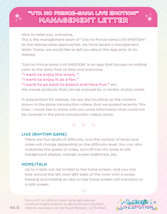
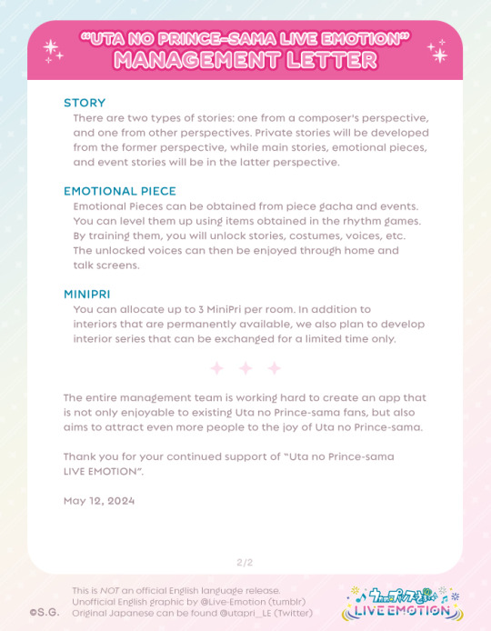
The official twitter account has released a letter from the Live Emotion management team. Thank you management team!
To help spread their message further, I have translated and edited a graphic for an English version of this letter. Please keep in mind I'm not a translator, so there may be some inaccuracies, and we don't know the official translation of some terms (Eg. Emotional Piece/Peace).
You may share these images if: - The credit remains in the image. - You also credit me as the original poster somewhere in text, or direct here to see the original post when you share them. - You do not claim or imply that these are any kind of official English translation by the management team!
Full translation text in alt text and below read more.
[Image 1 ID]
“UTA NO PRINCE-SAMA LIVE EMOTION” - MANAGEMENT LETTER.
Nice to meet you, everyone, This is the management team of “Uta no Prince-sama LIVE EMOTION”. As the release date approaches, we have issued a management letter. Today, we would like to tell you about the app prior to its release.
"Uta no Prince-sama LIVE EMOTION" is an app that focuses on adding color to the daily lives of idols and everyone. “I want to enjoy the music.” “I want to enjoy it as a fan.” “I want to go back to basics and have fun.” etc. We create products that can be enjoyed by a variety of play styles.
In preparation for release, we are also brushing up the content shown in the game introduction videos that we posted recently. This time, I would like to share with you some information that could not be covered in the game introduction videos alone.
LIVE (RHYTHM GAME): There are four levels of difficulty, and the number of lanes and notes will change depending on the difficulty level. You can also customise the speed of notes, turn off live MV, swap to still background display, change screen brightness, etc.
HOME/TALK: Up to 4 idols can be invited to the home screen, and you can look around the left and right sides of the room with a swipe. Pressing and holding an idol on the home screen will transition to a talk screen.
[Image 2 ID]
“UTA NO PRINCE-SAMA LIVE EMOTION” - MANAGEMENT LETTER.
STORY: There are two types of stories: one from a composer's perspective, and one from other perspectives. Private stories will be developed from the former perspective, while main stories, emotional pieces, and event stories will be in the latter perspective.
EMOTIONAL PIECE: Emotional Pieces can be obtained from piece gacha and events. You can level them up using items obtained in the rhythm games. By training them, you will unlock stories, costumes, voices, etc. The unlocked voices can then be enjoyed through home and talk screens.
MINIPRI: You can allocate up to 3 MiniPri per room. In addition to interiors that are permanently available, we also plan to develop interior series that can be exchanged for a limited time only.
The entire management team is working hard to create an app that is not only enjoyable to existing Uta no Prince-sama fans, but also aims to attract even more people to the joy of Uta no Prince-sama.
Thank you for your continued support of “Uta no Prince-sama LIVE EMOTION”.
May 12, 2024.
Additional text added by me at the bottom of each image reads: "This is NOT an official English language release. Unofficial English graphic by @Live-Emotion (tumblr). Original Japanese can be found @utapri_LE (Twitter)."
[End of image ID]
#live emotion#pre-release#management letter#i feel like this bodes well#we never really heard much from the management team for SL right?#not like this at least#i hope they keep it up
65 notes
·
View notes
Text

[ID: panels from the “yona of the dawn” bonus chapter “upon his back”. the first panel shows gija smiling softly while speaking; the dialogue has been erased to make the edit look less busy. the second panel is a closeup of jaeha staring at him in surprise/awe. a text post by blazevillains has been edited onto the image; it reads: “guy whos soooo haunted but very kissable about it”. end ID.]
i’m never letting anyone forget that gija has the spirits of past white dragons clinging to him (source: ch 101) and that jaeha can see ghosts (source: ch 107). fellas……..
alt version under the cut bc i can’t decide which one i like better

[ID: two panels from the same chapter as the previous image, with the same text post added. the first panel depicts gija running with a determined expression as the hands of previous white dragons grip his arms, shoulders, and head. the second panel shows jaeha with a serious expression. jaeha’s internal monologue, spanning across both panels, reads, “he carries the regrets of his father and other white dragons of the past. he’s prepared…to sacrifice himself…to redeem them. there’s…far more to him…than i realized.” end ID.]
#why yes i did indeed include sources to support my silly little edits#anyway the whole ghost element is yet another thing that gets brought up once and never again that makes me wanna chew glass#like what do u mean. What do u MEANNNN KUSANAGIIIIIIII#akayona#gijaeha
70 notes
·
View notes
Text
IMAGE 1 - [Image ID: The left illustration is a rendered redraw of a manga panel from Chapter 78. It shows Kunikida sitting on a hospital bed, with a withdrawn expression as his amputated arms are revealed. The right illustration is a 5 panel comic.
Panel one shows a zoom in of Jouno's eyes, looking like he's thinking deeply.
Panel two shows a chibi Jouno who looks like he has thought of an idea.
Panel three shows Jouno sitting down and presenting the half peeled apple pear. He says, "Perhaps my proposal was too unfavorable on your end. How about this: on top of your FREEDOM, we will have our specialized technicians create prosthetic hands catered to your specific needs." "All expenses paid!"
Panel four shows Jouno's smug expression, with red dots in his blackened irises, making him look suspicious.
Panel five shows Kunikida's uncomfortable expression, in between panel four and five is a speech bubble that says "What do you say?" /.End ID]
IMAGE 2 - [Image ID: There are 3 different doodles of Kunikida with his handless limbs. The first drawing on the left shows Kunikida sitting and looking down on his limbs. There is a shadow over his head as if to show his despair. The second drawing shows Kunikida raising his arms to eye level. On top of the arms are transparent hands, to demonstrate his phantom pains. He says, "It's still there. No. Why can I still feel them?" The third is a bust shot, where he is looking off to the distance. His arm doesn't have bandages compared to the first two drawings. /.End ID]
IMAGE 3 - [Image ID: It is a five part comic. From right to left,
Panel one is a waist up shot, showing Kunikida in a white button up similar to the Hunting Dogs uniform. He is looking at the prosthetic hands attached to his limbs. He looks shocked.
Panel two shows him extending his arms out, as if to get used to the feel of prosthetics attached to his arms.
Panel three shows one half of his Ideals notebook.
Panel four shows a zoom in of him picking it up with his prosthetic hand.
Panel five shows a pleased Jouno, who says, "It seems that we do have an agreement after all!" /.End ID]
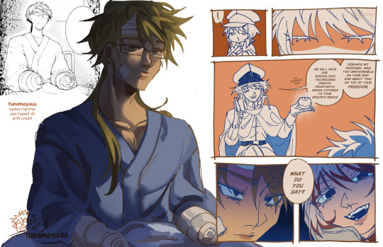

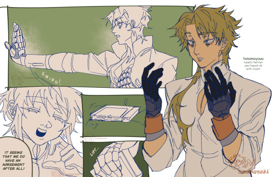
@bsd-disability-week-2024 DAY 1: PHYSICAL DISABILITY (Amputee)
i've always thought it was a missed opportunity to have an amputee in the main cast moving forward, but i do understand that it will not make much sense narratively (given yosano's ability)... so how about a kunikida joining the hunting dogs and getting prosthetic hands as part of his deal?
#hey so this will be my new system#ill be reblogging my own art with their plain text image ID so my captions can be shorter on the original post#esp bc my image IDs are really specific.. huhu#i will be adding image ID on older posts! hopefully. pls remind me#my art with image ID#ok edit i realize that tumblr has a higher limit on alt text! which is great. but i will still reblog with plain text IDs to boost my work#and at the same time make my work accessible as best as i can
824 notes
·
View notes
Note
hihi!! ur flags are so so cool ive been meaning to req for a bit! do you think you could make a transhinduism flag? please and thank you!

TRANS HINDUISM


When one identifies as practicing Hinduism . For whatever specified / unspecified reasons . TransReligion . TransFaith . Ect .

If already coined consider as an alt . Req by @/cranegirl . No DNI . Just be nice / civil about it . Free for anyone . Edit : Added image IDs .

#you stepped on a landmine#radqueer#transid#pro radq#pro radqueer#pro transx#radq safe#radqueer community#radqueer safe#radqueers please interact#rq community#radqueer coining#rq safe#radq#radq coining#rqc#radqueer please interact#radqueer friendly#transid coining#transid safe#transid community#pro transid#transid flag#transid please interact#rqc🌈🍓#pro rq 🌈🍓#rq 🌈🍓#transx coining#rq coining#rq please interact
34 notes
·
View notes