#Design tricks and tips
Text
Mastering Adobe Illustrator's Blend Tool: Tips, Tricks, and Design Magic

Unveil the creative wonders of Adobe Illustrator's Blend Tool! 🎨 Discover Replace Spine and Reverse Spine techniques for breathtaking designs. 🚀 Join us for expert tips, tricks, and design magic. Let's craft brilliance together! ✨
Watch Tutorial Now
#Adobe Illustrator Blend Tool#Design tutorial#Graphic design techniques#Blend Tool options#Replace Spine in Adobe Illustrator#Reverse Spine technique#Stunning design creation#Creative tips for Adobe Illustrator#Graphic design magic#Illustrator tutorial#Design tricks and tips#Adobe design tools#Digital artistry guide#Enhancing designs with Blend Tool#Illustrator design inspiration
0 notes
Text

Here's a go-to chart for your crime drama/fiction.
#writerscommunity#writer things#novel writing#writerslife#writing community#writers and readers#writing#writers#writers on tumblr#writing tips#characterization#character design#original character#character development#writing advice#writing resources#writing tips and tricks#how to write#writing help
188 notes
·
View notes
Text
(instagram)
Tutorial in After Effects under the cut.
ALRIGHT let's get into it. Straight to the point, no nonsense tutorial.
• Create a new composition 1080px x 1080px, let’s call it Design.
• Write some text, turn it into shapes (right-click → Create → Create shapes from text).
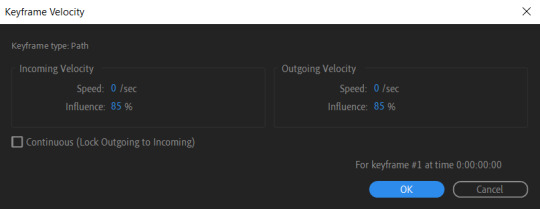
• Animate the path so the text stretches like so in a few seconds time. When animated, right-click on a keyframe and select Keyframe velocity and change coming & going velocity influence to 85%:

• Create another new composition and call it FX. Add your Design pre-comp in this composition.
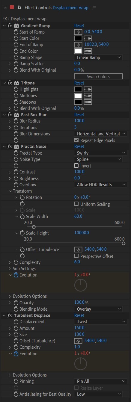
• Add a new Solid layer on top, call it Displacement map. Now we’re gonna add a bunch of effects on that solid layer.
• First add Gradient Ramp. Make it so the white color would be on the right side (End of Ramp) and black would be on the left side (Start of Ramp);
• Next add a Tritone effect and change the Highlights color to black and Midtones color to white.
• Add Fast Box Blur and change Blur Radius to 100.
• Then it’s time to add Fractal Noise effect, and change Fractal Type to Swirly, Noise Type to Spline. Then bring down the Transform panel and uncheck Uniform Scaling, make Scale Width 60, and change Scale Height to a very high number, such as 10000.0.
• Add a keyframe to Evolution at the beginning, and the second keyframe at 2 seconds rotating the slider for one rotation. Add an expression loopOut() on these keyframes so it loops.
• And lastly change the Blending mode to Overlay (at the bottom of the effect).
• The last effect we’re gonna add is Turbulent Displace. Change Displacement to Twist, Amount to 150, Size 130. Add the same keyframes to the Evolution as we did previously on Fractal Noise and loop them with the same expression.
So far your work should look something like this:

• Then it’s time to add colors! Create another new composition, add your FX pre-comp to it, add a background with a new solid layer (CTRL + Y).
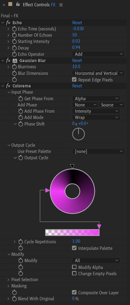
• Then add Echo effect to your FX pre-comp, change Echo Time to -0.030, Starting Intensity to 0.03, Decay to 0.94.
• Next add Gaussian Blur effect, make the Blurriness 10.
• Add Colorama effect, change Get Phase From to Alpha. Then go to Output Cycle and change the color presets (Use Preset Palette) to let’s say Solarize Red (it doesn’t really matter, we’re gonna change the colors, we just need it to have two sliders instead of a lot). Then grab a bottom slider and put it on the left side and choose the lighter color you want. I chose pink.
• Now duplicate your FX pre-comp. We’re gonna change some parameters on the effects.
• So the first thing you want to do is change Echo Time to -0.005, Starting Intensity to 1.
• On Colorama go to Modify and uncheck Modify Alpha. Then go to Output Cycle, and add more colors like you see in the screenshot.
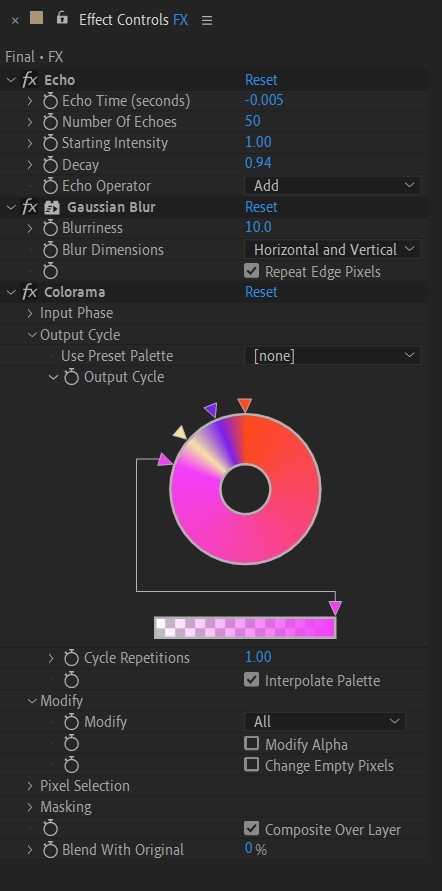
• Duplicate your FX pre-comp one more time and delete all the effects on it.
• Last thing to do is add an Adjustment Layer (Ctrl + Alt + Y), add the Noise effect, and make the Amount of Noise 15.0%.
• And you're done!
#art tutorial#tutorial#friday#art#motion design#artists on tumblr#tips and tricks#art tips and tricks#tips#artwork#digital art#gif#animation#visual art#loop#gif tutorial#learn after effects#illustration#2d animation#infinite loop
36 notes
·
View notes
Text
Do you often struggle with characters' expressions? Here's a simple hack!
1. Just draw simple emojis; happy, sad, surprised, angry— pick all the basic emotions.

2. Draw over your character's face.

3. And voila!

Here's our expression sheet!
So, what are you waiting for? Go, make your own expression sheet now!
13 notes
·
View notes
Text
webkinz room decorating tips!
hi. hello. welcome to property brothers: webkinz edition, where I give you some tips for decorating and designing rooms.
play around with room sizes and placements! this might mean something like splitting one large room into one small room and one medium room because you had more items than originally thought, or something like starting with a small room and changing to a medium room or a large room when you want more space or have more items than originally thought.
that being said - don’t be afraid to fill up small and medium rooms! I find that I like my rooms to have most of the floor space filled, so don’t be afraid to fill up every corner of a small room or add things on counters or tables.
okay this might sound a little insane but when going through your dock, START AT THE END. like scroll allllllll the way to the end. this lets all your items load so your dock doesn’t do any of those weird jumps and you don’t lose your place.
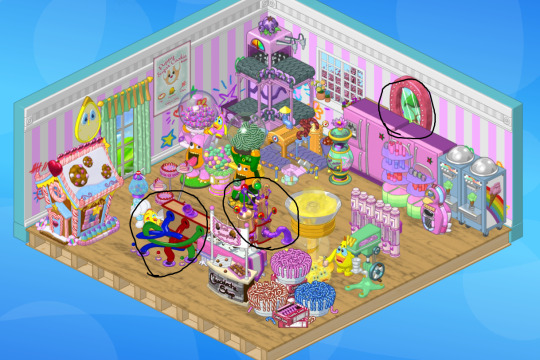
colors are key! how I start out designing a room is I scroll to the end of my dock and then work backwards and literally throw in ANYTHING that has the same color scheme or palette, and any item that matches the theme. don’t worry about the organization for now, cause if you remove anything from the room, it’ll just go in your recent items, which gives you a section of the dock to easily work with. like here’s a couple of rooms after that process:


like in the first picture I threw in items that were candy themed! and then right away I can kinda see that some of the items placed in there stick out, like they’re too dark or bold for the color scheme, or there’s not enough of that color in the room to pull it together. one way to identify those items is to take a step back or like. blur your vision - the first things your eyes are drawn too are probably the ones that don’t go, like this:

don’t be afraid to mix themes! what tends to make a room fit together is COLOR and STYLE. like I wouldn’t put a really angular table into a room that mainly has furniture with rounded edges, or vice versa.
don’t shy away from wshop items! I know this might seem like a basic tip and sound kinda silly, but I used to avoid using wshop items because they weren’t rare/exclusive/etc. but wshop has some great items for room fillers, like simple plants, toys, rugs, and tables. plus, wshop has a lot of simple items that can go with a LOT of themes - things like the white rug or the golden side table or the party time windows. it’s a-okay to use an item that’s wshop or not “rare” if you like how it looks!
ask for help! while everyone has different tastes and will design rooms differently, putting an in-progress room in a group chat or a discord server can help you get some new ideas on how a room is organized, what to add to a room, or ideas for swapping out items.
look through other rooms for inspiration! I like to search pinterest (here’s my board of webkinz inspo) and go through the rooms Michael Webkinz posts on WebkinzNewz. you can see a lot of different themes and design layouts and get some inspiration for your house!
try and make different “areas” or “zones” in your rooms, so you have different places within the room itself! in a bathroom for example, I usually have a toilet zone, a bathtub zone, and a sink zone. or if I’m making a large room that has a bed, I’ll try and siphon off a little area for sleeping. rugs and dividers are great for helping you make these zones!
play around with the space and do what makes you happy! the beauty of webkinz rooms are that you can change them over and over again.
and lastly, while not webkinz, this video by polygon talks about how you can use real interior design tips to decorate your virtual rooms - in the video’s case, they use animal crossing, but I find a lot of the tips are helpful for webkinz too!
happy room decorating!! don’t be afraid to share your rooms on social media or to Michael at [email protected]. there are literally infinite possibilities and I love seeing what people do with their houses!
87 notes
·
View notes
Text
youtube
Top 10 Yarn-Hungry Knitting Stitch Patterns
12 notes
·
View notes
Text
Are you too lazy to search for a bunch of variations of a sound effect and spend time implementing them all? Me too!
Here's my favourite gamedev trick to avoid audio fatigue and get away with using one audio clip repeatedly - just deviate the pitch slightly whenever you play it.

It's a small polish thing but it really help make 'grating' sound effects that can potentially get on a player's nerves blend in and feel way less repetitive. Really useful if you have limited resources or in situations like Game Jams where finding or generating lots of different audio can be too time consuming.
Here's what it sounds like:
Patreon | Discord | Wishlist Bombing!! 2
#bombinggame#game dev#gamedev#game development#indie game#indie games#sound design#audio design#audio#indie dev#gamedevelopment#tricks#tips#video game#video games#games#gamer#gaming
114 notes
·
View notes
Text
Look at the first design, and you immediately think: "Oh, it's simple, I know how to design it too."
And do you know what? 95% of people who think it's simple couldn't do it, or at least they did it wrong.
I just uploaded a tutorial video on Illustrator tips will blow your mind and change the way you design. I hope it proves helpful to you. If you like it, please give me a thumbs up. Thank you!
Video:👉 These Illustrator Tips will Blow Your Mind (Part 1)
#logo#logo design#logotype#logo inspiration#graphic design#logo designer#design#illustrator tips#illustrator tutorial#illustrator tips and tricks#adobe illustrator#design tips#illustrator for beginner#advanced illustrator tutorial#dainogo#tutorial#logo tutorial
26 notes
·
View notes
Text
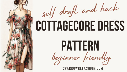
Cottagecore Dress Pattern Drafting Tutorial + Video
In this post, you will see cottagecore dress pattern drafting tutorial with tips and tricks.
Embark on a journey through the whimsical world of cottagecore with my comprehensive guide to drafting patterns for two enchanting dress styles. Whether you’re drawn to the delicate ruched sleeves or the romantic allure of an off-shoulder ruffle, this tutorial is designed to empower sewing enthusiasts of…
View On WordPress
#Adding Slits to Skirts#Advanced Dress Patterns#Beginner Sewing Projects#Cottagecore Aesthetic Outfits#Cottagecore Dress Tutorial#DIY Cottagecore Fashion#Easy Pattern Drafting#Fashion Crafting Guide#Handmade Dress Patterns#Off-Shoulder Dress DIY#Ruched Sleeve Pattern#Rustic Dress Design#sewing tips and tricks#Sustainable Dressmaking#Vintage Style Sewing
8 notes
·
View notes
Text
Useful links for (graphic) design
'sup folks, I've compiled a list of links of websites and tools that are useful for designing stuff! They're divided in different sections.
FONTS - All of them are free and easy to use, unless otherwise stated.
https://www.freefaces.gallery/
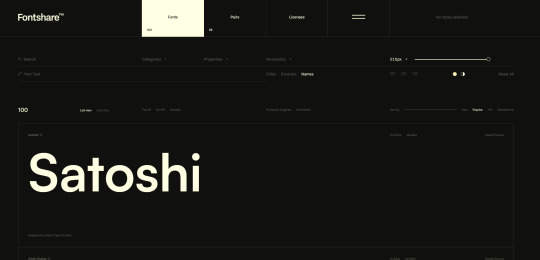
https://www.fontshare.com/
https://dirtylinestudio.com/freebies/ (These are the free versions only for personal use, so no selling stuff with it)
https://velvetyne.fr/
https://usemodify.com/ (Make sure to check the license to see if it's free to use)
COLORS - Helps you pick colors in different ways
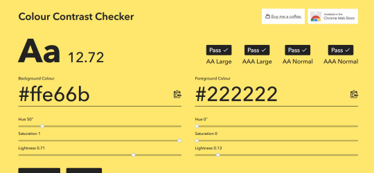
https://colourcontrast.cc/ (Helps you see if your font and colors provide enough contrast)
https://picular.co/ (Type a prompt and it will give you colors associated with that prompt)
https://pigment.shapefactory.co/ (Gives you a wide selection of dual color palette's that have a lot of contrast)
https://t-o-n-e.com/ (Gives you color palette's that have the 60-30-10 applied to it)
LOGO INSPIRATION- Searching for logo inspiration
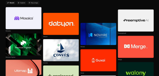
https://logosystem.co/ (Gives you a big variety of logo's)
https://dribbble.com/search/logo (Dribbble also shows other stuff than logo's)
GENERAL USEFUL LINKS - As the name says
https://freedesignresources.net/ (Here you can find a lor of free stuff like vectors, images, font's etc.)
I'm going to update as I learn and use more of them later down the line on this website that I made: https://design-links.carrd.co/ .
#illustration#digital art#queer artist#art#inspiration#procreate#design#graphic design#creative#designinspiration#tips and tricks#how to#tools#useful#graphic art#typography#logo#layout#graphic source
9 notes
·
View notes
Text
Woodwork interior design Tips and Tricks GK interior design All solution for Interior design ☎️ 96100 95531 WhatsApp 088246 31361 Bangalore


#woodwork interior design Tips and Tricks#interior design#home & lifestyle#home decor#home design#howtoguide#interiors#interior decorating#home interior#interiordecor#younameit11
3 notes
·
View notes
Text
i have tragically uncovered a new Pet Peeve and it's when someone shares a helpful art resource and calls it "not gatekeeping." it makes me so annoyed that it keeps me from reblogging the post with the resource. guess that makes me the true gatekeeper
#i heard this was a thing on the clock app but now ive run into it twice on tumblr TODAY#first of all this isn't what gatekeeping means!!!!!!#second of all lots of artists are so happy to share tips and tricks and resources and their entire process#third of all giving good art advice is genuinely a lot of work! it's labour!#whenever i get an art advice ask it may easily take me an hour to fully write it out#fourth of all ive seen like... enamel pin designers not share their manufacturers because doing so would overwhelm that particular manu#people usually have reasons not to share info and it rarely keeps you from making your art!!!!!!#the fact that art tools cost money is normal!!!!!#god im sorry i sound like the monthly art discourse on twitter
34 notes
·
View notes
Text
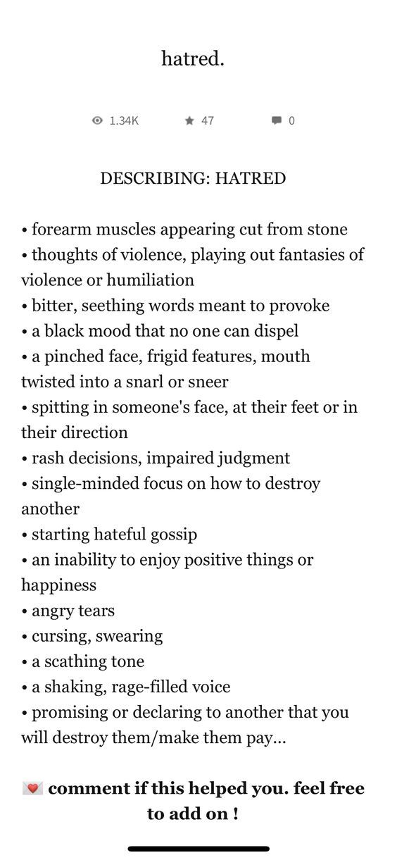
For your character development and description needs.
#writing#writers#writers on tumblr#writing community#writerscommunity#writer things#novel writing#writerslife#writers and readers#writing tips#hate#hatred#writing characters#original character#character design#originalcharacter#character concept#character development#writing tips and tricks#writing tools#writing help#writing advice#writer tips
34 notes
·
View notes
Text
(instagram)
Tutorial in After Effects under the cut.
• Create a new composition and call it Split.
• Write your text, pre-comp it, call it Text or whatever you want.
• Create a mask from the center to one side (top/bottom), change anchor point to the top.
• Bring down Scale property and unlink it, keyframe the text to go from 100% to 0% in 1s towards the anchor point.
• Cut the layer at the end.
• Duplicate pre-comp.
• Select the bottom one, click M to bring down mask properties, invert the mask and move anchor point to the bottom (so the text scales to the bottom).
• Duplicate Text pre-comp one more time. Select it, press M and delete the mask, move anchor point to the center. Create new keyframes to scale it from 0 to 100 in 1s (properties unlinked). Select both keyframes and delay it by 1 frame. It makes the text look like it’s scaling from the center.
• Change bottom and top text color by adding Fill effect to the pre-comp.
• Easy ease all keyframes.
• Select all pre-comps and duplicate them, put them at the top and put them at the back to extend your animation (or arrange in your preferred order if you’re doing a phrase like me). So far it should look something like this:
• Create new comp Wave of 10s, add your Split comp.
• Create new Solid layer, call it Map, add Gradient Ramp effect, make white at the left, black at the right and hide the layer.
• Select Split pre-comp, Right-click → Time → Enable Time Remapping and extend the layer to the end.
• Add loopOut() expression to Time Remap.
• On Split pre-comp add the effect Time Displacement, on Time Displacement Layer select your Solid layer (Map), and on Source select Effects & Mask.
• Change Time Resolution (fps) to 250-300.
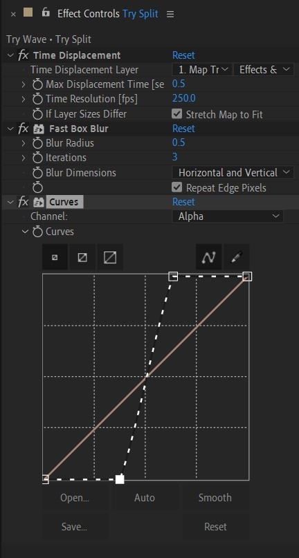
• Add Fast Box Blur effect, change Blur Radius to 0.5.
• To bring back the sharpness add Curves effect, change the Channel to Alpha and change values (see screenshot).
• Play around with Max Displacement Time [sec] on Time Displacement effect depending on the look you’re going for. I set it to 0.5.
• Now this whole animation is driven by our Solid layer (Map) we created. So if you make any changes to it, the animation changes too. For example, you can change Ramp Shape to Radial on Gradient Ramp effect, and see how it changes your animation.
• I additionally added some texture on the text, used Track Matte and added wiggle(5,500) expression to the Rotation property so texture would be constantly moving. Also added some additional effects to the new Adjustment Layer on top such as Roughen edges, Turbulent Displace, Posterize Time and Noise. Let your freak flag fly - it’s a matter of taste and creativity of what you do with it. Your animation should look something like this:
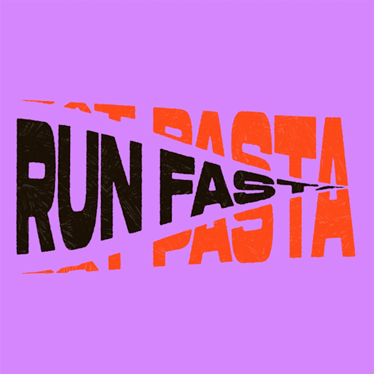
#artists on tumblr#animation#artwork#2d animation#after effects#gif tutorial#art tutorial#art tips and tricks#after effects tutorial#tutorial#art#motion design#tips and tricks#tips#digital art#gif#visual art#loop#learn after effects#illustration#infinite loop#pasta#funny#pasta humor
50 notes
·
View notes
Text

#digital marketing#marketing#seo#stategies#web design#tips#wordpress tips#wordpress tricks#wordpress#214setu
2 notes
·
View notes
Text
Advanced Photoshop Tutorial: Mastering Camera RAW Filter for Photograph Enhancement
Introduction: Adobe Photoshop's Camera RAW filter is a powerful tool for enhancing the quality of your photographs. It allows for non-destructive adjustments to exposure, colour temperature, clarity, and more. In this tutorial, we'll explore advanced techniques to make the most out of the Camera RAW filter to transform your images into stunning works of art.
Step 1: Open Your Image in Photoshop Start by opening your image in Photoshop. Go to "File" > "Open" and select the image you want to enhance.
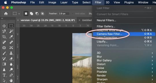
Step 2: Access Camera RAW Filter Once your image is open, go to "Filter" > "Camera Raw Filter" or use the shortcut Ctrl+Shift+A (Cmd+Shift+A on Mac) to access the Camera RAW filter.
Step 3: Basic Adjustments The Camera RAW filter interface provides various panels for adjusting different aspects of your image. Start with the "Basic" panel, where you can adjust exposure, contrast, highlights, shadows, whites, blacks, and clarity. Use these sliders to balance the overall tonality and contrast of your image. Pay attention to the histogram to ensure you're not clipping any highlights or shadows.
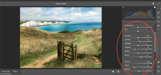
Step 4: White Balance Next, move to the "White Balance" panel to adjust the colour temperature and tint of your image. You can use the Temperature and Tint sliders to correct any colour casts and achieve a more natural look. Experiment with different settings until you find the right balance.
Step 5: HSL Adjustments The "HSL/Grayscale" panel allows you to fine-tune specific colours in your image. HSL stands for Hue, Saturation, and Luminance. Use these sliders to adjust the hue, saturation, and luminance of individual colours. This is particularly useful for making colors pop or toning down distracting elements.
Step 6: Detail Enhancements In the "Detail" panel, you can enhance the sharpness and reduce noise in your image. Use the Sharpening sliders to increase the overall sharpness while paying attention to avoid introducing artifacts. Additionally, adjust the Noise Reduction sliders to reduce any visible noise in the image, especially in areas with low light or high ISO settings.
Step 7: Lens Corrections If your image has any lens distortions or chromatic aberrations, you can correct them in the "Lens Corrections" panel. Enable the "Enable Lens Profile Corrections" option to automatically detect and correct distortions based on the lens used. You can also manually adjust vignetting and chromatic aberration sliders if needed.
Step 8: Effects and Vignette The "Effects" panel allows you to add creative effects such as vignettes and grain to your image. Experiment with the "Post-Crop Vignetting" slider to add a subtle vignette that draws attention to the subject. You can also adjust the "Grain" slider to add texture and character to your image, especially useful for achieving a vintage look.
Step 9: Graduated Filters and Radial Filters For selective adjustments, utilize the Graduated Filter and Radial Filter tools available in the Camera RAW filter. These tools allow you to apply adjustments selectively to specific areas of your image. Use the Graduated Filter for linear adjustments like sky enhancements or the Radial Filter for circular adjustments like spotlight effects.
Step 10: Final Touches and Output Once you're satisfied with the adjustments, click "OK" to apply the changes and return to Photoshop. You can further fine-tune your image using additional Photoshop tools or proceed with any further editing. Finally, save your enhanced image in your desired format.
Conclusion: Mastering the Camera RAW filter in Photoshop opens up a world of possibilities for enhancing your photographs. By following these advanced techniques, you can take your images to the next level, achieving professional-quality results with ease. Experiment with different settings and adjustments to develop your unique style and make your photos stand out.
#my art#artists on tumblr#art#photoshop#disabled artist#photographers on tumblr#adobe photoshop#graphic design#tutorial#art tips#art resources#art help#art tutorial#art reference#landscape#digital art#photographer#original art#how to draw#tips and tricks#useful#tips
4 notes
·
View notes
Last Seen Blogs

ohfuckiamthegaycousin
Gay Cousin

dorothyparker19
A literary world full of men

kramagrosvit
Kramagrosvit

fernandofanado-blog
Fernando Fanado