#Color psychology
Explore tagged Tumblr posts
Visit Tumblr Blog
Explore Tumblr blogs with no restrictions, modern design and the best experience.
Last Seen Tumblr Blogs


Fun Fact
1,644 Tumblr posts in 1 second.
Note
You should tell us about color psychology that sounds cool as hell
YES… HA HA HA… YES!
GGGOD I WISH I WASN’T OUT OF THE HOUSE RIGHT NOW. but i’ve been thinking about colors literally all day so you all get to be subject to my madness! sorry this is long and rambly wauaua. nightmarishly long post under the cut.
okay. first things first, a few basics. color theory and color psychology tend to get confused a lot in discussions, but they usually refer to different things. color theory is more about we physically perceive colors (color wheels and color schemes the like), while color psychology focuses on our emotional response to colors. if you’re familiar with the children’s hospital color theory post, that poster wasn’t actually talking about color theory, but color psychology (and also it’s incredibly surface level and heavily misunderstands the subject because in what fucking universe does the quantity of positive associations with a color matter more than the context it’s used in and sorry i have personal beef with this tumblr post).
color theory is also a special interest of mine but i’m not gonna touch on it too much here because it’s not entirely important. mmmaybe another time…
essentially, certain colors (and color combinations) have associations in our brains and that affect our behavior and emotions. these associations are also very much affected by the context a color is used in. colors don’t exist in a vacuum! so while red can symbolize passion and love when used in something like a dress or a bouquet of flowers, it has a very different connotation when it’s, say, splattered on the walls or smeared on the ground in a snail trail.
or for a less Children’s Hospital Themed example, i’ll put my euphrasie and king designs here!

(of course the saturation and brightness of these blues play a massive part in how they’re perceived but this is not a post about color theory this is n)
and, of course, combining colors in a piece can also change their meanings!! i’m about to get real fucking normal.
i’m gonna be focusing on the color combo of red and yellow here because it’s the one that’s most relevant to my art (and also it’s really interesting.) basically, seeing these two colors together activates the part of our brain that controls our appetite, making us actually feel hungry. this is why so many food companies use red and yellow in their branding! it’s neat stuff!!
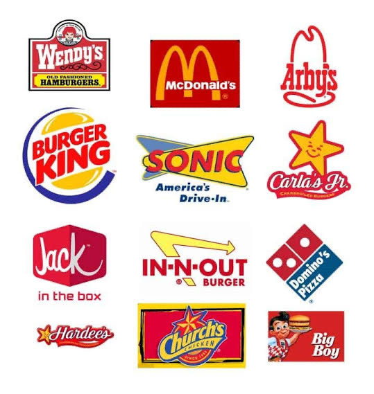
also, if you’re familiar with it, this is why the mv for butcher vanity uses this color palette!! along with red’s general associations with danger and blood, the color combo also physically induces hunger. pretty fitting for a song about cannibalism!
(there is also red’s association with lust and passion and how that intersects with the double meaning in the lyrics but i cannot derail this post into being an analysis of butcher vanity i’m sorry. we’d be here all week. maybe another day... wipes a tear from my eye)
and i think this might be the reason why some people feel hungry when they see my art, even when i’m not drawing food. while i don’t tend to use red outright, most of my art has very warm undertones (red-oranges and yellows especially), which could be activating that hunger response??

(ah fuck color theory managed to weasel its way into this post again)
admittedly this part is just speculation on my end. i think my rendering style and Shapes also play a role in it, but it’s interesting for me to think about!!
this is only scratching the surface of how complicated colors can get. i was going to go on an entire tangent about color grading and how green lighting can make a scene feel unnerving but this post is already Too Fucking Long. aaaa super sorry if this is Rambly or hard to understand!! i’m not Entirely sure how much the average person knows about color theory and psychology so if there’s any confusing terms here i’m fine with adding stuff for clarity!
wauauuaa thank you so much for asking!!!! i love talking about colors.
tl;dr colors have a bunch of different emotions and meanings tied to them, but you’ve gotta pay attention to the context in which it’s being used. so maybe take a step back before you put that thick red trail on the floor of your children’s hospital.
#marshtalkin#<- and by god did i TALK.#hhholy fuck how long is this. im so sorry i thought this was gonna be WAY shorter#admittedly i only realized colors were a special interest. fairly recently?#i genuinely didn’t consider that most artists probably don’t spend hours pacing around thinking about color symbolism#<- god don’t even get me started on color symbolism in my designs i’m so fucking normal#…do i even tag this as isat?? i mean i know i have to tag spoilers anyways#because of euphrasie#but this is mostly a post about color psychology even if i’m using my isat art as examples#aaaa whatever#isat#in stars and time#isat spoilers#color theory#color psychology#asks#also actually as a sidenote. sometimes color psychology is called a subsection of color theory?#but generally when someone is talking about color theory they’re talking about the technical side of things#terminology is weird and confusing unfortunately…
218 notes
·
View notes
Photo


YELLOW: insecurity, cowardice, betrayal, sickness, caution, madness, dishonesty, fear
786 notes
·
View notes
Text


“Throughout the Middle Ages, red had a religious significance. It was the color of the blood of Christ and the fires of Hell.��
“In Latin, the word for “black”, ater. Is associated with cruelty and evil. “Atrocious” and “atrocity” are derived from this Latinate stem. It is no surprise, then, that in Medieval paintings the devil was often painting in black”
1. From “color psychology.org/red/ ; 2. From “Google Arts and Culture” and the name is “The secret history of the Color Black”.
- Lately, I have been feeling restless which has reflected on my journals, I can’t seem to stick with one system. I don’t feel particularly attached to any of my notebooks. But I have been researching a bit about color psychology and the Middle Ages, as you can see from the excerpts above. Even though, the page you see there was a personal journal entry (it went with the color theme).
- Black has always been a color that I liked, so it has been interesting to research about the interpretations and symbolism that it had throughout history, the example here, is one of the most brutal ones, but then again so were the Middle Ages.
#youtube updates coming soon btw#notes#notebook#bullet journal#commonplace journal#commonplace book#academia#journal#bujo spread#color psychology
90 notes
·
View notes
Text
The Green Space That Is Green Yuri

As some of you may already know, I'm a huge fan of Sumiko Arai's The Guy She Was Interested In Wasn't a Guy at All. It's the yuri manga that has taken the manga world by storm. The manga has a cute romance story, some cool characters, and stylish artwork. I want to talk about the artwork and I'm not talking about just the characters and setting. It's how both reflect a central concept - the usage of the color green throughout the manga.
The series is affectionally known as "Green Yuri", which I will use to reference the manga since the title name is pretty long to write out. Green is everywhere in this manga. The covers and background panels are in green alongside the black and white character drawings. This gives the manga a very energetic and rebellious feel that makes it stand out among the crowd.
I did some research about the particular kind of green being used in Green Yuri. It looks similar to a color trend I read about recently. So it's called "brat green." The color blew up in the summer of 2024, thanks to mega pop-star Charli XCX's "Brat" album cover being that particular shade of green. Brat green represents freedom and the energy of being alive, according to the designer who helped with the color. Brat green is noted to be brilliant, intense, and rich.
But even before 2024 and the official international localizations of the manga, Green Yuri blew up online in Japan when it was serialized in pixiv. Green is often associated with all things natural and reflects a sense of calmness in the face of chaos.
If you follow the manga, you know that both main characters, Aya Osawa and Mitsuki Koga, are trying to be themselves in high school where they're not exactly themselves. Aya comes off as a gyaru-type while Mitsuki comes off as a very shy introvert. What's natural to them is their love of rock music. Rock music is what allows them to be calm to a degree. Rock music is the "green" that makes both Aya and Mitsuki feel refreshed to take on the day.
The usage of green in Green Yuri can also mean motivation. You see Aya and Mitsuki make several attempts to talk to each other despite these attempts ending up in awkward fashion. There's a constant green light for the two to connect with one another. Mitsuki is also driven to make music and we see her hard at work in songwriting.
Not all things green are good. Green represents envy. This becomes apparent in Volume 2 of the manga where Aya meets a long-time female associate of Mitsuki's and notices how close they are to one another. Things do get resolved, but there's a interesting conflict growing where Aya notices Mitsuki's attempts to be her true self (i.e. more self-acceptance) and she starts to become jealous of her. Green can also represent greed and from what I've seen, maybe Aya is like this because at times, she wants Mitsuki all for herself.
The positives outweigh the negatives anyway. Green is definitely about growth, but is also about renewal. And this is apparent in a side chapter featured in Volume 1 where the reader learns about Mitsuki's past before she met Aya. Back in junior high, Mitsuki never bothered to wear skirts because of her desire to not fit in as she loved rock music and its themes. Unfortunately, she loses friends as a result due to not following stereotypical norms. Mitsuki was content to just let life drift by without friends because she felt that there was no one out there who really syncs with her. It wasn't until she sees Aya come into the record store she works at and asks about about a CD from the American rock band Nirvana that her opinion changed. In a sense, this encounter brings a newfound sense of renewal in Mitsuki - a renewal in the belief that she can find someone who can match her rhythm.
Finally, I will say one thing about brat green that really brings the manga together. It's a color that reflects both the past and the present. Brat green gives off a classic vibe, but it doesn't feel like it's "old-fashioned" as you can definitely use it in a modern setting. It's a color that blends in perfectly in whatever time period. Green Yuri is basically using the past and present to create a very fun "green space" setting where two characters defined by both to create a future for themselves that takes the best of both worlds. Notable rock songs and acts from the '70s'/80s/'90s are referenced throughout the manga and its promotional material. The girls share Spotify playlists of some of the songs featured to each other. Spotify also has a green logo. This manga is literally going green for the betterment of all.
Green Yuri is a green space series that I hope benefits all of those who read it because in a world where the colors black and white seem to dominate so much thinking, green represents much-needed healing and a sense of optimism that we can grow and bloom naturally into something better for ourselves and those around us.
#Sumiko Arai#Aya Osawa#Mitsuki Koga#green yuri#yuri manga#manga#color psychology#psychology of green#The Guy She Was Interested In Wasn't a Guy at All
22 notes
·
View notes
Text
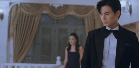
"BRYCE" - AN ANALYTICAL ESSAY
Heyyy um so i made an essay on color theory in BRYCE and i wanted to show it to y'all!!! I'm going to post it on ao3, just waiting on the invite :sob:
this is my first post as well so i hope you guys like it!
“How does Brandon Rogers use colors to portray emotions and character relationships in ‘BRYCE’?”
Most people would easily overlook the colors in BRYCE and label them as simply aesthetically pleasing. Whilst, this may be true, the colors in BRYCE have a deeper, more implicit meaning. BRYCE (2023) is a YouTube web series written, directed and starring Brandon Rogers. In BRYCE, Rogers is narrating the origin and rise to power of the fictitious character (who is portrayed by Brandon Rogers, among many others in his universe) CEO Bryce Tankthrust. It documents her childhood, life as a woman in work in the 1980s and her success story over three twenty-four minutes episodes. Brandon Rogers utilises color theory in the lighting and clothing of Bryce Tankthrust to portray her subconscious emotions and the relationships between characters. Rogers uses a mixture of color motifs, color schemes and color psychology in BRYCE, making a more visually appealing piece of media.
Rogers expertly makes use of color psychology BRYCE, strategically lighting scenes in a way to show the subliminal emotions of the characters, without them necessarily saying so. Color psychology is how colors make us as an audience feel and cleverly creates a more immersive film. Brandon uses varying colors for different emotions, but a few scenes stick out to me. For example, at the start of BRYCE episode one: the scene in which Bryce is having a meeting with an investor- the office is pitch black, safe for a desk lamp.
Aswell as this, at the end of BRYCE episode two, Diane is shown looking inside of Bryce’s house. The entirety of her hallway is in darkness, creating a suspenseful atmosphere. These scenes are both interesting as the subjects (Mark Dutton and Diane) both end up dead by the end of the it. In film, directors often associate the color black with death and fear. This shows how Brandon Rogers cleverly uses color psychology to foreshadow upcoming tragedies.
Interestingly enough, this is not where Rogers use of color finishes. Building off of color psychology, Brandon uses color motifs throughout the series. Color motifs are reoccurring colors that are associated with a certain character, place, or event. Using color motifs helps, not only with the aesthetics of the film, but with storytelling as well. This allows us as the audience to link colors to characters.
For example, Bryce Tankthrust’s colors change throughout the series from blue to red. Blue is representing her desire to live a good and stable life and eventually she transitions to a red, which symbolises her power and the danger she gives off. And Bobby Worst (also played by Rogers) is consistently shown in green, portraying his evil tendencies, madness, toxic nature and also stability as Bryce has only ever perceived him in one color.
An example of color motifs would be in the confrontation scene younger Bryce has with her boyfriend (at the time) Donovan at the end of BRYCE episode one. The scene is split up with an intense blue and yellow light, symbolising the two characters. At the start of the argument, majority of Bryce’s face is in blue, a small part of her yellow. This shows how she is only focusing on herself and how she is the one in the right in this argument. However, when she realises that Donovan has fallen off of the cliff, Bryce’s face is now entirely yellow, with only the back of her head being blue. this portrays that her priorities are now Donovan and his wellbeing, her wants and needs being pushed to the back. Interestingly enough, when Bryce goes down to check on Donovan, the scene is an intense and dark blue, showing this overwhelming feeling of isolation and helplessness Bryce is now feeling as Donovan has died. She is now all on her own. Throughout this argument, the colors shift and vary showing Rogers expert use color motifs to show Bryce’s reactions and subconscious thoughts throughout the confrontation.
An another different, but interesting, example of color motifs in BRYCE is the development of Bryce’s home as she grows up. It is really interesting to see how her environment changes around her through the subtly of color psychology. For instance: at the start of BRYCE episode one, seven-year-old Bryce’s house is casted in an orange tint, representing the warmth she feels. Orange is used in film as a direct link to childhood and home, showing she feels safe and loved in that environment.
As she grows into a teenager, we often see Bryce’s house as a pastel pink color – a delicate and “innocent” mask over the very much abusive household. Aswell as this Rogers uses a subtle split of complimentary colors on either side of Bryce’s face. These chaotic colors yet again represent these underlying signs of abuse.
After her mom is imprisoned, the house is a dark orange, almost brown. This shows the emptiness she feels after the loss of not only her boyfriend, but now her mother. This darker take on the once childlike and warm orange after the absence of her mother, shows how she was the soul of the house – and now that soul is gone, leaving Bryce confused and helpless.
When Bryce kills Diane, the house was a dark pink. This is a more intense version on the pastel pink we as an audience are used to with Bryce’s home. This shows Bryce’s take on her femineity. She is taking charge in her own dark and twisted way.
Bryce’s new home is one that is large and extravagant, with white marble walls and golden accents. These colors represent her newfound riches and grandeur and also Bryce as a character: she is very flamboyant and ostentatious with her money, and this is shown through the colors in her mansion. This is showing how Rogers uses color motifs in the setting of BRYCE to show her overall development as a character.
Rogers shows relationships and emotions throughout BRYCE by using color theory techniques such as color motifs and color psychology through the lighting and clothing of the characters and settings. He uses colors psychology to give the audience a metaphorical view of her thoughts and feelings and color motifs to allow the audience to associate certain colors to characters and events. The colors used in BRYCE are intense and impactful, expertly symbolising the emotions of the characters and creating a more intense psychological experience for the viewer.
https://pin.it/29xBTn0Ui written by: @siintax_error on Instagram.
#brandon rogers#brandonrogers#brcu#bryce tankthrust#bobby worst#bryce series#essay writing#color theory#color psychology#brandon rogers cinematic universe#worstthrust
22 notes
·
View notes
Text

orange means fun !


#color psychology#transparent png#pngs#orange pngs#orange#orange icons#sea#ocean#oceancore#mermaidcore#fish#sea creatures#pretty things ♡︎
238 notes
·
View notes
Text
Elf OC Challenge 🧝♀️🧝♂️
• Basics
- You can choose the height, skin color, and gender of your oc
• Elf Ears
- If you're younger than 15 you have short elf ears
- If you're older than 15 than you have long elf years
- If your exactly 15 you have medium elf ears
• Hair Length (Style is up to you)
- If you have long hair your OC has short hair
- If you have short hair your oc has long hair
- If you have medium length hair you get to choose the length
• Role and Clothing Style
- First pick a random number between 1-4 (you can do this however you like just choose 👍🏾)
- If you choose 1, your OC is royalty
- If you choose 2, your OC is nobility (Duke/Duchess, Knight, etc.)
- If you choose 3, your OC is a regular peasant
- If you choose 4, your OC is some kind of merchant
• Eyes
- Your OC's eye color is based off of their personality
- For example a OC with Anger Issues = Red, Loving OC = Pink, Cheerful OC = Yellow, etc.
- You can use this website to help!:
- Their pupils as well as their powers much match your own Zodiac Sign
- Ex: Pisces = Water Powers
• Accessories
- If your name starts with a vowel your accessories must be gold or of a simlar nature
- If your name starts with a constant, your accessories must be silver or of a similar nature
Mine! : )

(New Profile Pic?)
#oc challenge#elf oc#writers of tumblr#artists of tumblr#orginal post#have a good day#gacha club#gacha characters#gacha challenge#new profile pic#color psychology#zodiac signs
12 notes
·
View notes
Text
Uhhh, hey y'all, I found this in my drafts and it's basically completely done(I think?). So I've decided to let it loose.
This is also from approximately two years ago? So I think some of my opinions have changed, but whatever.
Anyway my here are my opinions on the usage of color and color psychology in the ever after high kids outfits! This is gonna be unreasonably long, so sorry ahead of time <3
.
.
.
.
Sorting them by their primary colors btw!
.
.
.
Let's start with warm colors!
Warm colors are ment to be exciting and stimulate reactions. Warm colors are stronger, bolder and more powerful, they're essentially the main characters of colors.
Red- power, sensuality, anger, urgency, heat, passion, confidence, warning, and danger
Apple white: to be honest I don't think using red as her primary color was the go. Red is a very strong passionate color and the feelings the color is ment to evoke aren't super present in Apple? I understand why the choice was made to give her red, as the apple in snow white is red. And often red is used to represent royalty and power, which are things snow white is shown to have, And Apple aspire to have. White is another one of her primary colors. White usually represents elegance, purity, and goodness and I feel like it could've good color for her to lean into it! Her last color is gold, gold is usually used as visual shorthand for wealth, wisdom or courage. Another color I feel is more in tune with Apple's personality. It's a color that can have two very vastly different meaning and I feel like that could be a fun thing to explore with her!
Cerise hood: it is very obvious why red is Cerise's primarily color lol, But it's a very good choice nonetheless. She very much represents a lot of red's traits, and honestly that's pretty interesting considering she has one of the more subdued personalities in eah. Despite this Cerise shown to be very confident in her abilities and genuinely a strong and confident character without being super gaudy about it. Her other main color is black, and to be honest before going back to check her character design I thought it was brown? Anyway, black is also color Cerise does a good job of representing. She has the dark intrigue and mystery of black while also encapsulating the strength and resilience! Her color pallet is definitely one of the more straightforward ones haha. Both colors also work when considering about her wolf side too. Cerise is just a very well rounded character, which is a little odd for eah lmao.
Lizzie hearts: yeah, she absolutely embodies red. As the future queen of hearts Lizzie has shown almost all these qualities, and because of the nature of the character she's Destined to be red fits(she also has love and heart motifs which I think really sell it). Overall lizzie is a very passionate and headstrong character, leading to her ability to embody such a bold color. Black is her other predominant color. black is most promently used to symbolize evil, and it definitely works in the context that she is In fact her mother’s daughter leading to her antagonistic spot in her story. Lizzie is not evil though, and a part that can come through in black is mystery! Lizzie herself is not particularly mysterious, but with wonderland being a place not super readily available there's a sense of mystery that comes from that.
Orange- excitement, confidence, vitality, energy, hope, wit, concentration, encouragement, and caution
Holly o'hair: Ok, so yeah, maybe orange isn't the most present color in her pallet, but I feel like it does a good job at representing her! Holly's character isn't the most fleshed out, overall both the o'hair twin were treated more like a unit as apposed to separate characters, but from what we got she does give orange vibes. Holly is the more outgoing, energetic twin and she is shown to be incredibly supportive of her sister and friends. She's also a very passionate fan fic author storyteller, and clearly pays a lot of attention to the things she's passionate about. Which is why I felt she fit here best! Another one of her colors is pink, pink is usually associated with softness, care, and femininity. A choice I think was very interesting is giving Holly (& Poppy) a stronger pink, stronger and brighter pinks give vastly different emotions from softer ones. For Holly specifically I think this was more so used to show her friendly nature, and seeming exitable nature. Lastly purple! The usage of purple in Holly is probably once again to tie her in with Poppy (they're the only two-piece siblings set with different sides chosen, so they were definitely going for a royal/rebel thing they have with Apple and Raven's color pallets; but more low-key), but it still can work in her color pallet. Overall the purple can be used to symbolize Holly's ambition, creativity, and royalty.
Yellow/gold- vibrant, energetic, joy, optimism, childish, attention, irresponsible, and unstable/ compassion, wisdom, charisma, wealth, success, tradition, greed, and extravagance
Daring charming: dude manages to completely encapsulate every trait of yellow AND gold, and you know what, good for him. Daring has got to be one of the only characters that manages to so blatantly represent their main color. He's the school's golden boy, and yellow/gold definitely encapsulates the energy and emotions a character who is held on such a high pedestal should. One thing that was done pretty well, but I feel could be done better, would probably be the extravagance and showsman-ship of Daring's character. Like, I feel like Daring would be very into the whole outward performance of the prince charming persona, if that makes any sense? His other main color is blue; out of the three charming siblings, Daring wears it the least. This could be used to show the separation of the other two, and more specifically, the higher level Daring is held, too. His lack of blue could also be used to his lack of empathy and self centered-ness or the lack of acknowledging his own true feelings. Dispite being incredibly self centered, often when the story centered on him Daring is shown to not be a bad person, he can be empathetic and vulnerable it's just hidden under layers of shitty lessonand morals he was taught. I haven't mentioned this so far, but another thing blue represents is masculinity. Daring is basically the masculine ideal, both at his school and the wider society of ever after, so its fitting.
Rosabella beauty: something I always found interesting about Rosabella's color choices is that her color palette is completely warm. So I find it strange thats she's such a dull character. I just think diving into a part of her that's more strong and charismatic could've worked? Anyway, there's potential in both yellow and gold for Rosabella. Yellow is very energetic, attention grabbing, and vibrant, gold is a color of success, wealth, and charisma. Both have surprisingly contrasting meanings, and both sides were used very little in her character. Side note but I absolutely hate how Rosabella's epic winter outfit is an absolute betrayal of her color pallet AND style direction! Most of the other central characters from epic winter have colder color palettes so the winter them lends more naturally to them. But they still could've done a better job on Rosabella's epic winter outfit!!! Her other color is brown, which I feel her charcter leans into a little bit more. Brown is a color of stability and honesty, which were communicated pretty well with the characterization we got, but brown can also be very boring and unmoving. Again, i feel that was shown, but over all I feel like her characterization was overall very boring and uninventive, Much like brown. Rosabella could've all around been done better, and I feel her connections to her main colors show that. I'm also 100% neglecting mentioning that stupid rose color they gave her on purpose. Just give her red you cowards!!! Are you scared of a girlboss or something mattel???
Neutrals!
Neutral colors are usually thought of as boring, they're used to tone down or bridge the warmer and colder colors of a pallet. Neutrals are often the safest choice went it comes to color as they are very uncontroversial and traditional.
Green- growth, hope, healing, balance, relaxation, safety, abundance, jealousy, cyclical, and guilt
Green is usually considered a cold color but personally I think it's a bit more of a neutral. It takes way to much of both Yellow and blue to be anything else.
Bunny blanc: having bunny here Is really funny to me for some reason?? Anyhow, her primary color is green, I thought it was blue, but that's not the point- Green! in general, Bunny doesn't really seem to fit in (visually) as well with the other Wonderlandians. It's probably because she uses the meekest form of green, compared to the other Wonderlandians who have very bold and present colors. Being completely honest, I don't actually like bunny in green? It seems like a weird choice, kinda. I understand the connection, but it results with bunny sticking out like a sore thumb. Also, bunny doesn't really represent green all that well? She doesn't really have much of a personality to begin with, but most of the secondary characters don't either, I work with what I have. Wow, look who created themselves a segway! Onto grey! Grey is everything conventional and boring, grey is the color of giving up, the visual representation of bla. of course, only when it's used wrong. Using it well isn't all that exiting(or revolutionary) either, but it has its caveats. More positively, it can mean; neutrality, balance, respect, wisdom, my hate for sportswear , and... sensibility? Yeah, grey isn't really a fun color, but it's a good accent color. It has the ability to look good when put in the spotlight, but I'm firm on my stance that it wasn't the go for bunny. Lastly, white! I'm of the opinion that white was criminally underutilized for bunny. She meant to be the next WHITE rabbit,so why white wasn't used more is a mystery. Not that much of a mystery because this was in fact a kids show, and using white as a main color is basically a no go for kids shows, but my point still stands, white would've been a better choice. So I conducted a little ✨️experiment✨️ to test it, and low and behold, I was right, white looked better. All this to say, I don't hate bunny or anything. I just think her portrayal was bland and underdone, and it happened that part of that stems from her color(and clothing) choices.
Hunter huntsman: green/tan/brown
Sparrow hood: green/black
Brown- earth, comfort, warmth, reliable, genuine, wholesome, boring, dull, and conservative
There's no brown font color, so forgive me.
Ginger breadhouse: ok, so idk If this is a controversial opinion but ginger should've had a brighter color pallet. Like I love her, but she definitely needed a brighter pallet. Anyway, brown! Its an earthly color that signifies nostalgia and warmth. Much like grey it's a safe choice, doesn't rock the boat much, like Ginger. She's very shy and generally trys to not be noticed much. And the way brown is used in her color pallet could be used to show that. Generally the use of brown in her encapsulates all of browns significance. it's a boring ordinary color, it very much contrasts one of her most noticeable traits; her bright pink hair! Yes, we're talking about pink next. Pink! It's another color that she manages to fully encapsulate. Pink is (more modernly) used to show vulnerability, and sensitivity, and weakness. It's a color heavily associated with feminity, often it's used to be unalarming (or innocent). So the fact that pink is one of her most prominent color makes such a fun little oxymoron when you remember she's ment to be the next candy witch! Another thing that I mentioned before is that brighter warmer pinks often are associated with louder, bolder, things. and Ginger is quite frankly, is none of that. Pastels probably would've fit her better, they would've also create a nice contrast to her hair! Idk I just think Ginger would rock pastels, that's all lol.
The cold ones!
Cold colors are often characterized as being mopey or sad, and too often people forget the power cold colors can hold. Historically cold colors have been seen as regal or holy.
Blue-greens/ teal- renewal, individuality, clarity, friendliness, protection, envy, morality
Didn't know where to put these two bc they have very mid-toned blues. Having them in the blue section would've also made it wayyyy to long for my liking.
Faybelle thorn: tbh Faybelle's color pallet is definitely one of my favorites purely for how visually appealing it is lol. It's a very different take on the dark fairy too. Usually the dark fairy has a more traditional villain-type color scheme, so giving her tones of blue was a very interesting choice. Also, putting her in blues and similar jewel tones puts her in direct opposition to Farrah, which is really smart tbh. Faybelle and Farrah are the two only prominent fairy characters, so putting them in direct opposition creates a, honestly, beautiful visual divide between "good and evil". I also find it funny that they're a royal and a rebel, which again creates another royal/rebel divide. Faybelle definitely embodies both the good and bad of teal, it's very fun putting characters that are ment to be villainous in traditionally un-villainous colors. It gives a very indivalistic look, which is often is more memorable. I'm also tired of seeing the same four colors being used for antagonistic characters. like, come on dude, I'm sooo tired of meeting a series' mega-villain and them being dressed in black??? It's so boring and makes otherwise non-threatening characters even more unlikable. like, ok edgelord, we get it, you want to destroy the word or whatever, maybe stop dressing like a stagehand and we'll take you seriously. Faybelle just manages to be a good charcters through and through, what else can I say.
Madeline 'maddie' hatter: teal/magenta/yellow.
Blue- tranquility, sincerity, intelligence, trust, empathetic, loyalty, coldness, fear, masculinity
Alistair wonderland: blue/brown
Ashlynn ella: blue/pink/gold
Blondie locks: blue/yellow
Dexter charming: Something overall the character designers did a surprisingly good job at, was making the Charming siblings look very distinct dispite other characters still wearing blue. That being said, Dexter's color choices are actually super interesting. Him having the most "technically royal" choices of blue is very interesting... Dexter is definitely middle child syndrome personified, being constantly treated as second fiddle(or third rather). Overall Dexter somehow hits almost every meaning blue has, It's really fascinating tbh. It really depends on the portrayal though, usually the show shows him more unremarkable and wimpy way. Whereas the books tend show him being overlooked dispite being as physically talented as Daring. Both do a good job at shining light on certain meanings of blue while still showing other more dimly. Next color is grey! Grey is a color of boredom, neutrality, balance, formality, practicality and innovation. I've said my peace on grey, but I think Dexter manages to be a good example of greys usage. It highlights his position in his family as resident second choice and nerd. Meanwhile not making Dexter stick out that much, it's nice to see grey being used in a less after thought-y way. And overall Dexter's character design is surprisingly well thought out.
Darling charming: Using a lighter pastel view was such a good choice for Darling! Like I said before lighter colors often emote children and innocence. So with Darling being Darling it creates such a fantastic oxymoron!!! And during dragon games her main outfit being a darker blue is just soooo, *chefs kiss*. Light blue is a also classic choice when designing princess characters, both because of blues connection to royalty and innocence, it's the quintessential classic damsel in distress color. Dispite this Darling is also very good at representing blues good qualities. She's shown to be very smart, insightful, and fiercely loyalty. Darling also represents a lot of masculine ideals in ways Daring does, and because of this she later becomes the white knight. Connecting to this, Darling's other color is silver. Silver representing glamor, grace, dreams, strength, and insincerity. This is facet of Darling character I feel could've been explored more. Because of the way Darling was, raised she is shown to bottle her feelings to show a constant perfect facade. The way silver is used in Darling could be used to show the image of perfection and glamor the Charming are supposed to represent, Along with Darling's more negative traits. Again, silver could've definitely been used more, but something I've noticed a lot is the kinda phenomenon(?) Of making Darling sway too far one way or the other. Darling manages to be a strangely middle ground character in a way? I probably can't explain it all that well, but an aspect I feel gets kinda ignored about Darling is that she enjoys certain aspects of the "performance" that comes with being a princess? Of course I'm not trying to ignore the heroic and knightly side of her, I just want to mention the lapse of inclusion when it comes to Darling's portrayals I guess? One of the better examples is probably her destiny. She's placed in a traditionally masculine role, but in the end still gets her heroism and prince(ss)- hood. She really gets the best of both worlds lol.
Purple- creative, independent, wise, ambitious, mysterious, magic, sophisticated, royalty, arrogant
Cedar wood: although purple is Cedar's most prominent color in her main outfit, pink is actually the color she wears most promently in other outfits. And tbh she absolutely rocks both. Anyway, Cedar does a fantastic job at representing purple! I think inherently, pinocchio is a story that matches purple, like, incredibly well. She's a character that has a lot of growing to do narratively, so her also being able to grow into the color goes great with her story. Let's talk pink next! Pink as a color represents generally very good things. It's a color that can have a lot of nuance, and like Cedar isn't often taken seriously. Again, pink lends very well to her story. it's a color that's often thought to be immature, fragile, and feminine, so it can be a good stand in for the more negative traits pinocchio has in the beginning of the story. A little off-topic, but Cedar as a character isn't a great Pinocchio? Which definitely leads to some questions regarding how she's supposed to complete her destiny. Cedar's kinda narrative fucked in a distinctly different way than the others... a detail I didn't mention before, is most of Cedar's colors are secondary colors. The reason I mention this is to point out the pink Cedar uses is actually peach! Which again, lends very well to Cedar and pinocchio as a story. It shares more meaning with pink than it does orange, and once again, was a great opportunity for Cedar to have a more dynamic character!!!
Duchess swan: her color pallet includes the usage of the lightest purples, which helps create the illusion of innocence as lighter baby shades are often associated with children. As the white swan she's supposed to represent a lot of the positive traits purple is meant to show. Purple has historical been a color that is hard to create and get as it doesn't naturally occur often. So the fact that Duchess wears purple, but only lighter shades, is ment to represent her 'not princess princess' status. Not to mention, she is the only royal with purple as a predominant color. The other predominant color she uses is white. Like I mentioned before, white is a shade that mean innocence, purity and elegance. White is chic and easy to soil, both things Duchess can represent, But she doesn't show many traits white is associated with too. I think its a little weird white isn't as prominent in her color pallet as she's quite literally ment to be the WHITE swan. Then again, it's a kids show and using white as a primary color for a character probably wouldn't pop as much. The last color of Duchess' I wanna talk about is black. Its actually not prominent at all in her clothes, but is in her overall color pallet because of her hair and often her accessories. Black mostly prominently means evil, death, and mystery. All things that Duchess' character heavily alludes too. The mystery of the whereabouts of the black swan, the possible near-death in her future, and Duchess' not so nice demeanor and the fact that she was put In General villainy, and what's associated with that...
Kitty cheshire: purple/grey/back
Poppy o'hair: purple/pink
Raven queen: I really love the use of purple for Raven. She has the darkest purples and it apposes the use of purple in Duchess, and the use of red in Apple. which create some funky little parallels i love so dearly. Raven is partially ment to represent the regal evil of purple. The evil queen is meant to be menacing and evil but still regal and classy. In reality Raven shows the more positive traits of purple, she's very independent, ambitious, and creative! Raven is also the only character with purple as a main color to show the mopey-ness of the color being cold. Her other main color is black! Black again, like I said before, is used to represent evil, death, and mystery. Black can be both nothing and everything at once, back is incredibly versatile. It's a very classic choice and can show things like Power, drama, and elegance. All traits Raven doesn't really have, leading to another fun oxymoron in her color choices. Raven obviously had a lot of thought put into her considering she's one of the two main characters. So I don't really have all that much to say lol.
Pink- love, caring, sweet, playful, beauty, inspiration, sensitive, weak, immature, feminine
Pink is actually a warm color but I realized a little too late that I placed it wrong lmao. I also don't feel like fixing it, this is taking me way too long to write already
Briar beauty: pink/black briar has such a different pallet from the other royals and princess'. like, they were definitely going ham with the (not so subtle), "she doesn't actually want her destiny, she's just going with it because it's what's expected of her," idea. Through and through briar is a character filled to the brim with life. So her color pallet being relatively limited is honestly very interesting. Like i mentioned, like three sentences ago, briar's color story is more reminiscent of the villain students than the princesses, and that's really fun! Anyways, colors! Again, we're going to mention brighter pinks. they have different feelings and emotions associated with them, and bla bla bla... y'all have heard this like five times already, so let's get to the point. Hot pink and similar bright pinks are big staples of some alternative styles. as y'all may or may not already know, (most) alt styles are birthed from rebelion and upset. funny enough, briar is mention to be very experimental with her fashion. So her color pallet being oriented in a sorta, rebellious(?) Path makes yet another, funky oxymoron! And also ties in with her character journey. Now onto, black! Most of what I said about the usage of pink can apply here, mostly because, the usage of black is similar to the usage of pink in briar. But there also are some things that can only be expressed through black, Primarily, tragedy! Briar is one of the three royals who wears black. (not so) coincidentally these three are the ones with the most, inherently, tragic stories and(or) ends. Her reasons to be dissatisfied with her destiny can be considered another inherently tragic aspect. Generally I see briar's style going down a very untraditional route. Maybe veering into a non-mainstream type style like... gyaru perhaps?
C.A. Cupid: pink/cream I love that both of the characters in this category have such contracting styles and color pallets. Like, that is beyond entertaining to me. Anyhow, I feel like a lot of Cupid's original charm was lost in her main outfit, overall her outfits really don't feel cohesive to me? It's probably because it seems they gave up on her original character directon early, and with that her color palette became a bit of a mess. But it kept its core color, pink! Cupid is apparently the only main character that uses light pink? But that definitely goes towards making her more distinct among the other characters. It's very fitting that she is very visually different, considering she's the only outsider, and the only character without a destiny to follow. This is actually a super great choice that managed to stay the same in both her monster high and ever after high appearances. Keeping with lighter pinks was a great choice as Cupid is a very sweet kind character. She intentionally keeps her personality very soft as to better understand the vast topic of love her life centers around, and obviously pink ties in with the whole theme of love. There's really not much to say about pink that isn't restating what I already said lmao. But Cupid was kinda done dirty is the main take away here.
.
.
.
.
.
Final thoughts~
Overall, this was just the tip of the iceberg in regards to my opinions on the design choices in ever after high. I've spent what is years at this point developing my ideas on what these kids would wear, and am very deeply passionate about this now lmao. But this was a very stupid thought exercise I spent way too long on haha. One of my favorite ways of visual storytelling is color, because it doesn't take a genius to figure it out. Usually my go to for visual storytelling lies in clothing silhouettes, but it's often not really a thing that your average person would pay attention to, and/or understand :/ leading into my love for color psychology! in general I'm just super fascinated with the idea that different colors can evoke different things! I love using color on characters considering I essentially only wear black and white irl haha. As a very visual person the choices in a characters colors can affect a lot, so I tend to pay more attention to it! I also have a weird interest in the human experience, more so in the emotions aspect? I really have no other way to explain it other, than like, a scientist studying bacteria and seeing what makes it react lmao?
Moving on... For the most part the colors choices the eah design team made are good, but I feel that there are some bigger tweaks i would've made. Them Being~
adding yellow and green to Apple's color pallet. Both are common apple colors and I feel would suit Apple's personality and character better. I still feel like red could still be included just not as prominently.
Having orange be more prominent in Holly's color pallet, I think this could work both as a means to make the O'hair twins more distinct from each and to show Holly's personality better, also tuning down the purple for a warmer color.
Making red a more prominent part of Rosabella's color pallet. this goes again with my idea of making Rosabella lean more into the inherent strong, and charismatic, parts of her character. red is brighter than the other colors she frequents, but I feel like it adds the necessary contrast while still being very visually appealing, it also would make for a more striking look which I feel would suit Rosabella's potential new characterization better. It also suits her better that that stupid pinky-rose color she has in her main outfit.
And the last two changes being!
making Duchess lean more into the white and black of her character. this, of course, coming to show more of her internal struggle with good and evil. By addition, maybe including grey? grey is the color of cygnets and the middle of black and white, it could be used to show a type of rebirth in her character or be used as the beginning point before her internal struggles to show a blank slate.
And finally! using the transition from black and purple to show the journey Raven goes through as she finds herself. while separating herself from her mother, and forging her own path as she denounces her legacy (Also maybe expanding her limited pallet a bit to?). Both of course, are more narrative focused than the others, but I still feel could add a layer of depth to these characters!
#apple white#cerise hood#lizzie hearts#holly o'hair#daring charming#rosabella beauty#bunny blanc#hunter huntsman#ginger breadhouse#faybelle thorn#madeline hatter#maddie hatter#ashlynn ella#alistair wonderland#blondie locks#dexter charming#darling charming#cedar wood#duchess swan#kitty cheshire#poppy o'hair#raven queen#briar beauty#ca cupid#c.a. cupid#sparrow hood#ever after high#color psychology
10 notes
·
View notes
Text
⋆₊⋆⁺₊⋆⁺𝐂𝐎𝐋𝐎𝐔𝐑𝐒₊⋆⁺₊⋆⁺₊
☾✩₊⋆and their spiritual meanings⁺⋆✩☽

Colour is, by dictionary definition, the frequency of light of which an object reflects. Although, To many spiritualist, we are all beings of light, which is why color brings great significance into our lives. It is possible that your favorite colour can say something about you, what you need in life, the type of people or environments you are naturally drawn to. Colour can represent many things in life, so today I will primarily be focusing on the personality, emotions, and spiritual messages each colour represents.
Thank you!!! I hope you enjoy <3
🥀Red🍷

✫ Red is primal color, in most cultures it represents life
✫ Red may symbolize strength, passion, love, anger, danger or power
✫ Red is associated with the Root Chakra (Representing safety, security, and stability)
✫ In Tarot, red is symbolic for power, authority, boldness, confidence, passion, leadership and strength
✫ When practicing your craft you can use a red candle to connect to your body, grounding, aligning yourself with your purpose, drawing in passion, self love and acceptance
✫ Red crystals can be used for motivation, inner strength, passion, drive, tenacity, and romance.
🍁Orange💥
✫ Orange is a sacred, communal and warm colour in many different cultures
✫ Orange is symbolic for optimism, joy, vitality, community, balance, energy, and enthusiasm
✫ Orange is associated with the Sacral Chakra (Represents creativity, sexuality, and intimacy)
✫ In Tarot, orange represents will power, courage, vitality and jealousy
✫ When practice your craft you can use an orange candle to attract friendships, respect, embrace sexuality, enhance creativity and connect to your inner child
✫ Orange crystals can help with your confidence, courage, vitality, embracing joy and playfulness, creative endeavors, or inner child healing.
🐤Yellow⭐️

✫ Yellow represents happiness (duh), life, communication and success in many different cultures
✫ Yellow is symbolic for hope, spontaneity, curiosity, focus, cheer, intellect and hazards
✫ Yellow is associated with the Solar Plexus Chakra (Represents self worth, will power, & responsibility)
✫ In Tarot yellow is symbolic for wisdom, confidence, hardship, hope, and timidty
✫ When practicing your craft you can use a yellow candle to manifest self confidence, obtaining will power, belief in self, courage, focus, intelligence, and knowledge
✫ You can use yellow crystals to help you be alert, have energy, balance, focus, confidence, self consciousness, optimism, warmth, and clarity
🎍Green🍀
✫In many cultures green represents harmony, rehabilitation, growth, change and abundance
✫ Green is symbolic for health, life, nature, envy, luck, money, renewal, freedom and tranquility
✫ Green is associated with the Heart Chakra (Representing love, self love and relationships)
✫ In Tarot, green represents youth, sentimentality, nature, adventure, growth, and health
✫ When practicing your craft you can use a green candle to connect to Earth, the seasons, open your heart, draw in abundance, attract luck, blessings,and good health
✫ Use green crystals to invoke spiritual transformation, attract lucky opportunities, align with prosperity, fertility, independence, and freedom
🌀Blue🌧️
✫ Blue represents calmness, spirituality, authority and peace, globally
✫ Blue is symbolic for emotions, serenity, peace, calm, trust, relaxation, sadness, grief, and fatigue
✫ Blue is associated with the Throat Chakra (Represents communication, speach, expression)
✫ In Tarot, blue represents emotions, imagination, sensitivity, memories, sentimentality and expansiveness
✫ When practicing your craft you can use a blue candle to bring clarity, reveal the truth, help with honesty, inner peace and calm, emotional peace, fulfillment and awareness
✫ Blue crystals can help you have more confidence in your voice, communication skills, bring clarity, connect to your emotions, patience, or attract peace and calm
☂️Violet🔮
(I'm using violet as purple)
✫Violet/purple reprsents royalty, spirituality, art, mystery, magic, luxury and wealth around the world
✫ Violet is symbolic for imagination, wealth, uniqueness, creativity, spirituality, intuition, mysticism, and arrogance
✫ Violet is Associated with the Third Eye Chakra (Represents intuition, sense of purpose and direction)
✫ In Tarot, violet means high ideals, communion, spirituality, devotion and peace
✫ When practicing your craft you can use violet candles to manifest inspiration, deepen intuition or psychic abilities, enhance connection to the universe or higher power
✫ Violet crystals can be used for dream work, astral projection, meditation, divination practices (Tarot, divinative astrology, etc), and creative inspiration.
🌸Pink🎀

✫ Around the world pink represents kindness, love, innocence, playful and beauty
✫ Pink represents compassion, innocence, sympathy, comforts, passivity, affection, and delicacy
✫ Pink is associated with the Crown Chakra (Represents connection to the divine, spiritual knowledge, and self realization)
✫ In Tarot, pink can be indicative of sensitivity, sorrow, friendship, forgiveness, and unconditional love
✫ When practicing your craft you can use pink candles to attract divine, unconditional love, beauty, kindness, forgiveness, gratitude, and connection to the collective
✫ You can use pink crystals to tap into your sensitivity, compassion, unconditional love, practice kindness, care, sympathy, trust, and faith
Fin
Thanks for reading, I really appreciate connecting with everyone on here and everyone who takes the time to read my work :)
Sending light and love,
Kya
#spirituality#witchcraft#crystals#candle magic#color psychology#spiritual colours#colour meanings#red#orange#yellow#green#blue#violet#pink#rainbow#chakra meanings
132 notes
·
View notes
Note
Hi! First off all, brain praise: I LOVE THE WAY YOU SEE I LOVE THE WAY YOU ANALYZE I LOVE THE WAY YOU THINK
*clears throat and shifts feet *
How much do you think the colors apply to people in real life? How far are someone's true colors (hah) identifiable through the colors and accessories they wear? And does your brain highlight those for you in real life too? (If yes please elaborate please)
Do people choose the colors they like consciously and then over time the qualities/traits get magnified/infused (?) or do the qualities make you subconsciously choose those colors as silent representation of the inner self?
Like if a red rascal consistently and consciously is trying to be a green guy or blue boy, will wearing those colors change his red rascal-ness over time?
Thank you in advance for taking the time to read through this
Anon, go look at your closet. What does it say about you? Is it an accurate representation of who you are as a person.

Maybe it is. Maybe it isn't. But I KNOW colors apply to people in real life, and I've written about this in other posts:
Why the colors?
Color-coding groups
Cultural color coding
Real-life color coding
Real-life color coding Part 2
Visual Rhetoric
But I'm going to be more scientific in my answer here since you want specifics.
TLWR: The colors mean things in real life, but we cannot color code the same as in visual media.
Most of these research studies are hidden behind a paywall, but the links will show you the abstracts.
A 2013 study found that people who were ovulating wore more red and pink clothing. It was a subconscious decision to highlight they were fertile [x]. However, when the study was conducted again in 2021, the results were not significant. The researchers suggested this change was due to a shift in unwanted attention (e.g. MeToo Movement). [x]
But women who wear red in the service industry receive more tips from men. [x]
Sports psychologist have long noted that players who wear red are deemed more aggressive than those who wear blue. Players who wear green are judged more fairly. [x] [x]
Several studies have found that people who wear black are seen as more attractive, specifically men [x]. There is an entire book about the historical context of Men in Black. [x]
During times of global competitions (World Cup, Olympics, etc.) color association is the strongest for national identities. For example, this study showed that orange was consistently associated with The Netherlands regardless if the person wearing it was Dutch. [x]
Research in educational design, interior design, and architecture concludes that colors affect the space in terms of emotions and production. [x]
Plants react differently depending on the color of the lighting they receive [x]. Animals as well. [x]
Colors mean things.
However, when you ask how colors affect people in "real life" I always have to give a tiny lecture because the term "real life" is broad. I know what you are asking, but art is real life. What colors we see on our screens have a real-world connection; therefore, they have real life implications. Barbie being pink is real life because pink in Eurocentric ideals is a feminine color, and Barbie is the epitome of femininity. We see this carry over into other pieces of visual media like Power Rangers where for thirty years, the Pink Ranger has been a woman.

The Japanese equivalent of Power Rangers finally had a male Pink Ranger in 2022, but culturally, Japan isn't tied to feminine pink the way the United States is. We use these colors in media because they mean something in real life.
But most people do not consciously go around choosing colors. People have favored colors, and they gravitate towards them more. People also have favored prints and styles such as florals or hoodies. So trying to categorize people based on the colors they wear in their everyday lives could quickly fall into dangerous territory, especially because a lot more goes into “real life” choices.
Neutral colors are more accessible in clothing – black and white. Blue can be found in nature; therefore, it has been easier to duplicate in dyes using natural resources. The red dye we typically use today comes from squishing a bug. When inventing new colors that weren’t seen in nature or that could not be duplicated through natural means, we used dangerous ingredients that could not and should not have been produced on a large scale.
All of this is to say that it is difficult for us to color code in real life because we do not have unlimited closets to pick items from like production teams. Most of us are not rich, so we must purchase what is available on the public market, and we must wear what we have available on the public market. Looking briefly at any clothing store, we can see how limiting those options can be:

This man cannot be a Red Rascal nor a Pink Person because the options do not exist for him at this store, and this is true of most men’s clothing. Because we live in a binary society, we get binary options. Men can’t be colorful unless it's blue (standard boy color), but women can. Prime example - The Met Gala.

And yet science tells me that we will find the man in the clothing ad more attractive in black. We will find him more approachable in white. We will deem him nonthreatening in blue-ish grey. We will see him as more of a worker in the tan/brown.
So, yes, I notice colors . . . because we assign meaning to colors.
If I see someone in a red suit in a crowd of black, I’m going to think that person is bold and wants to stand out, but that might not be true of his everyday nature.
People make subconscious decisions based on the society they live in, so if someone is feeling down or wants to appear more attractive, they might wear more black, but if someone wants to stand out or appear Dutch, they could wear orange.
But because it’s real life, we can’t always pick colors to match our emotions or personality. But we CAN do that in visual media, which is why we do. We can be more intentional about everything in visual media, so we are. Visual media is a more extravagant version of real life. So we can get the boy in the blue and the girl in the pink and when they come together, it makes purple.

I could write about this all day, but I have to work for a living and actually get to teach about this ALL SEMESTER because there is a lot to unpack. This is art, biology, psychology, anthropology, sociology, marketing, and so much more because this is life.
Colors are real life.

And they mean things.
#the colors mean things#color coding in real life#color coding is real life#color association#color symbolism#color psychology#color theory#it's everything#because colors are everything!
29 notes
·
View notes
Text
Color Psychology
Color psychology is the study of how colors can affect human emotions, behavior, and perceptions. It explores the psychological impact that different colors can have on individuals and how they may influence mood, thoughts, and even physiological reactions. While color psychology is not an exact science and can vary based on cultural and personal associations, certain generalities are often observed. Here's a brief overview of the psychology associated with some colors:
Yellow:
Positive Attributes: Warmth, happiness, energy, optimism, creativity.
Negative Attributes: Caution, anxiety (in excess).
Pink:
Positive Attributes: Calm, nurturing, romantic, feminine.
Negative Attributes: Immaturity (in excess).
Red:
Positive Attributes: Passion, excitement, energy, love.
Negative Attributes: Anger, aggression, intensity (in excess).
Blue:
Positive Attributes: Calmness, trust, serenity, stability.
Negative Attributes: Coldness, sadness (in excess).
Orange:
Positive Attributes: Enthusiasm, warmth, energy, creativity.
Negative Attributes: Overstimulation (in excess).
Green:
Positive Attributes: Harmony, balance, nature, growth.
Negative Attributes: Envy, inexperience (in excess).
Purple:
Positive Attributes: Royalty, luxury, sophistication, spirituality.
Negative Attributes: Arrogance (in excess).
Gold:
Positive Attributes: Wealth, prosperity, success, luxury.
Negative Attributes: Greed (in excess).
Gray:
Positive Attributes: Neutrality, sophistication, balance.
Negative Attributes: Boredom, lack of emotion.
Brown:
Positive Attributes: Stability, reliability, warmth, earthiness.
Negative Attributes: Dullness (in excess).
Black:
Positive Attributes: Elegance, sophistication, power, mystery.
Negative Attributes: Gloom, oppression (in excess).
Silver:
Positive Attributes: Modernity, sleekness, sophistication.
Negative Attributes: Coldness (in excess).
White:
Positive Attributes: Purity, cleanliness, simplicity, clarity.
Negative Attributes: Sterility, coldness (in excess).
It's important to note that individual experiences and cultural contexts play a significant role in shaping personal responses to colors. Additionally, color preferences and associations can vary widely from person to person.
#color psychology#brand development#photography#advice#digital art#artwork#art#artists on tumblr#color photography#color palette
45 notes
·
View notes
Text

Okay, ya'll, I TRIED to draw Bryce. I'm kinda self concious so uh...ye :3
Also I posted this on my insta too.
5 notes
·
View notes
Text
Batman as a character has always existed in a dark space in comics and I mean that very literally. He is called the DARK Knight, he comes out at night, his whole thing is bats and broody and he lives in GOTHAM which is notorious for its Gothic architecture. But the problem that occurs in utlizing that kind of aesthetic for a vigilante is that darkness is typically associated with violence.
Black as a color is psychologically linked with authority, prestige. You want the Black card, black tie is formal, and a nice tux is typically pressed and a deep black. Black is elegance, it's intelligence, and in that case it very much fits the character Bruce is established to be. However Black is also highly associated with death, and though you can take this as representation for Bruce's deep ties to mortality and his near constant mourning, people are more likely to associate Batman with death, with killing. Black is very stereotypically associated with villains even though Bruce and Batman are very notably not villains. Think Darth Vader, Maleficent, Voldemort, etc. The bad guys are very societally coded to wear the color black.
Which is why I think there are a lot of depictions of Batman that make him a very awful person. Bruce exists outside of the law but he adheres to his own moral code when he works as Batman, yet most major movies we see Bruce in depict him working not for justice but often times in revenge. He kills, he maims, he even brands villains. I think it's that association that makes people more willing to push Batman past being a hero. Its why people believe that he just harms mentally ill people and simple beggars. Because Batman is a dark character, and people expect dark characters to do morally ambiguous things.
The real kicker though, is that Batman isn't morally ambiguous. Not in the ways that people expect him to be. He is a hero through and through.
#batman#dc batman#bruce wayne#dc#dc comics#color psychology#i love character color psychology so much#it's unreal how much i love characters color coding#color motifs my beloved#character analysis#kinda
37 notes
·
View notes
Text
The theme for this challenge was Colour. And what says color more than art itself.

Also I checked Renaissance art before I decided contemporary would be a better fit. What happened, how did humanity get to this stage.?
#girlblog#poster design challenge#poster design#poster#graphic design#graphic designer#graphic art#editorial design#color psychology#colorful design#colorful poster#spring poster#canva app#canva#canva templates#canva design#canva art#canva pro free#canva premium#afrocentrism#afrocentric
2 notes
·
View notes
Photo

What Does the Color Black Symbolize?
#black#colors#symbolism#color meanings#black symbolism#color psychology#black color#meanings of black#cultural meanings#midjourney#ai
2 notes
·
View notes
Text
by this point we all know that Beetlejuice has mood ring hair. I’ve decided to write a color-emotion index, cannon for me and my fics only (unless you also wish to use it), and I’ve also decided to share said index with you all
Green: happiness, joy
Bright green: ecstasy
Light green: amusement, anticipation
Dark green: mischievous, enthusiastic
Red: anger
Deep red: hatred, loathing
Light red: annoyed
Burgundy: jealousy
Purple: loneliness, sadness, upset
Light purple: regret, guilt, shame
Blue: calm, relief, content
Light blue: pride
Turquoise: awe, admiration
White: petrified
Light grey: fear
Dark grey: apprehension
Pink: love
Light pink: flustered
Hot pink: pleased
Orange: pain,
The deeper, the worse the pain is
Yellow: compassion, sincere
Highlighter yellow: interest
Dark yellow: trust
Black: depressed
Brown: confused
Light brown: uncomfortable
#I was wondering what color pain was for a fic and it spiraled from there#beetlejuice has mood ring hair#color psychology#sort of#beetlejuice#beetlejuice broadway#beetlejuice the musical#beetlejuice musical
36 notes
·
View notes