#Color Grading Tutorial
Explore tagged Tumblr posts
Visit Tumblr Blog
Explore Tumblr blogs with no restrictions, modern design and the best experience.
Last Seen Tumblr Blogs


Fun Fact
In Q3 of 2020, 31% of US users access the Tumblr app daily.
Text
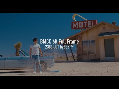
Blackmagic 2383 LUT byBoz™️ | Color Grading BMPCC 6K Pro Footage in DaVinci Resolve
Blackmagic 2383 LUT byBoz™️. Color Grading BMPCC 6K Pro Footage in DaVinci Resolve. Also works with Adobe Premiere Pro, Final Cut Pro X and other .cube LUT software. Get a special 10% discount at dehancer.com using the code: BOZ10 Available to Buy & Download Here: https://blackmagic-luts.yolasite.com/ For ALL Blackmagic Design Color Science Settings (Gen 1/ Gen 3/ Gen 4/ Gen 5). Continue…

View On WordPress
#blackmagic braw to rec709 luts#blackmagic cinema camera 6k full frame#Blackmagic Color Grade LUT#blackmagic full frame#Blackmagic Pyxis Full Frame (Gen 5) 2383 LUT#blackmagic pyxis lut#BMCC 6K Full Frame#bmcc 6k full frame lut#BMPCC 4K Color Grade LUT#BMPCC 6K 2383 LUT#BMPCC Cinematic LUTs#BMPCC Color Grading LUTs#Cinematic LUTs#color grade luts#Color Grading DaVinci Resolve#Color Grading LUTs#Color Grading Tutorial#DaVinci Resolve Tutorial
0 notes
Text
youtube
44°58'23.5"N 6°03'54.8"E
youtube/oftwolands
www.oftwolands.com
#of two lands#travel#landscape#mountains#filmmaking#blackmagic design#video#bmpcc#nature#color grading#tutorial#bmcc6k#bmpcc6k#iceland#antarctica#france#youtube#filmconvert#florent piovesan#Youtube
26 notes
·
View notes
Text
HOW TO GET OTHER COLORS ON TUMBLR LIKE THIS, PHONE VERSION⬇️⬇️
updated version
HELLO EVERYONE horizontal gradient
HELLO EVERYONE middle gradient
HELLO EVERYONE three colored gradient
HELLO EVERYONE solid
HELLO EVERYONE random colors
HELLO EVERYONE rainbow
pls don’t mind my broken ass english, also idk why the quality is so bad??🫸���😵💫🫷🏽
click here for the website!!!

35 notes
·
View notes
Video
youtube
How to Create a STUNNING RETRO & VINTAGE Look in After Effects Tutorial
#youtube#create#stunning#retro#vintage#film#film look#look#effects#color grading#video editing#filmic#retro look#noise#grain#grainy#filtergrade#after effects#tutorial#how to
1 note
·
View note
Text
When To Use A LUT And How To Customize It In ON1 Effects
If you are trying ON1 Photo RAW, the ON1 plug-ins like ON1 Effects or ON1 HDR, or upgrading your ON1 software to a newer version, please consider using my affiliate link. There is no extra cost to you and it helps support ON1 tutorials like this one. Ready to buy? Use the offer code SDP20 at checkout and SAVE 20%!
Photo editing tools give you a lot of choices to adjust the color and tonality of your images. ON1 Effects has a host of filters to enrich, tint, and color grade an image - there’s the Color Adjustment, Color Balance, Photo Filter, and Split Tone just to name a few. Another option is the LUT Filter. LUTs are both interesting and unique because a LUT can subtly or drastically alter the mood of an image with just a single click.
Step 1 - Audition The LUTs
First, apply the LUT filter and choose a LUT category. Or, you can also import LUTs you've downloaded from other sources. Once you have selected a category, you can audition each LUT. LUTs can be tricky and you can’t always predict how it will look on every photo.
Open the LUT list and use your keyboard to arrow up and down in the LUT list keeping your eyes on your photo. When you see a look you like – pause and make a note of the LUT that’s selected. Remember the LUT controls the color and luminance shifts. You can’t directly change those effects, though you can influence them after the LUT is applied. Aim to find a LUT that broadly suits the mood and color palette you want for your photo.
Related: Color Grading With The LUT Filter
Step 2 - Refine Your LUT Look With Blending Options
If the LUT looks great right away, you’re all set. However, if the LUT is too strong in certain tonal regions, you have control over that. Open the blending options of the LUT filter and use the Shadows, Highlights, and Skin sliders to limit the impact of the LUT to those tonal regions. (Skin is a rough equivalent to midtones in most photos.) For example, to reduce the color grading in darker areas, push the Shadows slider to the right.
Pro tip: You can also reduce the overall impact of the LUT using the Opacity slider of the LUT Filter.
Step 3 - Customize Your LUT Look With Luminosity Masks
Want more control? Using a luminosity mask is another approach to control how strongly a LUT is applied to various tonal regions.
A luminosity mask hides the impact of a filter based on the tonal properties of your photo. Open the masking area of the filter and click the Lumen button to apply a luminosity masks. By default, the LUT is reduced in the shadows. Inverting the mask limits the impact in the highlights. Also explore the Density slider to add some but not all of the LUT to the entire photo.
Luminosity masks are more nuanced and offer more control over blending options. Use the masks for greater influence over how intensely various tonal regions are or are not affected by the LUT.
Pro tip: Nudge the Feather slider up a little for smooth blending of the LUT among tonal regions.
Conclusion
You can also combine the luminosity masks with the blending options. After applying the luminosity masks, if the LUT is too strong in the shadows, midtones, or highlights, use the protection slides in the blending options to temper the LUT in those areas.
While you may not have control over the color mapping the LUT itself provides, you are not without control. Temper the impact of the LUT using the additional controls in the ON1 LUT Filter.
0 notes
Text

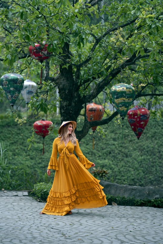

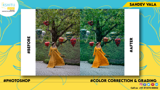


Color Correction & Color Grading
#Adobe #Adobephotoshop #photoshop #kshitijvivan #sahdevvala #artwork #Photoshoptutorial #photoedit #photoediting #graphics #graphicdesigner #designer #creativegraphics #creativedesigner #creativedesign #posterdesign #flyerdesign #educationvala #education_vala #parthsir #educationvala.com #educationvalanews #creativeagency #creativephotoedit #colorcorrection #colorgrading #colourcorrection #colourgrading
#adobe#kshitijvivan#photoshop#sahdevvala#photoshoptutorial#educationvala#educationvala.com#color correction#colour correction#color grading#colour grading#Colour Grading Tutorial#Colour correction tutorial
1 note
·
View note
Text
#color grading#dctl#resolve#color shift dctls#color shift#color twist#colorshift dctl#hue#density#saturation#tumblr#tumblr tuesday#tumblr tutorial#colorist
0 notes
Video
youtube
How To Steal Color Grading From Any Image Using Lightroom Classic
1 note
·
View note
Note
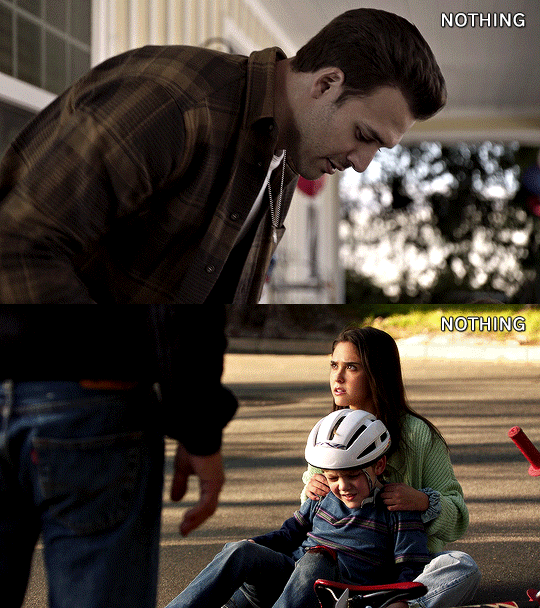
Hi! I was wondering if you had any tips on how to color the flashbacks in the begins episodes, because they have that weird green tint that's so hard to get rid of? Would really appreciate any advice you had! Love all your gifs :)
hellooo! that is really nice of you to say, thank you <3
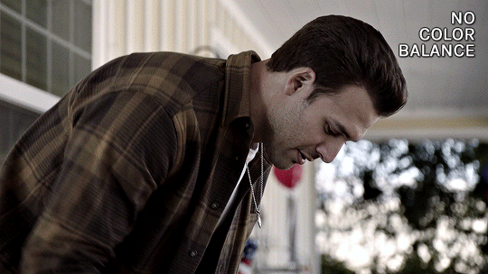
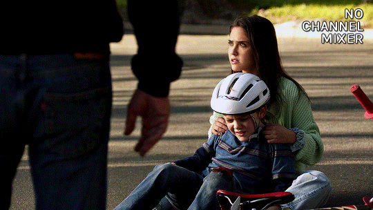
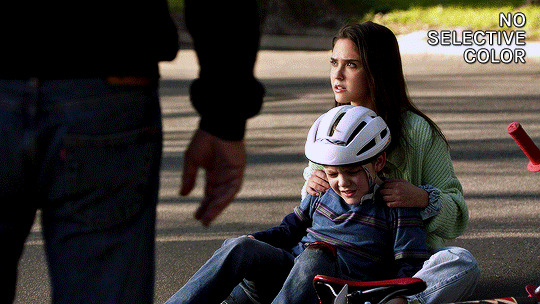
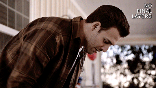
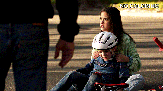
yeah flashback scenes in 911 can be tricky to color. i don't know why they made the el paso flashbacks look so drab, or the hershey flashbacks so glowy and green lol. anyway, i have two flashback examples on how to go from this:

to this


steps under the cut (:
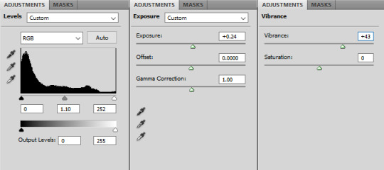
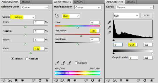
CURVES
the first thing i always do is usually use a curves layer to white balance the colors automatically. it can be quite handy, but it's usually not enough. it can be a great place to start though. on the top right you can click the 3 lines menu and choose "auto options..."


then you can play around with the different settings in the algorithms section, and the snap neutral midtones. there's usually one that's better, so i just toggle between them and choose which one looks best.

if the auto settings don't work well for your shot, you can always do this manually with the black and white droppers with a curves or levels layer. becca/@yenvengerberg did a great tutorial on it here (in the step one: curves section)
both gifs with curves auto color correction:
as you can see it brings the colors in a more neutral zone and less saturated, but the coloring still needs more editing.
COLOR BALANCE
i used a color balance layer to bring back some warmth into the eddie gif. i started by giving it a bit of red in the shadows, then with midtones and highlights, i simply played with the sliders until i got something i liked (knowing i'll grade the colors more specifically later).

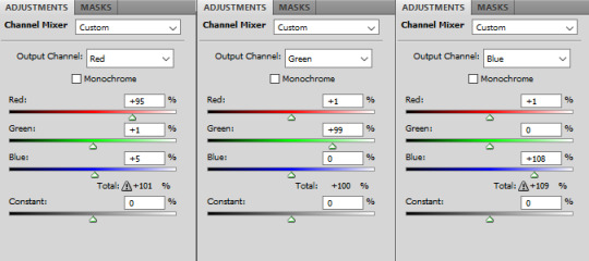
CHANNEL MIXER
for the maddie & buck gif, i wanted to reduce the yellow/green tint. i needed to add some blue to counter the yellow and channel mixer worked better than color balance for this one. this channel mixer tutorial by kate/@aubrey-plaza goes into so much depth, much better than i ever could, but here's how i did it:
SELECTIVE COLOR
my favorite and most used layer! i use it all the time. for the eddie gif, i wanted to make it warmer and less drab. i always start with deepening the blacks, then i want to make sure the skintones are good with the reds and yellows.

then the rest is mostly small adjustments to my liking, especially with cyans, blues, neutrals. this particular gif doesn't have a lot of blue tones so it doesn't change a lot tho haha

selective color results for eddie:

then for the maddie & buck gif, i went pretty much in the same order: blacks, skintones (reds and yellows)
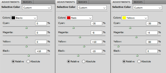
then blues, cyans, neutrals:

maddie & buck selective color results:
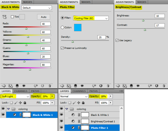
FINAL TOUCHES
now that the gifs are color graded, what's left is to add final touches, aka more vibrance, contrast, exposure, etc etc.
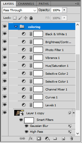
for the eddie gif i added these layers
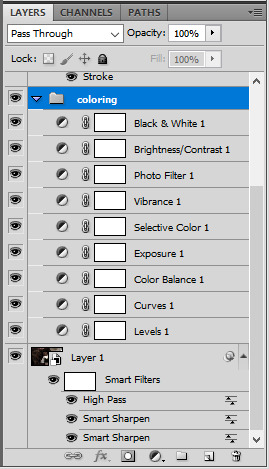
here's the layer order and final result:

for the maddie & buck gif, these are the layers i added:

and the layers order and final result for that one:

that's it, i hope that helps a little!
there's also this great tutorial by ace/@ajusnice on how to color yellow tinted shots, it's a great reference.
#alie replies#tutorial#*ps help#photoshop#completeresources#usermoonchild#userdena#uservivaldi#userisaiah#userace#userchibi#userraffa#userdean#usercharisse#usershreyu#userpjo#useraish#allresources#resourcemarket#userrebekah#Anonymous
142 notes
·
View notes
Note
Concept that just popped into my head: Milgram characters doing "get ready with me" videos
Aw, this was so fun!! I always love your hc style of normal au/everyone's chilling, and tried to go the same route -- it was so cute to think about :D
Haruka: Puts on his outfit for the day and explains everything in great detail. He has lots of comfortable items and fun colors. At the very end he speaks off-camera and you realize Muu was standing there cheering him on the whole time. He gets a lot of encouraging comments, and Muu and Fuuta keep an eye on the account to delete any nasty ones that may come in.
Yuno: Shows her outfit, makeup, nails, and bag she’s taking with her. She tries out a variety of styles (not just sticking to the more feminine looks we see in canon). She gives a bit of a tutorial and tips as well as showing things off. Has a main account for her daytime outfits, and a more private one for her nighttime looks. Mahiru is the only one aware of the latter account.
Fuuta: Layers. Lots of layers. There will be three sweatshirts laid out in front of him and you wonder which he’s going to choose before realizing he’s putting them all on. He focuses most on his sneakers and sportswear. He plays loud music over the videos, not knowing what to say. Has gotten into comment-section arguments over those yellow socks.
Muu: Also does a full look at her appearance: nails, accessories, etc. She mentions where you can buy everything, and it’s unclear whether she was sponsored by these brands or is just excited to talk about them. (Whether they’re actually together or not,) she’ll have Haruka on as a guest a lot to show off couple’s outfit ideas. She definitely has the biggest following, and loves recommending Haruka and the others’ accounts.
Shidou: He doesn’t really know what he’s doing, but his account is getting tons of views so the others keep encouraging him to make videos. He’s just glad to be connecting with the other prisoners as they show him how to do it. He dresses in a mix of the sleek patterned shirts and dad fits, and both types of videos are equally popular.
Mahiru: None of the serious-faced flirts or little pouty faces – it’s all smiles for her. Every video is basically a full tutorial – she has captions and a voiceover giving commentary on everything. She has the next biggest following, and interacts constantly. She loves getting questions “what should I wear on an x type date?” “How do I dress to impress x type of person?” because she always comes up with the perfect outfit to help.
Kazui: A bit confused as well, though he does know a lot about style. His interro question makes it seem like he wanted kids – I think he’d really get into the account as one of those “Dad How Do I” types. He talks about matching things, clothes upkeep, shaving/hairstyling.
Amane: Also wouldn’t have made the videos without prompting from the others, but enjoys it a lot. She usually talks about practical things instead of “vain” fashion: she’s excited to show off a new raincoat, sturdy shoes, useful pockets, etc. Over time, she leans into outfits that are more cute and colorful, gaining confidence in them.
Mikoto: He started the account as something for one of his design classes, and got really into it. He likes to challenge himself with unique styles and clothing articles, making pretty much anything work. He keeps everything professional in case an employer/coworker sees, but isn’t afraid to add some flirting and flaunting in there. If he’s open about his plurality, he’ll have some special videos, “choosing an outfit for John today!”
Kotoko: Like Amane, she’s more excited about practical outfits. She’ll show off clothes that have good flexibility, places to store and conceal objects, and heavy duty materials. She’ll rate jackets, boots, and other “military-grade” things for what has worked best for her. She’s very attentive to the accounts that follow her – she does full background checks to make sure her info is being used for justice, not more crime. Mahiru convinces her to do a special where she puts all her piercings in and talks about why she chose them/what they mean.
Es: Experiments with a lot of new styles, trying to figure out what they like. They also just play music in the back, not having much to say about each outfit. They'd rather focus on their series of dressing-up-Jackalope videos, much to his dismay...
#milgram#haruka sakurai#yuno kashiki#fuuta kajiyama#muu kusunoki#shidou kirisaki#mahiru shiina#kazui mukuhara#amane momose#mikoto kayano#kotoko yuzuriha#es#jackalope#thank you so much for the ask!! i didnt mean to take so long for a cute lil post but ah well#i kept getting caught up in canon timelines and relationships and finally tried to just vibe and it worked out#i love all your cast headcanons ;-;#it was still hardest for shidou and amane... i think theyd be the least likely to start/stick with it#but itd still be fun for them if they did :3#kazui starts slow but once he gets the hang of it i think hed be really into the whole thing#i can see es running a real cute pet account#both pet care and just cute/funny videos#fuuta thinks hes slick using a fake account to secretly follow kotoko but she knows its him...#mahiru follows everyone and leaves sweet comments on every video <3#though in canon im picturing yuno waking up every day to torment fuuta by going 'get ready with me' and explaining how she#puts on her uniform every. single. day. despite his protests
59 notes
·
View notes
Text
BMCC 6K Full Frame 2383 LUT byBoz™️ - DaVinci Resolve (Gen 5)
BMCC 6K Full Frame 2383 LUT byBoz™️ color grade in DaVinci Resolve. Also works with Adobe Premiere Pro, Final Cut Pro X and other .cube LUT software. Get a special 10% discount at dehancer.com using the code: BOZ10 Available to Buy & Download Here: https://blackmagic-luts.yolasite.com/ Kodak 2383 Color grading LUT for ALL Blackmagic Cinema Camera Color Sciences. Continue reading BMCC 6K Full…
View On WordPress
#blackmagic braw to rec709 luts#blackmagic cinema camera 6k full frame#blackmagic full frame#bmcc 6k full frame lut#color grade luts#Color Grading DaVinci Resolve#Color Grading Tutorial#DaVinci Resolve Tutorial#Dehancer Film Emulation#Dehancer Tutorial#Film Look Color Grading#film look on digital camera
0 notes
Video
youtube
44°58'23.5"N 6°03'54.8"E
youtube/oftwolands
www.oftwolands.com
#cinematography#bmpcc6k#travel#video#film#filmconvert#youtube#breakdown#tutorial#Blackmagic design#bmpcc6k pro#australia#Sydney#color grading#grading#bmpcc#4k#filmmaking#filmmaker#cinematographer#florent piovesan#of two lands
20 notes
·
View notes
Text
HOW TO MAKE GRADIENT TEXT ON TUMBLR: STEP BY STEP TUTORIAL WITH VOICEOVER, LAPTOP/COMPUTER VERSION
Site 1
Site 2
16 notes
·
View notes
Text

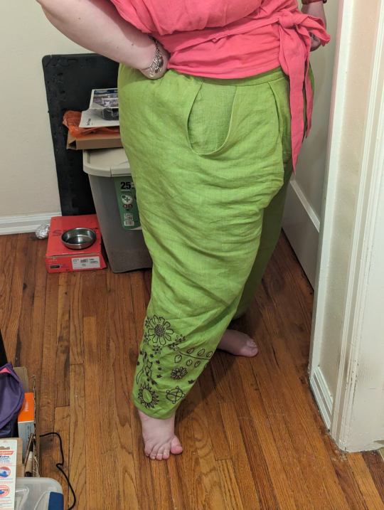
Photos of the pants! The top (which I also made, tutorial coming soon) kinda clashes but oh well I am living in neon colors and loving life!
I don't like how they fit so today I spent 2 hours grading the pattern up 5 inches. They don't look horrible but I wanted something looser and more flowy. I'm going to cut out the pieces for a turquoise pair and then call it a day because I didn't sleep well last night and I took a shower today and already stood for 2 hours straight so I need to pace myself.
I told myself I wasn't going to embroider any more pants cuz these ones took forever but I've decided to embroider black stars around the hems cuz stars go really fast and then I'll take some of the black cotton/linen blend I bought earlier this month and make a crop top and embroider turquoise stars on it so I have a coordinating outfit! I plan on using any leftover materials to make some coordinating crop tops using this tutorial so that I can mix and match my brightly colored tops and pants!
I'm working hard to get a bunch of projects finished so I can excuse buying this linen

To make another pair of pants and crop top set! I'm actually going to get the 7.5 oz version because my hot pink linen is 5.5 oz and it's slightly see through so I can't wear black bras or colored underwear underneath it.
OK. Going to go cut out the turquoise pieces! Wish me luck and less back pain!
43 notes
·
View notes
Text
How I Do Color Grading In Lightroom
There are many different ways to adjust color in Lightroom. The Temperature slider is a starting point and can bias a photo cooler or warmer. Hue, Saturation and Luminance (HSL) is for your primary color adjustments. Curves is another method to bias hues in the shadows, midtones, and highlights.
Then there is the Color Grading panel, the purpose built tool for adding a subtle or strong tint to different tonal regions of your photo. I’ve explained the Color Grading tool before and how to control the transition between the different colors. That’s the advantage of the Color Grading tool - it does the smooth transitions among the colors for you.
Watch the video in this article on how I approach color grading, and also why I choose to color grade an image. Central to my method is cranking the Saturation slider up to 100. It’s not as crazy as it sounds.
0 notes
Text
Resource Post: Supplies, Equipment, and Software
So I've had some people ask about the supplies and equipment I use to make my books! This is not a comprehensive list, nor is it an official tutorial on how to make a book (for that, I recommend starting with Renegade Publishing's resource documents, DAS Bookbinding, or SeaLemon's YouTube tutorials -- all free, no patreon required!), but if you're floundering because you don't know what you need to get, hopefully this will help a little bit ❤️ If I discover more good resources or change up my style, I'll add to this post.
Of note: I'm based in the US, so this list is unfortunately pretty US-centric. Apologies!
SUPPLIES
Disclaimer #1: I have a background in book conservation, so I'm picky to a fault about the supplies I use. To make a long-lasting book, you want to look for "acid-free" or "archival" materials -- BUT, a lot of consumer craft stores have realized those are good buzzwords to slap on products even if they aren't really archival. Your best bet is to buy from stores that supply materials to libraries and archives; those tend to be higher quality and stick to actual archival standards. Talas, Hollander's, University Products, and Colophon Book Arts Supply are good places to start.
That said! If price matters more than longevity, hitting up Michaels or Joann Fabrics is totally fine. This is a hobby. The bookbinding police are not gonna come smash down your door because you didn't use archival-quality craft paper. My big recommendation, though: at least get your glue and paste from Talas. High-quality adhesive makes a huge difference in how well, and how long, a book holds together. Bad adhesives can turn brittle with time, stain your paper/cloth, and make all your hard work fall apart.
So, all that said, here's what I use:
BOARD - Davey Binder's Board, 0.098" GLUE - Jade 403 PVA PASTE - Zen Shofu wheat paste (you shouldn't have to buy more than half a pound -- a little goes a long way) CLOTH - Either Arrestox or Dover bookcloth, which comes in a wide variety of colors and holds up extremely well to whatever you want to do to it THREAD - 25/3 linen thread, which I run over a small block of beeswax to make it easier to handle and give it better "locking" properties as I sew. For bigger books of ten signatures or more, I sew onto 3/8" linen tapes for extra support. DECORATIVE PAPER - Hollander's is a treasure trove of decorative papers for endsheets and covers; Talas has some really nice ones, too, but they tend to be pricier (since unfortunately everything at Talas has gotten a lot pricier lately) PRINTING PAPER - Hammermill Colors paper, 20lb, in cream; 24lb is also a good weight that feels a little more substantial than regular printer paper. (I'll probably switch to 24lb once my 20lb paper runs out.) To get the right grain direction, I buy a ream of 11x17 paper and cut it in half to make standard letter-sized sheets (8.5x11). Here's a quick primer on grain direction and why it's important when making a book! ENDBANDS - I've never had the patience to sew my own endbands (though I hope to gain that patience someday!), so I just use premade ones like these.
EQUIPMENT
Disclaimer #2: a lot of the stuff on this list is professional-grade (or close to it) with prices to match. You definitely don't have to buy everything right off the bat. It took me fifteen years to accumulate it all, and you can DIY a lot of bookbinding equipment -- a good googling will lead you to all sorts of innovative ways hobby bookbinders set up their shops. The Renegade Publishing resource documents also have a lot of A+ recommendations.
PRINTER - For text, I use a Brother B&W laser printer with auto-duplex (auto-duplex is key when printing a book); for images, both B&W and color, I use a Canon color inkjet printer set to at least 300 DPI. I fully admit having two printers is an absurd setup, but what laser printers can do well, inkjets absolutely suck at, and vice-versa -- and like I said, I'm hella picky. You can get by fine with a single laser printer! Just make sure it's got auto-duplex to save yourself a lot of pain. GUILLOTINE - I have this model, which goes in and out of stock with some regularity. The trick with this guy is to (a) sandwich your text block between some scrap board so the clamp doesn't leave a dent, and (b) REALLY CRANK DOWN on the clamp as tight as you possibly can to keep the paper from shifting as you cut. This fixes 99% of the skewing problems mentioned in the reviews. PRESS - I have a little cast-iron press I bought off a coworker for fifty bucks; similarly, you might have luck searching eBay, looking at Affordable Bookbinding Equipment (Jim does incredible work!), searching craft stores for a flower press, or even just using two pieces of wood and a few C-clamps. SeaLemon on YouTube also has a good video on how to DIY a book press. PRESS BOARDS - For setting the hinges in the press, I use a pair of brass-edged boards like these. It's a good investment if you want to get really nice, crisp hinges, but it's also 100% possible to DIY brass-edged boards if you want. At my very first job, we even set our hinges by taping sewing needles to the book before putting it in the press! FINISHING PRESS - I have this one, which I use to back my books in combination with these backing irons BACKING HAMMER - To my chagrin, I've discovered that having an actual backing hammer makes backing a book way, way easier. Some folks have had good luck with a cobbler's hammer or just a regular old hammer from a hardware store, but I splurged on a student hammer from Hollander's, and it works fantastically. (I wouldn't recommend buying the "professional" hammers, though, because seriously, $90 for a hammer?! No.) BONE FOLDER - I'm actually not a fan of bone folders made from real bone; I like Teflon folders a lot better for scoring and flattening. (Real bone folders tend to burnish the material, an effect I'm rarely going for.) CUTTING MACHINE - A Silhouette Curio. This is 100% optional, but it's how I do the bulk of my cover designs, including cut-outs, embossing, foiling (with a foil quill attachment), and spine titling. The software and overall quality are way better than Cricut, and its 5mm clearance means you can fit more than just vinyl in there. Sadly, Silhouette has discontinued the Curio, but it's still possible to buy from third-party sellers -- and if you don't care about the 5mm clearance, I've heard good things about the Silhouette Cameo line.
A side note on vinyl, from the obnoxiously picky book conservator: if you're aiming for longevity with your books, using HTV in your book designs may not be the best idea. Not only can the adhesives be questionable, but the plasticizers in vinyl break down in really weird, gross ways once several decades have passed. That's why I tend to stick with cut-outs and foiling instead of HTV. But, again: if you just want to make something pretty, don't worry about it!
SOFTWARE
TYPESETTING - I use Affinity Publisher -- it's similar to Adobe InDesign, but with a flat cost instead of a bullshit subscription model. I am by no means an expert in this, since I've only been designing books for a couple years; pretty much everything I learned, I learned from Aliya Regatti's tutorial, plus or minus a lot of googling and noodling around. I've discovered that it does get cranky if your book is over 250 pages or so, meaning you may have to split longer fics into multiple files. That said, I've been really happy with it, and it goes on sale every now and then if the $70 price tag is too much.
As always, Renegade Publishing has a whole lot of tutorials for other software options, including Microsoft Word, InDesign, LaTeX, and Scribus if you already have access to one of those instead.
IMPOSITION - "Imposition" is when you lay out a book so all the pages are in order once you fold + gather the signatures. Since Affinity Publisher doesn't do this automatically on export, I use Bookbinder 3.0, which is an old but nice little Java program that breaks a single PDF into a series of properly imposed signatures. I usually set it to 6 sheets per signature.
MISCELLANEOUS
IMAGES
The Noun Project is a gigantic repository of basic SVGs and PNGs that are not only great for cutting machines, but for adding flourishes to your title page, chapter headings, and scene dividers. Every single book I've made has used at least one image from here; I pay for the yearly Noun Pro subscription, but it's not necessary to use the site.
Unsplash is perfect for photo elements
Pixabay not only has a great archive of photos, but illustrations and vector images as well
Surprisingly, Wikipedia also has a lot of good Creative Commons photos attached to their articles!
FONTS
1001Fonts is a good starting point for finding free fonts, as is FontSpace and DaFont
If you're willing to pay for fonts (and sometimes it's worth it for a well-designed font that's perfect for your project), Creative Fabrica and Pixel Surplus have some good stuff, including discounted bundles of multiple fonts
264 notes
·
View notes