#retro look
Explore tagged Tumblr posts
Text

#anime#anime gif#gif#anime aesthetic#aesthetic#retro#retrowave#retro anime#retro aesthetic#retro style#retro look#retro vibes#80's#80's aesthetic#80's anime#80s anime#old anime#classic anime#animecore#anime nature#naturecore#nature aesthetic#cottagecore#forestcore#flowercore#forest#cottage aesthetic#forest aesthetic#sparkling#soft sparkling
2K notes
·
View notes
Text


2024's Action Comics Vol.1 #1067 cover by artist Eddy Barrows, inker Danny Miki & colorist Tomeu Morey.
#superman#clark kent#action comics#reporter#retro style#eddy barrows#wow#art#cool comic art#step by step#comics#dawn of dc#DC#dc comics#man of steel#the man of steel#cover art#woah#gail simone#retro look#vintage#daily planet#challenge from the stars#cover#metropolis#blast from the past#40s style#process#cool#superman superstars era
116 notes
·
View notes
Text

rowing 🚣♂️🚣♀️
yashica 35-me, on kodak color plus 200
#rowing#active#boat#retro look#point and shoot#motion#sports photography#sports#river#water#aesthetic#photography#film photography#35mm#analog photography#movement#moving#kodak#yashica#film is not dead#germany#photographers on tumblr#old school#vintage#my photos
45 notes
·
View notes
Text

Young Princess Diana playing tennis
#lady diana#lady di#diana spencer#tennis player#princess of wales#icons#glamour#inspiration#retro look#timeless style#timeless#the 90s#royal family#tabloid#the crown#princess diana#paparazzi
27 notes
·
View notes
Text


#nct wish#kpop bg#nct riku#maeda riku#kpop idols#japanese idols#boy group#stickers#face stickers#cute#sleepover#boys#friendship#retro look#nostalgia#riku#nct#kpop boys
10 notes
·
View notes
Text

🎸 TUESDAY STYLE SPOTLIGHT: ROCKABILLY REVIVAL
Step back in time with our latest rockabilly collection! Where vintage glamour meets modern edge.
The Rockabilly Clothing Style Guide:
• Classic 50s-inspired pieces
• Pin-up perfection
• Rock & Roll attitude
• Retro accessories
Style Notes:
Rockabilly fashion isn't just clothing - it's a celebration of an era when rock and roll changed everything. From swing dresses to pencil skirts, every piece captures that perfect blend of rebellion and glamour that defined the 1950s.
What's In Store:
• Vintage-inspired dresses
• Classic swing skirts
• Retro tops
• Pin-up style pieces
• Rock & Roll accessories
Styling Tips:
- Mix classic pieces with modern accessories
- Add a touch of pin-up glamour
- Embrace bold prints and patterns
- Don't forget the perfect red lip!
#rockabilly#rockabilly style#retro fashion#vintage fashion#pin up style#1950s#rock and roll#vintage inspired#retro style#rockabilly fashion#pin up fashion#vintage style#retro glamour#classic style#grin entertainment#fashion blog#style guide#rockabilly life#vintage look#retro look#style inspo
13 notes
·
View notes
Text

#jaejoong#kim jaejoong#denim jacket#jean jacket#y2k aesthetic#retro look#male cleavage#silver jewelry#silver necklace#beautiful men#kpop idols
15 notes
·
View notes
Text

7 notes
·
View notes
Text
78 notes
·
View notes
Text

f l y i n g h i g h
#vaporwave#vaporwave aesthetic#vaporwave edit#vaporwave vibes#aesthetic#lofi#lofi aesthetic#lofi edit#vhs#vhs aesthetic#vhs effect#clouds#dreamcore#retro#retro look#retro aesthetic
17 notes
·
View notes
Text

#めぞん一刻#maison ikkoku#anime#anime gif#gif#anime aesthetic#aesthetic#retrowave#retro aesthetic#retro anime#retro#retro look#retro style#retro tech#old tech#retro graphics#retro vibes#anime details#anime tech#anime style#anime vibes#vhs tapes#vhs aesthetic#vhswave#1980s#vhs#anime gifs#gifs#classic anime#retro animation
302 notes
·
View notes
Text
#fatboy#harley davidson#bikerstyle#bikerlife#bobber#motorcycle#indianmotorcycle#motorcyclesidebag#motorbike#moto love#sport bike#custom bike#pannier bags#retro look#interceptor#Continental Classic 350#meteor 350 fireball#meteor shower#Classic 350#royal enfield#Universal Hawk
2 notes
·
View notes
Text

olympus trip 35, on kodak gold 200
#photography#photographers on tumblr#film photography#film is not dead#film#35mm#35mm photography#analog photography#analog#kodak#kodak gold#olympus#original photography#nature#sunset#colorful#aesthetic#moody#moody photos#retro look#old school#my photos
29 notes
·
View notes
Text
Oh boy, here I go ranting again.
So I went in to play Cultic finally, and while it's a great game with awesome atmosphere, it has done the cardinal sin of having my pet peeve in it and so I must rant.

The game front-loads the "they used to have less colours" shaders, and it kinda made me overly negative on it for the first minutes until I realised that a lot of textures are just pixel art and what *is* stock textures that were crumpled down mostly look fine.
So, what's my beef with these two options? Here's a screenshot of the game, without them:

And here's them turned on, with and without "dithering"

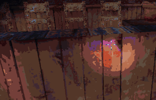
Note how, just how they are in the options menu, they are applied one after another - which makes dithering into little more than just a texture applied over top, you can still see the banding with perfect clarity. I get that GPU dithering is... Difficult, to say the least. Here's a forum post by Lucas Pope describing how he arrived at making dithering in Obra Dinn work. And that's just black-and-white dithering. You can do it by dithering the colour channels separately, but I digress. Dithering is a tool that's supposed to help you get *rid* of these banding artefacts - by mixing together pixels where you can't have an intermediate value. A shader will still have bands, true, but you can make them look significantly smoother while still having the same limited palette. Here's a kodak standard testing image of parrots.

Here it is, ran through a toy ditherer I have written, it's palette extracted and merged by distance, no dithering.

Here it is again, same toy ditherer, same palette, but with dithering enabled.

Looks quite a bit nicer, doesn't it? This kind of dithering lets you keep more image detail by trying to compensate for the error of down-sampling - in this case, literally picking nearest colour, checking what the error is, and then distributing it to the nearby pixels. This exact algorithm produces nice results, but is inherently linear so it can't be put into a shader. You can still make a shader that represents the intermediates with a different mix of two nearest shades - like this cool demo demonstrates. But you can't do it if you first strip the colours out and *then* dither it. So, what I want to rant about is - if you gonna go for a limited palette look with dynamic lighting, the part that does dithering should also be the part that does palette reduction.
#mine#text#rant#dithering#retro look#just want my retro games look retro and not like you turned posterisation filter on#this game be so fine and then bam#uhh... I think I broke the tags#oh well
3 notes
·
View notes
Text

#zb1 gyuvin#kim gyuvin#zerobaseone#kpop idols#cute guys#retro look#sweater vest#school outfit#school boy#gyuvin#zb1#kpop boys
9 notes
·
View notes
Text

★彡𝓛𝓓ミ★
4 notes
·
View notes