#Because everything’s always Adobe
Explore tagged Tumblr posts
Visit Tumblr Blog
Explore Tumblr blogs with no restrictions, modern design and the best experience.
Last Seen Tumblr Blogs


Fun Fact
Tumblr.com is the 103rd most visited website in the world.
Note
omg this is so important. I just went through hell about Adobe when I signed up for a couple months for school even though I hate Adobe and their Blackrock monopoly bullshit, but I had no choice. So I had to drop out because of chronic stomach problems and I go to cancel my subscription. Oh no, you can’t without spending $100. Which was certainly not advertised. I’m pretty sure there’s now a class-action lawsuit about exactly what happened to me, I’d have to look into it.
I also have been looking for graphic design opportunities, and I’m locked out of all of them because I use Affinity instead of Adobe. Adobe is awful, price gougy, AI ridden, ran by Black Rock, a Million apps that do similar shit, can’t own it, etc. Affinity is a pricey-ish one time payment that’s often on sale for less than $50 per program (there are 3). Then I use Procreate for Illustration (one time $12 iirc)
Please let’s get away from Adobe. If we all collectively do so maybe people can get into art jobs or college without having to use it. (Luckily Affinity can convert Adobe’s file types so you can import it that way, but I’m not sure about exporting which would be needed to lie to work about what program you’re using. Not that it would be feasible anyway). Also please someone on Skillshare make an Affinity course cuz currently there’s little learning tools that aren’t the books, further forcing people back towards Adobe.
Wait new hbomb video??? When???
From his most recent Patreon post:
"...my next main-channel video, tentatively titled Adobe Must Die, should be out before the end of the year, but don't hold me to that."
I'm reeeeeeally looking forward to that one, I hate Adobe so much and I wanna see it burn 😤
#Alex’s shit#Alex’s rambles#Adobe#Sorry for the ramble but I’m passionate about hating Adobe#I used to use illustrator and photoshop cs6 pirated#Because of course the pricing made talented people without much money locked out of learning#Affinity is so accessible and so much better#The only complaint is that there’s no how-tos#Because everything’s always Adobe#So your only option is to figure it out or buy their books which are kinda pricey#I wouldn’t mind because I wanna support them#I just haven’t had the money#This also isn’t to say there aren’t other options that aren’t Affinity#That’s just the one I’ve been using and I like it a lot
308 notes
·
View notes
Text
happy international rafael silva day
#hello????#me?? editing???#omg it’s real#911 lone star#trick edits lone star#happy birthday#rafael silva#edit#after effects#adobe after effects#fan vid#fan video#billie eilish#birds of a feather#this man is everything to me guys#like i know no matter what happens he will always be there#he’s my safety#my comfort#my everything#911 ls#carlos reyes#i hope his birthday is the best#he deserves it#i did not sleep in order to make this#i did not sleep#but it’s so worth it because look at this edit#i’m so proud#motion graphics#vfx#911lsedit
27 notes
·
View notes
Note
if you ever have time/feel so inclined, i would love to see a tutorial or some tips from you about how to do color isolation sets!! they are absolutely incredible and I love them so much! <3
absolutely! thank you so much 💙
here are a few examples of my color isolation sets:
the substance (yellow) || beetlejuice (red) || us (red) || conclave (blue) || sleeping beauty (cyan/blue) || crimson peak (yellow) || smosh (purple) || conclave (red)
beneath the cut, i'll walk you through my coloring process!
notes: tutorial assumes basic gifmaking knowledge & i'm using adobe photoshop 2023 (though afaik, your version shouldn't matter much)
i don't color my gifs until they're sharpened and i'll give you a quick overview of my process: file -> import -> video frames to layers -> trim any extra frames -> crop to desired dimensions -> run sharpening action (i used this tutorial and just made it into an action) which also converts to timeline
once i'm in timeline, i go through my normal coloring process. unless i'm giffing similarly colored scenes that i've already colored and saved a psd for, i usually color from scratch every time. obviously, some adjustment layers vary depending on the source material, but these are almost always my main adjustments, just with differing values
a brightness/contrast layer set to screen - this is a gamechanger for especially dark scenes. note: i do not adjust the values, i leave them both at 0 and just change the blending mode
a curves layer utilizing the black & white eyedropper tools. first, i select the black eyedropper and then click on the blackest area of the gif. i do the same with the white one, using it to select the brightest/whitest spot. this can help a lot if you're dealing with heavily tinted scenes!
a selective color layer (set to absolute, not relative) where i adjust the blacks usually anywhere from 1-5 notches higher and the neutrals either up or down the same amount depending on the scene. be careful with the neutrals when giffing poc as lightening them can result in whitewashing. if need be, i will also adjust the whites, making them slightly whiter with the black slider. selective color is by far my fave adjustment layer and i use it in every single coloring.
after this, i sometimes add a black & white gradient map adjustment layer set to soft light. i'll play around with the opacity, leaving it anywhere between 5-100% depending on the scene. i think this adds depth to your colors and adds some contrast, but i don't use it in every psd.
occasionally, i'll mess around with vibrance/saturation, and that'll be my final layer, but oftentimes i won't actually add this layer until i've finished the rest of the coloring. this is just where the layer will go.
these are the main 5 layers i almost always start every single coloring with and they act mostly as a base and to color-correct any weirdly tinted or exceptionally dark scenes.
now, let's talk about scene selection. i try to set myself up for success by choosing scenes that either already have a very noticeable pop of color or have a color i know can easily be manipulated. you'll want to pick scenes that aren't drenched with the color you want to isolate though, or you won't have the contrast of the black & white.
here are a few examples of good scenes:

the only red here is the covered bridge and it will be easy to adjust only that and not the blue, green, or yellow.

same as above, apart from ralph fiennes's face, which obviously contains red undertones. i'll go more in-depth on this in a bit, but because this scene doesn't have a lot of movement, this will be able to be fixed with layer masks.

again, here we have one bright occurrence of yellow surrounded by blue that we'll easily be able to neutralize.
and a few of bad/less than ideal scenes:

while this scene is an absolute dream for making super vibrant sets or color palettes, it's no good for color isolation. this yellow covers basically everything, leaving no other colors to cancel out.

while i definitely did try this one out, the scene is ultimately too dark and too cyan-tinted to properly isolate the red of the blood or the cyan in her eyes and on the walls.

just like the first one, this scene is fully just. color drenched. would make a great base for a vibrant or color palette set but not useful for color isolation.

bad and wrong!! coloring this movie, however beloved, was a test of my sanity. you have this yellow/green filter over everything and so much of it that isolating or changing one or the other is pretty much impossible.
with all that being said, play around! the best way to learn what does what is to try it out yourself. selective color, though there are other ways of getting the same or similar effects, will be your best friend. it's how i'm able to make sets like this & this!
let's look at this adjustment layer using a scene from conclave:

truthfully, you could either isolate the orange of the wall or the blue of her outfit. i'm going for the latter at the moment.
add a selective color layer by clicking this button:

i like to really emphasize the color i'm going to isolate, make sure it's as consistent with the other scenes i'm using and that it pops. from the dropdown in the layer properties, i select blue.

each color from the dropdown will look like this. you have adjustable sliders for cyan, magenta, yellow, and black. the more to the right, the more you're emphasizing that color in any blues in your image. the further to the left, the more of that color's opposite you'll adjust. each opposite pairing is as follows:
cyan + red magenta + green yellow + blue black + white
if you're struggling with this (i did at first), visualize it. pull up one of those "bad" examples. say we take the yellow scene from the gorge. add a selective color layer to it and select yellow from the dropdown. play with the sliders to see how AND how much each adjustment changes the coloring. decreasing the yellow slider all the way to -100% is adding blue to anything ps identifies as yellow. because yellow and blue are opposites, it pretty much neutralizes the scene. instead, if you use the magenta slider and push it all the way to the left, you make any yellows become green. if you move the magenta slider all the way to the right, you'll add magenta to any yellows, making the scene orange. it's all about knowing the color wheel and experimenting!
back to the conclave gif! i want to bring out the blue as much as possible, under the blue dropdown, i crank the cyan slider all the way up and bring the yellow all the way down.

is it a massive difference? no, but you can definitely see the difference between the left (with the adjustment) and the right (without).
depending on the scene and color i'm working with, i'll play around with other layers from the dropdown. but i prefer to do each color in a different layer and i right-click on the box with the eye in the layers panel and change it to the applicable color. that way, it's easier to adjust something later on. you can also rename your layers, but this is quicker and easier imo.

with this particular scene, this is the only adjustment i want to make to the blue for the time being. now, it's all about getting rid of any other colors. to do this, add a hue/saturation layer and select every color, one at a time, EXCEPT the color(s) you're isolating and bring the saturation all the way down to -100. in this case, it's everything but the cyans & blues.

and this is what i'm left with:

from here, you can leave it, but a lot of the time, i'll add a vibrance layer or even another blue/cyan selective color layer and crank that shit up.

this is after adding a vibrance layer (increasing both vibrance & saturation to 100) AND a selective color layer (decreasing the yellows to -100 in the blues).
i would consider this finished, but this can also be super fun to mess around with, again, using selective color:


and if the way her hair changed colors is bugging you, toggle your layers on and off until you find which one(s) changed it and add a layer mask, coloring over her hair with a soft black brush:

once you're happy with everything, save your gif in your preferred way. these are my save settings just for shiggles:


et voilà!
overall, the best advice i can give is to try. experiment! if you're not sure a scene will work, give it a shot. even if it doesn't, you've still learned something. i know it can seem confusing at first, especially if you're not super familiar with these layers or the color wheel, but please feel free to ask any questions. also, let me know if anyone wants another tutorial(s) where i go more in-depth on other colors. i'm happy to do it!
#answered#daynascullys#my tutorials#gif tutorial#gifmakerresource#completeresources#dailyresources#emilyblr#usercats#userholloway#tuseruta#usertina#userrobin#uservivaldi#userchibi#userbunneis#userbambie#useraljoscha#tusermira#userelio#userscourt#userishh#angelblr#heymaur#elwintersoldado#tuserhol#usermaguire#useraashna
106 notes
·
View notes
Text
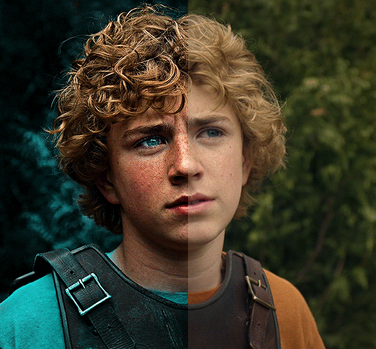
The silent art of gif making
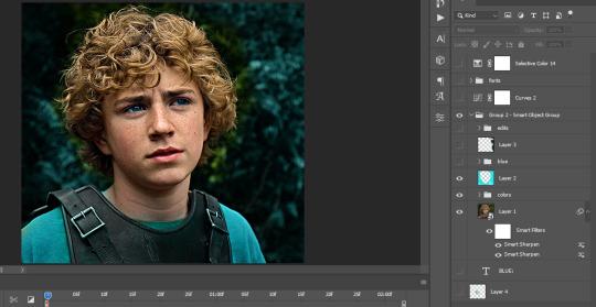
The gif above has 32 layers plus 6 that aren't shown because this is part of a larger edit. I wanted to share it to give everyone a glimpse of the art of gif making and how long it usually takes for me to make something like this. This one took me about an hour and a half but only because I couldn't get the shade of blue right.
I use Adobe Photoshop 2021 and my computer doesn't have a large memory space (I don't know what to call it) so usually most of psds get deleted because I'm too lazy to get a hard drive. It doesn't really bother me that much because I like the art so when it's done, it's done. Off to somewhere else it goes.
Here are the layers:

Everything is neat and organized in folders because I like it that way. I prefer to edit it in timeline but others edit each frame. There's a layer not shown (Layer 4 is not visible) and it's the vector art. Here it is:
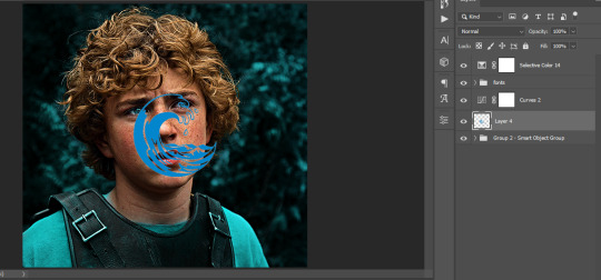
Now it is visible. I don't plan to make this a tutorial, but if you're interested I'd love to share a few tricks about it. I'm pretty new to the colors in gifmaking but the rest is simple to understand. Here, I just want to show how much work it takes to make it.
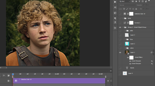
I opened Group 2 and here's the base gif. I already sharpened and sized it correctly but that's about it. Let's open the base coloring next.
Yay! Now it looks pretty! The edits are in Portuguese but it doesn't matter. There's a silent art of adding layers depending on how you want the gif to look but you get used to it. The order matters and you can add multiple layers of the same thing (for eg. multiple layers of levels or curves or exposure).
This was pretty much my first experiment with coloring so I don't know what I'm doing (this happens a lot with any art form but gifmaking exceeds in DIYing your way to the finished product) but I didn't want to mess up his hair, that's why the blue color is like that. Blue is easy to work with because there's little on the skin (different from red and yellow but that's color theory). I painted the layers like that and put it on screen, now let's correct how the rest looks.
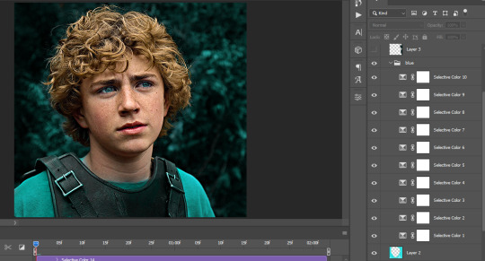
I was stuck trying to get the right teal shade of blue so yes, those are 10 layers of selective color mostly on cyan blue. We fixed his hair (yay!) we could've probably fixed the blue on his neck too but I was lazy. This is close to what I wanted so let's roll with that.
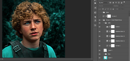
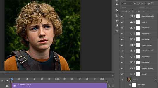
BUT I wanted his freckles to show, so let's edit a little bit more. Now his hair is more vibrant and his skin has red tones, which accentuates the blues and his eyes (exactly what I wanted!). That lost Layer 2 was me trying to fix some shadows in the background but in the end, it didn't make such a difference.
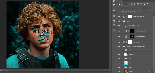
This was part of an edit, so let's add the graphics and also edit them so they're the right shade of blue and the correct size. A few gradient maps and a dozen font tests later, it appears to be done! Here it is:
Please reblog gifsets on tumblr. We gifmakers really enjoy doing what we do (otherwise we wouldn't be here) but it takes so long, you wouldn't imagine. Tumblr is the main website used for gif making and honestly, we have nowhere to go but share our art here. This was only to show how long it takes but if you're new and want to get into the art of gif making, there are a lot of really cool resource blogs in here. And my ask box is always open! Sending gifmakers all my love.
#gif making#gif tutorial#resources#completeresources#y'know what that post yesterday got me into this#i love creativity so i send all my love to gifmakers#this is HARD#my tutorials#tutorials
880 notes
·
View notes
Text
Gonna actually talk a little bit about the Great Mosque of Djenne, which has one of the coolest folk traditions around it in the world. The building itself is both at least 700 years old and incredibly fragile. It's made of adobe, and requires yearly resurfacing with fresh clay in order to prevent it from cracking structurally. It's incredibly distinct visually because of the planks which are a kind of permanent scaffold allowing access to every part of the structure for the purposes of annual maintenance.
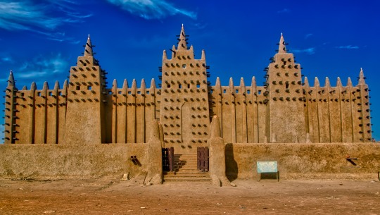
Now, when I say "reject tradition" as practical advice for opposing fascism, I don't literally mean "abandon the centuries old practice of restoring this beloved building to its pristine condition," right? This building is gorgeous and also a house of worship used daily. Well, for one thing, I'm not a Djenne muslim. I've never been to Mali, although I would certainly like to visit. But even if I were, I certainly wouldn't say that we should just let this symbol of my faith and country and nation rot right?
WELL,
no. This is a genuinely beloved act of community and a wonderful tradition and
also less than 120 years old
and what you need to understand is that
FASCISTS LIE ABOUT HISTORY ALL THE FUCKING TIME
Did you catch that? The 700 year old mosque was demolished and reconstructed from scratch in 1906. It spent an unknown amount of time between the mid 1600s when the towers were built and 1800s rotting after it was abandoned.
I love this building. I really do. I don't want to pretend that 120 years is small potatoes either, that is a really long time. And I think it's a beautiful symbol of the way that keeping what we love about the world beautiful and present takes work, and that you have to love something to keep it around and that keeping things around is a form of love. But once you ask "how long have they really been doing things this way?" suddenly the mystique of the 700 year old mosque that has always been preserved starts to crack and become ugly.
In 2006, men inspecting the roof had to flee the city to avoid being lynched after they were accused of vandalizing it. They were literally paid by an international islamic cultural society to do restoration work and had to flee because their actions were misinterpreted as malicious. The story and the mystique of the building and its sacred untouchability (except in the festival where we all touch and fix it) could have killed them.
The point is that buildings change over time. The great Mosque of Djenne was a mosque, then a palace, then a mosque again, then a ruin, then a school, then an empty lot, and then a mosque again. And, arguably, it's still the same building. There has only ever been one Great Mosque of Djenne and it maybe moved around a bit or didn't exist or was some rich guy's house or had another Great Mosque of Djenne next to it but there has still only ever been one Great Mosque of Djenne and every year the whole community comes together to fix it except when they try to lynch the guys trying to fix it and it's beautiful. I mean that. It is beautiful that they have been doing this for as long as they have.
And you have to remember that The Great Mosque of Djenne is a story we are all telling. And, when you tell stories, things like "it was a ruin for almost 200 years" get left out because "every year for at least 700 years people have come together to fix it" is a better story. It makes it seem like the building has only ever been just one thing, immune to history and politics.
That what fascists want. Because they are people. Awful, small minded, incurious people, but people who like you, love stories and wish, desperately, for a world with buildings that don't change for 700 years. Because, if something doesn't change for that long, it must be Worth something, you know, cosmically. Everything is always changing, especially in politics, and in history and it's so fucking scary to just be Alive when everything keeps changing like that.
So it must be that the reason It didn't change is because We didn't change. We didn't let Them change it because They are new and aren't interested in keeping the 700 year old tradition that We all know and care about that makes us Us and them Them. When you lie about history, you don't need to face that We were Them and They changed Us and we were better for it. We don't have to think about the fact that the tradition isn't as old as we say it is.
But also the Great Mosque of Djenne is a rejection of that idea. Because it changes every year. You can't argue that it doesn't. You just have to pick up your bucket and change it into the future you want. Because if you do nothing, it will crack and crumble and fall into rubble in just a few decades. It isn't invulnerable. It's intensely human because it is a real actual literal sandcastle that people have been in the process of building for more than 100 years. The story changes. The building changes. Slowly, imperceptibly, and then suddenly, all at once, and then people act like it never happened. But that's just the story. And if you read the history you can see the truth which is that people are beautiful and creative and also sometimes riot because they think someone is touching their story wrong.
75 notes
·
View notes
Text
Taller Nepantla: "So where do art and artists stand within this new techno-feudal political landscape?"
1) Artists don’t own anything.
We don’t own the studios. We don’t own the galleries. We don’t own the production of materials. We don’t own the newspapers. We don’t own the art schools and universities. We don’t own the mechanisms of art distribution. We don’t own our work. We don’t even own our own art. Artists have no labor protections and are content to work individually to perpetuate their own myth or pray to the sacred algorithm to go viral. By being atomized we are exactly like a feudal peasant of the Middle Ages, who lives in extreme precariousness giving away part of his crops to his local king. The art world, its industry, its weight, its impact, its trend, everything belongs to other people. Did you know 80% of the art-market is own by a small group of Mega Collectors? Those who control the means of artistic production control the artists.
2) By not owning anything, artists and cultural workers only rent.
We no longer sell handmade works, but instead we sell our hands for work. More and more the creative and artistic sector sells services rather than art. Artists need multiple jobs in order to invest in their art practice. Even more, just as in the feudal stage of history, we work the land in a territory that does not belong to us, the land belongs to the landowner. In this land artists will always pay rent, a tax, to the feudal lord. We use GOOGLE to send emails We upload our art to INSTAGRAM We educate ourselves through YOUTUBE We communicate through TIKTOK We pay to use ADOBE SUIT We buy materials through AMAZON We move through UBER We send files through WETRANSFER Every time we use these platforms, we generate money for the feudal lords.
The art world depends on these platforms, which collect our information and our data, to sell.
When a service is free, our attention is the product. That is, it is impossible for an artist to establish himself as an artist without generating money for the landowners who own the technological platforms. That is, the art world depends on these products. It is impossible to be an artist without using these technologies. Techno-feudalism keeps artists in a situation of -permanent-precariousness dependence on technological platforms. Just like in medieval times, peasants live off the crumbs offered by the crown, living in a house, working on land, and eating food that does not belong to them. Technocapitalists don’t want artists to own the means of artistic reproduction. Technocapitalist instead build a world where everything is rented. Every stage of artistic production from how you imagine an artwork, how you study an artwork, how you draft and artwork, how you build an artwork, how you show an artwork, how you distribute an artwork, how you perceive an artwork, and how you think about an artwork, is all determined by apps and tools which you rented from a tech corporation.
3) Artists SUBSIDIZE the profits of technological platforms.
That is, we pay an inflated price for these services directly from our pockets. The art world depends on the underpaid work of our services. If there were fair wages in the art world, then the entire pyramid wuld be destroyed precisely because it depends on the fact that most artists do not earn a fair wage. All the art we produce and share is being used to train algorithms to better sell us products. When a platform is free, like Facebook, Twitter, Instagram, Tumblr, we are the product that is sold. Even more, artists subsidize the entire artworld. We work for free. We work for low wages. We work for exposure. We are the “volunteer army” Jerry Saltz brags about. The artworld benefits from not paying us what we deserve.
4) The entire art world depends on the platforms of the Clouds.
All museums, galleries, fairs, biennials, and auctions depend on the technological infrastructure dominated by feudal landowners. In other words, there is a dependence on these technologies in order to promise an interconnected, cosmopolitan, and immediate “art world.” The feudal landowners who own the technological platforms, having no competition, can impose whatever price they want, and the art world must obey. They can raise prices without losing customers. The price we pay to use TechnoCapitalist services is completely arbitrary. It does not correspond with the quality of the service but rather to the whims of the landlords. One day, black ink for printing is free, the next day it costs $5.99 a month as a part of a subscription package. We are looking at you Anish Kapoor.
5) The algorithm decides what counts as talent as long as it can generate profits.
Algorithms are increasingly deciding what counts as “value.” Major collectors will be able to systematize the works on the market in order to deduce, through algorithms, the value of a work and whether it is a good investment. The algorithm has more power than art critics and art historians. An artist will then adapt to the algorithmic trends of his time, in order to go viral. A work of art that goes viral can change the artist’s life. NFT’s are just one example of techno-feudal experiments in the arts. NFT’s promise decentralization and transparency, but end up replicating the worst aspects of capitalism, feudalism, and what new technologies can do.
In short, the art world is interconnected with techno-feudalism. We artists are technologically and socially dependent on a system that exploits us. It is important to increase media literacy so that artists can build alternative technological systems to cut dependence on monopolistic companies. A king’s mindset is always to grown and conquer. In the end, the artworld’s investment in techno-feudalism will actively bring the destruction of other smaller artworlds in the global south. Techno-feudalism will produce a homogenized, sanitized, apolitical universal art, that privileges creations that protect the artworlds overlords."
81 notes
·
View notes
Text
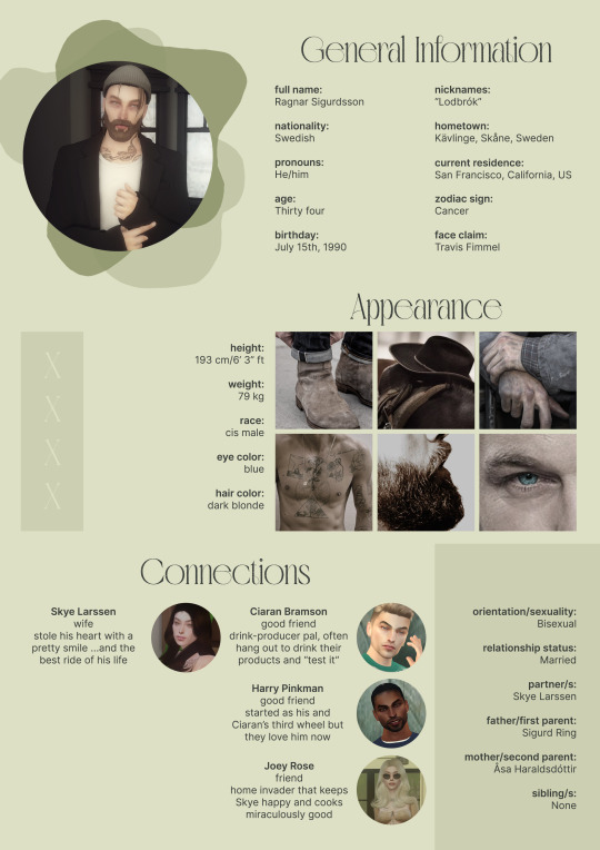
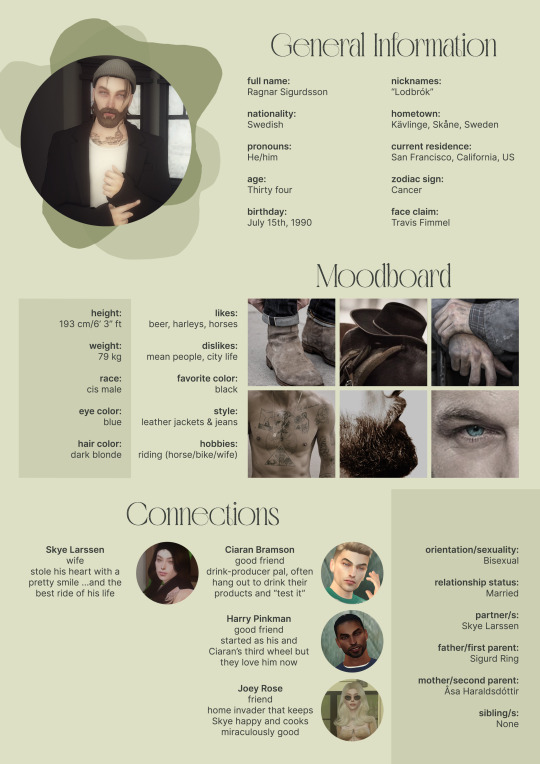
So uhm... I did a thing...
✨Character Info Template✨
UPDATE 11.24.24: this template now has a page theme version! if you're not a fan of templates, you can get the code to use it as an interactive multimuse page >here<
Been meaning to do this a long time ago (and actually started it but never finished it, lol) as a way to share some more information about my ocs without needing to use a custom page theme, but mostly because I haven't found any page theme that looks exactly as I want and allows this much customization.
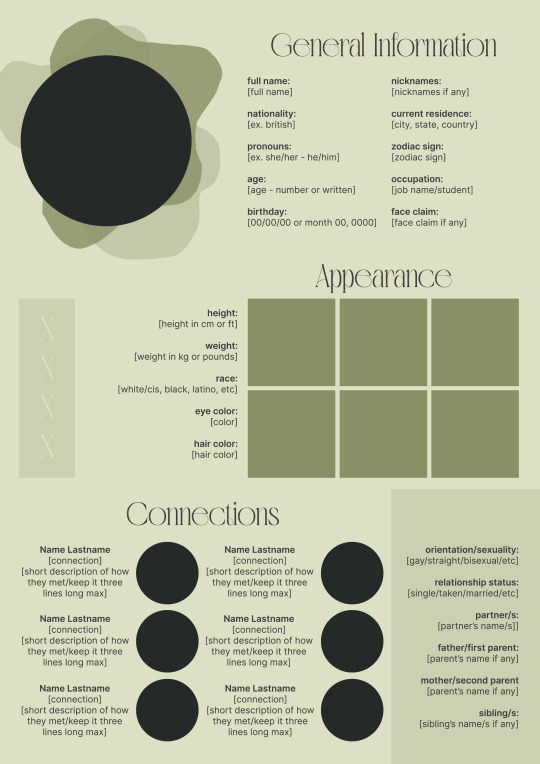
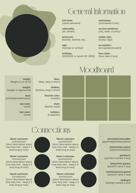
There are two versions and both are almost exactly the same; but the example shown in the left has an 'appearance' section which is small and has few quick facts regarding the oc's appearance; while the example on the right has a 'moodboard' section instead which allows you to add more info about your oc.
You can change every section/title to fit your needs like I did in the examples below; I personally removed some categories as well and got rid of some connections as this oc doesn't have that many close friends/partners to fill the original template. However, I also included an extra separated 'connections' section in the download in case you want to add more people and more information.
I recommend you stick to square-shaped pictures so it's easier to fit them to each section. Also if and when you edit the information or section titles, please select only one line at a time to replace it so you don't lose the text format. (Titles shouldn't change because that's a single format/font within the same text box, but should it change you can always hit ctrl+z hehe) When you're done, I strongly recommend you save this as a .png instead of .jpg so it's the best possible quality!
Last but not least, this is a .psd file. So you'll need either Photoshop (I did this with Photoshop Portable, but it supports newer versions of PS and it *should* support older versions too) or Photopea to open and edit this file.
Credits: Adobe Photoshop, Inter font, Golften Vintage font
>DOWNLOAD< (patreon but free :p)
(note: I'm posting this with my gaming blog because I think my fellow gamers might be interested in this, but please consider giving credits to me if you use this template by tagging @synindoodles instead of this blog)
More info on how to use and edit this template below the cut!
Layers:
>Each layer is properly named and categorized. The general layers such as the background, the icon shape and background shapes are under the groups.
>If you don't want to see/don't need one of the connections' pictures and information, I recommend you find which one it is (1, 2, 3, 4, 5 or 6) and click on the eye symbol next to the layer to hide it so that way if you ever need it, it won't be truly gone.
>To edit a text section, simply find the layer (such as General Information>Left Column) and double click on the 'T' symbol next to the layer. That way it will open edit mode and allow you to edit the text, just don't hit delete or enter while everything is selected or you'll erase it :p
>Main text sections aren't separated, they're blocks of text. I recommend you don't remove the amount (for example, if you downloaded the version with the 'appearance' section, which has 5 sections of information, don't remove the fifth line.) Either leave it empty or replace it with another data, otherwise it will look weird. The 'general information' section might look good even if you remove a few lines, just don't get rid of the whole block of text.
Pictures:
>To add a new picture, simply paste it over this document and move it using the Move Tool.
>To frame it (so it becomes a circle or fits over the shape you want), make sure the picture layer is over the layer you want, then while holding alt click between the two layers. [For example, if you want to add a new main oc picture: 1) paste the pic you want, 2) move it with the Move Tool so it's covering the big circle, 3) once you've fully covered the shape (if it isn't you can resize it by right clicking on it then on 'free transform', sometimes you might need to hold shift to proportionally resize it) make sure the newly pasted pic layer is over the layer named "picture goes here", 4) hold the alt key and hover your mouse cursor over the line between your pic layer and the circle layer until you see an arrow going down symbol, once you see it click it and tah dah! your picture should now have the same shape as the circle! - you can further move it if it doesn't fit the way you want with the Move Tool (;
Others:
>You can change every color, font and section to your liking, just don't change the general layout of the template.
>To hide/show the guides (those bright blue lines all over the document), click ctrl+,
>'Inter' is a free font and you can get it in the link above (linked with the credits), Golften Vintage is not, but you can get the demo version >here< (just scroll down and click the blue download button under license). I will not tell you how to install fonts as it might be different for everyone (for me it's C:/Windows/Fonts and I just drop the zipped files (except the .txt one) there), but google is your friend.
>I can't think of anything else that needs to be said here, but if you have any other question feel free to send me an ask or dm and I'll help you out!
>Last but not least, a like is appreciated if you plan to use this plus consider tagging @synindoodles if you use it <3
#psd template#template#characters page#muses page#muse page#muse template#character template#character page template#oc page#oc page template#synindoodles#rp resources#rp template#roleplay resources#roleplay template#writers resources#writing resources#writing template#writers template
206 notes
·
View notes
Text
Been thinking about Agent for a while and how he's really the character - character ever. I'm really enjoying what they're doing with his arc of survivors' guilt and vengeance.
His design is so extensively simple that it's a bit intimidating. Glued to his profession of business and fixated on his target, Chosen. He is as stern as he is anonymous as a person. And then it's with appeal that you note how he is in this position of authority between these new cast of animations - primarily the word of command and the follow up of Victim's line of leverage. With how gorgeous and elaborate the cast is, your eyes stay intrigued towards this one character. Despite the simplicity he pops up as unique.
It's rather how he's always the bold and center of the cast in every shot. Always held high with precision. He acts as the voice of control in the animations; a carrier. He has a strong passion for his ambitions. And then you get to his objective for Chosen, but with the longer the sequences carry on, it appears as more.. personal when referenced towards his role of precise profession. Especially in comparison to the rest of the group.
And of course; his abilities with the Adobe tools. He's fast, strategic, intelligential, and quite proud of his judgement. He pirouettes around combat with such ability - you can beg that he has much experience. All the animations have such uniqueness and natural abilities and quirks. And then you have Agent; who comes just as skilled in compliment despite the set of tools being just an add on towards his attire. His great combat makes up for the comparison. But with such a manner, why would Agent gain such a material, and how come him as this executive messenger and leader out of the cast? When factually compared to their abilities, he's left as the most.. uninspiring.
But then you get to the topic of his relationship with Victim, and suddenly the idea becomes much more clearer. Agent being this predecessor of delivery. How he is noticeably walking in the same accuracy as Victim; side by side. Everyone else but behind. And Victim allows it. He's moreso comfortable with Agent out of the entirety; directly giving him more flexibility, space, authority and commands. He trusts him and he treats him as though he's on the same level as him, because that's what he believes. Everyone else below their invisible barrier. Agent is very evident with what he's given. Hyperaware of his surroundings and with the implements and gear.
With such bounded delicacy it pushes scenarios and questions. Who is Agent without his occupation in mind, but as a person. What is he like? Or rather much, was he like? If you ask me, I think it's worth asking as much as it is cryptic in context.
And then it strikes you all too somber.
As a role of a security guard for Victim, Mitsi and their blooming business of quick and improved repairs - he's still so expressive. And surprising enough, he's so, so close towards the couple despite his working position. He truly admires and cares for the two. And it's mutually returned. It's so oddly affectionate when steaming from someone who you familiarize as so utterly closed off and precise.
These strange origins passed off as he's stranded - downright frozen in fear from the terrorism and murder of Mitsi and hundreds (if not thousands) of others. Only looking up when it's directed towards the source, Chosen. (From his perspective after all.) And despite being someone of a role who does nothing but help and protect; he's left so small and useless. All he can do is run.
Time and time again, memories replaying over and over again. It's this obsession. Everything that he could of done in a loop, everything that he didn't do lingering close by. And he won't be that same person who does nothing.
Even when it's not at all his fault. Far from it.
And then everything just.. clicks in a way, no? His odd relationship with Victim, Victim's utter trust in him, his personal introduction and conflict with Chosen, his strict combats, his weaponry?
When you think Agent would stem from a place of deep turmoil and lament and act out towards these, he proves you wrong. He's so utterly petty, cocky and a bit immoral when finally opposed to a scenario of karma. When you think he stepped an area of low, he goes lower. It's honestly quite humorous. In my opinion, Agent's greatest offense is Second.
Agent is relentless when it comes to irrational interference, it shows in how he handles Second. He has no basic compassion or regard for the poor kid, nor any sympathy to spare for him either. He's ruthless. There was no other reason to humiliate and tease Second the way he does other than it being for his own satisfaction after finding out Chosen cares for him. And it's quite sad even.

And then, really? The huge, intimidating terrorist who was the source of sleepless nights, trauma, destruction and such influence is an irrational, confused fraud. His hazard reaction brings some odd amusement towards Agent.
An evident narrative callback is how Agent looks up towards Chosen, frozen. Under his reign, he's powerless. And now when finally up against this source, he can only ever look down on him.
Sometimes I beg if Agent can bitterly empathize with Chosen. The only difference being how Chosen is strong willed and desensitized - willing to push bounds if it means he can protect a loved one. Something that Agent can reminisce with. Envy of the audacity, it really reeks. And he freezes him on spot; a bit similar to how he was that day. It doesn't feel good, now does it.
But at the same time he leaves it up for Victim. He really holds him valuable and prioritizes him. It wouldn't be much of a stretch to say it roots from a place of guilt of the downfall of the buisness, or Victim's utter change in demeanor, or the thousands of suffering animations from the tragedy. But I'm getting ahead of myself.


In this very small way, he's a bit like him.
#alan becker#animator vs animation#agent ava#chosen ava#he's so silly#really fond of agent ava#nerd voyage#and my interest spirals from a dude on twt#you captivated me NO#ava agent#ava chosen
36 notes
·
View notes
Note
We think fondly on the existence of Neopets. And we remember everything that has happened in Neopets' history as a website. And we remember it less fondly. And we mourn the death of Adobe Flash Player. And we mourn the death of child-friendly spaces on the internet. And we remember the "Quiggle" and feel warm. (tl;dr: quiggle review if you haven't already?)
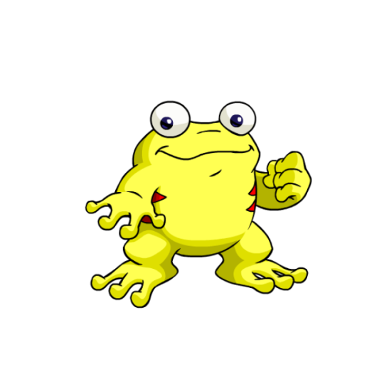
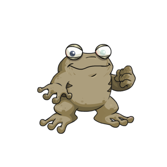
Quiggles are our other frog-based Neopet (the first being the Nimmo). However, they're basically opposites—Nimmos are very zen in nature and are long and lanky, while Quiggles are more stocky and considerably more outgoing and happy. While I like the vibes of the Nimmo more, I do think the Quiggle has the better design of the two.
Their bodies are simple, but it's compensated for a bit by two sets of stripes and tree frog-esq fingers and toes. The two eyes placed on top of the head are very frog like, and super cute when combined with their wide mouths—I feel like this makes Quiggles inherently appealing and likable, not to mention unique among other Neopets.
Their base colours are fine, though I don't know if I love the stripes always being red instead of being a complimentary color for each. Ultimately this doesn't matter much though, as most other colours change the stripe color or remove them all together.
I've heard some people say that customization ruined the Quiggle, but honestly, I don't see it. Sure, the loss of their overjoyed personality and more dynamic pose is a shame, but that's just how conversion works. To me, the design is still appealing, and it's pretty accurate to what it looked like pre-conversion—the only changes are the hands being a bit bigger and the hairs on their head being removed. I'm ambivalent towards the hands, but I like the hair removal considering that it's weird for a frog to have hair in the first place.
Favorite Colours:
Candy: A relatively recent release as of the time of writing, the candy Quiggle is based off of the classic Haribo frog gummies. Even if you don't recognize the type of candy, however, the design is still very cute—the body has a suitably gummy-like texture and the simple green color scheme with cream-colored underbelly instead of stripes looks lovely, and the entire thing also serves as a classic frog design that Quiggles were surprisingly lacking before now.
Robot Quiggle: The robot Quiggle is less fun-loving than a standard Quiggle, but I think it works. I absolutely love the lightbulb eyes and toes, and the simple dark green and yellow color palette looks great. I also think that it's neat the body segments line up with the stripes. The uncased version is also pretty neat, sporting a big heart monitor in the middle of the body. I like the cased version more, but both are enjoyable in their own right.
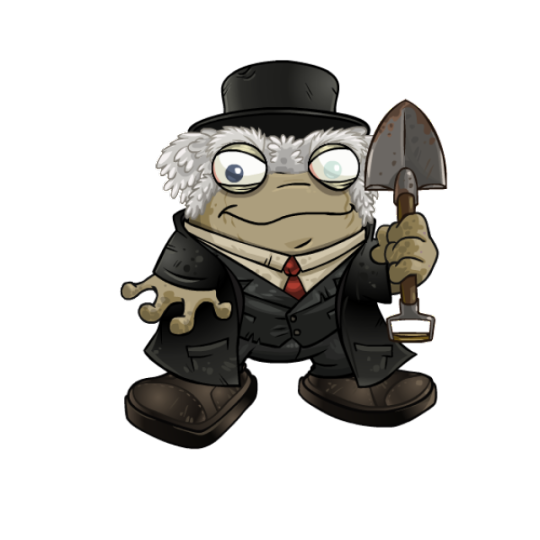
Halloween: I might be in the minority on this one, but I think the gravedigger look of the Halloween Quiggle works great and is very fun. Details like the dirt on the hands and shovel and the glossy eye, complete with eyelids, make for a unique take on the colour and work far better than you'd expect on such a silly pet. It also has a neutral brown base colour, which opens the door for other customization options.
BONUS: No review of Quiggles would be complete without talking about their species-specific Quiguki colour. I always like Quigukis better than Usukis (fight me), so a custom colour is welcome. However, I will say that the UC/styled versions are better for both of these—not only are the poses more energetic, but the hair on the Quiguki girl is enough to make one want to commit crimes.
Between the two, the Quiguki Boy has the better design, but looses points for looking like a Royal pet instead of a fashion doll. It also looses points because, while the Quiguki Girl is based on an actual item (the Beautiful Hair Quiguki Doll), the Quiguki Boy doesn't seem to be based on anything at all. Still, they're both fun regardless.
38 notes
·
View notes
Text
Texting it out down here cause in video would go by to fast. Also the video for the sketch layer didn't save so it picks up at me starting on Cross's face. Not too much missed, I only rough out some shapes and copy/paste them where I want them from frame to frame.
It takes me about 2 hours or so to make one of these. I'm using a mouse rather than a tablet so you'll notice my style is more like carving with lines rather than drawing.
I fill my background and put down a very rough sketch. I keep it rough mostly do to impatience. The line work does turn out better if I do a more detailed sketch but that doesn't matter. None of this matters.
Things I always do that I know to correct in my line work as I go: "That head too big! Always too big! Eyes too! Shrink erything."
I do the line art in a free program called ProMotion. It's for animation but I don't care, I'm looking for clean sharp lines and tools that let me copy/paste and instantly make brushes of pieces that I highlight. Its a pixel based program and I would normally use it to make sprites for my RPG maker games.
IMPORTANT STEP: ZOOM IN AND OUT OVER AND OVER AND OVER TILL YOU DONT CARE IF IT LOOKS RIGHT ANYMORE.
Then we take that line art and shove it into Photopea for coloring. This is another free program that's a clone of Adobe because I like photoshop tools but hate Adobe as a company with a fiery passion.
Yes I just kind of choose whatever color. I could make a reference sheet with saved colors but TRUST ME. I wont use it. I almost never use references, i forget, okay. Mostly drawing from memory.
Each color gets a layer essentially and then I "paint" them with the burn tool. (Midtones 20%) Cross's armor gets highlights on the ridges with the dodge tool. (Also Midtones 20%)
Add Blush to the skin! Thin points like face, shoulders, finger tips. Blur Blur Blur till it looks right.
Also, remember how I said I was looking for clean clean lines with no blur? That's cause I just clean up the "paint" by selecting with the magic wand and deleting it.
I make my backgrounds out of stock textures mostly. Though this usually takes a little bit more collage work this strip is simple so I just used the gritty/tech wall texture. Blur that bitch. (Gaussian Blur under the filter tab, whatever looks right but the default 7 pixels is usually good for the BG)
To add motion I copy the bits I want to seem like they're moving and use the "Motion Blur" filter, then I put that copied color over the background line art.
Add shadows! Under the coloring layers, that handy gaussian blur again.
Add Lighting! I usually have the overlayer set to "Soft Light" and then I use the gradient tool to filter everything to look cohesive. (You might notice I keep their skin tone pretty dark but it might look different when I change the lighting.)
Warp the action words... just...whatever feels appropriate at the time and set that layer to "Color Burn"
I just use the Oval select tool with the feather set between 3-5 pixels to make word bubbles. Paint it in voila. Add Text. All done!
Cross x Tahny: +A Summary+

My philosophy : Style matters more than skill and you should cheat and cut corners as much as possible. Peace and Love.
-++-++-++-++-++-++-++-++-++-++-++-++-++-++-++-++-++-++-++-
Tags:
@feral-ferrule @eobe @ghostymarni
#Time lapse#drawing time lapse#art time lapse#the bad batch#sw oc: tah'nyem ra#sw oc#tbb#crosshair x f!oc#drawing comics
34 notes
·
View notes
Note
Do you have any advice on how to format and print books? That’s my biggest obstacle in my work. What do you use to format them? What’s your favourite way to bind a booklet?
well if you're anything like me you're not going to like this but the answer is indesign. adobe is evil but unfortunately their products really do work. indesign is the only program i have EVER used that actually makes formatting easy, and in the newest version you actually don't even need to adjust for print formatting yourself because there's a setting that will auto format your pages into a booklet when you print. it allows you to adjust the page size, create style guides, manage really large files with a lot of links, and is just. generally convenient once you get past the initial learning curve. Honestly, if you're planning on going into any field even publishing-adjacent you should learn how to do at least a few different things in indesign, because it's the industry standard. learn how to lay text, insert images, create style guides, and format whatever it is you specifically are making, and you're golden. there are a lot of settings that can help you with your specific niche--for example, I have my version set to always display my pages in spreads unless otherwise specified because i'm almost always working with spreads in mind. I am NOT an adobe shill i SWEAR and i will admit indesign has a pretty steep learning curve (as do most adobe programs) but it really is worth it because once you understand it it makes everything SOOOO much easier.
#also arguably the most important thing to remember when formatting for a booklet is that your final page count MUST be divisible by 4!!#and that includes back and front covers and interiors so if you have a cover tack 4 pages onto your page count#truly the most annoying fact about book formatting. wdym i have 3 blank pages to fill suddenly#asks
47 notes
·
View notes
Text
Theory time :) Victim's kingdom
10 hours before AvA 11 cuz yeah
I've always wondered how someone like victim ended up with Rocket corp. I mean, we still don't know how he escaped death but I am for sure that once he did, his life was anything but normal.
We as humans, get an introduction to society and how it works. We learn as we grow that there's an economy, that there's people around us, that there's education and fabrics and companies.... But victim didn't, we don't know how much time he stayed dead, but probably it was more than enough time to impact in his knowledge and learning once he revived.
Victim was launched into the world without a guidance, without a family, without anything. Hell I could even say he didn't even know there was a thing to get or something else than nothing... He knew NOTHING
This is one of the reasons I like the farmer! victim theory a lot. Because it could explain how victim learnt about the world around him, that means that there would be a guidance for him... But yet, I still can't understand how he ended up with Rocket corp.
----
Limited creations
Animator vs Animation is a series about creation, animations fighting their creators and more. And for that fight to happen there needs to be a tool to connect both the animator's world and the animation's one. It isn't just the cursor but the cursor's capacities, and Agent shows that very well:

He has a tool bar that I relate to the Adobe Animate one. But I've realized that even with all of that he doesn't have a pencil nor a "free-hand" tool. Just straight shapes and lines... It's like the capacity to create but with a limit. A creation with a limit in its existence... Also looks so... machine made
All of the workers at Rocket (Agent too) are all made from these straight lines. And even if there weren't that many in AvA 9, it was showed a lot more in AvA 10. Because almost all of them were built like that.

I like to think this as a fact of how they were created (you'll see what I mean right after), they are creations but their creator had a limit of his capacity. They are alive but they don't have that freedom in their movements in comparison with Second's creations... A limited creation.

----
Victim's creation
I've seen that a lot of people relate Alan's stick figures with creation and destruction. Second being creation, Dark and Chosen destruction. And I kinda think victim is part of the creators because since his begining he has found ways to create and invent new methods of survival. He used the clones, he used a brush as a bow, he drew a lot of weapons and could almost defeat the animator just as the victim he was and is.
Yet, he still created something. And I see the fact that he used the brush very interesting because I thought: If these two tools work similar why can Second animate but victim cant.
The obvious answer is because of the lack of powers. And while that is true. I think that this capacity of creation of victim exists and could also create life but in a very limited way.

In victim's office we get a look at the brush tool and to an odd looking plant, almost as if it was drawn. Almost as if it was created by someone.
I don't know how outernet plants work, but let me tell you that I am more than sure that THAT plant was drawn by victim, maybe thanks to the brush tool. Victim can create, and even if his creation is different and cant bring things up to life (because that plant could just be a lifeless drawing of a plant that doesn't grow) he can bring things into existence just as he did with the brush tool first back in AvA 1.
----
Probably by now you know what I'm about to say. But I'll do it anyway.... Victim created Rocket corp literally.
All from its workers, Agent to the plant and to EVERYTHING. His company literally builds machines and studies Adobe tools related to creation and to the creator (animator).
Maybe victim's creation is weaker than Second's but he has one. And as I said, I see straight lines as a limited creation and it could mean that... These straight lines could not only mean this but I was thinking more of this:
As I said earlier, I see really really unlikely that someone who was launched into the world naked could build an empire all by himself, not only because he doesn't understant the world (because he could have learnt to understand it) but also because of where he cames and who he is. Who would listen to a random Hollowhead? And also, how would victim build such an empire in so little time, because victim died in 2006 and 18 years is just a little of time to do so much
So, without anyone who would listen to him, victim decided to create his listeners and his kingdom all by his own. If victim wanted to create this, he would need to be efficient and its so much easier to build something out of straight lines than free-drawn ones, this if we use machines, machines victim sells at the Corp. He could have used machines to build it all and to draw each one of them. And as he didn't have that kind of power of creation, he used the little one he had GREATLY enough to build it all...
Now, more stickmans:


-----
I MADE UP THIS PROMISE, HELL YEAH I DID ITTTT YESSSSSS.
IVE HAD THIS IS MY MIND FOR SOOO LONG BUT I COULD FIND THE TIME. And this is an old theory, but it was ssoooo bad written before, pleassse do well little post, do wellll
#alan becker#animator vs animation#animation vs minecraft#ava victim#ma' posts#theory time :)#Hell#it even makes sense cuz of the whole animator vs animation thing#creation created by a creation to battle his creator#woaaa
24 notes
·
View notes
Text

More Pokémon
More BH6
In the ongoing saga of Obake and Tadashi get Isekai’ed…happy April Fool’s!
Okay no seriously between my computer eating my save files for my emulator and Palworld basically doing everything PLA does but better I’ve...not touched PLA in a good year or so. ^^; Am finally feeling the need to get back to it, so hopefully by the time I finish the last two in my art backlog we’ll be caught up to where we were; even better, I was able to get an official copy with a coupon so hopefully no more doomed save files because WHY did you save in roaming app instead of on the external hard drive!?
Anywho...as with Nessla, Jormuntide gave me grief for the longest time in trying to catch it. Unlike Nessla, I was able to get this big boy. Definitely fun do go swimming to the Feybreak island with him, considering you can’t fly to that point without getting gunned down. D:
Anyway, hope your April Fool’s was enjoyable!
Find it on eclipse here, as always please be kind and reblog, not repost, thank you! :D
Pokémon © Game Freak; Nintendo
Palworld © 2024 PocketPair
Big Hero 6 © 2014 Disney
Done in Adobe Photoshop.
#bh6#big hero 6#big hero six#big hero 6 the series#big hero six the series#obake#tadashi#adobe photoshop#palworld#jormuntide#depresso#croajiro#pengullet#obake and tadashi get isekai'ed#I don't want to even think of how long it's been OTL#good news for Obake tho bazookas are baked into the palworld game so he's good XD
17 notes
·
View notes
Text
Tried Jailbreaking my Kindle Oasis...
And succeeded!
So, this video is making the rounds and I'm not surprised because it's really well done and the Kiki cover caught my attention immediately. Since Amazon removed the option to download the books we buy I'm always ready to give them the middle finger and decided to try.
youtube
In my case the Jailbreak was a success like I said before and I'm loving KOReader (which is what I'm using now to organize and read my books). The video is simple but I did find a few bumps in the road for my device so I decided to share a few things in case anyone else wants to do this.
I have a Kindle Oasis (2019 Ver.) with the latest Firmware which for this model is 5.17.1. Please beware the updated pinned comment on the video and the warning on the Kindle Modding Wiki "Mesquio does NOT work on firmware 5.18.1 and beyond" (at least for now).
My device did update while I was trying to Jailbreak it but (I guess) due to the Oasis model being discontinued I didn't get the 5.18.1 firmware, so I was able to go ahead.
This is the wiki that explains step by step and with images how to Jailbreak the kindle and how to install KOReader. Everything is there, just read carefully. You can find your kindle serial number on the "device info" settings.
Even with careful reading I downloaded the wrong KOreader version the first time lol, is not the end of the world.
When you go to the page to get the KOReader files, if you have the same Kindle Oasis as me you need to scroll down till "Assets", click "show all assets" and then download this one "koreader-kindlehf-v2025.04.zip".
If the Installation of the jailbreak seems to not be progressing at some point you probably have to turn off airplane mode at that stage (this seems obvious but this part of the tutorial was a bit confusing on the wiki, at least for me).
The video says that the process takes 10 min, but being honest it took me around 40 because of some mistakes on my part and I spent like 5 hours just deciding what pictures I wanted for the screensavers, so depending on how tech savvy (and obsessive) you are try to set more time aside for this just in case (I spent a big part of my Saturday doing this and it kept me busy while sick in bed with a cold so this was a welcomed entertainment).
To create my covers exactly how I wanted them (filling the entire screen or at the center) I used Photopea (is like photoshop but online, it has ads on the side but in my case I don't care, they need money somehow and I refuse to use Adobe products).
I created a new file with the Kindle Oasis resolution (1680 x 1264px and 300 DPI) and then just pasted the images I wanted there, resized and moved till I was content, and saved them as Jpegs on a folder called "ScreenSavers".
This folder can then be dragged to the kindle when is connected to a computer and KOReader will be able to use it as source for the sleep screen images. This was the result:


Now, I've seen some comments about KOReader not being aesthetically pleasing but I think it comes from the first look we get from it since all the folders there look like this:

KOreader is extremely customizable though, so I just created a folder called "Home" and chose it as the default Home folder. Now every time I click the Home button it takes me to my "Library".

You can display the books in lists, grids, etc., and customize basically all the info you want them to show (or not), how many books appear pear page, if you want to order them by series, author, etc.
You can also create collections.
Honestly, the amount of customization is endless (I was playing with all the menus for a few hours, but now everything is as I wanted it and I can just read and relax).
One thing I love is that you can look up terms or phrases from a book on Wikipedia and they come with images + you can download the Wikipedia articles to read offline later as an epub.

You can also customize what info appears on the cover screen (or remove this). In my case some book names are too long and make a double line so I decided to show just the % I've read on my latest book and the battery.


You have to write the words "read" and "left" yourself, or any text you want to add. The text for what my cover is displaying looks like this:

The progress bar is also fully customizable and you can choose what to display and in what order:

There's a LOT you can do with KOReader in terms of spacing, styling, fonts, etc. Stefan Svartling has many YouTube videos showing what's possible.
Now, how do I get my books into this thing? KOReader can connect with calibre so you can wirelessly send all your books to the Kindle or connect the device to a computer with a cable and drag the books.
Where do I buy books? Calibre comes with a "Get Books" function that allows you to search from different vendors or in the case of Public Domain books it lets you fetch them from places like Project Gutenberg for free.
In my case, I'm getting new books mostly from ebooks.com, they tend to be cheaper there than on Amazon. For example, Howl's Moving Castle by Diana Wynne is 5,49€ on ebooks.com and 10.67€ on Amazon.
Please be aware, a lot of e-books are now sold encrypted with Digital rights management (DRM). This means you can only open them in certain devices and can't copy them to others. You can add plugins to remove the DRM and then send them to KOReader, but this is illegal in some countries, so always check what's the copyright law were you live.
ebooks.com has a DRM-Free (legal) category, so you can search if the book you are looking for is there.
Pros of Jailbreaking the Kindle:
All things mentioned above.
You can still access the Amazon books you had if you exit the KOReader interface.
If something goes a bit wrong you can factory reset the Kindle and it will be practically brand new, then you can re-download your books from your Amazon account.
Cons of Jailbreaking the Kindle:
It doesn't work right now on new devices with the latest firmware.
You void the warranty.
If something goes extremely wrong you could brick the device.
You could get malware if you download resources from untrustworthy websites.
If you have any questions feel free to ask!
#Jailbreak Kindle#Jailbreak Amazon Kindle#KOReader#Amazon#Kindle#resources#Amazon Kindle#Amazon Kindle Oasis#Kindle Oasis#Calibre#e-books#e-reader#Youtube#Jailbreak#Jailbreaking
11 notes
·
View notes
Text
Some (Free) Writing Resources I Use
I've noticed that half the writing resources I see recommended are usually pretty limited without paying, so allow me to list off some of the completely free ones I've used throughout the years:
Azgaar's Fantasy Map Generator
Literally amazing for creating maps, it's so detailed and has a wide variety of options. I made the map for my book using it by modifying one of its randomly-generated templates. You definitely don't have to be an artist to use it but I did personally add little details to mine via hand later. Nevertheless, highly recommend.
Scribus
If you're formatting your own book, Scribus is basically the free version of Adobe InDesign. It has a bit more of a learning curve and doesn't have all of InDesign's capabilities, but it's just perfect for book formatting. I formatted three whole books on it by myself and they came out great. You've just gotta have a bit of patience until you get used to it.
Fantasy Name Generators
Ok yeah, this seems obvious since it's a very well-known website. I often use it as inspiration without directly taking names from it (since the names I put into my books almost always bear some sort of meaning), but then I looked at the sheer number of categories and HOLY MOLY. It may be called Fantasy Name Generators but you'll find names for everything there.
PureWriter
Well, this is awkward, because this writing program actually has a premium version so it's not completely free... Should I feel like a hypocrite? Maybe, but I think the free version is more than enough for most writers. It's on mobile and PC; mind you, I've only ever used the mobile version, but I'm really satisfied with it. Even without Premium there are no ads, the formatting options are a delight, and it's just really handy for writing on the go (because Google Docs and Word are atrocious for writing on mobile, fight me on this). Anyway, very neat program.
WordHippo
By far my favourite online dictionary (aside from the more 'professional' ones like Cambridge) because it provides you with quite a lot of options: from synonyms and antonyms to words that rhyme with the word you've put in! As someone whose books include some lore-important poetry here and there, it's been a real lifesaver whenever I find myself stuck.
HeightComparison
So... this may seem weird. It's a really small detail, but since I am also an artist who depicts her characters, I think that knowing your characters' heights (especially in comparison to one another) can really help with writing all kinds of interractions. Like the classic "someone stands on their tiptoes for a kiss" or "this person has to duck when passing through a doorway". I used it to measure my characters' sizes compared to a building and then used that information to determine the size of another being that appears in the books. Pretty fun stuff.
Anyway, that's all. Speaking of free resources, I recently discovered Carrd and it's pretty neat for making a simple site to display your books. Check it out! :)
Toodles <3
20 notes
·
View notes
Text
Watching a video essay, basically dealing with the whole curse of "for-profit" software in the creative zone of things, and it's got a section on Flash. The creator made a comment near the end of the section that really resonated with me about how, when Flash got "killed" by Adobe, a lot of animators never really found anything else that worked as well for them, so they just... stopped.
That was me.
I brute force learned how to properly animate in Flash. It wasn't great, but I did manage to make a full 3min narrative animation back in high school (it was my final project for film class) (I had to teach myself everything). And I enjoyed it, to a degree. I mean, sure, I can't listen to the background music I used for it anymore, because I heard it millions of times as I edited, but overall I was proud of what I made. I would've happily gone on to learn more, to better get a grasp on it.
But that was also when Flash got bought by Adobe. Outside of other things in my life, that kind of helped put the nail in the coffin. If I didn't have Flash, then I... didn't really have any means to keep going. So I stopped.
I didn't pick animation or fiddling with it at all back up until 20yrs later when I recently learned how to do animate in Clip Studio.
I know Adobe "resurrected" Flash as "Adobe Animate", but honestly? I feel like it's too little too late. Hilariously, that's the main program the 2D Animation class I was taking used, so it was all stuff that was very familiar to me, but I took the hard road of CSP instead because I, quite simply, didn't want to pay for the subscription. I already have a perpetual license for CSP. I'm not shelling out any more than I have to towards Adobe.
There's no real point to this story time other than to go, "Yeah, they're right -- killing that program killed a lot of creative potential". I hate that in the digital realm, we're kind of beholden to whoever developed the software tools we used. I say "kind of", because there is always piracy, and "dupes" of programs, but at the end of the day, I feel like the point kind of still stands? Especially professionally.
I hate the stranglehold Adobe has on everything so so so much.
8 notes
·
View notes