#Although it did add in a background color regardless
Explore tagged Tumblr posts
Text
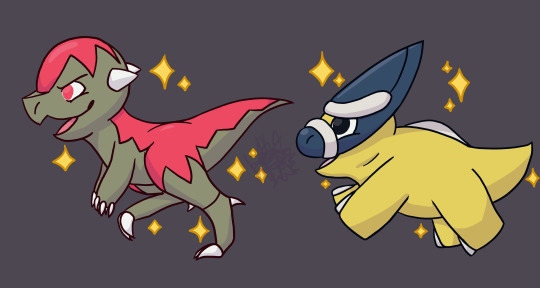
Making an art sacrifice to appease the RNG Gods so they'll finally let me leave the Coronet Highlands.
#Some Kinda Nonsense#Pokemon#PLA#Cranidos#Shieldon#Shiny Pokemon#Shiny Pokemon art#Context: I am going for a shiny Living Dex in PLA#And I procrastinated on hunting space-time distortion shinies#Which was a Bad Plan but also understandable because I am suffering#I don't want to leave the Highlands until I can cross the fossils off my list for good#But it's been Literally Hundreds Of Hours#And I still need one of each#So many dupes#So many blue shards#I can't even get any Eevee progress for my trouble#It's Drapion and Dusclops and Magmar all the way down#And then I still gotta hunt this way in like three other places....#Also Art Shield doesn't like transparent backgrounds for some reason???#Or it didn't like the sparkles#I used the Krita default brush at first and it chewed them up#And then the outlines for the ones I drew still came out wonky without a background??#Even though the Pokemon were fine#Although it did add in a background color regardless#So.... maybe no transparancy for a bit?? I dunno
53 notes
·
View notes
Note
hiii i just saw your ryuseitai phone theme and it’s so cool!! can you make a tutorial of how you did it?
hi !!!! id love to! im so glad you liked my ryuseitai theme! :3
first step: this widget app (widgetopia), or any other of choice. i used this to make the little square widgets as well as the countdown timer labeled LIBERATION (which is actually my graduation date)
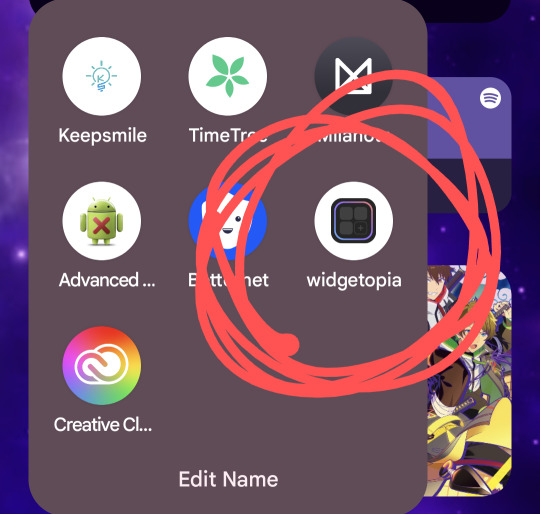
in addition, i would recommend having some kind of drawing app / image editing program on hand in case you want some custom graphics like my lock screen / wallpaper! ibisPaint X is my app of choice, as its free and has a pretty simple interface, but any programs will reasonably work!

keep in mind both of these programs have ads and paid versions but you dont need to pay for anything for this!
also i dont have progress pictures so. bear with me lol.
for the small square widgets, youre going to want to go to the LIBRARY panel and hit +SMALL.

this will open the NEW WIDGET menu! from here, youre going to want to hit NEW WIDGET (should show up as a tealy green button), which brings up this menu

from here, you can set various things, such as making the background of the widget transparent, making it a specific color, or setting it to send you to a website via an embedded link if you please!
for this tutorial we'll just make a basic regular widget with a picture on it :3
on this screen, hit the PLUS icon, and choose the option that says IMAGE. choose the image you want, and voila! its there!
although...
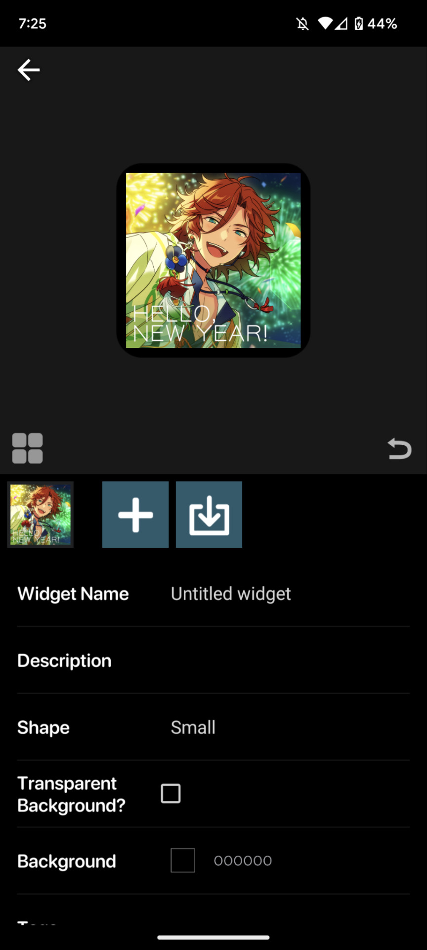
the borders are an issue. youre going to want to resize your image! this is a part of the process regardless of the image's original size.
click on the image to open the image property menu! here you'll find a ton of options for moving the image around, and edit it! here you can add some extra flair such as a slight rotation or tint, or you can set it to have an action when you tap on it! i wont get into that in this, but its neat to take a look at on your own!

make sure the chain icon between width and height is LINKED, and then increase the size! this is just a matter of eyeballing it based on your image, and will result in corners being cut off, so avoid having important bits of the image in the very corner! when youre done, you should be able to see rounded corners INSIDE the image's bounding box! this means that your image is as large or larger than than the widget, meaning that no weird borders will show!

from here, you can hit the back button, and then the purple ADD WIDGET button to put it on your homescreen!
note: if youre editing an already made widget of the same size, you do not need to press ADD WIDGET, as it will result in having two of the same widget on your screen!
from here, itll look something like this!

if you ever want to change the widget image, you can just click on it (if you have multiple, click on the specific one you want to replace), and go through this process again!
as for the lock and home screen backgrounds, thats more tedious. i recommend a 9:16 aspect ratio for phone screens, but other than that theres not many tips i can give you in the design sector of things, sorry 😔
one tip i can give is that if you dont want your home screen image to shift when youre swiping between screens, go into google photos, and zoom in on the image! make sure its cropped the way you want it to by the borders of your own device, get the UI out of the way (done easily by tapping once on the image), and take a screenshot, that way there wont be any buffer room on the sides for it to shift!
---
anyways, i hope this helps! i absolutely advocate for playing with some of the more advanced options on your own, as its super fun to learn new modes of phone customization! if anyone makes any themes with help from this tutorial, feel free to tag me in the comments! id love to see your work! :3
16 notes
·
View notes
Text
Commission Details
I apologize to those whom have expressed interest a while back as I have only gotten around to this just now. The point of my cheap commissions, which goes up to $5, is to simply create a barrier to entry as I get too many art requests as it is and it’s tough for me having to choose one over the other. Therefore, the expectation here is that my commissions are to be treated as art requests for the most part, but I will still have certain commitments to the commissioner. With that said, I will go over the details below:
PRICING AND PAYMENT
Each commission will be fully colored and shaded and will include a background by default. The pricing will be as follows:
$3 for one character regardless of the content.
$5 for two characters regardless of the content.
Payment is to be made via Paypal. I will provide you my Paypal info when I request for the full payment. I will only request for payment when the artwork is complete and I will send you a photo of the artwork as proof it is complete. I will send you the digital version of the image at its original resolution in png format once payment is received. You may request for a different resolution or image format if you like. I feel this is fair as I have nothing to gain from withholding the digital image from you after receiving payment.
RULES AND EXPECTATIONS
1. No intricate designs like really complex tattoos.
2. I will draw weapons but I will let you know if I feel they are too complicated.
3. I will probably not draw vehicles and things of that nature but it depends.
4. I will not include text in the image by default, but let me know if you want text or dialogue in the image.
5. Up to two characters only, no exceptions.
6. Let me know which character(s) you want me to draw and provide visual references. I prefer references that are drawings as they are easier for me to interpret. This part should naturally include what outfit and accessories the character(s) is going to be wearing.
7. Aside from letting me know which character(s) you want, the rest will be up to my discretion although I am open to suggestions. These include the following:
Half to full body. The character(s) will be drawn with around half of their body (upper body) within the canvas at minimum. This means that even if body parts are hidden due to factors like foreshortening, those body parts are still considered to be within the canvas. If you request for something less like a portrait, then I’m most likely willing to do it.
Pose. I will most likely ask for your input to get ideas, but please know that I will ultimately decide on a pose I want to draw.
Background. It will range from abstract to something closer to a landscape. I will not do complicated backgrounds in order to save time. I will always do abstract at minimum unless you request for a blank (white) or solid color background. Please keep these things in mind if you make a suggestion.
8. If you are looking for NSFW content then we should discuss on a different platform as I have limitations and there are certain things I will not do.
9. Please give me up to two months to finish your commission as I have other obligations.
10. I can cancel the commission at any time since I did not collect payment yet. However, I will try to give you advance warning and provide an explanation.
11. Should you cancel the commission at any point, please understand that I may opt to post the artwork as it is and probably add a big watermark. I will not name you as the commissioner and I will only stipulate that the commission is unfinished.
COMMITMENTS
Here are my commitments to you that I normally would not provide for an art request:
1. I will provide a photo as a progress shot for the linework phase, the coloring phase, the shading phase, and the complete artwork.
2. I am willing to do adjustments/corrections during each phase, especially during the linework phase. However, I do not expect there to be many requests to adjust/correct minor details (e.g. the hair bang is slightly too short, please make it reach the eyes). If I feel there has been too much back-and-forth then we will need to discuss further and determine if it is still worth it to proceed with the commission.
3. I will answer your requests for progress updates, although I would ask if you could please keep it to a weekly interval or longer.
THE END
Thank you for reading. Please message me if you are interested and I will let you know if there is a queue. I may also modify this post as I start working on commissions.
8 notes
·
View notes
Text
I recently worked on a commission for a good friend of mine, she wanted a reference for a glass painting she’s going to make for her cousin and wanted me to draw it, since I’m good with dragons and all.
She wanted the two new dragons from Tears of the Kingdom.

Sure, it’s just the lineart and the background was done separately, but it was a fun drawing to make! I loved the process and the designs are so cool (although Ganon did give me a bit of trouble with so many horns).
Regardless, I had a lot of fun drawing this, maybe I’ll add colors too eventually, just because, but uh… only if I feel like it.
#loz zelda#tears of the kingdom#loz totk#art#my art#fanart#commission#totk spoilers#zelda#totk ganondorf#totk zelda#dragon
6 notes
·
View notes
Text
April 23, 2024 Ask the Team Q&A
Below the cut you can find all of the questions and answers from the ask the team Q&A:
Q: Will we be able to have multiple save files? If so when you adjust settings in one save file will it automatically transfer to all of your other saves? Or can we set our settings per save? A: Game saves and the file that save the settings are separate. Your settings are preserved from new game to new game. You can have multiple save files.
Q: What are the construction sites we've seen in some of the videos? Will there be a construction career at the games early access launch on June 4th? A: The construction sites are placeholders for lots we intend to add during our Early Access period - for example, a 'School' lot.
Q: Hello! It's great that there are gender and pronoun options, but why has the game has opted for "female" and "male" body types rather than just one with sliders? I was hoping to be able to recreate a character of mine who is intersex, but I'm worried this won't be properly possible and I'll instead have to "choose" a binary sex for them anyway in the game A: In development, we trialed both a single body model and a 2-model masculine + feminine framework. We found that with one unified body type we couldn't make some variations look as good such as very curvy or larger frames. There was also too much stretching or distortion on clothing . However with the 2-model framework, you can easily make more gender neutral version from either model. We did try to separate gender from the body frame. We are currently working on separating genitals from the base models, but I won't be able to give you more details on when that option will be available right now.
Q: What do the colors in the traits represent? We’ve seen Green, orange, pink, and yellow A: You can read about this blog post: https://www.paradoxinteractive.com/games/life-by-you/blog/life-update-traits-deep-dive "The color-coding indicates the subcategory of Personality the trait falls under, which is keyed off of the trait’s tags so you’ve got that part correct! We decided to limit characters to 2 slots per subcategory, except for Likes/Dislikes which allows 5 each. This is to avoid what we’ve been calling “Trait Soup”, where too many conflicting Interaction Script Wrappers causes the character to behave and react as though it were doing so completely at random."
Q: Considering you're more marketing, have you noticed a particular platform giving better reception and/or better voiced opinions. And as a general note without naming names, have any creators declined? A: someone has done their homework on my background @ Rob1992 - i do have to say that in what i'm seeing (regardless of platforms), the deeper a player's familiarity with the life-sim genre, the greater their appreciation and understanding of the deep + rich gameplay that we're building in Life by You.
Q: 1. There's a social media app (Social Feed) in LBY and that's how news get spread around the world. Can we post rumours/gossip on there too? Can they be false? 2. Do things posted in Social Feed affect our relationships with characters we know and don't know? 3. What features most likely won't be ready for Early Access release, but will be one of the first things to get added/changed/improved in Early Access? A: [Answer to your 3rd question:] Our first priority will be fixing new bugs uncovered and addressing any immediate customer requests. After that we have a long list of items we will be adding during Early Access although we are trying to be as flexible as we can to make sure we serve players' needs. We will provide a high-level development roadmap closer to early access. Naturally fleshing out and unlocking the remaining life stages is a high priority.
Q: What will "observables" look like in action? Does this mean characters remember what they witness and be able to react to it or talk about it later? It doesn't seem like we've seen this in any videos yet although it has been talked about by Rod in interviews, so can we expect this feature to be part of the game at the release of early access? If so, will we get to see it in a video soon? A: Observables are remembered and can be shared as social information via our gossip system. Humans can also have an emotional reaction to an observable or even gain a little but of skill level from observing an activity such as watching someone cook. We will have some gossip content in the game at Early Access launch, but this is a system we plan to expand on greatly with new content throughout the Early Access period. Observables are fun because - like many of our systems - all humans in the world can collect and react to them.
Q: One of my main question was asked that Rocio said she'd look into 🙂 yesterday about would we be able to build worlds in Unity engine them port them into the game? Outside of that, I'm curious if there's a medical system planned that could link to hospitals in the future? A: [Answering your 'build worlds in Unity engine' question:] The answer is probably not right now. However you can use Unity to create the content bundles to add customized models to the game for objects and character customizations. So you can add things one by one via our modding system and use them to build out the world in game and then share that region with others.
Q: When will we get a peak at the website to share mods? A: You will be able to share mods via the Paradox Mods site. As well as being able to download the assets and put them directly in a local directory if you are getting your mods from another source. The site is https://mods.paradoxplaza.com/ and the Life by You page will be up with our Early Acces launch - and it will be populated with some mods made by some Creators who have been given access ahead of launch.
Q: Will the game be adding more customization for male characters like body hair and Adams apples? So far there is so many ways to make female characters feminine like hair makeup even purses not seeing the same love going to men to make masculine male characters A: Great question & feedback @ Lance - body hair is high on the team's internal wish list as well. We won't have it at the launch of our Early Access but we are investigating it.
0 notes
Text
“Thirteen″ Tips for Writing About Synagogues / Jewish Writing Advice / Advice for Visiting Synagogues
So your story includes a Jew (or two) and you’ve a got a scene in a synagogue. Maybe there’s a bar mitzvah, maybe your gentile protagonist is visiting their partner’s synagogue. Maybe there’s a wedding or a community meeting being held there. For whatever reason, you want a scene in a shul. I’m here as your friendly (virtual) neighborhood Jewish professional to help you not sound like a gentile who thinks a synagogue is just a church with a Star of David instead of a cross.
Quick note: The are lots of synagogues around the world, with different specific cultural, local, and denominational practices. The Jewish community is made up of roughly 14 million people worldwide with all sorts of backgrounds, practices, life circumstances, and beliefs. I’m just one American Jew, but I’ve had exposure to Jewishness in many forms after living in 3.5 states (at several different population densities/layouts), attending Jewish day school and youth groups, doing Jewish college stuff, and landing a job at a Jewish non-profit. I’m speaking specifically in an American or Americanish context, though some of this will apply elsewhere as well. I’m also writing from the view of Before Times when gatherings and food and human contact was okay.
Bear in mind as well, in this discussion, the sliding scale of traditional observance to secular/liberal observance in modern denominations: Ultraorthodox (strict tradition), Modern Orthodox (Jewish law matters but we live in a modern world), Conservative (no relation to conservative politics, brands itself middle ground Judaism), Reconstructionist (start with Jewish law and then drop/add bits to choose your own adventure), and Reform (true build your own adventure, start at basically zero and incorporate only as you actively choose).
Synagogue = shul = temple. Mikvah (ritual bath) is its own thing and usually not attached to the shul. Jewish cemeteries are also typically nowhere near the shul, because dead bodies are considered impure.
A Bar/Bat/Bnai Mitzvah is the Jewish coming of age ceremony. Bar (“son”) for boys at 13+, Bat (“daughter”) at 12+, and Bnai (“children”) for multiples (i.e. twins/triplets/siblings) or non-binary kids (although the use of the phrase “Bnai Mitzvah” this way is pretty new). 12/13 is the minimum, 12-14 the norm but very Reform will sometimes allow 11 and anybody above 12/13 can have theirs. Probably a dedicated post for another time. Generally, however, the following will happen: the kid will lead some parts of services, read from and/or carry the Torah, and make a couple of speeches.
Attire: think Sunday Best (in this case Saturday), not come as you are. Even at very liberal reconstructionist/reform synagogues you wouldn’t show up in jeans and a t-shirt or work overalls. Unless they are seriously disconnected from their culture, your Jewish character is not coming to Saturday morning services in sneakers and jeans (their gentile guest, however, might come too casual and that’d be awkward). 1a. The more traditional the denomination, the more modest the attire. Outside of orthodoxy woman may wear pants, but dresses/skirts are more common. Tights for anything above knee common for Conservative/Reform/Recon, common for even below knee for orthodox shuls. Men will typically be wearing suits or close to it, except in very Reform spaces. 1b. Really, think business casual or nice dinner is the level of dressiness here for regular services. Some minor holidays or smaller events more casual is fine. Social events and classes casual is fine too. 1c. Even in reform synagogues, modesty is a thing. Get to the knee or close to it. No shoulders (this an obsession in many Jewish religious spaces for whatever reason), midriffs, or excessive cleavage (as I imagine to be the norm in most houses of worship).
Gendered clothing: 3a. Men and boys wear kippahs (alt kippot, yarmulkes) in synagogues, regardless of whether they’re Jewish or not out of respect to the space. Outside of Jewish spaces it’s saying “I’m a Jew” but inside of Jewish spaces it’s saying “I’m a Jew or a gentile dude who respects the Jewish space.” Outside of very Reform shuls, it’s a major faux pass to be a dude not wearing one. 3b. There are little buckets of loaner kippahs if you don’t bring your own and commemorative kippahs are given away at events (bar mitzvah, weddings). Your Jewish dude character not bringing or grabbing one is basically shouting “I’m new here.” 3c. Women are permitted to wear kippahs, but the adoption of a the traditionally masculine accessory will likely be interpreted by other Jews as LGBTQ+ presentation, intense feminism, and/or intense but nontraditional devoutness. Nobody will clutch their pearls (outside of ultraorthodoxy) but your character is sending a message. 3d. Tefillin are leather boxes and wrappings with prayers inside them that some Jewish men wrap around their arms (no under bar mitzvah or gentiles). Like with the kippah, a woman doing this is sending a message of feminism and/or nontraditional religious fervor. 3e. Additionally, prayer shawls, known as tallit, are encouraged/lightly expected of Jewish males (over 13) but not as much as Kippahs are. It is more common to have a personal set of tallit than tefillin. Blue and white is traditional, but they come in all sorts of fun colors and patterns now. Mine is purple and pink. It is much more common for women to have tallit and carries much fewer implications about their relationship to Judaism than wearing a kippah does. 3f. Married woman usually cover their hair in synagogues. Orthodox women will have wigs or full hair covers, but most Jewish woman will put a token scarf or doily on their head in the synagogue that doesn’t actually cover their hair. The shul will also have a doily loaner bucket.
Jewish services are long (like 3-4 hours on a Saturday morning), but most people don’t get there until about the 1-1.5 hour mark. Your disconnected Jewish character or their gentile partner might not know that though.
Although an active and traditional synagogue will have brief prayers three times every day, Torah services thrice a week, holiday programming, and weekly Friday night and Saturday morning services, the latter is the thing your Jewish character is most likely attending on the reg. A typical Saturday morning service will start with Shacharit (morning prayers) at 8:30-9, your genre savvy not-rabbi not-Bnai mitzvah kid Jewish character will get there around 9:30-10:15. 10:15-10:30 is the Torah service, which is followed by additional prayers. Depending on the day of the Jewish year (holidays, first day of new month, special shabbats), they’ll be done by 12:30 or 1 p.m. Usually. After that is the oneg, a communal meal. Onegs start with wine and challah, and commence with a full meal. No waiting 4-8 hours to have a covered-dish supper after services. The oneg, outside of very, very, very Reform spaces will be kosher meat or kosher dairy.
To conduct certain prayers (including the mourner’s prayers and the Torah service) you need a Minyan, which at least 10 Jewish “adults” must be present, defined as post Bar/Bat/Bnai Mitzvah. In Conservative/Reform/Recon, men and women are counted equally. In Ultraorthodox women are not counted. In Modern Orthodox it depends on the congregation, and some congregations will hold women’s-only services as well with at least ten “adult” Jewish women present.
In Conservative and Orthodox shuls, very little English is used outside of speeches and sermons. Prayers are in Hebrew, which many Jews can read the script of but not understand. Transliterations are also a thing. In Reform synagogues, there’s heavy reliance on the lingua franca (usually English in American congregations). Reconstructionist really varies, but is generally more Hebrew-based than Reform.
We’re a very inquisitive people. If your character is new to the synagogue, there will be lots of questions at the post-services oneg (meal, typically brunch/lunch). Are you new in town? Have you been here before? Where did you come from? Are you related to my friend from there? How was parking? Do you know my cousin? Are you single? What is your mother’s name? What do you think of the oneg - was there enough cream cheese? What summer camp did you go to? Can you read Hebrew? Have you joined? A disconnected Jew or gentile might find it overwhelming, but many connected Jews who are used to it would be like “home sweet chaos” because it’s OUR chaos.
In Orthodox synagogues, men and women have separate seating sections. There may be a balcony or back section, or there may be a divider known as a mechitzah in the middle. Children under 12/13 are permitted on either side, but over 12/13 folks have to stay one section or the other. Yes, this is a problem/challenge for trans and nonbinary Jews. Mechitzahs are not a thing outside of orthodoxy. Some older Conservative synagogues will have women’s sections, but no longer expect or enforce this arrangement.
Money. Is. Not. Handled. On. Shabbat. Or. Holidays. Especially. Not. In. The. Synagogue. Seriously, nothing says “goy writing Jews” more than a collection plate in shul. No money plate, no checks being passed around, even over calls for money (as opposed to just talking about all the great stuff they do and upcoming projects) are tacky and forbidden on Shabbat. Synagogues rely on donations and dues, and will solicit from members, but don’t outright request money on holidays and Shabbat.
Outside of Reform and very nontraditional Conservative spaces, no instruments on Shabbat or holidays. No clapping either. Same goes for phones, cameras, and other electronics outside of microphones (which aren’t permitted in Orthodox services either). 11a. In the now-times an increasing number of shuls have set up cameras ahead of time pre-programmed to record, so they don’t have to actively “make fire” which is “work” (this is the relevant commandment/mitzvah) on Shabbat, so services can be live-streamed. 11b. After someone has completed an honor (reading from the Torah, carrying the Torah, opening the ark, etc), the appropriate response is a handshake after and the words “Yasher Koach” (again, Before-Times).
Jewish services involve a lot of movement. Get up, sit down. Look behind you, look in front of you. Twist left, twist right. A disconnected Jew or gentile visitor would be best off just trying to follow along with what an exchange student we had once termed “Jewish choreography.” Some prayers are standing prayers (if able), some are sitting prayers. It’s just how it is, although a handful of prayers have variations on who stands.
#jumlbr#jewblr#jewish#jewish writing help#jewish writing#jewish characters#writing jewish characters#jewish representation#writing advice#writeblr#writing jewish spaces#how to write synagogues#another long one sorry not sorry
233 notes
·
View notes
Text
LGBTQ Game Review - A Summer’s End – Hong Kong 1986
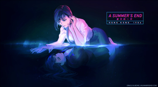
Before diving into the meat of Oracle and Bone’s A Summer’s End, I want to talk about the women behind this game Tida Kietsungden, and Charissa So. So and Kietsungden have done nothing but impress me since the announcement of A Summer’s End. They have repeatedly demonstrated their immense effort and dedication to creating a beautiful and thoughtful experience. Through conversations with the studio and reading their blog entries, I gained a remarkable understanding of how this game is both a tribute to classic cinema and a love letter to the Yuri and LGBT community. Through careful research and thoughtful expression, the two women navigate and acknowledge complicated issues, including Asian LGBTQ history and Hong Kong’s delicate political situation with grace and maturity. I am in complete awe of both women and their work. However, regardless of my profound respect for these creators, I still endeavor to offer my unfiltered thoughts on the visual novel, giving praise and criticism where appropriate.
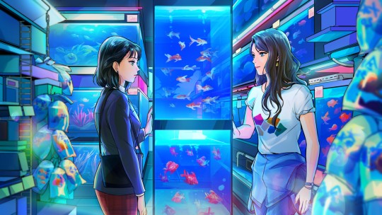
A Summer’s End – Hong Kong 1986 is a Yuri visual novel set, as you may have figured out, in Hong Kong in the year 1986. The game follows a young office worker, Michelle (Fong Ha) Cheung, who has a chance encounter with a free-spirited woman named Sam (Ka Yan) Wong. Both women feel drawn to each other, and the game explores this mutual attraction and the budding relationship which emerges from it.
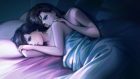
This plot follows the standard girl meets girl story that has permeated the Yuri genre for the past several decades. Like most Yuri stories, the older and more experienced woman, Sam, is rebellious and beautiful, with long dark hair and a dominating persona. Michelle, although far more naive in the ways of love, breaks the trend of this trope by being the more sullen of the two. I would have liked to see the game diverge a bit more from the standard story of the genre. Fortunately, A Summer’s End is a romance story between adults who do not work together, setting it apart from the norms. It even includes a coming out section that creates a more robust LGBT identity than any tale of temporary schoolgirl love.
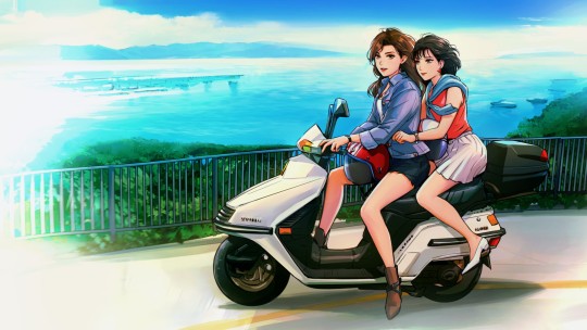
The story is well put together and well presented. The story is told primarily from Michelle’s perspective. It mostly takes place over a few days, during which Michelle engages in a whirlwind romance with Sam. This story features the struggle between her feelings and passion and her devotion to tradition and her mother. The progression of her affection is unrealistically fast. The story feels a bit rushed, and many of the societal and personal quagmires the game stumbles upon are not sufficiently developed or confronted. Had the game indulged in a more prolonged and tumultuous struggle for Michelle, conclusions would have felt much sweeter, and the story would have gone from good to great.
Even with this massive missed opportunity, there are plenty of exemplary moments and aspects of the narrative. The game pulls no punches addressing Michelle’s slightly overbearing mother and the conflict between the two. It would have been incredibly simple to take the easy route on this one. Still, the developers stuck to their guns and manage to explore a challenging situation satisfyingly, all while keeping the characters realistic and sympathetic. In fact, every scene relating to LGBT rights and history is flawlessly executed.
There are also some fantastic chapters, including a thrilling but refreshing bike ride and a flashback scene that recontextualizes certain events from another perspective. The many references and allusions to classic cinema including some older lesbian films and plenty of Asian works, are particularly noteworthy. However, the best part of A Summer’s End by far is the setting.
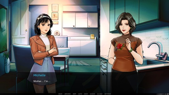
The location and time period is intrinsic to Sam and Michelle’s tale, as it is shaped by and reflects contemporary culture and LGBTQ rights. Oracle and Bone create a vibrant and lively world, a jaw-dropping depiction of Hong Kong in the 1980s. Everything helps feed into the creation of this world, including a fantastic and retro UI, small touches such as a Cantonese subway announcement, and objects encountered like a disposable camera help convey a strong sense of the period. However, the soundtrack sells it more than any other element, save perhaps the artwork, transporting the player to the era. While a few tracks are the standard easy listening affairs one expects from visual novels, there are tons of excellent city pop and disco beats, complete with plenty of synths and confidence! Finally, a visual novel soundtrack that contributes more than just background noise!
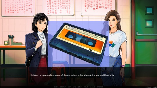
Sadly, the game’s dialogue choice system and branching paths are far more of a hindrance than a help. I can honestly say that the game would play better and be way more enjoyable as a kinetic novel. Most choices feel inconsequential, changing nothing of the story and resulting in almost the exact same response from other characters yet, they have a hidden points system. If you do not earn enough points, parts of the optional adult content will be unplayable until one goes back to find the right choice. I spent several hours replaying, and eventually skipping through, the game to unlock all the scenes, and finally gave up with one CG left unseen. The only choice with any actual effect is painfully evident in its consequences. One option leads to the bad ending, which is well written, but no reasonable player would go down that path unless they just wanted to see the whole game. The second unveils the true good ending, which no player in their right mind would not pursue, as again, the choice is obvious and adds nothing to the game. There is no reason to put in an alternative ending or tedious dialogue choice.
The characters in A Summer’s End are well constructed. Sam is adventurous without being obnoxious and has a mature though appropriately unrefined demeanor. Michelle is extremely curt and somewhat distant, although she displays a sharp wit and more timid nature on occasion. Both women participate in engaging, deep, and thoughtful discussions, often with each other, although sometimes internally, and thus feel well developed and complex. Unfortunately, their chemistry, while not absent, is not enough to sell the whirlwind romance. There is insufficient expression of their feelings and attractions, both internally or through dialogue and actions, so their inevitable closeness feels unearned.
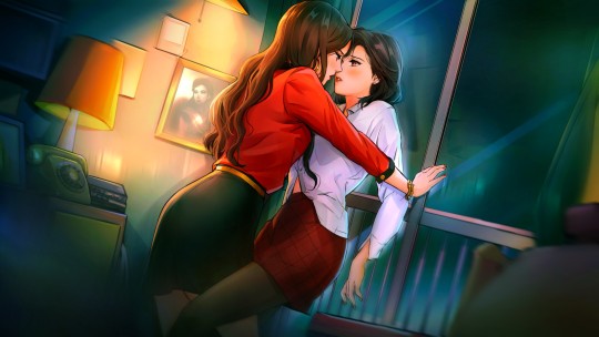
However, even in the short game, both characters change with each other, especially Michelle, as she becomes more affectionate, confident, and caring. She begins to embody some of Sam’s warmness while never losing herself. Some of my favorite dialogue and interaction came from her towards the end of the game, although I will not spoil it. Additionally, side characters have a strong presence thanks to their firmly established characteristics and a profound effect on the narrative. Each has their own sprite and mannerisms, helping cement them as fixtures in A Summer’s End rather than tacked on assets.
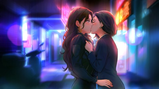
The visual novel contains optional adult content, which is installed in an extra patch and can be toggled on and off. I played through the game with and without it and can happily report that the story is just as fulfilling and complete without it. Although the unlockable nature of these scenes is aggravating, they are very well written and sensual without being exploitative. There were moments I did not care for as much, such as Sam getting carried away at one point, but it felt very realistic and incredibly sensual. The artwork in these sexual encounters is some of the best in the game, embracing darker colors and showcasing intense desire.
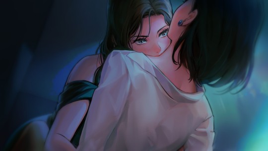
Speaking of the artwork, it is stupendous. The game is bright and striking, with amazing backgrounds complete with luminous neon signs, glaring televisions, and life and activity oozing from every corner. The backgrounds are so beautiful and detailed they could effectively serve in place of CG art, although there is plenty of that asides. The character models and designs are similarly excellent, with expressive poses and faces. The various outfits, of which the game has many, embody iconic 80’s fashion. Artist Tida Kietsungden draws both the characters and CGs with a distinctive hand-drawn style, which allows them to play well off each other and add to the beautiful presentation. The detail and care that went into the aesthetics are enormous and elevate the game at every moment.
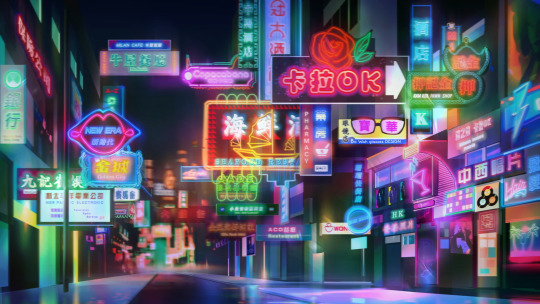
A Summer’s End – Hong Kong 1986 is a vibrant and intimate experience. The fantastic setting and flawless artwork surround a compelling and thoughtful story about lesbian love and desire, societal expectations, and the bonds between family and lovers. It is rough around the edges, with a slightly rushed story that leaves little time to wallow in complexity and an awful dialogue system. However, it will win players over with its striking presentation and sophisticated subject matter. I look forward to more from this studio and highly recommend you check this game out!
Ratings: Story – 7 Characters – 6 Art – 10 Music – 8 LGBTQ – 8 Sexual Content – 3 (8 with patch) Final – 7
Purchase A Summer’s End on Steam and itch.io, available April 23
Consider supporting Yuri news, reviews, and content on the YuriMother Patreon
#Yuri#lgbt#lgbtq#lgbtq+#queer#gay#reivew#a summer's end#hong kong#girls love#gl#wlw#lesbian#visual novel#games#video games#gaming#manga#anime#reviews
2K notes
·
View notes
Photo
so here’s my disclaimer: I hardly know what I'm doing. This is my glued together homemade giffing method that I’ve created over months of just random experimentation and bits and pieces from all kinds of tutorials. there are probably better or more correct ways to do a lot of these things! this also isn’t a completely universal tutorial, some of the specifics are geared towards giffing skam, specifically skam france.
I gif in photoshop cc 2020 on a macbook. Some things like keyboard shortcuts and little things about the photoshop interface will probably vary if you are on a pc/ other version of photoshop!
this is very long and very unprofessional, but I hope there is something in here that someone will find helpful!
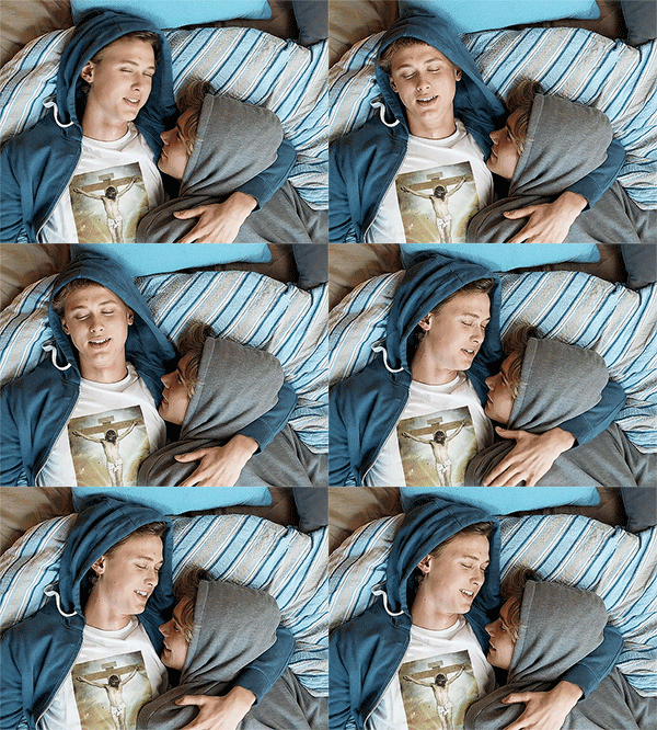
we’ll be going from this:
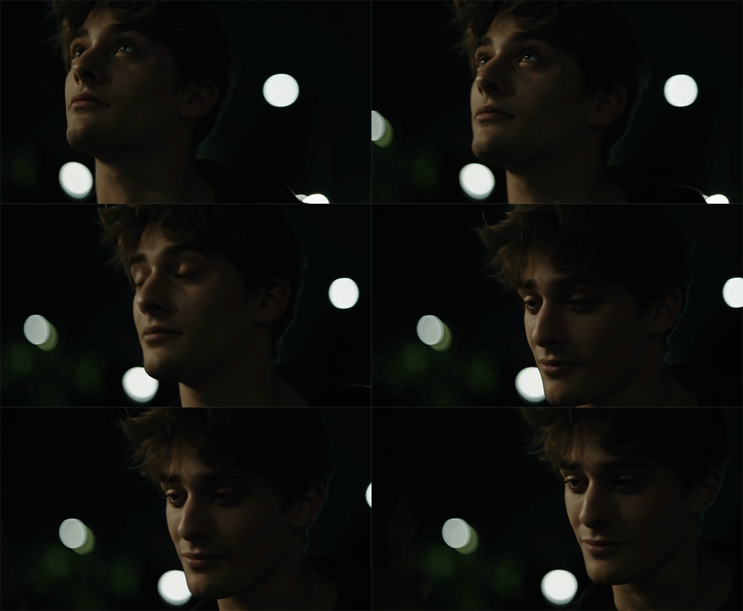
to this:

up to date as of October 25, 2020
downloading clips
selecting what part you’re going to gif
cropping
my action for resizing, converting to a smart object, and sharpening
coloring
exporting and setting the delay
tldr tips
1. downloading clips
4k video downloader (which you can get for mac or pc here) is great for things posted to youtube, especially from skam france because all the clips are on their youtube with no weird geoblocks or anything! it’s really easy, you just have to open the clip in youtube, copy the link, and go into the program and hit paste link. I like to put on smart mode first and set the destination folder so all my clips go into the place I want.

There is a 30 video per day download limit, so if you’re thinking you really want to gif lots of stuff from the show, and want a big chunk or a full season it’s definitely worth hunting for a mega or google drive with full episodes to download because it’s just less hassle! I might come back to this post later and compile a list of all of those, but for now if you type “[remake] no subs google drive” or “[remake] no subs mega” into a google search, you’ll probably find something! the all of skam website has no subs for several remakes, but not all!
If you don’t have enough space on your computer to be keeping full seasons, I know there are methods to get screencaps without having to download (generally for giffing movies and regular tv I think this is a common method), but I’ve never done it so I’ll redirect you to this tutorial that explains it! you should probably just go there for the whole thing tbh it’s much more coherent than this, but I digress.
2. selecting the piece of the video you want to gif
now that you’ve got your episode or clip you’ll want to just open it in photoshop! if you go the screen capping route the way to do that is a bit wonky, so you can keep following the tutorial I linked above and join back in here at coloring if you like!
if the timeline at the bottom doesn’t pop up automatically you can go to window > timeline and turn it on! now you can use the scrubber bar thing to find the moment you want to gif!
The advantage of this over screen capping is you can scrub with more precision. the arrows circled in blue below let you jump only one frame, where in screen capping I'm pretty sure you can only go by ten second or one minute intervals.
I usually drag the scrubber as close as I can to the start of the shot/moment I want to use, fiddle with the arrows circled in blue below to jump forward or back one frame at a time until I'm at the first frame I want. I move the left grey handle to the scrubber and then I hit the play button and let the whole shot/moment play. Pause and repeat the shuffling with the arrows until you’ve landed on the last frame you want to use and move the other grey handle.
the moment you want to use should be between your handles (it’ll look like what I have circled in red), and if you hit play, you should see the thing you want to gif playing on loop above the timeline. the speed will probably be weird, but we’ll deal with that at the end.

now I recommend doing command or control + s to save your gif as a psd (photoshop document). this is a working, editable file which means if photoshop crashes you can open your file right back up and keep working as long as you’re hitting command or control + s at regular intervals as you work. later we’ll go through exporting in gif format that can actually be uploaded to tumblr.
3. cropping
next I crop out any logos or black space at the top and bottom. Just click on the crop tool on the lefthand side of the screen, drag the edges and hit enter when you’re done. you can of course crop out more than just that, but regardless of what you crop out, now is the time to do it.
you can set an aspect ratio for your crop at the top of the screen if you’d like to be positive that all the gifs in your set will be the same:

4. my trusty action: resizing, converting to a smart object, and sharpening with one click
Now is when I use an action I made that does all the resizing, converts to a smart object, and sharpens. I’ll take you through the steps so you can conceptually get what’s going on, but I highly recommend using the actions window to record your process as you follow along so you have this action as well. It easily shaves at least 5-10 minutes off of the whole process, and these steps will be the same every time.
here’s how you make an action: go to window > action and open the action panel. click the plus symbol to start recording a new action:
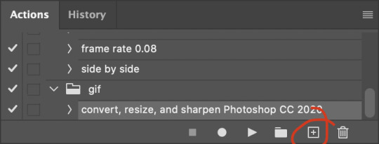
in the window that pops up, give it a name and hit record:

now just continue with the steps below, and it will save them!
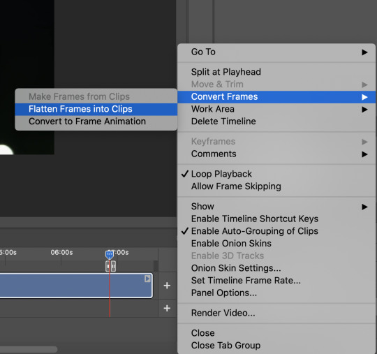
first you flatten frames to clips (I think it says flatten to layers on older versions of photoshop). this is in the menu at the top right corner of your timeline:
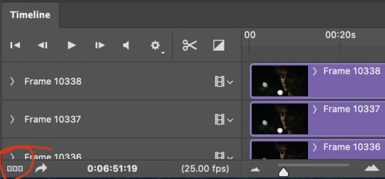
next you convert to frame animation by clicking on the symbol in the bottom left, circled in red:
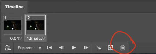
if there is more than one thing in the frame animation, delete the extra one. you don’t need to keep the last one but it won’t let you remove it until there are other frames in there. also go into your layers and delete video group 1 and its contents. don’t ask me why these steps are necessary, I don’t really know, but I’ve noticed it sometimes gets wonky if you don’t do this:

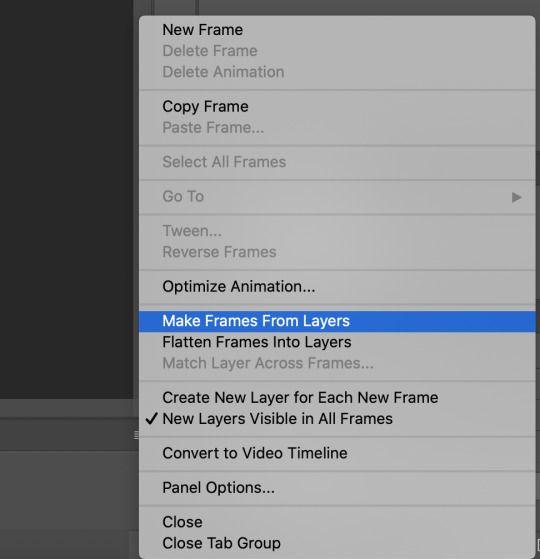
now you want to make frames from layers and delete that first frame that was there before:
then we return to the timeline:
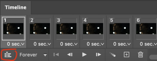
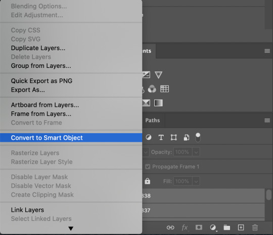
use command + option + a (control + alt + a for pc I'm pretty sure) to select all layers and then right click within your layers window and select convert to smart object. It’s important to convert to smart object after you go back to the timeline, or the gif won’t move:
next I resize. gifs for tumblr should be 540 pixels wide. for recording your action you should just go into image > image size and only change the width to 540 in case you ever have gifs cropped to different aspect ratios. don’t touch the height, let constrain proportions figure it out!

now, here’s what our base gif looks like, no sharpening, no coloring:

now to sharpen. go to filter > sharpen > smart sharpen. this is up to personal preference, but my go to settings are:
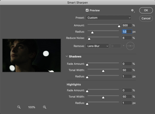
this is what we have after sharpening:

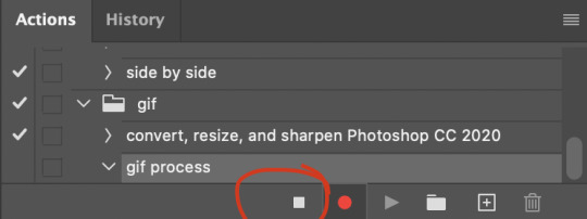
now is when you can stop recording your action.
just press the stop button in the action window:
this action is pretty much universal and after I select the moment the gif will be and crop however I want, I use it on every gif I make! so although this initial setup is tedious, now you’ll never have to do these steps again, and the process is magically much quicker.
5. it’s time to jump into coloring!
I typically start with exposure and sometimes some brightness/contrast. with really dark gifs like this, you kind of have to make it worse before you make it better. I did this:
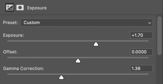
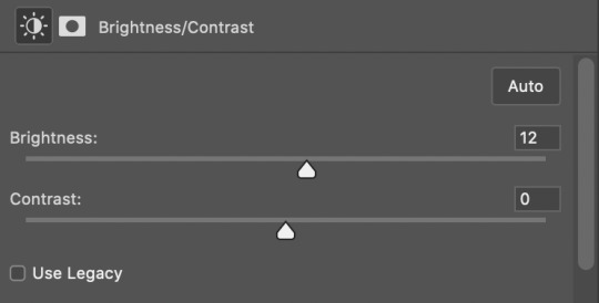
now the gif looks like this:
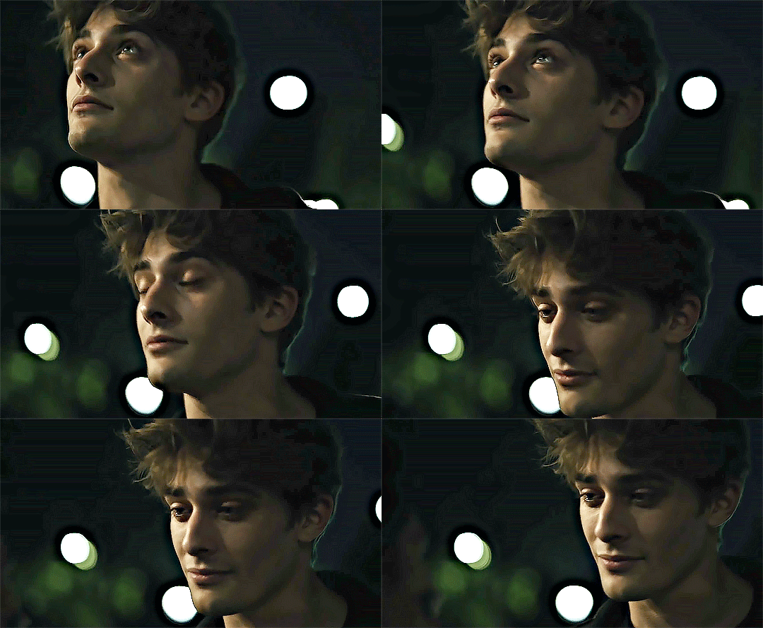
we have some static and some ugly bits, and this is where selective color comes in to fix it! boost blacks like this:
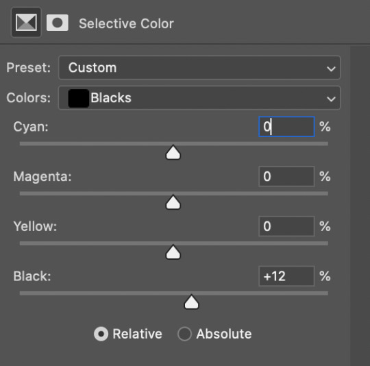
and now your gif looks like this:

the skin tone is looking a little sickly and weird, so I go into the yellows and reds in my selective color layer to fix it! I also messed with the greens here because I didn't want color in the background (that part is totally optional and just up to your preference):

now we have this:
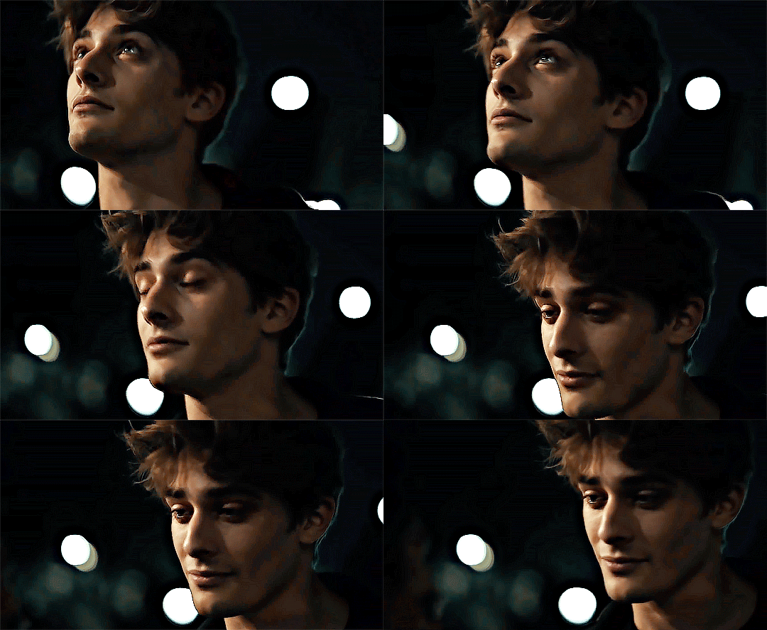
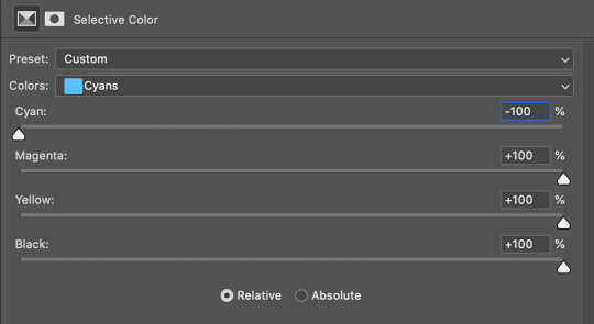
to really take the color 100% out of the background, I did one more separate selective color layer for cyan (again, I just felt like it but this is optional!):
and now the finished gif:

there’s lots of fun extra things you can add like text and tints and overlays and all that I won’t get into, but feel free to reach out for help on those types of things!
this gif was certainly not the most complicated to color. some ridonkulously dark clips (*cough cough* vendredi 20h27 *cough cough*) take tons and tons more effort than this and a lot of the time you’ll want to use color balance layers and vibrance layers and all of that to mess with your coloring.
with all of this coloring business, I really just learned by doing. I don’t know all the technical purposes of each type of adjustment layer, and I tend to stay away from curves just because I find them confusing and annoying. The bottom line is that you should always experiment and find out whatever coloring works for you and run with it! I’m sure every gif maker you talk to does things at least a little differently!
I highly recommend taking the time to go through all the types of adjustment layers and just move the sliders around to see what they do! That’s honestly one of the best ways to learn and decide what you like!
6. now to export and adjust the delay!
the keyboard shortcut for exporting on mac is command + option + shift + s, control + alt + shift + s for pc, otherwise you can go to file > export > save for web
my settings are here:
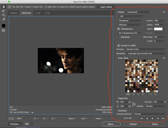
the settings only need to be configured once! otherwise just hit save and follow the pop ups to choose where to save and what name you want to give your gif. Since you saved as a psd way back, that will be the name it’s automatically given, but call it whatever you want!
then I adjust my delay by opening the gif I just exported (not the psd, the .gif file) and using one of my delay actions. I’ve made an action for each delay between 0.05 (real time) and 0.08 (really slow mo for certain super short shots, typically for more ~artsy~ sets).
all my action does is select all frames:
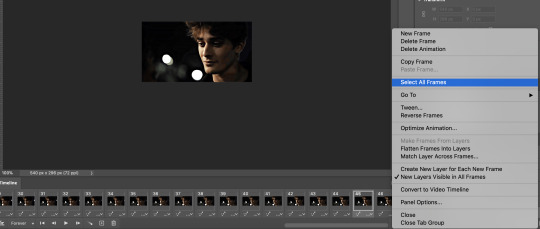
adjust the delay (which will differ based on whether you want them slowed down and by how much):

for reference, this is a 0.05 delay:

and this is a 0.08 delay
now you just export the same way you did before!
remember if you’re recording this as an action, you don’t want to touch the file name, just say yes when it asks if you want to replace the file. if you always save your gifs to the same place, your action will now enable you to override any gif with the incorrect delay with the correct one with one click!
7. tldr: the main tips
for downloading 4k video downloader works well for non geoblocked youtube videos, the all of skam website is another place you can look to download with no subs, here’s the screen capping method if you don’t want to download
The main way I combat dark lighting is to bump exposure to the right, gamma correction to the left, and then enhance black in a selective color layer. The amount of these three adjustments will vary gif to gif. I know lots of people use curves, but I find them really confusing for some reason, so this is my method! As my graphics teacher likes to say: there are always at least 3 different ways to reach the same result!
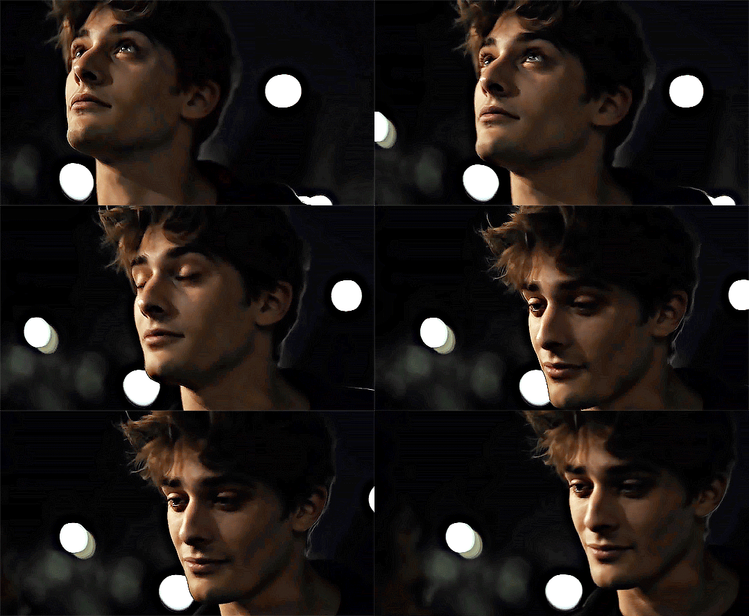
there’s a little bit of additional coloring on this one, but here’s another before and after example so you can get an idea of how those steps get you a better lit result without making the lighter parts super over exposed:

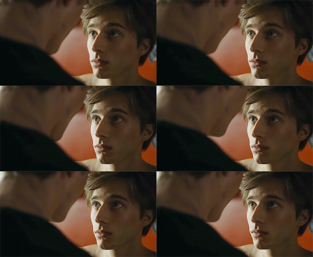
besides those three steps, you have free rein to use the other selective color channels, as well as color balance, vibrance, hue/saturation, etc. to restore color that was lost or to change the colors altogether! mess around with it and have fun experimenting!
7a. bonus coloring tip:
sometimes you can make use of selective color to completely alter an isolated color in your gif. You can get very adventurous with this, but here's a simple example of changing blue tones to teal (I got away with these gifs being longer because they were in rows of two in the set I posted them in. I'm too lazy to trim frames so I can put them here at 540 px without going over the 10mb limit so just ignore the quality ok):
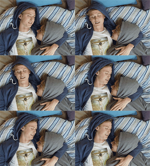
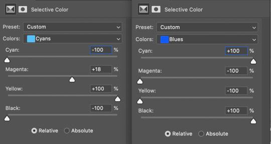
7b. actions, actions, actions!
if you find yourself doing a certain thing over and over, always record it as an action. the amount of time they will save you is honestly really impressive.
You can duplicate actions, so, for example, if you have different sharpening preferences for different shows or scenes, you can duplicate your gif process action and go into the steps, double click smart sharpen, and alter it however you want!
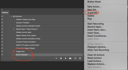
This could also be good to do for the different widths for tumblr if you ever do sets with rows of two or three! Duplicate actions is also how I made my actions that set delay at 0.05, 0.06, 0.07, and 0.08!
when in doubt, always make an action! it’s worth minimizing the tedious bits of the process as much as possible so you can focus on the fun part of seeing your awesome gifs come to life! any little task you find yourself doing often, make an action!
and for now that’s all I have. if any of this made no sense, if you want to suggest a correction or addition I could make, if you’re ever curious how I did something on any gifs I post, or if you have any other sort of questions, feel free to send me an ask or a dm! if I can’t answer your questions I’ll be happy to try to direct you to someone who can or a tutorial to help! again, I'm no expert, not even close, but I hope at least one person will find one thing in this mess that helps.
#this got . so long omg#mystuff#mytutorial#gif tutorial#tutorial#resources#fellow gif making peeps feel free to correct me or give input on how to improve or add to this tutorial!
31 notes
·
View notes
Text
Crusher Elaborations #1: Thoughts on the Aesthetic of Sonic’s World
If someone came up to me and asked “Which do you prefer, Classic Sonic or Modern Sonic?”, my answer would start off with “Well, technically Classic Sonic because...”, and then I'd get cut off by the other person immediately lecturing me on why I'm wrong and why I'm the worst kind of fan imaginable. Should they finish their rant, I would then explain to them in the midst of them basking in their flock of easy Twitter likes that I didn't necessarily mean it in the way they predicted.
If we were talking about the games, the characters, or the character design, I'd be fairly neutral, since I like both halves equally for the most part. In fact, when it comes to characters, Modern might actually have the edge believe it or not, since the sheer number of characters introduced from SA1 onwards naturally means a lot of my favourites were introduced from that point on, such as Tikal, Rouge, Gamma, Omega, Blaze... But then again, Classic introduced Eggman and Tails, and the Hard-Boiled Heavies are technically Classic as well despite being relatively new...
Anyway, the point is, I'm not talking about any of that today. I'm talking about the world that Sonic and his multicolored chums live in. Or rather, the aesthetic of it.
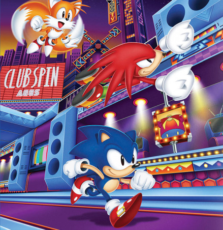
NOTE: This is purely about the game universe. While I do have my thoughts on Sonic’s world as presented in other continuities, that won’t be the focus here.
If you're familiar with my blog, you'll know that as a general rule of thumb, I much prefer colorful and creative worlds in my Sonic universe, and that rings true for my reasoning here. And I know what you're gonna say: “But Crusher, isn't there plenty of that in the Modern games as well?” Yes, there is, and I appreciate them very much. But this is why I feel the need to make a post of this sort to begin with, because I'm NOT saying “Classic cool, Modern boring” and calling it a day. There's a little more nuance to my tastes here.
When I say I prefer the Classic aesthetic for Sonic's world, I don't mean it in the literal sense of disregarding everything about the Modern aesthetic. Let's put it like this: when you're asked to paint a picture of these two sides of Sonic's universe in your head, a specific image will likely come to mind. When you think of Classic, you'll probably think of Green Hill first and foremost, whereas with Modern, you'll probably think of something like City Escape or Rooftop Run before anything else. In other words, when you think Modern Sonic, you're probably imagining the more realistic kind of locations first. And between the two mental images that come to mind, I personally prefer the Classic image. Shock, horror.
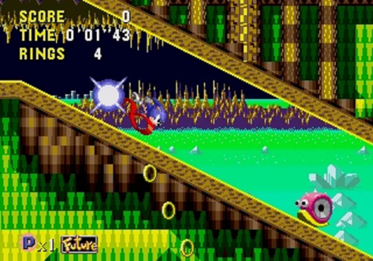
I wish I could swim in a sea that’s probably radioactive.
Now keep in mind, I'm not saying that City Escape, Rooftop Run, and all similar environments in the series look bad, because they don't. Unless they're painted with the '06 brush, they generally look fine, and the locations in Unleashed in particular are undeniably beautiful from an graphical standpoint. The problem is that although I can picture this as a world that Sonic could be in, I can't necessarily picture it as Sonic's world specifically. Because when it comes to the more realistic environments, I feel there's not much of an attempt to let it branch out as its own thing.
I know that might seem harsh, especially for Unleashed, since the real world angle was the deliberate theme of that game. And Sonic taking cues from real places is a fine concept, there's no issue there. I'm not gonna complain if there's a France Zone with an Eiffel Tower in the background. In fact, Sandopolis Act 1 has one of my favourite aesthetics in a Classic zone (mainly because the background is really pleasant to look at), and that zone is essentially Egypt Zone. But if you're making a Real World Zone, there needs to be more to it than that, otherwise you don't truly get a Sonic interpretation of our world... you instead have our world as it is with Sonic characters awkwardly stapled on.
When I look at City Escape, it may not be completely unfitting for Sonic (the posters and billboards in particular are actually a really nice touch), but when I look at it, I don't see Sonic's interpretation of San Francisco. I see San Francisco with Sonic shoved in. When they morph these places to Sonic's liking, they'll add rings, loops... and that's it. They rarely take the concept any further, which is a huge shame, particularly in the case of Rooftop Run, where I otherwise do like its visuals a lot, but it just doesn't go far enough with the concept for my liking.
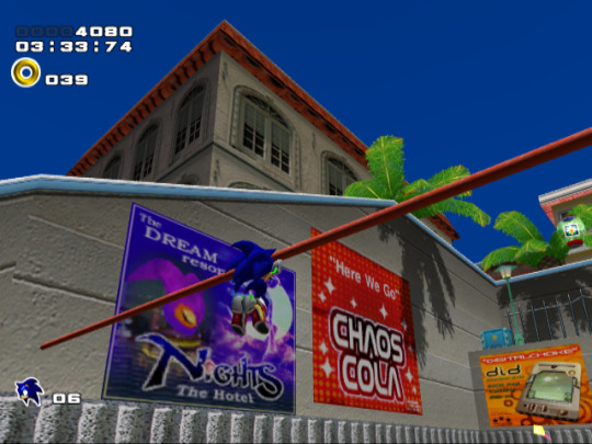
At least you get to murder car owners, and give G.U.N. a legitimate reason to arrest you.
So which Modern games do I feel did the best job at making Sonic's world... er, Sonic's world? Well the truth is, most of them actually do a decent job in this area, regardless of the level design quality or the game’s quality period. SA2 has Pumpkin Hill, Eggman's Pyramid Base, and... SOME levels aboard the A.R.K (mainly the “outside” ones, like Final Rush). Shadow the Hedgehog, a game that reveled in how brown and gritty it was, still had highlights like Circus Park and Digital Circuit. Even '06 of all games had Aquatic Base, which was pretty cool from a conceptual standpoint. And although Unleashed as a whole might be a touch too vanilla in the creativity scale, it still had the glorious Eggmanland at the very end. But if I had to say which of the Modern installments did the best job overall...
- For starters, I'm gonna give a shoutout to SA1, because even though it was the first Modern game, and thus it was technically responsible for the more focused angle of realism in Sonic's world in the first place, it didn't take it quite as far as later games would, and although it may not be a perfect 1-to-1 representation of the world we saw in the Classic games, it does well enough with what it brings to the table that I can still accept it without any issue at all. Some of that has to do with the fact that you still have wilder areas like Windy Valley and Red Mountain to balance things out, but even with the other half, the game's use of colour is enough for it to go a long way, oddly enough. Take the At Dawn section of Speed Highway for instance:

From innocent times, when the radar wasn’t a piece of shit.
Technically, it's really not that different to the urban environments you see in SA2 or Unleashed. But something about the sleepy morning approach gives it a subtle, almost dream-like edge to it that I really dig, and despite it being pretty similar to the likes of City Escape, somehow I have an easier time buying into the idea of this place being part of the same world as zones like Sky Sanctuary.
And seeing how I already mentioned Red Mountain, let me compare it to Flame Core:
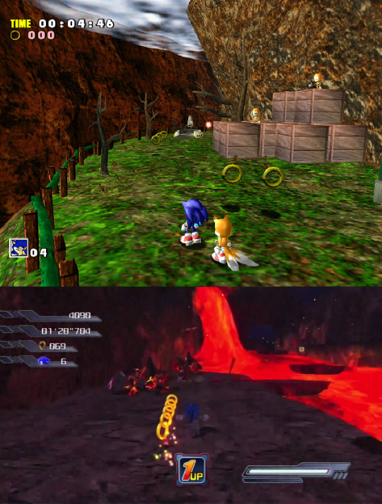
Yes, I know bringing '06 into this discussion at all is inherently and hilariously unfair, but let's put aside the game that Flame Core comes from for a moment. Aside from maybe the purple crystal caves indoors (and that's assuming you can even see where the fuck you're going in there), Flame Core is pretty boring to look at as far as Sonic levels go. Red Mountain is vastly more interesting, even though it's basically the exact same concept, and a lot of that has to do with - you guessed it - colour. Sure, it's day time, that's one thing, but you'll also notice that for a lava/mountain stage, it surprisingly has a few grassier sections, sort of like Hill Top in that regard. A little bit of green among the brown and red, and a great contrast to the volcanic nightmare you'll experience when you head inside.
Now this might seem like a fairly minor detail... and yeah, it is, but the thing that SA1 does so well is that it combines so many of those small details to make a complete, well-rounded package. This is why SA1 meshes well with the Classic style despite not being an exact replica, because just as the Classics excelled at, it wasn't afraid to use colour in interesting ways. It understood that a fire level could have more than just red and orange, in the same way that a grassy level could have more than just green and blue.
But of course, as I mentioned, SA1 is not an exception. There are other Modern games that did a great job on the whole...
- Heroes is an obvious answer, since it's translation of Genesis-style environments to 3D is probably one of the most recurring praises the game receives, and rightly so. Not much to say here, except that Hang Castle is still cool as hell.
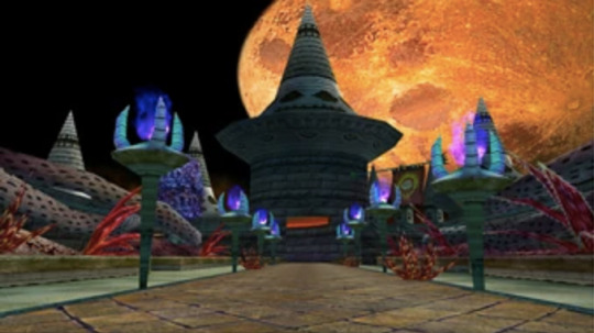
And plenty of opportunity to admire the not-broken-in-half moon.
- Colours is another obvious one, though something of an ironic one given that the premise of the game involved going to other worlds, and those worlds were all converted against their will by Eggman. Yet, they did an equally superb job at creating fun, unique locales, and Aquarium Park in particular remains a favourite of mine.

Gotta love that red/blue contrast.
- The Riders series has a more futuristic bend compared to the rest of the series, but even when it's not all high-tech, it's got some pretty cool environments of its own, and I feel they even do well at mixing the real world side of things on top of that. Gigan Rocks comes to mind, as does Aquatic Capital.
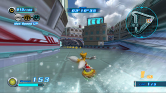
Reminds me of when Perfect Chaos peacefully protested against Station Square.
- Regardless of my thoughts on the game itself, Secret Rings had some undeniable winners in this depertment. You tell me with a straight face that Night Palace doesn't look amazing.
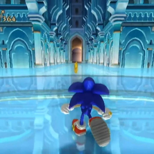
A wonderful palace for a domestic abuser.
- And lastly, they might have had an early advantage since they're already 2D, but the Advance trilogy and Rush duology deserve a mention. They had some fantastic ideas for zones, like Planet Sonata Music Plant, and they did great with the colours as well. Hell, throughout these five games, the sky was practically every shade of the rainbow at one point or another.
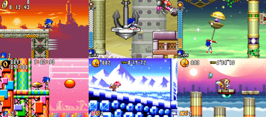
Oh look, another completely whole moon.
Also, quick shoutout to another minor detail akin to the grassy sections of Red Mountain: these pink tunnel sections in Ice Mountain. No elaborate point to make here, just another perfect example of how much I adore these games' use of colour and contrast.

Seriously, I could go on for hours about good contrast.
Although I do bring up these small details for another reason, and in turn, another layer to my more nuanced take on Sonic aesthetics. By this point, we get the basic jist: Crusher likey when Sonic levels unique and pretty. But this can - and has - lead to a couple of misconceptions, so I'd like to address those and then laugh at them.
“So you want Sonic's world to be exactly like Mario?”
A common complaint that Lost World received was that it was too much like Mario, in more ways than one, and part of this was to do with the game's visual style. The zones may have been upbeat, but they often consisted of a bunch of things floating in the air and not much else, ala 2D Mario. While I didn't outright hate it, it’s definitely not what I have in mind for Sonic.

Of course, all complaints about being too much like Mario suddenly turn into praise when Eggette gets brought up...
And why is that? Because yes, I like my Sonic locations to be fun and lively... but I also want them to be firmly established within the context of this universe. The Lost World approach is fine with Special Stages and the sort, but outside of that... well, Studiopolis is a perfect example of what I'm talking about:
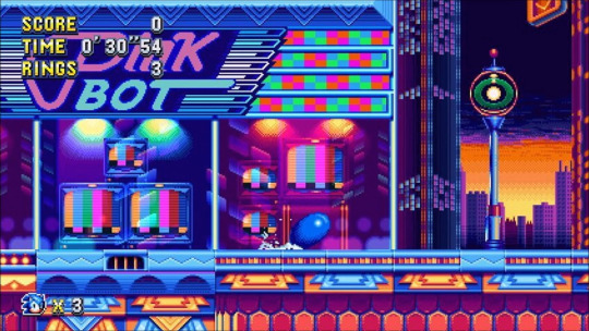
On one hand, it's very unique when compared to other cities in this franchise, and it's full of quirkiness, great use of colour, and all that good stuff I've went on about. But at the same time, it's grounded just enough so that it still feels like an actual city that the people of Sonic's world could feasibly live in, rather than a basic and empty video game level with a tacked on city background. Studiopolis may be a level from a video game, but you can totally believe it's a fully fleshed out place from its own perspective.
Naturally, this praise also rings true with the Modern games I listed earlier, and is yet another reason for why I approve of their settings.
“So you think Sonic can't have darker locations?”
It might be easy to take my compliments at face value, and assume that I'm immediately opposed to a zone that's not brightly colored. This is... very obviously false, as even the Classic games have their share of less-than-cheery areas, such as Scrap Brain and the Bad Futures in Sonic CD.
However, when you're making a grittier location in Sonic's world, regardless of the context, it still needs to be interesting. The problem with a lot of them in Modern installments is that they're boring. Crisis City is a generic city on fire. Westopolis is a generic city with aliens firing lasers from above. The prison levels in SA2 - and the indoor ARK levels not named Cannon's Core - are just grey hallways for the most part. That shit isn't exciting, and it doesn't get my mind speculating. It just makes me want to move on.

Let the eggsperts take care of this.
By contrast, Eggmanland is a prime example of how to do it right. Eggmanland is a magnificent theme park as envisioned by the good doctor, but it's also, at its core, a giant metal hellscape fueled by the energy of a dark entity, and it only gets more ominous the further you go through it or try to before you give up because it’s too fucking long and you died at the end. So it sets the mood to be sure, but it's still visually compelling to look at, and interesting to think about.
And since Eggman is apparently the only one who can show us how it's done, here's a shoutout to Titanic Monarch as well:

Like Heavy King, but Heavier and Kingier.
When comparing the final zones in Sonic games, I especially love this zone's visual approach, because it manages to be dark and colorful at the same time, and in a strangly organic way. It's got a spooky atmosphere, with a moody moonlight backdrop to match, and the titular robot is foreboding as hell as you climb up it and traverse through it... all the while having red floors, green and yellow wires, blue and pink buildings, and stained glass windows of Eggman and the Heavies for you to marvel at. So even putting aside the unique scenario of climbing up and then through a Kaiju-sized mech, the mood of the zone alone manages to be extremely memorable.
So what have we learned from all this? Aside from the fact that I’m way too interested in this subject? We now know that when I say I prefer the Classic “style” over Modern when it comes to the way that Sonic's world is presented:
- I don't mean that literally.
- There are certain qualities that although both of them possess, they tend to be more immediately associated with Classic in the collective consciousness, even within the fandom.
- The environments that I love the most in Modern games are often the ones that would also fit perfectly in the Classic style.
So whenever I express the basic nature of this opinion in the future... just imagine a small asterisk at the end of my sentence.
55 notes
·
View notes
Text
Wolfsbane : Noblesse Fanfic (post-ending)
(previous chapter)
Chapter 66 – A Solution, a Dilemma, and an Ordeal
“Just as I’d thought.”
Upon Frankenstein’s murmur, Takio and M-21 stuck out their faces from behind him towards the papers he was holding.
Alas, they gave up straight away as their eyes locked upon the numbers, graphs, and charts incomprehensible for their level of knowledge.
Tao, the only person they could count on to translate them into human language(?) was busy fidgeting with the machine that just printed out the papers.
Which is why they had to wait for Frankenstein to explain.
And they showed the generosity of waiting until Tao could bring Yuigi from the machine.
When the subject of the tests finally arrived, Frankenstein nonchalantly raised his glasses and began his lecture.
“Simply put, I need to take a look at your head.”
“What?”
“Huh?”
“Hmm?”
Yuigi retorted in fluster, with Takio and M-21’s bafflement resonating in the background.
Tao’s mouth was hanging open as well, his eyes very close to popping like a pair of balloons.
“That was meant to be literal. There’s something in your head.”
“...So Yuri that bastard did something under Crombel’s order, when I was imprisoned at his temporary lab.”
Yuigi scowled as hard as she could and moved her hand to her temple.
She could not remember what happened back then, her memories blurry due to pain.
She tried scrutinizing what was left of the pieces of her memories, but she could not find any scene holding Yuri doing something to her head.
Assuming it happened when she finally succumbed to pain, Yuigi focused her gaze upon Frankenstein, demanding more details.
Flapping the papers, Frankenstein landed upon the page about in the middle and turned it around for his small audience, displaying CT and MRI pictures of Yuigi’s head.
The pictures were not so big, but the four of them could see very clearly something was there, their vision much more superior to normal human vision.
They could see an array of spots, each of them much more miniscule than grains of sugar, scattered in the area where her frontal lobe would be.
“I don’t need to tell you what I want you to look at, do I?”
“No. But what’s this? Did something get into Miss Yuigi’s head?”
“Yup. I recalibrated that machine according to my manual, and I believe Crombel planted nanochips in your head, Yuigi.”
“Nanochips...? Are you saying all those spots are...”
Yuigi’s body heaved, as if she were just notified that the dinner she had yesterday was infested with cockroach eggs.
“When I...”
Frankenstein’s lips were shut in the course of his reply.
The pull between his lips were so natural, like the sort that would exist only between two poles of a magnet.
Which is why no one noticed that it was not his intention to halt in the middle.
Calming himself by fingering his glasses, Frankenstein restarted himself as smoothly as he could.
“When I left this place, I could get my hands on several files and data on the Union. Some of them were about Union arts and crafts we weren’t aware of, including this technique that employs nanochips. Since Union's main focus was on the mastery of body modification, nanochips were not exactly the favorite from Union’s shelf of goods. But I wouldn’t say they completely disregarded this technology, since it’s on the list of items that none other than Ignes took her time and effort and resources to study.”
“So are you saying the nanochips in my head are Ignes’s creation?”
“Either Crombel snuck away her recipe to dissect and put it back up in a fashion he prefers. Or she stole some of the ingredients he was handling.”
“So what exactly does this thing do?”
“Consider it a remote control to make a marionette out of its host. One of the features of this nanochip happens to be automatically appropriating the host’s control over its body when the host finds itself in mortal danger, so to make sure the host will stay alive as long as its puppeteer wants.”
The four humans gaped at him, confusion clear on their faces, and Frankenstein continued on, probably having foreseen this.
“Remember what happened when I had a rematch with the 1st Elder right before our final showdown against Crombel? Back then he was under Crombel’s control. He served as Crombel’s battle figure, his mind in one piece, with only minimum amount of life force left in him.”
“...With his willpower trapped within, watching and hearing and experiencing how his body is not his...?”
Yuigi muttered, the only one who did not take part in the aforementioned battle, apart from Tao, who had had wire updates on the situation.
The three members of the RK knew why she looked so stunned when she had nothing to do with this occasion.
“So... You’re saying the nanochips that Yuri injected into Miss Yuigi are...”
“They were probably the prototype of the technology Crombel used upon the 1st Elder. You said when you were fighting with that Kornel guy, you couldn’t even speak before you had an outbreak of emotions and broke free from the unwelcome disconnection of your mind from body, right? Unlike you, at least 1st Elder could offer some words to me back then.”
“Wait a minute. The gas we fired was based on a sample of Yuigi’s DNA.”
“So maybe all the people who went through body modification are plagued with...”
“Oh, don’t worry. The results show that the mechanism of body appropriation derives solely from these nanochips. And as you can see, these nanochips were inserted only in specific parts of her brain. So the victims won’t turn back to pseudo-zombies.”
“So once these nanochips are gone...”
“You can return to who you are. I’ll soon come up with a treatment, so I’d appreciate it if you could take your time and wait.”
Yuigi nodded in affirmation, but in reality Frankenstein knew there was no need for a treatment.
The only thing Frankenstein had to do was to draw out just enough power he needs to destroy the nanochips within all at once.
However, he had to coin a specific treatment for the sake of another soul who was unofficially booked for a doctor’s appointment with him.
Another reason why Frankenstein scurried from Lukedonia upon hearing Yuigi’s symptoms from Tao.
And something that had been poking needles into his sanity way before the QuadraNet project joined to add trouble to his side.
‘Lord Muzaka said that during the nuclear missile incidence, his body scrammed from the site on its own. Which would most certainly mean his body saved itself from mortal danger. I bet I can find the exact same nanochips in his head as well.’
If he were to be honest with himself, Frankenstein was dying to use this opportunity to his benefit, to broider the front and back of the werewolf lord’s head with big, fat, angry marks from his grasp.
‘But I have no reason to turn the entire wolfkind into my enemy, after everything that has happened. Not to mention Lunark won’t be happy if she later finds out what...’
At then his hand froze in the middle of its frenzied waltz across Yuigi’s test results.
It was neither in his intention nor in his cognition, yet his thoughts darted themselves right back to Lunark before he could stop them.
In fact, he was stunned for a moment back when he mentioned Ignes’s studies, for he was reminded of the werewolf warrior who visited his island to hand the files of the noble whom he destroyed himself.
Now that his mind summoned Lunark twice, everything he regarded he had left behind in Lukedonia – his thoughts about her, his deliberation on her, and his feelings for her – cascaded right into his heart to cause furious ripples.
He came back to Korea to seek time to himself, but seemingly fate did not want him to waste his time taking refuge.
Towards the room that the RK and Yuigi emptied, the sound of footsteps that Frankenstein would always notice regardless of time and place drew near.
Which was a sign that he could hide no longer.
“Master.”
Raizel’s face was blank despite Frankenstein’s greeting, a natural response from a non-talkative noble.
Which was why Frankenstein momentarily lost his control over his facial profile when Raizel dispensed a verbal reply to his greeting.
“Still afraid, are you?”
Raizel’s words drew Frankenstein’s ears right back to Earth, the blonde man mincing his lips.
“Frankenstein. You treasure her.”
Raizel usually leaves others untouched in terms of their emotional states, in respect of their respective owners.
Yet here he was, volunteering to unwrap the subject as soon as he made his arrival, especially at a time like this, which gave Frankenstein good idea of how much he had been in anguish.
And now that the topic was out in the open with Raizel’s courtesy, Frankenstein knew somehow sneaking past this topic is not an option for him.
Considering where he was standing at this point, he knew he should at least touch on – no, definitely put an end to this dilemma.
“I believe you already know she treasures you just as same. You would know the colors of symphony in your hearts have been identical for a long time.”
Frankenstein’s lips were unmoving, his tongue dormant.
“Know I well what you dread. You must have dreaded harming Lunark even little under the influence of the Dark Spear, as Lascrea attested. Remember I of how the Dark Spear absorbed Crombel and the shards of Blood Stone to attain greatest power in its history. And with Lunark recovering from the harm caused by the Dark Spear, I can feel how haunting the guilt of your heart is.”
“...Then you would know. You would know that is exactly why I don’t deserve to...”
“Do you still believe you will be a harm to her?”
As mellifluous as crimson silk was Raizel’s voice, but Frankenstein had centuries of experience with his master to pick up how his tone steeled by the smallest of the shade.
Which is why he unconsciously began retracing the facts instead of losing his words.
“...No. I can no longer detect Crombel or Blood Stone within the Dark Spear.”
Frankenstein was telling the truth.
Although he had no chance to look back on exactly what Lunark did to him, too occupied with agony while standing guard by her bed, he could feel how the Dark Spear returned to how it used to be before it absorbed Crombel and the Blood Stone.
“Then no more is the reason for you to hesitate, is there?”
Frankenstein was dumbstruck, the answer so very simple and clear.
The reason why he had been staying away from those dear to him, Lunark included, was because he feared he will lose his battle of dominance against the Dark Spear and manifest as a weapon threatening them.
His fear grew even more humongous ever since the nightmare of effigies the Dark Spear staged for him.
But now that the Dark Spear can no longer be a nightmare for him, there was no reason for him to keep himself isolated any longer.
“What is the bidding of your heart? The choice is most definitely yours, but I have had my lessons from 820 years of sleep. Only logical for us it is to live our lives to fullest, with no regrets, during the time that is given to us. We must listen to our hearts for what they wish. We must follow the choices our hearts seek.”
Raizel gazed at his most trusted follower, unmoving and silent.
“I have already told you. The last thing you can save at the moment is time. So do not save your time. Use it well to look into your heart in wholesome.”
“...Yes, sir. I shall do that.”
Raizel, as always, did not linger after delivering all of his messages.
Frankenstein stayed muted in solitude until he got moving; it was time to take a look at another patient he was tasked with, and Tao joined him in the middle, rather faster than what either of them expected.
“Right now, we are the only ones tending to Mr. Jang. Now everyone at KSA knows about his betrayal, so nobody’s visiting him. Well, Sir Rael was the only one apart from us that...”
Thanks to Tao, Frankenstein was reminded of the lesser son of the only one he could ever dub as his true friend for his life.
Rael already left prior to his return to Korea, and being the heir of Kertias, the fastest of nobles, by now he would be officiating his homecoming in the Lord’s Hall.
And Frankenstein heard from his team about the skirmish Rael had with none other than his own kind – with none other than a head of a noble clan.
Tao was about to voice his concern for Rael while he was at it, but then he suddenly heard Frankenstein puffing out a ball of air.
Did he just laugh when we’re discussing Sir Rael here?
Tao’s eyes bulged out, but Frankenstein did not let him stare at him, wiping off his face of his laughter and concern.
‘What am I worried about? I should worry about myself. As of now, that boy will have no trouble at all.’
After a brief self-reprimand, Frankenstein began to strut ahead, with Tao tagging along and complaining at him to wait up.
(next chapter)
Previously Raizel asked Lunark to take good care of Frankenstein. Now he’s telling Frankenstein to follow his heart. I didn’t plan or see this coming, but I made Raizel a matchmaker in my fic. XD As you would’ve noticed, next chapter will be featuring on Rael, through a scene that I had been dying to compose since the brainstorming stage for this fic. Stay tuned and find out how my boy is going through another growth in his career as a head of his clan!
(Edited) I just realized I posted this chapter instead of saving it as a draft - my mistake, and I’ll make sure it doesn’t happen again! My apology for whoever that got confused with the early upload!
#korean webcomic#korean webtoon#fanfic#noblesse#frankenstein#lunark#frankensteinxlunark#lunarkxfrankenstein#wolfsbane#Mr.Wolf#AnAngelicDay
4 notes
·
View notes
Text
Zoids Saga Fuzors

Go to the Zoids Research Facility, and take the Core Active Ion Small from the left Chest, and the Hellcat Data from the right Chest. Go to the Item and Weapon Shop, and take the Emergency Retreat.
Zoids Saga
Zoids Saga Fuzors
Watch Zoids Fuzors
Zoids Saga Fuzors for Nintendo Gameboy Advance/GBA is a RPG game published by Tomy.
Game Boy Advance Zoids Saga: Fuzors. Tags: Zoids View.
Zoids Saga III: Fuzors (sometimes just 'Zoids Saga III' or 'Zoids Saga: Fuzors'), is set in the Zoids: Fuzors fictional world, and follows the actions of 'Will'. A good portion of the storyline parallels the Zoids: Fuzors anime. Similar to Zoids Saga there is one city (Blue City) which the player returns to after each segment of the story.
Zoids Saga
ScreenShots:

GBA ROM’s are Playable on Android With My Boy GBA Emulator
Play On PC With Visualboy Advance GBA Emulator
Zoids Saga Fuzors Info:
Release Date: February 23, 2005 Genre : RPG Publisher: Tomy Region : USA Languages: English Platform : Gameboy Advance Rom Type: .GBA
Download Links: Size – (4MB) ———————————————————— Direct
For Extracting Rar Files Use WinRAR or 7zip
Notes:
Zoids Saga Fuzors
For Multi Part Games You need to download all parts.
Check the FAQ Page For Extract RAR (Multi) Parts Guide, Dont use comment.
No Password on any of those game files we’ve uploaded, all files are Password Free.
If the file is damaged or shows RAR CRC Error, re-download them.
Check our notes, faq page, instructions Properly before you ask for help on the comment section.
For File Missing/Dead Links –> Request for Reupload.
Ibm lotus notes university hospital. You May Also Like Super Mario Advance 4 Super Mario Bros 3 GBA ROM Riverbed nightmare pathfinder.
Watch Zoids Fuzors
* Your list is public by default.
Status:Eps Seen: / 26Your Score:Add Detailed Info
Alternative Titles
English: Zoids Fuzors
Information
Type:TV
Status: Finished Airing
Premiered:Fall 2004
Producers:Tokyo Kids
Studios: None found, add some
Genres:AdventureAdventure, MechaMecha, Sci-FiSci-Fi, ShounenShounen
Rating: PG-13 - Teens 13 or older
Statistics
Ranked: #61362
2 based on the top anime page. Please note that 'Not yet aired' and 'R18+' titles are excluded.
Members: 9,624
Reviews
Sort
Most Helpful (Weighted)
Most Helpful (All Time)
Most Recent
Friends Only (Weighted)
Preliminary
26 of 26 episodes seen
slax(All reviews)
21 people found this review helpful
Overall1Story1Animation1Sound1Character1Enjoyment1
Ok, I'm a big Zoids fan, and as such, this review focuses on the differences between the styles of this and the preceding series, rather than an more general overview (I won't use Genesis as an example since that is of a vastly different style). Unfortunately, it is very negative. Firstly, let me start with the Story: Fuzors basically has no story whatsoever for the vast majority of the series. In the final few episodes, a backstory gets fleshed out and some continuity established, but as this only happens very late-on, it feels more like a justification for why the series occurred in the way it did, rather than an actual plot that naturally developed. Furthermore, the story it does eventually manage to establish is rushed, this, along with the generally poor translations, makes it difficult to draw any praise from the story. Now, this brings me to draw parallels with Zoids Zero, which also had a very skimpy plot at best. However, the biggest difference with the two series is that Zero is built around battles and comedy, and as such tries to give the viewer fluid fights and funny lines rather than a deep plot. Fuzors does not, and as such has no excuse for the lack of story. To continue with the story theme, I'll next discuss the Characters: While Zoids shows are not renowned for their characters, the development of the cast is not handled well in Fuzors at all. For instance, in the first episode, the character 'Amy' walks in to Mach Storm's headquarters and appears to anger some of the main characters. What the show doesn't tell you is that Amy is actually a member of Mach Storm herself. This fact makes it very confusing (to say the least) when she shows up unannounced in later episodes. This is probably the best way of describing the problem with the characters in Fuzors, it simply assumes you know who/what everyone/thing is -rather than actually take the time introduce them. This is especially true for the Zoids themselves. Many of the Zoids, such as Arosaurers and Gorhecks are totally new Zoids that fans of the previous series would not know anything about -and yet they appear on screen without any kind of introduction at all. To make matters worse, old Zoids that fans would be familiar with from other series are changed abruptly and without reason. For example, the Blade Liger is depicted in the other series as a very rare (if not unique) Zoid. In the first episode of Fuzors, three of them are shown. Another prominent example is the Fuzors variant of Gunsniper, which are all customised to be the same as Leena's heavily modified (and thus unique) Zoid featured in Zero. No explanation for either of these is ever given. This kind of 'thrust the viewer into the show' serves to confuse new watchers and disenfranchise fans, and is a great detriment to the series. Toward the end of the series, some of the cast's backstory is explained, however this is done in a very rushed manner and fails to justify the terrible job done in the first three-quarters of the series. Next up is the artwork. Well, the most important aspect of a Zoids show is the Zoids themselves, so I'll start with them. The models are all done in 3D, but the style is different to the previous series. The models themselves are very detailed, and try to stick closely to the real toy range, with small things like feathers and antennae being included. While such attention to detail may sound good, this is actually a detriment, as it severs to clutter the screen with needless 'wriggly bits' that only serve to distract the viewer. Furthermore, the models are all done in a very bland color scheme, with everything appearing 'cloudy' and dull when compared to the crisp, bright, colors of the previous series. Compounding this is the fact that most of these included features are simply never used. For example, the Liger Zero Phoenix never fires the bomb or guns that it has on it's back, instead RD usually uses his claws to attack from a distance, which is a big departure from the realism the highly detailed models try to emulate. While this might be excusable if everything in the series were done in the same style of graphics, this is simply not the case. Bullets and explosions are done in conventional anime style and as such stick out like a sore thumb. They just do not blend at all with the Zoids they are fired from or hit. But the most noticeable feature of the animation is the movement of the Zoids. The Zoids move in a very awkward and robotic fashion. All of the Zoids featured are extremely rigid and inflexible, thus their movements seem entirely unnatural and unrealistic. This is especially prevalent when the Zoids 'fall over', wherein they appear to do a backflip on the spot rather than actually collapse or stagger. This is easily the biggest complaint I have with the series, especially when comparing with the extraordinarily fluid animations of Zero. The backgrounds are bland and uninteresting, with very little stand-out features, and as such, the only positive thing I have to say about Fuzor's artwork is the character's design. However, considering that the characters are very unimportant (as they are usually obscured from view inside Zoids) this is largely a moot point. Finally, is the sound. Almost all weapons have high-pitched sounds, regardless of what they are actually shooting. As any mech fan could well appreciate, it sounds a bit ridiculous when super-heavy artillery makes a 'pew' sound. Furthermore, RD's voice actor has a very high-pitched voice, as do most of the supporting cast (such as Sigma and Sweet). As the viewer's ears are bombarded constantly by all these high-pitched sounds, it honestly gets annoying. Other: Well, there is no section for this, but the quality of translation is very poor. The names of Zoids are often mispronounced or downright wrong. Overall: Quite simply Fuzors is a very poorly made anime when taken from the viewpoint of a Zoids fan. The animation is awkward, robotic and dull, the sound effects are annoying and inappropriate, the translations are poor and the story only picks up toward the end of the series, but this simply come along far too late to salvage the series.
26 of 26 episodes seen
sylvanelite(All reviews)
11 people found this review helpful
Overall1Story1Animation1Sound1Character1Enjoyment1
This might sound like a harsh thing to say, but this is one of the worst series I've ever seen. The plot is terrible, and the voice actors are outstandingly bad. The fights are poorly strung together and are terrible to look at. This series was cancelled from US airways for good reason. Although it does get better in the latter half, it's not enough to recover from the terrible first half.
26 of 26 episodes seen
Daniel_mugen25(All reviews)
7 people found this review helpful
Overall7Story7Animation7Sound6Character6Enjoyment7
Zoids fuzors, just like Zoids new century, have teams who uses Zoids to battle each other for entertainment purposes in my opinion. It has been a good series especially when their Zoids combine with each other. Unfortunately, the story is a bit cliche. Teams battling each other for no explained reason(I might have missed it in the series though). I have only watched the English dub so far and the voice actors are good. Animation is a bit different from previous Zoids series but then impressive when they combine. All in all, it was a good series.

7 notes
·
View notes
Text
Character Development — Part D
So, following the General Information is the Physical Information about your character. As mentioned before, this category is pretty much the most important one to be fleshed out properly, because your character will very likely be introduced by their appearance the very first time they appear.
Physical Information
Height Rather self-explanatory. The height can be noted down in your preferred measurement unit like meters/centimeters/foot/inch/ ... or a fictional unit. You can put a conversion into a common measurement unit i.e. in brackets for comparison purpose.
Weight This is the same as with height. You can either choose a universal unit or use a made-up one.
Body Type/Shape Body type, in this case, refers to type such as the common female types apple/pear/hourglass figure. The shape depicts the level of fitness of the character. This can reach from lean/skinny over muscular to curvy/fat. If you want, you can also add if your character is ectomorph, mesomorph or endomorph.
Species This comes in most useful if you write a fantasy story. The species would illustrate if someone is human/beast/demon/dark elf/ ... or anything you can think of.
Ethnicity Ethinicty is one of the most sensitive points in the character sheet, especially because it covers such a wide range of information. Determining someone as i.e. Banjarese/Hani/Komi/ ... gives a lot of information about a person’s ancestry, history, homeland, language and cultural heritage. However, be very careful when filling out this point, because it can happen very quickly that the character becomes an annoying avatar of a stereotypical representative of your chosen ethnicity.
Current Health A rather important but often overlooked point, I think. It gives you a lot of information to work with. Is your character currently ill? Where did they contract their illness? Is it likely to become an epidemic or pandemic? Or has your character a chronic illness? Is it lethal or just interfering with their life? You can also add the other extreme. Has your character outstanding health? Do they ever get sick? Do they have an unusual regenerative ability?
Hair Color Of course, here goes the color of your character’s hair. This can be a natural color like black/brown/blond if you aim for a more natural feel. But it can also be an unusual color like blue/pink/green/ ... if you want your story to feel a bit more like a fantasy story. Naturally, those can also be colors acquired through hair dyeing. You can simply put the original hair color i.e. in brackets.
Eye Color Like with the hair color, this can be common ones like brown/blue/green or exceptional colors like pink/red/yellow/ ... if you like. As with hair dyeing, unusual colors can also be acquired through colored contact lenses. Try not to give too many characters outstanding eye or hair colors because they will become the norm if used too much.
Skin Tone If you write an ordinary story, I would recommend to stick to skin tones that are present in our world. Strange and uncommon skin tones like blue/green/red/ ... won’t go too well with humanoid characters, so those colors should only be used for non-human characters.
Face Shape This is also a point that will look very random to most people. However, the face shape often tells a lot about a character. Those with round faces i.e. are often softer in personality and usually also have rounder body shapes. Moreover, for every face shape there are a variety of stereotypical traits that people think of immediately. So if you want your character to have some kind of specific impression on others, you can also utilize the face shape on top of body type. Of course, there can be exceptions to this rule.
Distinguishing Features Do they have any special birthmarks or tattoos that makes them easily recognizable in a group? Did they sustain any visible scars or some other kind of disfigurement? All this info goes here!
Facial Expressions Do they show their emotions on their face? If so, do they show everything or are there emotions the character hides no matter what?
Resting Face This could, of course, also fit into the facial expressions, but I think it is very meaningful to know if someone is constantly smiling/frowning/scared/angry/ ... even if they don’t feel the emotion at that specific moment. Because they could be easily misunderstood that way.
Smile Another point that would also fit into one of the two points above. However, like with the resting face, the type of smile says a lot about a person’s real thoughts or intentions. Do they smile often? And what type of smile do they show (gentle smile/smirk/sneer/...)?
Eye Contact Do they usually keep eye contact? If yes, does the character constantly keep eye contact? Or do their eyes shift/break from time to time?
Posture The posture can also tell a lot about a character’s background. Is it stiff or relaxed? Do they stand upright or slouched? An upright and slightly stiff posture could i.e. indicate that a person is from a noble family since they are often urged to keep such a posture all the time.
Gait Not many people know that, just like a fingerprint, the stride is unique for every person. So knowing if a character’s gait is confident/lazy/slow/fast/ ... can come in handy, especially for mystery stories.
Gestures Do they often use gestures? Are they using them compulsively? Or maybe they only use them when they are excited or agitated?
Distinguishing Tics and Mannerisms Like already mentioned before, this is another part of tics and mannerisms and a bit different from the one in the general information. While the ones in the general information cover more or less the mannerisms that hail from the mind, these are the ones that have a definite physical component. It includes habits like biting their lip during certain situations, rubbing their arm when they are nervous and anything along that line.
Accent The accent describes almost everything regarding the voice. What falls under this point is i.e. dialect, intonation and pronunciation.
Pitch Another component of the voice, but slightly different from the accent, is the pitch. This can also be a stand-alone identifier. The pitch can be described as i.e. melodious/gravelly/deep/smooth/...
Speech Impediments Although this could also be considered part of the accent, like the pitch it is something that can easily identify a character. This point could contain things like apraxia of speech, stuttering or dysarthria.
Preferred Curse Word This is just what it is. In my opinion, a curse word here and there livens up almost every story. It also tells a bit about a character’s upbringing. Tame and harmless curse words usually indicate a different upbringing than crude or vulgar curse words.
Style of Speech Rather self-explanatory. How does the character talk? Do they sound formal and stiff with complex grammatical structure and heavy use of subject-specific vocabulary? Do they use formal speech that would rather be used in written texts with a lot of figures of speech? Or does the character speak casually to others, regardless of who it is with easy sentences and commonly used words? Maybe they talk intimately with everyone, almost like a child, with very easy to follow sentences and slang words or abbreviations?
Tempo of Speech This too is quite self-explanatory. Does the character talk rapidly without pausing? Are they talking at a measured tempo? Or do they talk very slow as if choosing every word very carefully?
Distinguishing Speech Tics This point shares some similarities with speech impediments, but speech tics aren’t necessarily a speech disorder. What could also be included in this point are repetitive speech patterns that i.e. appear at the beginning or the end of almost every sentence. Like the catchphrase in the general information, Japanese media is a very good example. If watched/played in their original language, anime and games do often have characters that have a recurring pattern at the end of sentences. One good example comes from the game Final Fantasy IX, where the villainous characters Zorn and Thorn use the words ojaru and gojaru to finish their sentences in the Japanese version. The German version has a similar pattern with ..., sag ich and ..., zag ich.
Accessories Accessories cover anything that is carried around on a regular basis. This can be jewelry, hats, a cane or a pipe or anything else. Those things might also be important keepsakes from people the character cherishes.
Glasses Even though glasses could be counted as accessories as well, I listed them separately because aside from being a fashion item, glasses can also be a measure against a physical disability. Does the character wear glasses? Do they even need to wear them? And if they do, when do they have to wear them? Are they able to see without them?
Body Care This point tells a lot about a person’s upbringing, living environment and habits. It illustrates if a character cleans up regularly, washes their clothes and takes care of their body in general. I.e. a person who is on the run will very likely look disheveled, untidy, dirty and famished.
Preferred Outfit/Preferred Style The clothes a character likes to wear the most might also tell you a lot about the character’s personality. Though it will not always represent the exact same type as the personality, you can often estimate someone personality based on their clothing style. It can be a certain outfit they like to wear all the time or a specific style like grunge/casual/goth/sportswear/business casual/hip hop/streetwear/etc. which acts as a visible representation of the character’s personality.
As you can see, there is much more to comment on than with the general information points, so it might be obvious how important the physical information is. Next time we are going to cover the Mental Information.
#Writing Tips#Writing Experience#Writing Help#Storytelling#Story Building#Story Bible#character development#Character Creation#Character Sheets#Physical Information
47 notes
·
View notes
Text
Canonically, When Does the NY Special Take Place?
So, in today’s episode of “LycoRogue way overanalyzes things”, I think ZagToon has actually given us some pretty decent evidence to more-or-less lock-in when this special takes place.
The key to narrowing it all down relies on this quick shot that the Miraculous team deemed worthy to grace us with:
This is Adrien’s bodyguard starting up a meditation app just as the flight from Paris to NYC is about to take off. This, plus the sunset showcased in the next few scenes, will help us start to narrow it all down.
So, let’s actually start with their flight. Based on a quick Google search for “fights from Paris to NYC” I got this list of potentials in November (yes, just about all of them will then give you a pop-up stating that flights are restricted to/from US because of COVID, but we’ll ignore that right now).
The airline the animators created for the special has a design that seems to mimic Air France.


So, we’ll go with Air France’s listed nonstop flight - given that Alya mentions the “looooong” flight, we don’t see or hear anything about layovers, and everyone passes out, we’ll presume it’s a nonstop flight - and say that the class was on that plane for 8hrs and 40mins, more-or-less.

Okay. So we have the flight taking off at 15:55 (3:55pm). It is roughly an 8hr and 40 minute flight. This brings the class to 00:35 (12:35am) their time. At the latest, if we go with the 8hr 55min flight listed above, they’re arriving at 00:50 (12:50am). Add in the roughly 30min drive from JFK international airport in Queens to where they’re staying somewhere presumably around midtown Manhattan, and it’s past 1am their time. No wonder Ms. Mendeleiev wants them to go directly to bed when they get to their rooms!
Anyway, back on track. So, if they’re landing somewhere between 12:35am and 12:50am their time, that means it’s between 6:35pm (18:35) and 6:50pm (18:50) Eastern Time.
Now, we won’t get into things like “how the heck did they see the sunset on the plane and it was still happening as they drove into Manhattan when it probably takes an hour to make it through disembarking and Customs and weaving through a crowded JFK alone” because there are superheroes for friggen everything in this universe canon, so we can pretend 9/11 never happened and airport chaos isn’t as bad.
Plus, the “sunset” Adrien and Marinette watched was still mostly above the cloud line, so it was closer to “golden hour”.
Now, the attack on the plane from an American supervillain and the quick capture by the main NYC/East Coast superhero team pinpoints the flight as nearing its end. They’re probably only a couple of miles out from the coast. Especially since Majestia welcomes their arrival, the flight is probably close enough to being over American soil.

Further proof: the flight is making its decent into JFK as TechnoPirate is handed over to the authorities. Since the superhero team was flying faster than the plane’s cruising speed, it shouldn’t have taken them long to land and hand him over to the probably already awaiting SWAT team.

Okay, so we have established that the plane is probably coming into JFK International between 6:35pm and 6:50pm ET, and that they are in the Golden Hour leading to the official sunset as the plane descends. Which is also why the sun isn’t close enough to the horizon for an official “sunset” quite yet as they drive through what is presumably Broadway.

I mean, it’s not crucial that it’s Broadway, but it looks like they’re aiming for it to be...
Although this one marquee says “Roadway Musical”, so....
BACK ON TOPIC!
Okay, so it’s closing in on 7pm ET - or is closer to 7:20pm if you go with the 6:50 arrival and add in the 35min drive - and it’s the Golden Hour. Based on where the sun is, I’d maybe peg the sun to be officially setting (as in, touching the horizon and sinking below it) between 7:15 and 7:45pm (19:15 and 19:45).
Plug THAT information into timeanddate.com set for Manhattan, and you’re looking at the first week of September or even the last week of August.

Alternatively, you could argue that it could also be the last week of March/first week of April.

HOWEVER, when the class arrives at the hotel and Marinette and Adrien are first trapped by the dreaded Automatic Doors, we do see this shop sign in the background sporting a jack-o-lantern design. Halloween-themed stores like this are usually seasonal and don’t open until the end of August/start of September. Spirit, the largest Halloween-themed company in the US, has its “pop-up” stores open late-August through early-November. So we’re probably looking at those September dates over the March ones.

Especially since we also get this establishing shot of the class pulling up to the museum and the second show of Adrienette vs Automatic Doors where we clearly see that some of the trees are already changing color. This solidifies that the French-American Friendship Week is indeed during autumn.

Based on that evidence, the first week of September does seem a bit early. First of all, leaves don’t start changing in NY until the last week of September/1st two weeks of October, depending on how dry/cold the weather has been. So, what if we take the dialogue at face value and ignore that “sunset” is when the sun touches the horizon? What if we take it as “the start of Golden Hour when the sky becomes more of that orange hue”? In that case, we’re going back to the projected arrival time and using THOSE times against that one website.

The US premiere - which ended up being the world premiere - of this special was on September 25, which had a sunset time of 6:47pm. It could be a nice, neat way to have the air date be the canon date of this special and the class’s arrival within NYC. We can even bump it to the premiere on Disney Channel France and have it be Saturday, September 26th, with a sunset time of 6:45pm ET. This way it makes sense that Marinette wouldn’t already be with her class leading up to the bus departure, since it would be a Saturday and non-school day, as well as why Luka would be available to give her that ride at about 3pm (15:00) instead of being in school/just getting out of school himself.
Also, if Adrien still has the same schedule he did back in “Copycat”, he has fencing practices on Fridays.
We know that post-practice, Adrien tells Kagami that his class is going to NYC “tomorrow”, which would seem to confirm that the class is flying out Saturday afternoon. Kagami’s “I’ll see you tomorrow” and mention of "give us more time to practice” doesn’t necessarily mean fencing class and instead probably explains what they do for “dates” in this awkward “are we dating now?” limbo they’re in.
So, what do you think? Is their NYC trip from Saturday, September 26th through Monday, September 28th? Should we give more attention to the actual sunset times and have the trip be the first week of September?
Regardless of how we time the sunset, this trip IS in autumn, but it’s also after everything that’s happened in the first 3 seasons, which most likely means this is the start of a new school year. How do we feel about the entire class lucking into being in Miss Bustier’s class again; no new students and not losing anyone to a different class? What about the fact that Marinette and Adrien have officially been Ladybug and Chat Noir for a full year, and that Paris has been surviving Hawk Moth attacks apparently daily for that year? What about the fact that Adrien’s birthday is probably right around the corner again? You think they’ll do another episode focusing on that and how it differs from his birthday in “The Bubbler”?
What’s your theory on everything? Do you have more evidence to lock this date down further?
#ML#Miraculous Ladybug#ML NY special#ML spoilers#Miraculous Ladybug spoilers#ML NY special spoilers#essay#LycoRogue analysis#LycoRogue original#meta#analysis#over-analysis#visual cues#visual clues#canon timeline#I spent way too much time on this#I just wanted to rewatch the special#and I fell down a rabbit hole instead#long post
14 notes
·
View notes
Text
@swordrisen said (inbox):
❛❛ Nope ! No peeking ! ❜❜ Finger tips settled again eyes , warmth weaving within her own. ❛❛ A little further , Kento - kun. ❜❜ Guiding him along with her voice , she leads him to the engawa ; warm sunlight seeping through clouds , running across the engawa & casting away any chill. Slowly palms shift away , revealing to him a party ; a small gathering , just herself , her fathers & his parents. A commonplace event by now ( thrown every year since she has declared them friends. ) ❛❛ Happy birthday , Kento - kun. Grow older even more. ❜❜ Finger tips slip forth , grasping his own & bringing him towards the small picnic setting ( breads , concealed for freshness & various other foods. ) ❛❛ Let us bestow the Birthday King his crown ! ❜❜
Paper crown swiftly stolen from a rather offended looking Narajiro , Koto messily splats it 'pon his head & instantly bows her head , striking her hand forth. ❛❛ All the cheers for the Birthday King ! Except. ❜❜ There's a sort of evil that weaves 'pon her features , glancing 'pon her fathers who hurry forth ( yet , she is the fastest ! ) Limbs slip tight around his frame , features buried again his heart to hear it's beating ( alive , ever alive , he has made it one more year. ) She quickly looks back at her fathers , both seemingly pouting. ❛❛ Haha ! Beat you to the first hug , shi - poop holes ! ❜❜ She has never cursed in front of Kento's parents , she's not doing it now ! Narajiro stomps over with his present pout , yanking his daughter off carefully & pulling Kento into a hug.
❛❛ You get to hug him all the time ! He's like my son , you know , I never get to hug him ! He's gotten too tall. I remember when he was just a squirt , my tiny sonny boy. ❜❜ Fake tears quickly fill Narajiro's eyes ; Shakuhachi reaches forth to grasp both of them by the collars & pull them away from Kento before he approaches , gently ruffling his hair with a warm smile.
❛❛ Happy birthday , kiddo. I tried to tell you when you were 16 to get away from this family but now you're stuck with us & we wouldn't have it any other way. Thank you for being born , Kento. ❜❜ Narajiro & Koto , who were pulling at each other's cheeks , stops only to look over at them both affectionately.
❛❛ Thank you for being by my side , Kento - kun. ❜❜ Koto speaks out , tenderly as ever. ❛❛ Thanks for coming into our lives , Ken - kun. We love you. ❜❜ Narajiro adds his own bit , his tonality soft & without teasing.
❛❛ Happy birthday. Now let's eat before the bread gets hard ! ❜❜

NANAMI NEVER KNEW WHAT Koto was up to sometimes. He could be going about his normal daily routine, and then the next, was being tugged off for some new ‘adventure’ that came to mind. It was of little wonder that she and Gojo got along as well as they did when both often were spontaneous in what they did throughout the week or even a given moment. Thus, when hands came to settle over his eyes, as confused as he was, Nanami had little issue with allowing her to guide him along to who knows where. ❝This is a bit suspicious, Koto-san,❞ he mumbled, lips turned downwards into a slight frown. Was this going to be something bothersome? Then again, despite her and Gojo both sharing in that playful demeanor, he doubted Koto would purposely waste his time (he hoped). His entire plan for this afternoon was to lie back on his couch with his book in hand and allow soft music to play in the background while he sipped a nice cup of tea.
Of course, that was what he did all the time when he was back at his apartment, but that was not the point. It was still his favored means of relaxing despite the simplicity of it. As they walked, he could feel the warmth of the sun upon his skin, soft and gentle rather than oppressive as it could be during the summer. It was a nice little trek even if he was at a loss as to what was going on. Eventually, he came to a stop as Koto did, her hands slowly moving away so he could see what was around him. ❝A-Ah? What’s this?❞ What were Koto’s parents doing here? Or his own for that matter? Was there some event going on that he was unaware of? There were a plethora of different foods present, the very scene one that reminded him of a potential celebration, although for the life of him, he couldn’t think of anything big that would warrant all of this.
‘Let us bestow the Birthday King his crown!’ Birthday…birthday – oh! It was his birthday today! Nanami never really paid attention to this day, and so, it was easy to forget about it most of the time until the next day when he realized, ‘oh yeah, I’m a year older.’ Paper crown placed upon his head, he stood there, dumbfounded with mouth partially agape and eyes, no doubt, wide behind those colored lenses of his sunglasses. ❝T-This…❞ T-This was unnecessary. There didn’t need to be a large scale celebration for his sake. Just a text that said, ‘Happy Birthday!’ or something small like buying him a cup of coffee would have more than sufficed. Nanami would have been grateful regardless just for the fact that someone thought the day of his birth was so important that they would take time out of their day to remind him of such.
He hardly had a chance to say anything else before a grunt sounded in his throat, Koto clinging tightly to him as she grinned triumphantly at her fathers for beating them in being the first to give Nanami a hug. His own parents were in the background, expression filled with amusement as they watched the entire scene unfold. This was probably the first time in a good long while that he was spending such a day with them. All his previous birthdays were spent alone and in his apartment. It took time for the confusion upon his features to melt away, his expression softening as a small smile touched his lips soon after. Everyone was here for him, huh? For a long time, he had wrongfully looked at the world as if he was alone when that was hardly ever the case. Not once had he ever been, and this was a reminder of how incorrect that thinking had been.
Koto yanked away by Narajiro, he was given his present and pulled into a tight, warm hug. The ‘dramatics’ between the man and his daughter entertained him a great deal, the small smile he wore growing just a tad bit larger. ❝Sonny boy is such an embarrassing name…❞ That nickname was never going to go away, was it? He was forever going to be ‘sonny boy’ all the way until he was some older man finally retired and living his life going on adventures around the world. Both Koto and Narajiro were moved away soon after, however, Sakuhachi ‘saving’ him from their doting just enough so that he could ruffle Nanami’s carefully put together appearance with a brush of his hand through blond locks. The words that came touched him, overwhelmed him, even. It was hard to believe that he had left this much of an impact on the lives of others. This was the kind of reminder he had needed back then, or maybe, it was just something he had forgotten along the way as he had sat in his office chair, eyes staring blankly at figures and documents that would forever endlessly had taken his time.
Feeling embarrassed, he glanced away, clearing his throat and attempting to keep some form of composure in place even if there was hardly any need (it had long since shattered into pieces). ❝Thank you all for being here, and for all of this.❞ He held his present close, eyes trailing along the scene again and committing it to memory. ❝I will always be grateful for all of you.❞ And he meant that. Every word. With a polite bow of his head soon after, he made his way towards the food laid out with intent to enjoy himself. This was a wonderful day that he would never forget -- another memory to hold close and recall on another day.
#[CATCH ME CRYING IN THE CLUB AAAAAAAAAAAAAAAA]#swordrisen#;swordrisen : koto#;swordrisen : narajiro#;swordrisen : sakuhachi#;v: purify the impure#answered#;;inbox#;nanamin day
1 note
·
View note
Text
Thoughts of 3x1 from a film majors point of view.
- Kurt and Rachel not knowing that Juilliard didn’t have a musical theater program was a bit of a stretch considering how into theater they both are. However, I find their lack of knowledge on colleges that actually fit their needs pretty accurate and I loved that they actually went to Emma for help to find the right one for them.
- I understand what Will was aiming towards with the purple piano assignment but everyone knew by now that the glee club singing in public throughout the school only caused them hate. This assignment would just put a target on their backs.
- I’m a hard core Klaine fan but they missed out on a lot of really interesting and fun storylines when they moved Blaine to McKinley.
- Quinn being in a deep depression/personality change was a good storyline. However, I feel as though no one truly helped her out the way that she needed.
- Santana having to choose her loyalty between glee club and the Cheerios is so over done. Will kicking her out of the club until she proves that she is part of their team (although harsh) was a nice touch.
- The “We Got The Beat” performance was amazing.
- Will struggling with the decision to let Sugar into the glee club even though she sucked was interesting as well. They want to win but they are always about accepting people no matter how they are. She should’ve been on the team regardless. Even if only in the background.
- Blaines black/red outfit is everything. And it matches McKinleys school colors. Which makes sense because he is announcing his allegiance to the school.
- The scene where Kurt and Rachel were in a car and realized that there’s people outside of Lima who are amazing like them is a great moment and truly made their friendship seem even deeper. However, the rain on the windshield was way too heavy for it to look like real rain and it was super distracting.
- Kurt running for class president really shows how much confidence he has gained for himself over the first few seasons and I love that.
- Them adding the little moment of Quinn watching their closing number from backstage is a great add in and I’m glad they did that.
4 notes
·
View notes
Photo

-What is your inspiration for art?
My main inspiration for art mainly comes from within: feelings, memories, dreams. It can be a very in the moment type of thing--something that connects and resonates deeply to me. That said, I would not be where I am without a few favorite artists and friends, as they are a source of my creative drive too. I’ve always acknowledged that seeing others draw makes me want to as well, and it often can produce wonderful results.
-What do you think you’re best at right now? What do you want to improve on?
If I had to choose something in the ballpark of fairly even consistency as far as quality in my eyes, it would be landscapes or scenery. I’m still learning how to make them more proficient, but I would certainly identify them as a strength. Currently, I think creating a particular mood in a drawing has been something I’m slowly getting around to... I occasionally find that mood presents itself if the art has a story or depending on the individual showcased, as I myself rarely draw vent art. When I do, it tends to take the shape of and former two things regardless (see ‘New Lands’: https://www.deviantart.com/thebridgebeyond/art/New-Lands-853358640?ga_submit_new=10%3A1615499057&ga_type=edit&ga_changes=1)
-How much time do you put in a drawing/how long does it take?
I admit to being a rather slow and steady artist when it comes to completing certain projects. It can take me anywhere from two to four hours straight to complete a finished/detailed piece. Things like references take several days to even weeks as I’m very peculiar in the detail of a ref as well as the written descriptions for it. Semi-detailed flat coloring can take me an hour, and sketches take much less time. Although I expect to get a smidge faster as I solidify certain techniques, I am quite comfortable at my pace.
-How do you start a drawing-what are the things you do first?
Starting points are pretty individual, and I’ve gained mine out of one year of habit and a good art kick concerning consistency—so rather recently. Digitally, I start out with choosing the background color to set a tone, create a very loose sketch and paint over it as I go along. If I have a lineart, such as with individual refs, I will paint underneath that layer until the colors can hold the ‘form’ of what I am painting. The lineart gets deleted after as it’s more of a hinderance at that point in the drawing—I’m a lineless type of artist for the most part.
- what's your favorite way to paint?
I really enjoy and usually will paint concepts and scenes with the greyscale to color approach. I've always had a much easier time seeing depth, lighting, and the scene as a whole when it is composed in greyscale. For me, it all comes together first that way, and then I start thinking about color. I will always add accents separate from the greyscale in color (whether that be additional ambiance lighting/highlights or other elements). I also like having two versions of a complete drawing: a greyscale with nice values, tones and lighting and then a colored version if I choose to.
For me, putting a colored art to greyscale using a filter doesn't capture the same feeling. Some artists dislike the greyscale to color method because it feels as if you're drawing the same piece twice. I personally love it as it challenges the way I see the art in both ways.
That all said, for landscape studies I might dive right into color if I know what look I am trying to achieve. This is most comfortable when I’m doing speedpaints or freedraws (semi-speed). The Bejorh Environment is a good example (https://www.deviantart.com/thebridgebeyond/art/Bejorh-environment-869607503)
When did you learn to draw?
Like many artists, I started drawing when I was a child. Back then, I usually looked at something I liked (book cover art, a photo, etc) and I would just free hand. Eventually I’d draw so many of the same subjects that I scribbled them in my free time. I drew a lot of dragons, cats, and wolves. Eventually I began to learn from others and pick up on some of their own techniques in my own way. I was involved in many friend-artist groups growing up which was certainly fun and helpful.
-What is your favorite piece you’ve drawn so far?
I still very much like ‘Portal’ (https://www.deviantart.com/thebridgebeyond/art/Portal-833615032) because of what it means personally, but ‘Biding Time’ (https://www.deviantart.com/thebridgebeyond/art/Biding-Time-840941505) is a very close second mostly because it feels very “zhuardy”, and by that usually I mean a sense of unease when looking at the species; even to other zhuards when approaching an unknown individual. However, to most non-zhus, this feeling is probably a lot more warranted! The asymmetry of his face is another factor that may tell you something is not quite right with this creature, and yet, he in turn breaks your boundary by reaching out. I cannot guarantee non-creepy zhuard drawings, as they are what they are…but this drawing really does illustrate all the right things, in my opinion!
-How many w.i.ps do you take on?
I constantly write 'to-do' lists or plans for my art. I usually have two or three digital w.i.ps siting, and with occasionally one or two traditional art siting in a sketchbook. Often times, I do not get to some things on my 'to-do' list for many months…and some are left as is. As long as the concept was sketched, I might leave it alone until a time where I want to work on it.
It also all depends on what's going on in my life, but having the list at least keeps me on track for things I'd really want to see finished, even if it takes many months. I also tend to have new projects pop up in my mind midway through, so I'll hold off on them- to see if they're worth my time- or if it's something simple that can be done in a day...I just see it to completion, and continue on with the previous works. The way my mind works is a curse of badly executed multitasking ha...
-Do you have any interest in becoming an animal artist?
I’ve been dedicated to focusing my understanding of the concepts in the soulscape- Issuhiro- and zhuards. Can I draw other animals? Absolutely. Other creatures are often seen in the event of a commission, gift art or spur of the moment art. I typically use animals as references, but over the many years of drawing, the desire to make them subjects in finished art has waned.
Art takes a lot out of me at times (not so much in a bad way), and I rather spend that energy remembering, and artistically immortalizing zhuards and Issuhiro. Those subjects give me a deeper sense of purpose and drive than drawing animals from earth. The personal connection safe for a few animals, is lacking and I'd rather not waste energy needed elsewhere.
I notice you tend to focus on one or few individuals in your art- why is that?
Personally, I feel with less subjects there’s more emotion and gravity to an individuals actions or feelings. I tend to focus on those aspects and what I am feeling from said individual(s). I also simply find it easier to keep my mind on track when there’s not a huge crowd of subjects.
What was the strangest thing you've heard as a compliment towards your art /style:
That it reminded them of and seemed quite lovecraftian, which was interesting, as I don't see many of those elements personally. Time and time again I’ve heard “dark", “unsettling” to describe my gallery. I guess I find those as a compliment because- as said before- zhuards in themselves are usually described as such, as well as certain elements of Issuhiro and the greater Spiral realm. Although since I don't really intend to start drawing with ‘scary' themes, it seems that my understanding has translated into my art and style. Yes then, Issuhiro can be very unsettling, but some parts can look quite nice and scenic.
How do you organize your sketchbooks and art? What content do you fill your sketchbooks with?
Organization and compartmentalizing is something I am on top of concerning creativity (sadly not much else haha…)
I usually organize my sketchbooks by date worked on. I tend to keep a large and small sketchbook simultaneously: the larger one usually has more complete drawings or ref-like material, the smaller sketchbook might have complete art but tends to have more scribbled studies and fragmented concepts. Often times when I sketch digitally, or finish a traditional piece digitally, I’ll print it out and put it in either sketchbook depending on belonging. The way I see it, my sketchbooks are beginning to look more like a mixed media scrapbook at times. I usually upload my sketchbook art depending on completion of the art itself (I leave the scribbles and bits of concepts as ‘sketchbook only' most times).
Digitally, I have many sections and folders for specific purposes. They are under the main folder of ‘art' but are separated in sub folders (general art by year, animations, zhuard-specific, etc). This makes things easier for me to navigate.
Zhuard specific AMAs:
Why don't zhuards have a full set of external armor?
Knowing why the Taiber'su decided not to give zhuards or any of their creatures full armor can be traced to their architectural technology. They were the first advanced beings to shape shirkra (a non-natural metal) which formed their empire. Shirkra is a natural attractant of a transformative energy-a mimic called domruku. However, it was also used as a barrier (a partial or complete stalwart) by pitting ‘fire against fire' actively canceling out most other elements or deflecting them. All that to say shirkra was much more valuable from the energy it could collect, which could be manipulated.
The Taiber'su interwove their knowledge of technology into their biological engineering. The creatures were designed to protect their empire using everything available to them. This included the use of shirkra in their very bodies—which was also something naturally occurring in the fauna there as well. Their musculature was adept in resilience, muscle cells modified with that of shirkra was essentially a superior biological armor without need for actual armor or overly plated hide. Swords would snap all the same (or fail to slice), and medium artillery would perhaps leave a bruise.
A full set of armor would have been redundant given what is known about domruku: it could ‘provide’ its own defenses when skillfully used. Armor has holes and weaknesses, limiting mobility and deftness…and such was the mindset of the Taiber'su. The metallic-shirkra shield for the face of a zhuard is more a measure of identification than protection.
What is the hardest part of drawing zhuard for you, and what have you heard others say is the hardest part?
They certainly aren’t easy to draw. I’ve seen some people struggle with their neck, I’ve seen issues with their hindlegs (not built overly flexed, but also not ‘runner’ straight)--there’s a lot I can touch upon. The main challenge is their feet in particular and the bones within them. I call zhu paws X-ray paws, as the bones are so prominent and large that you might as well be looking at an x-ray of them. Some zhuard individuals might have extra ridged phalange bones, so their structure is not quite typical to start. Add to the fact that the thumb of the zhuard is hyperflexible and faces backwards in resting state---it’s a lot to take in just with their paws.
For me, it’s just yet another thing to keep in mind that I can’t rely on referencing animals 100% as much as I’d love to. I think in general that has always been the hardest part for me.
All of the above simply should drive home the fact that zhus were ‘stitched together’ from different creatures of their homerealm. Anatomically, zhuards are hard to wrap ones mind around. I often tell those who want to draw them to simply ‘draw what feels right or looks right to you’.
Do mini zhus have the spunkiness of a pony?
This question is from a fellow equestrian for sure haha- I actually get a bit of questions like this. Unfortunately (or maybe fortunately for us) all zhuards have their own quirks, I can’t say mini zhus—class three zhus—behave any different.
Speaking of equestrian questions:
Would zhuards be comfortable to ride—if they let you?
This is actually one of the most common questions I get from anyone- it’s amusing. If an individual did let you climb aboard and you’re totally fearless by how far up from the ground you are, you’ll probably find the ride uncomfortable. Zhuards, unlike horses, have much greater points of flexibility along their spines- akin to felines. You would have to absorb a ridiculous amount of movement in your abdomen to stay centered, and knowing how sore people can get on horses, it’s safe to say you might get seriously hurt attempting to sit on a zhuard. As in, tearing your muscles.
That said, the Taiber’su that rode zhuards rode them more or less in a two-point position. Their legs were made for riding zhus. For a small human, the ups and downs of a zhuards gaits would be nauseating at best but if you are an iron stomach, roller coaster riding, bucking bronc champ (try riding Yévonne lol), you could go along decently!
--
I would like to thank you all for the questions you’ve given me! It’s been a nice challenge to pick my brain with this type of introspection and the Q&A in itself was very fun to do!
1 note
·
View note