#...it's a website?? if people are logged in. posting. they Have To Use The Buttons. what do you mean
Explore tagged Tumblr posts
Text
also that cyle person said that they're tracking everyone who is a part of this testing. i hope they've also tracked how many elements i've blocked with ublock kjgfhdkjg
#i dont like the whole ''we're judging whether or not it's good based on how many times the buttons are used''#...it's a website?? if people are logged in. posting. they Have To Use The Buttons. what do you mean#''here is a button that shocks you! if you press the button that means you like it!''#''but if you DONT press the button then that means you are not participating in this test to see whether or not people like the button''#???????#anyways i hope they're also considering button use RELATIVE to previous button use#i click the activity button a lot. love the activity button! ... that's because i like the activity page#it's not because i'm enjoying the new layout it's just because i happen to enjoy seeing what people are saying in my notes 😭#this experiment design is so flawed i hate it. they're either not explaining it well enough or it's actually this stupid#chat
7 notes
·
View notes
Note
any thoughts on the new post that staff went scorched earth on which is now making the rounds abt tumblr live? it basically screenshots all the tos and claims if you've ever opened the app (or in some rbs, unsnoozed live) tumblr has gotten your data. on the one hand i feel like this is fearmongering, but on the other its true that MOST sites have your data as is so its pretty standard. you seem pretty knowledgeable abt data gathering so i was wondering abt your take
This is going to be pretty unkind but watching tumblr users interact with staff and live is a great primer on how conspiracy theories happen.
Nobody on this fucking website knows how to read a ToS, nobody on this website knows how anything fucking works (sorry, this is not a dig at you but how would tumblr "get" your data from you clicking or unclicking live; the only data that tumblr has on you is the data that you have put on tumblr what data do people think that clicking the "new" button is scooping up that is anything beyond interactions or posts or IP addresses which are the things that tumblr already has information about like you do not introduce new information into the tumblr ecosystem by clicking a button you haven't installed anything you haven't changed permissions on your browser if everyone is so goddamned scared about live stealing their data i strongly recommend they stop using anything but public internet through an anonymizer and making sure location data is shut off on all of their devices and anyone who is flipping their shit about the type of data that live is collecting but who is using chrome on any device needs to chill the fuck out about live and flip the fuck out about google)
this is like that post about twitter's content policy that circulated the other day or that post about deviantart's content policy that circulated ten fucking years ago nobody knows how to read legal documents and nobody knows how to read technical documentation and this comes together into unholy matrimony on the no reading comprehension at all moral panic website
live never violated the GDPR it was just rolled out in the US first but the entire userbase decided that because it hadn't been rolled out simultaneously in the EU and the US that it was SO UNSPEAKABLY PRIVACY VIOLATEY THAT THE EU HAD BANNED IT FOR ITS CRIMES with, like, nothing whatsoever backing that up because, again, even at its most intrusive Live collects about as much data as Twitter or Yelp, both of which are *capable* of meeting GDPR standards with that level of data collection (even if musk sometimes makes decisions that violate GDPR).
Live is significantly less intrusive than any facebook product, than Amazon, and than any Google product. If you use youtube logged in, don't worry about live, the horse is out of the barn and tumblr is the least of your worries *regardless* of live. If you regularly use Google as a search engine please god learn how to evaluate and compare risks across platforms because Live is like a coughing baby compared to about a dozen things that most highly online people interact with every single day.
If you don't want to use live don't use live. Clicking the button doesn't magically transfer your secret FBI file to tumblr and even agreeing to the ToS doesn't share anything that tumblr doesn't already have if you don't continue to interact - if you don't interact with live after agreeing to the ToS it's not collecting any data except your non-interaction.
For everyone who is losing it over Live just turn off your goddamned location on your fucking cellphone and turn off your location on your goddamned computers and that's it, you're good, you're fine, relax. If your response to "turn off your location" is "but I need it for _____" then don't worry about Live, whatever "_____" is was already collecting and selling your data.
Do you use an activity tracker? Congrats, you have much, much bigger privacy issues to worry about than tumblr live.
Okay but also I yelled about that post and the very many ways in which it was incorrect in January.
And I happened to take an archive of the page at that time because I'm a paranoid motherfucker.
And if you want my guess as to why staff went "scorched earth" on that post it's probably because if you scroll down to the bottom of the page on the archive, OP calls on everyone looking at the post to send a kind fuck you to the CEO then tagged his tumblr.
If you look at the other posts that went scorched earth in relation to tumblr staff they were also posts that very pointedly directed a lot of ire at a single staff member.
I don't think that any individual tumblr staff members are above criticism and I don't think that staff as a whole is above criticism but part of learning to read a ToS is understanding that someone can be shitty and vague and use TERF talking points and skirt the line and be technically okay under the ToS while someone can have a legitimate gripe about another user being horrible and manage to violate the ToS by accidentally spinning up a harassment campaign or suicide baiting someone.
Shitty people like nazis and terfs thrive on being edge cases. They are very good at finding a boundary and standing juuuuuuuuust on this side of it and going "la la la I'm not violating the ToS, you can't stop me!" and that blows and it leads to a lot of people encountering a lot of shitty stuff on a lot of websites but personally I'm pretty glad that there's a lot of gray area because when you cut out gray area that's when you see things like It's Going Down getting banned as extremist content alongside white supremacists. Please continue to report nazis and terfs, and when possible go deep into their pages to report because a pattern of behavior is more likely to get recognized as hate speech than a single post that gets reported a hundred times. Please block as many people who it's harmful for you to interact with as possible because it's clear that staff is not going to do the kind of work protecting users that users would like staff to do.
However I just can't get angry on behalf of a blogger who got nuked for saying "Hey everyone who hates this feature that we all hate please go tell the CEO to fuck himself at this URL specifically" - that is an extremely clear violation of the ToS because it is absolutely targeted harassment.
So now tumblr-the-userbase is going off on its merry conspiracy way skipping through fields and lacking reading comprehension and saying "users are getting banned for reporting the crimes of tumblr live and its gdpr violations" and ignoring the fact that the post was nuked because the last line was saying "hey everyone, let's all individually tell the CEO to fuck off in messages sent directly to him that are certainly not going to include any threats, exaggerations, gore, etc. etc. etc."
If I were to make a post that had 50k notes and the last line was "and while you're at it, please send tumblr-user-ms-demeanor a personalized message telling them why they're a terrible person so they know what we think of them" it would absolutely be reasonable to say that was harassing that user. And that post did it with the CEO. Who is not above criticism (and I have my criticisms! I don't think he really gets tumblr and that's a problem!), but jesus fucking christ don't tag the goddamned CEO or any other staff member in a call to action asking users to send them messages saying "fuck off" this is literally the stupidest thing I've ever seen a tumblr conspiracy theory coalesce around.
Anyway thank you for giving me a place to vent i've been getting more and more pissed about this for three days. Everyone feel free to kindly tell tumblr user ms demeanor to fuck off.
9K notes
·
View notes
Text
A QUICK GUIDE TO AO3 CUSTOMIZATION FROM SOMEONE WHO KNOWS NOTHING ABOUT CODING

ft adding pink to everything and my secret to writing long comments
note: I originally posted this to twt but if that place burns in a fiery pit I spent too long on this for it to disappear, so I'm putting it here too :)
so many people know way more about this than I do, but this is a step-by-step walkthrough of the changes *I've* made, and hopefully it works as an introduction people can build from for whatever they'd like to do
There are a lot of images in this post! (click to enlarge)
to start, AO3 skins
site skins change how the AO3 website appears when logged in (even on mobile), mine is pink and blue!

I'll have my skin turned off throughout the post so the guides appear as they will for you
to create, edit, and view skins, go to the "skins" tab from the left-hand menu. you can also view public site skins from there or from the button in the preferences.


public site skins are made by other users. i would really encourage previewing and exploring them to become familiar with the possibilities (maybe you just want to use one of them and now you're done!)
to create your own skin
on the skins page, click "create site skin"
if you don't know CSS (same), use the wizard! clicking on the "?" will give more information about each option
I only use the colours section you'll see a link right there for hex codes I use pink as a header colour and bue for accent but lots of people change the background colour and that looks really cool!
submit


The next step (optional!!!) is to add CSS from a public skin to your own. I use "ByLine" by Branch. this separates the tag categories and adds spacing to make them easier to read.
here is a before and after using the fic "Landslide" by @roosterbruiser as an example


to see the CSS of a skin, click the title
copy all the text below the CSS heading
in the skin creator/editor press the custom CSS option and paste all the text into the CSS box


you can have both wizard and custom CSS settings, in mine you can see the header and accent colours as well as the CSS

level up: USERSCRIPTS
userscripts are small pieces of code that modify a website. for AO3, this may involve adding shortcuts and buttons or even advanced tagging functions (computer people, I'm so sorry if this is wrong, I'm trying). I use Greasy Fork and Tampermonkey.
This is how I write long and formatted comments!
Greasy Fork is an archive of userscripts and Tampermonkey is a browser extension and userscript manager. You don't need to use these two in particular. please use your common sense when downloading anything or adding permissions to your browser.
Greasy Fork guide on installing scripts
Install Tampermonkey on Chrome
there are TONS of user scripts for AO3. This is another good opportunity to explore all the possibilities. there are lots of more complicated options I haven't explored.
scripts for AO3

i use this floaty review box
and this comment formatting
EDIT: if you use chrome you might need to turn on developer mode in your chrome extension manager - you can google "tampermonkey developer mode" and it should explain that :)
to install (once you have Tampermonkey installed):
open the script you want in Greasy Fork and press install
Tampermonkey will open, press install again


clicking the Tampermonkey extension will let you toggle scripts on and off, and opening the dashboard will let you view, edit, and delete scripts


i find i can only have a few turned on at a time before they cancel each other out, but that depends on which ones you're using and someone more savvy might be able to fix that
how to use the floaty review box - write more comments!
there will now be a "floaty review box" button at the top of the work, it will open a floating text box you can move anywhere on the page. highlighting any text and pressing the insert button will paste the text with italics into the box


anything you type in the review box will appear in your comment at the bottom of the page!
if you have also installed the comment formatting script, you'll be able to highlight any text in your comment and use the new buttons above the comment box to format it

thats all ive got! Hopefully this is a good starting point to get familiar with some of the terms and basics for skins and scripts <3
if you want some inspo for how to comment on fics i made a whole fic rec list on twitter based on comments I've left, it's here. i have a masterlist of recs there mostly for darklina/reylo and similar ships.
the tag #reading with ru has cod recs and me talking about books
:)
#please no one follow me from this im never helpful otherwise#ao3 skins#ao3#fanfic#ao3 community#fandom#ao3 resources#im sorry if the image quality is awful lmk if I should clarify any of the text!#floating comment box#floating review box#ao3 guide
481 notes
·
View notes
Note
When people put image IDs under the cut (Keep Reading) of a post on Tumblr, does a screenreader still detect it? Or does it skip it?
Hi! Thank you for the question.
So, in general, most of the time, a screen reader can find the “read more“ button/link and successfully activate it. And, the majority of the time, we can then subsequently read the rest of the post after activating the read more.
However, I want to put heavy emphasis when I say “most of the time.“ Tumblr is notoriously known for being barely usable with a screen reader at best and actively hostile to screen reader users at worst, and there are inconsistencies galore as well as frequent accessibility breaking updates. There are times when I have been able to access a read more one day, and then log on the very next day and find that I am totally unable to find it at all. There are other days where one post allows me to activate it just fine, but another gives me so much trouble that I give up And log off for the day completely in frustration.
For these reasons, as well as several others, it is almost always universally recommended to not put an image description under a read more. The image description should always be in the standard body of the post, and/or in the alt text.
The other big reason why it’s not great to put an image description under a read more is that if you delete your blog, that read more can no longer be activated, so that image description is gone forever even if others can still re-blog other versions of the post.
And, lastly, putting an image description under a read more simply just creates extra steps for disabled Tumblr users that non-disabled users don’t have to do to get access to the post and its content. We are often already doing so many extra steps just to use the website as a whole because of how inaccessible so much of it is, and putting more barriers in the way means that far fewer Blind people are likely to ever see that image description. Or if we do see that post and notice that you have put a description under a read more, we might already be out of spoons for the day and clicking that read more is just another tiring frustration. The description should be readily available And as easy to access as the original image is for fully sighted users if you want to create a truly equitable experience.
I hope this helps answer your question!
363 notes
·
View notes
Note
Between the recent custom buttons post with the pipe bomb and the gamification post with the post -deleting boss fight I'm starting to get absolutely feral over the idea of you making a social media platform.
The companies that run the current options are cowards.
i would honestly love to give it a crack and were i younger and sillier i think i probably would. unfortunately by now i've become a bit too aware that creating a social media website is one of those nightmare projects that is guaranteed to be 500 times more work and trouble than you initially expect, and if i get into that i'd never have time for anything else. i'd also have to deal with hiring an actual team and be an actual company instead of just some guy who codes in his bedroom. and then let's say maybe the website takes off and we get a few thousands of active users. after a while our uptime becomes terrible; people can't log in, posts won't load. tech sites are starting to make fun of us. we have to grow, get bigger servers, hire more people. eventually i'd have to confront the fact that despite my cute take on monetization our social media isn't recouping the growing server expenses and our seed money is drying up and people at the office are starting to bang at my door to get paid. do i pull the plug and throw away everything we've built so far? likely not, even my own ego aside there's too many people's livelihoods on the line. other folks on the team are motivated to make this work, and a feedback loop forms where we start to ever-so-slightly readjust our values if it means we get to survive another quarter. i get more cynical; our ad slots are more and more intrusive, our monetization strategy gets shiftier and more aggressive. we accept funding from less and less savory entities. we start collecting user data beyond simple telemetry. if we've gotten big enough by that point, we may choose to restructure and begin taking on shareholders. this is a deal with the devil, and we now have a fiduciary duty to play nasty and treat our userbase like livestock in order to secure short-term profit. we can't just stop accepting new users; continued growth demands that we throw away what's left of our ethics to accommodate the gargantuan swaths of money that hundreds of thousands of database calls per second require. those of us who disagree with the new direction are gradually nudged away from positions of power. me, i've either been kicked out of my own project a while back or i've adapted to become someone i would've despised a few years prior. this is all assuming the website didn't crash and burn a few months after launch from either my technical shortcomings or my inexperience with management, or maybe just because our site ended up being too niche to really snowball. it is fun to think about tho!
1K notes
·
View notes
Text
So, when Danganronpa S was released (and V3's UTDP but I'll get to that later...) Hinata and Komaeda were given noticeably different versions of their pre-existing sprites for their swimsuit versions:


If you struggle to see a difference, note Hinata's wider mouth in the swimsuit ver., and Komaeda's narrower eyes and more outlined smirk in his swimsuit ver.
I, along with many people, always wondered, why? Why change these already perfectly fine sprites and, honestly, make them worse? What gives?
Then, I stumbled across something. Back in 2012, before the Japanese release of Super Danganronpa 2, you could play an online monomono machine to win little goodies like desktop backgrounds and profile pictures. Please note these pre-release desktop backgrounds for Hinata and Komaeda:
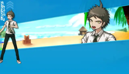
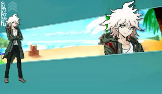
...So, wait a minute. The sprites used in Danganronpa S aren't new edits, but beta sprites? Older than the ones featured in the original SDR2? Turns out, this website features desktop backgrounds using beta sprites for nearly every character that otherwise never saw the light of day.*
I'm going to go through them one by one, gif comparisons included. This won't be the only post, either! UTDP also has some very interesting likely beta art used in it, too. As well, some of the other sprites featured in Danganronpa S may also be reused beta sprites!
As such, this log will be broken into three parts. This is part 1.
[Part 2 - UTDP (not made yet!)] [Part 3 - DRS (not made yet!)] [Part 4 - Dangan Island (not made yet!)]
*with the exception of UTDP in some cases, as well as some other things I will get to in Part 4.
As said, semi-flashing gifs will be included in this post. They are meant to swap between the beta and final sprites at a fast pace to illustrate the differences (2 frame, half a second each). Be cautious if you have epilepsy.
Also, because of Tumblr's stupid image limit, this post will have a reblog with the rest of the sprites! So please check this post's reblogs, it should be the first one!
Firstly, how do we know these are actually beta sprites? These images are sourced from the Danganronpa fandom wiki, and while I generally trust the wiki's credibility, it's always imperative to fact-check. So, I went ahead and searched Danganronpa's old website on the Wayback Machine and uncovered this:

A character intro page for Hinata, using this same beta sprite. Now, granted, the only capture of this page is from 2015. Still a year before V3 and a few more before S, but still, it's not the 2012 original. That said, a character intro page for Mioda circa early 2014 looks exactly the same, including the usage of her beta sprite.
And, when you click on the button that says スクリーンショット(Screenshot)...
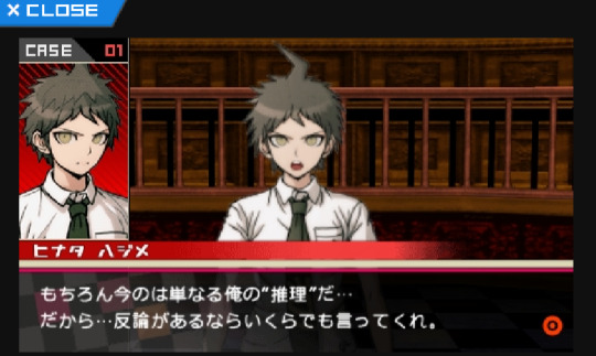
You're offered a very obviously beta trial shot. As is common with Danganronpa trials, in development, the actual character portraits are not put in until later, and to substitute, their art reference photos are used, as seen on the left.
With that out of the way, I think it's safe to say these sprite we are about to look at are indeed betas.


It's only fair, then, we focus on Hinata first.
(Please note for all the comparison gifs I had to manually size the final sprites to get them as close as possible in aspect ratio. Very minor size difference between sprites is likely a result of this and not an actual detail change.)

A lot is revealed with a simple gif. Hinata's entire face shape was changed (including ears), not just his mouth. In fact, not just the shape of his face, but the face itself is drawn very differently in the end. The neck of his shirt was raised, as well as tie being redrawn (you can actually see where the new part begins somewhat sloppily). Less notable but still apparent are his bangs being redrawn and shaded differently.


Keeping with consistency, let's check out Komaeda next.

Yet again, the differences are striking when flipped back and forth. Komaeda's face shape and ear was redone much like Hinata, but not to nearly the same dramatic extent. As well, his entire face was redrawn, notably erasing the black shading under his chin and shortening his eyelashes. Less noticeable, the hair touching his neck is shortened a bit, and the crease line on his hood is more well-defined. They also slightly changed the line art for the first fold in his shirt, the neck at the back of his shirt, as well as his leftmost bang. Interestingly, they either forgot or didn't care to fix the shading to reflect the new placement of these lines. His jacket also has some changes in line art weight.

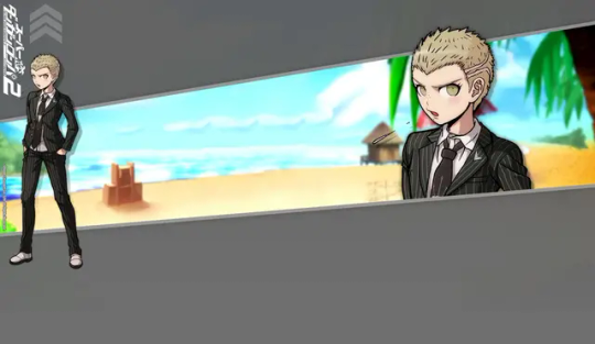
With Hinata and Komaeda out of the way, let's touch on Kuzuryuu.

This one honestly shocked me. Besides the added detail of him spitting, I didn't notice any difference right off the bat until I overlayed the images, but the differences are night and day. His eyes are made to be less mean and more skeptical. His mole was shrunk and his nose is more 3-dimensional. Extra detail is added to his ear while his hair is redrawn in whole, including it being slightly shorter. What's most interesting is the fact the body was sized up and moved down several pixels, I imagine to change the perspective. Some minor line changes are made to the white undershirt of his suit.

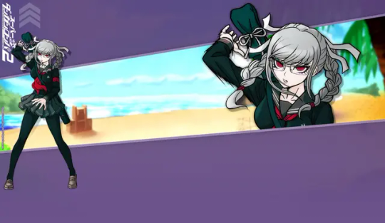
It would be improper not to do Pekoyama next.

Again, just like Kuzuryuu, I didn't notice half of these changes at first. Pekoyama's whole face is slimmed. The outer outline of her hair remains the same, but almost every outline inside of it, including her bangs, changes. (Although, her right twin-tail has a slightly longer end to it.) Her outfit receives minor touch-ups, including a clothes fold on her breast and darker shading by her collarbone. Speaking of, her neck muscles and such have been redrawn. Most interesting to me is the fact Pekoyama's outline is noticeably thicker with action lines in the original beta sprite, but lack them in the final sprite as if somebody used the magic wand tool to edit the background out, editing away some of the jagged black lines in the process. She is the only character where this happens.

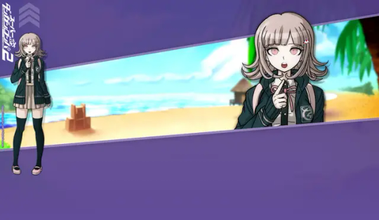
Since she is a major character, let's do Nanami now.

I wasn't surprised to find Nanami has virtually no difference about her. Her design was pretty much set in stone early on. That said, it's not entirely the same. Though very minor, the thickness of her left eye was increased at the top. As well, shading across her pinky finger was removed. There is also a chance her body is slightly bigger, but that's more likely to be a result of me failing to perfectly match up the two images.


I want to focus on Souda now as he was the first one I did this test with.

You know, when I first played SDR2, I thought Souda looked kind of scary. His beta is even scarier looking! I can see why they changed it...Every detail on his face is redrawn including his chin, notably his pupil was enlarged and his eyebrows were quirked. Funnily, it seems the clip on his beanie was redrawn, but like Komaeda, they didn't edit the color layer to match the new outline. Some minor line art changes were made to his back hair. The lines for his neck and collarbone were lessened, and the jacket zipper is made more three dimensional. His thumb was fixed too, as well as the lines on his hand.
Also, here's a fun little thing I noticed while replaying SDR2 just a few days ago!

The sprite used for Souda in the Dangan Island opening is the exact same as the beta sprite! This would be the only time Westerners would catch a glimpse of some beta sprites until UTDP, as keep in mind, these wallpapers were exclusive to the Japanese Danganronpa website.
In fact, Souda isn't the only one with a beta sprite in the Dangan Island opening. I will also be covering that in part 4.
Moving on...

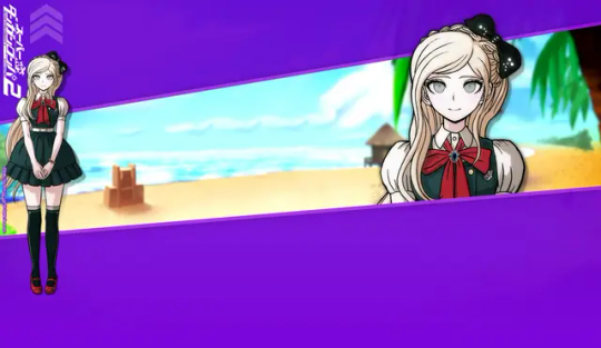
I guess it's only natural we look at Sonia's sprite next.

Changes like these ones are very interesting to me, because if you did not do a side-by-side like this, you may never see how many minor details were changed. A lot of Sonia's line art was redrawn to be more detailed, such as more lines in her hair, thinner outlines for her braid, and redrawn creases in her shoulders and bow (as well as a redrawn button). Her face is interesting as some very minor changes were made. Some detail is added to both ears (thicker outline on the right, changed line art on the left) and her left eyebrow is slightly edited. She was also given extra eyelashes on both sides. When it comes to such minor changes, it makes you wonder why they bothered at all. I wonder what the development looked like.
Anyways, please check the reblog for the second part! That's where the rest of the characters will be!
#hajime hinata#nagito komaeda#fuyuhiko kuzuryu#peko pekoyama#chiaki nanami#kazuichi souda#sonia nevermind#akane owari#gundham tanaka#nekomaru nidai#mahiru koizumi#hiyoko saionji#mikan tsumiki#byakuya twogami#teruteru hanamura#ibuki mioda#danganronpa#sdr2#;noxiatalksia#dr#;resource
111 notes
·
View notes
Text
Ex-Meta employee Madelyn Machado recently posted a TikTok video claiming that she was getting paid $190,000 a year to do nothing. Another Meta employee, also on TikTok, posted that “Meta was hiring people so that other companies couldn’t have us, and then they were just kind of like hoarding us like Pokémon cards.” Over at Google, a company known to have pioneered the modern tech workplace, one designer complained of spending 40 percent of their time on “the inefficien[cy] overhead of simply working at Google.” Some report spending all day on tasks as simple as changing the color of a website button. Working the bare minimum while waiting for stock to vest is so common that Googlers call it “resting and vesting.” In an anonymous online poll on how many “focused hours of work” software engineers put in each day, 71 percent of the over four thousand respondents claimed to work six hours a day or less, while 12 percent said they did between one and two hours a day. During the acute phase of the Covid-19 pandemic, it became common for tech workers to capitalize on all this free time by juggling multiple full-time remote jobs. According to the Wall Street Journal, many workers who balance two jobs do not even hit a regular forty-hour workload for both jobs combined. One software engineer reported logging between three and ten hours of actual work per week when working one job, with the rest of his time spent on pointless meetings and pretending to be busy. My own experience supports this trend: toward the end of my five-year tenure as a software engineer for Microsoft, I was working fewer than three hours a day. And of what little code I produced for them, none of it made any real impact on Microsoft’s bottom line—or the world at large. For much of this century, optimism that technology would make the world a better place fueled the perception that Silicon Valley was the moral alternative to an extractive Wall Street—that it was possible to make money, not at the expense of society but in service of it. In other words, many who joined the industry did so precisely because they thought that their work would be useful. Yet what we’re now seeing is a lot of bullshit. If capitalism is supposed to be efficient and, guided by the invisible hand of the market, eliminate inefficiencies, how is it that the tech industry, the purported cradle of innovation, has become a redoubt of waste and unproductivity?
251 notes
·
View notes
Text
The Death Of A Website.
tl;dr click source to see an AU of my blog.
As many of you may not have heard, Cohost has gone read only. The website infamous for "Zero Discoverability" and its users "Not Being Funny." Servers will close down at the end of 2024, if not earlier, being backed up on the Internet Archive before that. Since their user counts were still low after 2 years (about half of all sign ups ever were from people evacuating twitter, which then didn't know how to use the site so most left almost immediately. Kind of hilarious) they didn't feel like anymore money bleeding OR the fact that a staff of only four people being on call 24/7 was worth it anymore.
However,
the people who DID use the site loved it. And they did some genuinely cool things on it, far cooler than anything I ever saw even in the glory days of Tumblr. You know, like Finn and Jake hi-fiving between 2 posts. Stuff like a playable maze, or a fully navigable 3d room you move around in with your mouse entirely within a post. They really did some cool stuff.
There were also a ton of really talented people, people like the composer Lena Raine(Celeste/Minecraft) who loved the site because you could just. Actually talk to people on it! Without an algorithm to boost their posts, the only people who saw it were genuinely looking for it.
Also some of them were just good posters, we did get Pikmin 18 billion and eleven from Cohost after all.
The point is, I think if anyone outside of Cohost actually knew what was being done on Cohost, it would of succeeded. There would of been enough active users for them to invest more. If I knew about all of this I would of been there way more!
But rather than just you blindly believing me, I decided to spend (almost) every hour I would of on Tumblr, on Cohost instead. Clicking that link, or the source, or the link on the source above in the tl;dr, will take you to my Cohost blog. At least while it's still read-only.
You should check it out. I reblogged a lot, but the first page or 2 (every 20 posts, I kept trying to stop but I got sentimental and reblogged more) is pretty much just people's last posts. I'd say give it 3 pages to see if you're interested or not in exploring more of what the website has to offer.
If you've ever wondered what people would post on a dying website,
If you ever wondered what some of the best posts people were making on Cohost that got shared again in its last dying moments were,
If you want some reference for what inside jokes would look like to an outsider,
If you're just bored and need something to scroll through,
if you ever wondered what I would of reblogged on that website if I remembered my password easily enough to log back in easily...
You could think of my blog as a small encapsulation of a small website. There's only 60 pages, including the ones from before the announcement from me just rarely using the site!
I reblogged all kinds of posts. Goodbyes, sarcastic hellos, mourning, long speeches about the spirit of Cohost set to sad music, nothing burgers, inside jokes I didn't understand, The New Garfield, posts I flat out didn't read past the title because they were too long and I just wanted to move on really there's a lot of posts to archive, CSS crimes, stuff I found funny, "Where to find me" and webrings and website posts for people I never knew, Love Honk, reviews for movies and games I never intend to play or watch, 88x31 buttons, music recommendations and history, entire games, signing up for RSS feeds, asks and answers related to other stuff I didn't share on accident, regular memes, Intern Secretary Eggbug, a post that's just an image hosted off-site so it'll update even after readonly, and so on.
(Nothing overtly NSFW. Tag search still works if you want that)
One that I, personally, am sad is gone. That I'm glad I got to see at least in its dying days. That I genuinely hope someone makes another attempt at creating.
#Cohost#The Death Of A Website#The Global Cohost Feed#<- there was no algorithm or 'new' section so a lot of people just tagged everything with this to do that. Kind of funny tbh#yes btw the 4 people also handled all of the site moderation. This did in fact cause: problems sometimes#if it's not read only by the time this scheduled post goes up uhhhh. Go Hog Wild I Guess.#I would go through people's blogs and random tags whenever my following tab dried up#so post type can get kind of clumpy sometimes. Feel free to skip forward or back pages if that ever gets annoying.#If you genuinely want to buy Cohost go make them an offer it is absolutely for sale btw.#The Cohost Global Feed#I definitely did not mix it up and am just being thorough
33 notes
·
View notes
Text
hey (canadian) sticker enthusiasts. wanna learn how i got a huge box of blank ups labels for free??

here’s what ur gonna do. go on this website: https://www.ups.com/ca/en/shipping/order-supplies.page

ur gonna log in on this bad boy (or create an account, then log in.)
now. when u log in it will probably bring you to a new page. you don't care about this page. go away. go back to the previous page (or just open a new tab with the same link above). if it still asks u to log in just press the log in button again and it'll be like Oh Right hello yea! you're logged in my bad
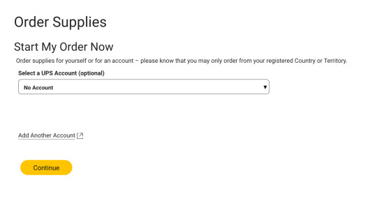
next you're gonna be asked to select a UPS account, it's optional, just say "no account"
now: the motherlode
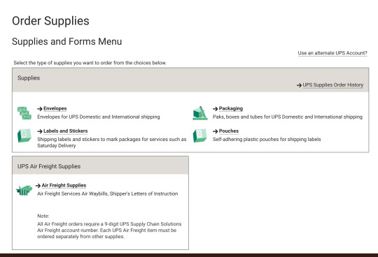
go to labels and stickers, then you're gonna have a bunch of options
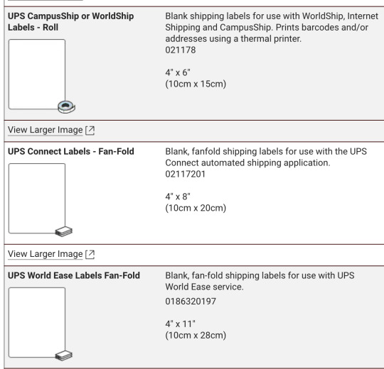
here's the three i got, i recommend the top two. the first option is a roll of labels, middle one is the box of labels at the beginning of this post, and i don't really recommend the bottom one. it's a huge amount of stickers (i cannot emphasize enough it was easily 5x the weight of the box of 4x8 stickers) but here's what they look like:

there's like. stuff on it. and the backing is weirdly cut? idk i do not like them i think it's more advantageous to get the first two!! anyways on the right ur gonna see checkboxes, just check the ones you want then scroll down and press "add selected to order". the page is gonna update and u will see this!!

view ur supplies order, then i wont take a screenshot of this part because it's just like. My Address, but just submit the order and bada bing bada boom it's on its way. i think theres a certain limit on how often u can order (for example i couldn't order more stickers because ive ordered some recently) but like. there's SO MANY who cares i have barely made a dent and i am using them like crazy and giving them to people.
ANYWAYS HAVE FUN! MAKE SHIT!
#punk#stickers#resources#free stuff#how to#guide#diy craft#streetart#remember kids graffiti's only illegal if they see u!#activism#canada#canadian punk#label 228#diy or die#graffiti
11 notes
·
View notes
Note
Hi Sarah, thank you for everything you have done to the Kalafina fandom until now, you're an angel.
Is there a tutorial for joining Finction Junction Station fan club? I want to apply for the next year's Yuki Kajiura live ticket lotteries an I want to be sure to have a ticket since I'll travel from a very far Country. Thank you!
Hello there lovely anon!

I currently have no dedicated tutorial for Yuki's official fan club, FictionJunction Station. However, many years ago, I made a very detailed post about Kalafina's fan club "Harmony". That post was meant to help people navigate the site and register as member. Even though "Harmony" no longer exists, the basic steps described in my tutorial still apply to both Wakana's fan club "Botanical Land" as well as Yuki's fan club "FictionJunction Station". All these websites are designed by the same company, SKIYAKI, so the basic structure is the same.
Here are some main requirements before you start〈(•ˇ‿ˇ•)-→
Credit Card: They do accept overseas credit cards as payment option so you'll be fine with that
Japanese Address: Find a forwarding/proxy service that will arrange everything for you. There’s tenso.com for example. You can get a Japanese address on this page which you can then use to buy things at various websites. That address can also be used to become a fan club member. They will not do transactions for you (as in, buy stuff for you, apply at ticket lotteries), they simply provide an address, store your stuff in case you buy anything and later send it to you. All your stuff will be sent to that address and then they will ship it to you (you can choose from various shipping methods). Payment for goods is also possible via credit card so you can have the merch sent to your TENSO address as well. Then there are sites like www.sosjapan.jp which will do pretty much everything for you (including payments). They will register for you under your name. They will apply for lotteries/pre-order/buy tickets or merch for you. This may actually be a better option for you but that's something you'll have to decide.
Step 1. Get your SC ID. An account will be issued by acquiring an SC ID (it’s free to do that!) which is required to use the service of this site. Simply click on the “new registration” button and enter your e-mail address and a password. A confirmation e-mail will be sent, by clicking the link in the mail, the first part of the registration process is completed. After logging in with your SC ID, you can access “My Page”.
Step 2: Confirm your e-mail address. After you have confirmed your e-mail address you’ll receive another mail stating that the registration of your SC ID was completed. You may log in now with your mail address and password. Be aware that your registration process is not done yet. Next up you should go to “My Page” to enter all your information.
Step 3: Go to “My Page” to enter all your information. Regarding the name, just enter your name in Roman letters first and then in katakana (Google Translate can help you get a katakana version of your name). As for the address, the Japanese address system is quite complex and can seem intimidating at first glance but Tenso provides a few tips on how to enter it properly so be sure to check them out.
Step 4. Confirm the information and continue to the payment method. It’s super simple. You have the option to pay with credit cards which is really the only option that is of interest to us. Simply choose your credit card and enter all the important data. On the right you’ll see the details for your payment (admission fee + annual fee, no extra fees). There's also an option to enable an automatic renewal of your membership. Only possible if you are paying with credit card. Once your year is almost over, the yearly fee will automatically be transferred from your credit card. I guess this comes in quite handy if you are prone to forget things like that easily. Lastly, there’s a button to confirm the transaction and then I think you’ll be asked one last time to confirm all your data and THEN it’s DONE. You are officially a member! You’ll be transferred to a page stating that the process is finished and listing some of the important data. You’ll also receive an e-mail welcoming you to the fan club and summarising all your information (=> member number, expiration date, payment details, payment method)
Please also keep in mind that often, a fan club membership will not be enough to get concert tickets. Most fan clubs will use one of Japan's common ticketing services for their lotteries. With FJS it's usually Lawson Ticket or e+. It can be very difficult to register for these site since they require verification via SMS/phone call (Japanese phone numbers only!!) The payment for tickets is also pretty much impossible for overseas fans. If you are uncertain about any of this and not willing to jump through many hoops, I recommend you look into proxy services like SOSJapan (as mentioned above).
Good luck on everything! Hope you'll be able to attend one of the lives next summer. It's gonna be Yuki's 60th birthday in August so maybe they'll do something a little more special for it.
#reply#yuki kajiura#kajiura yuki#fjs#tutorial#fictionjunction station#Tenso#SOSJapan#proxy service#ykl vol 21
14 notes
·
View notes
Text
A guide on using RSS
This is an extension of my previous post about diversifying your internet use!
What is RSS?
RSS (short for Really Simple Syndication) is basically an update log for a website. When a site has new content the RSS feed will update, and an RSS reader will show what's on the RSS feed. Think of an RSS reader like a centralized timeline/dashboard for all your favorite sites.
Why use RSS?
The most important reasons are to reduce your reliance on any one site, and to save time by compiling all the websites you check in one place instead of having to visit each one individually.
There's also no algorithm that decides what you see (or don't see.) No more shadowbanning, it's all where it's supposed to be. Plus, it makes it incredibly easy to jump ship from a platform that's endlessly fucking up, without having to start over entirely or maintaining profiles on 20 different sites.
Examples of websites that have RSS feeds:
Blogging + Social media sites (tumblr, cohost, blogspot, livejournal, mastodon, bluesky social, reddit, etc)
Video sites (youtube, dailymotion, vimeo, etc)
Podcasts
Forums
News sites
Personal websites (if the person running the site has added one. Here's a guide on adding an RSS feed to your own website! And here's a shorter one!)
How to use RSS?
You will need an RSS reader. I personally like and use Feedbro, which is a free browser extension (available on chrome, firefox, and microsoft edge.) Feeder is free and popular on android. Chrome on android also has a built-in RSS reader that can be enabled. Feeeed is a good free option on iOS.
How to find RSS feeds?
Some RSS readers like Feedbro are able to automatically find the RSS feed for a page with minimal effort on your part, you just click a button and it'll pull up the info.
Others will need you to paste the feed URL into a box, which isn't particularly hard either. There's a few ways to find an RSS feed URL. Some sites will have a direct link to it. It'll usually be an orange icon that looks something like this:

Less commonly, it'll be a link that says "subscribe", "web feed", or just a + icon.
Many sites don't have a direct link listed anymore, but that doesn't mean they don't have an RSS feed. A simple tool for finding unlisted feeds is Thirdplace Discovery. On that website, you paste the URL of the site or page you want the feed of, and you're given the URL of the feed if it exists.
Some sites simply don't have their own RSS feeds. That can often be worked around with tools like OpenRSS, RSSHub, or RSS.app!
It's also worth suggesting for websites you like to add their own RSS feed or to add the link in an accessible place. The more interest people show in it, the more likely it is to be supported.
That's about all you need to get started!
RSS is infinitely useful and customizable, it's worth trying out at the very least. Once you get settled in, it's very easy to use.
There's a huge amount of RSS reader options out there. Don't like the reader you started out with? The vast majority of them will let you export your subscription list as a file that can then be imported into a different reader! Feel free to experiment with different options to see which one you like best.
Also feel free to ask questions if you have them!
43 notes
·
View notes
Note
I've been poking around your website, I really like it.
I'm inspired to put together my own silly site, you've made a lot of posts about that. I know how to get started with a website builder or whatever, but that's kind of boring.
I'd like to imitate the look of Ao3's log in page.
I have several specific Ao3 searches that the 'favorite tag' section just can't manage. I have all of those links in a google docs but it's boring and clumsy. I want buttons to press.
Your website mimics wiki, so... can you point me in the direction to get started mimicing Ao3?
My website doesn't just mimic wikipedia, it is a MediaWiki site, which means that from the ground up the software it's running on is the same software as Wikipedia. When I write pages, I'm using wiki markdown ==Like This== for section subheads and [[like this]] to direct to other pages on the site, etc.
The reason that I chose to do this is because it's relatively easy to set up a site this way; I don't know enough about CSS to get a site to look like Wikipedia without running it on mediawiki software, and I don't know enough about CSS to get something to look like Ao3 without running it on OTW software.
Like MediaWiki, the OTW archive software is also open source, so you theoretically could set up a literal archive of your own, but it is not *easy.*
Walter from Squidge.org has created documentation for implementing OTW's software and has talked about helping others to set it up as well, so that is one option.
If that's not the kind of labor you're looking for (and it won't be for a lot of people! it certainly wasn't for me!) you could try something like using a site like wordpress and building a custom template. That would *also* be a lot of work (in terms of learning CSS) but might be easier than figuring out the whole backend as well as getting the visuals you want.
88 notes
·
View notes
Text
How to donate to Gaza and which legit fundraisers to choose :
Remember show proof of donations and you can commissions the artists , writers , translators (Spanish, French) and editors of your liking in the threads/posts below ⚠️❗️❗️❗️
Additional post with where to donate ( family fundraisers, esims , org , ressources etc..)
Place and methods for donations (can be one made in the last three weeks/months) :
CARE FOR GAZA
@CareForGaza is a non profit organization that uses the donations to give coats, baby items, food packages, flour, and even cash to palestinian families in need or palestinian refugees.
To donate, go to their paypal
Log in, enter the amount and currency, pick how you want to pay, review your information and click send payment
__________________________________
PIOUS PROJECT (For hygiene kits)
Founded by Fahim Aref, Pious Project's has the mission to empower everyone to make a difference--one good deed at a time. They have created a way to take part in global humanitarian, charitable projects, including donating and volunteering.
Their official website:
Currently, they are raising funds to donate hygiene kits to menstruating people in Gaza. The value of each one is $20, which contains sanitary pads, tissues, wipes, a hairbrush, toothpaste, toothbrush and other items.
How can I donate?
The following is the link that will take you directly to the page, once there you will click on the button that says "Donate."
Link: https://piousprojects.org/campaign/2712
If you are not logged in, it will ask you to create an account. You should receive an email welcoming you, as well as a direct link to the website.
The next thing that will appear are three options:
You can enter the amount you want to donate (USD), or instead, donate a specific amount to pay for from 1 to 50 entire kits. If you choose the second option, don't worry, each option tells you how many kits you are donating for!
The most important thing is to keep in mind that you will have the option to only donate once or monthly.
Finally, you will only have to fill out the details of your card or bank and that's it! You will have donated to the cause
In addition to the donation of hygiene kits, Pious Projects have many more causes, here we leave you the following:
FOOD
Food Baskets for Gaza
POINT OF CARE
Point Of Care Ultrasound for Gaza piousprojects.org/campaign/2172
FAMILY
Gaza Family Support piousprojects.org/campaign/608
You can also go on your own to the official website and check out the different causes they are donating to.
_______________________________________
SALAM ANIMAL CARE
Salam Animal Care is Abdallah's Twitter account. He is a man who rescues injured animals in Gaza and provides them with medical assistance. His @ is @RescueCare. To donate, you need to click on this link to go to his PayPal
Log in, enter the amount and currency, choose your preferred payment method, review your information, and click send payment.
Then just send us a screenshot that you actually made the donation!
________________________________________
DIRECT AID TO GAZA
Direct aid for gaza
Account : https://x.com/GazaDirectAid?t=sWfYhS-uKaxETizI4Avpkw&s=09
Paypal : https://twitter.com/GazaDirectAid/status/1757813936940876185?t=2KqHPkJHcLGPYi9jOPoWZQ&s=19
Trust wallet : https://twitter.com/GazaDirectAid/status/1760456373173620981?t=68DI1E0Ko3HNxIJULn8wDA&s=19
________________________________________
MEDICAL AID
Medical Aid for Palestine is a nonprofit organization that is located in the uk. their aid goes toward west bank, gaza, and lebanon. they help both palestinians living under occupation and those that have refuge status. they give medical, mental, and disability support
their twitter account also gives updates on attacks and deaths as a result of said attacks. @MedicalAidPal
To donate, you go to map.org.uk , select your currency and amount, and who you are giving your money as. then, select a title, fill out the contact and address information, and finally after doing that, you can fill out your card information and hit pay now.
________________________________________
E SIMS
eSims for Gaza is an initiative led by @Mirna_elhelbawi, a writer who demonstrates solidarity with the cause and ensures that aid reaches those in need. Mirna's efforts keep doctors, journalists, and the entire population of Gaza connected with the world, preventing their silence
By donating to eSims for Gaza, you can comission our collaborators.
Visit their website: [gazaesims.com]
★ How to Donate? | Below 👇
To donate, you can use two apps: Simly and Airalo. Download either app.

Follow these tutorials for both:
1. Search for "Palestine."
2. Choose one of the available plans.
3. Click on "Buy Now."
4. Proceed to payment.
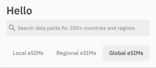
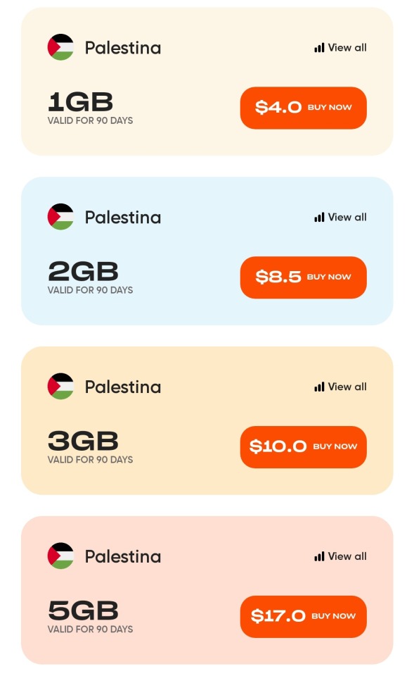
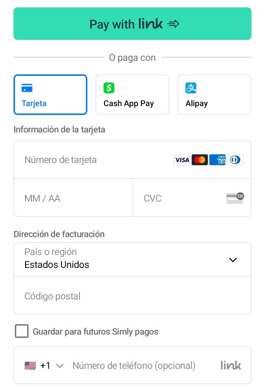
After purchasing your eSIM, DO NOT ACTIVATE IT. Once you complete the payment, you will receive a QR code in your email. We strongly urge you not to activate it, as the QR code received is the SIM card. Instead, take a screenshot of the QR code and send it to [email protected].
That's all it takes to donate. Then just send us a screenshot confirming that you've sent the QR to their email to commission us.
________________________________________
OPERATION OLIVE BRANCH
They have links for several Gazan families in need of help, and even if you can’t donate, helping spread the word can go a long way 🍉
Any donations to the ressources and fundraisers and charity reunited by @operationolivebranch on Instagram and tiktok will count as well as payments for the commissions Just go through the ones in the doc below 👇 :
choose and donate to one and send us the proof to commission someone !
________________________________________
EMERGENCY
Yasmeen Ouda is a Palestinian woman living in Canada who is seeking assistance to rescue her family from the genocide in Palestine and bring them safely to her residence in Canada.
Their twitter account is: @hosam_ouda
To donate, please visit their GoFundMe page:
Choose the amount you would like to donate, select the portion you will leave as a commission for the GoFundMe platform, pick your payment method,
fill in the necessary information, and finally, make your donation!
Afterward, please provide us with a screenshot confirming that you have indeed made your donation to be able to commission!
_____________________________
ALL DONATIONS TO CONGO AND SUDAN WILL ALSO COUNT AS WELL SO DON'T HESITATE TO DONATE THERE AND COMMISSION US IN EXCHANGE !!!!
#free palestine#aid to gaza#dttwt4palestine#fund raising collabs of artist and writers#fundraisers for gaza#e sims for gaza#donations for gaza#donations animals shelters in gaza#commissions as donations#donations of hygiene kits in gaza#donations to care for gaza#free congo#free sudan#mcyt fans charity event#artists and writers and editers charity / fundraising event for Palestine congo and sudan
24 notes
·
View notes
Text
Designing a fake real blog! Prt 4 | Dev Logs

Friday 5th May 2023
ALERT! This is no longer a fake blog website I am designing! I gave my Dad my laptop to have a look at what I was working on and he replied with "Oh but this looks really good! Why don't you actually host this and use it?" and I GASPED, why don't I? I have been using some Neocities as a reference and people who designed and built theirs have it up for people to use, so why don't I do the same?

Now what I worked on were some parts of the homepage and I made a temp post page, so when you click the actual 'Read more!' buttons, you can see the full post!
I am so excited to d and having so much fun with this. I’m trying hard to stick to the style and not just mash it up with something else but so far so good!
I also created an 'under con' page message for the other pages I made but haven't added any content in them!


Thank you for reading! Happy coding! 😎👩🏾💻🙌🏾

#xc: project logs#codeblr#studyblr#progblr#programming#coding#javascript#html css#comp sci#devlog#computer science#webdev#web design#tech#code#learn to code#personal projects#coding project#electronics blog project
61 notes
·
View notes
Text
Rapture: Before we begin.
We are about to start a long and involved process: I am about to start (tomorrow) posting OH GOD THE RAPTURE IS BURNING's final draft. As this story was first written here on this very tumblr, I have some experience with how to do this and what can go wrong.
Every day, with one single exception (May 22nd), I will post a chapter of the story (on both this tumblr and my Website). Each chapter is called a "log" (this story is also known as The Rapture Logs) and is titled with the day that it takes place. As the narrative persists from May 21st, 2011, to October 21st (and then a bit extra), I have elected to post the story now in the same way. The May 21st log will be posted on May 21st, the June 19th log will be posted on June 19th, et cetera.
As I much prefer to keep my hands on the 'product' even during delivery (there are many opportunities for something to go wrong), I do not plan on Scheduling any of these posts and will post them directly, myself, each day. I do not expect to adhere to a reliable schedule, so the exact time that a log is released may change per day. However, I may get into a rhythm. Can't promise anything. (If you want to.. what is it, Subscribe to my tumblr, make it so you get Notifications when I post? That may be a good idea. Up to you.)
After having done some testing, the exact method I use to bring these logs to tumblr this time causes some finicky formatting errors that tumblr does not allow me to fix. I've tried, many times, and they keep resetting. However, these errors are (so far) minor. When there is a long consecutive string of bolded or italicized text, for instance, you may see the bold/italics end before it should. If you see that kind of thing, I am 99% sure it is unintentional, and I am aware of it, and I am sorry. Hopefully it shouldn't be that distracting.
There are some... other missing features that the Website will have and the tumblr will not. So. The Website is the best way to read. And the tumblr will be here as a supplement, in case for some people it is just easier to stay on tumblr.
I am including links, at the bottom of each log, to the tumblr Table of Contents, and to the Next and Previous Logs. If you are following this release daily, the "Next" button will not function at first. Because the next log will not have been posted yet. Makes sense, but wanted to be clear.
Art will be included within the logs. Not every log. Not even many logs. But there will be art. And on those days, I will also post the art in a separate post after the log, giving full credit to the artist. There may be one exception I can think of, where the art is of a fundamental spoiler, and I'll.... figure something out for that event.
These logs are going to get long. They are not predictable. I mean, anything is predictable, and Rapture is easily long enough that you will start to engage with trying to predict it. But my point here is: Each day, ask your innermost heart, "Do I feel like reading this?" It is okay if the answer is "Not today." I do not require a certain number of Likes, Comments, and/or Subscribes before I post the remainder of the story. And this is not a Limited Release; Rapture will be available forever. I would like readers, of all stripes and sorts, including daily ones. But I also would like some spaghetti bolognese. Today might not be a spaghetti bolognese day, and I've made peace with that uncertainty. .....so, yeah, feel free to catch up with the story later if you must.
Now, let me remind you of the Trigger Warning that I had posted at the beginning of May.
Trigger Warnings: Sex, Gods, and Rock & Roll. (violence, to others and to the self. some swear words. teenage angst, cringe. death. insects. surrealism. symbolism. unpredictability of what will be explained and what won’t. sexual acts with dubious consent– you will be able to skip that part. religious iconography. and so much prog rock.)
The only joke in there is the word "some" before "swear words." I promise you, this story is not for everyone. I do not say that to brag; I say that to convey some of the responses I have gotten from previous drafts. I have accounted for one skip in the entire story, and it's pretty early on. Rapture hits the dubious consent theme in its least comfortable form early and then lays off of it. Being honest with you, earlier drafts did have more of it, and I cut out almost all of it, but I did not remove that early instance, even after eight big opportunities to do so. I deeply believe it is doing something beyond just shock. And so, if you choose to skip it, I have at least included a safe recap at the point where skippers resume.
That should be all the essential stuff. Now for some quick bits:
This story makes use of emoticons, including a couple that are not common. Keep in mind that every emoticon has eyes and a mouth. For instance: the .w. face is related to the owo face, but using the eyes from the ._. face. What .w. means is a sort of humble happiness, an "Aw, shucks!" (The < in <:D is intended as eyebrows, not a party hat.)
This story uses some real names, of people and places. The places are just... places. The people names are only used where permission was granted, and I explicitly only use them for the sake of aesthetic, personally enjoying the way a name looks or sounds. All the events and opinions portrayed are fictitious.
There is a caveat in the case of the main protagonist and narrator. He is a riddle of a self-insert, a caricatured snapshot in time of the author at 16. Think what you will about the merits of a self-insert. I promise you, every expectation you have has been taken care of. I promise you, I know what I am doing here.
Okay. That's a lot of words.
Honestly there's probably even more stuff I should say? But I don't want to overexplain this. Chances are, you're actually gonna be totally fine??? Chances are, Rapture in its final draft is totally readable, and not even all that shocking, and all this preparation is making it sound like it's gonna be way worse than it really is. That's the best-case scenario here. I'd rather be prepared.
So. So look. We are on tumblr. You have the ability to send me Asks. Ask me anything. Please, ask me anything. You want the best way to read? You want clarity on what the heck I was thinking when I wrote a weird opinion of Jordan's? You want to know when the story will get good? Ask me.
'Cause, starting tomorrow until the story's done, I'm only going to be posting about Rapture. I'm going full Rapture Mode. I will only reblog posts relevant to Rapture. I will only post links to the Website, or anything relevant to the story.
Right now, as of May 20th, I am still in the process of rewriting later sections of the story. I have hit some slowdown as there were some logs that took multiple days, but I am still over two months ahead of where you'll be, so there's a bit of buffer. I should be done around August? So you're watching me do a public performance here too. Trying to outrun my own story and finish it before the present catches up with me. We'll see. God, we'll see.
God, I hope my new readers are ready. Rapture was once called a "butchery of epistolary literature," are you ready to see what spawned that insult?
Am I ready to expose myself to the world once again?
Let's!!! Let's do this thing!!!
7 notes
·
View notes
Text
how i pirate music
i'm seeing old posts hating on spotify circulating again, so i'll describe how i listen to music without paying for streaming
discovery through cracked spotify
i discover a lot of music through cracked versions of spotify. i'm in a number of circles that do music shares and i stream recommendations a few times before i decide to download anything
windows
i use the spot x modified client on my desktop: https://github.com/amd64fox/SpotX/. be sure to cancel your spotify subscription and remove your payment information before logging into any cracked version of spotify
android
these websites come and go, but you should be able to look up "spotify apk" and find a one button installation. you can get an up-to-date safe link by visiting the database in this reddit post: https://www.reddit.com/r/ApksApps/comments/pcy1io/apksapps_official_megathread_apksme/
mac
i don't want to put anything weird on my work computer, which uses mac os, but if i control the music through my phone, then select my mac as the audio output device via spotify, i can listen ad free. here's the feature if you've not used it before: https://support.spotify.com/us/article/spotify-connect/
downloading music
file share
i download almost everything with soulseek, a p2p file sharing program: http://www.soulseekqt.net/. first you'll make a directory of music that you already have (say, from bandcamp) and soulseek will broadcast that to the world. you can then search other people's files for music you want and download it there
torrenting
i use the torrent client deluge: https://deluge-torrent.org/ and get my links from https://www.1377x.to/. you should use a vpn when torrenting; i happen to use surfshark because it's cheap. it is not perfect and if you want to torrent stuff there's better guides out there explaining how to do it safely
paying, but sticking it to the man
i buy more music now than i ever did when paying for streaming. i personally just use bandcamp, but i know people who use/rip CDs and other physical media. it's nice to support small artists and to upload big artists onto soulseek so other people can find it
audio quality
downloaded music is likely going to be higher quality than streamed music. if you don't know anything about audio quality i'd recommend downloading 320kps mp3 files. you can add a minbitrate filter at the bottom of your soulseek window. you've probably heard of FLAC before, but if you want to see how deep it goes, look up DSD or SACD
listening to downloaded music
windows
i use foobar2000: https://www.foobar2000.org/. it's designed to be modular and customizable, so it takes a little fiddling to get running. to start using it, i recommend: making a playlist and adding a file location of all your music (which should be your soulseek up and down directories). you can later make playlists of specific albums and tracks. then, look online for components like a theme or last.fm scrobbles if you want that kind of thing. last.fm scrobbles can be a great way to discover new music
android
foobar2000 recently released a mobile version but i haven't tried that yet. i use vinyl music player for no reason in particular: https://play.google.com/store/apps/details?id=com.poupa.vinylmusicplayer
final notes
this isn't about doing music better; i just happen to like doing things this way. i still hang out and listen to my friends' cytube on loop. i blast nightcore on youtube. the goal is to listen to music and have a good time so do whatever is best for you
37 notes
·
View notes