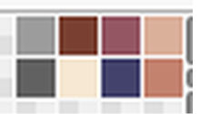
#(like a gradient from blue to white basically)
Explore tagged Tumblr posts
Visit Tumblr Blog
Explore Tumblr blogs with no restrictions, modern design and the best experience.
Last Seen Tumblr Blogs


Fun Fact
Average visit duration of Tumblr.com is 10 mins and 25 secs.
Note
YOU'RE GREAT!!!!
You're right, I forgot that ask.
But it's even better to discover it now!
GORGEOUS! I LIKE THE HAIR, THE EYES, THE SHINE OF HER SKIN AND HOW THE VITILIGO LOOKS LIKE THE TEARS/STRINGS MARKS UNDER THE EYES
Thank you for this beautiful sight.
-anon
ANONNNN!!!!!
man i did not expect to see you so soon again :'D buddy how are you doing??
and waaa THANK YOU!!! your words mean a lot >:')c <333
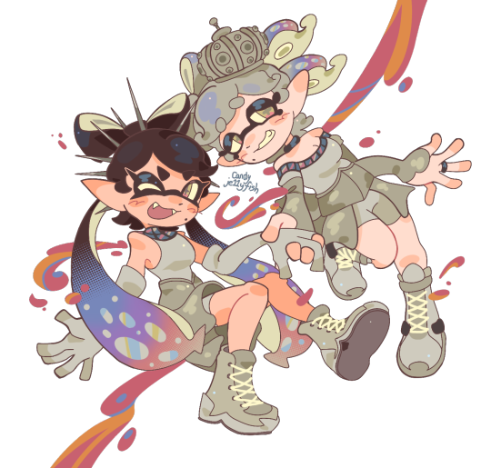
#ask#tbh when i don't post often i'm like 'maybe they forgot about me/my blog even existed'#but then go 'nah of course not- even i wouldn't forget a blog with an owner this unhinged about fictional characters '#so i'm pleasantly surprised seeing old faces return from time to time :')c you're all so kind istg<3333#hhh okay but really thank you!! i'm glad to see you're alive and hopefully well!#i had lots of fun drawing her too!!! one of my old designs had her with vitiligo as her tear marks#(like a gradient from blue to white basically)#so i wanted to incorporate something similar but a lil more realistic you know? same thing for her hair too but anyways!#thanks for passing by again!! hope you're having a great day<3333
7 notes
·
View notes
Text
My Favorite Cheap Art Trick: Gradient Maps and Blending Modes
i get questions on occasion regarding my coloring process, so i thought i would do a bit of a write up on my "secret technique." i don't think it really is that much of a secret, but i hope it can be helpful to someone. to that end:

this is one of my favorite tags ive ever gotten on my art. i think of it often. the pieces in question are all monochrome - sort of.

the left version is the final version, the right version is technically the original. in the final version, to me, the blues are pretty stark, while the greens and magentas are less so. there is some color theory thing going on here that i dont have a good cerebral understanding of and i wont pretend otherwise. i think i watched a youtube video on it once but it went in one ear and out the other. i just pick whatever colors look nicest based on whatever vibe im going for.

this one is more subtle, i think. can you tell the difference? there's nothing wrong with 100% greyscale art, but i like the depth that adding just a hint of color can bring.
i'll note that the examples i'll be using in this post all began as purely greyscale, but this is a process i use for just about every piece of art i make, including the full color ones. i'll use the recent mithrun art i made to demonstrate. additionally, i use clip studio paint, but the general concept should be transferable to other art programs.


for fun let's just start with Making The Picture. i've been thinking of making this writeup for a while and had it in mind while drawing this piece. beyond that, i didn't really have much of a plan for this outside of "mithrun looks down and hair goes woosh." i also really like all of the vertical lines in the canary uniform so i wanted to include those too but like. gone a little hog wild. that is the extent of my "concept." i do not remember why i had the thought of integrating a shattered mirror type of theme. i think i wanted to distract a bit from the awkward pose and cover it up some LOL but anyway. this lack of planning or thought will come into play later.
note 1: the textured marker brush i specifically use is the "bordered light marker" from daub. it is one of my favorite brushes in the history of forever and the daub mega brush pack is one of the best purchases ive ever made. highly recommend!!!
note 2: "what do you mean by exclusion and difference?" they are layer blending modes and not important to the overall lesson of this post but for transparency i wanted to say how i got these "effects." anyway!
with the background figured out, this is the point at which i generally merge all of my layers, duplicate said merged layer, and Then i begin experimenting with gradient maps. what are gradient maps?
the basic gist is that gradient maps replace the colors of an image based on their value.

so, with this particular gradient map, black will be replaced with that orangey red tone, white will be replaced with the seafoamy green tone, etc. this particular gradient map i'm using as an example is very bright and saturated, but the colors can be literally anything.

these two sets are the ones i use most. they can be downloaded for free here and here if you have csp. there are many gradient map sets out there. and you can make your own!
you can apply a gradient map directly onto a specific layer in csp by going to edit>tonal correction>gradient map. to apply one indirectly, you can use a correction layer through layer>new correction layer>gradient map. honestly, correction layers are probably the better way to go, because you can adjust your gradient map whenever you want after creating the layer, whereas if you directly apply a gradient map to a layer thats like. it. it's done. if you want to make changes to the applied gradient map, you have to undo it and then reapply it. i don't use correction layers because i am old and stuck in my ways, but it's good to know what your options are.

this is what a correction layer looks like. it sits on top and applies the gradient map to the layers underneath it, so you can also change the layers beneath however and whenever you want. you can adjust the gradient map by double clicking the layer. there are also correction layers for tone curves, brightness/contrast, etc. many such useful things in this program.
let's see how mithrun looks when we apply that first gradient map we looked at.

gadzooks. apologies for eyestrain. we have turned mithrun into a neon hellscape, which might work for some pieces, but not this one. we can fix that by changing the layer blending mode, aka this laundry list of words:

some of them are self explanatory, like darken and lighten, while some of them i genuinely don't understand how they are meant to work and couldn't explain them to you, even if i do use them. i'm sure someone out there has written out an explanation for each and every one of them, but i've learned primarily by clicking on them to see what they do.
for the topic of this post, the blending mode of interest is soft light. so let's take hotline miamithrun and change the layer blending mode to soft light.

here it is at 100% opacity. this is the point at which i'd like to explain why i like using textured brushes so much - it makes it very easy to get subtle color variation when i use this Secret Technique. look at the striation in the upper right background! so tasty. however, to me, these colors are still a bit "much." so let's lower the opacity.

i think thats a lot nicer to look at, personally, but i dont really like these colors together. how about we try some other ones?

i like both of these a lot more. the palettes give the piece different vibes, at which point i have to ask myself: What Are The Vibes, Actually? well, to be honest i didn't really have a great answer because again, i didn't plan this out very much at all. however. i knew in my heart that there was too much color contrast going on and it was detracting from the two other contrasts in here: the light and dark values and the sharp and soft shapes. i wanted mithrun's head to be the main focal point. for a different illustration, colors like this might work great, but this is not that hypothetical illustration, so let's bring the opacity down again.

yippee!! that's getting closer to what my heart wants. for fun, let's see what this looks like if we change the blending mode to color.

i do like how these look but in the end they do not align with my heart. oh well. fun to experiment with though! good to keep in mind for a different piece, maybe! i often change blending modes just to see what happens, and sometimes it works, sometimes it doesn't. i very much cannot stress enough that much of my artistic process is clicking buttons i only sort of understand. for fun.
i ended up choosing the gradient map on the right because i liked that it was close to the actual canary uniform colors (sorta). it's at an even lower opacity though because there was Still too much color for my dear heart.

the actual process for this looks like me setting my merged layer to soft light at around 20% opacity and then clicking every single gradient map in my collection and seeing which one Works. sometimes i will do this multiple times and have multiple soft light and/or color layers combined.
typically at this point i merge everything again and do minor contrast adjustments using tone curves, which is another tool i find very fun to play around with. then for this piece in particular i did some finishing touches and decided that the white border was distracting so i cropped it. and then it's done!!! yay!!!!!
this process is a very simple and "fast" way to add more depth and visual interest to a piece without being overbearing. well, it's fast if you aren't indecisive like me, or if you are better at planning.

let's do another comparison. personally i feel that the hint of color on the left version makes mithrun look just a bit more unwell (this is a positive thing) and it makes the contrast on his arm a lot more pleasing to look at. someone who understands color theory better than i do might have more to say on the specifics, but that's honestly all i got.

just dont look at my layers too hard. ok?
2K notes
·
View notes
Text

hi! someone requested me to do a tutorial based on this gifset!
this tutorial requires an intermediate knowledge of gifmaking. i won’t teach you how to do gifs from scratch, there are other tutorials for that out there.
[tutorial under the cut]
THE BASICS
AN INTRODUCTION
first off, the gifset in question is based on this gifset by @/eddiediaaz and i got permission from them to explain the process. i won’t be sharing the template because it’s a near replica of theirs (that isn’t shared to the public) and i don’t feel comfortable doing so, but you can recreate it by yourself just like i did!
also, ESL, so please pardon any mistakes.
THE FONT
Circular ST (Medium & Black). download it here & here.
CLIPPING MASKS
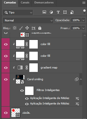
clipping masks are the way i put images and gifs inside of shapes. i used that method in the first and second gif of the Spotify gifset as you can see here. what does a clipping mask do? basically, it links two or more layers together in a way it follows the “shape” of your base layer. ie, everything that is shown follows the “shape” of your main layer and nothing more. your base layer can be anything: a shape, an image, a gif, a text, an adjustment layer, really everything. let’s see an example:
CLIPPING MASKS & SHAPES

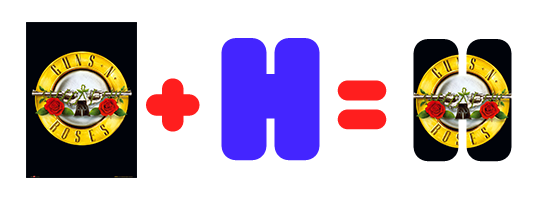
the original image (Gun 'n' Roses logo) is intact, as in, it’s not cut like a circle, something that cannot be undone. instead, everything outside the limits of the blue circle is just hidden. if i delete the base layer (the circle layer), the original image will appear as it originally is, as an rectangle. talking about layers, let’s see my layers panel (some things are in Portuguese, but i think you can understand):
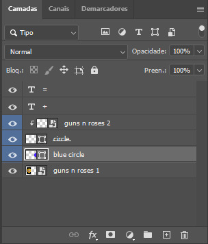
notice the little arrow pointing downwards to the “circle” layer. that is the clipping mask symbol. the base layer always needs to be below what is being clipped. if the base layer is deleted, the chain is broken and every layer clipped will now act independently and have its original shape. you can have as many clipped layers as you want. you can also have multiple chains going on in a .psd, each one with its own base layer. to clip a layer, you just need to press ctrl+alt+G or cmd+option+G while having the layer you want to clip selected (NOT your base layer). or, you can go to LAYER > CREATE CLIPPING MASK.
CLIPPING MASKS & TEXT
let’s see the same example, but with text instead:
A TIP
because adjustment layers are clippable, you can completely gif by using clipping masks. this is very useful when you have more than one gif inside a canvas and don’t want an adjustment layer to affect everything besides a certain layer/element.
let’s take my first gif of the Spotify gifset as an example.
the circle is the base layer. the “Carol smiling” layer is my gif converted to a smart filter. above that “Carol smiling” layer, there is a black and white gradient map and two color fills of white so i can achieve the coloring you see. all those layers are clipping onto the circle layer, making my now b&w gif have the shape of a small circle as well. those layers are in a folder in the .psd of my first gif, so i don’t have multiple files sitting on my PC to assemble just one gif. i could have giffed that small gif separately and pasted it onto my canvas as well, but i like to do this way so i can adjust everything i want in real time instead of redoing a gif over and over every time i want to change something.
HOW TO MAKE EACH GIF
all gifs are 540x540px.
THE FIRST GIF
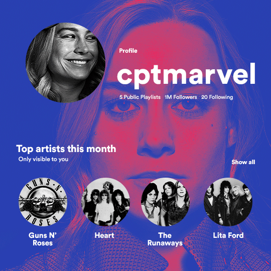
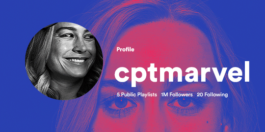
the first gif has 6 elements. the elements are: a big gif serving as a background (a close-up of Carol), a smaller gif inside a circle (a b&w gif of Carol smiling) as a profile picture and four static images for the featured artists. i giffed as i normally do (loaded screencaps, resized the gif, sharpened the gif, etc) for my background gif. to achieve the coloring, i’ve added a gradient map (layer > new adjustment layer > gradient map) purple to pink. to the profile picture, i made a 160x160px circle in the top left corner. the color of it doesn’t matter. the next step is a matter of taste: i giffed the smaller gif in the same .psd thanks to clipping masks that i explained earlier, but you can do it in a separate canvas too. for the featured artists, i made four circles with 98x98px each. for the images, i had to check Spotify for their selected PFPs. after that, i googled “[band/artist] spotify” to find the images. the PFP of bands and artists in the Spotify app are displayed in black and white, so you might have to make them b&w if you happen to find them only in color. to make the artists PFPs pop a bit more, i transformed them into smart filters and added a bit of sharpening to them (intensity 10 x radius 10). you can adjust the colors and the brightness if you want, too. the sizes of the texts in the gif are: 58px (username), 20px (top artists of the month), 15px (name of the artists), 12px (only visible to you + show all + profile) and 11px (following and follower numbers).
SECOND GIF
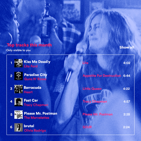
for the chart, i created a black rectangle (490x308px) that i set its blending mode to lighten (thus making it transparent) and i added an internal white stroke. i added the text and the little squares next to the top 6 numbers. the font sizes are: 17px (top tracks this month), 11px (only visible to you), 14px (song title, show all, top 6 numbers), 13px (artist/band, album title, length of the song). i added the album covers — that i made b&w — by clipping images onto 32x32px squares. for the coloring, i added a gradient map (dark purple > light purple).
THIRD GIF
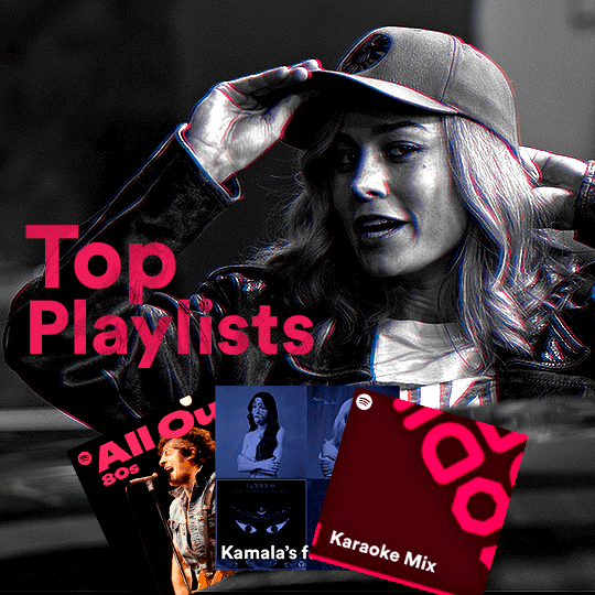
there are three types of playlists in this gif: a Spotify original playlist, a playlist made by a user and a Mix. you don’t have to follow this formula if you don’t want to, but in the case you do, here’s how i did it: browse Spotify for an original playlist of theirs. chances are, if you google the playlist’s name, you can find its cover on Google Images. at least, i found the “All Out 80s” cover that i used in my gifset. you can also create your own. for the user playlist, just pick four songs and find their (album) covers, also on Google. create a square canvas on Photoshop and make four squares, each in one quadrant of the canvas. paste your images onto your canvas and clip the images to each square. then, add a gradient map (black + whatever color you want) to all those images and title your playlist (font size: ). save that collage as a PNG and load to your gif canvas or merge all the layers+transform into a smart filter and drag the smart filter layer onto your gif canvas. now, the trickiest one. while you can invent your own Mix, i wanted to use a real one, but i had no idea on how to find them. thanks to reddit, i discovered that, if you search “made for you” on Spotify, you will find their Mixes! some of them are very whacky and specific! i just picked the Mix that made the most sense for Carol from that (gigantic) list. before doing the next step, i would advise you to google the name of the Mix you picked to see if you are able to find the cover of it with good quality. i wasn’t able to find mine (Karaoke Mix), so i just screenshotted my Spotify app, pasted that screenshot into Photoshop and cut the Mix cover and pasted that onto my canvas. the quality wasn’t great, so i transformed the cover into a smart filter, added a bit of gaussian blur and then sharpened it (intensity 10 x radius 10). the color wasn’t what i wanted either, so i used Hue/Saturation to change the hue. because the original image for the Mix was smaller than i wanted and i stretched it to make it bigger, the quality of the text and the Spotify logo was botched. i painted over the Mix cover and created a text with the font i linked earlier to replace its now pixelated title. i also painted over the little Spotify logo, found a logo in the internet and pasted over the Mix cover about the same size of the original logo. to achieve the “3D effect” of the gif, i made my b&w gif, the base. then, i duplicated all layers and added a gradient map (black > pink) and merged all the layers of that duplicate. i made a second replica of my gif, now with a different gradient map (black > blue). i set both replicas to the ligthen blending mode. you will notice that the replicas will "disappear" and only the original b&w gif will remain. if you move the replicas a bit, that colored border will appear. this doesn't work much in very bright gifs without a lot of dark areas, btw.
FOURTH GIF
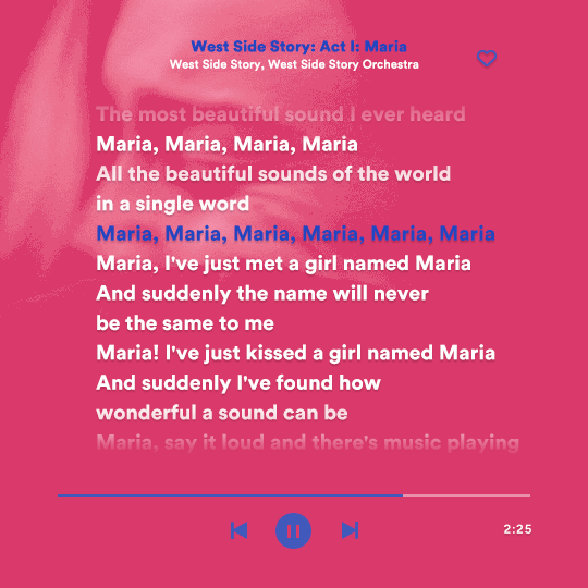
this gif used an altered (by me) version of this template. (i changed the fonts to match the rest of the gifset, too.) for the color text effect, you will have to gif with the timeline bar. take your gif’s length and do the math to find how many frames are ⅓ of it. take your lyrics’ layer and cut it into three equal parts or close to it by using the scissors icon in the timeline panel. in each third, change the color of just one line, line by line. when you play your gif, the colors of the lyrics will change like in Karaoke. you can do the same thing with frames iirc, though. i explained the timeline method because that’s the one i used in this gifset and use in general gif making. for the coloring, i added a gradient map. to make the colors pop a bit more, i add two gradient maps: the first one is in black and white, the other is in color. that adds depth to the blacks and darker colors of the gif.
FIFTH GIF
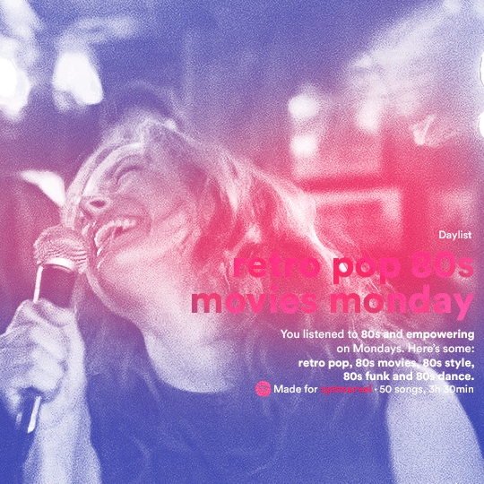
like in the Top Playlists gif, i wanted for my Daylist to be real as well. to achieve that, i listened to my Carol Danvers companion playlist (that you can listen here) for a long time until my Daylist refreshed itself. (Daylists refresh in certain times of the day — don't worry, Spotify will tell you when.) then, i just copied what it told me — the title and the genres i listened to generate such a Daylist, plus the genres i should check it out. you can invent your own Daylist if you want, but because it is generated by AI, i find very difficult to mimic its crazy titles, but you can try! you can also search in the web for other people’s Daylists if you want, but usually people don’t tell you what they listened to to get those playlists and nor what was recommended for them to listen to and i, at least, find that information important for the gifset. be aware that Daylists aren't available for every country yet (like in mine), but i found a way to work around that. the browser Opera GX offers a free "VPN" — not exactly a VPN, but it works close enough — so you can set your location to the US and listen to in-browser Spotify. i recommend not log into Tumblr while using Opera's VPN as there is a myth (that could easily be true!) that Tumblr terminates people's accounts that use a VPN. font sizes: 43px (daylist title), 13px (text), 12px ("daylist" & "made for"). for the flare effect, i searched for flare overlays on YouTube and downloaded one of those videos with 4K Video Downloader, a free software. i loaded the overlay into Photoshop and added a gradient map (purple > pink) over it, thus changing its color. i pasted the overlay onto my b&w gif and set its blending mode to screen. voila!
that's it! i hope you liked it and that i was able to express myself well. if you have any questions, feel free to contact me, i love helping people about their gifmaking questions! 💖
#*#*tutorials#gifmaker tag#dailyresources#usergif#completeresources#alielook#userairi#userhallie#userbess#userrobin#usershreyu#userzaynab#tuserju#tusermalina#tuserheidi#usertina#userabs#userbuckleys#usermagic#userjoeys#antlerqueen#userarrow#flashing gif tw
400 notes
·
View notes
Text
ty! \(^_^)/ feelin good so ill try answer in detail for ya!!!!
most of the time i just do basic cell shading. here ill explain my rendering process after i choose my base colours, ill try keep it short & sweet!! nvm warning buckle up its really super long.
flat colours -> fully shaded!!


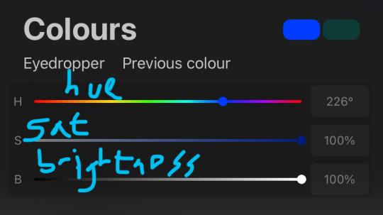
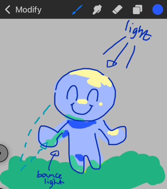
⭐️Picking shading colours!
usually it's just the base colour with +saturation OR a hue shift! i dont really lower brightness.
This is what i mean by HSB, i never use the colour wheel i prefer the sliders!!!
i like my art to look super colourful so i do things like shading pink with blue instead of with a darker pink or red, as shown in the above callie piece.
examples ft lumity:
skin: i always keep it very simple & cartoony! over the nose, below the eyes, the neck & sometimes the tips of the ears is where i'll put shading
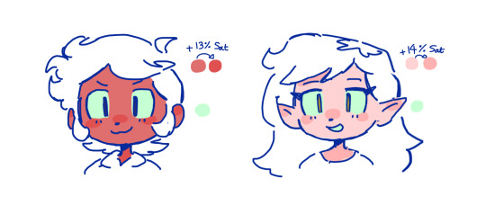
hair: as u can See, it's not darker than the base colour at all!! for dark hair like luz's, i brighten & saturate the colour, and for light hair like amity's i just shift the hue a little!
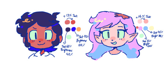
⭐️more kewl tips:
colourpick from yourself!!!! instead of making a new colour for everything, try using a colour u already have down!!!! like below: by limiting my colour palette, it looks more harmonious
really messy image but i hope u get what i mean. also the "off white / black" thing is a separate choosing base colours thing!! i can expand on that if anyone's interested 😙

shove halftones in wherever they fit. here are the 2 pngs i use!! there a rlly good alt to gradients, i used a LOT of them in that callie piece!!! clipping mask over where u want it & alpha lock to change colour.

⭐️here's a WHERE i put the shading:
look st the environment ur guy is in!! pick where your light source is coming from & look where that light will hit and where it is blocked by something.
bounce light: the sun's light is also shining on the grass! so powerful the green reflects right back!
this is kinda more realistic lighting now.
i kinda just put a circle wherever theres a corner!
and i put that Beautiful Shape a lot wherever. i change it a little depending on the character, sometimes its triangular or squarey but thats the base shape! i dont even know what its called but i love it.
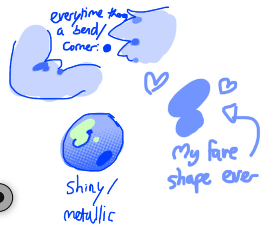
look at this hello weird shape guy!!!
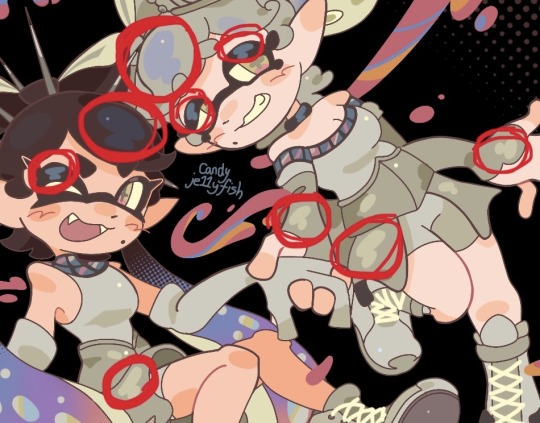
actually, my grandfest art are probably some of the most detailed art i have! u can see urself where i put shading & stuff - they do have more desaturated colour palettes though:

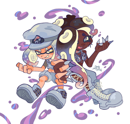
& here are some additional examples ^_^ flat colour -> shaded -> multiply layer -> lighting


in this one u can see the hand & leg at the back are completely in shadow too :)

anyway i think that's kinda it? i dont really know how to explain it, i just do what feels & looks right to me??? remember that im Not an expert & this is just how i do things :)
i will always repeat my no1 tips tho: keep drawing!!! and copy ur fave artists!!!!!! it really will hell u find what u like!!!!!!!!!!!!
i hope this post helps a little & answers ur question😇 never be shy to ask me anything cuz i love answering & chattin w u guys!!!!
EDIT: just saying these arent set rules or anything!!!! u can see just how many times i Dont follow my own advice LOL. my artstyle is super inconsistent, i rarely draw things the same every time
178 notes
·
View notes
Text
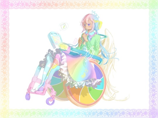
cumulus / nephos / “cloud” / ☁️
[plain text: cumulus / nephos / “cloud” / ☁️ cloud emoji]
[id: pastel fem looking person in pastel manual wheelchair looking down to slug in lap. there also slug on head n slug slide down skirt (don’t ask how). (all color pastel). person hair pink bangs, purple side hair, & blue low loose pigtails go below hips. purple eyes & medium-light ish skin. wearing bright turquoise ish color shirt collar with pink ruffles, & white shirt body with blue ruffles decorate, n green long sleeve cardigan over it also with ruffles. rainbow midi above knee skirt with white ruffles overflow from side of wheelchair. wear mismatch stockings, person’s left side rainbow stripes, n person right side turquoise blue with clouds on it. person not wearing shoes.
their wheelchair has yellow headrest, teal stroller push handle, green contoured backrest with supportive panels on two side lateral, teal to blue transition arm rest, orange big wheels with rainbow windmill candy swirl as cover & red push rim. frame is turquoise blue gradient to pink, has dump/slant, with yellow slug on one side’s turning point. purple fat caster wheels. attach to backrest is big white angel wings, & above arm rest has glowing yellow halo. their AAC device floating by them, has turquoise blue case with white cloud patterns. is saying “slug” icon. border of art lined with rainbow gradient lace. end id]
☁️.
(otherwise known as hate names terrible at decision)
VERY pastel n rainbow overload >:)
they level 3 autistic (“requiring very substantial support”) with high support needs—meaning they cannot independently do most adaptive functioning skills, needing other people physical help to do/do for them. they also need 24/7 supervision & physical help for all iADLs & bADLs.
they nonverbal & use AAC full time. their AAC is symbol based speech generating device.
their (most likely [<haven’t decided] partner who act as their) disability caretaker is hyacinthos shinya🪻🌌.
they also full time non-ambulatory wheelchair user with very specific posture & seating positioning needs so not out of it for long or really much at all.
angel wing on back of wheelchair is power assist! is magically powered by hyacinthos (who angel) & can be powered even remotely / far away. way control wheelchair & power assist part by intuitive / hand motions & gestures / etc, part by halo hover above armrest that act as joystick. can use it like traditional joystick or wear as bracelet n control that way! (gimme it i want one) (if you recognize this setting it may be because previous version)
they do mix of self propel, power assist, & caregiver push. their wheelchair have stroller style push handle instead traditional push handle for easier caregiver push, especially one handed.
is set in magical world & they do some magic (< haven’t decided]!
character not slug obsessed, artist the slug obsessed one
character sheet below cut!!
artfight character profile (VERY wip)
please do feel free draw them (with credit) n tag me!!!!!!
reblog welcome but please don’t repost
will fight you if debate about autism levels & support needs
.
hi under cut
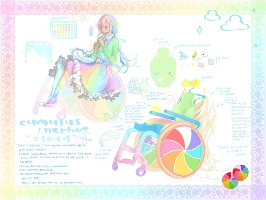
[character sheet. functionally described below]
top left is full character clothing (with wheelchair translucent in background) because in original there some key parts blocked by wheelchair especially arm rest.
skirt around waist have purple band with blue small ruffles. center have rainbow bow with rainbow star on top.
n also have front n back of AAC device. what drawn here is 5x7 grid with various colored squares showing different parts of speech but grid size more so because like. is how much could fit comfortably. so even when redraw n isn’t exact 5x7 with colors exactly right where is right now, is okay. colors & where they are based on own AAC device >:) because of course
design of aac device case basically same as above. back side just have bigger clouds. oh also device has handles. tho it float around so handles get used less. float around so don’t have worry about how to carry it how to mount on wheelchair etc etc etc it follows you it automatic come to your hand when you wanna say something (kinda also acting as prompting bc sometimes think about say something but don’t actually say in device) it get out way when you don’t want it. if only like this irl lol
bottom left is info about character already said
bottom right is wheelchair design
parts covered up by person: rainbow gradient side guard, blue contoured cushion.
n also drawing of back of backrest: when not in use, wings power assist shrink to small decoration on back. not big there all time.
also have stickers! sticker of nessie, banana slug, sheep, cloud, star, rainbow, & an AAC symbol of “AAC”
wheelchair may also have magical tilt & recline & elevate. how? don’t know!!! why not just make full powerchair? uhhhh like manual chair look better
n picture of irl windmill candy
border of art also rainbow gradient lace.
yea that all please draw them 🥲
praise me put lots work into them
pls be nice to them
#art#artist on tumblr#disabled#disability#wheelchair user#wheelchair art#autism#autistic#wheelchair#pastel#fairy kei#slug scribbles#🍞.txt#oc#original character#original charater art#long post#disabled artist#art fight#art fight 2024
329 notes
·
View notes
Note
May I ask on how you choose your colors when you color your art pieces? It is so pretty to look at the colors of your art, and I want to color like that, but color picking is very hard q-q
here's!! uh, the general areas in the color wheel where i try to pick depending on the vibe
highly inaccurate because tbh i just color pick directly or try to guess the colors from my references and just adjust them to be a little bit more pastel or to the atmosphere and if i have their colors memorized (such as ink or dream), i just pick by memory or by my modified colors LOL

color your scrunkly!
set your line work to multiply and lock opacity
i use warm tones for white ish colors so uhhh idk whatever warm color from here
color the line work!!!!! ofc, shift the hue depending on the undertones of the surrounding colors the skull color is a warm off-white, the undershirt is a blue-ish off-white, scarf is warm brown, so on and so on the multiply function rly helps just blend things into the palette a little more, but if ur confident enough, you dont have to set it to multiply at all for extra variation
minimal shading by just taking the surrounding colors n adjusting the hue slightly n its value n saturation gives it a very messy cel shaded look! been into it lately and stuff

and then i add a few overlays using the pin light layer mode! i usually use these two colors together, it gives the right amount of pastel colors that really appeals to me
if you have access to gradient maps, i recommend using them lots! it makes the pieces look a little more cohesive the pin light layer mode imitates it n is very versatile if u cant use them though (like me when im just doodling on sai)
that's it!!! that's the basic rundown of how i color i'm not very well versed in color theory so i can only do very basic color picking tips, but maybe next time i can offer ways on how to color more atmospherically!
have a nice time coloring your blorbos ✨
#Anonymous#tutorial#ref#ink sans#kia doodles shit#i hope this heeeeeeelps somewhat!!!!!#art tutorial#coloring tutorial#art help#art tips#art advice
414 notes
·
View notes
Note
Im so so so so sorry for the dm but I gotta do, how did you do the lighting for these two??
https://twitter.com/Licollis_a/status/1657703869068234754 https://twitter.com/Licollis_a/status/1657631596198125569
(dm wouldnt send on twitter so I'll send it here!)
Be not afraid, for I will reveal my secrets in rendering step by step.
1. After I'm finished with lineart, I added the base color. It's faint, but putting in gradient will make it pop.
2. In order for the whole thing to look harmonious with each other, on top of the base color I added a multiply and overlay layer. The color I use for multiply is usually desaturated, kinda pastel-y. The overlay one is more saturated (see alternative colors below).

3. The result should be kind of dark. Which is what I'm after, because what you're seeing is already shadowed. So instead of adding the shadow to the base color, I'm adding the light.
On top of the multiply layer, I added an overlay layer. I keep in mind where the light source is coming from (see the blue arrows). The color of the overlay can be whatever -- it depends on the vibe you're trying to make (e.g if they're in waterfall, I'd use light cyan).
Also, see that normal layer clipped onto my overlay? It's how I added my "fringe" (aka subsurface scattering). I often use pink. Just line it on the edges of the light.

4. Now I added a multiply layer again, just to give the piece more depth and details (like the skin)

5. Now I'm adding what's called reflective light (google to see examples irl). Basically, I covered the darkest parts of the drawing with something lighter. For this one I just added pastel purple in the normal layer, but there are other layer types to lighten it up!
6. Now, I colored the lineart through clipping. I usually just matched the surrounding colors by adding a darker one (e.g dark red for skin).
Optional: I like to make 2 copies of the lineart, make one red and another cyan, and respectively slide it to left and to right. Sometimes it doesn't even look good tho....

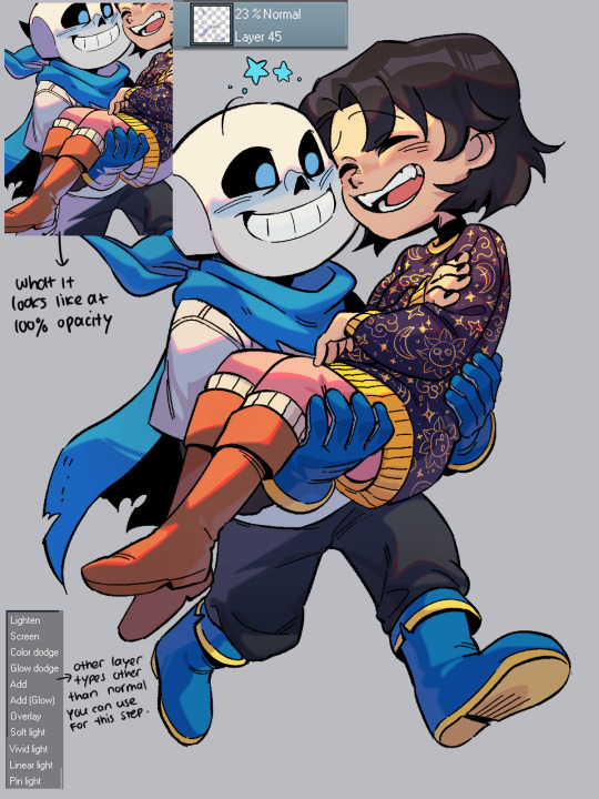
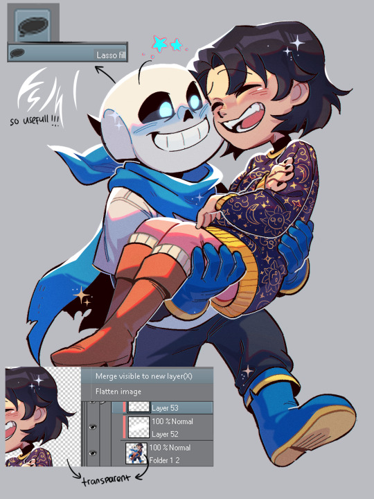
7. Highlights time! To do this I disable the background so it's transparent, click right and choose 'merge visible to new layer'. Which flattens the visible image onto a new layer. Now I can add in these white lights by clipping on top of it!
(It's a lil tricky to do this right with a brush, so I used the lasso fill tool.)
To top it off, I add some sparkes. My simp art is done <33
Edit: I forgot!! By the end of it all you can add a texture by setting said texture into overlay with low opacity (on top of the finished art). In CSP you can add a perlin noise, one of these:
You can use other kinds of textures for ur artwork, like watercolor etc.
#by the way the other art you linked also use similar steps. just simpler.#(multiply over base color. overlay for the light and fringe. low opacity for scattered light. done.)#i hope this helps you and other artists too!!!#happy rendering!!!#art tutorial#lico arting
717 notes
·
View notes
Note
Do you have any references/more in-depth descriptions of what Keith and lance’s outfits look like for fanart reasons?
yo thanks for the awesome question! it took a bit to put this together.
i gathered a few references off the internet for ya.
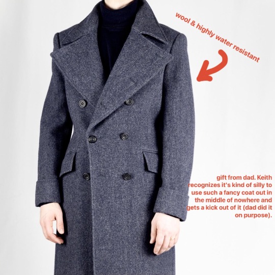
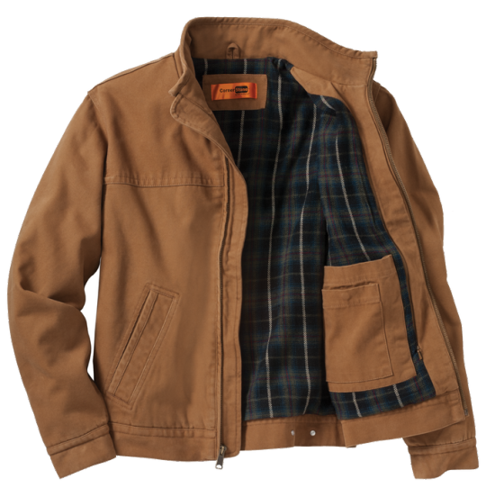
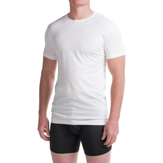
Keith starts off wearing a fancy reddish brown wool overcoat (gifted by dad) over a canvas jacket (rust red) lined with red plaid flannel (his own pick) over a red long sleeve and a white undershirt. images for reference, colors not accurate. 👇

his pants are those hiking zip away kind, black. 👇

he's also wearing a side/thigh pouch (black). 👇

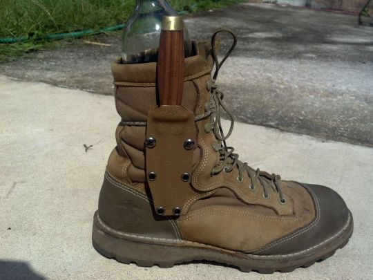
he's also got black hiking boots with an attached sheath (sheath would be slightly larger than picture). 👇

Keith's got a beard and a good amount of hair at the moment. i'd say about a bit longer than shoulder-length, but it's unkempt and he looks about as groomed as a lion. (he wasn't expecting company.) i would say he's about early thirties in age since he ages slower (post canon Keith, technically).
currently, Lance has combed Keith's hair out and he gave him a french braid with smaller braids snuck in there for funsies, and he used a strip of his romper to tie it off.
Lance is more difficult to describe. i came up with his outfit entirely using my imagination instead of using any references.
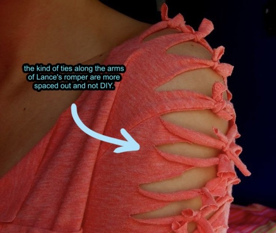
it's basically a long-sleeved and wide pant romper with ties all along the arms, a boat neckline, and multiple sheer layers in petal-like shape all along the material. iirc, i didn't give it a specific color in the story, but i imagined it at the start as a silver or forest green gradient, maybe even multicolored. have fun with it, it's nbd. and it shimmers as the light hits it, like water.


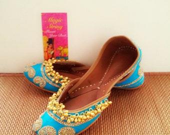
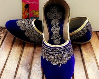
shoes are the same deal, but easier to describe. they're basically fancy, pretty ballet flats in blue. beaded with crystals and lace. some pics of the kind i mean. 👇


bird woman's boots, but black and shorter.👇

i didn't give Lance any jewelry (but earrings are fair game) and he's definitely NOT wearing any kind of coronet since he's supposed to be incognito.
the white security uniform is basically an asymmetrical zip-up blazer with a mandarin collar and straight leg pants, all white with no discernible markings except "security" depicted on the back and on the breast in altean.
the parka from the emergency pods is basically a white puffy jacket with with synthetic fur for the hood. (this bit isn't mentioned in the fic because it's useless on Planet Red, but if electronics worked, Lance would have been able to change the color of the parka. it's got a scanner to camouflage it to hide better in its surroundings, or conversely, make it super visible.)
at this point in the story (chapter 13), Keith is down to his undershirt and shorts. Lance, on the other hand, has cut the romper he's wearing into shorts. it's likely uneven because he used Keith's luxite blade for it.
Keith's pack. 👇
Lance's backpack, also white. 👇
if i missed anything or you'd like more info, feel free to shoot me another ask.
20 notes
·
View notes
Text
meet my ponysona Mintshine! :] she’s a toothpaste inspired pony ❄️ I made this updated version of her design.
❄️Things I added❄️
-A really soft darker blue gradient on her back, neck and part of her face, a white gradient on her paws, 2 snowflakes on her right paw, darker and thinner highlights on her mane & tail and some snowflakes on her cutie mark. She’s not a crystal pony anymore, she’s more like an ice pony…? Ik that’s not a real thing in mlp but I like the idea of it (she basically can become really cold and “frosty”, like an ice statue). She smells like light blue from dolce & gabbana and mint.
I also made a more specific ref about the design itself, it has no shading and I specified all the things needed about her design.
You can find more info about her on my Toyhouse (check my carrd


#art#my little pony#pony art#mlp fim#oc#pony#my art#pony oc#artwork#ponysona#my sona#self sona#light blue#winter#toothpaste#mlp artist#mlp g4#mlp fandom#mlp oc
32 notes
·
View notes
Text
HEY guess what you can do with wool? That's right!

DYE IT
With food coloring and kool-aid!! And also acid dyes, which are designed for this, but acid dyes can't be used with cookware you put food in, and Kool-Aid packets are 50 cents.
.. did they go up in price? Didn't they used to be 20 cents? Anyway
Tbh a big part of the allure of spinning my own yarn is dying either the fibers or the final product. I just like the sense of independence that comes from going "ah, I need a color, and I have a lot of white and a handful of dyes!". I did this a lot with my posable critters too, though acrylic and polyester are a lot more strict about what dyes will actually work.
(Though tbh? Soaking acrylic faux fur in watered down acrylic paint, waiting for it to dry, and then taking a slicker brush and brushing out the clumps will get you pretty far!)

The evidence of crimes past with that paint permanently on there. I think this fucker is almost old enough to make its own Tumblr account (but not in Australia 8()
I digress! Because I haven't been dyeing acrylic, but KERATIN!
I did actually try dyeing a chunk with the same semi-permanant magenta dye I use on my own hair, cos like. Hair is also keratin.

Actually, it was supposed to be a bisexual gradient from pink to blue, but when it came time to heat set the color, the manic panic blue just fucking vanished.
Lesson learned: Ion Color Brilliance is a good brand, Manic Panic is not.
My bestie has inquired about me spinning the yarn and knitting them a scarf, so I wanted to make what was basically a mockup of the different ways you can spin the fibers to get different colors effects. And also I got Kool-Aid this past grocery visit and have been chomping at the bit to use it.
@sivilityy enables me <3

BEHOLD, MY CHILDREN!
Dyeing wool with kool-aid or food coloring is very easy!
Step 1: Soak wool in warm to hot water with about a 1/3rd of a cup of white vinegar for 15 to 45min. The vinegar is a mordant, something that helps the fibers take up the dye.
Step 2: Mix your dye of choice into a pot of warm to hot water, close in temperature to the soaking bath. The more kool-aid or food coloring, the stronger the color. I was going for pastels, so I used half a pack for the blue and pink, and a single drop of yellow food coloring for the yellow. The purple... 8') We won't talk about the purple.
Step 3: Fish your wool out of its soak, give it a gentle squeeze, then plop it into the pot. I like to scoop out some of the vinegar water and pour it into the pot as well. For insurance!
Step 4: Heat your pot to just below boiling. You want steam, but little to no bubbles. Agitation + heat or sudden temperature changes = felt. You can't spin felt. If you want to to make felt, though, now you know.
Step 5: leave your wool at simmering for around 30 min. How do you know when its done?

it fucking sucks all the color out of the water. How sick is that?! In the few batches I've done, I haven't always gotten it to be clear like that but don't stress it. About 30 min seems to be good even if there's still some color in the water.


Turn off the burner and let your creations cool down in their soup. Or, if you're impatient like me, run your hottest tap water into a different pot, then pour your wool into the slightly cooler but still hot water, so it doesn't get a HUGE temperature shock. Don't use cold water, or you're gonna get felt! Give em a rinse in the hot water to get any extra color out.
Let 'em hang and dry, and you're done!
So far all of mine have felted a little bit? Which hasn't been so bad, I've just needed to fluff them up a little once they're dry. I want to try indirect heat with a steamer basket and see if that helps, but I only got the one basket and 4 colors this time, so I used the pots.
SCIENCE
#Technically art#Hey butters how is chapter 19 coming along#*flips water pitcher* YARN#If you want to try this yourself please look up a tutorial that wasn't written on a phone on Tumblr#I haven't skipped any steps but I didn't elaborate as much as I could have#Tbh I just wanted to show off how the color got complete sucked out of the water#But then my Adderall kicked in
17 notes
·
View notes
Text
First Encounter | Homelander

hello! here's the very first one shot i've ever written for Homelander (and hopefully the first of many). This is based off the first time Homelander meets Qilin. Even though this is based off of my OC it's can also be read as Homelander x Fem Asian!Reader as no physical description occurs in this except powers/shapeshifting descriptions.
Summary: Homelander meets the path of something, or someone? That will change the course of his life. Timeline: Pre-Canon (2014) Words count: 1,1k Warnings: None!
It was a sunny day, with a few clouds in the sky, and a usual boring patrol. Fucking annoying, Homelander thought. The only thing that kept him from missing them was the cheers he was getting when he was a bit too close to regular people. Honestly, it was a bit nice, just a bit though. He was flying so fast, soaring through the city clouds, he was only checking if someone needed any help. But to be honest? He didn’t care. Nothing thrilling was happening today. Homelander debated whether he preferred patrolling or shooting the most random ad for a useless Vought product.
Ugh, he thought, either way, that day was as basic as usual, an ad or not wouldn’t change how bored Homelander was. Not enough spectacular saves, not enough cheers, not enough praises. Can we get this over with, he thought. He wanted to get back to the Vought Tower and just have a break. Until he smelled something unusual, well, more like, unknown. It was the first time he smelled something like this. He rushed towards it, not even questioning anything.
And that was when he saw it, for the first time. The Cloud Beast, people called it. He always found the name ridiculous because he wasn’t able to visualize how massive The Beast was. It was… probably bigger than an elephant. Homelander couldn’t process the information, because The Beast saw him. It approached him, leaving a trail of clouds behind it, and made a long eye contact with Homelander.
The Beast was impressive. It looked like a horse… Or a deer, maybe a bit of both. But with scales, oh a lot of scales, a large tail that fades with the clouds, and a mane… a mane that moved as if it had a will. Its fur was a sort of blue canary, and the scales were darker. The mane was white but with a black gradient on the end. Oh and did I mention the long almost ethereal gold mustache that Asian dragons also have? Yeah, Homelander was struggling to process what he saw.
The Beast was still staring down at Homelander, not moving. It looked almost like it was amused by the Supe. The Supe couldn't draw his eyes away, until he heard his heart beating faster, and felt some sweat on his neck and forehead. Oh dear, was he scared? The Beast felt it. Homelander was scared, so The Beast just approached him a bit closer. But it drew Homelander to the edge, and he fled as fast as he could.
Oh shit, Holy fucking fucking shit! He thought. He fled to the Seven Tower roof and stayed on for a few minutes. It felt like hours. Homelander knew that this… beast existed, but he never saw it from his own eyes. And now what? He was supposed to be the greatest American Superhero, and he fucking fled because that… thing scared him! He felt ridiculous. He ran his gloved hand into his hair, sighing. Compound V did incredible things, yes, but its range was so unpredictable. He knew that there was a person behind the Beast, the question was, did it talk? Did it even have a human form? It should have one because you can’t fucking hide a monster that big!
But wait, was it really a monster? For Homelander, it was one for sure, but he was curious. Too curious. He quickly made his way into the Vought Tower and called for Madelyn. He stormed into The Seven’s Room and quickly took a seat, fidgeting with whatever he could find. Madelyn came a bit after, obviously in a rush.
“I have work to do. I hope it’s important Homelander.”
He took a moment before answering.
“You wouldn’t leave your office If you knew it was not serious. I’m going to be straightforward, do you know anything about « The Cloud Beast »?”
She froze. And Homelander saw it very clearly. He raised an eyebrow at her and waited for her to answer.
“We…” She cleared her throat. “We have barely any information on it. We just know that they call themselves «Qilin», Cloud Beast is just a name that people gave them because they’re scared each time it flies in the sky.” She paused, feeling the intense gaze of Homelander on her.
“From what we know it’s a Supe that can shapeshift into this creature. Apparently, it’s a creature from Chinese mythology, that’s why they want to be called Qilin. Not a lot of people saw their actual human form but it seems that some sources describe them as a masked woman in a Chinese-inspired hero suit.”
The Supe clenched his fist, the more he listened, the more he was curious. He wanted to know who was behind this enormous creature. He wanted to know if it was powerful, he wanted to know everything. Homelander wasn’t the curious type, oh no, but this moment when Qilin and he were staring at each other made him feel so many different emotions.
He wouldn’t admit it to anyone, but he felt weak, and powerless, in front of the Beast. It was the main reason why he ran away, but at the same time, he was drawn to the creature, he wanted to stay, observe it, follow its path. It was so conflicting for him, he never felt so… confused. Madelyn was still talking but he was lost in his thoughts.
He clenched his jaw, then looked back at Madelyn. His expression was unreadable and it threw Madelyn off.
“Thank you for all of this important information.” He didn’t seem sincere, as usual, but it seemed he was thinking of doing something he shouldn’t do. He stood up pretty abruptly, which made Madelyn jump a bit.
“Homelander, I hope you’re not thinking of doing anything irresponsible?” He snorted.
“I’m serious. We barely know anything about this woman, let the other supes and the Crime Analytics take care of this.”
He sighed as he headed towards the door. “Fine. But I’ll need reports! Every little thing, whatever saves or little apparition she makes I want to know.” His voice was firm. Madelyn didn’t feel like questioning any of his decisions when he was as stubborn as he was. So she just agreed without complaining.
He then left without saying a word, directing himself to his penthouse. He was tense, and a bit frustrated. The sun was already setting down. As he made his way inside his penthouse, he took off his gloves and let himself fall on the couch while running a hand into his blonde hair. Little did he know that this day was about to change his life. Little did he know that he would think of this first encounter every day until he would see her again. Little did he know that The Beast was so much more than just a mythical creature and that he would be the one that we call a Monster.
taglist: @sunshinetomioka
#the boys#homelander#homelander x oc#homelander fanfiction#homelander x reader#homelander x fem!reader#homelander x you#homelander x y/n#the boys fanfic#the boys series#the boys oc#qilander @tartiflvtte#homelander x asian!reader
23 notes
·
View notes
Text

Here is the "Scary Sweet Birthday" doll line, marking the return of C.A. Cupid (now called Cupid Asteria) in Monster High G3 !
This is a cute doll line but since Cupid is one of the characters I was most looking forward to in this G3, I have a opinion-that-no-one-cares to give...


Let's start with the positive first. In general, I like the design of Cupid (very Marie-Antoinette), the fact we have a mix of her Monster High outfit (the marble-colored skin with the gradient to black with the white drawings on her legs) and her Ever After High look (golden accessories representing the bow and the arrow) and all the accessories like the heels which are, once again, a piece of art.
BUT...
One think that I don't like is the fact they put red on her color palette. I'm pretty sure they did this because Draculaura is already in that line and also wears black and pink (and a bit of white) so they decided to slightly change Cupid's colors who already has MANY colors (white, pink, black, and gold were enough... SO WHY RED ??? And also this touch of blue on her headband ?) I'm also a bit disappointed that her hair is so pale pink. She looks more like a Freak du Chic Rochelle Goyle doll than a Cupid doll to me.
Honestly, if I had any sewing skills, I would remake her jumpsuit in pink and black and paint all her red accessories into gold, pink or black.
Btw, the XOXO inscription on the headband (and on her outfit) is just there to kill me ??? tf


Since we're here, why not also give my opinion on the other dolls of the collection?
Draculaura is soooo cute. She reminds me of my attempts to draw her outfit from the crossover "The Lost Movie"... but much more kawaii ! *w* I love her pigtails !


For those who don't know, Frankie Stein is one of my favorite characters in this G3. And besides their Monster Fest and Core Refresh dolls (and the Buried Secrets too), they always deliver with their looks !
I like the asymmetrical aspect of her outfit. I just wish the designs on her dress were as iconic as the Sweet 1600. But my real problem is the fact that once again Mattel feel compelled to put forward their prosthetic leg in such a tacky color.


Last but not least... Cleo de Nile !!! I love all the details of her plastic accessories. It really gives “fairytale princess dress”. I'm not sure about the bottom of the outfit. I don't know if it's the shoes or the fact that I imagine Cleo more with a long dress... but something bothers me.


Overall, this collection is very cute and I'm tempted to get these dolls (even though I swore to myself that I would only buy the characters in their basic outfit for this G3) Clawdeen Wolf is also planned in this collection with a playset.
#eah#ever after high#everafterhigh#mattel#monster after high#monsterhigh#monster high#monster high g3#c.a. cupid#cupid asteria#scary sweet birthday#draculaura#frankie stein#cleo de nile
18 notes
·
View notes
Text

randy gradient tests & findings
hey guys ive been experimencing with new gradient techniques to get phun-nu-FX (fun new effects) and i have some pretty cooll stuff to share
i explained how 2 make a gradient >>>here in this post<<< so employ that tek here
spray can haze
this is something that looks fuckt when you set it up but really delivers. using spraycan to "blur out" the gradient gives it this layered, grainy FX. you can put lines of other colurs in with the spray brush to add interesting tints to the haze. i used this on my recent snow drawin for the sky with white+light blue.
crayon sunset
usin the crayon for this gives a softer effect w less scanline-y a texture. its very soft and pretty. i personally prefer this over using the paintbrushes for gradience because i literally just dont like mspaints "paintbrushes". do what you want tho
i realy encourage messin around with this and seeing what you can make
width makes columns

so the standard 4 the gradient method is to reduce the width to 1px then resize to orignal. well, its also pretty fun to mess with diff widths cus you can get some interesting abstract shit.
this is what happens if you set the width as 5px instead of 1px. you get 5 equal-size columns that kinda deconstruct ur image. its very interesting
here is the last gradient design if i also did 5px width to it. you can get a bunch of gradients from one gradient basically
i thought this was worth sharing because well its fun to look at & think about
rainbow art +
rainbow art is cool as fuck. rainbow art is what icall it when you make a fun gradient and shift+drag it to use it as its own brush
you can make really cool+nasty backgrounds using rainbow art over itself like this kinda ocean-y pattern. i included what my "rainbow art brush" looked like to make it
well i hope this helps you to think about fun ways to use mspaint to its full potention. its a very fun thing to do. take care
83 notes
·
View notes
Note
hello! I just found your blog via your recent titanic gifset with hozier lyrics and it truly is the most gorgeous thing I have seen on this site in recent times... so so amazing! could you talk about the fonts you used and a bit about the coloring/blending process? thanks so much and hope you have a wonderful week. - A
hello! this is such a sweet ask— thank you so much! i'm so thrilled to hear that you love my silly little titanic gifset 🤍
i spent,,,,,, way too much time on it as a way to try and distract myself from a) politics and b) the bomb cyclone. we live in a time.
anyway! it's probably the most labor-intensive set i've ever made: lots of frame by frame coloring, layer masks, etc., and honestly i would love to talk about it!
all of the gifs were challenging to some degree, but i'd be here for another two weeks if i went through the whole set, so i'm going to narrow the focus to just the second gif. info on how i made this guy below the cut!

i tried out probably six different scenes before i settled on the two that i used: rose wading through the corridor (top blend gif) and jack and rose embracing (base gif). i went with them because even though there's a lot of motion in each gif, they lined up more neatly than any of the other options— rose sort of wades through the embrace while staying pretty much centered in the gif
so, scenes selected! however, the color and lighting situation was... well. it was this:


dingy! dark! the hallway lights are a problem! me @ me girl what are you doing!
basic coloring/lightening on both gifs took me from here:


to here:


a good start, but i needed to drastically reduce the brightness behind rose in the base gif and manufacture some blue tones for the top gif to match general color scheme of the set. to that end, i turned each gif + coloring into a smart object, converted to frames, and sat down to do so much goddamn frame by frame coloring
for rose, i used a black color fill layer, normal, 65% opacity

for the embrace, i went with a custom blue gradient map, soft light, 100% opacity

once each gif was back in smart object form, i got to work fine tuning the color: amping up the blues, doing a little bit of lightening, making sure rose's hair really popped. after that, i did some final layer masking to make sure the blend was nice and soft


don't worry about how long the scroll bar is! everything is fine! yes there are multiple copies of both smart objects! it’s all good! <— actively lying.
the before vs. after is pretty great though:


on to text! i wanted to use a different (but complementary!) font for the large text on the gifs that didn't have orpheus/eurydice. i went with against— a little rounder, but still in the same vein as sunroll. the small text on all the gifs is tw cen mt std
to get the fancy color effect on the large text, i slapped a color overlay (bright blue, multiply, 61%) on a white text layer set to difference. to make sure the blue stayed blue, below that text layer, i duplicated the layer, cleared the layer style, and set the blend mode to color. as a final step, i went back to the top text layer with the color overlay and added a drop shadow (pale pink, normal, 29%)
the small text got the same color overlay + base color layer treatment, except the overlay (pale pink, linear burn, 100%) was different
there you have it! one (1) gif from the set that consumed two wholeass weeks of my life!
if you'd like more technical information on my personal giffing/coloring process, i have an absolutely massive tutorial that covers everything from start to finish. for blending, becca @nataliescatorccio (one of tumblr's undisputed giffing queens!) has a great tutorial that goes into more depth than i did here
all that said, blending/coloring/giffing in general really are just a matter of trial and error; practice and patience are your best friends
thank you again for the very sweet ask! i really had fun breaking down the work that went into the set 💕
11 notes
·
View notes
Text

Day 1 - 100 Days CSS Challenge
Welcome to day 1 of the 100 Days CSS Challenge! In this challenge, we'll bring a design to life using only CSS. Our goal is to recreate the image we're provided with on the challenge page using HTML and CSS.
On the challenge page, we see:

A small preview of the design we need to replicate.
A starter HTML template.
A submission form to showcase our work alongside others who have taken on the same challenge.
Let's dive into the process step by step.
Step 1: Screenshot the Image
The first thing I always do is take a screenshot of the target design. Even if the design includes animation, having a static reference helps me focus on the basic structure and colors. Here’s the screenshot of the design we’re aiming for:
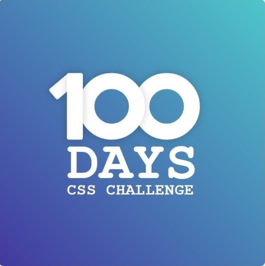
Step 2: Extract the Color Palette
Next, I identify the color palette that we'll need. This helps ensure that we maintain consistency with the original design. Here’s the color palette I’ve created:

Step 3: Identify and Create the Image Elements in HTML
Now that we know the colors, I break down the elements in the image:
Background: This is a linear gradient.
The 100 number: This is the main challenge, and it will require some work.
Text: “days css challenge,” which we’ll place to the left of the number.
Here’s the HTML structure for these elements:
<div class="frame"> <div class="center"> <div class="number"> <div class="one-one"></div> <div class="one-two"></div> <div class="zero-one"></div> <div class="zero-two"></div> </div> <p class="sentence1">days</p> <p class="sentence2">css challenge</p> </div> </div>
Now that the elements are in place, CSS will bring them to life.
Step 4: Bringing the Elements to Life with CSS
Linear Gradient
To create the background, we’ll use a linear gradient. Here’s a basic syntax:
background: linear-gradient(to <direction>, <color-stop1>, <color-stop2>, ...);
Parameter 1: Direction/Angle
This defines the starting point of the gradient. You can either specify a direction (e.g., to top, to bottom) or an angle (e.g., 90deg, 180deg).
Direction options:
to top
to bottom
to left
to right
If you want more precision, you can specify angles:
0deg: Gradient starts from the top.
90deg: From the right.
180deg: From the bottom.
270deg: From the left.
You can also combine two directions, specifying both horizontal and vertical movements, like to left top or to right bottom. This means:
The first keyword (left or right) controls the horizontal movement.
The second keyword (top or bottom) controls the vertical movement.
For example:
background: linear-gradient(to left top, red, blue);
This gradient starts at the bottom-right corner and transitions toward the top-left.
Parameter 2: Color Stops
Color stops define how the gradient transitions between colors. Each color stop specifies a point where a color starts or ends. Here's an example:
background: linear-gradient(to right, red 10%, blue 90%);
This means:
The element starts at 0% fully red.
By 10%, the transition from red begins.
Between 10% and 90%, there is a smooth blend from red to blue.
At 90%, the transition to blue is complete, and the remaining part is fully blue.

Once we understand the concept, we can apply the background we need. In our case, the gradient flows from the bottom left to the top right, so the code will look like this:
background: linear-gradient(to right top, #443DA1, #4EC3C9);
Bonus: Stacking Multiple Linear Gradients
You can also apply multiple gradients on top of each other:
background: linear-gradient(180deg, #f00, #0f0), linear-gradient(90deg, #ff0, #f0f);
Step 5: Making the "100" Number
Creating the Zeros
We start with the zeros. These are simply circles created using CSS. To make a full circle, we use border-radius set to 50%.
The white border gives it the appearance of the number zero.
.zero-one, .zero-two { position: absolute; height: 100px; width: 100px; border-radius: 50%; border: 24px solid #fff; box-shadow: 0 0 13px 0 rgba(0,0,0,0.2); }
This gives us a nice circular zero. We adjust their positions using properties like left and top, and manage the z-index to make sure the zeros stack correctly.
.zero-one { z-index: 8; left: 17px; } .zero-two { z-index: 6; left: 100px; }

Now both zeros are positioned, and they overlap in the way we want.
Creating the "1" Number
The number "1" is made of two div elements:
One-One: This part represents the slanted part of the "1".
One-Two: This is the straight vertical part of the "1".
What make the one-one element slightly slanted is
transform: rotate(50deg);)
the one-two is created simply with a little height and width nothing too particular then it is placed directly on top of the slanted part, giving us the full "1". Its z-index tho has to have a higher value than the slanted part of our 1 to ensure it stays above the slanted one.
Step 6: Adding the Text
For the two sentences “days” and “css challenge,” the styling is basic CSS. You can achieve the look with just a few font changes, some padding, and adjustments to font size. It’s as simple as:
.sentence1,.sentence2{ text-transform: uppercase; margin:0; padding:0; } .sentence1{ font-size:82px; font-weight:700; } .sentence2{ font-size:25px; font-weight:700; margin-top:-20px; }
And just like that, we’ve completed day 1 of the 100 Days CSS Challenge! Each part of the design is carefully crafted using CSS, giving us the final result.
Happy coding, and see you tomorrow for Day 2!
#100dayscssChallenge#codeblr#code#css#html#javascript#java development company#python#studyblr#progblr#programming#comp sci#web design#web developers#web development#website design#webdev#website#tech#html css#learn to code
15 notes
·
View notes
Text


So, I got low-key inspired by @littlehungrywarriorcats and her cat genetics videos, so I did the ClanGen challenge and decided to basically make adoptables using it. I've basically got two major families out of this, so some additional information below in-case you're curious. Forgive the intentionally poor quality of the images, I'll be giving the actual to scale high-quality renders to the buyer of this family tree. I'll have to make an actual commission sheet for my going rates or something, but I will say that this is about $2 per cat, which makes this $40 USD in total. You can pay through my Ko-Fi once I confirm the sale. I will not be taking commissions for making family trees of your already existing characters since Murphy's doing that and I don't wanna encroach on his business, so instead I'll just be occasionally making adoptable family trees using the generator.
Quick side-note: I had to do a significant amount of googling to figure out what 'pseudo-tabby' means. Since ginger is epistatic to solid (non-tabby), ginger cats will always look like tabbies even if they're genetically solid. So, a pseudo-tabby is a cat that looks like a tabby but is genetically not one. Also, I've been googling what 'sparse-haired/sparse-furred' means and all I can parse are like...rex cats and...Lykoi cats, which...no. I'm not doing that. They suffer from horrible skin issues and welts that are painful and show up when they're 3-5 years old and stays with them for life and the gene is pleotropic, so you cannot breed the skin problems out of the gene since the gene that causes the coat type also causes the skin problems. I've been doing this...for way too long. And the only way sparse hair has been described has been Lykoi and...again, no. So, I'm choosing to ignore it entirely and any 'sparse-haired' cats will just be treated as short haired. Cool? Cool.
I've left the other blanks in the family tree mostly blank, however I have their genomes filled in as necessary and some basic backstory stuff if anyone's interested. I also generated some kits since the website doesn't generate any. More under the cut (bolded letters are the genes that got passed down, blue is what was inherited from the dad and pink is what was inherited from the mom):
First tree:

Foxpelt:
?/? - The black base colour is invisible O/O - Ginger and not a tortoiseshell a/a - Since she's a "pseudo-tabby," she is genetically non-agouti (non-tabby) but still has stripes since ginger is epistatic to solid Mc/? - Dominant mackerel D/? - Dominant non-dilute W/W - No white L/? - Dominant shorthair
Rowanstar's Father: Foxpelt's dearly departed mate was a rogue who joined the clan
?/? - Rowanstar could have gotten black from either parent, but it has to have come from someone since it's dominant o/Y - Rowanstar is a tortoiseshell and her father can only have one X to pass, so he can't be ginger A/? - He has to pass a dominant A to Rowanstar in order for her to be a proper tabby, but it doesn't matter if he's homozygous or heterozygous on this locus and Foxpelt can only pass recessive a ?/mc - Foxpelt is already giving Rowanstar a dominant Mc, so he needs to carry a recessive mc to pass to Rowanstar so she can pass it to Fireheart but the hetero/homozygosity doesn't matter ?/? - Foxpelt is already giving Rowanstar a dominant D W/? - He must have a W to pass in order for Rowanstar to not have white, however it doesn't matter if he's homo or heterozygous ?/? - Foxpelt is already giving Rowanstar a dominant L
Rowanstar:
B/? - Dominant black, but she can get it from either since Foxpelt is ginger but is also capable of passing B since ginger is epistatic O/o - Tortoiseshell, since she gets an O from mom and an o from dad A/a - Not a pseudo-tabby, so she has to get an A from her dad and gets an a from her mom since that's all she can pass Mc/mc - Dominant mackerel w/ polygenetic gradient trait towards spots and carrying recessive classic to give to Fireheart which she would need to get from her dad since her mom's giving her an Mc for mackerel D/? - Dominant non-dilute she got from Foxpelt W/W - No white L/? - Dominant shorthair she got from Foxpelt
Fireheart's Father: Rowanstar's mate was a loner who had passed away when he helped her in a battle and gave his life to protect her despite not belonging to the clan
?/? - Fireheart's ginger, so his black locus is invisible ?/Y - Mom already gave Fireheart an O to make him ginger so all his dad can give is a Y ?/a - Rowanstar only has one a to pass so Fireheart has to get one from dad ?/mc - Rowanstar is already giving Fireheart a recessive mc, so his dad has to as well but it doesn't matter if he's hetero or homozygous on this locus ?/? - Fireheart is already getting a dominant D from his mom W/? - Rowanstar can only give Fireheart Ws so he has to get one from his dad regardless of zygosity ?/l - Rowanstar is giving Fireheart a dominant L, so his father has to pass a recessive l regardless of zygosity
Fireheart:
?/? - Since Fireheart's ginger, we can't see his black locus and since all of his kits are also ginger, we still can't tell O/Y - Dominant ginger since his dad's already giving him a Y and his mom only needs to give him one O on the X to make him ginger a/a - Since he's a "pseudo-tabby," he is genetically non-agouti but still has stripes since ginger is epistatic to solid ta/ta - Fireheart is not ticked and his mate is, so he's homozygous ta out of formality mc/mc - Classic stripes are recessive, so he needs to get one mc from both parents D/? - Rowanstar gives Fireheart a dominant D W/W - Rowanstar can only give him Ws and his father has to give him one, too L/l - Rowanstar is giving Fireheart a dominant L and Fireheart can get an l from his father to pass onto Plumpaw
Burnetpaw, Plumpaw, and Skipperpaw's mother: Fireheart had a thing going with a kittypet and she had to give up her kits to him so that her housefolk wouldn't abandon her or give her away, breaking things off with him while giving him her kits to raise in the clan
?/? - All of their kids are ginger, so we have no idea what's going on on the black locus O/? - Fireheart can pass an X with an O or a Y, but the mother doesn't have to be homozygous to pass an O A/? - Fireheart is a pseudo-tabby, so he can only pass an a, so the mother has to pass on an A to the kits, but she doesn't have to be homozygous Ta/ta - The mother has to be ticked to pass on a Ta to Plumpaw since it's dominant, but since her other kits are not ticked, she has to be heterozygous Mc/mc - Since Fireheart is a homozygous classic tabby, the mother has to have both a dominant Mc to pass to Burnetpaw and a recessive mc to pass to Skipperpaw ?/? - Fireheart's passing a D W/? - Fireheart's also passing a W, but the mother doesn't have to be homozygous to pass a W ?/l - Long hair is recessive, so Fireheart has to carry an l but the mother doesn't have to be homozygous to pass it
Burnetpaw:
O/Y - Dad's passing him a Y, so his mom has to pass an O on her X A/a - His dad is a pseudo-tabby, so he can only pass an a, which means his mom has to pass an A Mc/mc - His dad can only give him an mc, so his mom has to give him an Mc D/? - Fireheart's giving him a D W/W - Fireheart's also giving him a W, but his mom also has to give him a W L/? - Fireheart's giving him an L
Plumpaw:
O/O - Dad can pass her an X with an O and so can her mom A/a - Her dad is a pseudo-tabby, so he can only pass an a, which means her mom has to pass an A Ta/ta - She cannot be homozygous ticked since it's a dominant allele, so she has to be heterozygous and since her father isn't ticked, he can only pass a ta ?/? - Ticked is epistatic to all tabby types, so we have no idea what she's got under there until she has kids D/? - Fireheart's giving her a D W/W - Fireheart's also giving her a W, but her mom also has to give her a W l/l - Long hair is recessive, which means Fireheart has to be carrying it and so does her mom
Skipperpaw:
O/Y - Dad's passing him a Y, so his mom has to pass an O on her X A/a - His dad is a pseudo-tabby, so he can only pass an a, which means his mom has to pass an A mc/mc - His dad can only give him mc and his mom has to give him an mc D/? - Fireheart's giving him a D W/W - Fireheart's also giving him a W, but his mom also has to give him a W L/? - Fireheart's giving him an L
Second tree:

Cootcloud and Crowthroat were siblings from outside of the clan that were taken in and raised by the clan. They individually made a bet with each other over who could woo the most beautiful cat in the clan…and had completely different ideas of what that meant, so they both ended up being happy while being completely oblivious to specifically who the other was thinking/referring to until they succeeded.
Crowthroat:
B/? - He has to get a dominant B for black from at least one parent o/Y - No ginger A/? - Since he's not ginger, he has to be agouti in order to be ticked since ticked is a modifier of tabby Ta/ta - He has to be heterozygous in order to pass ta onto his daughters ?/mc - Ticked is epistatic to all types of tabby, but he has to carry an mc to pass to Nightbriar D/? - One parent has to give him a D W/W - No white, so each parent has to give a W l/l - Long hair is recessive, so he has to get one l from each parent
Cormorantberry & Nightbriar's Mother:
?/? - Crowthroat's giving a dominant B ?/o - She can either be non-ginger or tortoiseshell ?/? - Crowthroat's giving a dominant A ?/ta - She has to carry a ta to pass onto both daughters, but doesn't have to be homozygous ?/mc - She has to pass on an mc to Nightbriar ?/? - Crowthroat is giving a dominant D W/? - She has to pass on a W so that neither daughter has white ?/l - Long hair is recessive and both daughters are homozygous, so she has to carry an l
Nightbriar:
B/? - She can get dominant B from Crowthroat o/o - No ginger, so both parents have to pass an o on X A/? - Dominant agouti she gets from Crowthroat ta/ta - Not ticked, which means each parent has to carry a ta mc/mc - Both Crowthroat and her mother have to pass on an mc D/? - Crowthroat gives a dominant D W/W - No white, so each parent has to give a W l/l - Long hair is recessive, so she has to get one l from each parent
Cormorantberry:
B/? - She can get dominant B from Crowthroat o/o - No ginger, so both parents have to pass an o on X A/? - Dominant agouti she gets from Crowthroat ta/ta - Not ticked, which means each parent has to carry a ta Mc/? - Either parent could give her Mc D/? - Crowthroat gives a dominant D W/W - No white, so each parent has to give a W l/l - Long hair is recessive, so she has to get one l from each parent
Slugpaw's Father: Cormorantberry had a fling with a rogue
?/? - Cormorantberry is giving a dominant B ?/Y - Could be ginger, since he's giving a Y and not an X ?/? - Cormorantberry is giving a dominant A ?/ta - Has to carry a recessive ta to pass onto Slugpaw ?/? - Cormorantberry is giving a dominant Mc ?/? - Cormorantberry is giving a dominant D W/? - Has to pass on a W to Slugpaw ?/l - Has to pass on a recessive l
Slugpaw:
B/? - He can get dominant B from Cormorantberry o/Y - No ginger, since his father is passing on a Y A/? - He gets dominant agouti from Cormorantberry ta/ta - Not ticked, which means each parent has to carry a ta Mc/? - Cormorantberry gives him a dominant Mc D/? - Cormorantberry gives him a dominant D W/W - No white, so each parent has to give a W l/l - Long hair is recessive, so he has to get one l from each parent
Cootcloud:
B/? - He has to get a dominant B for black from at least one parent o/Y - No ginger A/a - Cootcloud has to pass on a recessive a to Shadowheart and Spiderberry Ta/Ta - Since he's ticked, he has to have a dominant Ta, but he can be homozygous no problem since both of his kids are solid, and thus aren't ticked ?/? - Ticked is epistatic to all types of tabby, so no idea D/? - One parent has to give him a D W/W - No white, so each parent has to give a W L/? - Short hair is dominant, so he could get one from either parent
Shadowheart & Spiderberry's Mother:
?/? - Cootcloud passes his dominant B on ?/o - Could be non-ginger or tortoiseshell so long as she has an o to pass ?/a - She has to pass on a recessive a in order for both kits to be solid ta/ta - Since none of Spiderberry's kits are ticked, we can assume her mother is homozygous recessive non-ticked so that she can pass down a ta ?/? - Since their kits are solid, we don't know what they inherited ?/d - Cootcloud passes on his dominant D, so his mate gives recessive d for Spiderberry to pass to Fennelkit W/? - She has to pass on a W for both kits to not have white ?/l - Cootcloud passed on dominant L to both kits, but she needs to pass on an l so that Spiderberry can pass it to Ravenkit
Shadowheart:
B/? - He can get dominant B from Cootcloud o/Y - No ginger, since his father is passing on a Y and his mother is passing the o on an X a/a - Cootcloud passes a recessive a and has to get another from his mother Ta/ta - His father can only pass down Ta, and his mother can only pass down ta ?/? - Since Shadowheart isn't a tabby, we don't know what stripes he inherited D/? - Cootcloud gives him a dominant D W/W - No white, so each parent has to give a W L/? - Short hair is dominant, so Cootcloud can pass his on
Spiderberry:
B/? - She can get dominant B from Cootcloud, however in order for her kits to make any sense, she MUST be heterozygous o/o - No ginger, Cootcloud passes his o and so does her mother a/a - Cootcloud passes a recessive a and has to get another from her mother Ta/ta - Her father can only pass down Ta, and her mother can only pass down ta and she has to have a ta to pass down to her kits since none of them are ticked Mc/mc - Since her kits display both mackerel and classic stripes, she has to have both to pass on D/d - Cootcloud gives her a dominant D, but she has to pass on d for Fennelkit, so she gets recessive d from her mother W/W - No white, so each parent has to give a W L/l - Short hair is dominant, so Cootcloud can pass his on and one of Spiderberry's kits is long haired, so she has to carry a recessive l from her mother
Chanterellebriar:
?/? - We don't know what's on his black locus due to epistatic ginger, but in order for his kits to make sense, he MUST be heterozygous O/Y - His father is passing on a Y and his mother is passing the O on an X a/a - Each parent has to pass on a recessive a mc/mc - Each parent has to pass on a recessive mc d/d - Each parent has to pass on a recessive d S/W - He has to give one S to Ravenkit in order for him to have white and blue eyes, but be able to pass a W to his daughters to keep them white free L/l - Short hair is dominant, so either parent could pass it on, but the other parent has to pass recessive l to give to Ravenkit
Copperkit: a red and chocolate, classic tortoiseshell she-cat, with short fur, and copper eyes
b/? - recessive chocolate could have come from either parent O/o - Tortoiseshell, O from dad and o from mom a/a - Neither parent has a single dominant A to pass, so it's recessive a all around mc/mc - In order for her to be classic, both parents have to pass on an mc D/d - Spiderberry gives a dominant D and Chanterellebriar can only give recessive d W/W - No white, so each parent has to give a W L/? - Dominant L could have come from either parent
Ravenkit: a long haired, black tom, with a white chin, and blue eyes
B/? - Either parent could have passed dominant B o/Y - Spiderberry passes her non-ginger o and Chanterellebriar passes his Y a/a - Neither parent has a single dominant A to pass, so it's recessive a all around ?/mc - Since he's solid, we don't know what kind of stripes he inherited, though we do know that he's carrying mc since that's all his dad can give him D/d - Spiderberry gives a dominant D and Chanterellebriar can only give recessive d S/W - Since he has a very small amount of white, that means he has to get a W from mom and an S from dad which means he can have blue eyes l/l - Each parent has to give him a recessive l
Fennelkit: a cream and lilac, mackerel tortoiseshell she-cat, with short fur, and green eyes
b/? - recessive chocolate could have come from either parent O/o - Tortoiseshell, O from dad and o from mom a/a - Neither parent has a single dominant A to pass, so it's recessive a all around Mc/mc - Chanterellebriar can only give mc, which means Spiderberry is passing a dominant Mc d/d - Each parent has to pass on a recessive d W/W - No white, so each parent has to give a W L/? - Dominant L could have come from either parent
Final Branch:
Chanterellebriar and Thymnecloud's parents are clanborn cats
Thymecloud & Chanterellebriar's father:
?/? - Either parent could pass on dominant B ?/Y - Could be ginger since he passed on his Y to both sons ?/a - Recessive a to pass onto their sons, dominant A could have come from either parent ?/mc - Has to pass on a recessive mc to both sons ?/d - Has to pass on a recessive d to both sons W/? - Has to pass a W onto both sons, but at least one parent has to pass on an S to Chanterellebriar (but not both) ?/? - Either parent could pass on dominant L or recessive l, but both sons MUST be heterozygous
Thymecloud & Chanterellebriar's mother:
?/? - Either parent could pass on dominant B O/o - Tortoiseshell in order to pass one of each to each son ?/a - Recessive a to pass onto their sons, dominant A could have come from either parent ?/mc - Has to pass on a recessive mc to both sons ?/d - Has to pass on a recessive d to both sons W/? - Has to pass a W onto both sons, but at least one parent has to pass on an S to Chanterellebriar (but not both) ?/? - Either parent could pass on dominant L or recessive l, but both sons MUST be heterozygous
Thymecloud:
B/? - He can get dominant B from his mother o/Y - No ginger, since his father is passing on a Y and his mother is passing the o on an X A/a - Dominant A could have come from either parent mc/mc - Each parent has to pass on a recessive mc d/d - Each parent has to pass on a recessive d in order for Thymecloud to be dilute W/W - No white, so each parent has to give a W L/l - Short hair is dominant, so either parent could pass it on
Eveningpaw & Orchidpaw's Mother: A loner whom Thymecloud was seeing for a little while and broke things off with him when she left her newly weaned kits with him to take to AlderClan
?/? - Thymecloud is passing on dominant B to both daughters O/o - Tortoiseshell so that she can pass each one to each daughter ?/a - Has to pass on a recessive a to both daughters Mc/? - Has to pass dominant Mc onto Eveningpaw ?/d - has to pass on recessive d onto both daughters S/W - has to pass a W onto Orchidpaw and then an S onto Eveningpaw ?/l - has to carry a recessive l to pass onto Orchidpaw
Eveningpaw:
B/? - Gets Thymecloud's dominant B for black O/o - Tortoiseshell and she gets the o from Thymecloud and the O from her mother a/a - She gets a recessive a from both parents Mc/mc - She gets dominant Mc from her mother and recessive mc from her father since that's all he can give her d/d - She gets recessive d for dilution from her father since that's all he can give and her mother since she's blue and cream S/W - She gets a W from Thymecloud and an S from her mother to give her white and so she can have blue eyes L/? - Her father can give her a dominant L for short hair
Orchidpaw:
B/? - Gets Thymecloud's dominant B for black o/o - She gets an o from both her mother and father a/a - She gets a recessive a from both parents ?/mc - Since she's solid, we only know that she's carrying recessive mc since that's all her father can give her d/d - She gets recessive d for dilution from her father since that's all he can give and her mother since she's blue and cream W/W - She gets a W from both parents l/l - Long hair is recessive, so both parents have to carry it in order to pass it to her
And finally, on a related note, Slugpaw is the oldest of the apprentices and is basically about to become a warrior with Orchidpaw and Eveningpaw just behind him in age and then Fireheart's kids are freshly apprenticed. Cootcloud and Crowthroat are quite up there in age (not ancient, but pretty old) while Foxpelt retired rather recently and was rather stubborn about it for a while.
9 notes
·
View notes