#(just an animation edited on top of the menu)
Explore tagged Tumblr posts
Visit Tumblr Blog
Explore Tumblr blogs with no restrictions, modern design and the best experience.
Last Seen Tumblr Blogs


Fun Fact
The Tumblr app for Google Glass was released on May 16, 2013.
Text
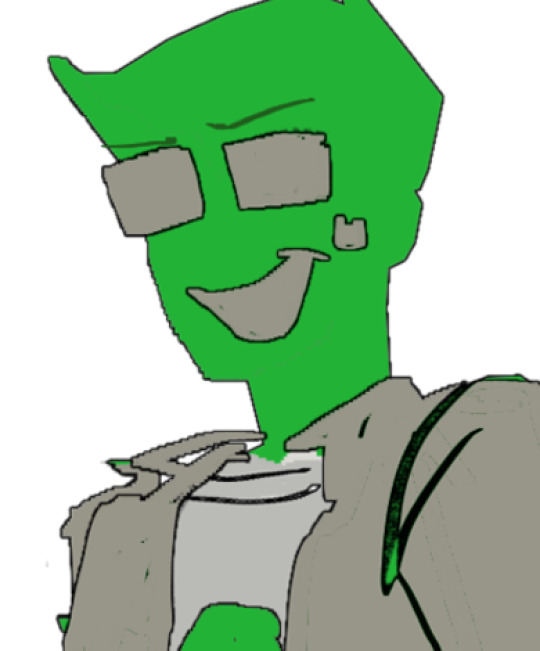
Ahahah what if we were both Shadows 👉👈
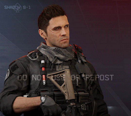
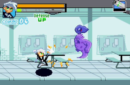
#call of duty#modern warfare#call of duty modern warfare#MWII#CoD MWII#blender renders#Phillip Graves#Philip Graves#Shadow Company#CoD OC#OC: Jax#Jackie Ramirez#Ship: High Places#IM INSANE IM CRAZY IM INSANE#I can't look at this god I'll cry#I KNOW its possible to mod the game I've seen people do it#I NEED to get jax in the game#(just an animation edited on top of the menu)#but HRGGRGGRHRHRaG#me trying to get them to match up but graves is hyperactive#this was mainly a test so I didn't go too hard with trying to match the lights#but whatever!!#animations take so long to render they drive me insane#1 hour for a 1k 3 second clip :))))))
245 notes
·
View notes
Text
Okay, gardening stuff is done (plus it is way too hot outside for late October, thanks climate change), so, here's a quick tutorial on how to use the Navigator function in Libreoffice to organize your writing :)
Don't have Libreoffice yet?
Download the free, open-source writing processor here! :)
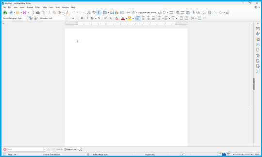
Once you've got Libre opened up, you'll probably be greeted with a generic New Document, like this:
To get the most of out taking notes and references, as well as just generally organizing your story (especially if you have it all in one master document), you'll want to use the Outline / Navigator function!
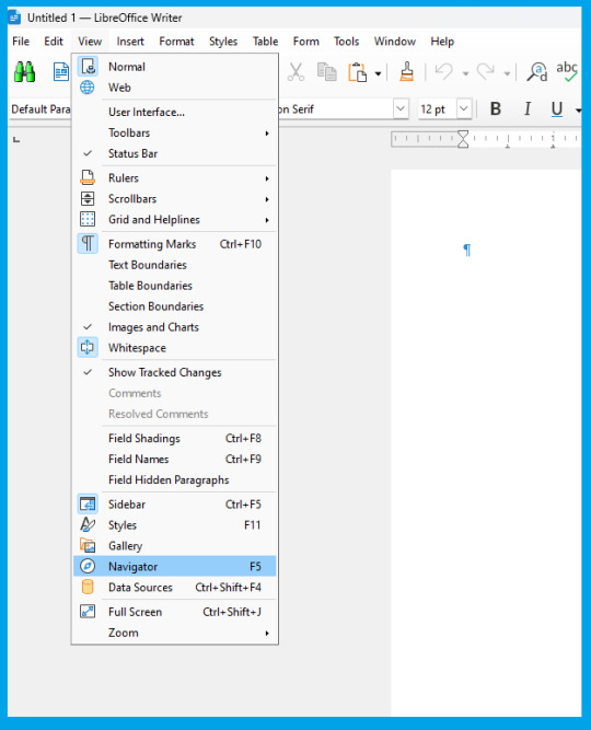
To get started, go up to the "View" drop down menu from the very top of the document (third option from the left) and in the drop-down menu, go all the way down and select "Navigator" (fourth from the bottom).
.Click it, and ta-dah! You now have your Navigator menu open.
You can re-size it by dragging the right-hand side to show more or less of it at any time, and I think you can move it to elsewhere in the document, but I use it where the default view is, so that's what I'll show here.
At first, it'll be empty:

But that is easy enough to fix!
To learn the ropes, type in a few example sentences in your document on seperate lines labeled 1 through 5.
As you type the first line labeled 1, highlight the sentence, and go to the Styles menu (shown below) and select "Heading 1"

Go head and type the other 4 sentences labeled 2, 3,4, & 5, changing each one's Style to the equivalent Heading (Heading 2, Heading 3, Heading 4, and Heading 5, accordingly)
(To do it more quickly with keyboard shortcuts, you can do CTRL + [Heading Number] to quickly change to a Heading, by doing CTRL+1, CTRL+2, etc)
until your document looks like this:

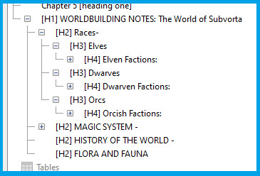
Notice how your Navigator now has different tiered categories, which you can collapse to hide the lower headings, which will nest together on the Navigator underneath higher level headings.
So, how is this useful?
If you have a document dedicated to Outlining your novel, you can now easily organize and find your information by sorting them by categories and subcategories, like below:

Here's what it looks like when most of the categories are collapsed:
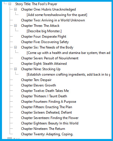
And, of course, when you're writing your story all in one Master Document, being able to easily navigate to different chapters is essential!
Here's an example:

If you need to make notes for editing later, such as:
[Add a description of location here]
[Come up with a fantasy animal here]
[rewrite this scene so its more clear]
[Skipped this scene from writers block, come back and redo]
etc
You can simply add these notes in as Heading 3 (or one-tier lower according to how you're organizing your document) to make it show up as a sub-heading inside the chapter to easily find it again :D

Obviously, 99% of works are going to have Tables of Contents much less chaotic than this example lol:
88 notes
·
View notes
Text
I'm crying laughing, the DVDs are even worse than I remember... Season 1's menus are silent with a single static jpg of the same key character art they use for everything else, and the episodes on the Season 2 discs don't even match what's listed on the box! Absolutely stunning lack of shits given. Truly unparalleled. But I really shouldn't be surprised given... well... everything about how this series has been treated since the very beginning.
Time for a quick ~✨PHANDOM HISTORY LESSON✨~ to give newer/less hyperfixated folks more context for why the graphic novel being as great as it is is such a HUGE deal:
Danny Phantom was one of Nickelodeon's MAIN cartoons, in its time. It was a central pillar. One of the top three or four of their lineup, which is saying something when the competition includes the cultural juggernaut that is Spongebob.
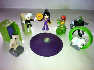
Despite this, and despite its superhero theming making it perfectly marketable, it got basically ZERO official merch.
What little we did get was often ugly and very, very cheap. The dedication at the start of the graphic novel that jokes about collecting the Burger King toys? That's because it was some of the most notable merch the franchise EVER had. (I sadly do not have any of it. There was no BK in my hometown. Here's a pic from the internet, though, to give you an idea.)
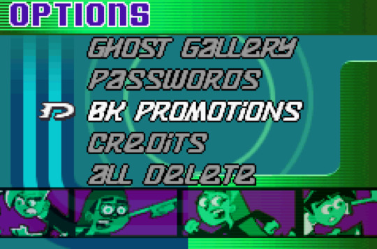
If you think I'm exaggerating about that being the most significant physical merch to come out of the series, consider that the first video game had an entire menu option specifically for the Burger King promotional tie-in:
That video game, by the way, was one of only two ever based on the show. The first was an adaptation of "The Ultimate Enemy" in the style of a short sidescrolling beat-em-up, and the second was themed around "Urban Jungle" and (as far as I can tell--I've only played the first couple levels) was an arcade-style scrolling shooter. Both were for the Gameboy Advance, and both are...... fine, as far as cash-grabby video game tie-ins to kids' shows go. This was pretty normal for the time, so I suppose we did okay in that department, actually. They're not GOOD, but they're playable and have at least a bit of effort put into them.
But besides those two video games (plus a handful of simple, long-defunct Flash games on nick.com)? In the decade and a half since the show ended?
Nothing.
No books, no games, no comics, no web shorts--unless you count mega-crossovers with every other Nicktoon (a la Nicktoons Unite), or soulless promotional material like "Fairly Odd Phantom" (which, trust me, despite being the first new DP animation in over 10 years was not even worth the effort of watching).
...I think there was a limited edition FunkoPop once?
So yeah.
A Glitch in Time is not just the first cool, well-made thing we've seen from the franchise in a while. It's the first THING we've seen since the show. PERIOD. And arguably the first worthwhile supplementary material to EVER come out of the show, depending on how you feel about those GBA games and the Nicktoons crossovers.
This franchise is widely beloved even now, almost 20 years after it first aired, and it feels like that fact is now, finally, FINALLY getting some official recognition.
PLEASE read A Glitch in Time. Tell other people about it. The series--no, the fans--deserve this (and more of this, if the folks in charge see enough of a response and decide to grace us with any followup). It's LONG overdue, but better late than never.
#Danny Phantom#this is why I've been losing my mind repeating ''please buy it'' over and over btw#this is the FIRST and maybe ONLY time we'll ever get to directly show support for the series#it is a uniquely huge deal for this fandom#it's totally fine if you can't (or just still won't) buy it of course but I am begging folks to consider it IF they can.#not for any moral guilting or anything just.... for me. for the fandom. (for yourself because it's a cool story lmao)#long post
538 notes
·
View notes
Text

ANIMATED TEXT TUTORIAL: ★★✩✩✩ Difficulty: Beginner/Intermediate
This is a step by step tutorial on how I did the text for my Pink Venom swinging text.
We are going to be making this text:
Before I start, you WILL need Adobe After Effects, but I will show you step by step how to achieve this.
Tutorial below the cut!
✔ Step One: Composition Open After Effects and create a new project, then a new composition making sure the composition matches your gif settings. (ex: 540 x 540, 2 seconds, 30 fps)


✔ Step Two: Creating Our Text Add a new text layer. It should be the same as Photoshop, you can just select the text tool and write what you want. Customize the text to say what you want and change the font and size to your liking.


We should have something like this:

✔ Step Three: Adding Our Animation There should be a box that says "Effects & Presets", in that box you can search for effects. Search for "Explosion". It will be under Text > Miscellaneous.

Select the first one and you can either drag it on top of your text layer or just double click it with your text layer selected. Sliding the time, we should have something that looks like this:

✔ Step Four: Adjusting the Animation With your text layer still selected, press "U" on your keyboard. This will open our key frames for the animation.

It's a lot to look at but don't worry, we will only be focused on Amount and Opacity, and I will make this as easy as possible for you. On the Opacity setting, click on the little time clock. This will remove the keyframes. Make sure your opacity is set to 100%.

Next we are going to adjust the amount so that it explodes INWARD instead of OUTWARD. Find a good spot where the letters are out and add a new keyframe the same way you would on Photoshop.
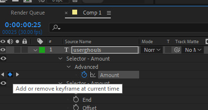
Now swap the two keyframes so the explosion animation is reversed. Next we are going to remove the scale keyframes. Click on the second stop watch for the second amount parameter, and make sure that one is set to zero.

We should be left with only ONE thing that is keyframed. And the keyframes should look like an hourglass.

You can stop now and leave it or we can make it a little smoother and more fun looking.
✔ Step Five: Editing the Graph & Adding Motion Blur To add a motion blur to our text, we just need to select the three little circle stack on our text layer. Also double check that the same symbol is highlighted blue up top.

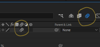
Now we have motion blur. Next we are going to adjust the graph. To open the graph select the little graph icon and then select our keyframed buy clicking on the amount parameter.


Now our graph should look like this:
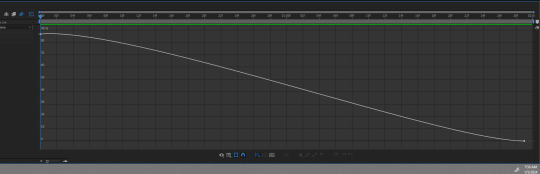
Select one of the dots and two little arms should pop up and we can drag those around to adjust the graph (the speed of our animation). Adjust to your liking, but to make it look like the text in the tutorial, my graph looks like this:
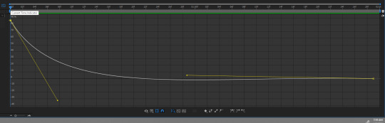
With my graph, the animation looks like this:

Now all the hard work is done!
✔ Step Six: Exporting Now to export our video so it can be turned into a gif: Go to File > Export > Add to Render Queue

We should be at a menu like this:
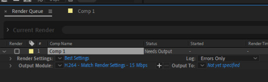
Click on the part that is blue next to "Output Module" and another box should pop up. For format: change to "Quicktime" For Video Output > Channels: select "RBG + Alpha" (this will ensure our background is transparent)
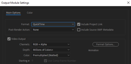
Select "OK" and then under "Output to" select where you want the video to save.
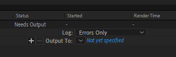
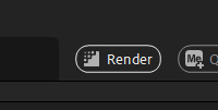
Now all you have to do is Render.
Once that finishes, YOU'RE ALL DONE!
Import video to frames as you usually would in Photoshop, just don't change the frame delay.
Treat it like a normal text layer/smart object.
As usual, you can play around with all the animation settings to get the look you want, this is just the basics for the main animation.
It looks like a lot but the difficulty is minor once you get the hang of the steps.
Any questions you have during the process just DM me! ★
149 notes
·
View notes
Text
HOW TO: change the background color of a gif with a lot of movement ⭐
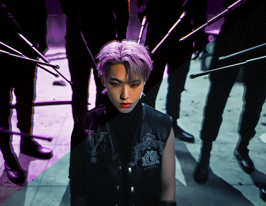
for if you are lazy as fawkkk like me and don't feel like figuring out how to use keyframes, or if your gif has too much movement to make it work teehee. it is labor intensive, but this gif originally looked like this so it is definitely worth the effort!
METHOD 1: adjustment layers
this works well with movement, however results are best if the background is very distinct! i would not advise against attempting this with a red or yellow background because it is going to mess with the skintones. i'd aim for blues, cyans, pinks, purples and very saturated greens (because some shades of green will be picked up as yellow and not adjust well)
for tutorial purposes, i'm going to go with a gif with a background that's cyan/blue. you can go ahead and get your gif loaded in, sharpened, etc. you can color it first, however i'm not going to be doing so.
the first thing you're going to do is make a hue/sat adjustment layer. you are going to bring the overall saturation up first (so leave it how it is and increase saturation). this is very much a matter of personal taste so just do as much or as little as you'd like. i'm also going to do a levels layer. use the eyedropper to pinpoint the darkest black and whitest white on the image. this leaves us with this, the goal here being to accentuate the background a bit.
now, create another hue/saturation adjustment layer. instead of leaving it as is, change 'master' to the most prominent color in your background. i'm going to go with blue. if you are working with a blueish background, you will likely need to follow this step with blue and cyan for everything to be picked up!
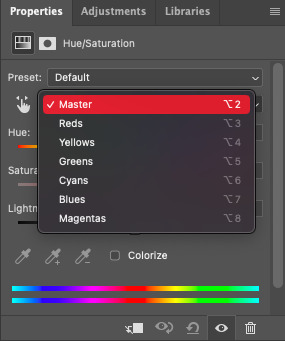
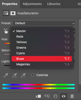
drag the 'hue' slider over in either direction until you achieve the color you're looking for. some shades will be easier than other: going from a blue to a purple or pink will be easier than reaching a yellow shade. however with enough tweaking anything is possible :3 this is what it looks like now.
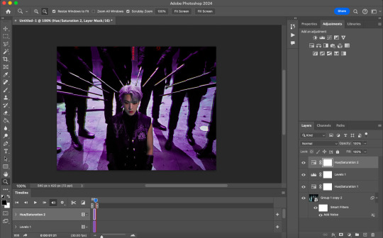
i'm going to do some coloring over this now, and some underneath as well. color to your liking! if the skin tones are off when coloring over this layer, move your coloring layers beneath it. you can also just color it first as i mentioned earlier :) either works fine. export it and this is what we're left with!
METHOD 2: frame by frame
this method is a little more time intensive, but it works well when your background is a neutral color, multiple colors, or too close to a skintone to be manipulated.
a few notes here: this works best in my experience if the person in the gif has dark hair. it can totally work otherwise but dark is more forgiving lol. it also helps it blend better because you can change the highlights without throwing the rest of the hair off!
you are going to want to do all of your sharpening, coloring and any other edits first. otherwise, your background may be messed up when coloring over it. once your coloring is done, convert your gif back to a frame animation. you can find a quick tutorial on how to do this as well as an action here.
with your gif converted back, create a gradient map with the color(s) you want your background to be. start with the very first frame in the gif and put the gradient map one layer above this frame. change the blend mode to whatever you happen to think looks best: i'm using color here.
now, you're going to click that first frame and select your magic wand tool. on your top toolbar you'll see an option to 'select subject'. click the drop down menu, select 'cloud select'. then click 'select subject' and it'll select the person in your gif.

then, go back to your gradient map and select your layer mask. make sure your foreground color is white and background color is black. then, go to edit -> cut. this will mask the layer so the gradient map is only applied to the background. make any adjustments using a white brush tool on the layer mask. here, there's still some small orange pieces left over so i'm going to fix that.
afterward, you will merge your frame with your gradient map (i recommend copying the gradient map first so you don't have to create it over and over again lmfao).
the highlights in his hair start to become more visible a few frames in, so when i'm adjusting the layer mask i'm going to account for this by brushing over his hair so the highlights go from their original white to pink. again, this is optional! the white just stands out too much for my linking.
now... you are going to repeat this step until you reach the end of your gif :) gradient map above the frame you're working with, layer mask, merge, repeat. it's time consuming but worth it!
once you're finished and your sanity is depleted, delete the frames from the timeline. the animation is going to be thrown off by all the editing we've done so it's best to just remake it.
to remake it, click the three lines, then 'make frames from layers'

then, select all your frames and set the frame delay to 0.07 (you can do 0.05 too but that's just my preference). you can either export it like this or convert it to a smart object for further editing. this is how it turns out!
37 notes
·
View notes
Note
Anon here!! How did you make the heart graphic for the power rentry?
hi!! i’ll put it under the cut since there’s quite a few steps. lmk if you need a more specific tutorial or images for any of the steps!!

1) finding the base
find the shaping mask you wanna use. you can look up “shaping mask png” or “mask png” on pinterest to find some. this is the one i used:
2) removing the background
to remove the background, use the selection layer in ibis paint x. to find this layer, go to the layers panel and it should be the one all the way at the top. it is titled “selection layer.” to remove the white background, select the bucket tool and select the white background. it should turn blue. then switch from the selection layer to the layer you’re removing the background from. look at the top middle of the screen. there should be a square composed of dotted lines that looks like this:
click on it and select “cut.” this will remove the white background. click on it again and select “remove selection area.” now you’re ready to continue!
3) creating a cleaner base layer
you might want to do this if you plan to add a stroke, as once the background is removed from the mask, it tends to leave some remnants behind. this makes the stroke look choppy and pixelated. to do this, take the paint bucket tool on a new, blank layer, and fill in the black part of the base with black. then, delete the base layer underneath the new layer. the hearts will become transparent (to see this better, change the canvas from white to transparent in the layer menu) and the base will hold its shape. you can also remove the hearts in the previous step, but this tackles two birds with one stone and (in my opinion) looks cleaner.
4) filtering manga panels
to make the manga panels pink, i looked up “pink manga polarr code.” pretty much any one will do, but this is the one i used:
for the rest of this step, you’ll need the app polarr. once you get the app, go to the edit section of the menu on the bottom. click “open photos” and insert the manga panels you wish to change the colors of. then, click “filters” and “import filter.” from there, click “import qr code” and click on the filter in your gallery. the filter will go into polarr, and you can just click instant export or you can save it and then export it. it’s up to you.
5) masking the panels
import the images you just filtered into your canvas. now we’ll use a clipping layer to have them take the shape of the base. click on the image layer you want to do this with, and then hit the clipping option in the layer menu. this will have it take the shape of the base.
6) coloring the hearts
now we’ll add a new blank layer atop the clipping layers. i color picked the pink color from the image, and then used the bucket tool to fill in each of the hearts.
7) adding the extra pngs
for this step i used the sticker option in picsart and a transparent canvas to collect the pngs. i believe i looked up “pink png” in the search bar, but i’m not sure. then i imported them into the ibis paint x project and positioned them where i wanted them to go. download transparent pngs of the project (one of each image you added). toggle the eyes on and off so that you can save the different versions (not individual layers. i just mean if you added two manga panels, make sure you get one with one manga panel and one with the other).
8) creating the gif
search up ezgif animated gif maker. it should be the first option that comes up. for this, i typically switch to “manually ordered upload” opposed to “alphabetically ordered opload” (the default) so i have more control over the order of the images in the gif. once you upload them into the site and you get to the editing menu, set the delay time to 100 and click the box that says crossfade frames.
andddd you’re done!!! i hope this was somewhat comprehensible and i didn’t miss any steps xD
195 notes
·
View notes
Text
Blender: Which Buttons Do I press? (Part 1)
There are a lot of tutorials where you already need to know how to "do the basics" like "maneuver the camera." So this tutorial is focusing on the Buttons- not on the sculpt or the object, just on the buttons and shortcuts that I personally use in Blender.
Note: You will need a mouse with 3 buttons / scroll wheel for this.
Before we start, I'm going to explain which shortcuts I use in this, but, not to make myself redundant, there's a shortcut for seeing shortcuts: Press Spacebar + Shift to see all available shortcuts in each mode.
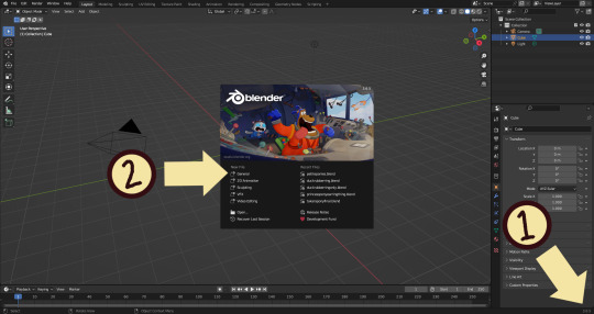
I'm using Blender 3.6 for this tutorial. I recommend you use the same. It's completely free and has a lot of great features! For this tutorial though, 3.4 will likely work as well.
Click "General" under New File.
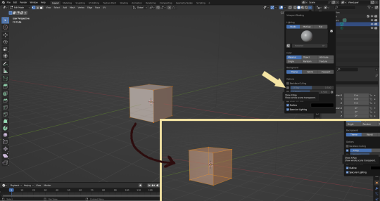
Your screen should look like this. There are 3 default objects in the file: Camera, Cube, and Light source.
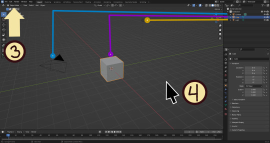
3. This bar indicates that you are in Object mode. This menu will allow you to go into other modes depending on the object you have selected.
4. Lets talk about shortcuts. You can zoom, rotate, and move the screen using buttons at the top right, but I haven't marked those because I will teach you a better way. Feel free to click them all and see what they do, but I assume you're here because you don't want to explore every button in this godforsaken program the hard way.
Below, the Left and Right buttons are marked as a reminder as well as the Middle button which is also the scroll wheel (press down to click it)
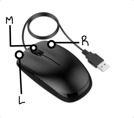
Left click: Select an Object Left click and drag: Selects multiple objects Scroll Wheel: Zoom in and out Middle Click and drag: Rotate your view Shift + Middle Click and drag: Move your view Right click: Brings up a menu that won't be relevant here. Shift + Right Click: Moves the 3D cursor. Not important for this tutorial, but I do it on accident a lot. Hit Shift + C to reset the cursor and also to reset the viewer position to see all objects at once.
Move the viewer around as practice! You're gonna need to do it a lot while modeling. If you have a keyboard with a Numpad (the calculator-looking thing on the right side, says Num at the top) you can use Numpad 1-9 to automatically adjust the view to front, left, right, backwards, and different angles. If not, test out the rotate tool at the top right which does something similar.
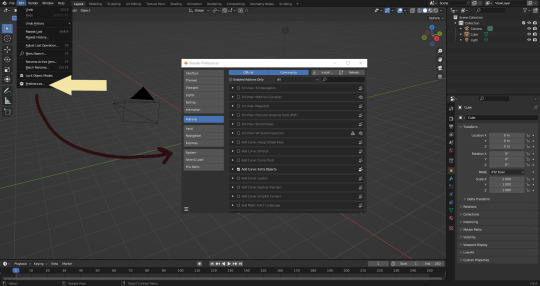
There's a helpful menu I use to switch between Modes (if you hit the dropdown menu where it says "Object Mode" you can do this without the shortcut); click Preferences to enable it.
Hop over to the Keymap section and check "Tab for Pie Menu"

And then close the window. No "Save" button is needed.
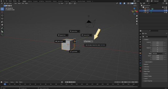
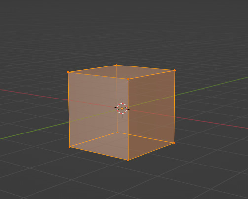
Now that you have the shortcut enabled, select your box with Left Click, hit Tab and Left click "Edit Mode"
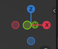
And yes, this is just like the Animal Crossing tool ring:
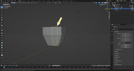
Now that you're in Edit Mode (You can swap back anytime by hitting Tab -> Object Mode), click arrow at the top right to open a menu where you can check the "X-ray" box. You'll be able to see through your cube. As a reminder, Spacebar + Shift will show you the available shortcuts in this mode, but I'll go over the important once momentarily.
What is a 3D object made out of?
This box is made out of vertices, and each face of the cube has four vertices at each corner- a triangle with three vertices also works, but we'll stick with squares for this tutorial. Moving the vertices will change the shape of the box, like a piece of stretchy fabric over a wire frame.
From now on, I'll be calling the vertices dots, because I hate reading and typing the word vertices over and over again.

5. By all means you can fiddle with the buttons over here but I'm gonna show you the shortcuts I use and the buttons you'll actually need. Don't get intimidated by the amount of buttons. Also press the T key and the toolbar will go away!
(Seriously, though, feel free to play around in this section as much as you want to, but we'll go over the shortcuts a few at a time with examples. at the end of this section will be a summarized list.)
6. Left Click one of the dots and press the G key. You'll see below a whole bunch of additional shortcuts show up at the button. Here are the ones I use:
G key: Grab and move around the dots
R key: Rotate two or more dots*
S key: Size two or more dots*; if two dots are selected, the distance between the dots will change but the angle between them will stay the same.
*Left Click and drag to select multiple dots!
CTRL + Z to Undo edits.
When you move a dot with the G key, imagine that the dot is against a piece of glass at a fixed point ahead of your viewer. The dot will not move farther or nearer to you, but will instead move parallel to your view.
As an example, if you press Numpad 1 and view the object from the front (The -Y green circle will be at front and center in the rotate tool), the dot will only move left and right (X axis) and up and down (Z axis). It will not move farther or nearer on the Y axis by default.
Play around with the G, R, and S tools before moving on.
This little X button at the top right will turn on symmetry. You don't need to use this, but it can be useful.
Left Click and drag so that an entire face (flat square) is highlighted and then press the E key to extrude. Extruding will add another set of dots that are automatically connected to the first set.
Ctrl + R adds a loop cut. This will divide the existing faces into two and add more dots. You can also drag loops to slide them to different positions.
The 3 key (not on the Numpad) will switch your Select Mode to Face Select. This is useful for extruding. Essentially it is simply selecting all the dots at the corners of the squares.
The 1 key will switch back to Vertex Select (or Dot Select) mode and the 2 key will switch to Edge Select (the least useful of the three, to me)
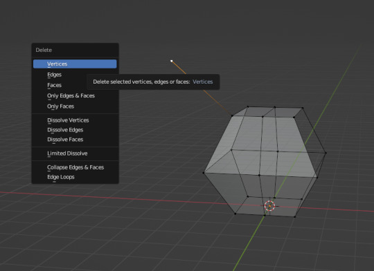
Before we go wild, there are a couple of additional things to know. For the tutorial, focus on working with faces, not vertices. If you accidentally pull a single vertex, select it and press the X key to delete it.
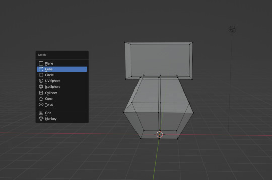
If you want to add shapes, I recommend sticking to cubes for now. Ctrl + A will open the Add Mesh menu and you can add a cube. Feel free to have complete cubes overlap for this tutorial.
Double Left Click will select a series of dots connected in a loop, and can be helpful for selecting areas all at once.
Ctrl + B is the bevel tool, and when a loop is selected it can turn it into two.
Here is a summary of all of the Edit Mode shortcuts:
G key: Grab and move around the dots R key: Rotate two or more dots* S key: Size two or more dots* *Left Click and drag to select multiple dots Double Left Click will select a series of dots CTRL + Z to Undo E key to extrude faces Ctrl + R adds a loop of dots Ctrl + B splits one loop into two X key -> Vertices to delete dots (vertices) 1, 2, 3 keys to switch Select mode Numpad 1-9 to move viewer automatically Ctrl + A to add a shape
Go play with them. See you back here in a while.
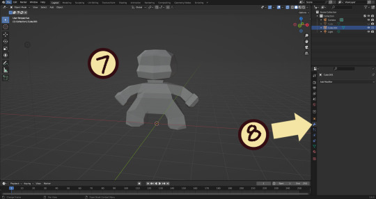
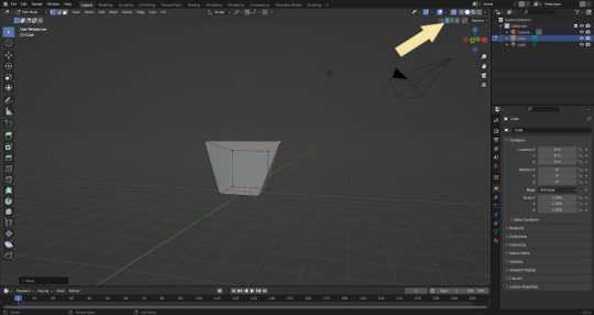
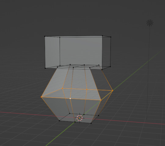
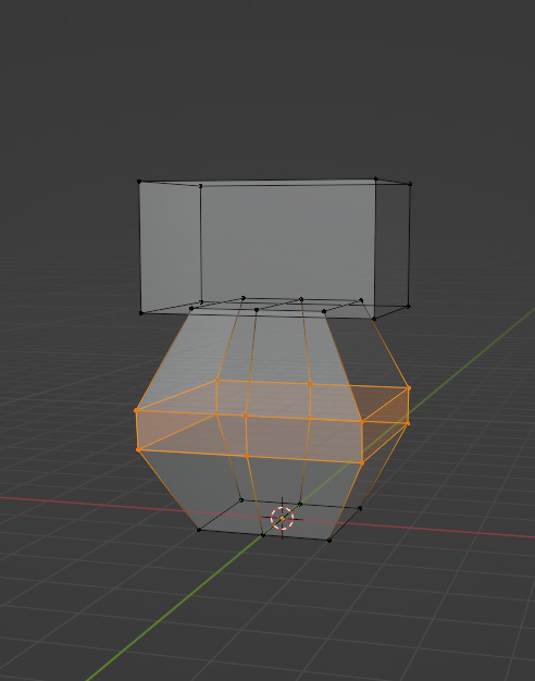
7. I used a single cube to make this figure. It's still very blocky, but that's fine. Loop cuts created additional faces which were extruded to create arms, legs, and a neck. Definition to the face was added by selecting individual dots. Remember, Ctrl + Z (undo) is your friend!
Once satisfied with the shape you made - a boxy figure or object is fine- continue on.
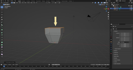
8. Press Tab -> Object Mode. Turn your attention to the right hand bar and make sure the Wrench button is selected. Note the Add Modifier Button.
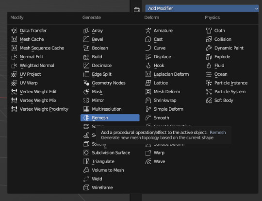
There are a heck of a lot of buttons here that you don't have to worry about- just select Remesh.
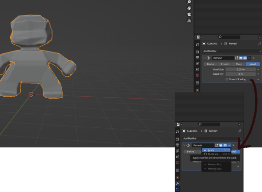
Change the number under Voxel Size to .05m by Left Clicking and typing it (there is a slider, but I find this causes lag). Then, apply the remesh by clicking the down arrow and selecting Apply.
Your figure should be shaped similar to before, but have a slight "graininess". If you have added multiple cubes, it will seamlessly merge them into one. The smaller the Voxel Size you put, the more dots will make up your object. However, I suggest starting with something in the .03-.06 range. We will refine this later.
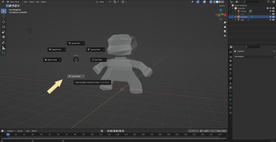
Press Tab and select Sculpt Mode.
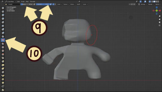
This is a mode where I actually use the tool bar for modifying my sculpt, as there are a lot of brushes . The icons show roughly what the brushes do using small icons (note on adjusting this below)
9. Observe the Radius and Strength bars, which will adjust the... well, the size and radius. Note that although the "brush" looks like a flat circle, the affected area is actually a sphere. Select a brush with Left Click and Left Click and drag on the sculpture.
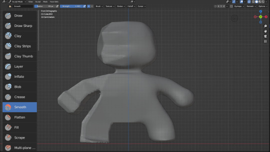
10. This is the smooth tool. I have smoothed out the right side of this figure. Note that I turned off symmetry to do this, but i usually have X-axis symmetry selected.
Although I am used to the small buttons, there is a way to change them. Hover near the toolbar to Left Click + Drag so you can see the names. Hold Ctrl + Middle Mouse button and drag to resize. You will be able to make the size of the menu much larger. This goes for many of the menus in Blender.
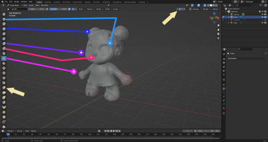
The above arrows point to the symmetry button (Top right) and Grab brush (bottom left). The Grab brush uses the shortcut G Key.
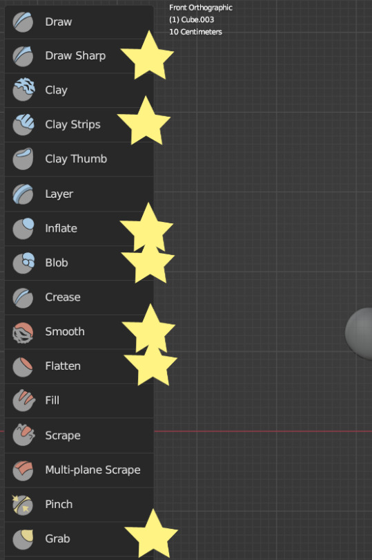
The lines point to which tools were used for each part of the sculpt. The Draw Sharp tool was used to mark out eyes. Clay strips made the hair texture. Round cheeks were added using the Inflate tool and a nose (and buns) were added using the Blob tool. The aforementioned Smooth and Flatten tools were used judiciously to remove sharp edges.
I don't have a shortcut list for you here, but here are all the tools I use the most:
You can hold the Ctrl key while using the brush to reverse its effects. For example, if you hold the Ctrl key while using the Inflate brush, it will deflate the shape instead, creating a concave shape.
As you can see, my figure is getting a little grainy. So, we're going to remesh this model again and add more dots and therefore detail.
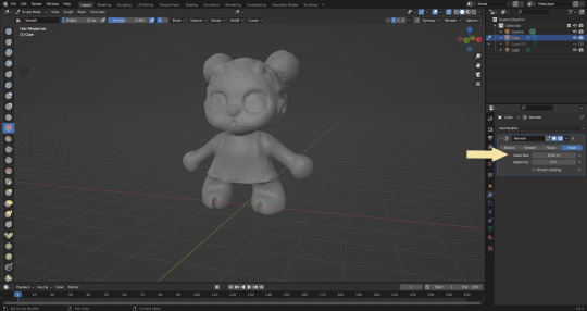
This time, we're putting the Voxel Size to .01m. Apply the remesh as before. Now we have more dots to work with and we're just repeating the process, smoothing, and sharpening the lines.
I was going to add a bit about how to take a photo of your sculpt, but I ran out of photo space. I will add a reblog with this information.
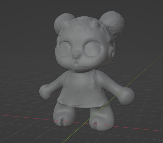
I came up with this little lamb character on the spot because the clay strips created a nice texture. She's by no means perfect, but she did turn out pretty cute so i might make a cleaner version later on.
62 notes
·
View notes
Text
Quick-N'-Easy Icon Editing Set-up with Krita!
I'm sure there are already a few tutorials like this one out there, but hey, what can one more hurt?
What's this do?: Krita has features you can use so you can make quick edits to your icons all at once, and save them all out individually with the press of a button. It's a great time-saver, and gives you a lot of flexibility in your edits!
What you'll need:
Krita, a free and open-source painting / image editing program!
Icons!
Part 1: How to export your icons all at once.
( warning: long and image-heavy! Written with beginners in mind. )
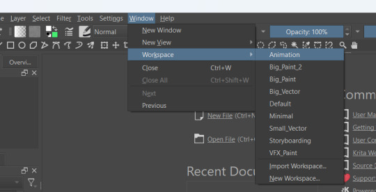
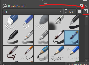
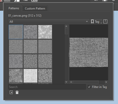
Once you open Krita, you'll want to go to Window > Workspace > Animation on the uppermost bar to change the layout for what we'll need, here.
We're going to be using Krita's animation features to make iconing / icon-editing a little easier.

( as an extra note, hitting '1' on your keyboard will set Krita's zoom to the image's actual size, while '2' will have it fill the available space. Helpful for seeing how your icons will appear on the dash. )
Okay, let's get started! Make a new image ( File > New or press Ctrl + N ), set it to whatever dimensions you want ( I default to 100x100px ). Make a new layer ( Click the plus icon in the layers tab, or press ins ), and then put that layer in a group ( Right-click the layer and click group > quick group, or press Ctrl+G while its selected. )
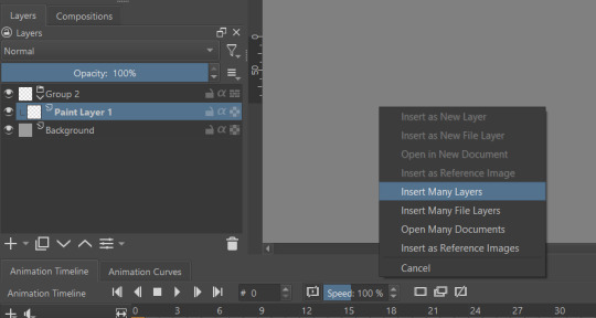
With that grouped layer selected, Grab your icons, and click & drag them into Krita, onto the canvas ( the big empty grey space in the center ). When Krita prompts you, select 'insert many layers.' This will load in each image as its own layer. If you don't have the grouped layer selected, you'll have to select them all and put them back in the group. ( No big deal, just shift + click the first and last layers, and drag them where you need them. )
You can now delete your initial paint layer in the group, if you want. Otherwise it will make an 'empty' icon when we export.
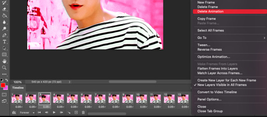
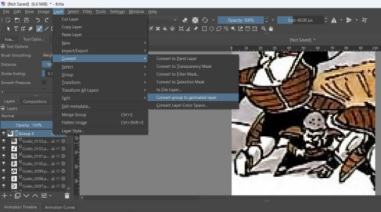
Select that group, then go to Layer > Convert > Convert Group to Animated Layer on the top bar. ( This is only accessible through the top bar, not the menu that appears when you right-click on a group. I don't know why. )
Congrats! Now all your icons are frames in an animation. Each cell on the timeline is a single icon. If you have a scroll wheel, you can scroll to quickly look through them all.
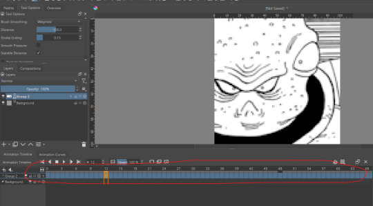
If you can't see all of your icons on the timeline, click the three bars here and set 'clip end' to whatever number of icons you have ( or a little more, for extra wiggle room. )
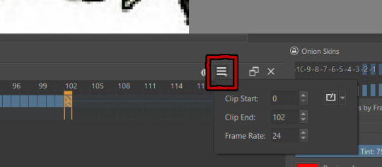
Find the last filled cell, right-click it and select 'set end time.'
When you're ready, hit File > Render animation.
You'll want to make sure you set it to export as an image sequence, and select where you want your icons to go on your computer. Give them a naming scheme. Make sure you save before you export your icons, as I've had Krita crash while exporting a large number of icons all at once. ( If it does this to you, just try again. Worst comes to worst, you can export by setting the first frames and last frames to smaller chunks instead of all at once. )
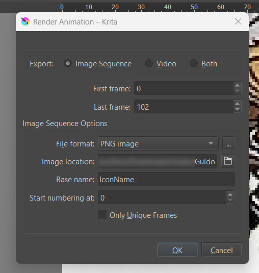
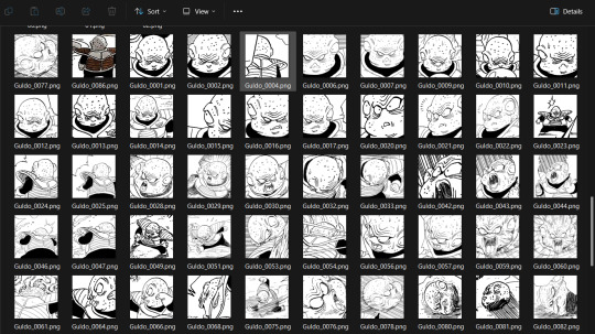
Hit OK and voila! No more saving icons out one-by-one!
Of course, we haven't done any editing yet, so this is all redundant unless you're saving out your own freshly-cropped icons. Let's move onto the fun part:
Part 2: Editing
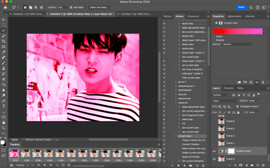
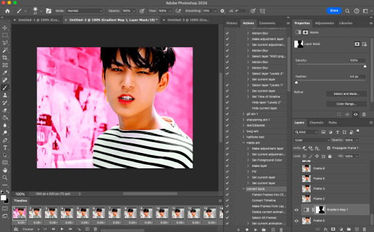
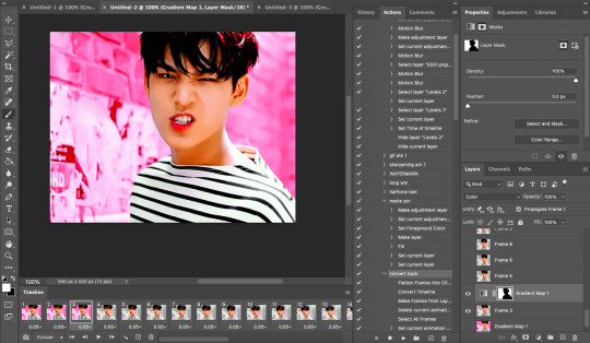
Right-click your new group layer and hit add > filter mask. Choose any you want- for demonstration purposes, I'll be using my favorite: gradient map.
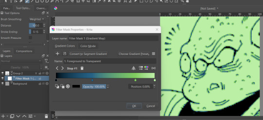
This will put that filter over all frames in that animation layer, meaning you won't have to repeat your edits per icon.
If you want to edit your filter mask after you click off, just right-click it in the layer tab and select 'properties.' It will bring the initial prompt up again for you to adjust.
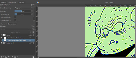
You can add as many filter masks as you want! The order the layers are in does matter, though, so keep that in mind.
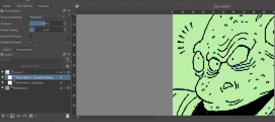
If you want to add frames, banners, name tags, symbols etc, you can do that on layers over or under that animation layer! They'll stay consistent across the 'animation' unless you add new frames to them on the timeline.
If you want to edit your icons again, just do so, and re-export! If the naming scheme and numbers are the same, Krita will automatically overwrite the old files. But watch out; if you're trying to save new icons, make sure you start numbering at a higher number than your last icon, or change the base name.
Happy iconing!
#rp icons#rp icon tutorial#rp resource#rp tutorial#icon editing#icon edits#not icons#no clue what to tag this as...
41 notes
·
View notes
Text
Krita tutorial the way I know it.
Basics: What is where.
Gimmicks.
Specific advice on specific tools.
Basics: What is where.

Upon opening the program this is what you're met with. First of all, must comment: The layout is HEAVILY editable so you can just drag menus anywhere you want, even leave them floating amidst the sheet you're drawing on.
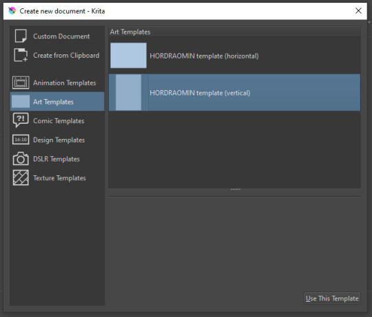
You can create custom art templates, I have two o'mine here as both have my signature background color.
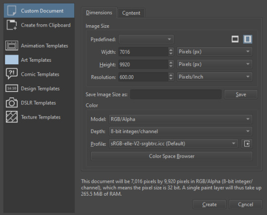
As well, you can edit the custom document settings, as in what size you want it, what resolution, even the initial content of the image. As well you can create from clipboard: Just copy some image from your browser and Krita will recognize it (useful for making meme edits lol).

Now, once you have your file, I will show you what is where.
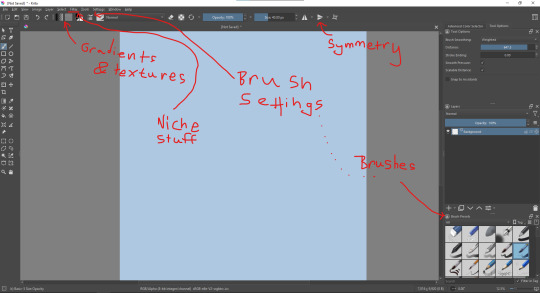
Brushes:
Brushes are easy to edit and there are tons of free bundles to download online. I myself only got one bundle, Jackpack (bit hard to find now due to original source being lost, it is still available but bit tricky to come by).
There. Are. Tons.

Some of these are my custom brushes for calligraphy in neography, you might even guess which ones. You can edit existing brushes, make new ones from the ones you've edited without changing the original, and all sorts of stuff (more below in the third chapter).
There are numerous packages of brushes once you enter Krita, but only one/two are available when you first open it. To unlock them all, click here:
And make sure all bundles are dark gray in color (example of both dark and light below).
Now Tools Options: those will pop up depending on what tool you're using.
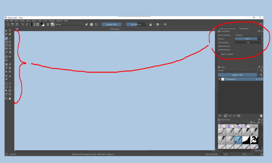
Symmetry: Fun stuff. You can drag the lines depending on how you need them and then center them back to the center of the screen if needed.
Gradients and Textures also have their tools options, you can play with those to get the feeling what they can do (more in third chapter).

The Filters tab is useful too. Blurring, motion blurring, color mapping, artistic filters and all that: Quite fun.
Gimmicks.
Krita allows you to customize your workspace freely. Floating menus, tabs, anything you want. It has quite many drivers at that-
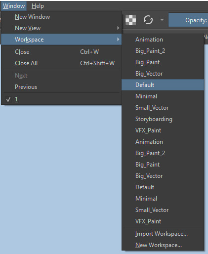
To access the workspace templates, go to Window and choose Workspace.
Krita allows for copy-pasting any image onto the sheet. Though, for me it sometimes crashes if I accidentally copy-paste text into it without choosing the Text tool first.
The software allows for both raster and vector work. It is basically Photoshop sharpened to be used by artists primarily.
There are some interesting mechanics regarding the Eraser (default bind E).

You can use it with any brush, allowing for textured erasure/quick work. Good for sketching.
You can use it on gradients (given there's a transparent point on the gradient preset).
There's a Multibrush tool:

People say Krita is good for animation but my brain can't wrap around it yet honestly @~@.
The keybinds:
B - Brush tool.
E - Erase tool option.
M - Mirror (useful for checking accuracy from a new angle).
Ctrl - Color pick (when used with brush or other color-using tools).
Shift+L.Mouse+drag - Changes the size of the brush by dragging left and right.
Ctrl+E - Merge layer with the one below.
Ctrl+G - Group selected layers.
Ctrl+A - Select whole sheet.
Ctrl+Shift+A - Deselect everything.
F - Bucket tool.
G - Gradient tool.
Ctrl+S - Save document.
Ctrl+Shift+S - Save As document.
Ctrl+N - New document.
Ctrl+O - Open document (will be seen in a new tab on top of the sheet).
Ctrl+C - Copy selected layer or selection.
Ctrl+X - Cut selected layer or selection.
Ctrl+V - Paste copied/cut layer or selection.
Q - Multibrush tool.
R.Mouse - Interesting thing: Opens up a quick selector for brushes and colors you've already used in the piece.
1 - Zoom 100%.
2 - Zoom to fit the piece vertically.
3 - Zoom to fit the piece horizontally.
4, 5, 6 - Turn 15 degrees (4 and 6) or undo the turning whatsoever (5).
Ctrl+I - Negative filter applied to layer.
Ctrl+U - Color editing on the layer.
Ctrl+Y - Soft proofing mode (for color mistakes and stuff like that, mostly annoying for me tbh).
Ctrl+T - Transform selection/layer.
Ctrl+R - Square select tool.
Ctrl+J - Lasso select tool.
Honestly you can just hover your mouse over tools and see their shortcut binds, as well. Or edit them in Settings.
Specific advice on specific tools.
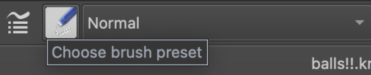
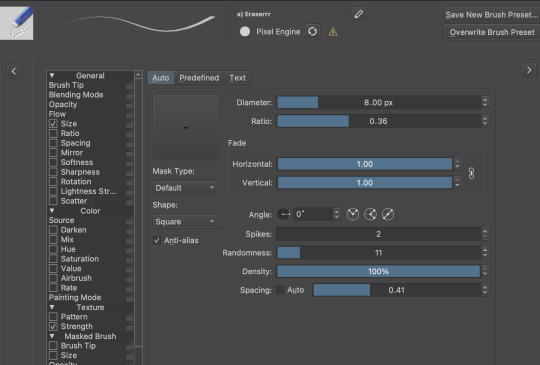
Brush:
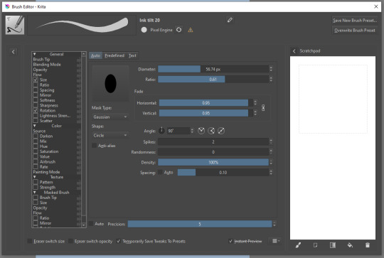
Brush editor is a great tool for making custom brushes, and it even has a sratchpad to test them out. Lots of settings, but no need to be afraid; Most of them you might never use on purpose.
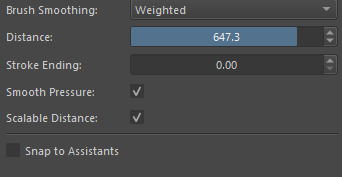
Use Brush Smoothing for great and pretty lines in lining pieces or making calligraphy.
Gradient:
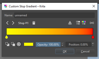
The four icons to the right top are:
Mirror gradient.
Arrange by lightness value.
Arrange by color value.
Space the stops evenly.
Click the gradient to add a new stop. The three things to the left are:
Make the stop use Primary Color.
Make the stop use Secondary Color.
Make the stop use a fixed color.
307 notes
·
View notes
Text
Handy book of tips and tricks for using Krita (by a user thats used krita for a while)
HI! So i'm a krita user, and i figure since i know fellow artists that are moving to krita, i might as well make a handy guide to some of the tricks i use to snazzy up my art and basic howtos. This will be splitup into three sections: Tools, Layers, Filters. I'll also be interspersing how i used them in my art as examples!! Thisll be a two parter so hold on tight.
Shortcut keys: P = colourpick E = eraser B = brush
Tools:
Obviously try using all of the brushes and seeing which ones you like. Krita has a myriad of handy and good brushes, and you can even make your own if you feel like it. I personally like to modify the rectangle eraser to a normal brush and using it, before i modified it a little more to be my own brush.
You can change the settings of the brush youre using on any layer by clicking this little dropdown menu in the top left of your screen. That little three dot button by the left side also goes into more detail about the brushes in case you want to fine tune a brush to your liking.
Personally, these are the custom brush edits ive used to make my art just that bit crunchier. As you can see, theres a lot more options you can tick and mess around with if you feel like it too.
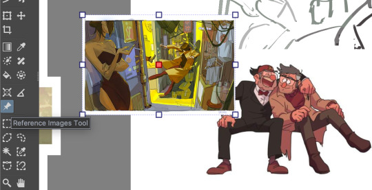
The pin button is the reference tool. If you copy paste an image into krita while the pin tool is selected, it will appear as its own image above all layers that can be moved around using the pin tool to use as a reference. Real handy so you dont waste layers on ref images.
Layer styles
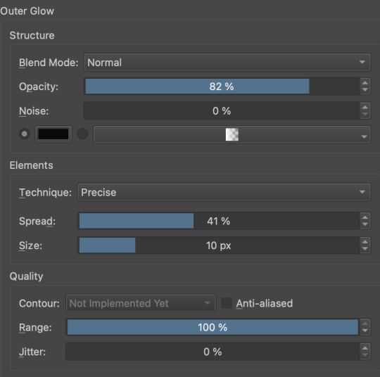
Ok, you probably know the basics of how to change layers, (its this little dropdown menu here) but did you know that krita has a cool thing called LAYER PROPERTIES??

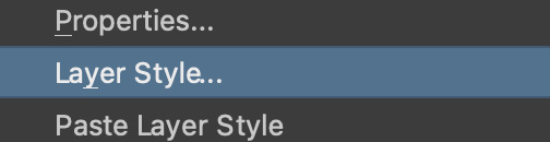
If you right click a layer and click this little button here..it should bring you to this handy menu with styles! These are really useful
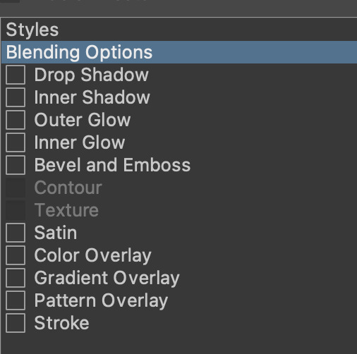
Now, i used to usually use outer glow set to these parameters to give the illusion of lines (and this is how anime artists usually line their very delicate pieces of hair and stuff), but i found an even better way!!
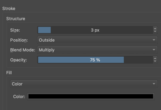
Its called stroke, and you can just modify it to be as thin or thick as you like. I recently used it for these two pieces, because its more precise, and used across multiple layers makes your work look cool and like you gave a damn about lineart. This is especially helpful if youre a stubborn son of a bitch that isnt going to to take the time to line your lineless work, or if you want to line really small items like string on shoelaces and not have it look messy (just set the colour to white and draw as usual.)
PART TWO
68 notes
·
View notes
Text
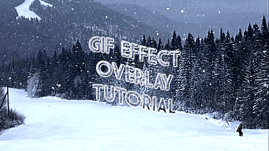
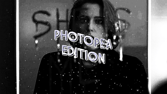

ages and ages ago @jaeyxns asked for a tutorial of how to overlay gif effects onto edits, so i am finally here! thank you so much for your patience. from the bottom of my heart, my bad.
we're going to look at two very similar scenarios here: overlaying a gif effect onto a still image and then onto another gif.
onwards!
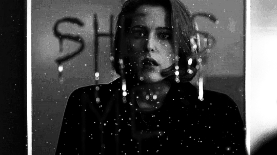
as mentioned in this great tutorial for the same effect on photoshop by @camwritesbooks, your first step in either case is going to be to find your overlay gif. you can do that by searching for the effect you want (smoke, snow, etc) on google or youtube- in this case, you may have to make your own gif- or searching for overlay gifs on tumblr. i got my falling snow gif from here. for the purposes of this tutorial, your overlay gif will work best if it includes a dark background (black is best) with light effects.
next you want to upload your gif(s) and, if relevant, image(s) to photopea. crop/resize as needed so that they're the same size by going to image in the master menu, then "image size" and plugging in the desired dimensions:
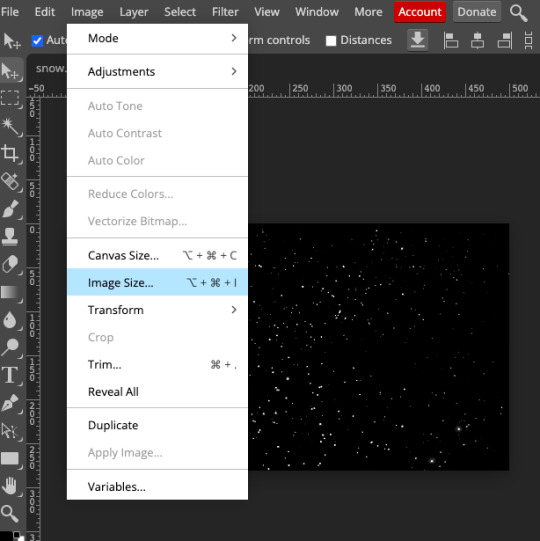
(to crop, you use the crop tool in the editor menu on the left!)
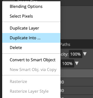
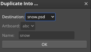
next, duplicate your overlay gif onto your base image/gif. you can do this by right-clicking on the folder in the workbar to the right, then selecting "duplicate into" and choosing your base from the dropdown:
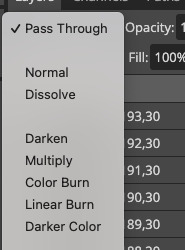
now go into your base gif. you should just see the overlay gif on top of it. to rectify this, select the folder of the overlay gif in the workbar, then go to the blending mode dropdown just above it (it will likely say "pass through") and change the blending mode to screen.
(if your overlay gif has a light background with dark effects, i THINK you can get the same effect if you choose darken instead, but i'm not completely sure.)
if your base is a still image, you're all done! you can go to file in the master menu and export as a gif.
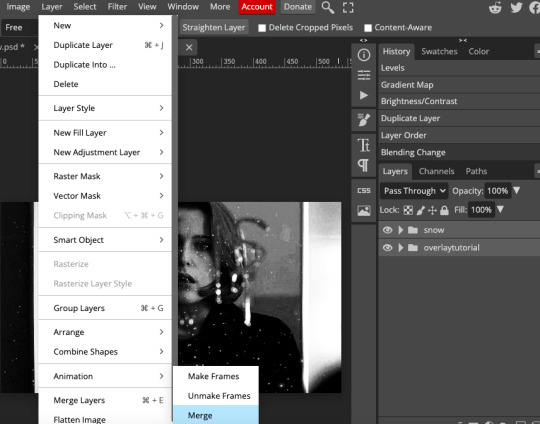
if your base is another gif, you've got one more step. you need to merge your gifs. i cover how to do that in this tutorial, but if you need a refresher, your first step here is to select the folders of both the base and overlay gifs at the same time. then, go to layer in the master menu, scroll down to "animation," and select "merge". DO NOT select "merge layers."
now you should be good to export your gif! if your base and overlay gifs weren't the same number of frames or the same framerate, it might look a little clunky at first, but you should be able to easily adjust the speed in the export window to make it look cleaner. i ended up speeding scully up to around 120%. there's a way you can completely fix the problem but it's really time-consuming and involves a lot of math, so i won't get into it here. if you'd like me to explain it in more detail, let me know!
as ever, let me know if you have any questions!!!
#arwen.text#tutorials#resources#completeresources#allresources#dailyresources#gif tutorial#photopea tutorial#photopea#overlay gifs
205 notes
·
View notes
Text
I may have messed up and deleted the ask TwT (sorry folks, and especially sorry to the user who asked, but here's the questions I remember and the answer that I was trying to give :,] )
"Can we be given an addendum to edit our responses to the form?
What's the artstyle of the game?
What about music?"
Hi hi hi hello there! Thank you very much for your questions! Glad you liked the moodboards! :,3
There is really no way that we know of to change your answers once submitted, but if you want to make any changes, just contact any of us and we will gladly edit the info! :D
About art style, we are planning to go for a good ol top-down classic RPG vibe, a mix of styles between pixel art, 2d art and 3d models! Pixel art adjacent for overworld sprites and battle animations, low-poly 3D models with low res textures with some flat 2D props here and there, and normal art for talking sprites and menu art! There are not other art directions but the ones in the presentation since we want to keep the artstyle unique and special as a tribute to this Fandom </3
About music, Arto's the one in charge, so take it away!
-Kori
Hi-hey-hello, Arto here!!!
There will be (kinda electronic) music. I use a program called UltraBox to make it, and ill be honest, I might not have professional music experience but don't count me out! I'm a musician with a huge love for writing (especially video game) music!! Obviously, it won't be as amazing as Toby Fox or others, but I'm working to get the songs to be as good as possible!!
12 notes
·
View notes
Note
hii, sorry if you've answered this before but what do you use to make your edits ? your stuff is so cool it's inspiring me to try it out for myself hdkghdkgj,,

oh my gosh tysm 🥺 i really appreciate this but ill just get straight into the list! underlined = link , highlighted is website names
sorry for the long post i ended up yapping.. tldr photopea, ezgif, lunapic, alphabetiser, nameberry, magic baby names, baby centre, sekaipedia, pinterest, tumblr, . also at the bottom is a tutorial on making stamps & some templates
for basic editing i use photopea - https://www.photopea.com/ , if its too confusing you can also try ibis paint but its too confusing for me. i click "new project" and then use the dimensions i need ( tumblr banner = 1280x720 , twt banner = 1500x500 ). i can also make basic photopea functions tutorial if you need it bc a lot of people find it difficult to navigate. i dont have any specific favourite layer blends but i recommend light colours -> use the section under "lighten" , dark colours -> use the section under "darken" , blacks and whites -> use the section under "difference". of course once ur more comfortable u can just do whatver layer blends u want ^ ^
for gif editing / merging (layouts, pixels, blinkies) i use photopea's layer -> animation -> merge settings, however if that doesn't work i use ezgif - https://ezgif.com/ , specifically the gif maker.
for adding animations to stamps, i use lunapic's animations tab - https://www6.lunapic.com/editor/?action=animation-examples . i also used to use this website a lot for old layouts before i knew how to use photopea. below i highlighted my fav settings (3x for sizing)

for npts i use alphabetizer - https://alphabetizer.flap.tv/ to organise name lists. if you use this make sure to turn ON "ignore case" in the side menu!! it sorts capital letters as normal, and then i delete the capital letters later when formatting a post. for names i use websites like nameberry, magic baby names, and baby center. not sure how to explain it but i just get a feeling that a name suits a character ^ ^. as an example in all of these i used "orchid". for titles and pronouns i just use my imagination based off the character's wiki page.

for resources: i find proseka transparents online at sekaipedia - https://www.sekaipedia.org/wiki/Characters , or at @prosekaipng or @sekaitransparents . i find frames and pngs on pinterest or tumblr, and use unscreen to remove the background of gifs and remove.bg to remove the background of any image i cant be bothered manually removing. when i need to do touch-ups myself i use photopea
i find colour matches for layouts on pinterest, and then edit the shit out of them until it looks close enough to a colour palette (example below of some colour editing i've done recently). most of the things i do are extreme changes but i started off by making subtle changes in my old layout posts on lunapic, which i still sometimes do today like in the last example from a post currently sitting in my drafts i havent finished. ( ̄  ̄|| )
(this is how i found out my emu photopea file didnt save btw so excuse the missing elements ...)


for overlays, btw i use A LOT OF THESE, and also lots of custom PSDs. a psd is basically a colouring file you overlay on top of something, and are similiar to smart filters. in photopea you can click "image -> adjustments -> (whatever)" and apply that to one singular image, and these are called smart filters because you can transfer them to other images by individually dragging them. OR you can click "layer -> new adjustment layer -> (whatever" and this is a PSD because it automatically applies to all images. in photoshop, there are no "smart filters" iirc. i use a combo of smart filters & psds & overlays. i find overlays sometimes on pinterest, but mainly on tumblr. my favs below. use layer blends on these!!

for stamps i use templates in photopea using a raster mask. you can find templates on tumblr and deviantart, majority of tumblr dumps are from deviantart, so i focus on using deviantart myself and finding original stamp works on tumblr rather than reposts. some accounts i recommend are caterpillar-with-a-crayon and dixons-graveyard. remember to credit artists!!
to do this, first open a template in photopea using either " file -> open " or " open from computer " . next select the magic wand and select the inside of the stamp. next open a new layer using the blank page (second from the right, bottom right, next to the trash can below the layers) and use the brush tool to colour in the selection from earlier. it may look like an eraser, or any other icons shown in the menu. right click and select the brush tool, then hold down to colour it in. you should have something now looking like the fourth slide, with a stamp template on one layer and the colour on a layer above it.
to make the raster mask, de-select the colour by clicking anywhere in the dark grey surrounding the canvas. while on the colour layer, select "layer" (fourth from the left, next to "image" and "select, menu in the top left), then select "raster mask" -> "from transparency" . your coloured layer will then split into the colour surrounded by black, and a white version of the colour. both connected with a chain.


now, create a folder above your stamp template by clicking the button shaped like a file (bottom right menu, 3rd from the right, between a sheet of paper and a circle cut in half). now, click on the RIGHT split from the layer (the white colouring) and drag it onto the folder. it should stick there. now, anything you put inside that folder will fit the stamp inside! remember to turn OFF the red layer by click the eyes next to the layer. this wont affect your raster mask. i used an image and the text tool.
you can also do more complex things involving stamps but this is a basic tutorial ^ ^.


16 notes
·
View notes
Note
how did you do that edit?? the tweening and everything?? what program did u use?? it’s so good!!!
Thank you!! Here’s my general editing/tweening advice (do advise tutorials though, this probably won’t make sense to beginners so start slow)
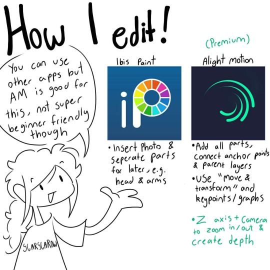
I use Premium (paid) alight Motion which allows for parent layers, more effects and camera motion but you don’t need these, it’ll just be harder without it.
Ibis paint:
• Insert your picture that you wish the edit
• Seperate each part you will need to edit later and fill in gaps and empty space (e.g. remove head, remove eyelids and eyes for blinking, remove upper and lower arm/leg, etc)
•Download all layers as transparent images
Alight Motion:
• Insert all your layers to tween in order (like head on top of the body/neck and hair on top of the head)
• Go into “Motion and transform” then click the already selected arrow icon to enter your pivot point, this is where things move from (e.g. the heads pivot point would be where it meets the neck so it moves from the neck)
• (Premium) Connect the layers with “Parent layers” (icon at the top right menu) so that if the parent layer moves, so do connected parts (e.g. connect hair to the head so if the head moves so will the hair)
• Now you can move the parts as you like with whatever music you choose to have. Use “motion and transform” to spin parts around (like tilting the head) or moving parts or scaling them up or down
• You can use the effects menu to add to your layers such as Scale Assist to help squash and stretch or bend to bend your layers
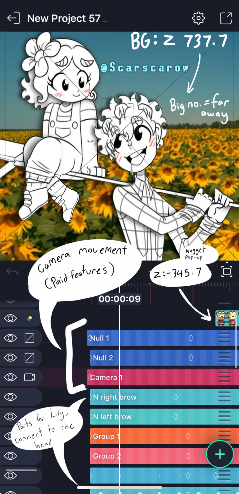
• If you’d like to add depth later (such as zooming in or just to achieve a 3D effect), use to Z axis (bigger number = farther away) and adjust it to your desired position, this will be used through the Camera layer and Null layers which treat the frame as a camera which you can zoom in and out and move around for depth
This may or may not have made sense but just start slowly if you’re new, learn basic transitions then get into tweening, practice with simple movements and learn graphs to ensure your animations are smooth! Tutorials are the way, so probably don’t jump to what I do, build up your skills first,
if you do what I do though, it may look like this:
#art#fanart#digital art#editing#tweening#animation#tips and tricks#animation art#alight motion#ibispaint art#tutorial#advice#kindergarten#ibispaintx#how to animate#anon ask
39 notes
·
View notes
Text
Fool

inspired by the Hayate Ichikura - Takayuki Mima date and a request years overdue. Also please listen to Fool by NCT 127 because some of the lines here are from that song.
characters: clumsy! stranger! brother! Yuta Nakamoto x university student! reader (ft. Mom and bestfriend! sister! Yuna)
summary: You met a stranger in a cafe with who you crossed paths again.
word count: 2.8k words
genre: fluff
warning: clumsy Yuta, accidental breast touching, lame ending
You sighed heavily, looking at the poster for the small animal cafe you just passed by.
It had been a stressful week because of your thesis. Why is being a university student so hard? You wanted to have a breather, something new. And the outside of the small shop caught your attention. It would be nice to come inside and look at small animals.
You pouted seeing what was written in the poster. Why is the hedgehog keychain so cute? You want to get their limited edition keychain. But why is it available for couples only?
You sighed once again before hearing another person sigh beside you. A guy, who looked much younger than you, in his brown sweatshirt and dark-colored hair, caught your attention. He has some kind of a far-away look in his eyes. Does he also want to go inside the shop like you?
“Hi,” you greeted, mustering the courage to talk to a stranger. “Do you want to come inside with me?” That sounded too straightforward and his innocent look doesn’t even help at all. “I…” you fiddled with your thumbs, “I kinda like the keychain.” You then pointed at the poster.
The stranger nodded, smiling widely at you. You gaped at how lovely he looked with that boyish smile. “Let’s go inside.” He held the door handle, pushing the door even if it says ‘pull’. He realized his mistake after the third time he pushed the door and then pulled the door for you.
You silently giggled, how cute.
You were both seated at a two-seater table facing the cage of hedgehogs. The guy in front of you looked so cute, with his huge bright eyes staring at the small animals.
The waitress came with the menu asking what you wanted, he ordered the couple's menu which consists of two coffees and a waffle. When asked for your preference for drinks, he said he wanted a hot iced coffee which startled you and the waitress. He looked embarrassed at the little mistake while clearing that he wants hot coffee.
How adorable.
The stranger shared that he had been wanting to visit the cafe for some time now but since couples or girls enjoy the cafe more, he was scared and embarrassed to come in. You can’t help but gush at how lovely he looked while enthusiastically talking about his hamsters at home. His soft giggles while holding the hedgehog and his whispers that it tickles are like music in your ears. You didn’t know that watching a grown man cutely interact with small animals can be therapeutic.
Although the conversation is limited, centering on small animals, you didn’t feel bored. You enjoyed the coffee, where you added two teaspoons of cream and three teaspoons of sugar the way you wanted it, and the waffle with ice cream on top. You enjoyed the stranger’s soothing voice and his healing smile.
When it was time to pay, you both decided on each paying half but he kept on searching inside his bag and even looking in his pockets. “Why?” You asked, “Did you perhaps lost your wallet?”
The guy shook his head then put his hands together, “Sorry. I think I forgot it at home.”
You lightly smiled. Why is he so cute? “No worries. I was the one who asked you to come inside with me.” You stood up while holding your wallet and he apologized once again, telling you that he’ll just send you the money but you shook your head. You were healed because of this small interaction and you probably enjoyed it more than he did. Paying for your food is nothing.
Once outside the shop, you handed the keychain to the guy. “A small thank you gift for coming with me here.”
But he only took the blue one and gave you the red keychain. “I had fun,” he started. “Thank you for making it less awkward and I’m sorry once again.” You laughed then shook your head. Less awkward? You nodded. To be honest, it is more awkward now than when you were together inside. “Where are you headed? I’m heading this way.” He pointed at the opposite side and you only smiled, answering that you were heading the other way.
—---
“And you separate ways just like that?” Yuna, your bestfriend and thesis partner, asked. “You didn’t even ask for his name?” You shook your head. You actually forgot. And he didn’t even introduce himself. “You should have let him pay.”
A small smile appeared on your lips. “It’s fine,” You claimed while typing the ideas you had on your laptop. “It’s not like I’m meeting him again.”
Your friend sighed loudly which made the older girl approaching both of you chuckle. “Why are you making Y/N do all your work?” Yuna’s mother asked while putting pasta on the table. “You should eat first, dear. Let Yuna do that.” You smiled widely, thanking her.
One of the perks of working with your bestfriend is that work becomes easier since it’s mostly fun with all her stories. Also, their family owns a coffee shop where you can work freely. Her mom also treats you like a real daughter so there’s always free food. “I also want some pasta.” Your bestfriend whined but her mom scolded her while claiming that she should just make her own. “I swear, Mom, you love Y/N more than me.” You chuckled at that. “I wouldn’t be surprised that you would want her as a daughter-in-law.”
“Why not?” Her mom claimed and your eyes widened in surprise. You’re loveless but you wouldn’t think of marrying Yuna. “Maybe I’ll introduce her to Yuta.” Yuta? “Anyways, have you seen your older brother? He said he’ll work here today.”
The other girl shook her head. “He must be stuck in a manhole somewhere.” You laughed at that. “Oh Y/N, my brother is a walking disaster. He’s not like your cutey-clumsy coffee shop date.” Yuna explained, “He is clumsy because he is stupid.”
That was harsh. But you didn’t know Yuna has an older brother. You have been friends for a year but you’ve never heard about him. Do they look alike? Or does he look like her dad living in Japan? It’s not like you’re interested. You’re just curious.
In the middle of working, Yuna excused herself to answer a phone call outside so you took it as a mini-break and went to the bathroom to refresh yourself. Seeing your pouch by the sink and the red hedgehog keychain, you were reminded of the little coffee shop encounter. Should you go back? Will you see him again there? Will he remember you? You shook your head, tapping your cheeks then smiling to yourself. Why are you acting like this just because of a guy?
Your laptop was still displaying the Word document you made related to your thesis and Yuna was nowhere to be seen. The plate of pasta is now empty, as well as your coffee cup. Maybe you should get a new one. You turned around to look for a uniformed staff and silently call the dark-haired man in white uniform wiping the table. Before he turned to you, Yuna called for him in the name of Yuta which startled you. He’s Yuna’s brother?
When he turned around, you almost drop the cup you were holding. You were just thinking about him earlier. “Oh, Y/N, this is my brother Yuta Nakamoto.” Your bestfriend introduced, “This is Y/N, I told you about her.” Wait, what did Yuna tell her brother? Does he remember you? Will you let Yuna know that her brother was the guy you were talking about earlier?
“Hi,” he greeted and you quietly repeated the same word as him. “Another cup of coffee?” You only nodded before handing him the cup you used.
Is this some kind of a dream? Why is the world so small? If what happened in the coffee shop isn’t that awkward, then this is. You cannot focus on typing and kept on stealing glances at the guy preparing your coffee by the counter. Once you caught him looking at you and you quickly turned your gaze to the laptop screen. Why are you even acting this way?
He put down the coffee beside your laptop and you thanked him quietly before he left to assist a customer who came inside. You took a sip of the coffee before placing it beside your books. You should finish this work quickly and leave the coffee shop. “Oh, should I get the cream and sugar?” Yuna asked, staring at your coffee. You shook your head and she looked confused. It was the right taste that confused you. How did he know your preference for coffee?
Did he perhaps pay attention that time?
A small smile played on your lips but you quickly shook your head. Why do you feel pleased that he paid you attention?
You tried to focus on your task, reminding yourself repeatedly that it was just you and Yuna in this coffee shop like you used to. You shouldn’t sit properly and just sprawl in the leather seat like you used to. You shouldn’t cross your legs like a lady and just sit cross-legged, with your shoes on, on the chair. You should make funny faces while typing, not make cute faces.
Why are you so self-conscious because of this guy?
Whenever he was close, you tried to hold your breath. Maybe that way, he wouldn’t notice your presence. But you only felt a warm liquid dropping on your chest followed by a hand touching your right breast, an apology coming out of his mouth. “Yah Yuta, your hand.” Yuna called and he quickly removed his hold on you. “Why are you so stupid?”
You assess the brown liquid ruining your light blue shirt as Yuna handed you tissues. Yuta kept on apologizing and even their mom apologized for the accident that happened. “No, it’s fine. It’s just hot.” You wanted to kick yourself for saying those words.
“Let’s go upstairs and change your clothes,” Yuna suggested and you followed her. Once again, Yuta apologized. A statement he kept on muttering even before you left the shop. You weren’t even bothered about it since you borrowed a new shirt from Yuna and you don’t want him to feel so apologetic about it. But whenever you would shake your head, he would apologize some more which only made you sigh.
You shrugged it off. It’s a little accident. No harm done.
But you almost threw your phone when it notified a message from an unknown number. You sat up from your bed just to see the message clearly.
‘Hi, Y/N. It’s Yuta Nakamoto.’
‘I got your number from Yuna.’
‘I’m sorry about earlier.’
You weren’t expecting it. And maybe you were too surprised that caused your heart to crazily beat inside your chest. He should stop bothering about it. Why does he have to get your number and message you so suddenly?
‘Please don’t be mad.’
‘I also still owe you from the small animal cafe.’
Why do you still keep him on read? You have to do something. Say something.
‘Do you maybe want to go back to the pet cafe?’
‘My treat.’
You have to reply something.
You started typing words and deleting them. What should you tell him? That it’s fine. That he shouldn’t bother.
That if he continues this, you might fall for him.
Then why are you standing outside the pet cafe while checking your hair from the reflection of the glass? Why did you wear a pretty blouse just to see him?
Maybe you have fallen for him already.
“Y/N,” he called and you turned to his way. “I’m sorry I’m late,” Yuta claimed and you shook your head, saying that you just came as well. “Let’s go inside.” He was standing in front of the door for a second before pulling the door for you.
Wait, something is different from him.
Once seated inside, he pulled out his wallet and placed it above the table. He started telling the waitress about the couple’s menu order flawlessly which made you stare at him in confusion. Something is indeed different from him. When the waitress left, he only stared at the hedgehogs by the cage with serious eyes. Maybe he doesn’t want to go on this date. Maybe he was just apologetic.
You ate your meal in silence. If he doesn’t want to be here, you should just end this date faster. Wait, he never called it a date. It was only you. Maybe he doesn’t like you. Maybe he’s just apologetic. This feels so sad. You feel so bitter.
“Y/N,” he called which made you look up at him. Yuta was pushing the container of cream and sugar to you. “Is the coffee alright with you?” You stared at the black coffee in your cup. That’s why it was bitter.
You timidly smiled. “It’s fine. I kinda want my coffee bitter today.”
Yuta just nodded before you were engulfed in silence once again. The waitresses were glancing your way and you figured it must be because you and Yuta are so different than the couples who were inside the shop. The couple beside you were even smiling at how cute the couple coin purse is, an item you can get after the third time going to the cafe. “Do you want to go here again and get the coin purse?”
You blinked at the question before looking away from him. “You don’t have to force yourself in going here with me.” He gave you a confused look. “You don’t…” You fiddled with your thumbs. “look very happy.”
There was a familiar look on his face. An expression that you knew from him even if you just met him. He’s apologetic once again. “I’m sorry. Do I look like I’m not enjoying this date?” Wait. He said ‘date’, right? You weren’t imagining it. “I’m just super nervous.”
Yuta gave a small smile and his whole facade relaxed. “I don’t want to mess up again in front of you. It’s embarrassing.” When he took the time to enter the door? Putting his wallet on the table? His serious face? All of it was because he doesn’t want to mess up in front of you? “I think you’re very pretty and your smile makes my heart crazy inside my chest.” No way! That was the same thing you felt for him. “I don’t want you to see me as someone stupid but all I do is mess up in front of you like a fool. I think I like you too much.”
A smile escaped your lips. That is a confession, right? His expression looked surprised before he ruffled his hair. “That was my innermost feeling.” He slapped his lips, “I just told you my deep feelings. I’ve made of a fool myself again.” You chuckled at that. He’s so cute talking to himself like that. “I’m sorry,” He bowed his head, ruffling his hair in annoyance. “I’m spouting nonsense.”
Can your heart even take this cuteness? “You’re so cute.” He looked up to stare at you, “I like you too Yuta but you are my best friend’s older brother.”
“Is there a rule that we cannot date?” You shook your head. “And Yuna was the one who told me to ask you to this cafe again.” Wait. Yuna knows that her brother is the guy you met in this cafe? “And Mom warned that she’ll disown me if I break your heart.” You gasped, why is his family like that? “So can we still go on a third date and get the coin purse?”
You nodded, staring at the poster pasted on the wall. “We should go until the tenth date and get that cute notepad.”
Yuta inched closer, staring at the same poster you were looking at. “Why not aim for that small rabbit bag?” He gestured at the item you get after the twentieth dine-in. “Yuna would love that.” You know she wouldn’t. She hated cute stuff.
But the idea that you still have a lot of dates with Yuta made you smile.
"And maybe we can give the rabbit bag to our future kids."
A chuckle escaped your lips. He tucked a lost strand of your hair behind your ear, smiling lovingly. "My heart is doing flips again. I can't breathe."
"You are such a fool for me."
Yuta grinned. "You're a Goddess and I'm a fool. What should I do?" You laughed. Why is this guy so charming?
#yuta#yuta nakamoto#yuta nakamoto scenario#nakamoto yuta#nct yuta nakamoto#nct fluff#nakamoto yuta fluff#yuta nakamoto fluff#yuta fluff
163 notes
·
View notes
Text
Hey you! Yes, you! Learn how to use GZDoom!
Also if you see this post, please reblog it if you think it's good, like I don't think Tumblr's algorithm (that kinda exists) will like it.
Hi, I'm Lynn "WJB" Beck, and I'm here to tell you about an exciting new old game engine that is extremely easy to use for not just making original games, but also mods and animations and stuff!
And this engine... is GZDoom.
GZDoom is an enhanced sourceport of the 1993 first-person shooter, demon-punching simulator and stress-test for pretty much any technology that contains a computer. As opposed to more low-key and/or "vanilla" sourceports like Chocolate Doom or Boom, GZDoom allows for a lot more options, including Build Engine-style voxels, several types of dynamic lighting, and even stuff that was originally exclusive to specific Doom Engine games, like Strife's light RPG mechanics, This means that it can be used to make extremely impressive "total conversion" mods, and even fully original games with entirely custom stuff!
This guide covers how to get started, and a basic overview of how certain things work (get ready to learn about lumps!).
Getting Started
Ok so before you can start Doing The Thing, you need to... install some software! Don't worry, it's only like 4 and they're fairly lightweight.
Go to this website here and download the most recent version of GZDoom. You will need this to actually run your game.
Go here and get Slade. You will need this to import custom graphics and audio, as well as to use text-lumps (which are basically necessary, even if you're making a basic custom level set, and I will explain why further down).
This ZDoom Forum topic is where you can get Ultimate Doom Builder. While there are other Doom mapping tools, UDB is what I personally use, and it's extremely beginner-friendly while also being fairly versatile. It even has a built-in script editor, so you can modify a script and then immediately jump into testing to see if what you've done has worked!
Finally, you need a copy of specifically Doom 2. You could use Doom 1, but in my opinion Doom 2 is better because it has a lot more stuff than the first game, and - let's be real - you'll probably be doing a lot of vanilla mapping to get to grips with the editor before you can start making your big ambitious game (which is what I'm doing over on my modding sideblog, check it out). I'll leave this one up to you. EDIT: I forgot that Freedoom exists. That's also good.
Mounting stuff into Ultimate Doom Builder
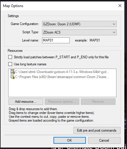
Next, you'll need to get UDB set up. This is fairly easy. First open UDB and, as soon as it starts up, go to the top-menu and click "Tools", then go to Game Configuration. Select "GZDoom: Doom 2 (UDMF)" and click "add resource"; using the attached file-explorer, locate the Doom 2 folder on your computer's file system and add DOOM2.WAD to the list of resources, then do the same with gzdoom.pk3 in the GZDoom folder (making sure to switch the "Add Resource" tab from "From WAD" to "From PK3". Click Ok, and you're done!
If you want to put your custom graphics into the game, you simply create a WAD file in Slade, put your graphics in (more on that later) and save it; then when creating a map in UDB, this box will appear:
If you click "Add resource" here, you can then select your custom wad and use any assets, code etc. in your map!
How Slade works
This bit is a bit more complex because it deals with multiple file formats and methods of importing stuff, but I'll start simply by explaining textures, flats, sprites and patches.
Before I do that though, I need to talk about Markers. To define images as a sprite, patch or flat, you need to put them between a pair of Markers with specific names, which you can create by clicking the "New Entry" button:

"Empty (Marker)" is selected by default, so all you need to do is name it. The naming format is [LETTER]_START to start a section and [LETTER]_END to end one; S_Start/S_End are for sprites, P_Start/P_End are for patches, and F_Start and F_End are for flats. You can, additionally, further subdivide this by making another pair of Markers inside a Start/End pair with a number after the letter, but I'm not sure if this does anything (my only experience with it is that the Doom 2 wad file does this).
Now to explain how these things actually work! First, sprites. A sprite is an image that represents an object or creature in the game, and a cool thing that GZDoom does is let you use generic PNGs instead of Doom's proprietary GFX format. Sprites use the following naming scheme: a four-letter identifier, a single character denoting what frame of the animation the image represents (the Arch-Vile, which has the most sprites out of any monster in Doom 2, has frames that go from A all the way to Z, and then [, \ and ]), and finally a number from 0-8 that indicates the angle the Thing (that's the technical term for a Doom Engine entity, by the way) is at. Using the Imp as an example:

The "0" angle just means that the sprite should look the same regardless of the player's angle; this is used for items, decorations, the death animations of all monsters (including players), and the two sprites used for Doom II's final boss.
A cool thing about sprite angles is that you can actually make a sprite work for multiple angles; by adding an extra frame-letter and angle-number after the first set, you can do things like have a monster whose left and right walking frames are the same but mirrored by formatting the sprite's name as something like NAMEA2A8 (in fact, the Imp uses this technique for all its sprites apart from its death animation).
Next up, flats! Flats are square textures that are designed to go on floors or ceilings (though you can use them anywhere, including as sky textures!) but lack the flexibility of patch-based textures. You literally just. Import your texture and put it between F_Start and F_End. That's it. That's how a flat works.
And finally, patches. Patches are complicated, but very easy to use when you know what you're doing. First, put your image between P_Start and P_End, then right click it, put your mouse over the "Graphics" dropdown, and select "Add to Patch Table". You will then be prompted to create a TEXTURES lump; click "Ok" with the default settings. This creates a Texture1 lump, and the "Patch Table" (which is just a list of patches, which I will explain soon), alongside P_Start and P_End if they aren't already present (and a dummy texture). Double-click Texture1 to open it, and then select "New Texture" (you can adjust the scale, too):
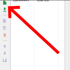
Once this is done, go to the top-right corner and click "Add patch":

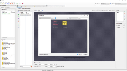
By default, you only have access to any patches you have assigned, but a cool trick I use in my own mapsets whenever I want to modify an official texture is to copy its Texture1 entry from the Doom 2 WAD, then paste it into my WAD's Texture1 and rename it. This does create copies of the constituent patches in your own wad's P_Start/P_End section, but you can delete those and it will still work fine.
Both patches and Flats are limited to 8-letter names, so be warned.
The actual final thing to talk about is converting PNGs to GFX; this is a simple process, but it can cause issues with colour. Basically, Doom has a very specific palette:

While this can look pretty good, on images it wasn't designed for or that use colours it doesn't feature, it can look pretty bad. For example, if I put this random image I made through the conversion process:
Then it comes out looking like this:
All the more cyan-adjacent hues become more blue, it nuked the antialiasing, and some of the gaps in my colouring are now much more obvious (especially on the fifth character's head and legs).
My point is, only do this if you want your mod to be compatible with more vanilla sourceports, or if you want to reduce the filesize. Otherwise, you're better off just using a strict palette when making the sprites and keeping them as PNGs.
Custom palettes are possible, but like. Literally all you do is click "New Entry", select "palette", name it, click the "Import from" button (purple page with a diagonal arrow on the top-middle of the palette-view window), set the filetype on the file explorer to "PNG", and import your custom palette image (which should be square (non-square images get squished and lose some colours) and 16x16 at the smallest, though the images I normally use are 128x128 because for some reason they're scaled up by a factor of 8, even though they display the same when imported regardless of size). You can even test them out or add them to the in-built palette list, which is nice. If you want it to override the default palette when your WAD is loaded, name the lump "PLAYPAL", which is what Doom's palette is called.
Now we get to talk about text lumps! I don't have much to say. Do the "New Entry" thing, select "Text", and name the file. The ZDoom wiki - which I will be linking to at the end - has information on each type, so check those out.
Map making
This is the final main section of this, and I'll try keeping it fairly brief and simple. Doom maps use four main elements; Vertices, Lines, Sectors, and Things. A Vertex is, well a vertex; it's a point in 2D space that acts as a starting or connecting point on a Line. Lines can be either walls or walkover triggers, depending on how you use them. Sectors can be rooms or shapes on the floor, and have properties such as damaging floors, being "underwater" (the player can swim and sound is muffled), or even having different gravity. Finally, a Thing is any entity that isn't one of those, ranging from monsters to player-starts to decorations, plus some complex technical ones I can't even begin to explain.
Useful resources
I am not good with words, but these places are!
ZDoom wiki - covers both regular ZDoom and GZDoom, plus other sourceports like the multiplayer-focused Skulltag and Zandronum. It has guides about ACS and ZScript, two of GZDoom's most useful tools for scripting maps and Things, respectively, as well as the obsolete "DECORATE" language which ZScript incorporates many elements of.
Dragonfly's Doomworks - mapping tutorial resource. I use their portal tutorial a lot whenever I want to put portals in a map.
Doomwiki - good for looking up monster and weapon stats for if you're making custom Things.
23 notes
·
View notes