#[guess what color palette I used lmao]
Explore tagged Tumblr posts
Photo
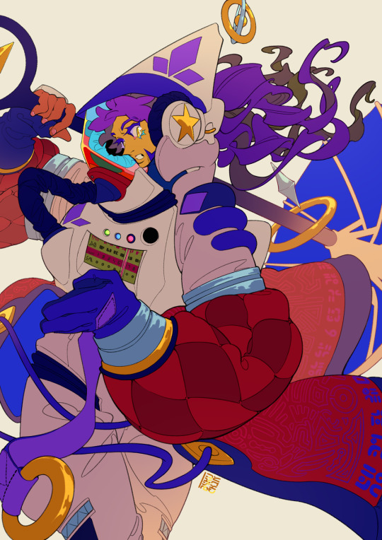
wizard looking for a way home (aka wizard of dark space)
#pokemon#swsh#champion leon#wizard leon babeyy!#thank u to cosme for hangin out with me while I figure this one out lol#this! is the piece I used for the ''speedpaint'' thingy btw. I'll try to put together the video over the next month or so#lol. usually when I make wizard leon designs I riff with what comes up and think abt like. maybe his affinity in this set#like ''oh he'd do fabric talismans. oh he'd levitate. he does poppet stuff''#that at most. but this. the moment I started fleshing this one out I was like#oh he's really lost. for a very long time. to the point he's learned so much he's forgotten what many of the things on his suit does#like lmao I guess I can Not be normal about any astronaut leon huh!! its chronic for me#I couldnt get to some of the questions folks asked with this one. so this video will probably not be comprehensive#but I'll make another when those things come up!!#fksjdfk sorry lads most of u guys asked abt colors but idk if this ones the best for that. its got a preddy concrete palette#guess I can save talking about the more insane color stuff for when that comes up too...#we'll see!! hope it's gonna happen#for now. one more wizard leon for the book. have a good night lads!#tie a yarn round ur wrist dont forget the way back
322 notes
·
View notes
Text


So I decided to buy @hannimatior's chibi pony bundle and make a mlp oc
#mlp#mlp oc#Wishful Ocean [OC]#my little pony#[guess what color palette I used lmao]#merpony#mlp unicorn
9 notes
·
View notes
Note
You know we keep talking about how Ravio and Legend share pain, which is completely understandable. And actually pretty funny.
But I just noticed how the rest of the Chain hasn't figured out that Legend basically confirmed that Ravio is another 'Link'. So I am surprised they don't have more questions regarding that. But I guess the current situation with pain sharing is more of a focus for them at the moment.
Yeaah! As you said, the pain sharing aspect of it is what's the focus here hehe
Like they all felt a deep stabbing pain, they know that it's not from a small injury, so they're more worried over ravio's well being that the small tidbit that he is legend's lolian counterpart
Plus I bet the others suspected something, after all they've met ravio before and know that he looks exactly like legend but with a different color palette and personality lol and not anyone can be legend's rommate AND be allowed to use his house as a shop, like I bet they at least knew ravio wasn't just a friend, maybe a relative or something else
that and also the comic was already 5 pages long lmao I didn't want to expand it even more
#my poor hand was hunting after drawing so much i just wanted to get to ravio's POV hehe#it's why i didn't dwell on the reveal#miry's ask box#lu pain sharing au#**hurting not hunting wtf autocorrect
63 notes
·
View notes
Note
Hihi! Love your art! I'm quite curious though. If there a specific reason why you draw sniper the way you do? For instance you have more darker skin, is that perhaps to make him look Maori? Either way I freaking love the way you draw him! (sorry if this offends you any way)
I'm not Maori or even remotely dark skin (I hate the sun), I have nothing to be offended about lmao
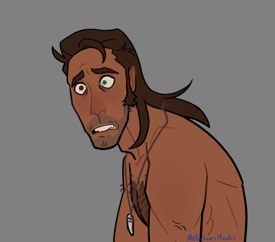
About his skin color: I just imagine that he... Spends time in the sun, but I'm too lazy to draw the tan lines or I just think that they don't fit the drawing, so I leave them out unless I'm going for a more realistic style
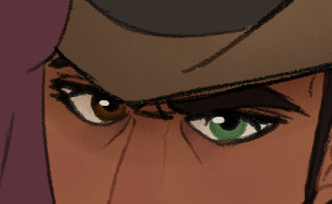
His eyes: the most striking feature of his design, I think. Besides from me thinking that heterochromia is really cool, I find it would make quite a bit of sense, like why always hide your eyes (even indoors, god) from other people? it's my headcanon that he kind of got bullied for it on his childhood, and when he was gifted a pair of shades he not only found himself looking very cool, but he also found that people didn't really notice his condition, so he just decided that he'd wear them pretty much all the time. He uses his shades to hide that he's high as well but, yknow
Facial hair: not much to see here, really. giving him a couple longer hairs on his upper lip and chin just kinda makes him look more rugged and feral
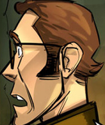

Hair: Come on, how could I not give him a mullet? in the game and the comics he already has a sort of.... mullet-y thing going on, so I just like to make it way longer, it makes him appear even more rugged and feral in my opinion. I will usually vary the length depending on what I feel like drawing, no particular reason for that specifically


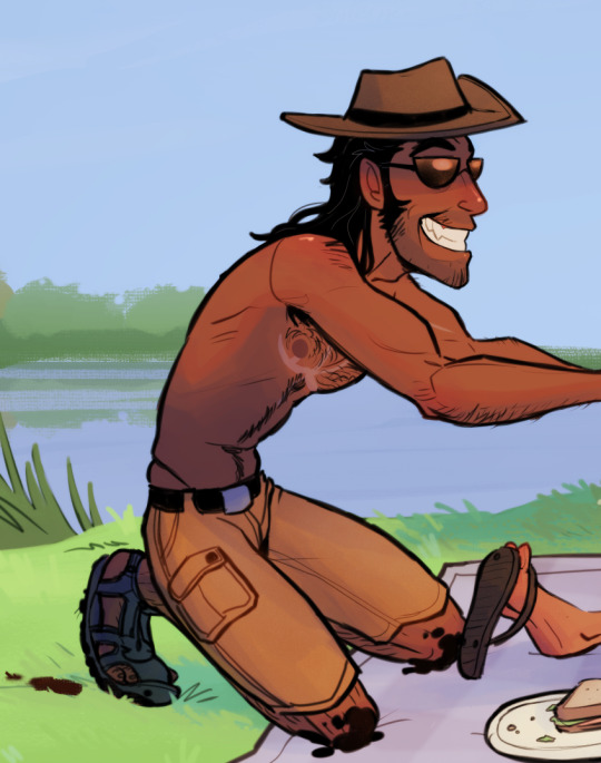
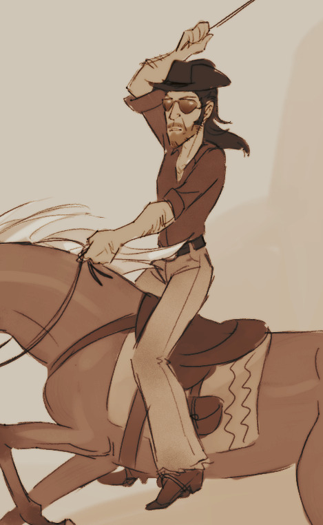
Clothing: I want to make him look like a cowboy most of the time, but his comfortable and very casual attire is more dad-esque, I think? I want all the outdoor vibes, honestly. The hat and the shades are always a must, but you may notice that I tend to depict him with a fang pendant, I just headcanon that it's a trophy he kept from a particularly arduous hunt
As for his body, I like to make him sort of... Sharp-looking? To make him stand out from the other mercs a little more. He's tall, and a little gangly, but not skinny, he has muscle and a little fat on him. I also like to make him the hairiest out of all the mercs, because he deserves it
Color palette: I really like giving him a very warm and cozy sort of color palette, it just kinda fits with his vibe, I guess? certainly fits with the "cowboy" theme that he has going on
I want to note that my style for him specifically is inconsistent at times because I just cannot make up my mind on how to draw his facial features, but the one thing that I do keep is his nose and his ears, long and sort of triangular
Overall I think I just kinda took the canon Sniper and exaggerated him even more? Cowboy-ified him, maybe? Anyway, yeah, that's it that's why I draw him the way I do
I have changed how I draw some of the mercs since I made this but these are my pseudo references for them, if you're curious.
138 notes
·
View notes
Text
Mortimer Outfit Catalogue (Part 1)
hey there, stranger! have you ever wanted to see every single one of mortimer’s outfits? no? well, with me and @scummiezzz’s extensive knowledge on mortimer media, we’ve collected all mortimer fits known to the public into post format just for you! (but mainly for ourselves lol)
i’ll go over (and rate) each outfit from his animated appearances, while scummiezzz will do the same for his comic + video game appearances! let’s begin :]
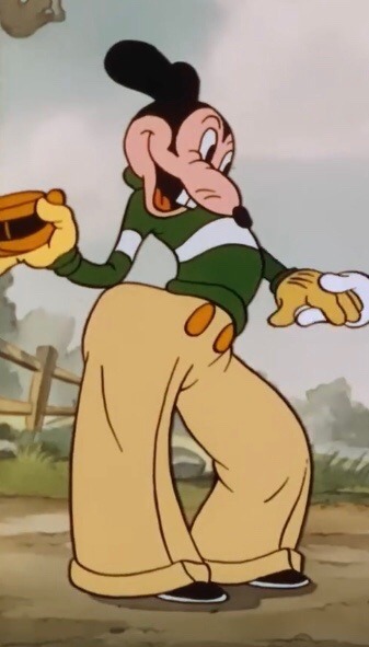
10/10
this is baseline mortimer. he establishes a common look for him, with the cuffed, striped sweater, the high waisted pants, the fancy hat. the pleats on his pants are a nice touch as well.

2/10
the difference in whites haunts me. i hate his shoes made out of ashes. why couldn’t he have just worn black or brown shoes? 😭
only getting 2 points because i did giggle when i found him in the movie.
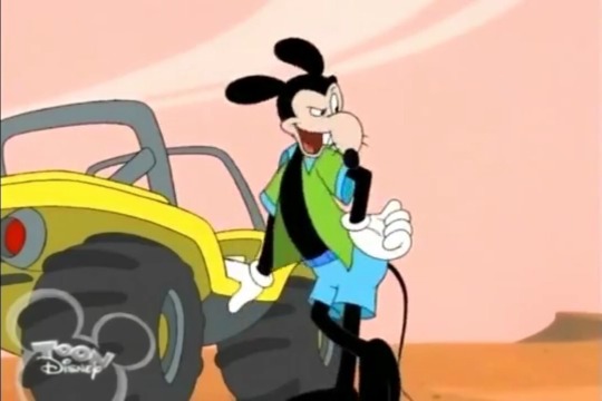
12/10
whoever decided his shirt should be unbuttoned should have gotten a raise 🙏
ALSO!!! HE HAS HIS TAIL 🥹🥹🥹
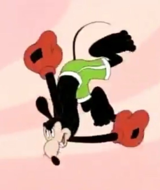
6/10
although this is a quick outfit for a gag, it’s interesting to me how they chose green with white stripes. they could have easily chosen blue, but they chose green. i like to believe this is a nod to his classic design, especially since this is mortimer’s first reboot appearance :)
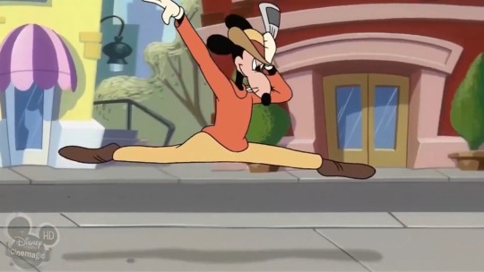
3/10
this design is lacking. i like how they tinted the gloves yellow to go with the warm colors of his outfit, and that they’re establishing his color as orange, but the hat throws me off idk
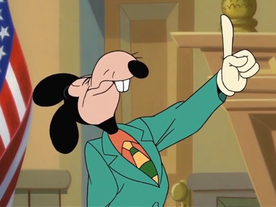
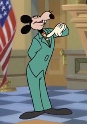
10/10
oh my god. the colors!!! the striped tie! the fact that he lied in court in this outfit! this is the epitome of mortimer! ❤️❤️❤️

5/10
i mean… it tricked the judge lol, decent disguise
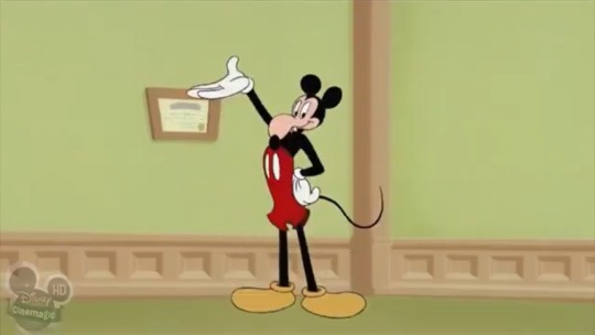
he even wears it again in “mickey’s april fools”!
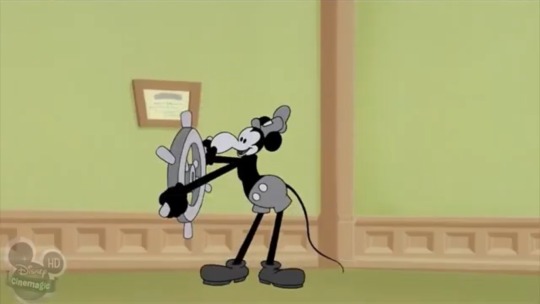
3/10
it served its purpose, but realistically, he can’t pull off the shorts. also does he have PECS here the hell???
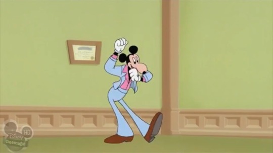
5/10
now this is more like it! there’s potential here. add a few patterns here, and a few bright colors there, and you got yourself an outfit made by mortimer!
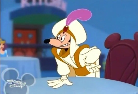
-10000/10
rating this gag outfit low because i cringe too much when i see this clip 😬
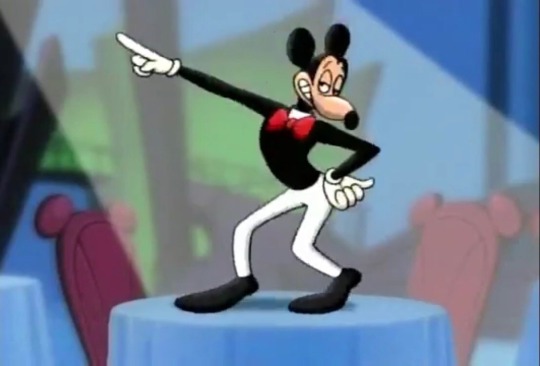
4/10
he just had this outfit on hand i guess LMAO
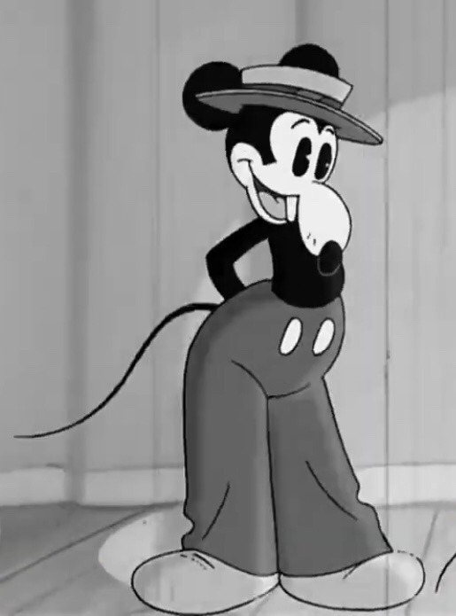
8/10
a great retro design for mortimer!! here, the hat works with the pants. also!!!!!!!!! he has his whiskers and tail :)
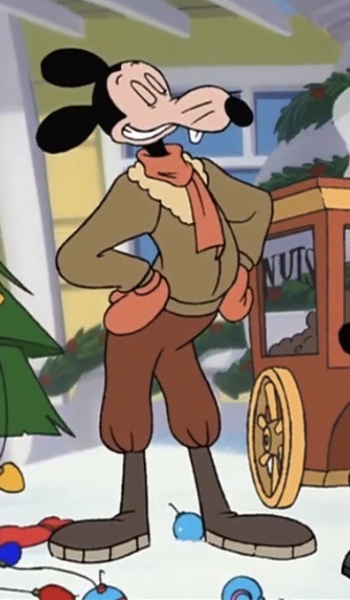
7/10
HE’S SO DEAR TO ME,,, he looks all nice and toasty for winter!! i like how they still establish that orange is his color in this series. it’s so cute how he tucked the pants into the boots. it gives this design a fun shape.
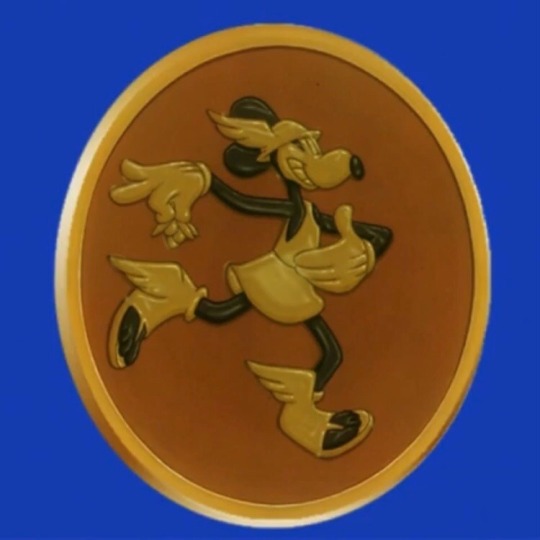
5/10
i don’t know what it is, but he can pull off this look. rated it a 5 because we don’t know the colors of this outfit.
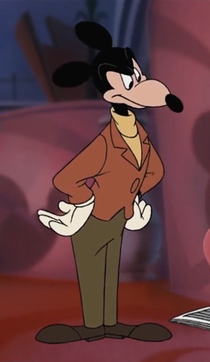
9/10
this is one of the first mortimers that comes to mind when i think of him, so it’s definitely an iconic look. the color palette goes so well together here. the turtleneck gives this a more casual vibe. looks like a modern revamp of the suits he used to wear in the comics. :] (ALSO love how they made the jacket cropped, that was such a good move on their part.)
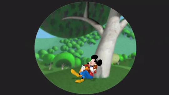
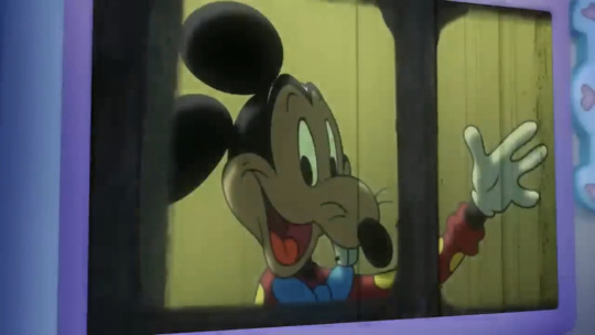
7/10
ngl… this one’s pretty endearing to me. awwwww, the primary colors. he’s wearing cuffed jeans??! THE BOW TIE IS SO DORKY… i guess you could say it ties the whole outfit together :D (BOOOOOOOOOOO)
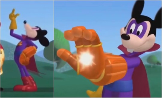
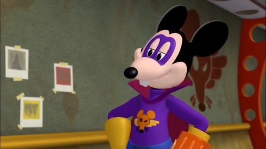
8/10
he’s on model, with his own personal emblem and a dramatic collar?? you know i gotta rate that high.
also reminder that mortimer somehow obtained (or even created???) this glove of inordinate power.
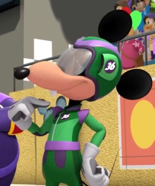
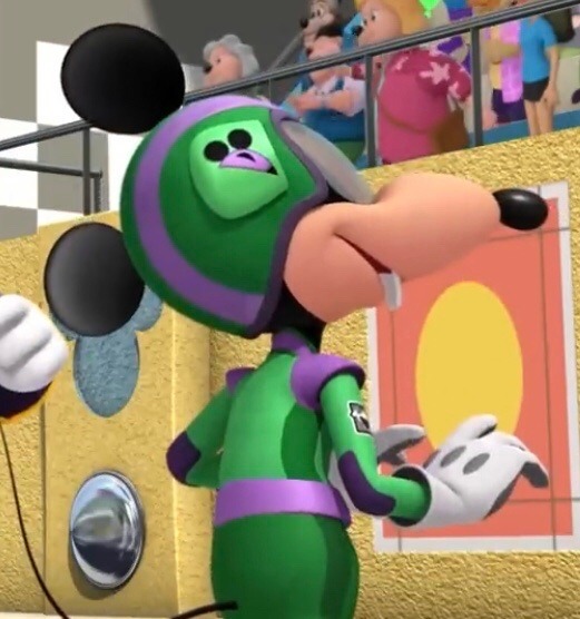
5/10
i’m pretty indifferent to this outfit, but i do appreciate how they gave him his own emblem (again) and made his number 36, which is a nod to the year his original short was released!
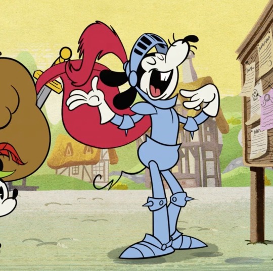
7/10
you can’t go wrong with armor!
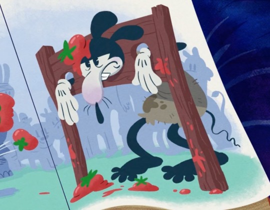
2/10
strangely, this matches him… 🤔 /JOKING
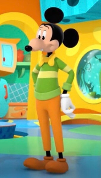
3/10
i don’t know what it is, but i just can’t like this outfit. maybe it’s the big pupils combined with the round ears that makes him off kilter??? i don’t like the choice of colors, nor his bowtie here. it’s nice that they added cuffs to the ends of his sweater, tho! (and they gave it a stripe :,))
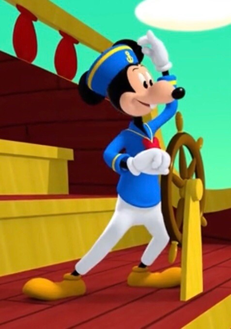
4/10
i definitely like the sailor’s hat, but the rest is just okay. (shrugs)
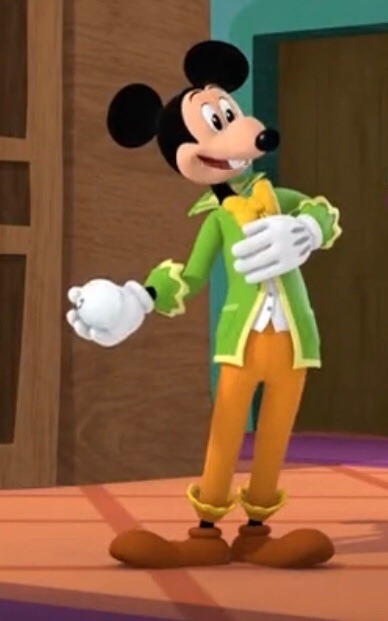
6/10
i like the frilly bits and the bowtie here. he’s at a ball, of course he would wear something formal! the collar is always a nice touch (so dramatic XD)
(link to part 2)
20 notes
·
View notes
Note
hey, i just wanna say i adore your colours and i really want to know if you have any specific proccess in how you do them? :0 they're always so good i keep coming back to stare
HII!!! SORRY I FORGOT TO ACTUALLY POST THIS WHEN YOU FIRST ASKED, I ONLY REMEMBERED NOW ARGH💥💥💥💥
Thank you so much💥‼️🫶
My process is honestly pretty messy with colors, I sort of switch them around until im happy with it. Doing color theory and real life color studies really helps being able to choose colors that look more "real" ig, but for my drawings like these, I usually go off of complimentery colors‼️💥
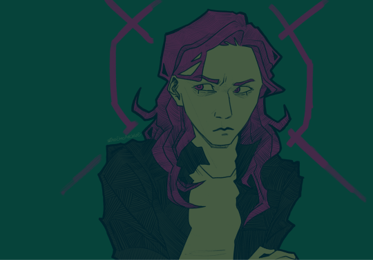
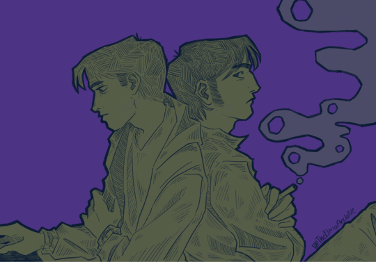
(Purple + green is probably my favorite color combo next to red/pink and teal rahh💥💥)
it doesnt always look good, so I change it up if I want to though 💥💥
For my bigger drawings like these, I sometimes do also have some complimentery colors as a basis, but I often don't end up comitting to them lmao. For the most part, it's just guessing until it's right
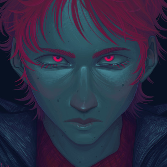
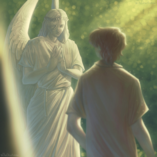
With these, it's a lot of adding thing and changing hue until it looks nice.
I think my best tip I can give, is don't be afraid to mix in colors that "shouldn't" be there, and also like i said before, studying colors from real life and photographs is extremely helpful‼️‼️ and challenging yourself to use a limiting palette also really helps you understand colors, at least it did for me.
Like back when i was doing these, I was usually going off of a palette I found somewhere, cause it helped me understand what looks nice together‼️‼️‼️
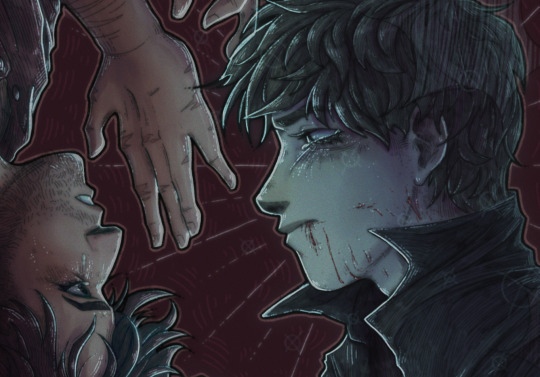
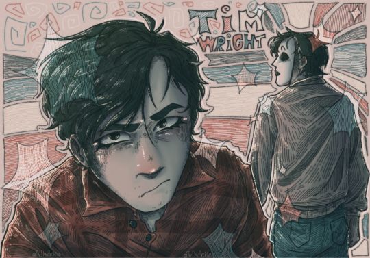
Idk if any of that is helpful to everyone, but that's just how I do it ghfhfhg
#No idea if i explained anything here!!!!#Hopefully it's not just pure rambling#Ghghgh tried my best#🫶🫶#:D yippie
28 notes
·
View notes
Note
do you have any tips on where and/or how to make blinkies? i want to learn how to make them but don't know how. have a good day btw :3
hiiii i will do my best to give tips!! o7
first of all if you want to get a feel for blinkie making without diving in directly i recommend using a site like blinkies.cafe which lets you just add text to premade blinkie templates! i think it's a good way to get an eye for the blinkies "aesthetic" especially regarding the actual blinking part, the borders, all of that. and ofc the size (which for the record is traditionally 150x20px!)
if you want to actually get into Real Custom-Made Blinkies, studying ones you like up close is a great idea because it'll help you see what works and what doesn't. obviously everyone will have different design sensibilities, but that's why it's always good to take inspiration from things that you personally like!
here are things that i like, as an example:
dotted/dashed borders that blink between two colors
shadows
outlines
pixel art
keep in mind that blinking can be upsetting to the eyes for some people! i always try to not overdo it, but at the same time, they are blinkies, so it seems kind of like a waste when they don't blink at all...
traditionally, blinkies include two things: a picture, and text. they don't always! sometimes there's only a picture, and sometimes there's only text. for example, this blinkie i made of lysandre only has his card art and little hearts. this is once again going to depend on your preferences. but for the sake of explaining, let's say you want one or two simple pictures, and some text.
i find pokémon to be a pretty easy thing to make blinkies for, because you have a large panel of pixel art to choose from! for example, i made this blinkie for my blog using one of the mini scyther sprites. a lot of them are animated, too, which is fun. i can't really advise you on what program to use for animated stuff because i use really old ones LMAO but i've always had a good time using ezgif! you can just feed it your frames and use the website to put them together into an animation.
the text imo is the trickiest part. the blinkies you find on blinkies.cafe use pixelated fonts, but i've had a really hard time using them outside of that context. it's hard to get them to look good imo, especially at the small scale that blinkies end up at... so what i've been doing is making my own little pixel art alphabet. it's very fun for me and i don't think it's as difficult as it sounds, so i definitely recommend it because it gives you a lot more flexibility imo. i handdrew the text for all of my PSS blinkies, as well as the aforementioned scyther one, and this trans rights one. i actually have the trans rights and PSS alphabets completed and saved in a file for later use in case i need them, lmao:

you can see what the process is like: i make a rectangle, draw one letter, and then copy the rectangle to draw the other ones at the same size and in the same style. it's very, um, vibe-based, i guess? you just have to figure out what looks good for your Vision. but i find it super fun... so it's easy for me to do, i guess...
if you want to see the scyther blinkies text closer up, here it is at 500% size:

uncapitalized letters are more difficult than capitalized letters imo, but i think i did an ok job! maybe i'll make a full alphabet for that one too at some point, lmao. for the "tumblr" text i just copied the style of the logo (hopefully that comes through...)
i'm not sure what else to say, so feel free to ask more specific questions if you'd like! i think a lot of the other stuff is more general art/graphics advice, like color theory and the likes, which i'm not sure is worth going over LOL. but as a parting note, i'd definitely suggest not going overboard on the color palette. blinkies are pretty small at their default size, and too many colors will make them really hard to look at, let alone understand. in general, keep in mind the final size when working on something like blinkies, and make sure to zoom out periodically to double check you've got something readable!
and don't forget to have fun 👍👍👍
#la réponse d#in the process of looking thru my blinkies files for this post i realized i had apparently started working on villain team blinkies so uhhh#maybe i'll get back to that LMAO#blinkies
15 notes
·
View notes
Note
So, your DF sequel has those four kids in Episodes 40 & 41. Which Spirits will each one get and why? Where are Takuya, Koji, Zoe, JP, and Koichi in all this?
First ask, woo!
When deciding what spirits went to what kids, my main deciding factor was color palettes.
Lmao, it sounds silly but look:
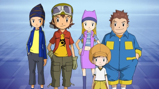
Each of our protagonists' color palettes reflect the spirit they're assigned to (though a first time viewer who looks at this picture could guess that Koji, J.P, or maybe Zoe were associated with water due to the blues in their ensemble).
With that in mind, Chiaki gets the Spirit of Water and Teppei gets the Spirit of Earth.
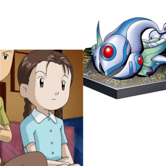
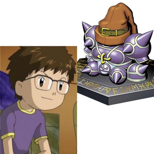
And if we're going to follow that rule strictly, then that would mean Katsuharu gets the Spirit of Wood and Teruo gets the Spirit Steel, since Katsuharu's color palette has more hues of brown than Teruo's...
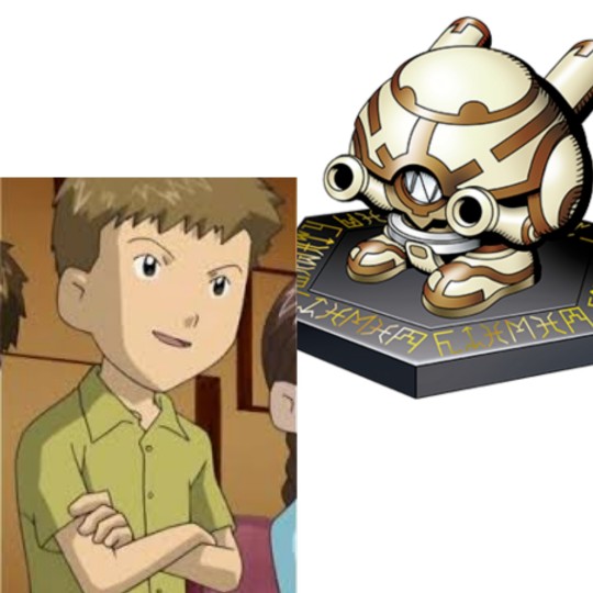
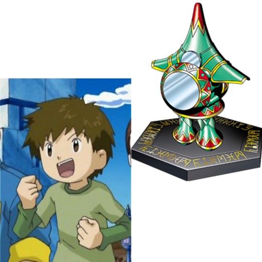
HOWEVER
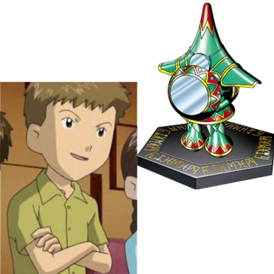
Given that we know the most about Katsuharu, and the fact that he's a leader, a bit self-aggrandizing, and a former bully, his personality parallels Mercurymon, who manipulated others into getting his desires fulfilled, acted on his own accord, is the most notorious, and although he wasn't the leader of the Corrupted Spirits, he was arguably the most capable.
So instead, I wanted to give Katsuharu the Spirit of Steel and Teruo the Spirit of Wood.
But at the same time, it'd be interesting to give the Spirit of Steel to Teruo, a character we know little about. It's tempting, if I change it last minute, no I didn't lmao.
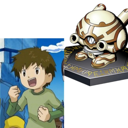
The premise might need a bit of reworking, but initially, the six Digidestined had received messages on their cell phones telling them to meet at the Shibuya Station four years later after the events of Frontier. However, for reasons, Tommy doesn't make it and the others wait for as long as they can before heading off.
A year passes and Takuya, Koji, Zoe, J.P, and Koichi are still missing. Tommy not only is worried, but suspicious. Time didn't pass during the first visit to the Digital World, so why now? What's even more strange is that other unidentifiable creatures seem to be teleporting in and out all over the world, as if they're fading out like a hologram. So when he receives a second message calling him to the Shibuya Station, he doesn't hesitate.
Long story short, he and the gang find out later that their spirits have been corrupted by the new big bad. Sort of like the popular Swap AUs I see floating around, however, this time they've got Tommy leading the charge (and a double agent who might be used to a certain darkness and might have had an aversion to it).
#digimon#digimon frontier#digimon fic#my fic: redemption#takuya kanbara#koji minamoto#kouji minamoto#tommy himi#tomoki himi#zoe orimoto#izuki orimoto#junpei shibayama#jp shibayama#koichi kimura#kouichi kimura#chiaki digimon#katsuharu digimon#teppei digimon#teruo digimon#answermon
9 notes
·
View notes
Note
hello! I've been playing through your games and having an absolute blast, the way you weave eroticism and discomfort/trauma together is so deft! I'm really early on in MalMaid right now, and I'm struck by how you do the backgrounds. I'm used to either custom-modeled 3D ones like in Coquette Dragoon or the blurry heavily processed photography/stock photos in stuff like Higurashi or even earlier work of yours like (I assume?) Hopeless Junction. How did you come by the ones for MalMaid / what guided the decision to do something crisper and more traditionally photographic?
hmm i feel like im using roughly the same approach for all my backgrounds. i use free to use photographs and run filters through them. looking at hopeless junction screenshots looks like it was overlays and noise and in malmaid it was blurring and saving as indexed for a limited color palette. sometimes photobashing elements together when i really wanted something more specific. photos can be limiting
i quite like filtered photobackgrounds for games as much as i think custom made (be it 3d or 2d) ones tend to look most impressive generally. but making a game solo is already a full time job taking the roles of an entire dev studio so filtered photos is a great approach i always recommend. seeing it in other games just makes me relate to them
im proooopably going to be doing 3d backgrounds for naomida. but I'm probably going to be relying on these same type of filter type approaches even there cause i just dig the aesthetic. seeing coquette dragoon renders grow over time has been a big inspiration for me enough that i actually picked up blender long ago (as is evident from cancelled trans goetia) but its just not feasible usually to try to blender on top of everything else. especially when essentially all my projects except malmaid (and now naomida) are jam games
edit: i guess demon dash also had 3d renders as bgs but i blurred the fuck out of them lmao
9 notes
·
View notes
Note
2, 4, 18 :))
2. if you could be fluent in any language at the snap of your fingers, which one and why?
I have a whole damn laundry list of languages I wanna learn, (German, Irish, Japanese, Arabic, Mongolian, just to name a few,) but tbh I'm too interested in the process of actually learning those to want it done effortlessly. So then my answer to this question is basically which language would be the most immediately useful to me to know fluently, and that's probably Spanish
4. what was your favourite tv show as a kid?
My go-to answer here is Bill Nye The Science Guy, even though that's not a TV show per se. I didn't grow up with TV really, we would go to the library and check out VHSs basically every week, I could recite entire episodes verbatim lmao
18. what’s your clothing colour palette?
Hm, eclectic? I've been meaning to start putting a bit more intent into my wardrobe at some point, right now it's kind of a mishmash of tshirts and tanktops and blouses and cardigans of many different colors and textures. Within that selection I tend to mostly go for darker colors on any given day, especially black, blues, purples, reds, so I guess that's as good an answer as any!
6 notes
·
View notes
Note
if you were a side order palette (ohhhh noooo please save me Acht 'Dedf1sh' Mizuta), what would your kit be
the idea being the palettes can ignore traditional weapon pairings, your soul defined in a damn splatoon kit
Hmmm... I think for my main weapon, I would go with a Decavitator because that is not a weapon in Side Order already. Plus it's a really fun weapon that I've grown to love. It's not the best competitively (like B tier roughly) but I really don't care. It's still fun as hell for me.

For my sub I would choose a Splat Bomb because I'm a basic bitch and if I was given a sub, I want a bomb lmao.

And for the special? Kraken Royale I guess. I just like being a giant squid and octopus messing shit up. Its a fun special to use and it has a learning curve to it. It's not a win button and players who know how to use it are rewarded very well for skillful play.

For my primary and secondary color chip tones, I would go for power and mobility because it fits with my play style.
So yeah, that's if I had a Side Order Pallette!!!! Interesting ask from you dude.
#splatoon#splatoon 3#side order#discussion#ask me stuff#ask me anything#ask#ask blog#acht dedf1sh#acht splatoon
16 notes
·
View notes
Text
Your Friendly Neighborhood Spider-Man 01-02
What I realized near the end of the first episode is that... I don't like this Peter Parker? His lines are typical Tom Holland-era writing with no original take on it, god he's almost insufferable. Why was him taking a picture of the car so annoying?
Let Nico Minoru be the protagonist instead because I'm tired of this Peter already lmao. I'm just a bit cross at her because why would she stop Peter from going to his internship?
Aside from that, the visual style is alright (I like how colorful it is, but I'm not sure about the palette itself), the score is whatever, the opening is visually nice but the song will need getting used to. The writing is... bad though. Extremely cliché.
Also gotta laugh at Peter's VA saying he hoped the show wouldn't be too woke; Nico is strongly implied to be queer, racism is a big Theme in one scene, Peter is pretty much the only white guy... It's funny to see how much non-white the cast is. Is this the most diverse Spider-Man property?

So far my favorite character is this corgi. Hopefully he keeps appearing. (I wrote this before our fateful meeting with Spider-Dog.)

She's so funny. She's from Wakanda, they're all from New York.

Oh I know what I'll call him.
We get a Dr. Wittman, which reminds me of Debra whitman... Oof.

(there's no equation on the whiteboard.)

These two terrifying creatures in the background are a still drawing and terribly jarring
Thankfully I'd guessed the twist, so I'm glad it's revealed upfront at the end of the 2nd episode because yeah
(That ending theme is fire though)
6 notes
·
View notes
Note
Short message !
For the Hürrem drawing 🌸🌸
First and foremost! I was writing another message when the art pop up and I was like ?! "This is my baby !!"
And the fact that is on your phone with your finger is amazing like what ? What do you mean its that cool with a finger !
Honestly I love her she really is giving parrot colors (she is a sun conure) I love it ! Like RIO the dreamworks movie ! Now that I see her from another point of view, I think Gluttony Ring could be her favorite ! Because her in yellow/orange scenery is slay ! Or maybe Sloth!
And the unhinge "you know bastard or not m i can use magic!" *pull a gun* 🤣 Is excellent ! Now I think about it, she is suppose to have a scary big monstruous form like Stolas in episode 6 of Helluva boss right ?
And the bunny moustache/weaskers it is really a detail that she is not full Goetia. Thank you !
And OF COURSE the adorable doodle of Giovanni on the back ! Is like "whatever fluffy feathers, as you say. Hum hum."
(Ps : she is suppose to have pink eyes like her dad Vassago BUT I DONT CARE RED cause this doodle is fire !)
Thank you again !! 🌸🌸 I'm still flabbergasted about the fact that this is drawn on phone!🌸🌸🌸
Yes lmao yes, your reaction at the end of the last message was very cute"OMG MY BABY!!"
I was used to draw a lot with my phone before, so I got used to it, I'm sure you can draw very well with practice!!
Yes, it really gives the color of a parrot. It's nice to have such a colorful color in a place like hell!!
I really love Hürrem being a parrot.It suits her personality and looks very beautiful and colorful.🌈🌈🌈
RIO!! I really love it, it's one of my favorite animations both musically and in terms of story and character design!!!
Yes, it really makes sense that it is Gluttony's favorite.The circle with the least chaos, and both in terms of color
Yes, Sloth can also have it, the color palette is very nice.A relaxing atmosphere,remembered hospitals a little bit.
---
LMAO definitely, after all, doing the unexpected always surprises the enemy.
--
Yes, I guess, she is a Goetia (mostly) after all. I think it makes sense for her to have such a form. But was there someone who taught her how to use this form?
But just imagine, something happens.
G:fluffy feathers, I think it's time to use your noble powers. A had would be vert helpfull rn!! *Screams while dodging bullets during combat
H: I'M TRYING OKAY!! IT'S HARDER TO DO THAN SAY!!
**Tries to transform*
G:Okay, honey, you should concentrate, I'll dodge a few bullets here, after all, I have a second life, don't worry, relax.I'll be just fineeee
H: YOU'RE not helping! Wait! Is happening!!!
G: Wait really??
*Hürrem starts to transform in a really cool way, but not a demonic form, but a colorful rabbit that is small enough for Giovanni to hold in his hand*
Giovanni: ಠಿヮಠ
Hürrem: ಠ,_」ಠ
Lmao
---
Always!! I love Hürrem's rabbit whiskers!!
---
I'm so glad you liked the doodle!! And thank you for telling me that her eyes are pink, they be pink in my future drawings!!And pink definitely suits her better!!!
--
Hahaha Thank YOU🫂 But as I said, you can do it too with practice. If you are going to use ibis paint, you can ask me questions. I don't know much, but I will try to help!!
Have a great say!🫂❤️❤️❤️
13 notes
·
View notes
Note
Don't worry I feel the same way about mochi ice cream D: the texture is great!! But the flavor....ehhhh. Also, Rin needs a psychologist gf lmao he and so many other boys (like Reo and Nagi) could benefit from having a partner with the analytical thought process and emotional maturity to call them out on shit and give them advice 😂😂😂
Out of curiosity btw, have you ever thought about what lipstick color/or chapstick flavors the bllk boys would like?? Reo supposedly like older, classy women so he seems like a vintage red lip guy with maybe a minty chapstick. Nagi, Isagi, and Rin seem like pink boys for sure but different shades. Bachira is a fruity flavor and likes the wholeeee color palette
aaaAaA pls the psych girlfriends …… yes absolutely </3 rin would HATE the thought of it, but eventually learn that it actually has its perks. nagi wouldn’t realize that it’s helpful 2 hear someone’s pov and actually give him some good insight on what’s going on w his thoughts. reo actively asks u for advice & wants to hear your opinion!!!! it’s not like he’s going 2 make use of it immediately tho lol he’s so baby :( but yes definitely agree. this is extremely self-indulgent but yes all of these stressed out emotionally constipated men need a psychologist s/o. end of story i am actually assigning them one as we speak :,3
as for the lipsticks !!! this idea is so cute omg ^_^ for starters reo is definitely into red, cool toned and rich!! matte or lacquered, it doesn’t really matter, he just loves the color in overall. it’s very classy && he’s absolutely into that. also may i add,, lipsticks stains…..oh he goes cRAZY. as for chapstick flavors yes! def something minty, nothing too weird, he likes the way it feels cool when he gives u kisses!
bachira is so fun omg he truly does like all the colors on u,, it’s so hard 4 him to pick a favorite he just loves them all :( watches you apply it in the mornings &&he’s so giddy ‘cause you can pull off anything and he likes how fun it looks. fruity chapsticks are a must, even better if u have a few different flavors and he makes it a little game to guess which one is it that you’re wearing today >_<
yes !! rin, isagi, & nagi all love pinkish shades. there's something so cute about it! i'd say rin is into nude-ish colors, the kinda pink that looks like your lip color but better, and loves if you wear a darker lip liner w/ it <33 it makes your pout pop nd he just cannot stop thinking about it!!!! chapstick flavor - anything sweet :( the sweeter the better. coconut, vanilla, or some other fancy stuff, he loves to lick his lip and taste the remaining traces!
isagi is more into lip gloss i feel like !! he doesn't discriminate between shades, but pink just does it for him. it makes your complexion all dewy and fresh and he likes how sweet it makes u look :< also adores the way ur lipgloss leaves stains on his cheeks and stains his lips a soft pink as well whenever u smooch him. somethin about yoichi strikes me as a simple,, lovely lovely guy and so i think his fav chapstick is just plain strawberry!!!! mmhm
last but not least, nagi likes u in a little toned down pinks. liquid matte, preferably,, so that it's not a pain later when u kiss him and leave marks :x BUT i'd say he also has a think for darker lip colors, i'm thinking a nice deep chocolate brown or perhaps a brown-ish gloss, i'm thinking of that one fenty heat shade..... it catches his attention, makes your lips so vibrant and accentuated, he cannot resist it!!!!! loves ur cola flavored chapsticks
71 notes
·
View notes
Note
May I humbly ask about your animatic-making process?
i got you
1. Find an idea
I usually get my ideas from tiktoks or some songs.
I kinda try to fit the song to the character I want in it lmao
2. Download the audio
I’m an android phone user so downloading stuff is really easily.
I usually use YTMP3.com to download my stuff
there is a lot of websites with that link but l usually pick the second or first one
Then insert the audio in Alight Motion. I use Alight Motion a lot since there’s a lot of choices there.
Also I use the APK version so I don’t have to pay for premium features. ALSO THIS IS ON MY PHONE. I use an Ipad to draw….
3. (Optional) Storyboarding
GUYS TBH IN MY ANIMATICS I DON’T STORYBOARD
EVERYTHING IN MY ANIMATICS, I LITERALLY JUST WING IT LMAOOO
The only animatic I did need to storyboard was Floyd’s little minecraft song angst video LMAOOO:
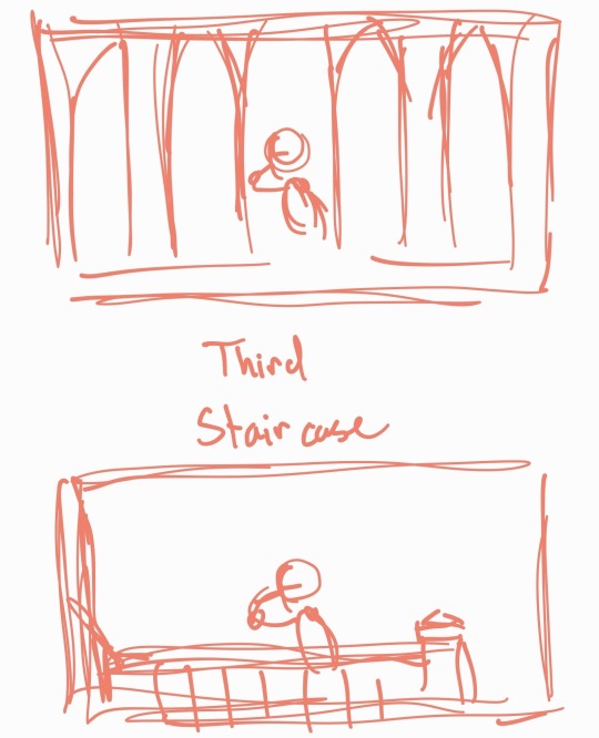
a lot of people happen to storyboard their animatics so they have a plan but i literally storyboard in my head and if i think it looks good, i just put it in 😭😭😭
I literally have to go on my old tablet to fetch some of my old content here
4. START DRAWING
In my drawing process, it’s kinda easy unless I’m using a bunch of colors.
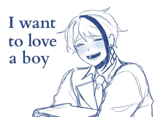
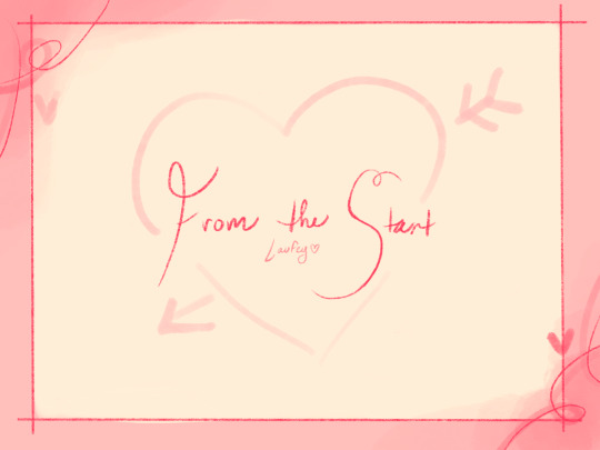
I also try to change the styles up so you can differeniate the animatics from eachother like how in Jade’s Laufey video, the colors are warm and soon turn pale and cold. And in the To Love a Boy, it’s like pt 2 of Jade’s Laufey video but in MC’s perspective and in which the MC does not return his feelings so the colors aren’t warm as Jade’s perspective.
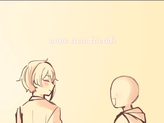
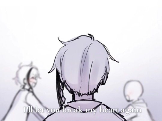
And then in Azul’s Laufey video, the appearance and color palette’s looks very sweet and valentiney since it’s in the MC’s perspective on having a FAT FUCKING CRUSH on Azul
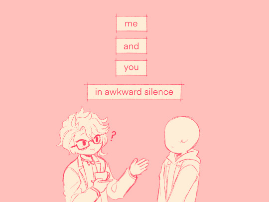
Epel was the hardest because during that time, I was not that active on TikTok and school took my time so it took a lot of time to gain back the motivation and finish it
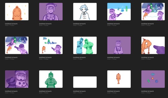
ALSO, i literally draw on my Ipad now and I send the pictures to my phone to edit them so it’s an annoying process since I DON’T WANNA PAY FOR ALIGHT MOTION WHEN I CAN GET IT FOR FREE
BUT YOU KNOW WHAT TOOK ME A YEAR?? My “I Wanna Be a Princess!” MUSIC VIDEO… it’s not animatic but that took like a year to finish because I forgot about it but I did so well on it.
AND YOU CAN TELL HOW LONG IT TOOK BECAUSE THE MC APPEARANCE ALREADY CHANGED
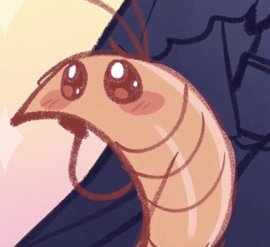
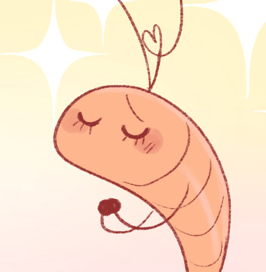
5. Editing
Okay, I’m so happy that I actually got into editing for a bit because my videos would’ve looked so trash bro
LMSOOO but editing animatics aren’t really that hard unless you’re going for a specific transition or movement
I guess the transition that pissed me off the most were the ones in Jade’s Laufey video when it switches from warm to cold and Epel’s MLP video where it switches from silly to dark.
My editing process isn’t that unique. I just insert the song, move the pictures, and done 😭😭😭
6. Touch-ups
Touch-ups include subtitles, effects, filters, etc
I don’t really use filters for my animatics unless i’m going for something
BUT SUBTITLES?? yeah I use them a lot lmao
But also trying to fit the subtitles with the animatic is hard bc IDK WHAT TO GO FOR so i literally pull them out my ass
7. Post
I don’t do much about posting or what to say with my animatics
i just post them
14 notes
·
View notes
Note
i loveee ur art its sooo expressive and it has such a 90s feel to it.. if i may ask, how do u pick ur colours? do u have a specific colour pallete u adhere to? thanks!
thanks so much :DDD im curious what might make it feel 90s 🤔 thats so interesting
anyways stuff abt coloring below
honestly i kinda just fuck around with color, technically i somewhat understand color theory but despite that im bad at choosing the right colors straight from the color wheel so a lot of times i just hsb adjust things until theyre right
ive got two different ways i color things currently:
softish shading with a marker brush in greyscale, applying too many color adjustment layers, and then coloring a little on top of the greyscale to make things not monochrome. usually i color on top of a clipping mask bc its a lot easier, which i did in the ace attorney one but not in the merlin one for ?? no reason i guess i just didnt think abt it lmao

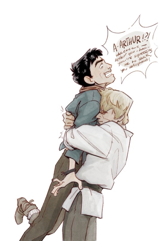
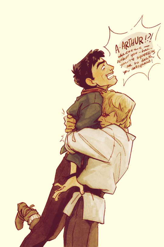
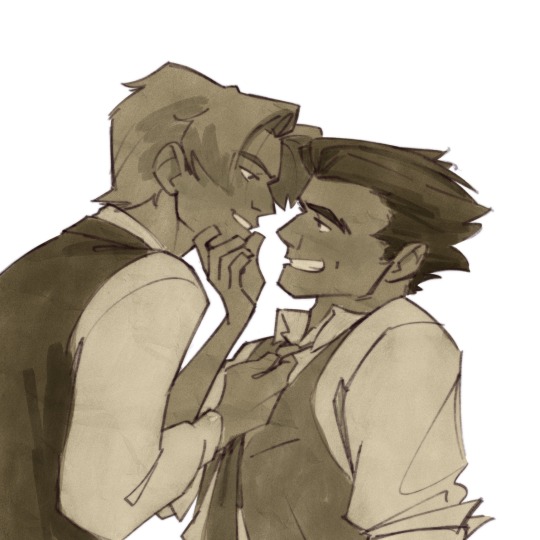
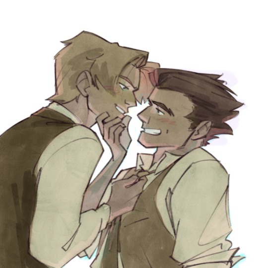
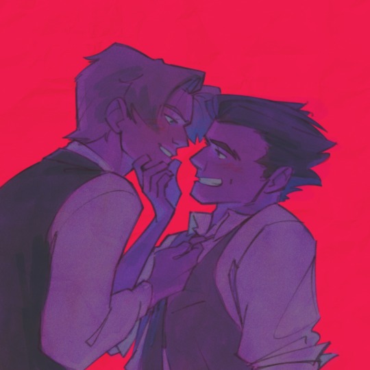
the other way is i decide what color i wanna cast the whole drawing in and i make that the base clipping mask layer (which ive been making like. neon green a lot lately lmao) and then i block in color on top of that, and shadow color on top of that. the cybersix ones a great representation of what im doing there but its a little chaotic since all of the sketches were meant to be cropped oops. the cowboy danny phantom ones a lot cleaner of an example haha
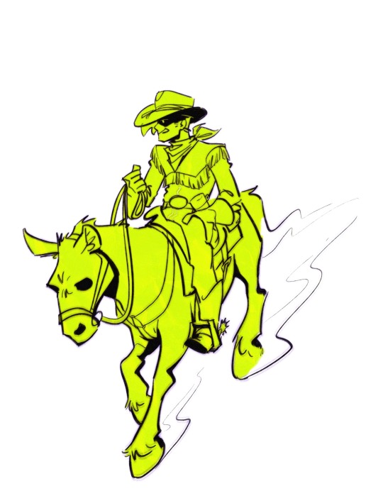
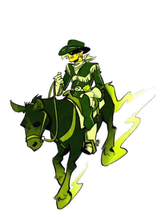
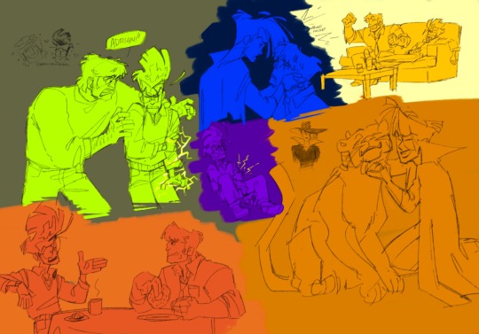
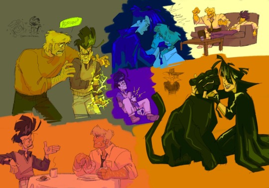
i really like doing the second method because it also works great with lineless and also i really like comparative colors? i know theres a better phrase for it but like. when one color looks like a different color when its put in a different colored space. like when im making things green, id color blue things in the scene green and red things in the scene a muddy orangey color. or when i was really into yellow id make the blues purple. idk usually the “blue” in the scene is first color i like to figure out im not sure if its because its my favorite color or if its because i love drawing jeans but thats just how it goes lmao
oh also putting things on a or neutral bg helps to pick colors a lot easier than keeping the default white bg, i always turn it off and leave it transparent until im finished lmao. i use procreate light mode so its still rather light but not too bad
i dont really have any palettes that i intentionally adhere to, no, but i do get kind of stuck using the same colors for a few months before moving to something different. rn im very stuck on green and need to accept that not everything needs to be the grossest greens ever and ive been stuck on it for about six months? in the past i was really stuck on yellow haha
#coloring method is fuck around and find out#ask#anon#very surprised abt all these questions abt how i do things recently#not in a bad way#its just interesting#how i draw
48 notes
·
View notes