Don't wanna be here? Send us removal request.
Text
04/10/2018 ... Project 2 ... It’s (sort of) done.
Ugh.
Six hours of rendering later, I noticed mistakes... So here’s the new final (minus all the grain). The grain was what took it so long to render. I don’t know how to handle grain. It also led to a 3GB video, so I couldn’t even post it on Vimeo without upgrading my account. There’s still some issues, which is why I’m saying this is (sort of) done. My plan is to pick this up later on in the summer and do some more work on it, but for now, I need to put it aside. I never got around to working on the drink spilling out, and the Australia illustration moves slightly when the prisoners populate on it. But I’ve just run out of steam right now. I should have cut more at the beginning to make it more manageable so I could have done a better job, but I didn't want to until it was too late. By the time I wanted to cut it down, the only part left to do was my favourite part (the Australia scene), and I didn’t want to cut that out! Sigh...
Anyway... Here it is...
vimeo
Here is my reflection:
As Vizzini goes deeper and deeper into the debate, the motion of the illustration and type were meant to speed up more steadily, contributing to the “dizzying intellect.” The type and illustrations were meant to interact together. Illustrations setting a scene, used in some playful moments, with the type emphasizing the circles Vizzini is walking in. The typeface chooses were meant to be closer to old style and a medieval aesthetic, alluding to the (sort of) European princess fairy tale that this movie is, even if it is a satire. Rather than try include all of the type from the dialogue, I wanted to emphasize key moments. The type also was meant to come on screen more abruptly and fly into place to be representative of the quick train of though Vizzini has.
0 notes
Text
03/22/2018 ... Project 2 ... Adding in some type
I started adding in a bit of type! I was working off my storyboards, but found a couple instances where I could be more playful with how the type interacts with the illustrations. It’s not much, but here’s what I have so far.
vimeo
0 notes
Text
03/18/2018 ... Project 2 ... Opening scene?
Whelp I’m off to a great start. For this TYPE in motion project I started off with an opening scene with (almost) no type... Don’t worry, I’m not counting this as a part of my time (which will actually have type I swear), but I just wanted to do something a little fun and a little on the nose before the dialogue started.
vimeo
Something weird is happening with the grain (it’s because I applied the grain to my recomposition instead of the individual layers beforehand, so it’s looking super not good when I’m move those objects around). Other issues too, but I’ll figure it out).
0 notes
Text
03/15/2018 ... Project 2 ... Moodboard
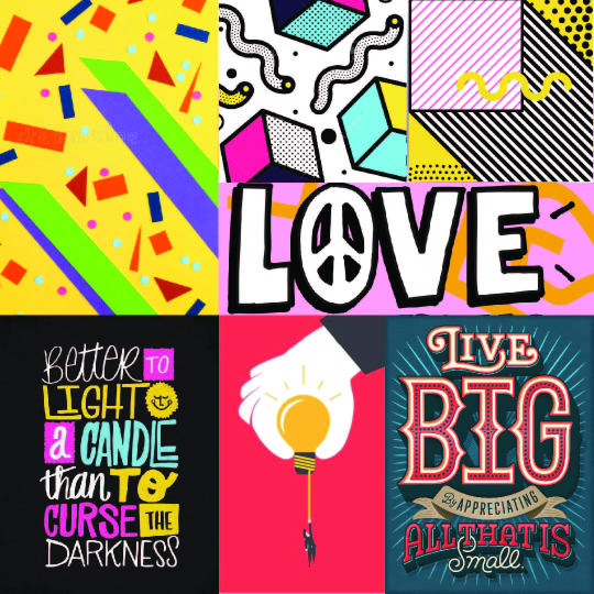
I want to use bold, saturated colours, use an illustration style that’s fairly minimal but packs a punch, and have loud type. Vizzini (the character doing most of the debating) is loud and talks fast. He’s sure of himself, and the type needs to reflect that. When “the Battle of Wits” flashes across the screen at the beginning, I want it to be similar to a type treatment in the bottom right, where it almost turns itself into a poster for the event itself (the event being the battle of wits that’s about to take place).
0 notes
Text
03/14/2018 ... Project 2 ... Rough Storyboards
A reminder of the audio I’ve selected: “The Princess Bride,” Battle of Wits scene.
https://www.youtube.com/watch?v=3EkBuKQEkio&t=190s
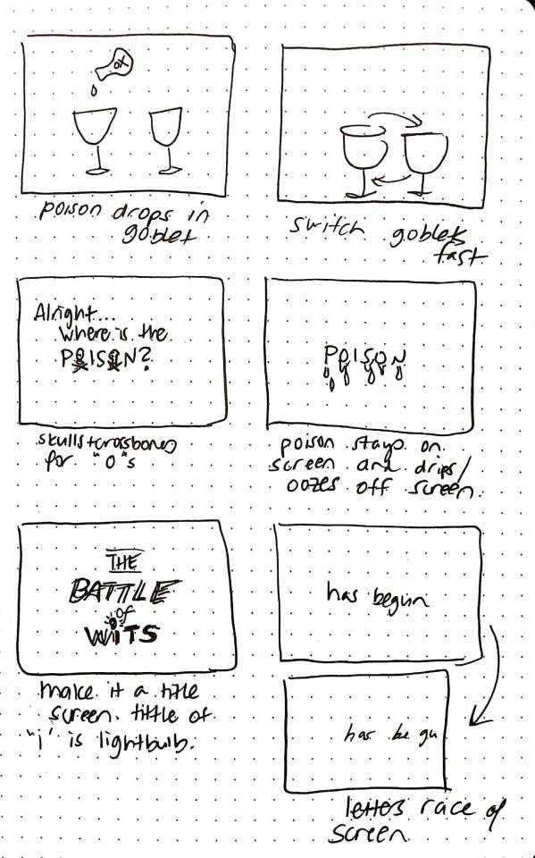
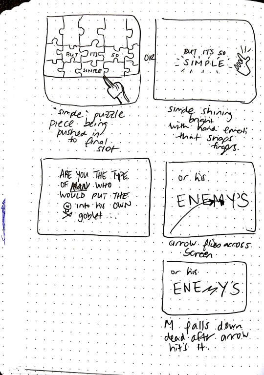
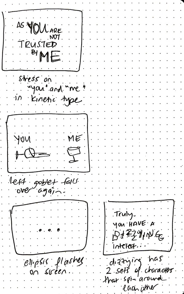
This video is too long, so I’m going to have to cut it. I’ve decided to start with “All right, where is the poison?” and end at “Truly you have a dizzying intellect.” Time on video: 1:59 to 2:55 (will stop at 2:36 if I need to shorten the time).
Here’s a rough sketch of my proposed storyboard. Notes accompanying the screens are underneath their frames.
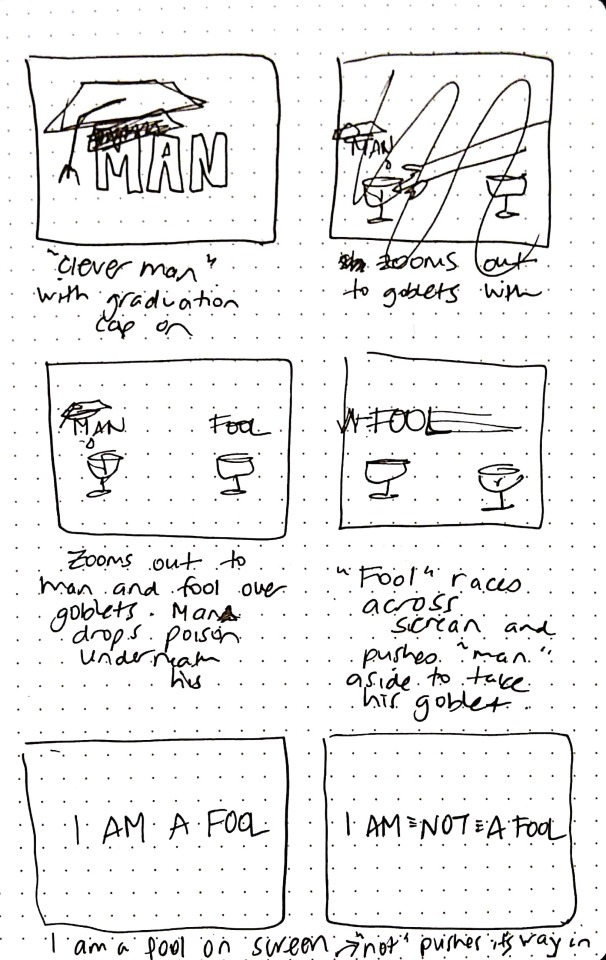
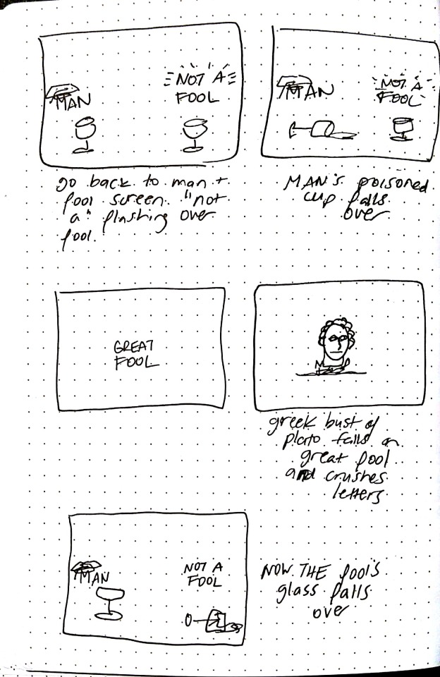
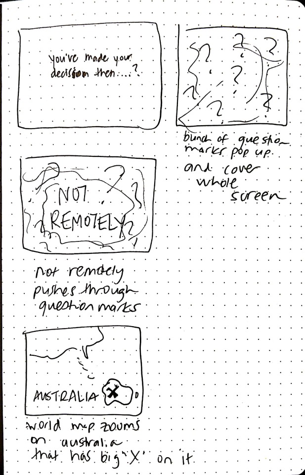
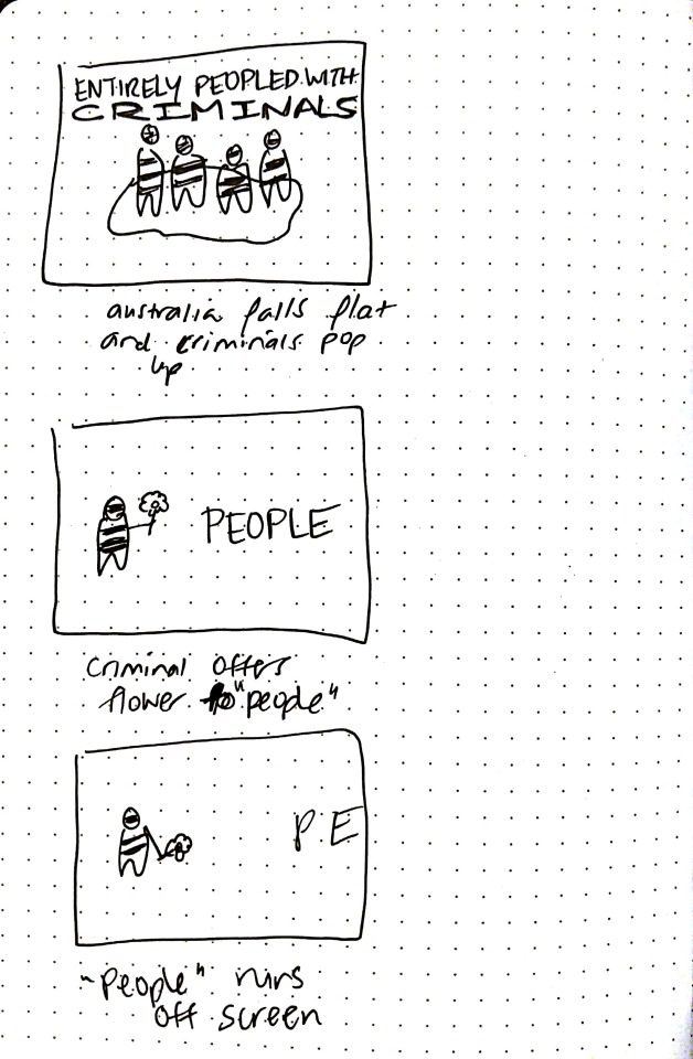
1 note
·
View note
Text
03/12/2018 ... Exercise 3 ... Process
To me, Wes Anderson’s style is pretty light, subtle, and even when there are dramatic scenes that carry a lot of emotion, it’s very conservative. I wanted to go with a more minimal approach in my exercise. I wanted to bring in some colours, but have them pretty muted, washed out, and very faded and light. I wanted to bring in some gradient into the background music as the choir continues to sing, and I wanted to play with textures, and “jittery text.” The jitteriness made the text feel a little bit more organic, and played of the textures and grain I was going for.
I didn’t want to have super large text, because I felt that the dialogue was soft-spoken. The different typefaces for each character, and adding in different colours, helped differentiate who was speaking in the conversation.
I won’t show too many videos, because unfortunately I spent more time building out the entire thing, then I did with getting to refine things.
To start with, I worked on getting a skeleton framework for my type. I knew I wanted to work with kinetic type, and I knew I wanted it to be based on the syllables rather than the words. I found that when I was doing it as words it felt disconnected at times, and doing it by syllables helped created a better rhythm.
vimeo
I love textures, but as I was trying to work with the sounds I found I was getting way too similar to my project one (when the girls were turning around), and needed to go in another direction.
With the clothes being pulled apart I wanted to mimic that using an abstract method. I started by using rectangular bars with a gradient and a grain. I was using very dark colours at first, and it just didn’t quite feel cohesive with the lighter colours I was using later. This was, however, where I started.
vimeo
I got the movement how I wanted it, but something wasn't right about the colours. Also from my previous videos I knew I had the skeleton of the type done, but it was boring... I needed to figure out a way to brighten the curtains without making it feel super saturated, and also bring a bit more life into the type.
From here I spent a lot of time trying to bring in gradients, play with the type, edit the colours, and here’s the final result. To be honest, I’m not that happy with it, and I think it needs a lot of work still. I think I got some things right, but there are others that could have been improved if I had allowed myself more time to work on it. Alas, I must move on to the next project.
vimeo
As a happy accident, I found using the gradients I put in for the background noises as an overlay for the “curtains” helped blend it into the video, while still muting the colours and not making them feel too bright or saturated.
I added in the growing circles to represent the indistinct whispering of the birds before Sam announced his presence.
I really wanted to bring in a moving gradient background to play off the choir, but it was taking me sooooo long to try and sync it well. It’s not timed quite as well as I wanted, but I still wanted to hint at something else going on. It was supposed to be very subtle, but I think it might also be a little bit too subtle. I’m sure on the projector it will disappear entirely, but I didn’t want to compensate by having it darker and then make it way too noticeable on a computer screen.
For many of the text transitions, I wanted to have it blur out to stress the pauses. When Sam asks for the second time “What kind of bird are you,” the ellipsis are meant to trail off to Suzy, as if directing which of the birds he’s talking to.
When Suzy announces she’s a raven, I wanted that little bit of moving texture to draw attention to her statement. If you go through it slowly, you can actually see details of a raven (the feather and the head). It’s also supposed to mimic a sort of Rorschach test (which can be used to “examine a person's personality characteristics and emotional functioning” (Wikipedia). It was meant to play off the idea that Suzy is a problematic child for her parents, and throughout the movie shows that she’s a bit darker than first glance.
When Sam announces he’s be leaving soon, I wanted to have it fall off the screen, mimicking that he’ll be leaving soon, and going back into the choir. When he asks about her hand, the text colour and size for hand change to something closer to Suzy’s type treatment, indicating that he is talking about her.
The mirror treatment is pretty obvious. When Suzy talks about losing her temper at herself, the type gets distorted, hinting that Suzy lost control and gets into a frenzy.
And that’s about it... :)
0 notes
Photo

Posting each image separately, hoping it will help with how blurry it’s been posting.
0 notes
Text
02/20/2018 ... Exercise 3 ... Thinking of Type
I transcribed the recording to help with my planning:
[Curtains pulling open]
[Singing in background throughout]
[Whispering among birds]
Sam: Ahem
[Birds turn around]
[Pause]
Sam: What kind of bird are you?
Sparrow: I’m a sparrow, she’s a dove---
Sam: No. I said, what kind of bird are you?
[Pause]
Suzie: [whispers] I’m a raven.
Sparrow: Boys aren’t allowed in here.
Sam: I’ll be leaving soon.
[Pause]
Sam: What happened to your hand?
[Pause]
Suzie: I got hit in the mirror.
Sam: Really, how did that happen?
Suzie: I lost my temper at myself.
[Pause]
Suzie: What’s your name.
Sam: Sam, what’s yours?
Suzie: I’m Suzie.
[Pause]
Sparrow: It’s not polite to stare.
[Door opens]
Teacher: Birds. Ready. Who are you? Where did you come from? Go back to your seat.
[Scrambling]
Owl: He likes you.
[Singing grows louder]
I then started exploring different typefaces for each character, trying to find something suitable to their sound and actions. I’m having trouble uploading them here so I’m going to do that separately and figure it out later. Ta ta for now!
Oh I also found this video I want to implement for kinetic typorgraphy: https://www.youtube.com/watch?v=kD73GVXwLXg&feature=youtu.be
0 notes
Text
02/18/2018 ... Exercise 3 ... Movie Watching
I had seen Moonrise Kingdom a few years back, but didn’t recall too much of it. I wanted to watch it again to familiarize myself with the characters a bit more, but I also wanted to immerse myself in the iconic style of Wes Anderson once more to see if I could pull out any inspiration. Here’s my reflections on the characters involved in the scene for Exercise 3.
Sam: awkward, bold, smart, direct Suzie: awkward, quiet, strong, stubborn “Sparrow”: bossy, authoritative “Owl”: wise Director/teacher: strict, authoritative
In terms of Anderson’s style, he really does love his symmetry! I’m thinking of playing off of this in my exercise. Another thing he does is play with how the camera moves, panning it across entire rooms, houses, or scenes (either horizontally, vertically, or by zooming out). Here are some screenshots I collected to demonstrate the lovely symmetry. It was also a sort of colour collection method for me. Originally I was thinking of doing Suzie’s typography in black with gold highlights, but watching the movie again, I’m thinking of using the pink (of her dress), and using the black more sparingly. The khaki colour of the uniform might also be used for Sam.
Anyway, here’s the screenshots (I also included the paper mâché one because it was hilarious):


0 notes
Text
02/2018 ... Project 01 ...Final Reflections
And here’s my final!
vimeo
From early on I knew I wanted to work with moving patterns, and I knew I wanted to work with a building soundtrack. I figured both of these things could lead to a sense of unease and would mimic what one feels when watching movies form this genre, but in a more abstract way than what is usually done.
By using a simple pattern (checkerboard), and layering it four times, I was able to create a range of movement that gave life to the patterns. It would have been impossible to try and work with hundreds of tiny squares individually, and I would have never had these results. It was a good lesson on having things grouped together and moving them all as one unit and what that effect can do. I love that the simplicity of the solution for something that looks a lot more complicated than it is.
Having the type interact with the patterns created a lot more consistency, and while working on building my own soundtrack was challenging, it gave me a lot more control over what I could do with the forms. There are a few tweaks here and there I could work on, but alas, time has run out for now. I still need to try and work out why that stroke is applying black to the peak (I’m at a loss).
I also need to challenge myself more with storyboards. I got too stuck in trying to picture it in scenes and needed to explore the software a bit more to see what I could do with it. Other than that, I will depart to try and escape the ticking that has been playing on my computer and in my head for the last two weeks!
0 notes
Text
02/15/2018 ... Project 01 ... Part 2 ... Process
From some helpful suggestions, I rearranged and reworded the type to make it shorter (which solved the reading time I was concerned about. At the same time I worked on bringing the red in a bit earlier. I decided to coincide it with the breathing of the soundtrack (this way the red was only in the textures when there was either breathing or screaming.
vimeo
It was getting better, but I felt that turning the type red was too disruptive, and again it made it difficult to read on a short screen time. I decided to try bring it into the background instead:
vimeo
0 notes
Text
02/15/2018 ... Project 1 ... Process Work
I fell really behind on posting my process because I was too busy doing the process! C’est la vie. So here is a walkthrough on what I did to make my project.
From my last exercises, I learned that it’s easier to get the sound you want to use before you begin designing. So I began going through freesound.org to find what I wanted. I was hoping to layer different sounds similar to the Harry Potter puppet show discussed earlier (still hilarious that this was my inspiration for my horror festival), and was searching for things like a heart beat, ticking of a clock, breathing, a knife sharpening/slicing, and then end it off with a blood-curdling scream. The only one I couldn’t find was a breathing one I liked, so for that one I recorded my own. This is an early video of my placing the sound (there’s no visuals at this point).
vimeo
Once I was happy with how my sounds were layering and building up, I started trying to design. I tried to storyboard, but it was difficult to try and draw out how each sound would be associated with a different movement to build up to something. In the end I went straight to After Effects to explore what I could do in there first, to try and gage what was possible. This is something I need to try work on in the future: to plan out how to show the steps of my movements.
I wanted each build of the sound to alter the visuals in a specific way, so they would slowly build along with the ‘music.’ The next video is what I started working towards.
vimeo
You can see that I didn’t get too far into the video, but I was starting to work toward each sound having a specific visual cue associated with it that started to build. While I really liked the switch to black and white between the ticking clock, I felt like it was limiting would I could do within these periods with the other sounds, and I went to try something completely different. Continue reading to find out more!
For my next direction, I went back to my mood boards and started considering patterns. I went to illustrator and began playing around with different shapes. Funnily enough it felt like I was going back to my first year’s Visual Language class using squares to try create different design principles (movement, texture, rhythm, etc). I found that by having two checkerboard patterns laid on top of each other, it created a black screen. By transforming these layers in different ways (stretching horizontally, vertically, or both; rotating them, scaling them, etc), I could create a lot of movement that made the patterns come to life! I explored how these different transformations could come together with the sound, and this is what I came up with:
vimeo
You can see that while one sound rotated the layer, another might have moved it vertical, and I was able to even build these movements on top of one another just like the sound was building. It was a fun exploration! There were definitely some problems. Looking back at the end with the screen there was way too much drastic change and it broke the illusion of a single pattern and you could see the two checkerboards. It’s not fun when you realize how it’s done! Another problem was trying to think about how I would include the type in this. After all, it’s a typography course! The next challenge was in how to fit type into something like this!
Well, I found it super difficult to try and bring type into that! There was already so much going on in the composition that to layer text on that somehow just didn’t feel right, and it interrupted the movement too much also! So I tried to move in a new direction, where I kept all those textures and movement alive but brought it directly into the type. Here’s a quick image of what I was playing with on illustrator:

There was still some cool things I could play around with! I was pretty happy with the result when it was a single letter... The problem was when I tried to bring it to entire words. Here’s a video of how it was looking when I started bringing it into After Effects:
vimeo
First of all my apologies for the blurriness, I must have scaled the vectors without hitting that magic button you showed us last week! Regardless, I didn’t get far in to the video before I realized I wasn’t happy with how it was looking. The textures were getting lost at this small size, and the energy it had before was missing. Back to the drawing board.
I took the weekend to do a little thinking (which was pushing it since it was due in just under a week at this point!). But when I came back to work on it, I started over. I thought about what was working from the textures I had originally created, and tried to apply them in a new way while making a place for the type to live. One of the suggestions I was given to let the type come into play along with these texture, and I started working on different animations I could use that sort of mimicked the moving textures, but was still distinct enough.
For the checkerboard pattern, I also layered four of them on top of each other. Two of them were duplicates, but by moving them in different ways at different times, I got even greater variety, and was able to do more transformations without so obviously breaking the illusion as I had done before.
You’ll also notice through a lot of my process the sound has been constantly changing. This was another lesson for me to learn. I gave myself too much control over my sound. I think if I had taken a sound file that was already finished, it would have forced me to work within those constraints. Because I was able to constantly edit the sound and play around with how it layered, I was constantly updating the sound in addition to updating the visuals. While I’m happy with how everything came together in the end, I do think it slowed me down a bit in getting through the visuals. Anyway, here’s what I came up with on Monday!
vimeo
One of my concerns from here was that the type wasn’t living on screen long enough to read. There were a couple other things that I wanted to fix, but in the end I was satisfied that I was able to balance the textures with the type, make it feel consistent, but keep the energy I had before. I sent it off for a final critique! (Thanks again!)
0 notes


