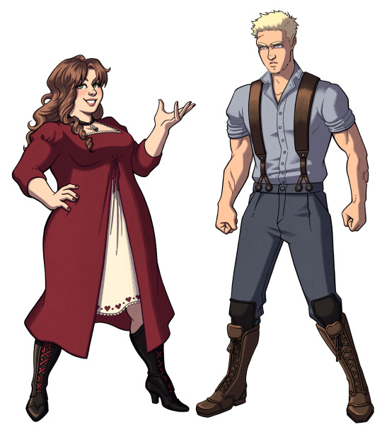
#[//also their design has changed a bit since the icon's design]
Explore tagged Tumblr posts
Visit Tumblr Blog
Explore Tumblr blogs with no restrictions, modern design and the best experience.
Last Seen Tumblr Blogs


Fun Fact
The average Tumblr user visits about 67 pages every month.
Text

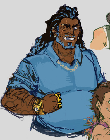
ok i have a bone to pick with these clothes (no actual spoilers just mentions of small things that happened in the ep)
I don't think Adrien should have this marketable design this far back. Personally I've always thought the reason Adrien has to wear the same thing everyday is because it's a "marketable" design so Gabriel makes him wear it. It makes him recognizable and iconic, and... apparently these multicolored stripes are the most marketable design Gabriel could come up with. But let's just pretend this is the case (since I could be wrong). Writing-wise, I don't think he should have started marketing Adrien as a model since he popped out of the womb.
It would be SO much more interesting and make a lot more sense if Gabriel only started this whole marketability stunt when his ideologies about fashion changed and we could slowly see this design take over Adrien's wardrobe. This 6-year-old shirt could have been a picture of how Gabriel used to treat Adrien and how Adrien used to actually be able to express himself, and it would've gone so well with the Papa Corn thing to show that Gabriel used to be a decent dad.
In Representation in Felix's little theatre-kid play, he described Gabriel's clothes as "clothes so magnificent that they revealed the beauty of anyone who wore them" (12:57). In that case, we can assume he has a fashion ideology similar to Marinette's: fashion is meant to let people express themselves. But we see that that ideology has changed in Pretension, when Gabriel and Marinette talk over pancakes... Gabriel says, "Life is like fashion. You think you have a choice but all you have is the illusion of choice, and I decide what choices are given to you. [...] Fashion is a product, a marketing strategy, an industry that relies on an uninterrupted trend renewal that forces you to either throw away everything you have and buy more or, worse, be out of fashion" (6:41). That last bit is after Marinette describes fashion as understanding people and creating things that will help them express themselves, which, again, seems to be the old ideology Gabriel had.
That being said, Gabriel's old clothes for Adrien should have reflected that ideology rather than totally... contradicting it??? Forcing him into that marketable clothing would have reflected his current ideology of fashion. Now, what pushed him to that new idea? I think that's probably when he wanted to start making more money. Specifically, I think he would have locked in on designing fashion as "a product" when Emilie started to get sick and he was going on all those trips to find cures. It couldn't have been cheap and it would make sense he would lock in for that... and we also know he wasn't a fashion millionaire before since, again in Felix's little play, we find out that he was still poor when he and Emilie married. He could have started corrupting the idea of fashion before Emilie started getting sick, but really I don't think that would happen for no reason unless Emilie had that same ideology. That's completely up in the air, though I doubt the show would go for that complex take of "Adrien's mom actually wasn't that great either" with its Marinette Mary Sue problem and all... I'm not sure what her ideology on fashion would be though, or if she even has a solid view of it. Anyway, I really think Gabriel would have only picked up on that ideology to make bank to try and save Emilie, and I think Adrien would be one of the last things he'd turn into a product since he's an extension of Emilie.
So yeah!! I think the shirt should have been different. A hint of the past where Gabriel treated Adrien as more of a kid instead of a product and those old ideologies he used to have, since one of the huge points of his character is that he used to be some normal, assumedly reasonable guy, but he went off the deep-end. It also would've went well with the Papa Corn bit. And it would have shown how his life was better with Emilie, even if it was something as subtle as wardrobe choice. AND (last and) given that little timeline of him having to lock in on designs in a desperate attempt to save his wife!!!
And likeeee... how cute would a matching frog onesie be????
rant over!!!
i have a lot more thoughts i have to post on the earlier series and even the current series but i may go back through and rewatch to give those!!! but these thoughts stand on their own so i decided to write it down
obligatory thank you to my roomie @baldisfan for getting me into mlb and watching this ep together 💞💞💞and for letting me yap this idea to her as she lets me yap all my ideas tehe
anyway would love 2 hear ur guys' thoughts on this too!!!
#kittyclysmic rambles#el toro de piedra#miraculous el toro de piedra#miraculous el toro de piedra spoilers#el toro de piedra spoilers#miraculous spoilers#miraculous season 6 spoilers#miraculous season 6#adrien agreste#miraculous adrien#miraculous ladybug#mlb#mlb adrien#mlb gabriel#miraculous gabriel#miraculous headcanon#miraculous tales of ladybug and chat noir#gabriel agreste
47 notes
·
View notes
Note
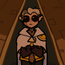
hey what do you look like? ur kinda hard to see as a silhouette
Oh right. Let me fix that.

Here. Apö̸̧log̵i̴es my form is a bit un̷s̴t̷abl̷͍̆e. This is what I look like.
#[Apologies] [unstable]#/ask#/anon#/art#/gif#squip ocs#[//WOOOO finally drew them]#[//also their design has changed a bit since the icon's design]
26 notes
·
View notes
Text
And at last !! the baddies

Finaly they are all here !!!!!! The full recap/height chart will be ready soon :3c


ALSO ! I modified Padme's one a little (redid the portrait a bit and some other minor details), and added Sabé :)))) dw about it <3

[COMMISIONS]
[PART 1] - [PART 2] - [PART 3]
Yapping below vvv
Had a lot of fun with Palpatine's outfit !! She gets to dress dramaticaly like the rich influencial nabooian (?) woman she is (the gown is heavily inspired by a 1998 Dior dress) ! Of course after the creation of the empire she doesn't do that anymore :( evil old lady in a bathrobe didn't bother to brush her air for 20 years... Good for her ig
I must admit.... Dooku's design is the most indulgent one here, it's targeted to *me* specifically fjfkdk like this outfit (minus the cape...for now) would be something I would wear, the dracula vibes because it's christopher lee and I have no problem what so ever with the hammer draculas, the feminine tall older woman- so yeah maybe I pushed the sith vibes a bit, and gave her the shadow the hedgehog color palette... But this is one of my faves design here sue me
For Boba I redesigned the og trilogy look a little bit, by taking some elements from disney's design and adding a bit of my own flaire to it :) and giving her a *big gun*
And for the first time..... You can trully appreciate how tiny Boba is jdndk big gun for tiny butch
Vader is just Vader- what do you want from me this is one of the best designs ever created djdk I'm not changing anything here (but this *is* one of the best Vader I ever drew jfkdkd don't know what I did different but he looks great !)
And Sabé is here now !! nothing to do with the fact I stumbled upon the Sabédala ship and it has occupied my mind ever since jfkfj Anyway ! Had a lot of fun with the flame dress (I know it doesn't contrast well with Padmé's, but I really wanted to do this one :(( the over handmaiden's outfits weren't as iconic imo)
PS : link to a post explaining why Vader uses he/him and Anakin she/her
#oh I had so so so much fun with these !!!!#soon the full recap will be finiiiiiished !!!!! (not looking forward to tagging the post omfg)#star wars sapphic au#darth vader#count dooku#darth tyranus#sheev palpatine#darth sidious#boba fett#padmé amidala#handmaiden sabé#butch lesbian#lesbian#star wars#star wars fanart#star wars original trilogy#star wars prequels#art#my art#digital art#fanart#sith lord#darthfett
1K notes
·
View notes
Text
Six of Crows Character Design Notes
Character design notes for my most recent character lineup for The Crows! I did this last time for the super old ones I did right after I read the series, so these new ones are much closer to how I imagine them. There probably will be a good amount of rehashing from the old notes, but I hope you enjoy these nonetheless!
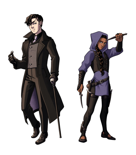
Kaz and Inej
Closest in color scheme due to how close they are at the start of the series, though there is a difference between the purples. Kaz's purple accents are light and muted (similar to the color of Kruge). Inej's tunic is more indigo, shifting away from the warmer purple she wore at the Menagerie. After she realizes her dream in the incinerator shaft, I imagine her theme color changing to dark blue, then dark teal by the end of the series.
I often see Kaz in a red tie, but he had to wear something different for my design since him and Van Eck would basically be in the same outfit. His black shirt is also meant to distinguish him from the real merchant class.
Coin added to Kaz's pose to refer to his magician and thief personas (and a callback to his backstory)
Their vests symbolize their morality. Kaz's is asymmetrical ("crooked and wrong...") while Inej's evenly goes down the center (more balanced and true to herself).
Jesper and Wylan
They're meant to contrast each other, since they don't exactly see eye-to-eye at the start, but their similarities are important. Both have patterned elements, brown leather boots, and freckles. My favorite differences: vibrant vs muted, gold vs silver, open vs closed poses
Jesper has freckles just because I feel like they suit him but also as a visual connection to Jordie. :)
Wylan is holding a Victorian fire grenade! They were actually used for extinguishing fires back then, but I can imagine Wylan replacing the ingredients to do the exact opposite.
I used to draw Jesper in a longcoat just because that look from the show is so iconic, but I changed it to something more cropped. The shorter coat makes him look taller and differentiates his silhouette from Kaz's.
Wylan's black vest is meant to hint at his merch family ties.
Nina and Matthias
Another couple who clashes through color palette! Nina's Heartrender red vs Matthias's northern blue. They also differ in leather color (black vs brown).
Matthias was a bit harder to design since he's not wearing clothes that he'd pick out himself. These are whatever Kerch dockworker clothes the gang could find for him, but I feel like they suit him enough to convey his personality.
Nina's necklace pendant is teardrop shaped (The Queen of Mourning).
Nina is wearing makeup and nail polish. From my limited research on Victorian culture, this was seen as improper, but I think that fits Nina's boldness all the better. I don't try to make any of my designs authentically Dutch Victorian (It's a fantasy series after all! Why not make semi-anachronistic designs that value personality over accuracy?), but it is fun to think about how these characters would be interpreted with that lens.
#next week's post isn't a comic but it's still gonna be real cool#six of crows#six of crows fanart#soc#soc fanart#grishaverse#grishaverse fanart#kaz brekker#inej ghafa#jesper fahey#nina zenik#matthias helvar#wylan van eck#wylan hendriks#kanej#wesper#helnik#character design#design talk
437 notes
·
View notes
Text
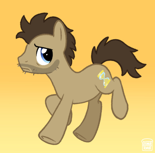
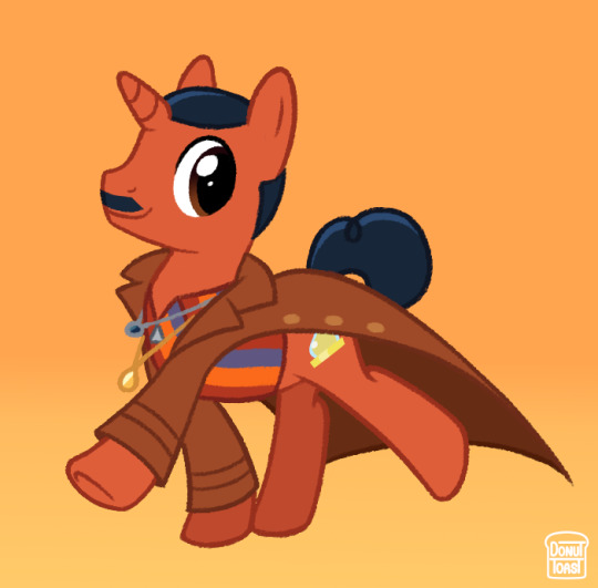
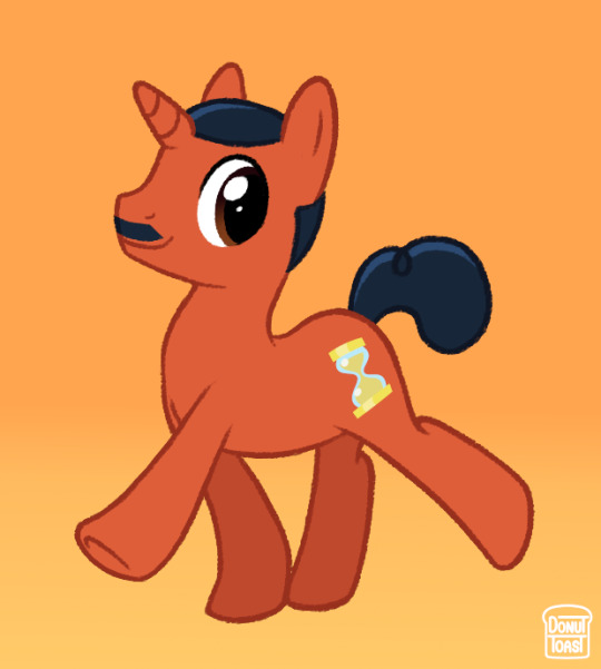
I haven't seen any MLP Doctor AU designs past Capaldi's era and I really think that's such a shame! So here's my take on the 13th, 14th and 15th Doctor :o]
Once again love to ramble about certain design choices!
Since the 13th Doctor wears ear jewellery depicting a golden and silver hand holding each other, I thought it'd be fun to change that into 2 horseshoes instead! I also gave a heavier focus on the more subtle rainbow on her coat because I feel it'd be more fitting for a MLP AU and something that could make the design a bit more balanced. I'd also tried to make her blue at first, but felt yellow actually felt more like the 13th somehow.
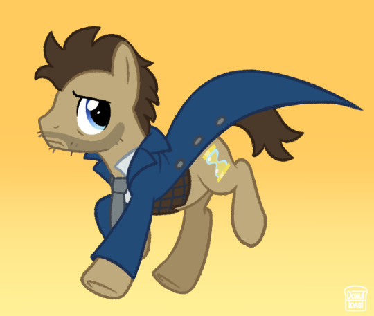
I decided to give 14 his iconic Doctor Whooves design, with the only difference being messier hair and some rough facial hair. I was definitely looking at it more with a nostalgia factor, which ultimately fits perfectly with what the 60th anniversary specials ended up being!
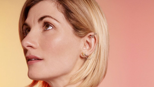
15 was a toughie, I'm not going to lie. A thing about MLP AUs I tend to dislike, is when an artist gives them the same colour as their skin. It tends to look silly with white characters, but I've noticed it's seen (at least USED to be) as less silly when it's with darker skinned characters. So with that in mind I wanted to make 15 the general colour he's themed to have in promotional material (orange and blue) and make it darker! ... but dark orange IS brown. So after some tinkering I decided to base his colour on the more earthy red Ncuti wears in this image.
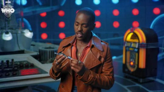
I also decided to tone his hair blue instead of going with black to really hammer in that orange/blue theme 15 has!
Thank you for reading this far! I'm really passionate about this sorta stuff so it really means a lot :oD
#I was so torn between making a genuinely David Looking 14 but I think the doctor whooves design is just too iconic to pass up on#not what i expected to give 100% of my energy today but we roll with it#donutdrawsthings#fanart#doctor who#doctor who fanart#doctor who au#new who#nuwho#nu who#the doctor#mlp fim#mlp g4#mlp art#mlp au#my little pony#mlp fanart#doctor whooves#thirteenth doctor#13th doctor#fourteenth doctor#14th doctor#fifteenth doctor#15th doctor#character design#design#au design#my art#digital art#au art
2K notes
·
View notes
Text
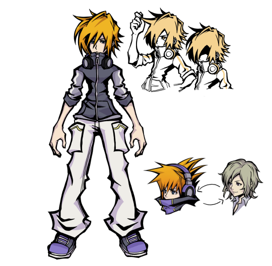
TWEWY SWAP AU 2/4
I don't have a clever name for this if anyone has any suggestions I'm all ears 🙏
ohh yeah... composer neku.... (click 2 read)
Neku Sakuraba (swapped with Joshua)
Remeber how shitty he was in week one? Imagine that but for the whole game. Whatever experiences Neku had before he became composer made him quite cold hearted and self centered. Neku's shibuya is less superficial, he doesn't feel any need to hide the fact that he doesn't care about other people. Only through choosing Joshua as his proxy to play a game out of sheer boredom, does his heart soften a little more. Edgy emo 15 year old but it's so serious now. I'd say he's a bit more grouchy and self centered.
His relationship with Joshua is about the same, but he is disconnected from the others in the hachiko gang since he won't interact with them as much here. Like I mentioned in Josh's post, their character arcs are parallels anyways so there wouldn't be many changes plot wise. The interesting stuff comes from the other characters (I'm cooking I swear just wait for my shiki and beat posts....)
I'm no game dev but I think the mechanics would be pretty different if neku was the composer instead. For one thing, he doesn't care about clothing so why would he let the dead people shop? I'm not really sure how I would do it, but I think the game would be more music-centric to reflect his character.
In this au, Minamimoto plays the role of Hanekoma. In this case, he's Neku's connection (and also an angel). Their dynamic would be like bickering siblings... older bro Minamimoto... kind of similar to his character in NEO. Sometime in the future, I'll probably make a post dedicated to him as well.
Design Notes:
I've read Nomura's notes on Joshua's design, and he said that his design is deliberately simpler than the rest of the cast, with baggier clothes that might not fit him right, to suggest that there may be something more to his character. I wanted to include those elements while still making sure he's readable as Neku, since his color palette and headphones are just too iconic to change. I'm not really sure if I've achieved that at all, but for now I'm fine with it! I'm not gonna stress over it anymore!!! Still wanted him to be in a kind of sportswear loo, and and I wanted his hair to be less sq enix protagonisty so I made it downturned instead. Both my Neku and Josh designs have the two little hair spikes to match each other :)


ain't that cute
anyways i think shiki will be next! stay tuned 4 more.....
#digital art#art#fanart#twewy#the world ends with you#neku twewy#neku sakuraba#character design#alternate universe#square enix#au#crab canon
218 notes
·
View notes
Text
doodle dump and human designs for a particular AU work in progress


These were made in our lord 2024 but only a few months ago, who knows if most of these designs have been revamped lol and here are some thoughts!
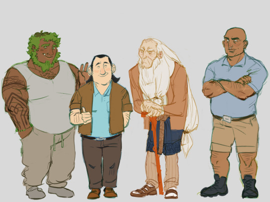
Dictatious - I wanted to edge-ify his design in the most simplest way and also make him look kinda endearing. I kept some of his troll form's features (ie: like his weirdly-shaped jawline, "stubble", hair,) and tried to replicate it in his human form in a way that would work, yet make him not look too trollish or too indistinguishable. Excessive piercings as a bonus and a frankenstein-hairdo, he's definitely a nosferatu freak and listens to type o negative/the cure.
Gunmar & Bular - Gunmar has two colored versions where he's in a yellow phase so he wears a yellow shirt and dyes his hair yellow, change his eye-contacts... Vice versa with blue, this change is very prominent and important to the plot but also, not going to lie Gunmar, it's a little gay. I couldn't imagine him with a lighter-skin tone or it would've looked a bit off (as well with the rest of his colours), so I managed to play around with his iconic troll colors while sticking true with how I wanted him to look like. Bular, oh my goodness I was reading The Secret History of Trollkind and there was a panel where Argh had done him some damage to his right upper lip, kinda badass. Had to add it onto his design, as it is very important to the storyline. If you've noticed, I tried to shape their hairstyles to look similar to their troll horns.

Ursuna - I'm a little bias towards her (you'll see a pattern with the others, lol) and she's not going down without feeling pretty. I wanted her beauty to balance with her charismatic 'leadership' and make her someone you'd least expect to be a villian, or already suspect she is one. Yes, she'll do drag. Yes, she is mother. No, I do not support her actions.
Angor Rot - His hair-do following the same inspiration from his troll form's horns, I imagine he'd style his own hairstyle and give himself braids. He's a true entrepreneur, and still is very magical! He carves voodoo stones etc etc, call him a false prophet or call out on his facade... nothing is going to happen, lol (Still, pack up & move out to a new country for good measure!) Someone put him in a retirement home, he is TIRED.
Gremlin - I spy with my little eye, the random french guy behind Gunmar & Bular. He is specifically the gremlin who draws a moustache onto his face while he trolls around with an alphabet kid's toy. (Yeah he has experienced death once)
NotEnrique/Rique - I don't know, I wanted to make him a normal guy. Who looks like a kid, but is actually almost in his 30's with a heavy boston-scottish accent ? he's a punk.
Draal - He has a new design now, but I thought it'd be nice to bring up his older design. Adidas pants, that says it all. Over-competitive and an over-achiever. He doesn't care about trends, just wears whatever is comfortable and it happens to be a brand clothing. I wanted to give him a fur-coat to resemble his troll form's spiky back, and keep his cool prosthetic arm. He's like the Costco guys with his dad but angrier
Kanjigar - A friend said he looked like he'd live in the suburbs. I see it. An arguably good father (that part seems to be controversial), I wanted to give him a Walter White vibe, while he is supposed to represent the Police.
Argh/Arthur - Big guy, build is a little wider and heavier, still has a muscular build, overall he's changed since. He used to have a slimmer, more muscular build when he was still working under Gunmar, call that an improvement. I got inspired by other people's human designs of Argh and HAD to design how I would see Argh. (I had an Argh/Blinky ao3 binge-reading phase, kiwibird being one of them aaah)
Vendel - A majestic wise old man, managed to keep his hair that long for over a decade. Gave him a skirt, he's kinda giving irish I think. In my defense, he had red-hair when he was younger. (Shown in The Secret History of Trollkind or The Felled !) Treatable hunchback and skin cancer, he and the hospital bill are opps. Does a lot of good for his community.
Speaking of fanfics, i plan to reread the one that heavily influenced me!!! and to know where I'm getting at please read below: the real thing
#paes art dump#paepaerest art#trollhunters#chit chat#I apologize for the long text post#I appreciate if you've read it all#Inspired by multiple fanfics under the same creator#i don't mean to water down the characters as i'm giving bullet points of my reasoning for the designs#for some reason my hyperfixation with these human designs is through the roof I can't help it GUH
199 notes
·
View notes
Text
The inconsistencies continue…
green-best to red-worst…. It’s almost criminal to not have proper references for what these characters huge ass lashes look like in certain expressions. Letting the animators guess for you cause you couldn’t be arsed to create a consistent reference of any character. Hurts more when you remember this is also animated by underpaid bento box employees and exploited college students.

Now for one of the most inconsistently drawn besides Charlie herself:

Her cheek is there then not, her lips have a cupids bow then not, her eyes are super wide then smaller, her lashes are super long then short or not there. Not seen here but her cheek blush is just as crazy inconsistent as Charlie’s. Once again. Is there no draw overs? Someone there to fix storyboards that might confuse the animators or are they given full reign cold turkey? No instructions? I admit I’d go insane.

This isn’t the first time a design proportions change every two seconds in a vivziepop’s work. Beelzebub is another contender, being changed with each animator as they struggle and get nowhere near the original proportions set for them by vivziepop's design. And that is no offence to them at all, I’m sure what they’ve been given is nowhere near as thorough as Lackadaisy’s sheets.

before anyone tells me I’m a hypocrite because I have a Steven universe icon. I’ve been preaching the same thing before you were born lol. Inconsistencies take the viewer out of the story! It MATTERS. Visually and narratively. I’ll give Hazbin a bit of a break since they probably had the same issue like Steven universe where it was overseas and as to not rock the boat said overseas animators relied heavily on the proportions in storyboards… but helluva boss really has no excuse whatsoever.

#hazbin hotel critical#helluva boss critical#spindlehorse critical#hazbin hotel critique#hazbin hotel criticism#helluva boss criticism#vivziepop critique#hazbin critical
302 notes
·
View notes
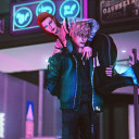
Note
Hi! Saw you were taking Lost Boys requests...
I have a lot of silly concepts or ideas but my favorite is poly!Lost boys with a partner (I usually prefer fem reader but whatever ur comfy with is all good) who loves stealing some of their older clothes. Like, reader is smaller than them so the clothes are really comfy. Especially the older stuff cus decade+ old fabric is so soft.

reader stealing the lost boys’ clothes!!
pairing(s): implied poly!lost boys x fem!reader
warning(s): aside from paul and marko definitely paying attention to your curves, none!!
(now if i was the reader here i know damn WELL i would be stealing their clothes too. each one of their styles is literally perfection and to see that shit on vampires? HELLO? also i may have gotten a bit too carried away with thinking about all their clothing designs.. but thanks for this cute request<3)
gifs not mine! (if you know the original owner please tag them!)

HEADCANONS
• Stealing your boys’ clothes is by far the EASIEST thing anyone could do. The reason being? They quite literally never change out of the fits they’ve had on since 1987.
• The boys don’t have much of a scent, seeing as they’re all undead. So a washing machine doesn’t exist in their little world anymore. Which means they will now forever be outfit repeaters.
More fun for you. 
• All of the boys have the most random shit scattered around the cave. They’re the worst hoarders you have ever encountered. Cough cough.. Paul.. cough cough..
• But the amount of clothes they have laying around is shocking. Boots, band tees, jackets, jeans, leather trousers, gloves, shirts, man you name it. They have it. Every fucking decade.
• The band tees are by far your favourite thing to run around with. Paul has a shit ton of Môtley Crüe tees, and Dwayne has so many shirts with The Doors on them. (Jim’s face is literally everywhere in the cave now. They sure as hell ain’t Christians, so if they’re selling their souls to anyone it’s the horned god below or their icon Jim Morrison.)
• They did let you away with wearing their old band tees until Marko told the boys about EBay.
When Paul found out a vintage Mötley Crüe tour shirt was going for over a grand, the mf was ecstatic..
So much so, he decided to put his own vintage Mötley tees up for bidding.
“Two thousand… three thousand.. FOUR THOUSAND… FIVE THOUSAND FUCKING DOLLARS!!!”
Poor Paul’s bubble was burst however when David told him there was absolutely nothing they could do with the money aside from unlimited Chinese food for the next few months.
• David’s old clothes are much different from what the others have. He was the first to be turned, therefore he’s lived throughout the most eras.
• He’s got a LOT of leather jackets and trenchcoats. Paul and Marko always joke about him being Jack the Ripper, but you see a different side to his style. There’s been many nights you actually sat down with him and asked where he’d gotten the majority of his old items. Some were by Spanish designers that had been gifts from Max whenever he’d provided David with different clothing, others were from when David had fed off multiple store owners and casually picked out what he fancied afterwards.
• It saddens you that he doesn’t wear any of these anymore. The only reminder he ever gets of them is when you put on the soft wool Trenchcoats that go right down to your ankles, almost looking like a cape. Marko makes mini conspiracy theories that maybe you’re the real Dracula.
• Dwayne’s load of clothes is FILLED with leopard print designs. He’s been a 70s boy even all these years later, and he misses that era so dearly.
• There’s this one satin leopard print shirt that actually fits you quite well in his eyes. It’s still a little baggy.. yet oddly attractive to him. You’ve claimed it as your own now, wearing it like a pj set.
• Aside from the satin shirt, literally nothing else Dwayne has fits you. He’s a muscular guy.. and a vampire. So trying to get his baggy ass clothes to even have a slight loose fit is not for the weak 😭
• Marko however, this is where the real fun begins. You can borrow anything from Marko.. ANYTHING.. and it’s guaranteed to fit.
• He was a big crop top collector. When he used to find a good shirt that wasn’t cropped however, he’d cut it up and make it into a crop top himself. And these are what he adores you wearing. They cling nicely to your curved body, and whenever you wear them you can never get both Paul and Marko to stop staring at your breasts. Assholes.
• Marko’s clothes are by far your favourite pieces out all the boys. Much like the crop tops, he really enjoyed designing all his other outfits when he wore them. And he was pretty damn good at it too. Marko can be a crafty little thing when he wants to be. He’ll even help you design your own outfits too! He’ll cut, sew, stitch, glue, draw, paint, anything you want Marko to design, he’s down. He took so much pride in his unique outfits back in the day. And if you want yours spiced up, Marko’s your man.
• You wear his old belts a lot. One time, you were rummaging through the boys’ old stuff again, and immediately fell in love with this black latex belt Marko had. He’d drawn on perfectly shaped skulls with a white acrylic pen, and added different studs around the buckle. Ever since that day, Marko pretty much customises everything you own now.
FIRST TIME WRITING FOR THE LOST BOYS!! hope you all enjoyed these headcanons and my requests are open for any lost boys related ideas you may have!! <33
#the lost boys#the lost boys 1987#the lost boys x reader#headcanons#the lost boys headcanons#ask#request#david the lost boys#paul the lost boys#marko the lost boys#dwayne the lost boys#kiefer sutherland#brooke mccarter#alex winter#billy wirth#david#paul#marko#dwayne#headcanon#ghastlyfilters#x reader#reader#fem reader
336 notes
·
View notes
Text


Finally got around to doing this, here are some rough sketches of my idea of how Lester looks each book! Some books are more different than others, like I don't think much changed between books 1 and 2, but I had fun doing this! Look under the cut for some notes about things I added for each design.
Book 1: Not much changes from how he's described in the books. All of the clothes he borrowed from Percy are a bit too big for him, but the flannel he borrowed from Will fits pretty well, only being slightly too long (I think Will has like, an inch over Lester)
Book 2: Basically the same as book 1 Lester. He keeps the flannel Will gave him, but it gets pretty beat up over the course of this book so he has to switch it out before book 3 :(. Hair is just a lil bit longer, and he gets clothes that fit a bit better. Headcanon time bc if Rick won't give me substantial Thalia and Apollo interaction I'll make it myself: Thalia gives Lester archer's gloves at the end of TDP, which he wears for the rest of the series. He didn't even think to wear gloves bc as a god he wouldn't need them, but Thalia noticed his beat up to shit hands at the Waystation and went "bestie... bestie no...." and gave him a pair.
Book 3: Will's flannel has been swapped for a big coat and Lester get his iconic pink camo pants. His hair is long enough to start getting weighed down a bit, and also way messier bc he's been in the labyrinth for like a month. The beat up sneakers he was wearing in books 1 & 2 get replaced with much more reasonable boots. Eyebrow scar shows up, a reminder from one of the many concussions this poor man has suffered. Also another HC time! Georgie gives Lester a little handkerchief that he wears for the rest of the series (I was gonna use Paolo's handkerchief, but Lester canonically gives that back so boo)
Book 4: The Lester looks like shit book /j. His hair is now long enough that he should really be doing something with it but he is not. He has a zip up hoodie now to cover up all his fun purple veins. Just more beat up in general honestly. Also I hc that Apollo actually lost some weight here (both bc he wasn't really eating well before getting to New Rome bc of stress/grief, and bc he got really sick and continued to not eat well while that was happening) But it obviously doesn't do anything to help his self-esteem or mood in this book. Kind've a visual way of being like "the superificial flaws Apollo clung to in the first book weren't the real issue, he was just hyperfixating on them to distract himself from what he was really upset about, so when the superficial issues get solved he doesn't even notice bc he's grown enough as a character to cut the bullshit and focus on what's really bothering him." or idk something like that. I like to contrast this with a hc I've mentioned before about the time between books 4 and 5, which is that the physical flaws Apollo whined about in book 1 (i.e. the acne and his weight) get "worse" throughout the road trip from California to New York, but Apollo truly just does not care that much about that shit anymore and that's why it doesn't come up in the narration.
Book 5: Final Lester! It's been over a month since the last book so I'm taking liberties and saying Lester's hair is long enough to pull up now bc I want him to be able to do that goddammit. Final outfit is borrowed from Percy again, so that's why it's so big. He also has a pendant that Lavinia gave to him bc they're besties. Also I forgot to mention it, but his shoulders are slightly broader here (and have been getting broader throughout the series) bc he's been working those muscles so much with the constant archery.
Also I didn't draw his quiver bc honestly I forgor, but I like to imagine he's been getting little pins and bobs from a lot of his friends that he's been sticking on his quiver strap. A few examples that come to mind are:
Kayla: A classic hot topic pin with a sun with sunglasses on it.
Leo: A pin made of scrap metal with the alchemical symbol for fire carved in.
Agave: Pinned a clover to Apollo's quiver for good luck. It didn't stay on there long, but it was the thought that counted.
Hazel: A piece of citrine decorated with metal cords.
Lavinia: Another classic hot topic pin, this one is heart shaped and has a picture of Hatsune Miku on it.
Jason: One of the monopoly houses he'd been using to mark the positions for the temples. A lot of the little houses had fallen off the diorama during the car crash at the beginning of TTT. The night after, Apollo asked Reyna if he could make sure the diorama was fixed. Reyna agreed, and he put it back together based on what he remembered. He spent an hour or so gluing on houses and hotels for Mars, Somnus, Fons, Salus, and on and on, until he got to the last one. A red hotel meant to show where the temple of Apollo would go. Apollo poked a little hole in it, and fastened it to his quiver with a bobby pin. It's nestled close to where the strap meets the quiver itself, so it's less likely to fly off.
Meg: Pinned a rose petal to his quiver right before he went to fight Python. It lasted for even less time than Agave's clover did, but again, it was the thought that counted.
#sunny speaks#long post#trials of apollo#toa apollo#lester papadopoulos#apollart#fun fact: all of the colors I used for these were color picked from the covers of the books they came from!#oh and i forgot to mention he also get more freckles as the series goes on bc he spends so much time outside
219 notes
·
View notes
Text
Undertale YELLOW ReImagined!

I wanted to put my own spin on how the cast of UTY would look in my style! :) I'm new to pixel art, and I had a blast trying it out! [Just to clarify, this is NOT an attempt to "fix" UTY's designs; I have immense respect for all the artists and developers working on UTY, and their work is incredible! I LOVE the cast, their animations, art and designs! This is all just for fun!] A ton more thoughts and comparison under the Read More! if you feel like reading a lot.

Flowey the Flower: I gave Flowey flushed, freckled cheeks and a tooth gap to make him look cuter and more approachable! Just a ruse, though - fluster him enough, and he might revert to that typical pale face and frown.
Clover: Clover is the iconic player character of the game so I changed as little as possible. I simply adjusted some colors and added details, including the adorable blush they have in a lot of promo art!
Dalv: I aimed to showcase Dalv's lightning powers through his design, so I gave him glowing horns and some subtle markings, including a pinkish nose. <3 While he’s originally based on Vlad, I added some minotaur elements because they really suit him. I Like in the original story, the minotaur trapped in a maze, unsure of what else is out there.
Martlet: I'll be honest, I saw some art of chubby Martlet and was inspired. To bring her passion for woodworking across, I gave her some tight but comfy overalls! She has some cool goggles that she always forgets to wear when flying - typical Martlet! Since a martlet is said to be a bird that never rests or settles, I gave her some cool glowly ghost legs! They're translucent!
Starlo: I revamped Starlo's cape by changing the patterns and adding tassels! I also removed the piece of wheat sticking to his hat because, honestly, I tend to forget to draw it. ^^* The inner fabric of his cape has a fun star pattern, tying into his previous obsession with space! And of course, big boots!
Ceroba: I made Ceroba a bit furry-like and taller, sort of to mirror Toriel! I wanted to give her a more traditional kimono with beautiful patterns, and I added eyebags to make her look a bit tired. She also has large paws now; I considered giving her sandals but ultimately decided against it.
Axis: To be honest I wanted to push his design even further but!!! Then it wouldn't be Axis anymore! :( I kept most of his original features but added some pink highlights. His antennae now have pointy tips, resembling bunny ears! I couldn’t resist the idea of a fox monster creating a bunny robot to apprehend humans - it’s just too cute! He's also taller now for intimidation factor and in case a larger human comes along.
And that's all! Thank you so much if you made it this far! More is to come soon! :) here is a wip!

I also have an AU in the works! And lots and lots of art!!!
#undertale#undertale yellow#uty#featured#artists on tumblr#my art#flowey#clover undertale yellow#uty dalv#martlet#starlo uty#ceroba#uty axis
289 notes
·
View notes
Text
UNITED KINGDOM - Jo Hansford, Ian Carmichael, Richard Ward & Amanda Cook Tucker
And finally the Brits. As we all know there's not much hair to talk about. The only prominent british royal figure that does something with her hair is the Princess of Wales, the Duchess of Edinburgh on galas or other important occasion also, but mostly is Catherine the one that gives us hair to look forward to.
But before we get to her hairstylist/s, I wanna talk about those behind the impassive hairstyles of Queen Elizabeth and Queen Camilla.
Let's start with Camilla's long-serving hairdresser: the colorist Jo Hansford.


She has an homonymous salon in Mayfair, London, that opened in 1993. According to Jo, she doesn't go to the palace to work as opposed to other royal hairdressers, so is Camilla the one who goes to the salon early in the mornings to go unnoticed by curious eyes. The layout of the salon makes it impossible to sit one client next to other, so not even other customers inside see Jo working with her. The only time she went to Clarence House instead of Camilla going to her was the day of the engagement announcement.
Jo started working with Camilla in 1988, and as her specialty is coloring, she has stated that over the almost 40 years they've worked together, she has been changing Camilla's hair color bit by bit to go according to her time in life, sofening it up gradually as she gets older. And if we look at pictures in 2005 when she became the Duchess of Cornwall to her hair now 20 years later, we can see that it has gone from a more yellow tone to an almost white color.


Now from one Queen to another. Just like it happens with Beatrix, Sofia or Camilla, Queen Elizabeth's perfectly coiffed hair has been unchanged over the years, giving her and iconic look that's imprinted in everybody's mind.


The mastermind behind the Queen's look and who styled her during the better part of her 70-year reign, was Charles Martin, a really private and unknown person, who retired in the late 80s (there's not even a picture of him) and then, for the latest 23 years of her reign, Ian Charmichael was the one in charge of tending her locks.
A senior hairdresser at Trevor Sorbie in Covent Garden, London, Ian worked with Elizabeth until her very last days, going twice a week to wherever she was to shampoo and style her hair. He hasn't given any details about his work with her, nor the secret behind her symetrical hairdo (we'll talk about it later), but the hairdresser on standby, Lino Carbosiero (who took over whenever Ian wasn't available) did talk a lil bit about working with the Queen.


According to him, they don't have a hair salon at the palace like other royal families, but just a stand-up attachment to a sink in the bathroom in her private quarters where she sat back to have her hair washed, or at least in Windsor Castle they do have that setup.
Queen Elizabeth's distinctive hairstyle was designed to accomodate the tiaras when she became Queen, before that she had longer hair showcasing her curly locks like on her wedding day. The major change in the Queen's hairstyle was in the 90s when she decided to let her grey hairs take over and since then her hairstyle was even lower maintenance becaus she didn't need coloring.


If you came all this way, I'm going to tell you the secret behind the perfectly structured hairdo the Queen had: her hair was cut the same length all over her head, there wasn't a longer lock anywhere, that's why it was so rounded. That and the usage of curlers on the ends and on the hair framing her face (and loads of hairspray of course).
And now, the one you all were waiting for, Richard Ward, the hands that has been shaping Catherine's head full of hair.


Owner of the Richard Ward Hair & Metrospa in west London, Richard has been working with Catherine since even before she became part of the Royal Family. His most notable work was Catherine's hair on her wedding day in 2011, and when searching, Richard is listed as her only hairdresser, so it's safe to say that he's behind all her updos and trademark curls (him or maybe someone trusted from his team when he was unavailable). (continue reading to find out why this is crossed)


It's reported that Richard mainly does Catherine's color and that she visits his salon for that, or at least she sometimes does as it was written that she continues visiting from time to time.
As everyone that works with the British royal family, they're not as prone to talk about their work with them as it happens in other european royal families, but he did appear on tv to show how to do Catherine's signature "Chelsea blow-dry" or gave the tips to do her bouncy curls at home to the women lifestyle magazine Woman&Home If you want to check it, here's the video:
youtube
As I couldn't find a piece or interview where he specifically talks about Catherine's hair or his work with her, I decided to look at a big amount of photos of the back of her hair in different events and years to try and find something to add here. Catherine hair is on the longer side, so Richard has enough hair not to use extensions or hair pieces to do the big updos (as contrary as some haters might think) and he's not afraid to try twists or other cool accents to elevate the looks. He most likely uses hair cushions to give some of the updos the necessary base, I say some, because sometimes her updos are kinda flat, which means that there's nothing in there to make it puffier, and he likes the use of hair nets to prevent the harstyle to be destroyed with movement, but this is happening less and less over time as she's favoring more twisted updos in recent years.


As pointed out by and amazing anon, there's another hairdresser that works with Catherine: Amanda Cook Tucker. She's been working with Catherine since 2012, but she reportedly worked with other royals previously (she did William's and Harry's hair when they were younger). While Richard is said to be the one behind important days hairdos, Amanda does not lag behind and has done her hair following the births of her children, or accompanied Catherine in different tours like the South-East Asian, Norway and Sweden or the Caribbean. (cool tip: if you want no frizz in humid climate use coconut oil like she did with Catherine's hair in that very first royal tour)


According to the media, Amanda goes to the Princess of Wales' home to do her hair, cutting the ends every six or eight weeks. Below you can see the picture she posted once on her now-deleted secret Instagram account of all her tools for a royal tour, so we can get a better picture of all what's needed to style one of the most famous royal manes.


Souces: x x x x x x x x x x x x
And with this, the Royal Hairdressers series come to an end. Hope you liked it!
xxx L
#royal haidressers#queen camilla#princess of wales#kate middleton#queen elizabeth#british royal family#richard ward#jo hansford#ian carmichael
64 notes
·
View notes
Text
Progress Checkup! (Jan. 2025) | Scratchin' Melodii Devlog
Hey guys! Time for another progress checkup; This is actually the first one of the new year! I hope you were all able to enjoy the holidays. I took a bit of a break from working on most stuff last month and have been getting back on things this month. First, I wanna thank everyone who's wishlisted Scratchin' Melodii on Steam! So far, the game's gotten over 17,000 wishlists! Thanks so much for the support!
In the previous devlog, I mentioned some changes to the rhythm system. In the Dragon Funk preview, you can see the new rhythm system and character icons I mentioned in the previous devlog! Actually, let's unpack some of the new things you're seeing in action there:
Hold Notes This is the first song in the game to include hold-notes! They mostly work the same as they would in any other rhythm game. However, since this game has an emphasis on self expression, moving the control stick during these will let you tune the note's pitch-bend for extra expression points! I showed that off in a post here. As for Pow Notes, I've been working on a way to let the player get expression points from these too! I'd like for most of the special notes like these to be not just a gimmick, but a tool that the player can use to their advantage.
Quadruple Lines Yep! The first blue line in this one is extra long and has 4 rows! Fun fact actually, I had to implement this feature after I realized that part of the song was too long to fit in just two rows. It was pretty difficult to figure out both how to do it and how to execute it in a way that doesn't feel too jarring, but I'm pretty satisfied with the results! In fact, barely anyone's even noticed it; I guess that's just how natural it feels! Not sure how much more often I'll be having lines longer than two rows, but it's great that I have the option now.
AutoPlay You might also notice that the player inputs are perfectly timed... TOO perfect... that's because I've developed an autoplay feature for the game! At the moment, it's mostly for debugging and stuff, but if all goes according to plan, AutoPlay Mode and Replays should hopefully be available to players as well in some form when the game comes out!
"Next" Indicator & Other UI Related QoL Some of the top things players said they had trouble with in the demo were related to being prepared for the next line. So, if you look at the right-end of the rhythm bars, you'll see a little tab that shows the color and amount of rows the next line will have! Also, now each line's suggested notes can be seen before the rival performs them. This did take some thought, as I actually kinda still liked the idea of it appearing as if the characters were making it up on the spot, but to put game design first, it makes more sense to have it displayed as soon as possible so the player has more time to react and prepare. This also opens up more possibilities for future mechanics, so in the long run, I think I've made the best choice here.
Now, let's get into what I've been and/or will be working on that you haven't seen yet!
Act 2's Boss The music for the Act 2 Boss is nearly complete! I'll likely be starting to animate it pretty soon. This song is the longest one I've done so far, clocking at a duration of a little over 3 minutes long!
More Animation Updates for Stir & Mix At this point, I've done even more cleanups on the sequence you saw in the last devlog and I've finished animating the "I wanna" scene of the song, which will probably have the most changes out of any other scene in the song. When I first animated Stir & Mix, I didn't quite have the time or skills to do everything I really wanted to do with it. That scene in particular I felt was WAY too stiff and boring, especially compared to the more dynamic and fluid scenes that appear in some of the other the stages now. I'd say I'm about halfway done retouching all the animations for this one!
Refined Model Sheets I don't talk about these very often, but sometime around 2023 I started using model/reference sheets for the characters. (I might show them off someday, but for now they're staying private!) Before this point, the designs are pretty inconsistent from shot to shot, so this helped a lot with that. Recently, I've done some revisions I'm really pleased with. Their designs are finally becoming... well, final! I'll be reworking the affected characters' hub world sprites at some point to reflect these changes.
Slight Reworks for some Act 1 Songs On the sound side, Stir & Mix's vocals have been reworked again! As I've mentioned in the previous devlog, 2cada's tuning style and techniques have evolved a bit since we first started working together, so we thought it'd be fun to go back and incorporate some of that into it. We'll also probably be reworking the structure of Nami's song a little bit at some point just to make it a feel a bit more solid, which may require a new line or two from her voice actor, Meggie-Elise! So funnily enough, it seems some of the songs will have end up having TWO unused beta versions after this.
Also, a quick PSA: Please note that beta versions of content will NOT be included in the full game. I've heard people ask for them to be "brought back" or toggleable, but in my situation something like that is both easier said than done and I also just... don't want to LOL. With as many directions I can take this game, I know I can't satisfy everyone, but I can make a game that satisfies me, so I'm aiming for that! And hey, maybe other people will like it too.
I think that's all I wanna talk about for now! Thanks so much for reading. It can be a bit of a daunting task to write these at times, but I'm glad to keep you up to date on the project when I can.
-LJ
129 notes
·
View notes
Text
WASP REVIEW - BEES (MINECRAFT)

[Image ID: An official render of the Minecraft bee /End IDs.]
Alright y'all, it's time for an iconic one. One of the most common of only a small handful of arthropods in the game (ironically given the fact they felt the need to specifically make Bane Of Arthropods a thing), and the least hostile one at that, these blocky bees have deservedly buzzed their way into beloved status amongst Minecraft players over the past five years since their official debut. However, as I'm well aware at this point in this series, popularity does not necessarily mean accuracy, so how do these insectoid cuboids really stack up?
Starting from their appearance, it's obvious is that their bodies are heavily fused, with one solid body segment. I'm sure you don't need me to tell you this, but nevertheless, the body of a bee is notably more segmented than the body structure of the Minecraft bee, having three body segments: The head, the mesosoma (also referred to as the thorax, though these are classified a bit differently), and the metasoma (also referred to as the abdomen, same thing here as with the mesosoma). This is clearly a stylistic choice, so I can't get too mad at it, but it is disappointing, given the fact that Minecraft's spider is more segmented, perhaps even having more body segments than the real thing.


[Image Sources: iNaturalist, Yuriy Danilevsky, and PBS, Nebraska Public Media | Image IDs: A photo of a black and yellow/orange European honey bee feeding from a yellow flower, followed by an illustration of a honey bee (female, worker) showing its body parts as labelled. Mandibles, antennae, eyes, thorax, abdomen, stinger, foreleg, middle leg, forewing, hind wing, and hind leg (with labelled pollen basket) /End IDs.]
That said, there are some other things I take issue with regarding this design apart from just this choice of segmentation. I feel like it's safe to assume this bee is based off of the most common honey bee species, the European honey bee (Apis mellifera), in which case, they honestly feel like they're a bit too wide? This wouldn't be a big deal, except, I feel that if they were a bit longer it would help keep the proportions from feeling kind of... Off- Even if we do simplify a bee down to one continuous body segment, it helps to have some distinctions made between the areas of the body. The way they've done it here almost makes it seem as though the mesosoma is just straight up not there; Like the head goes directly into the mesosoma with no in-between.
Another thing that would help this design to not feel quite as "fused together" would be a slight change in coloration. The Minecraft bee has a yellow head, which goes directly into the stripes of the metasoma a little further down the body. In a lot of real world honey bees, the head and mesosoma are generally darker and more solid in color than the lighter and/or more vibrant stripes of the metasoma (with some exceptions), varying in shade depending on the amount of fur (the length of the setae), from a muted yellow to a dark brown color; Further still, honey bee heads can also be noticeably darker overall than the mesosoma at times. Taking this into consideration, I would make the Minecraft bee long enough proportionally to fit another pixel or two lengthwise—enough to provide slightly more space while also not being too long—making the area representing the mesosoma a slightly darker yellow, and the area representing the head the same color as the brown stripes on the original design.
But enough about the body segmentation! Let's talk about the smaller details for a minute here. The wing count is wrong, with only two wings as opposed to the four of a real bee, and they're lacking in terms of venation. The leg count is right but the proportions are all wrong, and they suffer from the same issue as the body, where they look completely fused together. I completely understand wanting to simplify this aspect of the design, but going from five major segments (Coxa, trochanter, femur, tibia, and tarsus) is kind of ridiculous!

[Image Source: bugguide.net | Image ID: An illustrated diagram showing the legs of three Hymenopterans, the first two being of other wasps, while the last one is of a bee, with each segment labeled. Coxa, trochanter, femur, tibia, and tarsus, with metatarsus on the bee. /End IDs.]
The antennae themselves are alright, if a bit short; I appreciate them having little pixels on the main body where they connect to the head, but yeah, it would've been impossible to give them much detail at all at this resolution. The position of the antennae, however, is what throws things off, as they're placed above the eyes when they should be placed between their eyes. Speaking of! Their compound eyes are FAR too small, they should reach up and around the top of their heads, while the eyes here reach only about the halfway point of the texture; and to add insult to injury here, they don't even have their three ocelli (simple eyes)! Nor do they have any mouthparts to speak of, which is an even more major thing to be missing for a bee!

[Image Source: Arizona State University | Image ID: An illustration of the head of a worker honey bee with mouthparts extended, the whole head labelled as follows; Compound Eye, Ocellus (one of three), Antenna, Labrum, Mandible, Maxilla, Labial Palp, Proboscis, and Glossa /End IDs.]
In the end, there's not really much left to cover in regards to this design just due to the fact it's so simplified, though I will say one last thing about it, for now; Their stingers shouldn't be out like that 24/7. Some of their relatives DO have their ovipositors (same thing, a stinger is an ovipositor that can also inject venom) out on the regular, but not bees.

[Image Source: mchoneybeev | Image ID: An in-game screenshot of two Minecraft bees in a cherry forest /End IDs.]
Ok so, what about their behaviors, then? Well, honestly, I think these are actually some of the more accurate ones I've covered in terms of behaviors in this series. Unlike many previous reviews, Minecraft actually goes through the effort of showing that these insects visit and pollinate flowers; Which, barring the ones that are explicitly aliens or robots, would be the case for every Hymenopteran we've covered in the real world. Now, pollination in Minecraft doesn't have an effect on the flowers themselves, it certainly affects the bees!
After visiting a flower, the bees will return to the hive, supplying the hive with honey, as well as beeswax in the form of honeycombs. While this happens much quicker and in larger quantities per trip in the Minecraft bees for purely mechanical reasons, this is relatively accurate to the honey bees of our world, which produce honey from the sugary nectar of flowers, in turn producing more wax as well as they process various bits of plant matter.

[Image ID: An image of a nest made by bees in Minecraft, in the state in which it is full of honey /End IDs.]
We don't actually see these processes happen, however, which I'm sure is partially, fairly enough, because they didn't want to animate it, but it's also because their nest is an enclosed arboreal nest! Bees of the genus Apis primarily prefer to nest in sheltered locations, so the enclosed nature of their nests isn't entirely inaccurate; When they can't find a hollow log or something of the sort, they'll even nest out in the open in the branches of trees. However! These open air nests are exactly that, open! In the instances that they make their hive in the branches of a tree, they will actually make it in a structure that is entirely exposed to the elements, in slabs of honeycomb with no protective outer walls. It's also, perhaps, because of this enclosed shape, and the sheer scaled-up size of the bees in Minecraft (Roughly 0.56 meters if you go by the 1 block = 1 meter measurement) that these nests can only fit a measly three worker bees compared to the upwards of tens of thousands in a real colony of honey bees.
There are actually social bees, though, that produce enclosed nests, made of wax, out in the open, in trees—even producing honey. They're in the same family as the honey bees we know and love, in fact! However, these ones are a part of the genus Trigona, whereas the common European honey bee belongs to the genus Apis.

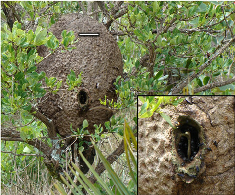

[Image Sources: iNaturalist, Kahio Tiberio Mazon, ResearchGate, Multiple Authors, and AJC, Tim Thompson | Image IDs: A photo of two black and red bees of the species Trigona spinipes on a yellow flower, followed by an image of a nest in a tree made by the same species, followed again by an arboreal nest made by a bee species within the genes Apis, showing how the honeycomb is shaped into slabs exposed to the air /End IDs.]
Some other things we don't seem to see in Minecraft are the queen and drones of the hive! Perhaps understandably so, as queens don't leave the hive many times throughout their lives, and the drones mainly leave the hive to mate with queen bees, along with the fact that there aren't as many drones and queens in a nest as there are workers! This does also further confirm, on top of the presence of their ovipositors, that all the bees we see in minecraft are females! It would be quite fun to see how they would translate the eyes of a drone into this style, however.
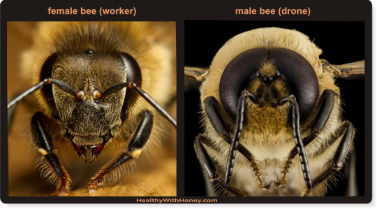
[Image Source: Healthy With Honey | Image ID: A close up set of photos that shows the differences in facial structures between a female, worker bee and a male, drone bee /End IDs.]
Again, on the topic of those ovipositors (I.E., their stingers), how do they attack? Well, thankfully this time there's not anything fantastical about their attack patterns, as they simply sting the player when provoked. Which is another thing! They only attack when provoked; when their hive is attacked, when they're attacked, or when you attempt to harvest from the hive without taking the proper precautions. I feel like this strikes the right balance between being dangerous if messed with and also not being "aggressive", once again unlike many other depictions of Hymenopterans in media in general, as, usually, you get either complete pacifists or murder machines fueled by anger.
Furthermore, when these bees sting you, they take another cue from their real world counterpart and actually lose their stinger! Most bees, ants, and other wasps that are capable of stinging are also capable of doing so more than once; Famously, though, honey bee workers will, more often than not, get their barbed stingers caught in the skin of things like mammals, and lose it. Understandably, Mojang did not depict what actually happens when they lose their stinger, as this leads to the partial disembowelment of the bee, thusly causing it to die.

[Image Source: PBS, Rose-Lynn Fisher | Image ID: An image of a honeybee stinger magnified 650x /End IDs.]
As I mentioned in passing a minute ago, you can, however, absolutely harvest from your hives without aggravating your bees—which doing so could end up potentially killing both you and your bees. With the power of a campfire! And no, of course I'm not suggesting that you burn your bee nest, since, as it turns out, the bees are calmed by smoke! Another well known fact due to the process of beekeeping, as beekeepers usually use smoke to calm bees. I would not necessarily recommend the campfire method, though, as it might be a bit too much in general, and may be a bit too hot for the bees. Even still, relatively cool smoke, applied in just the right amount as to be completely safe for them, will mask alarm pheromones and suppress bees' sense of smell, in turn suppressing their alarm response.
Fittingly, this isn't the only aspect of beekeeping carried over into the Minecraft world, as bees can also be moved from their natural hive into a man-made box hive!

[Image ID: A render of the wooden beehive from Minecraft /End IDs.]
Not much to say here about the structure itself here, as it's made by the player rather than being made in nature. Sadly—and logically due to their equal size—this structure cannot contain any more bees than the natural hive can, however, it still remains useful as the easiest way to move bees from one place to another. That said, I feel it necessary to mention; Due to the fact that, again, we never see a queen, this implies that either these bees have a social structure that is quite different from the real world, or that these bees are leaving their nest without their queen, which would be highly disadvantageous for the colony as a whole, as the queen is the only fertile female! You can even get them to leave individually, which is highly strange behavior for a honey bee. If brought away from the nest, a singular worker bee will typically not attempt to make a new home, and instead try to find a way back to its original home and its queen.
One final thing I want to bring up is that... You can put bees on leads! In fact, this is a major way of bringing the bees from a natural hive to a wooden one. This would be highly impractical in real life, however, it is very cute!

[Image ID: A screenshot of a Minecraft bee on a lead /End ID.]
With everything out of the way, we're left quite a few aspects that are accurate to the real world, but some strange inaccuracies all over the place as well. I find the design to be one of the least accurate among those I can directly compare to the real world, but certain aspects of their behavior, as well as the care put into including certain details, redeem them somewhat. Still, their behavior does contain some inaccuracies as well; So, these blocky bees get my accuracy rating of-
-
Overall: 4.5 to 5/10
-
Leave your wasp review suggestion in the replies, tags, or askbox!
56 notes
·
View notes
Text
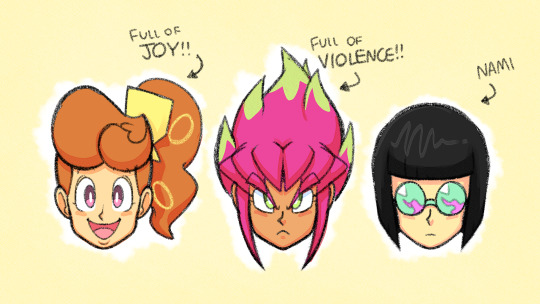
SMG4 Crew Redesigns Part 2

HOLLLLLY CRAP THIS TOOK FOREVER!!! And I wanna blame Desti and her stupid tentacle hair, but honestly I think after Tari and Saiko I started to slow down because of outsides forces and just no general ideas forming for Melony.

So alright Tari!!! At least in the SMG4 Verse. I still gotta watch Meta Runner (especially because I wanna do a redesign of Belle at one point but she doesn’t really show up much aside from the YouTube arc plus it’s the last Glitch Productions show I gotta watch). But for this redesign I changed her hairstyle a bit with an opened up hoodie to show off the tank top. Couldn’t take away the iconic socks with flip flops she was rocking so kept that, but changed the pants a bit. I should’ve done it in the drawing, but the back of the hoodie has the meta runner logo. Nothing too crazy with her.

Next up Saiko! So decided to change up the colors a bit with her outfit giving her a cool ripped up pink skirt with less beige and more reddish jacket color. Then I changed her necklace to a choker and put the skull as a pin on the jacket. Then some piercings, a spiked belt with a heart skull cross buckle, painted black nails, and some combat boots! Also loved the headcanon people had of her being ripped so I did my best to draw that. Definitely need to practice drawing muscles more.

Okay so Melony- honestly it was tricky with her. Was not a fan of her canon design and tbh I’m still on the fence with her character- idk the OwO types of characters can get annoying pretty fast plus the childish behavior. But I mean she does have her moments where I’ve liked her (really wanna see more of her and Bob interacting) but yeah design wise I changed up the hoodie while still keeping the watermelon design while also giving her some black shorts, kept the striped socks she had for the college fit, and gave her green shoes. I also gave her a watermelon hairstyle for what I’m assuming are meant to be leaves on the top of her head. Then I did a small drawing of her deity form and gave my interpretation of it; even changing the hairband to fit the style.

Going down the line, Axol! So I initially went into all the Axol episodes thinking he was just a one note character that was a simp for Melony, but when I was first watching the arcs I was pleasantly surprised. He shows up before Melony for one thing, but even when she shows up he doesn’t turn into a one note character. Wish I got to have more of him. But anyways back to the design- I actually did like his design so I didn’t change too much, with just giving a turtle neck ish vibe, a beige belt, pockets on the pants to keep his blank papers and sketchbook, and gave him a tail since axolotls have tails.

Lastly Desti- good god it took her SO FRICKEN LONG TO DO!!! And it was mainly because of the tentacle hair!!! Horrible, never wanna draw again but probably will because I have so many ideas with this character. Like man I wish she was used more before the anime arc incident happened. So the hair I didn’t really change much, just had it flopped the other way. Her hoodie has a blue flare on the sleeves along with the hood part, ripped baggy pants, black boots, and a blue belt hanging out.
And that’s part 2! I gotta do more of the main ones like Bob and Boopkins but Bob already looks perfect the way he is and overall anything that’s not human is not my strong suit. Oh well.
Part 1 of SMG4 Redesigns
#smg4#smg4 fanart#smg4 Saiko#smg4 Saiko Bichitaru#smg4 Tari#smg4 Melony#smg4 deity Melony#smg4 Axol#smg4 Desti#smg4 Saiko redesign#smg4 Tari redesign#smg4 melony redesign#smg4 Axol redesign#smg4 Desti redesign#smg4 redesigns
55 notes
·
View notes
Text


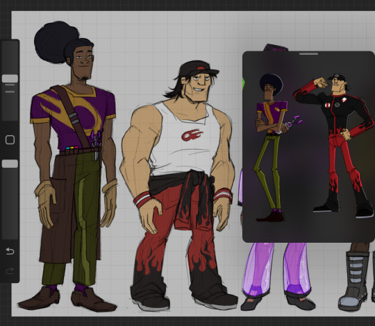
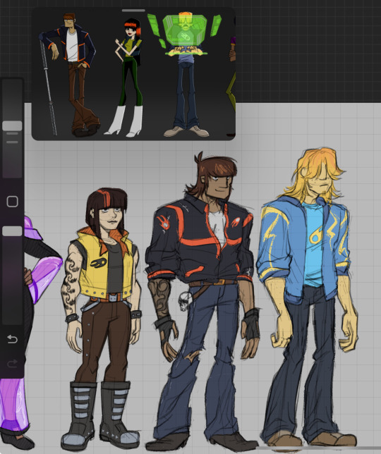
future interpretation of the gang, ill prolly add jacob later on, but i really like how it came together with the help of @giantrobotslug
(notes below)
- The burners here are in their mid to late 20s
- claire officially moved into motorcity, rocking her own style (smth like cyberpunk/futurepunk? with a mix of retro space chic, and racer outfits as well, similar to the amazons episode) i will probably design more outfits for her since shes so fun to draw
- dutch works along the cablers with tennie, so he picked up a bit of their equipment into his everyday outfit (outside of driving), always has his mask and wrench on him, but also uses a coat from time to time when taking time alone to make art
- texas picks up workout, and gains weight and strength, but his suit's sleeves cant fit his arms in, so he just ties them by the waist and calls it a day lol
- julie around this time has already cut off ties from kane, completely changing her look, piercings, a nine lives cat sleeve tat on her left arm, and a burner flame tattoo sleeve on her right arm (that i forgot to add) matching mike
- mike's still holding onto his iconic jacket with a few stitched up rips here and there, loosely worn with the bottom tucked in, he keeps his sleeves folded to show off his tattoo, plus practicality, he also has his spark staff clipped to his belt
this was the second time i drew him, since his first draft looked kinda off
- chuck takes up a more loose/casual and comfy look, with a coat resembling the design for his matching ride, blonde thunder, he also has longer hair
#tattoo idea for mike was designed by @r0b0t1me#motorcity#azzy art#this was so fun to do#art#fan art#mike chilton
215 notes
·
View notes