#yayy we are so back!!!
Explore tagged Tumblr posts
Visit Tumblr Blog
Explore Tumblr blogs with no restrictions, modern design and the best experience.
Last Seen Tumblr Blogs


Fun Fact
25% of US internet users with an annual income of $80-100K use Tumblr.
Note
hello adeleine what is your favorite color
day 138
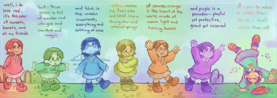
when the world is so full of color and vibrance, how can you choose just one?
#yayy we are so back!!!#i think shed have a preference for red based on that one 4koma and her beret but when living through such wonder filled lenses i find it-#-hard to believe she would just choose one#adeleine#adeleine kirby#kirby series#day 138#ask#been hoarding this ask for a while not bc i didnt want to answer it but because i really needed to marinate the answer. let it sit.
327 notes
·
View notes
Text

secret santa gift with riv for @sagewren ~🔥
#drawing#ffxiv#elezen#wildwood#monk#ffxiv monk#rivaer#okay so i've had this sitting around for a month but we only swapped yesterday sooooo#always nice going back to painting#hadn't done it in a while ;w;#he gets fun colours yayy
50 notes
·
View notes
Text
Me n @bubba-buff drew Sakura a (Not belated I Have NO idea what you're talking about) birthday gift of her from childhood shows we watched

here's Bubbas GORGEOUS art (THAT THEY DREW AT THE SPEED OF LIGHT BTW??? The skill on them like what 😭) with my colouring and shading!! This is her from winx club,,, I like the sparkles they were fun to add. I mean I literally used a brush to do it but it was still fun lol. I SPEDRAN THE AXE SHADING BC I DIDNT KNOW WAYY INWAS DOING IDK HOW TO SHADE METAL WAA 😭😭😭

Heres my art with Bubbas gorgeous colouring 💞💝✨️💗♥️❣️💓💞💝💗❣️💖💝💌💌
My dad made fun of her hands 😞😞 BTW SHES FROM CARD CAPTOR SAKURA!!!!! I couldn't pick between literally making her card captor Sakura or making her a clow card so i kinda mixed both??? It doesn't look like a clow card or like she's a Card captor but blegh! It was fun. And it was also fun when I finished the colouring before bubba could bc of the flowers lmao
#happy belated birthday Sakura#Sorry we were late#Also sorry my post is later than Bubbas I'm watching the land of waves arc and getting distracted#Chat why does no one talking about how traumatising it would be to see a friends 'corpse'#BRO IM WITH SOMEONE RN I CANT BE CRYING ALONG WITH SAKURA#EW U HAVING FEELINGS??? CRINGE!!! STOP!!!#Lol Zabuza attacking Kakashi and the png of Kakashi just moved backwards slightly 😭#They don't like Naruto and is it bad for me to say I hope they get sad during Zabuzas speech thingy at Hakus Corpse#They seem emotionally checked out of the show I want them checked back in#They are not ready for when we get to the actually exciting parts not bc of the parts themselves but bc im gonna be stimming#Like crazy#I'm gonna be so distracting 😭😭#I hate Gatō did you know he has a Canon birthday#Its 30th of April btww#Moldy-flowers#Moldys-art#Bubba-buff#Yayy omg we're twinning!!#I gor distracted again gatō dked :)#haruno sakura#naruto#sakura haruno#my art#naruto fanart#Sakura my beloved#She's literally my wife
23 notes
·
View notes
Text
this week nintama rantarou took me out back punched me in the chest repeatedly for ten minutes straight and left me to bleed out in the snow. send tweet
#KOHEITA AND SENZOU INTERACTING WAS EVERYTHING I COULDVE ASKED FOR#IM SO HAPPY#anyway i cracked and made a provisional acc to watch the new broadcast LMFAOOOO. it was amazing and beautiful and perfect#the fight choreography for tomesabur0ou and monjirou was EVERYTHINGGGG#them hiding in that little secret compartment was EVERYTHINGGG its giving like#romcom where the two main love interests end up hiding in a closet super close 2 each other... um. anyway what#GRAHHHHHHHHHHHHHHHH we are so back#really like the energy season 33 has brought to the table so far. its been a while since they had an arc that was this long YAYY but i like#season 30 thru 32 having just a series of special introspective episodes too!! but also YAYYY extended arc of shenanigans and tomfoolery!!#quirinahscreams#very excited for tomorrow RRRAGHHHH
12 notes
·
View notes
Text
Listened to the first 2 episodes of the Magnus archives today am I a real tumblr user yet?
#it was good so far#I’ve heard that the first season is pretty much just short stories but there’s plot later?#we shall see#the magnus archives#tma podcast#tmag#amber rambles#I’m going back to my podcast roots yayy
13 notes
·
View notes
Text


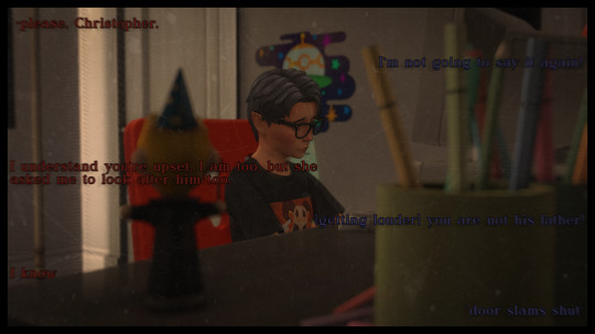


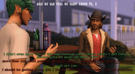
Sebastian and Grffin talked for a while longer, Seb told him about his family, about Elowen's immortality, and about his plan to become a vampire...
previous // next

#ok so i realized i never said this#seb has no memories of griffin other than that one#of his dad yelling at someone#and at the time he didnt even know who it was but he knew it had something to do with himself#and now it just came back to him and he put the pieces together#editing the flashback part was really hard i tried so many different things trying to give the vibe of a flashback#and thats the best i got 😐#anyway long tags ramble but next posts we get back to our normal layout yayy#ts4#ts4 legacy#sims 4#sims 4 legacy#tjolc#save: tjol#tjol: sebastian stein#tjol: griffin kane#tjolgen1
25 notes
·
View notes
Text
corporate wellness mindfulness 30-mins obligatory training (which most of the staff are skipping) for mental health day in which the moderator said mindfulness is cool and punk rock
#i wish i was making this up....#last year we had cupcakes but apparently a 30 mins teams call is cheaper....bring back the cupcakes they were better for my mental health#ALSO we might be going through round 3 of layoffs yayy!!!!!#im so glad im leaving soon because this situation is all hilarious and i wouldnt be able to appreciate the ridiculousness of it if i wanted#to stay
5 notes
·
View notes
Text
NEVER KILL YOURSELF!!!!
#just had such a good past few days aaa#i had a lab party/gathering which was rly fun#and then got to see my brother!!!! and the concert was soso good aaaaa#ans then we had a nice morning in london and i showed him around stuff#(its his first time not going w parents or school)#i have to go back to work now but its sunny and it's spring#and my professor thinks im doing a rly good job#yayy#lala#and I'm seeing some friends from undergrad tomorrow who i havent seen in ageeees#yayyyy#im so joyous
5 notes
·
View notes
Text
shipping characters who are thematically linked is the best. is all the mirroring hinting at them being in a relationship? definitely not but i sure will eat it up
#samtxt#i'm trying to post this but tumblr is fucking up. will it post this time. we shall see#YAYY IT DID!#anyway prfr is so ripe with stuff that's like. clearly a call-back to that other guy. i will choose to believe this means they're fucking
19 notes
·
View notes
Text
speaking of bsol through speaking of xmas xtrav that like i'm so augh god hand over heart falling over (just like the bloodsong b/c it's the like conclusion of being Overwhelmed By Artistic Effect that then in the ideal version you may as well die) at the thought of the finale where you have the main plot conclude as that Story w/those Themes like ah but even then, the influence, the other the musicians now, that this whole time like yeah you have to do it even if you just keep building or die or were thwarted even prior to that b/c you didn't know you wouldn't be....but that then just like in the opening song Outlaw or sort of distillation of the theme abt being someone making art Last On Land or that at other points other characters have emerged as not really their characters not really a greek chorus but elements of the story helping to Tell It, here's Everyone again for the friendship song altogether & each with an instrument & like not even able to see it but pics & imagining & the enthusiasm & the Thematic Resonance like this is when you are pursuing these pursuits together like _o__ (splayed out facedown emoji) aaauuughhh ;;mm;; bsol finale with everyone showing up playing & singing & dancing the song celebratory finale it's all the Theme when the full cast of Characters had only ever all been together for the one standoff scene at the end & yet obviously We've known them all & everyone is outlaws which is a song like i'm already going sicko mode & this is just the intro, so yknow, The Conclusion, good lord find an iconis musical finale without that place for the celebratory outpouring of enthusiasm right amidst other feelings & situations but Good Lord Here's This in a story that'll always have been all about people's depths & heights & widths & breadths & variations & tumult & all the dimensions, people will have Brought It all over the place & it's like yes leap around together playing & singing this song together which isn't The Story but is such an extension of it b/c bsol has its show within the show quality still infused all in it & if this flurry of Actors Celebrating Outpouring We Put On This Show but still within the show you are seeing as an audience in this venue wouldn't have been part of the original plan with a whole [outside the show within the show] plotline like. embraces bsol holding it so hard my becherished
#bsol#& in true xmas nature yknow like yeah i think of the whole show like wwaaughh think of the baby please come home like Aauuuughhh#think of specific moments within & none of those make me weep but they do make me go omg & woww yayy & clap & cheer & caper & gambol#but what everything has been: all about its central theme & bsol/xmas playing w/& sending up Genre Conventions we all know & thus can be#enough on the same page about so as to then be on the same page abt what's Unexpectedly done w/them but it's not just about#like oh we do this to be Above it b/c it's also done abt genre convention stuff that's enjoyed & interesting to its creator here so#that also as ever the Heart of w/e the genre stuff being messed with is Earnestly Kept & that's what all this is used to express things#with in addition to being able to have fun & explore things that plausibly a completely straightforward recreation type homage couldn't#or couldn't do as well without sacrificing one or the other vs if you're already doing an open like remix playing with exploration; then...#the conclusion of the xmas show isn't yeah i love xmas isn't that cringefail of me. yeah these xmas special media we're working off of#isn't that all so silly & no matter how much i love it it's important to end up Above It. like nobody's here to be above shit good god#soooo much more you can do if you don't have to prioritize That central theme. [you & me; We're superior] undermines Anything Else#while never holding yourself as Apart & Better lets anything else grow & flourish & have the Capacity & Flexibility to be & do whatever#the villain as an emotional reflection of part of the hero / representing a Possible Version of them; not Who They Could Never Be#as Only a force to be overcome with your greater force; though naturally yes the villain creates conflicts & stakes & obstacles#& in these so very genrey xmas bsol situations i'm clapping cheering go also very fun & funny little villain who kills you Gooo#100% this bitch Oh No Not Miserthorpe Krampington Thornwassail Cocodrilo that's right you fucks ahahahaaa >:) die btw#thinking about specific parts of bsol like oh wow oh yay oh this fun turn into this bit oh what a scene what a song wahooo#then overall like lying back reaching up Bloodsong....#thinking of the finale friendship song actors as actors ish characters ish ft. instruments 😭😭😭😭😭😭 (one each)#this mf (gesturing to myself who'll inevitably fire up Outlaw.mp3 at any moment & go Augh the harmonica the harmonies the chorus The This)#also that obviously i get to have a delightful time going well so of course lo cocodrilo is gay; perhaps & trans; &....
2 notes
·
View notes
Text
And in typical Unallied Queens fashion, we are putting the boys in situations until the context is complete for a doodle that I made once. yay! And that doodle is in the next chapter!!!! soon tm
#it is what it is#idk why these sections of dialogue were so agonizing to complete.#like every day I came back to try to add something so I can move on and I'd just rewrite the most recent paragraph#and then add one sentence#OUGGHHHH#but it's a lot more fun than the original draft for this chapter so I suppose I gotta take what I can get from this brain of mine lol#also. it's only agonizing because I would very much like to write but then can't make full real people sentences yayy we love it
2 notes
·
View notes
Text
IM FREE I WAS ACTUALLY ABLE TO WRITE SOMETHING TODAY
#vixen rambles#slapped down 2500 words in like 3 hours. We Are So Back#have 2 go get ready for friend's art thingy but yayy ^__^
6 notes
·
View notes
Text
Been devastated to find out that because of TMJ (my jaw joint dislocating itself) I'm basically unable to make out with my bf anymore X____X
#if im lying down on my right side and kissing him itll discolate itself almost right away#i start feeling pressure on my jaw and if i try to open my mouth#it just wont open yayy#laying on my back is better but it also feels a bit bad#i love making out and this has been so frustratingggg#luckily my bf is patient with me and said its okay and that we gotta learn how to do it#and try different positions if they could help#QAQ#personal#bf
2 notes
·
View notes
Text
i feel like the whole debate about whether or not p3r looks good is entirely reliant on how good the UI looks, which is a shame because something can really be said about how atlus wipes away any creative freedom and art direction their games have when they give them remakes. the original persona 3 had an art style that was reflective of the narrative of the story, and its new, shiny coat of bright colors, perfectly sanatized talk sprites, and big flashy effects feels distracting. they did the same thing with persona 4 golden, in which its terrifyingly bad compared to the original, and the new sprites of radiant historia: perfect chronology are infamous for how much everyone does not like them. which is a shame, because i think atlus does a great job at picking what art style and aesthetic to use for their video games. theres a reason why persona 5's style is so famous ! not to mention other games like smt3, etrian oddyssey, and even in its newer IP's like unicorn overlord (terrible name, so glad they're going back to exploring with fantasy rpgs). the ui is amazing yeah but it isnt the only part of a game that should be discussed in terms of art direction
#.text#anyway ive seen a lil of the beginning of the game and it looks great yayy ! i still dont like how bright it is!#these are not mutually exclusive.#it kind of just frustrates me that majority of twitter discussions on this are like#someone going man the talk sprites are so boring. and then another guy going 'so you want to go back to the shitty email menu?#is that it? you want to go back to the microsoft powerpoint ui? fuck you.'#and its like man. what#that being said AGAIN i prefer the beta ui designs a lot more#i dont like the bright colors at all. maybe if it were more muted ... alas#but anyway atlus does this sometimes. we should talk about it. maybe theyll stop
3 notes
·
View notes
Text
did this event also at almost the last minute but this one was very fun :]
#personal stuff#thorn plays genshin#i liked the story a lot. chiyo mention yayy + connecting the abyssal nightmare state we saw in natlan to her lore from the masks#also the shot of the inazuma friend group WITH makoto waugh. auuugh#thoma gave me mondstadt / ludi harpastum crumbs so i'm happy. soo sad he didn't actually get to collaborate with the trio though :(#ayato and ayaka sibling moments CONSTANTLY making me cry. he lost on purpose so she could play cards get me out of hereee#kokomi and gorou appearance WITHOUT a gorou and yae scene yayy. also the appearance of the swordfish members was really nice#and heizou!!! heizou appearance!! so glad he got to show up again after his like 5 seconds last time#also getting more sara moments is nice i do like her :]#and the mentions of the irodori festival via npc with calling back to albedo and klee and xingqiu was nice too#and it's nice to see characters from inazuma who live abroad coming back for the festival too. kazuha and chiori and kirara yayyy
0 notes
Text
had a dream in a dream in a dream tonight. today? when i was sleeping.
#but it was all vacationy#don't remember the beginning but then we went to a restaurant#and didn't know what to order so i went deeper into the dream where we went for a walk instead#and went through some kind of weird tunnel that was partially underwater and you had to dive through it#so I went deeper into the dream and we were back at the hotel (rlly high Wolkenkratzer)#and forgot it was a dream so I couldn't go anywhere anymore :(#but we went down into the basement where the Fundsachen were#and found a bunch of comics yayy!! mostly Green Lantern. Well mostly Somebody I Don't Know And Probably Doesn't Exist In Comics IRL#and we figured out they belong to a girl who was trapped in a box under the hotel?? and she doesn't know how she got there she just woke up#in it at some point.#Which meant Oh It Could Happen To Any Of Us Oh Noooo (horror movie ish)#but she was just chilling and then we figured out how to get her out (Pikachu helped her for some reason)#👍#doddie redet#doddie träumt
1 note
·
View note