#where you could reSIZE images in the post
Explore tagged Tumblr posts
Visit Tumblr Blog
Explore Tumblr blogs with no restrictions, modern design and the best experience.
Last Seen Tumblr Blogs


Fun Fact
Tumblr has a low social media market share in South America.
Text

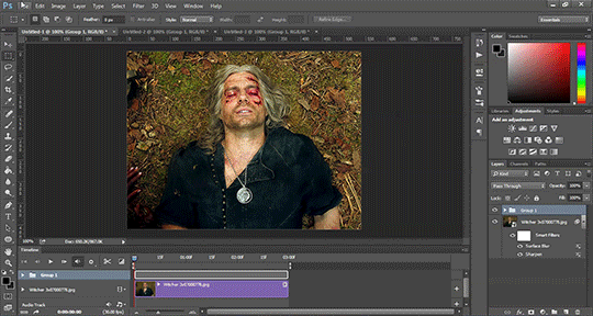
ms paint. you know her. u used her age 8 to make loads of rainbow ovals all over the canvas and then scramble it with selection tool. now u will know her true powers with my handyrandy tips under the readmore. some will be pretty basic and others are very special.
this post has 8 cool trix to learn for you. enjoy and i may do another in the future if i remember/learn more stuff
some of it might be common knowledge. but its got some deep cuts. all tips have gifs to show process easily.
🙂 enjoy and i hope this encourages you to fuck around in mspaint more
soundtrack for this post (loop it while you learn for advanced learning experience)
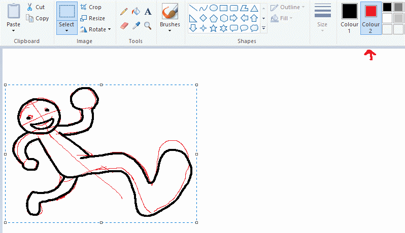
TIP 1) the right click trick
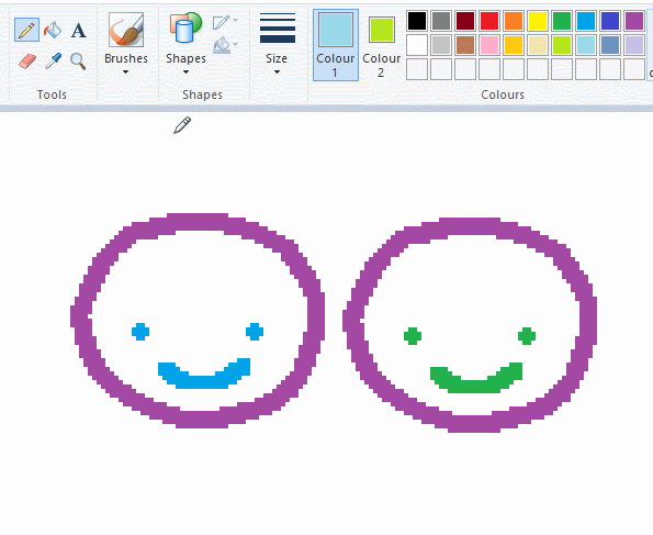
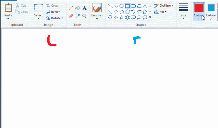
left and right mouse click correspond to col1 and col2 respectively, which u can see in the top bar. this applies to all brushes and the fill tool like above. when using shapes col2 will be the fill colour (if you have solid fill selected). right clicking with shape maker will reverse the colours use on the shape.
TIP 2) right click eraser
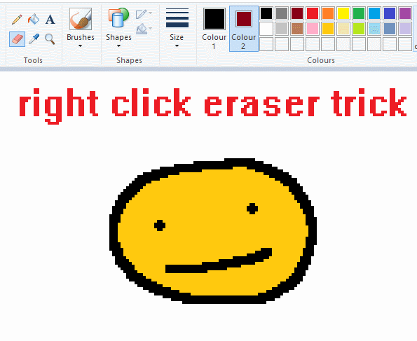
this one is extremely helpful for lineart or add shading. the eraser always uses col2. so your eraser can technically be any colour. but here's where you get powers: right clicking with eraser will only erase onto col1, with col2.
TIP 3) transparent selection change a guy destination
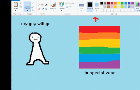
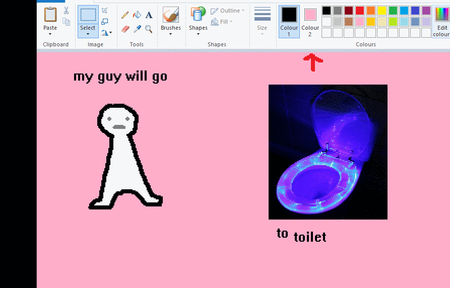
the beloved transparent selection tool works based on what is selected as col2. so long as you have the correct colour as col2 you can make any image transparent and put it on top of anything else. and yes this works with photo bg as you can see.
TIP 4) the gradience
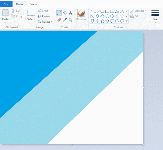
this one is a little more complex. you want to start off with any canvas size, and make as many diagonal coloured bands as you want. (protip: holding down shift makes a perfectly diagonal line with line tool)
then you need to resize the canvas to a width of 1px (make sure you resize by pixels, and do not maintain aspect ratio). then resize again back to its original width (or a different width i cant stop you). you will have your lovely gradience.
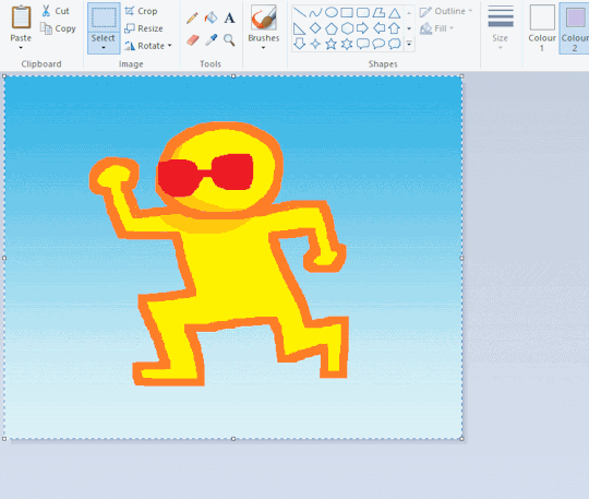
TIP 5) superimposter

so. you got a cool gradient and wanna put a guy on it. heres what i do:
i open a 2nd mspaint with same canvas size and draw whatever i want on there. i then pick a completely unrelated colour to my entire piece, and set that as the bg. you could use white, pink, geen, whatever you want as long as it doesnt appear somewhere else in ur drawing. copy the guy.
go back to your gradient tab. ensure that col2 is set as that bg colour you picked (lilac for me). have "transparent selection" enabled. paste your guy in. cue fanfare
TIP 6) advanced superimposter
the great thing about this method is u can put multiple gradients in multiple areas of the image. this is where it gets all japanese printmaking type of shit. ukiyo-esque
all you need to do is make another canvas with a new gradient, ensure col2 is set as the colour you want to replace, then paste your original piece onto the new gradient. now my guy has a soft fade. you can do this as much as you want. (you could even make a canvas with a texture or photo and paste your drawing onto there)
TIP 7) "sketch layer"
so as you now know, col2 is what is removed when you click "transparent selection". which means you can also remove any instance of a colour from ur drawing. which means you can have a unique colour for sketch layer and remove it from the drawing later. i admittedly dont do this but it is a great trick to have.
now combine this with lowering your dpi for smoother lines. may seem obvious but it helps. its like a free stabiliser whenever u want.
TIP 8) rainbow art
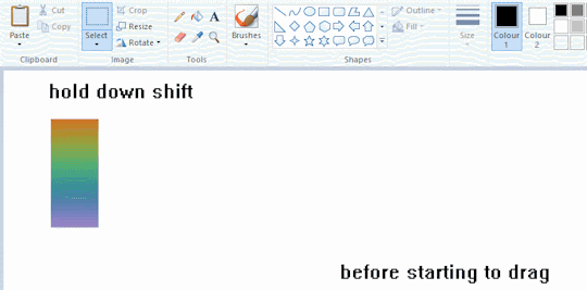
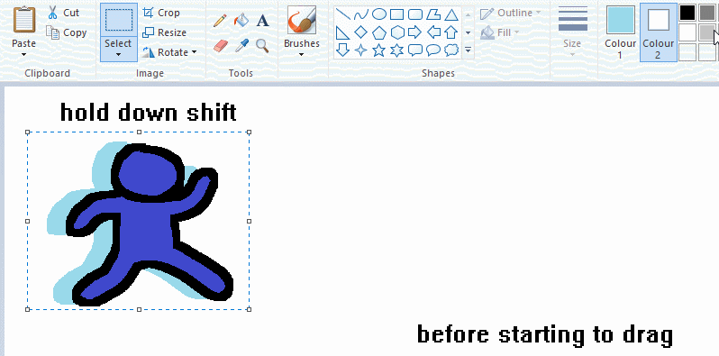
now this is where you can get dizzee rascal "bonkers". check out my small and shitty rainbow trick. you can select anything and hold down shift, then drag with left mouse, to turn that selection into its own brush. i even did it with a guy. and you can of course do this with a photo as well.
🙂well that it for now. hope you liked it thanks for reading now back to your regularly scheduled tgcg programming
2K notes
·
View notes
Text

Hello and welcome to "Icon Making With Killian: An Intro to the 'Lost' Art of LiveJournal Icons"
aka, I'm still making them and I'd like to teach you how to do it, too!
This tutorial was written in Photoshop 2020, but you can probably recreate it in as far back as CS2-ish (since I still use the same sort of techniques I've been using since then, lmao). It also assumes basic understanding of the software, though I've tried to be as clear as possible throughout.
With that out of the way, let's get this tutorial on the road!!!!!!
I started with the bloomed art of Hiiro from the White Lilies scout box (image courtesy of the Ensemble Stars!! English Wiki).

I basically always start with a blank 100x100 canvas and paste the image into it. I try to go into icon making with a vague idea of what I want to do, and I knew from the beginning that my vision for this icon would have the top 1/4-1/3 of the image covered by a solid band of color. To make positioning the image of Hiiro easier, I made a rough version of the band with temporary colors (though they're pretty close to what I ended up using in the end).

With that in place, I could start working with the actual image for the icon. After pasting it in and adjusting the layers so it was under the band, I resized it and moved it around a bunch until I was happy with the position. Once I liked how it looked, I used an Unsharp Mask on the base.

Next up, I used a texture from lookslikerain. However, purple is all wrong for the color scheme I had in mind, so I went to Image > Adjustments > Hue/Saturation... to change it up to better suit my needs. Never be afraid to mess around with textures!

Here's how I adjusted this specific texture, but each one is unique- both the texture and the icon you're creating, so it's best to play with it until you get good results.

I then pasted this into the icon, making sure it was under the layers making up the top bands of color (because I was only trying to affect the base for now), and set this layer to Darken.

Now it's time to mess with the colors of the top band. They sorta matched before I did anything to the base, but now...not quite. I used a layer style for each part of it, but using the paint bucket tool would work just as well. I went to Layer > Layer Styles > Color Overlay... for each, changing the colors as necessary. The thickest band is #85d0bf, the middle band is #086371, and the thinnest, lightest one is #fcfcd8.

Time to start putting stuff on top of everything!! I took this light texture from ianthinae, rotated it, and set it to Lighten. I decided I wanted it to be a little bit brighter, so I duplicated the layer, set it to Screen, and dropped the Opacity to 20%.

I then used a texture from Sarah-Dipity and set it to Lighten as well.

Okay, now that's what I'm talkin' about!!! It's time to throw some text on this~ I went for something simple to go with the theme of the story this card is from: Princely. The font is Georgia, 10pt, in #086371, set to all caps. I decided it didn't stand out enough, so I duplicated it, changed the color to #8b4235, dragged it under the first text layer, and moved it 1 pixel to the right.

I wanted a bit more embellishment around it, so I used this simple tiny text brush from colorfilter in #06444d. I also erased part of it to make it fit the space better.

Finally, I used a texture from shiruji, set to Darken to get a bit more color variation in it, and called it done! :D

If you have any questions, please feel free to ask, and I'll answer as best I can- as long as it's not about making icons in other software D: I only know Photoshop (and Paint Shop Pro, but I don't think anyone uses that anymore). If there are any other icons of mine you're interested in seeing tutorials for - or even just specific techniques! - just lemme know. I love helping :D
Also, I'm happy to share where I get icon resources from. I have a whole post dedicated to that on my DW graphics journal, though tbh that's the best place to talk to me about making graphics in general. But I will absolutely answer asks/replies/etc about icons here on tumblr, don't worry!!!!
#livejournal#icons#icon tutorial#graphics#graphic tutorial#photoshop#LJ icons#100x100 icons#100x100#tutorial#tutorials#reference#what do I even tag this as XD
91 notes
·
View notes
Text
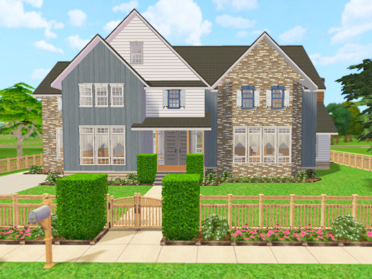
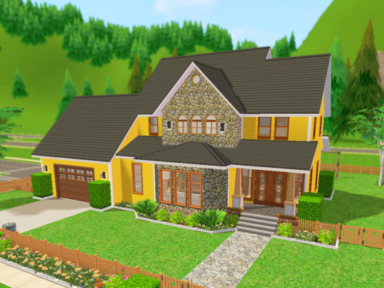
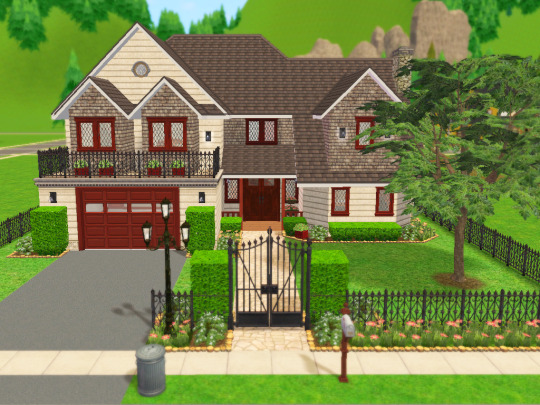
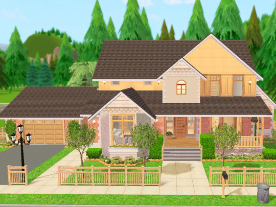
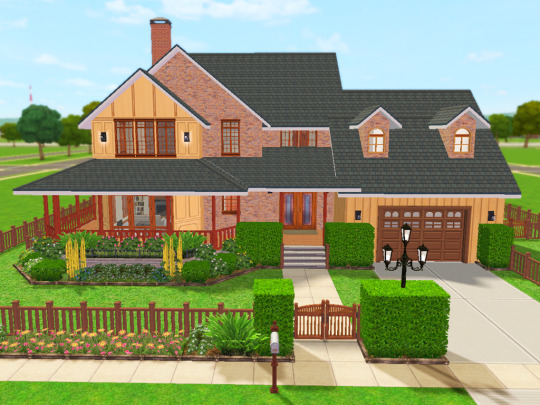
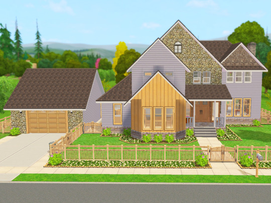
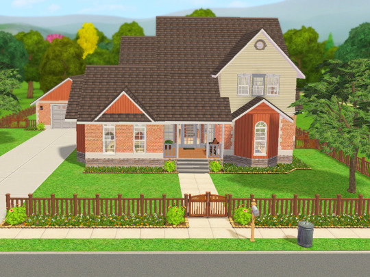
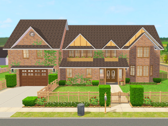
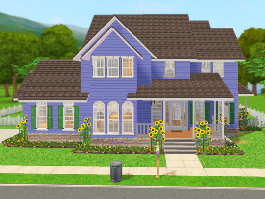
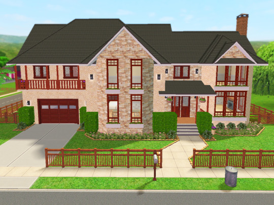
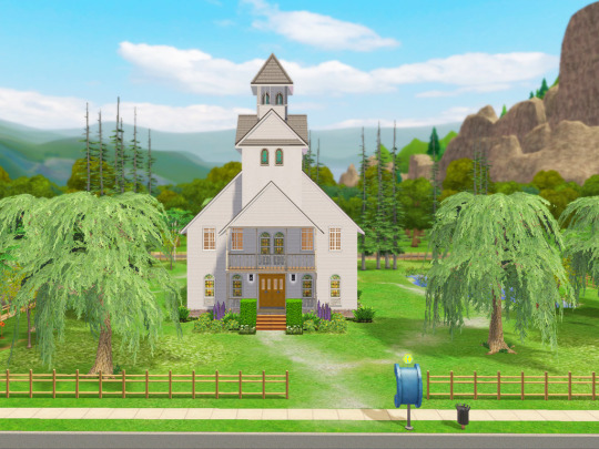
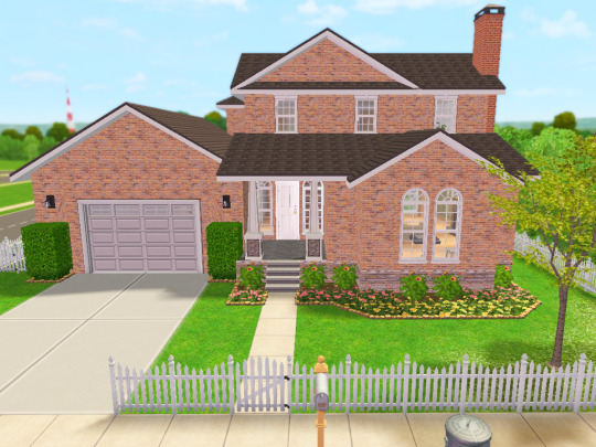
Lot Previews and Build/Buy Mode Mods I use
Finally! Pretty much everything I had on my old Simblr has been reposted here! Thank you for your interest in these homes. I hope they continue to bring a smile to your face as you play with them. 😊
Here are some previews of the lots I've been polishing up recently. Fun fact: 90% of these lots started out as houses I built for my kids' sims families when they were young (ah how the years fly by!).
These will eventually get uploaded at least that's the plan as I have more time.
Here's where I could use your feedback though:
I love to build and landscape, but decorating the insides...not quite as much.😅
I'd be able to put these lots up faster if you're ok with furnishing and decorating them yourself. I'd add things like kitchens and bathrooms and place beds in the bedrooms.
What do you think? Scroll through and let me know!
I am using Reshade 4.91 for the images that you see. That link will take you to Reshade's official repository folder for Reshade 4.0 series downloads.
Other than cropping and resizing, this is how they look in my game. I'm blessed enough to have a machine that will let me play with this beautiful custom LUT I configured. It helps to see bright, happy colors, especially in winter. 😎
So now a few words about the mods or hacks I use to make building a whole lot more fun, considering I play with very little CC in my game.
I use a number of building cheats such as 'allow45degreeangleofrotation true', 'boolprop snapobjectstogrid false', "setquartertileplacement on", and of course, "moveobjects". If you notice an object blocking something feel free to move/remove it. Grab this mod to allow your sims to sit in chairs placed at 45 degree angles.
I use a lot of shiftable decor mods: shiftable wall lamps, ceiling deco made shiftable, shiftable wall decor. The other day I ran across this mod that allows you to shift just about anything up or down, so I may switch to this in the future. Today I came across Fway's Object Freedom mod which I'm going to start testing out since it includes the "Shiftable Everything" mod. If you've been frustrated by the limits of where things can be placed in order to be used, this might be the answer!
I also use a few default replacements (head over here for a more complete list):
CuriousB's Lush Terrain
Peppermint & Ginger's Shrub defaults
TVickie's Phlox default replacement
PineappleForest's Spiderlily texture default (along with a number of other defaulted things).
Fway's Default Garden Plot
Less saturated BG flowers (I can use the poppies finally!)
Lunatech Lighten Up Ceiling Light Placement Fix
I do use a few other things but these are the primary ones.
And as far as CC goes, these are the only items you'll have to deal with (Use Sims 2 Pack Clean Installer to remove any of these things if you don't want them in your game):
Anything Maxis "Lost and Found", preorder "Bonus" items, or items that were offered on the Sims 2 website. I'll label this in the lot post.
Functional Washer/dryer
Maxis Match Wall Cabinets by CTNutmegger at ModtheSims
Maxis Match Chimney Recolors: Brick, Stucco, Southwestern Style Stucco, Masonry
So there you have a short list of things I have in my game that you may already have in yours, but if not, you now know where to find them. :) I'm looking forward to hearing your feedback on what I should do with the lots (since my time is pretty limited by real life responsibilities). 🎉😄
#ts2 build#sims 2 lots#residential lots#ts2 screenshots#sims 2 build#sims 2 house#lot#sims 2 mods#ts2 mods
50 notes
·
View notes
Note
How do you do your Final Fantasy edits?
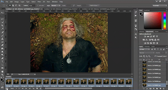
The hard way, my friend. No AI is used here, I do it all by hand. 🥰 I assume you mean the screenshot manipulations I create? I'll try and give a simple summary... First, I boot up Remake on PC and use a "free camera" mod(you can find the links to the mods I use on my archive pages for manipulations, which is on my pinned post) to take a couple screenshots that I think will work well together. Sometimes I change my mind and choose a different one. It can be hard to match the camera angles and lighting, so sometimes I have to mess with that later, as well. But it's easier if they fit together from the beginning. We'll take my current WIP as an example. I started with these two screenshots:


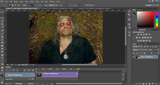
I open them in the free program GIMP (GNU Image Manipulation Program), which anyone can download at gimp.org. Then the first thing I do is choose the base image. In this case, they're both facing the same way, so I choose to flip Sephiroth(you can't really do that with Cloud easily because of his earring, and his hair is less symmetrical). Since the camera was closer up on Cloud, and he's the smaller one, I usually choose Sephiroth's to be the base image. With that decided, I roughly cut Cloud from his background and paste him onto Sephiroth's image as a new layer. Then I position him, resize him, rotate him, whatever I need to do until he seems to be in the desired place, which ends up looking like this: (I ended up adding snow for this preview, so it would look more complete than it is when I showed it to my server, haha)

If you look at Cloud, you can still see a thick outline of his old background around his head. Once he's positioned properly, it's time to remove the rest of his background(I use a size 10 eraser with 100% hardness and zoom in about 5 times). Then I need to think about where they're connected, and how to make them look like they're touching, as well as layering to make them seem intertwined, as if they're truly occupying the same space together.

I cut away some of Cloud's shirt, and the rest of that effect will come with shading later. If I wanted Cloud even closer, I would make a duplicate of Sephiroth and erase his background, so that his lock of hair would appear to go over Cloud's face. I could also make it semi-transparent, so you could see the outline of Cloud's face through his hair. You can see I have some small game defects to fix, such as Cloud's hair clipping through his ear. I leave those tiny details for later, typically. Sometimes, because of their height differences, I have to "rebuild" missing parts of them from scratch, such as I did for this other manipulation:


It's a delicate process that's mostly the clone tool(to keep the textures) and some freehand drawing, but I don't have an art tablet, so I use my mouse for everything, which can be quite challenging. I've had a lot of practice from translating doujinshi, where I'd erase the words, rebuild the missing part of the image, and then place the translated words over that spot.
In any case, I decided I wanted more out of this manipulation than just leaning against each other. I wanted Cloud to be reaching up towards Sephiroth, and perhaps for Sephiroth to be pulling him closer. To do that, I needed pictures of their hands/arms like so:


I've taken hundreds of shots, so I looked through what I had first, but it wasn't the right angle, or was the wrong outfit for Cloud, so...then you open up those images and cut out the parts you want. After that, you work on positioning and things like that again. I haven't finished with that part yet, so it looks a little awkward. (And when you're doing these kinds of things, color matching is very important, but that's a bit advanced.)

I'm not fully satisfied yet, so I'll probably remove the rest of the background from the arms and then mess with the placement. As for Sephiroth's hand, I intend to thread it in Cloud's hair, so Cloud will need to be duplicated in order to create that layering effect, as mentioned previously. Which should end up looking similar to this one:

(I had to draw in most of Cloud's hand because I didn't have the camera mod back then, and the Sephiroth shot was provided to me by Coeurlwhiskers.) After that, it's a matter of shadows and highlights, remaining details, and finishing up the colors, etc. It's a long and difficult process, and can take many hours to complete, depending on how ambitious I get with it. Most of that stuff would be a much longer tutorial, and I did used to do some actual artwork a long time ago, so I...kind of know what I'm doing?? I probably do a lot of stuff the hard way(like not using layer masks) because I just don't have the time to teach myself more than the basics. 😅I know it may seem daunting, but it's really fun! I hope I managed to answer your question properly. Feel free to ask follow ups~
20 notes
·
View notes
Text
Updating... The Tattooer (ver. 3.4)!
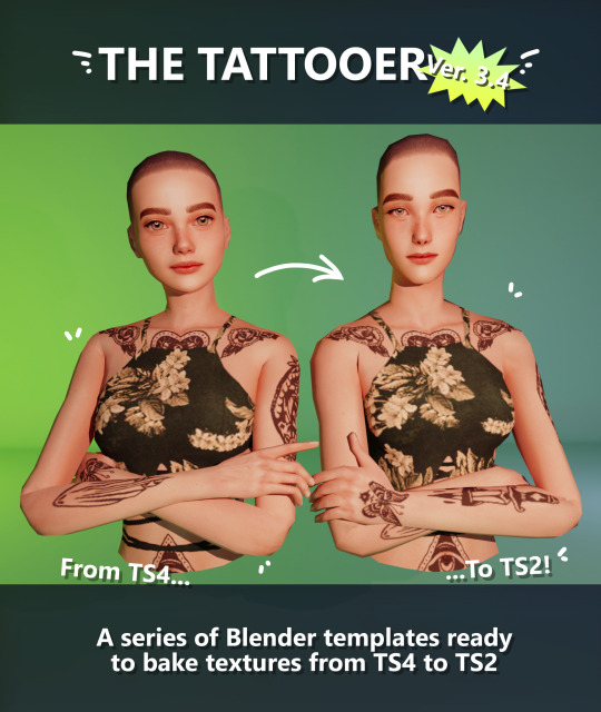
Finally! Took me a while, huh. This is the updated version of the Tattooer project. It skips some steps, making the workflow much, much faster! Huge thanks to @applewatersugar for his suggestion on how to bake textures while preserving the transparency. This is kind of a repost of the original Tattooer post, but it actually has some new stuff and a few changes here and there, so please take a look if you want to learn how to use this new version.
This is a series of Blender template files already set up to quickly bake textures from The Sims 4 to The Sims 2. The different Blender files will allow you to: -Bake body textures from TS4 to TS2 (Female) -Bake body textures from TS4 to TS2 (Male) -Bake body textures from TS4 (Female) to TS2 (Male) -Bake body textures from TS2 (Female) to TS2 (Male) [Bonus!] -New! Bake face textures from TS4 to TS2 (Unisex) [Bonus!] -Bake head textures from TS4 to TS2 (Face + Scalp) (Unisex) [Still experimental] Check the file names to see which one is which, and the resolution of the baked texture it will give. Everything you see in the render above was 100% converted using those Blender files.
Download here! SFS / GD
Update: Version 3.4.1 (27/08/2023) Fixed some issues on the shoulders for the AF-body-4t2-1024 and AF-body-4t2-2048 templates. Now the top straps on most converted underwear/swimwear should look right.
Update: Same version (13/12/2023) As requested, added a new spanish version of the included pdf guide!
These templates were made mainly to bake and convert tattoos, but there’s more you can do with them if you get creative. I have to say, these are NOT perfect. Results may vary depending on what you are trying to convert, so! With that in mind, this is all the stuff you will be able to convert almost seamlessly from TS4 to TS2: -Tattoos. -Other body details such as body hair, scars, freckles, supernatural/occult details… -Body painted underwear and swimwear, as well as some other clothing that’s mostly painted on the body. -Socks, stockings and maybe leggings. -Even skintones! In some areas they will look weird, so I recommend editing and blending them with other existing TS2 skins. -Makeup, eyebrows and beards. In the old version this was just a proof of concept, but now I’ve added a new Face file template which gives some pretty decent results! -Hair scalps. Very useful when converting some hairs! Although keep in mind part of that texture might also need to be baked on the face mesh, you know, that hairline makeup stuff.
Got your attention? Nice! Editing some of the textures from TS4 to match the UV mapping in TS2 using a 2D editing program can be incredibly hard. That’s where texture baking in Blender comes to the rescue!
You will need to download Blender, at least version 3.4, but you could always use a newer version. It is only incompatible with versions older than 3.4. -You can download Blender for free here. -You will also need Sims 4 Studio to extract the original Sims 4 CC textures you want. In the first version of these Blender files, there was a necessary step using Photoshop, but that’s no longer needed. However, there’s still a tiny extra step which requires resizing the newly baked texture on some of the high resolution templates, so you might need a 2D editing program like Photoshop. More on that later.
So, before we begin, let’s clear out some questions you might have. What the heck is this texture baking thing and what does it do? Well, let’s imagine you have a video projector and point an image into a blank wall. Then you pick up some brushes and start painting and copying that projected image in that wall. Texture baking is kinda like that when it comes to 3D models. You align two models and match them as closely as you can in shape and form, and once you adjust some parameters and values, Blender does the rest for you: it will give you a new texture for a new model with a different UV map. These files I’m sharing have everything already set up, so it’s a matter of plopping in that Sims 4 texture and you will get that new texture for TS2 in just a few clicks.
This tutorial assumes you know literally nothing about how to use Blender, so if you feel uncomfortable with it, worry no more! This will guide you with pictures showing where you need to click and explaining what is happening. For Sims 4 Studio and Photoshop the process might be a bit less detailed, but still this should be pretty beginner friendly. For this tutorial, I will use some tattoos as an example (properly credited at the end of the post). Alright, enough with the rambling. Let’s get started!
·EXTRACTING TEXTURES IN SIMS 4 STUDIO: First things first, you will need to extract as pngs all the textures you want to convert from TS4 using Sims 4 Studio. It should be pretty straightforward. Just open the packages and export the Diffuse textures. Keep them organized in a folder for easy access.
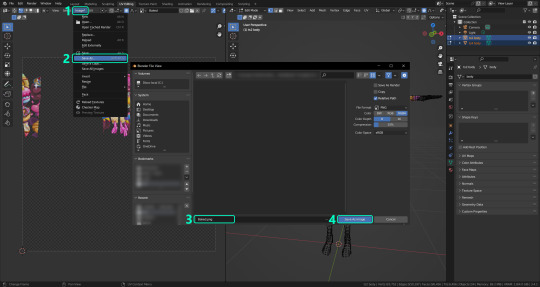
·BAKING THE TEXTURES IN BLENDER: PRELIMINARY STEP 1: CONFIGURING BLENDER’S GRAPHICS SETTINGS: Open your preferred Blender file depending on what you’re going to bake and the desired resolution (in this example I’m going to use the AF-body-4t2-1024 file). Before we start messing around in Blender, there’s one thing you should set up. It is a onetime step, and once it’s done, you won’t need to do it again. So, does your computer have a dedicated graphics card? If you don’t know or you’re not sure, just skip to the next step. Configuring Blender so it uses your graphics card instead of your CPU will make the baking render much faster, so it is recommended you set it up correctly. If your computer has a dedicated graphics card, click File (1) > Preferences (2) > and on the window that pops up click System (3) > and select CUDA and make sure your graphics card is there and tick it (4). I have an Nvidia Graphics card but your case may vary. Once you’re done, click on the tiny button on the bottom left corner and Save Preferences (5).
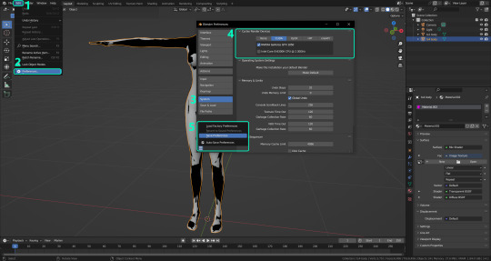
PRELIMINARY STEP 2: CHOOSING THE RENDERING DEVICE: Click on the tiny camera button on the right, called Render Properties (1), and on Device (2) select GPU Compute if it’s not already selected. If you’re not sure if you have a graphics card or not, just select CPU. Then select the Material Properties tab (3) and Save your changes, either by pressing Ctrl + S, or clicking File (4) > Save (5). You might need to do this second step with the other Blender files, but once you have it done and saved, you won’t need to do this again. Okay, time to get into the good stuff!
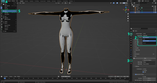
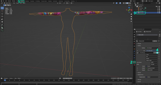
·STEP 1: LOADING YOUR TS4 BASE TEXTURE: In the Material Properties tab, click the folder icon that says Open (1) and on the window that pops up, navigate through your folders and select your first texture. To navigate easily, the 3 buttons on the top right (2) are for the display mode. They will show your files in list mode, vertical and horizontal, and the one on the right will display the file thumbnails, pretty useful if you want to easily preview your textures here. The icons on the left side (3) will let you go one folder back and forward, go to the parent directory, and refresh the folder in case you just dropped something new in there. Double click on the image you need and that will load the texture into the Sims 4 body model, named “ts4 body”.
·STEP 2: SETTING UP YOUR SELECTION AND BAKING THE TEXTURE: On the top right of the screen, you will see the names of the 2 models in the scene. Hold the Ctrl key in your keyboard and left click on the “ts2 body” model (1). If you did it correctly, you should see “ts2 body” in a yellowish orange color, and right down below, “ts4 body” should look more like a red orange. If not, try again by clicking first on ts4 body, and then while holding Ctrl click again on ts2 body. Then switch to the Render Properties tab by clicking the tiny camera icon (2) and click Bake (3). Depending on your screen resolution, you might need to scroll down a bit with your mouse to see the Bake button. Wait a few seconds for it to finish. You will see the progress percentage down on the bottom of your screen. Don’t panic if you notice your computer fans start ramping up, that’s completely normal! As I said in the beginning, using your GPU will bake the textures much faster than the CPU.

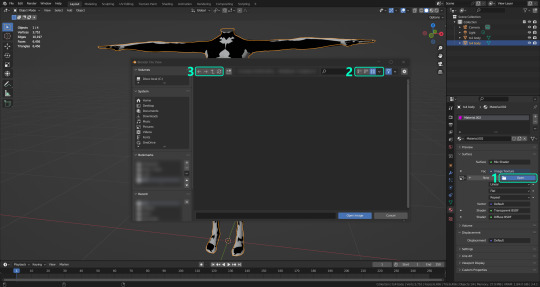
·STEP 3: SAVING YOUR NEW TS2 TEXTURE: Once it’s finished, switch to the UV Editing Mode by clicking “UV Editing” on the top of your screen. And there it is: your new texture! You might have to scroll up your mouse wheel a bit to zoom in and see it in all its glory on the left side of the screen. We’re still not done yet though. You need to save it to yet another new folder (always try to keep your stuff organized!).
You can save it by pressing Shift + Alt + S, or clicking on Image* (1) and then Save As… (2). That will pop a window where you’ll need to navigate again and save it somewhere. Give it a proper name (3) and hit Enter to save it… well, Enter doesn’t always work for me for some reason, so if that happens just click Save As Image (4). And that’s it! You’ve successfully converted your baked texture. Congrats!
·STEP 4: GOING BACK TO STEP 1: Alright! If you’re done with your textures, you can close Blender without saving and call it a day. But let’s say you want to keep baking other swatches. In order to go back to step 1 and start the process once again, click Layout (1), go back to the Material Properties tab (2), select “ts4 body” (3) and click on the folder icon (4) to open and load your next swatch.
Then it’s just a matter of repeating the process from step 2. When you’re ready to move on, close Blender without saving. If you see a small check telling you it will save some images, make sure you uncheck it, so you will be able to use it again in the future from the starting point with no issues. I don’t think it really matters if you accidentally save your progress in these files, but I like to keep it clean and fresh so I can do the process where I left it from the beginning next time I open it. And in case you mess up and save somewhere, you can always just delete the .blend file and download the template files again.
In case you’d like a video tutorial on how to use these files, the amazing @platinumaspiration recorded this fantastic video showcasing the process! You can watch it here.
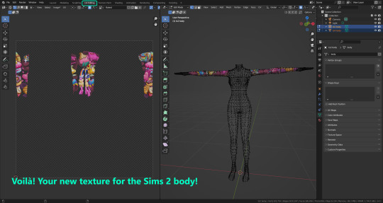
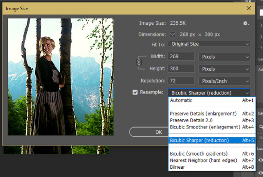
One final note: some of the baking .blend files save the textures with a resolution of 2048x2048 pixels, as clearly stated at the end of their file name. That’s way too overkill, because TS2 only properly supports up to 1024x1024 for most of its textures and you should always resize your final product to that max resolution (or lower if needed). I just made those 2048 versions because there might be some really tiny and slim details on some tattoos that might look a little too blurry when baked into a 1024 resolution texture, so for those cases use that if you want and then resize them using your 2D editing software of choice. In Photoshop, in the Resample mode of the Image Size menu, there are a few options to choose. For the fine details, I like the Nearest Neighbor (hard edges) option, which, even if it looks a bit pixelated, it still preserves most of the texture and quality.

For anything else, I would just directly bake them using the 1024 versions in Blender (512 for the face and scalp).
And for the folks who feel comfortable playing around in Blender, this is just the beginning! Texture baking opens a LOT of possibilities, so feel free to move stuff around and edit the models to your liking! If you notice the baked textures look warped or stretched somewhere, or don’t like where some textures are placed in the S2 body, poke around that area moving stuff and then give it another try. The main objective of the baking process is keeping both overlapping models as close in shape as possible. You may also edit and save new copies of the templates, or make new ones from scratch using mine as a reference (keep a close look on those Baking settings and values, I think they work pretty well) and share them if you want to. Go ham, do whatever you want with them! I still have plans on making templates to convert body textures from Sims 3 to Sims 2, but for now it’s not on my priorities, so we’ll see when that happens.
Whew! Hope none of this was too confusing. Need help or have any issues with these? Please ask/message me here and I’ll be glad to help when I’m able to!
Credits for the CC used in the render demonstration: -Skin by Sims3Melancholic. -Eyes by Northern Siberia Winds. -Eyebrows by PeachyFaerie. -Tattoos by xtc. -Top by SerenityCC. And the Tattoo I used for the tutorial can be found here, by ValhallanSim.
Last but not least, a huge thanks to all the people who somehow contributed to make this project and update possible, either by doing initial testing, finding issues to fix, or teaching me new Blender tricks to make the workflow way faster and easier. So thanks again to @elvisgrace @moyokeansimblr and @applewatersugar on Tumblr! <3
And thank you for reading! Hope you have fun playing with this (not so) new toy hehe.
#tattooer project#tattooer update#ts2 tutorial#ts2 resources#ts2 blender#ts2 overlays#ts2 texture baking#4t2 conversion tutorial#this took me so LONG to update#im really sorry for the delay :(
373 notes
·
View notes
Text
Friday, April 21st, 2023
🌟 New
The ability to Blaze other people’s posts is out to everyone.
In the iOS app, everyone will now be able to scroll to see related content in the lightbox when tapping an image in a post.
We removed the “New” labels next to Blaze, Tumblr Live, and TumblrMart in the dropdown menu on web because these things aren’t really new anymore.
When using Tumblr in a browser on a mobile device, new activity notifications are now highlighted in the menu.
🛠 Fixed
Version 29.1 of the Android app fixes the issue where GIFs and images in posts could be very small.
We fixed an issue where blogs in your follower list could be repeated.
The “Recently visited blogs” carousel now excludes blogs you’ve reported.
On web, we fixed an issue where the carousel of blog recommendations on the “Blog Subscriptions” dashboard tab would disappear when resizing your browser window.
On web, we fixed an issue in the trending topics carousel where clicking the left arrow to scroll back would scroll you all the way back to the very first item. Now it matches the behavior of the right arrow, scrolling one column at a time.
We fixed a crash that could sometimes occur when creating a post in Firefox.
On web, we fixed an issue where the wrong option would be highlighted when hovering over an option in the text formatting menu in the post editor.
We fixed an issue where disallowing other people Blazing your posts would also prevent you from Blazing your own posts.
🚧 Ongoing
The aforementioned issue in the Android app which could cause the wrong image to be loaded into the lightbox when tapping on an image in a post is mostly fixed, but there are still a few areas where it can occur. We’re working to solve the root cause in an upcoming app version.
🌱 Upcoming
Nothing to mention here today.
Experiencing an issue? File a Support Request and we’ll get back to you as soon as we can!
Want to share your feedback about something? Check out our Work in Progress blog and start a discussion with the community.
313 notes
·
View notes
Text
rocambolestim's super duper cool awesome mega stim gifmaking tutorial!
[plaintext: rocambolestim's super duper cool awesome mega stim gifmaking tutorial!]
what you need:
a pc w/ a good amount of storage
a video downloader
honeycam (gif making program)
ezgif (helpful site which has many tool inclduing a gif optimizier if your gif is over the 10mb limit)
hello everyone, this is my own attempt at making a gifmaking tutorial, today ill be using an instagram video as an example. make sure your device has a good amount of storage avaliable. (please note some of the wording might be off since english isnt my first language & the honeycam interface in the screenshots are in bulgarian so its translated)
download your video. since im using this extension, click on this button. it will download your video

or you could just use an instagram video downloader site instead of an extension to download the source vid (pro tip: always use an adblocker so annoying ads wont show up on some of these sites)
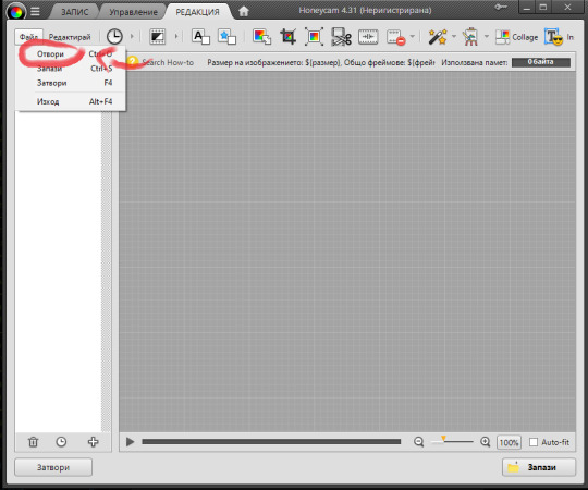
2. open up honeycam (you can download it here) then click on edit.

then it will land u on this page.
now click on file & now click open and choose the video file you downloaded.
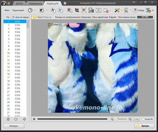
tadaa! you now opened your gif file!
since its already square shaped, ill skip this step, but if your video is in a non square size, you can crop it by clicking this icon

3. filtering the footage (optional)
im gonna filter the footage first before making it into several diff starting points, click on this icon! (the magic wand w/ sparkles) it is the filters option.

boom! we're now in the filters section, so ill click on this box which says multiple filter, i even put some filters which i commonly use as shown here as an example. then press ok to save it.

then ill press save & download the filtered footage as an mp4 file just incase + before i make it into gifs
4. making the gifs
alr alr, so this is where the fun part starts of gifmaking.
click on this icon (cut frames)

and it will bring u up to this menu!
now u can cut any part of the video, then press ok.

5. exporting the footage
export your gif by clicking save then click on the save menu the gif option & resize image & set it to around somewhere in the screenshot (u can resize it if u think its too big or too small), it will be saved in the honeycam folder by default, so click the option where it says see in folder to drag & drop it onto a new post. optimize the gif via ezgif's optimize option to lower its filesize so it isnt over the 10mb filesize if the gif has too many frames and/or if its too long

6. (idk what to call it)
repeat the previous steps (5 & 4), and dont forget to link the gif's viddeo source if you post a gifset, have a great gifmaking experience, bai bai!!
[gifset from the tutorial will be added soon as a link for u to check it out!]
update: gifset from tutorial can be found HERE!!
#mod rocambole speaks#not a stim#gif making#gif tutorial#helpful#resources#gifmaking#stimblr#stimmy#visual stim
5 notes
·
View notes
Text

Thanks for the ask, @strrwbrrryjam ! i'm flattered that you think I do a good job of that, because I'm still learning! (and I also struggle heavily with proportions. I have to resize my heads and arms so, so much...)
I'm afraid I don't have any secrets. I think the answer is to just practice, over and over again. But specifically, this is what I try to focus on as I'm learning:
references
quick practices - 30 second to 5 minute studies that help with getting a full scope of the shape and energy of the body, not meant to be perfect
studies - deep dives into certain anatomical structures (videos linked below)
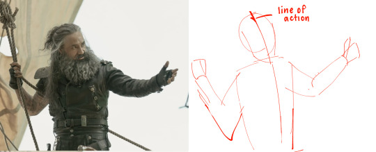
Below the cut is how I use references go from this to this:

References:
Use a bunch of references! Pictures you take, stock images, from shows--practice real people. Even if your style is heavily stylized, it all starts from an understanding of anatomy.
How I Use a Reference When I Struggle With Proportions:
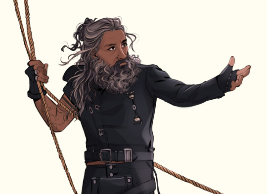
The first step I take while looking at a reference is to just draw a very loose sketch with a line of action that goes then entire length of the piece, and I try to section it out. I find if I don't think about the body as a whole, and just start drawing a head, the head will be way bigger than the rest of the image. So my first step is just really boxy and basic, just to get all appendages on paper. My first pass could look like this:
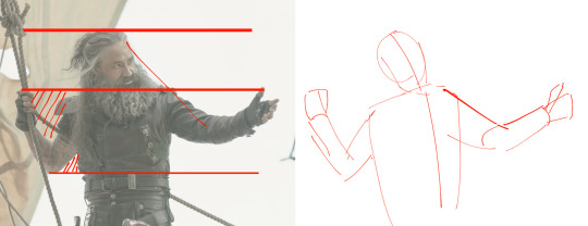
Okay, not bad. But the right arm is going way too far down--the forearm is really long. The head is too big for the style I want, and the left arm is at a 90 degree angle, unlike the picture. But, I have the general scope of everything on the page, so it's easier to adjust and look at the full picture!
Then, I try to focus on landmarks. I look at where certain body parts fall in the reference. For instance, Blackbeard's right elbow doesn't reach his belt, so his elbow shouldn't be near his waist. I can tell that his left arm is closer to being straight than at a right angle, and I can see that his head isn't as big on his shoulders as I have. I can also look at the negative space and see that the gaps between his right arm need to be smaller. So my next pass might look like this:
(I don't usually draw on the reference image, and I just "draw" the lines in my mind, but the for sake of things...)
Now it's looking a bit closer!
The next is the harder part. It's making things shapes, and is closer to the lineart stage. I try to follow curves, separate the chest from the torso, get the angle of the shoulders and head, etc. I have some video links at the end that explain this step much more in def.
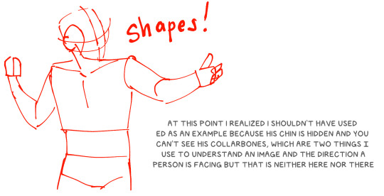
You may notice that the head angle is a bit different than the image, and the shoulders are a bit lower. Sometimes, following a reference image completely either doesn't fit your style or, in some cases, the more accurate drawing following a reference can actually look "wrong" (anatomically) when drawn. Figure out what works best for you, and for the message you're trying to get across in the piece!
[sliiiight flashing in timelapse]
And here is the final timelapse, with a little refining and polishing of the anatomy. Not everything is completely accurate to the reference image, but I've created a believable image in the likeness.
I hope this helped! This was a quick and dirty post of something I'm still learning. Here are some youtube tutorial artists, resources, and books that I use to learn!
Youtube:
-ModerndayJames has lots of videos on creating shapes and understanding anatomy, and placing people in perspective. He has a lot of free videos, and then some cheap ones on gumroad that go more into it.
-Proko has lots of videos on anatomy!
Practice Resources:
-Pose Maniacs - figures in different poses. You can move the camera around to see different angles.
-QuickPoses has images for figure drawing and quick gesture drawing! You can even have different timers.
Books:
Morpho Series. There used to be the one on "Fat and Skin Folds" that was a free PDF download that was on tumblr for a while, but I don't believe the books are that expensive.
Taco's Books, published by Lezhin. This is heavily anime styled, but talks a lot about anatomy, and is a great resource!
#art tutorial#asks#mytutoirals#myart#proportions#turns out you can't add videos to asks and if you try it makes the post uneditable#so i couldn't answer your ask directly. hope you see it sorry!#anatomy tutorials
59 notes
·
View notes
Text
Currently open for Project Path Action + Pre-Traveler Form

Newly added Costume for Tytos as a Knight Ardante was added!
Costumes are included with the Project, as it gives people a chance to draw a character they may have missed out on!


For a little bit of creativity, the artist that takes him could draw him in a way where he appears younger.
Tytos is canonly 40 years old, the flashback in which the design is used is 18 years before Master of Power, making him about 22.
Project Guidelines:
Each drawing is doing their own take on the Path Action sprite's pose (not the gameplay of the Path Action) that is provided. Drawings MUST be full body.
2000 x 2000 Canvas. This is to help all drawings be similar in size for the finished image. Depending on the pose, some horizontal/vertical space can be added. If I am sent a bigger file, I will have to resize it!
Minor changes can be made to the pose or Traveler, such as angles of the pose, facial expressions, etc. You are also welcome to use your own interpretation of the Traveler you are drawing (such as body size, skin tones, other details, etc.), so long as the Traveler remains recognizable.
Transparent background when sending the image (a PNG image) is a must.
Please do not post your finished art until you are given approval.
I am easiest to contact via Twitter @/P_PathAction or through email at [email protected]
If there are any questions about any of these, do let me know and I'll answer the best I can!
And if Knight Ardante Tytos isn't an interest for you, you can also fill out the Pre-Traveler Form, and possibly get an early claim on characters before they are playable!
#octopath traveler#octopath cotc#champions of the continent#octopath traveler 2#project path action#octopath collab#Octopath Tytos
5 notes
·
View notes
Text
Hello @crispyliza !! So I'm replying in a separate post because this is too long for a reply on the post. Hope you don't mind. I also think it might benefit others who have asked me in the past and those wishing to start gif making. Especially with whumptober just around the corner.
So here's a full look at how I make my gifs. This got very long so I put it under a read more
A quick thing before I start: I use windows and google chrome. If you're a mac or firefox user I'm not sure of this will work for you in terms of programs. The techniques I use in photoshop should though.
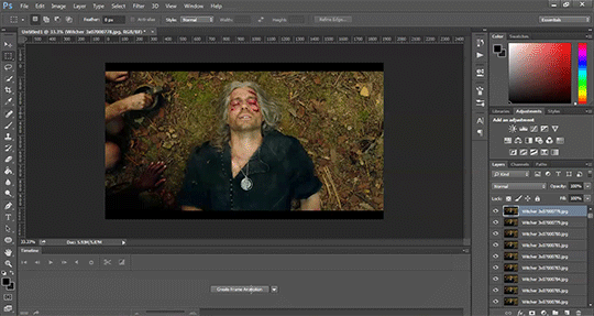
Okay for this demonstration I'm going to show you how I made the gifs for this gifset
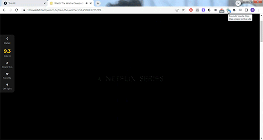
To start we need a video. I don't torrent because my internet connection will cut out a random which makes using vpns rather pointless. I've tried. My internet would cut out halfway through a torrent download and then my internet provider was notified to what I was doing. It was just not great. So I found a new way to download videos off the internet! You can use torrents though. If you've got a vpn, go for it.
There are several streaming sites that I go to to get my videos. 1movies, and bstsrs are my go to right now since soap2day is gone (rip i miss you).
Now there are three ways I can get a video depending on what website I'm using. Bstsrs is the easiest because they have a whole bunch of links available. I always go with mixdrop because it has an easy to use built in download button. Unfortunately this site doesn't have movies. Just tv shows and sometimes it's not the best quality or there aren't links available. That's when I go to 1movies. Once you've found your video I use the chrome extension Cococut to download it. Click the extension button to open, then the download button. Then you just have to wait until the video is rendered. Click save. Wait until its downloaded.
Okay we now have our video! The next step is to turn the scene you want to gif into frames. For this we're gonna need KMPlayer. This video player makes it really easy to turn scenes into frames/screencaps. Open your video. Find the the scene you want and pause the video. Type control-g to open this screen:
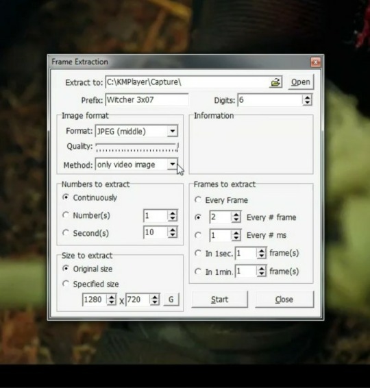
Here you choose the destination you want your frames to be saved. Decide what to name your frames and match up your settings with mine. You want to continuously extract frames, original size, and I stick with every 2 frames. Then, and this is important, choose video images only.
Now click start then start playing your video until the scene you want to gif is done. When you've got everything you wanted, pause the video. Hit ctrl-g again to reopen that screen and click stop. You now have all the frames you need so go ahead and exit out of KMPlayer. You don't need it again unless you need to redo frames or get the dialogue or something.
Next up we are gonna open Photoshop. I use Photoshop CC 2014.
Click on File -> Scripts -> Load files into stack -> Browse.
Go wherever you saved your frames and select the ones you need. Click okay and let the frames load completely before doing any thing else. Depending on how many you've selected this could take a while.
Once all of your frames are loaded, click "Create Frame Animation". Next click the little arrow button on right followed by "Make Frames From Layers" so we have all of our frames laid out. Now we need to reverse the frames because they're backwards so click that little button again and then click "Reverse Frames"

Okay you've got your frames loaded and all set to go. Time for all the cropping, resizing, setting the speed, and editing.
First thing I do is set the speed because otherwise I forget and it's important to do and a pain in the ass to do after all the editing is done. So do it first and get it out of the way. Select all of your frames. Click the little button beneath a frame where it says 0.0 and pick your time. I usually go for .1 seconds but .05 is also a popular speed. Just test one out and see which one you like best for your gif. You can hit the play button at any time to test your gif.
To set speed:
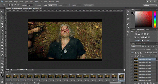
After this I do one of two things. Either I go into cropping and resizing or I separate frames. Depends on how many frames I uploaded. If I uploaded all the frames needed for an entire gifset this is the part where I separate them out onto individual gifs. So let's do that.
Originally I was just gonna do one gif but I have 115 frames uploaded which is waaaay too many for just one gif. I like to keep my gifs between 30 and 80 frames. So I'm going to split this into 3 gifs I think. It'll make a nice balanced gifset.
Select the frames you want for the first gif and copy them using the copy frames option in the same menu as the make frames from layers menu. Open a new document with the same dimensions as your current document. Click "Create Frame Animation" and paste the frames over the selected frame. Make sure that first frame is the same speed as all the other frames. Repeat until you have your desired gifs.
Next up I crop and resize. For this gif I'm going to first crop out the black bars above and below the image because we don't want that in the gif. Use the select tool to pick what you want to keep then "Image" then "Crop".

Now I could leave it as it but I think for this gifset I'm gonna focus more on Geralt so I'm going to crop it in a bit more.
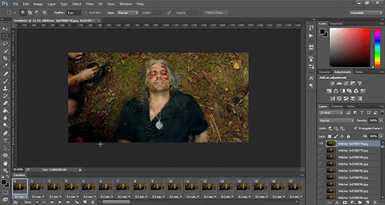
Once cropping is all set i'm going to resize the gif to tumblr dimensions. Click "Image" then "Image Size" and change the width to 540px. The height can be anything and best not to mess with it so your gif keeps it's proportions. 540px is the width of a tumblr post and I plan on making these gifs stacked one on one.
Okay the gifs are all cropped and sized. Now it's time to do some editing. Go back to your first gif. We'll do all the work on this first gif and apply the same things to the other ones later because the scenes are the same. If they were different each gif would be colored and edited individually. First thing to do is turn it from frame animation to timeline. Timeline mode makes applying things like sharpening and brightness much easier and smoother.
So just click this button in the bottom left corner to go into timeline mode. Next up select all your layers. They're on the right side. Make sure you've selected ALL of them. Then click on "Filter" -> "Convert for Smart Filters" THIS IS AN IMPORTANT STEP! We can't edit until this is done.
This button to switch from frames to timeline:
First thing I do is sharpen. You can use one of the presets or try to do manually do it with smart sharpen. I use the preset labelled "sharpen" because I'm lazy and this one does a fine job for my gifs. I also add a layer of surface blur to smooth things out. Just a small touch. Like barely any blur but I think it smooths noise a bit and makes it look better.
Next up: Editing!! This step is going to be different for each and every gif you make. It all depends on the colors in the scene your giffing so you're gonna have to do a lot of experimenting to get the right look you want. Personally that's what I like about it. Makes it fun.
All your adjustments can be found found on the right side of the screen:
I almost always start with the "Levels" layer to brighten up the image because as we all know, every freaking whump scene is sooo dark. So with levels you just slide the little arrows around until you get a look you like.
Then I add a layer of "Curves". I love curves. With curves you can select the whitest white and the darkest black and the middle tone to change the brightness and colors of your gif. Or you can use this part and just brighten or darken a specific part. It's really versatile and i love it. It does take some practice and experimenting though.
Now a layer of "Contrast" and a layer of "Vibrance".
After this it's all about the selective colors, photo filters, and color balance to work on the colors and brightness. For this gif I'm only doing a tiny bit of editing cause I like the coloring but sometimes I'll have multiple layers of these to create a good coloring.
Once you're satisfied with how your gif looks it's time to save it!
Click "File" -> "Save for Web" and wait until it's all loaded. Important thing too look at here is the size of the gif. You can't upload any gif that is larger than 10mbs so make sure it's under that. Sometimes even 9.8 is too big because tumblr is a butt. I go for anything below 9.8. If your gif is too big try resizing it or removing a few frames. Make sure you gif is set to loop forever. Otherwise it'll just stop after a little bit. Don't forget to change this!
Here are the rest of my settings:
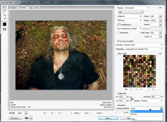
After that you can click save.
And that's it! You've made a gif! Congrats! If you have any questions or want clarification feel free to message me :)
32 notes
·
View notes
Note
Is there a size limit when submitting images for characters? I was looking through some of the characters I submitted here and their image size is a lot smaller than I assumed, did you shrink them? I’m not trying to pick a fight, I’m just curious cause I don’t wanna make you have to resize an image when submitting (also the image quality drops a bit and I don’t want that to affect people’s perception on some of my blorbos😅)
For lanscape-oriented images those are fine, since tumblr displays them in a way that doesn't take up too much space. But I do sadly have to resize a lot of the potrait-oriented images submitted, so they're not stretching out the posts too much and taking up loads of space of people's dashes I don't have any set rules or dimensions, usually I just try posting the image as it is and if I go "Uh that's very long" I'll then go resize it. I really don't mind doing that, but unfortunately it does result in a loss of quality in the image. Which is the trade-off for not making the post super long I suppose I could ask what people prefer between super long posts with higher quality images or shorter posts with lower quality images? I never really thought much about it tbh. Also, if you're submitting landscape-oriented images you'll always be fine, so I'd say where possible these are the best choice for image submissions
10 notes
·
View notes
Note
Hi!! I have a question about gifs. I’ve noticed some users (yourself included) have something on their gifs that I could only describe as sort of a net on top of their gifs. I noticed it, for example, on your Barbie/suicide squad parallels post. It almost seems like some sort of tool like noise where it helps to make a gif appear more hq. I’m wondering what that might be, or if I’m totally off base!
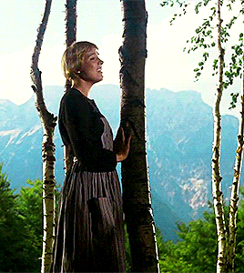
Hey! Unfortunately, I didn't save the PSD for that particular set - the closest one I still have was for this Sound of Music one, but the settings were fairly similar from what I remember.
There isn't really much to it, and the easiest way I can explain what the "net" is, is that it's basically the combo of your resize settings, sharpening/noise you've added to your gif, and finally your export settings. At least that's how it is for me - keeping in mind I usually try to work with the most HD cuts available so the quality is already there. Anything less than 1080p will always require more adjustment.
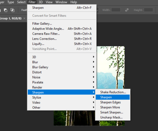
When figuring out your image size early on, ensure the resample size is set to Bicubic Sharper (reduction) as that'll give your gif a cleaner, more sharpened look to start with and it should make things easier moving forward.
Proceed to make your gif as usual.
I add Smart Filters last, and these gifs didn't require anything more than the simple Sharpen tool applied to the gif once the layer had been converted.
You can mess around with noise or blurring etc. if your gif doesn't quite look the way you want. Before sharpening, I sometimes use Stylize > Diffuse > Anisotropic > ~20% opacity (under blending options) to give the gif a softer look first and remove any graininess. It can look a little funky sometimes.
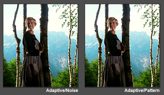
Lastly, when exporting your image, select Adaptive and Pattern as your save settings these can significantly change the final appearance of your gif - especially Pattern. The two in combination are what create the "net" and will retain the quality of your gif in export.

You should be all set with your quality-control "net"! 💜
#tutorial#ps tutorial#gif tutorial#mine*#gif making#I kinda suck at tutorials so let me know if this did/n't help anon and I can maybe offer some more suggestions if necessary :)
53 notes
·
View notes
Note
Ask art🎨! 1. 3. 5. 13. 15. 25. 34
What got you into art? When did you start?
I feel like I was one of those kids who was always drawing. One of the earliest hobbies I remember having was drawing, and since my mom was a teacher, it seemed like we were never at a loss for pencils, crayons and markers in the house. I think I also developed a desire to imitate things I saw on television pretty early on. I remember being TRANSFIXED by the Saban "Grimm's Fairy Tales" that would play on occasional Saturdays as part of Nickelodeon's "Special Delivery" programming. This was old timey anime, but even as a kid I could tell there was something different about it that I liked, and I tried to imitate the style as best I could in the margins of my notebooks.
Later, I got into comic books, and I remember wanting to draw my favorite characters from those (Batman was an early one, eventually giving way to Nightcrawler and the X-Men.) Again, I'd copy pictures out of comics I snuck in my bag to school. By the time high school came around, I was holding pieces of paper up to a paused video on television to get anime characters exactly right (please understand the internet was still in its infancy, and google wasn't even a thing yet). So I guess the thing that "got me into" art was seeing things I liked, and wanting to make them too.
3. What digital programs, if any, do you prefer?
I pretty much only use CSP for drawing, and then I'll hop onto Photo Pea if i need to do any grunt work (resizing/reformatting etc)
5. Who is your biggest inspiration?
Mostly, other people in my fandom circles. When I see people creating art of the things I love, it makes ME want to make art of the things I love. Sometimes this is people posting art that makes me think "I want to try that" and other times it's just conversations that spark something in my mind, but I know I'd be waaaaaaaaay less productive if I didn't have a community of awesome creatives to keep me fueled up!
13. Where do you draw inspiration from?
Hmm. Stories, I think? Sometimes I have an idea with a story connected to it, but I don't know if it could sustain an entire fic, and would rather see it as one powerful image. Other times, I'll hear a song and it will spark a visual in my mind I want to get out. And of course, I love a good redraw. I'm quick to draw associations between things I like, and a lot of time that has to get expressed as art.
15. Any tips and advice?
So, I actually originally went to school for painting hahahaha. I was convinced I wanted to be a fine artist. But I spent a lot of my time in art school convinced that I had to reach certain (totally undefined) thresholds before I would be capable (or allowed?) to do certain things. Use certain materials, attempt certain projects. And to be fair, I was limited by some things, like money, my ability to go places and *get* said materials, my available time etc. But that wasn't the roadblock in my head. Many years later, I was sitting in on a panel of female creators who had made a place for themselves in the digital space, and one of them asked the audience how many of them had an idea for a website, a podcast, a webseries etc- anything creative they wanted to do. A lot of people raised their hands. Then she asked how many of them had a cellphone. Everyone raised their hand again.
"Then you already have everything you need to get started. This isn't the best camera or microphone or computer in the world, but it's enough for you to get going. You don't need anyone's permission to get started."
I think that she did a really good job of articulating an issue I'd given myself- I was waiting for permission to do things, and I didn't need it! I try to keep that in mind now whenever I want to try my hand at something new.
25. Most frustrating thing about art?
Having an idea you're really excited about. Wanting to draw it. And being unable to make yourself get up and do it. I probably spend just as much time figuring out ways to have better habits and rituals around making art as I do actually making it.
34. Piece you didn’t think would get noticed as much as it does?
I cranked out that Scott Pilgrim deleted scene redraw (the comic with Murderdock at a Mary Janes concert) in the course of a single evening because the idea came to me all of a sudden and I knew that if I didn't do it RIGHT THEN i never would. Since that movie kinda only has a cult following, and the scene was only available on the DVD version, (and Murderdock was more niche than he is now) it was really something I did for myself. The fact that a bunch of people have found the idea s funny as I did still surprises me.
3 notes
·
View notes
Note
hi!!! i love for custom blog theme,, do you have a link to the code or creator 0:?
ya!
so my theme is actually a heavily modified version of redux edit #1 by lopezhummel (current url: holyaura). i always remind users that most tumblr themes are old and that you'll need to replace all instances of "http://" in the code with "https://" so tumblr will save the theme. i had to do it with this one
these are the modifications i made to the theme. i edited this theme over the course of at least a year or so and don't quite recall how i did all of these things. but to the best of my ability:
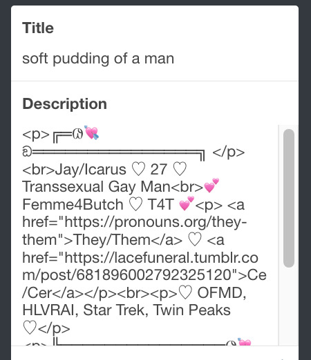
i moved the "left side img" to the right side of the screen. i also made this element "responsive" so the image will never get cropped when you resize your screen. this was a bitch and a half to figure out and i truthfully do not remember how i did it
i deleted the text in the drop-down navigation so it appears as a little line that is otherwise not noticeable. this type of theme, the "redux edit," used to be very popular because having a drop-down menu let you cram a bunch of links that lead to sub-pages on your blog. i've done away with my sub-pages, but i still like the format of the "redux style" tumblr theme, for its minimal UI and for its customization options.
i separated my mobile description from my web description for formatting reasons. basically, most elements in tumblr themes are connected to specific text fields and toggles. i simply went to the section that was connected to my blog description and deleted it. the web description has to be manually typed inside of the CSS/HTML editor when i want to change it. whereas my mobile description is whatever i type in the "description" box of the normal tumblr theme editors.
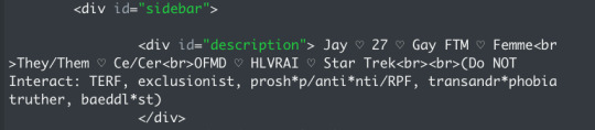
i added code someone else made ("NoPo" by drannex42 on GitHub) which allows you to hide posts with certain tags on them. i did this to hide my pinned post, as it looks bad on desktop.
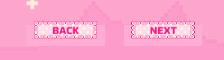
i replaced the tiny pagination arrows at the bottom with images that literally say "next" and "back" because the arrows were far too small/illegible. i know they aren't centered in the container i'm not sure how to fix that lol
i added a cursor

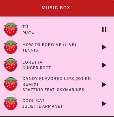
i installed a working music box ("music player #3" by glenthemes), and then added music by uploading MP3 files to discord and then using the links of those files as the audio sources. iirc i also had to make this element responsive and i aligned it so it would sit on the left side of my screen. i made the "album art" for each one the same strawberry pixel art
the moth is just a PNG i added and then moved around so it was behind my sidebar using the options that came pre-packaged with the theme
if you want something like the strawberry shortcake decoration at the top (called "banner" in the theme) your best bet is to google "pixel divider"
theme didn't support favicon so i added that in so i could have a little heart
ALSO:
this theme is. really weird about backgrounds. any background that i have ever set for it, i've had to do weird shit in photoshop. like making the background HUGE, mirroring it, etc. - because it would crop the image weird, or there would be a gap where there was no image. idk man, it's haunted. i'm sure there's a way to fix this but i am NOT tech savvy enough. anyway, patterns are probably your best friend. and if you DO want something that isn't a pattern, it's going to take a lot of trial and error. but i love this theme so i deal with it 😭
the sidebar image and the floating image do not scale. if your image is 1000 pixels, it will display at 1000 pixels. you'll either have to edit the code so that the theme scales the image for you, or resize any images before you add them
my white whale of theme editing (aside from the Weird Background thing) is that i cannot get infinite scrolling to work. i have tried every code out there. all of them break my theme. it makes me sad because like. i have music there for a reason. the idea is that people would listen to it while they scroll. unfortunately, the way it's set up now, the music will stop every time someone clicks "next" or "back" 💀
anyway sorry for rambling but i hope you enjoy the the theme and customizing it in the way that you want to!
21 notes
·
View notes
Note
Hi, I love your banners on your posts like the ones on your lepacy posts. How do you make them? 🤍
Thank you!! That's so sweet <3
It's actually very simple!
What you do is that you load up your editing program of choice. I use Gimp. (:
Then I create an image where the dimensions are so that it's a lot wider than it's tall. How tall depends on how thick you want the banner to be. I tend to prefer them on the skinnier side so they don't take up that much space in the post.

There's no particular reason why this image is 1920x200. It was 1920 pixels wide when I created it and I just adjusted height accordingly. You'll of course want the image on the bigger side so it doesn't turn out pixely and blurry.

I like my banners to have white backgrounds, but you really can do any colour you want, or even transparent.
Then you just type out what you want the banner to say, pick a font and colour, and resize the text so it fills the image the way you want.
Programs come with a lot of fonts, but it's also possible to download new ones. I have a tag for it on my cc finds blog.
I usually want the text to almost touch the top and bottom. In my opinion it looks the best because there's a gap between pictures on tumblr - a gutter, I think it's called? - but it's entirely up to you how you want it.

Gimp also has this tool that alligns your layers for you, so I like to use it to make sure the text is in the middle of the banner.


Love this thing. Lifesaver fr.
At this point the banner is almost done. You could call it here and export it, but I prefer to add a drop shadow to make the text pop. Even if the shadow is light, it really helps in my opinion.

There's a lot of possible customization to be done with the drop shadow, but I have a few presets I've made that I usually like to use. Of course, my PC conked out this summer and I had to reinstall everything, so I'll have to make new ones now. /:
Here's an example of the settings I've done for this banner's shadow.

Here you see one banner with a drop shadow, and one without


You'll see it on p much all of my banners:
It's subtle, but I quite like what the shadow adds. It's of course, optional and can be as dark and strong as you want it to be.
Depending on the font, you'll have to adjust the placing of the shadow, but that's easy to do.


If you have any other questions, don't hesitete to ask (:
I tend to like shadows with harder edges for text, but it's up to you how the show looks on your banner.
And that's it! Only takes a few minutes. Sometimes deciding on colour and font can be a bit time consuming, but the rest of the process is relatively quick.
3 notes
·
View notes
Note
hi queen im in love with your theme pls teach us how u make your dividers 🙂↕️🤲
waaaaaa THANK YOU !! 🤩
there isn't anything all that special to it,, i use the procreate app on my ipad to make everything but i'm sure there are other free apps that you could use to do a lot of the basics,, i know ibis paint is a free app and is pretty great :3
i'm gonna add a cut because i'm not really sure which divider you're referring to in particular but i can show what i do for these ones below !! 🩷
obviously you don't have to do everything exactly,, you should do things differently to make it your own or to better fit what you like !! this is just how i do it and how i prefer to do things (❁´◡`❁)


⁂ for the first ones that are just plain strips of colour,, i crop a canvas to the size i want,, the thicker one is 879 × 8px and the thinner one is 879 × 4px. opening the actions tab and clicking crop and resize and then adding in the dimensions i want,,, you don't have to do the dimensions exactly, you can eyeball it ! this is just what i do :3


⁂ then i pick out my colours for my theme and place them all on the same layer like this

⁂ then i open up the adjustments tab on the canvas to find the gaussian blur option

⁂ lastly, i slide it until i am satisfied with the blend of the colours :>

⁂ and it ends up looking like this !!

=͟͟͞★
⁂ for the mdni divider,, i do the same thing for the background as i do for the slimmer divider but on a bigger scale,, the canvas size i use for it is 1350 × 80px i then go into the actions tab on the canvas and add the text

⁂ type in whatever text you want,, you can fiddle with the font,, the size of the text,, add emojis and symbols and such. place that where you want it on your canvas and then i rasterise the layer so it is no longer a text layer

⁂ after this i alpha lock the layer so i can add another colour to the text that i like,, totally optional, this is just what i do :3

⁂ after that, i gaussian blur the layer like i did earlier but on the layer with the text to blend the colours

⁂ this is what it ended up looking like :D you can add the lines above and below by using hyphens and another text layer and repeating the above process
=͟͟͞★
⁂ finally, for the headers in my posts i usually just find an image of some kind of smut manga online,, twt is a good place to find things like this. one acc i look to is @/lewdkittymia but they retweet others posts too so you can find some stuff from other accs that way too :> ⁂ the canvas size i use is 1488 × 326,, i add a layer and do the same as above with the smaller dividers but the size of this canvas,, you might not be able to see the image under it in the beginning but that's to be expected !

⁂ after this is when i lower the opacity of the layer by pressing on the 'N' on the layer with the colours,, i use the slider to adjust the layer until i can see the image underneath and am happy with it and then it's all done !!

finished product 🩷
=͟͟͞★
i'm not sure if this was at all comprehensive or helpful but this is my process !!
if you were curious about my animated ones that might need it's own post but i'm happy to make one if you want !! i use procreate for that too !! (i have procreate because i draw so you definitely don't need to pay for the app just to do this,, like i said,, ibis paint is free and you could probably use that !! 🩷)
thank you for your ask and for complimenting my blog hheehfgbe always makes me giddy 🥰 i hope you all are having a good day/night !!
4 notes
·
View notes