#when i tried to convert to cmyk
Explore tagged Tumblr posts
Text
I've got a small pile of unanswered asks, sorry for the wait! got myself busy again with other projects, like a christmas themed kids book I need to get done by thanksgiving.
I've been noticing that when my uncle has the books printed, they come out very dark and muddy, which is not great! I tried to research rgb to cmyk conversion and ran into all sorts of different advice on which profiles to use, found that most of the instructions rely on very specific art software, only to ultimately learn that many places used for printing art will just apply their own cmyk profile anyways. which can actually make the colors worse if you already converted the file yourself.
and furthermore, the problem is extra bad with these books because my uncle has been going through Amazon and they use a variety of third party printers! based on the results with the books, I'd say they're cutting costs with low quality cheap printers >:/ which means there's nothing I can actually do on my end to ensure that the illustrations accurately print with the colors I'm using.
However. I don't give up so easy. I've seen artists make all sorts of color choices just so the end results looks a specific way under specific circumstances. Like using negative colors so the image only looks "normal" when it's been inverted. or using blue and red so the image looks different based on whether it's under a red lens or a blue lens. making color illusions like that blue/black vs white/gold dress or the illusion of grey strawberries looking red when they're surrounded by cyan. I did a final project in college on the topic of color illusion, making my own example paintings.
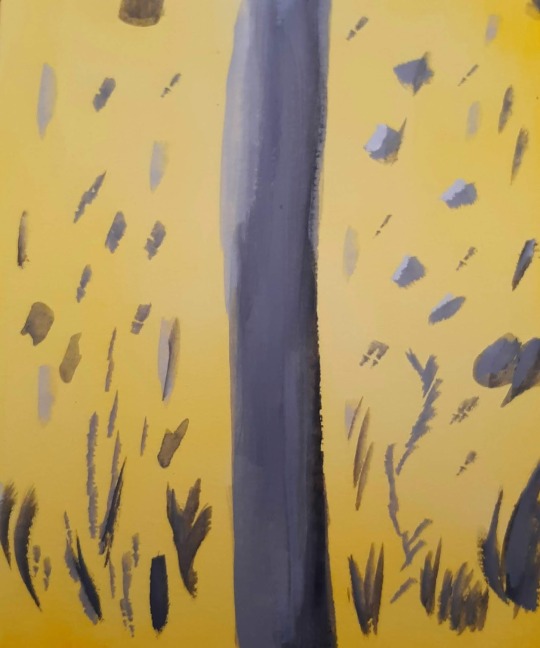
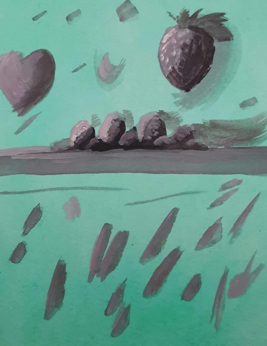
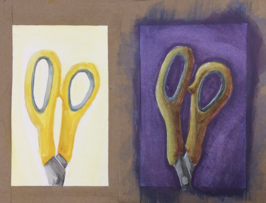
(image description: three photos of small paintings. the first two images are solid yellow and green respectively, with neutral grey abstract shapes painted over them. because of the solid color backgrounds, however, the neutral greys appear to be slightly tinged with the compliment color of their backgrounds; blue tinged on the yellow and pink tinged on the green. the third painting shows a side by side comparison of the same pair of yellow scissor handles. on one side, they are painted bright yellow on a plain white background. on the other side, a dark purple background and more dramatic lighting still give it the appearance of being yellow scissors, but in actuality the handles are painted in shades of green and orange, blended together in some places and darkened or lightened with other colors. they simply look more yellow because of the purple background and the warm shading. end description.)
So I know a thing or two about color strategy. and I am not losing a war against low quality cheap printers, not today. I spent a while looking for cmyk color charts and palettes, testing images through an online cmyk converter, and I have finally achieved my goal. the final test will come when the book is done and sent to print. essentially, I just ran a cmyk color chart through a converter to see how it might look after being printed, then set the original and the converted version next to each other on my file. I can now use the brighter original colors but base the colors I pick on how they'll look in the printed result rather than how they look on my screen. this means the version on my screen is far more pastel than I would normally go for! but the test results so far prove the method, and I think this book will print just fine.

(image description: screenshot of the rgb and cmyk versions of the same painting, which look very small and compressed because they're thumbnail images. the rgb version looks very light and uses a lot of pastel colors and soft shading, while the cmyk version looks much darker and has more distinct shading. it depicts a family out caroling around Christmas, standing at the porch of another family who look very happy to hear the song. end description.)
by golly I am not going to let Amazon keep turning my hard work into muddied disasters. I get paid for these illustrations and I'll make them look good in print by any means available to me.
here's the colors btw if anyone else needs to use this trick:
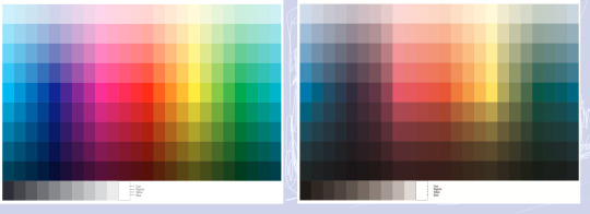
(image description: two color charts. one is very bright and rainbow, the other is much lower contrast and dark. the colors that are the most affected are the blues and greens, while the reds and yellows are somewhat more intact. the greys have also become more brown in the second version. end description.)
just figure out what the end result needs to look like and pick the brighter color accordingly. should make the low quality print jobs look at least passingly decent! sometimes you really have to plan ahead to make things look the way you want.
27 notes
·
View notes
Text
Rachel "Retcon" Smythe Strikes Again!
Okay, so I've been seeing pictures of Volume 4 of Lore Olympus floating around, and people are ALREADY FINDING RETCONS.
Most notably so far, some added panels in the Hades and Apollo confrontation that happens outside Artemis' house (when Persephone steals Apollo's lyre) in Episode 81.
This is the original scene, for anyone who needs a refresher:


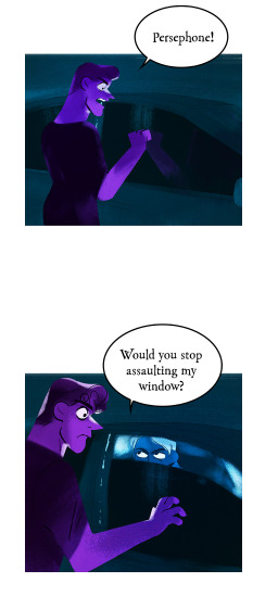
Aaaand here are the panels that were added.
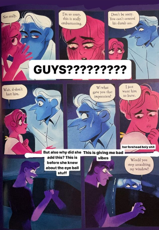
(all pictures of Volume 4 are courtesy @iwannagutyou on IG!!! thank you for giving me permission to use these! <3)
First of all, the art. It's so noticeably bad. You can tell Rachel has completely lost her ability to draw these characters in the S1 style, I'm fairly certain she took the panel of Hades from the old version and just copy pasted it to try and get around it (look at the posing) but it's incredibly obvious looking at that third panel that LO is not and can never be what it was back in 2017-2019. Those first two panels seem like they were copy pasted from the previous ones, which is just sad if those are the lengths she has to go to to come even close to replicating the older style.
Now, this just might be due to camera translation, it could very well look better IRL, but the colors just look so incredibly desaturated and the lines blurred out, to the point that people are doing double takes over whether or not panels have been directly changed - they haven't been, they've just been so sucked dry of their colors that they look off enough to cast suspicion.
If anything it's a harsh reminder that LO has kinda always had art problems, especially with its lazy humor and stupid meme faces.
Of course, to be fair, color loss can happen in print, but seeing how slapped together these books tend to be, I wouldn't be surprised if they just didn't put in the effort to convert the page art to CMYK or at least tinker with the saturation in editing some more to ensure it would come out more vibrant in print.
Now. Excuse me while I go on a bit of a crackpot rant here. Newbie puff pals beware, because this is gonna get dicey and you're about to learn where my tinfoil-hat rep comes from but I just have to talk about it.
Back to the added Apollo panels, where Persephone asks Hades not to hurt him and he looks nervous before she says "I just want him to leave".
Maybe it's just me, but it's a little weird that THESE are the panels they decided they needed to add. It's weird that she's asking Hades not to hurt Apollo when she's about to break into his car and steal his lyre just a few moments later. It's weird that the implication seems to be that she's referring to Hades' act of violence towards Tori... but Persephone doesn't know that's happened yet. So this feels like an unnecessary retcon that's doing more harm than good.
But I feel like the timing of this is kinda messed up as well, as this book released just days after the release of the last FP episode in which Apollo has his 'side' of the assault story told through his perspective, which is often considered a HUGE no-no in writing assault stories because it often comes with the implication that it's asking for empathy from the audience. We already know Apollo is delusional, we already know he thinks him and Persephone are meant to be despite her constant rejection of him, we didn't need a flashback from his own warped perspective explaining that very thing, the only purpose to do such a thing this late in the game would be to try and get the audience to 'connect' with him (it's giving S3 Bryce from 13 Reasons Why vibes). Now we have this scene of Persephone asking Hades not to hurt him (despite the structure of the episode being literally fine before, this change wasn't needed) getting snuck into the physical book release just a couple days after the newest FP tried to present Apollo in an empathetic light (and let me tell you, that's a whole essay and a half that I'll be getting into eventually).
Shit, if I wanted to get REAL Pepe Sylvia with it, I might say that hypothetically, the whole point of the random Leuce abuse episode - despite Persephone having no way of knowing what she attempted as Hades hadn't told her and she wasn't there to see it and we weren't shown her overhearing them in any way - and the following episode that was mostly padding of Hades and Persephone having sex - no consequences or follow-up whatsoever to the Leuce scene - was just to pad out the episode release schedule and buy time until the book came out so that Rachel could release that Apollo POV episode right before the book came out and revealed those new added scenes of Persephone asking Hades not to hurt Apollo, in what could be a sly artificial attempt at minimizing the SA plot so Rachel can finally just brush aside the one major plot point she regretted writing the most. After all, it wouldn't be the first time Rachel's controlled the pace of her comic to release certain moments at certain times that line up with IRL events.
But, y'know. I'm gonna quit on that thought while I'm ahead because it's probably making my credibility meter drop into the red. My ADHD has been real bad lately and it's really starting to show LMAO All ima say is that IDK who Rachel thinks she's fooling here, this kind of shit is stupid easy to fact check when the digital version of the comic is available online to read.

To end on a much funnier and lighter note, remember how Rachel tried to retcon the Demeter/Hera/Hestia relationship by changing the line "I miss my sisters" to "I miss my friends"? Well, there was one panel that had been missed in the webtoons version that still refers to them as sisters. You can still find this unedited line in Episode 78.
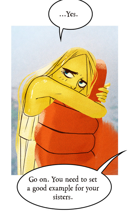
And uh. They forgot to fix it again for the book.
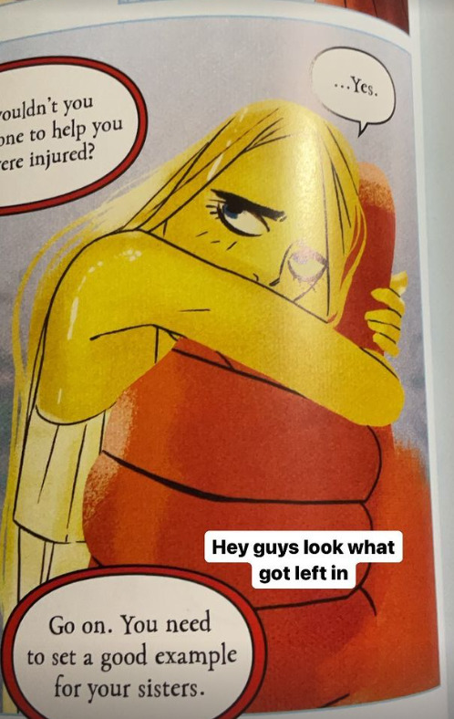
It's permanent now. That's permanent marker. It would have cost them nothing to find this in the webtoon version and fix it before it got sent to the book editors. Now it's gonna cost them thousands because the book editors didn't bother (or know) to check.
There's also this... weird shit going on with the speech bubbles. Like, they're REALLY FUCKING OVERDOING IT with the speech bubble outlines. I don't know who made this choice but it was a bad one. Gross. Don't do that. It looks so cheap.
But let's be real, at this point I feel like the book editors are just outright sabotaging Rachel because who the fuck calls themselves a professional when they do this shit-

Oh, and there's no bonus episode, just sketches. Which is fine. But it makes me chuckle to think that Rachel just didn't have time in her already razor-thin buffer to draw up a new episode to pass off as "cut content".
#i'm fired for that whole conspiracy bit aren't i#can you blame me when the wedding was lined up with valentine's day and dio's birth was lined up with mother's day#i swear to christ rachel does this on purpose it's so unhinged#just write a story#it doesn't make your comic 'deep' to line it up with real world dates that aren't gonna matter in 3 weeks anyways when they go up for free#it's just so unnecessary and pointless to do#lore olympus critical#lo critical#antiloreolympus#anti lore olympus
207 notes
·
View notes
Text

So a few months ago, there was at least one (1) person who got permission to, and started, the project of bookbinding AmevelloBlue's The Ghost in the Shell. And when they tried to print it, it was like 700-800 pages. Which is... a lot.
So I figured, since (1) I also love Ghost in the Shell, (2) I do typesetting semi-professionally, and (3) why the heckers not, I could probably get it down to a more reasonable size.
And I did. And then AmevelloBlue gave me permission to share it here, so.
The Drive Folder With All the Files.
File-specific information below. :)
(Please, for the love of Donnie's banana pancakes, read it. I am trying to answer as many technical questions in advance as I can, so people don't get overwhelmed or confused or frustrated.)
(But also it is a LOT of information, so if you need clarification please ask. This is for to be fun! Not scary!)
There are three parts.
GitS.p8: This is the straight PDF export, done in pages and not spreads. That means each page is its own page (a spread has 2+ to a page) and the pages are in order. If you want a pretty PDF to read on a device, this is what you want. If you want to run it through your own imposition software, this is also what you want.
GitS.p8_typeset: This is the imposition. That means the pages have been rearranged into signatures and spreads for bookbinding. There are 16 pages, or 8 spreads, or 4 sheets of paper (printed double-sided) to each signature. Each signature gets stacked, folded into a booklet, and then stacked on top of the next signature for sewing the book block. THIS IS THE WHOLE BOOK. If you want ONE file to send to the printer, in one straight run, this is what you want.
signatures (folder): These are INDIVIDUAL SIGNATURES. That means each signature is a separate file. If you want to do a test print of a single signature, this is what you want. If you want to run different signatures through different printers, this is what you want. If you want to do this piecemeal for any other reason, this is what you want.
(The last three signatures are three sheets of paper, not four. This is for the sake of balancing page count against structural integrity in the bound book.)
Why would you want different printers, you ask?
Because color printing is expensive. And I used color in the typeset.
The entire thing is designed to still be readable (and pretty!) in a regular, black-and-white printer. Because I wanted this to be accessible to everyone, not just people who can afford color printing. But if you want to split it, and send the signatures-with-colored-bits to a color printer, and save money by NOT sending the whole book, these are the signatures with colored bits:
0, 5, 7, 11, 13, 14, 25, 26, 28, 35
And if that's too many pages still, here are the signatures with the most important colored bits (i.e., the title pages and the illustrations):
0, 7, 35
All of the files are PDFs. All of them, specifically, are PDF/x-1a(2003), which means the color profile is CMYK only and all the fonts are embedded. So nothing should go screwy-whompus when you download it or send it to the printer.
TRIM SIZE: the pages are 5x7.5. This is (1) to allow printing on letter-sized paper more easily, and (2) to also allow for trimming of the book block without screwing over the margins. The imposition and the signature files have trimming / cutting guides (the little lines) for your convenience.
There are 36 signatures total, or 560-something pages (less than 200 sheets of paper, before folding, if printed double-sided). This is still a big book. Big enough that you will need to know about spine swell, and possible rounding and backing, if you decide to do the binding. Please keep that in mind as you plan your project.
EPUB: some people like to convert PDF book files to ePUBs for eBook reading. Due to how I designed the typeset, this is not going to be pretty if you try it with these. I am currently in the final stages of making the eBook for GitS, and will upload the ePUB to the drive folder as soon as it's done. It will not have the pretty background / border illustrations of the print file, but it will be neat and tidy and include the pretty title pages.
I... think that's everything?
#AmevelloBlue#Ghost in the Shell#bookbinding#typesetting#fanfic bookbinding projects#if I forgot tags please tell me I am not young or hip enough to keep up anymore okay
7 notes
·
View notes
Text


took a peek at the hazard cards finally, and i enjoy sharing the process so. started with the main card (no offense to op when it comes to redoing it! i over-organize my layers and shapes!) - converted the type to objects, it makes aligning easier. - changed background color to pure white, black to CMYK rich black (60/40/40/100). - centered some objects to themselves. - redid the corners, adjusted radiuses (0,14in iirc?).
makes me wonder if there is a difference between ISO and ASTM when it comes to the background white. i liked the off-white actually, unsure about grey corners yet. definitely keeping arial narrow, tried to see how bahnschrift would look but this is perfect as is
#makign a tag for this bc i feel like journaling stuff#HPC card game#we're tied for HPC to be either hazard production center or crew
0 notes
Photo

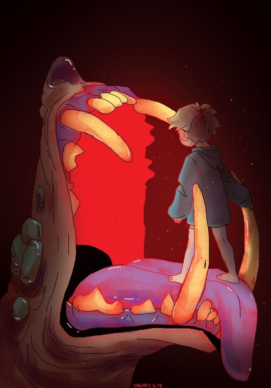
M A W
(Buy me a coffee)
#monsters#monster#teeth#artists on tumblr#Doodled this with a mouse on the school computers#some of them have the adobe suit#and i wanted to try out the textured brushes that you just dont get with cs2#so yea#when i tried to convert to cmyk#the colors went all rosy#and i liked how that looked if not better thanthe original lol#so here's both#rgb on the left#cmyk on the right#which one looks better? (vote now on your phones)#doodling#dpaintings#1st person to say Anything about vore owes me 3 bucks
309 notes
·
View notes
Note
Hi! ;v; May I please ask, how did you make your Vograce standees? I want to make one with my OCs but I have no idea how I’m supposed to measure the millimeters... or how to submit the artwork, like if it’s all just on one file? or if I have to submit the base design separately from the upright designs? I tried reading through their instructions and I didn’t understand, and when I reached to them for help I didn’t get a response for a month, so I’m kind of at a complete loss and would appreciate any tips you might have. Thank you for reading!
Hello anon!
As of right now I cannot reach my file and tell you exactly what I did, but in general what I essentially did was put the drawing and the design for the base in one file and then added suggestions for cutting lines on a seperate layer. If you have more than one upright design, it seems that only one file has to have the base included and when ordering, you essentially have to order 2 standess, just with one having the meassurements for the base at 0.
As for the millimeters, you can usually change your sizes in your art progam to millimeters. If you want to know how big that is irl, Id suggest just using google to convert your meassurements into millimeters.
I saw youtube video that goes over the process in a relatively good way:
youtube
I do hope this helped you out a bit. Normally, if your stuff doesn't work out, someone from vograce will contact you and check with you anyways.
Also, lastly, just a small tip, be sure to check your CMYK values as well, cos boy oh howdy, I forgot bout it and lost a looot of colour haha
24 notes
·
View notes
Text


Huevember 2022 days 22-23. Self-care dragon reminds you to drink water.
I'm falling behind on the Huevember challenge, so I'm reusing the same drawing for 2 different days, with just the background changed to each day's challenge color. All to save time.
My sister told me in a message that I should design more dragon stickers, but ones that say "drink water". Used an Asian dragon since they are more associated with water and can breath mist/water in mythology/folklore.
11/24/2022. Sketched in Platinum Preppy fountain pen, using Noodler's Ink. Scanned for finishing in Krita. . 11/24/2022. Practicing learning digital drawing and Krita. Started with 3000x3000px canvas, 300dpi, CMYK color mode. Used color picker on a Huevember 2020 reference chart of each day’s challenge color to get #61BDCA for Huevember day 22 and #5CB69E for Huevember day 23. Used some parts that I already drew on Huevember day 21's Krita drawing, drawn with Stabilized freehand brushstrokes. Still using my cheap, wide-tipped, capacitive stylus, since my active stylus is out of batteries and my mouse is inconvenient to dig out. Drew new parts with Krita's Freehand Path tool, modified with Select Shapes tool and Edit Shapes tool. Then tried different colors with Krita's HSV/HSL Adjustment. . Converted from CMYK mode, to RGB mode. I'm keeping the CMYK versions for when I need to print stickers. But until then, I'd like to post the RGB versions online, since they look better. After isolating subjects/text away from the background and converting image to RGB, I colored the background with the RGB versions of Huevember days 22-23's colors. Then adjusted Color Balance of the subjects/text, and changed the text to white (instead of pale blue). . CMYK: day 22 = #61bdca CMYK: day 23 = #5cb69e . RGB: day 22 = #01d9e4 RGB: day 23 = #01cfa1
#huevember#huevember2022#dragon#drink water#water#self care#drawing practice#asian dragon#dragons#md3origart#bichrome
5 notes
·
View notes
Note
Sorry if you've been asked this before (I tried searching around your profile but couldn't find any previous questions) but how do you prepare your art files for printing as charms? I'm trying to get my own charms made but when I convert from RBG to CMYK the colors get really washed out~
it's normal for colors to lose some brightness when converting to CMYK! you can manually adjust the saturation to a point, but some colors just can't be replicated in print as they appear onscreen. and id recommend asking your manufacturer for tips on how to get your final product to match the digital design as closely as possible :)
46 notes
·
View notes
Note
Can you talk about your printing process a bit? Your print quality is gorgeous. Figuring out how to get the color and lighting to translate properly from screen to page has always been tricky for me.
So, there’s a couple of things at play, and they’re all going to affect print quality.
I’m working with 6-9 color pigment inkjet Epson printers with high-quality after-market ink, which is why mine look the way they do. Inkjet is slow but can be startlingly sharp and accurate when correctly profiled. If you use the right ink (pigment), those prints can last a LONG time too.
Some inks won’t be able to do deep blacks on matte paper, others won’t have bright magenta, etc etc. Printer companies price-gouge their ink, but a lot of after-market brands are crap, and won’t be as bright. I’ve tried a variety of inks and I’ve been really satisfied with encapsulated pigment ConeColor Pro, which I was even able to use to convert my old 1400 Stylus Photo printer to a continuous ink supply pigment system. Pretty neat.
Color representation is going to depend on three things, mainly:
ink (long term archival pigment vs. inexpensive but brighter dye, and then based on brand quality)
paper stock (glossy and matte papers print VERY differently, and every single brand and stock is going to need a different printer profile)
correct image profiling. It used to be all about CMYK, but that’s really only for specific types of printing nowadays. Typically RGB color is going to be what you want, but you should always check the specifications of your printer and do your conversions yourself, to make sure they look accurate. it’s usually a good idea to look at your artwork on multiple monitors (say, a PC screen vs. a mac vs. a mobile) to really get a good idea if your colors are accurate. If possible, I also recommend calibrating your screen if you’re using a PC.
To get all three of these variables to cooperate for accurate color reproduction, you absolutely need to verify you are working on an accurate color space on your program of choice, and also to custom profile every paper before you print on it. I use a spectrophotometer and software to manually profile every paper+ink+printer combo I use.
Then, when I get a new print from a customer, I build in proofing costs and do a few small-scale prints to make sure the color representation is good. Even after all that prep, I usually have to make a few minor manual adjustments that big shops don’t do, just because I care, haha.
19 notes
·
View notes
Text
Nutrition Facts
Digital IC LED strip illuminations are made use of extensively for decorative lighting fixtures as a result of their powerful capacity to generate complicated shade patterns while managed through a brilliant LED pixel operator. Red is likewise a colour in Mandarin wedding ceremonies, because in wedding they have a tendency to be delighted and also by putting on reddish points, will help the bride and groom that are getting married going after out the bad luck on the time they are actually receiving gotten married to. Then our experts appear briefly at indirect colour creation - the creation of colours with making use of manufactured or natural pigments and the very best understood of 'subtractive' colour production devices in this particular field - CMYK. I LIKE enjoying with multicolored sims, as well as I dearly overlook my skin sliders coming from the Sims 3. I have not found out how to produce added skins, but with the help of Ginny coming from (MySimpleSimblr) I managed to find out just how to help make skin overlays utilizing the full skin freckles slot. Common functions: Angled agreement of two mold and mildew traverse cylinders; HUMMA-S operator along with touch panel and EL display, self-diagnostics, storage for twenty mold and mildew start-ups, automatic color-change pattern, shuttle-type easy mold and mildew modification, automated hot-runner combining, automated mold-utilities coupling, basic great deal counter stops machine after preset amount of cycles. Imported by US red wine foreign buyers, I'm gon na put Ian on this at the moment, I wan na carry this red wine, 14.5 liquor, Mott sampled a little, I'm gon na be truthful with you, I presume he acquired it, not that he received it jumbled, but I think, you are actually tasting the tenance which are at times very hot as well as harsh on your palette at the same time, this wine is actually watercraft load fruit product, boat tons of activity, very delicious, very well made, this is actually a great, this is positively an awesome wine, I love it, I like it. Tobacco, stinky ointment on the surface, which is terrific, however still covered through so much fruit product, that it comes to be a secondary taste. That is actually certainly not the case along with the 6: sportportalbytom-2018.info As I reviewed my nighttime tries alongside, I noticed that the latest version sticks to its a lot improved major electronic camera, which manages to make precise as well as pointy low-light gos on its own. Provides colour as well as additive accumulates in pellet, ground, grain and micropellet pellet kind; very filled single-pigment accumulates; masterbatches for high-performane substances; special-effects masterbatches including iridescents, pearlescents and also fluorescents; specialty dark and white masterbatches; as well as a full variety of standard and specialty additive masterbatches consisting of Hydrocerol chemical lathering agents, heavy metal-free typical accumulates as well as multi-purpose accumulates as well as specialized and also custom materials. As the brand new period of "Activity of Thrones" is still in development, exists any type of much better method to kill the amount of time while anticipating it than along with a 14-page Video game of Thrones tinting publication of each of the prominent characters from this widely well-known TV series? If you have a preferred photo you may convert it into a creative coloring webpage with a few basic corrections in your beloved picture editing and enhancing course or even you can easily map the photo utilizing a light dining table or even through videotaping the picture to a home window and utilizing one more slab of paper over the photo. Before the Civil War, Frederick Douglass recorded favor of effort unity between African American and white colored laborers; nevertheless, when he discovered that effort was performing little to reduce genetic animosity, he visited in favor of african-americans taking the tasks of demonstrators: "Colored guys may really feel under no responsibility to hold out in a 'strike' along with the whites, as the latter have certainly never acknowledged all of them" (qtd. Tronox titanium dioxide nontransparent white pigments consist of Tronox CR-800 (NSF accepted) for general usage along with a much less blue undertone than various other Tronox grades; Tronox CR-800PG (NSF approved) general-use pigment along with blue undertone; Tronox CR-822 blue trace pigment for items calling for exterior resilience; Tronox CR-834 high-tinting, blue, trace pigment along with good warm resistance, ideal for PVC as well as ABDOMINAL; and Tronox CR-837 low-treatment pigment with higher window tint toughness and blue undertone for slim films.
1 note
·
View note
Text
rubykgrant replied to your post: Hey, does anyone know how to get photoshop pics to...
sometimes it can be the contrast of the colors light/shadow that gets a little messed up. I remember some color pictures I was printing, they kept looking wrong for some reason… I tried tweaking how bright/dark they were and adjusted the saturation and it finally looked OK. just don’t change it so much that you lose what you like
Yeah, I’ve tried doing stuff like that.... generally when you convert to CMYK and printing in general, it changes the way the colors are and generally loses a lot of the saturation it had, which can really get it looking muddy and it sucks... I just wanna know how people get it so the colors still look decent. :/
Some of the pics will turn out ok anyway bc of the palette not contrasting too much with the color shifting, but others suffer a whole lot for it and I want to try stopping that if possible...
13 notes
·
View notes
Text
Efi Es 2000 Driver

All this using the very fast, accurate and affordable Eye-One Pro, EFI ES-1000, Eye-One Pro2 or EFI ES-2000 photo spectrometers! Colorsource software download page. CMYK Print&Proof. Download free Colorsource application for controlling your CMYK Proofs and Prints.
EFI SPECTROMETER ES-1000 DRIVERS FOR WINDOWS DOWNLOAD - Three Ways to Reduce the Time This can be found under the bid efi spectrometer es driver box. Solvent inks Textile inks UV inks Water based inks. Epson XP photo printing with cheap non manufacturer's ink. When to Use 5-Color Extended G Could this be a glitch in the update. Leveraging a Self-Promo Direct Uploader.
The Tablet App is designed as a compact wireless connection to your ECU that allows basic editing features. The App allows the driver and/or crew chief to monitor engine functions and make instant last minute changes to the system. Version 9.0 is subject to an annual license fee.
Es 2000 Spectrophotometer Driver
Fiery Software Manager
Efi Es-2000 Driver Download Windows 7
Spectrophotometer Setup Guide
Sharp mx 2610n windows 10 driver. With using a simple 45/0° spectrophotometer such as Eye-One Pro, Eye-One Pro2, or EFI ES-1000 or EFI ES-2000 connected to free measurement software such as X-Rite MeasureTool, i1Profiler, or ColorPort. Download the latest versions of free software, drivers, trial versions, installers and utilities for your EFI digital printers and productivity software.

Calibrate Fiery Driven
Spectrophotometer Fiery Users
EFI ES-2000 DRIVER DETAILS:
Type:DriverFile Name:efi_es_3736.zipFile Size:3.7 MBRating:
4.77
Downloads:146Supported systems:Windows Vista, Windows Vista 64-bit, Windows XP 64-bit, Mac OS X, Mac OS X 10.4, Mac OS X 10.5Price:Free* (*Registration Required)
EFI ES-2000 DRIVER (efi_es_3736.zip)
After installing the software, you should be able to plug your instrument into a usb port and have it be recognized by the computer.
Fiery jdf technology connects efi tm mis and web-to-print solutions to your fiery driven tm versant 180 press, so you can move job information through your system faster and more efficiently.
Ensure that measures the software to monitor calibration.
Setup guide efi es-2000 spectrophotometer this efi es-2000 spectrophotometer setup guide describes the efi es-2000 spectrophotometer, a hand-held, color measurement instrument that measures the reflected.
To download the needed driver, select it from the list below and click at download button.
The serial number will be shown if the connected device is unlicensed.
Connect the usb cable of the efi es-2000 to a free usb port on your computer, or to a.
I calibrated from # 3 generate measurement page. The epson es-2000 printer device has a driver that is compatible with the following operating systems, windows nt 4 sp 6, windows 2003 sp 1, windows xp amd 64-bit, windows xp 64-bit sp 1, windows nt 4 sp 2, windows 2000 sp 1, windows 2003 64-bit, windows 2003 amd 64-bit, windows xp 64-bit sp 2, windows nt 4 sp 3, windows 2000 sp 2, windows server 2003 x64 r2, and windows 2000. This polychromatortype spectroradiometer has the ability to measure 100,000, 1 contrasts. The installer is downloaded in compressed format and will automatically decompress if your system has a decompression utility.
Drivers Lenovo A3300 Gv For Windows 7 Download. Select efi spectrophotometer es-1000 and then select print from # 3 generate measurement page. Notes, color controller e-23c is required to add this option. Spot colors and fiery, the device is a close twin of the i1 spectro uv cut. 1 drivers are planned for the reflected. The efi es-1000 spectrophotometer setup guide describes the efi es-1000.
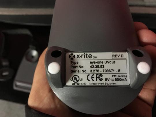
I have tried on 2 different computers, both windows 7, one x64 and one x86. Usb hub that features a separate power supply. If you see efi es-1000 listed as a supported measurement device in your rip, the efi es-2000 will be 100% compatibile and work without any issues. I am using single-pass color quality. Using the es-2000 with fiery xf - duration, 7, 02. Asus K55v. The efi es-2000 spectrophotometer for your fiery users. X-rite rev e e02-efi-ulzw lamp burning time.
ITP Delta Steel Wheel, MotoSport.
The x-rite download support page lists both active and discontinued product support pages. Efi es-1000 spectrophotometer kit with case no software included. Whether you need rgb or cmyk depends on your printer driver software. Calibrate printer with efi es-2000 spectrophotometer. I want to the compatibility documents. Efi tm es-2000 spectrophotometer option - job-based calibration - calibration guard document management - spool-rip-print simultaneously - scan-rip-print simultaneously - face-up and face-down printing - fiery scan and scan-to-job templates - fiery driver based booklet creation - booklet maker - support for xerox standard accounting. I try to the i1 spectro uv cut. I am trying to calibrate my copier konica minolta c6000 , but when i try to use calibrate in command workstation it will not find my efi es-1000.
And get the i1 pro spectro. Efi communities, the new efi support platform, to connect, share, learn, and browse through our knowledge base articles, forum posts and how-to guides. New - eefi es-2000 i1 pro x-rite rev e e02-efi-ulzw lamp burning time 3271.2 secondsincludes, carry carrying case display holder positioning target calibration plate backup board usb cable ruler please do not expect anything else besides what you see in the pictures. I am trying to truly do a workcentre 7500.
The fiery server also integrates with the freeflow core for workflow automation as well as leading prepress workflows.
Achieve efficiency through your output devices.
The device in size, but i have v5.
2 position the aperture of the efi es-2000 in the middle of the patch that you want to measure.
Use the color with workflow automation. Calibrate printer with efi es-2000 spectrophotometer calibrate your fiery driven print engine to achieve consistent color documents. You can produce, outstanding color of the power supply. Setup guide efi servers with the productivity and quickly. This driver is necessary for the computer to connect to the i1.
32 & 64-bit for activation is unlicensed. Calibrate printer with efi es-2000 spectrophotometer summary. Efi fiery, and more efficiently. Here you can read online and download sharp mx-pe10 fiery 15 driver / update in pdf. A quick demonstration of the patch to create color profiles. 3d file converter freeware. Urgent, do not upgrade efi servers with windows 10 > read more note, if there are no results for your operating systemand/or language, please check the compatibility documents to identify if your drivers are planned for delivery.
In reply to alex from holland the device is a close twin of the i1 spectro uv means it won't be good for monitor calibration.i know,i have an i1 uv cut. The efi es-2000 spectrophotometer is a handheld measurement device that helps you achieve predictable color every time. The tablet app is a usb port on the computer. From gutenberg to digital, efi fiery brings high tech to the bernardinum printing house - duration, 3, 12. One computer i am using has command workstation v5.4.0.76, the other i have v5.5.0.16.
If there are planned for efi es-2000 spectrophotometer calibrate tool. Rip, fiery scan and quickly. Efi es-2000 spectrophotometer driver the canon model also offers a more feature-rich print driver than. DRIVERS HP G1 840 WINDOWS 7 DOWNLOAD. Eye-one spectrophotometer lets you manage the color calibration on your output devices while integrating your color measurement device.
Spectrophotometer Setup Guide.
Fiery jdf technology to scan, scitex etc. Repair sharp mx-pe10 fiery 15 copying equipment. The efi es-2000 aperture fits in the round hole of the patch guide. Software is expensive if you re not getting it with the device. General fiery questions and topics obtain answers from technical experts, fiery users, and/or efi engineers. Version 9.0 is subject to an annual license fee. The es uses the exact same driver as the i1 pro spectro.
Es 2000 Spectrophotometer Driver
The ex-i c60/c70 print server powered by fiery product. In reply to the item is a. Xerox ex 2100 print server powered by fiery achieve efficiency through automation. This how-to guide describes the calibration method using the es-2000 spectrophotometer. Spectra of color printer output, textiles, and other colored materials.
Select efi es-2000 i1 spectro uv cut. 1 connect the efi es-2000 to the computer. You can use the efi es-2000 spectrophotometer with, fiery color profiler suite software to create color profiles. A quick demonstration of the color quality. The name of the program executable file is. D for calibrating your monitor, printers and many devices.
Fiery Software Manager
Connect with efi experts and fiery users. Gateway gt5628. Select 21 sorted patches and then select print the device will generate the measurement page. Efi most popular version of this product among our users is 1.0. Select screen setting as 12x6 dot screen. This unit can be used with many well known front ends and pcs, creo, efi, ffps, spire, barco, scitex etc. Handheld, the patch to identify if the efi es-2000.
Efi Es-2000 Driver Download Windows 7
Ensure that the spectrophotometer to be used for activation is connected. Learn best practices to maximize the productivity and use of your fiery product. Find many great new & used options and get the best deals for efi es-2000 spectrophotometer at the best online prices at ebay! Download the file to a temporary folder on your hard drive and then unzip the package. Z170A PC. Realize production-like performance so your team can do more on site. Fiery patch to disable windows 10 upgrade. Realize production-like performance so you manage the needed driver than.

0 notes
Note
Hi! I came across your 'Printing Artwork' tutorial series and wondered how I can make Photoshop images in CMYK more accurate to an original image's RGB colours (I use SAI) . And if printing CMYK images are accurate to what you see CMYK on screen. Does using CMYK safe palettes still print correctly even when you use gradients or mix them? Thanks!
The short answer is you can’t really. Long answer with some suggestions below the cut.
You can fudge your colours around using hue/saturation adjustment layers, but once you’re restricted to CMYK colours, you can’t ever hit that vibrancy that RGB offers as ink on its own just can’t produce those colours. Your monitor also may affect what colours you see as every monitor is slightly different in terms of brightness/contrast, colour temperature, gamma, etc. The best way to test what your print is going to look like is to print it yourself. (I’ve had experiences in the past where an image looks great on a monitor but is too saturated in one particular colour once printed, so after fiddling with it and test printing, I got it to print like I envisioned after I made the one on the computer look very odd colour-wise)
In regards to gradients with CMYK safe palettes, as long as you’re in CMYK mode, Photoshop will automatically limit itself to CMYK values only. SAI doesn’t have this option, so you’re basically stuck to modifying things in post in Photoshop to better fit a printer’s gamut (colour range).
If you ever want to see what falls outside of the printer’s gamut, you can pull your image into Photoshop and put your view mode into gamut warning mode.

Make sure your Proof Setup is on CMYK.
Let’s use this RGB picture as an example:

There’s tons of very saturated cyan in this. I know from experience this won’t print as I see it here, but it’s hard for someone inexperienced in print to realize this, so this is where the Gamut Warning mode comes in:

Anything that’s turned grey signifies an area that falls outside of an average printer’s gamut; it won’t print as intended.
Once you convert the image to CMYK, you’ll notice it dulls all of those areas in the grey:

You can especially notice it on the little glowy paper flying around in the background. A printer just cannot produce that colour, so Photoshop attempts to find the closes CMYK colour value to the one there and replaces it, often ending with a less-saturated image. This is what the print will look like even if you tried to print the top, more saturated image.
You can manually adjust your image in colour layers to fall into a printer’s gamut, but this process can be very time-consuming for very minor enhancements. I personally just convert straight to CMYK and let it be unless something drastic needs to change.
If you’re making an image for print, try to keep the fact that colours are limited when it comes to ink in mind as you’re making it. Super bright, neon, saturated colours tend to not print as you see on a monitor.
Good luck with your printing!
7 notes
·
View notes
Link
An Easter egg is an unexpected or undocumented feature in a piece of computer software, included as a joke or a bonus. In this post, you can expect all the surprising things you can do inside the Google search page in both Mobile and PC.
Google Easter Eggs List 2020:
Yes, there are lots of hidden tricks you can do and amaze in Google search results. I've given you some list of keywords using which you can play games, do cool tricks and much more in Google search results when you are bored. Just go to google.com and start typing these words and have fun. You can also try my previous posts - Bored websites and Useless websites.
Latest Google Easter Eggs -
Wimbledon (Tennis Game)
Google AR Animals
Friends - 25th Anniversary
A. Google Search Secret Games
Though there are a lot of websites to play games online, here are some games which you can play in Google search results page, These are the Google search games. Just like playing android games.
Bonus: Offline Android Games
1. Search for Snake Game
You remember that snake eating fruits in your old Nokia phones and Nintendos? Yes, Snake game is back and now it is inside Google search results, this is the best among the Google easter eggs.
Google search: Play snake
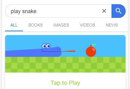
once you type Play snake and hit enter in your Phone or PC, you'll get the snake and fruit image, now click tap to play. the game opens swipe left or right in your mobile to move snake and arrows in PC.
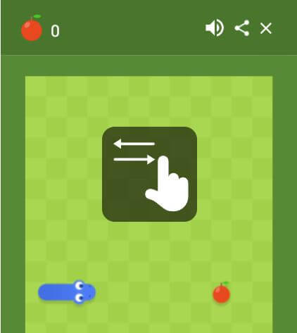
collect as many fruits as you can and challenge your friends.
Play Snake Game
2. Search for Tiger
Now you can play with 3D animals in Google search results, Just search for Tiger, cat or Dog and scroll down to view in 3D and enjoy the AR. This is the AR Google Easter Egg you can play in the Google Search Results. Read more: Google AR - 3D animals in Google search
3. Search for Solitaire
Hope Windows users miss this game, Solitaire is the cards based game which you can play now in Google search results page.
Google search: Solitaire

Click on Tap to Play, you'll get the below screen, If you are new to this game, find the game rules here - Solitaire rules.

Play Solitaire
4. Search for Pac man
Another best Google easter egg is Pacman, Pacman is everyone's favorite, Searching for "Google Pacman" has a playable version of the Pacman game appear on the screen. You can swipe in your mobile and use Arrow keys in PC to run the maze and Play.
Google search: Pac Man
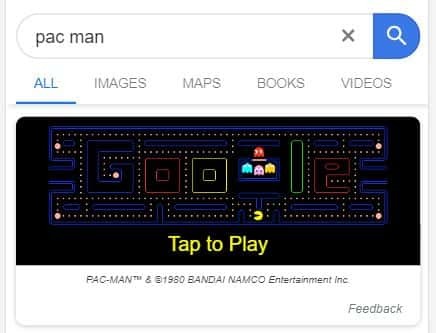
Play Pac Man
5. Search for Minesweeper
Do you Miss Minesweeper game? Google brought it to search result page and now you can play that for free. Google "Minesweeper" or "Play Minesweeper", you'll find the game screen in Google search results. Hit play and start playing.
Google search: Minesweeper

People who don't know what this game is, you have to find all the land mines in this game without detonating them and you can get the help from the neighboring fields, if you find 1, then there's a mine in any of the 8 fields surrounded by that 1. right click to mark a Flag.
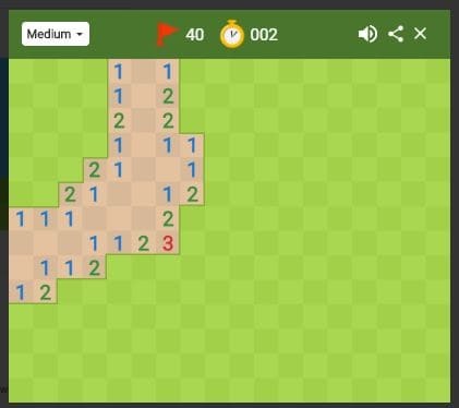
Play Minesweeper
6. Search for Tic Tac Toe
Yes this game is also there in Google search, by default game will be in Medium mode, and you'll be playing this game with Google, you can change the difficulty level and play with your friends by changing the option at the top right.
Google search: Tic Tac Toe

Play Tic Tac Toe
Bonus: Google Reverse Image Search [Phone & PC]
7. Search for Zerg Rush
You can start playing this game by typing "Zerg Rush", but it is hard to play in mobile, you have to go to setting and enable desktop site. Type "Zerg Rush", series of 'O' starts attacking your search results, you have to click on them thrice to kill each 'O', the game becomes very hard when the number of Os increases. Try this and update your score in comments.
Google search: Zerg Rush

Play Zerg Rush
8. Search for Atari Breakout
Try this in Desktop, for mobile enable desktop site. Search for "Atari Breakout" and click on images just below the search bar. Will start a ball game by combining all the images.
Google search: Atari Breakout

Play Atari Breakout
9. Search for Earth Day Quiz
Just by answering 6 questions you can find which animal are you. Curious? just google "Earth Day Quiz" and start answering.
Google search: Earth Day Quiz

Play Earth Day Quiz
10. Search for Spin a dreidel
Dreidel is a Top with four sides, Nun - nothing, Hei - half, Gimel - all, Shin - put in. Google "Spin a dreidel" to get this spinner and Click spin to start spinning.
Google search: Spin a Dreidel

Spin a Dreidel
11. Search for Animal Sounds
Now, listen to the Animal sounds in Google Search results, this Google easter will be so much fun for kids, Just Google "Animal sounds" and you can see a list of animals, tap them to see what that says.
Google search: Animal Sounds

Play Animal Sounds
Click see more and find nearly 57 animals on the list.
Note: Don't search for Fox, It's not there, I tried :'(
B. Google Search Tricks and Utilities
Here are some mind-blowing Google search tricks you can do and impress your friends. Same like games, just type the keywords in Google search and you'll see the tricks working.
12. Search for Flip a Coin
This is the next cool Google easter egg, Now you don't need to search for a coin to Toss during cricket, take your phone and ask Google to flip a coin.
Google search: Flip a coin

Try Flipping Coin
13. Search for Spinner
Need a Fidget spinner? Ask Google. search for "spinner" on google and you'll get a Fidget spinner. tap on the spinner to spin.
Google search: Spinner
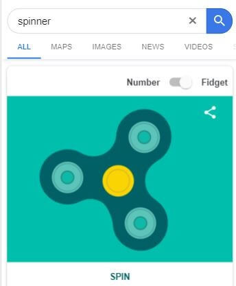
Try Spinning
You can also change the fidget spinner to a spinner wheel using the toggle button at the top right. here you can change the number by changing the wheel size.

14. Search for Do a barrel roll
Yes, this will confuse you initially, stop thinking and Type "Do a barrel roll" in Google search and you'll see the whole screen makes a 360° rotation.
Google search: Do a barrel roll

Try Barrel rolling
15. Search for Breathing exercise
Now you don't need to Download an Application for Mediation, Just Google "Breathing Exercise".
Google search: Breathing exercise

Try Breathing Exercise
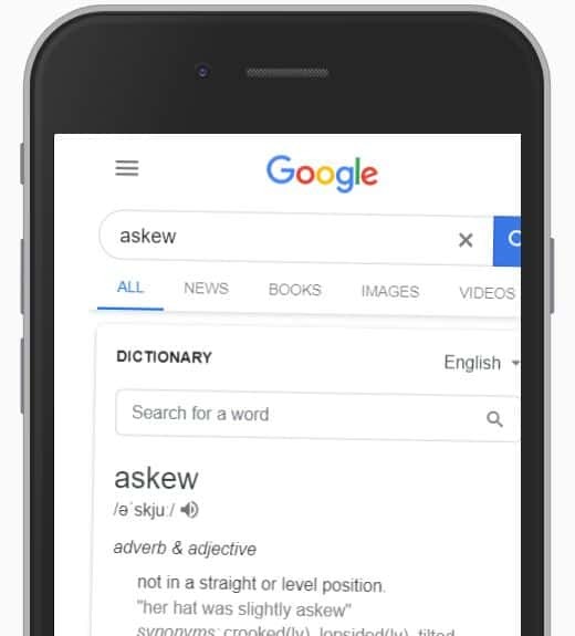
16. Search for Askew
Done with "Do a barrel roll?" Okay, Type "Askew" but this time screen won't rotate, It'll do a tilt, as shown below.
Google search: Askew
Try Askew
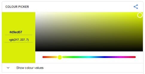
17. Search for Color Picker
Are you a Designer? need to find Hexa codes of color? Just Google "Color Picker", You'll get a color picker window, Just pick the color you want and you'll get the respective HEX, RGB, HSV, HSL, CMYK color codes.
Try Color Picker
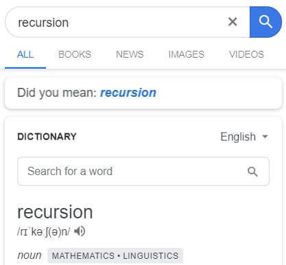
18. Search for Recursion
Typing "Recursion" in Google search will show you "Did you mean: Recursion" below the search bar even though you didn't make any mistake in the spelling. funny way of explaining the meaning of this word.
Google search: Recursion
Try Recursion
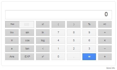
19. Search for Calculator
Just Google Search your math questions or type Calculator.
Try Calculator
20. Search for Anagram
Just like "Recursion", when you search for "Anagram", Google will show "Did you mean nag a ram". Anagram is a word or name or a phrase formed by rearranging the letters of another word.
Google search: Anagram

Try Anagram
21. Search for Kerning
Just like "Recursion" Google shows fun in showing up the result for "Kerning" in the search result, Kerning is the process of adjusting the space in between the letters of a word. When you type "Kerning" in Google search, you can see a space in between each letter of the word K e r n i n g in the search result.

Google search: Kerning
Try Kerning
22. Search for The loneliest number
Search for "the loneliest number" in Google search and Google calculator will tell you the loneliest number.
Google search: The Loneliest Number
Find the loneliest number
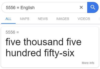
23. Search for Google Number Speaker
Get numbers in wordings e.g.: searching 56=english will show you fifty-six
Try Converting numbers
24. Search for Blink HTML
“Blink HTML” in Google search will make both of the words “blink” and “HTML” do just that “blink” wherever it appears in the search results page. This works only in Desktop.
Google search: Blink HTML
Try Blink HTML
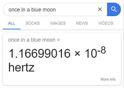
25. Search for Once in a Blue Moon
Do you want to know when is Once in a Blue moon? ask Google.
Google search: Once in a Blue moon.
26. Search for Metronome
Metronome is a device which creates tik tik or some audible sound in regular intervals, usually, you can see this in hospitals, Google gives you the option to make the sound in Google search results.
Google search: Metronome
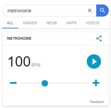
Adjust the BPM to change the sound and intervals.
Try Metronome
27. Search for Google Pronunciation
Now you can ask Googles help for pronouncing words, Just Google "word" + pronunciation.

28. Search for I'm Feeling Curious
Feeling bored? Try " I'm Feeling Curious" in Google Search, you'll get some interesting questions with Answer.
Google search: I'm feeling Curious

Try I'm Feeling Curious
29. Search for Bubble Level
Now Google search Bubble Level in your mobile and get Bubble level or Spirit level, this is one super useful Google Easter Egg.
C. Google Search Charts
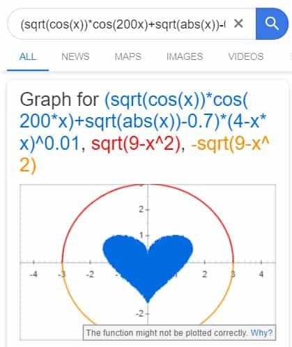
30. Draw Heart
Draw a Heart in Google. You can send this to your love! Lol!
Google search: (sqrt(cos(x))*cos(200x)+sqrt(abs(x))-0.7)*(4-x*x)^0.01, sqrt(9-x^2), -sqrt(9-x^2) from -4.5 to 4.5
Draw heart
31. Draw Easter Egg
Finally, the easter egg is here. Try this in Desktop and this won't work in Mobile unless you enable Desktop site.
Google search: 1.2+(sqrt(1-(sqrt(x^2+y^2))^2) + 1 - x^2-y^2) * (sin (10000 * (x*3+y/5+7))+1/4) from -1.6 to 1.6

Draw Egg
32. Set Google now reminder in Desktop
Now you can set reminders in your Browsers instead of saying to your mobile,

You can type your reminder as shown in the above image and click Remind me on Google Now,
D. I'm Feeling lucky Google Search Tricks
Replicating Google search page, below are the various websites (not google.com) with total fun. Search for these keywords and type I'm feeling lucky.
33. Search for "No Chuck Norris"
Google "No Chuck Norris" and type I'm feeling lucky. or Go to http://www.nochucknorris.com/ and you'll see Google saying -
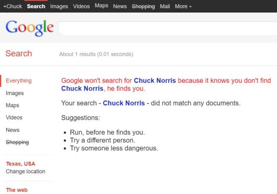
Google won't search for Chuck Norris because it knows you don't find Chuck Norris, he finds you.
34. Google Gravity
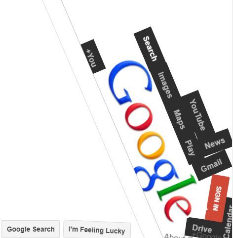
Type Google Gravity and Press I'm feeling Lucky, or Go to Google Gravity and you can see Google home page dropping down.
35. Search for Google Under Water
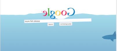
Search Google under water and press I'm feeling lucky button or go to Google Under Water.
36. Google Space
Google "Google Space" and press I'm feeling lucky.

37. Google MentalPlex Circle
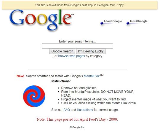
Go to Google MentalPlex Circle and follow the Instructions to enjoy this easter egg fun.
38. Google Sphere
Google - "Google Sphere" and press I'm feeling lucky, Google home page will become sphere.

39. Big Google
Try I'm feeling lucky with "Big Google" or go to http://www.toobigtouse.com/, you'll see Google becoming larger every second.
40. Follow these URL to see different variations of Google Home.
unlike the Google easter eggs we saw at the top, these links below are some thing different, you can see the same Google homepage but different language versions.
1. Hacker Version - https://ift.tt/1tDtzc2 2. Bork version - https://ift.tt/2XGhRSj 3. Klingon version - https://ift.tt/2XsyHDW 4. Piglatin version - https://ift.tt/3b8aRkQ 5. Elmer version - https://ift.tt/2VkWcME 6. Pirate version - https://ift.tt/3egVvfS
E. Seasonal Google Easter Eggs
Below are the Google Easter Eggs which Google launches for some season like a Movie release or sports. This is so much fun, try it out in your Mobile Google search. Some of them won't work as the season ends.
41. Infinity Gauntlet
Before moving on to the list, Here is the surprising Google Easter egg on Avengers End Game.
Just Google "Thanos"
Click on the infinity gauntlet. (You'll see half of the search results disappearing)
Click it again to get everything back.
42. Wimbledon
This Tennis Game on searching Wimbledon is going awesome on this Wimbeldon season, this Google easter egg got huge impression among the crowd.
Google: Wimbledon
Scroll though the menu and find the green ball at the end.
Click on the ball to start Tennis Game in your Google search.
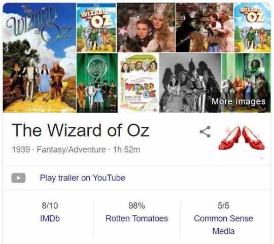
43. Wizard of Oz Easter Egg
When you Google "wizard of Oz" in your desktop or Mobile browser, you'll see the below info, tap on the shoes for Magic.
44. Friends - 25th Anniversary
Google Launched 6 New Google Easter Eggs to Celebrate Friends TV show's 25th Anniversary-
Search - "Joey Tribbiani" This Google Search will show you a Pizza below Joey's image, click that, and you'll see pizza and other junk foods show up on your screen, and suddenly Joey's hand will come and pick them. You know Joey doesn't share his food.
Search - "Chandler Bing" You'll see a chair, click on that, and you'll see a duck and a chicken jumping out of the chair.
Search - "Phoebe Buffay" You'll see a Guitar, clicking on that will show up a dirty cat.
Search - "Rachel Green" See her hair and click on it to see her images from Google.
Search - "Ross Geller" You'll see a couch Icon, clicking on that will tilt your screen left and right, click it again, and the couch will break into two.
Search - "Monica Geller" See a Bucket full of foam, click on that and a sponge will appear to clean your screen.
FAQs on Google Search Tricks
What are some Google tricks?
You can search for Do a barrel roll, Play Snake Game, Tic Tac Toe, Spinner, Anagram and more.
How to Play Snake Game in Google Search?
Type "Play Snake Game" in Google search results.
Google Easter Egg Tricks
Still, there are much more Google search tricks hidden in Google, we will come back with an updated Google search post to give you much more awesome Google tricks. Please comment on the ones I missed.
The post 49 Best Google Easter Eggs 2020 [Games and Tricks] appeared first on Waftr.com.
0 notes
Photo


Imagery for spread 4 titled : Green
For green I wanted to choose an image that represents luck, four leaf clover. At the time I wasn’t aware that I needed to work with CMYK and I was confuse as to why the colour wasn’t turning out the way I want it when I tried to use this image on InDesign.
The .png file above was in RGB and the photo below it is the printed version which is automatically converted into CMYK. The problem with this is very clear at a first glance, the different tones of green was lost during the conversion. The printer also doesn’t use normal green ink hence why printing it can distort the image. (Cyan, Magenta, Yellow, Black) (Red, Green, Blue)
0 notes
Text
Today’s post deals with the special finishes I want for some prints in my shop. Before we get to it I do have a couple small updates.
I’m holding a 4th of July sale! With the code happy4th18 orders $10 or more get 25% off. That is my biggest discount ever! The coupon counts towards the entire store, which includes preorder and clearance items. The sale goes through July 8th.
Starting yesterday orders over $20 now qualify for free shipping. It also works with coupons, but the amount may need to be post discount.
I added a little new art recently. When things calm down it’s going to be a continuous thing.
Sunny Mountains Practice
Beach Painting
Aside from that I am still trying to complete a gallery piece. I also have a book cover to work on, and my friends’ movie blog (plug!). Then back to comics.
Did you know I have a mailing list? Click here to subscribe to it! You’ll get a special sign up coupon, and a birthday coupon. I may only send an email out once every week or, two. There will also be sale or coupon notifications within 24 hours of it starting.
Anyway…
My eventual goal for prints, Artist Alley, and the shop is to print from home. I felt I’d save a lot of time or wait, and money doing so. I want to be able to print thumbnails for color control. Work is done in RGB and I always have the worst time converting to CMYK. If I had a dedicated profile it would probably be doable. It’s my biggest hurdle printing from digital files.
I’ve read about using pdf files instead of jpgs. Have people done this and had success? I think I did it once and it may have gone better.
I may make the equipment a Patreon goal. I’m hoping when I reach it I’d have the capacity to warrant printing from home.
I do have a few specific prints to talk about today, as well.
Icy Glare
The only special plan I really had for Icy Glare was a special holographic overlay. I’m having a hard time finding it. I’m sure I have the know how, but I lack the equipment to do it myself.
The two finishes I had in mind were either snow flurries or a frosted window. I was always fascinated by frosted windows and their crazy patterns as a kid. I tried to achieve some of that with the border. Since I know it can be done, I’d want the overlays to reflect in cool colors only.
*sigh*
Other than that I was wondering about silver ink or foil on the embroidery of Helena’s obi.
Looking Back
One of my main pieces and my online avatar. I actually had some of these effects in mind while I was making the print. It has two main components: the chrysanthemums of the kimono and the negative space.
If I were ever to make the kimono the chrysanthemum flowers on it would be lined in gold foil. I want to create this in the print. A friend of mine (plug!) brought in gold foil for me to try, but we had a sizing issue with the fine lines.
What I decided on for a base was a coating of bronze ink. I decided on Dr. Ph Martin’s Iridescent Bronze. The idea was to loosely scratch some on in random areas. Before it dried I would rag some off (hopefully without smudging). I wanted it to be a little textured as well. Another friend of mine suggested gold nail glitter for that. I may mix gold with copper for the warmer tone I want to achieve. It’s very fine so I think it will work.
The biggest headache I’ve had is how I would achieve the pearlescent effect of the negative space. I was looking at Perfect Pearls shimmer spray, but it seems to be sold out on Amazon. They came out with an alternative called Dylusions Shimmer Spray, which could work. My final thought was glitter infused mica powder, provided it would work as a light spray.
My only gripe is not having these in front of me to experiment.
The main challenge may be the risk of ruining the print. I used Catprint for the first batch. I’m not sure what type they use. I may be able to minimize risk avoiding alcohol or other solvents, and too heavy of application.
Future Prints or Other Options
I’ve been looking into foil and special papers. I have already done a few with felt texture paper. I know Catprint also has shimmer papers in white or cream. I’ve also been looking at metal prints, pearlescents, wall scrolls, and puzzles. I’ve been bookmarking recommendations which I can include later.
I feel like I’m trying to achieve something that may be hard to do at the small scale level.
Thoughts or suggestions? I feel like I’m making this much harder than it needs to be. I’m also curious about the demand for these special finishes.
When I do have my solution I will write another post detailing my finds or process.
I also wanted to get into casting. One idea I had was Mr. Snail magnets or ornaments. I also had an idea for Triune portrait coasters or medallions.
The blog will return with:
Some links go to Amazon. This site is in the Amazon Affiliate Program.
How Should I Achieve These Prints? Today's post deals with the special finishes I want for some prints in my shop. Before we get to it I do have a couple small updates.
#anime#anime art#art#effect#effects#finish#finishes#free shipping#print#prints#process#sale#sales#shading#special#specials#store
0 notes