#when i first started digital art i used way too big of a canvas and it was horrible
Explore tagged Tumblr posts
Text

fernanda shepard!!! my beloved!!!
pix below the cut of me trying to do this because it is embarrassing but tbh trying to journal the process more of redoing and relearning and whatever


#oc: fern#bytesie art#my art#commander shepard#trying to watch gouache artists on youtube ?? i love the style but it is very hard i hope 2 one day be able to accomplish similar digitally#tbh some of my best eye region work tho yet and im happy i figured out what was wrong w the lower face a lil#just keep swimminggg in a dory voice#also the quality is ass srry i rpomsie next time 2 not work on the smallest canvas known to man kind#when i first started digital art i used way too big of a canvas and it was horrible
9 notes
·
View notes
Note
How does one become good at drawing planets
Hey, thank you so much for the kind words & the question!
I'm still definitely a beginner, and have a long way to go, but it really warms my heart to hear you say that. For starters, getting over any perfectionism you may have is a big must!
I know a lot of people always say this, but practice, time, patience, doing studies, and having fun are the most important ways to get better!
I'll walk you through my progress, and what I've done to get where I am today with things! I will warn you, it did turn out to be a long winded post. If you want the jist of it, you can scroll to the bottom!
So, I've been doing digital art since say, mid 2015 or so. I didn't have much of a grasp on art, and while I grew up loving space and space exploration, I didn't quite understand how things worked.
On August 2nd, 2015 (when I was just 15), I posted my first piece on DeviantArt.
This was my first foray into space art. It may not be the best, but I remember being very excited about it, and actually making a piece like that.
This first piece is a big sign of what issues I would face with space art until very recently; a lack of detailing, leading to a soft appearance.
This would plague me for quite some time; I would put very little effort into detailing, and wouldn't even zoom in on the canvas for quite some time. I would do things from afar, not wanting to zoom in for some weird reason. This can be seen in the following paintings, as well.
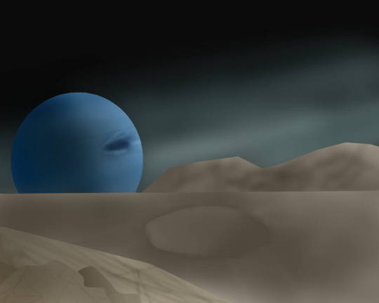
This one, also of Neptune, was posted two years after the first one. The framework is kind of there, but only barely. The perspective is off, and once again, the detailing is too minimal and too soft. On top of that, the shading isn't nearly as harsh enough. Compositionally though, I was starting to get a grasp of some basics.
There would be a brief artless period in my life from 2017 to 2020; every once in awhile, I wouldn't do art for a few years. Then, suddenly, I would get back into it and put out several pieces, all before growing quiet once more.
2020, once Covid-19 started happening, would see the return of me to the world of art now that I was suddenly without a job.
Once again, Neptune will be a demonstrator of how my skills changed.
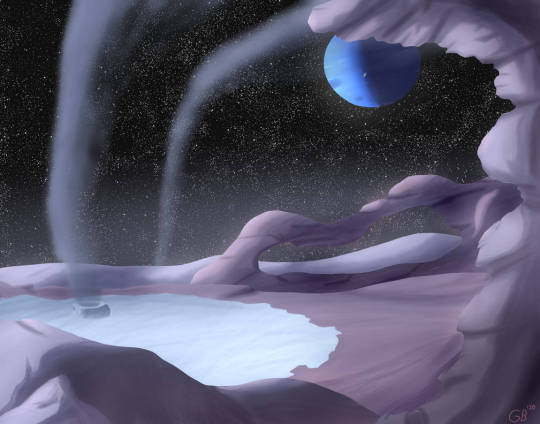
I was starting to get there; in terms of composition, much better than my older works. Coloring is a bit off, but overall, I was starting to actually understand how art works, and why things like detailing were important. One big thing here though; I was still painting with color. That would be one of the last big things for me to get over, although I didn't even know it then.
From the period of 2020-2021, I made a lot of paintings and mission patches for my one friend's KSP youtube series (seen here).
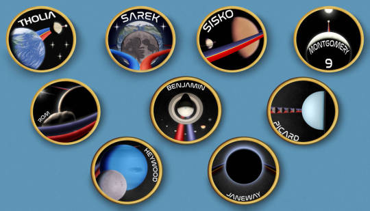
Doing what were essentially mini paintings, I learned a *lot* about composition and detailing. I think the one I spent the longest on was Heywood, in which I did my best to follow imagery from Voyager. Looking back now, however, it isn't quite accurate; that's the south pole! I still had a lot to learn in regards to doing accurate portrayals of celestial bodies, down to inclinations and the like.
Anyways, doing all that really burnt me out, on top of doing free art for people I didn't even know. That's another big lesson; only do gift art if you feel up to it, and for a friend. Do not do it for strangers.
It wasn't until late 2022, in September, that I actually finished a piece again. My illness had been pretty bad, leaving me bedbound for quite some time. However, during that time, I hadn't lost my skills thankfully.

This would be one of my first somewhat decent portrayals of Jupiter and one of his moons, using SpaceEngine for getting reference images and making sure all the parts were in the right place. This would set the groundwork for later paintings, as I always use SpaceEngine now to make sure I have the orientations and sizes of things in the sky right! It's been an invaluable tool, I quite literally don't know where I'd be without it.
Anyways; after that, it was very sparse once more, up until quite literally this year. Sickness sprung up again, and I had a rough winter due to the loss of my grandfather to Covid-19, among other things.
2024 saw, in my personal opinion, the biggest and best change to my art yet.
PAINTING IN VALUES!!!!!!!!!
I cannot stress this enough; understanding what values are, and how to see them in every day life literally changed my entire perspective on things. On life! I cannot go outside anymore without comparing and contrasting values of objects and natural phenomena.

This was before values. Not bad, but still not great. Detailing was getting there. This is from March 27th, 2024, and was part of an art trade with @dan-asd of their worldbuilding project.

And this, this is 3 months later, from July 16th, 2024. Commission for @corvidist, my very first. This was a massive leap in the way I understood and processed the world around me, and in turn, what my art looked like.
Everything is in values. Your phone, with the seemingly pure black LCD touchscreen to the blue and purple phone case. The clouds, with their bright white tops and dark bottoms. The river, with the murky green waters contrasting with the bright orange stones. All values, just differing shades of gray with color added! Everything is light! Everything is the absence of light! Light is the entirety of your piece; you just have to understand where light falls, and where it doesn't.
Apart from that, everything is just rudimentary shapes and lines. The universe is made up of different kinds of lines and shapes. Entire worlds can be reduced to light and lines, people can be too. You just need to know what to look for, and how to process that into artwork.
I cannot stress how much understanding that, and doing tiny little paintings really helped me get a much better grasp on things.
Take some time, get a small canvas out, and paint your favorite celestial body. Take as much or as little time as you need, and just have fun with it. Play with color, play with values, whatever your heart desires!
Once you're done, take a step back, and compare it to the picture. Analyze what areas you didn't enjoy, and what areas you did. Look for what doesn't line up with the picture, and think of how you could better approach it. Think of how you can change the lighting to make it seem more real, what effects are needed to bring it to life.
Art is the process of taking what you love, and putting it to paper (digital or not!). Focus on what you enjoy doing; it will all come naturally with time. You'll start to pick up on things, big and small, that will bring your pieces closer and closer to what you want it to be.
And please, for the love of everything that is holy, have fun with it and don't overthink it! You will be so disappointed in yourself if you hype yourself up for a piece, only for it to come out not the way you expected. That's ok! That's part of learning! It can be disheartening, but if you take the time to look at how and why you don't like the piece, it'll come out so much better next time around!
Talk to people, too! Talking with my dear email-pal Eduardo was my first step into understanding astronomical art, and thinking on how to improve my work. He really helped me step into the right direction when I was just starting out, which I am still eternally grateful for to this day. I think of him and his work often; he really was a massive help.
In more recent times, talking to @whirligig-girl helped me to get a better grip on realism, and how better to portray celestial bodies. She was a huge help in giving me pointers for fixing up my View From Amalthea piece, as well as the ones that followed after. Talking to artists more experienced than you and getting critiques is always a huge help; it can really show you things in a new light!
Speaking of, don't be afraid to let a piece rest and marinate for a bit. A day, a week, or even a year. It doesn't matter. You will come back to it, and you will see new things you never saw before, and think of new ways to improve upon it. I have a piece that's been in limbo for YEARS, and I still have yet to actually get to paint it (the top one, the alien one (i will never finish that Uranus piece though lol)). I have it perfectly envisioned now, so waiting really did pay off in the end.
Essentially, it all boils down to this:
Everything is light, or lack thereof.
Don't overthink it, and have fun.
Do not do free art for strangers.
Everything is shapes and lines.
Step back and look at your pieces, deconstructing them in your mind or on paper.
Examine your everyday life, and see how everything interacts in terms of values and color.
Do studies, please god, do studies they're so fun and eyeopening
Warmup! Warm! Up! WARMUP!!!!! They are critical to getting your mind in the art headspace! You will feel less interested and less focused otherwise!
Don't worry about your medium, just do what you enjoy and works best for you! There is no such thing as a perfect brush!
Talk to other artists in fields you enjoy!
I love talking about art, I really could go on for hours, but I will stop myself here.
You decide what you get out of art; it's your skill, your time, so do what you desire! These are only anecdotes about my experiences with art; they aren't universal, but I do hope they've helped. If you have any questions, any questions at all, don't hesitate to reach out!
Lastly, here are two resources for you for any future artworks you may do:
I got this book many years ago, but the lessons it gave me were invaluable. I mean it; they helped me to understand the importance of doing studies, and for detailing!
Paid membership, but an organization dedicated to doing astronomical art. I have yet to join, but I've heard lovely things about it! Hoping to join later this year, funds allowing.
I will finally end this here. Thank you so much for the ask, and I hope you have a lovely rest of your day!
18 notes
·
View notes
Note
mwah your art is good and nice :>
can I ask for some advice? no worries if u don't want to answer.
do you have any tips on how exactly to practice art? everytime I ask for art advice everyone always says "practice" but idk what to practice first! do you have any strategies for learning how to draw something? do you do excercises? and if so how do they work?and are there any beginner mistakes I should look out for and change specifically?
thank you so much!! have a wonderful week :>
thank you so much! im ok w answering! i dont want to speak as if i am an expert on how to draw things in general as i am learning as well and definitely am not completely learned, so i might not be the best person to ask since im not very professional w my art as I do it as a hobby (and I can only speak on mostly digital cartoon matters) but i reallly hope to try and help u out even a lil ! im really happy that you’re eager to draw :] I wish you so much luck muwah muwah
i also hated when ppl told me “just practice” and i dont wanna inflict tht on u EITHER LOL but also thats just what i ended up doing for awhile but i tried to find some things to help ^_^
tips for practice: My number one rule is that practices should be challenging but still fun, I know it can get frustrating trying to redraw a pose over and over trying to get it perfect. And over time it rlly is all about muscle memory, the longer you draw the more your eyes will pick out specific shapes in everyday life and convert them into its own vision of them! or at least its good to look at life that way, try to pin point key shapes and stress less on details in practices. after you look at key points, THEN you can go over what you have and draw in and over it to make it more “complete.” To stop practices from getting too stressful I recommend starting out drawing what you want a little more simple looking than ur desired finished product. This helps eliminate the pressure of everything not looking “perfect” and keeps your art more loose and fun. Doing this a few times is gonna get ur brain to recognize patterns in art and how things look/flow in anatomy and such. dont get stuck in ur own head abt perfecting everything to the point you either 1) give up bc ur not at a level capable of it being 100% “perfect” or 2) focus so much on making it perfect that you end up saying the work looks “wonky” or stale in dynamics, So while I do think studies help, don’t get too lost in them. I always practice with media I enjoy too, whether it’s characters or fashion I enjoy.
Strategies learning to draw something: people get mad abt this one but I think tracing reference photos is great. its been awhile but When I tried learning to draw hands better at first I would trace them then put the traced image to the side of the canvas, then try and replicate what my mind saw as its most important angles and aspects. Same for clothing folds/hair/etc! I think it’s maybe not the best idea to trace the ref and use the tracings as is, because you learn more from tracing it then trying to replicate and simplify what u learned into the style you’re working in. Find what shapes you like from them and don’t over detail it. you may have to go by eye and think “what parts of this ref photo should i simplify to fit my style” and for me, its usually adjusting the length of the torso and then the limbs by associations. i dont recommend feeling like u need a reference for every art you make though, its ok to let ur own head try out its own sometimes too while trying to learn this, see if it remembers any call bad from the past referenced sketches! over time ull remember where everything goes more, these days i rarely kick myself to use refs but im sure they still would help to use, but figure drawing simple blobby figure in a bunch of random poses was a big thing i used to do as well to get better at full body art + overall dynamics (still does this). also paying attention to silhouettes is great
Exercises and how they work: I WANNA HELP U SO BAD BUT to be honest, all the works on my blog ARE exercises! i rarely actually do finished pieces, if u scroll thru my posts ull notice most r sketches. i usually just fill up a page and call it “warm ups” then i get attached to some of them, take a few, and just line them up pleasingly on a smaller page, then color them in (or sometimes fix the lines to be more clean too). im not rlly a person who “exercises” to practice, it more so happens from just me drawing a lot for fun as a hobby! but i really should. i will tell u this has humbled me a lil i need to start practicing too 😭 LOL but a good exercise is to look at what ur inspirations do, and study it. Make a collage and write out what you like most abt their styles/what u want to gain from them. For ref Here’s a page I did awhile ago when someone asked me abt my insps:
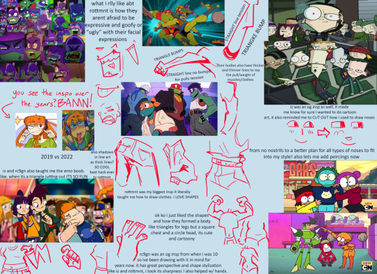
i also look at fashion magazines and as well as anime figures and take insps from that sometimes with learning cool poses and compositions to convert into my own things
Beginner mistakes to look out for: its hard for me to pin point “mistakes” beginners make, as sometimes we cant avoid all of them or even notice them, progress comes from growing out of old ways. some mistakes are even the foundation of ur future amazing cool style! but i think some things to look out for could be these, from my own old art experiences
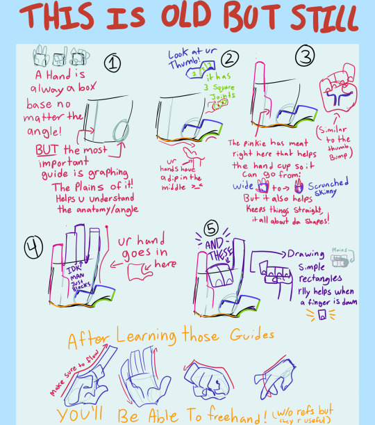
Hands were the first thing I learned bc i liked drawing them. I don’t know if that is the best way to go but I think it is smart to practice sooner than later, here is a lil guide thingggyyy wingyyy from awhle ago
i see beginners shy away from drawing signs of age in people, sometimes adding too much detail on an older person in cartoon art makes it look weird, so i try and hit the key markings on ppls faces of age.
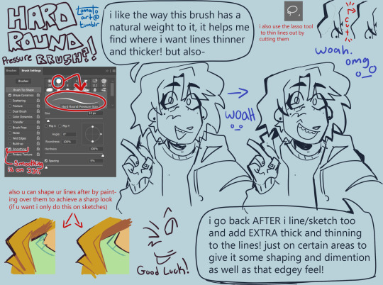
Too thin of lines. sometimes its a stylistic choice to use thin lineart, and it can look amazing ! but sometimes it can flatten an image if ur not familiar with its flow. im not saying use thick line art, but more so to keep in mind the weight of ur strokes, adding depth with a thick thin combo of line art can do SO much for the simplest of pieces. heres a visual from a while back when i talked abt my brush + more abt lines:
but if ur desired style is thin lineart that is cool too! tbh it was just harder for me as a beginner
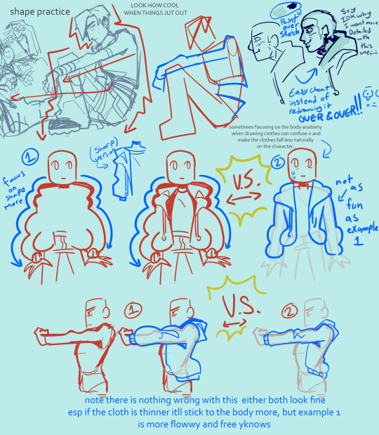
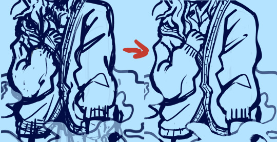
sometimes artists think they need to do full lineart for everything and then hate how it looks compared to the sketch, do not fear i will introduce u to my bff: painting over a sketch, extractinging the lines, then calling it line art. i only do this sometimes but its a fun exercise-ish thing to do in a pinch. example:
finding what shading fits ur art. sometimes ill see ppl starting out who have a style thats very simple, but they use a very detailed rendering process on it. this is not something id ever police of course, art is each persons own choice! And it CAN work. It can be so cute! but sometimes mixing two very contrasting mediums of art can throw off the “put together” look of it. i use to abuse the airbrush tool thinking it made my simple style look super cool and detailed, but looking back on it now those pieces looked a little off, having such a simple style have somewhat more realistic shading. dont get me wrong the ability i see ppl use rendering like that is so insanely talented! but i found cellshading to be a good match for cartoony art like my own. a tip i learned way too late abt that is rather than shading each layer by color picking a darker color, instead use a clipping mask over the entire art (above line art too as I color my lineart) and lasso tool the areas u want shaded + fill it w a saturated purple then set to multiply + lower opacity. also, sometimes coloring can come out chalky looking when u meant for it to be smooth and transitional, i think this comes from overshading and overlighting pieces without reason. pay attention to where the light source is, and focus on making the shaded and lighter areas nice shapes that cover the necessary areas, then u can add additional shading to the smaller details of what should have a casted shadow/light
its good to spice up ur art now rather than later, focusing making ur art pop more w backgrounds will help ur coloring skills look better too! i dont mean detailed huge backgrounds, a small lil color pallet and design rather than a blank white bg. like this will make u feel better abt it or at least it helped me *sweats* yeah:

beginners tend to draw blank faces like “:)” but I think a good thing to do is try and get silly with expressions early on. It’s okay if the mouth hangs off the face cartoonishly with joy or shock, it’s ok if the eyebrows are super high in surprise.
tracing and pasting it as is (already said this but I’ve seen ppl do it a lot with hair styles and it makes it look alienated from the rest of the style) (final fantasy fans found critically injured) n if need a ref for a pose, using a real humans anatomy as-is doesn’t look quite right on a cartoonyish drawing. Shortening torso and legs usually comes out of this for me!
flip ur canvas i promise u it’ll be less embarrassing over time!
using guidelines for perspective and foreshortening is GREAT. Do it stylistically rather than realistically to add some groove to it...yay. Having silly perspective in art can make it look like a 10 so easily opposed to a normal front facing sketch. Look at cool poses from fashion magazines! Don’t be scared to draw something you don’t feel confident in conveying perfectly, this is why progress redraws exist :)
Drawing the hairline b4 u draw the hair is great, it helps u understand where their hair flows from, where it starts and stops, AND prepares u for drawing bald ppl. Also don’t make the head too big, the skull IS bigger up top, but sometimes I see an alien head affect.
Anatomy is an interesting mistake that beginners make a lot, but it’s one they find harder to notice! When I started out, all my art would be SO wonky, but I didn’t even realize it! It still happens today too! specifically though I see beginners struggle with the arms in this department. My advice is to try and measure them out and make sure they don’t go past the knees, and are the same length as each other when Unfolded. asking for criticism is hard but it helped me realize when i would make something bigger/longer than it should have been in my art, and stuck with me being able to go “oh... i see it LOL”
clothing wrinkles- do not over do it! Too many wrinkles and shading can look unpleasant and wirey- like a plastic table cloth all bunched up which isn’t exactly what ppl wear. pay attention to gravity too
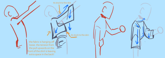
I hope this helped even a lil im sorry tht I’m not very good at explaining or didn’t have much to sayyy! If u have any troubles no guarantee I’ll have the answer, but ur always free to ask!
114 notes
·
View notes
Note
hii, i just wanted to ask if you have any tips you have for someone who is just starting to do digital art and fan art in general? im just kinda lost because i don't even know where to start (for context, im a 2nd year art student but i only draw and paint traditionally bc im terrified of digital 😭)
im asking you because I've been following you on here for a while and i LOVE LOVE your art, i love how you draw intimacy so much and how you give the characters some different traits or details, it makes your art feel so special i love it<3
sorry for the long ask don't feel pressured to answer if you don't know what tips to give me (and im sorry for my awkward english, it's not my first language and im also autistic so it's Even harder)
have a great day/night <3<3
thank you so so much for your sweet message!!! 🩷
ive been in the spot actually, because for the majority of my art journey ive been drawing traditionally- ive started doing digital art like 3 years ago now
as far as tips go it really is just a lot of trial and error. digital art can be overwhelming because suddenly you have all these tools on your hand that you didn't have before. trying all the brushes and not being afraid to go out of your comfort zone are probably the most important things- don't be afraid to adjust and tinker with brush settings!!! one of my favorite brushes is one i custom made myself because i realized what i wanted in a brush!!
and don't be afraid of using the tools digital art has to offer!! a lot of them are different (and some people keep saying it's cheating but it's really not) but they're so helpful!! the lasso tool, color picking, references and 3d models, flipping your canvas etc.
doing studies, especially when it comes to colors and composition, help a lot too!! i was so overwhelmed with the coloring process in the beginning and eventually you'll figure out what works and what doesn't!!
fanart really is just drawing what you want to see but i really can't stress enough how fun and inspiring fan projects are!! big bangs and collabs and zines are the best way to meet other artists and find a community!! i've made so many friends through these things and they continue to inspire and help me out 🫶🏻
but yeah, other than that it's a lot of practice and trying things out and connecting to people- but that's also the most fun part 🩷
10 notes
·
View notes
Text
Tips and Tricks For Beginner Artists
I want to preface this by saying two things. Or maybe couple more.
One: This is my first ever blog post that I have written. There will be mistakes. I am still figuring out Tumblr Blogs. Deal with me. Thank you <3
Two: I am by no means a professional artist. I am still a student. I have been doing art for little over three years now and I am writing these to share my experiences as an artist that is self-taught. Also because I struggle with the mental aspect of art. I want to share and help people that are where I once was. I wish I had found somebody to give more personal, down to the bits advice to get me into the world of digital art. I am writing about what worked for me and how I did certain things. Enjoy.
(I am largely a digital artist. This is centered around digital mediums and methods. )
This blog post will be more helpful for people that are self-teaching and just starting art.
Regardless of why you want to do art, you need adequate tools to do it.
My first and current graphic tablet is One By Wacom in Small (ought to be replaced soon). I still use it and it serves just fine. It has no buttons on it, plain design. Wacom has excellent support and works smoothly. It was also a good budget decision. If you have a tablet that comes with a pen, work on that. Keep in mind, if you are intently buying a graphic pad or a tablet for purpose of art, buy something that you won't regret too much if art doesn't work out for you and it ends up collecting dust. It is easy to upgrade once your needs require it. Research what graphic tablets are out there and what would work best for you. There is a wild variety to choose from.
Now to the art program. Finding an art program to start on is not at all hard now. There are so many, each with its own quirk. I used Krita since forever. It is very professional, much like Photoshop but also easy for a beginner to grasp. And entirely free. Find an art program that you are comfortable in. Procreate, MediBang, Clip Studio Paint, Paint Tool SAI, Photoshop are only some of the choices.
Possibly in another post I will get more into Krita and how I use it as I am very fond of it.
Set Up Your Canvas
Here I am not going to go way too much into depth on this as it can vary greatly depending on what tools you use and what program but I want to stress the importance of having a workspace that works with you, not against you. Some of the best tips I have gotten for this are:
Set your canvas to a a medium gray color, somewhere in the middle of the gray value scale. Looking at a plain white canvas is daunting and quite inconvenient when you're starting off.
Pick your resolution. Usual choice is 300 dot per inch (DPI). Size of your canvas depends on your screen/machine/program. I usually go between 2000-2500 as my PC is past its prime and doesn't handle things well without sounding like a rocket about to take off. Research what your machine can do without lag.
I will give more advice on using brushes in another post but just going to say, using plain black color is usually bad idea. At least it was for me. It amplifies mistakes and leaves little room for fixing. Instead, try using a gray color somewhere between black and your canvas color. Medium value blue and red also work fine as sketch colors.
Start Comfortably
There is no point looking at all the masterpieces that ArtStation and Instagram has to offer and setting it as your short-term goal. A biggest downfall you can have is from starting too big.
Instead, focus of doing small things. Sketch a lot. Sketch basic shapes. And draw what you love. Art is a craft of heart, at least for me. Detaching yourself from that will make art will like a chore, a cold labor that you do not enjoy.
Ahem. Anyway.
One of the best exercises I have found is to just draw lines. This you can do on paper too as it is an excellent way to warm up. Try to make a straight line. Go not too fast nor slow. Make as many as you need until you get it straight. Do the same for circles. Make them as round as you can. Your hand is the biggest trickster. It does not cooperate with your mind as well as you want it to.
Sketch, sketch sketch, get yourself comfortable with it. Everyone does sketches, one way or another. Of course, you are free to try an entire piece but it can be very discouraging when it turns out nothing like you expected it to be.
I will make a post just on the ways you can practice as a beginner.
Find Inspiration
The biggest foe of artists is lack of inspiration and an artists block. I know it was mine. Finding inspiration is way easier when you are starting off as you often want to draw everything. There are plenty of places where you can get inspiration on what to draw. Pinterest in my all time favourite. You can also look at Instagram, ArtStation, your favourite shows, camera roll, world outside. Jot down what you want to draw when you get an idea and save it for later.
Find Artists You Love
This goes for everyone, but especially if you want to get into business of art. Having artists that inspire you and whose art you enjoy seeing is a must. It feeds your creativity and helps you develop your art style in the long run.
Don't compare yourself to other artists
Often, artists you see that get most views and likes have been in it for years. Do not go into art expecting that it will look perfect right away. Art takes time. A lot of it, often. Those artists whose works seem perfect have spent countless hours on sketches, studies, classes, lessons. Stressing over why your art is not good at the very start will not allow you to move on and better. Instead, appreciate and enjoy little what you created. Everyone's art journey is different and what matters is the road, not the destination
You don't have to be a natural
I never was exceptionally good at art growing up I did have an affinity for all things creative—I had passion for it, but my skills weren't out there. Majority of artists aren't naturals. In my opinion, passion and will is more important than natural skill set. Skills can be taught but without passion and will to learn, you won't get anywhere in art.
Your journey is unique
Everyone learns things at a different pace. What works for somebody, might not work for you. We all have different minds.. That is why everyone's art journey is so unique and interesting. When I started off, I was doing things exactly as I saw others do them and it resulted in frustrations because it wasn't turning out the way I imagined it would. Beginners are inclined towards this and that's alright. But it is important to realize that there is no law out there on how you have to learn the craft. Do it in a way that is most comfortable.
For example, I have quite an attention deficit. I cannot focus on a subject for longer than 15 minutes tops. So watching hour long lessons on Youtube or reading books on the subject didn't cut it for me. I either broke it up into smaller bits and only took what I needed in the moment or looked for compact, one-slide lessons, usually with examples, to tackle a subject. Rather than being told what to do, I needed to be shown how to do it. This might not be a good way for somebody, it really depends and comes down to you. You know yourself the best.
Now for the more practical tips
Outlining
This might be a controversial one out there, but I was never a strong believer in outlining. While it can be fun and it is helpful in beginning stages, it eventually stunts your growth. Instead of simply just outlining, look at how the things work and why does it look the way it does. Break down shapes and study them. Of course, there are instances where it does help to do it and I am not saying that you shouldn't do it, I just never did it. In my opinion, training your hand and mind to follow references is much better way to study and improve.
Use References
Do it. The best of artists use them or have used them for a large portion of their art journey. Do not see reference images as a cheat for artists. Drawing from mind is difficult and not something I would suggest to somebody starting off. Instead, find several references—for poses, shapes, color palette. The more references you have, more you will learn. I use Pinterest for this mostly. As I get can very easily distracted, I usually prepare them couple of hours in advance or a whole day before and store them so I can use them in the future whenever I need.
Don't just look at at the image and completely try to mirror it. Improvise. That's how you learn. Study it. Draw over the reference and then draw next to it. Do it as many times as you want and do it on several references. Sometimes it is enough to do reference thumbnails to effectively improve your art for the day.
Learn from Other Artists
I will make a special post on what artists I watched and learned from and how the self-teaching process looks for me. Regardless of how you study art (art school or not), it is important to find as many resources and sources as you can. Do not focus too much on narrowing it down to a specific thing. Look for lectures on basics that will prepare you for any course you might want to take, especially if you are self-taught.
Practice. Practice. Practice.
This advice I got from listening to my favourite art podcast from Adam Duff LUCIDPIXUL and it gives you this comparison.
If you spend a year reading fitness magazines but never go to the gym, are you going to get fit? No.
Try to make a routine and set the time when you are free to draw. More you do it, faster you will progress and develop your skill. No matter how bad it looks to you, just draw. You don't even have to complete it. Just sit down and put something on the canvas or paper. If it doesn't work, store it and move on. You learned something and will be better next time. It only looks bad if you didn't draw anything.
I hope this tips got to you and that you find them as helpful as I did. Happy drawing!
____________
I am a self-taught digital artist from Serbia. I hope to help people by sharing my art, process and advice that has and still is helping me.
#art#digitalart#artadvice#selftaughtartist#illustration#arthelp#arttips#tipsforbeginnerartists#artists on tumblr#artblog#artblr#digital artist#myartwork#artwork#drawing#digitaldrawing#digitalartprocess#artprocess#beginnertips#useful#reference#wacom#artcommunity#howtodraw#howtoart
6 notes
·
View notes
Text
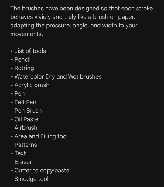
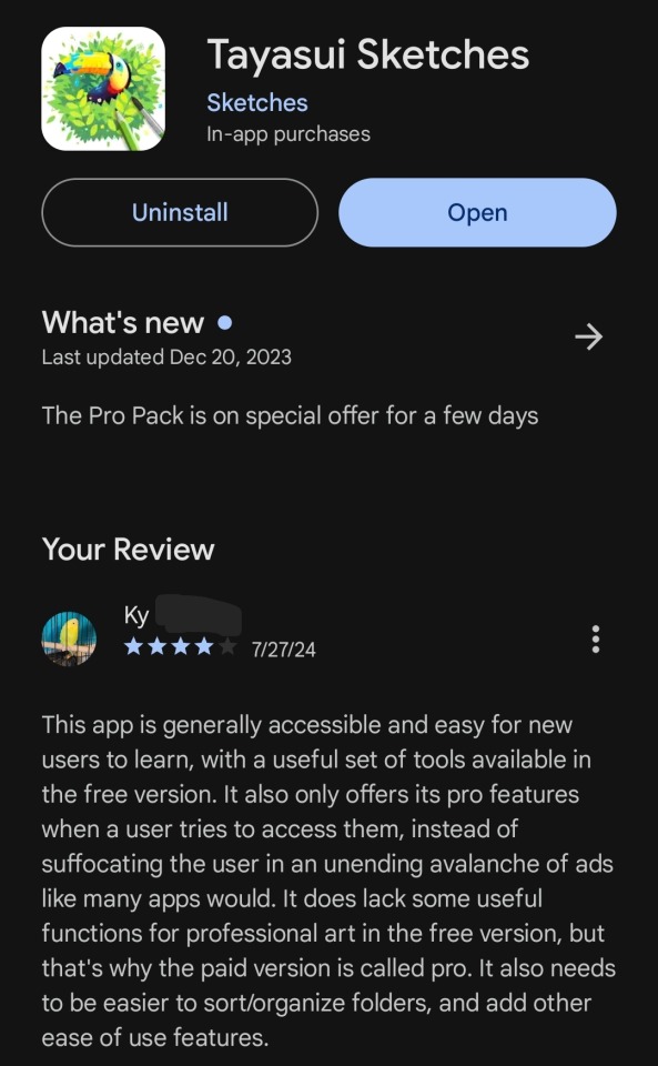
Tayasui Sketches, Digital Drawing App
I've been calling the app I use to draw all of my digital art "the free Sketches app on Android" because I use it on an Android phone, and the homepage icon looks like this.
All it says under the simple pen against a white background is "Sketches" without any other names or identifiers.
However, when I opened it the other day I paid enough attention to see that it actually says its full name the first time you run it after having it closed for awhile.
I didn't want to keep being vague about the name, because I know there are other people like me who (for whatever reasons, we all have different situations) can't justify buying and/or subscribing to a digital drawing program or app and are always looking for a free one to allow them to draw. I know I always pay close attention to the exact name and features when another artist or writer mentions a free program they use and get frustrated when they just say "that one, I'm sure you all know it" or "the thing with the icon," so I'd like to share the same details I seek out with anyone who wants them.
If you're one of those people, Tayasui Sketches is available on at least Android and may or may not be available on other mobile platforms. Here's my relevant knowledge and thoughts about Tayasui Sketches.
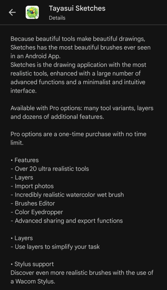
This program is largely free of fees, subscriptions, and/or ads. It has the one-time cost for its pro upgrade, still image ads you have to scroll past in your sketch library, and the occasional prompt to buy its pro version if you try to use pro features. It may have other ads that play here and there, but they're so rare that they're not memorable to be and I can't be sure what -- if anything -- triggers them to happen.
It's also fairly easy to intuit what goes where and which buttons do what in areas where the initial tutorial/help menu falls short. Developing my own tricks for it and ways of using it has felt natural, for the most part, and it's a big part of why I stick with this app even when I can't use the pro version.
Another reason is the array of tools it gives free users. Not being able to use layers has been frustrating sometimes, and I sometimes look longingly at the small "more tools available in pro" banner in the tool table, but what I can and do use is great for my style of art. Being able to use painterly brushes has helped me refine my art style a lot, the pen brush makes my handwriting and lineart look much more legible than when I draw or write notes on paper, and the text, smudge, and lasso tools have seen more use than I'd expected when I started.
I especially love the options to change the texture and color of the canvas itself, and how the size and opacity sliders for almost all the brushes/tools are so easy to adjust. Being able to save and export my sketches has made sharing my art a lot easier, too.
It's not a perfect program, those most likely don't exist and I'm sure this one has flaws I haven't even noticed, but overall it's great for beginners and good for people who can't get/use a paid app. I like Tayasui Sketches a lot.
#art#art app#digital art app#tayasui sketches#amateur artist#sketches app#app analysis#app review#kind of#sonder speaks
0 notes
Note
HEY SO I'M GONNA FINALLY ANSWER THE HANDS PART OF THIS QUESTION LMAO
don't get your hopes up tho, it's probably not gonna be that interesting because honestly?? I STILL SUCK AT DRAWING HANDS. ALL THE FUCKING TIME LOL I have little "quirks" with how I draw hands that make them evident that it was indeed I who drew them, and I still struggle with fingers specifically because I often have to redraw them during the process to make them look less like little freaking sausages. I owe that to my roots in cartoon/chibi-style art where sausage fingers were pretty much the norm, it drives me nuts when I end up with them on my normal-proportioned characters LMAO
That said, to me, "learning how to draw" whether it's hands, shoes, faces, etc. is literally just learning little tricks and secrets that help you understand the things you're studying better. And one little 'trick' I learned that helped me understand hand structure a lot more was from an Ethan Becker video talking about Loish's hands. I've been following the "when in doubtie one fingee outie" mantra ever since, it shouldn't be used as a default setting for fingers in every scenario obv but it DID help me understand more how the fingers moved relative to one another and how you could "trick" the complexity of hands into 1-2 easy shapes.
youtube
(if you've never watched Ethan Becker, don't take his style of comedy too seriously, he's not actually attacking anyone lol)
When it comes to my actual drawing process though, thanks to the way I draw Rekindled I've learned that I work a lot better by laying down solid shapes as my 'sketch', it works better for my brain to see immediately what's working and what's not, vs. a wireframe sketch that doesn't 'fill in the gaps' quite as much as solid color. So try that sometime, instead of sketching out a hand, just lay out the shapes with solid color. Personally I've learned the 'wireframe' structures or whatnot that you see in a lot of how-to-draw guides don't work for me because I find it over-complicates it-

(haha nope sorry too much for me, it's cool if this works for you but my brain cells are out on this one fam)
My brain thrives on simplicity and freedom of movement in my structures, so solid colors work a lot better for me in that regard. That said, what works for me might not work for you (and vice versa) so try your best to find new techniques and methods, you don't have to do the thing that people tell you you have to do to "get good". That's just what works for them.
And of course, do life studies! Here are some steps you can start off with that I think might really help for simplifying the life drawing process:
1.) Prepare a nice big canvas for yourself, if you're working digitally do not zoom in on that canvas, keep your fingers OFF that zoom wheel or the Z key or whatever you're clicking to zoom. Zooming removes the big picture and you need big pictures to break down.
2.) Pick a big brush size or a tool that can't become too detailed (so if you're doing digital, pick a round brush and bump the brush size up to a medium-large size, if you're doing traditional, get yourself a nice thicc charcoal stick)
3.) Rather than looking at other people's breakdowns of hands (which they made for themselves and their brains, not for you and your brain!) go and find some pictures of hands and break them down yourself, trace over them if you have to, fill them in with solid color or just draw yourself some cute mittens like Becker above, just whatever you gotta do to break those forms down into shapes that are simplified and easy for you to understand. Try out different hand shapes and finger positions, eventually you'll notice there are ways the hands can and cannot move and that's going to be the foundation you need to actually stylize them with your personal flair down the road - learn the rules first, then break them. And yes, tracing is okay if you're using it for educational purposes like personal art studies and shape breakdowns. Just keep it loose and for learning.
Yes, it really does come down to "just practice" BUT you can wind up practicing the 'wrong way' if you're doing the same things over and over again expecting different results so make sure to step outside of your comfort zone a little and experiment with new techniques even if it means coming up with your own. You never know what will work for you until you try it!
Hope that helps! Happy hand drawing! <3
Omg hiiii, I absolutely love Rekindled! You're so talented, and the story you're making for Persephone is so intriguing! A lot more than whatever trashfire Lore Olympus has become.
That being said, what was the moment you stopped liking LO Persephone? Have you always disliked her, or was it gradual? Or just a specific moment that made you go "yeaaaaah.. she's not it ;-;"
(And bonus question if I can ask, but how do you draw hands?? I hate them with a passion, but unfortunately hands are pretty necessary T^T)
aahhh thank you so much!!!
honestly, I was a pretty big fan of LO up until the trial arc. Like, you've all seen me hate this comic with a fiery passion, but the only reason I'm able to do that is because before I hated this comic, I loooved this comic. I'd literally be counting down the hours until new updates, I loved the art, and I was too smitten by the appeal of the series to notice its writing problems, I just loved the romantic drama and the H x P ship, and yes, I loved Persephone, I loved her design, her personality, and I felt so 'seen' by her struggles, both with her trying to pave a path for herself and the SA plotline. I was even (regrettably) one of those people who would lurk in the antiLO tags and think "wow, these people are dumb, can't they see how brilliantly written this is ?? they're nitpicking!"
But then the trial arc happened which involved writing a plot that didn't put the romance front and center anymore - now that Rachel had to actually write something complex and logic-driven, the blinders started to fall off and I went wait... maybe Rachel doesn't know what she's doing. Persephone choosing her own lawyer? And it's Hades, one of the judges? Why are they suddenly establishing Thanatos as Hades' adoptive son? I'm not a lawyer, but I know that's not how any of this works and it really tipped me off that something was amiss, that Persephone was having all of her solutions conveniently handed to her on a platter and all of the other characters were suddenly being made to look like assholes just to make Hades and Persephone the heroes.
And then... Eris happened.
See, one of the things I loved most in the story was Persephone's character arc concerning the Act of Wrath. I write stories about characters with dark "personas" all of the time. So it was something I had frame of reference for, I really loved the premise of Persephone earning her name through this act of violence and while it was dashed with the opening of S2 revealing it was "all an accident", I was excited to see how the trial arc would bring about new information and confirm who was telling the truth about what "really happened" with the Act of Wrath. If the courtroom drama wasn't gonna be realistic, I could at least hope for some good 'OBJECTION!' reveal that would finally put to rest once and for all what really happened, and maybe Kore would finally embrace this 'dark side' she had.
So for the actual twist to suddenly reveal itself as... 'actually, this one goddess we've never mentioned before blessed you with wrath. why? idk she just did. anyways she's the reason you have wrath and that's what made you commit the act of wrath. problem solved.'
And that was where the twisting of 'faith' happened. When I went through the subconscious realization of , "Oh no, Rachel doesn't know what she's doing and it took me this long to notice. Oh no, maybe those antiLO freaks had a point-"
That said, there was a glimmer of hope in the midseason finale. Persephone was sentenced to remain in the Mortal Realm to carry out her mother's duties and I thought, "great! This will be Persephone's Rocky moment! She'll have to prove herself without the help of Demeter or Hades! This is gonna be awesome!!" During the hiatus, I was VERY excited to see where the story was going, I still had so much hope and I figured the mishandling of the trial arc was just a bump in the road. The series was still good, it was just going through a rough patch, these things happen.
And then it came back and it all went downhill from there. There was a 10 year time skip with very little insight as to what happened. Minthe and Daphne were just suddenly back to normal. They were referencing some food shortage or terrible event that happened during Persephone's reign that they never explained in explicit detail. And now, all of a sudden, Persephone was just returning to the Underworld, where Kronos had suddenly taken over. I had cautious optimism but throughout it, I was really seeing the cracks that were already forming opening wide. A lot of what I had to say wasn't positive anymore, I literally couldn't understand what the reasoning was behind these writing decisions and I couldn't find myself rooting for Persephone anymore, everything just seemed to convenient and easy for her to make her seem like the "strong and confident" character the comic claimed her to be.
The S2 finale was my breaking point and I think it was for a lot of other people too. That was pretty much where my 'transformation' from passionate stan to passionate critic happened, and it happened alongside the creation of the UnpopularLoreOlympus subreddit which would become my new 'home' within the community. After seeing how much the story had gone downhill, it made me realize in hindsight just how awful and one-note Persephone is, how she really never cared about anyone but herself and Hades, how her mother did, actually, have a point about her being practically groomed into a relationship with a billionaire slave driver, how she was very intentionally drawn to look like a child in ways I couldn't believe I had never noticed before, the list of "awakenings" goes on. And it sucked! It sucked to have that realization that the thing I loved wasn't just imperfect, but incredibly problematic in its writing and art choices. And just like when I loved the comic, I couldn't just let go of it, I had to understand to some degree why this happened.
It happened because Persephone was always being written as a one-note, easy to project onto self-insert character. A Wattpad protagonist. Not an actual representation of the Goddess of Spring, but a blank slate for the creator and the fans to imagine themselves as purely for the power fantasy of hooking up with a rich and abusive guy.
That was when I made my first piece of LO art intended to be an 'edit' - a redraw of Persephone's rebirth as the Dread Queen from the S2 finale, an ode to the Persephone I was hoping to see but never got. The rest from there is history.
youtube
I know I'm being SUPER dramatic about it but this was literally how it felt to go through the realization that this comic - and its characters - wasn't as good as I thought it was, and I think that's a sentiment that's shared by a lot of the 'haters' in this community. LO was a big part of my life and even some of my friendships with people, so when it went downhill, it felt like such a hit to the gut. It's still a big part of my life, albeit in the opposite direction, but I still wonder sometimes over the "what ifs", what if the series hadn't turned out this way? What if I had never realized its flaws? Rekindled is basically a love letter to those what ifs, satisfying the feelings I never got to keep with LO, and giving me a reason to count down the hours on Saturday nights again. I'm glad it's made that same impact for others, too <3
169 notes
·
View notes
Note
hi!! i’ve recently started a portfolio project with some friends to create a retro styled game. while i like to think i’m decent at digital art i still struggle with pixel art and i absolutely adore your style and pixel pieces. if it’s alright can i ask if you have any tips for working with pixel art?
aww, thank you so much!! <3 i'm not an expert by any means, but i would be happy to share a few tips that may help you out!
first things first, i use aseprite as my program while working with pixels! however, you can make do with any art program that has a binary tool :]
1 - Coloring the lines!
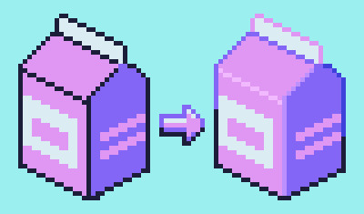
something that i think can add a lot to pixel art is coloring in the lines in specific places to suggest a softer edge, or difference in lighting (and accuracy aside, it looks more interesting!)
2 - Shading!
when it comes to shading, there are a lot of different ways you can do things based on your own style!
personally, i tend to avoid what's called pillow shading, which is basically just shading around every outline of the art with no difference in weight. i also prefer not to make the shading overly detailed with too many different colors, as it can muddy up the palette and readability (especially with smaller sprites!)
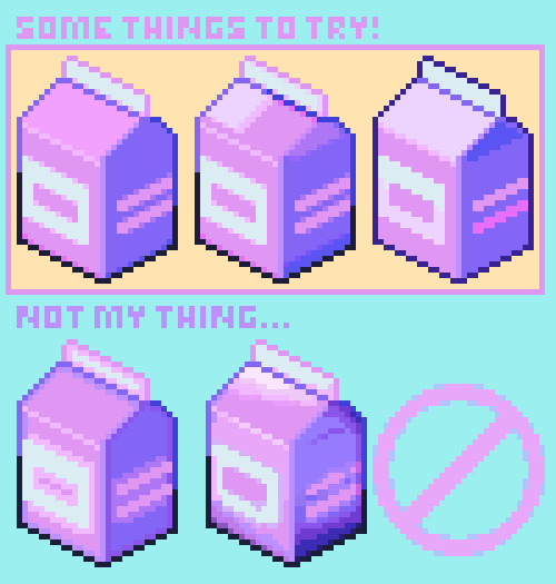
out of the three examples on the top, the first one is what i would personally use! sometimes just having simple shading is best, but it really depends on the size...
3 - Sizing your canvas!
one of the most important parts of pixel art is a choice you have to make before you even begin the artwork, which is how to size the canvas.
if it's too small, you may not have enough room to fit all the details
if it's too big, there may be parts of the sprite that seem barren and kinda wonky
... so use your space wisely! depending on the thing you're trying to draw, a larger or smaller canvas may be more suitable.
4 - Color Palette!
another small tip is to try and re-use as many colors as you can from your existing palette! it's fine to add a color here and there as needed, but using as few colors as possible can make your artwork feel a lot more coherent
---
i hope this helped a bit! if there's anything specific that you would like some tips on (making character sprites, tilesets, etc), just let me know ^__^
#art tutorial#art tips#pixel art#pixel art tutorial#pixel art tips#pixel tutorial#how to make pixel art#tutorial#how to#resource#game dev#pixels
304 notes
·
View notes
Text
first, it's already a great start! it looks so cute :3 i have a bunch of tips and tricks, and i broke them down into similar categories. bit of a warning, i'm self taught, so how good/helpful these will be is uncertain
set up
this is all the boring stuff before you actually draw. the main thing is make everything easy to access for you and streamline it, so you can focus more on drawing than fiddling with settings
pen pressure setting: procreate has a universal pressure sensitivity that i recommend playing with until you find what works for you. for example, if you find you struggle with getting darker strokes, move the line a bit to the top left. the default of a linear curve from bottom left to top right works just fine though. for reference, these are my pressure curves (the right one is from a different software)
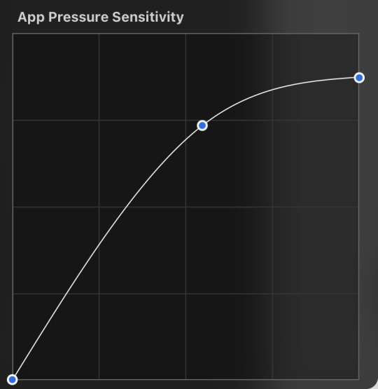
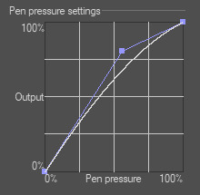
i don't recommend copying mine from the left since it's to make drawing darker without much pressure since i have tendinitis
canvas size and resolution: honestly the "screen size" preset is pretty good for anything. you can also change the canvas size and resolution once you're in, so if you realize you need something bigger or smaller, it's an easy fix. my general rule of thumb is at least 2000px for the smallest dimension and at least 100 dpi. my default is 2480 x 3508px at 300dpi, and i downscale it to about half the size at 72 dpi for posting because the files are too big. if you notice your lines look a bit "jaggy" and it's not from the brush texture, that's pretty good indicator that your resolution/dpi is a bit too low
shortcuts and gestures: highly recommend putting anything you notice you use a lot as a gesture or in the quick menu which i think is tap and hold by default. this can be actions like flipping the canvas horizontally or switching to the eraser brush
brushes: anything goes! try out a bunch and settle on a couple that are your go to's. this also applies to brush settings. tweak settings to your liking! if you didn't already know, you can have preset sizes and opacities on the slider by tap the slider and then the plus icon. if you're lost, there are only three main brushes you'd need for anything: a hard round brush like monoline (caligraphy), a pressure opacity brush like round brush (painting), and a soft airbrush like soft brush (airbrushing). the main reasoning is that you can get the variation for hard and soft edges for anything.
technical tips
these are more for tricks specific to digital art than the "how to draw X" kind
liquify: need to make small adjustments like moving the nose, but you don't want to redraw it? liquify is your best friend! it's under the magic wand/adjustments setting. liquify also works on multiple layers
reference window: under the actions setting and canvas, you can toggle the reference window. by default it shows a small version of your canvas, but you can use it to put a picture to use as reference. very handy when drawing a character! (side note: you can also color pick from your reference by tapping and holding over the reference)
flipping the canvas horizontally: also under the canvas tab is the "flip horizontal" action. it does what it says on the tin. it's benefit is that flipping the entire piece sorta refreshes how you see it. the oddities jump out more since your eyes got used to seeing it in its normal orientation
layer effects and blend modes: by default, every new layer is a normal layer, but you can change it to one of the many different types. there are way better explanations and tutorials explaining what each does, so i'm just gonna go over the ones i use most: multiply: it'll make what's underneath darker using whatever color you use. it's best for applying shadows quickly add: it'll brighten what's underneath with the color you're using. i like using it for bright highlights or lighting, but it's often too strong to my taste, so i lower the layer opacity afterwards overlay: it's kinda like a tint for what's underneath. if you use a blue overlay layer, everything will have a bluish tint to it. i use it to quickly change the setting (sunset, night, etc) and to add the bluish hue to the bottom characters and a yellowish hue to their faces
post processing: these are the fancy effects done at the very end to add the extra cherry on top. all of these are under the adjustments tool. the first four let you change the colors after the fact. again, there are much better explanation than what i can provide, but my go to's are: noise at ~5-8% and for more finished pieces perspective blur and chromatic aberration at ~3-5%. none of these are necessary. i just find them fun to use
foundational tips
these are the general drawing tips not exclusive to digital art
references: references are great! whether it's for poses, outfits, settings, or the character themself, references make drawing much easier
construction: everything can be broken down into simpler shapes, and by building off of simpler shapes, it's easier to notice and adjust things compared to something like a fully drawn face. what guidelines you choose to use are entirely up to you. as long as they're helpful, that's what matters!
stop to think: sometimes, it can be really easy to get lost in drawing and go on autopilot. slowing down and trying to draw with intention often helps to combat drawing what you think you see vs what you actually see
resources
marc brunet has been my resource for learning pretty much everything
emiliodekureart has amazing tutorials on drawing figures in movement
marco bucci has amazing tutorials on painting and lighting
chommang has easy to follow tutorials on drawing various faces and poses
proko has phenomenal and in depth videos on fundamentals and anatomy
i hope this helps! this was very long, and i hope it wasn't overwhelming or anything
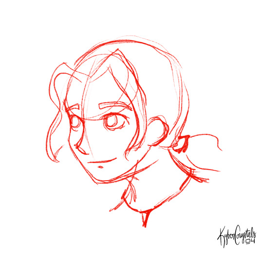
I love art. I love doodling. Sketching. This took me under 3 minutes to scratch out on my tablet…but getting past this point is so hard for me!
I use Procreate on my iPad … to my fantastic, artistic peoples…what are some tips and tricks (and maybe some YouTube videos) you use that can help a newer digital artist??
27 notes
·
View notes
Text
Someone said they wanted a Cricut tutorial, so here goes:
First of all, disclaimer, I do not really want to give Cricut money. This means I'm doing this with the least expensive tools I can find. Literally the only reason I went with Cricut instead of another brand is that Cricut sells the Cricut Joy, which is like $120, making it the cheapest computer cutter out there AFAIK.
One of the parts of the Cricut line that I don't have is a subscription to Cricut Access. Cricut Access is an online library of assets that are all digitized for the Cricut and are ready to use. I didn't get my Cricut to make baby onesies that say "Sorry I made big bad poopoo pants" on them or whatever the cricut wine moms make. I got a Cricut to put my own designs onto stuff.
So, if I'm doing a cricut tutorial, I'm going to start by showing how to make your own designs for the cricut. While this normally requires some kind of digital art software, which is going to get its own tutorial, here's a really fast technique that doesn't require that.
Part 1: draw thing.
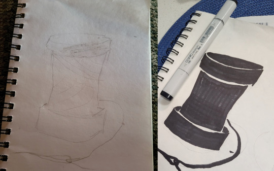
Part 2: Using some kind of dark marker to color in your design. You can get more detailed than this. However, make sure that you're keeping in mind that these shapes need to be cut out. You can only get so detailed with this before the machine can't figure out what to do.
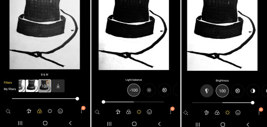
Part 3: take advantage of your portable, pocket-sized* image editor. Your phone usually has some kind of image adjusting options. You need the black outline to be as dark as possible, and the white to be as light as possible. First, crop the image so that it is as small as it can possibly be without cutting your design. Then, I started by putting a stark black-and-white filter on it, and then adjusted the sliders until that dark part on the bottom-right corner was gone.
____ *okay, depending on your pockets. I have some pants that won't even fit an iphone 4 or a motorolla razr

I've never used the Design Space mobile app, so I just emailed the picture to myself and uploaded it into the desktop version. After repeatedly declining Cricut's offer of a free month of Circut Access and just $9.99 a month after that, we're ready to upload the image.
When the software asks you what kind of image, you hit "simple." Full honesty, I feel like any image that makes you hit anything other than simple probably needs to be reworked on my end before trying to make Design Space understand that.

After you've uploaded it, and declined the offer of a free month of Cricut Access and just $9.99 a month after that, you'll get access to these tools.
If your image is good, you can start by just clicking the magic wand tool into the white areas of your design. This will erase them and make them transparent.
Note: with the way this process works, you don't actually need to fill in the whole of the dark areas, as long as you outline them dark enough and have no gaps. I did it anyway for this design, to make it easier to see the process. However, if you have a more detailed design, you can get sharper lines by just using a 1.0 sized multiliner and leaving your fill-ins blank.
I also went in with the eraser to make sure that the gaps between my pieces were large enough to stop the pieces from touching.
Then, you upload it as a cut-type image, and it'll open in the canvas.

Since we're using the Circut Joy here, I went into the size box in the top right and set the smaller of the two dimensions down to 4.5. 4.5" is the maximum width that the Joy can cut, so this will make the piece cut as large as possible.
Since the Joy can also cut 24" long, you could combine a lot of little designs on the Design Space canvas and make a file for a border print. However, it's probably a better idea to learn the basics of an image editing software and do the combining there; Design Space likes to crash on me if I load too many images into one cut.
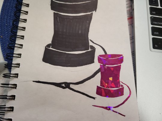
Then you just cut it out and stick it on something.
Final notes:
1) This is a really great technique if you know calligraphy, which I do not.
2) Because your lines are not as smooth as a computer-generated one, the blade is going to jitter when it cuts. This is normal and won't her the basic cutting blade. It might really annoy the knife/rotary blade, but I don't know for sure, because I don't have a Maker.
3) A brayer is a useful tool for sticking transfer tape onto your cut vinyl, and for sticking your vinyl onto things. If your local craft store is a Joann, be aware of this:
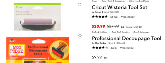
Cricut products are ineligible for coupons, even when they are no on sale. Mod Podge products have no such restrictions. If your store doesn't have the Mod Podge on in the glue aisle, you can check the scrapbooking section next to all the embossing powder and Zim Holtz stuff.
4) You can totally reuse transfer tape if you're careful.
5) it's pronounced "cricket". If you want to say it wrong, that's your right, but if you're going to rudely "correct" a craft store employee who got trained by the company, and you're wrong, be aware that you WILL be mercilessly mocked by that employee and several of their coworkers in the break room. If you want to be wrong, please be polite.
Okay, so that's your easy shortcut way to digitize without having to learn any software. Stick around for other ways to digitize your stuff, and that tutorial about making border prints with it.
22 notes
·
View notes
Note
do you have any advice for digital artist who is just getting started with digital? i have a cheap tablet (wacom) and i use photoshop. thank you!<3 sorry for bad english
ok first of all your english is really good, dont apologize <3 second of all yeah i can give some advice! keep in mind that i am not a professional by any means, im just a 20 y/o who's mostly self taught. took a couple of classes in high school but honestly they didnt teach me much beyond what i already knew unfortunately. still, self taught is something, and clearly my art is decent enough that people enjoy it and are coming to me for advice, so! here's a list of advice i can think of.
stop using photoshop. this might be a bold one to start out with, but don't use photoshop for drawing, man. i know how to use photoshop REALLY well, i'm like taught in it. and that program is ASS even at editing photos, much less drawing. it's outdated and overpriced and really needs to stop being an industry standard. it's one thing if that's the program you've been using for years and you're comfortable with it, but if you're just starting out? ditch that shit. i personally use both sai2 and clip studio paint, but both of those are paid programs. not that i paid for them, but yknow. if you don't want to pirate or pay, some good free programs include krita and sketchbook pro ! also most programs come with a free trial you can test out.
the deform tool is ABSOLUTELY your friend, especially in the sketching phase. the face looks a little off? adjust it a bit instead of redrawing it. make it look perfect. leg not in the proper place? grab it and move it! just keep in mind that you should generally do this before you line/paint/etc. it's best to make these adjustments to the sketch, because oftentimes deforming something will reduce the quality of it. this depends on both the program and the amount of adjustment being done, but as just a general rule best to get this out of the way early on.
flip your canvas. a lot. this will REALLY help you. say you're drawing a guy standing up straight, and you're like huh, this looks kinda weird, but i can't tell why. it just looks super off for some reason. flip the canvas, and i can promise you that that drawing will be leaning all sorts of ways that will be immediately obvious to you once you're looking at it from that angle. make it look good from that angle too and it'll look WAY better from the normal angle.
on the same note, rotate your canvas! it'll really help you out just like rotating a piece of paper when you're drawing traditionally. a lot of people seem to just... not want to do this for some reason? but it's really a big help.
using references isn't just okay, it's something you should ABSOLUTELY be doing. idk why people online used to constantly cry about how using references is cheating, but it's not. using references is a great aid and will drastically improve your art.
use clipping masks !! say, you want to put some sparkles on your character, but you only want them on the character, not the background. instead of tediously going around the character and erasing the leftover sparkles from your brush, you can just make the layer of sparkles a clipping mask above your character layer, and that's it. no cleanup necessary, it'll only be on your character. this is a HUGE help.
experiment with shit!!!! play with brush settings, layer effects, textures, anything. get to know your program, and use everything you have at your disposal. nothing worse than finding out about a feature and thinking 'awh man i wish i knew about this three year earlier' but you just never found it because you never bothered clicking on that button.
i don't have much else at the moment, but if yall have any specific questions go ahead and hit me with em i guess
17 notes
·
View notes
Note
You should do one of those art reflection things with your ocs. You know like taking the first drawing you ever did of them and comparing it to their most recent art piece to see how much you’ve improved. I’d love to see your art journey. ❤️
Oh boy, time to bring out the cringy art. LOL But I do like doing that every so often; usually don't end up posting the progress, but I do occasionally look at old art compared to new just to see how much better I've gotten over the years.
So time to pick a few OCs for this!
I suppose I shall begin with Cynthia, since she's my main OC.

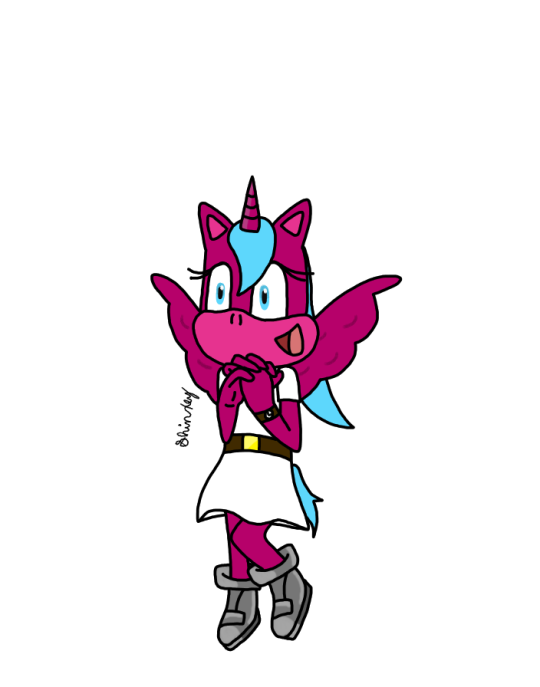
Image on the left is not actually the first drawing I made of her, but it is the oldest one I still have saved. It was done in 2013, according to image file properties. The one on the right, while not the most recent drawing she's been in, is a singular frame from an animation I did of her just a few months ago. Design-wise, she's had a few changes. Her color palette has always been the same, I just did not have the correct shades of pencils at the time when I made the first one. The most jarring change is probably the head/wing shape. I had her originally and purposefully resemble a more anthro MLP-style because of her origins, but I later decided I didn't like that and changed it to be more Sonic-like (since she's, y'know, a Sonic OC). Slightly changed her hair/tail style, swapped the watch from her right arm to her left, and changed the belt buckle from black to yellow. Rest of her is still the same. lol She's had quite the glow-up. lol
Next is everyone's favorite wolf lady, Sabrina!
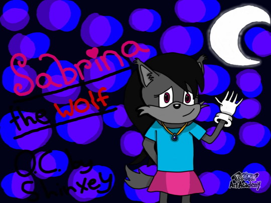

She hasn't had as much of a change as her bestie did, but still some notable ones. Left was done in 2015, and right was done early this year. I made her really fluffy, but then thought her face resembled Tails a little too much, so I removed the fluff from her face, but left the ear floof. The next change was simplifying her hair style a bit. And the colors on her shirt/skirt are now inverted, but that's mostly because I forgot which went where, but I like the way it is now more. The only other thing that changed with her was her gloves, in which the new ones were based on a pair you can unlock in Sonic Forces that I thought were cute. :)
Pinchy's another OC that I love a lot, so how about him, too?
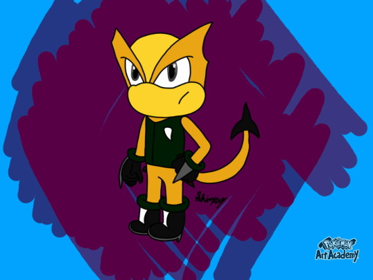
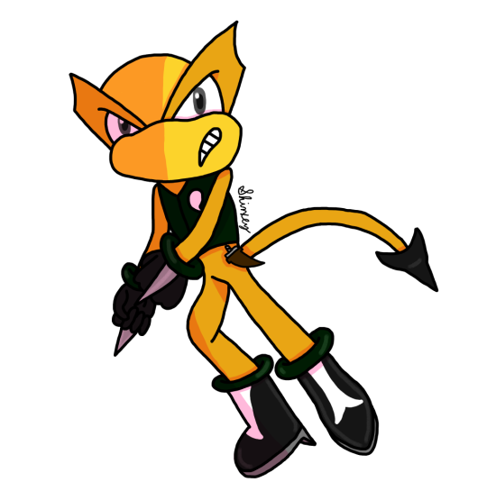
He didn't get any changes outside of an updated art style, but I still think it's neat to see how much my style improved. Left was done in 2020 and right was done only a year later! He doesn't look nearly as squished or big-headed anymore. :)
And one more for good measure, I suppose? My girl, Cashmere.

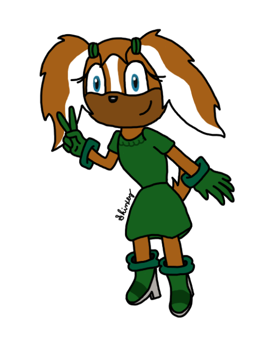
Much like the funny scorpion man, she didn't get any design changes, just an updated art style, but she's another one in particular that I feel had quite the glow-up. Left was done in 2015, and right earlier this year.
I think the biggest glow-up with all of them is the anatomy. Holy crap was it bad before... Hands, too. I think a big part of the improvement was getting new, better digital art software. Before, all I had for digital art was Pokemon Art Academy, and while it's good, it's limited on what it can do. You can't resize the canvas and if you accidentally draw something too big, you can't just resize that; you have to start all over or deal with it. I think that's a huge part of why my PAA stuff looked so squished and why the heads looked so big. I use Krita for my digital art now and it's REALLY good; I saw immediate improvement upon my switch. And layers? REALLY great, especially for shading! PAA didn't have a layer system, so I think that really stunted any sort of art growth in that regard. Using more references for things like hands and posing seriously helped me out a lot in improving my anatomy and hands as well. I would usually just wing it and guess from memory, which is why it would usually look really bad. Seriously y'all, use references, it's not cheating.
I don't really have much else to say on the matter atm, but yeah, this was a neat deep dive into my old, cringy art. lmao It's really cool seeing just how much I've improved over the years.
#anon ask#shinxey's asks#sonic the hedgehog#sonic fan character#sonic ocs#shinxey's ocs#shinxey's art#cynthia the alicorn#sabrina the wolf#pinchy the scorpion#cashmere the dog#art comparison
5 notes
·
View notes
Text
AVARICE
INCLUDES CHROMESKULL
It is so nice to finally write for a Slasher that can actually afford nice things so I went all out... All the other big stabby men either don’t have jobs or have low income so Jesse is a nice change lol. Lets get into the luxury! Now I honestly went WILD with this one, like it is a bit much lol so take the warnings. Warnings: knives, dirty talk, squirting, choking, mirror sex, spanking, afab reader.. enjoy🔪💕

High heels clacked along the marble floor of the unfamiliar hallway, only to be lead by the man in front of who carried your suitcase. You couldn’t remember his name but he was the manger of the luxury hotel who told you your boyfriend had reserved the penthouse suite for the weekend. Jesse never let you visit him on his “work trips” but this one was seemingly difficult from the length of time he had been gone. 3 weeks you counted. 3 weeks without his hands. 3 weeks without his smell incasing you. 3 weeks without his lips. This was a torture you had never known. Was it possible to die from sexual starvation?
“Here we are...” the man pulled you from your thoughts and lead you into the massive room, putting down your bags. “If you need anything do not hesitate to call us Mrs. Cromeans” You smiled as the man left, of course Jesse told them you were his wife.
Turning your attention to the room, it was absolutely stunning. Floor to ceiling windows in every direction giving you full view of beautiful LA. The room had a full kitchen with beautiful black granite counter, a big living room with a white rug on the rich wooden floors between the dark leather couches, there was the finest marble on the walls and floor of the large bathroom, and everything looked so luxurious it made you a little uncomfortable. Coming from a smaller town and working a boring 9 to 5 job you could never be able to afford even an hour in this hotel, but that was before you met Jesse of course. The man had an insatiable hunger for wealth and the finer things in life, even if that meant stepping over people to get to the top, and he made that apparent in your everyday life.
Walking over to the bedroom there was a bottle of your favorite champagne chilled in a bucket of ice on the nightstand, and two black boxes with satin red bows on the California king sized bed. Shaking your head you kicked off your heels and sat on the bed, picking up the white little note card with his business logo at the top, it read:
Beautiful Dove,
Put on everything. I will meet you around 8. Miss you so so much baby.
Jesse
Simple, straightforward and with a twist of lust coating the words he had hand written, making you smirk and rub your thighs together. Opening the first perfectly wrapped box, your eyes widened at the sight. It was a beautiful lacy pushup bra, with straps framing your chest like an art, and the lacy thong to match, of course all in black.
Moving on to the second box, you gasped seeing the expensive material and pulling it out. It was a silky red drape dress, knowing it would frame and highlight Jesse’s favorite parts of you. He knew you too well. Knew how to make any woman fall to their knees, willingly or not.
Looking at your watch it was 4 o'clock, you had time to kill, painful time. Trying to ease your nerves you ran a bubble bath with your favorite scents, and poured yourself a glass of the expensive champagne. Settling into the steamy water your mind was flooded with images of Jesse; the way he would touch you, gentle but always with an edge, the way his experienced tongue worked your body like a canvas, the way he teased you to tears but making it all worth it with the extreme surges of pleasure no one else could inflict. It almost made you moan from the memories, wanting to touch yourself, maybe even make yourself cum before Jesse could touch you but you knew it was in your best interest to not, he always found out. He probably had the place laced with cameras already.
Some hours had passed and it was still a torturous hour and a half until 8. You had taken a bath, read, played on your phone, and admired the view but it was becoming dreadful waiting for him. Slipping out of the fluffy hotel robe, your hand grabbed the delicate lace lingerie and decided to put it on, gawking at yourself in the mirror as you fluffed your hair. Fuck it looked good. Finally putting on the red satin dress and your heels to perfect the image.
Smoothing your hands down the dress feeling the luxurious material on your soft skin, another sensation appeared, a startling hard body pressed against your back and you gasped until there was a familiar low groan from the body behind you. Jesse.
Before you could speak cold diamonds were being placed around your neck, your hands running along the sparkling gems. “Jesse... you didn’t have to do this” clasping the necklace he gingerly placed kisses on your neck and moving to your shoulder making you shudder.
“Touch starved?” He signed in front of you, normally it would make you giggle but just leaning into him was already making you tumble “Sorry little dove” moving his large hands away from your front, they trailed around your body, exploring like he had never known you. Whimpering already you felt Jesse’s bulge in his suit pants.
Hearing the snap of a holster he brought one of his massive knives up to your flushed cheek making your breath hitch “Jes” you whispered lowly, you knew he would never hurt you but having a knife in your face was still scary. The cold flat side of the blade pushed your cheek making you look in the mirror. The master bedroom had a wall of windows and another with mirrors. He wanted to watch everything. Wanted you to watch everything.
The cold sharp tip of the blade pushed the dress off your shoulders and it pooled on the floor exposing your sexy lingerie to him. Jesse’s crooked smirk said everything, his brown and scarred blue eyes devoured you whole like a wolf, the knife trailed the details of the lace and straps. Every stroke of his hands and knife made you bit your lip trying to stifle the moans and whimpers.
“Such a needy little thing” Jesse signed and removed the large blade making you face him, and kissing him breathless.
“Fuck, I missed you so much baby” you whimper shoving off his jacket and fiddling with his black dress shirt buttons, rubbing your thumbs over the little LV logos stamped in. Putting the knife into the champagne ice bucket on the nightstand, Jesse loosened his tie pulling it off his head and over yours, tightening it and pulling upwards making you look at him those doe eyes he loved so much.
“Missed you too baby girl” Jesse signed towering over you, walking backwards until you fell onto the bed. “gonna be my good little girl?” he asked bending down his large frame, long fingers tracing the lace over your clit and smirking. You were soaked, the anticipation was too much you moaned loudly forgetting his question until his large hand smacked your thigh hard.
“Fuck Jes-Jesse yes.. yes please.. I want to be good for you, p-please” you begged from only a simple motion of his hand, he owned you and that much was clear. “Jesse I want you... I need you. Just dress me up and fuck me like a your little doll... please master”
He smiled reeling in his power over you, “Good girl” he signed with one hand while the other went to your mouth, you sucked his fingers as a natural reflex. Pulling away his hand from your mouth he replaced it with his lips groaning into the kiss as you grinded against him. Snaking his hand in between you he forced 2 fingers inside your sloppy cunt making you squirm under him. Everything was too much all at once coming from 3 weeks without him, you immediately came hard around his digits as he curled them.
“Poor little girl.. so deprived of me...” Jesse pulled away completely from you and undressed himself “Maybe I should bring you to my work trips more often” he signed watching you just nod and whine looking at his huge cock. Silently he laughed at your need “You want something baby?”
"Please master, please" you panted, roaming your hands around your recovering body. "Jesse"
"Turn around" he ordered, and you did as you were told, on your hands and knees looking in the mirror, watching his every movement behind you. "So fucking beautiful like that little dove" Jesse's hand met your ass with a beautiful sting making you jump foreword but kneel back to him for more, moaning when you felt his length rubbing against your pussy. One more harsh slap echoed through the room, making you hiss but Jesse bent down kissing the red flesh, feeling his teeth scrape against your ass as he pulled down the lace with his mouth.
Seemingly the large mans patients was wearing thin as Jesse moved his hand in front of your mouth telling you to spit, you did and he did as well, stroking his length mixing the saliva together along with his precum, and slowly pushing into you. “oh my god.. J- Jesse...” you cried as he eased in inch by inch, slowly, a painful slow.
Through hooded eyes you saw him sign in the mirror “Fuck.. so tight... it’s been too long baby girl” He felt you start to shake, he held your hips up and pushed your head down. Jesse went still within you as he hilted, letting you adjust to his massive cock, adoring the clench of your muscles and moans.
Dragging his member inside you, taking his time watching you come undone below him. He missed you. Missed you so much to torture you. A dangerous kind of love for a man with all the power, but you wanted it all.
“Jes.. please” you panted, wanting him to go faster, needing him to go faster. He did as you pleased growing impatient himself. Pulling out fully before slamming back into you with power, hitting every delicious spot inside you. “Don’t stop baby please” Jesse grabbed the black silky tie around your neck arching you back against his torso, allowing your arms to hold his neck, you watched him fuck you brutally in the mirror. The scene making you drip and scream against him.
“Cum for me” Jesse signed quickly before holding your waist surly leaving in bruises behind, while his other hand circled your swollen bud, making you shake, cry and ultimately tumbling off the cliff into euphoria, clenching deeply around him.
You attempted to form words but nothing was coming out as you just panted and whimpered, Jesse peppered soft kisses down your neck and shoulder smirking at you in the mirror. He let you go and pulled out to roughly flip you over on your back, grabbing his knife again that had been chilled by the ice, Jesse ran it in between your breasts cutting the brand new bra in half.
Whining in protest he just chuckled and signed “There is always much more where that came from baby doll” shaking your head, what a wasteful man. He placed the freezing blade on your erect nipples for a moment then sucking with his warm mouth, the temperature difference making you arch and moan.
Dragging the metal around your body he superseded the path with his hot tongue, your pupils blown with lust, and your nerves oversensitive. Jesse was fulling grinning, bearing his teeth like a wolf taking you in as the knife trailed your thighs teasingly.
“P-please” you mewled feeling the hard tip of his cock aching for a release he thrusted into you harshly making you writhe on the bed. “Oh, god.. Jesse..” the sound of skin slapping furiously behind your moans he threw the knife away, clanging on the floor beside your discarded lace and stain dress, a sexual scene displayed on the hardwood. A tale of you and your lover. Luxury, sex, lace, and danger.
His large right hand held your throat, cutting off your airway, preventing you from sliding up from the assault on your dripping cunt. Jesse’s left hand spread your messy pussy lips, watching him impale you over and over again. Your broken moans and cries sending him over the edge quickly, he needed you, just once more. His thumb began to press and circle your oversensitive clit making you see stars and want to black out from the pleasure.
Your cunt clenched for the final time, showing Jesse it’s appreciation by squirting on his shaft and thighs, as he painted your insides with his hot seed. Releasing his hand from your throat you gasped and coughed roughly, Jesse supported your head and neck, hovering above you he panted and placed feather like kisses on your shaking body.
“Fuck... I missed this” you panted as he pulled out falling on the bed next to you. Rolling over onto his inked chest, gleaming with sweat, he stroked your hair and held you close. Just Jesse and you again tangled in the sheets, as it should be.
“Love you little dove” he signed and kissed you, hungry for more. Jesse always wanted more. His avarice side coating him like a fine armor, shining and glinting like the sweat along his chest, holding strong like his arms around you.
#THIS took me so long to do omg#chromeskull#jesse cromeans#horror#slasher#slashers#my writing#smut#x reader#x you#x s/o#laid to rest
376 notes
·
View notes
Text
Art Advice #4 - A Beginner’s Guide to Digital Art
Hi all!
This weeks entry into my Art Advice tag, where I offer various advice for artists of any skill level, is about digital art! Now, I am by no means an expert at digital (I’ve been doing it for nearly 8 years at this point and that is almost entirely self taught), but I have picked up a few pointers in that time which will hopefully help anyone just starting out!
(this blogpost is a little over 2000 words long btw)
A Beginner’s Guide to Digital Art
I know that the world of digital art has changed drastically in the 8 odd years since I started, but I’d still say that some of the options I started out with will be just as good for anyone who’s starting out now!
As always, I’ll be splitting this into sections to make it easier for you to navigate this post!
Part 1 - Equipment/Hardware
There are a lot of drawing tablet options on the market at the moment, and I’m not going to pretend that I know anything about half of them lol. But I think for a beginner, don’t worry about going for the most expensive option, even if the reviews are really good or your favourite artist uses it, especially if it is way above your budget!
An important thing to know is that there are two types of tablet. One is the plug-in kind. These are essentially a pad which you plug into your laptop or computer and draw on that whilst looking at the screen (they basically work the same way as a plug in mouse works). The other kind is the screen variety, which is a lot more like what most of us know as ‘tablets’ nowadays. And you draw directly onto the screen.

(a plug-in vs on screen tablet, both from Wacom)
Now, as for choosing between these, it is honestly a personal choice. But I’d say if you’re just wanting to try digital and you’re on a budget, a plug-in tablet can be really useful since it gets you used to the mechanics of what digital is like, and they are often significantly cheaper than the screen alternatives. I would say that plug-in tablets are a big learning curve, especially if you’re used to doing traditional stuff, but I do know a lot of professional artists who still use this kind of tablet when doing their work, so if it’s something you can get used to I would definitely consider it! Also, they’re often a lot more portable than some screen tablets! The first one I had was a Huion (a model so old that I can’t even find a link to it now lol), and I also know that Wacom are a well known brand that do some decent plug-in tablet. I’d recommend you do your own research on other brands and options, though!
Screen tablets are often a lot more expensive, but if you’re used to traditional art, they are a lot easier to get a handle of! But I know if you already have something like an iPad, or other general use tablets, then they offer apps that you can use to draw on (as well as things like the Apple pen, or other stylus’). The big difference between using these general tablets and ones specifically designed for drawing is pretty much purely a personal choice. I personally prefer the bigger screen of my XP-Pen tablet, along with a special screen protector that removes the shininess of the tablet screen and makes it feel more like ‘paper’ over when I used a general use tablet it draw. But if you already have an iPad, or something similar, then it’s honestly a really great starting point!
I think it’s important for me to mention that you don’t need fancy equipment to be an artist. The incredible Elicia Donze has revealed countless times how she has very basic equipment but still manages to produce the most stunning artworks! All you really need is some kind of drawing apparatus and a lot of patience lol! Getting good at any kind of art takes a lot of time and effort, but I would definitely say it’s worth it when you’re able to look back at your progress!
Part 2 - Software/Drawing Programs
Much like with the hardware discussion, choosing which program to use is entirely down to personal preference. I personally have never really liked Photoshop purely because it’s really complicated, but I know so many artists swear by it.
I think the main aspect to consider when you’re starting out is whether you want to pay for a program. Software like Photoshop, Clip Studio Paint and Procreate are some of the popular ones I hear about a lot of people using, but all require you to purchase or subscribe to them. So if you’re young or on a very tight budget, I’d honestly recommend the free alternative versions of these, such as Krita (Krita is quite a large program, but it has a lot of really awesome features and is very similar to Photoshop!), Gimp (this one is similar to Krita, but has slightly less options, I’d honestly recommend Gimp for anyone who does photo editing though!) or FireAlpaca (this is the one I use, by the way and it’s a pretty simple program, but has a lot of fantastic features and is perfect for how I work!). These don’t have as many features as some of the paid alternatives, but I honestly think all you really need to start digital art is some kind of ‘canvas’ and set of brushes!
Another great free program for beginners I’d recommend is MyPaint, which is great for doodling and just getting used to how digital art feels in comparison to traditional! It also has a bunch of ‘traditional style’ brushes, to make it look like charcoal or watercolour (which I’m sure the paid alternatives have too, but it’s always better when it’s free, I find lol...)

(this is an example of a drawing I did on MyPaint using the ‘charcoal’ effect brush!)
Most of the sites are pretty self explanatory, with sections dedicated to different brushes (I’ll go into the types of brushes later on in this post btw!), adjusting brush size, shape and opacity, a colour wheel, etc. You also have a section dedicated to ‘layers’ (another thing I’ll go into more detail later), and various ‘filters’ and editing options and effects you can add to your work to make it more interesting!
I’d really just recommend playing around with programs until you find your one!
Part 3 - The Pros of Digital Art!
I realise this section should probably earlier in this blog post lol, but I kinda wanted to go into what digital art can achieve in comparison to traditional art, and how beginner artists can utilise this!
I definitely didn’t take advantage of certain aspects of digital art when I first got into it, and they’re things that would have definitely made my life a whole lot easier lol!
Digital art allows you to tweak drawings as you do them. So if you accidentally drew the eye too far to the right, then you can easily move it to the right place. (I usually do this by selecting whichever area is wrong, cutting it out and then pasting it into a new area... And yes, there is probably a better and quick way of doing this but...I haven’t found that way yet lol...). And I honestly think that this has allowed me to look a lot more at a reference image in order to figure out where I’ve gone wrong with a drawing! Whereas with traditional art, I usually spend so long trying to get an eye right, that even if it’s slightly in the wrong place, I don’t want to completely redo that section. Digital allows you to completely rub out sections without leaving indents, which is honestly such a saving grace!
Another pro of digital is the Undo/Ctrl Z function! This means you can easily go back to before you made a major mistake with just a click of Ctrl Z... Though I have to say that this function has honestly ruined traditional art for me... Oh what wouldn’t I give for a real life Ctrl Z... But yeah, this is a great part of digital art and definitely something you will grow to love lol!
Another great thing about digital is that it allows you to flip and turn a canvas as you’re drawing on it. I spent a lot of time trying to turn my tablet around in order to draw certain parts of a piece before I realised you can turn the canvas itself without having to move yourself or your tablet!
Layers are another part of digital that can be super useful, and I have to be honest but I don’t really use them a lot. I know a lot of artists create layers for every section of their artworks (so, one for the linework, one for colouring, a separate one for the background, etc etc...). And there’s something really great about being able to paint without worrying about smudging into a previous section of the painting. This works well for my work since I do a lot of bright backgrounds. I also often create a lot of ‘versions’ of my works, so it’s useful to be able to change the background without affecting the main figure of the piece! (I have to say that I often work in one big layer when I’m doing paintings, just because I like how it feels more like ‘traditional’ art that way, but layers are such a brilliant tool, and definitely something you should play around with!)
The eyedropper tool is another one that is really useful! Although I never colour pick from my reference photos, I know some artists find this useful when they were just starting out (especially if you’re not sure what colour to make shadows or how to mix skin tones, etc etc). The eyedropper basically means you don’t need to mix your colours every time
Part 4 - Just some other things I wish I had known about when I was starting out lol...
This last section is just dedicated to a few things that I would have liked to have known when I was just starting out all those years ago.
First one is fluffy/textured brushes!
I spent most of my art life from 2013 until 2016 using ‘round’ brushes which are notoriously hard to blend with, so I’d recommend either downloading some fluffy/textured brushes (DeviantArt was where I got mine from a few years back, but there are probably other places you can get them for free too!) to your program of choice, since most of the programs I’ve used haven’t had fluffy/textured brushes as pre-set.
I may make another post about how I blend in my artworks if that’s something people would be interested in?
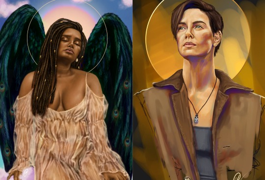
(this is an example of textured brush blending vs round brush blending... I usually opt for round brushes for rougher blending styles and the textured brushes for more smooth and ‘realistic’ blending... for a lot of pieces, though, I use both brushes (the round brushes are good for details!) in the same way that you use different sized brushes for real paintings!)
The next thing I wish I’d discovered earlier is the Brush Stabiliser option. Some programs may do this automatically, but the one I use (FireAlpaca) requires you to manually change the amount of stabilising you have on your brush. This is particularly useful if you want to draw neat lines or straight lines (the stabiliser essentially slows down the ‘ink’ as you’re drawing). I only recently started using the stabiliser, and although I still like having it mostly turned ‘off’ for doing sketchy work, it does make doing line work a lot easier, and also gives pieces a more polished look!
Next advice is to explore all the options you can in whatever program you use!
I feel like with certain programs, you can get overwhelmed by choice and you end up just using a few of the functions. But I’d really recommend just playing around with these programs, trying all the filters and editing options to get used to how the program works. You can often find interesting ways to adjust your artworks this way! In a way I’d recommend this way of working more than finding tutorials made by other people... Unless there’s a specific function you want to learn how to do, just having fun with digital art is a major part of it’s appeal to me!
~
There are probably a lot of other options I could go into, but this is already over 2000 words long, so I’ll leave it here for now lol! (I may do a part 2 though so... keep a look out for that!)
As always, if you have any questions to things I’ve said here, or are just looking for more advice, don’t hesitate to message me!
And if you like my work on here (art & blog posts) feel free to support me on my Ko-Fi! <3
#art advice#digital art#art advice for beginners#digital art for beginners#artist advice#digital art tips#artists on tumblr#just want to say again that i am not an expert at this at ALL lol#i just want to offer some really basic advice to anyone interested in starting out with digital!
101 notes
·
View notes
Note
How did you learn to use procreate? 🥺 It seems so difficult or I’m just dumb LOL. Have you watched any tutorials on how to use that app. I love your art work btw xx
Hi ! Omg this is a big question..
Ok so at the beginning I also felt that it was suppperrr difficult to use even though I was painting/drawing for a couple of years. The medium is completely different so it takes time to adjust.
For me what overwhelmed me was the big blank canvas, and the amount of features available.. like where the helll do you start! But I’ve picked up a few things along the way.
Firstly, I worked on the procreate phone app on my iPhone and a stylus from Amazon. I didn’t want to commit to an iPad without figuring out if digital drawing is for me. So I worked on that for 2 months. This allowed me to understand the interface and the features it had. Anything I did not understand, i used a YouTube tutorial. Reddit was also a useful resource if I wanted to improve technique or find resources. I’ve seen people recommend reading the procreate handbook which contains an in-depth analysis of all the features available.
Once you have a good knowledge of the app you can apply this to the digital canvas. I’d say use a reference picture and try to draw a basic outline of it with a basic round brush and block in the main colours. Also Use your creativity too and allow yourself to paint whatever you want. If you feel like you’re thinking too much about it (this happens) try doing it when you’re a little tired, your mind will feel a little more free and you can be present and draw.
Tiktok is a good resource as there are loads of digital artists on there. You can Watch time lapses of digital artists on YouTube. This way you can understand how a digital artist creates an image and the different details that go into it.
Ok and also you’re not going to be able to make a masterpiece without warming up. I actually learnt this very recently. So to tackle this I’ve been doing warm up exercises for both practice and improving my technique. This will allow you to become comfortable with creating shapes/drawing lines which is the foundation of every single drawing. I used this YouTube tutorial https://youtu.be/35rju_APLqQ to warm up. It’s really good to get into the mood of drawing and improves your skill.
I also think that digital drawing is linked to your physical drawing. This means if you improve your physical drawing skills with a simple pencil n paper you will see more improvement in your digital art. The biggest thing I recommend is to start drawing things you can see. A mug on your desk, your lamp, a tree in the garden. Sketch as much as you can. Literally the foundation of a good digital drawing is a good first sketch. If you neglect this your final piece will probably look. A little off even if you use the right colours/brushes etc.
I do a first underlay painting in a bright colour .. it reminds me a lot of the technique that oil painters use. This way I can build my detail. Then I use another layer to add detail. I always use the colour dropper to find colours on the reference picture. I use several diff shades to make it pop. Also as it can be tiring I like to work in 20min- 30 min slots. So I try get some detail in. Then work on it another day so I can see what needs more work. This way u can build a detailed picture without tiring urself.
Once you start practicing all of these things, you can tailor your art style but in the beginning I’d say keep your mind open. Look at different types of art, there’s line art , you can replicate oil paintings/acrylic paintings etc. there’s basically a tonnn of freedom w digital painting because you have unlimited resources at your hands.
Also I’d say download new brushes and create something. This pushes u out of the comfortable brushes u use.
Now all of this can be overwhelming at first but as you master one brush/one feature over time things become a little easier.
In addition to learning all this, I’d say follow digital artists on Instagram. Often they post tutorials and you can get a glimpse into their work.
Other tips I’ve used to make my work better is
1. Use a lower opacity on the brush to create more detail. Depending on what style you’re drawing when u have more shades of colours/more brush strokes it gives it way more depth
2. Use light and dark to make your work pop.
3. Consider your palette - warm tones and cooler tones always look good together.
4. If you’re creating a digital painting don’t use black. Instead use a colour above it? Black can have a tendency to look flat so when u use a let’s say dark brown.. it looks more realistic as not many things are completely black rather it is an assortment of shades.
5. Use the editing feature. If u look at ur painting n u think it doesn’t look good. U can amend the colours/shape on the adjustments bit of the app.
6. Participate in art challenges/ build an Instagram portfolio. You can meet like minded ppl and it will inspire u to continue improving your skill.
There is a lot to it imo.. digital art is not any easier than physical art but. Stick to it. U will see lots of improvement if u do a little bit each day, or each week!! It is definitely hard at the beginning but like any skill when u put time and practice into it u will see improvement.
If u are struggling to understand theory, I’d recommend doing an art course online or in person. This way u are being guided by an expert rather than just self learning. Art has a lot of theory in it and it can be difficult to grasp it all especially if u are teaching yourself.
I think that is everything. There is also a tiktokker I recommend. He is SUPER good and offers practical advice. His advice has helped me shed a lot of anxiety ab my art recently. Their @ is @handmouthdancer . Really recommend them!!
Ok if u have any more questions let me know. I love art n I love speaking about it !
#my MAIN advice is practice But don’t Neglect Theory#sjdjdjd smh I wrote sm n now I need to make Lunch.
7 notes
·
View notes
Photo
Translated interview with Adèle Haenel, heroine of “Portrait of a Lady on Fire”
Performing in order to richly live the now
Tomoko Ogawa, in: Ginza Mag, 3rd of December 2020 Translation by Rose @rosedelosvientos 🙏🏾
Set in 18th-century France, the daughter of an aristocrat who refuses marriage and a female painter who makes her portrait - two people of different social status - meet and fall in an unforgettable love that will last for a lifetime.
In the film “Portrait of a Lady on Fire”, Héloïse, an aristocrat, is played by Adèle Haenel, who, as an actress, always thinks, acts and decides constantly for herself. Late last year, she filed a complaint against the director for sexual abuse during/after her first film debut 18 years ago. At the César Awards, she protested and walked out after Polanski won Best Director, which shook the world of French cinema and is also still fresh from memory.
This film is also the work of Céline Sciamma, the director of Water Lilies, in which Adèle Haenel also appeared. Adèle recounts her thoughts about her current film, and director Sciamma’s “Female Gaze”, who, for many years was also her partner in her private life.
Q: Last year, “Portrait of a Lady on Fire” opened and was screened in Europe, and won Best Screenplay at the 72nd Cannes Film Festival. A year and a half has passed since then. Do you feel the magnitude of this work’s influence on women empowerment?
A: If put this way, people might think that it may be too subjective, but I think that not only this film, but Céline Sciamma’s works have constantly played a role in empowering women. But, it was understood that, surely, there’s also a way - that it’s possible to show the worldview of equal love between women from a different perspective, in a history where there are a lot of films that contained an element of women being controlled unilaterally from men’s point of view.
Q: Not dominance, but the joy of collaborating and creating something with someone, and the love that continues to grow is depicted in this film. What do you think sets it apart from many other films that have depicted love until now?
A: Until now, love has been depicted in ways such as controlling the other person, and in a sensual manner, but in this film, the nature of love is kinda different, I guess. The two women who happen to be in that place - while interacting extemporaneously using language that is characteristic of themselves and figuring each other out - are building up their relationship. While it’s fictional without altering historical facts, it’s a proposal that’s entirely different from what love looks like until now. I think that it’s a film that brings with it a new perspective.
Q: It’s not a one-sided view from the painter’s perspective where the person whose portrait is being painted is the “muse”, but rather of both sides looking at each other, and the connection of being seen is depicted. I think that you’ve also been called a “muse” up to this point, but during those times, do you remember how you felt then?
A: The word “muse” is used against actresses as a stereotype, and there were people who did say that to me that but, even if I were called a “muse”, I’ve come to be aware of not taking that position that’s being asked. That’s because even if it’s the director who’s directing, ultimately it’s up to the actors how they perform something while working together with different actors. So, you’re supposed to actively consider how you build up the character relationships artistically, politically, all aspects. In the first place, it’s not acceptable that in most films it’s the men looking, and the women being looked at, so even for things that aren’t visible on the surface, I constantly think and make decisions for myself.
Q: Tell us about the charm of Céline Sciamma as a director.
A: She has a very clear perspective, doesn’t she? She’s a person who can raise all sorts of questions and kinda make you rethink various ideas, not about how reality is, simply, but beyond those ideas that are based on the reality that there is. She’s also a visionary, and she understands the wonder of fiction, and has philosophical ideas.
Q: In this film, you were also able to apply the relationship of trust that you’ve built with your partner, at the time, through the course of many years.
A: That’s right. I’ve been friends with her for as long as 15 years, and of course she was also my partner, and that’s because I’ve been collaborating artistically for many years. This time, in the script, too, the character of Héloïse was written with me in mind. So since we’ve already built that trust with each other, there was no need to talk about every little thing, like, “I’m thinking of doing it this way”.
Q: This film has a mostly female staff, such as director Céline Sciamma, cinematographer Claire Mathon, Hélène Delmaire, the female artist who carried out the painting on-screen, etc. What do you think about its significance?
A: From the very start, this film’s intent - especially since the relationship between women hasn’t really been presented as something very important - is to focus the spotlight on women across history who weren’t written about. This time, an axis (focal point) has been put together by the film crew for the women who properly understand that importance, so there’s a part where the production did really well, I think.
Q: Through this film, is there anything that you discovered about yourself?
A: I don’t think in a way like, that there was a discovery or change just because of the role that I played. Basically, I’m the type of person who keeps moving and doesn’t stand still, who constantly asks and answers my own questions, and raises issues. Whichever work it is, I perceive them in one of those processes.
Q: I see. In the midst of constant movement, what is your primary motivation as an actor?
A: Meeting with people with whom I can collaborate with is a big one. Whenever I work with new people, I’m made to realize that there’s also such a different way of depicting (t/n: lit. “drawing”) the world. That there is a way to richly live the now, that is in film and art in general. That also motivates me.
Q: With all this motivation that’s hitherto been given to you by the director, do you think that it’s because you both share a common perspective?
A: Since I take the responsibility myself when I perform, there’s no such thing as being influenced by the director. I’m a person who doesn’t really care (t/n: I’ve a feeling ‘give a shit’ is what she really wanted to say here) about hierarchy, and the people whom I can really respect are those persuasive people who have a clear perspective, and, within the silence, can properly show what they want to talk about. Directors who give hints to the actors on how they can arrive at the reality that they’re thinking they want to depict more. I’m thinking that actors don’t express form, rather, their role is to explore the expounding of their own vocabulary. So a person who has a clear vision of what they want, and what they want to draw is amazing, in my opinion.
Q: Finally, all the handmade dresses have an impression that they’re being fastened thickly and heavily, but how do you think the costumes influence your acting?
A: When I wear the costumes, I feel like a pilot in the Star Wars series (laughs), so as we handle the costumes that we’re given, I really think about how I’m going to move while in it, you know? The one we had was a basic dress, but at first there was a feeling of nervousness, a tense kind of stiffness. But as the story went on, I try to be aware that the movements of the dress will become a bit softer along with my facial expressions. Even if it’s the same costume, I performed while feeling that change of heart.
“Portrait of a Lady on Fire” Original Title: Portrait de la jeune fille en feu Director: Céline Sciamma Cast: Noémie Merlant, Adèle Haenel, Luana Bajrami, Valeria Golino Music: Jean-Baptiste de Laubier Distribution: GAGA 2019/France/122 mins./Colour/Vista/5.1 Digital Channel Dec. 4, 2020, TOHO Cinema Chanter, Bunkamura Le Cinéma Nationwide Screening © Lilies Films https://gaga.ne.jp/portrait/
Profile Adèle Haenel Born in January 1, 1989 in Paris, France. Attended theater classes at 13 years old. In 2002, debuted as the heroine Chloe in Les Diables. In 2007, her name became more well-known after being nominated for Most Promising Actress at the César Awards. Furthermore, she was also nominated for her role in House of Tolerance (2011), and for Suzanne (2013), achieved Best Supporting Actress, and won Best Actress for Love at First Sight (2014) – becoming one of the actresses representing the world of French cinema both in name and substance. Her major appearances also include The Unknown Girl (2016) and Bloom of Yesterday (2016), among others.
***
Translated excerpt from ’“Portrait of a Lady on Fire” - Approaching the True Face* of Adèle Haenel’
Atsuko Tatsuta, in: Madame Figaro Japan, 4th of December 2020 Translation by Rose @rosedelosvientos 💜
(*t/n: may also mean the 'true nature’ of AH. Literally it means bare face with no make-up.)
“A woman who has an adventurous spirit, while living under constraints.”
Interviewer: Marianne and Héloïse are depicted as contrasting characters, aren’t they? From the outset, when the canvas falls from the boat, Marianne jumps into the ocean in order to retrieve it. Héloïse, which you performed, has never gone into the sea despite living in the island. How did you interpret the contrast between this free and conservative way of living?
Adèle Haenel: Marianne and Héloïse were indeed depicted contrastingly. Not just marriage, but Héloïse is a person who’s lived within various restrictions. But, as the story progresses, you’ll understand that actually she’s a character who is highly curious, and also has an adventurous spirit. People tend to think that she’s dull and lacks vigour, but it’s soon understood that up to this point, in reality, her actions are coming from a place of being shackled. Playing the transformation of such a character was very interesting.
#rosedelosvientos#Ginza Mag#Madame Figaro Japan#Adèle Haenel#Céline Sciamma#Noémie Merlant#Portrait of a Lady on Fire#December 2020#Japanese article#Translation#A spirited woman#Thank you so much Rose#long post
95 notes
·
View notes