#we love cohesive aesthetic
Explore tagged Tumblr posts
Text
patch update v9.24: have settled on dragonflies for air so I cleaned up this blog with better tags & updated my pinned with the new tags etc etc.
1 note
·
View note
Text
literally getting choked up rn tears prickling my eyes we are so back i love you tomorrow by together. the parasocialisms got me good honestly theyve got me in a chokehold
#this is the longest I've ever ulted a boygroup#this may marks 4 years ...#the mv was so beautiful and the song was giving old school slash somewhat emo vibes it was really fucking good#i loved the layers in the instrumental and the visuals were like. so tumblr 2016 but tastefully so Lol#i want to cry that was so beautifully shot we really are so back. i love the txt lore being so crucial for this cb and the cinematography#in general went crazy to me like it wasn't anything overly complex but it was still so aesthetically cohesive#im jsut saying words atp yeah#but no its not even like ill praise anything txt puts out bc i qas so painfully underwhelmed by chasing this feeling and that mv in general#like the album was solid but i couldn't care less abt the music video or the title and the aesthetics were so mediocre#but this time. holy shit we r so back like this is the txt i started stanning when i was 16#z.post
16 notes
·
View notes
Text
THE ISLANDER EUPHRASIE THEORY: THE CRACK HEADCANON THAT RUINED ME FOREVER
HI. you might know me as the kingphie divorce guy. or as the guy who wrote the 6k ludonarrative essay. Today i am going to introduce to YOU @the-bitter-ocean's fantabulous ISLANDER EUPHRASIE THEORY!!!
DISCLAIMER
This post contains SPOILERS for ALL of In Stars and Time. INCLUDING THE ACT 6 SECRET!!
You have been warned.
ALSO!!!!
The original headcanon/theory is VERY MUCH Ocean's fantastic work! I am merely rehashing all the arguments for it that have been laid out across various chats into one cohesive thing people can look at. Also citations! Who doesn't love those.
WHAT IS IT?
Well, it's quite simple. It's the theory that Euphrasie, love of my life and Head Housemaiden of Dormont, is from the forgotten island, same as Siffrin and the King.
(Yes, this is why divorce AU exists.)
WHY DO YOU EVEN BELIEVE THIS?
Quite a lot of reasons, actually.
It's really funny
Let us begin with: the basics.
SUPERFLOUS AESTHETIC DETAIL
HAIR COLOR
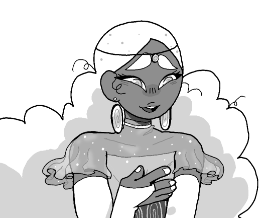
This is Euphrasie. She's very pretty. I love her.
You might notice several things about her, like her fantabulous white hair.
Well. What other characters have white hair?
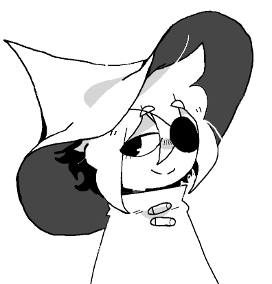
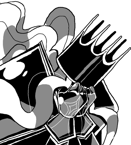
You have guessed correctly. The ONLY OTHER white haired characters with actual artwork are Siffrin and the King, both from The Island The World Forgot. Thus we can assume that it's a typical hair color for islanders. Makes it stand out very much that Euphie also has it.
(What about the beautiful one- sh sh sh he's blonde. He's blonde.) (Well, actually, considering that they are the only one who acknowledges that Vaugardians are also weird, what if he's from the island as well? Checkmate atheists.)
EYELASHES
(EDIT!!!!! FINALLY PUTTING THIS ON THE MAIN POST!!!
Turns out I was incorrect in this. Some characters (Mira, Isa) also have eyelashes on SOME portraits. The mentioned chars r still notable for Always Having Em, + the Loop lashes are like, literally intended as plot twist foreshadowing, but, hey.
That's what you get for writing essays at 1am.
IN RETURN!!! Someone pointed out to me [i forgot who sorry] that Euphrasie's capelet.... has stars on it!! It's speckled like the starry sky!! Now isn't that a neat coinkydink.)
(Original text left up because I respect my past self's artistic vision. And his lunacy.)
Correct. Eyelashes.
Going back to our portrait of Euphie, she is drawn with precisely three eyelashes. Why is this notable? Because Siffrin and Loop are.
So much so, that being drawn with three eyelashes, is specifically an element of foreshadowing to Loop's true identity.
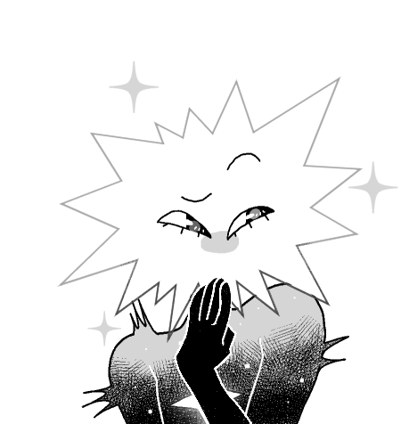
(squints at character portraits) literally no characters besides Siffrin, Loop, and Euphrasie have eyelashes? Oh my god. What? Nobody has eyelashes? What the fuck? (okay, some moments later: Mirabelle has eyelashes in some battle artwork, but these three are the only ones specifically with eyelashes in dialogue portraits, which is still incredibly odd.)
SPEAKING HABITS
(EDIT!!! Another Point that is Kind Of Off, in that other characters [e.g. Odile] also do this occasionally. Again, keeping the text for my creative vision.
In return I get to inform you that the King makes the "not so bright, Bright One" pun TWICE in different loops, thus implying the King likes puns. Take this as you will. That's been my psychic damage, buhbyeeee~)
Hey, so, you know when you talk to people in Dormont, a lot of the NPCS will have a nametag that just says "[something] One" right? Daydreaming One, Castle-Loving One, Beautiful One?
And I've seen people wonder, are these titles? Nicknames?
And I bring you this: Siffrin addresses these people with these epithets in his head, because they have no fucking clue what anyone's name is.
So Siffrin just naturally lapses into this style of nicknaming strangers.
Which two other people also do.
Bright one... ...... Do you remember? Traveling one! Are you done talking with your companions? Yes, wonderful, wonderful!
Funny little tidbit that these three characters all speak alike isn't it :)
Okay. With aesthetics out of the way, let's move onto the next tier of this iceberg:
THE MECHANICS OF FORGETTING AND BEING FORGOTTEN
I realize in the process of writing that we must outline the nature of the curse. What gets forgotten and what gets to stay?
The particularity that's important to us right now is: what people get forgotten?
All evidence points toward this: an entire person is only forgotten if they were physically present on the island when it vanished.
I'm pulling up two example cases to prove it: Siffrin and the Daydreaming One.
The thing with Siffrin is: we know he witnessed the exact moment the island vanished. And, very notably, Siffrin was in a boat.
You can get the dialogue that proves this only in ACT 2 in a secret room most people don't find on their first playthroughs, which is both very funny and very evil. Here's the dialogue.
Siffrin: "I ran away from home once!" [...] Siffrin: "And so I took our boat! Got to the beach, rowed away from the shore a bit. I was going to come back right away, I just wanted to scare my parents a bit!" [...]
Siffrin: "I started to row back towards the shore... And then, I... I... ..." Isabeau: ... Sif? Siffrin: (Woah! What?) "Um, yes?" Isabeau: Um... You were telling us how you ran away from home? Siffrin: "I... was?" Odile: You... Were. Bonnie: DID YOU FORGET WHAT YOU WERE TALKING ABOUT WHILE TALKING ABOUT IT?!?
Siffrin is from the island, but was not physically present when it disappeared. This resulted in Siffrin forgetting their entire identity, including given name and spoken/written language.
Additionally, this is confirmed via Word of God to be the exact moment the island disappeared, so here's proof I'm not reading into it:

Shoutout to bibliomaniac's insane google spreadsheet for the easily searchable screenshot. god bless. Brinny, ily.
On the other hand, with the Daydreaming One, we have proof of a person who is not originally from the island, but was physically on it at the time of disappearance.
Siffrin: "Don't you have a sister?" Daydreaming One: I... I don't? I just said I'm an only child, silly!
(For her to forget someone like her sister, so easily... Her sister must've traveled to...)
Secondly, we know that remnants of the island were not completely forgotten immediately.
Memory faded gradually, starting with the ability to still speak and think about it with accompanying headaches, until it ramped up in intensity and everything is simply gone.
The Sparkling Diary in the library is more or less proof. Memory of the island was gone, but... people still remembered that they forgot something. People still knew what they were talking about, (an island north of Vaugarde), just without the specifics.
"Urgh. Also, Dad noticed no one can say the name of the island north of here anymore?" "I tried to say it yesterday and I got like the WEIRDEST headache for HOURS."
And Odile also remarks the following
Odile: We also know that people could remember that country clearly, before.
This will be relevant later. Moving on.
CONTRIVANCES
THE HOUSE'S OBSERVATORY
SO. The House of Change of Dormont has this funny little room on the third floor. It's an observatory. To look at stars with. When entering this room for the first time, Mirabelle says this:
Mirabelle: What...? Was there a room like this in the House? Y-yeah, I remember! Someone was working here... Studying... They looked like... ... Um... Sorry, I can't remember.
This reveals to us several things:
This room is innate to the House, and not brought here by the King's weird redecorating
Someone from the House was using it for study
All memory of who or what was studying and being studied was erased alongside the island's existence
Of course we can say, "yo, what if Euphrasie was using this room and just forgot?" but that is. a headcanon. I ADMIT! It is a stipulation
However, I find the general presence of the Island written all over the House incredibly interesting.
Inside the Observatory, there's a pile of papers with messy handwriting. You can't read these in until ACT 4. Even in ACT 4, you can't read them. But you do learn what's written on them.
(A pile of papers.) (It looks like someone was trying to write your country's name.)
Inside the observatory is also a globe. Upon repeated interaction in... act 4, i think, you get this:
(You see a spot on the globe where the paint has started wearing out, like someone kept dragging their finger on it.) (You drag your finger there too.) (Erased. You almost want to look for lightless paint.)
BOOKS
During the various quests to discover the truth of the loops, you run into a lot of books, written in the forgotten language. Now, Dormont is not close to the island. Dormont is not close to the coast.
Bambouche is. That's why Bonnie has heard about the island before and knows it was a big deal - they lived really close to it.
Bonnie (and then1): I think, I think my village was really close to it!!! My sister said it was all everyone could talk about for weeks!!! Mirabelle (anxious1): That's so frightening... I'm glad that whatever happened, she didn't get caught up in it!

As we can see in this map, Dormont is in the southern half of the country, and very centrally at that, meaning it has basically maximum distance from all waters and ports. So why does this landlocked small town have so many books in this language?
These aren't just dry books, either. In Dormont's library, there's actually a translated version of volume 2 of The Cursing of Chateau Castle.
(You take the book out again.) (You can read its title, now...) (Your heart is beating, badump, badump, badump.) (It's...) (... A translated copy of "The Cursing of Château Castle", issue #2.) (You start laughing.)
CONCLUSION OF THIS SECTION
Islanders lived in Dormont. Maybe even multiple! We've established that whoever is in Dormont when it vanished would not simply disapper, instead
they forgot where they're from.
One day, the islanders in Dormont could no longer remember being anywhere but Dormont. Being anything but Vaugardian. The observatory fell into disuse, as the person studying there gradually forgot what they used it for, even as they desparately tried to hold onto it, boring holes into the globe, and scribbling its name over and over until its unintelligible.
And, in all likelihood, eventually that knowledge was just gone forever. They simply became part of Dormont, none the wiser to their own history.
Books slipped into cracks. Rooms fell into disuse. Nobody remembered to clean out the remnants.
Now. The real cinch of this.
Why, in particular, do I think Euphrasie is one of them?
Answer me this, then.
How does Euphie know what Wish Craft is?
1. How could she read it?
Euphrasie knew specifically that Wish Craft exists, when all books on it are written in a language nobody can read.
The book in the storage room? The diary in the room behind the star door? The book in the secret library? None of them are legible.
There are no legible records of Wish Craft.
2. What about the Favor Tree?
Euphrasie knew specifically that Wish Craft is related to the Favor Tree. It's also a Vaugardian practice to make requests of the Favor Tree, but they're just that - requests. Nobody thinks they actually have power.
Only Euphrasie does. She thinks it's the key to defeating the King.
(This is... A list of people who wished to save Vaugarde!!!) (You look around her desk, trying to find out more.) (Why would she record the people who wished to save Vaugarde?) (... There!!!) (It's a little notebook, jammed between random boring paperwork...) (In it, the Head Housemaiden talks about Wish Craft... How in the days before the King attacked, she noticed everyone was wishing to the Favor Tree for the same thing:) (To save Vaugarde.) (And she started wondering if this wish could be the key to the King's defeat, somehow...) (So the Head Housemaiden knew about Wish Craft!!!)
Except, when Isabeau talks about it...
Isabeau: Well, it's just a random big tree. But when you're a believer of the House of Change, the biggest tree in a certain place is called a Favor Tree! It's like, it’s the tree with the most power, so you can ask it things? As a favor?
He struggles a little to explain it. Almost, as though the tradition came from some other culture, imported into Vaugarde, and no one can definetely remember where it came from.
To note, here, is that the Favor Tree is hugely associated with Loop, and wishes in general. Wishing on a Favor Tree is such a hugely powerful ritual when executed correctly, that it caused the entire timeloops.
And I'm not even gonna break out citations to prove that Wish Craft is associated with the island. Come on. You know that. You played the game. It's required to beat the game.
If you haven't beaten the game, what the fuck are you doing here. Go back and play it, baka.
3. Something's breaking, failing, rotting
At the end of ACT 4, when Siffrin confronts Euphrasie about her knowledge of Wish Craft, Euphrasie is distinctly aware of this: the people of Vaugarde are wishing wrong.
It's true. All of Vaugarde wished to the Favor Tree, wished for us to be saved. We wished for a savior. A way for us to win against the King. And Wish Craft gave us the means to do it, didn't it? Made sure it'd work? [...] But... But something went wrong, didn't it? Something goes wrong, every time!!! [...] The only answer I can find... Is it's because we did it wrong. I don't know what happened But we must've done it wrong!!! None of us in Vaugarde knew the exact ritual, but-- But we must have done it so wrong, it broke, and it doesn't answer to us at all anymore!!! [...] I don't know, I don't know, I don't know!!!
There's only one person who knew how to make a Wish correctly. And he made it by sheer instinct. Something they could not place even if they tried. Just... a forgotten ritual, dredged back up by muscle memory. Something he's probably been doing since he's a little kid, something that's so backed into their habits they use Wish Craft to carve figurines out of wood.
To end, I leave you with this. Dialogue you get when you try to talk to Euphrasie again, before you talked to everybody else.
If you talk to me... REALLY talk to me... It's all over. What "it" is, I have no idea... I know... I can feel that... I couldn't change whatever comes next, even if I wanted to. But I know it is the will of the Change God. Or, no, perhaps... The will of something even bigger... ... Something will end, once you talk to me.
There is a way for Euphrasie to know all of this. To know Wish Craft exists, to be aware she's doing it wrong, but not knowing, remembering quite enough to get it right.
If she knew it all beforehand already.
#Feli speaks#in stars and time#isat spoilers#isat#euphrasie isat#head housemaiden#ALL THE TAGS. I NEED PEOPLE TO LOOK AT THIS. PLEASE. IT'S 1:30 IN THE MORNING.#i spent two hours on this i think
586 notes
·
View notes
Note
Can you share what your art-making process is? What software and tools do you use?? I'm falling in love with your work!!
Thank you, I'm so happy you like my work and are interested in the process. The short answer is I mostly use Adobe Animate.
I hate how I'm using an Adobe product (although I still regard it as a MacroMedia Flash product), but there's just no other software that compares to its jankiness. Perhaps it's just my long familiarity with the program, but nothing I've experienced matches how it simultaneously feels like drawing in MS Paint and using Microsoft PowerPoint vector shapes. The result is something that feels in-between the two; handmade yet computer-generated.
Typically, I'll start with a hand-drawn sketch, often beginning as a thumbnail done with pencil and paper.
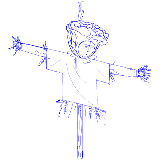
I'll then do a mix of hand drawing and vector shape tool rendering. I use the Paint Brush tool to hand draw strokes, and the line and shape tools mixed with transform to make more geometrically accurate shapes. The design is rendered into divided closed loop shapes, ready to be filled with a solid. The strokes are kept or removed depending on the design.
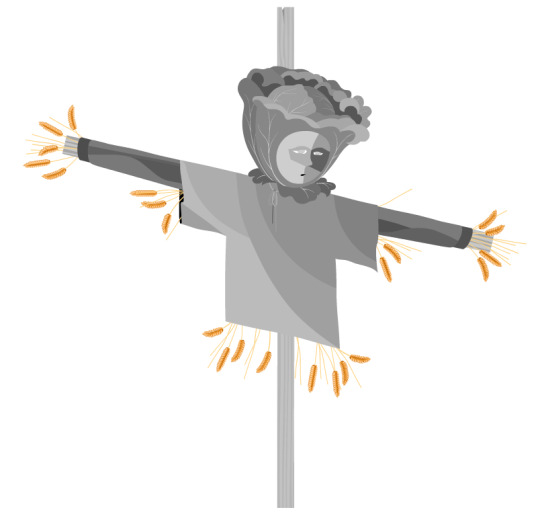
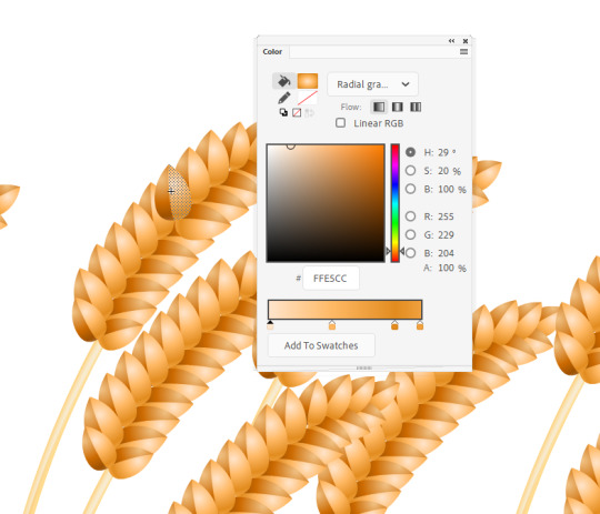
These fill shapes are then either coloured and rendered in Adobe Animate, using fills, gradients, or a more complex process of masks and effects.
Alternatively, I'll bring all these vector shapes into Photoshop and use them as clipping masks. The vector shapes act like masking taped areas or shields to maintain sharp edges, while the brush is like an atomized airbrush used to build soft volumed forms.
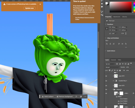
Please excuse all that horrible Adobe Cloud and AI bloatware...
And there we go!
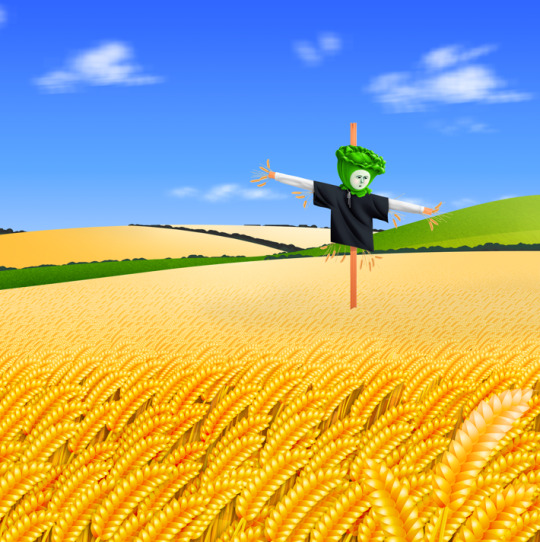
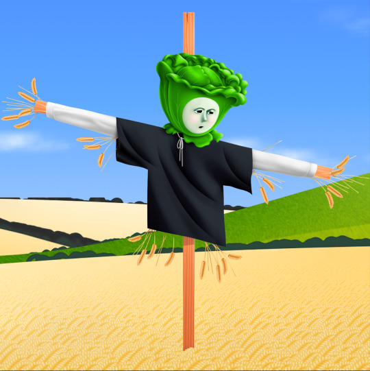
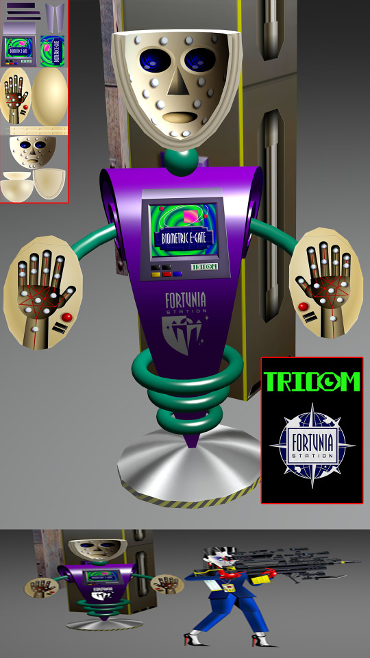
Variations in the process include just using MS Paint, index color in Photoshop, or 3D programs.
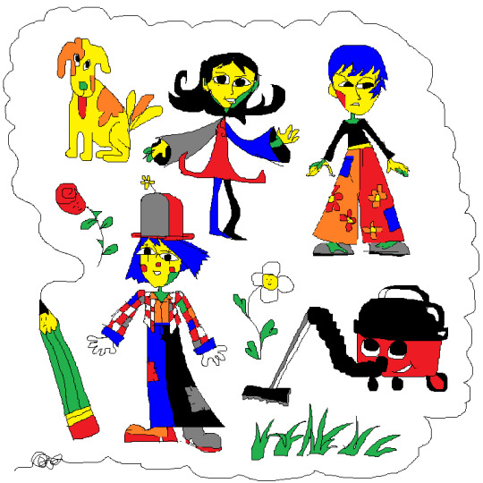
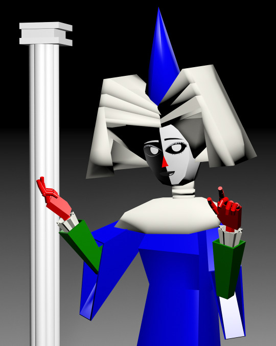
Very old works of mine were almost abstract, just exploring digital mark-making, which was a trend I was following in the mid 2010s that I loved. This kind of stuff.
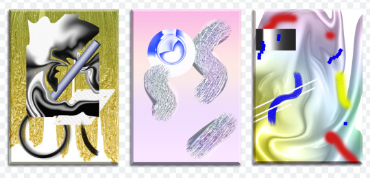
While my current work uses its digital material specificity as an intermediary to the subject in the illustration.
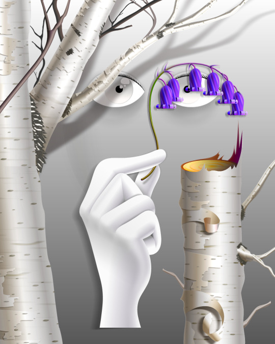
For example, #ersatz.world parodies clip-art and flash edutainment styles but imagines the characters living within that kind of world. The designs are meant to be cute, easy to read, light in computer processing, but also irreverent, janky, and generic too.
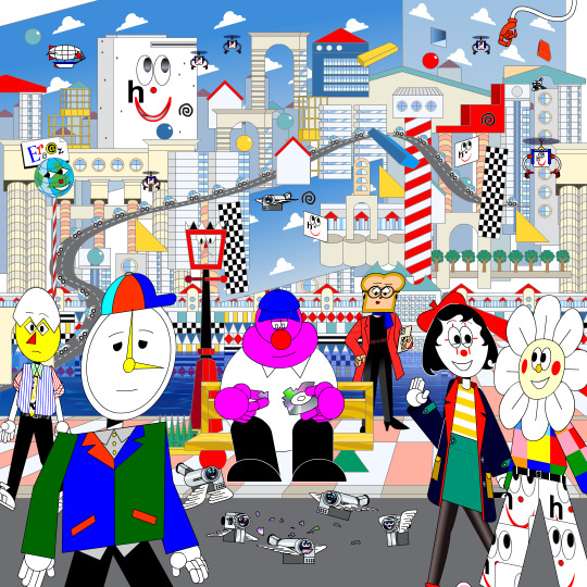
People typically regard this sort of clip art style as ephemeral trash, but I always found them charming. I use Ersatz World primarily as a satire vehicle, parodying educational formats to spoof corporate explainer content and digital media.
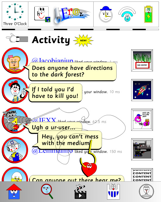
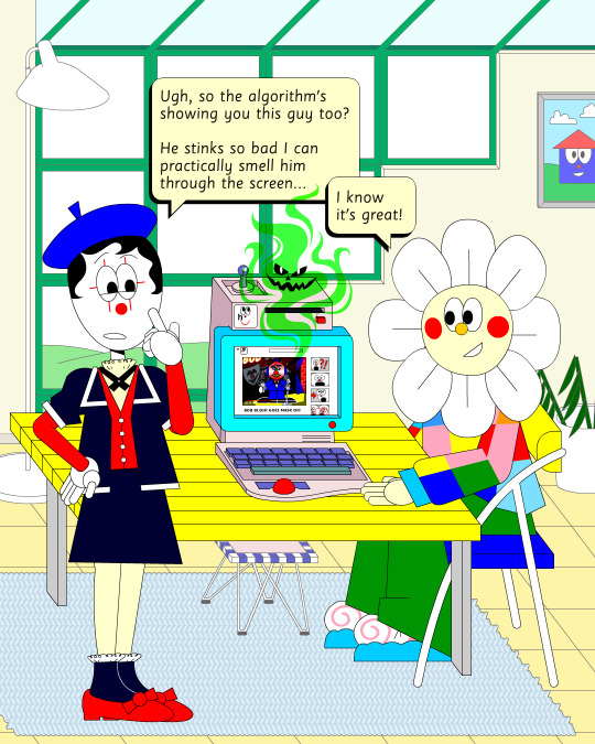
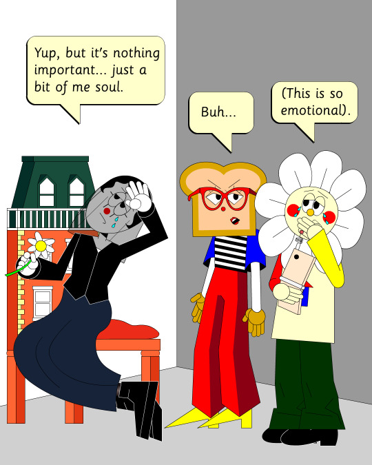
However, part of the problem with Ersatz is I've made it look too polished, complex, and I've grown too attached to the characters, which I imagine is a typical issue with overbuilding a world. So recently, I've made an even jankier Ersatz-like set of characters to play about with, using an even simpler style with less cohesion. I like to try and use slightly different styles and digital material styles to relate to the property at hand.
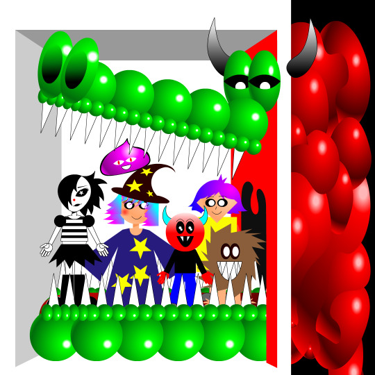
That’s why #autonymus has a bitmap digital material and a denser feel to it. Unlike Ersatz, Autonymus is not meant to be an overt semi-meta fiction. It’s not exactly pixel art, but the pixels are just about visible, as the intention is to create a digital expressionist depth to the setting. Although it’s still stylized and not realistic to our world, I definitely still want to evoke semblances of our world. That’s why there’s attention to landscape, plant life, and implied life beyond what you see in the frame with the characters, etc. But I'm still making a cartoon, and I still want it to feel at ease with itself being a digital material work. Characters are therefore flat, simple, stiff, and the speech style is like a bad Shakespeare parody. I like to balance between ugly and appealing, simple and complex, familiar and unfamiliar.
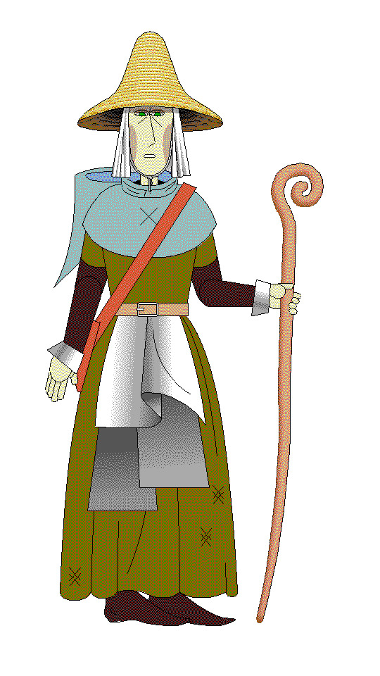
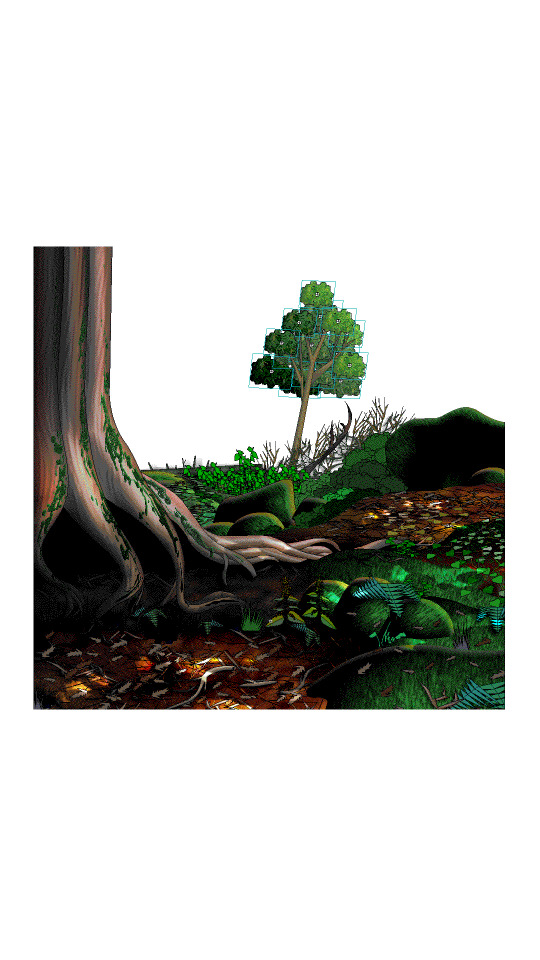
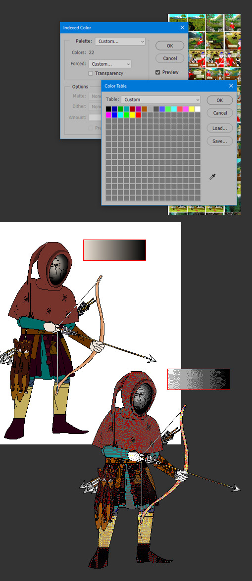
In regard to things like inspiration, references, and my relationship to aesthetic genres; these things certainly factor into my work, perhaps I'm even overtly dependent on them. My work can definitely be post-modernist in method; creating new, ironic, or fragmented interpretations through deconstructing a mix of various styles or methods. But at the same time, I'm still trying to make a digital gestural representation where the aesthetic is driven by my relationship to the software and techniques directly—not simply in an attempt to reference a style. For example, I like drawing lines in sweeping strokes, not to a point of geometric perfection, but just in a way where the curves are smooth and simple. But if I want perfectly curved or straight lines, I'll use the vector tools.
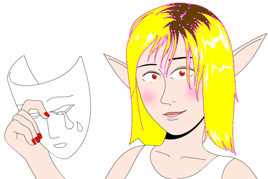
Working this way, you can sort of learn why certain styles and design choices in past vector aesthetics were made, as they would have also needed to make similar choices. That’s why I’m more mindful of using digital material specificity as a foundation to build narrative and subjects upon these days.
For example, genre references like cyberpunk clichés for #cyberhell or late medieval design for #autonymus or 2005 to 2015 era subculture fashion for #gradientgoblinz.
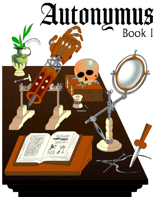
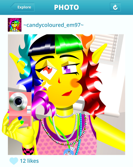
I think it’s important to take inspiration and reference from a wide variety of sources, but I think they’d mean nothing without having something to say or express. Autonymus, although it is a collection of tropes and clichés, isn’t just about that. It’s a story about the tensions of socially constructed systems and how that shapes faith, technology, and the natural world, or at least that's what I'm aiming for anyway.
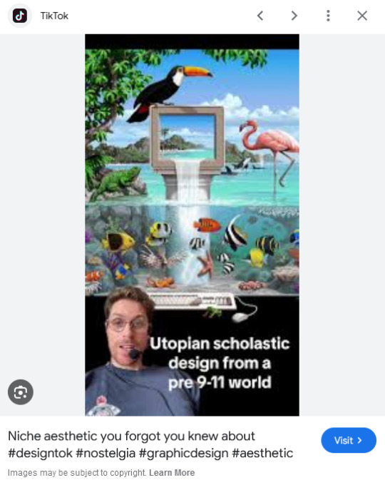
But despite all that, I think there’s a danger of locking myself into the past by using these methods. For example, using nostalgia and references to past aesthetics can result in just recreating the past in a form of role-play. To avoid that, I try and evoke the past through a messy, inaccurate pastiche rather than caring to accurately re-enact anything. I’m probably not always successful at communicating the deliberateness of this, and it can certainly get very frustrating and pedantic. To be honest, I do kind of hate aesthetic labels (terms like Y2K, global coffee house, utopian scholastic designs from a pre-9/11 world).
I do not believe that a project aimed solely at mapping history through aesthetic styles is worthwhile. Sure, they can be handy for organizing style trends, but they can also be reductive and ahistoric. Who are these people to define the history of these design eras? The result is a kind of suffocating simulation of design history but removed from context, perfect for moodboardism. I wish it felt more tongue-in-cheek, less absolute of itself in its own practice. Instead, it acts to legitimize and engender those making these labels, almost giving them ownership of the design styles. It’s similar to the logic and process of generative AI and its databases in a way, just done manually.
I’m very inspired by artists like Oneohtrix Point Never in this regard, as I think he’s able to create an aesthetic portal to all kinds of memories, feelings, and worlds reminiscent of the past, while still being in the present. It’s more a reflection of how timelines are messy now, like a memory or dream, rather than an audacity to say the past was actually like that, or to try to actually map some kind of timeline.
I think the benefit of this process is how it avoids the other side of the spectrum—being locked into chasing the cutting edge of digital processes. I don't necessarily think using an old digital process means your work inherits the semiotics of old aesthetics. Non-digital mediums don’t have this issue to this degree, as you can still paint in oils and be considered contemporary, or at least it's not frowned upon to such a degree. And I also don't think anyone in the heyday of Flash ever made work the same as I do, especially as computers are more powerful now so can handle more. I probably shouldn't boast too much about that though, as artists at the time probably just had more sense than to use Flash like a painting program! So then, why is my use of Adobe Animate critiqued as obsolete and an aesthetic dead-end? Because to whose standards is this process obsolete? If you value digital aesthetics as an apparatus in industry practice, then sure, my work is redundant.
But as wonderful as the latest tech can be in creating new aesthetics, I do feel it can be overtly dependent on the trends and directions of tech corporations, and therefore act as an indirect propaganda tool to their hegemony over digital aesthetics, such as the ever-demanding processing power needed for simulated realism. If anything, work that does follow in the direction of the latest tech trends is ironically the quickest to date once the trends move on.
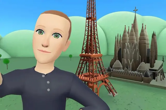
I've noticed I've not really described what my work is about, just the process, in this text. But I don't know, maybe I like Flash because it is regarded as redundant. No one really cares about it, so I feel free to make whatever I want, and can decide on form myself, to my own standards, the quality of my work. As fun as making images is, I find it difficult to put into words what it is exactly I'm expressing in my work, and perhaps that would spoil it anyway.
218 notes
·
View notes
Text
AOT character & their personal fashion styles
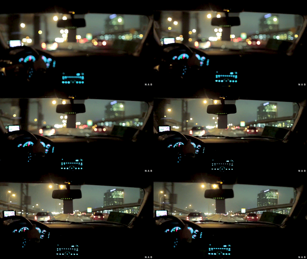
characters : Eren Jaeger, Mikasa Ackerman, Armin Arlert, Jean Kirschtein, Connie Springer, Sasha Braus, Marco Bodt
warning: all of these are just purely based off of my personal insight and views of the characters and how i think they’d dress today
🪩🥡🪐🎸🎧
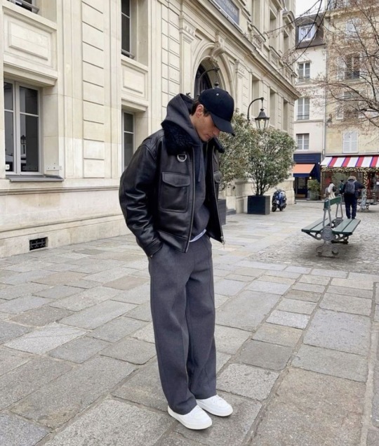
Eren Jaeger: 🎱🌪️🩻⛓️
based off of season 4 Eren
i picture Eren in todays world really rocking with a minimalist street style
he’s all for comfort and breathability in his clothing and his style reflects that
a closet full of loose fitting boxy t-shirts
LOVES the cold months so he can layer his hoodies and leather jackets
while also sporting the slutty tightly fitted black shirt grey sweat pant combo every now and then
maybe even just walking out his apartment with a wife pleaser and baggy jeans on as a fit alone
all paired with sneakers, small silver hoops, and a chain of some sort
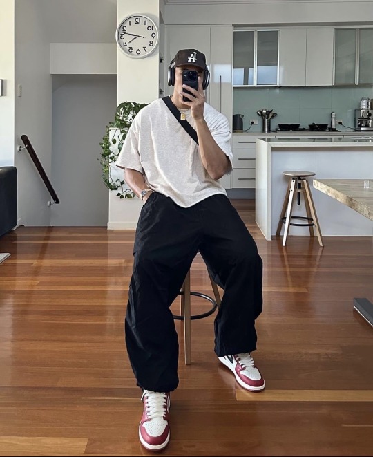
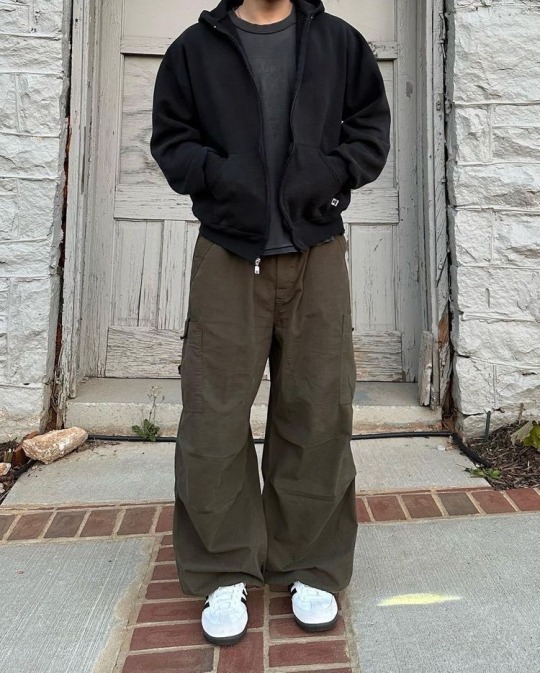
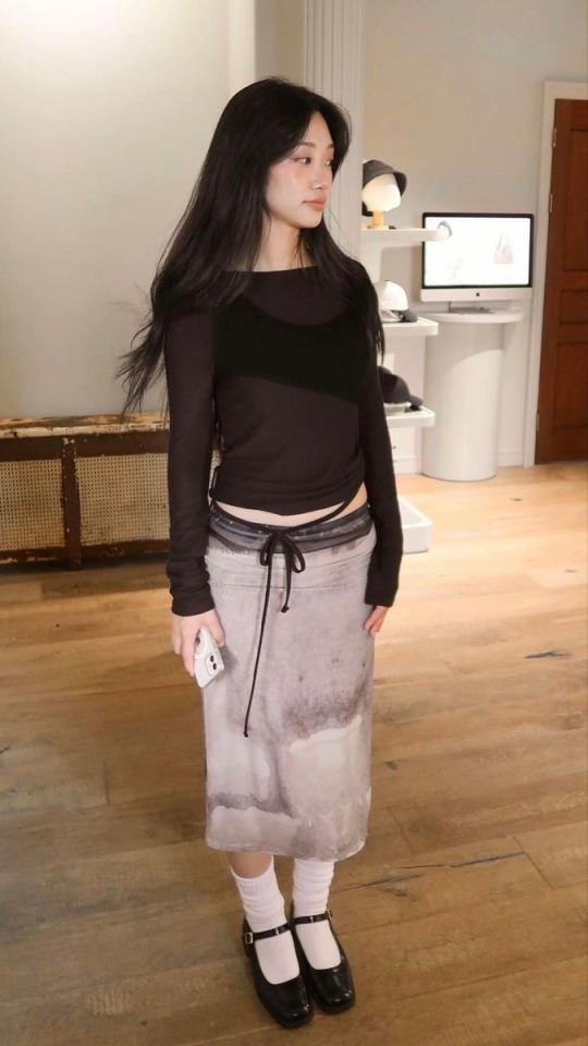
Mikasa Ackerman: 🍒💿📷🃏
we all know for a fact that Mikasa can DRESS
she just has an eye for fashion and has a unique style of her own
one that isn’t over the top, in terms of being a spectacle, but just well put together and tailored to HER. a girl you 110% give a second glance
she is a girlie who LOVES wearing any skirt whether it be long, midi, mini or knee length she LOVES them
most of her pieces are pretty free flowing with lots of different silhouettes
absolutely loves a good leather boot, pair of mary janes, or platform loafers
she literally could wear a trash bag and make it look like it’s the next trend
and has a huge collection of baggus


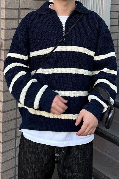
Armin Arlert: 🎧📘🍵☁️
Armin will literally never be free of the soft light academia aesthetic
the cable knit sweaters, soft cardigans, and sweater vests will forever have a hold on him
but what college boy Armin loves more than anything is a good quarter zip or quarter button up
or a nice casual white and blue striped button up
almost all of his clothing is soft and warm materials
definitely withholds the cute boy in the library title
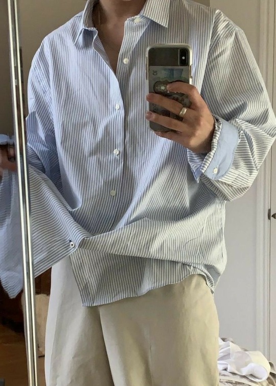
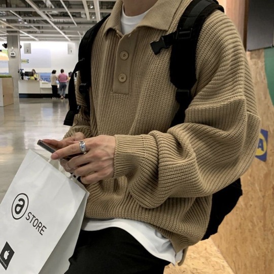
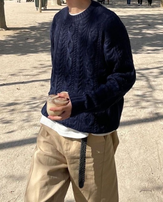
Jean Kirschtein: 🪐👁️🗨️⚡️🌉
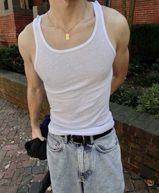
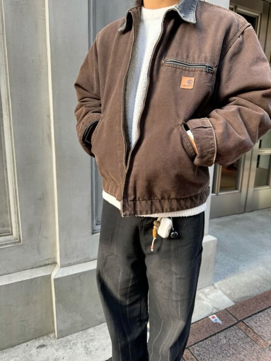
will live and die on the hill that Jean is a Carthartt guy
his look is a casual-relaxed but clean one
he’s all for clothing that is durable and will last him forever
Jean’s style is honestly super basic but NOT boring
although Jean’s style isn’t one that is made to make it hard to look away from its one that really just compliments him well
loves a good hefty Dickies or Carthartt jacket, basic white t-shirt, or a loose button up over a tank top
while wearing a variety of rings, with small hoops and a chain
his clothes compliment his strongly built and lengthy body well, which is why although they are basic, it isn’t boring
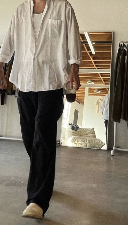


Connie Springer: 🎧💽☄️🩻
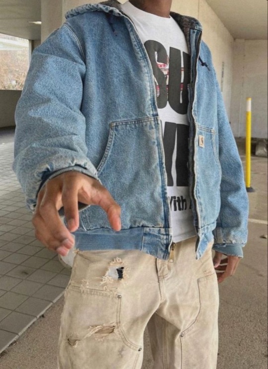
Connie is a literal fashionista
he probably is tiktok famous for his fit check videos and adventures at the thrift stores
the street style aesthetic was MADE for Connie
knows how to put pieces that may not look ideal together into a cohesive fit
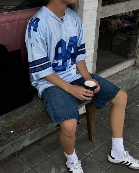
LOVES JORTS and swears he made them trendy again
and wearing jerseys of teams he has no clue of , but it’s for the fit so who cares


Sasha Braus: 🍰🪩🗽🧸
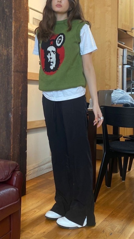
the DEFINITION of downtown girl or coming of age movie in a city aesthetic
Sasha lives for the nostalgia of 90s pieces and it shows in her clothing
comfort is also a huge factor that plays into Sasha’s outfits
color is another component that makes Sasha’s outfits HER outfits
LOVES a good brown leather jacket
Sasha honestly though has a hard time sticking to just ONE specific style and will wear whatever feels good for her

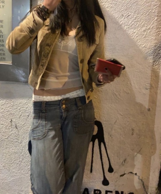
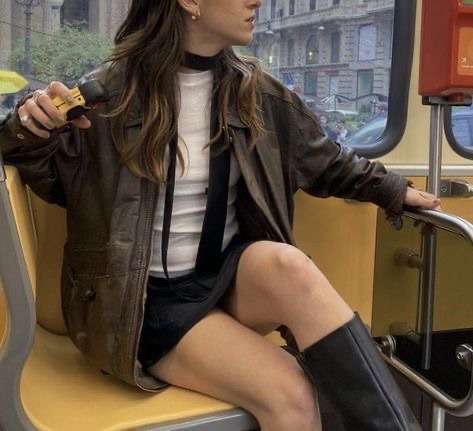
Marco Bodt: 🍙🪴♠️🍊
Marco is a soft boy at heart but he’s traded in the traditional sweaters vests for hardy collared jackets
he absolutely LOVES PLAID
and loves layering his button ups with his worn out thrifted jackets
has a more warm palette in terms of colors and leans more towards earthy tones
super casual in his shoes though sticking to good tried and true high top converse, sambas, or loafers if he's feeling fancy
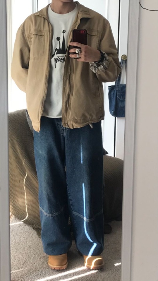
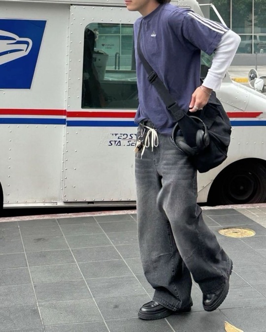
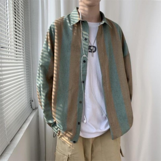
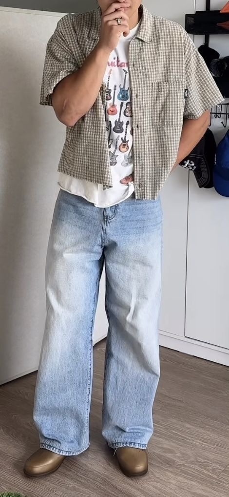
#eren jaeger#mikasa ackerman#armin arlert#connie springer#jean kirstein#sasha braus#marco bodt#aot modern au#aot x reader#attack on titan headcanons#aot college au#Spotify
298 notes
·
View notes
Text
Kurapika being deemed by the hxh fandom as one of, if not the most, aesthetically pleasing character in all of hxh is ironically hilarious to me.
While I agree with this sentiment to an extent, as someone who is very keen to elements that make up an inherent sense of asethetic, canonically speaking; it should be expected that Kurapika has almost everything that would go against having a cohesive one. If anything, I am in firm belief that the main reason why he holds such a title is due to the manga covers along with the elegantly crafted filler added in hxh 1999 in which depicts the suffering intertwined with the discovery of his nen ability in such an artistic manner, which then created the baseline aesthetic for the lovely artists of this fandom to further expand upon.
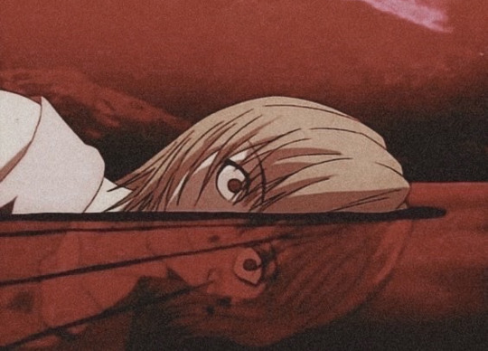
But outside of this? Even so, many hxh fans still agree that he holds a sense of aestheticism to him. It truly does not matter that his color palette is all over the place, or that he would absolutely not care for style, and that, when not his cultural attire or a suit; he dresses as though he had walked into each of his friends closet's, picked out one item from each one, and wore them all together and called it fashion. (They absolutely do not match at all and Killua would absolutely have a stroke at the sheer sight of such grievous combinations).
Specifically talking about these 2011 official arts in which he is one step away from becoming Armin Artlert. (Even complete with the seagull)
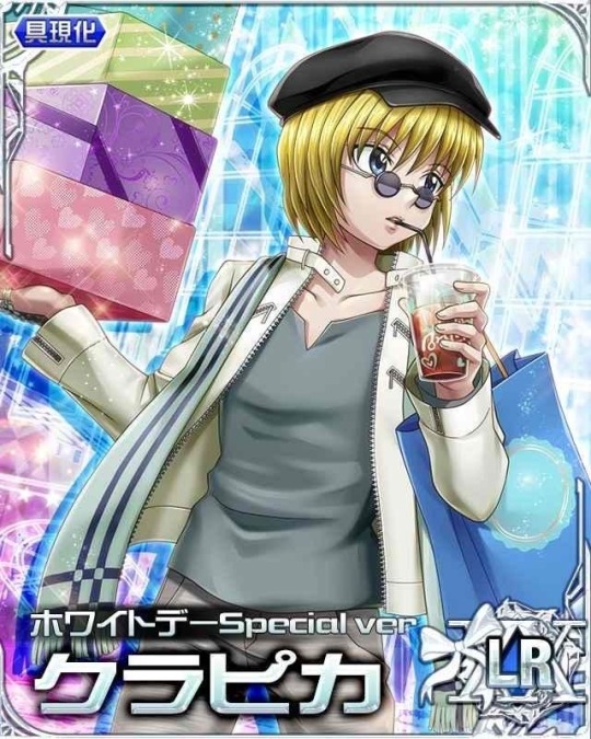
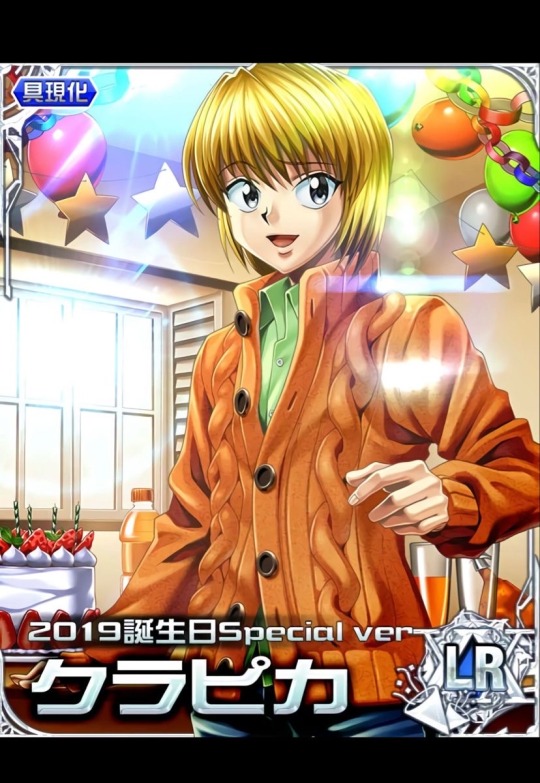
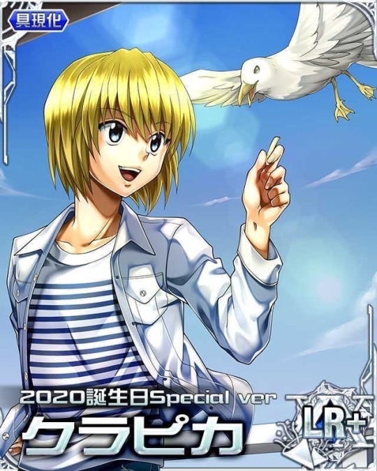
Either that, or he dresses like a recently divorced wine mom. Or a butch lesbian. Not to feminize him in any way of course. It’s just the observed truth. It’s just the, pure, unavoidable reality when you dress in those particular color combinations, wear flannel or an oversized sweater, and have that oh so particular “fuck ass bob.”
Specifically talking about these 1999 official arts. A friend of mine had pointed out to me that the one on the right reminded them of Major Hughes’s wife from FMA and I couldn’t stop laughing. Poor 1999 official art Kurapika they did him so wrong.
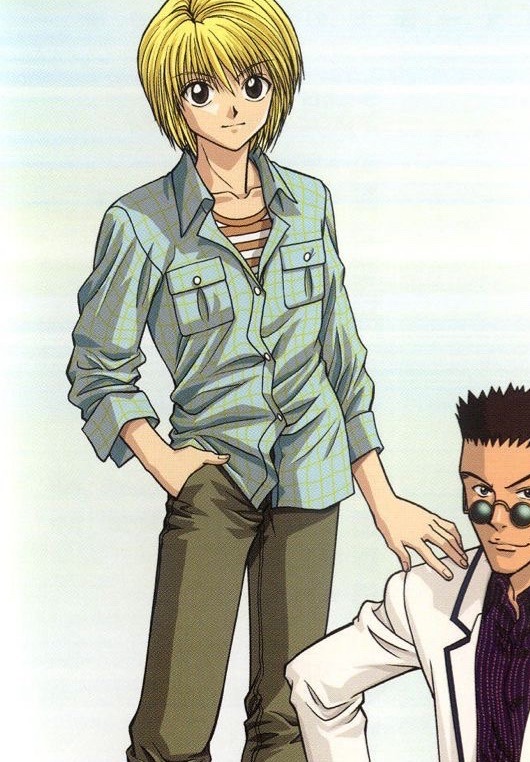
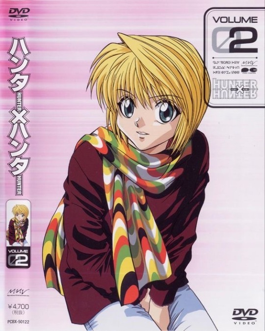
Though there also many instances in the 1999 official arts in which he does a complete 180, and dresses as though he were the most insufferable character in a shitty 90’s mafia movie. While yes, in the manga, he is technically a mob boss as of now, I genuinely could not fathom watching the absolute mess of succession war unfold with a straight face if he dressed like this.
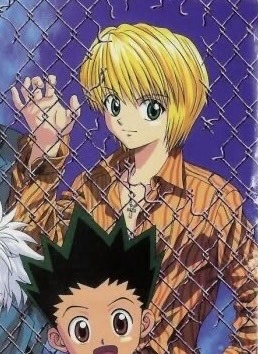
Yet even still, we have a multitude of artists making the most breathtaking artworks that depict him in agony while holding the eyes of his people almost as if he were some sort of sacrilegious patron, a lot of which are usually inspired Catholic/ Orthodox paintings. (I love these types of arts so much)
Now thinking about it, I suppose, maybe he is so aesthetically appealing because he is an androgynous presenting man with heavy backstory that has many symbolic ties to Christianity as he is representative of Lucifer in juxtaposition to Chrollo who is seen as this twisted version of Jesus Christ. And as we know, it was Lucifer who was considered to be the most “ beautiful of all the angels.”
But anyway, I digress. Bro is just ethereal. Congratulations togashi for creating a character so intentionally-unintentionally aesthetic.
(also this is very much a shitpost please I beg don’t take this seriously at all)
122 notes
·
View notes
Text
Ranking Men's Costumes in Period Dramas - Part II: The Good
Part I: The Bad
This is the second part to my ranking of men's costumes in Renaissance period dramas. I selected 10 shows and films which I think have great costuming for the female characters and ranked them according to their costumes for male characters. I have noticed that even when women's costuming is great, men's costuming might be absolutely dog shit. And that's very much what we saw in the first part, where I ranked the five worst entries. For some reason shows and movies are afraid to put men, especially the characters who are supposed to be cool, manly and hot, into historical costumes. And I'm not even asking for historical accuracy, I just don't want my male characters living in the actual 1500s in basically modern leather jackets and pants. Like I don't watch period dramas for vaguely historically inspired modern fashion, I watch it for the historical setting, which costumes help create. This time we will be looking some rare gems that actually imo have really good costuming even for the male characters. For the five best entries, we'll go from worst to best.
5. Eizabeth R (1971)
Elizabeth R is incredibly committed to historical accuracy in it's outfits, especially for queen Elizabeth herself, many of her costumes being directly recreated from her portraits. It covers the whole reign of Elizabeth, so this commitment is especially admirable as the timeline is more than 40 years, including a stark shift in fashion from less structured and more toned down Tudor fashion to the extremes of the highly structured Elizabethan fashion. It's not perfect, The hair is not always great and like many others they fail at French hoods, though they are not upward pointing or pseudo crowns detached from the hood, so could be much worse.

The men's costumes are also very good. They are faithful to history, they wear stockings, very short trunk hose, ruffs and even have some structuring in their doublets and jerkins. However, the reason this is not higher is that the men's costumes especially, but also many other costumes beside Elizabeth's are looking a little sloppy. There's some structure yes, but the men's silhouettes are just not bold enough and they end up looking a little costumy. Even the codpieces are shrunk so small I'm not even sure if they are there half the time. Cowardice. Here's two Robert Dudley's costumes and an actual portrait of him. I think the second costume is probably an attempt at recreation of that portrait, but it's just kinda halfway there.
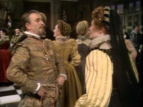
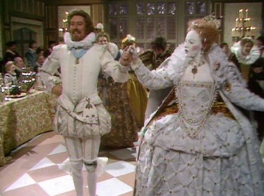
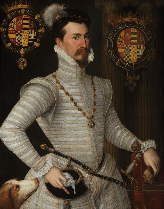
4. Taming of the Shrew (1967)
This film is set in Renaissance Italy, the women's costumes fit well to 1520s-30s. They are honestly really great and cohesive. My only gripe is that their bodices have a very 1960s shape and the make-up is a little distractingly modern. But the costuming is not attempting to recreate historical accuracy, rather they took the historical silhouette and basic elements and crafted a very over the top but cohesive look. I honestly love these very much.
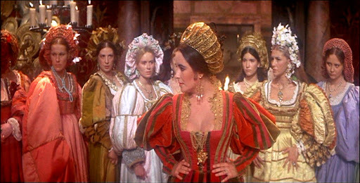


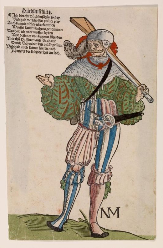
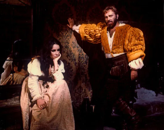
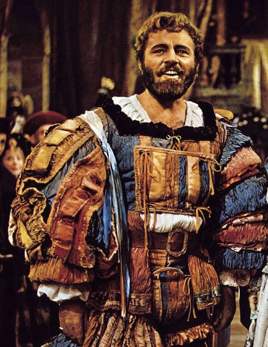
An interesting choice is made with the men's costuming, especially the main male lead, whose costume is based much more on the Renaissance German men's fashion of that period. His costumes resemble the over the top fashion of the German Landsknecht (first image below). In Italy (second image below) the doublets were also very voluminous and quite colourful but not to that extent as by the Landsknecht and literally no one, not even the other Germans, rocked that slashed style as hard.

This is not really criticism though. In fact I respect that choice a lot. His costumes are certainly not historically accurate, but they do fit the bombastic aesthetics of the overall costuming, they are loud, large and not afraid to fuck around. This man oozes sex-appeal much more than any character with some modern plain black pants and leather jacket. This is how you costume a Renaissance man who fucks.
3. Tulip Fever (2017)
I am stretching the definition or Renaissance here a bit, I admit. This movie is set during the 1630s tulip mania, by which point the remnants of Renaissance fashion had already been left to the previous decade. However, I do think most of the movies and TV set in Baroque era also struggle with the men's costumes. Though not as much, because black was fashionable for everyone, the cod piece was gone, trunk hose were replaced by more palatable Venetian hose, fashion was much more stripped down from embellishments, leather was not uncommon in jerkins and appeared even in doublets and hose and the Hollywood's beloved boots became actual fashion items. The men's silhouette in this period is very silly in my opinion and people seem to agree because it's usually skipped in costuming, but overall the period seems to fit modern masculinity standards much more easily than Renaissance era.
But I just really wanted to include this because the costuming is absolutely stunning (and let's be honest we are a bit desperate here trying to find 5 actually good examples). I have not watched the movie and probably never will because the post production was an absolute mess and it apparently came out as just a very bad movie, which is a shame, since the costumes are so good. The ruffs are perfectly crispy. The buttons are dense and look just right. The shoes, both boots and otherwise are so on point. The fabrics are honestly perfect. The silhouettes are just as goofy as they are supposed to be. And the women too have perfect silhouettes. All the details are just simply perfect. You rarely find costuming this meticulously created with historical details and great construction.
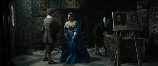
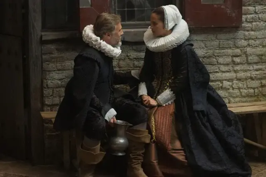
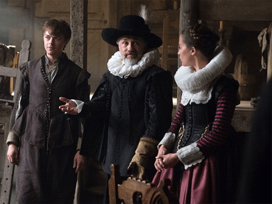
Honestly these top three could all be the best one. This final order was decided purely on which costumes I like more. And while I love the women's fashion of this period, I think the men's fashion is kinda stupid and boring, so I don't like these costumes on aesthetic level as much as the top two.
2. Romeo and Juliet (1968)
This movie is a perfect counterpart to the movie with the worst men's costuming which I talked about in the first post, Rosaline. They are both set in Italy around very end of 15th century and retell Romeo and Juliet. Both have very good costuming for female characters but obviously I think differ greatly in the male character costuming department. Romeo and Juliet costuming takes some artistic liberties to create a heightened reality quite similar to Taming of the Shrew costuming, but follows history much more closely. The colors are bright, the hose are tight, the giorneas are voluminous, the sleeves are long and massive and the cod pieces are prominent. Even the hair is perfect, even for women, they even use hairnets. I imagine the men's hair was quite easy to get right as hairstyles in 60s and 70s were basically lifted directly from 1400s Italian men's hairstyles. The men are even wearing appropriate goofy hats??? Amazing.


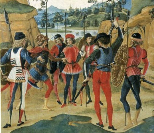
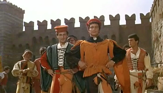
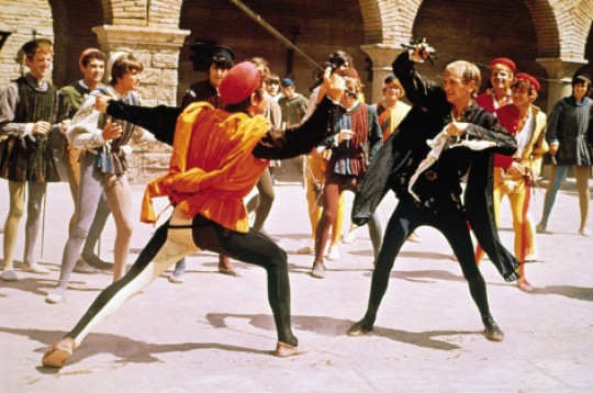
The costuming perfectly captures the era, but they still clearly had fun with it too. Honestly even though I appreciate the meticulously recreated historically accurate costuming, like in Tulip Fever, I tend to like more costuming that does take some artistic liberties to create a distinct look and atmosphere for the movie or TV show. There's some small things they don't get quite right, like having standard lacing instead of ladder lacing, metal eyelets (which would become a thing as late as in 1830s) and most egregiously Juliet in one scene has this very dumb supportive undergarment without even shift under it (first picture below)?? The outer garments were supportive during this era, there was no such thing as supportive undergarment which was any different from the outer kirtle (or gamurra in Italy). Shift was the only truly undergarment. But I will forgive these errors because the costuming is overall so fun and gorgeous. And they did get some details so so right, like look at Romeo's arming doublet (second picture below)! It has Lombardian sleeves!! This was a very specific style of arming doublet for this era and place. However those errors does prevent it from taking the first place. Which leads us to...


1. Orlando (1992)
This movie has Tilda Swinton in flamboyant Elizabethan men's clothing. That's all.
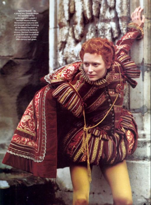

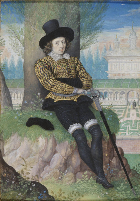
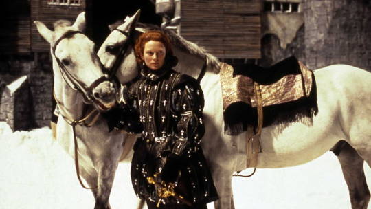

Okay, I that is all that needs to be said, but I will say more. This movie spans centuries and shows excellent costumes from several different periods, but I will focus on the Elizabethan costumes only for the sake of this post. The costuming is not super historically accurate in all the detailing, and clearly not trying to be, but it is always impeccable. Even while it takes artistic liberties and the story has an immortality fantastical element it still captures the men's fashion's silhouette much better than any other movie or TV show I know of set in this period. It does that better than the "we recreated these portraits" Elizabeth R. But what really makes this the best in my humble opinion, is that the movie is not afraid of the effeminate and emasculated modern perception of Renaissance men's fashion, no, it leans into it and uses it to explore the themes. The whole story is very much about gender and gender fuckery. Tilda Swinton plays the titular Orlando who is a cis man in Elizabethan era, becomes inexplicably immortal and later inexplicably turns into a woman for the rest of their several centuries. He is the embodiment of "I'm not sure if they are a butch or a twink" and as a bisexual I can only be grateful. But in all seriousness I think the costuming and the casting (queen Elizabeth is also played by a male actor) are so perfectly utilized to highlight the arbitrary construction of gender without needing to say it explicitly.
Conclusion
I have some closing thoughts. I took on this task as a way to show a point, which is that for some reason in Renaissance shows and film especially men's costuming is piss-poor, even when women's costuming is great. Male characters tend to have very bad costuming in Medieval media too, though this is also an issue for female characters. I don't think I have ever seen a Medieval show or movie with truly excellent costuming for anyone. In Renaissance media the issue is clearly not lack of skill or knowledge, they choose to do so. My thesis was that the producers think that the Renaissance men's fashion is too effeminate and too unsexy for the Hot Very Heterosexual Male Lead, who the mostly female audience are supposed fawn over like the female characters do. After the analysis think my hypothesis holds up.
Though there's an interesting trend I only noticed while doing this ranking; every entry (except the least bad) in the worst five list are from 21th century, and every entry (except Tulip Fever which is a little bit cheating anyway) in this best five list are from 20th century. I have some theories on why it turned out this way. First is that the studios have become increasingly more concerned with growing profits so they don't take risks and they put pressure on movies and TV shows to be as broadly appealing as possible. This means they can't just make period dramas for the core audience of period dramas, aka mostly women who are history nerds, so they pander to the modern sensibilities in costuming and not to the people who love to see actual historical costuming. Secondly, I think this might also tie to the broader conservative backlash against loosening of gender roles and broader queer acceptance. Among the core audiences of period dramas there are two distinct groups, queer nerds and conservative women, who don't want politics in their media, which is why they love historical stories because obviously queerness wasn't invented yet and people of colour didn't exist yet (they were and did). (They are ofc not always this extreme, but you get the point.) As men wearing dresses has become a culture war issue, I think the studio executives are afraid that anything not masculine enough in modern standards might alienate the more conservative audiences, and more broadly those who don't want to feel like they are engaging with modern political culture war topics in their escapist media. Even if they knew about the queer nerds, they wouldn't care about them and assume they will go along with it anyway. After all not challenging modern gender roles is not seen as an active choice, it's the default.
This bears repeating: cowards.
As a thank you for reading all the way to the end I will leave you with the image of Tilda Swinton in mid 1600s men's clothing. You are welcome.
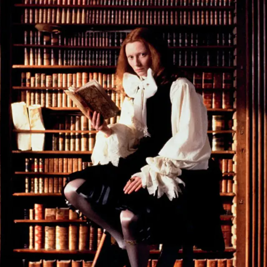
Part I: The Bad
#fashion history#history#historical costuming#costuming#renaissance fashion#renaissance costuming#film costuming#historical men's fashion
175 notes
·
View notes
Text
I have been thinking about two silly headcanons for Gale's tower because we don't have a ton of info about it, and I think headcanons are fun-
1 - If Gale's tower is located in the Dock Ward, as it seems to be in his romance cutscene, then it does not look like a tower from the outside. It sits entirely unassuming amongst the neighboring buildings, but on the inside it is a full, multi-story wizard tower complete with all the amenities one would expect from Gale. While it could all be illusory, I much prefer the idea that the tower's architecture is literally impossible.
2 - Gale's tower is actually located in the Sea Ward (based on vibes, nothing concrete from the game) but his balcony is still in the Dock Ward. He rents a bit of wall space out over the harbor and either did some wacky wizard reality-bending nonsense so the door from his study to the balcony is a portal, or it's an illusory replica of the view. Again, I prefer the wackier, reality-bending version because I feel like Gale's time as an archmage had to include at least a few acts of pure self-indulgent disrespect for physics and the like. I think he'd do the illusion thing with a few windows though- I am projecting my own love of the ocean here, but I like the thought that no matter what window you look out of, you always see the Sea of Swords.
In both cases I don't imagine his tower to be huge. I like a Gale that has a few favorite comforts that he heavily leans into, rather than one that surrounds himself in opulence for the sake of it. It's cozy for a wizard's tower- only a handful of floors tall, filled with rare flora samples that double as houseplants, and the furnishings are a mismatched collection of pieces that he's accrued over the years. There's minimal effort towards aesthetic cohesion. It's just a bunch of stuff he found at various points in his life and decided, "Yes, I like this enough to have it in my home."
58 notes
·
View notes
Text

Redesigning Mualani
So,,, I’m trying to do some redesigns for Natlan the way I did for Sumeru. I started with Mualani, since her design honestly has the most potential.
Disclaimer: I do not belong to any demographic represented by Natlan, these are just purely aesthetic/ opinion-based redesigns.
So let’s start with the original, for reference:

So, this design is not bad, it just could be a bit better, in my opinion:
So the character designers DO know what undertones are?? I like the warm-toned tan- it looks good, and I wish we could have had this skin tone in-game a lot sooner. That being said, I think they could have leaned in and given her a much deeper tan, since that would give more contrast with her tattoos and outfit.
Her outfit is actually really cute, I don’t think it needs too many changes.
I absolutely love her facial features. Her eyes are literally so pretty, especially with how long her eyelashes are!
Her hair is not bad, but I think it could use more volume and texture.
So here’s what I changed:
Deepened her tan. Literally so easy to do, and makes the design look overall more cohesive. Also contrasts with her tattoos more, making them more easily visible.
I added a small heart to her cheek, since I feel like that’s something she would like lol.
Added slightly more definition to her muscles, since it seems from her animations and splash art that she is athletic.
I gave her fuller, wavier hair, and added some blue highlights and several smaller braids. I feel like that sort of suits her more, and kind of ties together her look somewhat by matching her hair to her outfit.
I kept most of her outfit the same, since I think it’s super cute, I just got rid of the bow in the back, since it felt like it didn’t match anything. I also made her shorts slightly longer, since I feel like it adds a bit more personality to her look, if that makes sense?
#art#digital art#anime art#anime#ibispaint#artists on tumblr#fanart#fan art#mualani#genshin impact#genshin impact redesign#natlan#natlan redesign#natlan characters#genshin impact natlan#genshin impact mualani#mualani genshin#Mualani Genshin impact#Genshin Mualani#Genshin fluff#Mualani redesign#character redesign#Mualani headcanon#Mualani headcanons
52 notes
·
View notes
Text
Jimin - Muse (2024)
3/5 ☆
I thought it'd get me several days to come back here with some thoughts on Muse, but it proved it's not necessary.
Who as title track makes complete sense. We're still into 90s nostalgia, but it's a recipe that works. Not just in kpop, but pop in general. Looking at the charts, it paints a pretty clear picture for the last couple of years. Add the zoomer idea of a what a Y2K aesthetic is like and we get the recipe for today's music and concept. Repeat, reuse, recycle. How fitting for postmodernism.
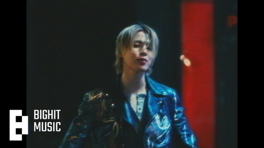
Who is a really catchy tune, with lyrics easy to remember and sing out loud. A tad more commercial-sounding than Like Crazy, but that's Muse overall anyway. The truth is, I have the song on loop (streamers can't come for me, lol). I think Jimin's style of singing and the melody itself are a good fit. Lyric wise, it's sort of basic, but this is pop music made for mass consumption. I don't mind it. It's also radio friendly and definitely has the potential for summer hit, but I'm 99% sure it won't turn into one. BH won't move a finger to send it to radio and it's another song that will fall victim to fandom mass streaming to chart high for one week. I've seen this all before.
It's also a shame to have this released when an artist is away, without being able to properly promote it. In my non-expert opinion, it could have been released as a single a few months later after Face and scratch the rest of Muse or keep it in the drafts.
As to the other songs, perhaps Rebirth (Intro) is the only other song on the album that has something to it, it stands out a bit more and it also bridges the two albums, despite the connection being sort of flimsy.
Having Sofia Carson on Slow Dance had brought nothing to the song. It could have been a full Jimin track all the way. Her style of singing does not stand out and I find it a failed pair because there's no contrast or voices complementing each other. Jimin can sing just like her. If a collab is really wanted/needed/necessary, then I'd wish for a pairing that also makes sense vocal-wise.
Be Mine is ok, but it sounds too much like that one TXT song and I simply can't get over past it. It's afro beat and latino influence which has been all the rage in the past few years, which Hybe has been pushing a lot. It explains the song.
SGMB and Closer Than This were previously released and I'm not covering them again.
I think it's difficult for me to not make comparisons to Face, considering both albums were produced around the same period, without much time left in between them. One is simply more cohesive and has a depth that showcases a first solo attempt, while the other one is clearly going a more commercial route with less of a personal signature.
Despite Muse being promoted as another conceptual album, I find that umbrella to be a bit forced given that the theme of finding love is really a generic one. Perhaps way too generic with not much individuality. Does it show Jimin's vocal range? Yes. Does it show him trying various genres? Yes. In this case, perhaps Muse is a bit similar to Golden in some aspects, with the difference that Jimin gets producing and writing credits in 5/6 songs. So his involvement is greater, but the scope of the album is in the same category as Golden, which is another production that had this LOVE as an overarching theme. But without much more to it that would make it stand out lyrically. The focus on both is genre diversity and vocal capability.
In short: I like Who (I also like Ace of Base songs and all those silly 90s pop songs, so my music taste is most likely considered bad, but I don't care). I think Muse overall is an amalgam of whatever is trendy at the moment, without being able to truly stand out and say more about Jimin, apart from his capabilities as idol/performer. Perhaps that was the point too.
P.S. My inbox has been closed for anonymous asks since I reblogged a few days ago my post about using lyrics as clues for personal life. It seems that it invited homophobia and I won't have that here.
I'm keeping it that way for now because I'm sure my personal "review" on Muse will either be seen as an invitation for people to either bash me for not thinking it's the album of the year or to be seen as an opportunity for others to talk shit about Jimin, Who and the album overall. I found that usually there is no middle ground with kpop stans/army/Jimin stans, etc.
43 notes
·
View notes
Text
Hello hello everybody! It is time for another months progress, and I am so excited to share with you, all the things I have gotten my grimy little gremlin hands on. First off, what we are all here for; writing. I have been on fire, to be honest! Last month I churned through the last of the first batch of erotica stories (there's 6 (!!!) of them on my patreon already) and set them up for publishing along with two more unseen ones- I'm still going over the logistics of where to publish for the best revenue (I know this sounds boring, but I have to make an income somehow, and hopefully find another audience as a smut writer on other platforms 💀 I love writing it so why not!), and I am making headway, learning the ins and outs of self publishing. On patreon, there are also two Q&A's that are written in a bit more fictional manner, in character: a more fun way than just writing answers straight up and down. I have enjoyed those so much! There's a bunch of other stuff I haven't even mentioned- honestly, I have to say, I'm really proud of my output on Patreon even though I have been really anxious about writing full time. It's going great! I have to thank my new friends and support-network on discord; you make this all worth it. I cannot express how fun it is to shoot the shit with you in vc, gaming together, or seeing your shenanigans in gen or your in depth theories (thanks for the brainworms!) or memes or staring longingly at the fanfic channel or drooling over your art (ouro related or not) or... Gah. You are just amazing people, and I will waste no opportunity in saying so. Thank you forever and ever and ever an-
When it comes to OUROBOROS, I am happy to announce that the next chapter is damn near done! I was halted because of the discovery that dashingdon is no longer supported by it's creator, and have been working on the twine version ever since, earlier than I expected- it's tough work, but I am so excited to make this an actual game made entirely by myself, and not submitting to a company that quite frankly leaves a bitter aftertaste. It is taking long to make because I want to make it mobile compatible from the start, which there isn't a lot of resources for. But I'm doing my best! The plan is that I will be posting the next chapter for Patreons in the coming month, and then treat you to a full twine release here on tumblr. I haven't made any rewrites when porting the twine build, but I would like to do that too... so we will see; this plan is not set in stone. I will just have to see how it evolves over the next month. Yes, beta-readers is still on the schedule, just holding off a little while while I wrap my head around this new coding landscape.
Other than that, I have been working on the set aesthetic for ouro, which has been really hard, a lot harder than I expected. You all know I am no wizard when it comes to graphic design, but I want to at least develop a set palette and imagery and portraits that is cohesive to the story. The work is ongoing, and I don't have much to say about it- even though it is taking a lot of my brain power. I'm hoping I can come to some kind of set and in depth conclusion that I am happy with before the twine release, because I want the game to feel like a treat to open up and play; a world to get lost in.
That's it! If you want to see weekly and more in depth dev-logs, you know where to go. I hope you have an amazing day or night, and we will see each other soon. xx
#OUROBOROS#ouroboros-if#interactive fiction#twine wip#progress report#dev log#I am SO sorry I haven't been around a lot to answer asks- there is so much work to be done and only so little of me to go around whuhuhuhu#send help lmfao. tuck me into your pocket. keep me safe!!!! I have no idea how people manage all this. But I promise and cross my heart I a#Doing My Best™#other things not mentioned: I have been going through The Stress with my doagy who injured her leg but today we finally took a full hike t#together- she really scared me with how much pain she was in but we made it through 😭 I cannot thank my patreon supporters enough because#your support is making me breathe easy about the upcoming vet bill. why are blood samples so expensive. wah#yeees yees im bursting with butterflies and rainbow emotions. but truly- I can't thank you enough#Onwards! We keep moving!I am so excited for all this-damn all the stress and the insecurities-I am Doing It!!! It is Happening! Wahoo!
233 notes
·
View notes
Note
hi its me again i feel legally obligated to ask about your thoughts on the new riz design (but also extends to al of the other new art for the bad kids too!!!)
HI SHOKO sorry this took so long to asnwer, it feels a little late to the party now but I have lots of thoughts and this has been in my drafts for a hot minute so I'll break my thoughts down in order <3
Fig
GOD DO I LOVE FIG'S DESIGN. It hasn't changed too drastically in many ways, it's largely the same beats with the plaid skirt, leather jacket, biker gloves, and docs, but there's a lot more detail pertaining to her character now. Ayda's feather earring is abviously a huge win, everyone loves to see it, but I love the small details like the added wallet chain on her skirt, the added ear piercings, and her painted nails. If I had to choose something I didn't like, it'd be the color of her shoelaces, which isn't a huge deal bc you know spyre might have different cultural beats, but it's very reminiscent of punk doc lace codes, which were a way to sort of factionize yourself among punks. Fig wears one purple and one red, and traditionally purple means gay pride(which is great and i would've picked it for her too) but red usually means you allign yourself with neo-nazi's and similar groups which. is definitely Not Fig. It's not a HUGE deal but, maybe some more research could've been put into it.
Gorgug
Gorgug's new design is so. Perfect. Amazing. Spectacular. No notes. It's exactly the changes I wanted to see. The goggles, the dirt-covered face, the ripped jeans, the bags and tools, the gloves, the most disgusting worn pair of convers you've ever seen. It's absolutely amazing and the artist has managed to bring all the beats we loved about his original design(his extremely fashionable purple pants) and mixes them perfectly with all of the new facets of Gorgug's personality that have changed and grown theough their adventures. A little detail I love is how the color of his headphones has changed to match with the rest of his outfit better, creating a more cohesive design with the introduction of more red/maroon tones. This was always a little bit of an issue with the old design for me. The colors sort of didn't go together.
Kristen
She's going through a break up. She's at the most chaotic she's ever been and she's trying to fix it. It is so genius to make her jacked. The bright yellow tracksuit is beautiful and exactly something Kristen would buy and wear every day. Plus the tiedye purple sports bra tying in her old church camp shirt aesthetic is brilliant. I'm mourning the loss of her sandals, but the matching shoes to her tracksuit can't be complained about. Not a whole lot to say, I'm excited about how this design will change and reflect her growth this season! Praise Saint Kristen Applebees!!
Adaine
THE ELVEN ORACLE IS COOL NOW!!! I love her jacket, all the patches and the toned down fur lining is absolutely perfect. I also love the cool strapped bags on her hips and legs, it's just a really cool adventurer addition cementing her as a bad ass practical caster. Her entire face seems more assured and relaxed, which is absolutely amazing for her and reflects how her resting state is no longer as addled with panic and anxiety as it used to be. Her hair also seems a lot more her! Not sure how to describe it, but it seems like she's focusing less on keeping herself perfect, and more on just keeping herself, herself! Not very big design swings or changes, but she doesn't need to change, she just needs to be true to herself. (Also. a huge fan of her cool magic circle shirt.) My only gripe. Give her blue hair. And pronouns. And glasses pretty please.
Fabian
That boy is the future of dance!!!!!!!!!! I love the color palette shift for his design, it's a really great way to show how he's grown out of Bill's shadow and embraced his own passions with the grey tones with red and gold accents. Also a huge fan of the fancy robed pants, tons of great movement lines and something a dancer would totally wear. On the same note however, I feel like it doesn't really go with the rest of his outfit. I love how the changes made are geared towards movement and dance(his shoes changing from sneakers to dance shoes is great) but I feel like the changes are all sort of mismatched? The dance shoes look a lot like tap shoes, but the pants look more big and flowy, better for a more leaping and running style of dance, and his jacket has almost nothing to do with dance. It's delightfully artsy and detailed, which is so chic and Fabian, but the shapes of it don't really match up, and especially without a clear view of the front it makes him look like he's wearing half of a matador outfit. I would've loved to see a more dramatic silhouette without the use of the battle sheet(which is absolutely perfect, no notes) with either lots of flowy parts for movement, or a sharp jacket with skinnier pants for that exaggerated silhouette. Again, I think this is really all due to a lack of research, but the spirit of Fabian is still in the room with us. The colors are great, the bandages on his hands are perfect, and the fanciful element is very on point, just needs some better shape language and cohesiveness.
Riz
There he goes, he's gone from gritty detective to gadget-heavy superspy. I LOVE the character choices that Murph made for Riz, he's become even more of a loser and seems a lot less hard and fast, and more generally passionate. In freshman and sophomore year, he was entirely goal oriented, completely focused on completing his mission and solving the mystery, this time around he's still got a mission, but because he can't do it all himself, he's sort of given the opportunity to branch out and explore himself. This is all to say, i love the insufferable loser hipster kid that he's become. He is truly the trinket goblin of all time, I love all his wild little gadgets and jewelry, and all the extra arcano-tech screens on his glasses are brilliant. I'm also a huge fan of his torso gun-holdster, which is a beautiful homage to his detective nature. The undercut is also obviously perfection. The loser teen-boy urge to cut away your beautiful hair for a nerdy undercut is so painfully lore accurate that it's one of my favorite details. It's probably because he's a dork. but I would love to know why he has rolled up pants and no socks. What is that. Why would he do that. ALSO STOP BEING A COWARD D20. GIVE HIM DIGITIGRADE LEGS AND A TAIL. CAT GOBLIN TRUTHERS UNITE!!!!!!!!!!
anyways that's probably the end of my rant for now. I love the bad kids and overall their designs are great. constantly wishing all of my headcannons were real but understanding that the cannon will never relent.
#dimension 20#d20#fantasy high#bad kids#adaine abernant#kristen applebees#fig faeth#fabian aramais seacaster#riz gukgak#gorgug thistlespring
65 notes
·
View notes
Text
that's it for jötun design party! i had so much fun seeing everyone's designs. the most difficult part was picking the winners, but i got there in the end! here are the winners, why i picked them, and the prizes they won!
as i will not be using this account anymore, i'll leave this as the pinned post and link to This Post as well as the #orientalism search for anyone who may stumble upon this blog in the future ❄️

Jötun Design Party Winners
First Place
Prize: full-body drawing of a character (original or otherwise) of their choice. I have your discord, and will contact you when I have the time to start and complete your drawing!
@therese-lokidottir
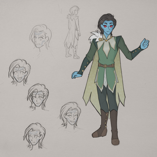
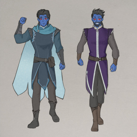
elegant and cohesive, it's clear that a lot of thought was put into the world and culture of jötunheim. every design is distinct and filled with personality while still maintaining a singular aesthetic. looking at these designs together, it's easy to imagine how the characters might interact with each other and their vibrant world.
Second Place
Prize: half-body drawing of a character (original or otherwise) of their choice. Please message this tumblr with your preferred method of communication (Discord, Instagram, or Tumblr itself) and I will contact you when I have the time to start and complete your drawing!
@ak800
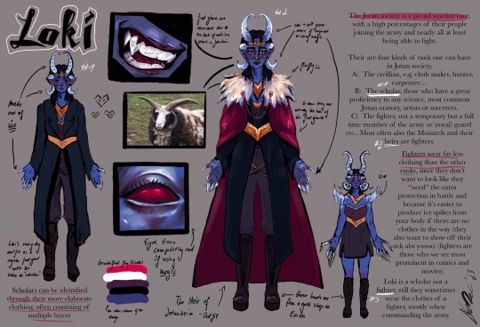
looking at this design, it's easy to tell how much love, time, and effort was put into it. with elements that mirror loki's canon moteifs altered in ways that feel cozy, it's undeniable that there was a lot of thought put into the jötnar as a people. they mirror asgard in a way that directly contrasts the claims we see the aesir make of them, while still feeling like a separate and distinct culture with their personalized magic, unique horns, and clear social dynamics
Third Place
Prize: bust-shot drawing of a character (original or otherwise) of their choice. Please message this tumblr with your preferred method of communication (Discord, Instagram, or Tumblr itself) and I will contact you when I have the time to start and complete your drawing!
@corvusartchronicles
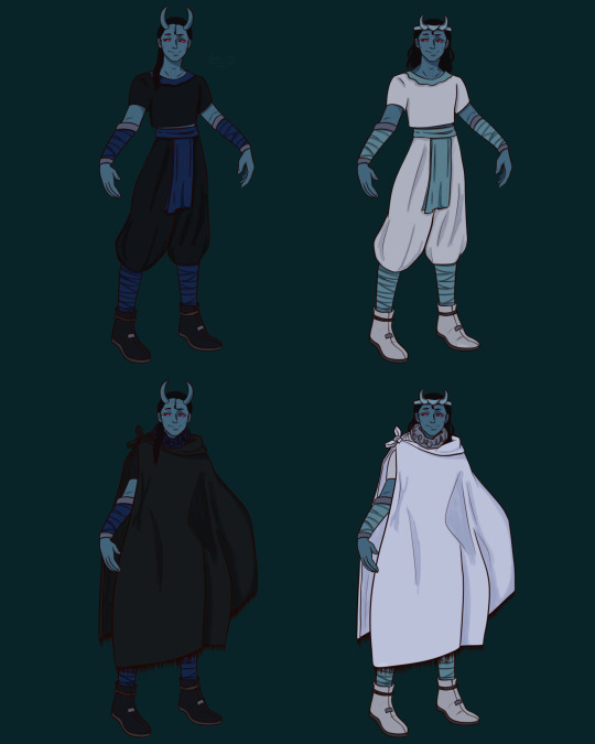
while deceptively simple, this design is thoughtful and paints a very different picture of jötunheim than we are used to seeing in canon. this design implies a combination of mythologies, which we are very used to in marvel, while giving love and thought to a vivid world of religion which is not often given the same respect as norse or greek mythology. protected from the weather in a way that would not make a temperature-sensitive frost giant overheat, loki's design is full of love for both fantasy, and the very real people who often inspire it 💞

it means the world to me that as many people participated as they did and i really hope that this contest helped make this fandom a more inclusive space in some way
picking the winners for this was SO DIFFICULT. so under the cut, i have also enthused about some of the submitted designs because i wanted to be able to share my thoughts on more of them. i'm so sorry that i wasn't able to get to everyone!!
treacheroustrickster
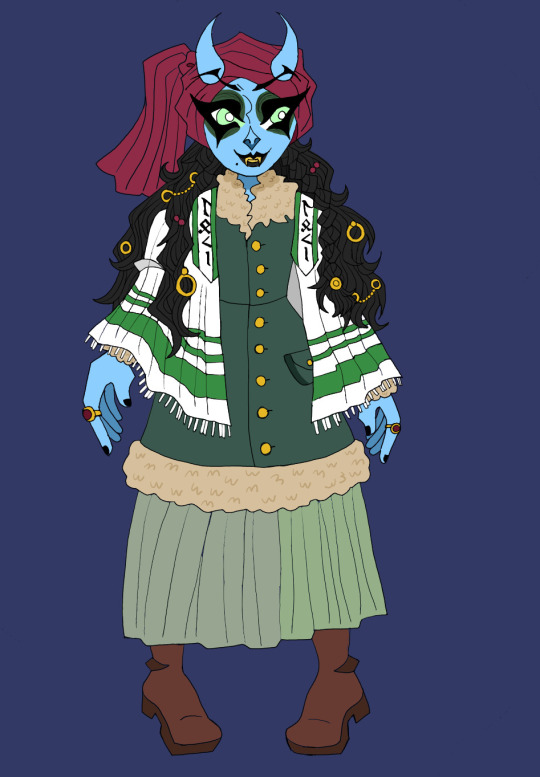
all of those shades of green? i am in love
red tichel!!! was this a callback to loki's red hair in mythology? I AM IN LOVE EITHER WAY!!!
i know it's based on a canon design and russian ashkenazi fashion but the hair jewelry just looks so in-place here. if it was cold enough outside that i needed to layer my clothes then i too would prefer to wear my metals in my hair where it wouldn't feel cold against my skin
newsted
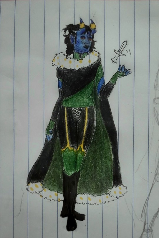
this one specifically is just so ROYAL to me. far more than most of the entries! it has my heart
the riding pants >>>
the fingerless gloves >>>>
this design, with the minimal layers of clothing mixed with the warm cloak, makes me feel like it's designed to keep loki protected from the cold winds that comes with riding horses at high speeds in the winter
vvviktor
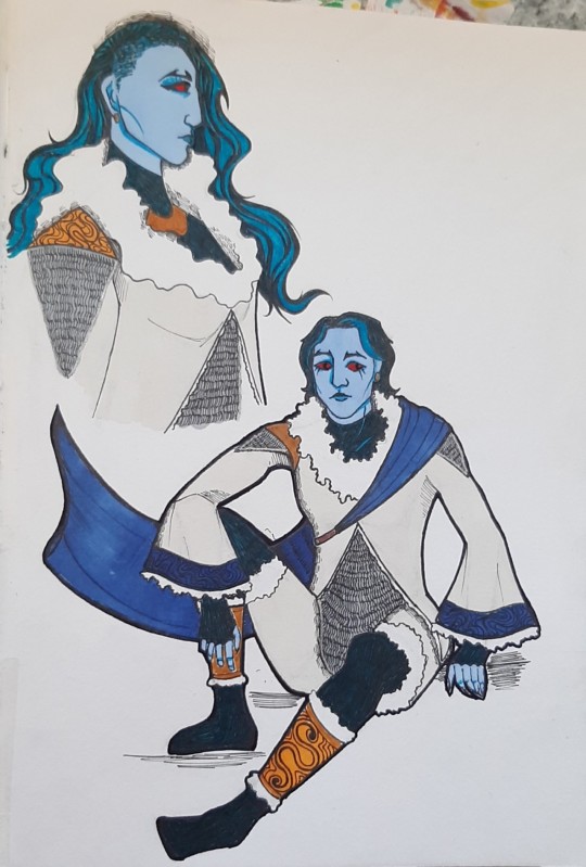
NY FRIEND I LOVE THE DETAILS
the embroidery on the sleeves
and the idea of loki in bronze instead of gold is one that i adore. i associate gold so heavily with asgard AND with loki that whenever i try to design jötun lokis, it's incredibly difficult to pick whether to use gold or not. bronze is the PERFECT solution to this
also shut up the feet literally are not bad
du-ed
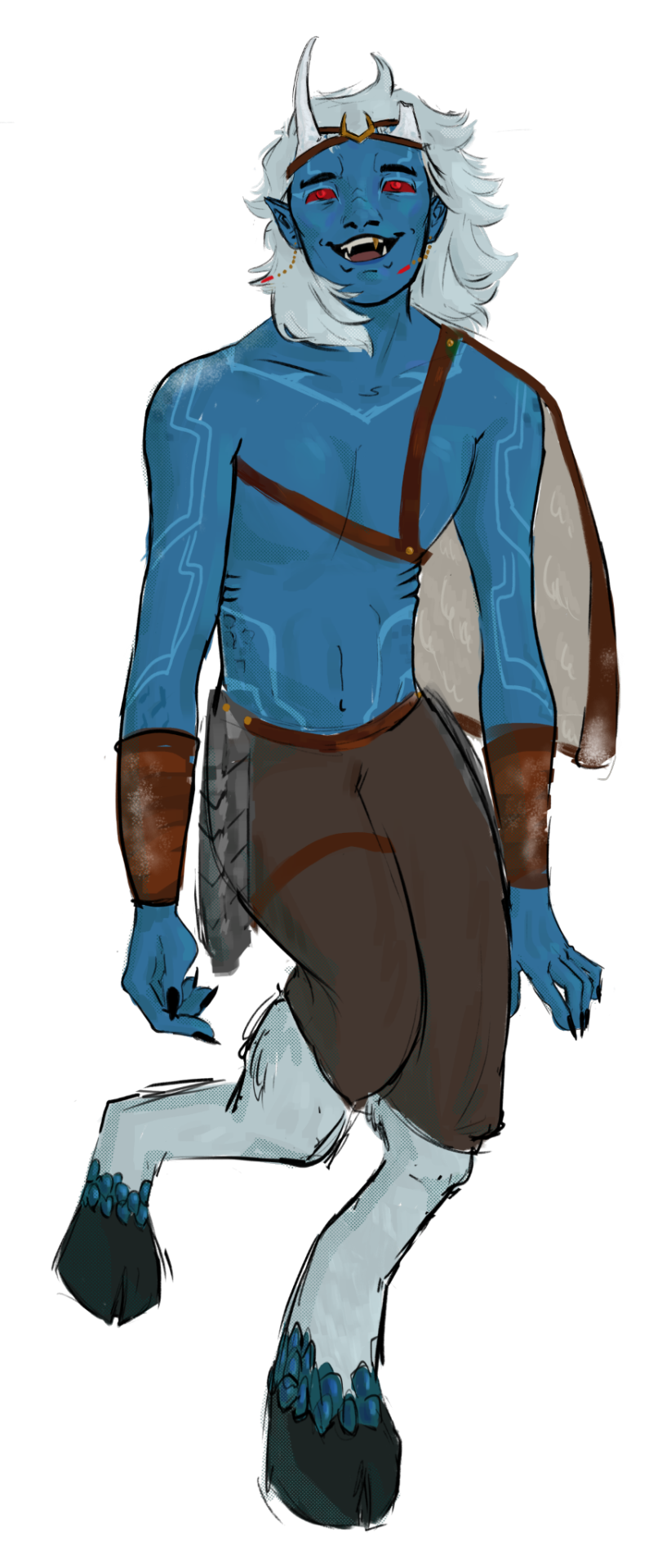
HOOVES!!!!!!
okay cuteness aggression aside i think this is such a smart idea for the jötnar.
it helps with that balance of showing them in minimal clothing to get across their lack of sensitivity to the cold while also actually protecting them from the snow they are likely at least knee-deep in half the time
like yes. just yes
of COURSE they would look like this it just makes sense to me
imreaallyasorry
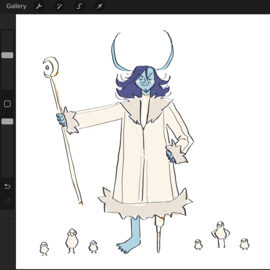
look at this. JUST LOOK AT IT. what more do i need to say
its perfect. i will be following you on my new account
this is the cutest thing i've seen in my entire life
also the staff/scepter is so cool, it's gorgeous, that's MY moon queen and magic theatre
unityrain24
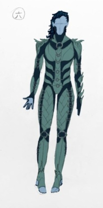
this one is SO COOL, it's my absolute favorite out of the designs you submitted.
it looks so warm and sleek, and the idea that travel wear is so different from everyday wear makes me wonder just how harsh the conditions on the planet are.
i'm an absolute sucker for designs that are distinctly alien like this and it has my heart i love it so so much
#jotun loki#jötun loki#jotun design party#marvel#frost giant loki#jotun loki fanart#loki fanart#loki art#loki of jotunheim#jotun form#jotunn loki#marvel loki#loki fandom#marvel fanart
88 notes
·
View notes
Text
Headcanons surrounding the abbey, the siblings, and the ghouls. Let's go.
-The abbey is a mix of new and old architecture, with an emphasis on cohesively blending the newer wings with the older parts of the building, at least from an aesthetic standpoint.
However, there are some parts of the abbey that have been intentionally cut off by modern additions, in other words; There are parts of the abbey that are visible form the outside, but completely inaccessible from within.
These parts of the abbey are either structurally unsound, thus dangerous for anyone to venture into, or have been sealed for reasons unknown.
As a result of this decision to conceal rather than demolish these areas, the abbey has a very mazelike layout akin to the Winchester Mansion, and new and old siblings of sin are often seen consulting maps to find their way around.
-The basement where the ghouls reside/where their dorms are housed is NOT the abbey's "real" basement; The abbey's actual basement, where the electrical panels and pipes feed down to, is only accessible through two points on the property.
The first entrance is located through a door labeled, "Custodial Services Only", and is pretty obvious, given that the door itself is painted bright red and has a keypad beside it, whereas the other one is located... somewhere.
Yeah, no one actually knows where the second entrance is, but it's somewhere outside.
The ghouls also have another way of getting into the actual basement, but that's because ghouls really love to dig.
-Speaking of weird shit underground, if it wasn't bad enough that the abbey is a maze, there's plenty of places where one could accidentally wind up in the catacombs, because, yeah, not only do they have two basements, they have a tunnel of bones, too!
Mountain says it used to be used for burials back in the olden days, but that it eventually took on a more sinister history that he prefers not to delve into.
Dew sometimes hangs out down there with "the nuns", and he won't elaborate more on what he means by that, and everyone is lowkey a little concerned.
-On the topic of the nuns though... Yeah, there's a bunch of dead nuns floating around the place, which may or may not be the reason why the library is so fucking haunting, but we digress.
Many of the siblings report seeing apparitions of nuns -not sisters of sin in their habits, straight up nuns- traveling through some of the more secluded hallways, and on occasion one of the old chapels seems to be filled with the sounds of prayers spoken in Latin despite the room itself being condemned and empty.
This is another place where Dew can be found from time to time, seemingly having conversations with the air.
-The infirmary is one of the newer additions to the abbey, as the older wing dedicated to medical services was bricked shut during renovations decades ago and has been left to rot ever since.
There's a challenge among the medical staff, ghouls included, in which they have to travel from the infirmary to the old wing, touch the wall where the door used to be, and come back, and there are marks from where they've placed their hands there.
Aether undertook this mission solo after his retirement, needing to feel some kind of connection to the abbey and leave his mark, and truth be told he's never quite been the same since.
According to him, once you see the wall, it's impossible not to feel different.
"You'll always know someone is looking out for you... whether you like it or not."
And lastly;
-There's a rumor among the siblings that there's a secret cemetery in the woods surrounding the abbey, but no one has been able to find it... at least no one who's lived to tell the tale.
Many more scientifically minded folks think these individuals may have fell victim to sinkholes or one of the edgeless, cavernous wells -such as Ol' Dens' Pond- that have cropped up over the years, but no one can say for certain.
In a way, perhaps, it is a self made graveyard, born of aimless wandering and a lack of caution.
Though the worn crosses turned to naught moss covered stones beg to differ.
#lamp rambles#shitghosting#nameless ghouls#dewdrop ghoul#aether ghoul#mountain ghoul#ghost band#the band ghost#ghost bc#ghost band headcanons#nameless ghoul headcanons#sibling of sin#sister of sin#sibling of sin headcanons#sister of sin headcanons
105 notes
·
View notes
Text
Zenless Zone Zero
Well, I’ve been playing the shit out of this game, so fair warning, there will be significant brainrot ahead.

Overall, I really dig it. I’m a huge mark for character action games, and well-done life sims tend to suck me in; Zenless Zone Zero is nailing both those aspects pretty damn well. In fact, it’s nailing them well enough that… how do I put this… it starts to slip into the territory of being A Good Game Generally, rather than just a gacha. And while this is a big accomplishment for ZZZ, this also puts it into direct conversation with other full-price games, resulting in its gacha elements causing more friction than Honkai Star Rail’s ever did*.
*I’ll be comparing this to HSR a lot, because I play way too much of both and they’re made by the same developer. I recognize that it is pretty odd and potentially even problematic to A / B compare them when I could be looking at the game through the lens of, you know, Gaming At Large. But hey, that’s why this is a subjective journal and not a holistic review blog! It is what it is.

So, the aesthetic of this game fuckin rules - it’s like, late 90s to early 2000s VHS-core. The main characters run a Blockbuster, for Christ’s sake. Presentation-wise (and systems-wise, and, hell, music-wise), ZZZ is obviously borrowing a lot from the Persona series, but like… great? I’d love it if more things cribbed that style and made it their own, from the confidant hangouts, to the small but comfy explorable areas, to the dynamic menus with edgy character poses. The character design itself is all superb, all the way down to the crowd NPCs - some the shopkeepers here have cooler designs than the main characters of some other games. Even aside from the designs, ZZZ is doing a lot with lighting and color desaturation that really lends it its own unique vibe. They actually have a cohesive artstyle in here! wild.

The presentation of the story is also killer. Sure, a decent chunk of the conversations are just models lip-flapping at each other - although they at least emote and pose a bit here, unlike the Star Rail dialogue scenes with their demure princess waves. In the main story, though, we get not only a heap of fairly lengthy cutscenes, but also this really cool comic panel-style presentation.

I feel like there was a bit of a trend in the PS3/360 era of games to present a game’s story in this comic panel / storyboard style. I understood the motivation: games increasingly demanded a more involved, consistent storytelling approach, rather than the ‘One big rendered cutscene at the beginning and end’ they used to get away with, and the generation’s increased visual fidelity meant that doing even basic, in-engine cutscenes took a lot more resources to make something half-decent. In Spyro the Dragon on PS1 you could get away with a fun little 15-second gag with a barely animated polygonal yeti or whatever; in the PS3 era, you were going up against tryhards like Metal Gear Solid 4. Amidst this landscape, the pitch of having your illustrators pretty up some storyboards and put them in the game sounds like it’d save a lot of work - plus, consoles were finally outputting a high enough resolution that this sort of flat image wouldn’t be compressed to hell.
Thing is, I always kinda hated that approach. In some cases, I think that’s the popular opinion - I fuckin love Bayonetta, but I don’t think I’ve ever seen anyone defend its weird slideshow cutscenes. Even in games where the execution is perfectly fine, though, it rubbed me the wrong way. I think of Infamous - objectively, the art’s solid and fits the tone of the game, and the motion graphics aim to capture some of the dynamism typical cutscenes would provide. Despite all that, it still feels cheap to me - all of the panning, effects, and graphic imagery feel like they’re trying to polish up something that inherently doesn’t fit.

In ZZZ, though, I’m loving every one I come across. It’s obviously still done for efficiency reasons - there’s already a handful of characters that exist only in these panel scenes, saving the team the effort of having to model and rig them. But the freedom this allows for staging and storytelling is huge; the characters are more expressive here than anywhere else in the game, and we’re able to see situations with huge crowds and new locales much more often than would be possible in typical cinematics. And the illustrations are genuinely good, too - full of character, cool poses and creative compositions/angles.

if everything actually had to be modeled, there's no way we would've gotten Legally Blonde Nicole
Plus, the cutscenes are constant, and boy do I love the animation here. It feels so rare nowadays for a high-budget game to do stylized 3D animation of this ilk. Your biggest budget games are all going for the cinematic look, and pushing realism as much as they can - and while I know an immense amount of work and craft goes into animating something like The Last of Us, boy, I just could not care less about something so lacking in flair*. Even bigger properties that use a stylized artstyle these days, like Breath of the Wild, still tend to lean towards fairly naturalistic animation. Zenless Zone Zero’s cutscenes, on the other hand, spin and stretch motherfuckers around like we’re back on the PS2, are filled with forced perspective, and I am absolutely living for it. It’s not even reserved only for bombastic action scenes, either - we get honest to god character acting-focused conversation cutscenes.
*Seriously, take me back to the Naughty Dog that animated Jak & Daxter. Jak’s hero animation is top tier to this day
youtube
Of course, the combat animation slaps too; each of the playable agents is absolutely dripping with character. Even characters whose designs initially left me cold won me over once I saw the amount of care put into their movement and combo strings. It’s honestly shocking to me that this is the same studio that made Genshin Impact, a game I dropped after about 2 hours because of how lifeless all the animation felt*. Unique run cycles for every character, actual non-human designs, the flourishes everyone has when stopping mid-combo to snap them back to idle, the absolute synergistic audiovisual bliss of the parry… it’s really impressive stuff from a young team.
*Same studio in name only, totally different team, I know, but still
Mechanically, I have some mixed feelings about the combat as a whole. Zenless Zone Zero is, without a doubt, aiming to present complexity and depth as a team battler - that is to say, it’s more about team synergy, tag combos, and knowing who to use when, rather than soloing as any particular character. Nonetheless, I really would’ve appreciated individual characters having a bit more depth to their movesets; a jump, a launcher, cancels, anything. As outstanding as all the animation work is, there’s some characters that only have a normal attack string on square and one special attack on triangle. Like, sub-Dynasty Warriors level of complexity here. It’s rough.
This is where ZZZ’s gacha nature gets a bit ugly: so far, more complex kits and skill expression are mostly locked behind rarity, which is kind of scummy. In Star Rail, for the most part, 4-star characters are defined as such due to their numbers: they still have mechanics and complexity, they just aren’t tuned as high as the limited characters. Hell, in some cases they have more complexity. Ruan Mei is an almost incomparably stronger unit than Asta, but Ruan Mei’s play pattern is fucking boring: you use skill every three turns when it runs out. Asta, meanwhile, basically has her own risk & reward minigame that demands more thoughtful SP management.
In ZZZ, on the other hand, the lower-rank characters straight up have less going on in their kits. Nicole has like… one tech, sorta. Anby has one single animation cancel to chain her normal into her special quicker. Lucy’s only skill expression is choosing whether to tap special or hold special. Meanwhile, Zhu Yuan, a limited character, has a normal string that bounces between melee and ranged attacks, can be dodge-canceled at any point in the combo to branch into variations of the string, and a hold-normal attack string that’s completely different and has the same branching dodge-cancel tech.

It’s one thing to lock raw damage and meta viability behind a gacha, but locking the characters that are mechanically more interesting to play straight up sucks. If I hadn’t been lucky enough on the standard banner to pull exactly the two characters I find the most mechanically satisfying, I don’t know that I’d still be playing - and this is the point where ZZZ begs comparison to other, non-live service character action games. Sure, it’s probably not fair to compare a random A-rank’s moveset to Devil May Cry V’s iteration of Dante, a feature-creeped nightmare of a kit 3 console generations in the making. But what about Sengoku Basara Sumeragi, my personal character-action GOAT? By all accounts a mid-budget title, yet it offers 40 full characters chock-full of more unique mechanics and animation cancels than you can shake a stick at.
Fuck, can we please get a new Sengoku Basara? Please? I’m desperate out here. I’ll take anything, y’all.
There’s also the inherent issue that plagues every action RPG (usually deftly avoided by the character action genre), which is the delicate balance of player success depending on the numbers vs actual mechanical skill - a balancing act made even more noticeable due to the gacha genre-standard of characters taking weeks of grinding to level up. This is a topic for another day, but suffice to say, a big part of the reason Honkai Star Rail works for me as a very pretty version of Cookie Clicker is because of the Autoplay option. In Zenless Zone Zero, if you’re not willing to grind out the same mob fight for a week or two, you’re gonna hit an endgame roadblock of doing chip damage to a boss you’ve mechanically mastered because you’re underleveled, and boy, that never feels good.

For all those issues stemming from the gacha, I will say, it’s great that the story missions let you use the characters that are actually supposed to be present for those missions, even if you don’t own them. Aside from how nice it is to have an opportunity to put the whole roster through their paces, it goes a long way for actually getting invested in the story. Honkai Star Rail’s storytelling is a hot mess for many reasons, but it’s always particularly jarring rolling up to a sidequest at like, a local theater troupe with a wanted space criminal, the sitting president of a completely different planet, a ten year old child, and a shirtless cyborg cowboy, none of whom have canonically met each other; ZZZ’s approach sidesteps this issue. The proxy angle even provides a pretty valid diegetic explanation for why agents that don’t know each other might be working together.

Now that we’ve sort of meandered back to the story after talking about animation led us on a long detour - the story is surprisingly solid. In particular, I really appreciate how straightforward the writing is. I don’t know if the issue lies with the original text or the localization, but Star Rail’s dialogue, even in simple missions, tends to be incredibly meandering and overstuffed; ZZZ is a lot better about letting all its characters talk like actual humans. It also helps that the plot so far is a lot more grounded, and spends more time focusing on each faction’s group dynamics rather than the overarching plot. These games live and die by their characters, so leaning into those strengths is a smart move.

Zenless Zone Zero is, unfortunately, fully in line with Hoyo’s weird conservative politics - in particular, 1.0 and 1.1 are absolutely stuffed full of copaganda. With how many safety regulation jokes they made at the construction company, I initially hoped they’d lampoon the police faction a bit, or make a commentary on how comically heavily armed New Eridu’s police force are. In a vacuum, Zhu Yuan shouting combat lines like “Stop resisting!” or “Freeze, hands up!” while blasting someone with her gigantic, ‘JUSTICE’-emblazoned rocket launcher shotgun feels like it ought to be satire. Every time we talk to the officers, though, it’s just line after line about their solemn duty to protect the people of the city, how essential and important they are for the community, and so on and so on.

This wholehearted embrace of the world’s current power structure is something Zenless Zone Zero approaches in nearly the exact same way as Star Rail. In both games, your playable character is someone that’s sort of operating outside the law - in Star Rail, as the maverick organization that is the Astral Express, while in ZZZ you work as an illegal proxy. Despite this setup, any time the protagonists come into contact with a governing body, they are no less than thrilled to help them enforce the will of the law.
In Star Rail, you aid the local governments (one of which is an undemocratic monarchy) in committing massive cover-ups to hide their failures from the populace not once but twice. In ZZZ, you aid the police to an obsequious degree - playing along with them to not arouse suspicion is one thing, but helping them organize a fucking community day on Sixth Street? Fuck that. Hell, said community day is even shown to initially be DOA because none of the local residents trust the police - and you best believe we get two full scenes of the MCs changing the resident’s minds, resulting in them spouting shit about “Oh, it was our fault for judging the police too harshly - they really do have our best interests at heart!”

is it tho
There’s an argument to be made that the N.E.P.S. are a little different, given that they exist in a post-apocalyptic world with monsters popping up every day - and ZZZ’s copaganda is certainly a little less flagrant than something like Spider-Man helping the NYPD install civilian surveillance networks in Insomniac’s Spider-Man. And, sure, perhaps this can help excuse why they post fully armored, rifle-wielding soldiers in the Lumina Square DMV, and provides some justification that their existence is more helpful than the real world’s civilian-murdering property guards.

Thing is, though, at every turn you’re hit with dialogue and situations which make it clear that, no, they’re the normal cops. Every other sidequest seems to involve calling the N.E.P.S. in on somebody or helping with an investigation, and for every time we see them handle ethereal activity, there’s two instances of them being called in for petty property theft or something similarly minor - even the playable character has heaps of dialogue choices threatening to call the police on someone*. Much like Star Rail’s reactionary politics were strangely at odds with the ‘blazing a new path’ ideals of the trailblaze, Zenless Zone Zero’s obsession with the police puts a damper on its underground, counterculture aesthetic.
*Including a case where both options threatened this, leaving me without a non-narc dialogue choice.


illustration by Lv01KOKUEN
And finally… I don’t know where to fit this in, so I guess it just goes in its own little section at the end here. Lots of people, myself included, have touched on the Persona inspirations - and they’re certainly significant. One thing I’m surprised I haven’t seen anyone mention as a huge influence is Yasuhiro Nightow’s Kekkai Sensen / Blood Blockade Battlefront. From its sense of style to its worldbuilding, ZZZ damn near feels like fanfic to me. Hell, it’s right in the name - BBB? ZZZ? And this is on top of the dimensional crossover / big city vibe, the retro fashion, the different factions. Victoria Housekeeping might as well be Libra 2.0 - Von Lycaon is a damn near perfect 50/50 expy of Klaus and Stephen Starphase. And then Belle / Wise, who assist these powerful fighters in a noncombat role just like Leo, also turn out to have some sort of special magical eyes granted to them by untold powers from within the dimensional rift??


I’m here for it, don’t get me wrong - love Nightow. But that can’t be coincidence, right?
#will's media thoughts / virtual brain repository#long post#games#zenless zone zero#zzzero#kekkai sensen#blood blockade battlefront#Youtube
19 notes
·
View notes
Text

Kunoichi Cheetah Girls character profiles:
ChoCho--songwriter, producer, leader.
ESFP-T. "Entertainer." Most likely to take center stage, strong aesthetic and musical vision, spontaneous but loves to hang out with her friends. Sometimes she gets lost in her own vision and dreams, but she means well! Favorite group number: "Strut." Tracksuit color: Amber Yellow.
Sarada--lead vocalist.
ENTJ-A. "Commander." Strong-willed, strategic, grounds ChoCho in reality, reminds group what is best logistically rather than idealistically. Teaches group the harmonies. Favorite group number: "Cinderella." Tracksuit color: Fuschia Red.
Hima--lead dancer, choreographer.
ENFP-A "Campaigner." Athletic, passionate about her craft, empathetic. She takes pride in communicating her vision to the group through choreo and cohesive formations. Her mom prefers ballet, but Hima prefers more contemporary dance. Favorite group number: "Step Up." Tracksuit color: Baby Blue.
Sumire--backing vocalist, stylist, AV specialist.
ISFJ-T "Defender." Humble, always loyal to group, provides auxiliary support where needed. Plans the outfits, preps AV equipment and sound checks. Favorite group number: "Together We Can." Tracksuit color: Lavender Purple.
Part 2
#mybutterflykindred#chocho akimichi#chouchou akimichi#himawari uzumaki#sumire kakei#sarada uchiha#cheetah girls#himawari#sumire#chocho#sarada#raven symone#galleria#dorinda thomas#chanel#boruto#aqua#boruto two blue vortex
14 notes
·
View notes