#we are bears aesthetic icons
Explore tagged Tumblr posts
Visit Tumblr Blog
Explore Tumblr blogs with no restrictions, modern design and the best experience.
Last Seen Tumblr Blogs


Fun Fact
Women make up for the other 50% of Tumblr’s audience.
Text


Billy Batson Week 2024 Use #billybatsonweek and #bb84week to participate!
This year marks the 84th anniversary of Billy Batson as Captain Marvel debuting in Whiz Comics #2, the first official cover-dated issue released February 1940. We're three years into this fan-run event - hopefully we'll have many more to come!
Day 1 ✦ August 11, 2024 Bearing the Bolt + Favorite Costume
Over the years, Captain Marvel has gone through many design changes depending on the era and artist. Let us know which of them you favor the most - or even come up with your own! Bearing the bolt can also mean many things aside from the aesthetic. Is the bolt a heavy thing to bear?
Day 2 ✦ August 12, 2024 On the Battlefield + Favorite Fight
From the Captain Marvel battle that made us hold our breath to the one that you think about constantly - which is your most memorable battlefield moment? Or when has Cap struggled and still persevered?
Day 3 ✦ August 13, 2024 The Rock of Eternity + At Home Base
The Rock of Eternity is a place of reverence as well as the place of Captain Marvel's origin. It's had its moments since the first appearance of it in comics, but most notably it is our hero's home base, and a place he can find refuge.
Day 4 ✦ August 14, 2024 The Perfect Pair + Favorite Duo
Captain Marvel (as well as Billy himself) have had many iconic team-ups over the years. His occasional one-on-one collaborations are among some of the most noteworthy of his career. Who is your favorite Captain Marvel partner, either from canon or from your most wanted dream team?
Day 5 ✦ August 15, 2024 Into the Elseworlds + Favorite AU
Captain Marvel's Elseworlds appearances always have impact, no matter the weight of his role. Pick one to explore, or perhaps an alternate universe of your own making.
Day 6 ✦ August 16, 2024 Domestic Bliss + Off-Duty Hours
We love every moment our hero is a hero, but even more so when Cap turns in for the day and Billy has his own time to shine. Whether it's an unassuming picnic day or a day-in-the-life of Billy Batson, the off-duty hours can be just as fulfilling.
Day 7 ✦ August 17, 2024 Holiest of Molies + Favorite Moment
Holy Moly! Can you pinpoint the very moment that Billy Batson compelled you the very first time? He's been on this planet for way over three-quarters of a century, so let's talk about his impact! This day can also be used as a free-for-all.
Although the prompts have been laid out, you are more than welcome to refer to previous years’ (2022, 2023) to choose ideas from! All prompts may also be interpreted in any way you like, however abstract. Any form of content is encouraged, from drawing, multi-media work, photos, graphics, writing, and anything else under the sun. There's no pre-requisites or rules to join except for keeping everything SFW. Posting late is more than acceptable, especially if you find these dates to be incompatible with your own schedule.
Feel free to post your writing in our collection. There is no closing date, so works may be posted beyond the event.
Remember to use the tags #billybatsonweek and #bb84week so everyone will be able to view your masterpieces! View all previous years' works here.
#billy batson#shazam#captain marvel#billybatsonweek#bb84week#shazamedit#dc comics#justice league#dcedit#comicedit#comiceditblog#dcmultiverse
216 notes
·
View notes
Text
The Identity of Cyrene’s murderer, or the Past, Present, and Eternal Self
Ancient Hymn Trailer — "Of Titans and the Mortal Realms"
(I know we’re not in Penacony anymore, just let me have this).
There’s something interesting happening in Amphoreus. And no, I’m not talking about the eerie parallels between the world’s superficial god-slaying prophecy and the ongoing Aeon-slaying subplot playing out in the universe, or the clandestine Memokeeper who tried to spy on Herta and Nous, or even the mysterious murmurings of Oronyx calling for their “mother.” All of those things, I think, are the secrets about this world that the writers actually care about wrapping in mystery. What I find fascinating is that, to this point, there are just as many things that they evidently do not care about keeping a secret, making only the barest effort, if any, to try and hide the truth.
I think the identity of Cyrene’s killer is a prime example of this. Let me show you what I mean.
SPOILERS: Amphoreus Act I: Heroic Saga of Flame-Chase and Honkai Impact 3rd’s Elysium Everlasting arc (and also parts of the Elysian Realm arc). You have been warned!
Amphoreus’ first act concludes with Kevin Phainon undergoing Nikador’s trial to prove he’s worthy to inherit Strife’s legacy. We know Phainon is unsure of this path, despite his repeated assertions that he’s been waiting for this moment, and that it’s his dream to inherit Nikador’s authority. As of this writing, the outcome of the trial is undecided.
…Except we do know its outcome, because Mydei has already been drip marketed as the heir of the Lance of Fury, two weeks before 3.0 even dropped.
“O Chrysos Heir that seeks the Coreflame of Strife, you must suffer a thousand deaths, be bathed in blood on the path home, and bear the madness of fate alone, for one must slay a god to become one.” (Amphoreus' Saga of Heroes | Mydei)
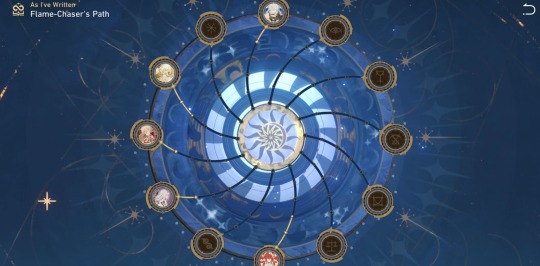
Not exactly suspenseful for the people engaging with Honkai Star Rail’s social media accounts. What’s more, towards the end of Act I, Mem gives the Trailblazer a storybook called “As I’ve Written” to record their memories of the flame-chase journey and the flame-chasers Chyrsos Heirs. Just like the Titans’ constellations are displayed on a wheel in the Vortex of Genesis, the Chrysos Heirs are represented as icons around a similar constellation wheel after the Trailblazer writes a memory of them into the book. Mydei, unsurprisingly, is occupying the same space as Nikador’s constellation, while Phainon is at the top over the constellation I presume is Kephale’s. Again, this is not exactly a well-guarded secret. All of the marketing for Amphoreus has strongly implied that Kephale is Phainon’s fate, down to the design of Phainon’s eyes. The devs are not even trying to hide this, because it is not supposed to be a secret or point of intrigue in-and-of-itself. In other words, we know the result, but we don’t know how these characters will get there.
Now, spoilers-by-drip-marketing are not a new thing in Honkai Star Rail or in Hoyo games in general (looking at you, Mavuika and Dan Heng Imbibitor Lunae and Wanderer and Robin and–). But that’s not the only example of shit they don’t seem to care about keeping secret in Amphoreus. If you frequent any HSR fan spaces, then surely you’ve seen theories by now about our new friend Mem:
If you haven’t, then here’s the sitch: the current running theory is that Mem is Cyrene, or at least connected to her in some way. Supporting evidence for this is a mix of vibes (Cyrene and Mem’s shared pink aesthetic, similarities between Mem and ELF Elysia’s role in Elysium Everlasting) and concrete hints rooted in the narrative (the memories Mem showed us of a little boy and girl [presumably Phainon and Cyrene] when we first land in Amphoreus, and this part of Nameless Faces), as well as the uncanny resemblance between Mem’s as-yet unnamed voice actors and the performances for Elysia and Cyrene in all languages. I definitely hear Marina Inoue in Mem’s Japanese voice acting.
This is still a fan theory, but there are too many coincidences pointing at least towards its partial truth. When it comes to Mem’s identity, it seems that the writers are far less concerned with players knowing who Mem is, but rather why she is appearing to us in this form.
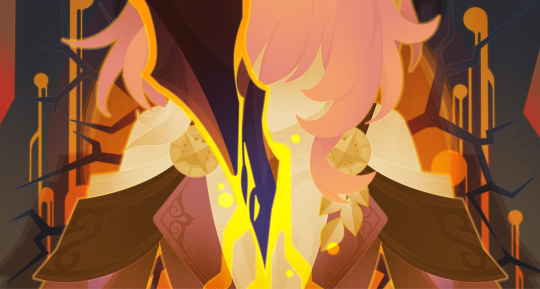
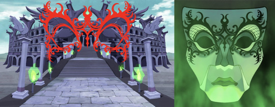
Cyrene’s only explicit appearance as Cyrene in the story so far occurs in a 2D illustrated cutscene of Phainon’s past towards the end of the first act. Cyrene is sitting in a field in Aedes Elysiae, his homeland, and she says he will be “a hero worshipped by all” based on a card she drew (perhaps some Amphoreus astrology?). But Phainon resists this reading of fate because he has no interest in becoming a hero for the world, which is yet another aspect he shares with Kevin Kaslana.
And that’s when we’re confronted with the horror of Cyrene’s fate — she’s stabbed by an unknown assailant, with golden blood flowing from her wound:
To be honest, I didn’t read too much into this image until this past week while watching Cy Yu’s VODs on Youtube. Because upon seeing it again, I realized I knew that sword. And if you’ve been watching all of the marketing for Amphoreus, then you’ve seen it before too.
It belongs to this dude:

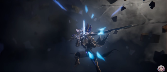
First two images are Mythology Opening, last image is Nameless Faces
That’s what happens when you stare for too long at Anaxa crumbs. Stuff gets burned into your brain that you didn’t even know was there, and it comes roaring to the front when you least expect it. Looking at these other stills of Masked Dude at 0.25x speed, I’m almost positive it’s the same blade.
And yes, this is a tenuous connection at best as is, but hear me out. There’s a lot more to it than just the similar blade shape.
Elysium Everlasting
Cyrene is inarguably a variant of Elysia from Honkai Impact 3rd, and if you’re not familiar with the game then let’s just say she is extremely important in shaping Part 1’s finale. TL;DR, Elysia is from the Previous Era, the generation of humans before Kiana, Mei, and Bronya, who lost to the Honkai and had their civilization destroyed. She was one of the Flamechasers, a group of humans who were modified with the genes of strong Honkai beasts so that they could fight and resist the Honkai in ways other humans could not. Mei learns about this past era by venturing into the Elysian Realm, a simulation composed of every Flamechaser’s memories, where she first meets Elysia’s simulation.
Before the Previous Era lost to the Herrscher of Finality, the real Elysia sacrificed herself so that when she returned to the Honkai, her pure love for humanity would influence the Will of Honkai so that the next Herrscherrs could retain their humanity and the will to fight for its survival rather than its destruction. By doing so, she paved the way for a brighter future that she would never witness herself. I flag this plot point because it almost exactly mirrors what happened with Gnaeus at the end of Act I, and you know how Hoyo loves to foreshadow greater plots through subplots like this:
Gnaeus: I will return to where I came from and become a part of Nikador’s divinity once more. In all likelihood. I will also be consumed by corruption. An inevitable course of action if we hope to end this madness. Castorice: You are willing to…sacrifice yourself for a future you won’t get to witness? Gnaeus: This is my purpose, my origin. I am no mortal and I do not fear death…Even so, will you still weep for me? (Kremnos, Cleanse Thy Rusted Blood (II))
The last memory sync the real Elysia did with the realm happened before she died, so reconstructing the memory of her death in Elysium Everlasting required uniting the memories of those who witnessed it - and one of the people who not only witnessed it, but executed it, was Kevin Kaslana.

This leaves us in an uncomfortable position regarding Cyrene’s death. Could her executioner, (presumably) Masked Dude, actually be Phainon filling a similar role to Kevin's? In Nameless Faces, we see Phainon and Mydei fighting Masked Dude themselves, which would seem to rule this possibility out, nevermind that it seems Cyrene died when they were both children, and that Phainon once sought revenge for having his home ripped away from him. How could he be angry about what happened, and also be the reason it happened? And wouldn’t this direction for Cyrene's death be too close to Elysium Everlasting if it’s true? After all, Shaoji said these characters would have their own fates, separate from some of their variants from Honkai Impact 3rd, right? I think this is still true, but it doesn’t have to rule out the possibility of Masked Dude being “Phainon.”
It’s clear that there’s a lot more to Phainon than meets the eye. “Phainon” is apparently not his true name, and in his recent past he followed a much darker path than the one he’s on now. Kevin also was known to wear a ‘mask’ while he was in MOTH, only rarely revealing his true feelings to the people he was closest to, and even then he kept many of them in the dark, including Su, MEI, and Elysia. Everyone can tell Phainon is going to crash out at some point in Amphoreus, the writing is on the wall re: his lack of a strong will, his surprise that borrowing a Titan’s power actually hurts them, and the little he seems to understand about the true nature of the prophecy he and the other Chrysos Heirs are following.
Castorice: The prophecy gave him a new mission, granting him a new life as a Chrysos Heir. But which is more important to him: his new mission or his desire for revenge?
This part of him, his “past” self that bubbles beneath the surface of his “present” self, may come back to haunt him as he journeys toward Kephale’s Coreflame in more than just a figurative way. It’s not like this is out of the realm of possibility - we’ve already seen how past and present can be superimposed on one another in Amphoreus, interacting in strange ways through tools that construct illusions (perhaps a consequence of both the Erudition and the Remembrance’s influence). Or maybe it’s that Masked Dude is actually split off from Phainon himself, similar to Wonweek and Sunday, or all of Tingyun’s “selves” in A New Venture on the Eighth Dawn.
And speaking of past selves, there’s a pretty fun puzzle throughout Amphoreus called Golden Scapegoat that features a “past” version of the player, which shapes the gameplay into a series of convoluted maneuvers to both avoid your shadow and trick it into creating a path forward for you. If we read this puzzle as an additional clue to the main story’s themes, just as Oronyx’s puzzles involve using shapes to create light and shadow that construct a desired form (Plato’s Allegory of the Cave), then the idea that Masked Dude is a shadow of Phainon has some additional support, though I suppose there’s nothing specifically limiting it to Phainon, either:
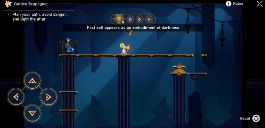
"Past self appears as an embodiment of darkness"
However, I did think this passage of the Golden Scapegoat’s Mutterings was interesting given the nature of Elysia’s death, since Kevin knew Elysia wasn’t their enemy and partook in her sacrifice because he wanted to believe in the future she envisioned. Still need to do a close reading of the rest of it, but this is from the 4th part:
There’s also a part of the Mythology Opening trailer that I assume is Masked Dude talking (I could be mistaken, so take this with a massive grain of salt), and while I will say in Japanese it is not clear to me that it’s Satoshi Hino’s voice (I kinda hear it, but it feels delusional), in English to me it has that same uncanny similarity to Joshua Waters’ Phainon that Mem’s voice has to Cyrene’s (compare Phainon’s “even gods can bleed” to the link clip). This is pretty copium evidence, since these similarities could be all in my head, but for what it’s worth…
Phainon and Masked Dude shown right after each other (0:09 vs. 0:10) in Nameless Faces. What did they mean by this?
One last note on this Phainon/Masked Dude theory that I think is interesting. The theory that Phainon has something to do with Nanook is as ubiquitous as the theories about Mem and Cyrene, and while there’s clearly some Nanook symbolism going on in Nameless Faces when Phainon splashes golden blood on his torso, I am hoping Phainon will have a happier ending than Nanook and that he won’t go nearly as far as Kevin did in Honkai Impact 3rd. But if Masked Dude is some other version of Phainon, perhaps he is the allegory for Nanook’s ascent, and Phainon’s journey will represent an “alternative ending.” To put it another way, Kephale is the Worldbearer Titan, who shoulders the fate of Amphoreus and delivers mankind to hope and salvation. So what is the opposite of this role, or its shadow?
The Worldbreaker, who delivers all to Destruction:

While this theory did make more sense with some additional knowledge from Honkai Impact 3rd, the available official material for Amphoreus, including marketing videos like the Mythology Opening and Nameless Faces, is not exactly subtle about who Masked Dude might be. I mean come on, they use very similar visual storytelling with Phainon and Masked Dude in Nameless Faces as they do for Mem and Cyrene in the same video. This leads me to believe that this particular “secret,” as well as Masked Dude’s potential role in Cyrene’s fate, is yet another plot point that the writers don’t care that much about shrouding in mystery. And to me, this indicates that there is something much, much, bigger that they’re concealing through the story of Phainon and Cyrene, the “why” of Amphoreus rather than the “what.”
And that’s all! Hopefully you found this entertaining if nothing else ^_^ What lore have you found in Amphoreus so far?
EDIT: changed a sentence about what elysia's sacrifice would do for the next generation of humans cuz I realized the way I wrote it before was not accurate. ☺️
Director’s cut:
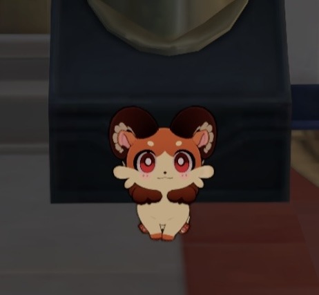

Chat, is it normal if your CHIMERA has horns? Get it? …I’ll see myself out.
(no but why does this kitty chimera have horns like the golden scapegoat character?)
References:
What Happened in Elysium Everlasting!? Chapter 29 - 31 Story Recap by Homu Labs. This channel is the GOAT for HI3rd lore.
41 notes
·
View notes
Text
The End of an Era - Philip Morris Has Left Ferrari
I was considering writing about the Daytona 500 and the state of superspeedway racing, but quite frankly, I didn't want to go on a super negative rant saying a thousand things that have already been said about NASCAR plate tracks.
Fortunately for me, something else happened.
The Decalspotters twitter account noticed that Philip Morris International is no longer listed on the bottom of the page sponsors on the Ferrari website. Using the wayback machine, I was able to confirm that the Philip Morris International logo was still there in November 2024, so they were removed specifically for the 2025 season.
Now, Philip Morris hasn't been on the cars in awhile. Their last attempt, on and off from late 2018 until 2022, was with Mission Winnow, a brand seemingly created for the sole purpose of subliminal advertising.
By 2023 they seemed to have abandoned this plan and the logo on the website changed from Mission Winnow to Philip Morris International, which is how it was all the way up until the end of the 2024 season.
Nobody has run with the story quite yet, but it appears that Philip Morris has finally left Ferrari.
You can still access the Philip Morris page on Ferrari.com if you search for it specifically, but the same thing applies to Santander, and we know they're gone. Ferrari has even signed UniCredit as a replacement bank sponsor.
This is huge, as Philip Morris has been in F1 in some form since 1972 and has been with Ferrari in some form since 1973 when they became a driver sponsor. 1973 to 2024 is perhaps the longest sports sponsorship ever, and even if you don't want to count the driver deals, they've been a team sponsor of Ferrari since 1984, which is still a forty year run.
So is this the end of tobacco sponsorship in F1?
Not really.
McLaren has a partnership with British American Tobacco (the same company that owned BAR and also acquired Rothmans International in 1999, which had sponsored Williams with its Rothmans and Winfield brands). BAT dodges restrictions in a number of ways, with the A Better Tomorrow subliminal advertising brands, as well as Vuse vapes and Velo nicotine pouches.
Vapes, all the health risks of cigarettes with none of the coolness.
I say that flippantly, smoking isn't cool: it stinks, and it kills you.
Tobacco liveries did, however, have a great aesthetic to them. I wish the likes of Marlboro, Player's, KOOL, Benson & Hedges, and all the rest would make like teddy bears or koala heart transplants or something because they made a lot of pretty race cars and their money funded a great deal of racing teams.
Though the problem there is that the very reason why tobacco got so big in motorsports is because they weren't allowed to sponsor anywhere else. Marlboro poured millions into Ferrari, Penske, and Ducati because those were the only places where they could still show their logos.
The most iconic racing sponsors only became iconic because their products were so deadly they couldn't advertise anywhere else.
In fact, a small part of the reason why NASCAR got so big is probably because tobacco liveries weren't that big in NASCAR. The series had a title sponsorship with Winston, and because of the Viceroy Rule - something I've discussed previously on this blog and itself a product of tobacco sponsorship - none of the other cigarette companies could touch NASCAR teams.
So instead of the best drivers being sponsored by Marlboro or Camel or West, they were sponsored by DuPont, Kellogg's, and Home Depot.
Brands that you could market to anyone, even kids.
Thus, the kids of the 90s and 2000s grew up with NASCAR diecasts and wearing M&Ms jackets instead of repping tobacco-laden F1 or CART merch.
There's a lot more to NASCAR's rise than that, but it likely has something to do with why, when the average American thinks about racing, all they know is NASCAR.
And when the entire field decides to wreck repeatedly so that the guy who starts the final lap in ninth manages to stumble into the win, that ubiquitousness of NASCAR makes all of racing look bad.
Positive though, stay positive...
How about a quick rundown on Marlboro in F1?
Well, the story begins in 1972, with Marlboro signing on to sponsor the BRM team. BRM was British, as the name British Racing Motors may suggest, but like their name also suggests, they made their own engines. BRM weren't a garagista team running the Cosworth DFV (Cozzeh!), instead, they were running their own 3.0L V12.
It was in one of these 3.0L V12 BRMs that Peter Gethin drove the car out of a giant Marlboro pack to unveil the car. The Marlboro era had begun.
They won their first race that year with Frenchman Jean-Pierre Beltoise winning in Monaco.
That was their only major success that year, as that win, paired with a 4th in Germany, and then 6th in both Austria and Germany was only good enough for 7th in the standings.
1973 was even worse, as despite running a stacked lineup of Beltoise, Clay Regazzoni, and Niki Lauda, they were still in seventh. In fact, their points total slipped from 14 to 12, and they didn't even have the saving grace of a win or a podium.
Thus, Marlboro went to McLaren for 1974, while Lauda and Regazzoni went to Ferrari, where they'd wear Marlboro patches as well.
The Marlboro McLaren partnership was obviously successful, with Emerson Fittipaldi winning the title in 1974, James Hunt in 1976, Niki Lauda in 1984, Alain Prost in 1985, 1986, and 1989, and Ayrton Senna in 1988, 1990, and 1991.
The success continued when Marlboro went to Ferrari, where Marlboro progressed from mere sponsor in 1984 to main sponsor by 1993, and finally becoming title sponsor from 1997, after the McLaren deal had ended.
Ferrari won the constructors' championship in 1999, followed by Michael Schumacher winning the drivers' championship in 2000, 2001, 2002, 2003, and 2004. Kimi Raikkonen would add a title to the list in 2007, Ferrari's last championship to date.
The team was still officially Scuderia Ferrari Marlboro all the way up until the 2011 British Grand Prix. After that, Philip Morris' sponsorship became more subtle, first with the new-for-2011 Scuderia Ferrari logo that many accused of mimicking the Marlboro logo - and it didn't help that it took the engine cover placement that Marlboro's bar code filled until the 2010 Spanish Grand Prix - along with a similar rebrand from Ducati Corse in MotoGP.
That part is all pretty well-known, but what some people may not know if how widespread Marlboro sponsorship really was.
Back in 1973 and 1974, while Marlboro was sponsorship the BRM and McLaren teams, they also supported the original Frank Williams Racing Cars team, with the cars initially known as Iso-Marlboros.
Not too long after, Marlboro would sponsor the Alfa Romeo team from 1980 to 1983, during their McLaren years.
Then from 1988 to 1992, Marlboro would sponsor the BMS Scuderia Italia team, an Italian backmarker that is best known for becoming a Ferrari B-team in 1992 and 1993, the first of those years being with Marlboro, the latter year with Chesterfield as sponsor.
Merzario, Team Rebaque, Fittipaldi, Spirit, Rial, EuroBrun, Onyx, Arrows, Minardi, and Forti would all also carry minor Marlboro sponsorship at one point or another.
That's just the team deals, if I tried to list out all the drivers that Marlboro sponsored...we'd be here all day. Plenty of drivers would have Marlboro on their helmet or overalls with driving for a team with different sponsors.
One such case was Michele Alboreto, who was at Tyrrell in 1989 and had Marlboro paying his salary at the unsponsored team...until Ken Tyrrell secured Camel as a sponsor. Alboreto refused to break off his deal with Marlboro, so Tyrrell had to fire him and replace him with a young up-and-comer named Jean Alesi.
Michele Alboreto then lost his Marlboro sponsorship because he didn't have a ride anymore.
Two races later, Micheel Alboreto found a ride at Larrousse...which was also sponsored by Camel. Meaning Alboreto was wearing Camel stickers on his helmet and overalls anyway.
A very pointless episode, but one that kicked off the career of Jean Alesi.
Jean Alesi who would then race for the Marlboro-sponsored Ferrari from 1991 and 1995.
Tobacco money made everything go full circle.
30 notes
·
View notes
Text
Wouldn't say it's the best character design in Hades game franchise (that is subjective) but for me personally Eris Hades game II has to be my favorite design in the whole IP.
From Hades game I the goddess of strife was established to be source of conflict within the narrative - she is a bearer of the Adamant Rail - something that goes against the narrative setting of the story within Ancient Times. They build further on this anachronism by evoking Punk aesthetic - we see her short hair, wild colors, studded corset, torn clothes, wild makeup (which double as evoking her own wings), her band makes her look like she's got tattoos, eating plastic wrapped snacks, her disregard for typical social norms. Her and Exagryph both are anachronistic and therefore punk by the aesthetics of the game. While also not being too off - she wears a chiton still. As well as that braided bra style idk what's it called.
Her design simultaneously works withing the narrative of the story. I've already talked a bit here how she scratches out the Moon Sigil on her gorget and wears it upside down on her face to opposed the Unseen. But that sigil on her face also golden - which we've specifically associate with Chronos, the Unseen's Enemy (who prefer silver). It's also gold like her Iconic Golden Apple, the symbol of her most famous crime. Eris's design also bears the colors of the Three Eriynes - who in the first game, serve as a much more personal antagonist and foil to Zagreus the protagonist there. Here, Eris is Mel's most personal guardian boss outside of Hecate - they've got beef with each other, and that's likely due to their past history.
The colors and the tassels to me also recall the jester archetype. The jester in history was tasked to entertain the king and also dole out information that the royals might not want to hear (and do so without getting killed cause rule of funny). Eris is the most verbally opposed to Mel - challenges her on her motivations especially. Why is she so hell bent on this task when she doesn't even know her family (who she might not fit in with)? What does she plan to do with her life then? Loosen up! Which she tries to get Mel to do - by fighting her to the death. "This is for your own good Trouble" and all. The Jester indeed.
This conflict leads me to another detail - Eris is an excellent enemy foil to Melinoe. Melinoe who is neat and proper compared to crass and messy Eris. Melinoe who is hellbent on restoring an Order she's got no familiarity with. Eris, who lived it and opposes it. Melinoe who's a slave to her task and whose future post-task is a big Question Mark - she's never considered it, never questions it. Eris who also lives in the present but specifically to have freedom and hedonistic-ally strife causing as possible. Melinoe who has an insane level of rizz and is absolutely adored by all around her - but is unaware of the effect she has on others but somehow is fixated on Eris herself. Eris, who is loathed by all and actively is aware of the effect she has on people at all times and intentionally cultivates a negative response from them - with the exception of Melinoe, where her troublemaking serves a dual purpose of exasperating her but also luring her in. Melinoe and Eris both are estranged from their birth families - Melinoe due to circumstances leading to nurture, Eris due to her nature. Melinoe, who Chronos describes as not fitting anywhere despite her clawing for a place in said world, Eris who had no place to begin with, and continues to dig herself out of each subsequent one. I could go on.
It's such a great foil dynamic for a boss. I love Eris.
#Eris (hades)#Melinoe#hades 2#hades II#hades II spoilers#meta#also if you put your shipping goggles - Eris calls Mel trouble (trouble and strife = wife in Cockney slang) and has an umbrella erected#in their beach fights meant to relax Mel and also the whole thing with the nectar exchange#Eris *is* planning for the future in a way - theoretically it's to bag Mel#planning that we never see Mel do with any of her situationships
147 notes
·
View notes
Text
The Truth About Power and the Maneater Myth
When the maneater gets eaten by men

I think we’ve all fantasized about her at some point. The maneater: wild, confident, unapologetic. She’s the woman who seems untouchable, the one with beauty so sharp it’s almost dangerous. She moves through life effortlessly, holding men—and the world—in the palm of her hand.
She’s been immortalized in songs, from Daryl Hall and John Oates’ iconic anthem to Nelly Furtado’s unforgettable beat. (Only God knows how many times I’ve danced to that one in front of the mirror, lip-syncing like I had the world at my feet too.) She represents something intoxicating: power, allure, freedom. Or so we’re told.
Over time, I’ve come to see cracks in the image we’ve painted of her, and they’re hard to look away from.
Her shine, that magnetic confidence, feels... muted. Almost as if the very force that made her so untouchable has been swallowed whole by the same system she’s supposed to rise above.
Here’s the thing about the maneater: her power has always been a performance. What we believed was control was always a false sense of empowerment—a game that looked like it was hers but was actually rigged from the start.
Think about her name. "Maneater." She’s defined by men before she’s even had a chance to define herself. Her power—her entire identity—is grounded in the very gaze she thought she had mastered. How far can she really distance herself from the male gaze when her existence revolves around it?
This was easier to ignore in the past, back when the maneater existed in songs, movies, or whispered stories. But now, in the age of social media, her shadow looms larger than ever. Platforms like TikTok are littered with guides on how to “become a maneater.” Entire accounts are dedicated to teaching women how to embody the aesthetic—what to wear, how to act, what to believe. There are even courses for sale promising to turn you into a siren-like figure who commands attention and leaves men in pieces.
But let’s be honest with ourselves. What’s behind all these trends? What’s at the heart of this obsession with being a maneater?
Fear.
Fear of being overlooked. Fear of not being enough. Fear of being powerless in a world that demands we center men in every aspect of our lives. And so, we create a persona—a character to play—because if we’re going to be consumed by this system, we might as well act like it’s on our terms.
Except it never is.
And here’s the truth: the maneater doesn’t exist. She never has.
The real woman behind the fantasy doesn’t care about men, let alone eating them alive. She’s not plotting or strategizing, and she definitely isn’t wasting her energy learning how to manipulate others for validation. In fact, the maneater isn’t devouring men—she’s too busy living her life, building something real, something meaningful, for herself.
So where did this idea even come from? Why are we still clinging to it?
Because it’s convenient. The idea of the maneater allows men to dismiss women they can’t control. “Oh, she’s just like that with everyone,” they say, as if their failure to win her affection isn’t personal. And for women, the maneater becomes a shield—something to hide behind when the vulnerability of simply being feels too much to bear.
But what would happen if we let go of the need to perform and focused on ourselves instead?
The women who are truly powerful aren’t trying to fit into a mold. They don’t need labels like “maneater” to justify their independence, their choices, their lives. They’re not chasing some aesthetic or performing for the male gaze. They’re simply existing—fully, authentically, and without apology.
Real power isn’t found in manipulation, control, or detachment. It’s not about who you can conquer or how many people fall at your feet. It’s about connection. It’s about seeing others—not as pawns or opponents, but as equals.
The true maneater isn’t eating anyone. She’s not interested in games, roles, or power plays. She knows who she is, and that’s enough.
Real strength, real wildness, isn’t about becoming her, someone for someone else—it’s about stepping away from the illusion, leaving the fantasy behind, and finding power in being unapologetically yourself.
Because the real power we’re looking for has nothing to do with men. It’s been in us all along.

-xoxo
#maneater#siren aesthetic#for the girls#girl blogger#girl boss gaslight gatekeep#girlblogging#in this essay i will#essay writing#it girl#female manipulator#female rage#female hysteria#girlhood#journal#my blog#im just a girl#feminism#let go era#writerscommunity#writing#writers on tumblr#femme fatale#writeblr#writing my thoughts#relatable#lol#tiktok#my pov#it is what it is#jennifers body
42 notes
·
View notes
Text
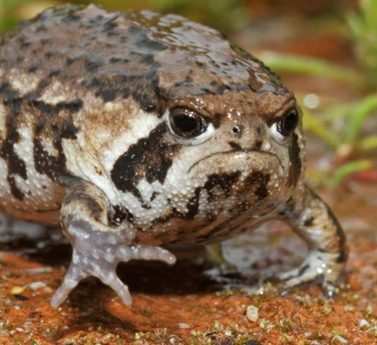
Top 10 Animal Comparisons for Near
inspired by this iconic post by @13eyond13 :-)
10. Gecko
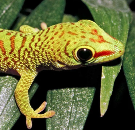
geckos made it onto the list because of their round black eyes and solitary nature. i also found it interesting that the oldest known gecko lived to 27, which is the same age we see Near in his last canon appearance.
9. Hedgehog

wary of people and not easily trusting. generally solitary, although capable of forming few attachments, and most content in familiar, comfortable environments. both show tendencies to curl in upon themselves.
8. Squirrel

curious and intelligent with impressive memories and problem-solving skills. also seen to be quite cunning and have a variety of tricks and schemes to deceive potential predators or food thieves. they would have been higher on the list if not for the fact that they are known to be very active and social.
7. Raccoon

not as strong a comparison for Near as they are for L, but they are known to be highly intelligent, cheeky and mischievous, much like Near. the comparisons are similar to those of squirrels, but ranked slightly higher due to their more solitary nature.
6. Rabbit
intelligent and inquisitive but can easily become bored. the appearance is the main feature that made me rank them so high, with reference to the round black eyes, small build and (for some breeds) white aesthetic. they also typically spend their entire lives in the same place and do not move far from their warren, which reflects Near's preference for staying indoors in one place where possible. rabbits probably could not catch a plane by themselves.
5. Seal

much like the gecko, seals came to mind because of their big black eyes and solitary lifestyles. they move in packs for safety but are not typically close with other individual seals, which mirrors Near's preference for working in a team despite having no close personal relationships outside of that. however, seals are much higher on the list because of their tendency to lounge around on rocks or play alone when they aren't hunting, which reminds me a lot of Near. they are also known to be intelligent and cautious.
4. Arctic Fox
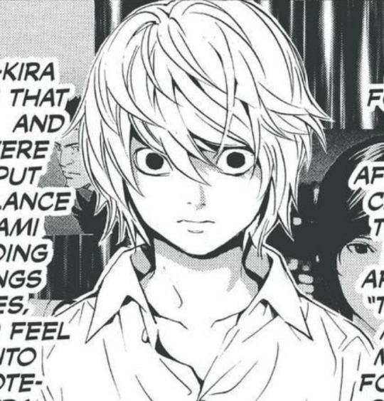
quite small and unassuming but sneaky, clever and adaptable. arctic foxes are not as strong or aggressive as other breeds but are very cunning, and sometimes follow larger animals like polar bears while hunting for protection and to find prey. in terms of aesthetic, the arctic fox specifically reminds me a lot of A-Kira Near with its white fur/dark eyes combo, long body and graceful aura. foxes are also commonly associated with the zodiac Virgo, which is Near's star sign.
3. Sheep
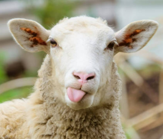
a very common comparison for Near based on appearance. both are calm and level-headed with a high level of intelligence, and very strong memory and recognition skills. despite being known for their placid nature, sheep can have a wide range of emotions, much like Near.
2. Cat

rolls around on the floor, plays with toys and is often destructive while playing. looks innocent but is actually a little bastard. my specific choice for him is a ragdoll cat because of their placid temperament, mostly white colour palette and preference for the indoors (and also because i am a ragdoll owner myself, so i am very biased <3)
1. Frog

self-explanatory i suspect. he may not share the most personality traits with frogs, but their overall vibe is too similar to rank any lower than first.
bonus comparison, in case you aren't convinced:
112 notes
·
View notes
Text
Take My Hand again actually we're gonna go on a walk through Night Raven College campus real quick while I lose my mind

First off look at the front gate. People have definitely brought up the birds and the keys and those ARE both very important symbols, BUT. What about the thorns sprawled across the top of the gate? And the repeat use of 4-pointed stars in the lettering gives an especially prickly quality, overall.

Also of note are the decorations on the main pillars and the very specific aesthetic choice for the shape of the wrought-iron fence—by which I mean both reflect designs found in Draconimom's appearance.
The carvings on the gate pillars feature an ankh-like shape that matches up eerily well with the central decor of Draconimom's belt, as well as two curves that mimic the main body of the belt. The three-leaf/bud-like shape above that is reflected in the lace pattern and dangling decoration of the Mirror Chamber's chandelier. The two swooping S-shapes mimic the Draconia family's iconic horns, and the little decorations on either side of the carving match with the shape of Draconimom's pauldrons.
As for the fence…it's That Shape again. Each post also bears resemblance to the upper portion of Draconimom's staff.
Considering the focus on thorned vines in relation to Diasomnia/the Draconias, the way that vines are slowly creeping up both the fenceposts and gate pillars feels relevant.
(Please recall: The coffins by which students are summoned into NRC are also referred to as "Gates.")

Next stop is the botanical garden. As I mentioned in a previous post, the building's overall shape is notably similar to the chandelier found in the Mirror Chamber. The large beams surrounding the building, with their spear-like support pillars, give the impression of the building being held in place by thorned vines.

The inside of the garden doesn't yield much in the way of analysis, unfortunately. The most stand-out feature is the crumbling structure in the subtropical zone, but that arguably could've been intentionally allowed to decay as a way of cultivating the various mosses and lichens we see growing on it.
(Please recall: at the beginning of the game, before you choose a student, Crowley has a monologue in which he appears to refer to the Dark Mirror as "a lovely and noble flower of evil.")
And now the Hall of Mirrors. This one has subtler details than the others, but still just enough for the pattern recognition part of my brain to start making noises.
Again, the outside of the hall bears a passing resemblance to the chandelier in the Mirror Chamber, though much less so than the botanical garden. More important to this analysis is the inside of the building.
Listen. Not all lace is related to overblots. But the majority of lace in Twisted Wonderland HAS appeared in relation to overblots. The presence of an unmistakably lace-y pattern on the beams under each ceiling arch feels worth pointing out. After all, as of Book 7, at least one student per dorm linked to the Hall of Mirrors has overblotted.

There are also small floral decorations on each arch: two buds in the lower corners, and a bloom at the top. Again, Crowley's "flower of evil" comment comes into play; each dorm, again, features a major antagonist who is visually and textually placed parallel to their respective member of the Great Seven (OG Disney villains).
There's also. Y'know. The horn-like design on the pillars.
(Please recall: each dorm linked to the Hall of Mirrors is, apparently, contained within a pocket dimension with somewhat strict borders.)

Okay now we're at the coliseum and I need you to bear with me for this first point. Look at the entrance. It's too ostentatious to not be important somehow, right? It's too overdone. It's the Dark Mirror's mask, kinda? Don't ask how long I've been staring at this thing
Aside from that, the coliseum has thorns lining the rim of the structure twofold. One set of thorns exists as spears jutting out along the rim, while the other set exists as the long, simple, repeating pattern on the wall just under those spikes. On the outside of the building, this pattern repeats for every floor, effectively giving a sense that the structure is "wrapped" in thorns.
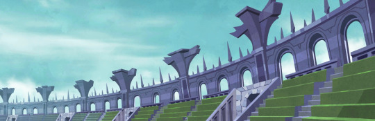
There are also thorns visible in the support beams of the stage; they're especially noticeable after Malleus fixes the stage, as they're lit up a bright pink (as opposed to the gold they were prior).

Upon the stage sits an odd, crumbling structure. It's clearly made of a different type of stone than the rest of the coliseum, being a dark gray instead of subdued purple, but that's not all—the architecture doesn't match up, either. The two main columns don't resemble any others found in the coliseum, notably. The arch-and-a-half visible both distinctly feature three-pointed arches, unlike the round arches consistently found throughout the rest of the building.
The fact this structure has been allowed to remain in such a deteriorated state is also worth questioning, especially since it's obviously been modified at some point fairly recently; the LCD screen it's been fitted with seems to work like a normal electronic device w/ no magical component to it. Even if you were to argue that the structure is supposed to have a distinct aesthetic from the rest of the coliseum to better draw attention to the stage it rests on, its condition renders the argument null. I love its decrepit vibe as much as Malleus might, but very few people would see this as an acceptable "centerpiece" for such an important location. With how Crowley squawks about maintaining the school's reputation, why does this pass by without comment from him…?
At least the chains frame the stage nicely. Though, they could serve a symbolic purpose as well…
(Please recall: according to Rook, the school staff claims that the coliseum is "imbued with a special field that makes it harder for damage to spill out." We can assume that this is the truth, as no one outside of the coliseum seemed to notice Vil's overblot—just the traces of excessive magical energy leftover afterwards.)

And finally, we come to the Mirror Chamber. Keeping in mind that the Dark Mirror can teleport people (both for enrollment and in general), the most notable visual qualities of this room are as follows:
Gates (coffins, the Dark Mirror)
Plants (chandelier, rose arches, standing lamps, windowpanes)
Mirrors (the Dark Mirror)
Containment (chains, coffins, the Dark Mirror)
It is very, very interesting that the four primary structures on NRC campus with a direct relationship to the items on this list also feature aesthetic similarities to the Mirror Chamber. Also of note is that although each structure chiefly embodies one item on the list, they all incorporate aspects of the other items:
Front Gate–
Plants: As previously noted, there are vines steadily attempting to overtake the fence and pillars + thorns sprawling across the top of the sign.
Mirrors: Structural design is mirrored across the vertical axis, carvings are mirrored across both horizontal and vertical axes.
Containment: Although open in this view, the front gate as a whole embodies the concept of NRC campus as an area that is closed off to the rest of the world.
Botanical Garden–
Gates: The entire building signifies a departure from the surrounding campus into a space especially designed for the housing and growing of plants.
Mirrors: Look at that thing. You can't have a building made mostly out of tempered glass and not have it be reflective as fuck.
Containment: Aside from the appearance of being held down by thorned vines, the building does, again, exist for the purpose of containing plants.
Hall of Mirrors–
Gates: Each mirror acts as gate leading to each of the seven dorms.
Plants: Previously-detailed floral decorations.
Containment: Again, each mirror contains a dorm. This, in turn, means that this building technically contains…nearly the entire student body.
Coliseum–
Gates: It's got one right out front lmao. But yeah, like the botanical garden, the building signifies a departure from the surrounding environment.
Plants: As mentioned earlier, the entire building has the appearance of being wreathed in thorned vines + further incorporation of thorns in the stage.
Mirrors: Previously-shown Dark Mirror comparison. Also, like the front gate, the structural design is mirrored across the vertical axis.
What does this all mean? NO fuckin clue. But if we consider how the very first battle of the game seems to take place in the Mirror Chamber, at least two of these locations have been (or will be) the setting for a major overblot battle.
(I will say…it's very funny that, despite Pomefiore being the first established dorm from a lore perspective, a lot of the campus has much more Diasomnia-esque aesthetics.)
#twst#twisted wonderland#twst meta#meleanor draconia#night raven college#design analysis#twisted rambling#nearly 1.5k words and i'm tired of looking at this thing. change da world. my final message. goodb ye
189 notes
·
View notes
Text
Minnette de Silva is my Roman Empire and here is why.

It’s 1918, Sri Lanka is still known as Ceylon, a British Colony and the last place you’d expect to find feminist ground breaking artistic pioneers. Minnette de Silva is born and concurs.
One of the first modernist architects to come from Sri Lanka AND the first Asian woman to become an Associate of the Royal Institute of British Architects.
She was awarded the SLIA Gold Medal for her contribution to architecture “regional modernism for the tropics”
She did not complete her formal education due to family circumstances. Despite not finishing the modern equivalent of her A-Levels, she undertook an apprenticeship and attended lectures at the Ceylon Technical College (Desi kids rejoice at an intellectual icon who had an untraditional path through education). She then joined the Sir Jamsetjee Jeejebhoy School of Art which allowed her to study under many influential architects.

She was eclectic, intelligent and a force to be reckoned. She was expelled from the Government School of Architecture in India for attending a Free Gandhi March and refusing to write an apology letter to the Head of the School for it (we don’t stan Gandhi but we do stan standing up for your beliefs!)
Her father was extremely opposed to her career path but she went for it anyway. A bad bitch. An unstoppable force.
According to The Guardian “During her time at the Architectural Association (AA) in the UK she cut an elegant figure, draped in silk saris and followed by a train of young male students bearing her bags and instruments.”

This is how I imagine her walking down those halls!
Minnette de Silva returned to a newly independent Sri Lanka in 1949, and established her career in Kandy. She was influenced by Ananda Coomaraswamy, and advocated for the preservation of the traditional methods of craftsmanship, construction, and acquiring materials. She was inspired to create a style that incorporated the newly Western methods of development with the natural style, aesthetic, and landscapes of the tropical island.
The photos below are her designs and they are
e x q u i s i t e ✨


She never married. According to Architectual Record Minette explained to a friend “husbands are only good for carrying one’s bags”

My real life reaction to reading THAT quote🔥
However, Minette was always plagued by financial insecurity, she died penniless in a hospital in Kandy on the 24th of November 1998 at the age of 80. She had fallen from her bathtub at home, and was not found for days. Only a relative few of her buildings remain standing.
RIP Minette de Silva, you were a pioneer and an inspiration.
#sri lanka#dark academia#sri lankan culture#desi culture#light academia#museums#sri lankan history#history#architecture#inspirations#poc dark academia#sri lankan dark academia#poc academia#women history#i’m back bitches
43 notes
·
View notes
Text
From a thing to wear to an icon of culture 👘

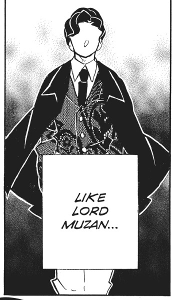
There is this hidden detail in Muzan that when I noticed I could not help but smile. Remember how he said that the thing he hated the most was change? Well coming from someone that had to live in 5 different eras is kinda funny, and it's even funny when you realize that he ended up adopting the Western fashion pretty fast. But that's the twist, if you look at Muzan's vest you come to realize that it's the exact same pattern as the kimono he used to wear. The best part? That was a thing that actually happened in history.
Wanting or not, the clothing that the people used to wear represents the history they lived through. "To look seriously at art objects of the everyday, such as clothes - their discourse and practices, their meaning-bearing forms and their codes of internal and external interpretations - in an essential, and often neglected, component of any study of modern aesthetics." - Slade, 2009 Yofuku [Western Clothing] is a type of clothing that is now common all over Japan, but during a lot of time, it was a type of clothes that only selected few grew up with. The 1st contacts with these types of clothing [even if extremely different from what we now call western clothing] was in the 16th century when the Portuguese arrived in Tanegashima. With them came not only different shapes but also different fabrics. But the “true” introduction to western fashion would only happen with Commodore Matthew Perry, catharsis to the Meiji restoration, where Emperor Meiji would start to dress in a typical western military outfit, and soon after the empress would start to aper in the typical victorian dresses. In the Edo period clothing visually distinguished the social classes. "Certain articles of clothing visibly differentiated people of diverse social classes, and simultaneously distinguished an individual within a specific group. The materials, motifs and construction of military campaign coats, for example, marked their wearers as men belonging to the military class." - Milhaupt, 2014; Samurai ranked on the top, followed by farmers, artisans, and merchants on the bottom. What happen was that most of the times the samurai where poor while the merchants lived in economic success. But samurai had the privilege of using certain types of fabrics and patters, even tho most of the times they could not afford them, and so, the merchants would start to adapt the fabrics and patters they were allowed to were and would end up becoming the patrons of arts and fashion. The trends of fashion would later be documented in ukiyo-e, and not only in the work of art sense, but also in pattern books were people could browse the prevailing styles. After the 1st contacts with the westerners, what would start to happen is that slowly but surely the Japanese would start to integrate the western ways of dressing into their lives. The Japanese started to introduce some of its elements with the kimono, shoes, hats, gloves, glasses, umbrellas, etc. Then in the 19th century a full change would happen starting from the man in the highest classes to the man in the lowest classes. The emperor decided to cut his topknot in 1872 and started to dress in western clothing in official appearances, also changing some of the more cultural habits like eating meat and more wester kind of meals. In the official portraits he appears adorned with a French-style military uniform with ornaments in gold and ostrich feathers. Before this, the emperor was never a public figure, so when pictures of the Meiji Emperor became available, and he started to appear more publicly the nation would have their eyes on him and start to imitate him. Women would, for the longest time still dress in the now classic kimono, that would develop as a symbol of the old and traditional Japan. The idea of the western clothing being associated with a modernized Japan and the Kimono [that literally means “thing to wear”] to a traditional country came from the fact that the emperor would choose to wear western clothes in more formal, international events, and for religious national events would choose the traditional Japanese court dress. The western clothes will end up being a symbol of the modernization of Japan, and the Meiji government would use it as yet another tool of national control. For all the Japanese born after 1945 the western clothes became the norm. Most families would end up transforming their kimonos into western clothing pieces, and the patterns sold for kimonos would double for kimonos and western clothing.
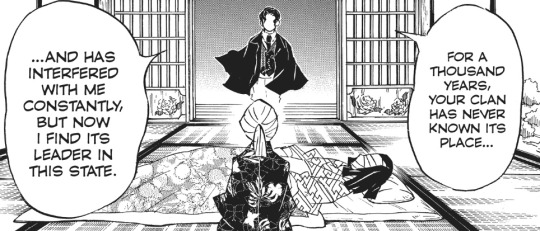
But it is funny to notice how despite it all Muzan is the one being presented in western clothing and Ubuyashiki is the one in traditional clothes, always being the contradiction of the other, but also it can also be interpretated as the Ubuyashibi family being "trapped" in the past since in hundred years the corps never killed an upper moon, the history never changed. And Muzan in his ever-changing cycle of his life, in the changing of eras and changing of personas he decided to reuse the only thing he could: his clothes. And just like him, they would adapt through the times.

MILHAUPT, Terry Satsuki. 2014 - Kimono: A Modern History. London: Reaktion Books [Ebook]; SLADE, Toby. 2009 - Japanese Fashion: A cultural History. Oxford, Berg. [Ebook];
#demon slayer#history#demon slayer from history to fantasy#demonslayerfromhistorytofantasy#history research#japanese history#demon slayer history#kimetsu no yaiba#research#demon slayer muzan#muzan kibutsuji#ubuyashiki#kimono
250 notes
·
View notes
Text
Can we talk about Paul McCartney twink death
Because here’s the thing — It never even really happened!
No but seriously why aren’t more people talking about how gracefully and beautifully Paul McCartney avoided twink death. He is nearly the gold standard for how to age as a twink
Like


Obviously yeah he’s in his 20s it’s the 60s he’s a twink sure
absolutely beautiful. flawless, loveable, amazing, adorable
we get it
As he aged a bit he got into facial hair

But he still clearly had a beautiful face underneath


He got into his mcbeardy era when he was all sad the band broke up


Obviously not a twink at this point, but iconic for that and still really pretty looking
But he still looked just as good clean shaven well into his 30s


And then

this is a picture of him from 1980. he was 38 then. and he still looked like his younger self. How???


and he just kept going


now its the 90s, he's well into his 50s and still looks like that. Bravo Paul!
And I have to say

there's something about 90s paul in particular...

just gorgeous.
obviously it couldn't last forever though
his beautiful wife linda sadly passed away of breast cancer in 1998
and you can see

his looks

started to take a downturn

culminating in my least favourite paul era aesthetic-wise
the mid 2000s.

He's married to the infamous heather mills, bears a slight resemblance to an overripe grapefruit, and is about to enter one of the nastiest divorces the tabloids ever got their grubby little mitts on

still, quite impressive for a man in his mid 60s

and after the divorce, he seemed to be growing out his hair again, he's got a new wife

quite aged, but consistent figure

and then, what a mercy! He finally stopped dyeing his hair, and allowed it to transition to a gallant silver

and there's something there. There's an elegant repose. A satisfaction. A twink who has made it farther than any twink has come before. A graceful aging


Look at any photo of him now and you'll see a surprisingly dashing old man, now entering his mid-eighties. Obviously his looks can't compare to what once was, but it provides a reassuring model of how twinks can more forward through their years, maintaining an essence of the beautiful
Time at least, hasn't taken a toll on his spirit
though i wish i could still say the same thing about his voice...
#paul mccartney#shitpost#but not really a shitpost#the beatles#twink#twink death#graceful aging#random#thanks for coming to my ted talk
39 notes
·
View notes
Text
Blogmas #2 2023
Underrated Disney movies that I love
1) Big Hero 6
This movie always makes me cry like a baby

2) Dinosaur
Before Disney Plus, I swear I had thought I dreamt this movie. Because no one else seemed to remember it. But honestly this movie makes me cry so much. Like definitely worth a watch
3) The Wild
This was clearly Disney's attempt to compete with Madagascar. But it was a cute attempt, nostalgia is definitely helping this but it's definitely a classic
But the iconic dialogue lives in my head.
"who knows how to stere?"
"we are animals"
"so none of us"

4) 101 Dalmatians
Cruella Deville is a bop. And i have to say the movie is so aesthetically pleasing. It makes me happy to see all those little puppies just vibing as the adults scramble to save them

5) Atlantis; the lost empire
This movie made me bisexual
6) The Emperor's new groove
This movie made me the person I am today. It's the perfect combination of heart, humor and just utter ridiculousness. This movie genuinely feels like a warm hug of my childhood after a particularly hard day
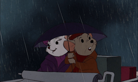
7) the Rescuer series
Under movie which I was convinced for the longest time was a fever dream. I love that they made this film. It broke my heart to see both those children and how the adults in their life let them down but it made me the person I am today. I work in healthcare to make sure that no child ever feels like that. So this movie really is worth the watch..brilliantly written just deserves so much more credit
8) The Hunchback of Notre Dame
First of all, the crush I had on Esmeralda is unreal. Like she is so pretty. Also, i love how they showed that she didn't love Quasimodo but not because he was ugly but he just wasn't the person for her. Also the villian death was so Amazing. I was so happy when that mother ducker perished
Also god helped the outcasts deserves an Oscar
.

9) Brother Bear
Another story that makes.me cry. And i love the portrayal of Native American lore compared to Pocahontas where there was a glamoroisation of the coloniser. The ending always gets me and makes.me an ugly crying mess
Also the iconic "stop.telling people I'm dead" meme

10) Robin Hood
The humor in this movie is unmatched. I had the biggest crush on Robin. He was so smooth and those eyes. Sir! Omg please.
Also i think it's so well written which can't be said for some Disney movies

#blogmas 2023#blogmas#Disney#big hero 6#dinosaur#dinosaur 2000#the wild#101 dalmatians#atlantis the lost empire#the emperors new groove#rescuers down under#the rescuers#the hunchback of notre dame#brother bear#robin hood#disney 100
87 notes
·
View notes
Text
Traversing Tel'anor: Insights into Kaldorei Funeral Traditions
Tel'anor, perhaps translated to: Holy Earth from Darnassian.
“This is a city for the dead… It is beautiful, and it is tragic. It is–was–a sacred place for my people. Or what my people once were.” -Thaedris Feathersong, the redeemed
Nestled in the mountains just beyond Suramar city's borders, the resting place of Tel'anor once commemorated the Kaldorei fallen. Today, it is overrun by disturbed spirits, harpies, and withered scavengers. Traversing through the burial site and taking a closer look at the architecture, offerings, and placards has offered some insights into the funeral traditions of the Kaldorei people. It appears that some shal'dorei still pay respects to their forebears and loved ones here, as we see in Thaedris Feathersong's story. Valtrois also echoes this sentiment in the quest [Honoring the Past]: “We nightborne owe our unmatched grace and intellect to a noble heritage. The ancestors at rest in Tel'anor deserve proper tribute.”
Architecture and History
Thaedris Feathersong explains that he used to visit this place often “before the barrier was raised,” implying that it was likely first established prior to the events of the War of the Ancients. Additionally, the fact that some plaques here give honorifics to the heroes of this war could indicate that it was actually the surviving Kaldorei of the Broken Isles, perhaps the Sisterhood of neighboring Val’sharah as an example, who created these memorials in addendum to those of the Pre-Sundering era. As the shal’dorei were confined within the barrier around Suramar city, some other group was likely responsible for these specific placards, and the subsequent upkeep of Tel’anor until the incursion of the harpies and withered. This city of graves is a wonderfully preserved window into the architecture of the ancient world. The marbled stone so iconic among the Highborne ruins that we see strewn about the world is also the primary choice of masonry here. The layout of this memorial site speaks to a highly manicured aesthetic, with deliberate and controlled inclusion of natural flora within shaped stone confines; notably in circular, ocular, and teardrop (almost comet-like) varieties. Pale pink and ivory flowers seem to be the ornamentation of choice for gravestones; while more richly pigmented purple flowers decorate the vases. As the rest of the area speaks to a lack of groundskeepers in recent times, much of Suramar’s native wildlife has begun to adorn the structures by way of vines and tree growth. In the central fountain area, there is a depiction of three women holding up a pillar, similar to the statues of Haidene. These maiden figures are each adorned with a green garland of flowers around the waist: one purple, one orange, and one blue. A grand statue of Elune, or perhaps a past elder of the Elunarian faith, is situated before the spire at the back of the grounds. Inside of this building is another statue in the center of an offering pool, this time of a man. He holds out an open tome, and wears a gleaming diadem on his brow. Who this depicts and what occupation he holds is uncertain, though he may signify an Elunarian faithful, a ritualist of Tel'anor, a sorcerer, or a star augur of old. Purple cloth banners and runners also adorn many of the open-air gazebos, though some are completely barren. Certain sites bear the symbol of the Highborne, while others are decorated with nondescript cloth. Flags are flown atop many of the buildings here as well; some with purple and gold trim, and some with blue and gold trim. These could have been another layer of marking one's status or even a building's purpose, as we know that the Highborne caste had a "penchant for all things purple." Blue and gold were the primary architectural colors in Zin-Azshari, as seen in the Azshara Warbringers cinematic.
Lunar Headstones:
A recurring motif throughout Tel'anor are the headstones that bear lunar symbolism, likely from the prevalent influence of the Elunarian faith. An intriguing detail of the headstones is that they are reminiscent of different moon phases: some appearing to be waxing, waning, or even the new/full moon. I do wonder what their symbolism could mean: maybe this marks the moon phase they died upon, when they were interred, the moon phase of their birth, their favorite moon phase, social status, combat ranking, generic imagery in homage to Elune, or something else entirely? The graves and ornate coffins accompanying them reinforce the idea that Kaldorei prefer to bury their dead, and in the past, even entomb them. There are headstones and sarcophagi both outdoors and indoors, interestingly enough. Some also bear a small glowing orb in the center that others lack, perhaps another indicator of one’s accolades in life.

During the quest Tools of the Trade, we learn that the deceased are anointed with sacred oils, preserving incense, and burial shrouds before their interment. The sacred oils are housed in a heavy skin that bears a strong fragrance, likely to help mask any scent from the deceased. What exactly makes them sacred is unclear, though they might derive from ingredients considered sacred; such as specific herbs, remains from honored animals, or have been blessed by a member of the Elunarian faith. The bundles of preserving incense are said to be surprisingly dry and undamaged, perhaps owing to a highly effective storage method, or especially resilient reagents. These could have included anything in the realm of leaf, bark, and wood powders; gums and resins; herbs, fruits, seeds, and flowers; as well as wines and honey mixtures. The chest of burial shrouds is described as being sealed tightly shut and feels lightweight to hold. It is not specified what material these shrouds are made of, though protection and preservation of the body seem to have been of great importance.
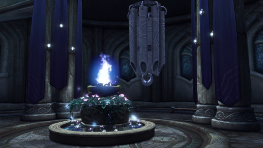
Spirit Fonts:
From a gameplay perspective, spirit fonts are usable objects that, when given an offering of Ancient Mana, buff the player character with 10% haste and movement speed (called Spiritual Infusion), and transform them into a spectral model. Their flavor text describes them as being “unused for some time,” though they still possess a radiant magical aura and full basin. Perhaps they are filled with blessed water, the liquid fire of Elune, or some other remnants of a moonwell. It is said in the Stormrage novel that, "magi and other spellcasters can refresh their mana in these pools.” This could be why the Withered are so drawn to this place, given that these fonts may still hold some semblance of the moonwell's restorative cleansing properties, both on one's lifeforce, and on their mana. In Elegy, Astarii Starseeker describes that bathing in a moonwell "eases feelings of pain, weariness, and grief," an experience the mana-starved Withered likely long for. They may also be feeding upon the energy of offerings left for the deceased here, scrounging for any motes of magic that still remain. These fonts may be, or once were, used for spirit communion; or to facilitate offerings to spirits. The crux of using these fonts indicates a sort of exchange between the living and the dead; as offering up the crystallized mana gives us, in turn, a boon. Thaedris Feathersong recalls that Tel’anor had a sect of caretakers who performed rituals and venerated the dead, so it may be that the rites of the spirit fonts were relegated to them specifically. The fact that these bestow a spectral form for a short time has some interesting implications as well. For one, it is possible that an offering ritual shifts someone partway into the spirit realm, perhaps to better communicate with the souls of the dead. Secondly, it could be that a spirit is imparting some of their energies to the offeror, and thus briefly strengthens them in the physical plane. Lastly, this boon could quite literally infuse the offeror with the essence of a particular spirit, which causes them to take on their guise or characteristics.
The Chimes of the Moon:
Across Tel'anor, chimes can be seen hanging in various locations and sounding throughout the environment. Near the southeastern portion lies a larger set of these instruments, reading: "The Sisters say that Elune sings a song, notes pure and beautiful. The Chime does not ring often, but when it does, it is the same note as the one She is singing." Singing seems to be a prominent aspect of Elune worship, perhaps in emulation of the Goddess as described here. According to the novel The Demon Soul, priestesses impart peace and comfort through chanted spellwork. During the Burning of Teldrassil, Priestess Astarii begins to sing to the refugees in the temple, and Elune responds in kind by granting them a peaceful slumber so they would not feel a painful death in the overwhelming flames. These chimes may have been crafted in such a way that Elune responds through them, or so the Kaldorei once believed. Considering chimes are typically used before or after a prayer, it seems possible that Elune could have used these as a conduit of communication with her faithful. Perhaps from fervent prayers, significant offerings, a new soul passing over, or even in warning, She was thought to harken through the chimes. Smaller, more personal chimes could be something Kaldorei carry with them, hang in their homes, or store in places of worship, similar to the windchime item discoverable through archaeology. Perhaps an old practice of the Kaldorei involved using chimes to contact or call out to spirits. This large chime monument in Tel'anor could also be the last of their kind - their likenesses and ancient craftsmanship no longer reproduced.
Silver Braziers:
Countless braziers glowing with silver fire still burn to this very day in Tel'anor. Given that this place is overrun by all manner of aggressive beings, there are likely no groundskeepers continually tending to the flames here. The quest The Liquid Fire of Elune implies that a flame can be born from the energies of a moonwell, and can cleanse scourge-blighted creatures. Unless a wayward devotee keeps all of these braziers lit, the fact that these fires are still active speaks to just how enduring the magic of Elune and Her moonwells really are. It could be that the vestiges of the Well of Eternity keep these flames everburning, or that they have thrived off of Elune’s energies each night without physical kindling.
Ancestral Offerings:
Alongside the worship of Elune, revering one's ancestors has endured as an integral part of Kaldorei culture, for a myriad of offerings adorn the grounds of Tel'anor. Many graves and headstones are beset with candles, vases, flowers, urns, water basins, and statues.
Thaedris Feathersong has us gather some scattered memento urns in his stead during the quest Fragments of Memory. He tells us that "these relics are tokens and mementos of the former lives of those interred here. They like to be remembered and these offerings keep them in their eternal peace." The Kaldorei seem to carefully select items unique to each of the dead that then remain with them, and serve as anchors of the memories they made in life. The abandoned state of Tel’anor could explain why there are so many disturbed spirits wandering aimlessly through its paths, because there has been no one to leave mementos and remind the spirits that their memory lives on; thus shattering their ‘eternal peace.’
There are countless seating areas with benches and fountains in Tel’anor, and clearly this was a place where people spent quality time, either alone or communally, in the resting place of their ancestors.
On nearly every epithet in Tel’anor, the same message echoes in the last words.
"Anu dorah. We remember."
#kaldorei#night elf#nightelf#wow#world of warcraft#lore#nightborne#tel'anor#elune#priestess#roleplay#shal'dorei#withered#rp#headcanon
76 notes
·
View notes
Text
Speculation on Lotor's Armor
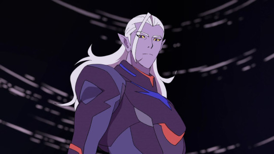
It's time for more unnecessary speculation about Lotor because I miss him. Last time we addressed Lotor's appearance, we talked about what was up with his incredible hair (here), now I'd like to discuss his iconic armor, the potential history behind it and how it services his character.
Even just at first glance in his introductory scene, Lotor clearly stands apart from his fellow Galra and not just due to his features. Even before we see his face, his unique stature and attire speaks volumes about the character we're about to meet as the colors and overall style bears no resemblance to anything we see a typical Galra wear - nor anyone else for that matter - singling Lotor out as a unique and unpredictable individual. So, why does he choose to dress so differently?

One interesting and inescapable truth about Lotor's armor is that it perfectly matches the color scheme of his cat, Kova, to such a specific degree that it can be no accident, so it only makes sense that Lotor himself decided to create or commission a suit to match. But why? Well, given the childhood that Lotor had to endure, it's not hard to imagine the inspiration was simply due to his allegiance to the fellow quintessence-touched creature. A way to honor it as the only true friend and companion he's ever had and the only thing that's ever truly been his or, at least, the one thing he chose for himself. Kova no doubt played a huge role in his lonely life and was probably the only decent thing in it as, for someone who had no real or meaningful connections, this relationship would naturally become incredibly important to him - important enough to showcase visually. In this way, perhaps the decision isn't just a matter of honoring a friend, but also perpetuating his own individuality as defined by his relationship with his cat as something that belongs solely to him.
However, if we dig deeper into this, things get more interesting.
When I was originally writing this meta, I was looking for clues in Lotor's main design that could legitimize the idea that he would have tailored it to honor his Altean side (as he clearly isn't dressed like a Galra), as I think that would make a lot of sense for his character. Unfortunately, there's nothing incredibly obvious in his clothing that matches the aesthetic of the Alteans we see in the show as the style and color palette just don't align. This makes sense, I suppose, given that Lotor would never know exactly how they dressed even if he wanted to emulate them. And then I thought harder about Kova...

Given that he was originally Honerva's pet and she's Altean and therefore is from there as well, one could argue that designing his appearance after Kova was, intentionally or not, reflective of Altean culture to some degree. And if Lotor devised that Kova was originally Honerva's, his signature look could also be a way to remember his mother as well as her culture, both of which he deeply admires and are intrinsically part of himself. At this time, he believes all Alteans to be extinct, making him (and Kova) the sole keepers of their legacy and he chooses to wear that proudly. Ultimately, Kova isn't just his best friend, he's also a connection to his mother and Altea and all the things he holds dear and thus becomes his own personal mascot of sorts.
This decision is also deliciously ironic given that his chosen appearance is simultaneously an unintentional extension of Haggar as well, whom he despises but cannot fully escape. Just as Honerva and Haggar are two halves of the same person and Kova, therefore, belonged to both, the style Lotor chooses is also inextricably a reflection of Haggar just as much as it is Honerva and what they represent to him: corruption as well as purity - which is an interesting contrast in regard to Lotor's character.
Speaking of contrast, it's worth noting that there is, of course, a distinct and purposefully clashing styles between the Galra and Alteans. The former made up of sharp edges and intimidating reds and blacks while the latter is defined by soft shades of blue, gold and pure white. Both designs are successful in respectively encapsulating a race who's known only war and another that promotes peace. With a parent from each, Lotor naturally stands somewhere in between these opposing views both in his internal struggles as well as an outward appearance that doesn't conform perfectly to either. Lotor's style, therefore, is an interesting amalgamation of his roots, an echo of their inherent conflict, and a bold statement to all who see him who he is and where he stands.
So, we have an idea of the inspiration behind the armor, but when did he implement it?
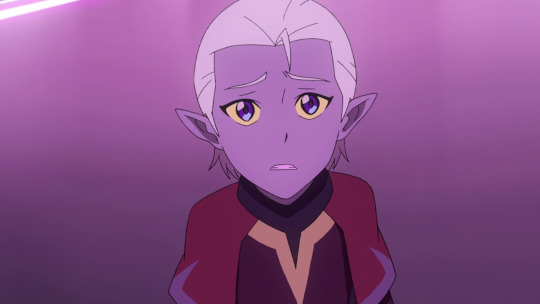
We see in some flashbacks that young Lotor did wear Galran styled clothing. Though he cannot change the reality of his mixed blood, he can try to speak, act and dress as a Galra - all actions that a young prince would be expected to uphold but also probably pushed himself to practice and perfect in order to assimilate himself better into their society and appeal to his father. However, there's a huge unexplored time gap between what we see of Lotor's childhood and him as an adult who has already adopted his very divergent final look with no real explanation. That's why I mainly want to address the flashback in 8x02, as it's the youngest adult version we see of Lotor and marks an influential event that I feel could have had a grander effect with a few tweaks to his design.
At the beginning of the flashback, we see Lotor and Kova together - the proximity affording the audience a strategic reminder of their unmistakably similar color schemes and of their bond. Now, perhaps his appearance remains unchanged here simply to make it easier for the artists and animators so they could avoid designing a new look for him for only one scene, but I personally find it a wasted opportunity to benefit the story further by showing Lotor at a very different point in his life and a different appearance would certainly help reflect that.

Personally, I would have liked to have seen him in more traditional Galran clothing here and maybe even sporting slightly shorter hair - even if only for the selfish desire to see Lotor look somewhat different at some point during the course of the entire show. The hair would help to indicate that he's a little younger here (though we don't actually know how long ago it was) and the traditional armor would supplement the story visually by showing him still bearing some ties to his Galran heritage at this point as he continues to try to prove himself to his father that he is an effective and worthy son. He does want to change things though and help his father see there are other, more merciful ways of reaching their goals and by appearing as a Galra in the best way he can, he could perhaps make his sentiments more palatable.
Of course, things go horribly wrong and this flashback details one of the biggest shifts in Lotor's life. In the span of one scene, he transforms from dutiful Galran prince trying to please his father to exile who has severed all ties to the Galra, all hopes of appealing to Zarkon and is now determined to bring him down. Until this point, Lotor has struggled and failed to be the prince his father and the rest of his people would approve of and changing his entire appearance after his exile would really punctuate his literal and symbolic divergence from the Galra by creating a look and identity all his own with no aesthetic connection to them. Lotor, at last, is taking control over his own life and no longer living in his abuser's shadow. Naturally, the change is openly rebellious - an unmistakable rejection of a culture that rejected him and a slap in the face to all who see him. He's charted his own course and pledged allegiance fully to himself and what he believes in. Lotor's generals are also tasked to wear the same style clothing as him - a clear sign to all who see them to whom they serve.
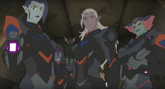
Of course, there could be other explanations that accommodate the writers need for him to maintain this look:
Perhaps Lotor just changed his look as an angsty teen who wanted to rebel perhaps. My issue with this idea though is that I don't think Zarkon would have approved of him dressing as anything less than a Galran prince is expected to and, as we see of Lotor even as an adult in the flashback, he's still trying to present himself the best he can to his father, and I don't think he'd take the risk of angering him just to feel more independent as Zarkon will use any excuse to punish him. I like to think that Lotor's outburst against his tactics in this flashback is the first real time he's ever rebelled against his father, hence the surprise and severe punishment. Lotor would never want to willingly incur his wrath unless over such an important thing as the lives of others - another reason why I think changing into his final look after his exile is the best narrative choice. Only after being formally expelled from the empire, I imagine, Zarkon would no longer care about seeing Lotor maintain a Galran appearance and would no longer protest to seeing him dressed differently.
Or, maybe he only recently adopted the new look while staying on Ven'tar's planet with Kova for a year. Perhaps, in his first real venture outside of Zarkon's shadow and Galran culture, he became more independent, more self-assured and wanted to adjust his attire to reflect that growth. To make something of himself on his own and define himself as an individual who is open to clothing untethered to just one culture. Maybe this decision was also partially bolstered by his inclination to make the people he's leading feel more comfortable around him as well by presenting himself as different than the other Galra they know and fear. Of course, during his conversation with Zarkon, we also learn that Lotor now knows about his Altean roots and that potentially recent discovery could also have played a role in his desire to alter his appearance (using Kova as his muse) as his time away gave room for him to begin to distance himself from the Galra and begin his exploration into his Altean heritage. Again, though, I don't think Zarkon would naturally approve of seeing him in foreign attire (especially inspired by Altea). He doesn't care about Lotor but he does care about maintaining his image as a Galra prince and projecting the strength and authority that title brings over others as demonstrated in this scene.
Ultimately, regardless of the exact origins, this visual separation from the Galra serves to aid Lotor in his quest to transform the universe by presenting himself as someone who stands apart from the rest of his race and their ruthless ways. He's independent with a unique appearance to match his unique manner of leadership and ideas for the future. Presenting a wholly personal choice of style that acts as a natural extension of himself and a love for his Altean heritage as inspired from the only friend he ever really had.
So, there you have it! That's my unnecessarily long take on why Lotor dresses to match his cat.
#vld#voltron#lotor#prince lotor#kova#zarkon#honerva#haggar#v:ld#voltron: legendary defender#lotor meta#vld meta#voltron meta#vld lotor#lotor vld
119 notes
·
View notes
Text
A Daydreamer's Holiday Movie Marathon: My Little Pony: A Very Minty Christmas🦄


Here's another childhood favorite of mine! It's Day 2 and we have My Little Pony: A Very Minty Christmas which came out in 2005 during the third generation of My Little Pony. Now, I don't have the DVD, but I've seen this film plenty of times on TV. It used to air on discontinued channels like Playhouse Disney, Toon Disney, and The Hub Network. It also recently aired on Discovery Family back in July. You can even watch it online now. This movies stars Minty who is a little clumsy. Every year, the ponies place the Here-Comes-Christmas-Candy Cane on top of the Christmas tree in the middle of Ponyville so its light will guide Santa to the town. Unfortunately, Minty breaks said candy cane! She attempts to become Santa, but after realizing that may not be a good idea she decides to head for The North Pole to tell Santa where Ponyville is and hopefully make up for what she did. Pinkie Pie immediately goes after her along with Thistle Whistle who flies alongside Minty.
This film is ICONIC! It's not perfect, but it's ICONIC! This is also a film that's mixed between fans. Coming from G3 property, some MLP fans aren't too kind to G3 at all since MLP G4 (My Little Pony: Friendship Is Magic) really took off in popularity. Some people don't like the voice acting. Some people don't like the plot. Some people don't like the execution of the story. Some people don't like how "corny" it is. Some people say it's "too girly". I have a soft spot for this movie and I honestly wish it was a little longer. I loved the aesthetic it was going for! I loved the music! I loved Minty as a character! I won't lie, there are times where I wish some scenes were shorter and some scenes were longer. I also wish there was a slightly better direction in the voice acting. However, I love how much this film is a present of it's time and I love how even after years later it keeps airing on TV. It's even available to watch through streaming or YouTube. It's even had plenty of appreciation from so many MLP fans. This is a film I would also recommend you check out, if your'e curious. Though, it is mainly more so directed to kids than the Care Bears Nutcracker Suite. It's a fun time for any pony fans!
Featuring art by @sleepyc0rex
9 notes
·
View notes
Text


On May Day 2017, anarchists participated in lively demonstrations all around the United States, from the heartland to the coasts. In the Northwest, Seattle witnessed a successful block party at the site of a juvenile corrections center, while in Olympia anarchists barricaded train tracks to oppose fracking and clashed with police. Support arrestees here. Yet Portland, Oregon may take the cake for the most creative and combative May Day. Demonstrators not only defended themselves from unprovoked attacks from police who declared the march a riot—they also introduced exciting new innovations into the aesthetic of the black bloc street presence. Here, comrades from Portland explain their goals with the giant spiders they created for May Day, and offer a helpful guide for those who wish to make spiders of their own.
In an effort to bridge the gap between art and activism, giant spiders were assembled off-site and pushed up the street to the demonstration, stocked with water bottles, snacks, earplugs, and other party favors. The idea was to narrow the divide between “us” and “them” that often exists at demonstrations, and it was a complete success. We performed community outreach, engaged in cultural development, boosted morale, provided crucial supplies, and created an amazing photo opportunity in the process.
The concept is multi-dimensional: it works on many different levels. The idea began from frustrations around attendance at local demonstrations. In Portland, where the majority of citizens seem to be white, middle-class, and apolitical on account of these privileges, they don’t show up unless a demonstration concerns their interests specifically. However, Portlanders are fascinated by their own love of art and “wacky” stuff as well as the commodification of protest as “funtertainment.” We decided to embrace this love of the “weird” to test whether a hyper-localized approach to engaging people could succeed.
Our tactical art enabled us to fill a supporting role for other participants in the march, helping challenge narratives that the black bloc is an “othered” or “othering” tactic. Whether this separation is intentional or not, the fact remains that the general public is often hesitant to engage with us. Bearing that in mind—as well the tendency of the Portland Police Department to brutally shut down demonstrations—we stocked our Spiders with fliers, water, LAW (liquid, antacid, water, the eyewash with which street medics treat pepper spray), ear plugs, and snacks. We also included a few other party favors, because anarchy needs revelry!
We intentionally engaged with the folks around us. A lot of people walked up to ask what the spiders meant! It was inspiring to see so much dialogue between folks in everyday garb and folks in black bloc. We explained the ideas behind our actions as anarchists and the creations themselves: the three spiders representing Mutual Aid, Solidarity, and Direct Action.
A word about symbolism. The idea of using the spider as an icon of resistance is that spiders are always there watching, waiting, and keeping the environment free of pesky insects and other parasites that consume resources without supporting their fellow beings. While we may look scary, we’re here with you and for you. We are the spiders, and the insects are the societal ills that we fight against.
The symbolism of the black widow spider is rich with history that guides our work. We want to contribute to that rich history, adding our own interpretations. Mutual Aid, Solidarity, Direct Action are our black widow’s cruses. (Crux? Curse? Cures?)
In regards to developing our own culture, there are many barriers we face in this process. State repression is the biggest threat, of course. The specter of state repression can complicate organizing, planning, and building trust in our communities. Portland has a history of repression and slander, ruining the lives of activists and anarchists; these horror stories reverberate throughout the underground. We can’t allow ourselves to be publicly disparaged and forced into hiding by our adversaries and their culture war, so we create as a political act. Creating is intuitively human: we plan, we build, we think, we conspire, we imagine. It is also an activity in which everyone can engage to some degree while building new skills. It enables us to get to know each other, build trust, and share time and company.
More globally, seizing the Spectacle is a step towards our goals, because it allows us to dictate our own narratives. With the development of Public Relations and Social Engineering, the visage of capitalism has come to define its delusional reality. To paraphrase Guy Debord, lived experiences are now taken in as a collection of representational images. We can tell our own stories and show the general public what these three principles mean in action. We can create our own mythos, speaking out on our own terms, in our own language, with our own symbols. The state and media dictate too much of what we’re allowed to say and how it’s spun—it’s time to spin our own webs to connect and fortify our relationships.
We are building the bridges we need to move forward. The existing connections between art, activism, and anarchism are fiery and well-storied. The new wave of repression under Trump’s regime is still building steam, but it is already proving dangerous. We need to be more careful than ever. Art allows us to demonstrate and show our fangs, and we can use art to empower those around us.
#how-to#guides#and manuals#May Day#Portland#protest#reportback#community building#practical anarchism#anarchist society#practical#mutual aid#grassroots#organization#anarchism#resistance#autonomy#revolution#anarchy#daily posts#communism#anti capitalist#anti capitalism#late stage capitalism#grass roots#anarchists#libraries#leftism#social issues#economics
34 notes
·
View notes
Text

jae | 27 | ey/they/he | trans t4t | asian
˚₊· ͟͟͞͞➳❥ @remy my beloved (r)
carrd | toyhouse | flight rising art credits: icon | pinned
system. personal blog idk man i'm trying to stop using twitter and stop using tiktok and that means i'm back here.
tags: j | v | about me | aesthetic
media: re-animator, atla, lotr, bob burger, flight rising, moomins, nightmare moon, stardew valley, animal crossing, breath of the wild, over the garden wall, hamtaro, we bare bears, danmei, tgswiiwaagaa
music: fallout boy, noah kahan, chappell roan
other: toy making, disability and accessibility content, media creation and comparison, character analysis, cryptids, scp, kaiju, dragons, furry content, cooking, little thing art
8 notes
·
View notes