#vincent figgins
Explore tagged Tumblr posts
Visit Tumblr Blog
Explore Tumblr blogs with no restrictions, modern design and the best experience.
Last Seen Tumblr Blogs


Fun Fact
Kazakhstan’s Minister of Communications and Informatics has blocked the Tumblr site because it contained 60 sites of terrorism, extremism, and pornography in 2015.
Text
That mysterious font is Festive, not Stymie
By Ray Newman - April 22, 2024
Source: https://precastreinforced.co.uk/2024/04/22/that-mysterious-font-is-festive-not-stymie/
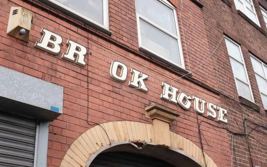
What is that font? You know, THAT font? The chunky italic lettering you see on launderettes and council blocks, on post-war churches and new town butcher’s shops, across the UK.
The font you’re thinking of might well be ‘Festive’, a lettering style designed by Maurice Ward of Ward & Co, a sign-making company in Bristol, founded in 1952.
Launched in the early 1960s, Ward’s ‘Inter-signs’ product, manufactured under the Lettercast brand, used injection moulding.
Lettersigns was available in two styles, Festive and Block, and made it possible for anyone to mount their own custom signs with professional-looking 3D lettering.
Or, of course, the specific sign you’re thinking of might be in one of any number of similar lettering styles in the broader category of ‘Egyptian italic’.

Samples of lettering styles similar to Festive cobbled together by me from various sources including The Studio Book of Alphabets, 1963.
Those include:
Egyptian Italic (an earlier Ward & Co style)
Festival Egyptian (an official style of the Festival of Britain)
Stymie Bold Italic
Clarendon Bold Italic
Profil
Amigo No. 1
First, then, let’s pin down how to spot Festive in particular.
How to spot Festive
Trade catalogues from Wards of Bristol include samples of Festive in print.
From this, we can see the most distinctive features of Festive, which can help us distinguish it from similar lettering styles in the wild.

A sample of Festive from a Ward’s catalogue from, I think, 1971.

A shop sign in Bristol in Festive, author’s own photo.
First, there’s the unexpected serif at the apex of the capital A.
Then there’s the relative flatness of the round letters, like C and G.
And, of course, there’s the built-in beading – that outer line that traces the edge of each letter.
The origins of Festive
There’s a clue right there in the name: like almost every bit of flair in Britain’s mid-20th century public spaces, it came indirectly from the 1951 Festival of Britain.
One of its official lettering styles was ‘Festival Egyptian’, as depicted in the typographic handbook for designers.

A page from A Specimen of Display Letters Designed for the Festival of Britain 1951 via Chris Mullen at The Visual Telling of Stories.
But why Egyptian? In around 1817, London type founder Vincent Figgins created a typeface he referred to as ‘Antique’.

An 1834 sample of an italic variation of Antique. SOURCE: archive.org
It was fat, bold and easy to read from a distance.
Earlier examples of this style have been found but Figgins commercialised it and prompted imitations from other foundries worldwide.
These days, they’re known as slab serif fonts but in the 19th century, they were usually referred to as antique, after Figgins; or as either Ionic or Egyptian, in variations on the theme.
You can certainly see in Antique, especially when italicised, the seeds of the 20th century launderette signs and tower block titling.
But these in-your-face, ungainly display typefaces went out of fashion, like everything associated with the Victorians. They spoke of slums, music halls and Gothic mausoleums. They weren’t fit for the world of motor cars, aeroplanes and Streamline Moderne.
Then, in the 1930s, a revival began, achieving its full flowering with the 1951 Festival of Britain. This is documented in detail by Paul Rennie in this 2001 essay (PDF) but here are the key points.
First, the cover of John Betjeman’s first book Ghastly Good Taste, published in 1933 when he was still in his twenties, showcased a jumble of Victorian typefaces.
Then, in 1938, came Nicolette Gray’s book Nineteenth Century Ornamented Typefaces, celebrating Victorian lettering styles.
And in the same year, the architect and townscape designer Gordon Cullen personally produced (non-italic) slab serif lettering for the starkly modern Finsbury Health Centre. It is clearly ahead of its time and wouldn’t look out of place on a municipal building erected 20 years later.

The Finsbury Health Centre in 1979. SOURCE: Gillfoto, via Wikimedia Commons, under a Creative Commons Attribution-Share Alike 3.0 Unported licence
Though the British Government generally clung to clean, uncluttered sans serif typefaces such as Gill Sans for official posters (Keep Calm and Carry On, chaps) advertising designers and publishers dabbled in Victorian styles throughout the 1940s.
After World War II, In the run up to the Festival, committees and working groups were put together to consider every small detail, including typography. Gordon Cullen and Nicolette Gray were both on the Festival of Britain Typographic Panel.
Once the Festival was over, Festival style lingered. Lettering catalogues from the 1950s and 60s include, for example, Egyptian Italic, Rockwell Italic and Ultra Bodoni Italic.

A sample of Egyptian Italic from a Ward’s catalogue of 1971.
Maurice Ward wrote this of his Egyptian Italic, the immediate precursor to Festive, in a catalogue from 1962:
[This] face, together with its vertical counterpart is a harmonious combination of the best features of the Egyptian family of characters and is perfectly suited as an architectural letter on buildings. The popularity of these Egyptians is unquestionably due to the Festival of Britain in 1951 and no face characterises more aptly the word ‘Festive’.
And when Ward & Co (Lettercast) launched Festive in around 1963 it was labelled as “based on Egyptian Italic”, which was in turn a take on Festival Egyptian.

The A from Egyptian Italic (left) and from Festive (right).
Feelings about fonts
What’s fascinating about Festive is how it moves people emotionally, and obsesses them.
The writer Jason Hazeley has been trying to identify it for years, for example, referring to it as “That Font” or “Everywhere Bold Italic”.
And he is not alone. For a generation of British people, it represents the vanishing landscape of their childhoods, tied into ideas of nostalgia and even hauntology.
Graphic designers have often resorted to Profil as a close match – and, of course, Festive was never really intended to be used in print.
On social media, including a popular Flickr group, Stymie Bold Italic has incorrectly been used to describe this entire category of lettering styles.
It’s only recently, however, that illustrator and designer Richard Littler of Scarfolk fame managed to unlock the mystery – or, at least, bring together all the threads.
When he put out a call on social media his significant reach across multiple platforms, with exactly the right kind of people, brought to light:
previously overlooked material at archive.org
detailed research into the British soap opera Crossroads (Wayback Machine)
The latter, a spectacular piece of work, has been sitting there for anyone to find since 2020, in a different domain of geekiness – if only type nerds had known to search ‘Inter-signs’ and ‘Lettercast’.
Personally, I’m a bit embarrassed not to have got there sooner. Back in 2020 I spent some time researching this seriously. I got in touch with Andy Ward, Maurice Ward’s son, who tipped me off to Egyptian Italic, and sent me photocopies of material he had at hand, at home, during lockdown.
And then Christine Daniel sent me photos of the back of some sign letters in her collection with ‘Inter-signs’ clearly marked on the back. But I couldn’t quite make those final links.

Together, though, we got there. The mystery has been solved. What a relief.
With thanks to Christine Daniel, Jason Hazeley, Richard Littler, Paul Rhodes and Andy Ward.
0 notes
Photo

Photo: Monument to Vincent Figgins at Nunhead Cemetery, London
Date Taken: 29th September 2018
2 notes
·
View notes
Photo

antique | egyptian
illustrated is the earliest founder’s showing of the face called by the foundries «antique»: vincent figgins from the 1817 appendix to his 1815 specimen [facsimile: berthold wolpe (ed.), Vincent Figgins Type Specimens 1801 & 1815, printing historical society, london, 1967]. nicolette gray says «His double pica Antique [illustration, ��Two Lines Small Pica’] is magnificent. It has all the deliberation, the firm, solid, reasonable precision which is the fascination of the Egyptian.» [XIXth Century Ornamented Types and Title Pages, faber & faber, london, 1938, p30]. giving some elevated theory behind the antique, nicolette gray tells us: «But if type tends to be neater it is also richer, as if Wilkie had something of Etty’s bloom or Mulready something of the verve of Lawrence. It has more weight, too; it is emphatically a product of the same period as Inwood’s St Pancras Church (1819-22 ) and Smirke’s British Museum (1823-47). Here is a classicism not altogether illuminated with the sunlight of greek rationalism, the heavy forms are opressed with the burdens of their weight, the shadow of the Egyptian collection which it was to house (installed by troops in 1834) seems cast over the façade of the Museum. It is significant that the typical letter of the period was called at its first appearance Antique but that the alternative name, Egyptian, became the common usage. The distinction between the two civilizations is not always clear in the minds of the revivalists.» [op. cit., p28]. it is unclear, to me, as yet, as to why egyptian stuck as the more usual appellation for this species of type.
0 notes
Photo


Typography Tuesday
WOOD TYPE FROM I. M. IMPRIMIT
This week we present two wood-type broadsides printed by Ian Mortimer, artist, designer, printer, and proprietor of I. M. Imprimit in London. The top poster was printed for the very first issue of Matrix in 1981 and displays twelve of the more decorative typefaces from the collection at I. M. Imprimit. It demonstrates the range of widths, weights, and sizes that poster and job printers frequently stocked. The next broadside was printed for inclusion in Matrix 2 of 1982 and shows the range of so-called “Antiques” to offer an idea of the diversity of appearance that could be manifested in a single type style.
The “Antique” was first shown and named by London typefounder Vincent Figgins in his specimen book of 1815, and by 1820 versions were known as “Egyptian Antique.” The basic style is characterized by square-cut slab serifs, which in the so-called “French Antique” became thicker and heavier than the main strokes. This particular specimen displays both Egyptian and French Antiques in bold and light versions of normal, elongated, and expanded styles.
Mortimer notes that:
In practice it would be very unusual to use nothing by Antiques in this way ether in the present day of in the nineteenth century, when these styles would invariably have been interspersed with other typefaces to alleviate the heavy monotony inevitable in a setting composed entirely of type of this character. Likewise, of course, the display types shown in Matrix 1 . . . . If display types are juxtaposed indiscriminately their overall effect can easily be diminished.
These broadsides come from the second editions of Matrix 1 & 2, which were reprinted in 1985 and 1993, respectively. Matrix was printed by John and Rosalind Randle at the Whittington Press in England, and is a donation from our friend Jerry Buff.
View more posts from Matrix.
View other posts relating to the Whittington Press.
View more posts with wood type!
View our other Typography Tuesday posts.
#Typography Tuesday#typetuesday#wood type#I. M. Imprimit#Ian Mortimer#Matrix#Egyptian Antique#French Antique#display type#type specimens#slab serifs#broadsides#posters#John and Rosalind Randle#Whittington Press#Jerry Buff#19th century type#Typography Tuesday
61 notes
·
View notes
Text
The good, old legible types formerly used in print are being scorned in these days (on account of the new ones being cut every day). And yet, however many new faces may be cut, when they have been forgotten and no more new ones can be imagined, the old ones will once more be produced under the pretence that they are new, as is the case with other things.
Wolfgang Fugger, 1553, from Vincent Figgins Type Specimens 1801 & 1815 (Facsimile 1967).
5 notes
·
View notes
Photo


0 notes
Photo

First 3D typography, by Vincent Figgins (1815)
0 notes
Text
Week 2
So this week our reading was on the history and evolution of typography from some of the first hand carved printing blocks to modern day with type being made for mobile devices. One thing that I found really interesting from the beginning of the history of printed type, was that it didn’t seem that people reversed their charters on their blocks. Of course, it’s all in a language that I could not read, but in figure 1-18 which features a carved block with English letters, the ‘L’ for example is not reversed making my first thought be that when they printed with that block it would come out backwards on the paper, but there may have been a way of reversing the print that I don’t know of.
Another significant part of the history that stuck out to my was the industrial revolution and specifically Vincent Figgins. I was really drawn to a lot of his type and he did some rather experimental things for the time like making shadowed type and perspective type. It seems like he really wanted to push the boundaries of what was acceptable but was also very curious about just figuring out what worked.
At the same time, lot of display type started being used which was more graphic and very big. It seemed like it was generally used commercially, as a lot of type is, and normally it had a very distinct hierarchy to it. Usually the most important part of info would be display type and the rest of the type would center around that in some type of graphic style.

This is a photo of the project that our class worked on this week. Our goal was to make a poster using text from Humans of New York, and constructing it with a grid that we deconstructed from another poster. We worked in InDesign for this project, and it was my first time ever really using the program. Though I feel that I have a heck of a lot to learn in the software, this definitely taught me a lot about it and I feel much more confident on it. I’m still a bit iffy on printing and dimensions as printing with bleed still doesn’t make complete sense to me, but I think I do have a better understanding of it now. I’ve also learned to “print early and print often” from this project as I felt my underlying image for this poster doesn’t come through that well at all, but it looked much better on screen.
1 note
·
View note
Text
Major project
- Designers/movements
I want to make sure I'm looking at as much relevant visual information along with written sources and more, so for this I knew I had to look into more modern designers who use the topic of industrialisation as inspiration. I understand this would most likely mean looking at newer industrialisation however I still think it is very relevant to the subject, of exploring/visualising man made to machine made. However during my research I found relevant information that was closer to the time and how this industrialisation helped new art forms and medians be explored.
- Graphic Design
‘As this supply-and-demand cycle became the force behind the relentless development, graphic design played an important role in marketing factory output. It was a time of optimism and wealth, but not without it’s social costs. Long 13-hour days, unsanitary and filthy living conditions, women and children among the workforce, overproduction, economic depressions, and the loss of jobs due to new improvements in technology took their toll.’
‘Mass production of goods brought with it an overpowering need for mass communication.’
- Typographers
Robert Thorne, Vincent Figgins, Henry Caslon, among others, began experimenting with bold, heavily slabbed-serifed fonts called antiques or Egyptians. These typefaces generally had an even stroke weight, heavy, rectangular slab serifs, and short ascenders and descenders.
Robert Thorne’s Type


Henry Caslon’s Type

- Printing
Hatch Show Print, a print shop that uses wooden letter press to create typography posters, located in Nashville, Tennessee, was founded in 1879 and still produces wood type and letterpress posters for a broad range of uses.
Hatch Show Print’s Work


- Automatic Type Press
Ottmar Merganthaler
‘Ottmar Merganthaler invented and obtained the first patented Linotype machine that created type automatically. The linotype machine could do the work of seven or eight compositors at the same time.’


- Periodicals and Illustrated Weeklies
The linotype led to a surge in the production of periodicals and illustrated weeklies, including the Saturday Evening Post.
Saturday Evening Post Covers


- Victorian Era
‘During the reign of Queen Victoria it was a time of strong moral and religious beliefs, proper social conventions, and optimism.’ ‘The Victorian love of ornate and extravagant embellishments was noted in architecture, manufactured products, and elaborate borders, text, and imagery in graphic design.’
‘Victorian graphics utilised a printing technique called chromolithography that unleashed a flood of colourful printed images.’
Victorian Era Products


Victorian chromolithography


- Art Nouveau
‘What Defines Art Nouveau? Art Nouveau was a compelling and energetic style in the visual arts which spanned from around the early 1890s to the First World War. Art Nouveau artists, inspired by plant forms and nature, took organic subjects and flattened and abstracted them into sophisticated, sinuous and flowing motifs.’
‘Art Nouveau emerged as a reaction to major world events including the Industrial Revolution which began in the eighteenth century. The Industrial Revolution was the transformation from a handicraft economy to one dominated by machine manufacturing through the rise of technology.’
‘These five elements can also be seen in the Art Nouveau movement. The industrial revolution allowed for faster and cheaper production of materials making new building materials such as glass, reinforced concrete, cast iron and steel, readily available. Art Nouveau artists embraced industrial production and the accessibility of materials to create their work.’
‘Art Nouveau was ubiquitous in Europe’s train stations, tea rooms and department stores: it belonged equally to the public and private realms. Art Nouveau flourished during a period of rapid social and technological change in Europe as industrialisation, mass production and urbanisation accelerated.’
Examples of Art Nouveau


- Art Deco
This movement also then inspired other artists and designers to express themselves further which played a part in creating Art Deco. Though this is movement has happened after the industrial boom it is a by-product of its new found opinion on mass production and accessibility to a range of once hard to come by or expensive materials.
‘In the increasingly conservative political climate, critics saw Art Nouveau as ‘decadent’ and over-elaborate. It failed to meet the demand for a modern national style.”In a time of booming industrialisation and post-war nationalism, veterans of French Art Nouveau like Maurice Dufrene and Paul Follot recognised the need to modernise tradition’
‘finding the new factory style of mass production highly effective in making its everyday objects d’ art widely available and affordable. In contrast to the whimsically flowing, heavily-ornamented style of Art Nouveau, Art Deco found relief from the curvaceous pastel “excessive decadence”’
- Art Deco Artists/Designers
Jean Dunand
Jean Dunand, ‘Despite beginning his artistic career as a sculptor who produced decorative objects, Dunand is most remembered for his lacquered works which included panels, interiors, and furniture pieces. Dunand applied lacquer to a variety of objects and even decorated the works of other famous Art Deco artists like Émile-Jacques Ruhlmann.’
Jean Dunand’s Work


Georges Lepape
Georges Lepape, Remembered as one of the most famous fashion magazine illustrators in history, Lepape’s works were seen as crucial Art Deco pieces as they were able to seamlessly blend fashion and artistic expression. As his portraits were characterized by bold colors, smooth lines, and graphic stylization, Lepape injected an air of elegance that gave his works an appealing aesthetic.
Georges Lepape Art,


- Sources
https://99designs.co.uk/blog/design-history-movements/art-nouveau-design/
https://www.europeana.eu/en/exhibitions/art-nouveau-a-universal-style/origins-of-art-nouveau
https://www.oreilly.com/library/view/understanding-industrial-design/9781491920381/ch01.html
https://vietnamnews.vn/life-style/419279/young-designers-showcase-collections-inspired-by-industrial-revolution-4-0.html
https://essayfrolic.wordpress.com/2017/05/30/art-deco-an-artistic-response-to-industrialization/
https://medium.com/@brandywilletts/how-the-industrial-revolution-impacted-graphic-design-6140fad2cca
https://artincontext.org/famous-art-deco-artists/
http://luc.devroye.org/fonts-54976.html
https://www.hatchshowprint.com/haley-gallery/restrikes
https://blog.drupa.com/en/pioneers-printing-ottmar-mergenthaler-2/
https://www.rit.edu/press/history-linotype-company-softcover
https://guides.loc.gov/american-women-prints-photographs/graphic-journalism-illustration/weeklies
https://ncna.dh.chass.ncsu.edu/imageanalytics/history.php
https://www.saturdayeveningpost.com/history-saturday-evening-post/
https://brewminate.com/mid-victorians-and-their-food/
https://visualartsdepartment.wordpress.com/the-victorian-era/
0 notes
Photo

Vincent Figgins / 16 Lines Pica (1815)
0 notes
Text
Ch. 1: The Evolution of Typography

This week’s reading was Chapter 2: The Evolution of Typography, which highlighted how typography has developed and change over the course of human history. Something I really enjoyed about this chapter is how they broke down the history and chronical order of typography into a well-organized timeline. This kept me very interested in the reading and highlighted important movements and changes in written/visual communications. My favorite section of timeline starts at figure 1-85 where we see typography begins using slab or Egyptian serifs created by Vincent Figgins. I have always loved this style of letterforms, so I find it fascinating to see how the early forms of this style were created and have since transformed into type we see today. This was a very fun and interesting read!
After working on the first kerning practice page with the words “Charlie” and “gobstopper”, I have come to realize how difficult it is to kern letter forms by hand and fix the spacing for it to be optically and visually pleasing. There were multiple times during this project that I had to completely erase a letter because the curve was incorrect, or I added to much or too little letter spacing between the forms. One thing that I have learned from this project is that we as designers should not take our favorite typefaces for granted. There is a reason they are so beautiful and work so well for different functions, because they are well designed and likely took a very long time to create. My hope is that one day I will be able to create my own typefaces for others to use and appreciate.
0 notes
Photo

The History of Typography
This image I have uploaded is my second attempt at typography art, which I think is a great improvement compared to my first result. I made this piece of work on Adobe Illustrator and I think this gave me a lot more artistic opportunities and methods to design text, compared to Procreate.
To get some historical and background knowledge of Typography, I researched how Typography has developed over the years since it was invented. Johannes Guttenburg was the first artist to use Typography art to create the first Typeface/font 'Blackletter' which was very dark and intense, not the most legible font but it meant that books would not have to be hand-written; saving a lot of time and money. This happened in the early 1400s.
The next font to be made was 'Roman Type' by Nicolas Jensen in 1470 which was inspired by the text on ancient Roman buildings. This typeface was far more readable than 'blackletter' and is still one of the most popular fonts in the current day. The next typeface created was 'italics' by Aldus Manutius in 1501, this was created to fit more words onto one page to save resources and money. However, currently, 'italics' is used to add emphasis or design detail.
Over hundreds of years, more typefaces were created and so were 'serifs'. Many fonts were experimented with and styles went in and out of fashion. Vincent Figgins was one of the type designers from 1815 who created 'Egyptian' and 'Slab Serif' that were more complex in design, however, the present-day font trend is to opt for a more minimalistic look.
Many of the most popular fonts for publishing were created many years ago, but access to the internet has also allowed experimental and unique typefaces to be accessible to everyone who wants to try something new.
https://www.ashworthcreative.com/blog/2014/07/brief-typography-typefaces/
0 notes
Photo
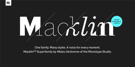
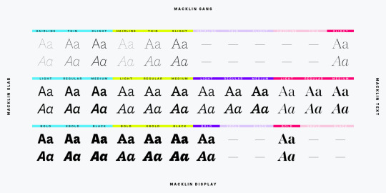
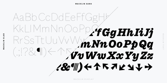

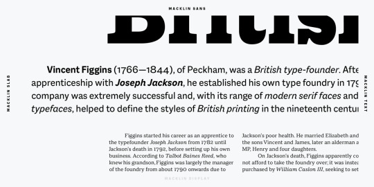

Monotype introduce el concepto de “Súperfamillia” tipográfica. Esto es, que una misma familia incluye variaciones de la misma tipografía en versiones con, sin e incluso semi serifas, como por ejemplo su familia (súperfamilia) “Macklin”. https://www.myfonts.com/fonts/mti/macklin
¿Qué son las súperfamilias tipográficas? por Monotype:
Súperfamilias.- Vastas colecciones de tipos que pueden satisfacer una multitud de necesidades sin comprometer la consistencia. Pero, ¿qué define exactamente a una superfamilia? "Normalmente pienso que una súperfamilia tiene más de un estilo, digamos un componente sin y con serifas, pero eso no está grabado en piedra", explica el diseñador tipográfico principal de Monotype, Terrance Weinzierl. "Creo que si un tipo de letra tiene una gran variedad de pesos y anchos, es una gran familia. Lo que la hace 'súper' es la capacidad de cambiar de personalidad o de voz mientras se mantiene la armonía y se conserva algo del mismo sistema, quizás la métrica vertical y el color del peso visual".
Una comparación útil son los colores análogos. Mientras que una gran familia tipográfica puede ofrecer un azul claro a oscuro, una súperfamilia ofrece un espectro más completo de ese color, desde el azul-verde hasta los tonos amarillentos y púrpuras. Al basarse en la misma arquitectura de letras subyacente, las súperfamilias permiten a los diseñadores emparejar diferentes estilos sin crear combinaciones incómodas.
Sobre la familia “Macklin” de Monotype:
Diseñado por Malou Verlomme del Estudio Monotype, Macklin es una superfamilia, que reúne varios estilos que llaman la atención. Macklin es un tipo de letra elegante y de alto contraste que exige su propia atención y ha sido diseñado con el propósito de permitir a las marcas atraer de manera más emocional a los consumidores modernos.
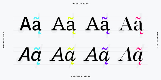
Macklin comprende cuatro subfamilias -Sans, Slab, Text y Display- así como una variable. La superfamilia completa incluye 54 fuentes con 9 pesos que van desde la línea delgada hasta el negro.
El concepto de Macklin comenzó con la investigación de material histórico de Gran Bretaña y Europa a principios del siglo XIX, específicamente la obra de Vincent Figgins. Este fue un período de intenso cambio social... el comienzo de la revolución industrial. Una época en la que los fabricantes y los publicistas sustituyeron repentinamente los modelos tradicionales de escritura o caligrafía y exigieron una tipografía audaz y llamativa. Los tipógrafos experimentaron con nuevos estilos innovadores, como las caras gordas y los italianos, y desarrollaron muchos estilos que las marcas y los diseñadores siguen utilizando hoy en día, como las tablas, las serifas y las sans serifas.
Verlomme respeta el trabajo de Figgins con Macklin, pero empuja a la familia a un lugar más contemporáneo. Cada subfamilia ha sido diseñada a partir del mismo esqueleto, dando a los diseñadores una amplia paleta para la representación visual y la capacidad de crear con contraste sin preocuparse de emparejamientos incómodos. Con Macklin, Verlomme nos muestra que es posible crear una superfamilia que permite una completa expresión visual sin comprometer la fluidez.
#tipografía#super familias#superfamilia#familias tipográficas#font family#font families#fonts#typography#type#familia tipográfica#Macklin#monotype#paquetes de fuentes#combinación de fuentes#combinaciones tipográficas#tipos de letra
0 notes
Photo


I did this little practice and enjoyed it a lot this afternoon. While browsing English type specimens from the XIX. century, looking for Antique designs, I found this beautiful 'sterling' in Vincent Figgins' Specimen of Printing Types (1834)
—and then I digitalised it
—this was then modified to match the look and feel of the family I'm drawing
—showing the underlying structure of the glyph—and finally the weights.
These are more or less interpolated although I'm working with 4 masters and usually tweak the interpolated glyphs by hand.
#slab#slabserif#comingsoon#boldfacefoundry#boldface#belafrank#hungariantypedesign#hungariandesign#type#typeface#typedesign#typedesigner#letter#letters#glyph#glyphs#glifa#egyptian#antique
36 notes
·
View notes
Text
Giza

Giza is a sixteen style slab serif typeface designed by David Berlin in 1994. It draws inspiration from the original Egyptian letterforms and is based on Vincent Figgins’ specimen of 1845. Mostly used for poster designs and works best at a large size. At smaller sizes, it would be harder to read due to its tight kerning.
- Deborah Alalade
0 notes
Text
Vincent Figgens ~ Egyptian/Slab Serif

1817 ~ Vincent Figgins created the first recorded Egyptian/Slab Serif typeface which appeared in Figgins’ 1817 catalogue and was named Antique. Here, we see the transformation of the refined detailed serif to a heavy slab.
0 notes